Ghosts of Planner’s Past: Bullet Journalling

I’ve been putting off writing this post because of all the planning systems I discussed, this Bullet Journalling (BuJo) is such a big topic and the system that I’ve used the most and the longest, apart from GTD. This will be the last post in this series as I’m planning on starting another series of posts on a different “how I use my notebooks” kind of topic. The previous posts are here: Chronodex, Weekly Planners, Daily Planners, Filofax, GTD and Friends.

So, Bullet Journalling was started by Ryder Carroll as a very utilitarian, relatively simple, glorified to do list combined with a calendar and some forward planning. At first glance it looked like another GTD system, and it’s clear that they share a common ancestry. This is the first video that Ryder Carroll published on the topic. He’s using a Moleskine squared large notebook here (he’ll switch to a Leuchtturm once he hears about the brand from the Pen Addict podcast, and he’ll land a collaboration deal with them later on), and there are no Instagram worthy spreads, metaphysical musings on how BuJo can transform you into a more enlightened human being, or attempts to upsell anything. It’s like the early days of Moleskinerie and 43folders posts – a guy finds a way to manage his to do list that works for him, and may work for others and so he shares it. Ryder Carroll knows how to explain complex things succinctly and clearly, and the video is beautifully made. It gained a lot of traction at the time, although it’s clear that Carroll prefers that you don’t watch that version of the BuJo explanation.

This is version of bullet journalling is what I started using, and what I still sort of use to this day. Why sort of use? Well, because the basis of the system is a daily to do list with a monthly calendar (and a monthly review), an index and a set of “collections” which are basically project to do lists. I still use the daily to do list and “collection” lists, so I sort of bullet journal. But I also sort of don’t – because none of this is new or unique. To do lists with checkboxes written out on notebooks, with project lists alongside them? There’s a monster list of those. You can’t get a book deal and a stationery collaboration based on that, right?

The official Leuchtturm1917 Bullet Journal

Wrong. About a year passes from the original video, and Carroll signs a deal with Leuchtturm1917 and suddenly there’s an official Bullet Journal and a new video. Stuff gets added to the system. A future log. A whole set of new symbols instead of checkboxes. There’s an added aura of importance and self improvement sprinkled on top. This system will help you be a better person, not just a more productive one.
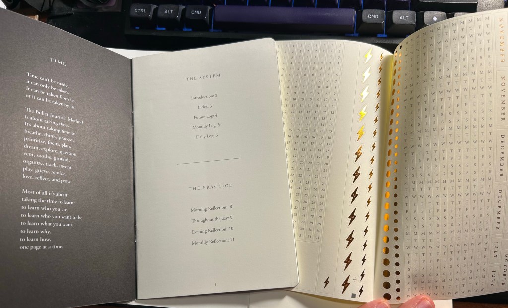
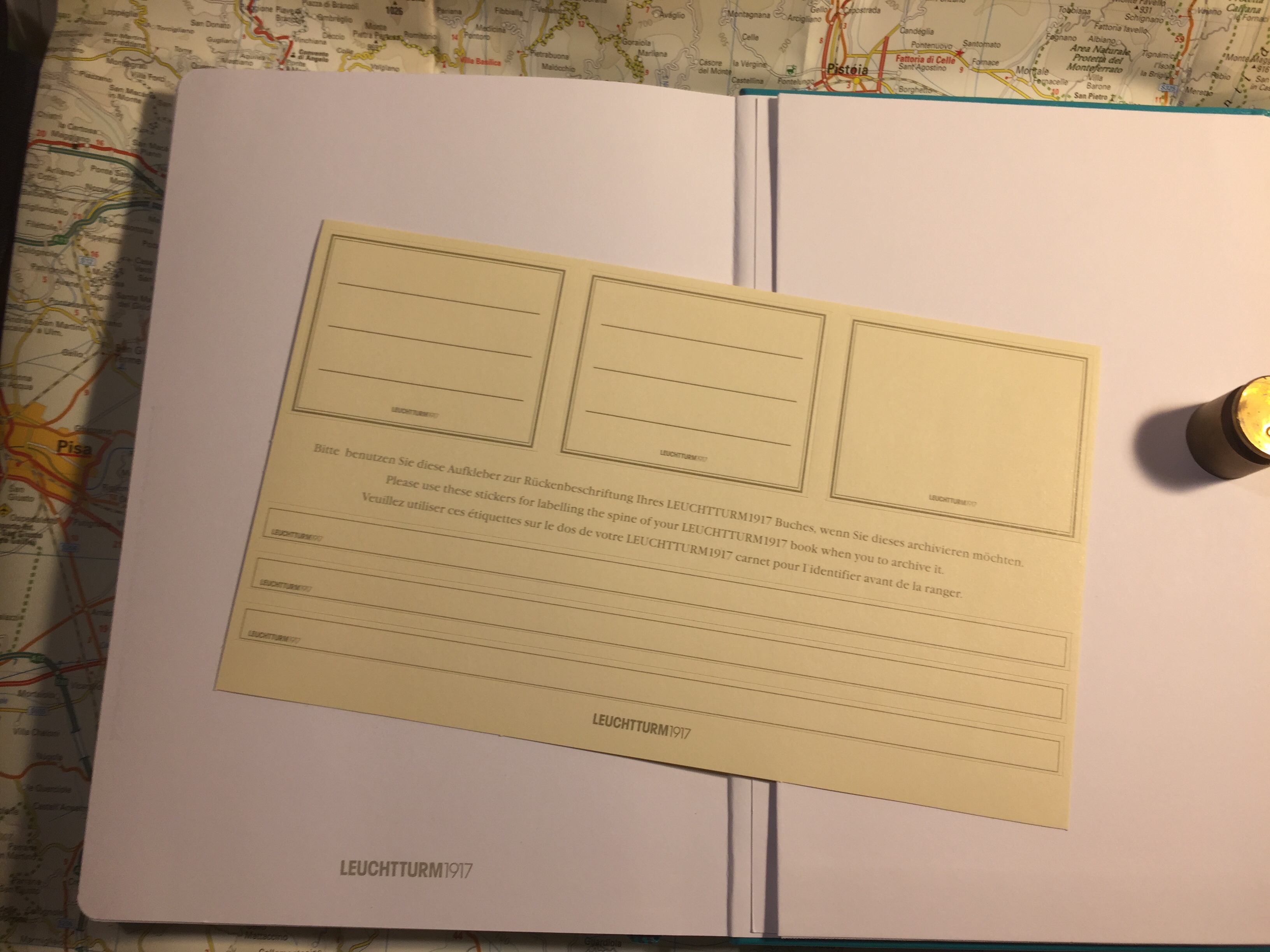
The included pamphlet – with a poem about BuJo no less – and sticker sheet

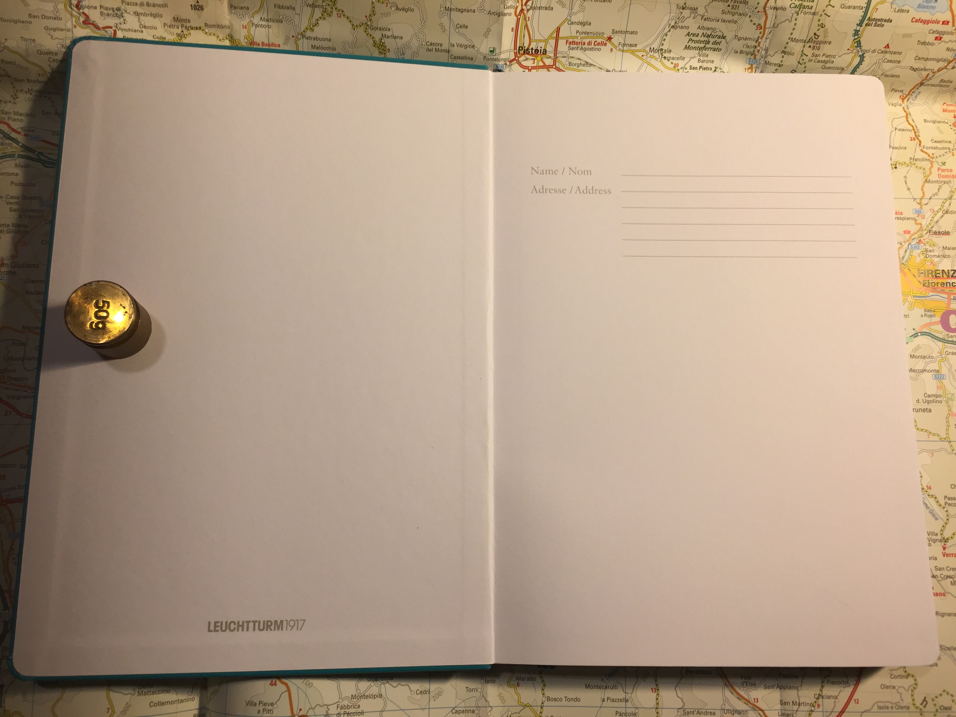
This is where the Bullet Journal system starts taking a problematic turn for me (and others, gathering by the comments to the videos). It starts becoming an Instagram thing. People spend hours making gorgeous, Instagram worthy monthly spreads. They spend money on templates, markers, stickers, and notebook bling for this. There’s an army of BuJo influencers. It’s no longer a “getting things done” system, it’s a “make pretty planner pages” system. Carroll inflates the system’s importance and “holistic” approach more and more. Out of curiosity I bought the second edition of the official Leuchtturm1917 Bullet Journal. My PTSD makes planning a real struggle now, and I was at the point where I was willing to try anything. Well, for quite a bit of money you get an overly thick notebook full of Leuchtturm paper, which is tolerably useful with fountain pens. Don’t expect Tomoe River levels of fountain pen friendliness, as there is spreading, and it doesn’t show off the full properties of all your cool inks. Then again, it’s not really meant for that. There’s also an added 12 (!) page manual about the system and a large sheet of planner stickers (and three ribbon bookmarks). There’s also stuff printed on the end papers that shows you how you can divide the dot grid page using the supplied markings. If you create tables often, I guess it’s useful. What I mostly feel using it is that it’s a lot.
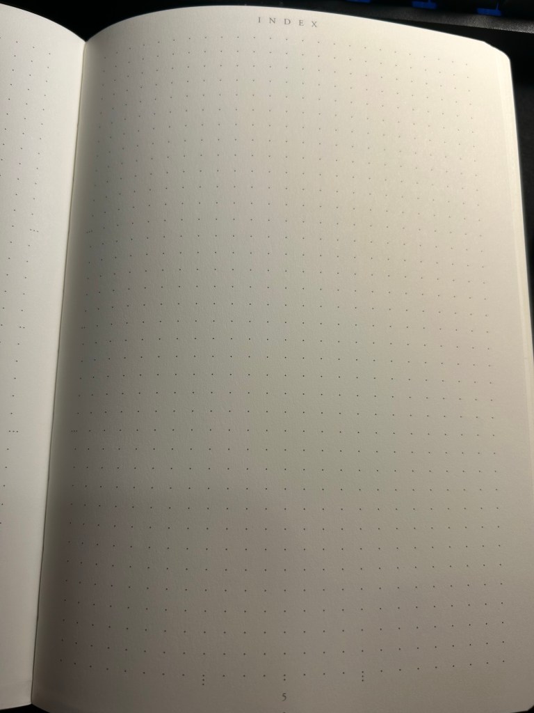
Index page

Have you ever tried to write an essay using Microsoft Word? Have you ever been able to do that without futzing with the formatting, the alignment, the spacing, etc? Word is a program created with printing in mind, and it shows. Writing applications like Scrivener supply you with full screen blank canvases that contain zero formatting prompts because that’s how you get the actual writing done. What the Leuchtturm1917 Bullet Journal does is give you all the tools you need to distract yourself from actually planning your stuff as quickly and efficiently as possible so you can move on to get them done. It’s full of calls to design pages, and I had a hard time at first training my brain to ignore the noise that the notebook came with. Ignore the wide margins, the little division markings, the pages with titles, the stickers and the pamphlet.
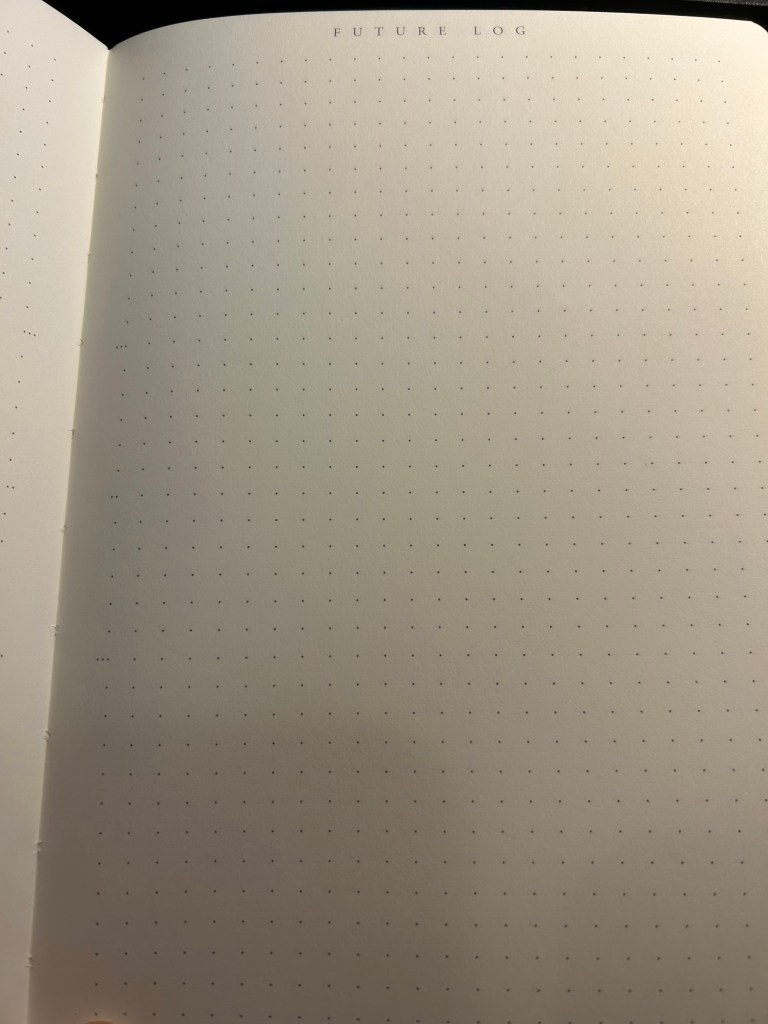
Future log

But back to the Bullet Journal system itself: stripped of its self-importance and its need to preen for Likes and Favs, is it still useful as a planning system?

Let’s take a look at it part by part:

  • Index – I didn’t keep one. I think I might have tried this during the first month, but I gave up quickly on this. It’s too much hassle for very little gain. How many times a month do you actually need to find something in your notebook, and when do you not just flip through it? There were many GTD systems with indexes and indexing systems, and I never found the indexes useful.
  • Monthly log – I keep a version of this separately on a small “Rebel Plans” pad from the Well Appointed Desk. It contains a monthly calendar that’s shaped like a calendar (and not a list of days), with important days in the month circled in a different colour, with basic monthly goals and big monthly milestones/events marked on it. I keep it before my eyes constantly as I work, and so having it tucked away in a notebook doesn’t work for me. I also find listing on paper the events of the day for the entire month a waste of time. That’s what digital calendars are for, and they’re much better than paper ones for it.
  • Future log – a new invention made for the official bullet journal notebook. I tried using it and found it to be useless for me. If you want true long term goal tracking, I suggest you try the theme system journal or something of the kind.
  • Daily log – this is the heart of the system, and it works because it’s a to do list. See also my post about GTD. I fluctuate between using the dash-plus annotation system and simple checkboxes, but you can use whatever works for you, of course. The important part is, of course, defining your tasks properly – actionable, doable in a short amount of time, and something that you can and should be doing.
  • Reflections – these are just a rebranding of GTD reviews. These work well if you do them, but it’s been my experience that it’s very easy to stop doing them because who wants to review what you didn’t get to complete as planned?

So there’s good stuff in Bullet Journal if you are able to strip it down from its anxiety inducing beauty contest trends. The question is, will you be able to ignore all the Bullet Journal page design noise and make use of this as a pragmatic planning system, or will you get carried away and start decorating pages and comparing monthly spreads with people who do this for a living, as you buy yet another template and another BuJo perfect pen? I’ll leave you to answer that one for yourself.
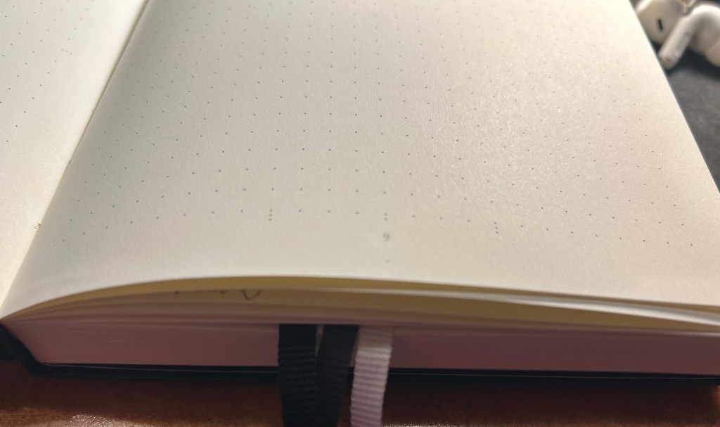
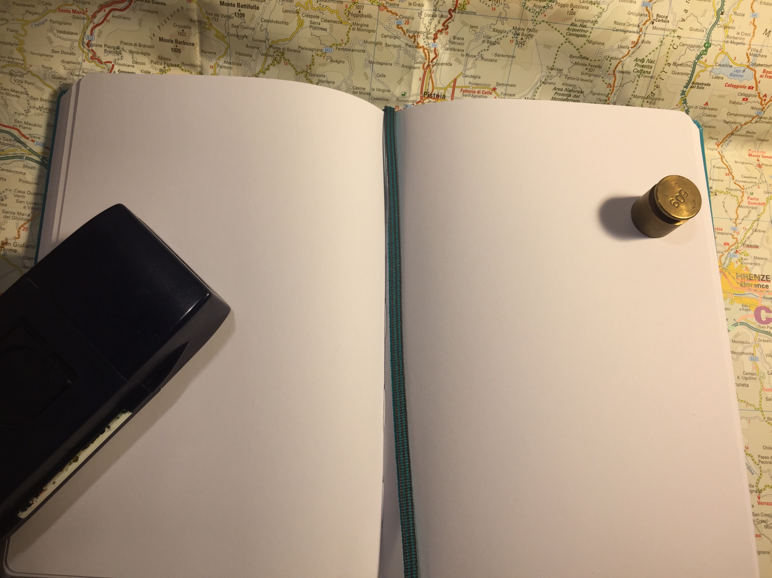
Three ribbon bookmarks and divider markings closeup. You can also see the white margin all around the dot grid page.
London Haul: Carrying Cases and Standard Pens

I’m working on my backlog of posts after about a month of hiatus (work and health related) so here’s a look into more of my haul from my latest London trip.

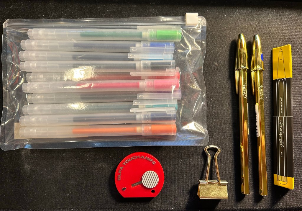
Muji happened to have a sale on its standard pen sets, so I bought a pouch of these 0.38 gel pens (I think that Zebra makes their refills but I’m not sure) to have around. There are 10 pens in the set, and my plan is to bring them into the office to have them around as occasional highlighters, pens to doodle with or pens to loan with no expectations of seeing them again.

The red Olfa Touch Knife was an impulse buy and is the thing I use most from this bunch. I used it while gift wrapping books, I used it to open packages, and I’m using it now to open Lego bags for my current build (the large Disney Castle). This is a nifty and handy little tool and I’ll probably buy another one at some point as a backup.
The bronze paper clip is just a nicer version of the clip that I use to keep my pocket Stillman and Birn Alphas shut, as they don’t come with any kind of elastic closure.

The gold bics are from Present and Correct and they made me laugh. I plan on giving one away to a designed friend, in the hopes that it will make her laugh too. I used to use them so much when I was a teenager (before gel ink pens became widely available) and I hated them so much that having a gold one is just beyond perfect.

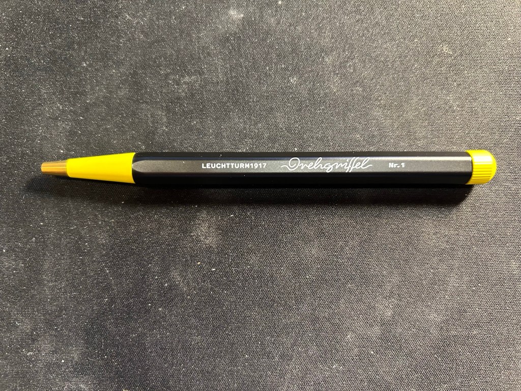
The black and yellow pen is the Bauhaus edition of the Leuchtturm1917 Drehgriffel Nr. 1 ballpoint. It’s a twist mechanism aluminium and brass hexagonal ballpoint pen that comes with a blue refill. I reviewed the gel ink version (identical apart from the refill) here. I purchased this pen in London Graphic Centre near Seven Dials/Covent Garden, and it was completely an impulse buy. Should you buy one yourself? If you’re in need of a pocketable ballpoint that doesn’t use a click mechanism, then maybe. Ergonomically it’s not the best for long writing sessions, and the twist mechanism doesn’t make it great for quick deployment, so there are better options in the market. The design is very fetching, and if you like it you might be willing to overlook the pen’s shortcomings. The Bauhaus edition was created as a companion to Leuchtturm’s Bauhaus notebooks.

Drehgriffel Nr. 1 Bauhaus ballpoint.

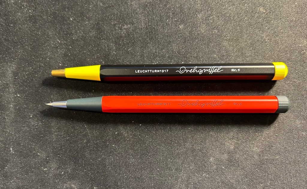
I bought the Drehgriffel ballpoint to accompany the Drehgriffel mechanical pencil that I bought at the same time. The pencil is fire engine red and grey with silver trim, and the pen is black and yellow with brass trim, and the pencil is slightly heavier than the pen, though they’re both the same size.

Pen on top, pencil on the bottom.

I also got two carrying cases, one a blue Cordura pen case from Midori. The case is called the two way pouch, and it appears very well made.

Midori two way pouch.

The pouch is divided into two identical compartments (hence the name) each with a small divider/pocket inside. It also has a prominent and robustly built handle. I am considering using this pen case for my Caran d’Ache neocolors, but we’ll see.

The second case is a heavily discounted net pouch from Muji. This is going into my travel backpack as a way to keep easily lost bits and bobs together and easily found.

The net side of the Muji case

The net is just on one side of the case, which is perfect, as it allows you to see what’s inside the pouch and also have this little bag have some sort of body and structure to it due to the solid side.

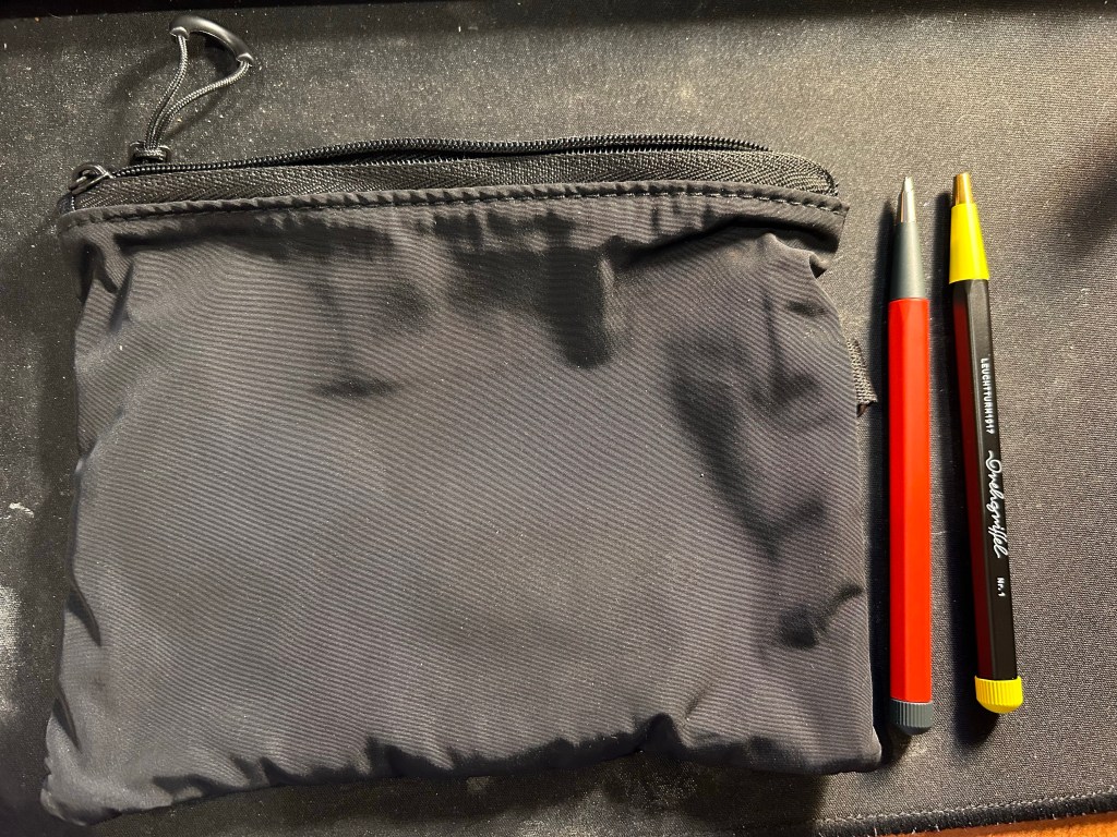
The solid side of the Muji case next to the Drehgriffel pencil and pen.

I also bought a solid plastic box for the my neocolors at Muji, but I decided not to use if for them in the end. It was too small for them and they rattled around in it and made a racket every time I walked, and I didn’t like that.

All in all this was probably my most “impulse buy” bit of the trip, and I’m OK with that. Compared to previous years I’ve really toned down my “must try all the pens in the world to find just the perfect one!” tendencies. If you’re reading this I assume that you can relate.
Now to just use it all…

Drehgriffel Nr. 1: A Review of the Leuchtturm1917 Gel Ink Pen

London Graphic Centre is one of my favourite stores in London. It’s tucked away in the corner of a street off of Neal street in Covent Garden, and it’s a real haven for artists, designers, architects and anyone who loves stationery and art supplies. I visit it several times whenever I’m in London, and I never fail to find something new and interesting there to try out. This time was no different, and one of the first things that caught my eye while I was there was this:

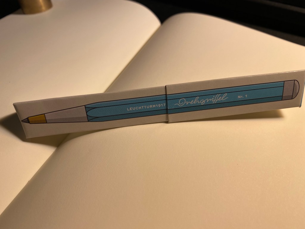
Rectangular box, Leuchtturm1917 logo, aquamarine colour, unusual pen design – of course I had to check it out.

It was just above the Leuchtturm1917 notebook display, and there were just three or four colours available, but it was obvious that this pen was designed to match the colours on offer in the Leuchtturm notebook lineup. I assumed at first that it was a ballpoint, in which case I wasn’t really interested in it, until I saw that it was prominently labeled as a gel ink pen. Now that was intriguing.

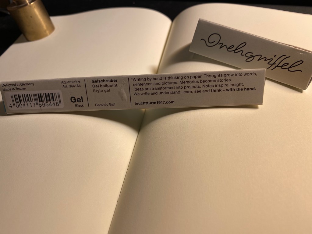
Rectangular cardboard box, with Nr. 1 and “Gel” clearly marked on it, plus the aquamarine colour.

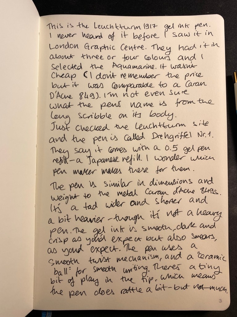
The box was a bit confusingly marked as both “Gel” and “Gel ballpoint”. Checking out the Leuchtturm site clarified that this pen (we’ll get to the name in a minute) is indeed a gel ink pen, with a Japanese refill and a “Ceramic Ball” tip. The refill itself looks very much like the Monteverde Capless Ceramic Gel ink refill. My guess would be that this is the same refill, but more on that later.

Several things of interest here: the “Designed in Germany, Made in Taiwan” that is reminiscent of Apple’s packaging. The prominent “Gel” marking and then the confusing “Gel ballpoint” designation. And the “Ceramic Ball” notation.

Somebody really took the time to design this box, but really didn’t consider how illegible the pen’s name is:

I was sure that the pen was called orehgriffel or ovehgriffel.

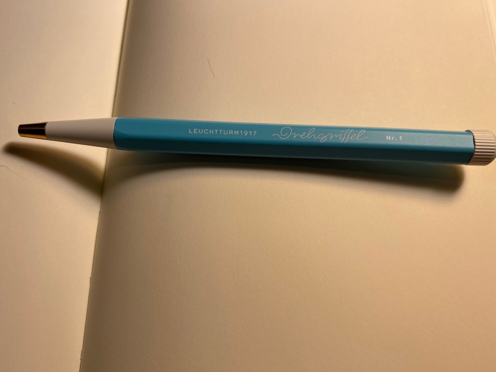
The pen is called Drehgriffel Nr. 1, a bit of a mouthful. Apparently Drehgriffel means “rotary stylus”, which probably refers to the pen’s twist mechanism.

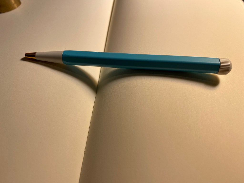
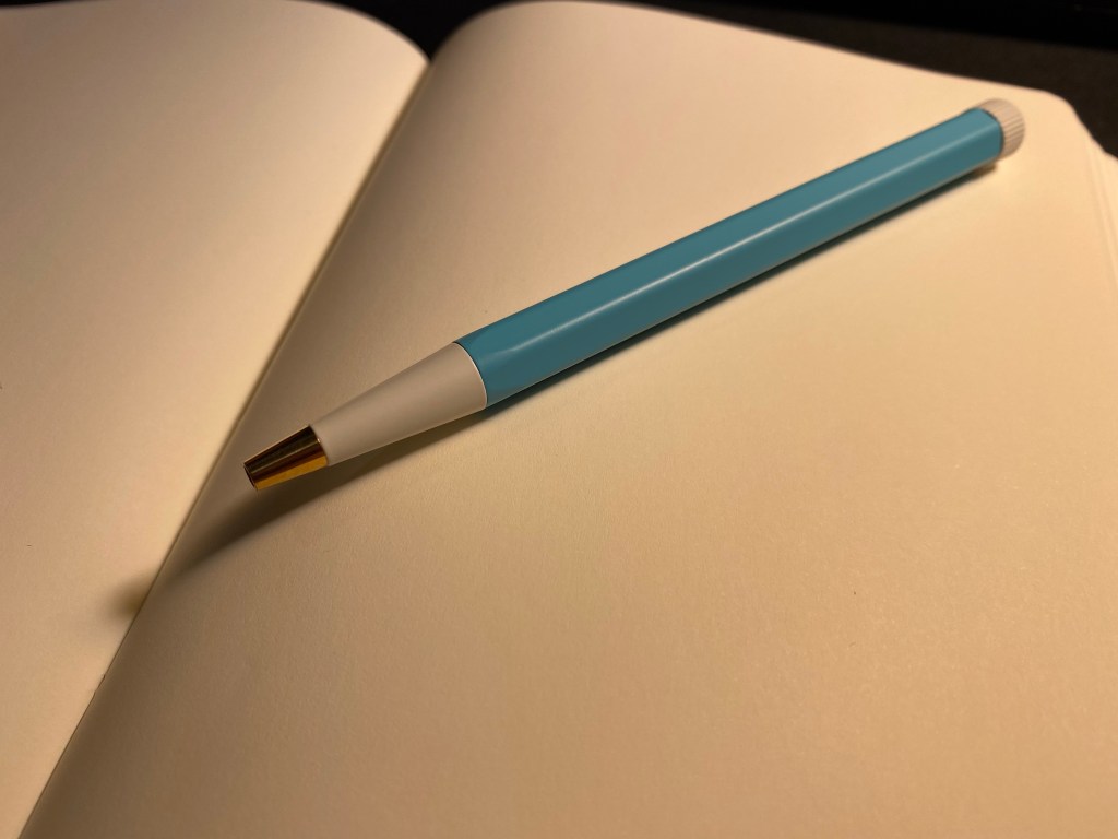
The pen has an aluminum body, a white twist nob at the end and brass pen tip. It’s well balanced, heavier than a plastic pen but lighter than a Retro 51 or a machined pen. It’s slightly heavier than a metal bodied Caran d’Ache 849, but if they were put in a boxing ring they’d both be in the same weight category.

The Drehgriffel has a very 60’s look, which I happen to like, but other people may find to be dated. Also, the Nr. 1 is a weird designation when you don’t have any other pen on offer. Will there be a Nr. 2? A Nr. 3?

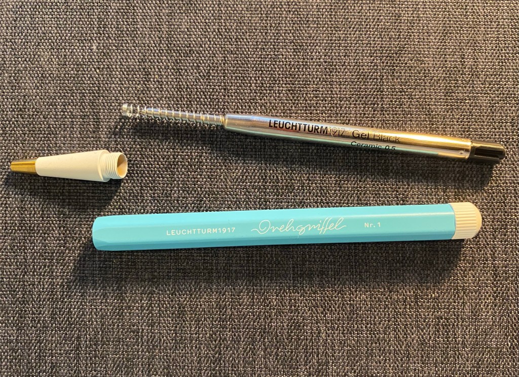
Here’s the pen’s refill and parts. It’s weighted slightly towards the tip because the tip is brass (and, of course, the pen tip will tarnish with time).

The Drehgriffel taken apart.

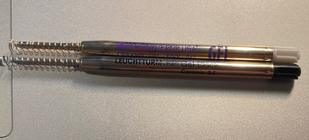
Here’s the Drehgriffel refill side by side with a Monteverde Capless Ceramic Gel refill, and they are exactly the same. Good to know if you’re looking to replace refills, although I suspect that it will take a while to write this pen dry.

Monteverde refill on the top, Leuchtturm refill on the bottom.

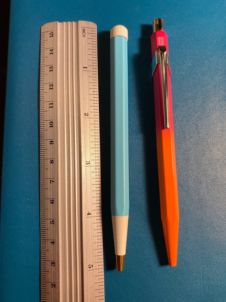
The Drehgriffel is similar in size and weight (and price) to the Caran d’Ache 849 metal barrelled pens. It’s a smidge wider and heavier than the 849, but they are very much in the same ballpark. Here they are side by side:

Leuchtturm1917 Drehgriffel on the left, Caran d’Ache 849 on the right.

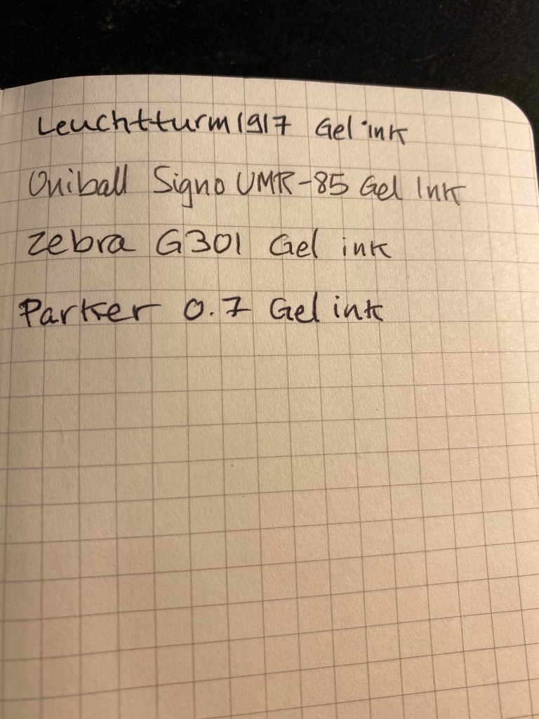
Here’s a writing sample of the Drehgriffel against a few other gel refills. It’s noticeably wider than Japanese 0.5 gel in pens, and is closer to 0.7 gel ink refills. I tested it on a Moleskine squared notebook (and further down you can see it on a Leuchtturm1917 notebook).

Writing samples.

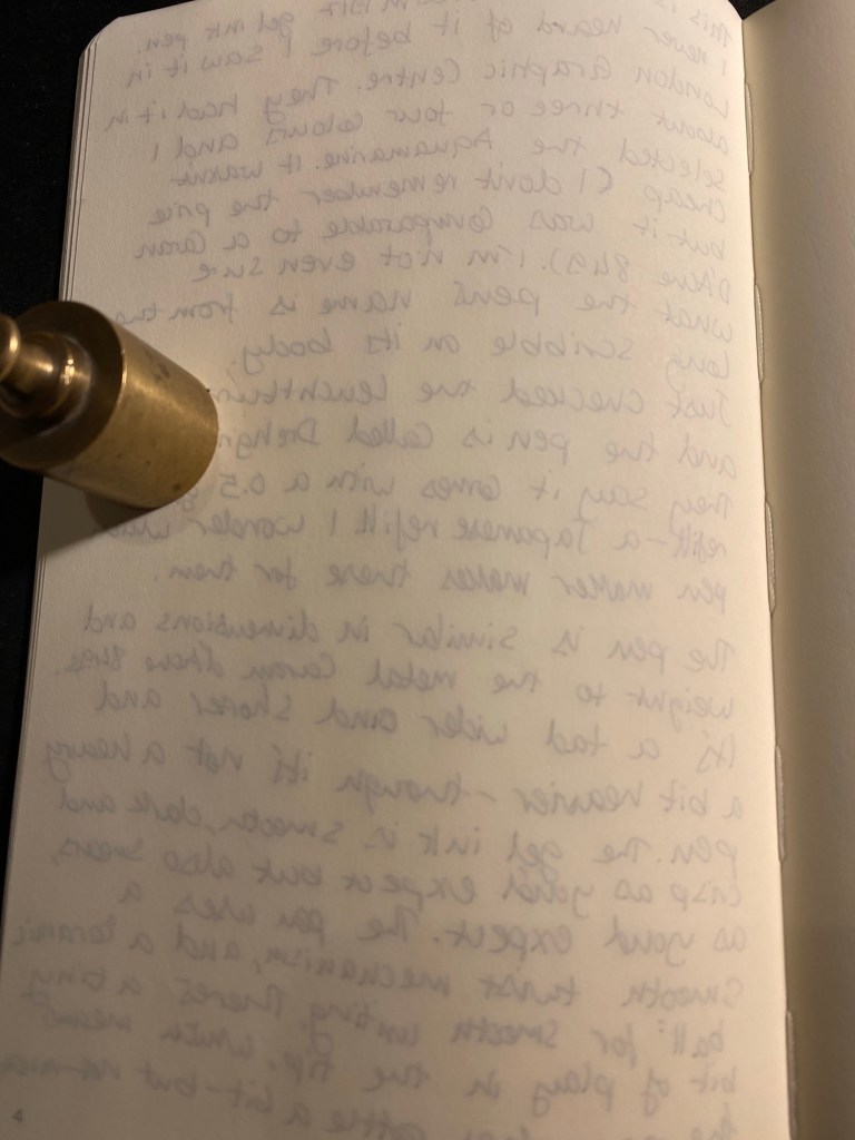
Here’s the reverse side of the Moleskine page. The Drehgriffel bled a bit more than its counterparts:

The reverse of the page.

Here’s a writing test on a Leuchtturm1917 80gsm blank notebook:

Leuchtturm1917 writing sample.

Here too there was visible show through an some bleed through, although there was less bleed through than the Moleskine.

The reverse side of the Leuchtturm1917 page.

The Drehgriffel writes smoothly, but there’s nothing in the pen’s smoothness that justifies the advertising. It’s a nice pen, that comes in a variety of colours and that has an interesting design and good refill. In my opinion it would have been more popular if it came with a click mechanism and was a little cheaper, but I still appreciate the fact that Leuchtturm chose to come out with a gel ink pen first and not the more obvious choice of a ballpoint. I like the look and feel of my Drehgriffel, although I would have liked it better if it would have been a little bit wider. As it is if I use it for more than a page or so without pause it causes my hand to ache and cramp up.

Now I’m wondering if there’s going to be a Drehgriffel Nr.2 with a click mechanism perhaps?

Random Draw: General’s Pacific 365 #2

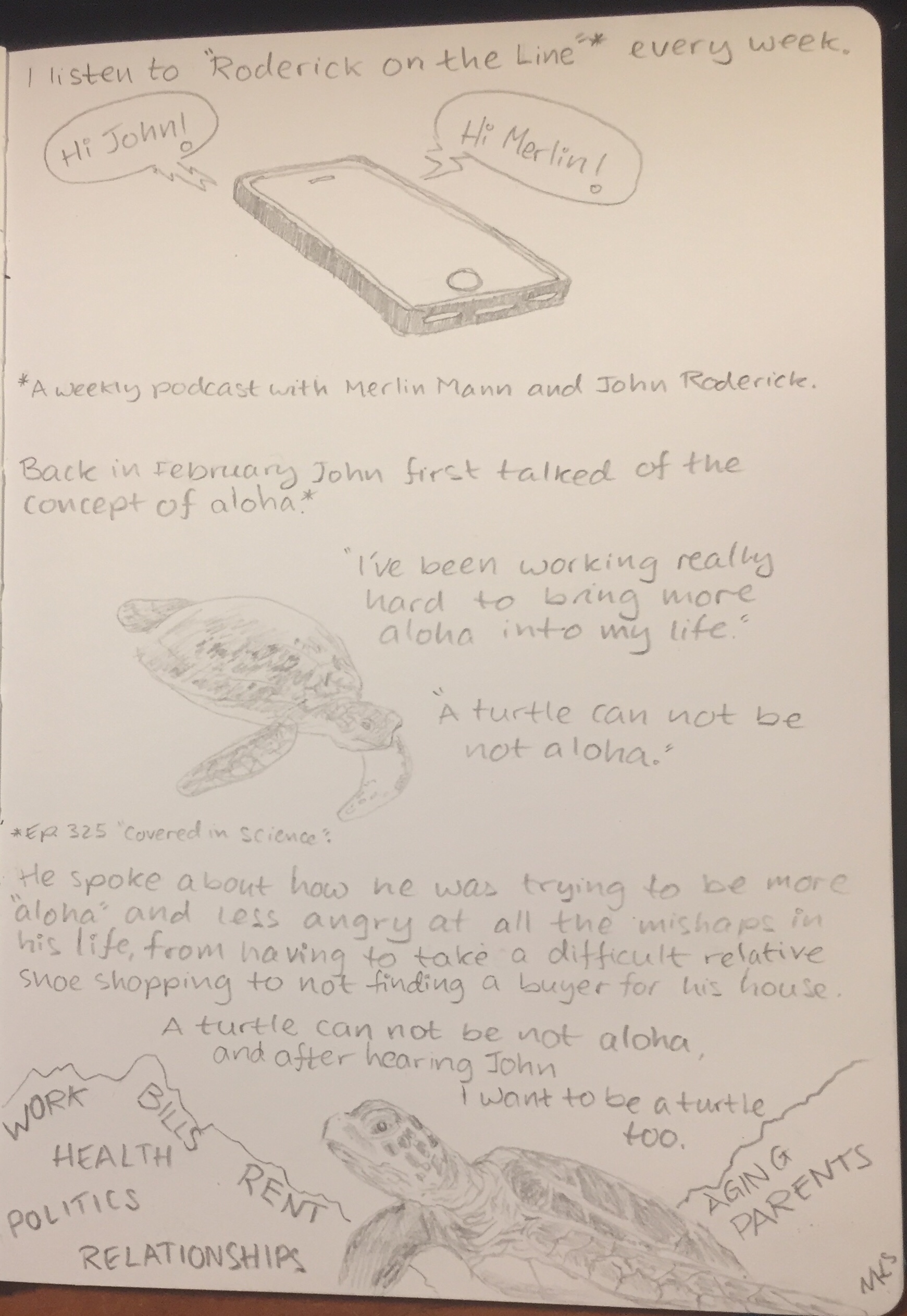
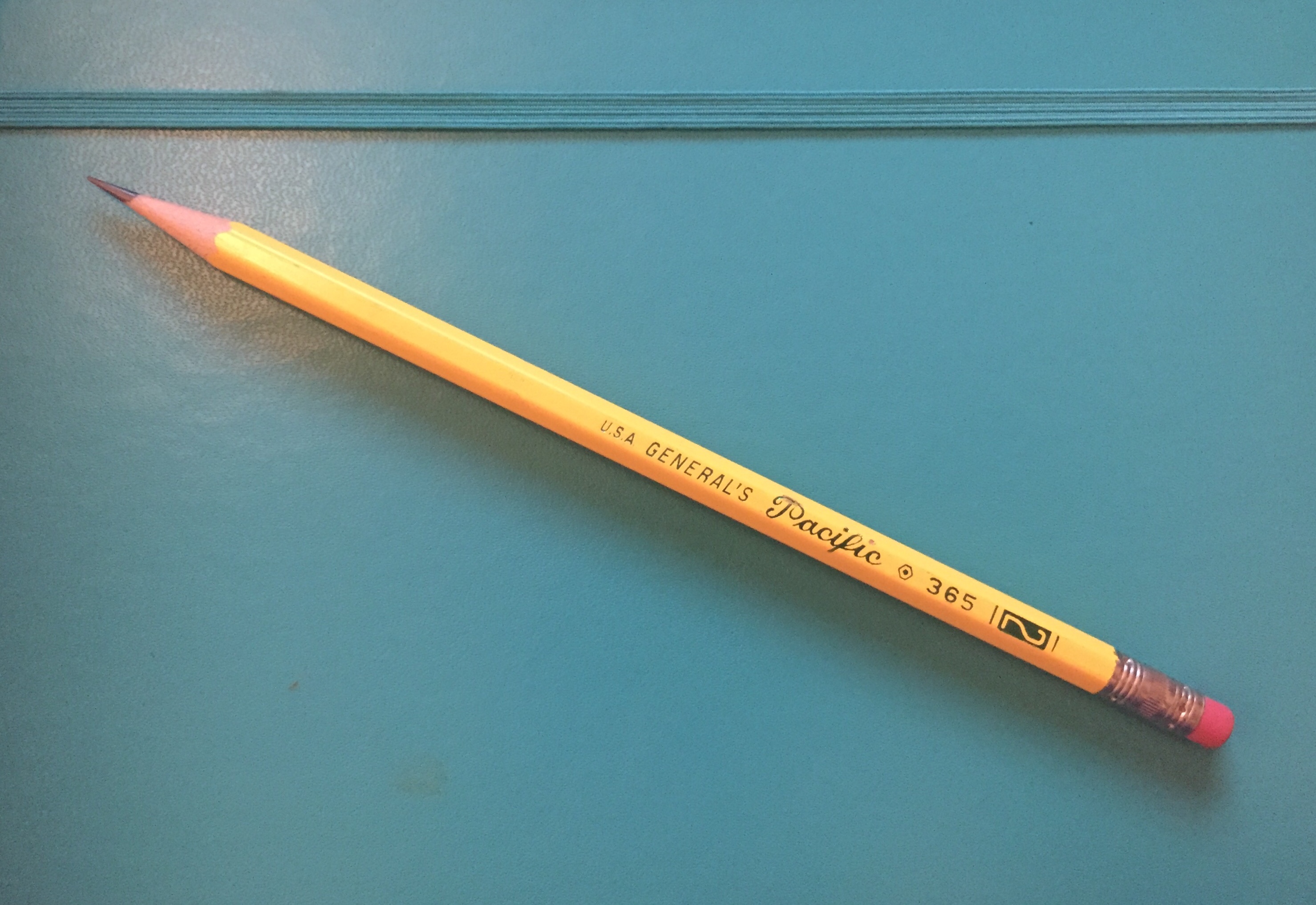
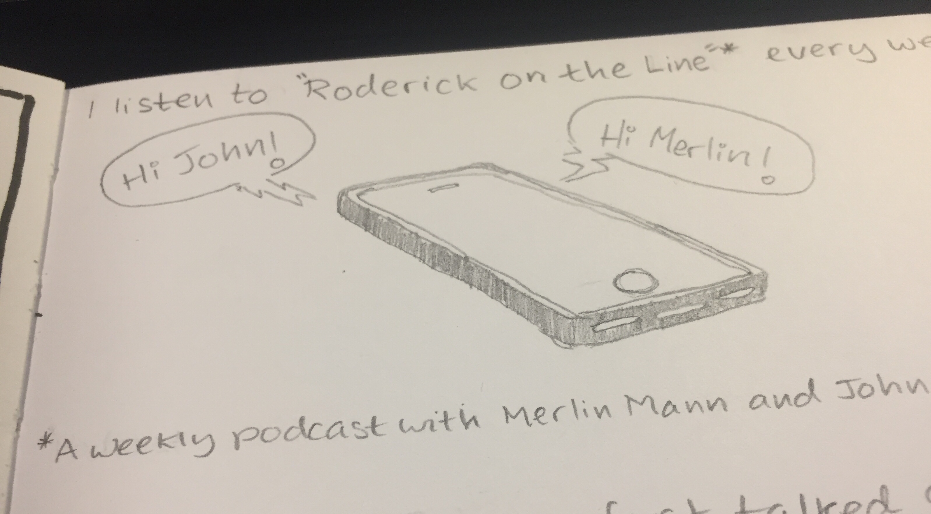
I have too many pencils which I don’t take the time to use. Inspired by this episode of the Pen Addict podcast I decided to literally do a random draw: I randomly drew a pencil from the pile, and then I randomly drew something with it. Today’s pencil: the General’s Pacific 365 #2.

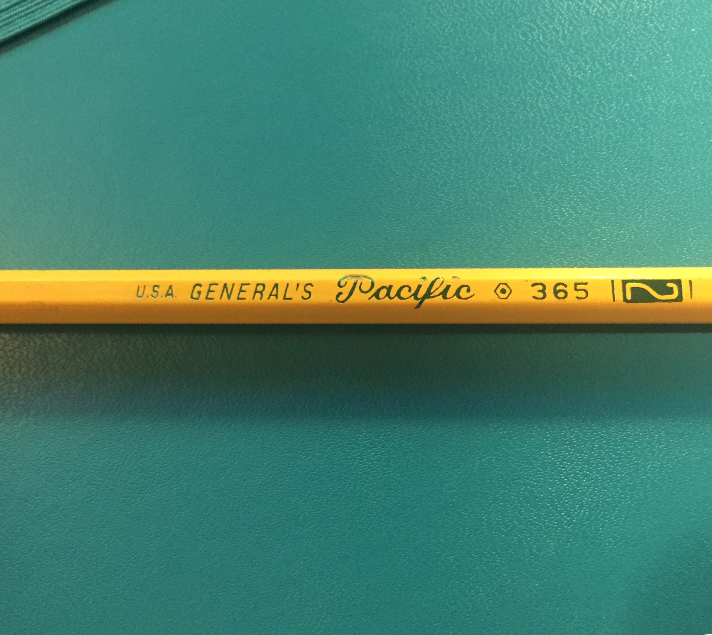
It’s a classic looking #2 (or HB) pencil, with for some reason three or four fonts on the barrel, depending how you count the numerals. It’s made in the USA, out of California incense cedar, and has a little red thing on the top that looks like an eraser, but trust me, I wouldn’t try to use it as one.

Why so many fonts?

The green foil imprint quality is not great, with the “Pacific” imprint chipping the pencil’s coating. The coating itself is pretty thinly layered, but the core is perfectly centred and sharpens like a charm.

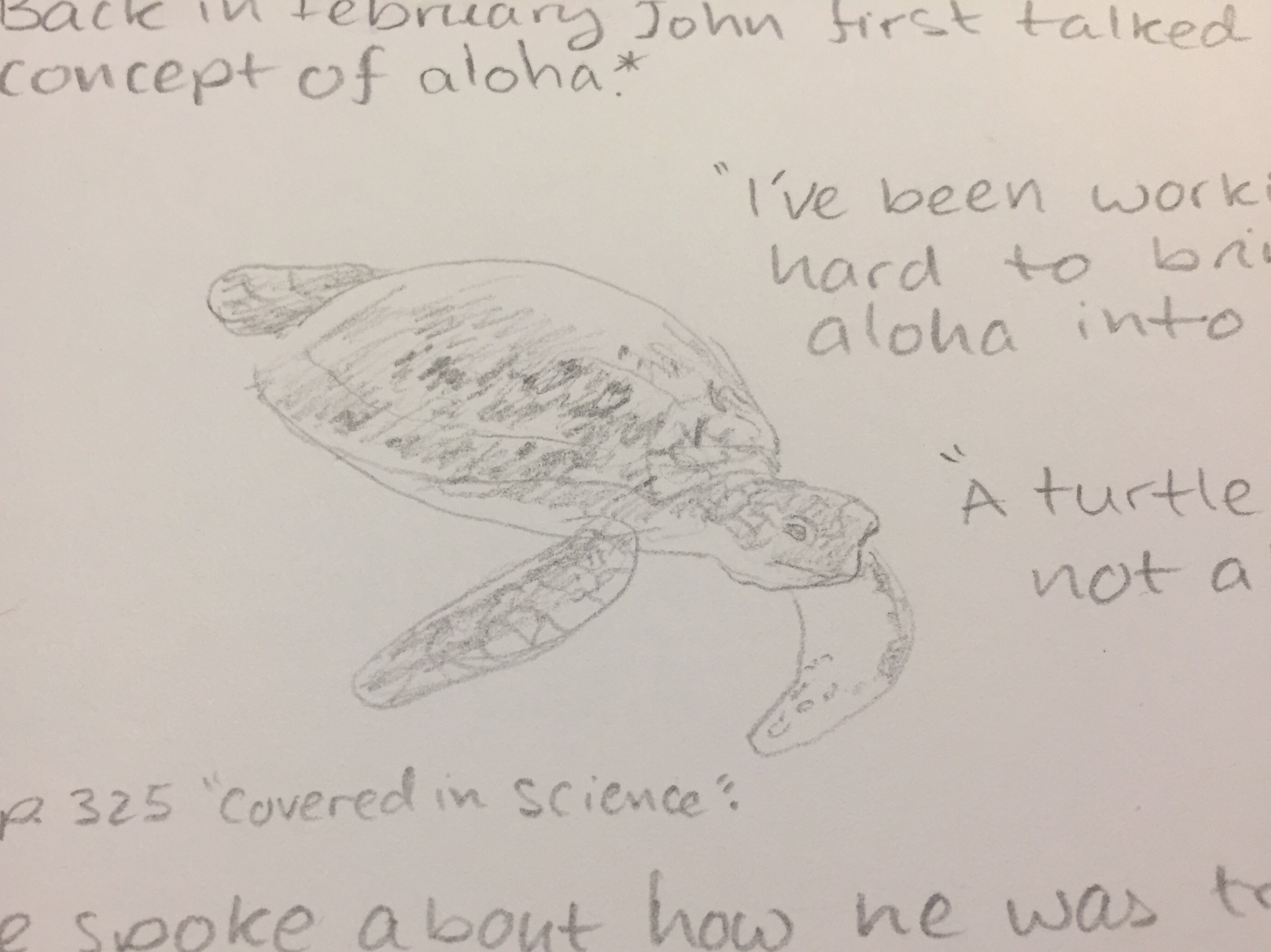
You can see the available shades that the General’s Pacific is capable of producing in the closeup of the sea turtle above. If you’re looking for a #2 writing pencil that could do for a quick sketch in a pinch, the Pacific ought to do the job. It doesn’t smudge and holds a point very well.

I erased a word between the “S” and the “LATIONSHIPS” on the left side of the closeup above. It erased out pretty well, even though the writing was dark and done with some pressure.

The phone above shows you the maximum darkness I was able to produce with the General’s Pacific. It’s not bad, considering that this is clearly not a pencil made for drawing, but one made primarily for writing.

If you’re buying from CW Pencils and are looking to add a workhorse cedar pencil with a fondness for fonts to your order, the General’s Pacific is a pretty good choice.

May we all be more turtle.


Roderick on the Line podcast episodes referenced:

Episode 325: “Covered in Science”

Episode 333: “The Turtle Just Goes”

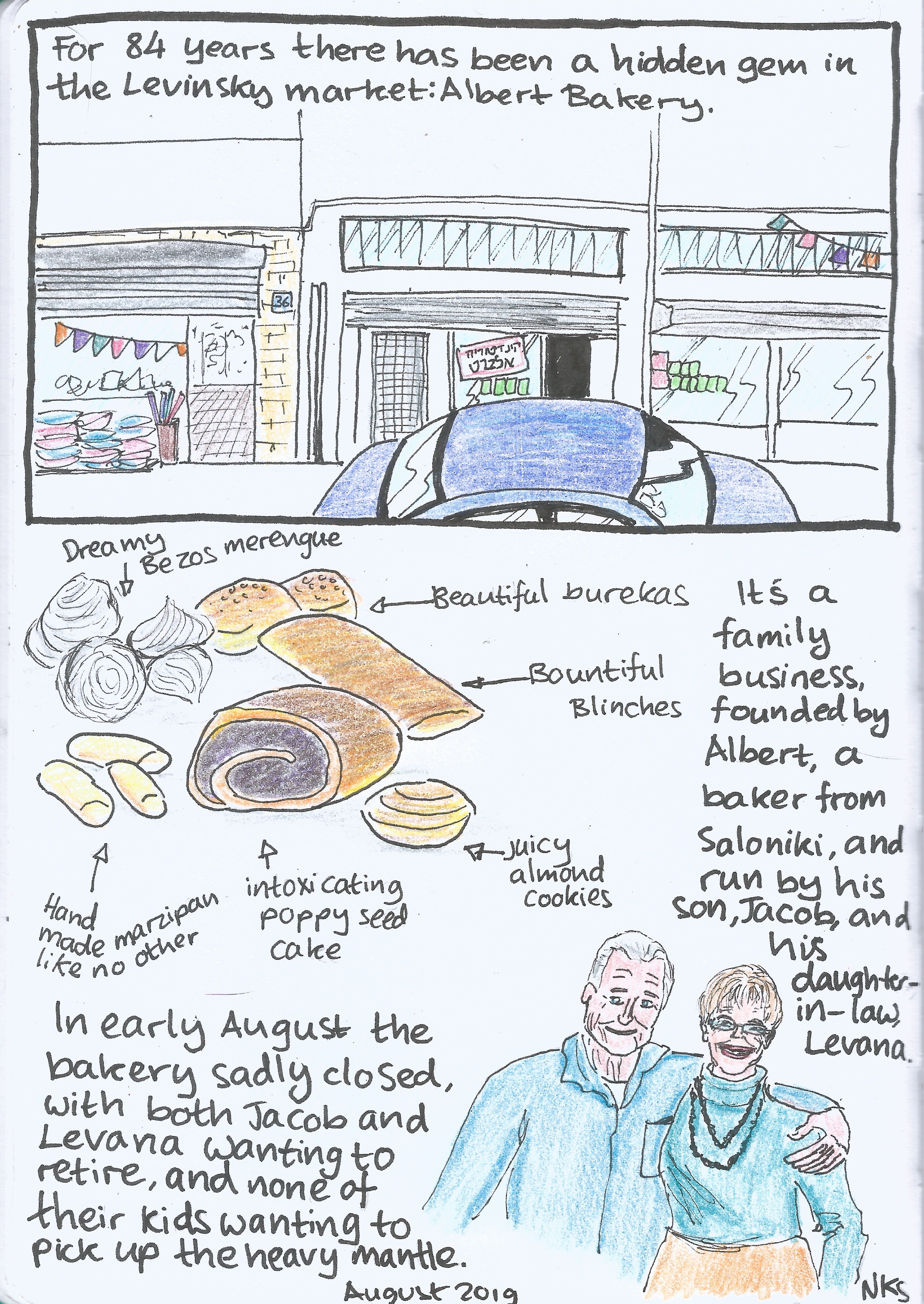
Closing Time (Journal Comic 11-8-19)

Journal Comic 11-8-19.jpeg

Leuchtturm1917 sketchbook, Kuretake Zig Mangaka pens, Deleter Neopiko-Line-3 pens, Caran d’Ache Pablo coloured pencils, Faber Castell Albrecht Dürer coloured pencils.

Leuchtturm1917 Sketchbook Review

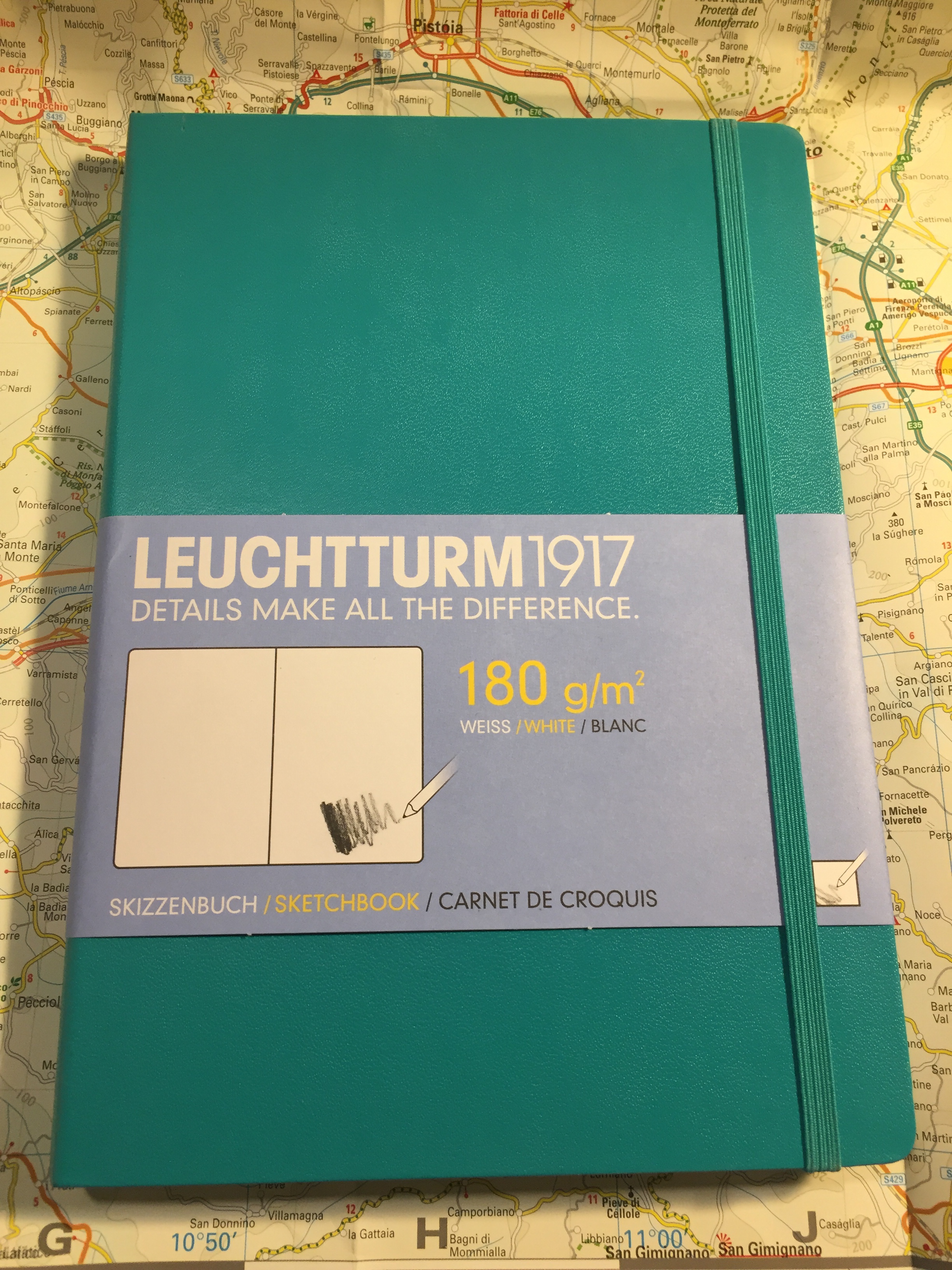
Leuchtturm1917 entered the busy sketchbook market about a year or two ago, with a lineup of A6, A5 and A4 sketchbooks with white 180 gsm paper.

The covers of the Leuchtturm1917 sketchbooks come in a wide variety of colours, which is a rarity in this market. Usually you find sketchbooks in black, or maybe one or two other colours, but Leuchtturm has decided to offer these in all the colour options available in their regular lineup.

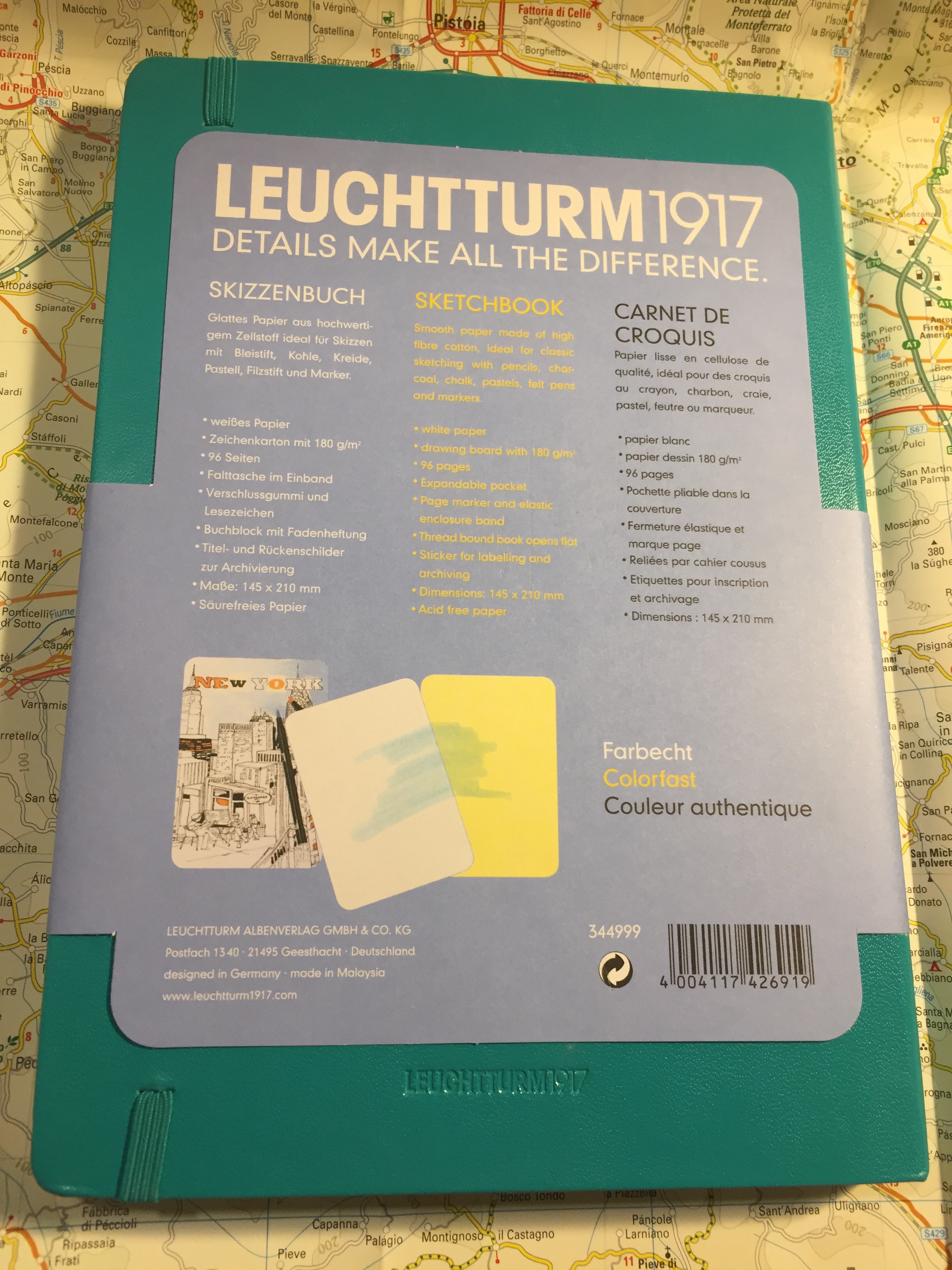
The sketchbook contains 96 pages of acid free 180 gsm paper, and it opens flat. There’s a note in the back packaging that says that the paper is colourfast, and shows a sketch made with a fineliner and markers. More on that later.

There’s a place to write your name and address on the front cover. I recommend writing your name and email address instead. It’s more practical, and more secure.

There is a back pocket. I don’t really think that it’s necessary in a sketchbook, but it’s nice to have.

Leuchtturm offers two unique things with its sketchbook. One is the offer to personalize it with an embossing of your choice. During last year’s Urban Sketchers they personalized the sketchbooks that they gave away as part of the symposium’s package, and the result is very nice.

Now for the heart of the notebook, it’s paper. The pages lie flat with a bit of coaxing, and are thick and substantial. You have to really layer down markers for them to bleed through, and there’s no show through, meaning you can use each page on both sides.

So how does the paper behave? It depends on the medium. This sketchbook excels at dry media (pencils, couloured pencils, conte crayons, etc).

It’s pretty horrible with wet media, including fountain pen ink, watercolour washes, and ink washes. The paper buckles, shows off colour poorly, turns into a grainy mess, and and the ink feathers and spreads. I wouldn’t recommend it even for the lightest washes. All the vibrancy of my schminke watercolours turned into a muddy mess here (the sketch was done with a medium nibbed fountain pen and R&K Emma SketchINK):

Even with fineliners you’re going to have spread. If you like sharp lines, find a different sketchbook.

Again, even from a bit of a distance you can see the spread. That’s just a shame, because if the paper was a little less absorbent then this would be an excellent sketchbook.

This brings me to my frustration with the picture on the back end of the paper band, the one showing a tiny marker and fineliner drawing. This is my experience using markers and fineliners on this notebook:

There’s no option to layer or blend the markers, but that’s OK. This isn’t marker specific paper after all. But even for casual use, or just for use with fineliners/brush pens this paper isn’t great.

So do I recommend this sketchbook? It depends. If the way it looks makes you want to use it, then yes, it’s a notebook for you. I’ve been using this sketchbook for my journal comics mainly to test it out. Will I continue using it? Only because I already have a body of work in it. Otherwise, there are better options out there, ones that aren’t only pencil great, but also work with pen, ink and light watercolour washes (the Stillman and Birn Alpha sketchbooks come to mind).

Property Damage: A Deleter Neopiko Line 3 Review

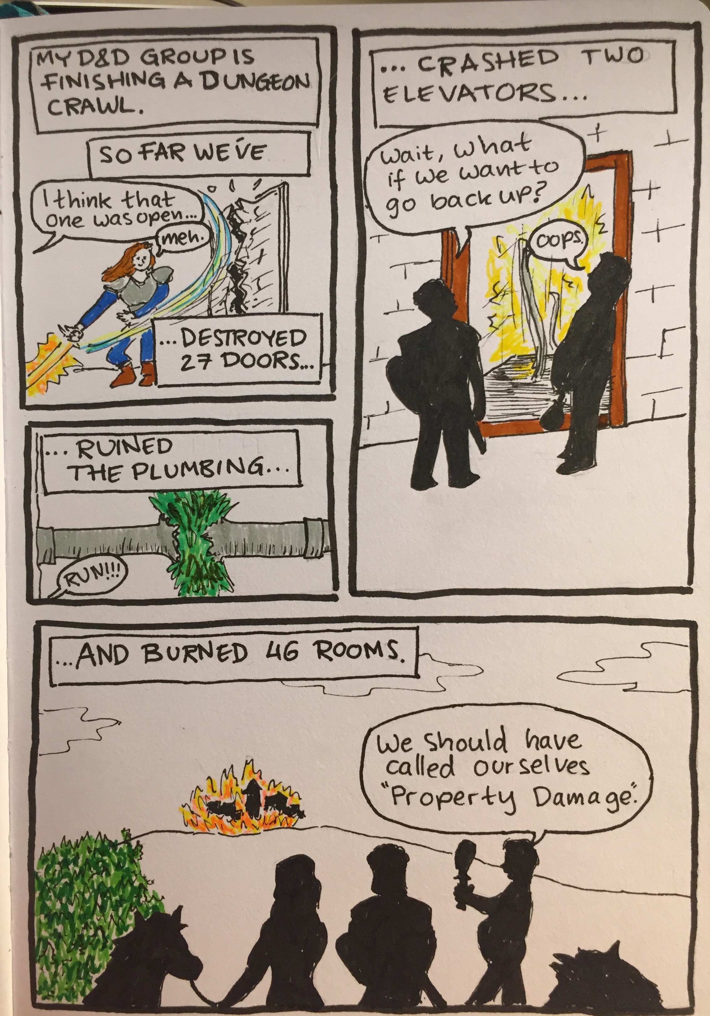
Property Damage

I have been using the Deleter Neopiko Line 3 felt tip pens for a while now as my journal comics pens, just to try them out. I didn’t bother buying all of the lineup (pro tip: you never need all of the tip sizes in felt tip pens), instead choosing to focus on the tip sizes that I would use the most.

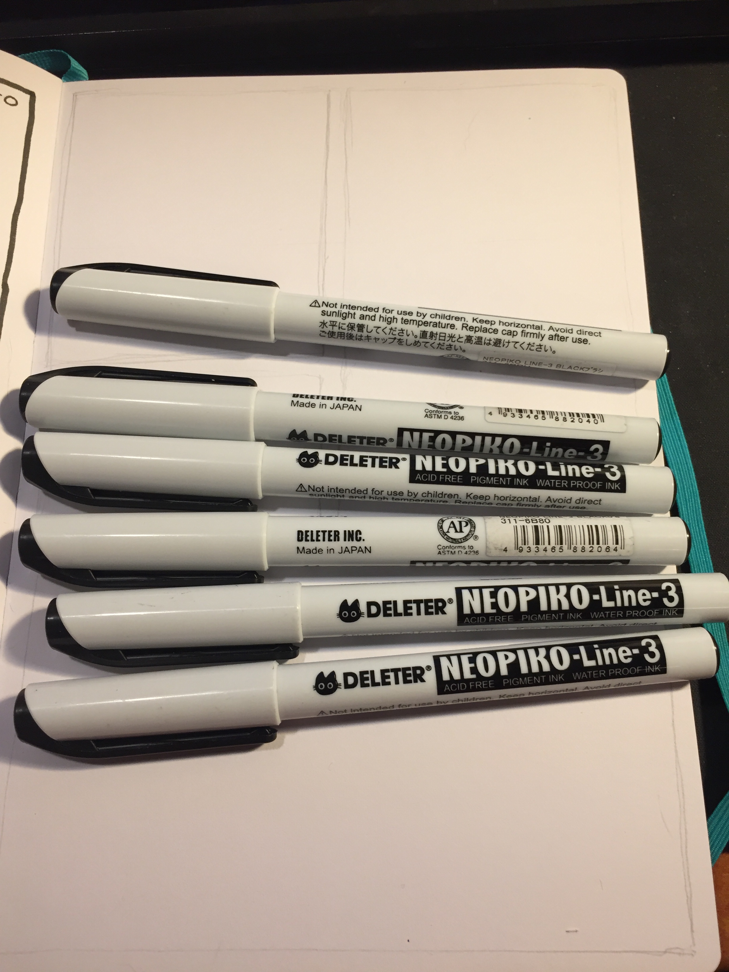
The cat logo is cute.

First thing first: the barrel design. These are wide enough and light enough to be comfortable for long use, but otherwise the Neopiko Line 3 has a terrible design.

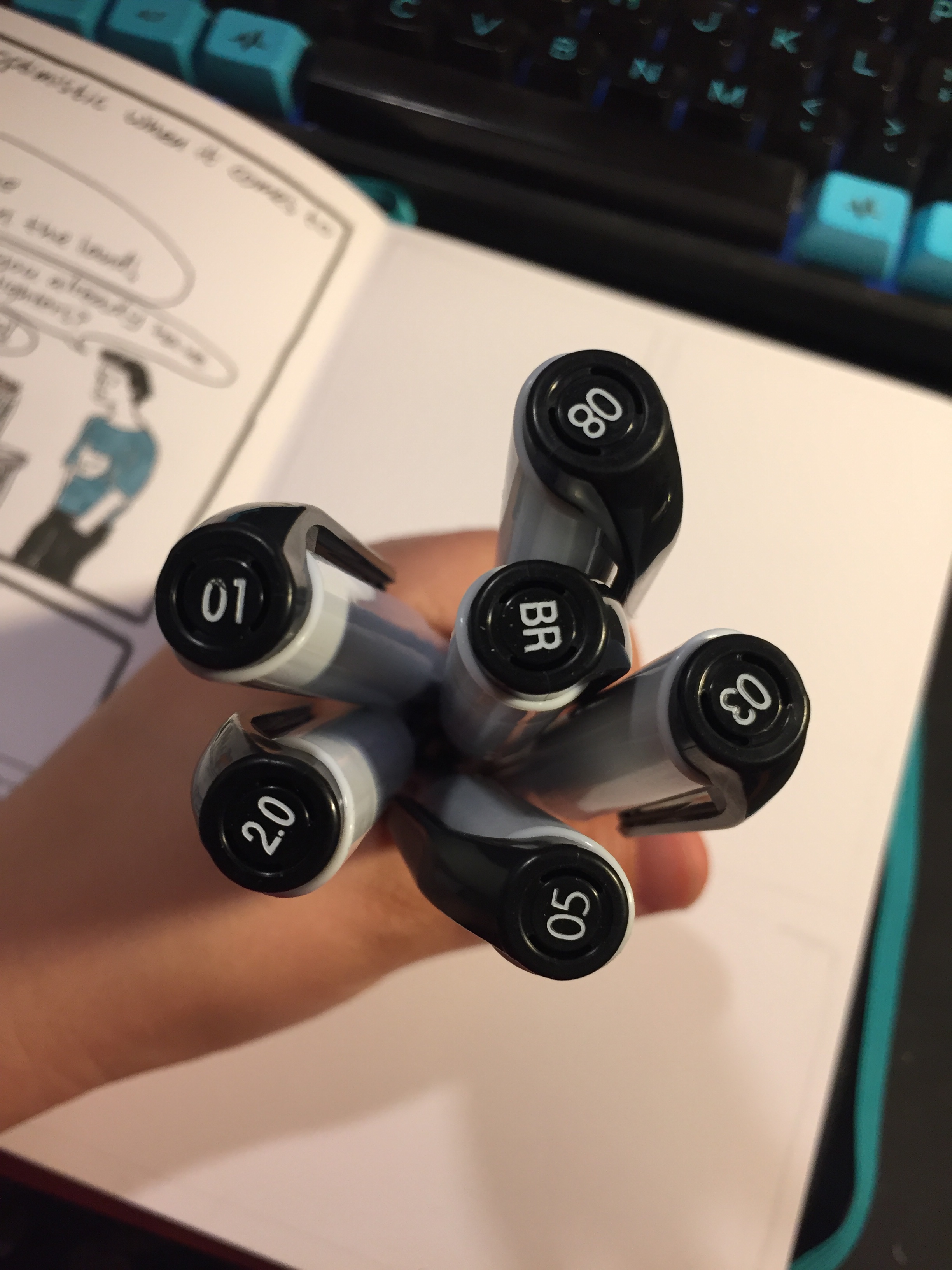
You can’t tell which pen is which without looking at the cap, which is a fatal design flaw in these kinds of pens. I normally use several felt tip pens at the same time, and can oftentimes accidentally cap one pen with another one’s cap. That’s no big deal with the Staedtler, Copic or Faber Castell felt tip pens, as you just look at the pen body when using them to know which is which, but you just can’t afford to make this mistake with the Deleter Neopiko’s. You won’t mix up the 2.0 with the 0.2, but try telling between the 0.3 and the 0.5 when you’re in the middle of a drawing.

Another design drawback is also related to the cap: it’s requires a lot of force to use. This means that you can’t easily cap it with one hand, and if you draw to any extent with felt tips you know how bad that is.

These two choices on Deleter’s part meant that when I was using these pens I had to change my drawing method, working not panel by panel as I usually would, but pen by pen. You’ll see what I mean in a moment, when I review each individual pen.

The Deleter Neopiko Line 3 comes in the following tip sizes: 0.03, 0.05, 0.1, 0.2, 0.3, 0.5, 0.8, 1.0, 2.0, and Brush. These are pretty common tip choices in this kind of pens, with perhaps only the 2.0 tip size being unique to Deleter. I recommend not buying the 0.03 or 0.05 because they are much too fine (in any maker), and skipping the 0.2, as these pens do allow for some line variation (as all felt tips do), so you won’t be able to tell the difference between the 0.2 and the 0.3 in use.

To showcase the pens in use, I decided to create a journal comic and show step by step how and when I use each of these pens.

The Deleter Neopiko Line 3 2.0 pen is what made me try out this pen lineup. It’s a fun and unique tip size that’s just perfect for comic borders or if you like big, bold lines in your drawings. This is the only pen in the Neopiko line 3 lineup that I recommend buying, despite the barrel design flaws.

The 0.8 tip size got very little use in my first journal comics with this set. Normally I would use this tip size for the panel borders, but I was using the 2.0 for that, so I had to remind myself to use it in other places. This is my least favourite of the lineup, as it was scratchy and gritty, and offered a lot of resistance, especially when drawing vertical or rounded lines. It was as if the tip had split, although in reality it hadn’t.

The 0.5 Deleter Neopiko Line 3 (wow to Japanese companies like long names for their products) is one of their most useful tip sizes. You can basically do with the 0.5 and the 0.1 for very fine detail, and the 2.0 for absolute fun, and you’re set for 99.9% of what you’d need for comic line work.

The 0.3 Neopiko is the second most useful pen in this lineup, and one that I used probably the most. If you don’t draw super small, it can probably even replace the need for a 0.1 tip pen for you.

As you can see, the 0.1 Neopiko Line 3 didn’t get much use in this comic, but when you need it, you need it. This is as fine as I would go, though, as already the tip is tiny and fragile, liable to break with too much pressure.

The Deleter Neopiko Line 3 brush pen is useful for filling in black areas, and not so much as a brush pen. It’s very firm, offering very little line variation or brush-like qualities. The only reason to buy it is to get big areas filled with black that is identical in shade to your other line work.

So, is the Deleter Neopiko Line 3 a contender against the Staedtler pigment liner? No, not even close. It is, however, worth giving the 2.0 a go, and if your drawing method is already a pen size by pen size one, then you might want to give these a go. They are waterproof, marker and eraser proof (once dry), and archival.