February 2024 in Pens and Paper

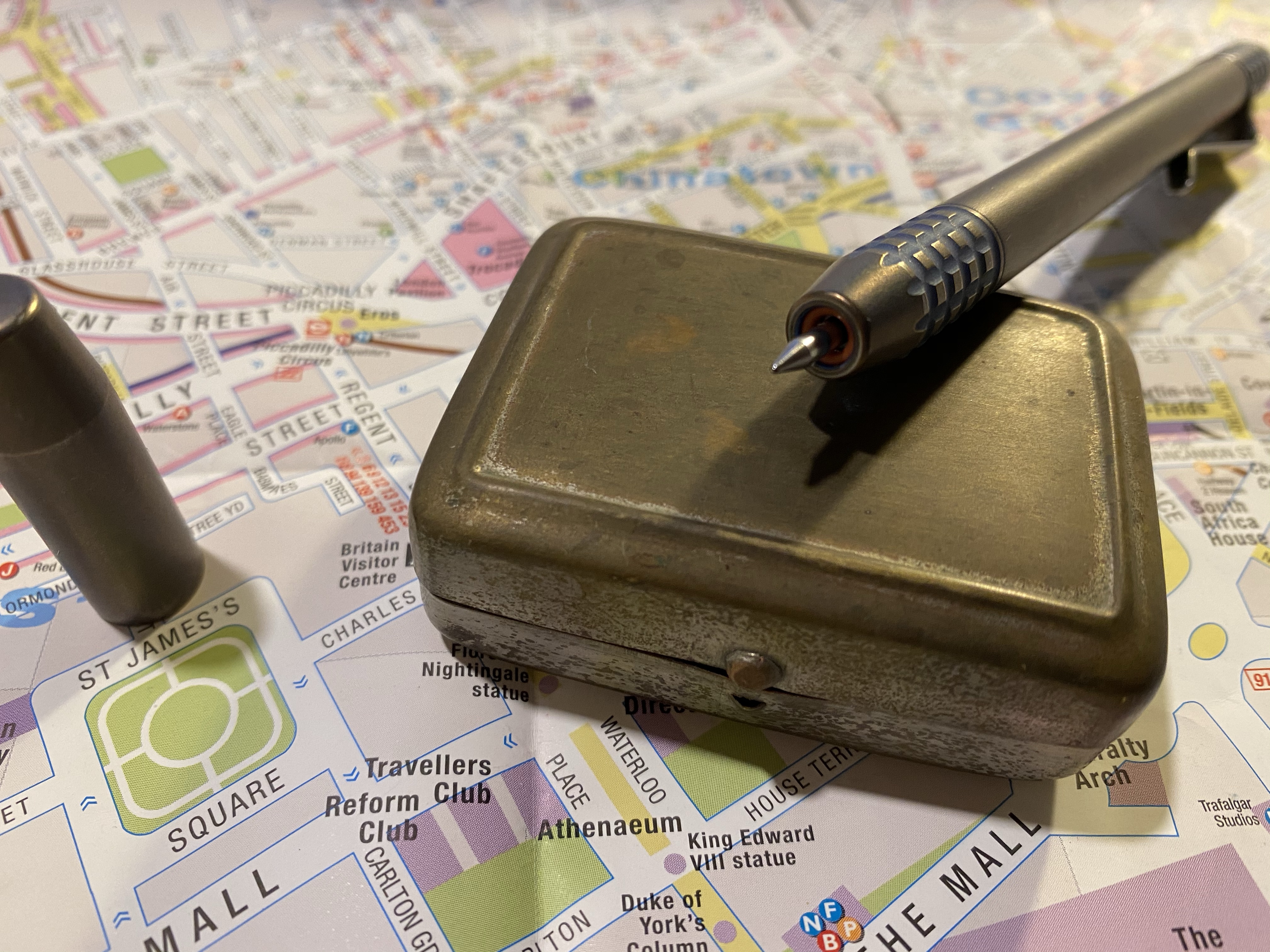
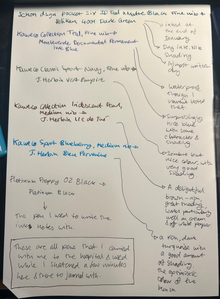
I started the month ready to spend the first half of it in hospital, with my dad. So the fountain pens I chose were all expendable pocketable pens that I was willing to have stolen (apart from the Schon Design Pocket 6 which was a leftover from January and never left my desk). So that meant I inked 4 Kaweco Sport fountain pens using various ink cartridges that I had on hand.

The portable lineup:
Once my dad got out of hospital and back home, I decided to celebrate by “shopping” from my collection. I inked up a Parker 51 Plum (use the good china!), a Parker Vacumatic, a Franklin Christoph 45L Turqish (spelled like that on their site) Crush that I had purchased but hadn’t inked before, and a vintage Radius Comet (because I heard that the brand was being revived).
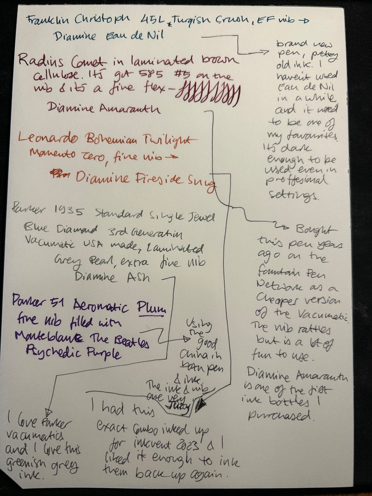
The Franklin Christoph EF nib isn’t the best companion to the Eau de Nil as the ink tends to dry in the nib, causing hard start issues. The Radius is a flexible nib of the vintage kind, which means it’s really flexible and not just springy. It also rattles, which makes me not carry it around with me — it stays at home at my desk. The Leonardo is a beautiful pen with a beautiful ink that I refilled immediately — the only Inkvent 2023 ink I did that with. The two vintage Parkers are phenomenal, as usual. The extra fine nib on the vacumatic somehow really well with Diamine Ash, though I was worried at first that the combination would be too light to be readable. The Parker 51 Aeromatic is a treat to use. It’s the rare Plum colour, and it’s got a fantastic nib (as all 51’s have) which pairs very nicely with the Monteblanc The Beatles Psychedelic Purple.

In terms of paper I’ve been using Kokuyo A4 KB paper which I cut to half size (so A5) to manage my daily to do list. The paper is relatively cheap and very fountain pen friendly. I’m also able to use both sides of the page despite there being some show through.
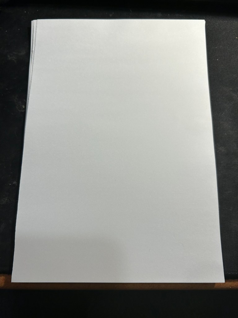
Kokuyo A4 KB paper cut in half to A5 size. This is why standards are great.

I’ve got a Field Notes Heavy duty on my desk at home and at work, and I just bought a new stock of them. These are where I jot down quick notes, phone call details, doodles during boring meetings. When they’re filled up they get tossed out as nothing in them is permanent — everything important in them moves to somewhere else as I work my way through them.
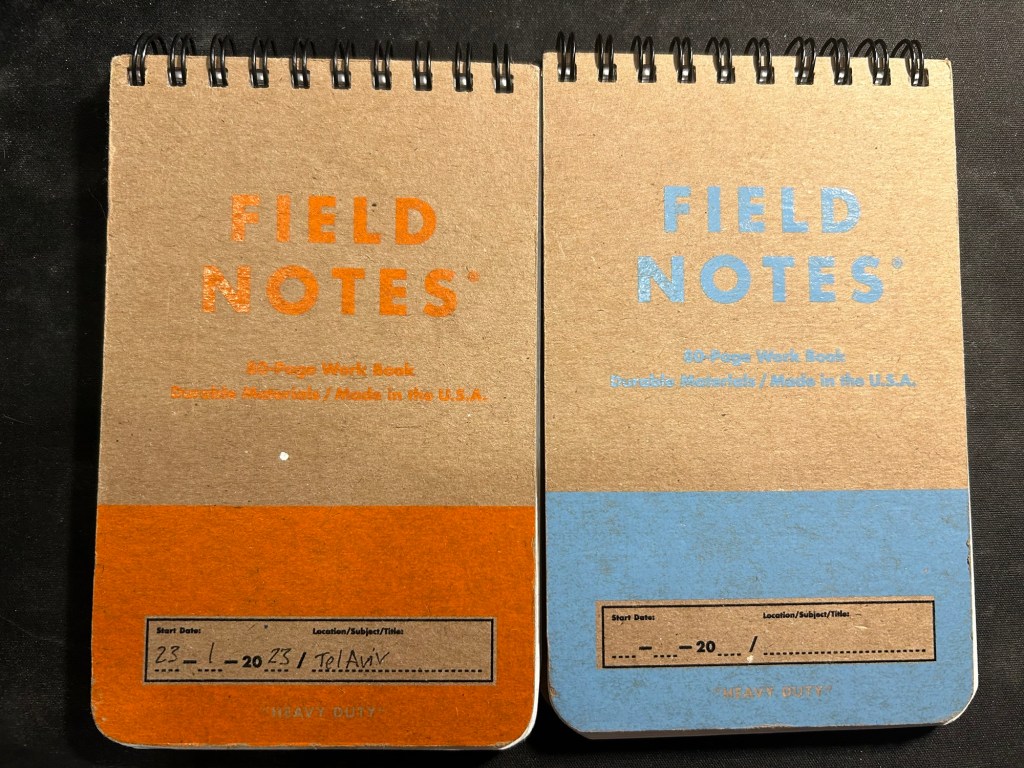
Field Notes Heavy Duty pocket spiral bound reporter notebooks

I have finally found a use for my Dingbats notebooks (beyond giving them away as gifts, as I have in the past): this lined purple hippo one is my blog notebook. I discovered that I have a much easier, much quicker time writing blog posts if I first draft them on paper, and this is where I do it in. I’ll likely write a dedicated post to this notebook soon.
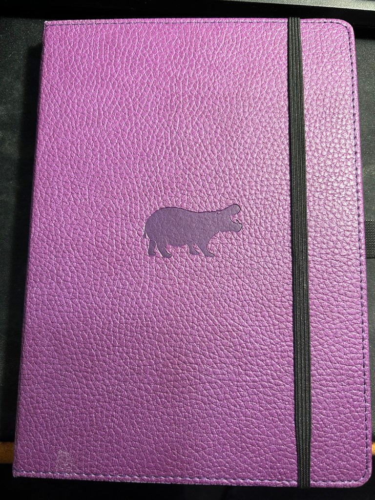
Dingbats Puple Hippo A5 lined notebook

Apart from them I still use the notebooks I used last month.

Pencils

I’ve been using the Drehgriffel Nr. 2 as my daily driver. I use pencils extensively to plan, as my plans tend to change, and there’s something about this solid little mechanical pencil that makes me want to use it.

Apart from that I brought two pencils into the rotation, to try to use. One is from my last purchase from the late and great C.W. Pencils Enterprise, and it’s the “Big Dipper” J.R. Moon Pencil Co 600. It’s an oversized pencil, the kind of pencil that kids who are learning to write are expected to use. I’ve been having pretty significant neuropathy in my hands lately and I thought that this would be nice and easy to use, as after all it’s designed for kids just learning to develop their fine motor skills. So far it’s been a disappointment – the eraser and ferrule make it very top heavy, and I’ve been having a hard time manipulating it. I can’t imagine kids using this pencil and having an easy time with it. I like the over the top red foil with gold writing look though, so I haven’t given up on it yet.
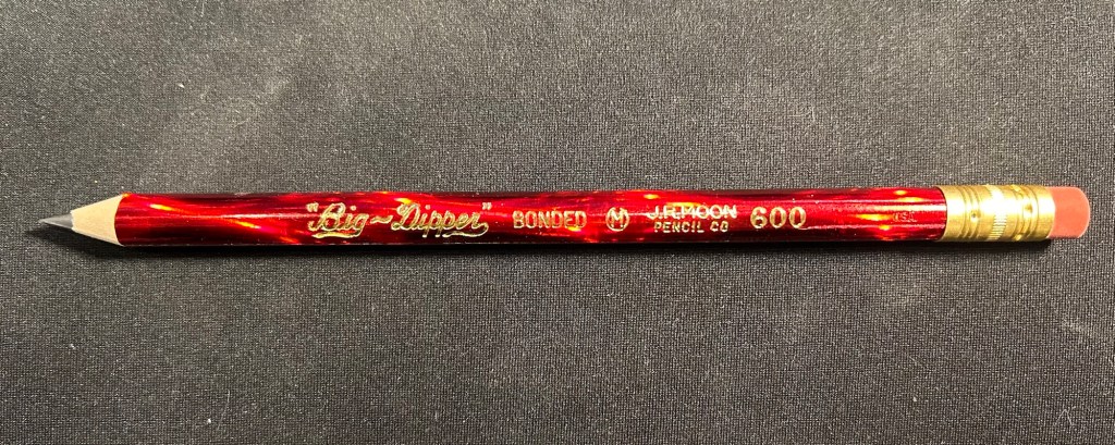
Big Dipper J.R. Moon 600

The second pencil is a Blackwing Volumes 56, the baseball themed one. The core is soft and dark, and I’ve been using it for quick and loose sketches. I’m trying to ease into one week 100 people by training myself to work faster than I normally would.
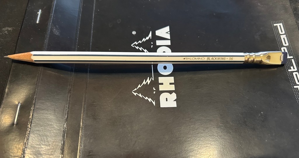
Blackwing Volumes 56

What did you use in February? Any planner changes? Pencil revelations? Pen preferences?
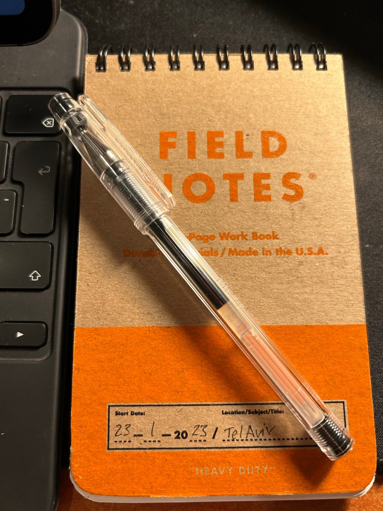
What I’m Using: Field Notes Heavy Duty

Field Notes Heavy Duty started out as a limited edition product and I believe is now part of their lineup (these posts are quick and dirty ones, so google things if you’re interested. The point of this exercise is to write these without pausing to search for things). I didn’t use them at all at first, but lately they have become my scratchpad of choice. I have a pair currently in use, and I throw whatever I need to remember into them, plus little things that I need to work out, notes that I take during phone calls, etc. Things then get processed from there, or just torn off and chucked away. Aaron Draplin would approve.

These take pretty much any kind of pen that you can throw at them and are decent enough even with fountain pens.

Pro tip: feel free to ignore the ruling and use them landscape style. This goes for any portrait oriented writing pad.

The Field Notes Sketchbook: Field Notes Maggie Rogers

I am a big fan of Field Notes, so when I saw that they came out with a sketchbook in collaboration with musician Maggie Rogers, I had to give it spin. The Maggie Rogers Field Notes are in the “Dime Novel” size, and are bound with and contain Strathmore paper. That is a promising start: an uncommon sketchbook size, with artist quality paper inside.

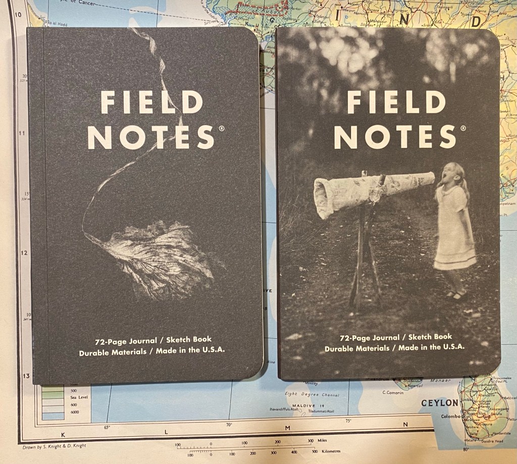
The Maggie x Field Notes edition comes with two sketchbooks in each pack, one with a red tinted spine and one with a blue tinted spine. On the cover of each is a Joshua Meier photo that was featured on Maggie Rogers’s first two albums: Blood Ballet is on the red tinted one on the left, and The Echo is on the blue tinted one on the right.

Blood Ballet is on the red tinted one on the left, and The Echo is on the blue tinted one on the right.

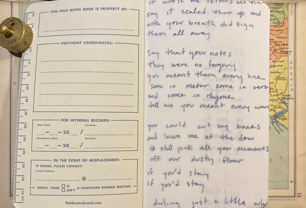
Beyond the normal “Pertinent Coordinates” design on the front cover, there is a vellum fly-sheet in each sketchbook featuring Maggie Rogers’s original hand-written lyrics. It’s a nice touch that really adds to this edition’s design.

Hand written fly-sheet in the blue The Echo sketchbook.

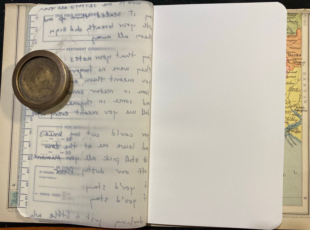
I also like the decision to print these on vellum and not on Strathmore paper that is in the rest of the sketchbook. It gives the words an airy feeling that doesn’t weigh too heavily on the user. You don’t feel the need to compete with them, so to speak.

Reverse side of the vellum fly-sheet in the blue The Echo sketchbook.

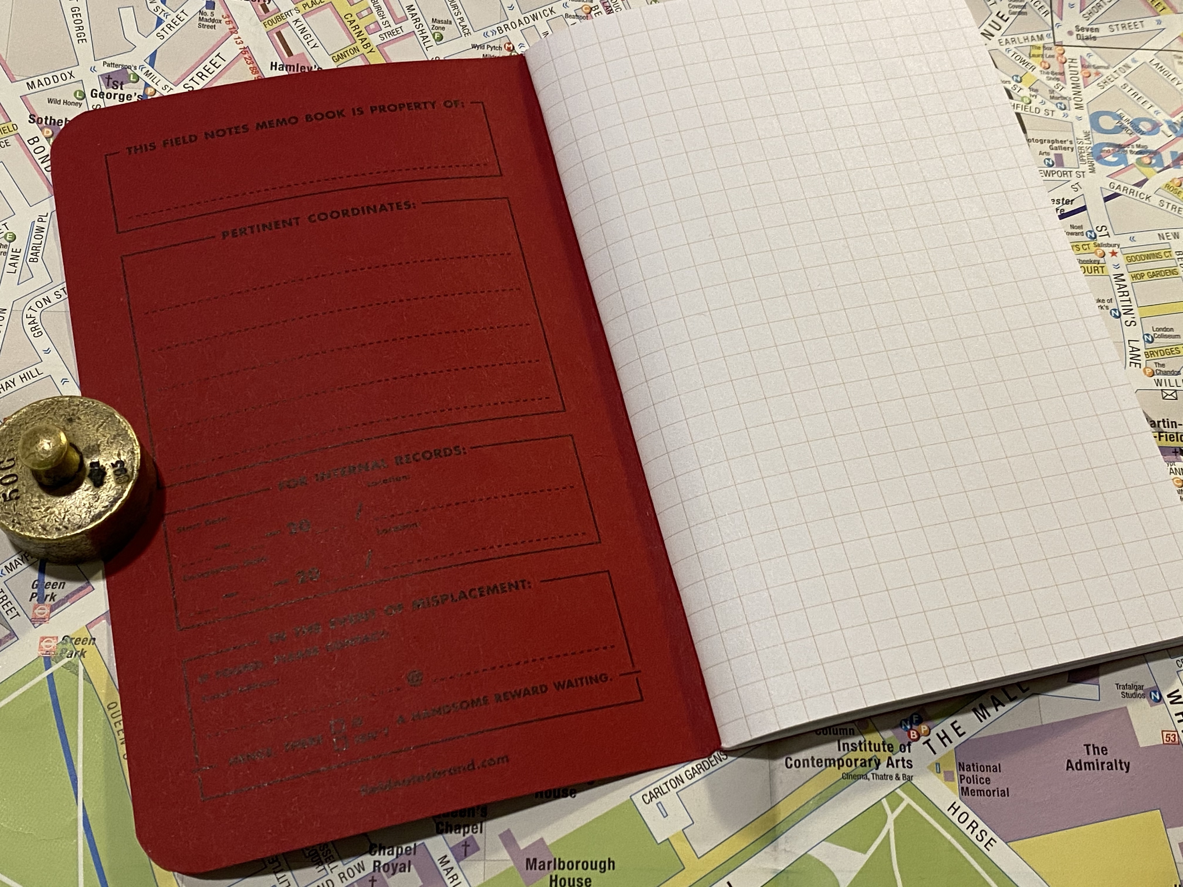
The inside of the back cover features Field Notes’ usual spiel and some information about Maggie Rogers and this collaboration. As usual, it also lists all of the technical details of this sketchbook, which I love. It would have been nice to get the Strathmore paper weight in a more standard gsm notation.

The inside of the back cover of the The Echo edition of the sketchbook.

The red, Blood Ballet edition of the notebook is the same as the blue one, just with a red brown tint to it.

Front page of the Blood Ballet edition. Vellum fly-sheet and pertinent coordinates.
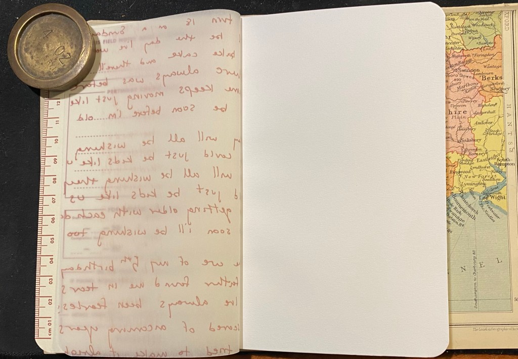
Reverse side of the vellum fly-sheet with hand-written lyrics.
The back page of the Blood Ballet edition.

So, to business. How does the Maggie Rogers Field Notes perform as a sketchbook? For that I tested it with some Uni Pin fineliners and brush pen, a Fixpencil with 2B lead, and finally with light watercolour use. Unsurprisingly, considering the paper inside is light weighted Strathmore, it’s a good sketchbook to have in your bag or coat pocket. It’s versatile and not too precious to make you feel bad about “ruining” pages.
The first sketch that I made was done with a grey Uni-Pin 0.5 fineliner. The paper isn’t entirely smooth, but I no problem using the fineliner on it. The ink doesn’t spread or feather, but it does show through and even bleed through to the other side. I won’t be using both sides of the paper here.

You can see through the relatively thin paper to the drawing on the next page. Not ideal, but that’s part of what makes this sketchbook not precious.

You can see the show through and even a spot or two of bleed through here. I really don’t recommend drawing on both sides of the page here.

Show-through and bleed-through even with a 0.5 fineliner.

The next drawing was done with a Uni Pin brush pen. The paper isn’t glass smooth, and that actually makes it more fun to draw on. There was no spread and less bleed-through than with the fineliner somehow. I still wouldn’t use the other side of the page, because it will show through.

Brush pen drawing.

The paper shines with pencil, and I had a lot of fun sketching this palm using a Fixpencil with a 2B lead. If pencil is your medium of choice, you are going to love this little sketchbook.

This paper made even a relatively pedestrian subject like a palm tree really fun to sketch.

As for watercolour, you can use the Maggie Rogers Field Notes sketchbook for light washes in a pinch, but it’s clearly not made for this. Washes come out patchy and grainy, and while the paper holds and doesn’t buckle too much if you are vey careful and only use a small amount of water on it, I really wouldn’t use it for watercolour.

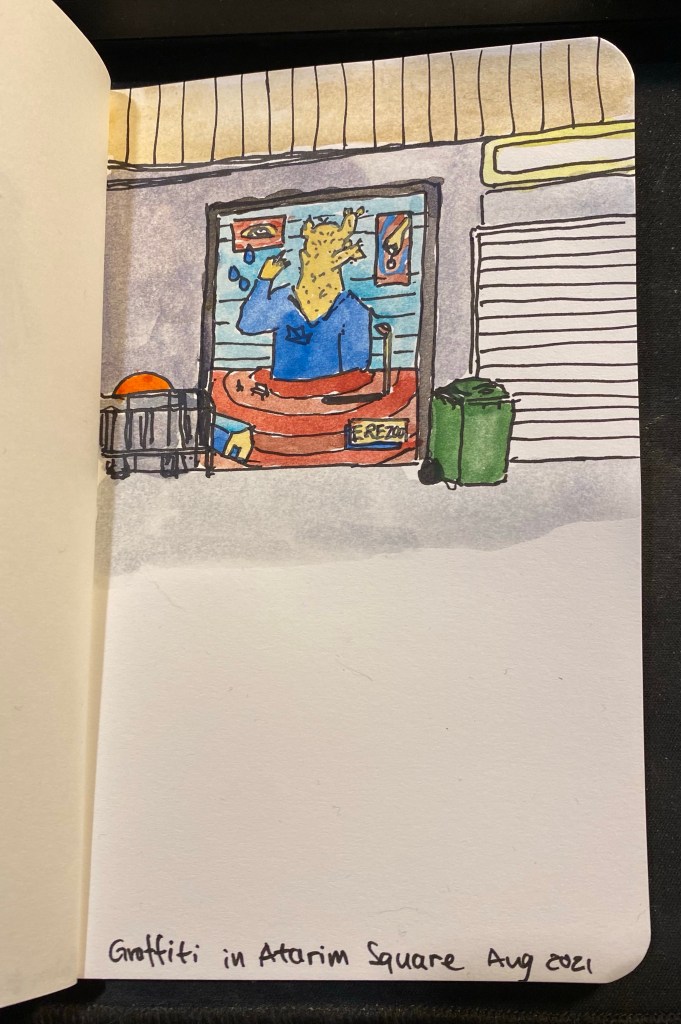
Watercolour sketch featuring the work of local graffiti artist Erezoo.

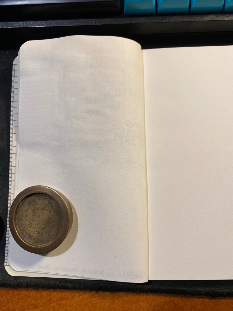
The reverse side of the paper shows just how much it buckled under the strain of even a small amount of water (pun intended).

Buckling on the left is the reverse side of the drawing in the previous picture.

I think that the Maggie Rogers Field Notes is a nice sketchbook to try out quick ideas and vignettes in. It’s a nice sketchbook that’s not too nice, the vellum fly-sheet actually reduces the pressure of the first blank page, and so long as you don’t insist on using watercolour with it, it’s versatile and will do as your main pocket sketchbook in a pinch. Its main weaknesses (the thinness of its paper and the binding that doesn’t allow the pages to open flat so you can’t use a whole spread) actually work together to make this a sketchbook that encourages you to burn through it. It’s not precious. It’s not too nice. It’s a workman-like sketchbook, which works perfectly with the Field Notes brand.

New Reading Journal

Yesterday I finished my fifth reading journal, and so I thought that it would be a good opportunity to write a post about how I set up my reading journal.

I use my reading journal to keep track of what I read and to encourage me to read more. This is the journal that I’ve just finished, a Moleskine Two-Go:

Moleskine Two-Go. The perfect size and format for my needs.

I used to use a Field Notes Arts and Sciences notebook for my reading journal, but once I got back to reading more it made sense to move to a larger journal. For the past three years I’ve used the Moleskine Two-Go, and I fill one book journal a year (70 books are logged in each notebook).

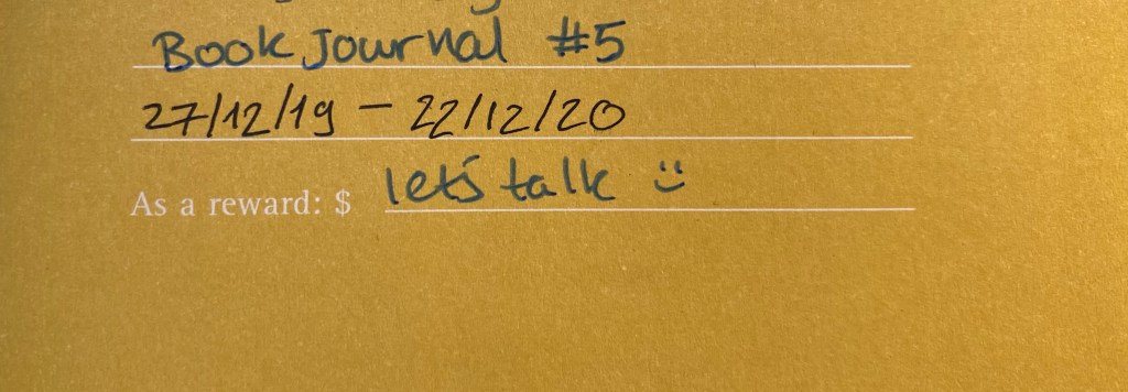
Start and end date for this reading journal.

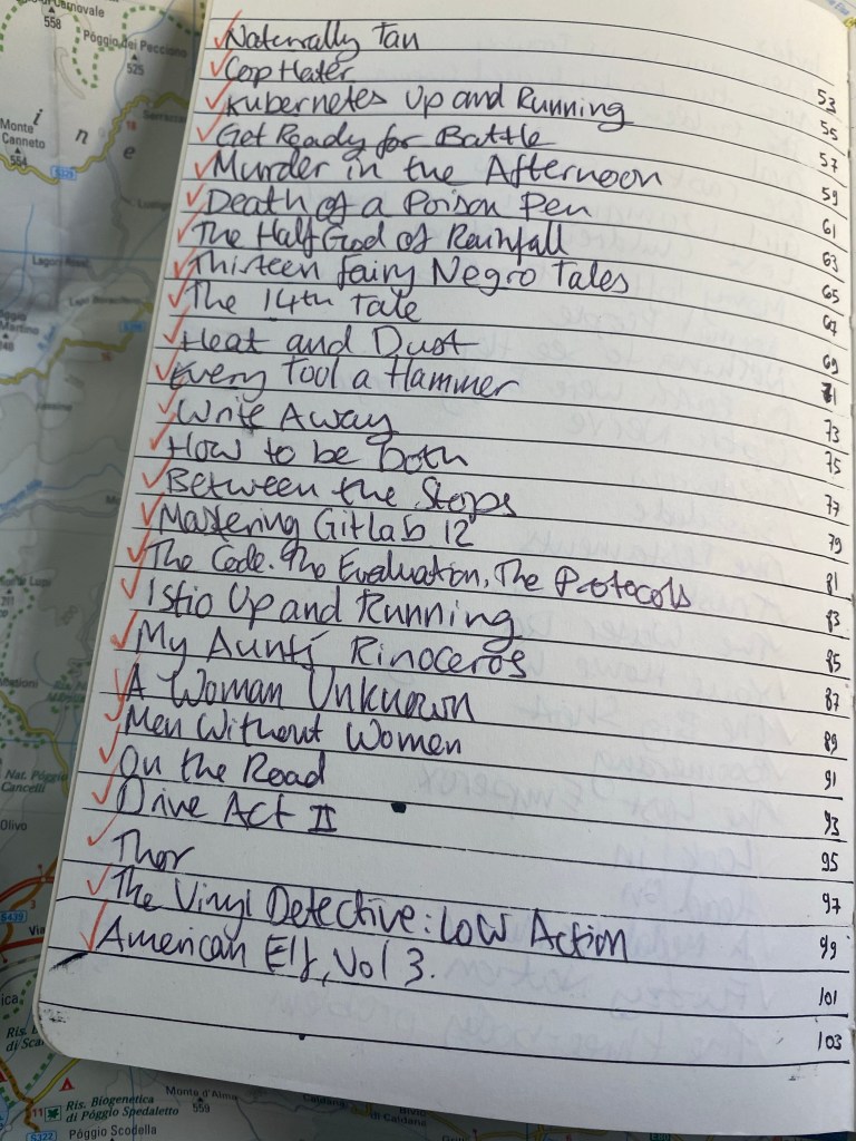
This is the setup in my old reading journal. Three pages of index:

First index page. Red checkmarks for books that I’ve read.

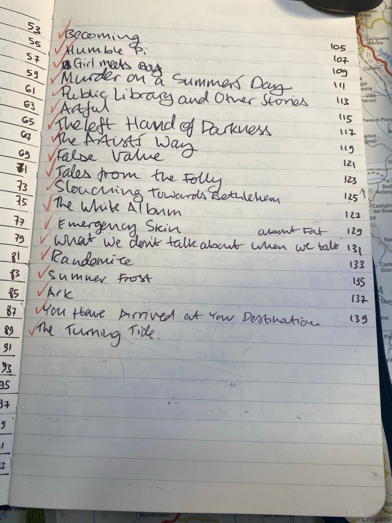
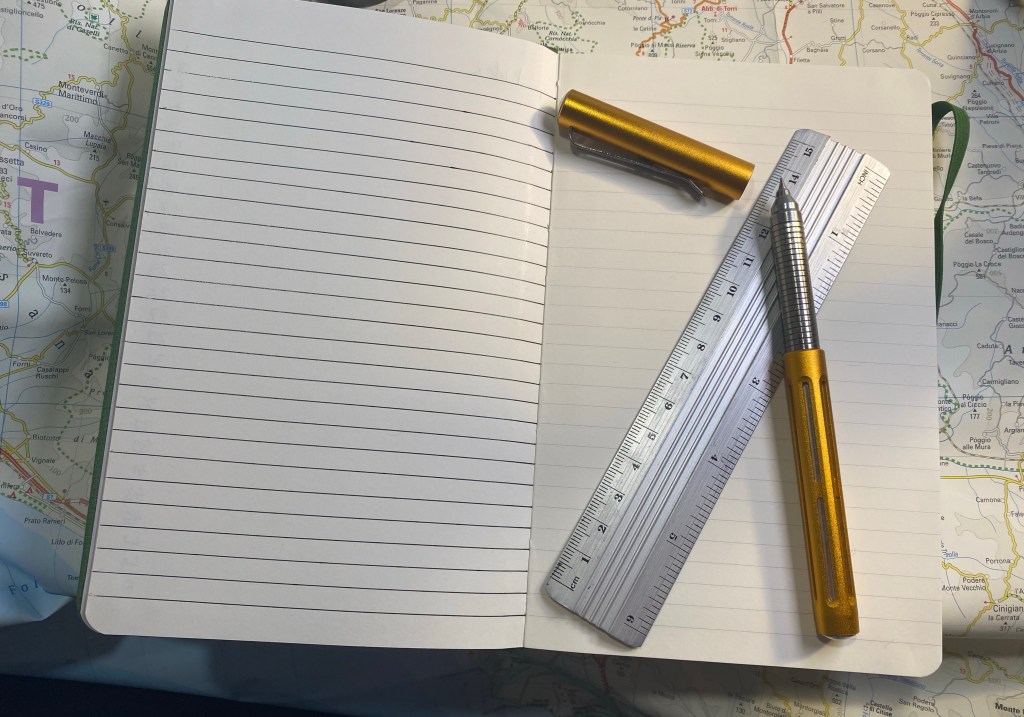
The Moleskine Two-Go comes with pages that are blank on one side and lined on another, which is perfect for my use case, except for the second index page, which I need to rule myself:

Ruled second index page.

I missed a line on the second index page, so the index numbering came out a little wonky. It’s only for me, so I don’t mind.

Off by one error in my index.

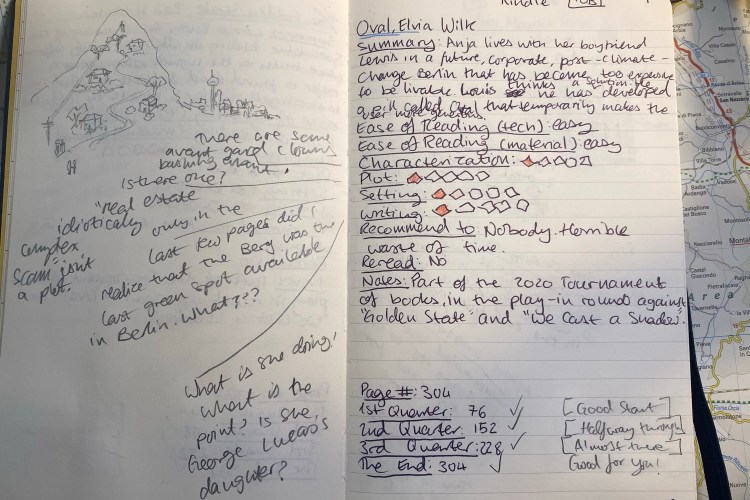
Here’s a sample of a complete page. I talked more about my thoughts behind the design in a previous post, but you can get the gist by looking at this sample. I like drawing something that captures the book for me on the opposite page, which is why I love the Moleskine Two-Go format.

I remember really not liking this book, and this is a reminder of why.

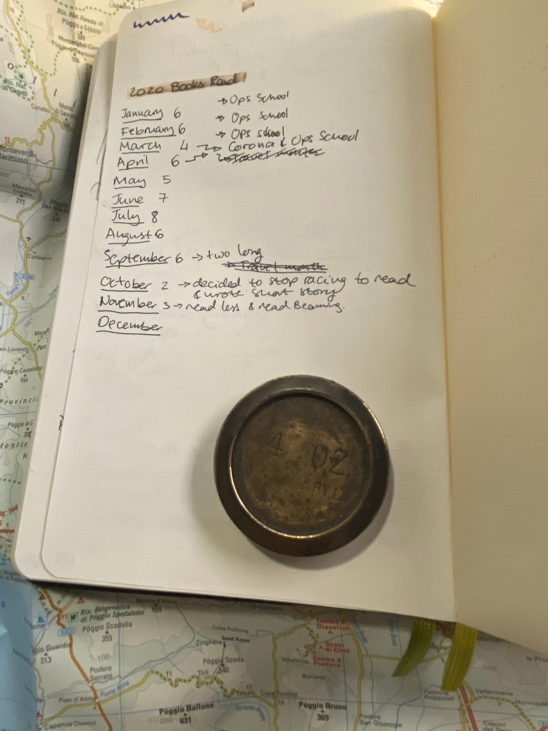
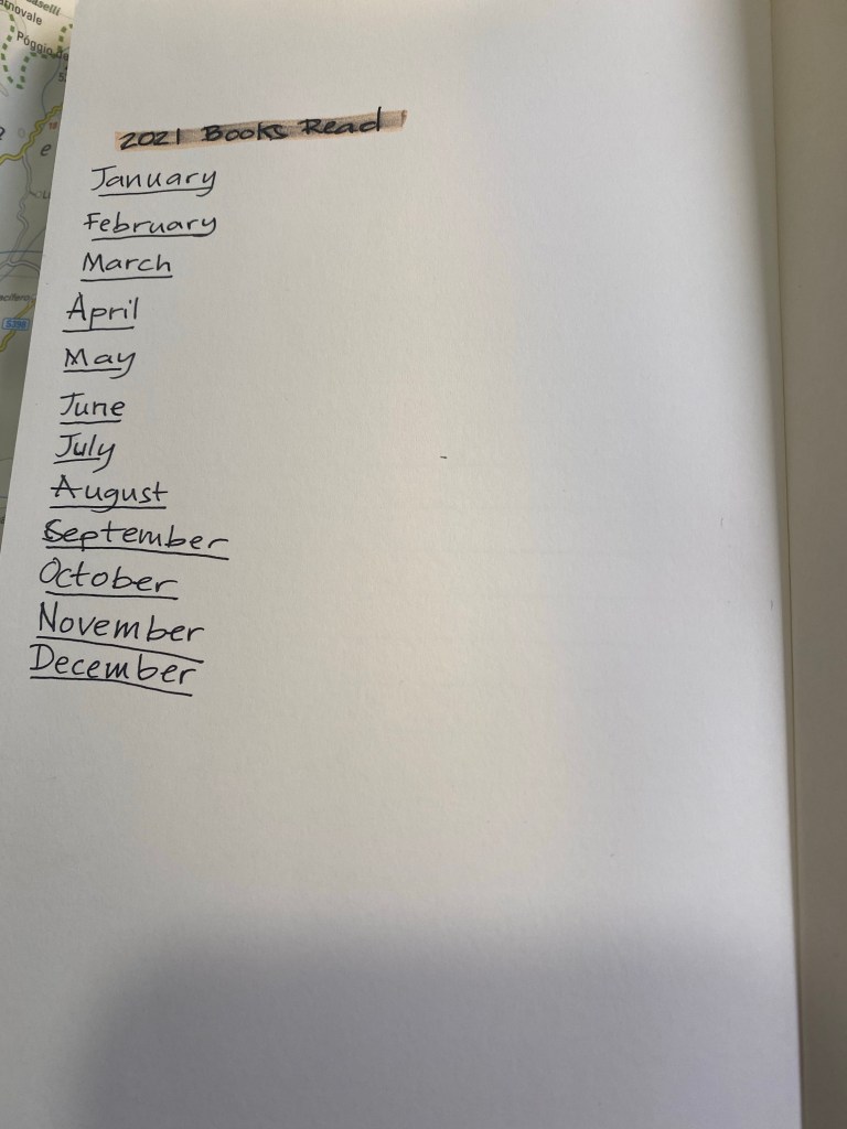
At the very last page of the journal I keep a log of how many books I read that month. It’s ten books so far for December, but the month isn’t done yet so that line isn’t filled.

Number of books per month tracker.

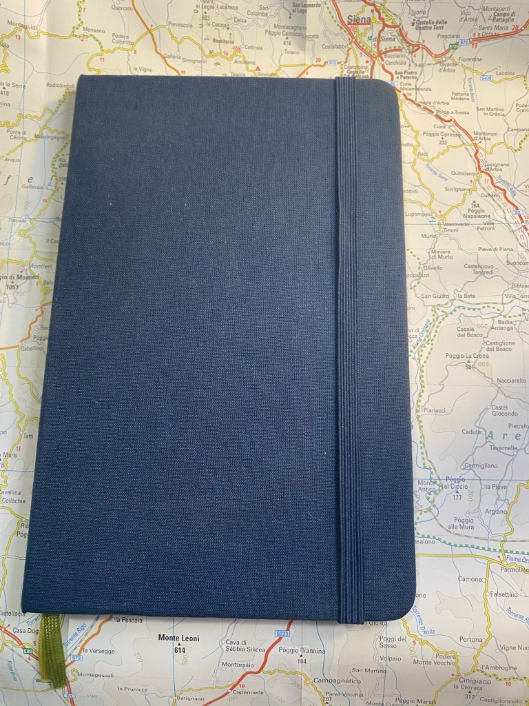
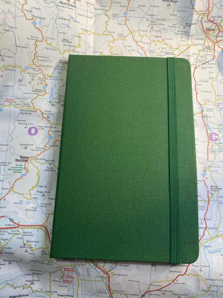
Here is my new reading journal, a Moleskine Two-Go, this time in green (my previous ones were in light grey, dark grey and navy):

Front cover.

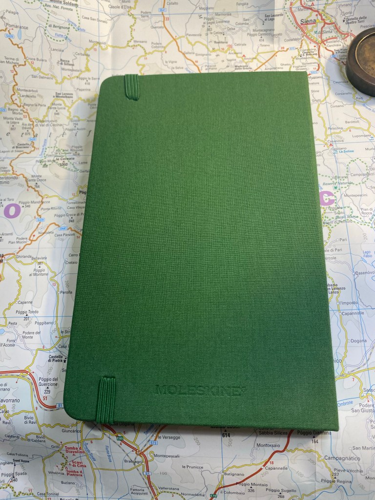
I love the texture of the fabric colours on this, and the shade of green is interesting. The two contrasting bookmarks and the endpapers are grey.

Back cover

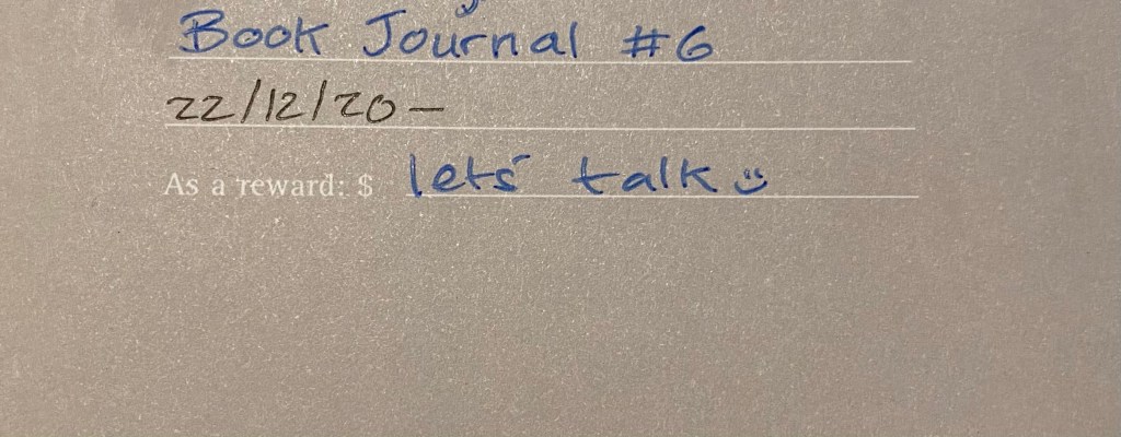
The first page, marking when I started the notebook and which journal number it is. This notebook doesn’t leave my desk yet I still write my name and email in case I misplace it somehow.

Front page

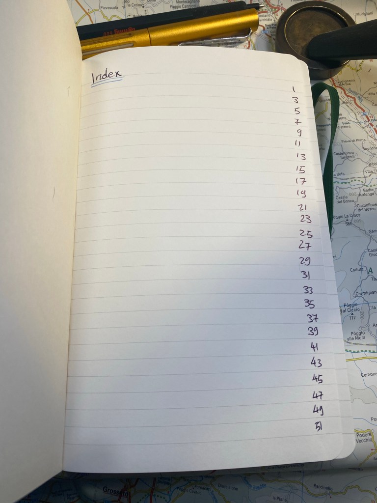
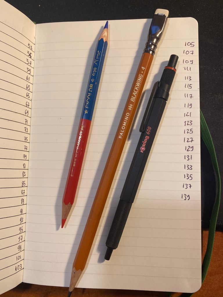
Next comes the index page. Since this is my third Two-Go reading journal I already know to number the pages until 139 (I number odd pages only, since my reviews are on odd pages), which comes out to 70 books.

Index page.

I rule the second page, because I tried just winging it on the first year and it didn’t come out great.

Spoke pen for the win.

On the last page I create my books per month tracker:

Zebra mildliner highligher smears gel ink, but I still like it.

I number all the pages of the index, but only the first 25 pages of the actual book journal. I will continue numbering pages in batches as I add books to the journal. The great advantage of using a completely unstructured book here is that I can do whatever I want with it, including starting the numbering after the index pages and not on the first notebook page.

These are the pen and pencils that I’ll be using in this journal. The Rotring 600 is a ballpoint, and the only ballpoint that I regularly use. The Caran d’Ache Bicolor has been my companion in these notebooks for several years. I use it to highlight things, and sometimes in my book scene sketches. I used the Blackwing 611 in my previous reading journal, and this time I’ll be using the Blackwing 4.

Caran d’Ache Bicolor, Blackwing 4, Rotring 600 ballpoint.

The first non fiction book in this journal:

The Good War

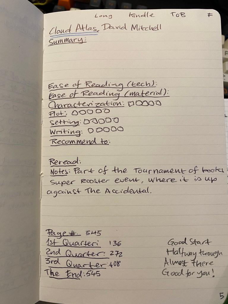
The first fiction book in this journal:

Cloud Atlas. ToB means Tournament of Books.

That’s my new reading journal all set up and ready to go. I hope that this inspires you to keep a reading journal of your own, one that will encourage you to read more and help evoke the memories of reading a specific book.

Broken Lamps and New Pens

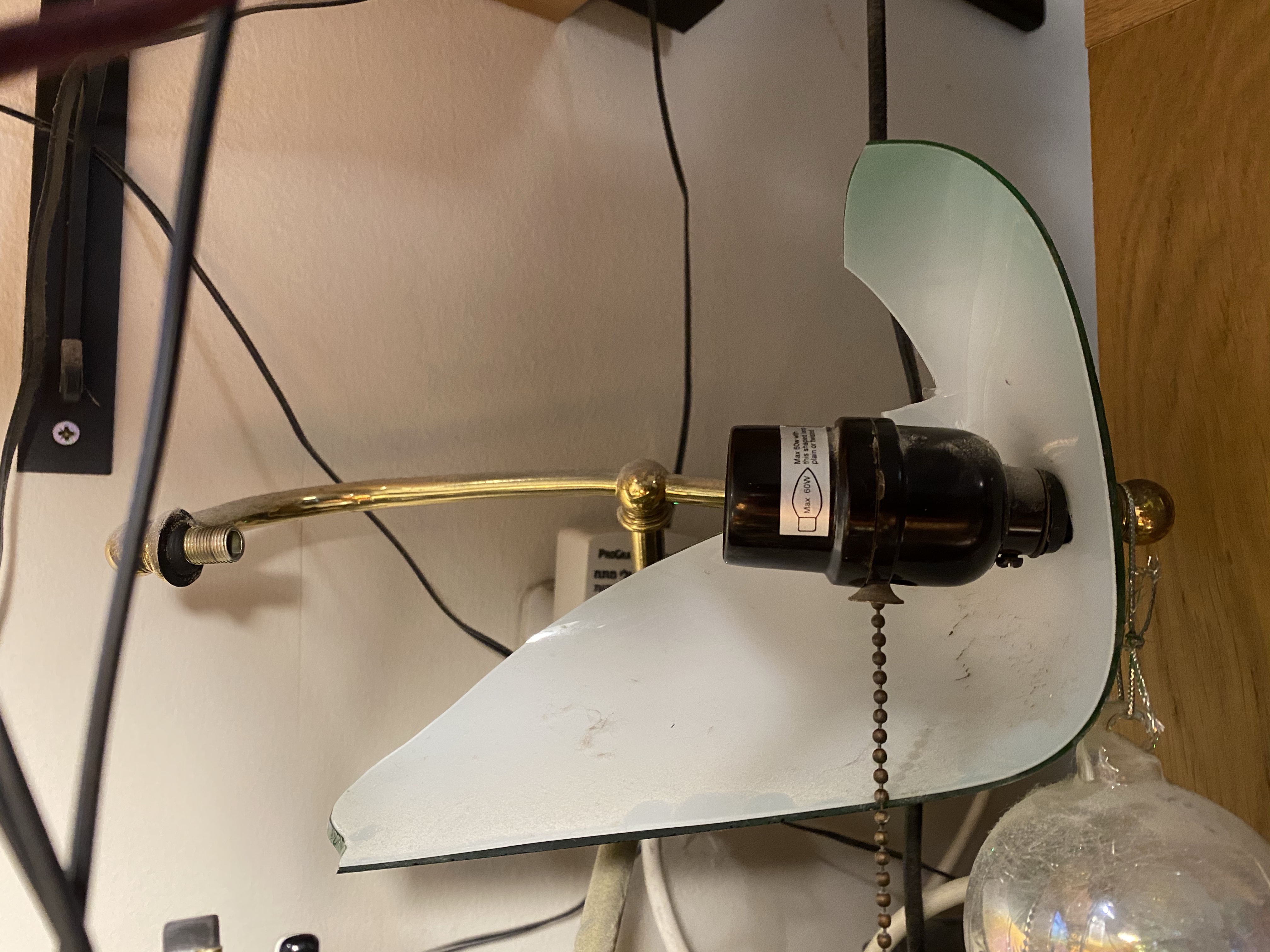
My little cat (I have two, a little black and white cat, and big black cat) managed to drop a desktop table sharpener on my banker’s lamp and it cracked the glass lampshade clear in half. So I had an interesting but unexpected project today: I bought a replacement lamp shade and took the lamp apart to get rid of the broken glass pieces. A youtube video and a Philips screwdriver took care of the taking apart bit; let’s just hope that I can put it back together again.

Broken shade halfway through dismantling.

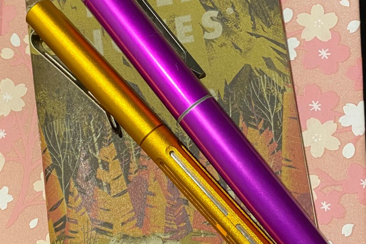
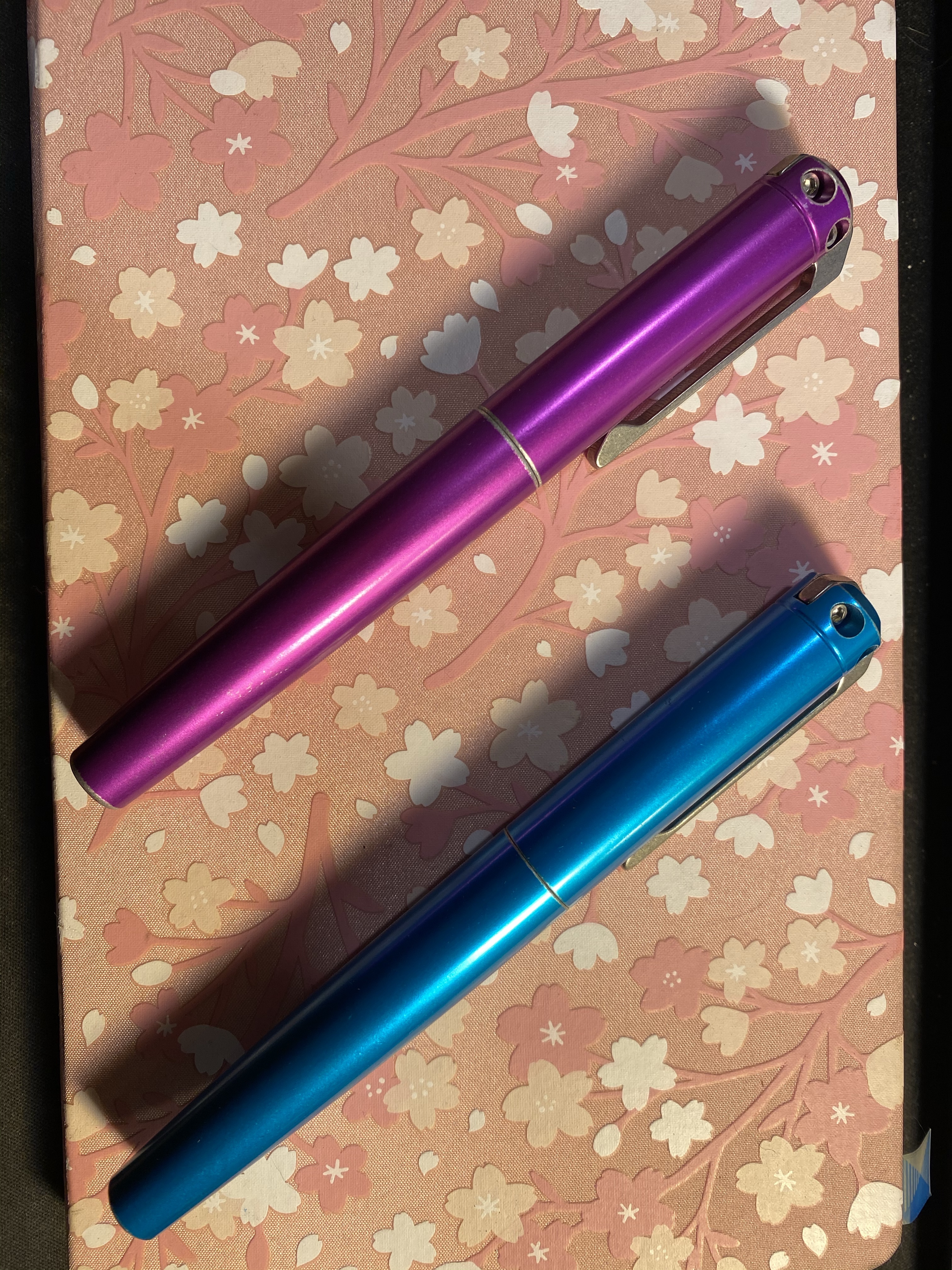
I got my Battleworn INK 2.0 Karas Kustoms grab bag rollerballs today. This was my first Karas Kustoms grab bag and my first ink rollerball and I’m very pleased with both the colours that I got and the way the INK 2.0s look and feel. These are chunky but relatively light pens, and I look forward to using them and maybe reviewing them in the future.

Karas Kustoms Battleworn INK 2.0 purple and cyan.

The INK 2.0 uses the Pilot G2 LG2RF refills, which are larger than the usual G2 refills, and built a little different. I haven’t yet tried to swap them out for a different refill, but I suspect that they won’t accept my beloved Uni-ball UMR-85, which is something I was aware of ahead of time.

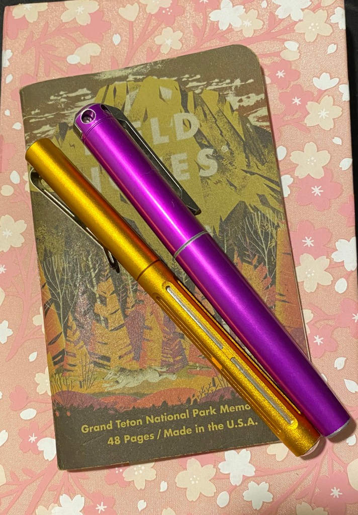
These are the pens and some of the notebooks that I’ve been using today (I’m not getting much fountain pen use lately): my beloved Orange Crush Spoke pen, and the new purple Karas Kustoms Battleworn INK 2.0 rollerball.

These two pens look great together. Spoke on the left, INK 2.0 on the right.

Field notes came out with a new addition to their National Parks series, which I’ll probably pick up on my next purchase there. They’ve got an offer for a free decal for purchases made by the 30th of August if that speaks to you.

A Pen Hack, a Field Notes and the Hi-Tech C

I had an issue with my Ti2 Techliner where my favourite gel ink refill (the Uni-ball UMR-85) and basically all gel ink refills dried out and stopped writing a few words after I uncapped the pen. While ballpoint refills like the Jetstream faired better, they also would “fade out” after a few lines, and then, after some coaxing, return to normal. It couldn’t be that the refill was drying out, as after capping the pen, it wrote well enough again for a few words. It was a refill problem, as the same refill wrote perfectly fine in a different pen.

I tried searching for answers and asked around in the Pen Addict slack but got no answers. It was frustrating, since I liked the pen, but couldn’t use it because it wouldn’t work with my preferred refills. I had a feeling that the magnet at the tip of the pen was what was causing the ink flow issue, but it only yesterday did I figure out how to bypass the very thing that was holding the pen together.

What I did was change the order of the parts in the front section of the pen. The original order was refill, plastic spacer, red o-ring, magnet and then the section screwed over that. What I did was reverse the o-ring and the magnet so now it’s: refill, plastic spacer, magnet, red o-ring, and then the section. The result is kind of pleasing to the eye, and more importantly it fixed the flow problem completely, and now I can actually use this fetching pen.

You can see the red o-ring around the tip of the pen.

I tend not to review Field Notes because they arrive so late to me (due to postal issues, not Field Notes issues) that it seems irrelevant to review last quarter’s edition when everyone already has the new one at hand. Covid-19 has made the postal problems even worse, and so only now, and after contacting the wonderful Field Notes people and getting a reshipment, have my Vignette notebooks arrived.

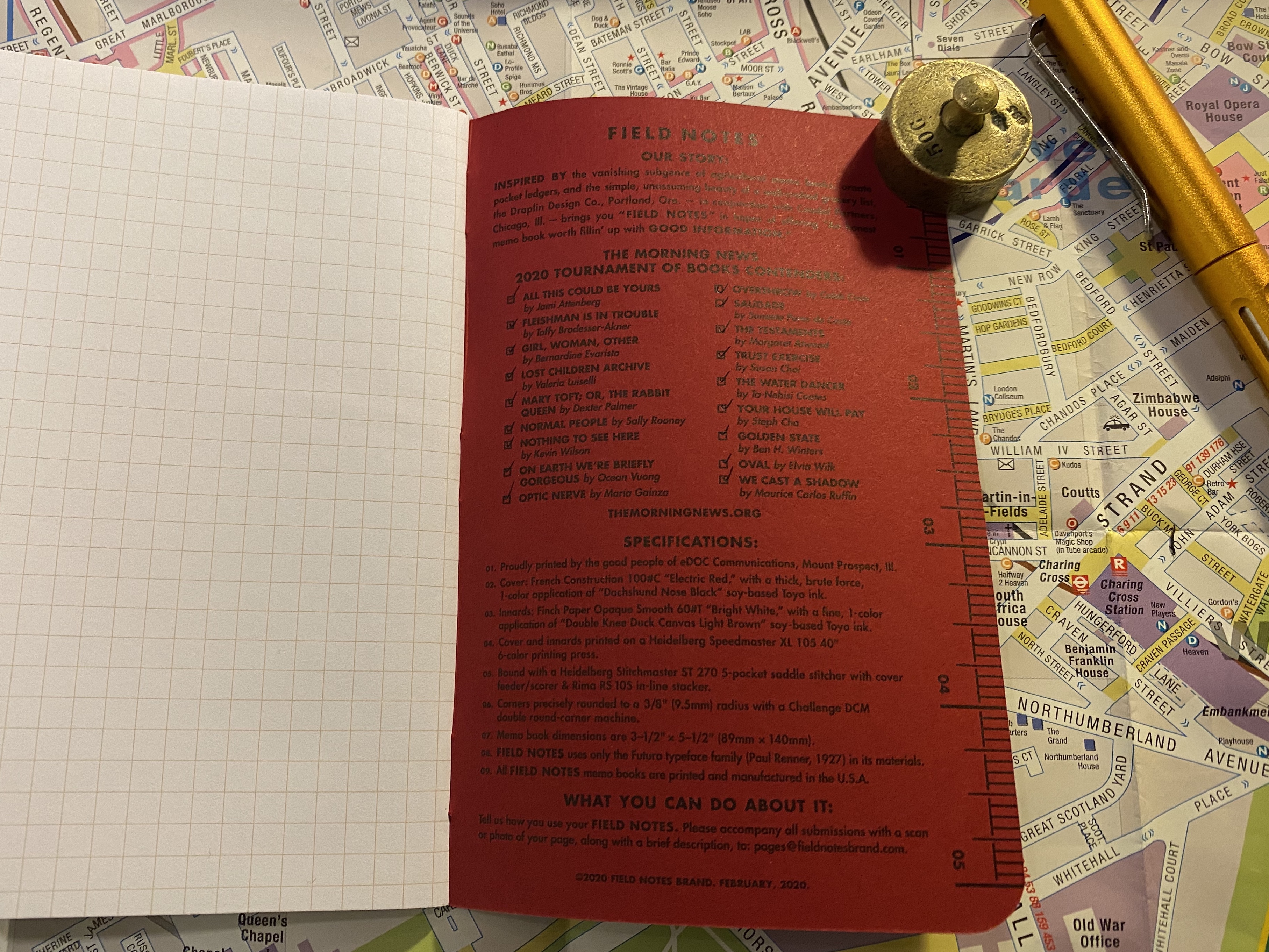
What also arrived were my Field Notes Rooster 2020 notebooks, which are part of Field Notes’ yearly sponsorship of the Morning News and the Tournament of Books. I read all of the books in the Tournament of Books shortlist this year, for the second year in a row. I didn’t post reviews of them all in this site as I didn’t enjoy the last 3-4 books, and I didn’t feel like posting negative review after negative review.

I did, however, love this year’s Field Notes Rooster special edition notebook, and it is by far my favourite Rooster special edition notebook that Field Notes ever issued. It is a squared notebook, and not lined, for the first time ever, and the bold red and black print on the cover is much more striking than their usual craft or cream choices for this series.

Bold, bright colours on the cover.

The fact that these notebooks (sold as singles, with the proceeds going to literacy related charities) arrived so late means that I have a had a few months to think about the Tournament of Books 2020 reading list.

Squared notebook.

I enjoyed the 2019 reading list more, but the 2020 list was overall a good, interesting list of contemporary writing that I for the most part would not have read otherwise. There were a few mediocre books on it, and a few that I really disliked, but as a whole it wasn’t a bad list. I may try reading next year’s list too.

The list. There are 18 books on the list, 4 books that I though weren’t worth reading, of them two were a silly, bloated waste of time and two were infuriatingly bad. There were 7 books that I thought were real gems.

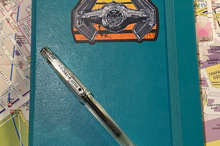
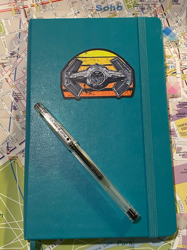
I wrote a few weeks back that I was struggling with my notebook setup, and things have changed since then. I’ve settled on using a blank large Moleskine hardcover in Reef Blue and a Pilot Hi-Tech C 0.4 for a running list of work projects and related notes.

I’ve customized the cover with a Star Wars decal to make it pop and let me easily identify it.

I use the right hand side for a running tasks per project (I still manage major project points in the Things app), and the left hand side for related points, reminders and ideas. Each project has at least one spread, and I drop in pages with ideas and things to remember in between the project pages.

The Pilot Hi-Tec-C (also known as the G-Tec-C4) is not a pen that I would recommend because it’s so very delicate and unreliable, but I used to be a fan years ago, and in a burst of nostalgia (and against my better judgement) I’ve gone back to using these pens. There’s something about the barrel design of this pen, combined with it’s needle tip that makes me enjoy writing with it. Again, I wouldn’t recommend it, as you’ll rarely see a refill through (the tip will bend, or it will become to scratchy to use, or it will dry out and become unusable) and in general the Uni-ball Signo DX are much better 0.4 tipped gel ink pens. But the heart wants what the heart wants, and this is what I prefer for daily work use right now.

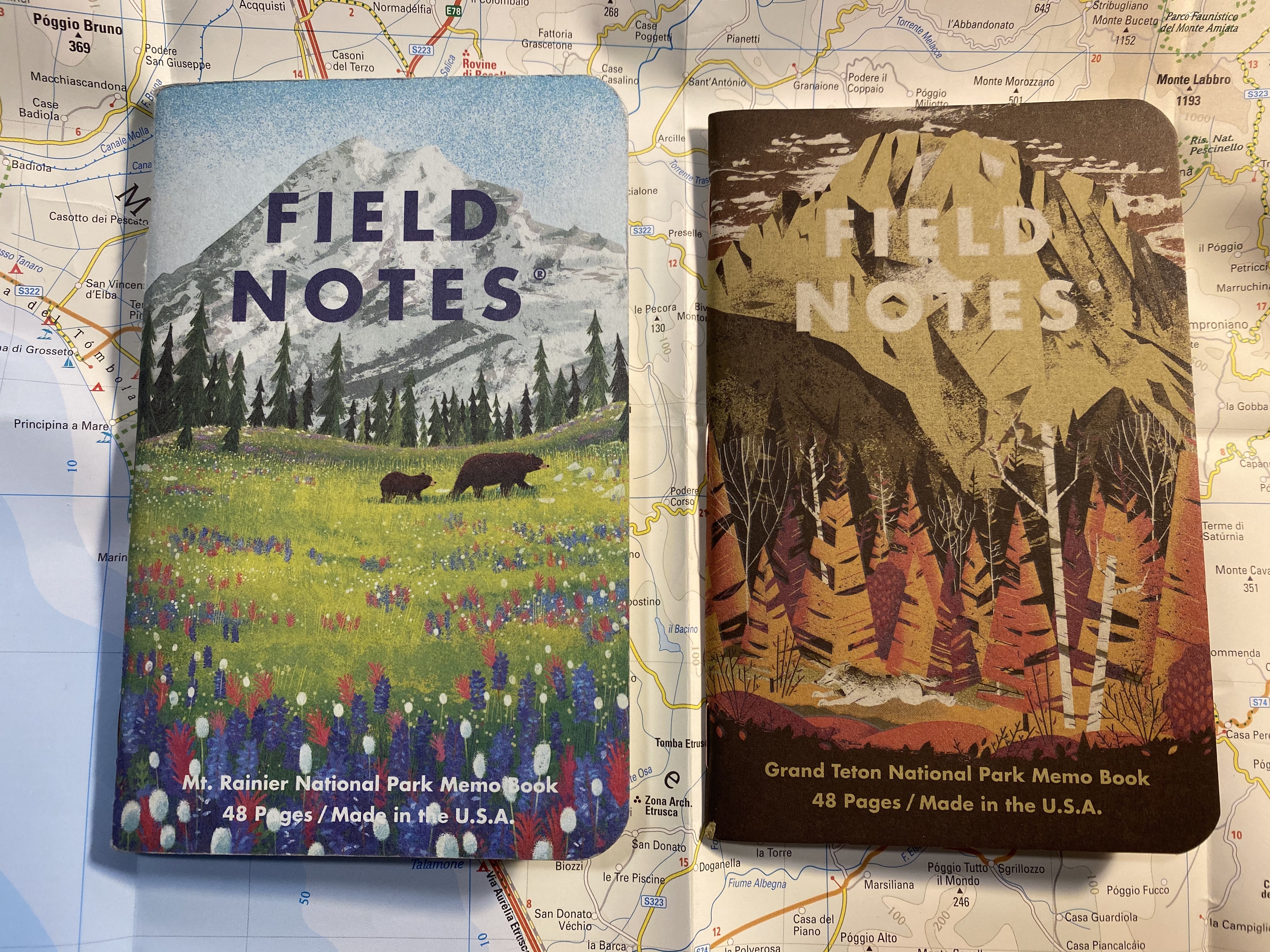
Field Notes In and Out: National Parks

Out: Field Notes National Parks Mount Rainier (the last of series B that I’ve been using).

In: Field Notes National Parks Grand Teton (the first of series D to be put to use).

National Parks is my favourite Field Notes edition since Two Rivers. I’ve bought additional packs of series B and series C, beyond what I received with my subscription. I highly recommend splurging on a pack or two of these pocket notebooks.

Field Notes In and Out: National Parks

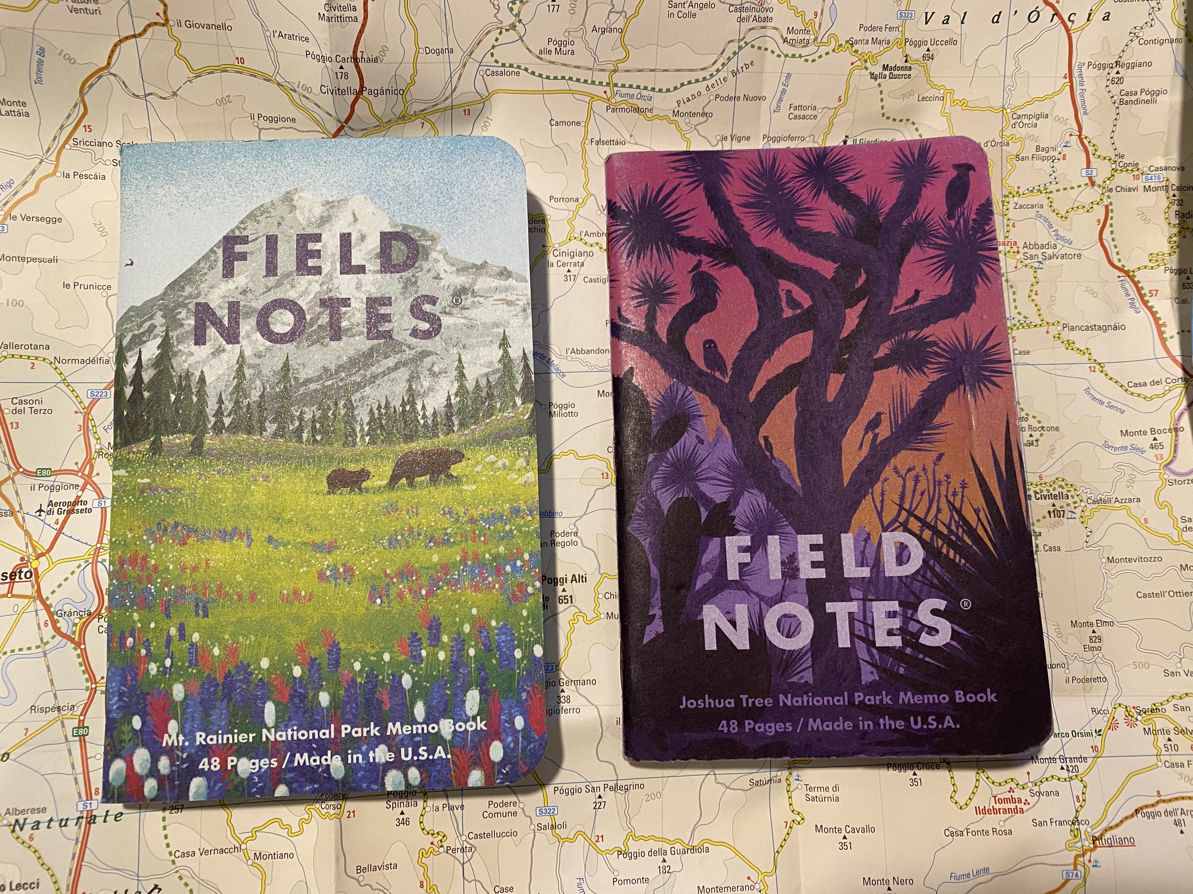
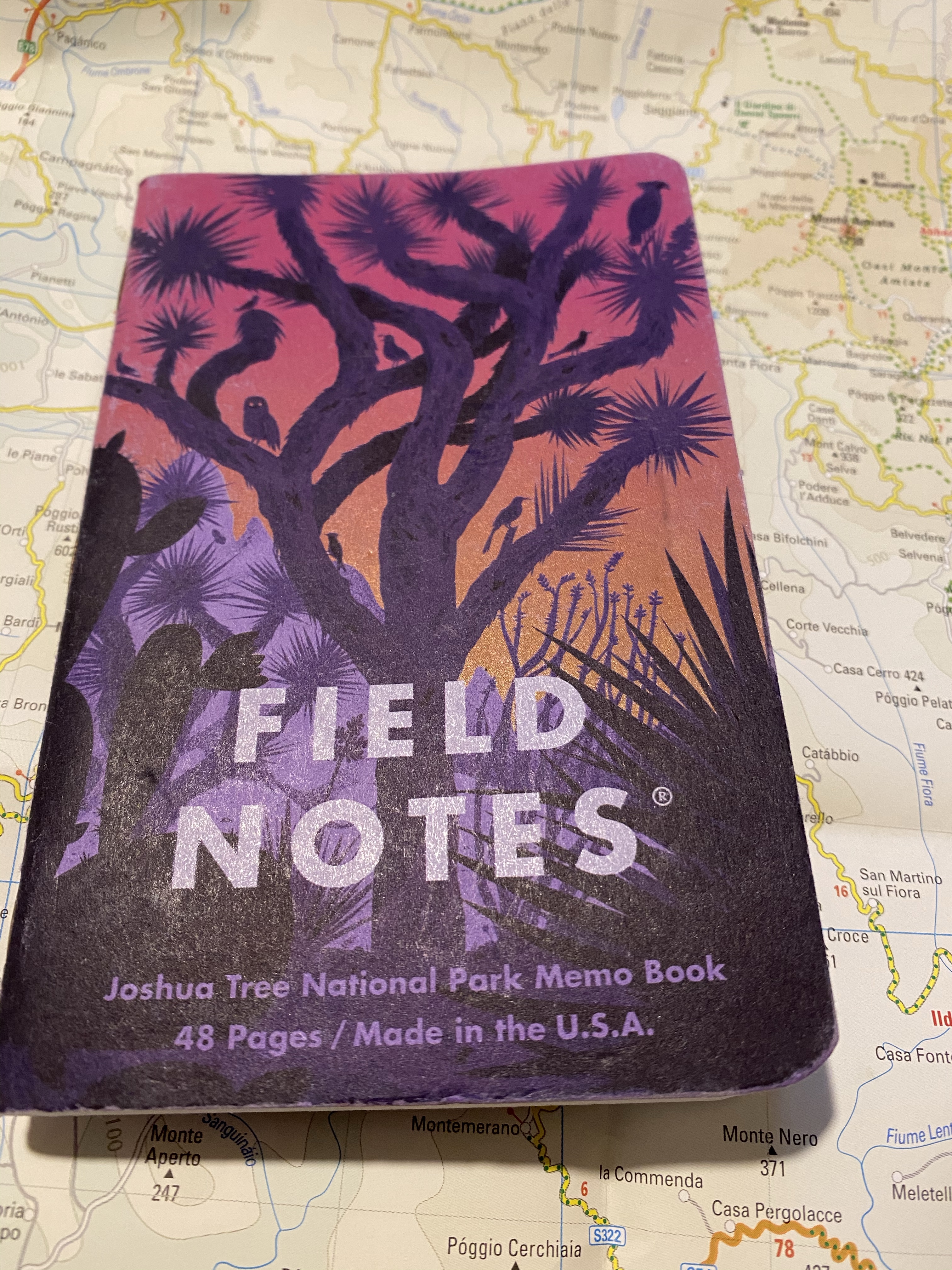
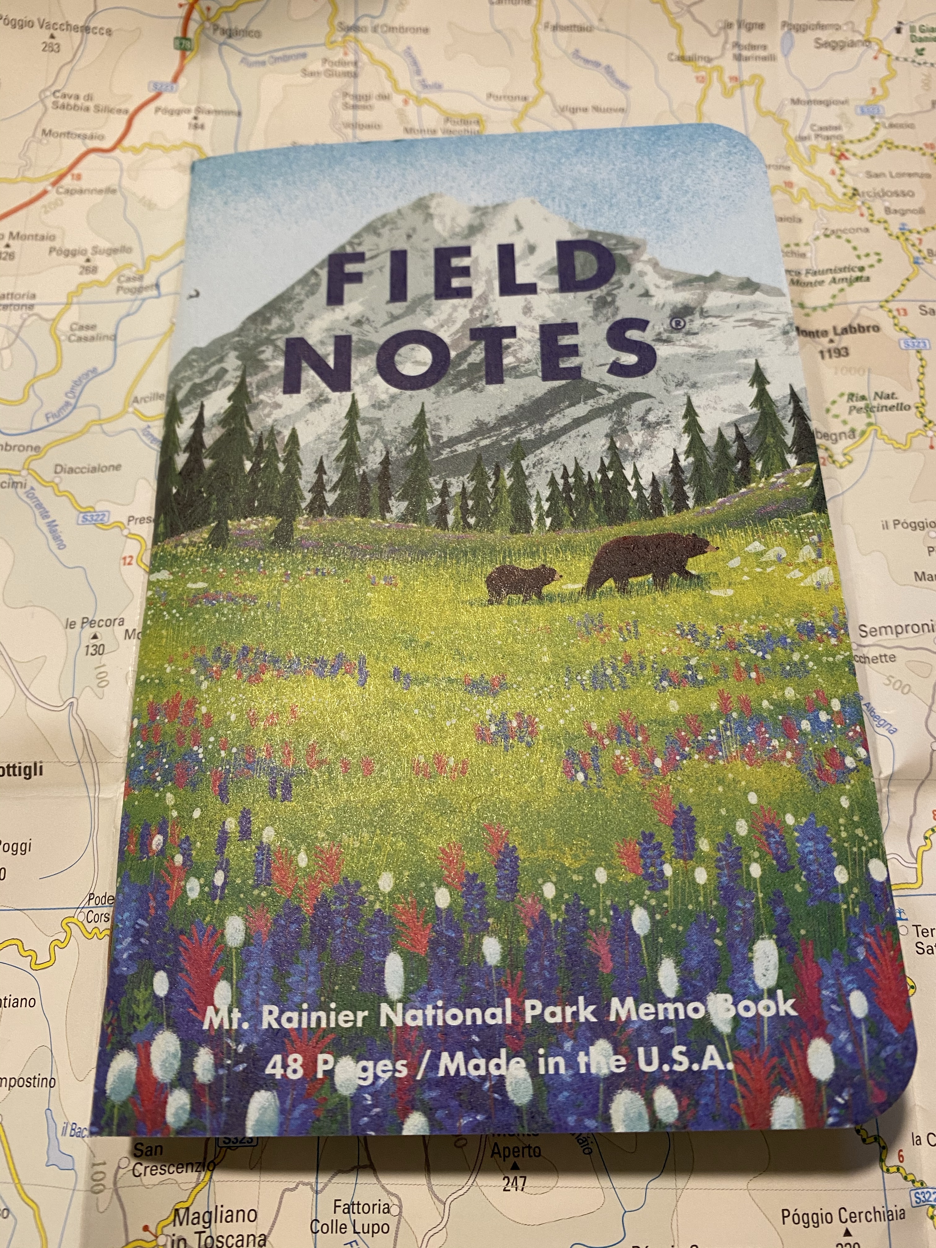
I just finished my first Field Notes of the year. In: Mr. Rainier National Park (Field Notes National Parks), Out: Field Notes Joshua Tree National Park (Field Notes National Parks).

This has become one of my favourite Field Notes editions, right up there with Two Rivers and Balsam Fir. It also wears surprisingly well. This notebook has been bashing around in my bag for the past three months and you can barely tell:

The dent on the side is from where I clip it shut.

The Mt. Rainier is the last of the National Parks C pack (which also included the Grand Canyon) and the cover just brings a smile on my face. What a great edition.

Field Notes In and Out

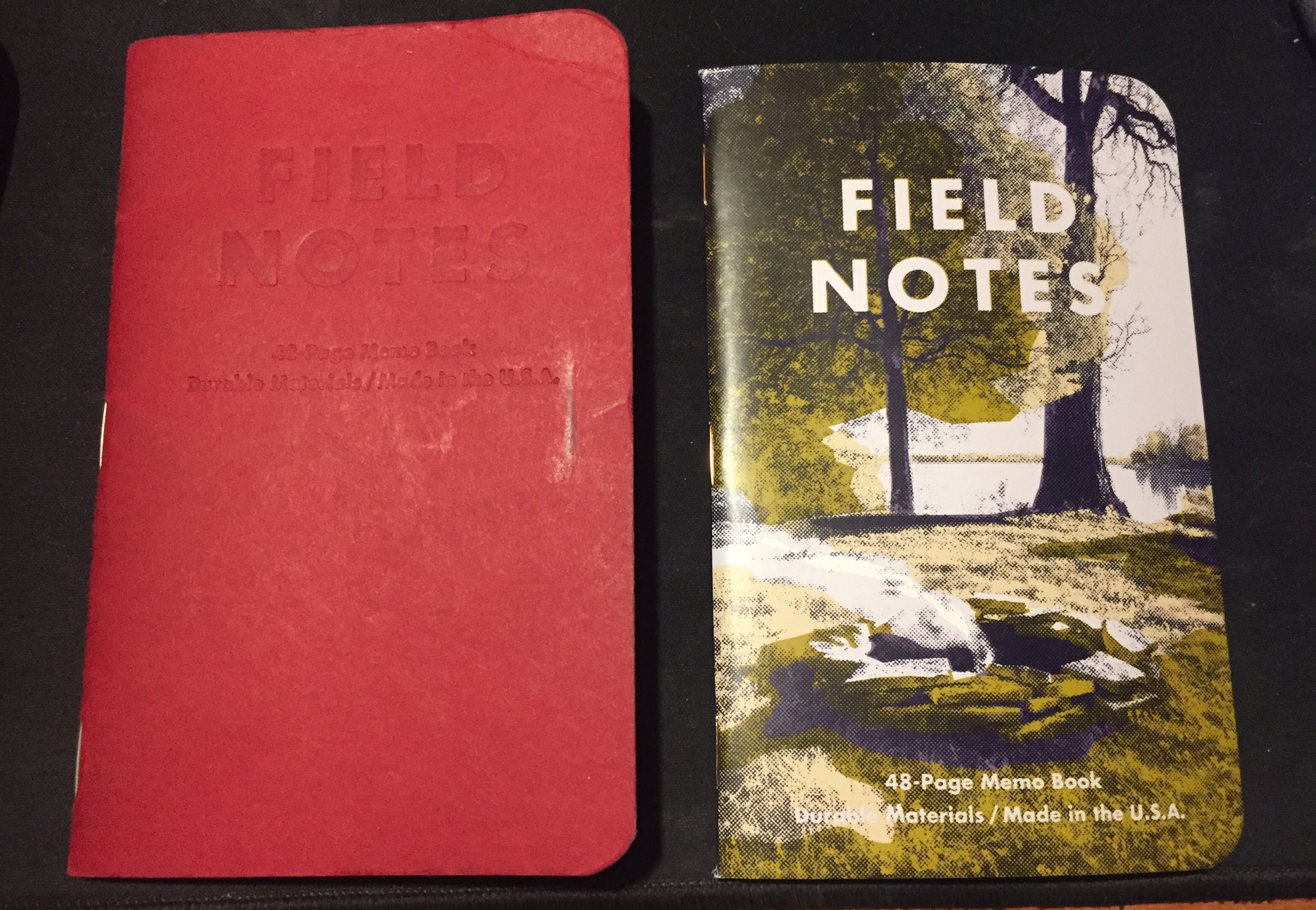
Out: Campfire Dawn. This is one of the editions that I learned to love the more I used it: it just wears out so well.

In: Snowblind. Somewhat ironically this edition shows itself off best in the summer. It’s going to get dinged up and grimy, but that’s just what happens to used notebooks, especially ones with light coloured covers.

Field Notes: In and Out

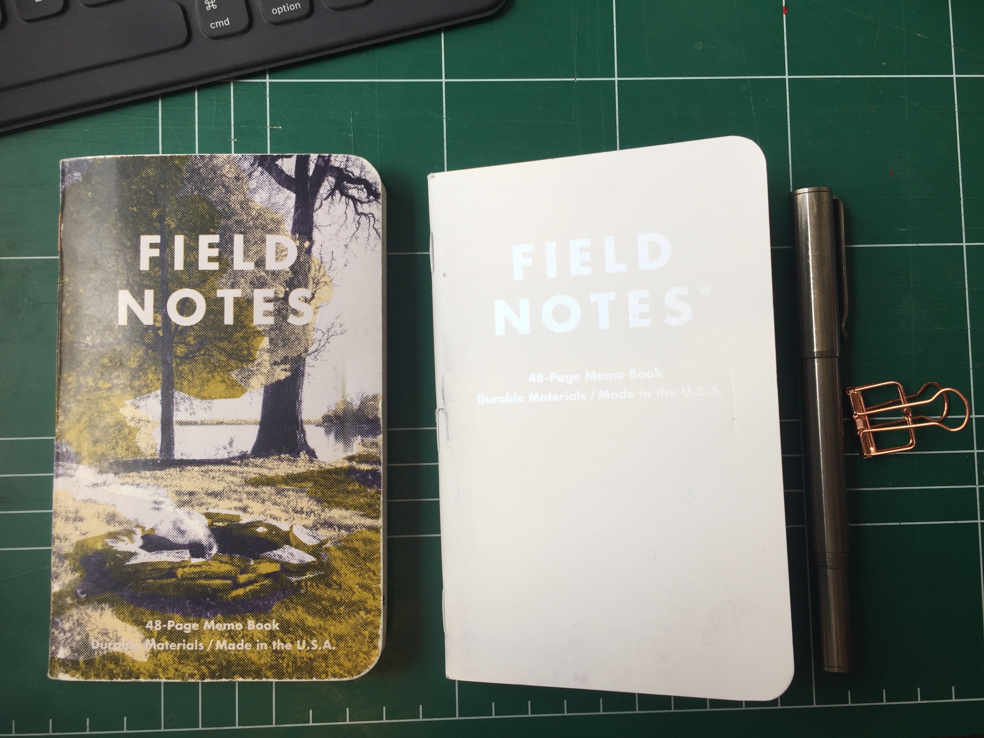
Out: Firespotter, In: Campfire, Dawn. Somehow very fitting. I love how these notebooks look when they’re used.