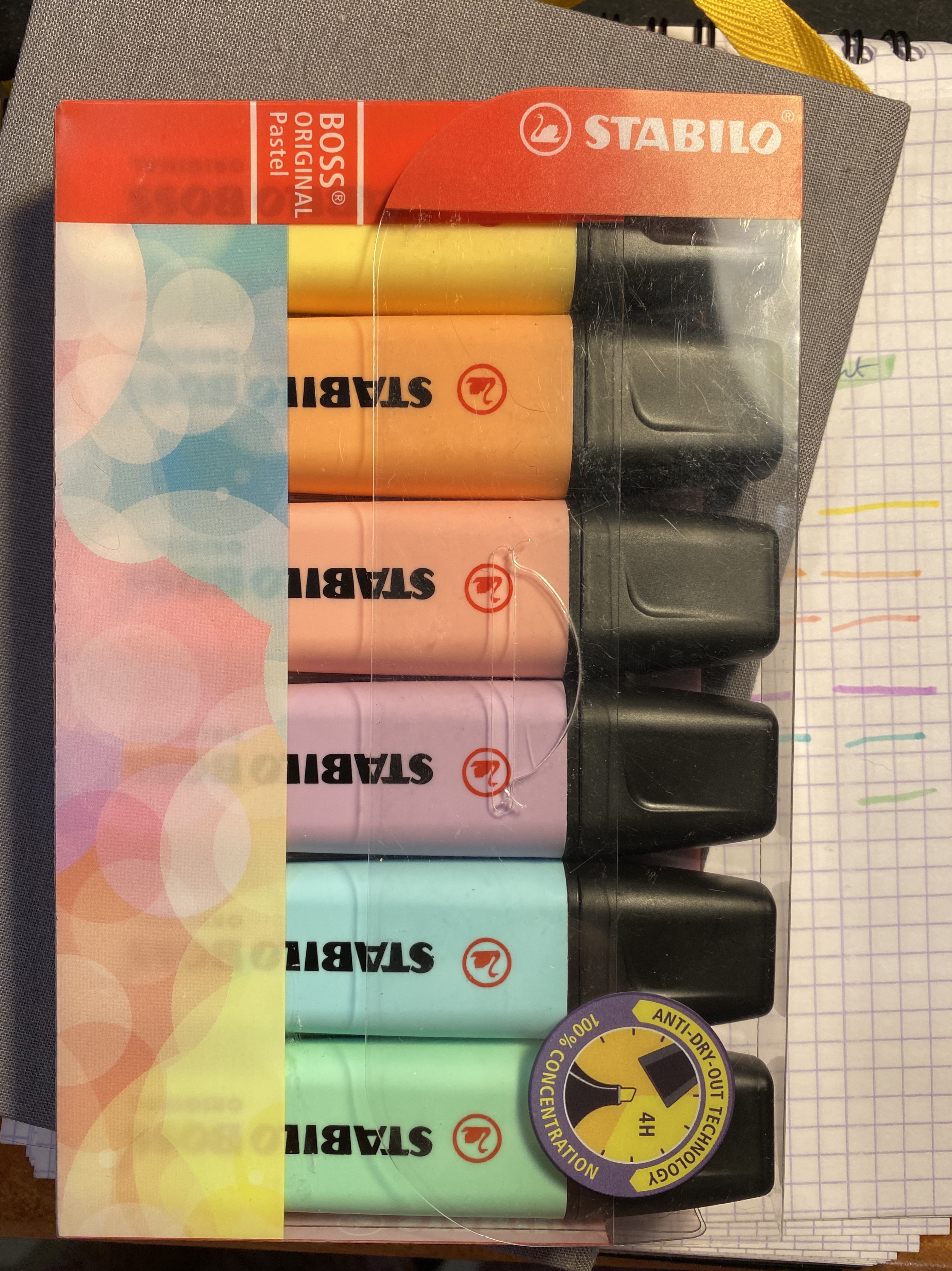
There’s something about multi-coloured sets of stationery items that I just find irresistible to the point where I bought an entire set of Stabilo Boss Pastel highlighters even though I hardly ever use highlighters.
I think highlighters are one of the quintessential back to school items, as you’re likely to use them most when you’re revising or reading and taking notes for a class. I used to use highlighters extensively, in the “bad old days” when Stabilo Boss were the only decent highlighters around. They are now bested in every possible way but price (and even that depends where) by their Japanese counterparts, with their sophisticated windows, double-sided tips, brush tips and weird double line producing tips. Even when it comes to colour choice the old Stabilo Boss gets left behind.
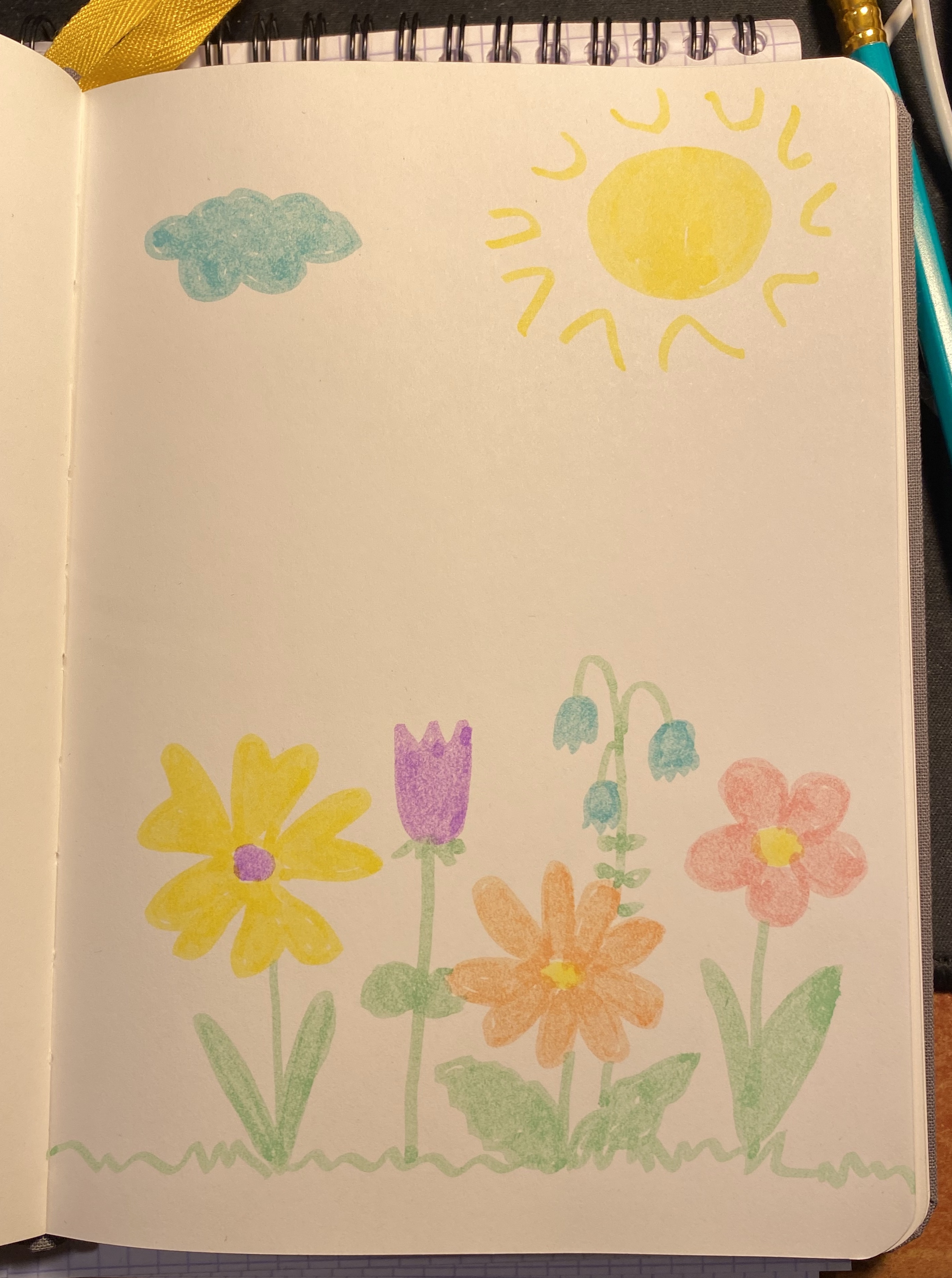
The Stabilo Boss highlighters are likely what you’ll find in the office (when you actually go there, Covid permitted). If you can get your office to purchase the pastel version of these I highly recommend it as they are less searing on the eyes than their standard fluorescent brethren. Otherwise these have a chunky pen body that’s pretty comfortable to hold, especially if you’re a kid, and truly terrible ink. It’s much too wet, and tends to bleed through practically every kind of paper that you’ll find in a normal office setting, and most of the high quality stuff too. My main use for them has been as colouring markers to give to the kids my colleagues sometimes bring to work. I draw colouring pages with a sign pen, and if the parents didn’t bring coloured pencils or markers with them, the Stabilo Boss markers do in a pinch.
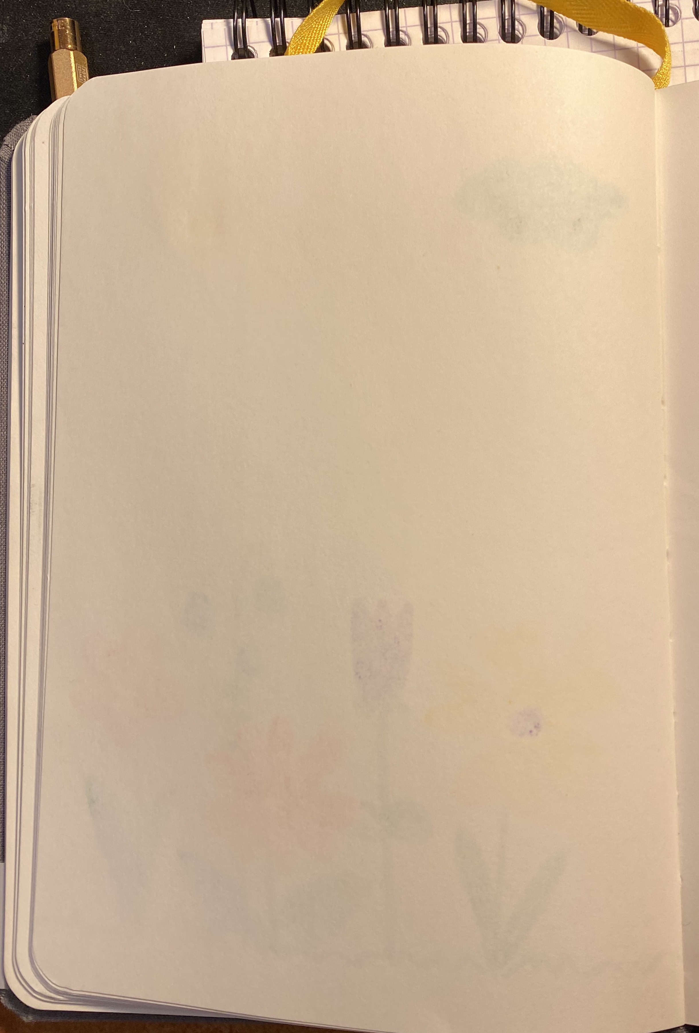
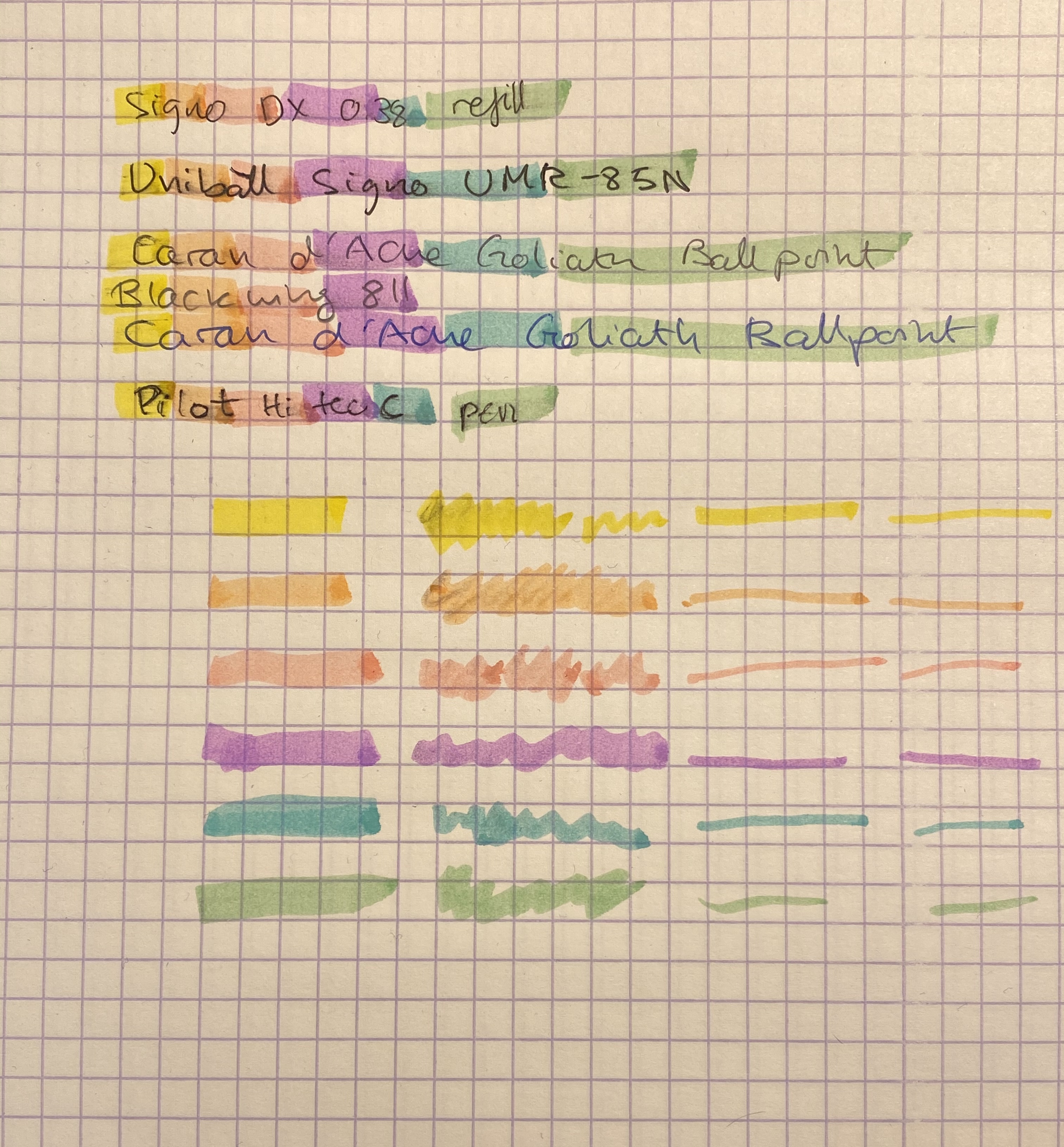
As for actual highlighting, these do a terrible job. They smudge anything but ballpoint, they bleed through like terrible, and the colours are decent but not very exciting. Note that these pick up ink and retain it pretty well, which gives the classic “dirty highlighter” effect, especially on the lighter coloured ones.
So if you’re looking for a highlighter, look elsewhere, there are much better choices on the market. I’m not going to even deign to test Stabilo’s claim that these still work after being left uncapped for 4 hours. It’s more important that the actual highlighter is good and useful than that it wins in a highlighter survival contest that has little to do with their standard everyday use.
Now to the notes on highlighting: on the second semester of my first year as an undergraduate I had a professor who actually took the time to teach us how to take notes and revise. He had an acerbic sense of humour and a great dislike of highlighters. “If you want to highlight something, only use a pencil, or at the most a pen, to underline it. Never use highlighters, because then when you read back your eyes will only see the highlighters, and if you’ve misunderstood something, or appropriated too much importance to a sentence or passage you have little chance to ever correct it. Underlining with something that doesn’t immediately jump out to you lets you see things in context, and reevaluate them if necessary”.
I tried his advice out and I found out that it worked well for me, and so I’ve been underlining and not highlighting ever since.

Pamalison
I think you’ve worked in some splendid offices if they soared to the dizzy heights of having Stabilo Boss highlighters rather than the cheaper, even worse, ‘own-brand’ options offered in the stationery company catalogue like most of the places I’ve worked. I can remember as a teenager in the 1970s underlining with pencil and still like to do that – it’s offered as an option in the highlighter colour menu in Apple’s “Books” e-reader app so you can be consistent across your physical and digital domains (although to be fair the option is underline in red, a nice grey pencil line would be better).
LikeLiked by 1 person
Pingback: Journal Comic: Cheap Art Supplies – Writing at Large