A Friendly Suggestion for Beginner Vintage Fountain Pen Users
I’ve been catching up on the Pen Addict members-only “Friend of the Show” podcast (highly recommended), and person after person said that they prefer modern pens, and they have a vintage pen, an Esterbrook, which they don’t really use. That people’s first vintage pen is an Esterbrook didn’t surprise me, as it’s a great little pen at a very compelling price, and it can be easily modified to suit your writing style by swapping out the nib. What did surprise me a little is that people aren’t really using the Esterbrooks that they have.

Then again, I own five Esterbrook pens:

Yet I haven’t used them in years. They all have nibs that I carefully selected to fit my writing style perfectly, and still I haven’t used any of them since 2016 or so. And the reason I don’t use them is the reason why I’m going to suggest to people starting out with vintage pens to maybe not pick the Esterbrook as their first vintage pen, ubiquitous and cheap and beautiful as they may be.

They’re lever fillers, every last one of them.
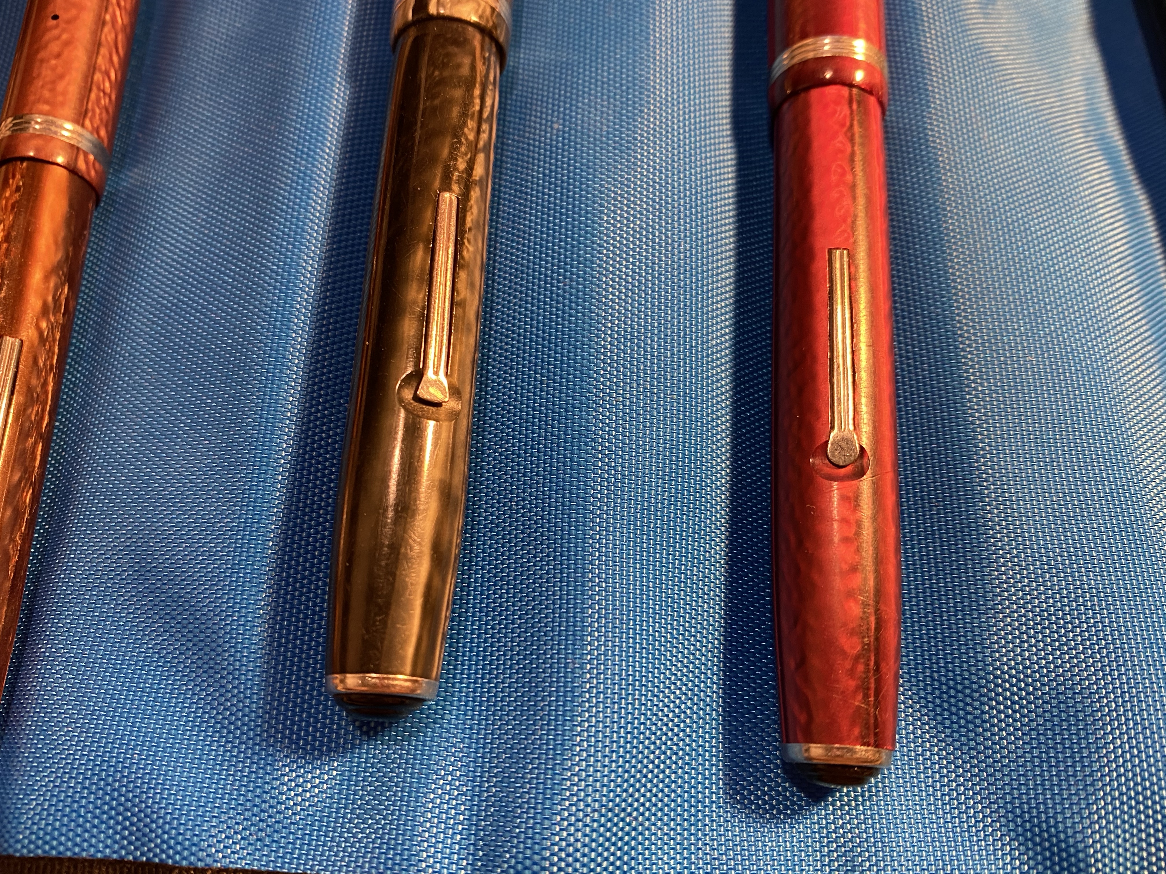
The dreaded lever.

Lever filler mechanisms are very common in vintage pens, because they are so cheap and easy to produce. They’re also fairly easy to mend, and so you’ll find them everywhere on a vintage dealer’s table or on a vintage pen site. They are my second least favourite filling mechanism (hello button fillers, you get first place) because they are not great to use when you’re filling a pen, and they are really not great to use when you’re cleaning it.

The Esterbrook does allow you to bypass the annoying cleaning part in that you can unscrew the nib and clean the pen like that, but you still have to use the lever when you fill the pen, and you still have no earthly idea how much ink is in your pen while you’re writing with it.

So my friendly suggestion would be to delay your first purchase of a vintage fountain pen and buy something a little more expensive (in the $100-$150 range) that is easier to fill and clean. If it turns out that you like vintage fountain pens, then you can start getting used to lever fillers and their quirks.
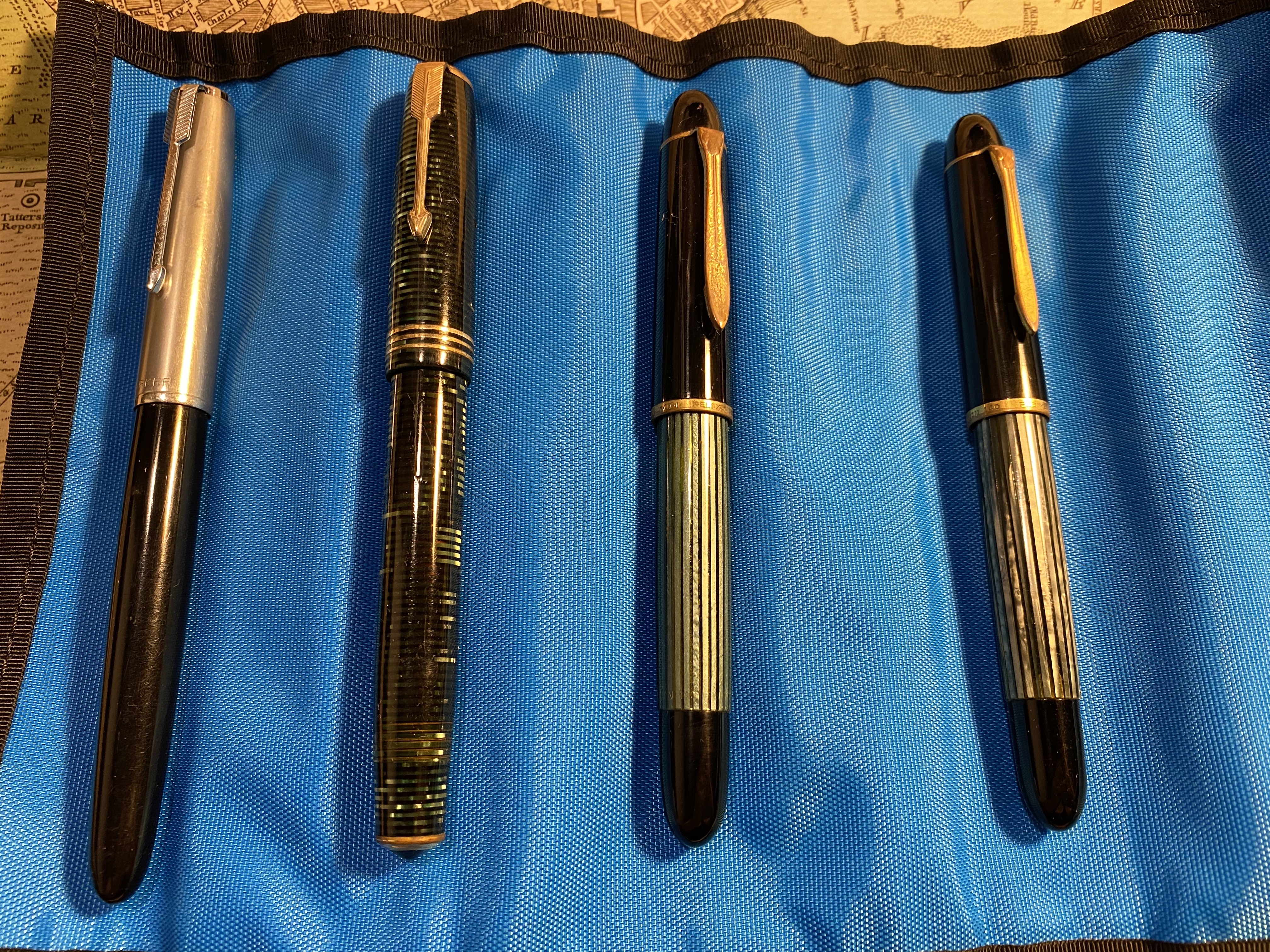
Parker 51, Parker Vacumatic and Pelikan 140

Here are my top three suggestions, in order of most beginner friendly to least beginner friendly (but still friendlier than a lever filler): the Pelikan 140 (a piston filler), the Parker 51 aerometric (an aerometric filler that works like a squeeze converter), and the Parker Vaumatic (a vacumatic filler).

Aerometric, Vacumatic and Piston filing mechanisms.

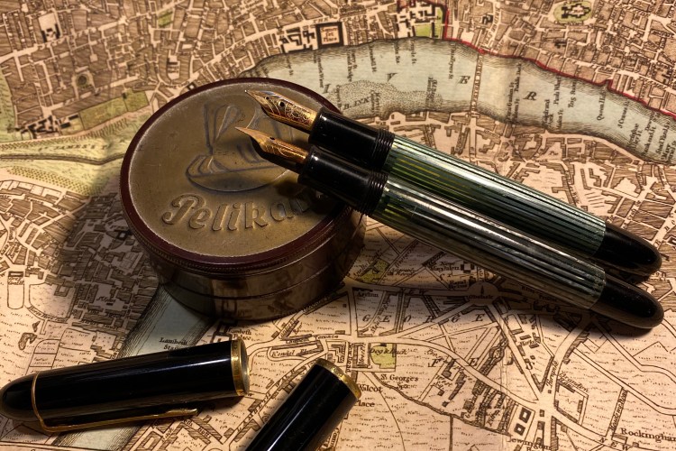
The Pelikan 140 is a piston filler with a gold nib, and a semi transparent body which allows you to see if you filled the pen properly and how much ink is left. It was made for over a decade and has a wide variety of nibs, so you can quite easily find it, and look for the perfect nib for you, just like with the Esterbrook. It is a more expensive pen, but you can still get a phenomenally good pen (ebonite feed, gold nib which can sometimes have flex, and a large ink capacity) for significantly less than what the same features would cost on a modern pen. The downside is the aesthetics, which can be a little spartan (Pelikan 140s are mostly black with green stripes), and the trim’s tendency for brassing. But brassing adds character, as once a very good vintage pen blog said. These pens are also likely to be more easily obtained in Europe than in the US or Asia.

Pelikan 140

The Parker 51 is still my absolute favourite vintage pen, but that’s not why it’s here. It’s here because the aerometrics (which are also cheaper) sport a filling mechanism that works very much like a modern squeeze converter, albeit permanently attached to the pen, and the filling instructions are etched into the pen, which is very helpful of Parker.

Parker 51

Theoretically you can gauge if there’s ink in the pen using the transparent sack but in most cases the sack will no longer be transparent, and even if it was, its position doesn’t really tell you a lot about the state of the ink in the pen. So it’s relatively easy to fill and clean the pen, but you’re not going to have any indication as to how much ink is in it at any given time.
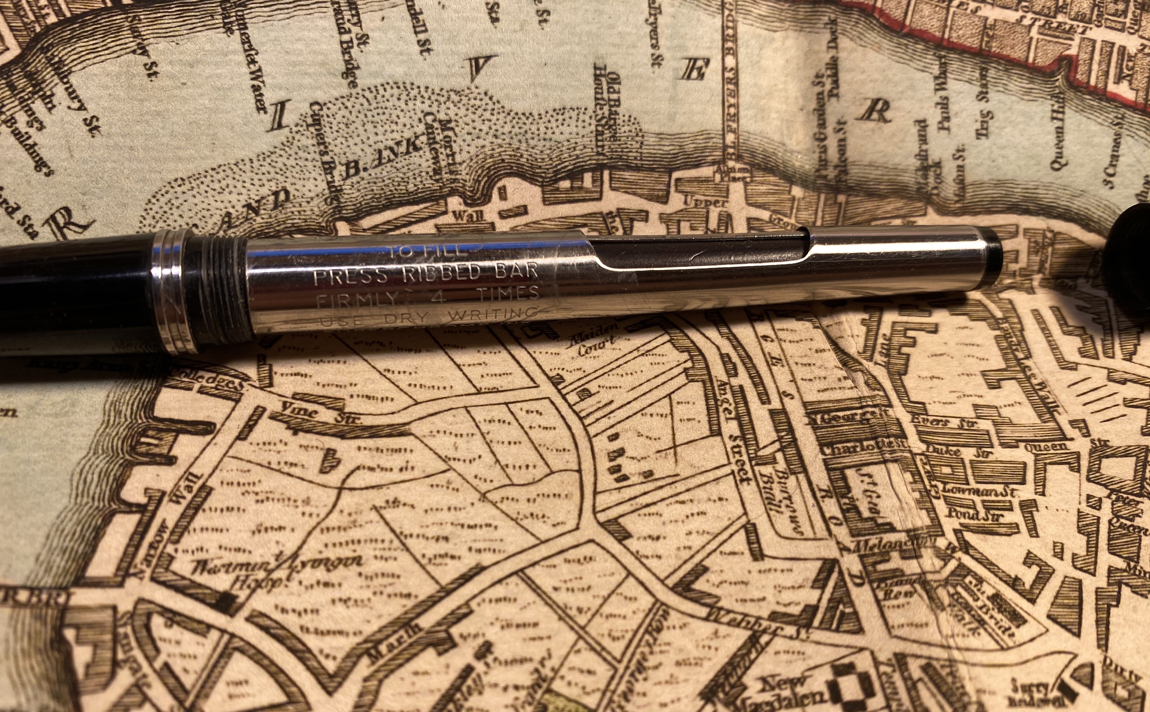
Filling instructions on the pen body.

The Parker Vacumatics are gorgeous pens with great nibs, and the striped Vacumatics let you know what the ink level is unless they are stained beyond belief, in which case I’d wait a bit for a pen in better condition. The Parker Vacumatics I’m recommending are those with a lock down mechanism. Of the three pens they are the most fiddly, and that’s why they’re in third place, but they allow for a relatively large ink capacity, and the option to see the ink levels at all times, so they go on the list. To fill the pen you unscrew the blind cap, give the metal nob on the top a slight turn and push (a bit like opening a child proof pill bottle) and then the metal plunger springs out. You push the plunger a few times to fill the pen, and then you push down the plunger and twist it once it’s down so that it locks back into place. If you’ve ever used a child-proof pill bottle then you’ll be familiar with the push and twist mechanism, and if not have it demonstrated when you buy the pen or find a youtube video that shows you how to do it. It’s not difficult.

This is a more expensive, double jewelled model, but the filling mechanism is generally the same on cheaper vacumatics.

The Parker Vacumatics are not as intuitive to use as a lever filler, but they allow for an ink window which means that you can see if you have ink left or if you’ve filled or cleaned the pen properly pretty easily:

You can see the ink levels through the orange transparent bits between the stripes.

These pens are never going to compete with the Esterbrook pens on price because they have gold nibs and more sophisticated filling mechanisms. They do quite easily compete with modern pens in terms of bang for your buck when it comes to getting things like a piston filler with a flexy double broad gold nib. If you’re buying a vintage fountain pen that you want to have a relatively easy time filling, using and cleaning, and that will give you a unique and oftentimes exceptional writing experience, any one of these three pens ought to do.

And just to set the record straight: I love Esterbrook pens, and there was a time when I used them constantly, and I still heartily recommend them as they are little workhorses of delight. It just occurred to me that perhaps that little lever combined with the opaque body may be off-putting to new users, and so I’m suggesting a few (much more expensive, sometimes harder to obtain) alternatives. With vintage fountain pens purchase patience is required and not FOMO, so it’s worth waiting for a great $100 pen that you’ll use more than buying a $50 one that you won’t.


A Pen Hack, a Field Notes and the Hi-Tech C

I had an issue with my Ti2 Techliner where my favourite gel ink refill (the Uni-ball UMR-85) and basically all gel ink refills dried out and stopped writing a few words after I uncapped the pen. While ballpoint refills like the Jetstream faired better, they also would “fade out” after a few lines, and then, after some coaxing, return to normal. It couldn’t be that the refill was drying out, as after capping the pen, it wrote well enough again for a few words. It was a refill problem, as the same refill wrote perfectly fine in a different pen.

I tried searching for answers and asked around in the Pen Addict slack but got no answers. It was frustrating, since I liked the pen, but couldn’t use it because it wouldn’t work with my preferred refills. I had a feeling that the magnet at the tip of the pen was what was causing the ink flow issue, but it only yesterday did I figure out how to bypass the very thing that was holding the pen together.

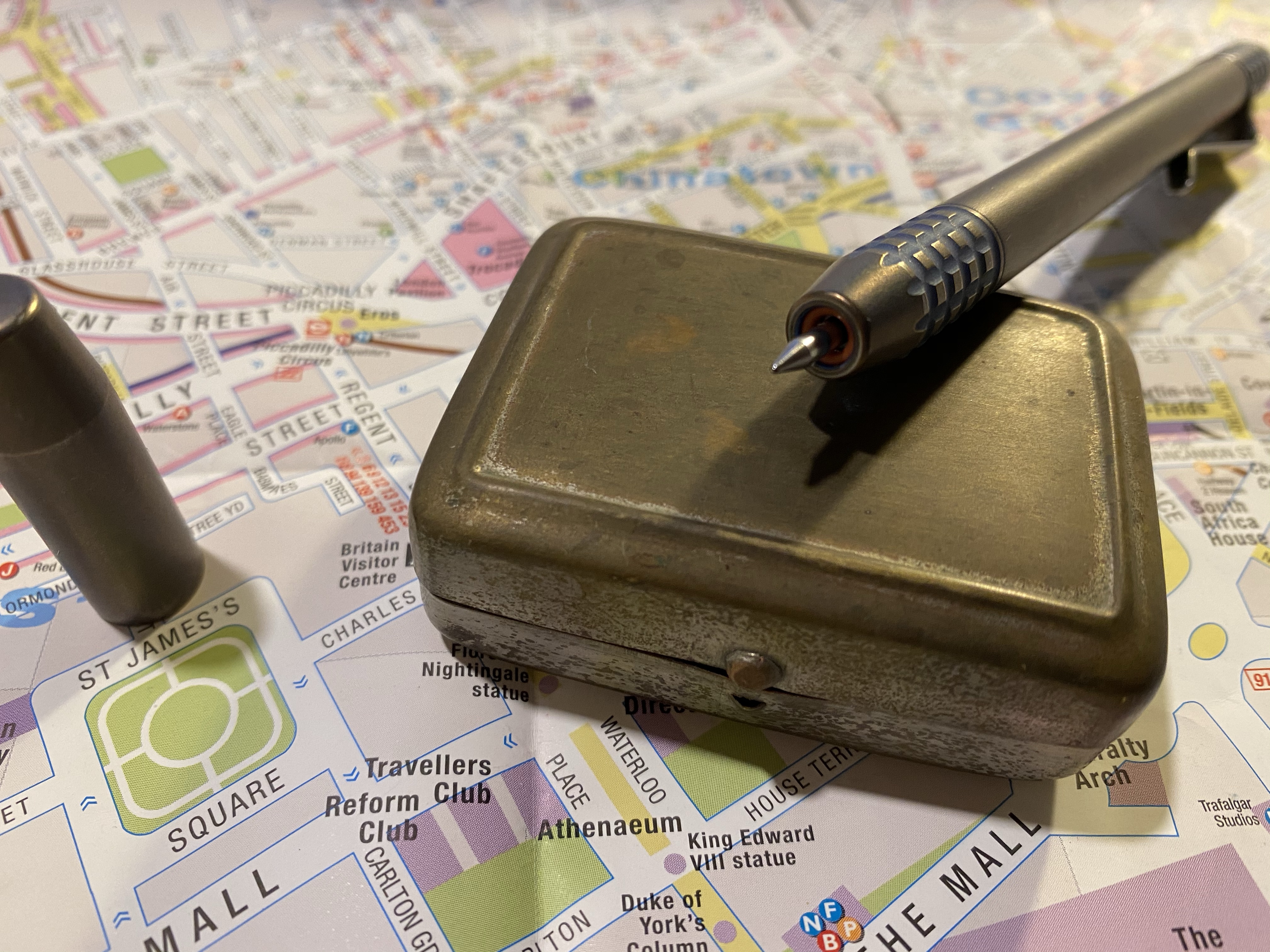
What I did was change the order of the parts in the front section of the pen. The original order was refill, plastic spacer, red o-ring, magnet and then the section screwed over that. What I did was reverse the o-ring and the magnet so now it’s: refill, plastic spacer, magnet, red o-ring, and then the section. The result is kind of pleasing to the eye, and more importantly it fixed the flow problem completely, and now I can actually use this fetching pen.
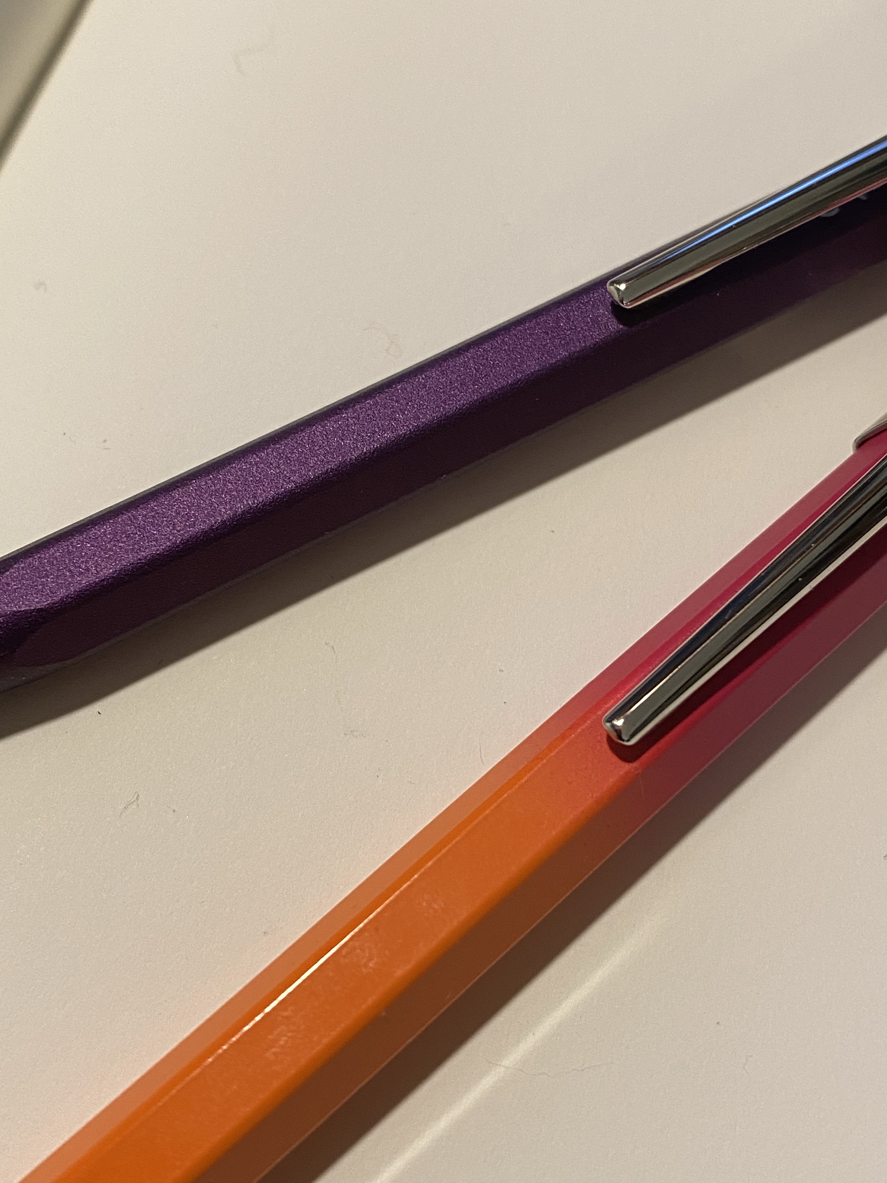
You can see the red o-ring around the tip of the pen.

I tend not to review Field Notes because they arrive so late to me (due to postal issues, not Field Notes issues) that it seems irrelevant to review last quarter’s edition when everyone already has the new one at hand. Covid-19 has made the postal problems even worse, and so only now, and after contacting the wonderful Field Notes people and getting a reshipment, have my Vignette notebooks arrived.

What also arrived were my Field Notes Rooster 2020 notebooks, which are part of Field Notes’ yearly sponsorship of the Morning News and the Tournament of Books. I read all of the books in the Tournament of Books shortlist this year, for the second year in a row. I didn’t post reviews of them all in this site as I didn’t enjoy the last 3-4 books, and I didn’t feel like posting negative review after negative review.

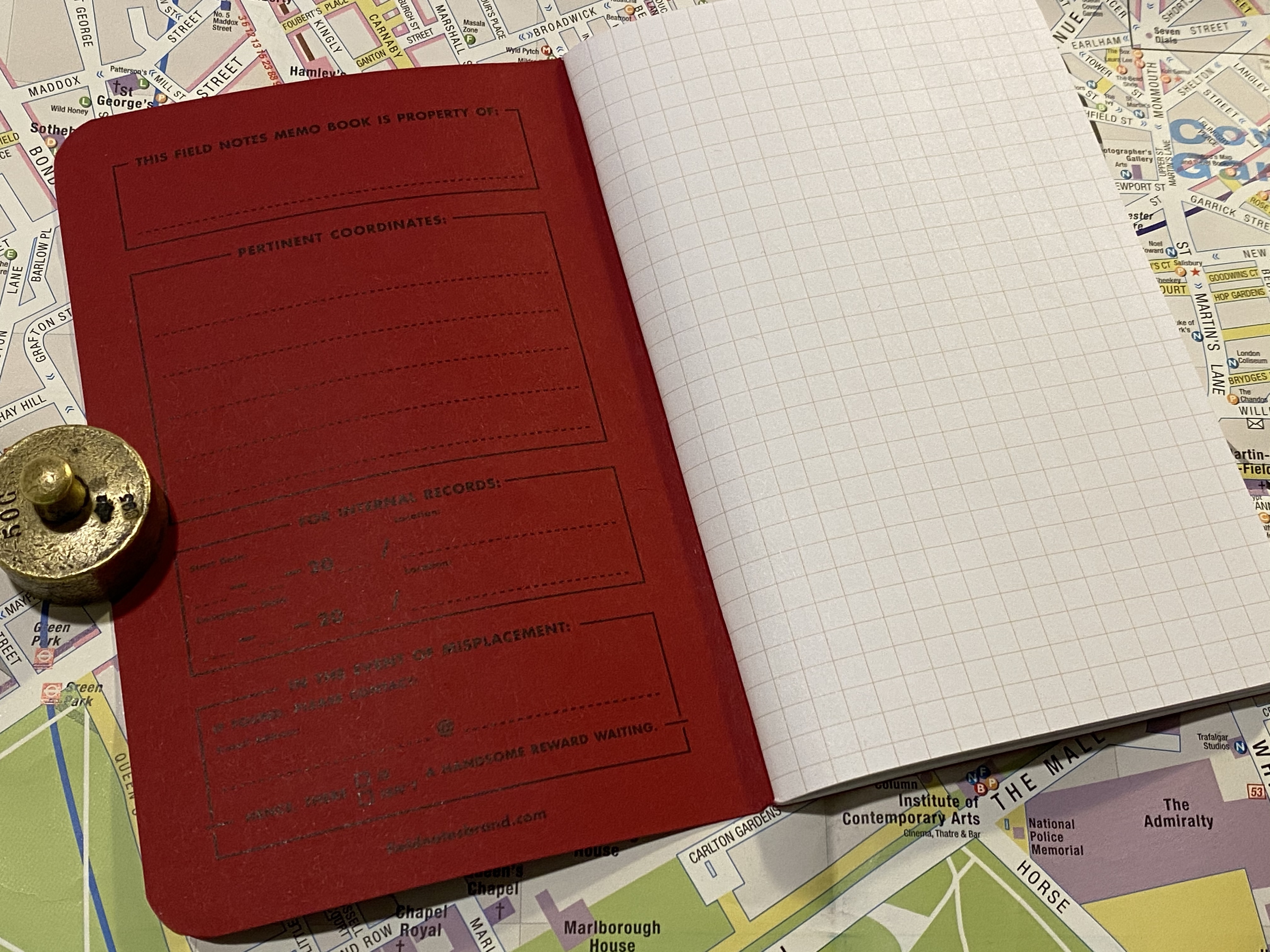
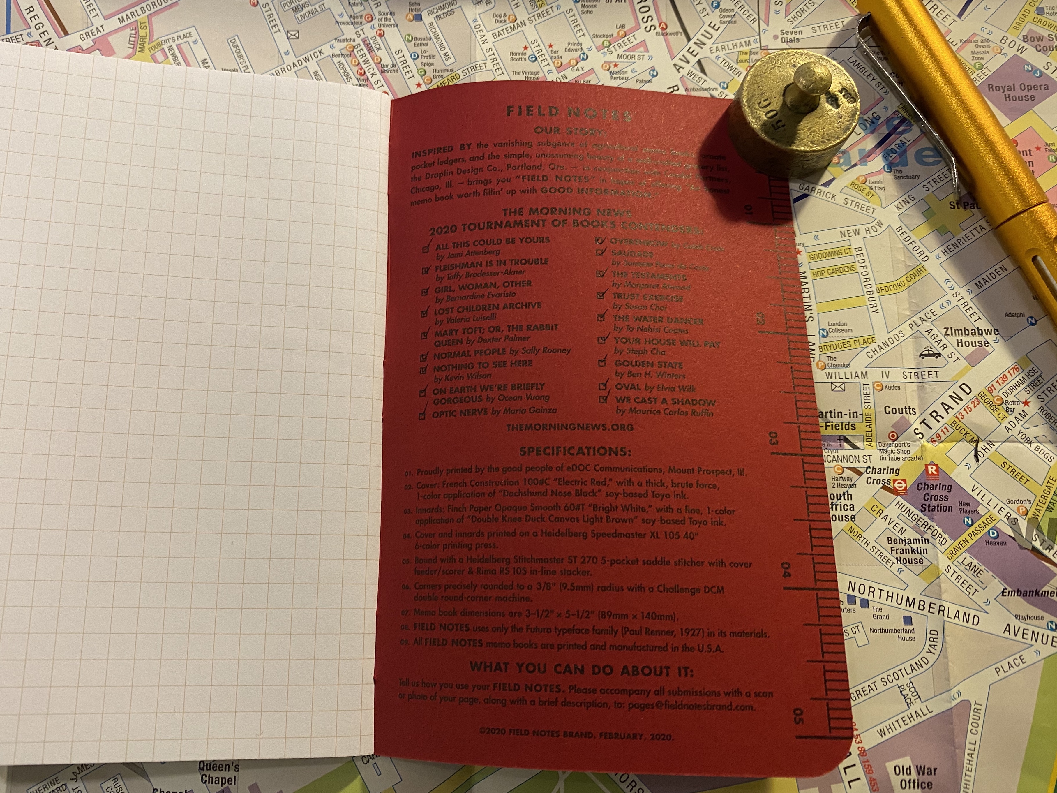
I did, however, love this year’s Field Notes Rooster special edition notebook, and it is by far my favourite Rooster special edition notebook that Field Notes ever issued. It is a squared notebook, and not lined, for the first time ever, and the bold red and black print on the cover is much more striking than their usual craft or cream choices for this series.

Bold, bright colours on the cover.

The fact that these notebooks (sold as singles, with the proceeds going to literacy related charities) arrived so late means that I have a had a few months to think about the Tournament of Books 2020 reading list.

Squared notebook.

I enjoyed the 2019 reading list more, but the 2020 list was overall a good, interesting list of contemporary writing that I for the most part would not have read otherwise. There were a few mediocre books on it, and a few that I really disliked, but as a whole it wasn’t a bad list. I may try reading next year’s list too.

The list. There are 18 books on the list, 4 books that I though weren’t worth reading, of them two were a silly, bloated waste of time and two were infuriatingly bad. There were 7 books that I thought were real gems.

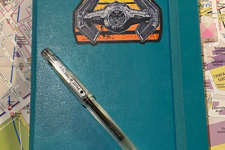
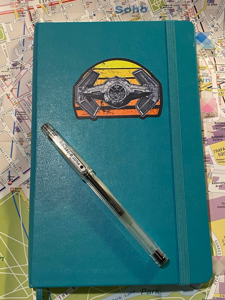
I wrote a few weeks back that I was struggling with my notebook setup, and things have changed since then. I’ve settled on using a blank large Moleskine hardcover in Reef Blue and a Pilot Hi-Tech C 0.4 for a running list of work projects and related notes.

I’ve customized the cover with a Star Wars decal to make it pop and let me easily identify it.

I use the right hand side for a running tasks per project (I still manage major project points in the Things app), and the left hand side for related points, reminders and ideas. Each project has at least one spread, and I drop in pages with ideas and things to remember in between the project pages.

The Pilot Hi-Tec-C (also known as the G-Tec-C4) is not a pen that I would recommend because it’s so very delicate and unreliable, but I used to be a fan years ago, and in a burst of nostalgia (and against my better judgement) I’ve gone back to using these pens. There’s something about the barrel design of this pen, combined with it’s needle tip that makes me enjoy writing with it. Again, I wouldn’t recommend it, as you’ll rarely see a refill through (the tip will bend, or it will become to scratchy to use, or it will dry out and become unusable) and in general the Uni-ball Signo DX are much better 0.4 tipped gel ink pens. But the heart wants what the heart wants, and this is what I prefer for daily work use right now.

Diamine Earl Grey Review

Ever since I saw the first reviews of Diamine Earl Grey I have been fascinated by this ink, and only partly because I love, love, love tea. The colour seemed to have shading properties and tonal depths that were similar to the much coveted yet hard to obtain Sailor Studio 123. I had vowed to cut down on my ink purchases, but as I broke down and bought some Diamine Blue (i.e. Christmas) inks, I had to add a small bottle of Diamine Earl Grey to the cart.

Parker Vacumatic Major with an medium italic nib on a Rhodia No. 16 pad.

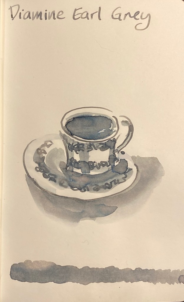
This ink is sheer magic. It is very legible (unlike many lighter grey inks), it shades like mad, and even on Rhodia paper you can see a bit of its tonal depth.

Shading on every single letter.

On Tomoe River paper the depth of its hidden tones really comes to light:

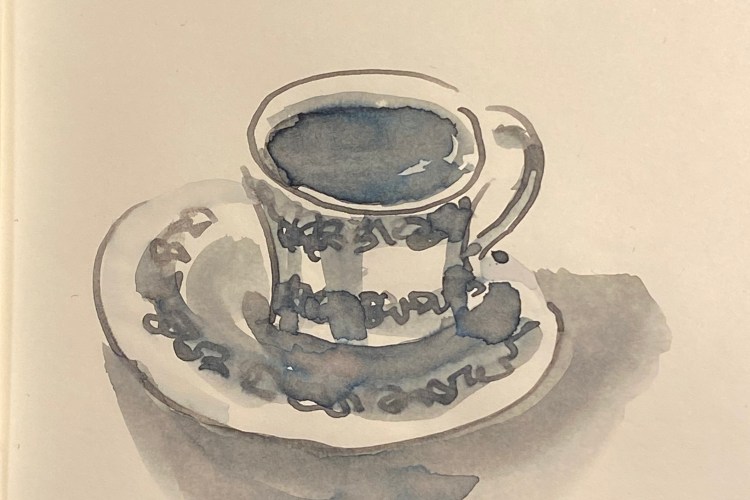
Drawn with the Parker Vacumatic and a W&N Series 7 #2 sable brush.

There’s blue, even slight hints of turquoise, green, yellow, shades of pink, and in the dark recesses hints of warm brown. It’s like the greys I often create on my watercolour palette: a mix of reds, greens and blues, with a dash of brown. The result is a rich, “living” grey that surprises you every time.

I’ll probably skip the Sailor 123 Studio Ink because the price plus shipping plus customs will make it painfully expensive. Now that I have Diamine Earl Grey I don’t feel like I’ve missed out.

Mechanical Pencil Day Reviews: Pentel Graphgear 1000 and Retro 51 Tornado Pencil

The 5th of July is apparently mechanical pencil day, which is something that Cult Pens started most likely out of promotional reasons. I’m all for celebrating what ever little things we have because life in general and mine in particular sucks pretty badly now, so I’m jumping on the bandwagon and posting two mechanical pencil reviews.

I mostly use mechanical pencils to sketch maps and plans.

The first mechanical pencil is actually a drafting pencil, and it’s the excellent Pentel Graphgear 1000. I actually enjoy writing with the Graphgear more than I enjoy writing with my Rotring 600 and 800 (gasp!).

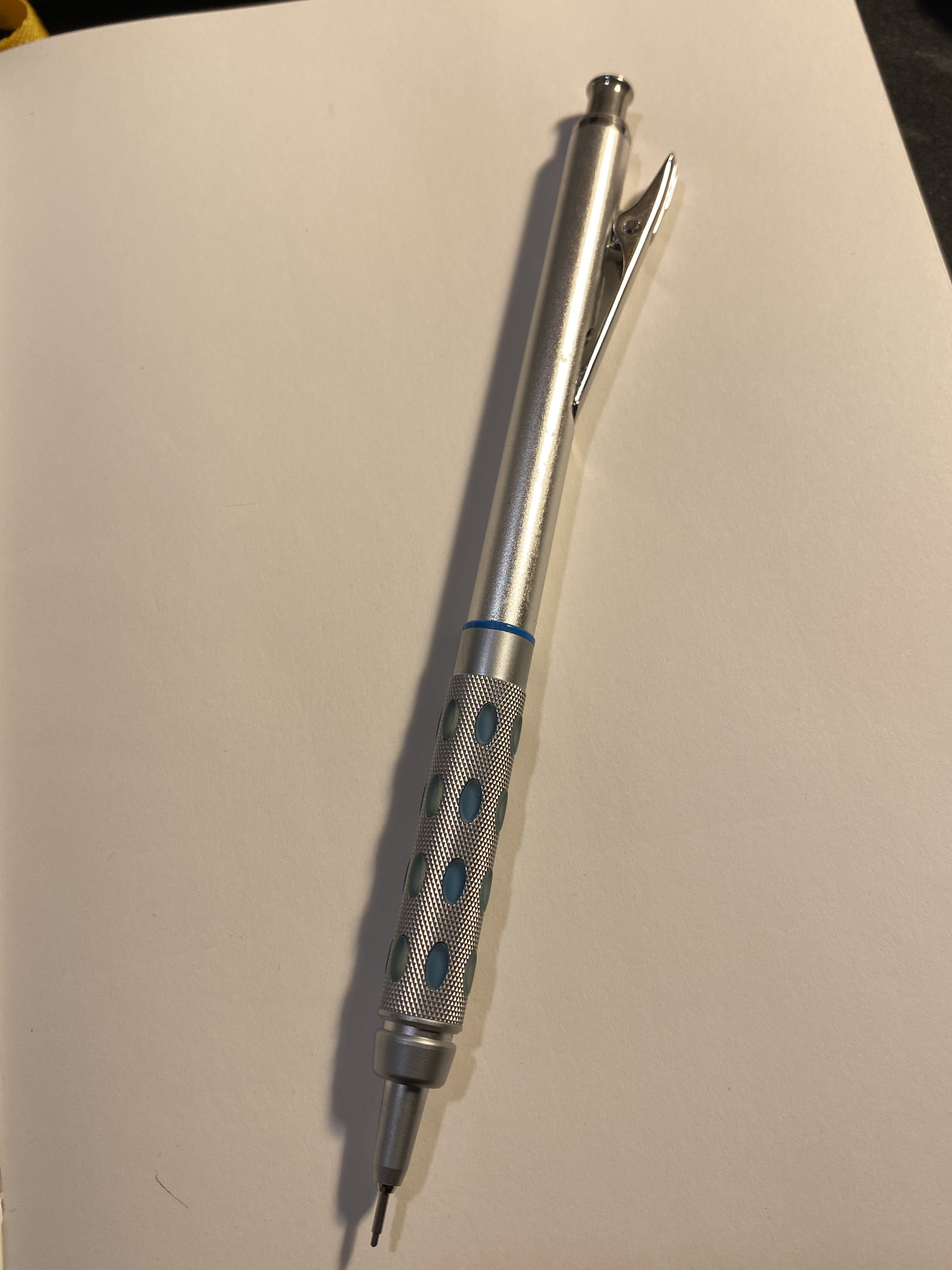
Pentel Grapgear 1000.

The Graphgear is lighter than my Rotring pencils, its knurling is less harsh on the fingers particularly because of the (non-latex) pads it sports, and the retracting mechanism means business.

It also helps that this is a well designed pencil, a beautiful writing tool to use, and whoever thought of creating different colour schemes for different lead sizes and incorporating that colour subtly over the pencils should get an employee of the month prize at the very least.

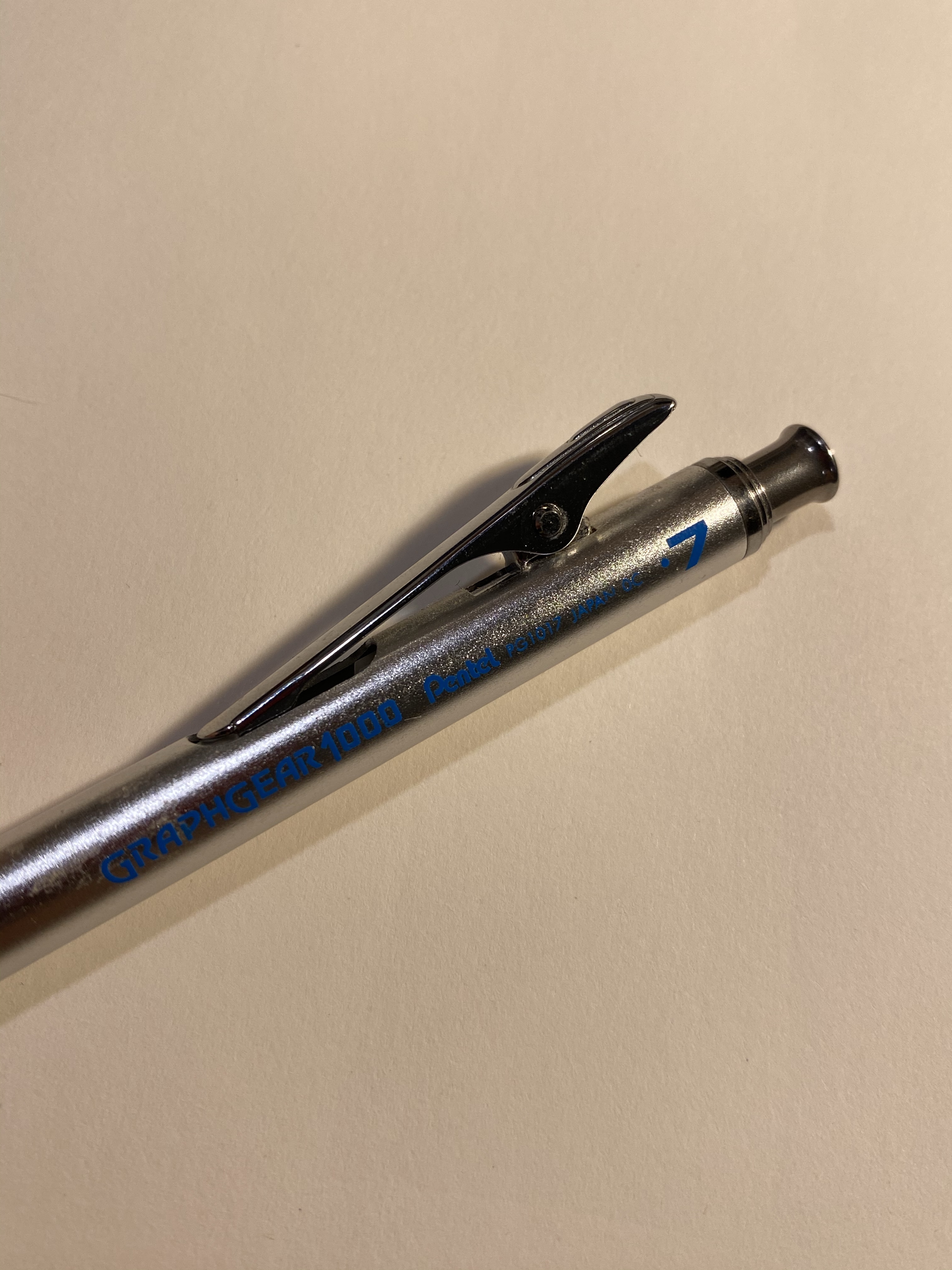
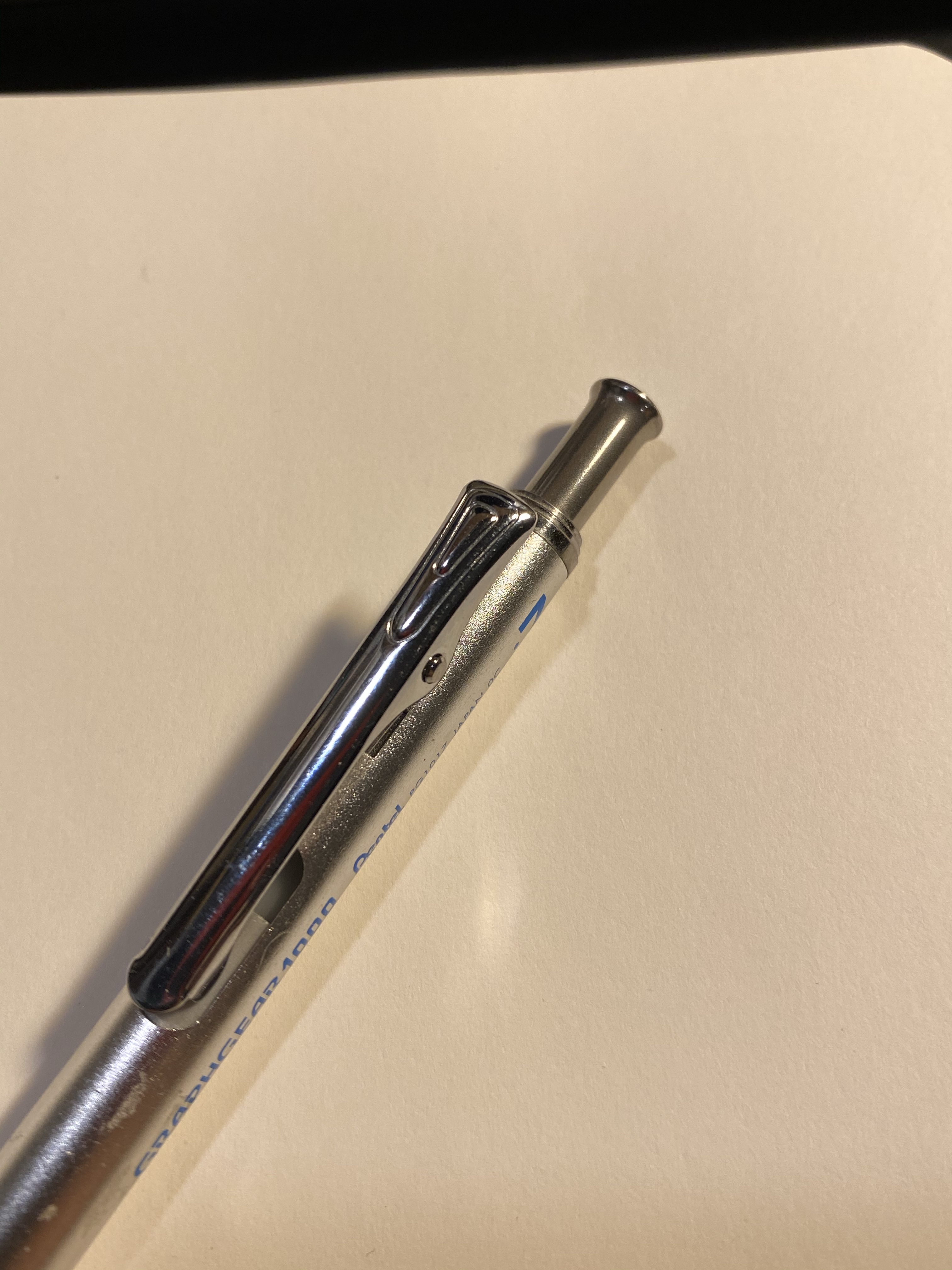
The clip. This thing will stay where you put it.

The retracting mechanism for the Graphgear sits in the clip, and works beautifully and makes the most satisfying “chunk” sound in the world. It retracts the pencil tip into the pencil body, ensuring that the lead doesn’t break and you don’t get stabbed while carrying your pencil around. This is a must-have feature for drafting pencils (together with the knurled grip, lead pipe, and lead hardness indicator), and it is done to perfection here. The only minus is the cutout below the clip that tends to collect pocket lint while being carried.

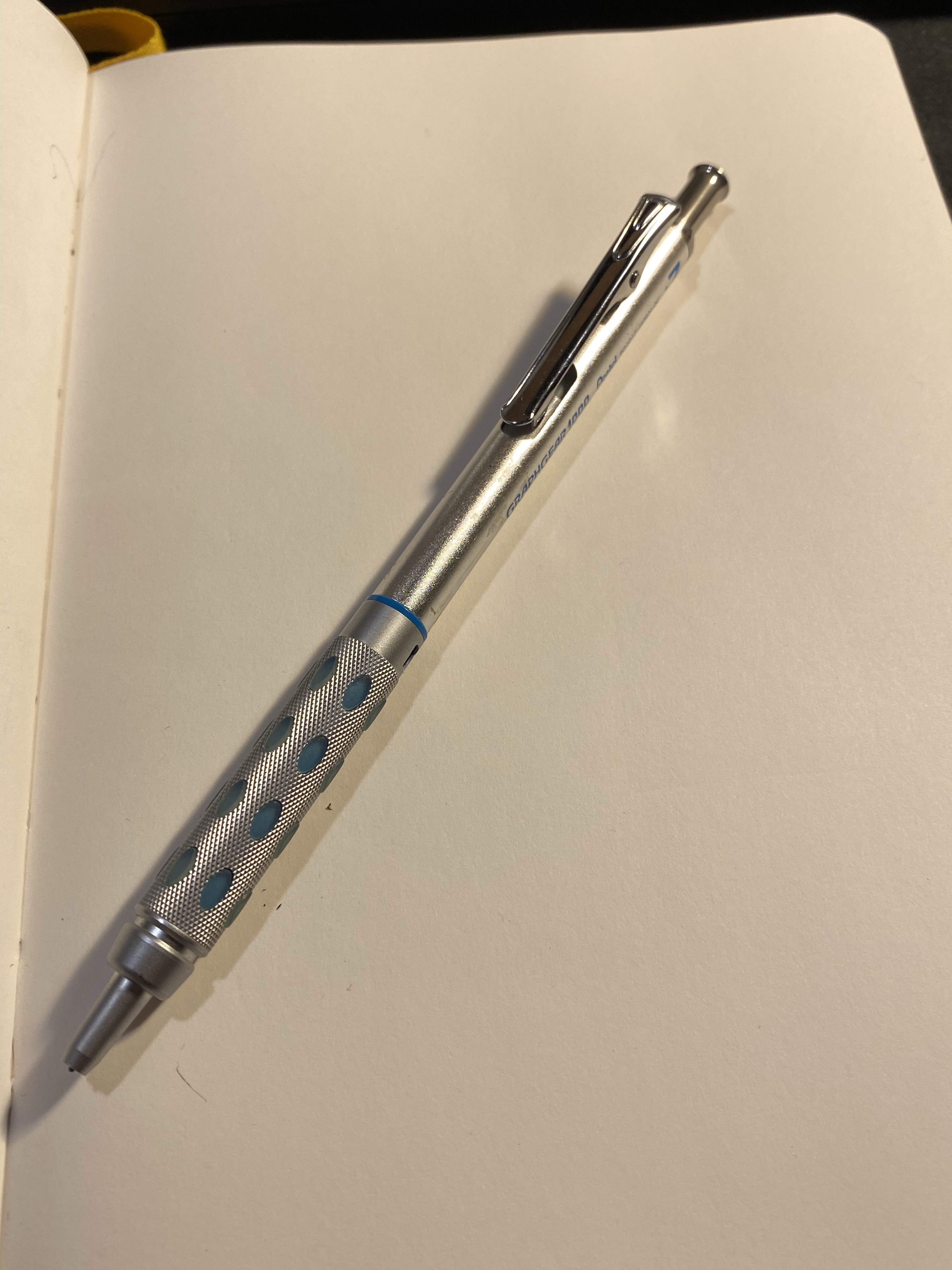
Look at that sleek design!

A click on the pencil cap extracts the lead sleeve once it has been retracted, and you press on the clip to retract the lead pipe, which is something that you’d do anyway to clip the Graphgear to you pocket, so this is a very intuitive pencil to use.

The design on the clip isn’t necessary, but it is beautiful.

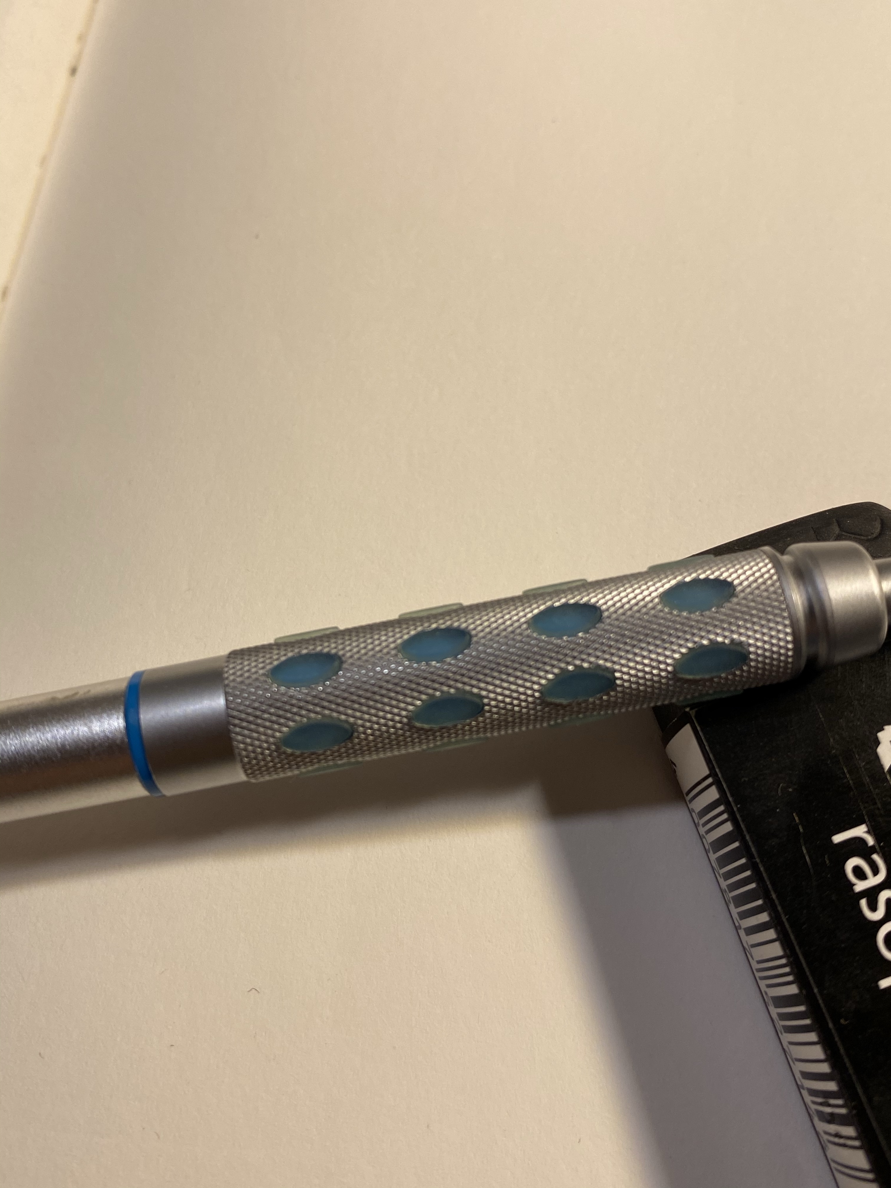
The grip is superb: the Graphgear won’t accidentally slip from your hand, and the knurling won’t dig into either, even if you have a “grip of death”.

Closeup on the grip and pads.

The tip of the pen cap has a lead size indicator, in this case 0.7, and right above the grip you’ll find a lead grade indicator.

The Pentel Graphgear 1000 isn’t a cheap mechanical pencil, but if you are looking for a drafting pencil to use for long periods of time, or you’re looking for a mechanical pencil that’s a cut above (except for the Uni-Ball Kuru Toga), I highly recommend this pencil.

Bonus tip: If you’re starting out in watercolour on location or urban sketching, get a pencil like the Pentel Graphgear in 0.5 or 0.7 and some H leads and use that for your preliminary sketches. Even if you don’t erase them, they’ll disappear behind the washes.

Now for the second mechanical pencil, which is also a unique beast: the Retro 51 Tornado Pencil.

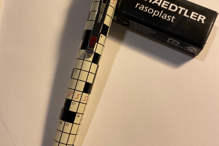
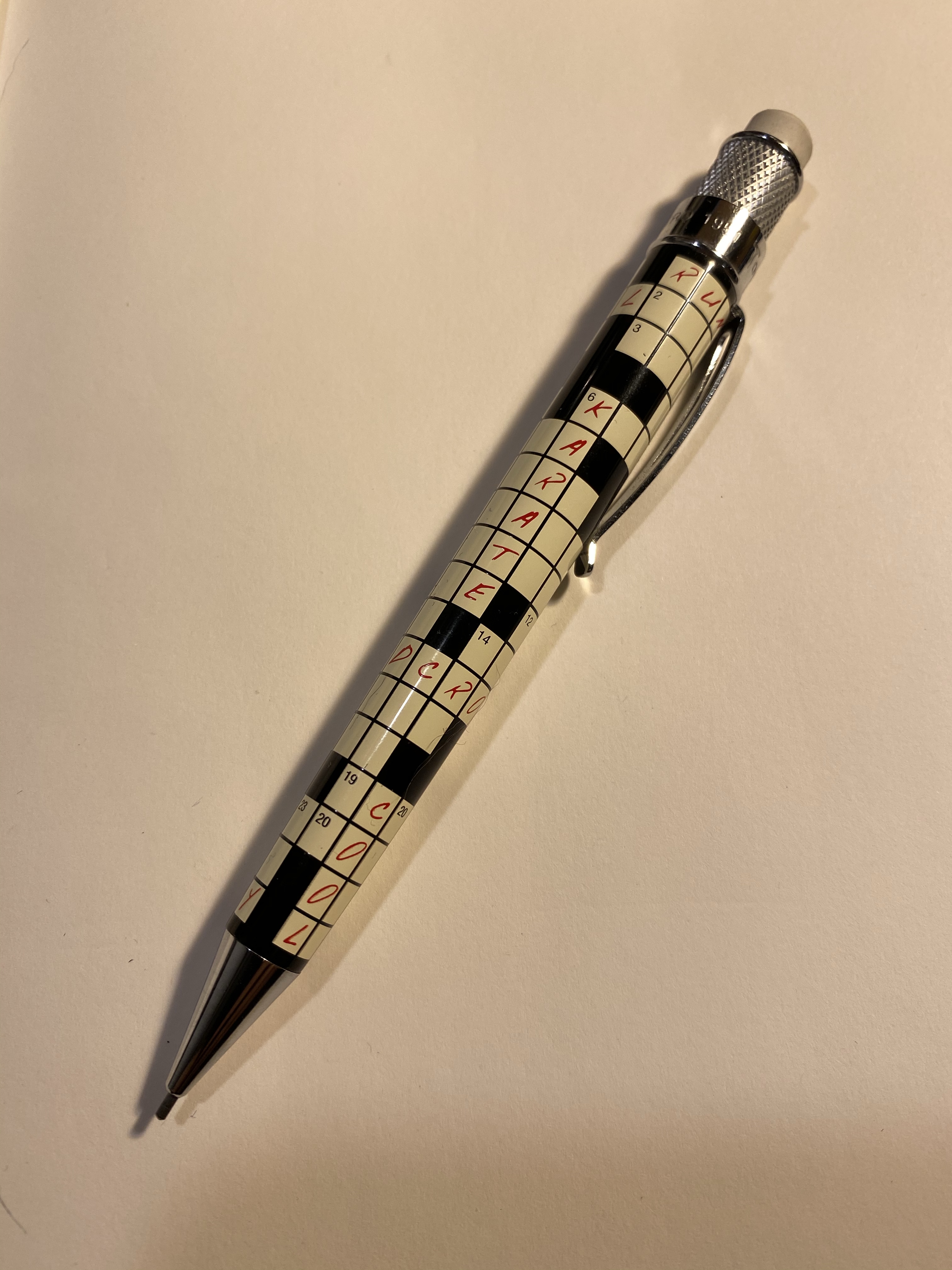
The Retro 51 Tornado Pencil Crossword

There are two things that are unusual with this mechanical pencil: it uses a 1.15 mm lead, and it’s shaped like a Retro 51 Tornado rollerball. That means that this is a bigger than usual pencil that uses a bigger than usual lead. Is it any good?

It depends. I’d skip using it for drawing or sketching, because at that lead size either go the 2mm lead holder route, or stick to woodcase pencils. It is, however, a fun object to have around, and it’s pretty nifty for sudoku and crosswords. The lead size is perfect for that, creating a pretty bold line even on sub-par paper while still giving your the option to erase it.

Have a delightful mechanical pencil day, and when in doubt, Kuru Toga.

Caran D’Ache 849 Nespresso Arpeggio Limited Edition

Hey, look what just arrived in the mail:

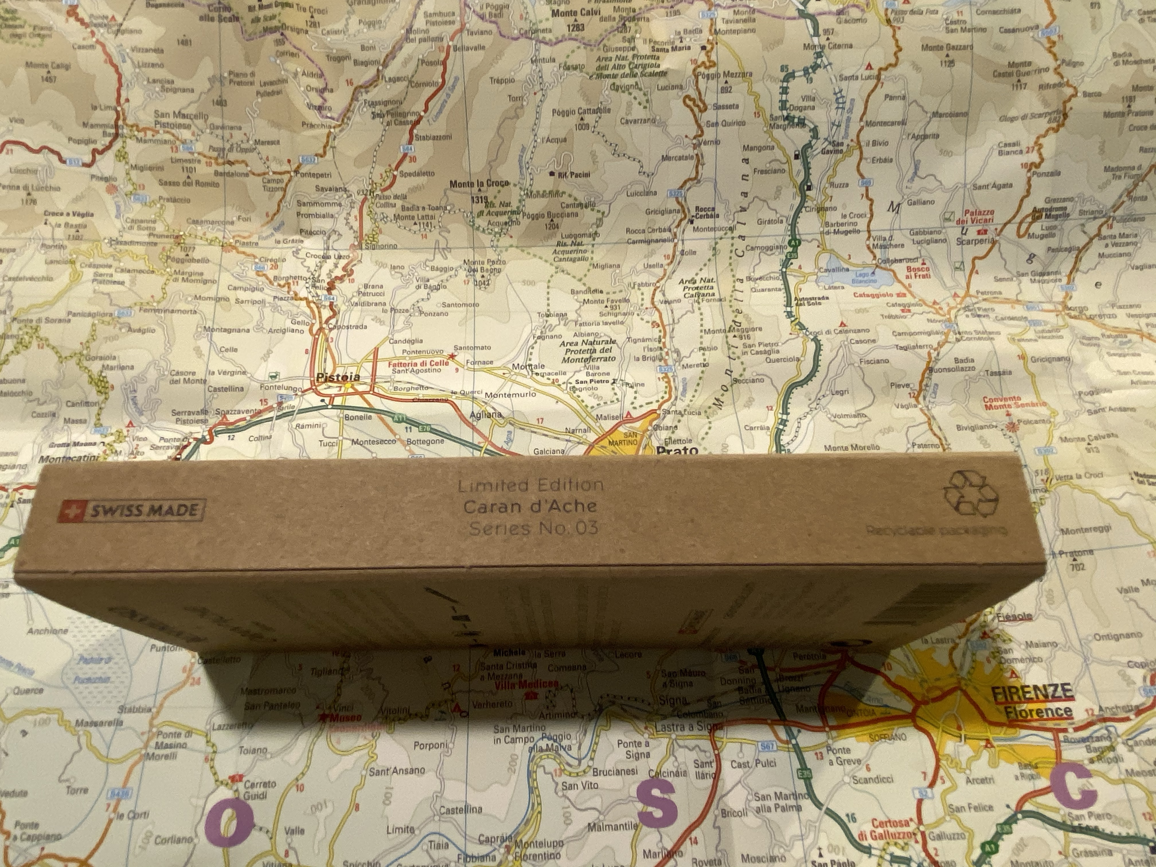
Such great packaging.

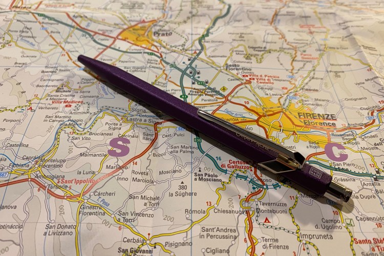
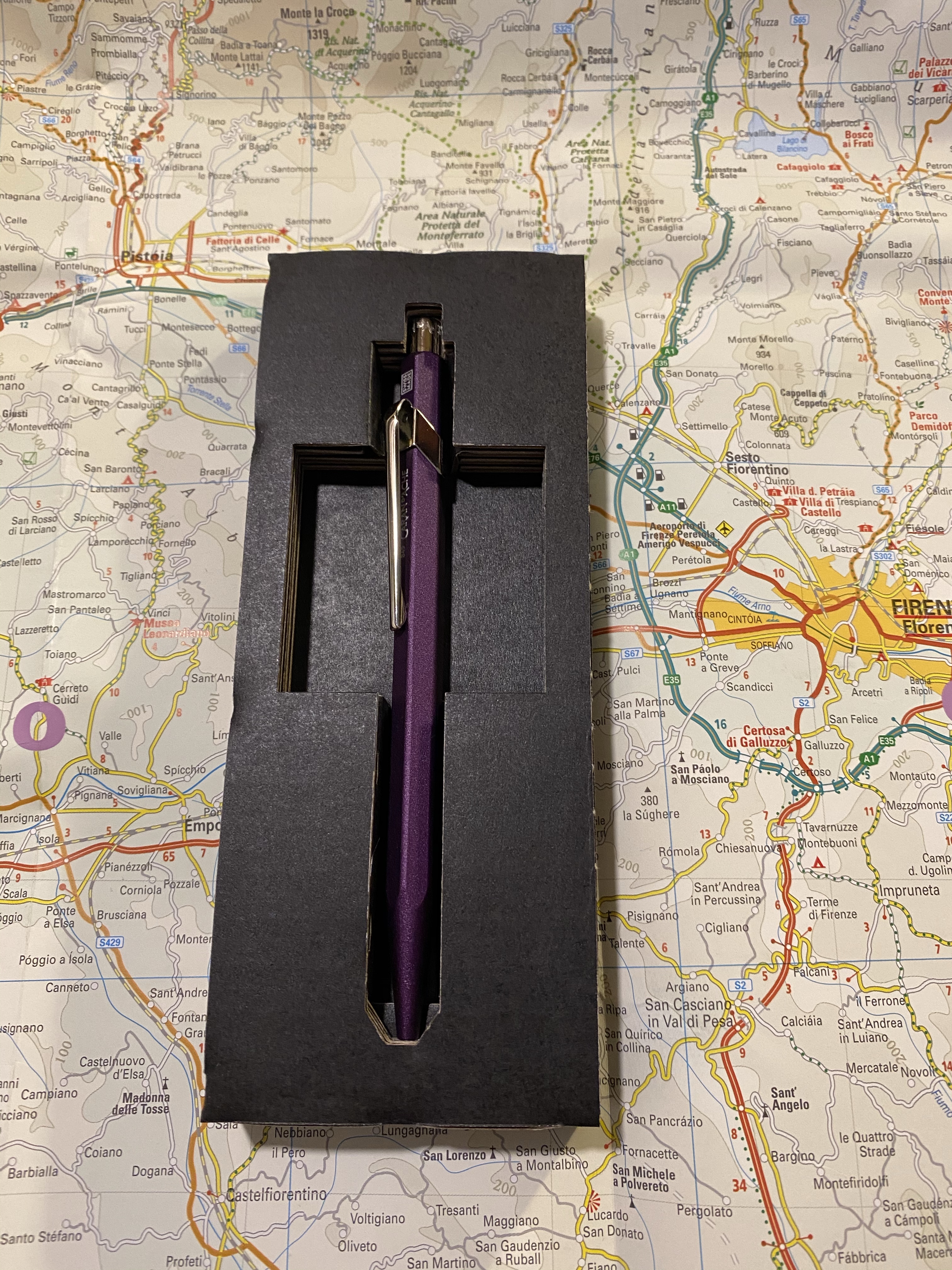
It’s the new Caran d’Ache 849 Nespresso limited edition and this time it’s Arpeggio that was chosen. Arpeggio is not only one of Nespresso’s more popular capsules, it’s also a gorgeous purple, which is a huge plus in my book, and big difference from their previous edition, the India.

But first, some photos of the phenomenal packaging of this pen:

Side view, where you can also see that it’s the 3rd of the series.

The 849 Arpeggio is made out of recycled Nespresso capsules just like its predecessors:

The back of the pen box.

The cardboard cutout the pen comes in still on point: a simple and fitting material designed to perfection to best showcase the pen and its materials.

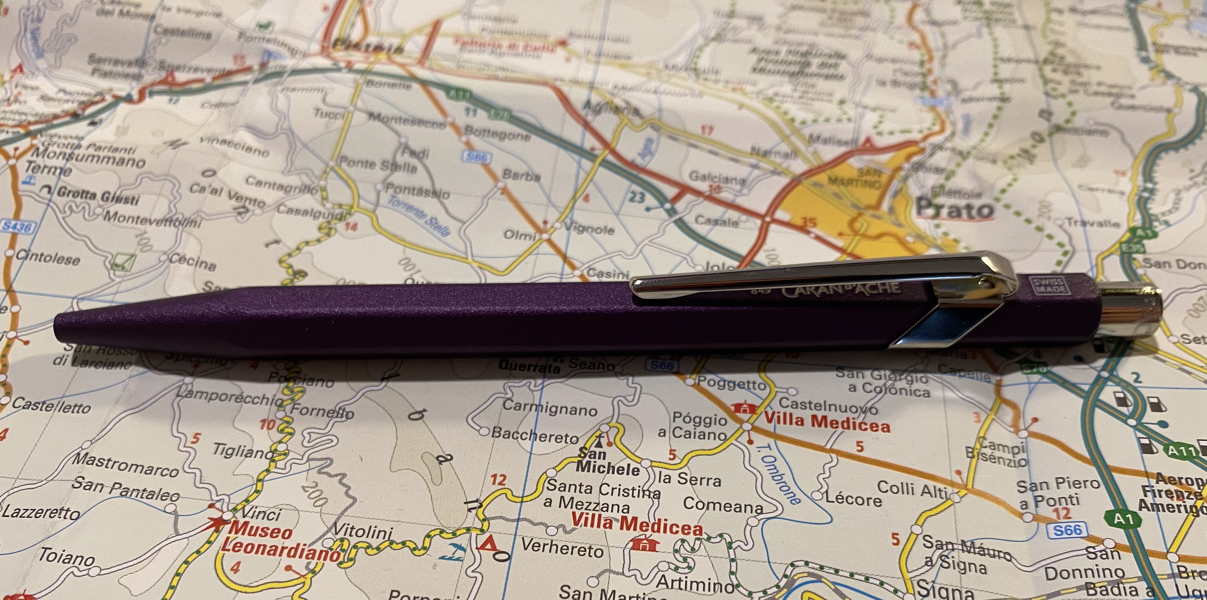
Look at that colour!

This came out darker than I would have preferred, but you can just about see the Caran d’Ache brand under the clip, and the “Swiss made” on top.

Swiss made.

The 849 Arpeggio is a lovely deep purple, and has a great texture to it. The non-smooth surface makes it much easier to grip than many of the other 849 pens. You can see the difference in texture here between the Arpeggio and one of the 849 Tropics pens:

Textured Arpeggio finish vs the glass smooth finish on the Tropics 849

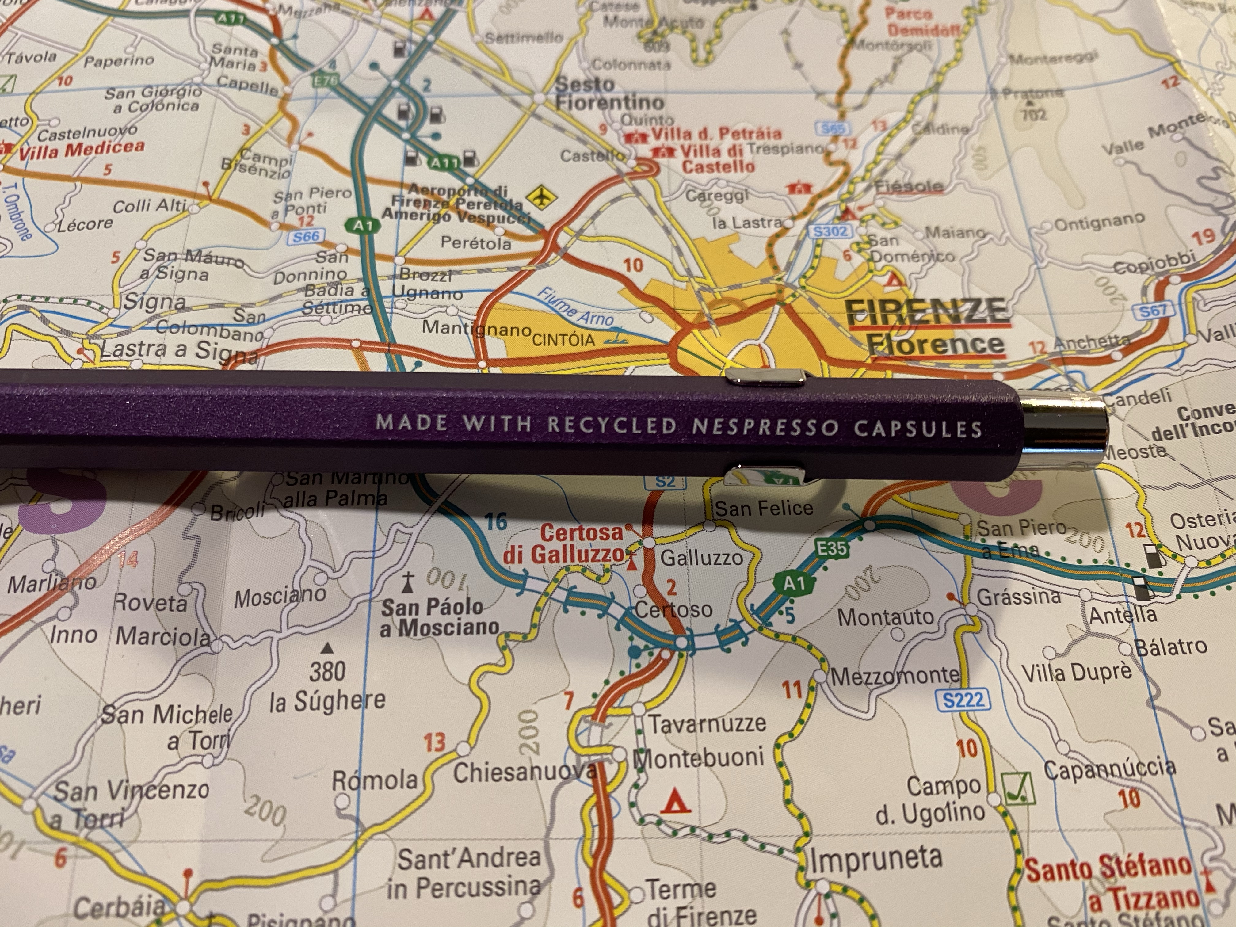
And here’s the by now familiar “made with recycled Nespresso capsules” tagline on the side:

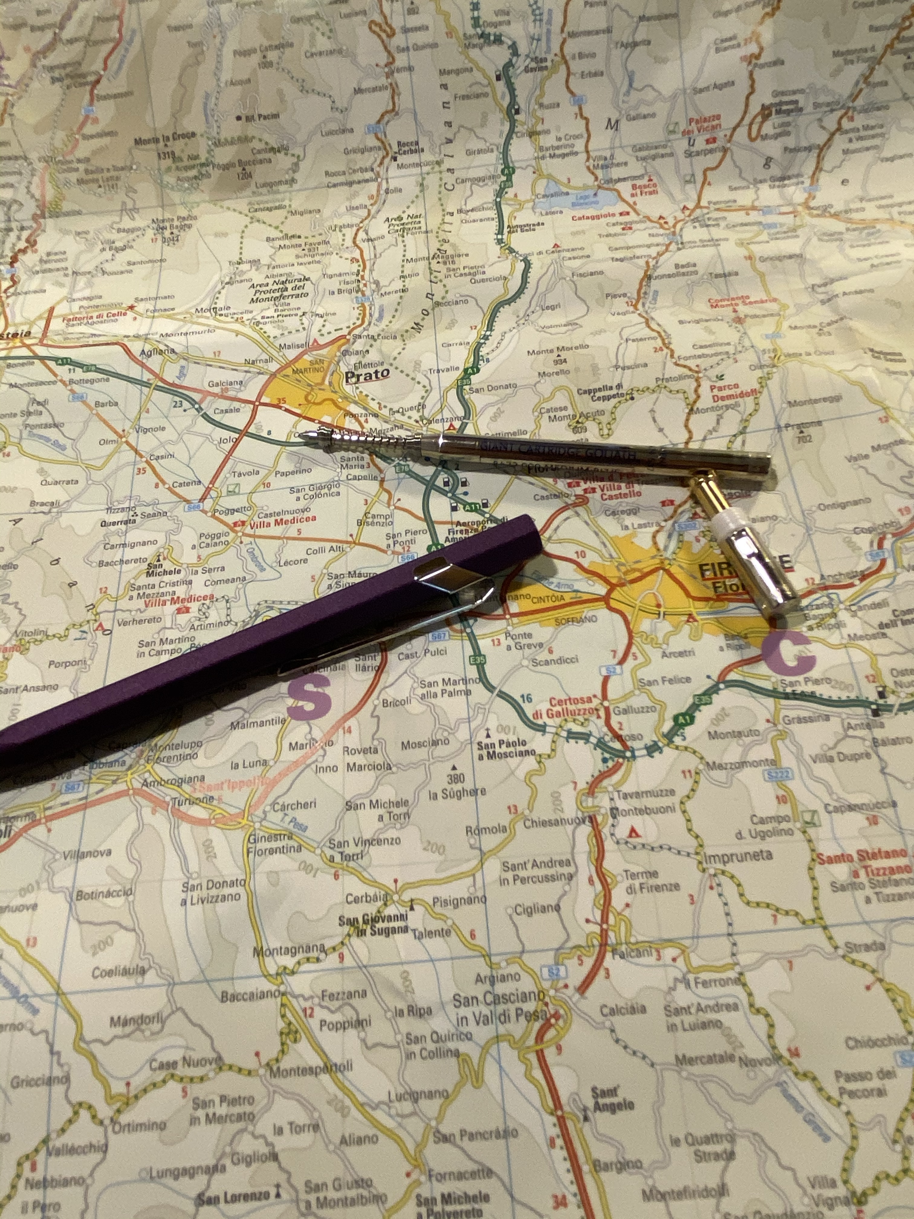
I changed the refill, and since somebody asked, I thought I’d focus on that for a bit. To change the refill you unscrew the clicker on top, and that might take a bit of fiddling, since it’s pretty securely screwed in. It doesn’t take force, just a bit of patience. Then take out the refill and swap it out with the new refill, and don’t forget to put the front spring on, preserving the right direction it was placed in when it came off.

Body, cap and original refill with the spring.

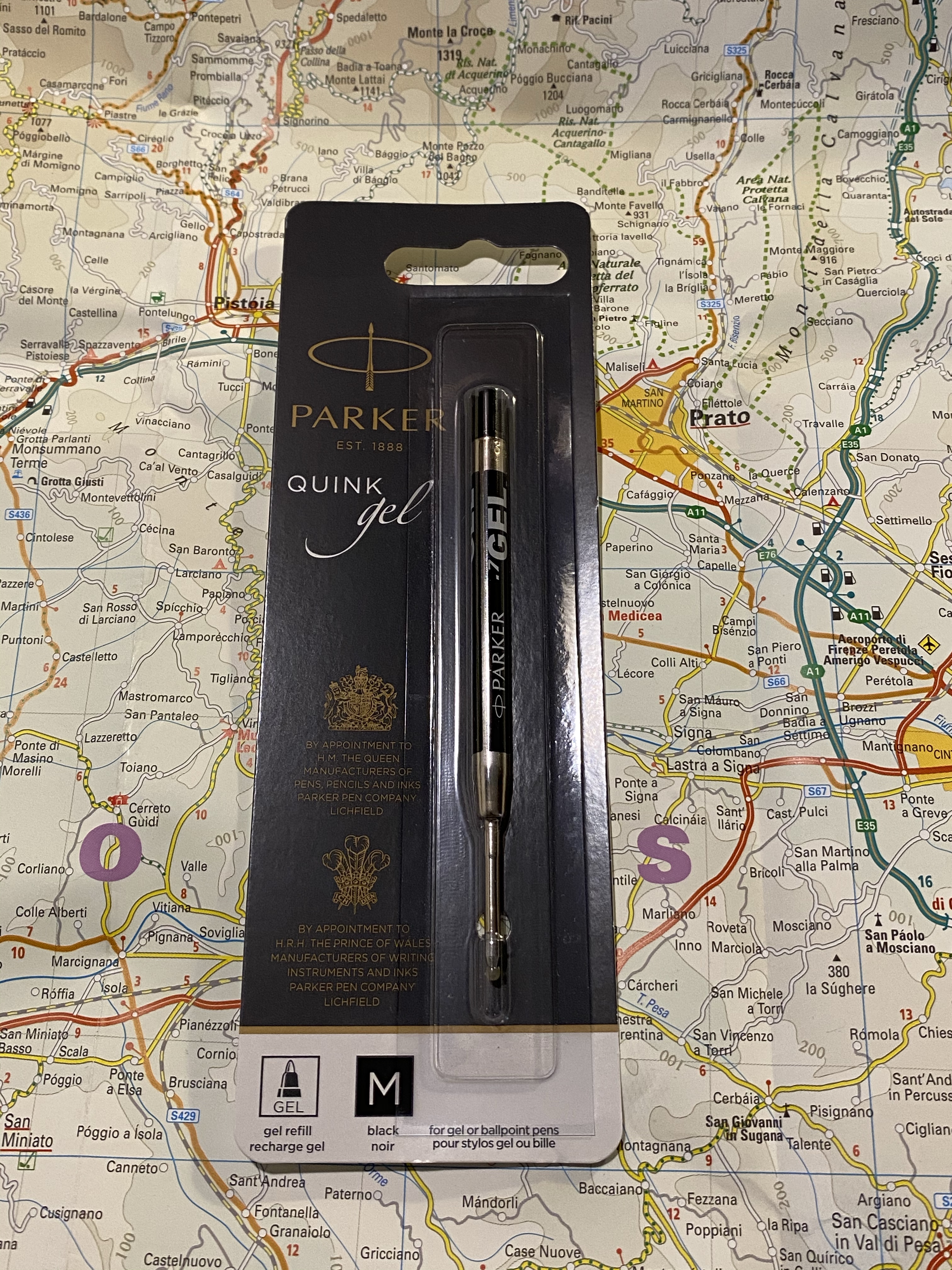
I replaced the original Caran d’Ache Goliath ballpoint refill with the Parker Quink medium gel refill (it’s 0.7 mm). Here it is in the packaging in case you’re looking for it. I bought a pack of these from the excellent, excellent CultPens (I’m not being paid to say this, I just really appreciate them and what they’re doing. If you’re a non-US pen addict in particular I recommend checking them out).

Here’s a writing sample with the Caran d’Ache Goliath ballpoint refill and the Parker Quink gel refill. If you’re a fan of ballpoints, the Goliath refill is excellent. I just happen to not like ballpoints, so I change them to gel refills whenever I can.

The Caran d’Ache 849 Arpeggio is a beautiful pen that would make for a great gift (if you can bear to part with it). I can’t recommend these series of pens enough, and I can’t wait to see what next year’s edition will be. Nespresso’s capsules come in a variety of pretty nifty colours, so I don’t think that Caran d’Ache can really miss with them.

Parker Quink Blue Black Ink Review

Parker Quink Blue Black is far from a new ink on the market: it’s been produced and in use for decades. So why bother to write a review about it now?now

Because Covid-19 happened, and it’s turned shipping and shopping into a challenge, and so I have found myself seriously contemplating a “desert island” kind of question:

If the only ink you can buy is ink commonly found in brick and mortar shops, which ink should you buy?

The obvious answer for me is anything Waterman, but specifically Waterman Blue Black, now renamed to “Waterman Mysterious Blue”. But Parker Quink Blue Black is just as readily available, and just as cheaply priced (more or less), and also a workhorse, utilitarian ink that packs a few surprises. So why is it not my go to ink? I’ll get to that near the end, I promise.

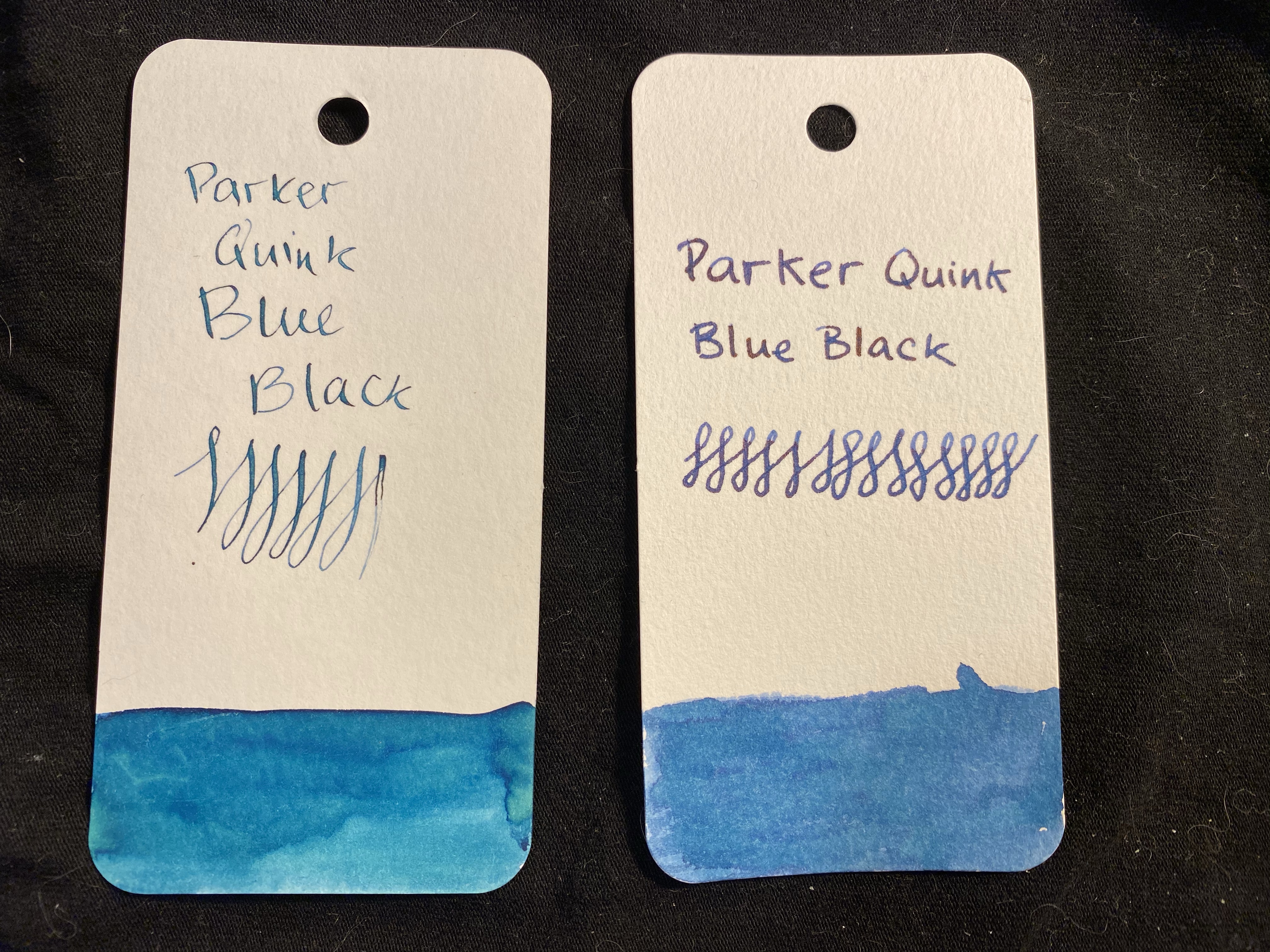
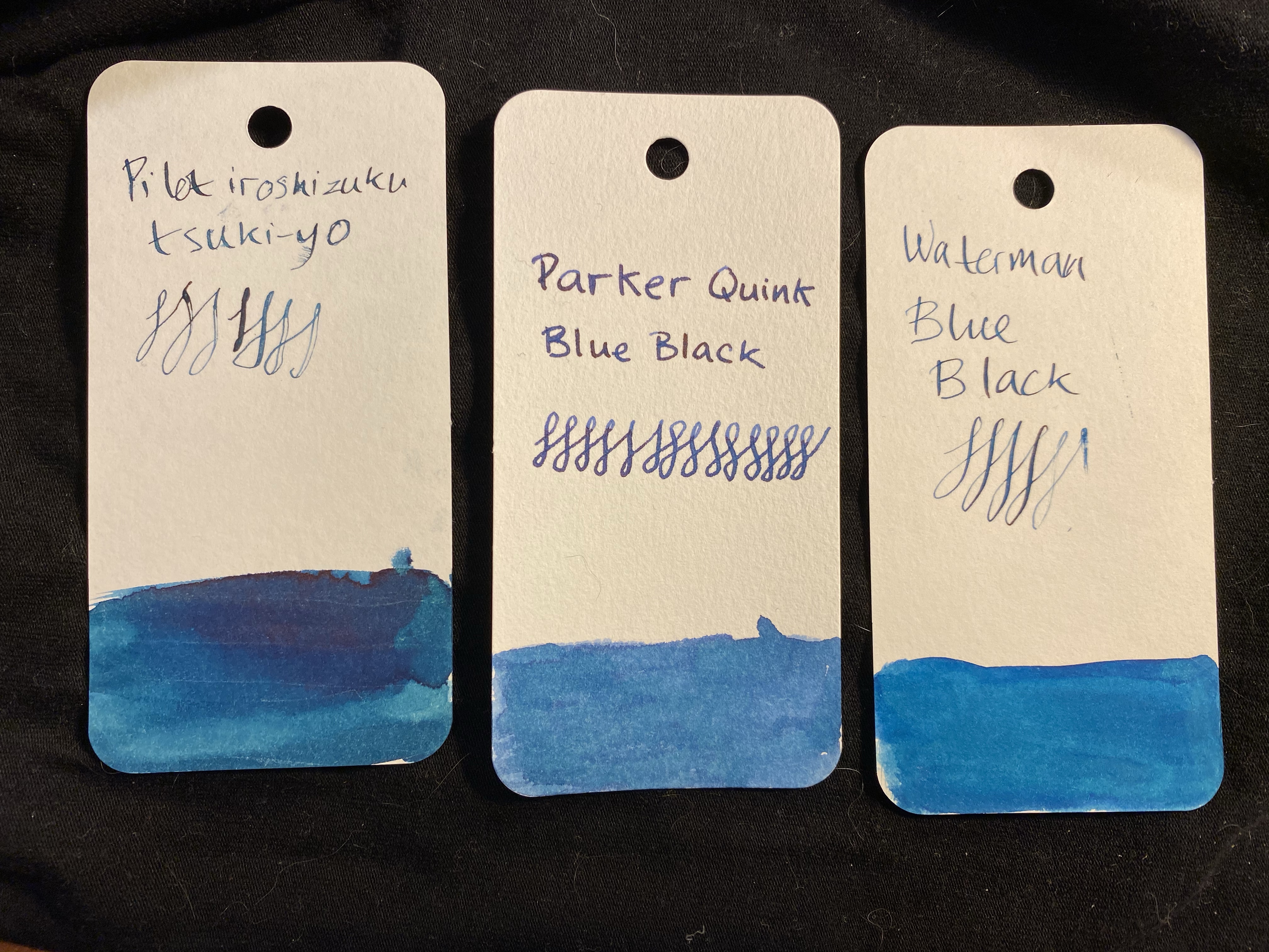
Two swabs of the same ink: how are they so different?

I took two swabs and writing samples of the Parker Quink Blue Black, mainly because I thought that the first swab didn’t show off the correct colour of the ink. The left hand writing sample was done with a dip pen, and the swab was done with a brush. The right side was done with Henry Simpole’s Jasmin pen and a Conway Stewart medium nib, with the swab being done with a q-tip. The right hand sample is truer to the colour of the ink, although you can get a more teal/turquoise colour out of the ink in certain nibs (as is true with Waterman Mysterious Blue). This changeability is part of the charm of blue-black inks.

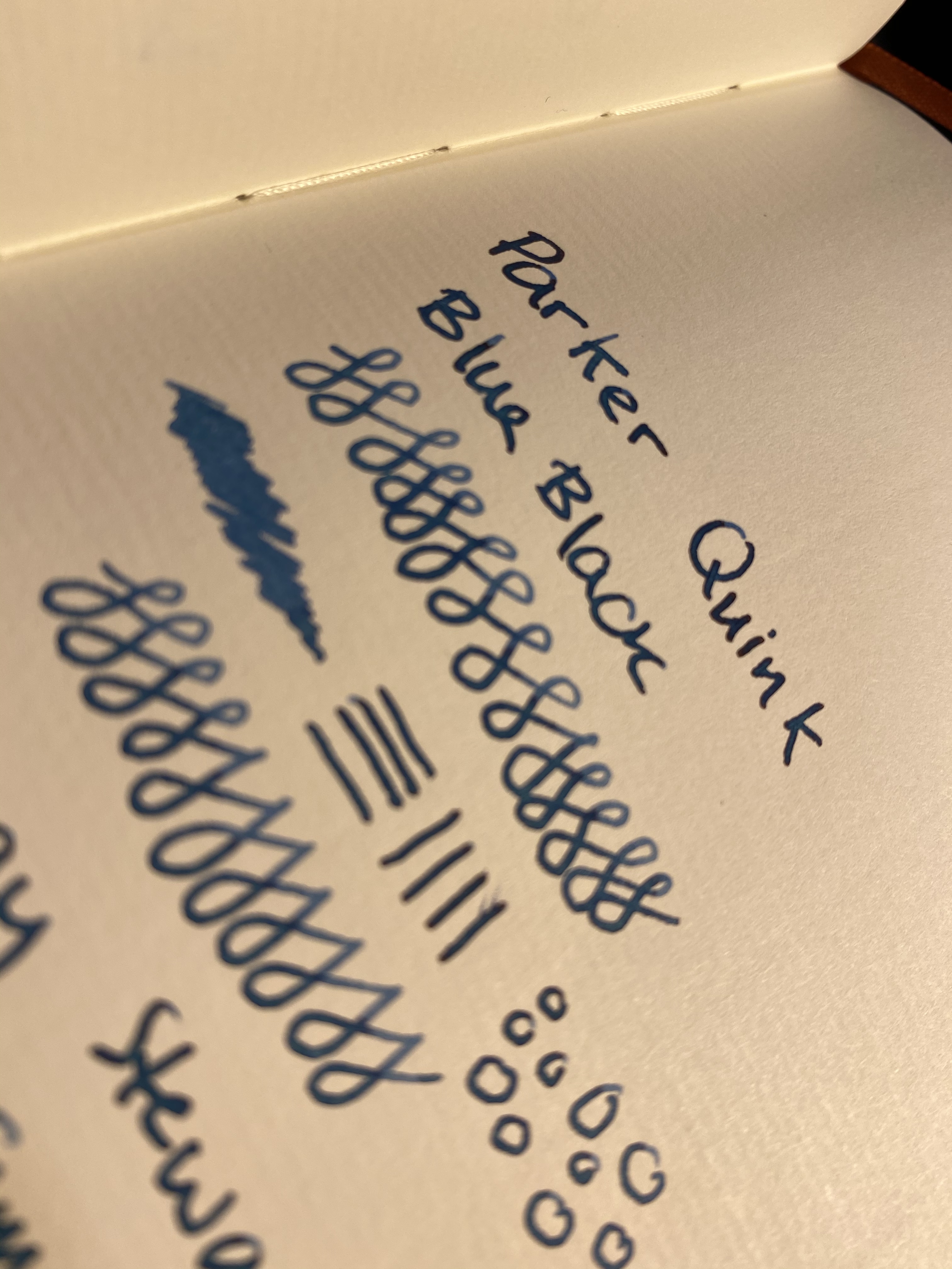
It’s also worth noting that Parker Quink Blue Black both shades and has a red sheen, so it’s far from a bog standard, boring ink. Here’s an ink that can be fun at the same time as it makes you look serious.

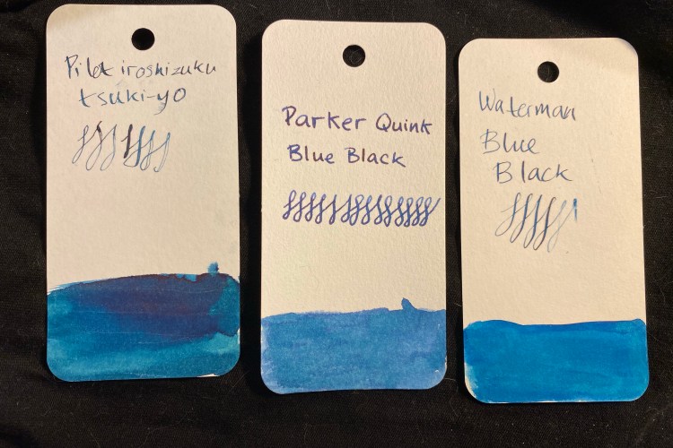
Comparison swabs.

Waterman Mysterious Blue leans a bit more into the teal/turquoise side of things, but it doesn’t sheen as much as Parker Quink Blue Black. Here’s the ink on Paperblanks paper (I snagged a fountain pen friendly Paperblanks a few years back and have been using it to test inks ever since):

You can see the shading particularly in my swirls.

There’s a red sheen even on the Paperblanks paper, in every spot where the ink pooled (so the bottom half of these letters for instance):

If you can’t see the red sheen, look at the sample below.

And here it is on Tomoe River paper, showing off shading and sheen. The photo came out a shade lighter than in reality, but that was the only way that I could show some of that sheen off.

Parker Quink Blue Black is neither waterproof or water resistant, just like Waterman Mysterious Blue. Yet it takes a bit more time and effort to clean the Parker ink out of pens than the Waterman’s (my gold standard for easy cleaning ink). It’s vintage pen safe, and an excellent staple ink, available practically everywhere that sells stationery or art supplies. In times where shipping prices have skyrocketed and many places no longer offer shipping to all destinations, it’s good to know that there are still good, cheap and widely available ink options out there.

Stay safe and stay as much as possible at home.

Ti Mini Review

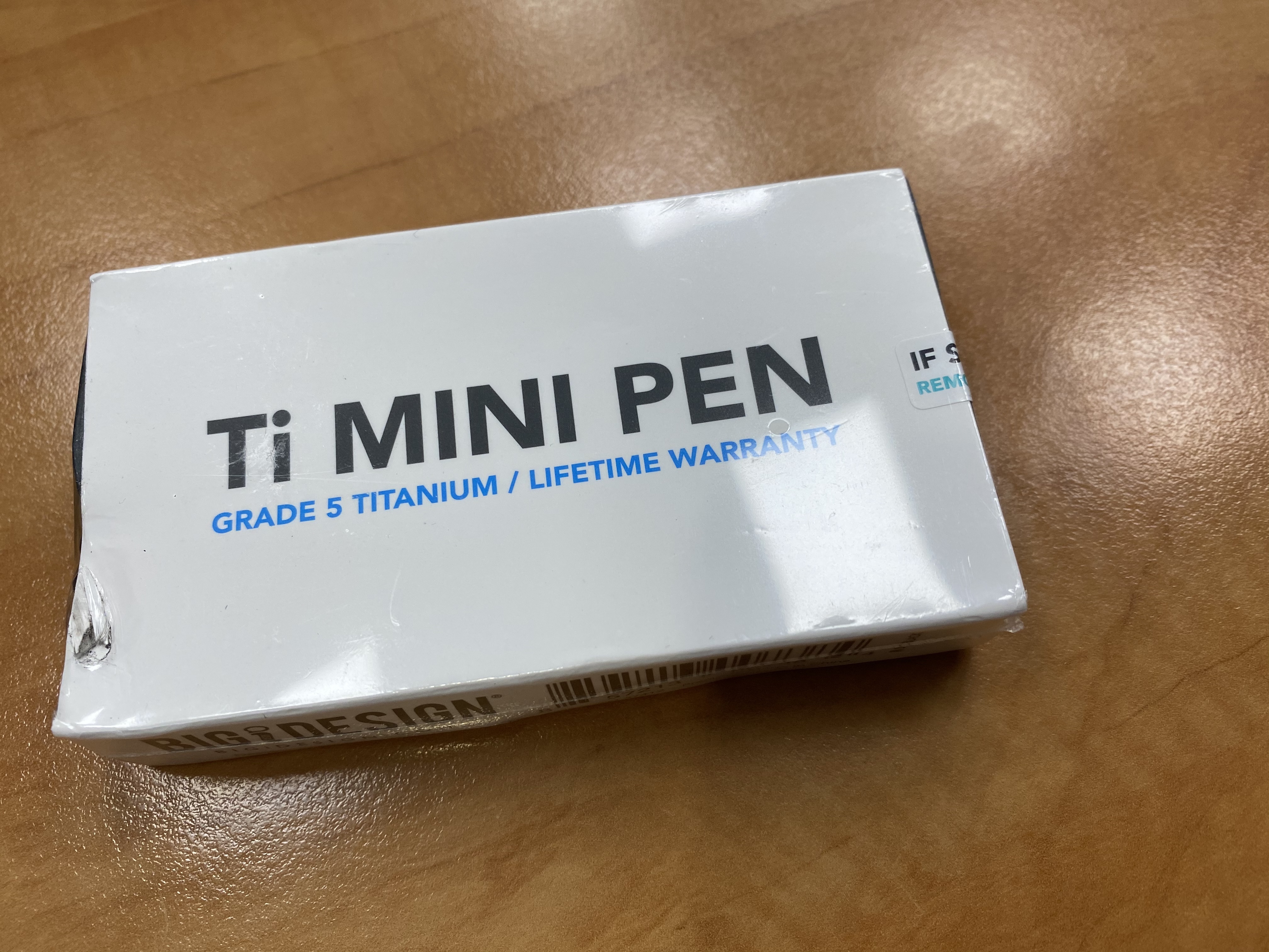
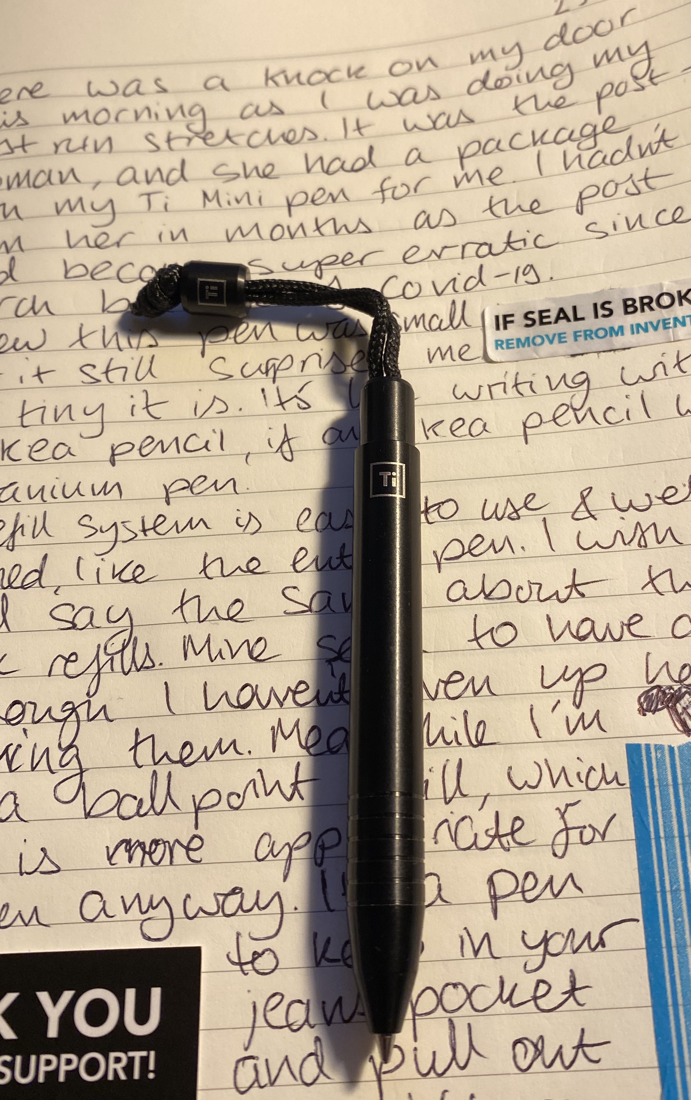
Look what arrived in the mail today! It’s the Big Idea Design Ti Mini, fresh from their latest Kickstarter. I generally love all Big Idea Design pens (except the for the click, which I still enjoy, though it’s not my favourite), but I still hesitated before backing this one. The form factor is so “extreme” that I wasn’t sure that I’d like it or find use for it. A small pocket pen (i.e. a pen that’s small even for a pocket pen), the Ti Mini is a titanium machined pen that uses D1 refills and is basically built for the watch/change pocket of your jeans. It’s the emergency pen you pull out when you need to scribble something on a note, something that you can carry around without even remembering it’s there until you need it.

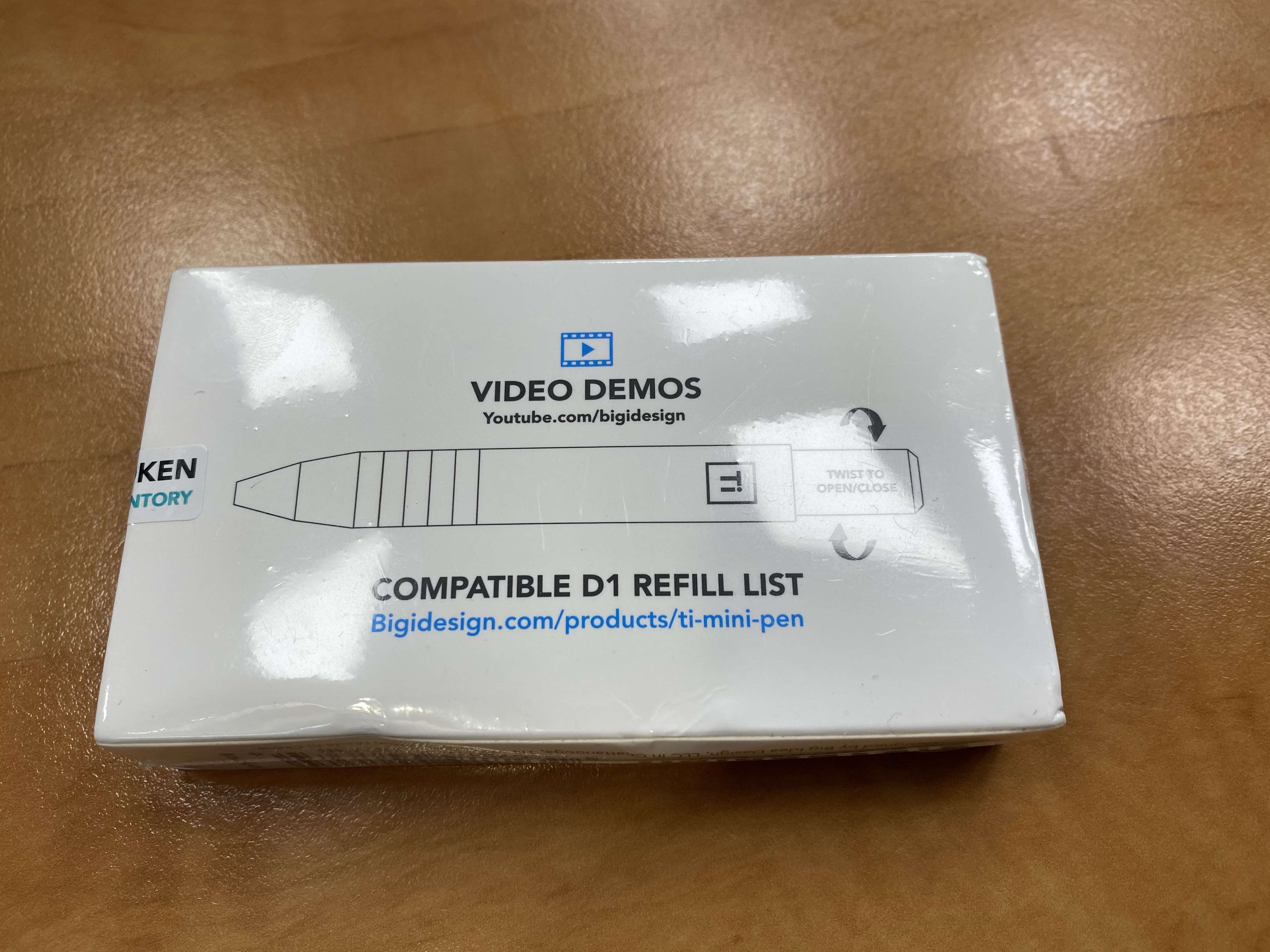
The post was enthusiastic so the package got a bit smashed in transit.

The packaging is standard Big Idea Design: utilitarian, full of useful information, well thought out and designed and with a bit of an Apple vibe to it.

Smashed package, but you get the gist
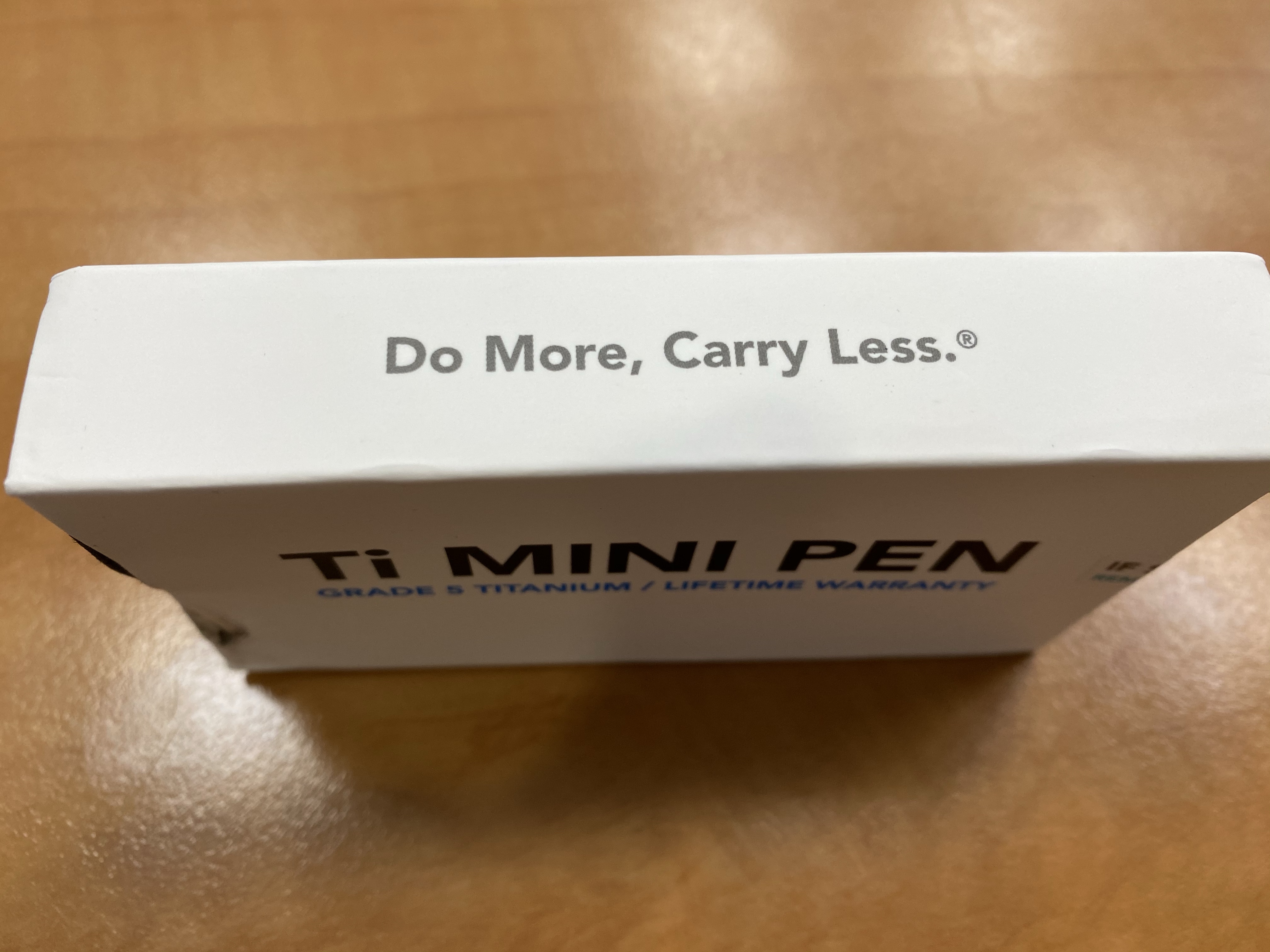
That is just a great tagline
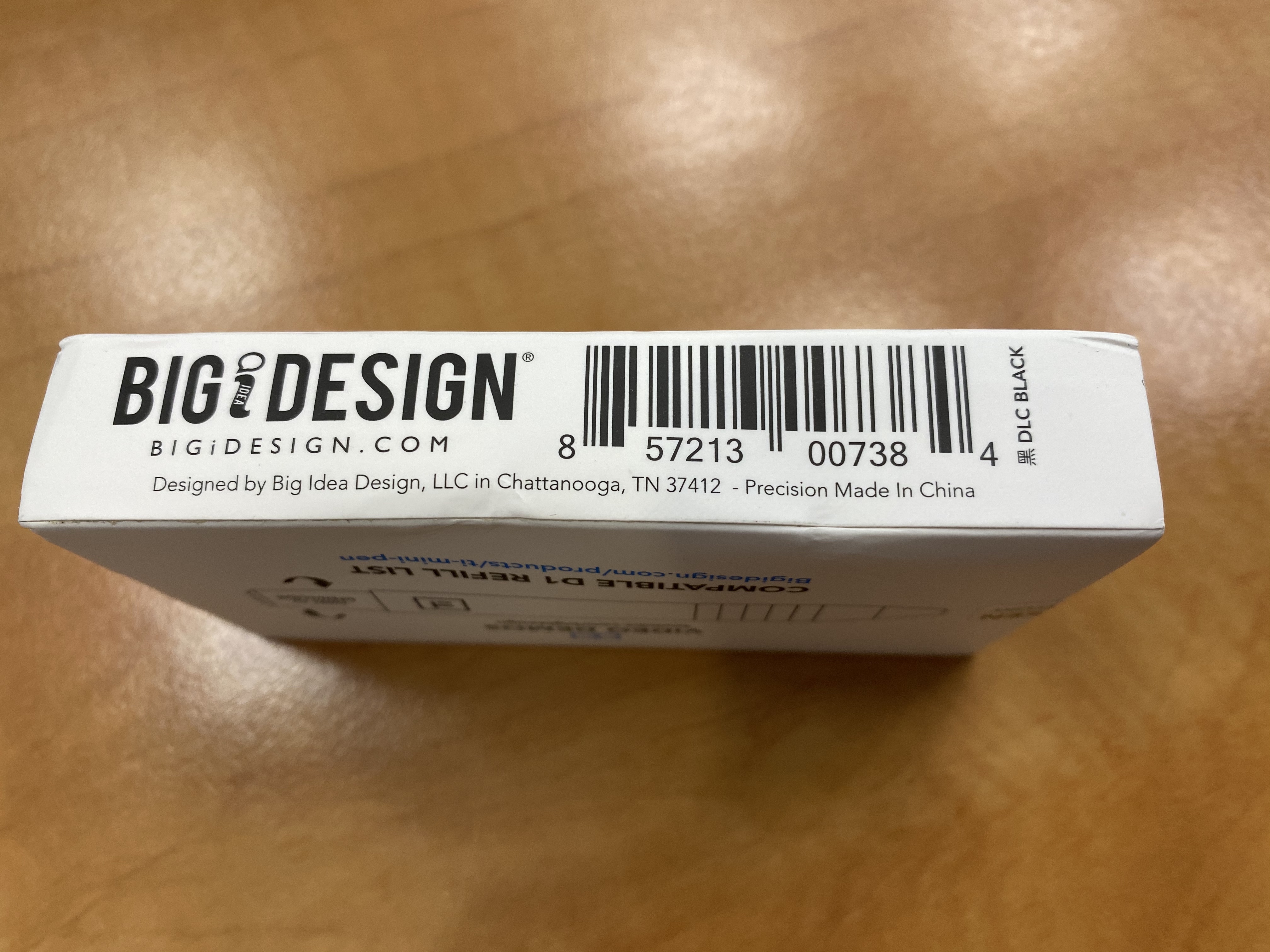
Designed by Big Idea Design, Made in China. Remind you of something?

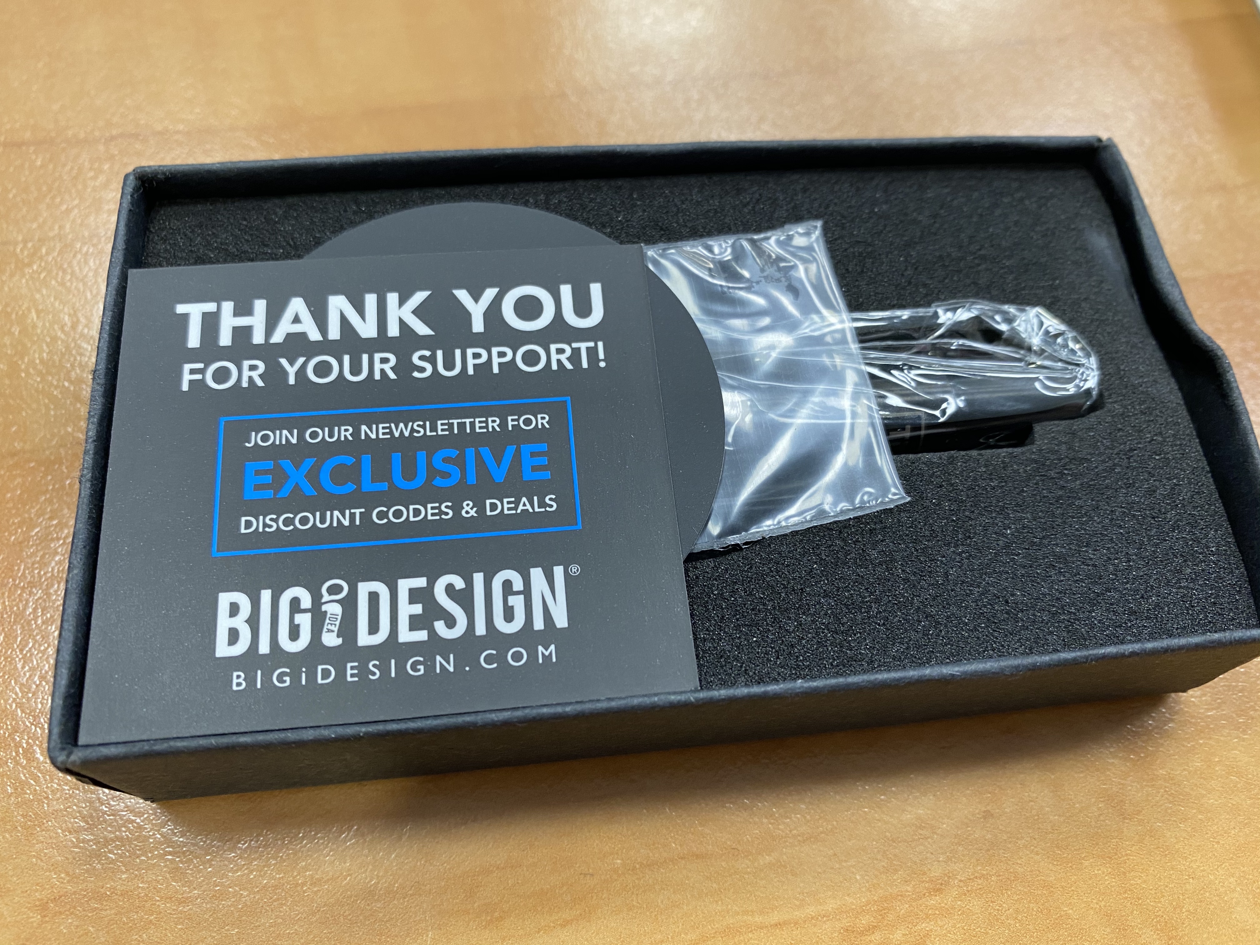
There’s a bit of marketing material when you open the box, but I’m just going to pause and say that I’ve paid a lot more for machined pens that weren’t half as well packed as this, and the reason that my pen survived the rough-handling that my package received is because someone took the time to consider good packaging. And I’m not even someone who usually appreciates packaging (unless it’s particularly good or downright insultingly bad).

Not a scratch on the pen even though the box was smashed in.
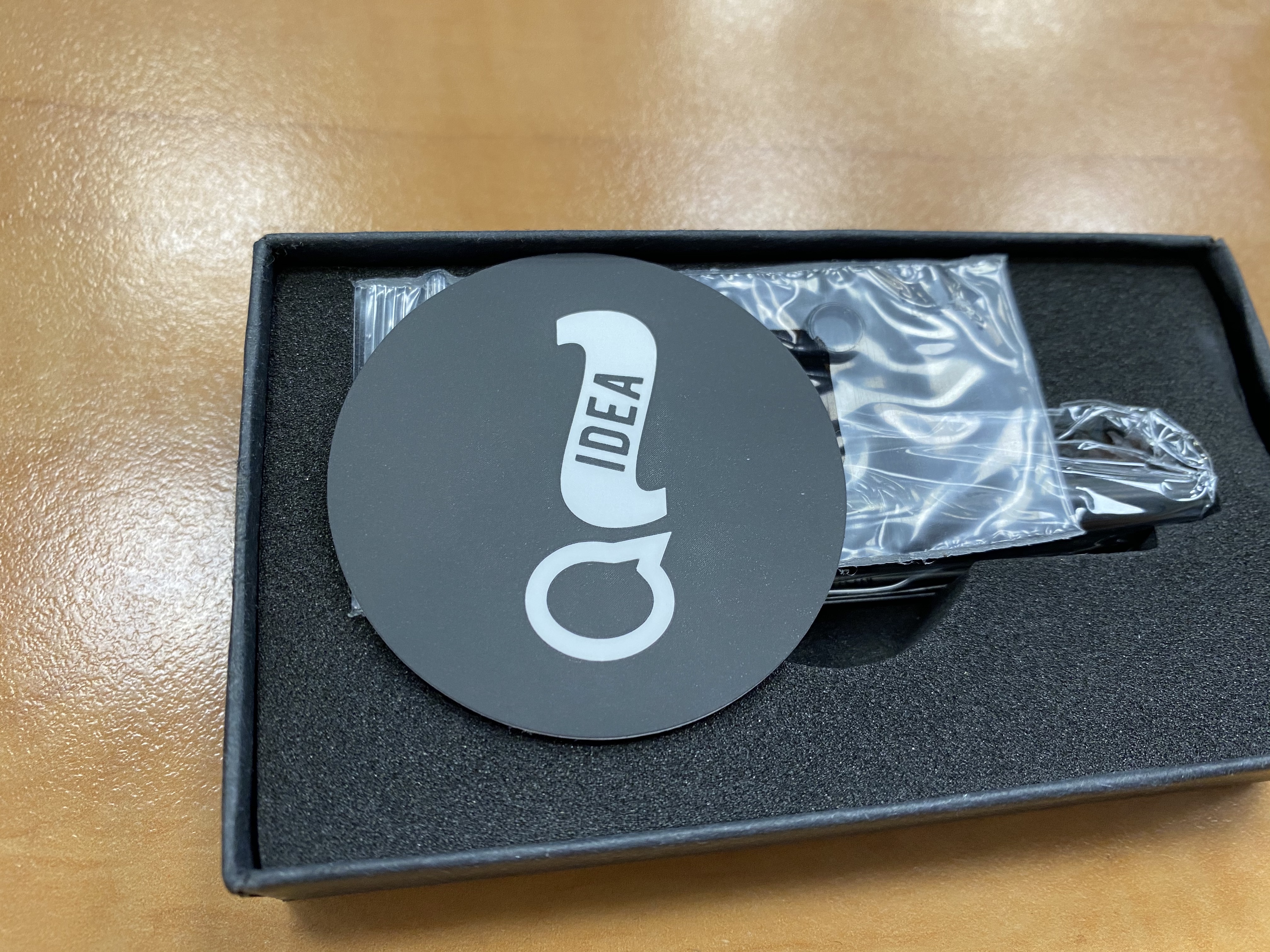
Nice logo sticker to go with the pen.

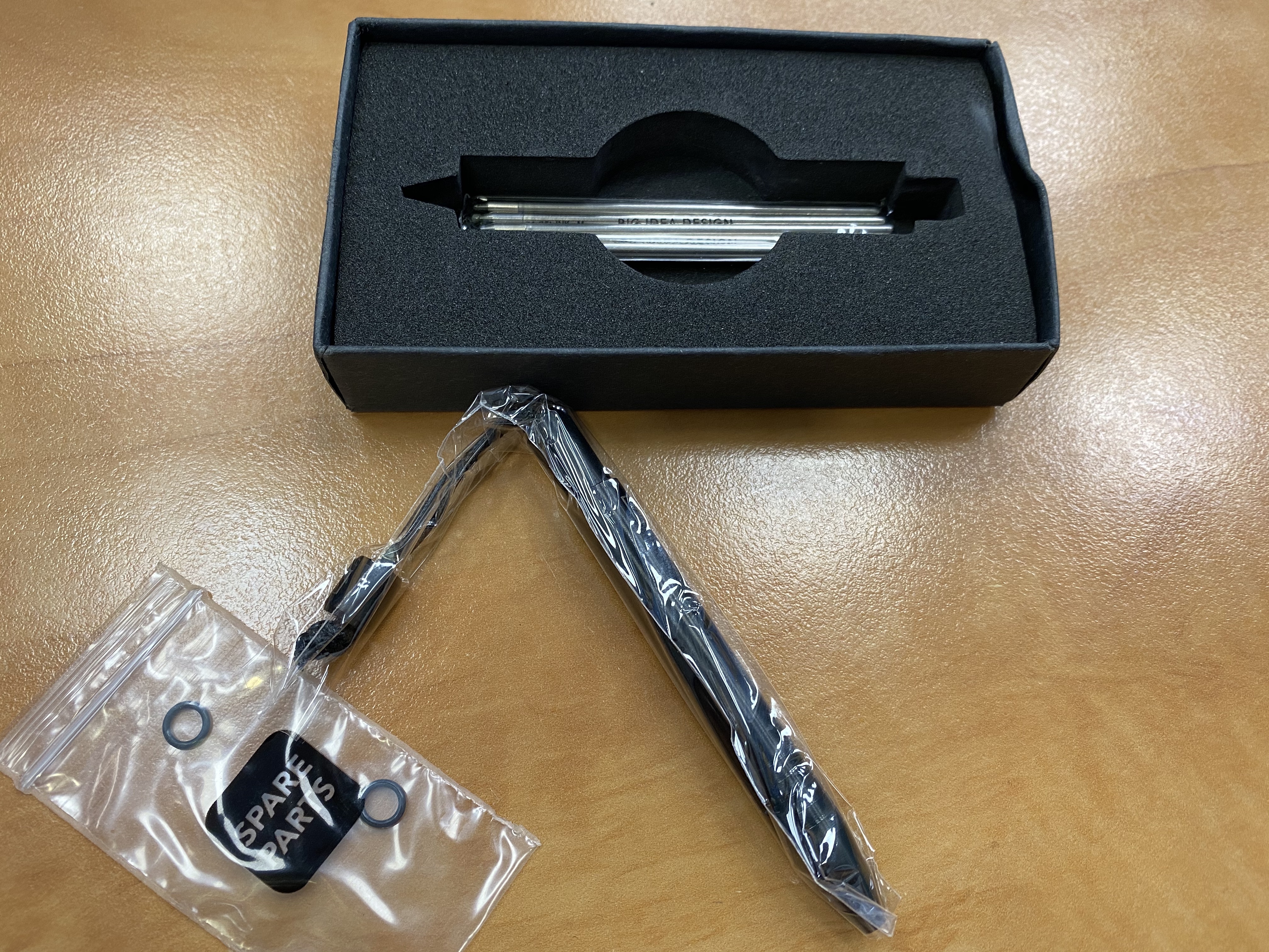
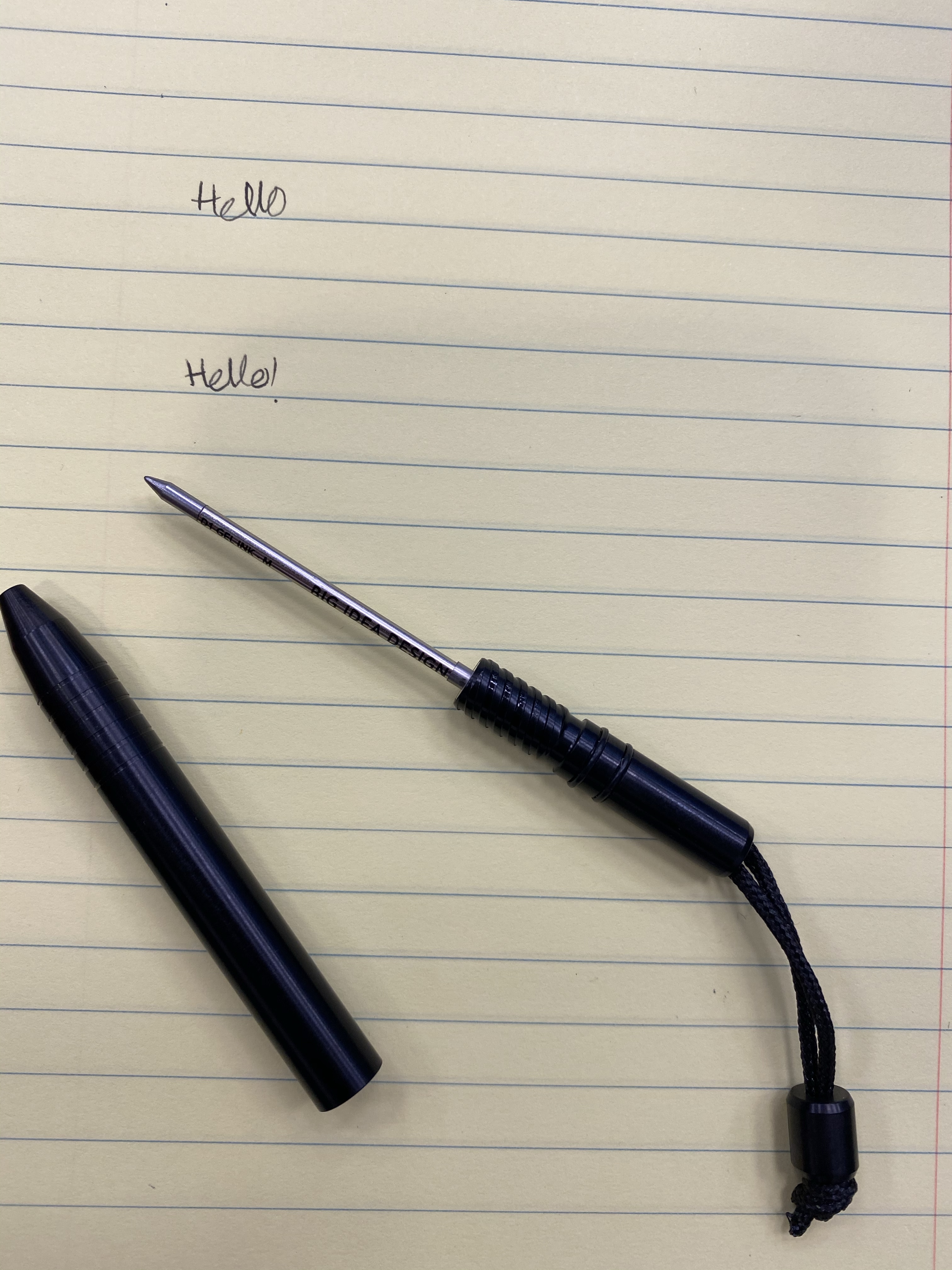
The Ti Mini comes with two spare o-rings and six D1 refills: three gel ink refills (one in the pen, two others in the refill bag), and three ballpoint refills. All refills are Big Idea Design branded, and all of them are medium refills. You have everything you’ll need to write with this pen for months if not for years, right out of the box.

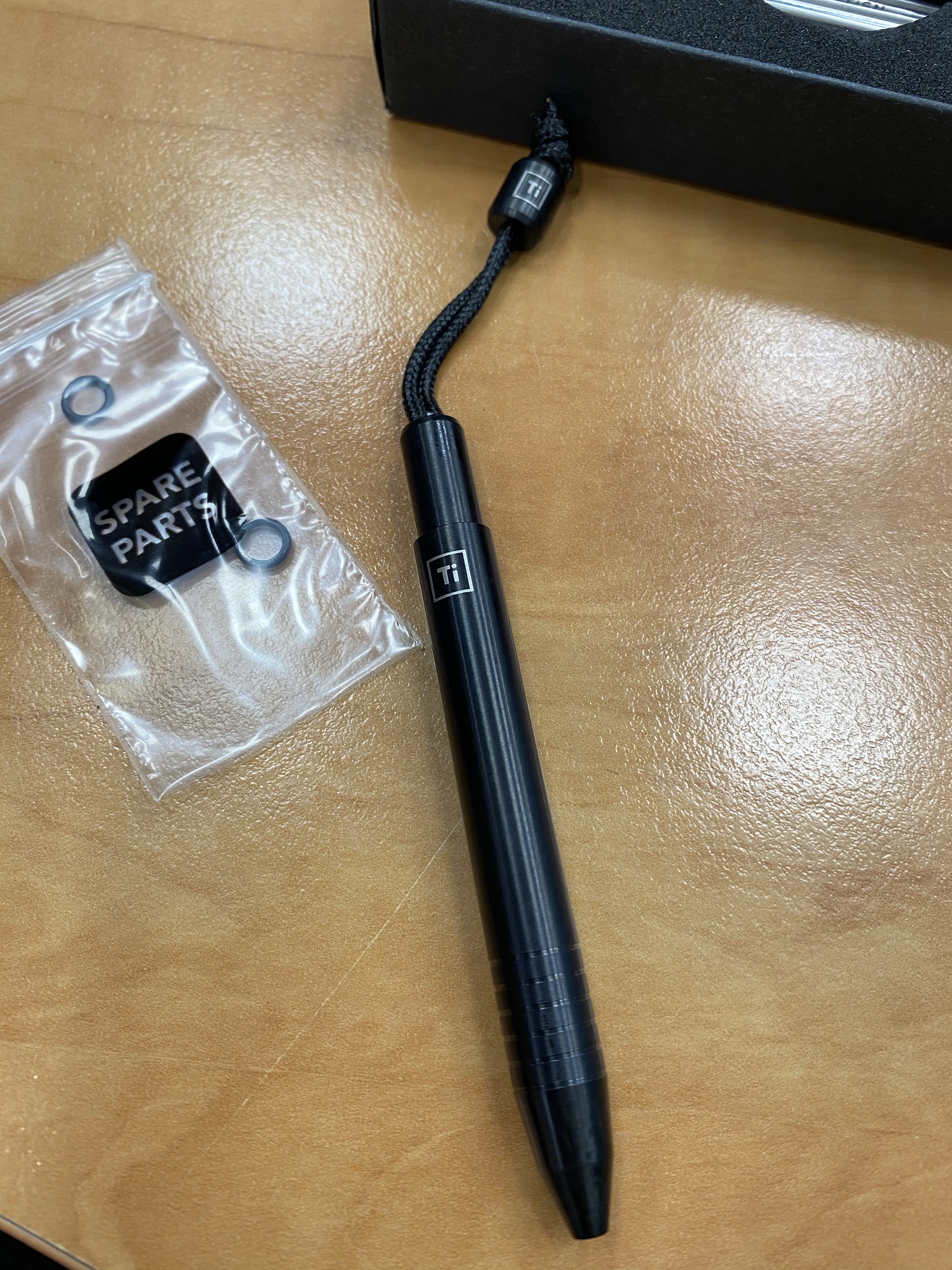
The Ti Mini in DLC Black

The pen has the classic look of any Big Idea Design pen, with an addition of a titanium bead at the end of a lanyard, to make it easy to pull out of your jeans’ change pocket. It’s an extremely well designed pen, built perfectly for its purpose.

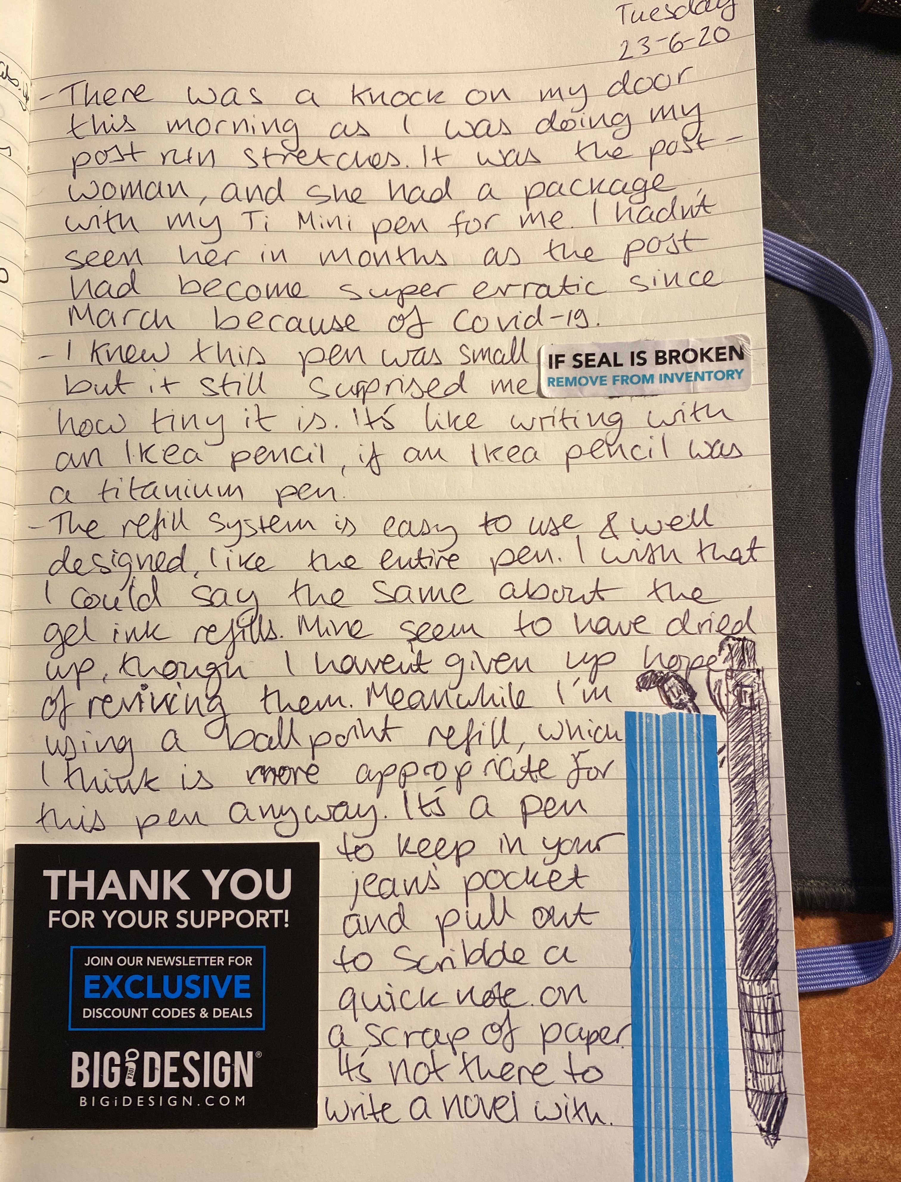
The Ti Mini isn’t built for long form writing, but for a few lines and a scribble when you’re on the go it’s perfect. The gel ink refills that came with my pen seem to be duds, which is a shame, and the only strike agains this pen purchase. It’s not too bad though, because if there’s a pen that calls for a ballpoint refill, it’s this one.

Changing refills is a breeze: unscrew the top, and then unscrew the refill, replacing it with another D1 refill by simply screwing the refill in and then screwing the top back on.

If you’re looking for an “emergency” EDC pen, something that’s always there and ready for when you really need it, the Ti Mini is perfect for the job. It also makes for a great gift pen, even though now is not the time when people travel around much (stay at home!). Just be careful not to forget about it and leave it in you jeans when you wash them. The pen will survive, I’m not so sure about the washing machine…

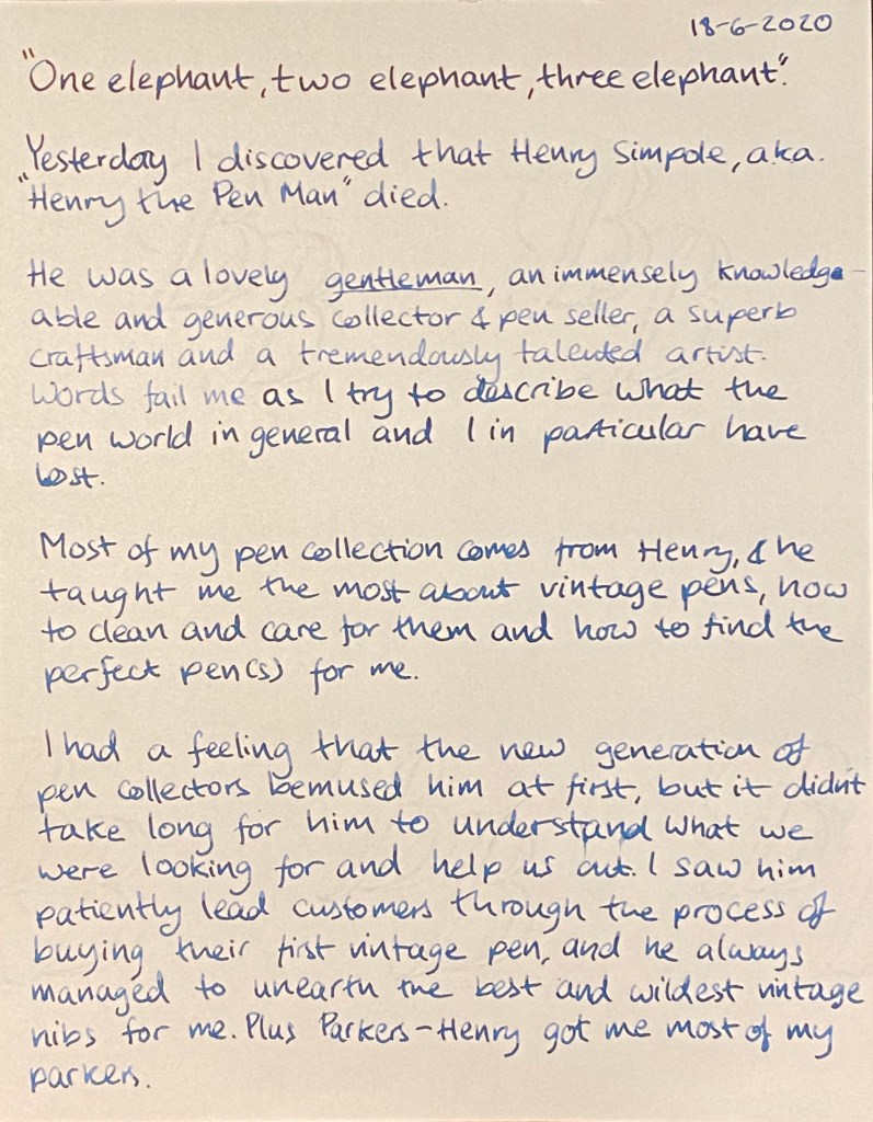
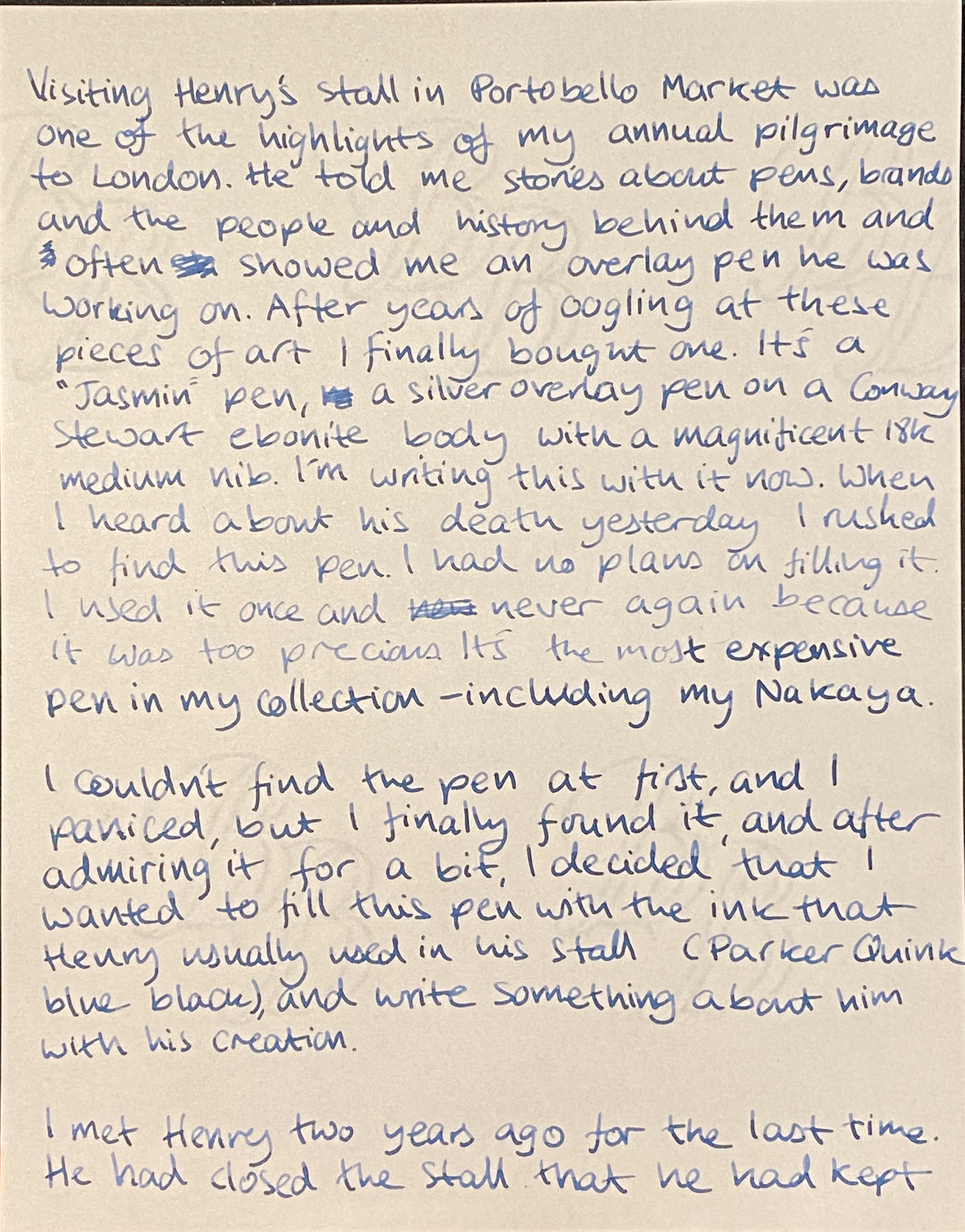
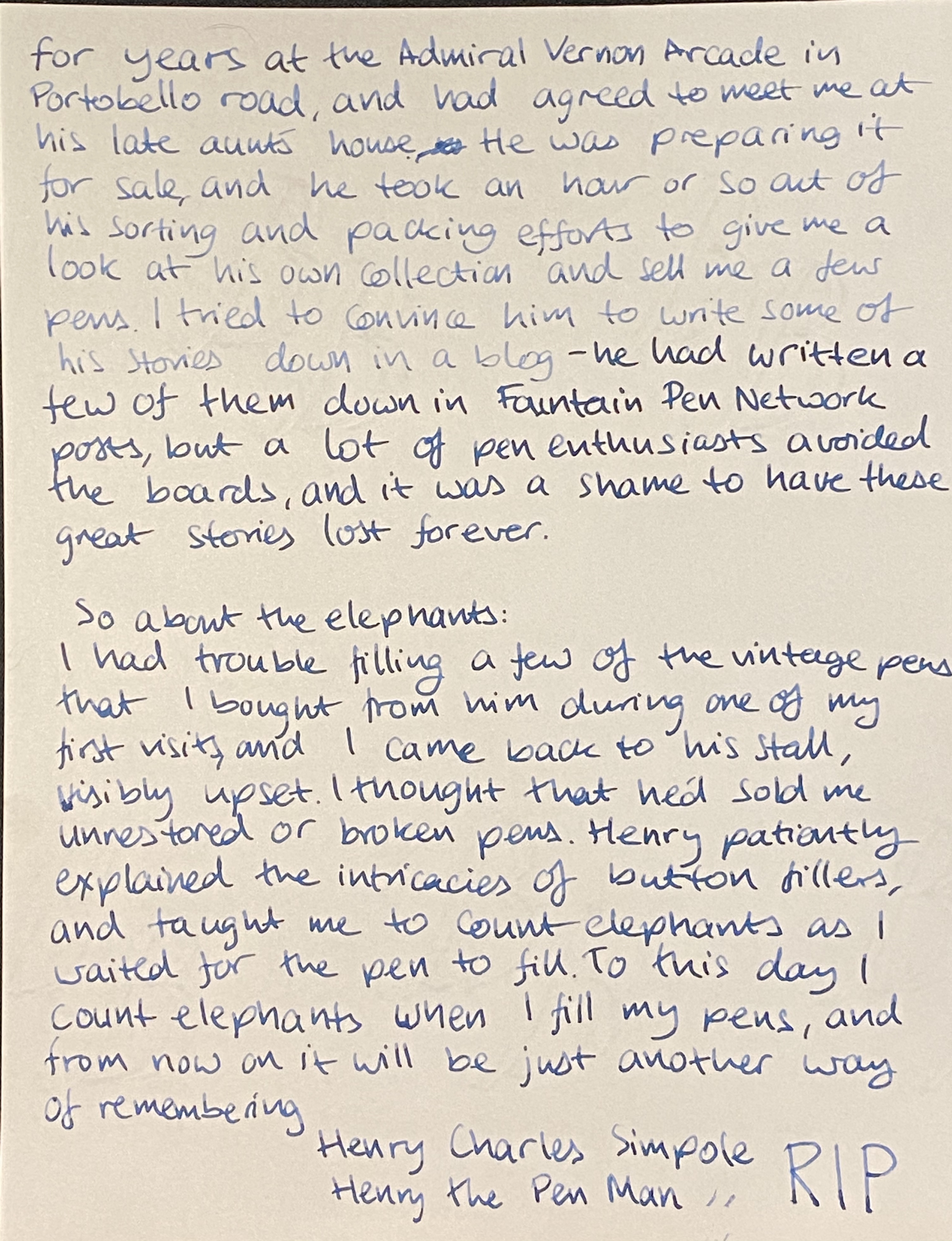
Henry the Pen Man

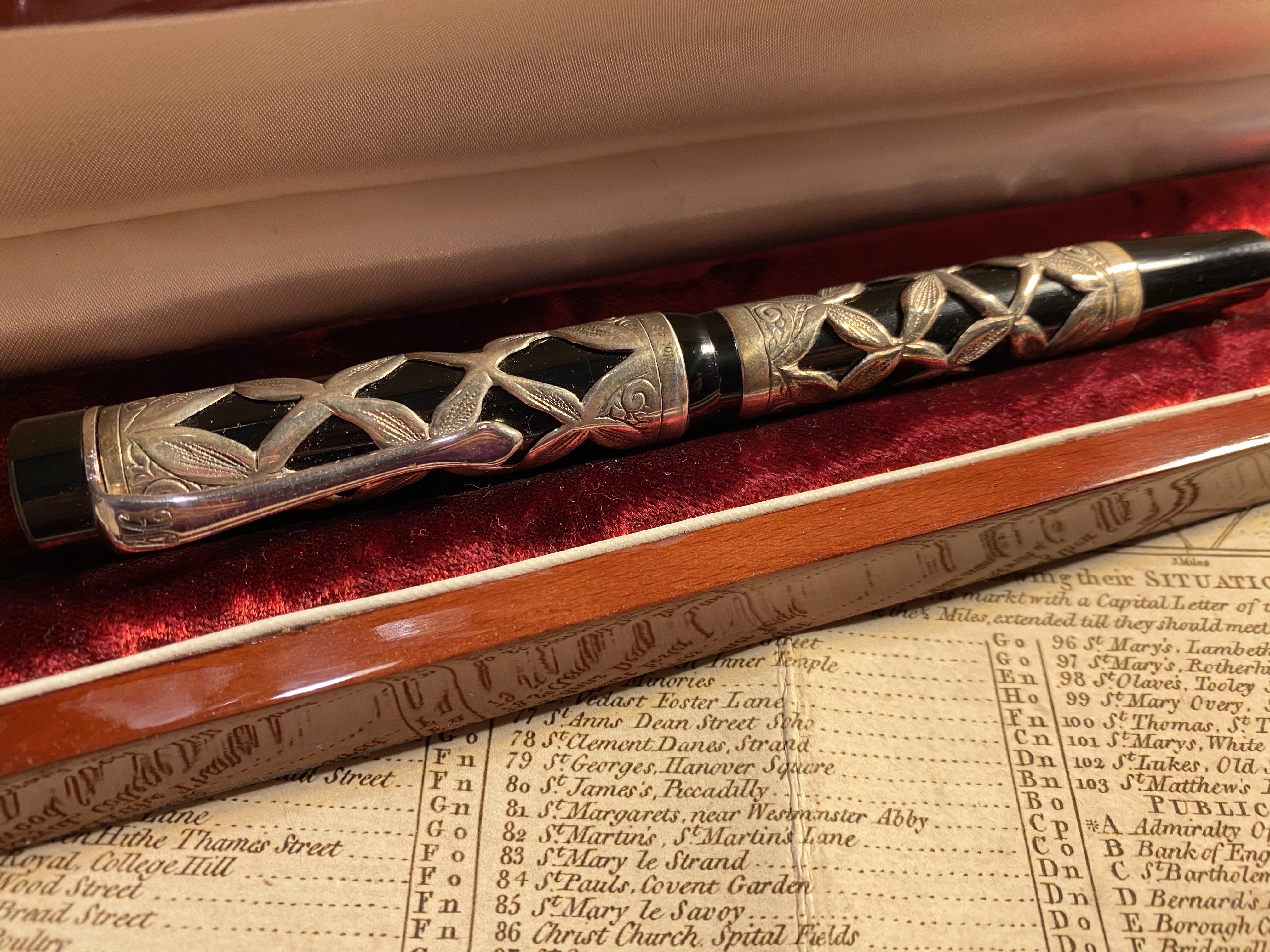
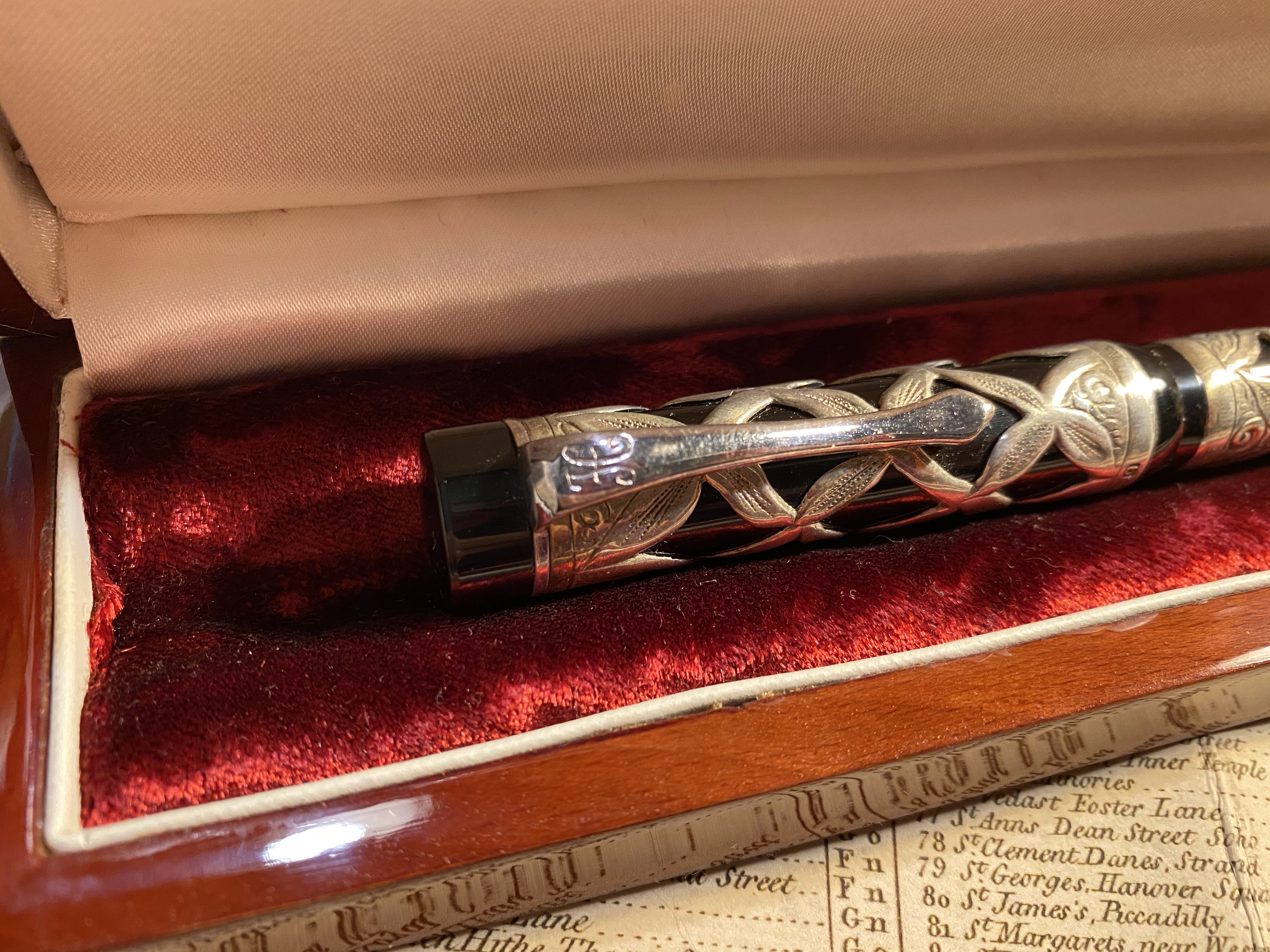
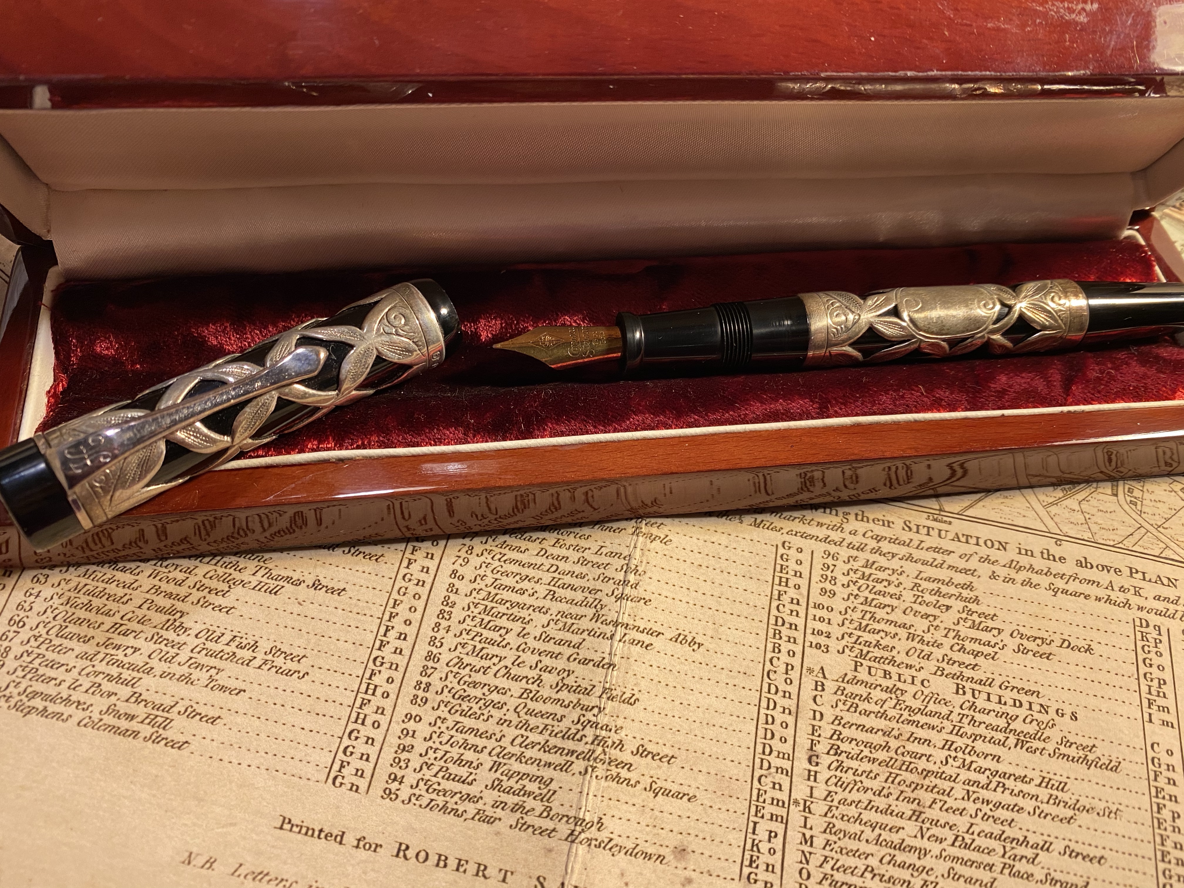
Find out more about Henry here on his site, and here on the famous “Has anyone heard of Henry Simpole” threads (one and two) on the Fountain Pen Network. Henry’s moniker was Truffle Finder. People are writing kind words and their memories of time spent with Henry here.

This is my favourite Henry story, and if you’re remotely interested in Esterbrook you should give it a read.

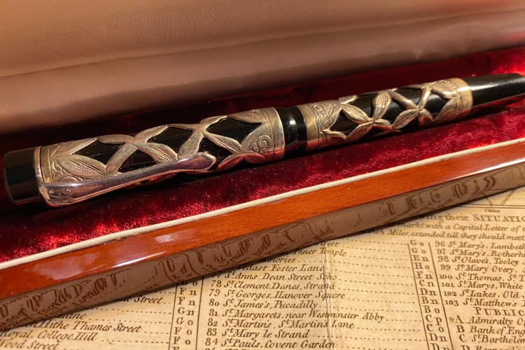
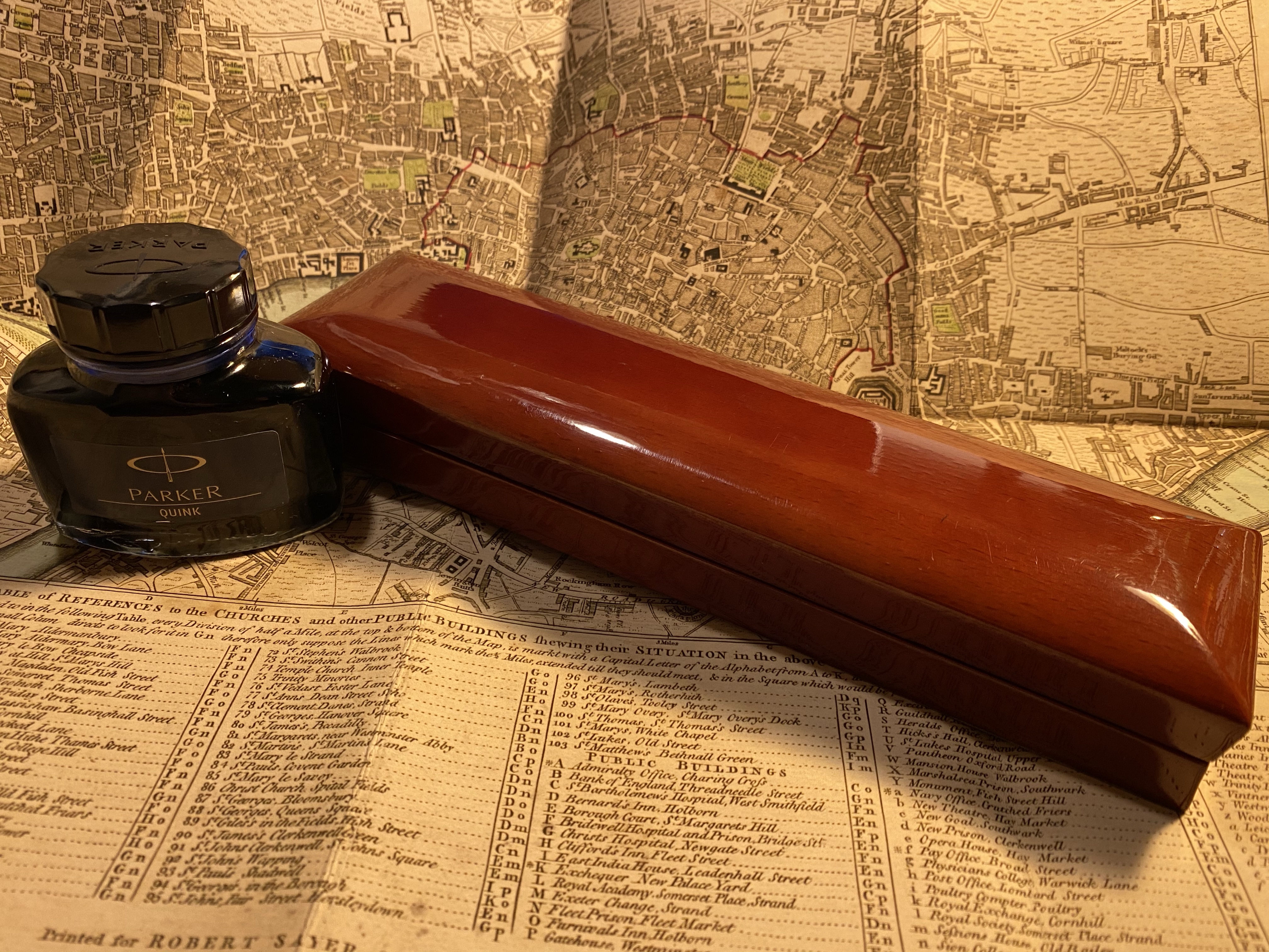
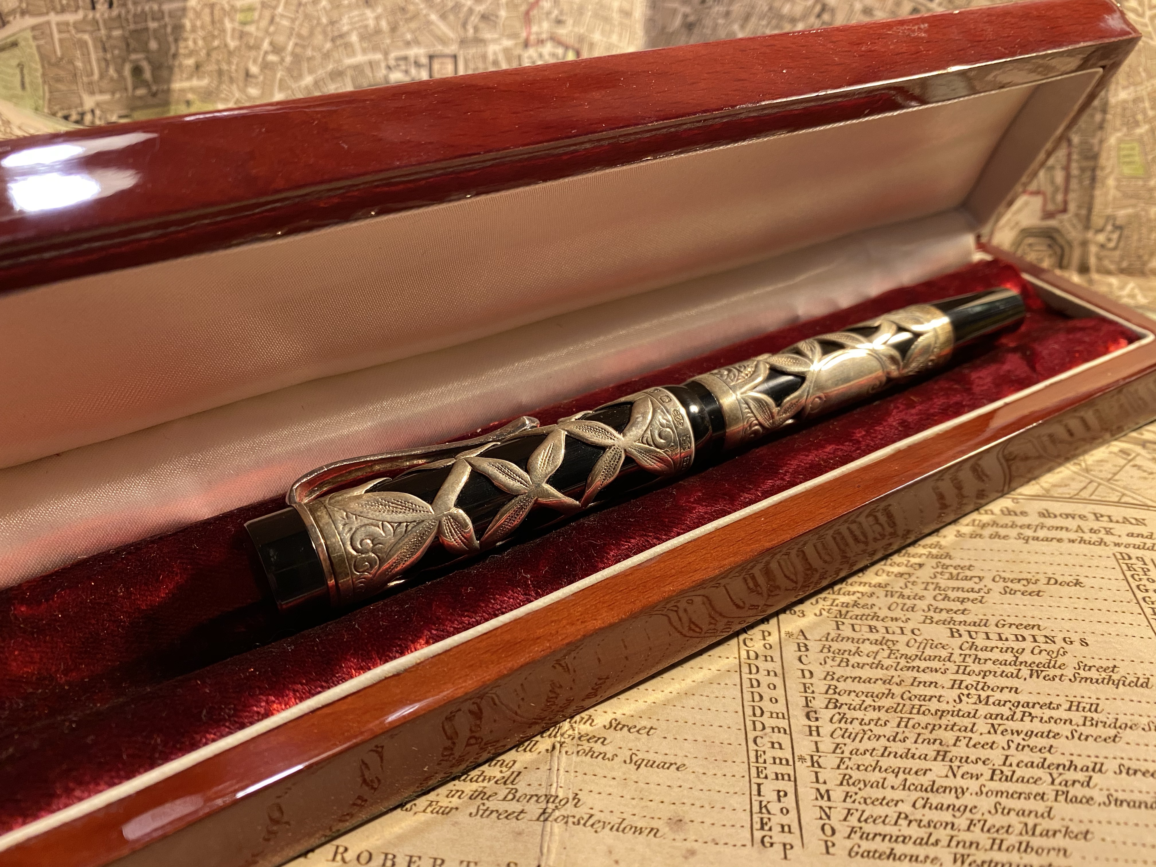
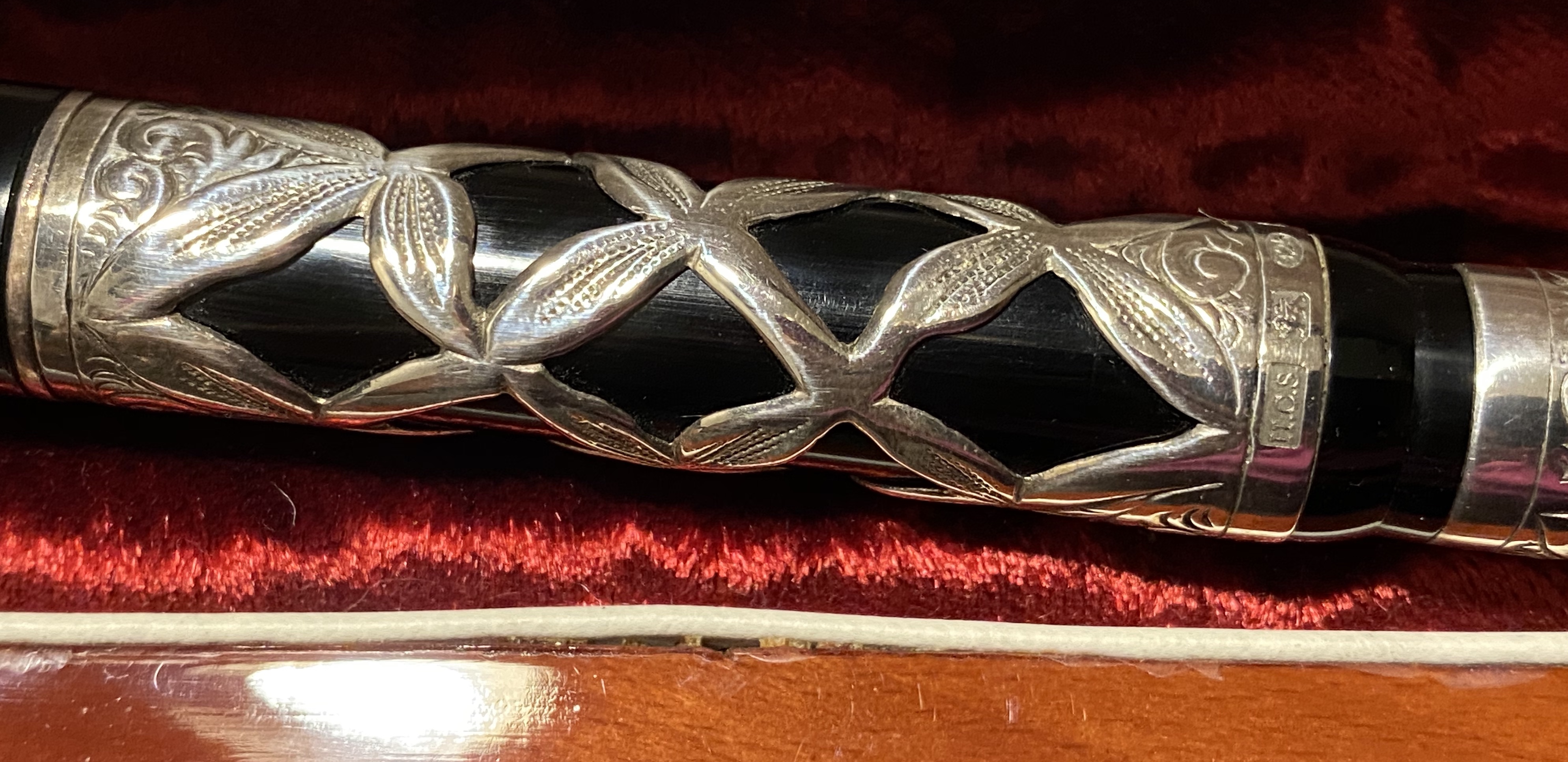
Read here about the Jasmin pen. I’ve attached photos of mine below.

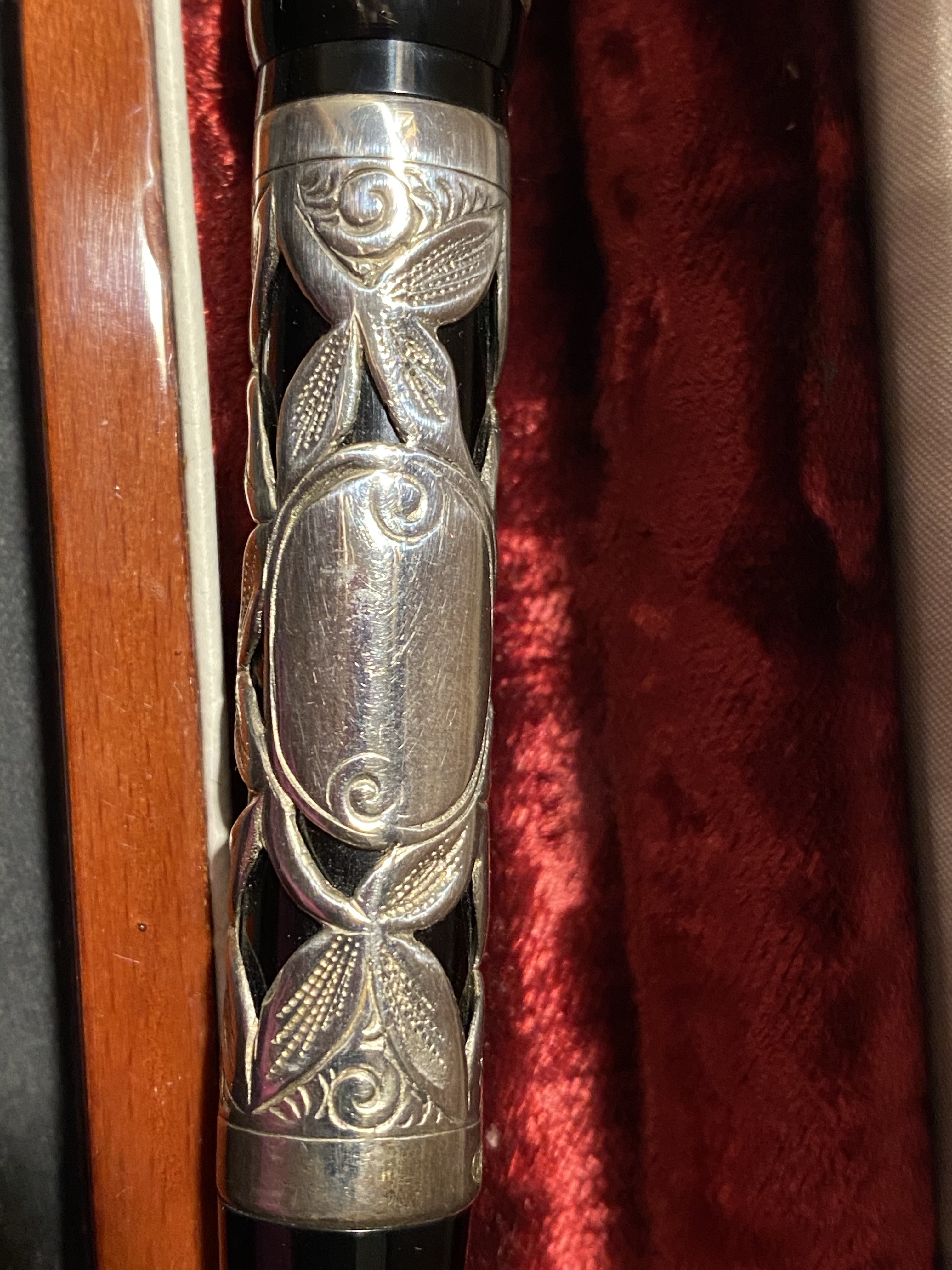
You can see both Henry’s beautiful work and his hallmark here.