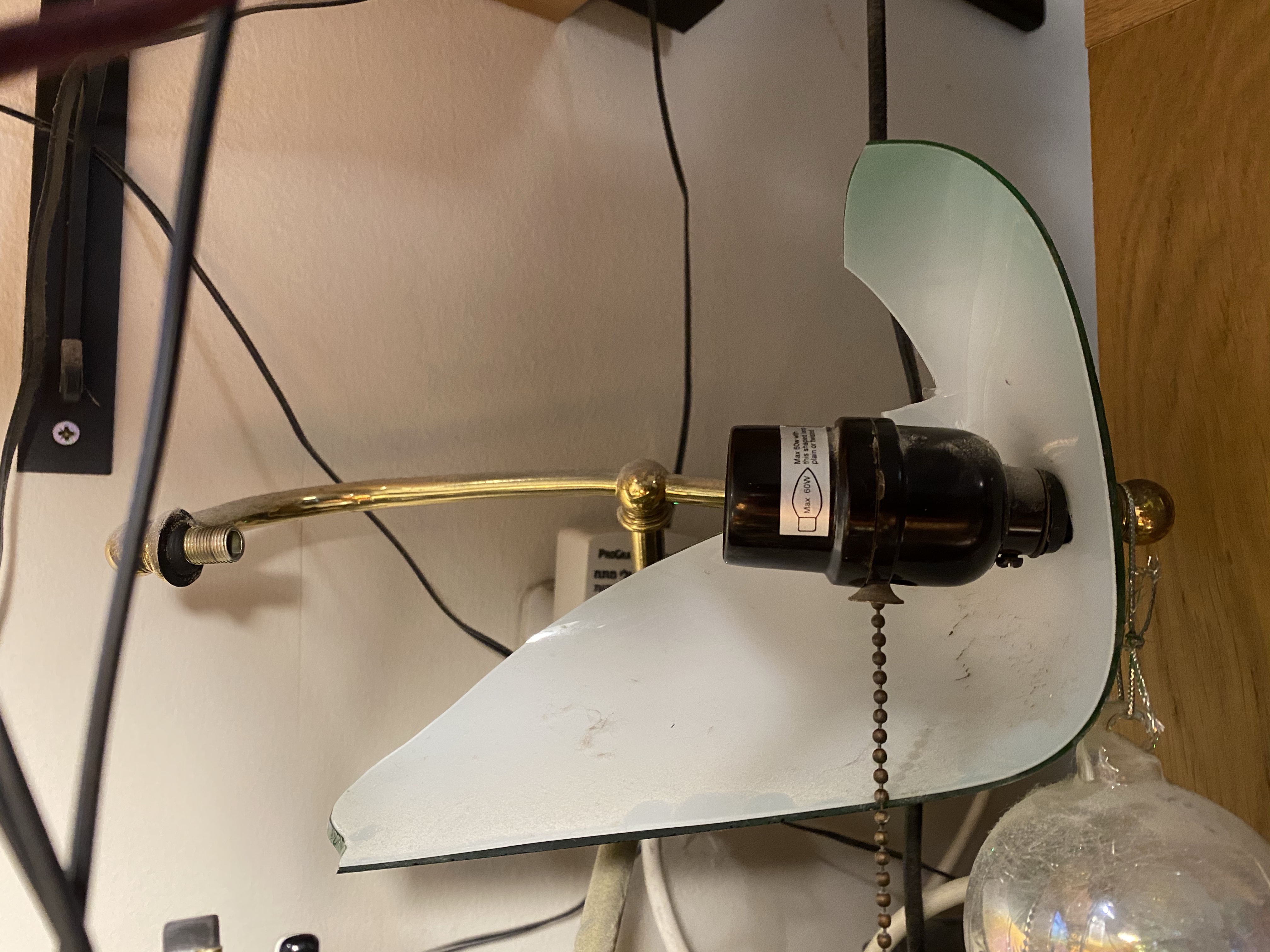
My little cat (I have two, a little black and white cat, and big black cat) managed to drop a desktop table sharpener on my banker’s lamp and it cracked the glass lampshade clear in half. So I had an interesting but unexpected project today: I bought a replacement lamp shade and took the lamp apart to get rid of the broken glass pieces. A youtube video and a Philips screwdriver took care of the taking apart bit; let’s just hope that I can put it back together again.
Broken shade halfway through dismantling.
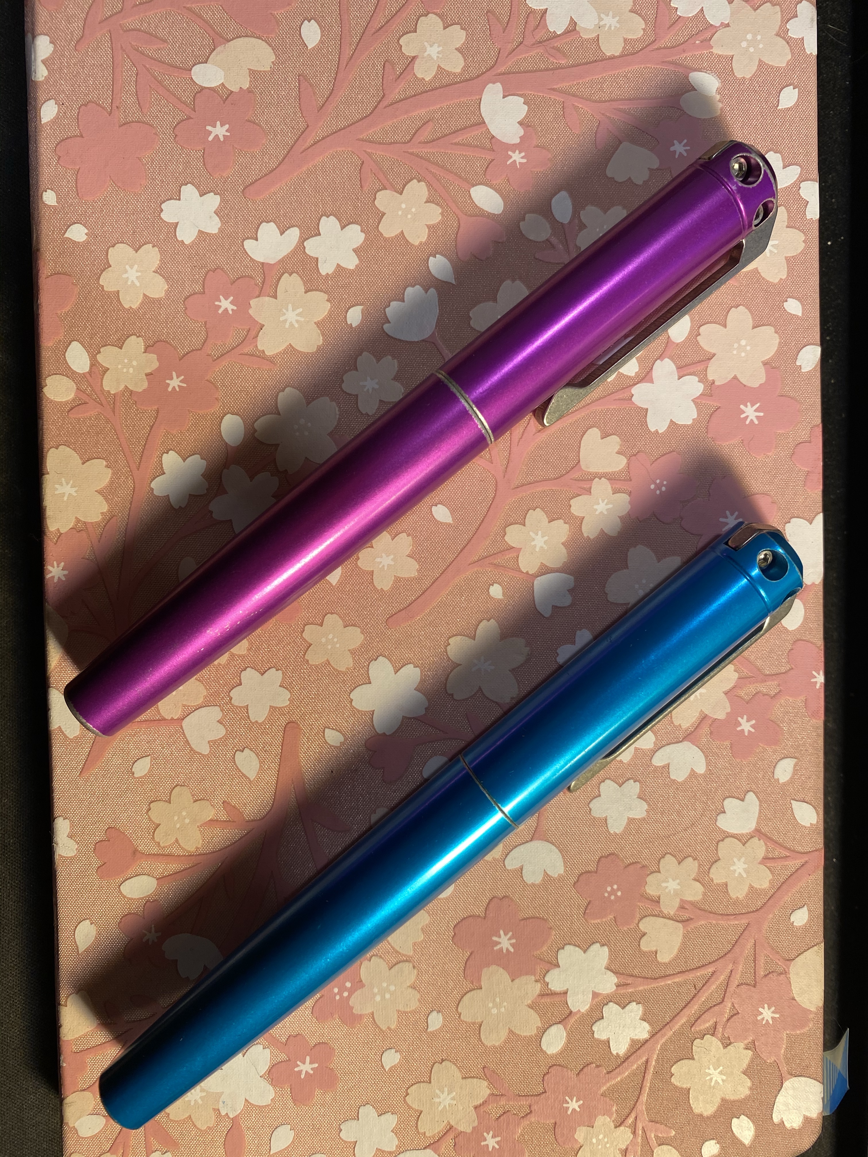
I got my Battleworn INK 2.0 Karas Kustoms grab bag rollerballs today. This was my first Karas Kustoms grab bag and my first ink rollerball and I’m very pleased with both the colours that I got and the way the INK 2.0s look and feel. These are chunky but relatively light pens, and I look forward to using them and maybe reviewing them in the future.
Karas Kustoms Battleworn INK 2.0 purple and cyan.
The INK 2.0 uses the Pilot G2 LG2RF refills, which are larger than the usual G2 refills, and built a little different. I haven’t yet tried to swap them out for a different refill, but I suspect that they won’t accept my beloved Uni-ball UMR-85, which is something I was aware of ahead of time.
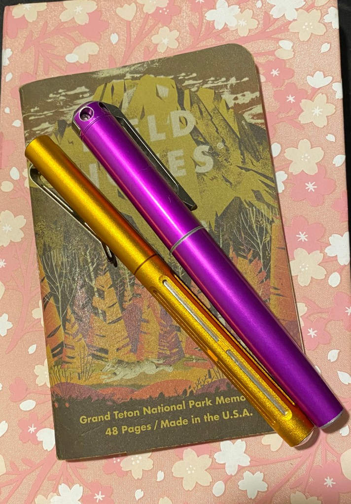
These are the pens and some of the notebooks that I’ve been using today (I’m not getting much fountain pen use lately): my beloved Orange Crush Spoke pen, and the new purple Karas Kustoms Battleworn INK 2.0 rollerball.
These two pens look great together. Spoke on the left, INK 2.0 on the right.
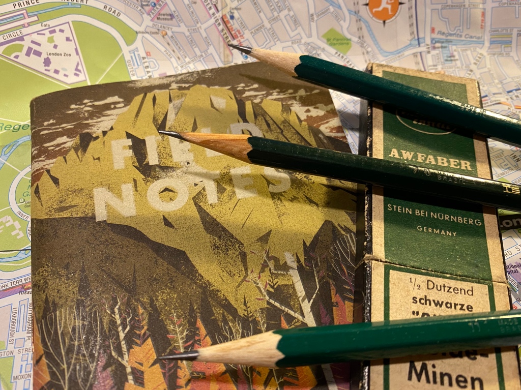
Field notes came out with a new addition to their National Parks series, which I’ll probably pick up on my next purchase there. They’ve got an offer for a free decal for purchases made by the 30th of August if that speaks to you.
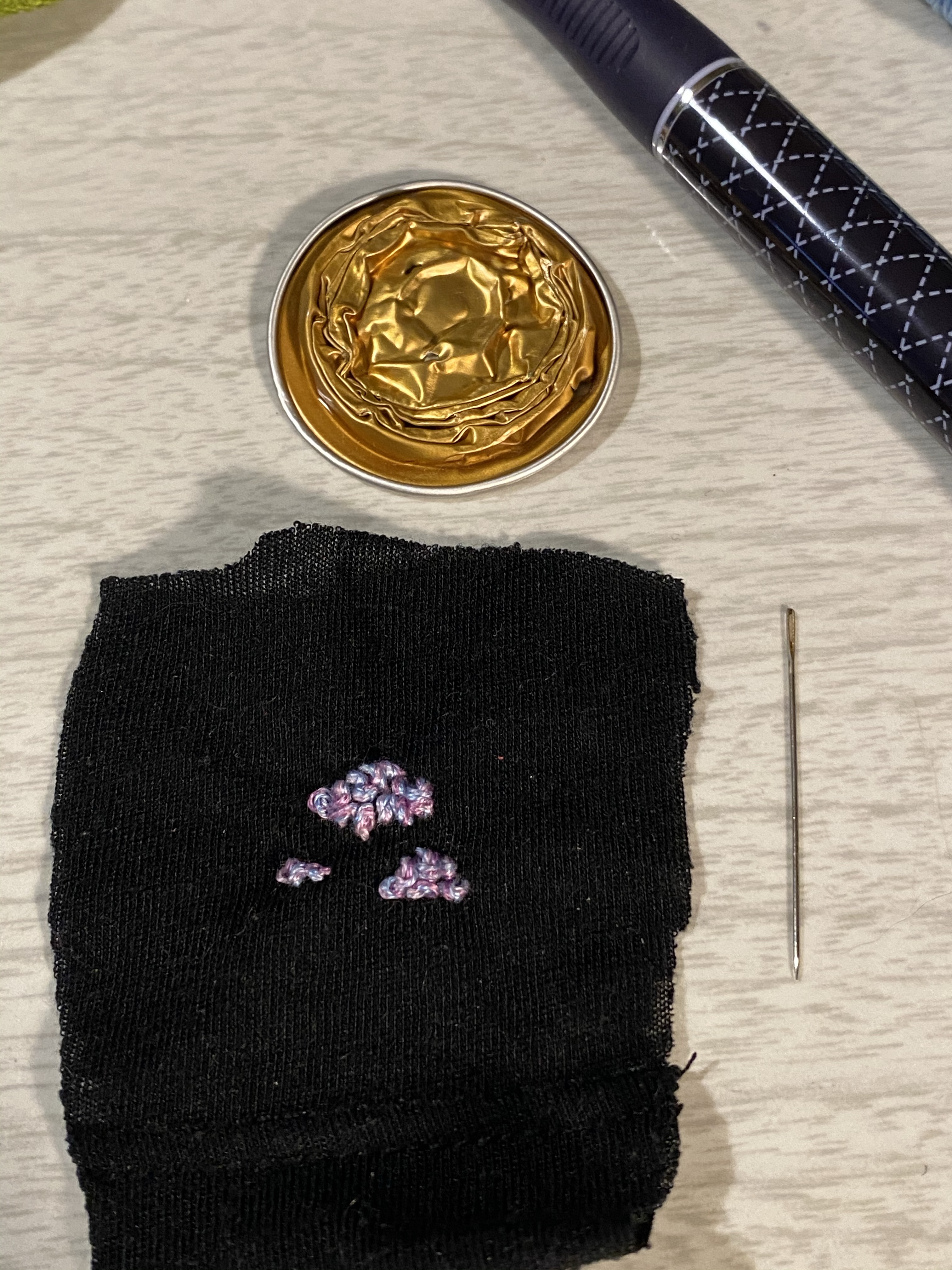
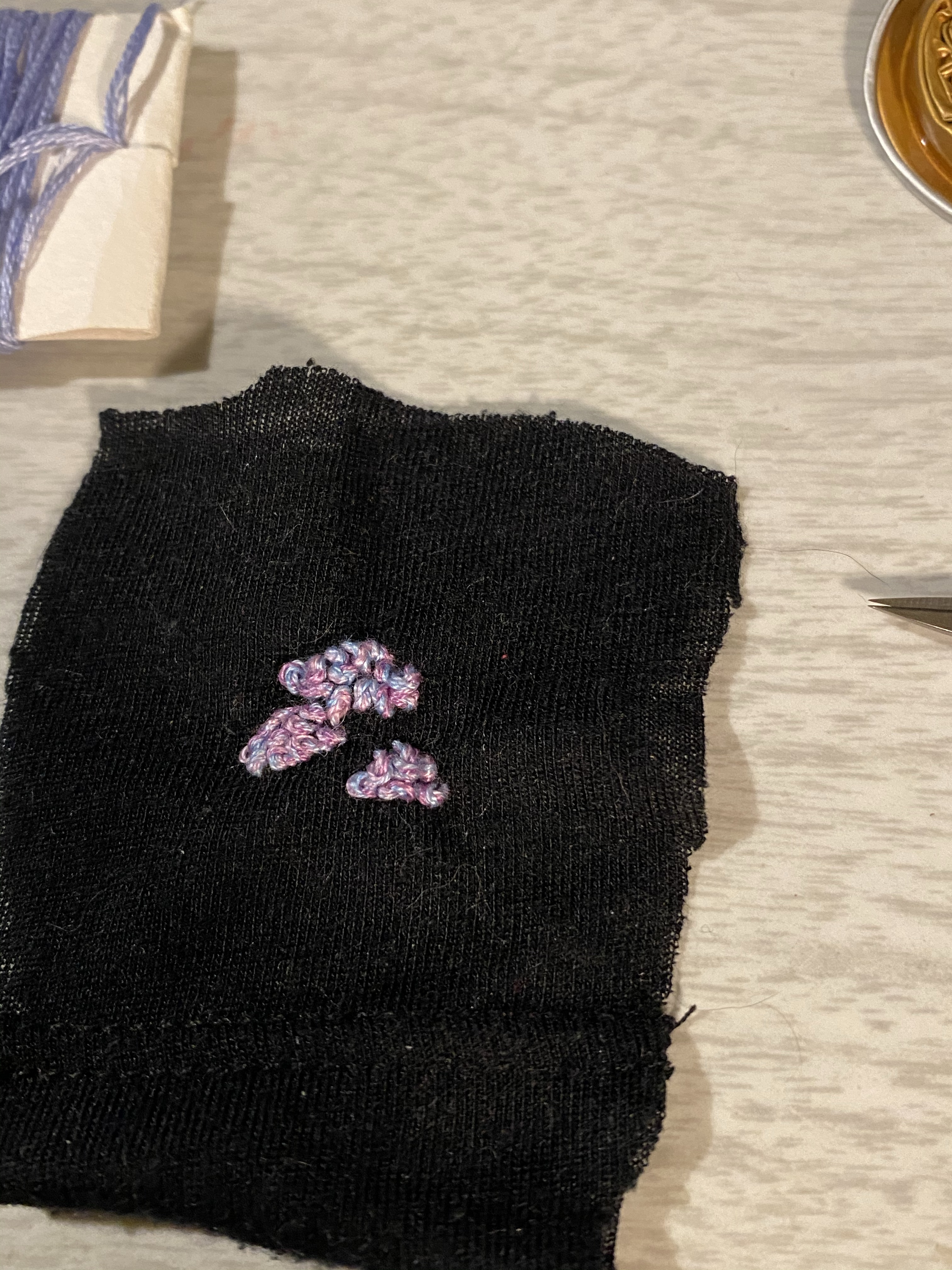
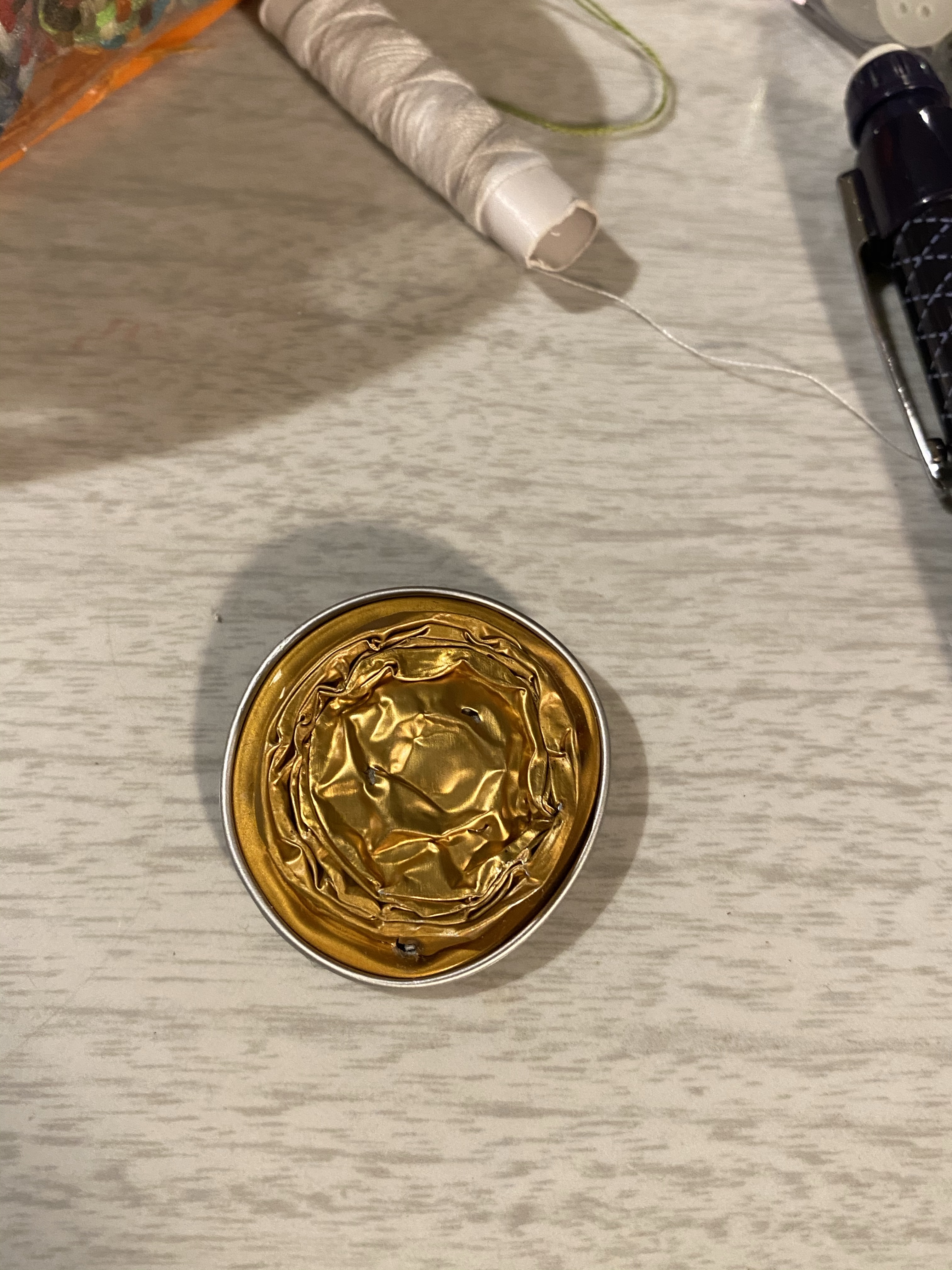
I’ve been playing around with Nespresso capsules, and after cleaning one out and hammering it flat I made a little prototype of Nespresso backed embroidery piece that I was thinking of creating. The first prototype came out better than I expected, and I got some valuable ideas on how to improve the design – mostly it was pure fun.
The capsule and the bit of fabric that I used.
I took an old t-shirt and cut it out for scraps, using it as the fabric for my prototype. It’s much too lightweight, but I got a sense of how I should work and what to avoid. I also got a chance to work with a dark fabric background for the first time.
French knots over french knots.
I was surprised to discover that I could use darker threads than I anticipated to be able to use on such a dark background. I thought that the green would be swallowed by the black, but it still pops.
Embroidery done.
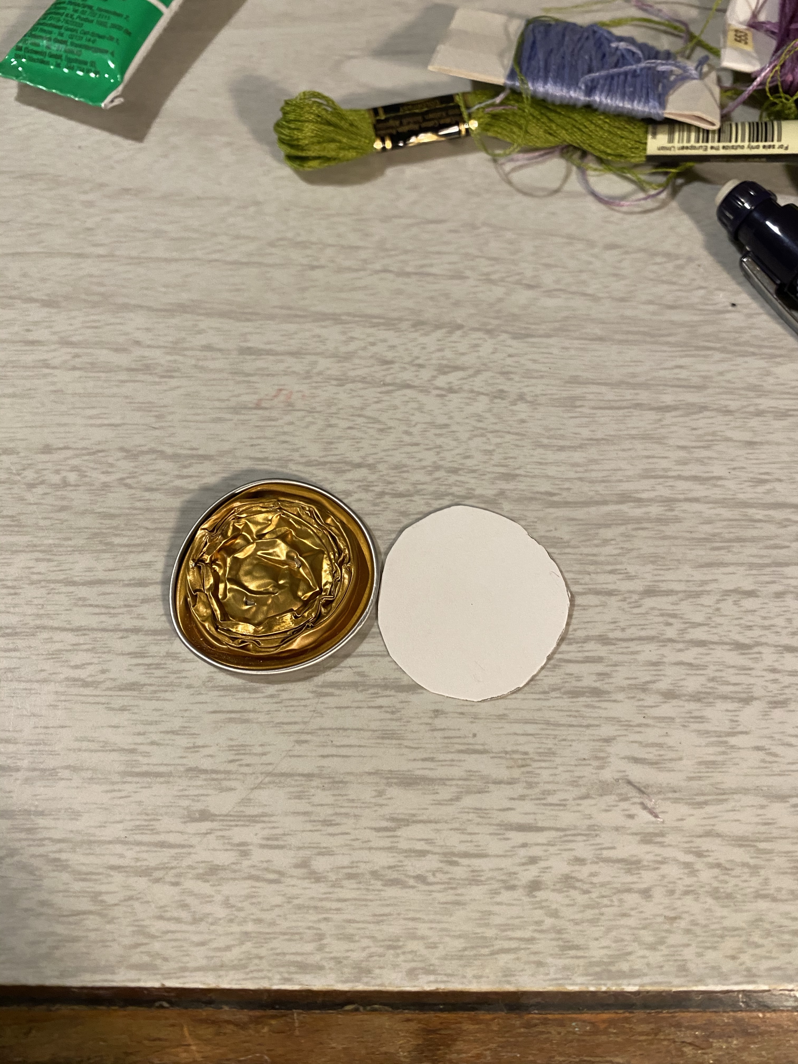
I originally thought of gluing the fabric directly on the capsule, but even if the fabric wasn’t so lightweight that wouldn’t have worked, and the fabric was very lightweight. I decided to cut out a thin cardboard backing and lace the piece to the backing.
Capsule and backing.
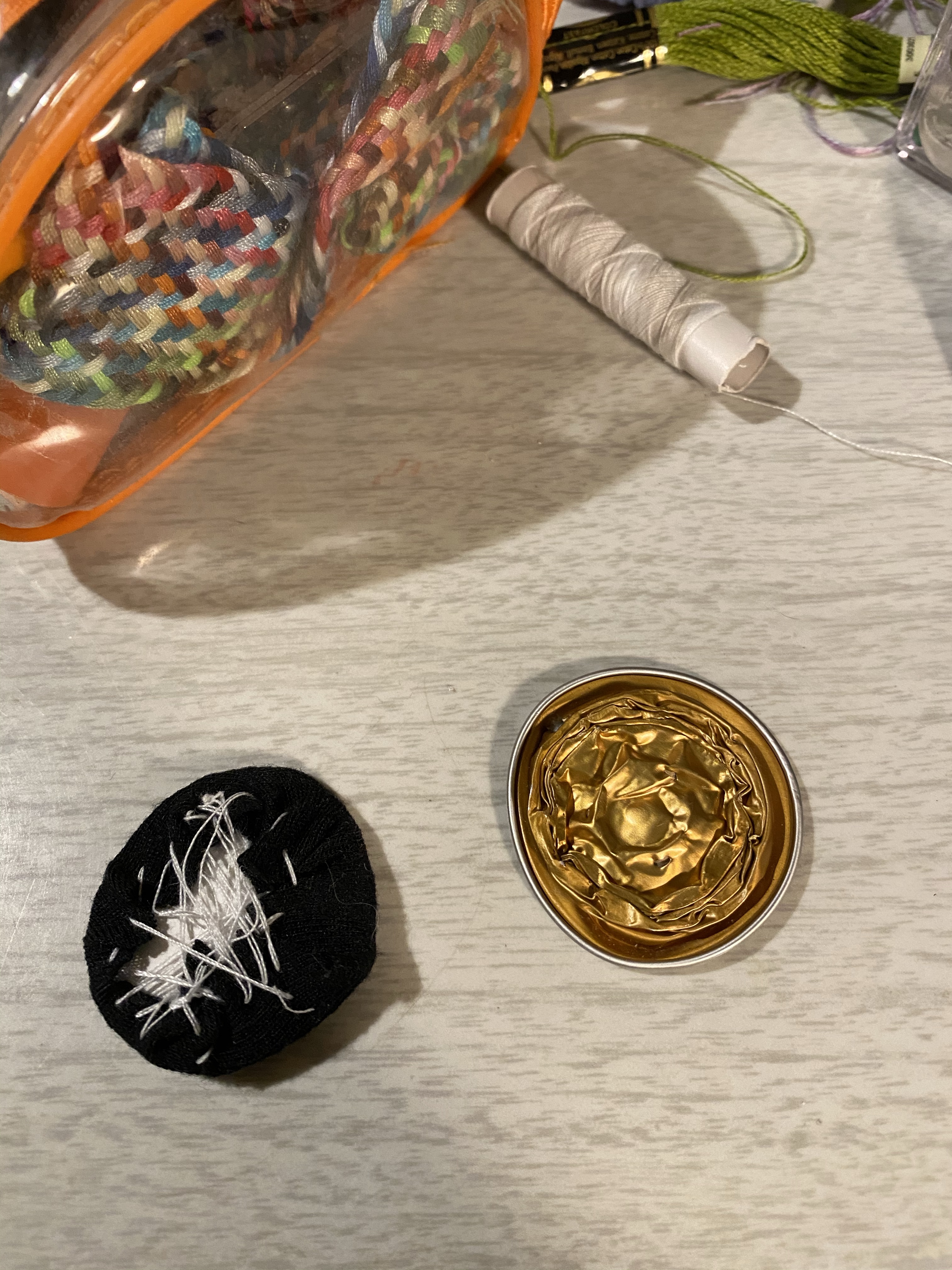
Here it is post lacing and before gluing on:
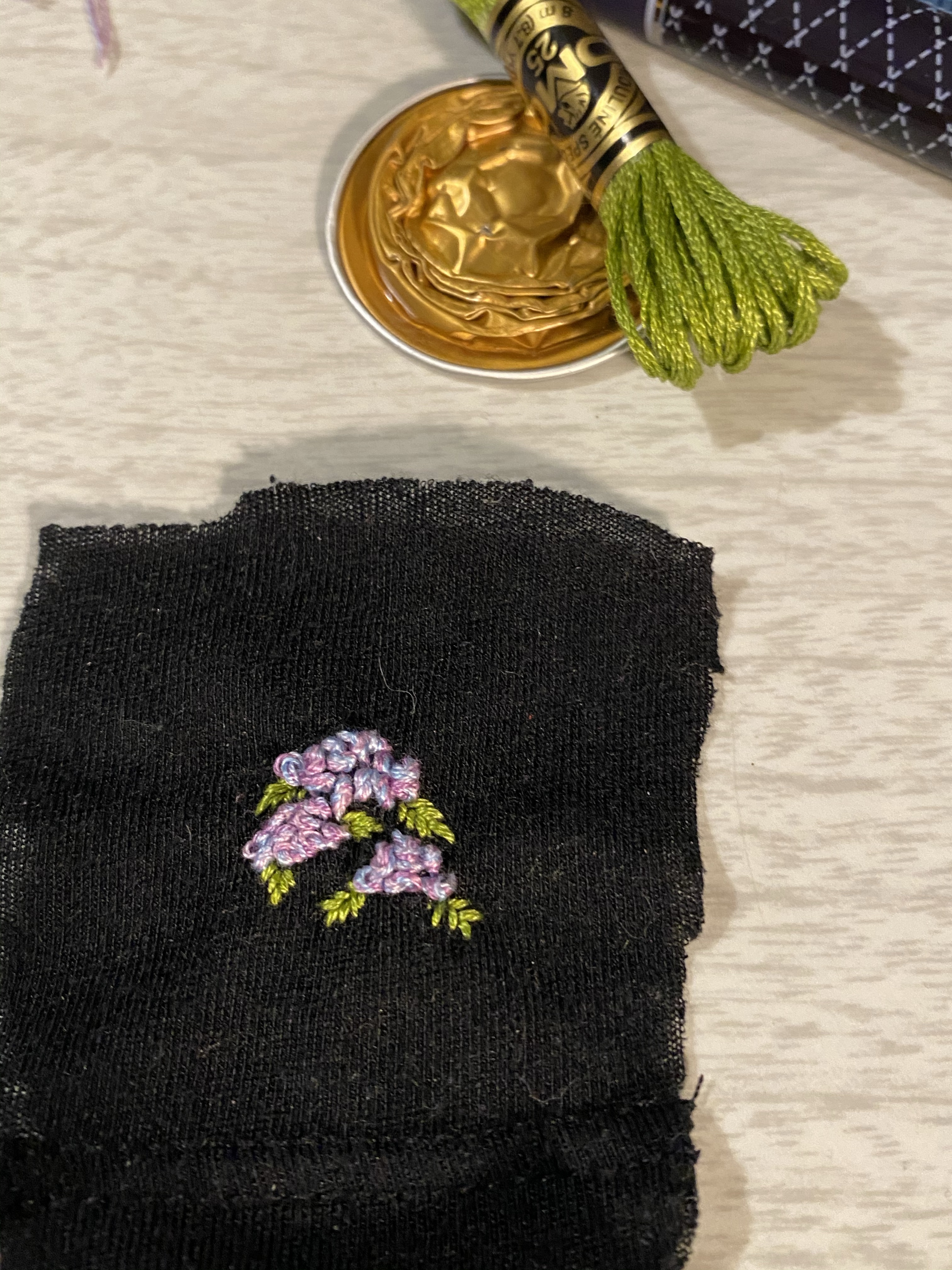
The finished prototype, the back side:
And the front side:
Hydrangeas galore.
This was a quick and dirty prototype. I now know how to better place and create the work, and which materials I need to get my hands on. And I had a lot of fun along the way.
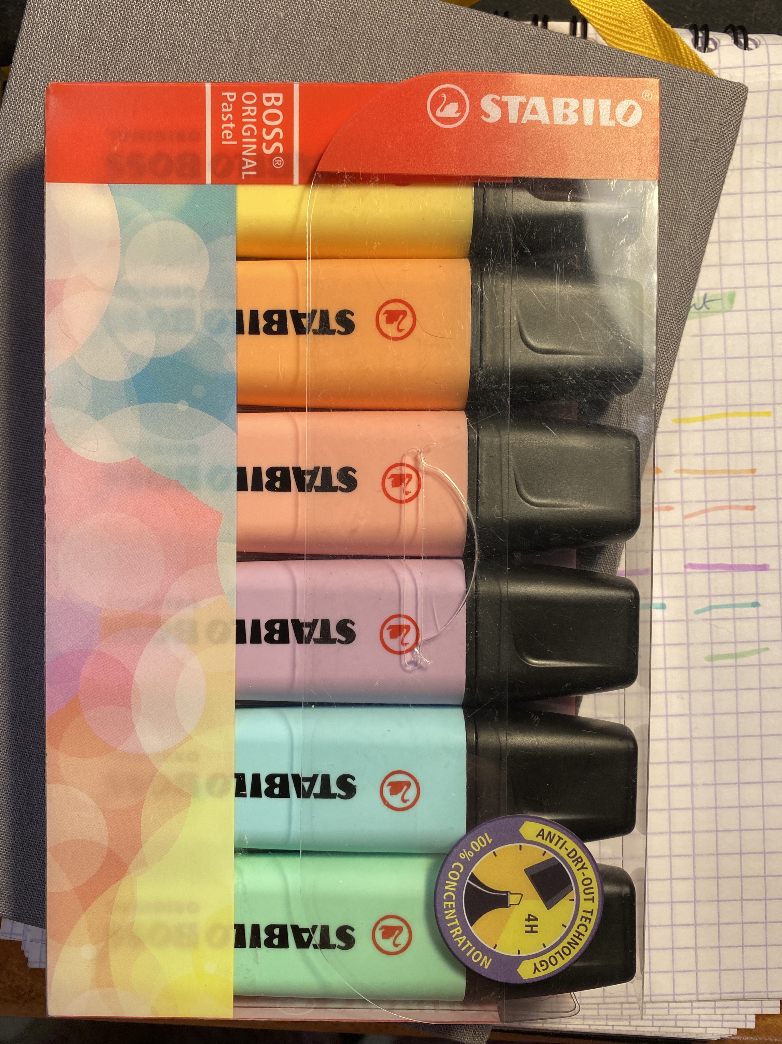
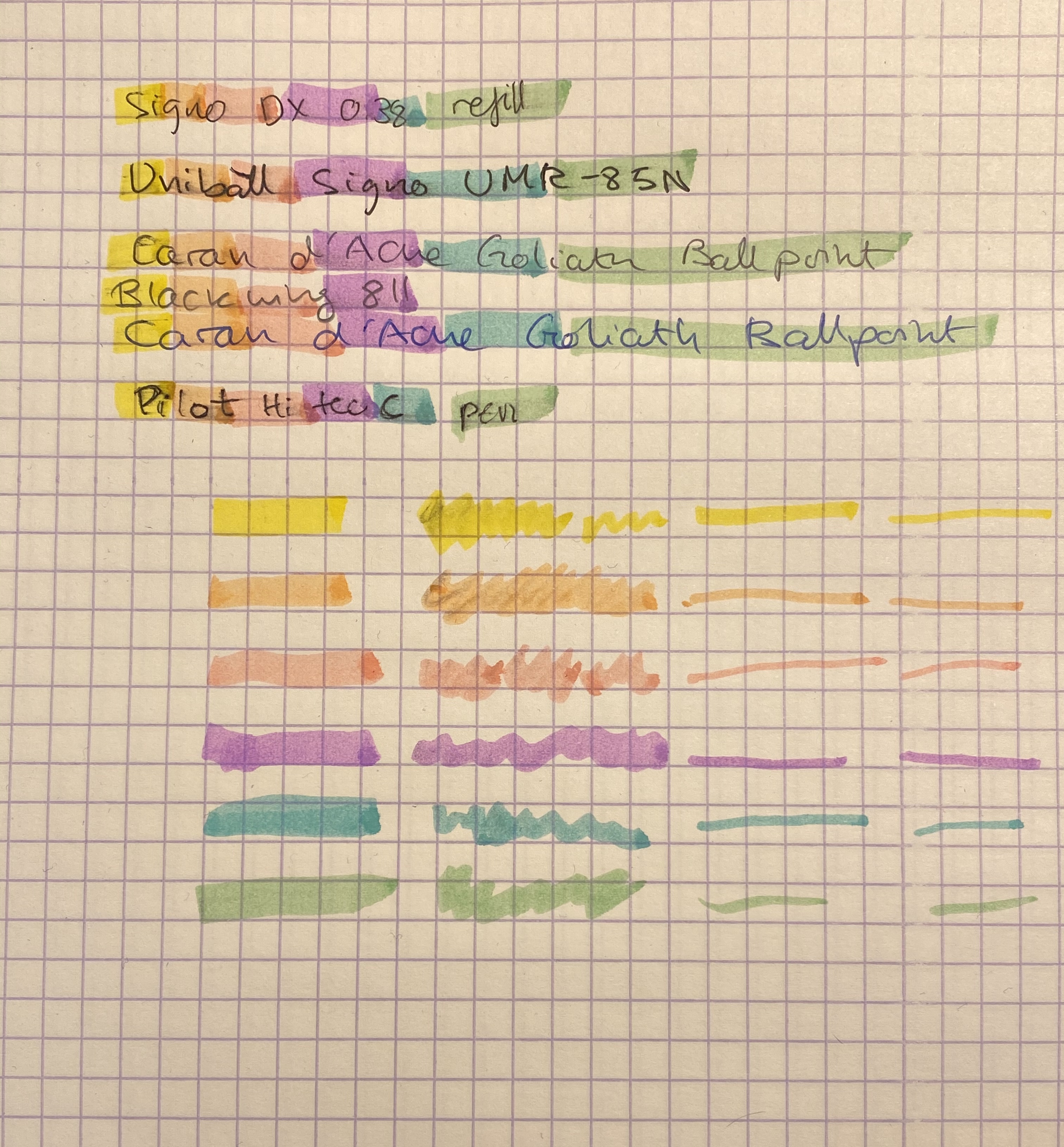
There’s something about multi-coloured sets of stationery items that I just find irresistible to the point where I bought an entire set of Stabilo Boss Pastel highlighters even though I hardly ever use highlighters.
These were on sale. It hardly justifies me buying them.
I think highlighters are one of the quintessential back to school items, as you’re likely to use them most when you’re revising or reading and taking notes for a class. I used to use highlighters extensively, in the “bad old days” when Stabilo Boss were the only decent highlighters around. They are now bested in every possible way but price (and even that depends where) by their Japanese counterparts, with their sophisticated windows, double-sided tips, brush tips and weird double line producing tips. Even when it comes to colour choice the old Stabilo Boss gets left behind.
The strange mottling you see is because these lay down so much terrible ink.
The Stabilo Boss highlighters are likely what you’ll find in the office (when you actually go there, Covid permitted). If you can get your office to purchase the pastel version of these I highly recommend it as they are less searing on the eyes than their standard fluorescent brethren. Otherwise these have a chunky pen body that’s pretty comfortable to hold, especially if you’re a kid, and truly terrible ink. It’s much too wet, and tends to bleed through practically every kind of paper that you’ll find in a normal office setting, and most of the high quality stuff too. My main use for them has been as colouring markers to give to the kids my colleagues sometimes bring to work. I draw colouring pages with a sign pen, and if the parents didn’t bring coloured pencils or markers with them, the Stabilo Boss markers do in a pinch.
Even on relatively thick Baron Fig Confidant paper these manage to bleed and show through.
As for actual highlighting, these do a terrible job. They smudge anything but ballpoint, they bleed through like terrible, and the colours are decent but not very exciting. Note that these pick up ink and retain it pretty well, which gives the classic “dirty highlighter” effect, especially on the lighter coloured ones.
Highlighter testing on Rhodia paper, which you’ll probably not have access to at work.
So if you’re looking for a highlighter, look elsewhere, there are much better choices on the market. I’m not going to even deign to test Stabilo’s claim that these still work after being left uncapped for 4 hours. It’s more important that the actual highlighter is good and useful than that it wins in a highlighter survival contest that has little to do with their standard everyday use.
Now to the notes on highlighting: on the second semester of my first year as an undergraduate I had a professor who actually took the time to teach us how to take notes and revise. He had an acerbic sense of humour and a great dislike of highlighters. “If you want to highlight something, only use a pencil, or at the most a pen, to underline it. Never use highlighters, because then when you read back your eyes will only see the highlighters, and if you’ve misunderstood something, or appropriated too much importance to a sentence or passage you have little chance to ever correct it. Underlining with something that doesn’t immediately jump out to you lets you see things in context, and reevaluate them if necessary”.
I tried his advice out and I found out that it worked well for me, and so I’ve been underlining and not highlighting ever since.
So I’ve been drafted today to run a new roleplaying game for three players over Discord. Two of the players are experienced, one of the players is completely new to roleplaying games. After a bit of debate we settled on Dungeon World as our system. As an aside I’ll say that I highly recommend Dungeon World both for newcomers to roleplaying, and to GMs and players who are short on time. It’s a phenomenal system which lets you get to do a lot of cool stuff fast, and allows you to have a character that is fun and functional from level 1.
The challenge with this adventure is that I need to create something fast, so that we can have our first session sometime next week, and something that’s appealing and accessible to players with vastly different experience levels. Also, I actually need to have fun running it.
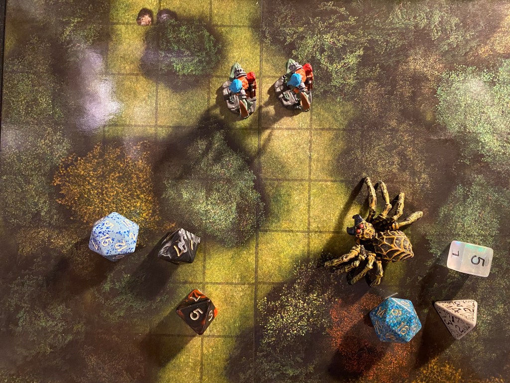
I’m also running the second session of a very dense urban D&D 5E campaign tomorrow. It’s a game that is challenging to run particularly in terms of tracking the vast and complicated cast of characters, and the various locations the game can unfold in.
So I thought that I’d write a few posts on the various tools that I use to plan, organize and track my games. What I use changes based on the game, and also based on how happy I am with the results I previously had with it. I’ve been DMing and GMing for 17 years now, and during that time I’ve tried out a lot of tools and approaches to handing the “backstage” parts of roleplaying games.
A few words about Covid: my main RP group moved to playing over Discord a few years ago, when one of the players moved abroad and we wanted to keep on playing together. We started out in Google Hangouts before Google did terrible business-y like things to it, and then we moved to Discord, which has been our home for a good long while. Due to Covid a lot of groups have now been forced to make that same move or else forgo playing at all, and the internet has exploded in the past few months with a lot of resources for running online games successfully. A lot of these resources are very helpful, but a lot of them also just add “noise” and added pressure to the already tough job of being a DM/GM. If you are running a game for an online group, whether it’s your first game or not, don’t feel the pressure to run a game at the level of production that you see on various podcasts/twitch/YouTube channels. You don’t have a production budget, you don’t have a production team, and here’s the thing: your players aren’t expecting that. They just want to get together and have fun for a few hours. Prep as you would for a face to face game, with a little added attention to images that you can send in the chat (monsters, NPCs, maps, etc), and make sure that you have video on, or the players will miss a lot of nuance in your body language. Keep it simple and add complexity only if needed, later on. I recommend using Discord with the Sidekick and DiceParser bots (you want two as a backup, because eventually one of them will lag or break), and Google Docs/Dropbox to share sheets and information between sessions. If you’re playing D&D 5e then I highly recommend managing the character sheets on D&D beyond, and gradually learning to use the Avrae bot in your game (it’s got a lot of commands, so don’t sweat it if you don’t start running all your combat scenes with it from the first session on). If you need a mapping resource, here’s a free, open-source browser based tool called mipui that one of the former players in our game made. It’s very simple to use, and it works just fine for D&D games. I recommend using it in Chrome. Remember that technology has a tendency to break and jitter, and be patient.
If you’re someone that’s always wanted to play but never had a group, now is your golden age. Tons of new groups are forming up using Facebook, Reddit and Discord to find new players.
This post came out longer than I expected, so I’ll go an brainstorm and plan for my games, and I hope that you find your people and start gaming too. There’s nothing like RPGs to bring a group people together for a few hours of blissful, harmless fun.
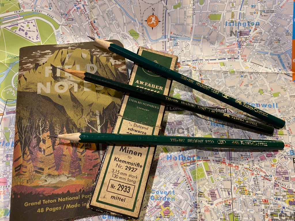
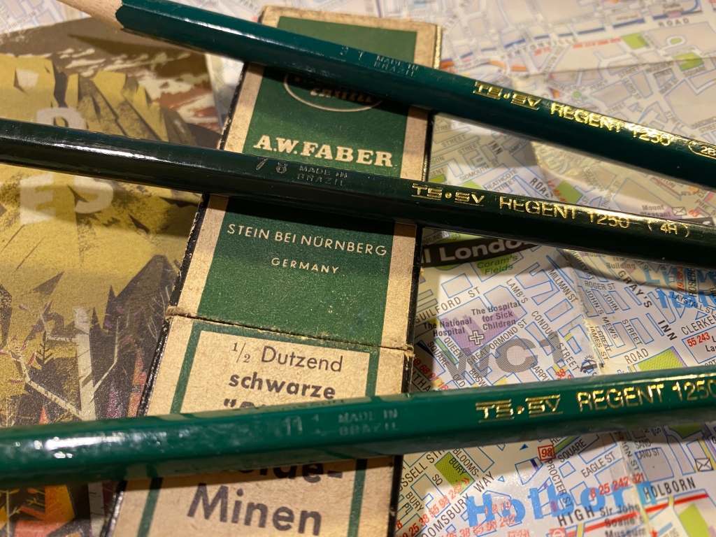
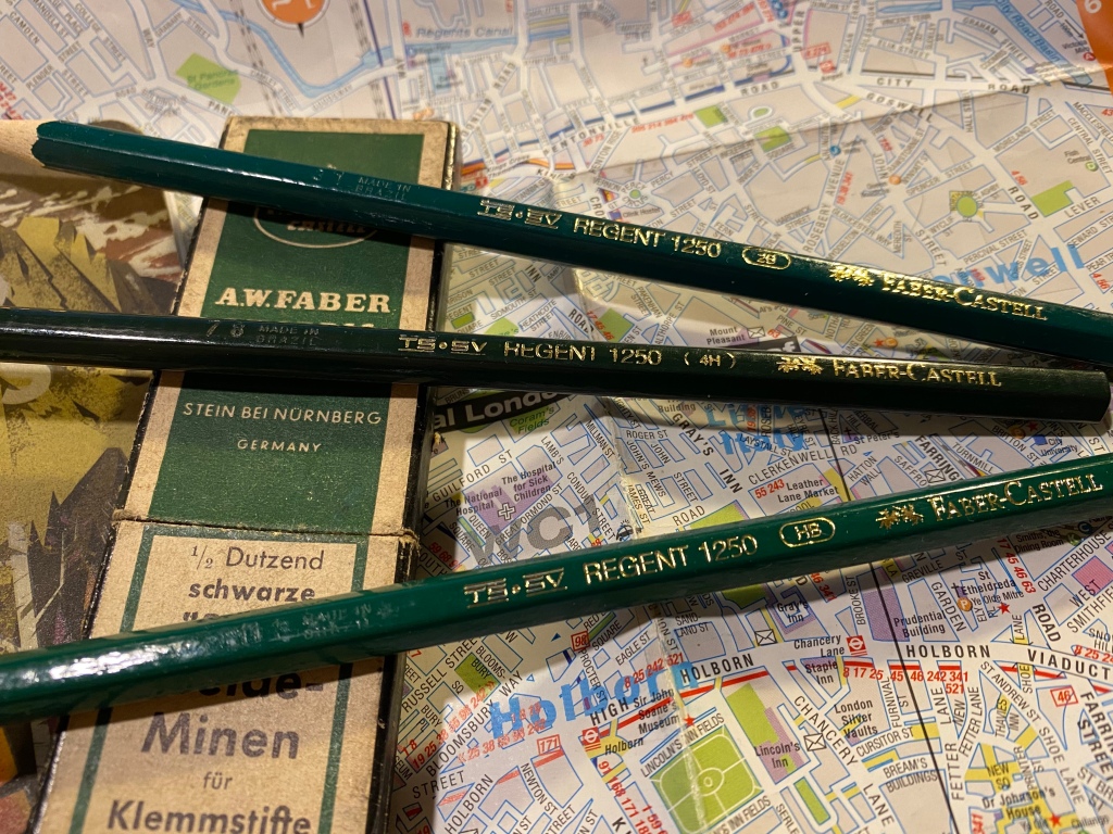
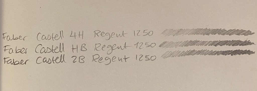
So a few years back I was at the main branch of a local art supply change while they were getting rid of a large amount of inventory by slashing down its prices. I was there to stock up on art supplies, and most of the sale inventory consisted of poorly made knock-off pens and no-name novelty print pencils, so I skipped the sale baskets and made a beeline for the tills. As I was standing in line my eye caught a small basket in the corner of the nearest sale table. It looked like it was full of Faber-Castell 9000 pencils offered at a 10th of the price of a Faber-Castell 9000. I left the line and went to investigate.
Don’t they look like Faber-Castel 9000s?
Now my go to pencil for sketching is the Faber-Castell 9000, and although they are excellent pencils, they are not cheap, and I use to go through quite a lot of them. Here I was offered a pencil that looked like a Faber-Castell 9000, was made by Faber-Castell, at a “practically free” price. I couldn’t test them, as they were all unsharpened, but I dug in and grabbed a few of the weird assortment of harnessed on offer: 2B, HB and 4H.
They were Faber-Castell Regent 1250 pencils made in Brazil, and what little I could find about them was people saying that they don’t compare to 9000s. I of course planned to add them into my rotation, which is why I almost immediately lost them. This happens quite often with pencils in my house, since my cat loves to steal them and play with them, so I usually hide the good ones and let him play with ones that I care less about. The result is that when it comes time to looking for a certain pencil I only have a vague idea about the various areas it can be in.
Now that I’ve found them, to the review:
The Faber-Castell Regent 1250 are Brazilian made pencils that look like twins of the Faber-Castell 9000, minus the grey band on the tip. They don’t seem to be widely available outside Brazil, which is both frustrating and understandable. The Regent 1250 poses a risk to the 9000 sales: it’s a much cheaper counterpart that offers graphite performance that’s on par with the 9000. Artists aren’t usually swimming in money, and if FC made the 1250 widely available my guess is that their 9000 sales would take a significant hit.
The gold foil branding appears on only one side of the pencil, and the lacquer appears rough, but not to a point where you’d actually feel it in use.
The Regent 1250’s body is where is where it falls short of the 9000, though I sincerely believe that not enough to justify the reviews that it has gotten so far. The 1250 is cheap and offered in Brazil because it’s made of abundant cheap Brazilian wood. The result is a pencil with a woodcase that doesn’t sharpen as nicely or easily as a 9000, and that has a somewhat rougher finish when it comes to the lacquering.
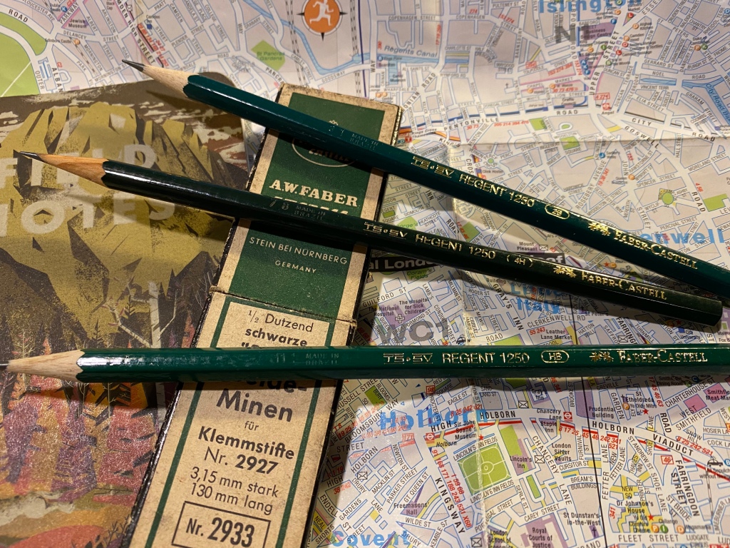
Made in Brazil. The 4H is a darker green and has a different imprint on it, which makes me thing that it was made during a different time period that the 2B and HB.
The wood is not terrible, and it doesn’t chip and break in large chunks. You just have to put a little more elbow grease when sharpening with a sharpener. If you sharpen with a knife you probably won’t feel the difference at all. The lacquer isn’t pretty: you can see pits and bumps in it, though they are not deep enough for you to actually feel them. The wood on the pencil isn’t consistent in its looks or particularly attractive.
The different appearance of the wood between the 4H and the other two pencils leads me to believe that it was made during a different time period.
These pencils only look premium from a distance. Up close they look battered and bruised. However, these are meant to be artist tools not museum pieces, and what’s most important about them is their graphite. Everything else has to be good enough, and so far it’s been good enough.
I doubt that if I saw two sketches, one made with 9000s and one made with 1250s, that I could tell the two apart. The graphite looks and behaves practically the same, both in drawing and erasing.
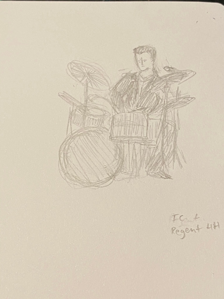
Regent 1250 4H on Baron Fig Confidant
It’s so tempting to look down at these pencils as cheap trash, but look what you can create with them:
Regent 1250 HB at work.
The graphite is smooth, the pencils hold a point for a long, long time, and they’re a joy to use, especially since I don’t have to feel so precious about them.
Regent 1250 2B
If anything I wish I could have purchased a wider range of Regent 1250, but seeing how they work I doubt that FC would ever widely offer them outside Brazil, as they would cannibalize the sales of their 9000.
Regent 1250 HB on a Baron Fig Confidant.
It’s frustrating knowing that a company has the ability to offer a good product for artists at a non-premium price and chooses not to. I understand the market forces at play, but I still find them annoying. And to all those who had a chance to use a 1250 and looked down on it: don’t judge a pencil by its lacquer.
Since I’ve been working from home I’ve had more time to dig into my stationery and art supply stash and add new things into my rotation. My favourite lead holder is a vintage Eagle Turquoise Prestomatic 3377, which is all metal and a little on the heavy side, but it’s a fabulous sketching tool. If I want to carry something lighter around I fall back to the all time classic Staedtler Mars technico.
Eagle Turquoise Prestomatic on top, Staedler Mars technico on the bottom
I use these lead holders as sketching tools, and so they normally hold B or 2B leads from Staedler, Mitsubishi, or Caran d’Ache. Good quality leads aren’t cheap, so I expect any lead holder I use to protect them sufficiently well, as well as provide a solid grip that works in many drawing angles. Any added bells and whistles, like clips, a lead sharpener or a built in eraser, are just not things that I’ll use, so I don’t take them into account when I decide whether to purchase a lead holder or not.
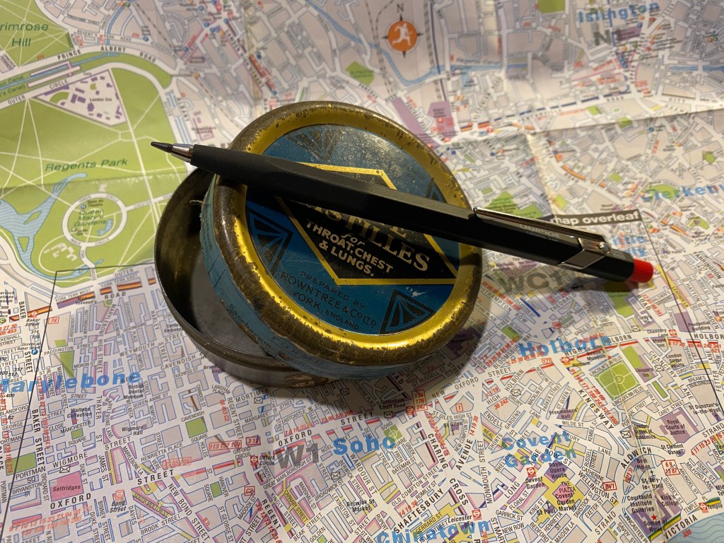
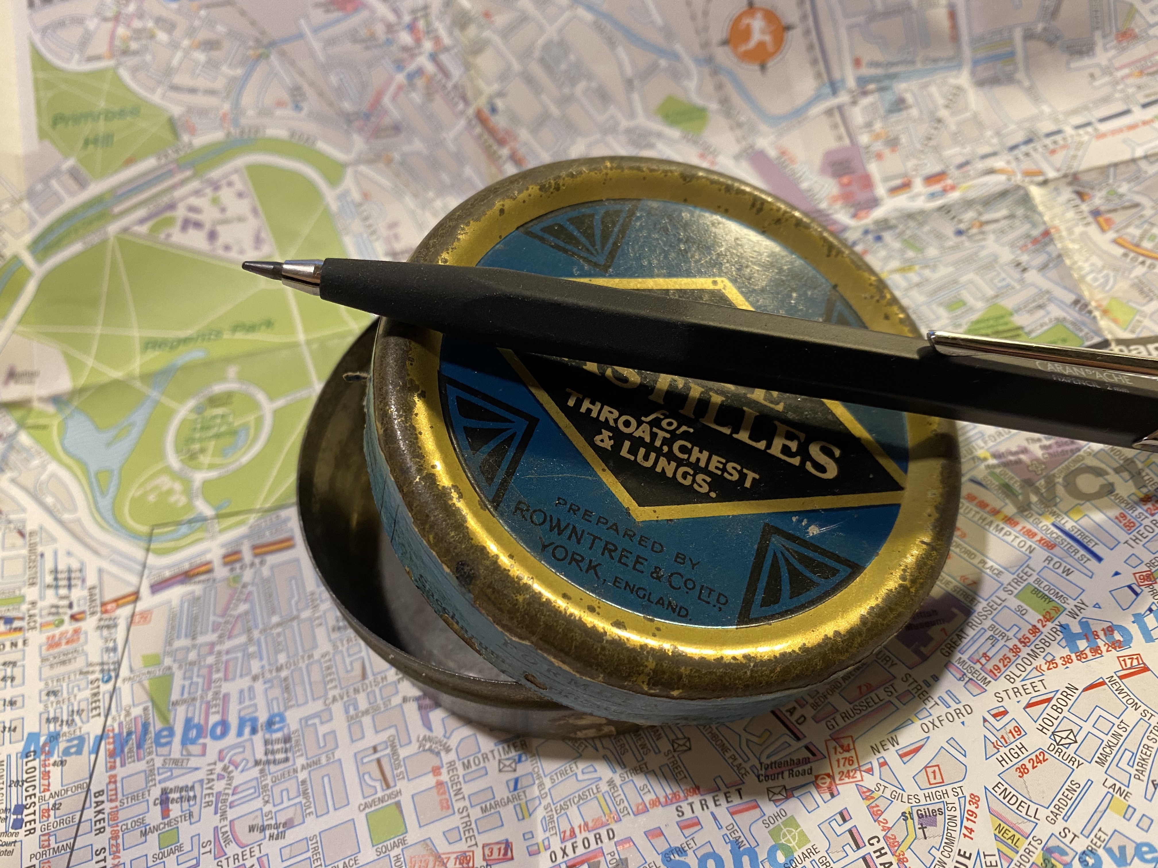
Caran d’Ache Fixpencil
The Caran d’Ache Fixpencil is not a new lead holder on the market, but it is a new lead holder for me. Something about its price range and design made me think that it’s a lead holder for people who like to write with lead holders, not so much for people who like to sketch with them. Lead holders ordinarily have a very functional, “tool-like” vibe to them, and not a lot of polish. Contrary to that, the Caran d’Ache Fixpencil is a sleek and polished thing of beauty.
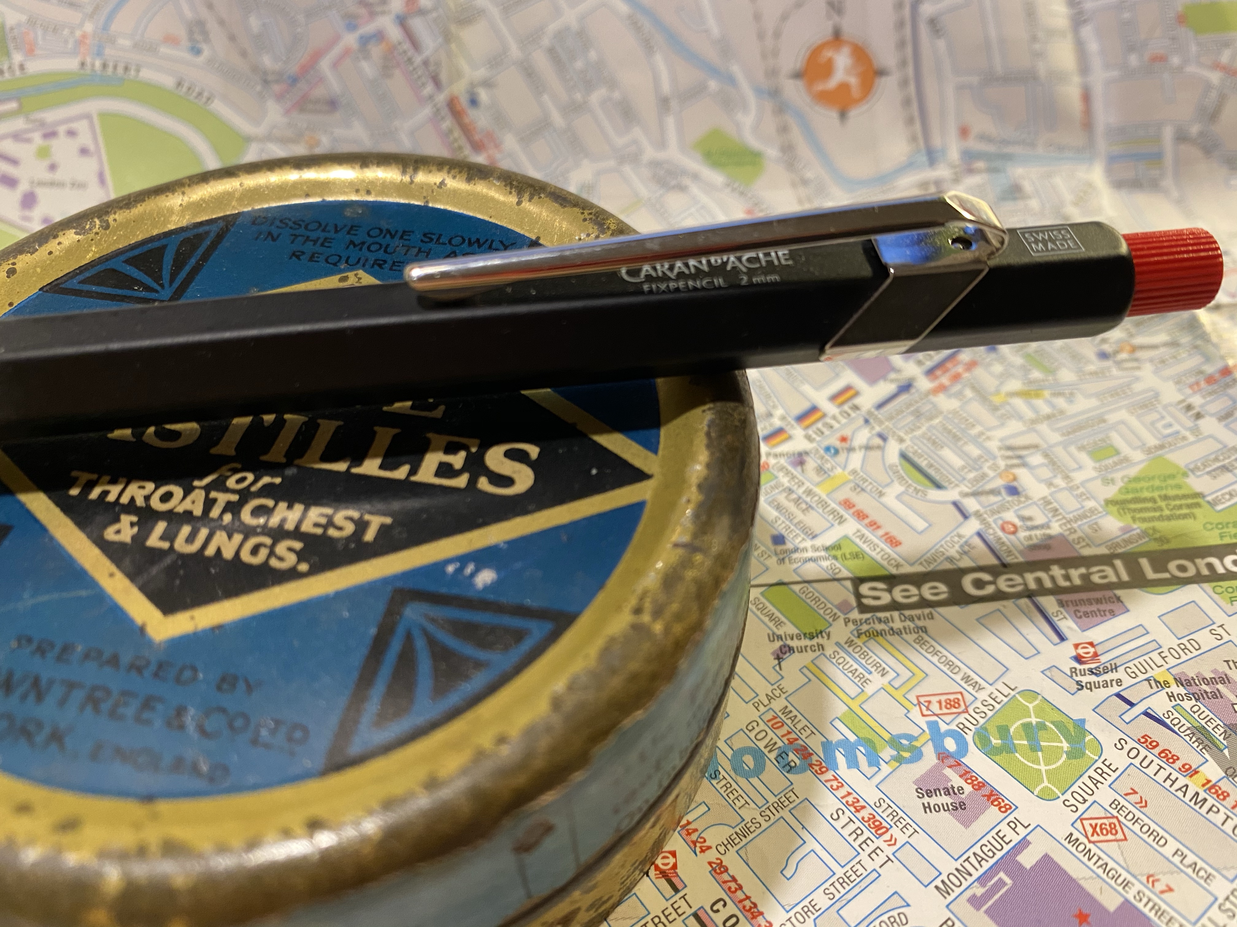
Grip texture vs body texture.
Having used the Caran d’Ache 849 I was worried that the Fixpencil would have the same slippery texture, with a grip that isn’t up to the task. If I’m drawing with a lead holder, then I’m working fast and loose, and the last thing I want to worry about is the holder flying out of my hands. Unlike other lead holders, the Fixpencil doesn’t have a knurled or striated grip, but rather uses a sandpaper like texture on its grip section instead. As I shift my drawing angle a lot, I find that texture really unpleasant. I also wonder how superficial it is, and whether it will wear down to sleekness after a relatively short time.
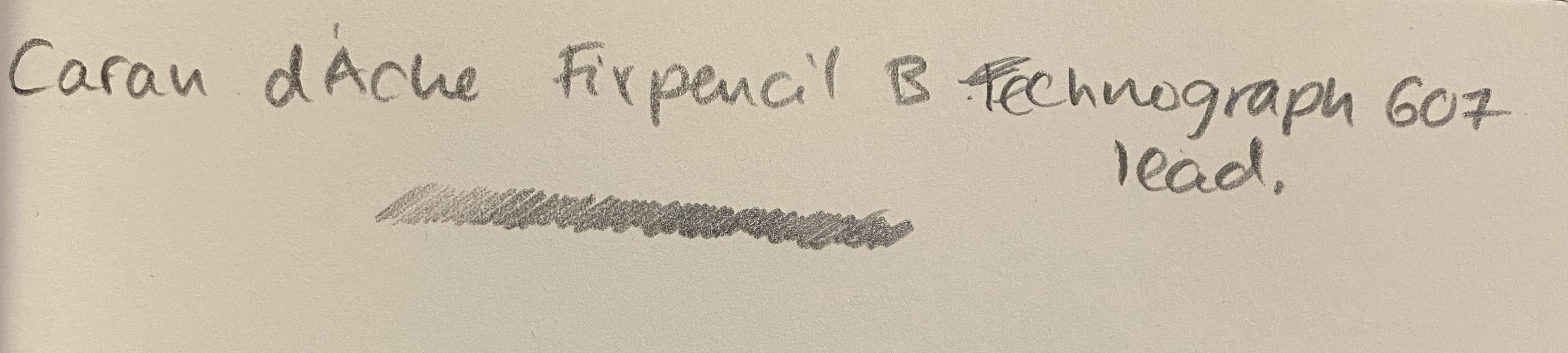
The Fixpencil is a thing of beauty, with the same minimal branding as the 849, and the same clip and body design. Apart from the clip, there are no bells and whistles here, but that doesn’t detract from the holder. It comes with a B Caran d’Ache technograph lead, which is excellent.
Written on a Baron Fig Confidant
I watched an live streamed concert from Ronnie Scott’s Jazz Club in London, and sketched the singer using the Fixpencil and a Leuchtturm1917 Sketchbook and it worked well. I would never use it as my main lead holder, as I don’t like the grip, but your milage may vary, especially if you plan to write and not sketch with it.
If you’re just starting your sketching journey I’d recommend the Staedtler Mars technico line, whether vintage or new. They are ugly ducklings, but they are great, relatively cheap workhorses. I’d recommend trying the Fixpencil before you buy it, as you may find its grip section as unpleasant as I found it, or it may be one of your favourite tools.
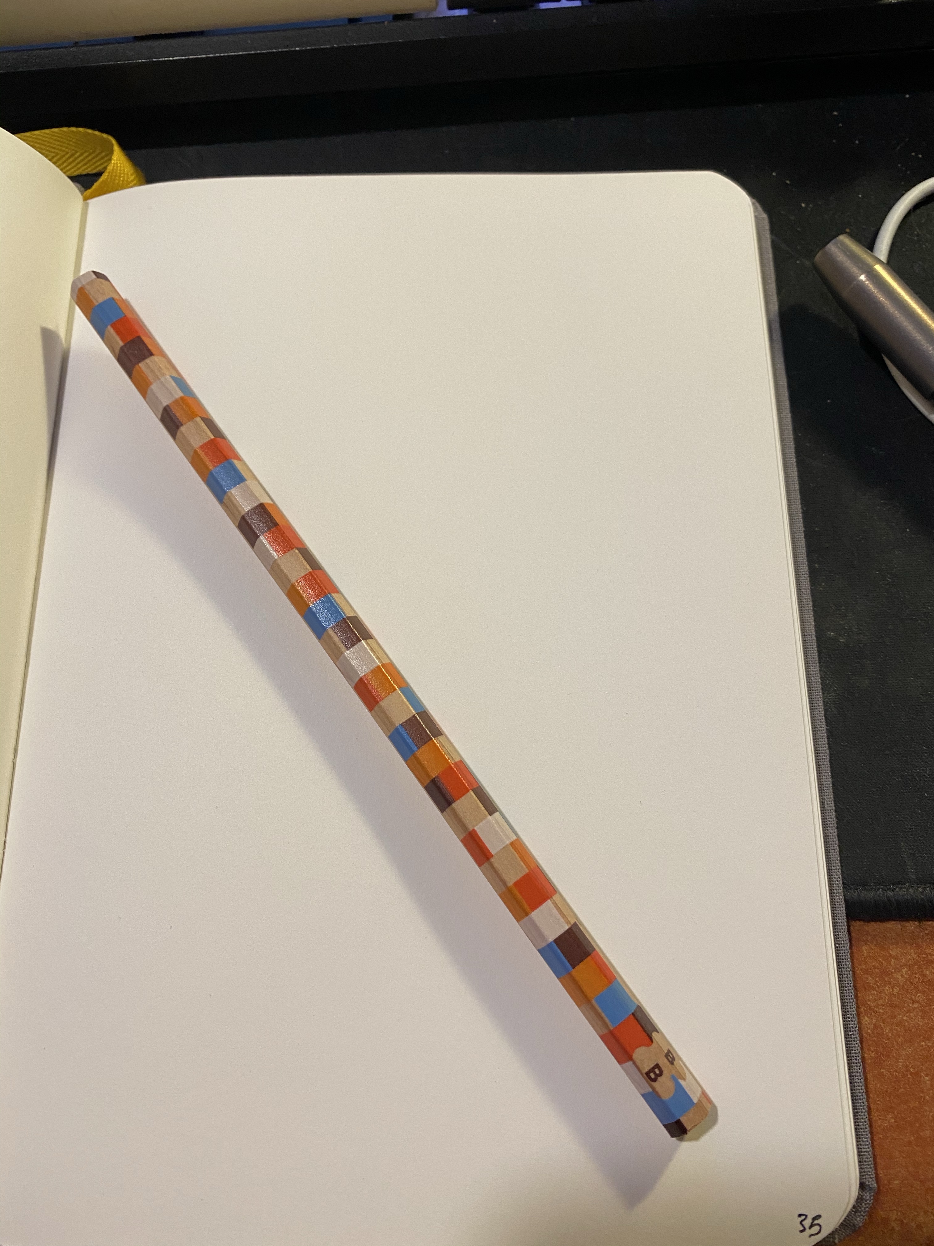
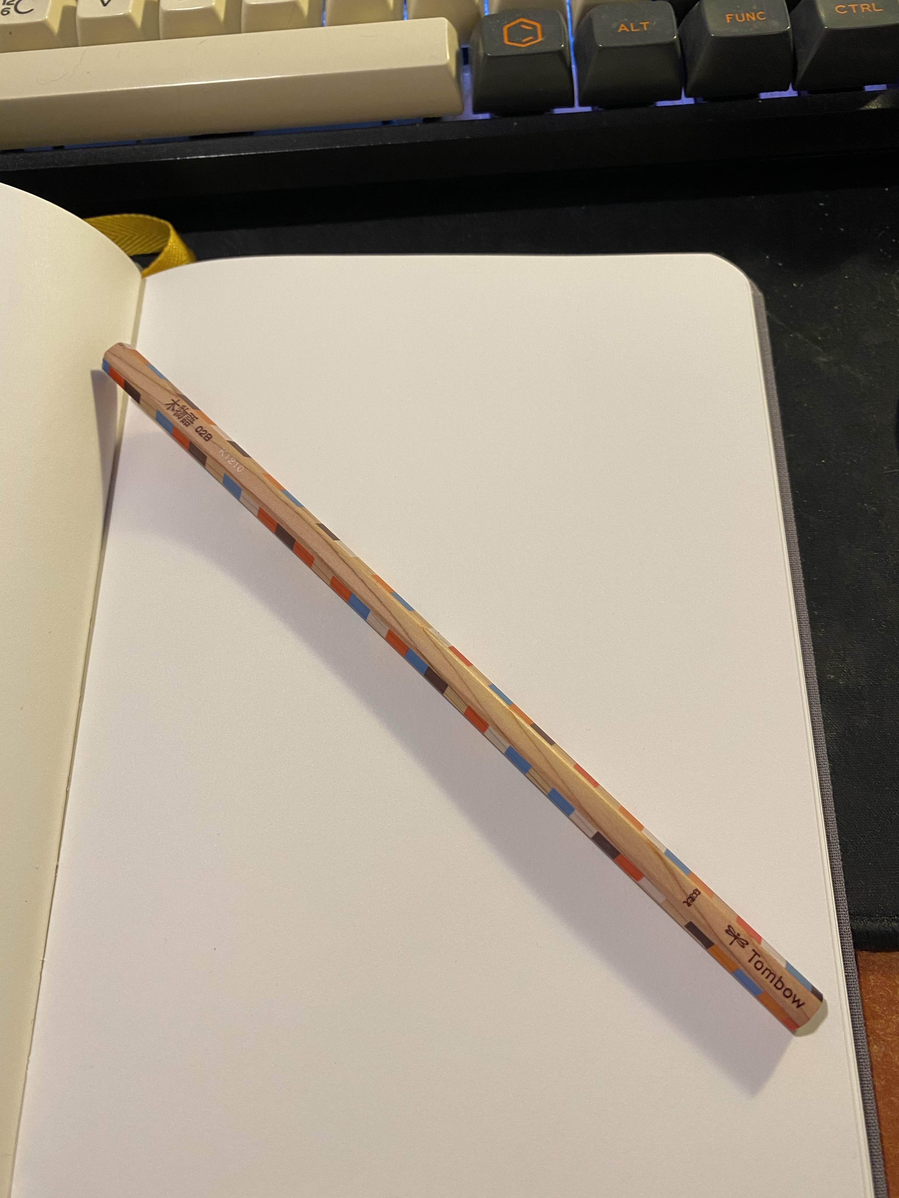
I was searching for a craft knife when I stumbled upon this cool pencil just lying around, being beautiful but of no use to anybody:
I’m pretty sure that I bought it somewhere in London, perhaps in the London Graphic Centre or in stationery section of Foyles, but in any case it isn’t new.
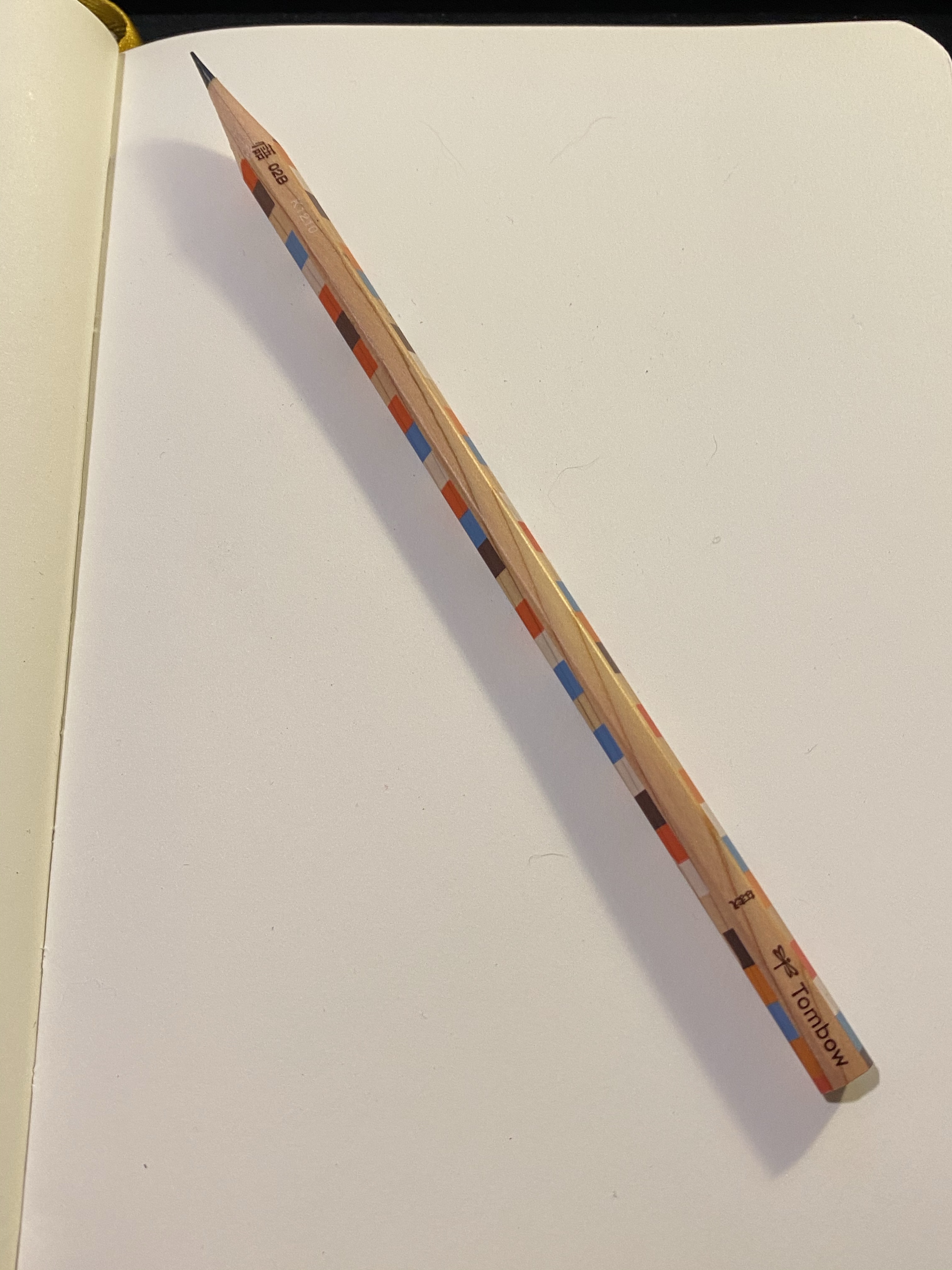
It’s an unlacquered woodcase pencil with a chequered print, a B grade core and it appears to be a Tombow Ki-Monogatari, part of their eco pencil range.
It has a silky smooth finish, and it’s one of the most attractive woodcase pencils I own. The wood is not cedar, but by the way it sharpens and feels it’s high quality stuff.
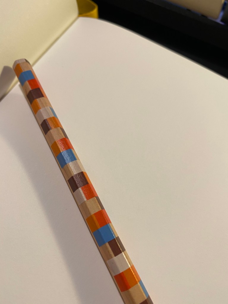
Tombow has one of the best logos in the business.
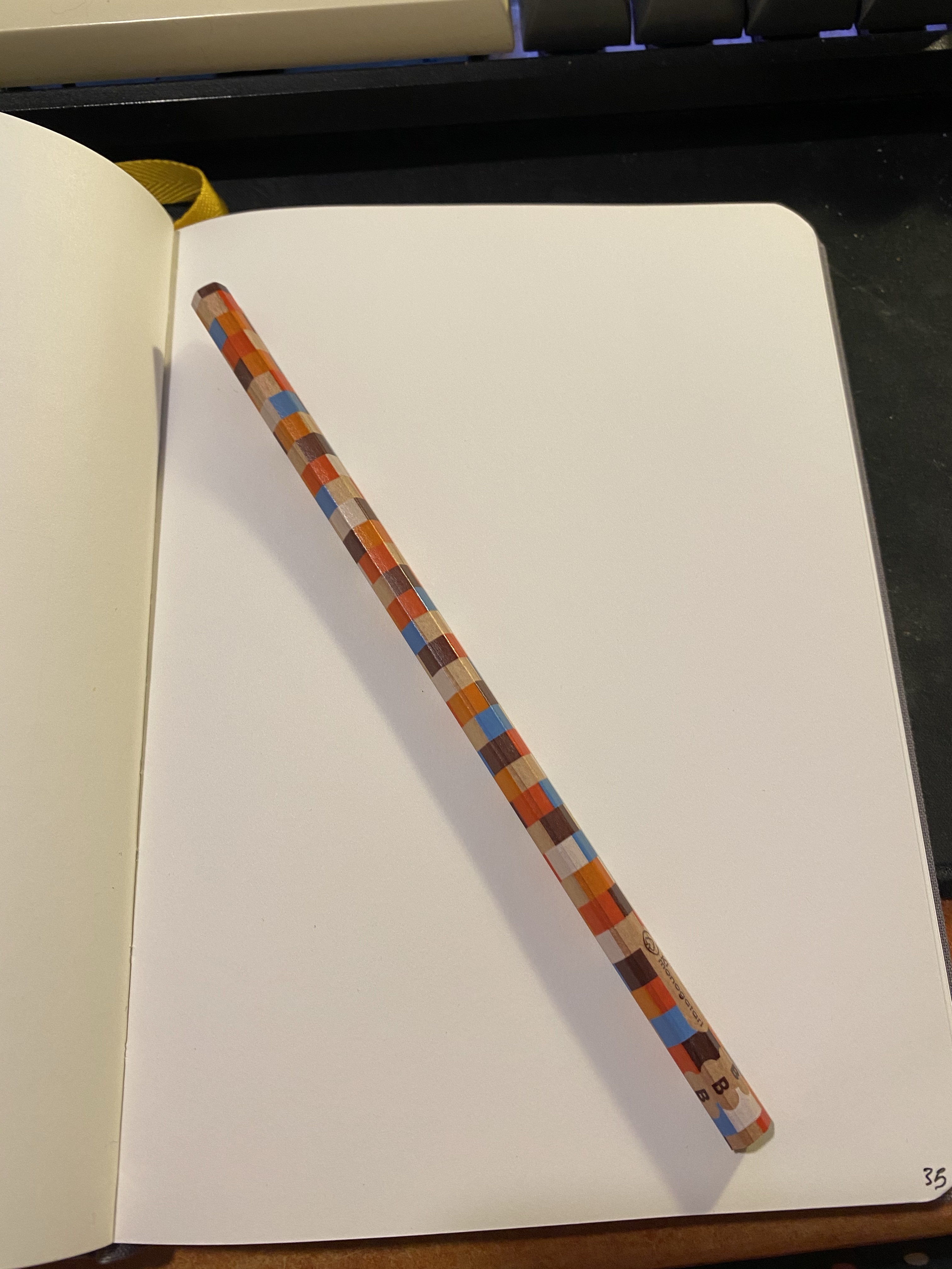
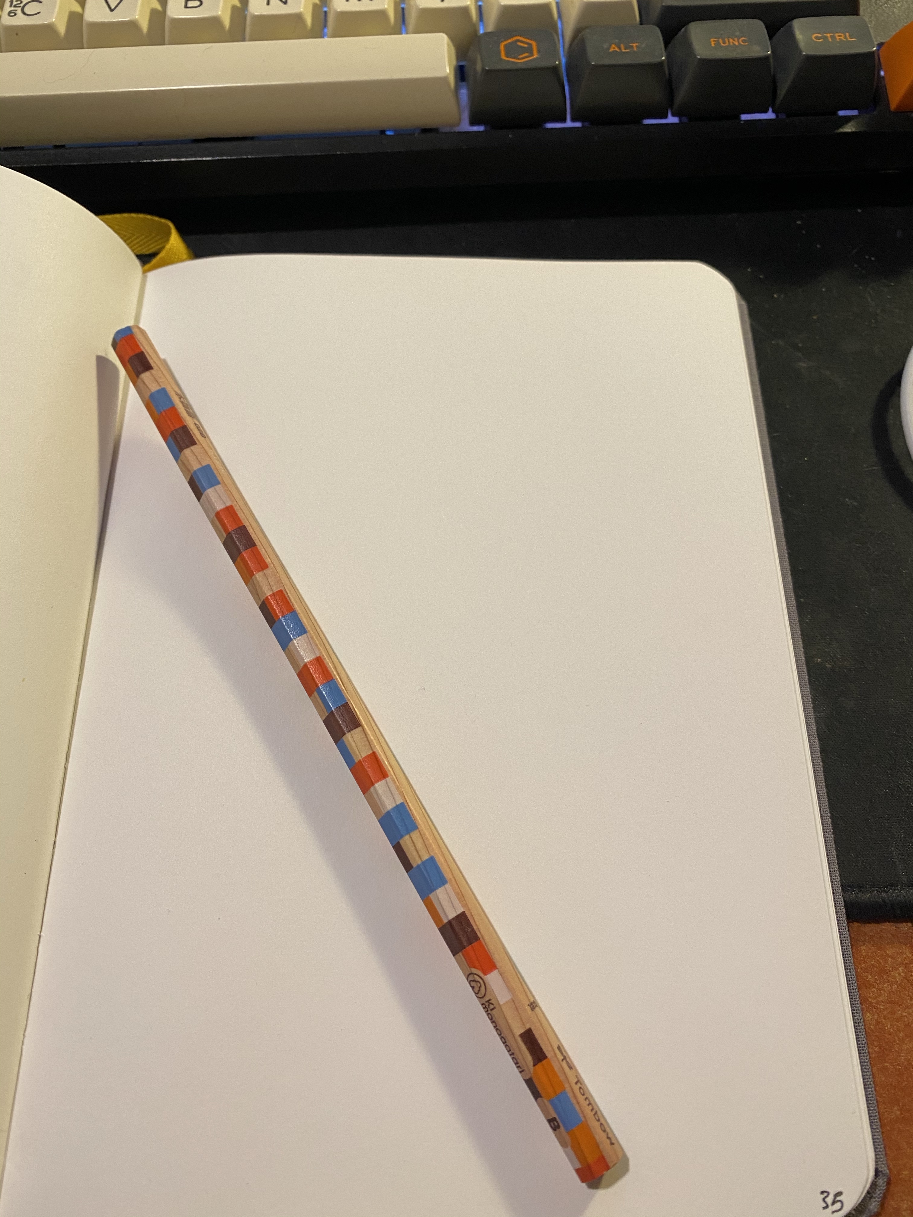
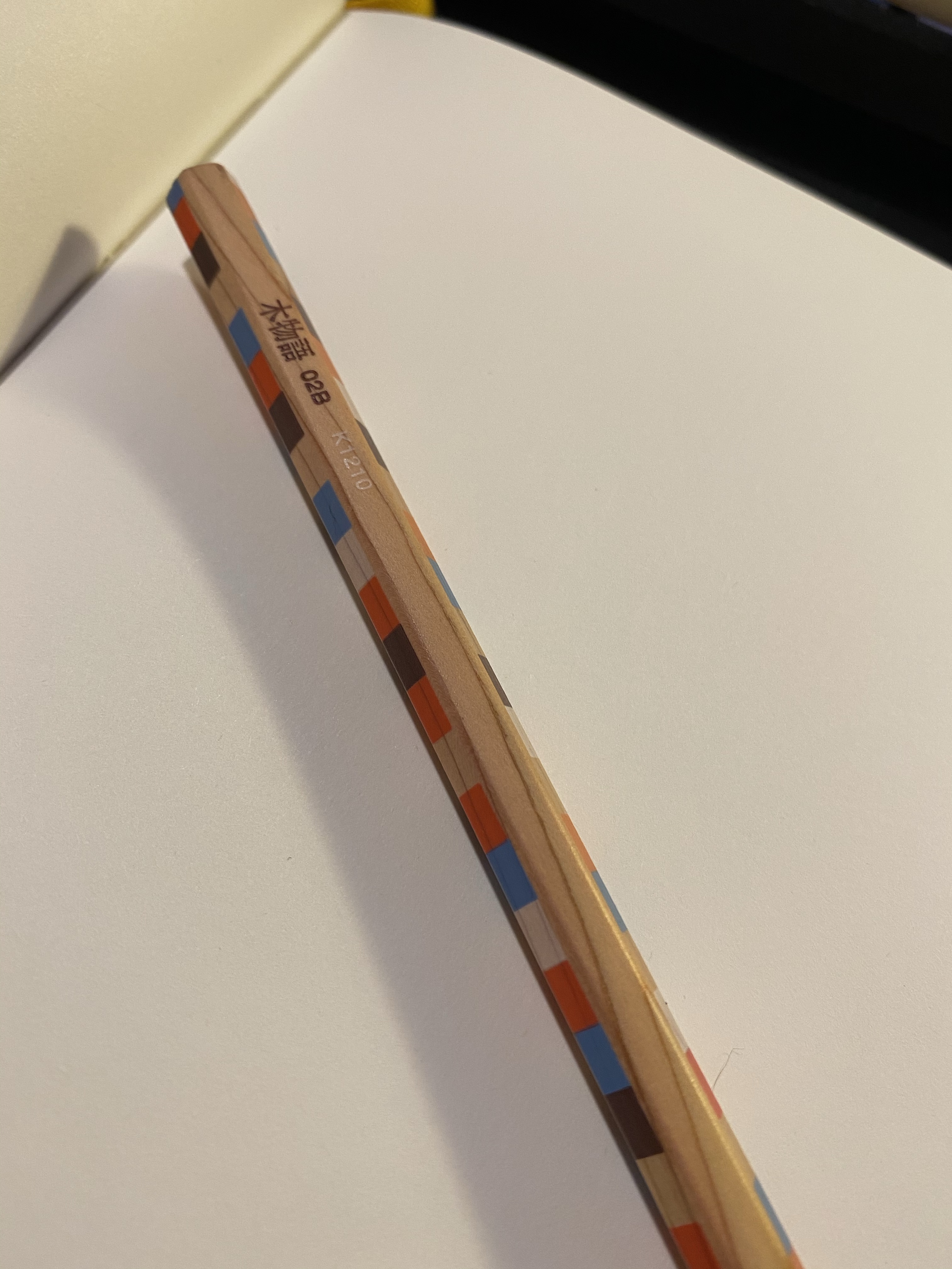
You can see the grain of the wood very nicely here:
And also come through the chequered pattern:
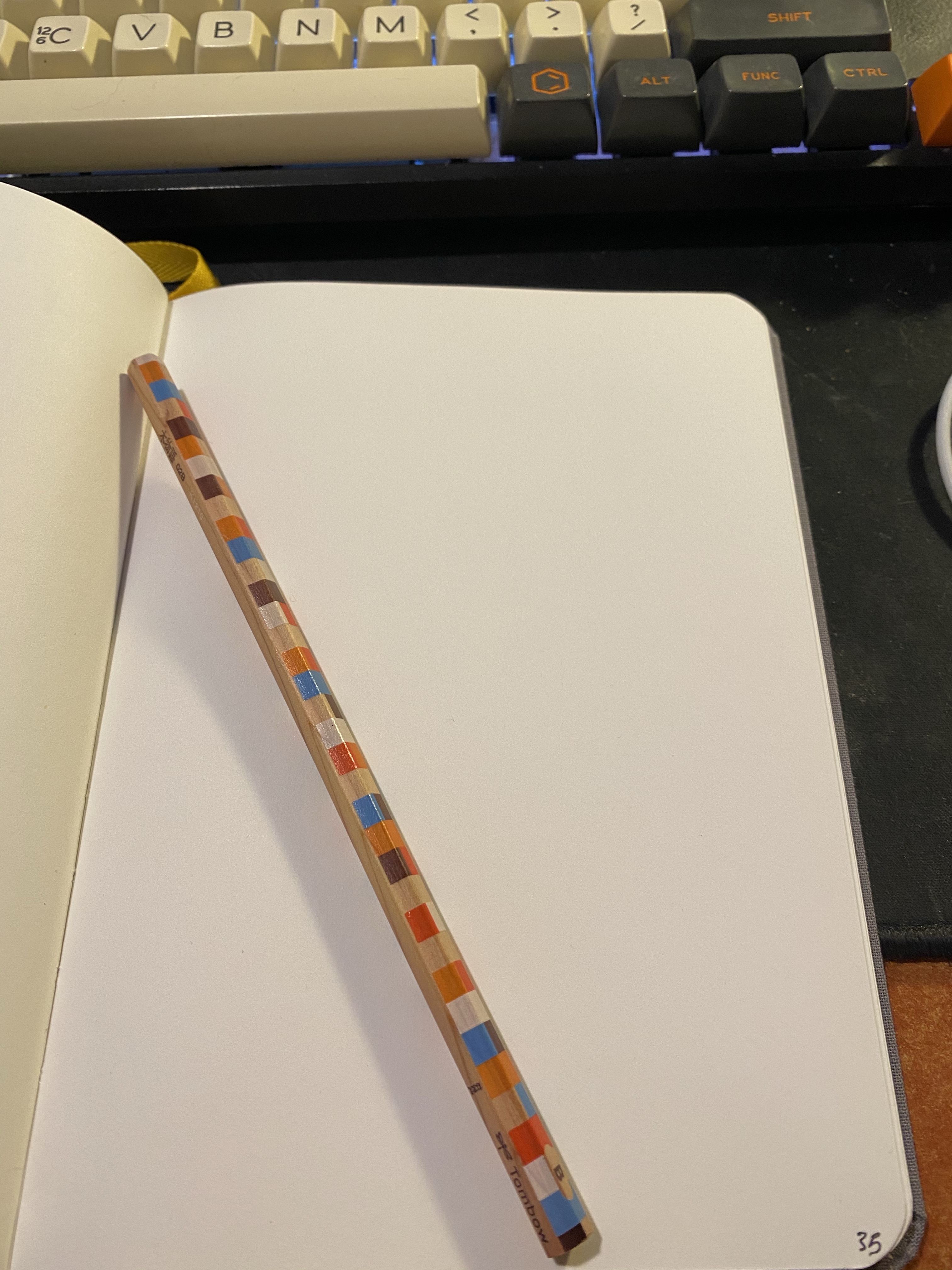
It sharpens like a dream, with a perfectly centred core and no splinters or chunks falling out. High quality wood, high quality design, so what about the core?
This is a Tombow pencil and one of the things that Tombow do exceedingly well is make woodcase pencils. Drawing with this pencil is a dream – it glides on the page, there’s no “grit” to the core, it offers a good range of shading for a B grade, it doesn’t smudge and it keeps a point really, really well. This is a grade A drawing pencil.
Drawn on a Baron Fig Confidant. You can barely see where I tried to smudge the graphite near the front tire.
I found this pencil by accident, totally forgetting that I ever bought it. I have cool stuff, so why don’t I use it?
I have no idea what the actual model of the pencil is, I’m just guessing that it’s a Ki-Monogatari, which means that this isn’t a “you should buy it” review. It’s a “go open you stationery drawer(s) and see what cool stuff you find there” post. Treat yourself to the stuff you already own.
When Cult Pens and Diamine came out with their first two “Iridescink” shimmering inks together they turned to the fountain pen community to name them, jokingly suggesting Robert and Maureen as possible names. The fountain pen community duly said “challenge accepted” and voted that the inks be called “Robert” and “Maureen”. I thought that this was a charming anecdote until I actually purchased three of the now four Cult Pens/Diamine Iridescink inks and realized that I with names like Robert, Maureen and Christine I would never be able to tell which ink is which.
This, of course, is a minor problem for an otherwise solid addition to the world of fountain pen inks. These inks are super sheening and generally well behaved, with a good solid base colour and an interesting sheen hue on top of it.
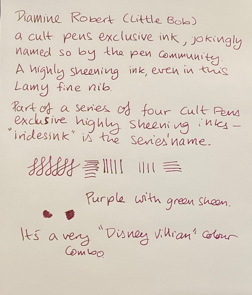
Robert, a purple ink with a green sheen (I will forever have to consult a guide when trying to remember which ink is called what), is one of the most attractive inks in the bunch. It features a reddish purple somewhat reminiscent of Diamine Amaranth, and a gorgeous green gold sheen.
On Rhodia paper with a Lamy fine nib you can see the green sheen on almost every downstroke. It’s also well featured in the swap I took in my Col-o-ring.
For the biggest sheen effect, of course there’s nothing like tomoe river paper. Here’s a quick sketch that I did on a Kanso Sasshi tomoe river booklet. As you can see the ink isn’t waterproof or water resistant (not that Cult Pens or Diamine claim that it is), and you can barely see the base colour in most places because of the heavy green sheen.
So why did I say that Diamine Robert is “generally well behaved” and not just “well behaved”? Because if you leave it unused in a pen for a day or two you may find that you need to “prime” the pen for a bit to get it to start to write. Once it gets going the ink flows well, but this is the sort of behaviour that makes me wary of using this ink in vintage pens. Your milage may vary, as ink flow changes with altitude and weather, but for now this gorgeous ink is relegated to “just” my modern pens. That’s more than good enough for me.
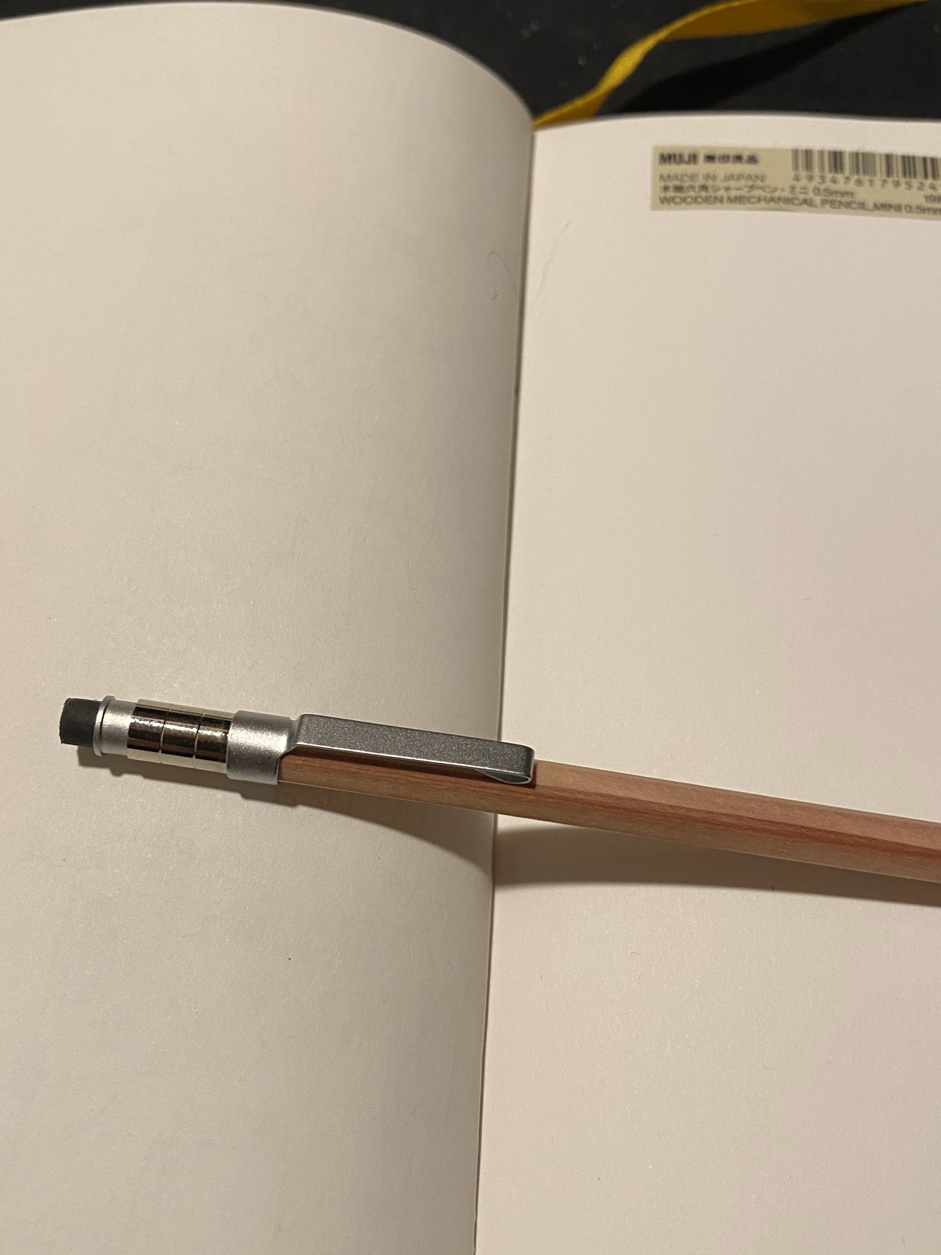
I was organizing some things around the house when I found a brown paper bag with the Muji logo on it, and in it was some washi tape and three wooden writing instruments: two mechanical pencils and a pen. There appears to be an advantage to being a forgetful unpacker, as I get to enjoy a little trip to a London based Muji store while I’m stuck at home in quarantine times.
Here are the three writing companions:
Muji Wooden Mechanical Pencil, Muji Mini Wooden Mechanical Pencil and Muji Wooden Ballpoint Pen
I was drawn to them because they were wood encased, and they had that very sleek, minimalist Muji design. They weren’t expensive, so even though I’m generally not a ballpoint fan and the mini mechanical pencil looked more like a novelty piece than an actual writing implement, I bought all three.
And promptly forgot about them.
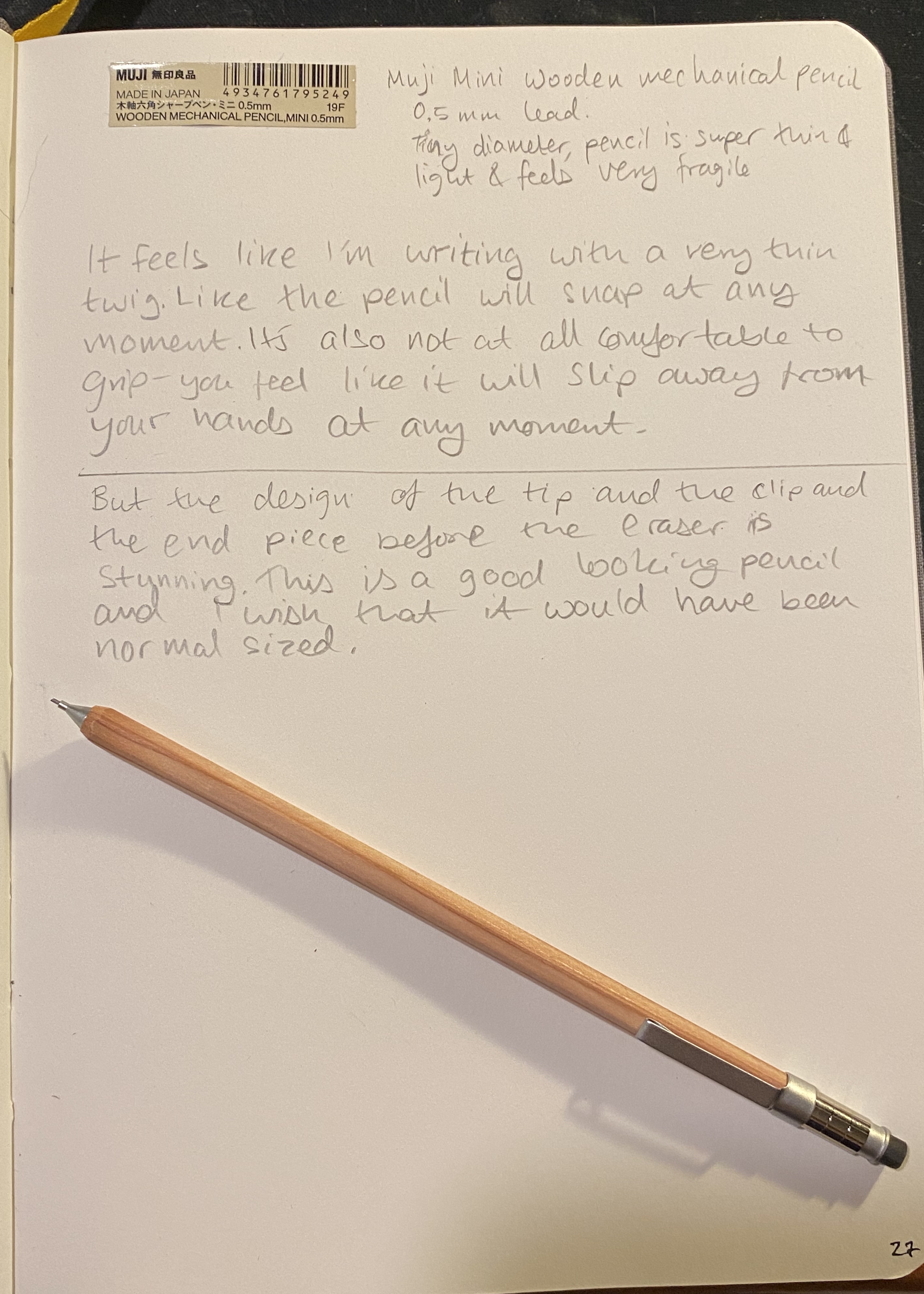
Muji Wooden Mini Mechanical Pencil
Well now I’m giving them a spin, and I can’t help but be intrigued the most by the least practical of the bunch: the wooden mini mechanical pencil. It’s a 0.5 point pencil, which is pretty bog standard for mechanical pencils, but here’s where the standard ends and you venture into the wild world of Muji industrial design. The pencil is very, very, very, very thin and also very, very light. It makes all other pencils, mechanical or not, look like veritable giants around it. It is 0.6 cm wide, which is tiny, and it feels like a delicate little twig that will snap at any minute, making it quite the adventure to write with. You get a little thrill when you pick it up and scribble with it: will it break? will it survive to write another day?
Your own mini “Survivor” in pencil form.
The design of the cap and clip area are both peculiar and handsome. There’s a combination of matt and shiny aluminum parts that make a striking statement, especially on an otherwise minimalistic pencil body. There’s no branding anywhere, and no indication of the lead size that this pencil takes (though that isn’t hard to guess). If the metal bands serve a practical purpose I can’t think what it is. They seem a bit blingy at first for such an understated pencil, but I think that they do add to the design.
The pencil tip is very short and stubby, which adds to the kawaii of the pencil and yet keeps the tip visible. Which would be important if you could actually do any kind of writing or drawing with this pencil, but it’s just too thin to be used for anything but a sentence or two once in a while when you have no other choice. It’s like trying to write with a pen refill without the pen body: not something you would ever do unless it was an emergency and it was the only option you had.
All in all this pencil feels like a designer or a maker got a challenge to “make the smallest usable mechanical pencil possible, something nice that we can use in a Filofax ad”.
The Pentel Graphgear 1000 in comparison to the Muji Mini Wooden Mechaical Pencil.
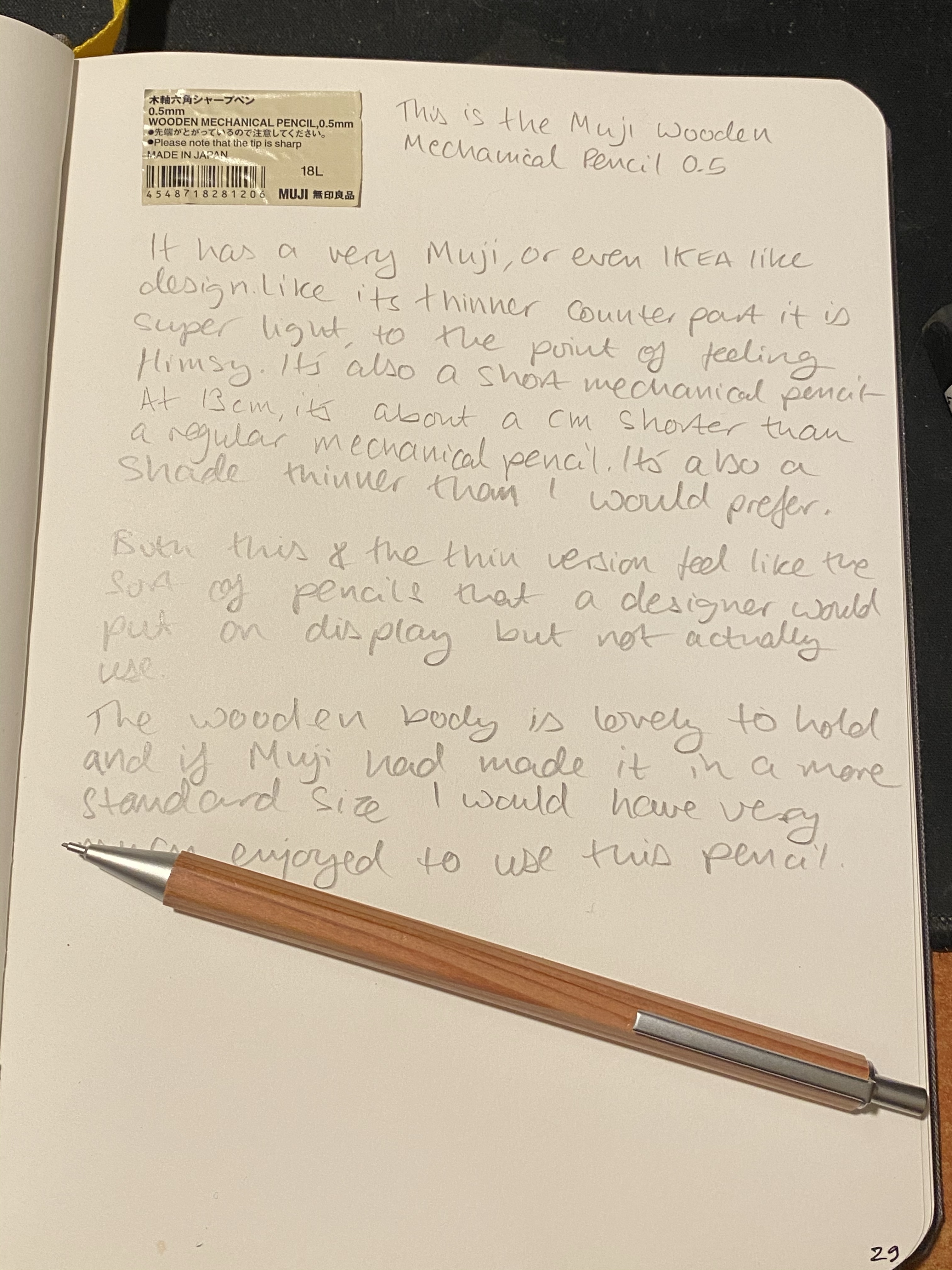
Now we’re back to normal pencil size world, and it’s time to take a look at the Muji Wooden Mechanical Pencil. It’s also a 0.5 pencil, and it has a very Muji/IKEA sort of look to it. It would definitely feel at home in an IKEA ad for a desk.
The wooden barrel is the highlight of this pencil, and since there aren’t many wooden mechanical pencils around and this was an inexpensive purchase I would recommend splurging for one if you have room on your desk.
I say “on your desk” because while the wooden pencil body is good looking and feels great in the hand, it is uncoated. This means that it will pick up dirt and dings from being carried around in a case, a bag or a pocket. Even on your desk it’s likely to become sullied with use, although I have had luck with using erasers to clean soiled wooden pencil bodies before.
Muji wooden mechanical pencil alongside a Uni-ball M9-552 drafting pencil.
The pencil is slightly shorter than a standard mechanical pencil, and it’s a very light pencil, but it’s absolutely usable, unlike its mini counterpart.
The Muji Wooden Ballpoint Pen is probably the one that I’ll use the most of all the bunch. It’s a 0.5mm needlepoint ballpoint that writes with a really fine, clean line. The refill, like the pen, is completely unbranded, but I’m pretty sure that it’s made by a large manufacturer like Uni-ball or Pentel. The only ballpoint pen that I have that writes remotely like this is the Traveler’s Company ballpoint, and this pen is more comfortable to hold and use.
The design aesthetic is the same as the mechanical pencil, very Muji/IKEA modern and minimalist. Like the mechanical pencil the wooden body makes for a lightweight pen that feels lovely to hold but is liable to easily get dinged and dirty.
The pen is on the thinner and shorter side when compared to other pens, so it isn’t the greatest for longer writing sessions. It is still a great pen for the price, as it’s solidly built with a good click mechanism and no wiggle in the tip or rattling while you write. Of the three I’d recommend this the most, as a general pen to keep in handy for those times that call for a ballpoint.
I’m drawing a lot of maps and schematics lately for a D&D game that I’m running so I’m using a slew of mechanical pencils for the occasion. Here’s the normal sized Muji wooden mechanical pencil at work on a Baron Fig Confidant:
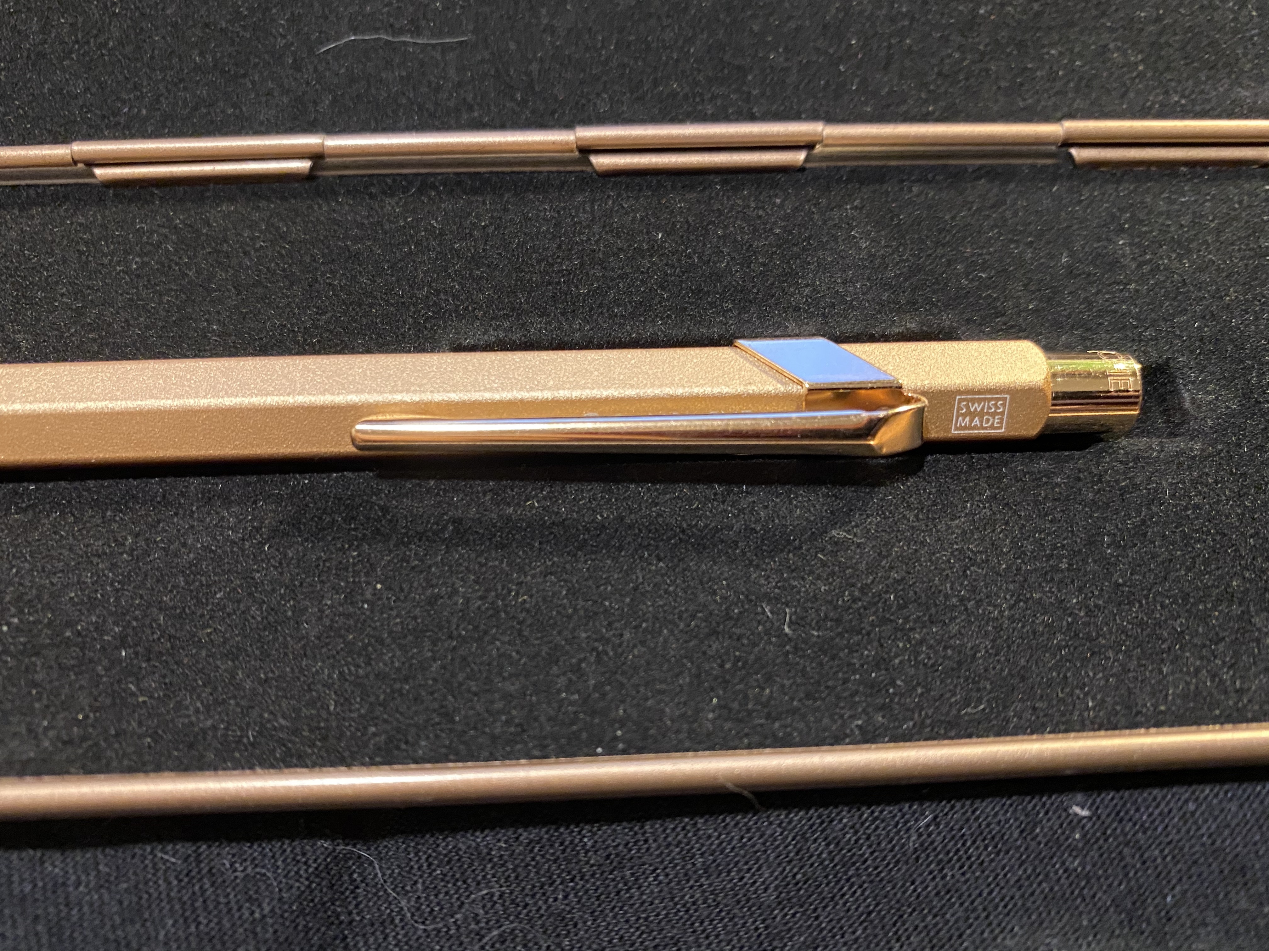
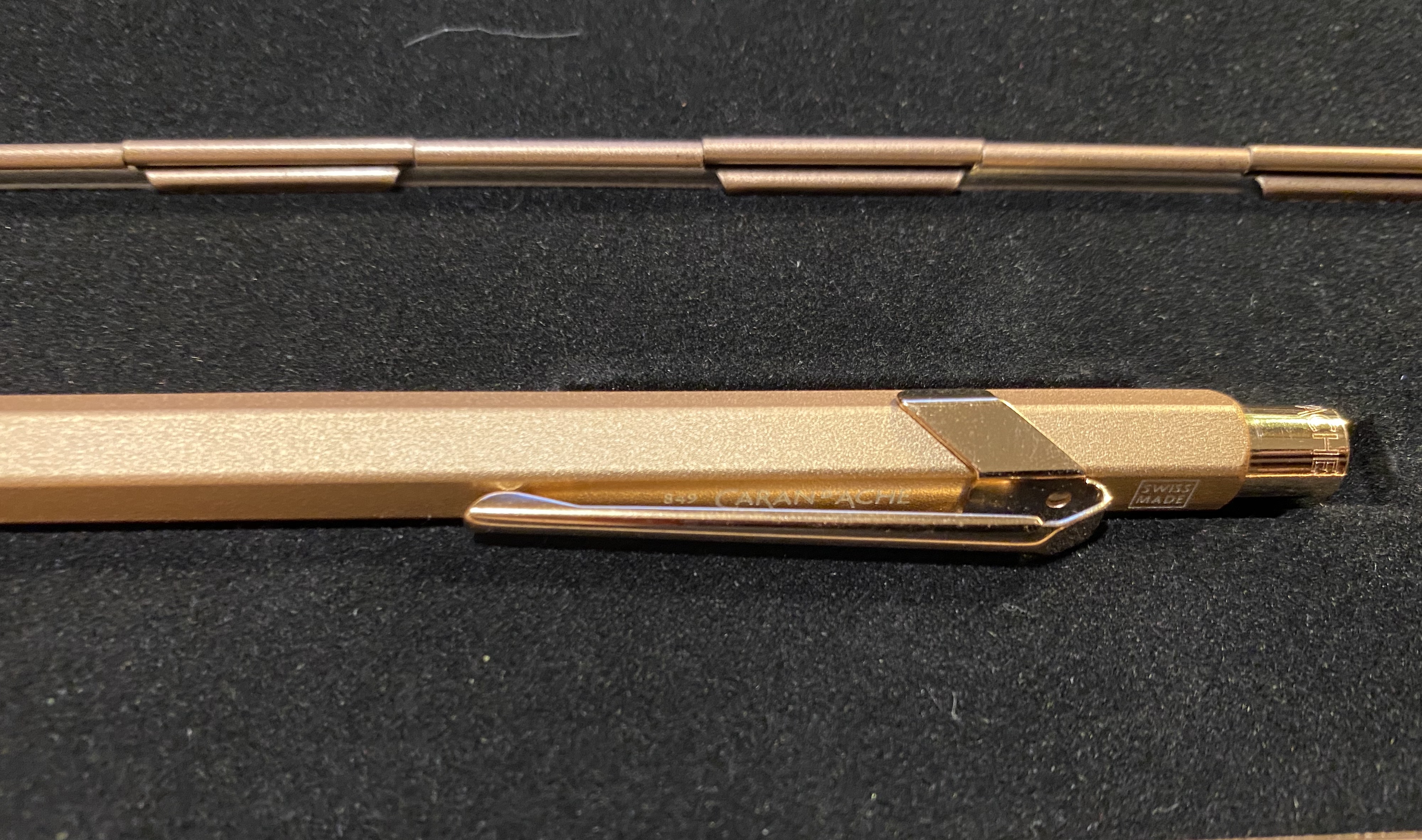
I’ve been on a Caran d’Ache 849 swing ever since I discovered that they can accept Ohto Flash Dry and Parker gel ink refills, and though I usually shy away from “blingy” pens, I was drawn to the 849 Brut Rosé (rose gold) . It is one of the few 849 pens that have a “rough”/ grippy texture.
The box.
The Brut Rosé Caran d’Ache 849 is part of “Celebratory” series that includes Sparkle Gold and Black Code pens. They all come in metal presentation boxes with fabric lining, magnetic closure, and what appears to be the tagline of this edition: “We write the 849 Legend, with added sparkle”.
The box is clearly meant to evoke a jewelry box, and it does so well. The pen itself has the added weight that the Caran d’Ache Nespresso849editions have (and the same texture) but is still not a heavy pen. The clip and nock appear in pictures to be gold and not rose gold, but that is only because this is an incredibly difficult pen to photograph. In reality the pen is entirely a warm rose gold.
The clip and nock are a slightly more coppery rose gold than the body, but they are still clearly rose gold.
In terms of branding, this pen didn’t receive any special treatment (unlike the Nespresso pens). There’s no indication that this is a “special edition”: it has the same Caran d’Ache etching on the cap, a white “Swiss Made” screen print above the clip, and “849 Caran d’Ache” screen printed in white under the clip.
Swiss Made.
You can just about see the print under the clip here:
Thus the only indication that this is a more expensive “special edition” is the box.
The Caran d’Ache 849 Brut Rosé comes with the Caran d’Ache Goliath blue ballpoint refill. It is an excellent ballpoint refill, but as I’m not a fan of ballpoints, I’ll be switching it out for either the Parker gel 0.7 refill or the Ohto Flash Dry 0.5 refill.
The pen looks plain gold here, but that’s just the fault of the lighting.
The Caran d’Ache 849 Brut Rosé will make for a fantastic gift pen, whether for yourself or for someone you like. It’s on the more expensive side of 849 special editions, but I think that it makes a more subtle and sophisticated impression than the similarly priced “Claim Your Style” 849s.