Caveat: this year’s Inkvent appears to have elusive ink colours. I suggest reading my description of the inks and not going by the photos alone, and comparing my results with those of other reviewers.
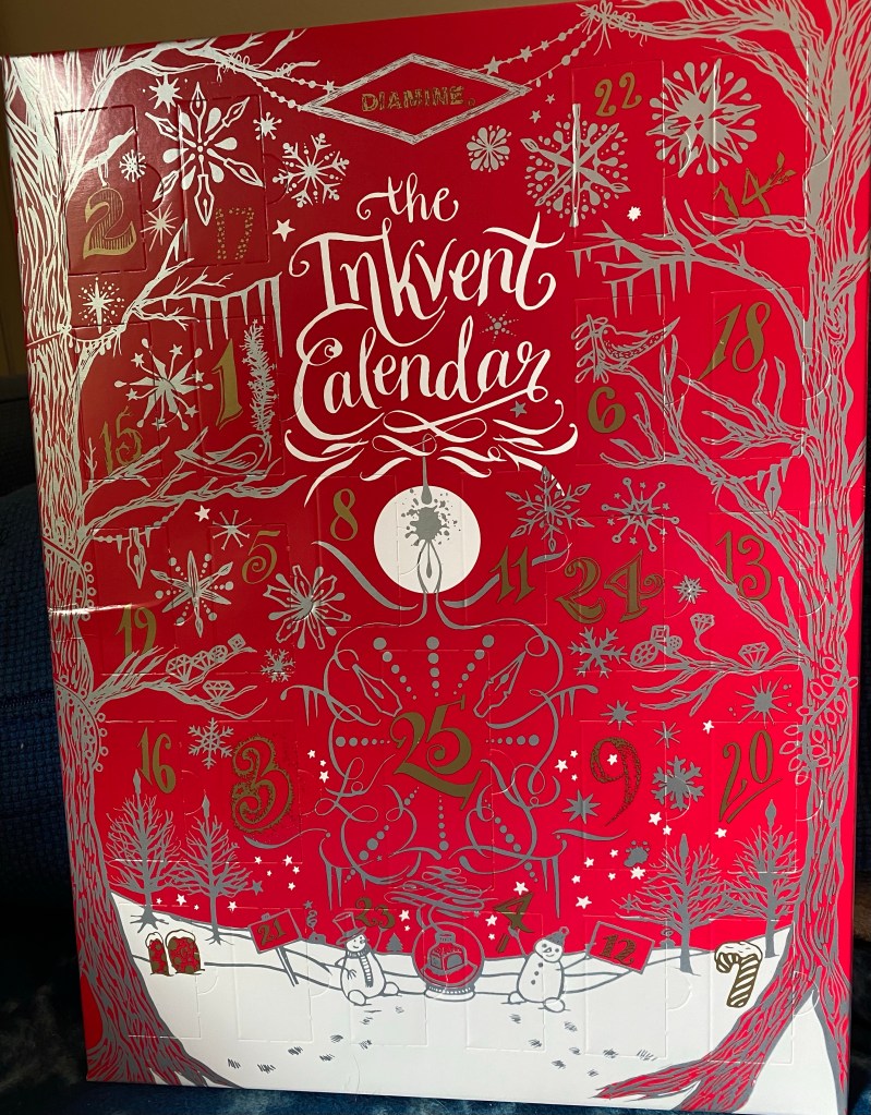
The Diamine Inkvent calendar is an advent calendar with 24 tiny (12ml) bottles of fountain pen ink behind 24 doors, and a larger, 30ml, bottle of ink behind the 25th door. All the inks are limited edition, and, at the moment, only available through this calendar.
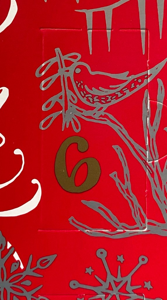
Day 6’s door.
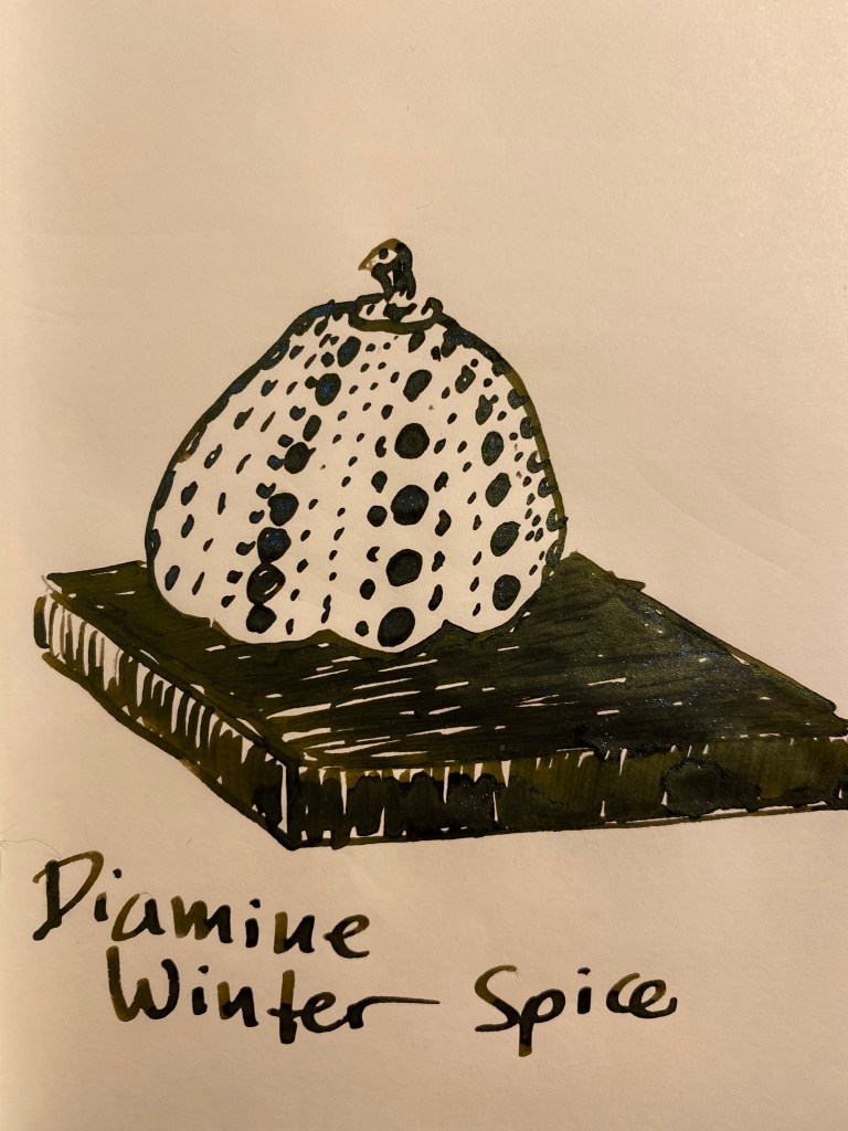
Day 6’s ink is Diamine Winter Spice. It’s a rich brown colour with a blue shimmer and a green sheen.
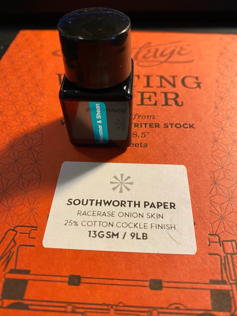
Diamine Winter Spice. Shimmer and Sheen.
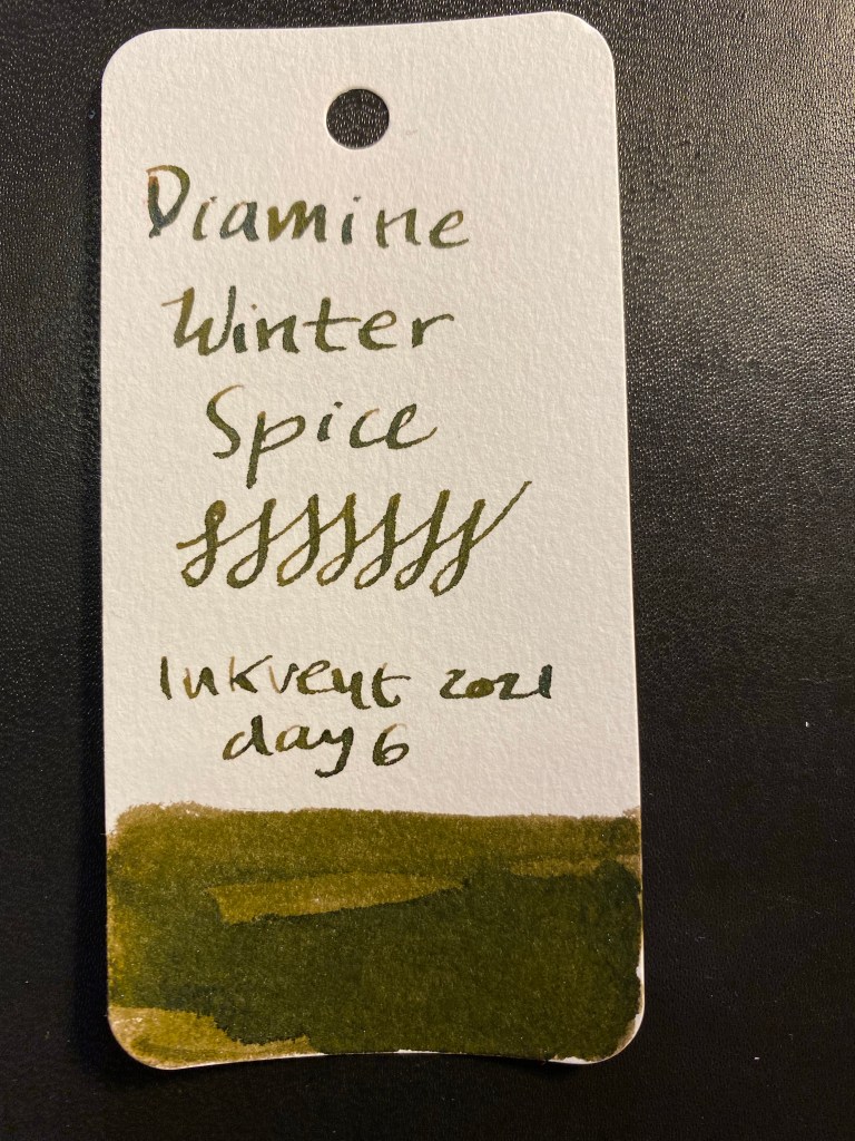
Here’s a Col-o-Ring swab of Diamine Winter Spice. It came out more yellowish in the photo than it looks like in reality – the Tomoe River sketch below is more true to colour. There’s a significant amount of blue shimmer and green sheen, especially with the music nib that I used to test out this ink.
Col-o-Ring swab.
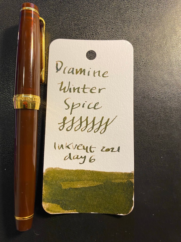
I used a Sailor Pro Gear with a music nib to test Diamine Winter Spice, and it lays down a generous amount of ink.
I drew a Yayoi Kusama pumpkin to test Diamine Winter Spice out, and it shows the colour of the ink pretty well.
Diamine Winter Spice is the least favourite of the Inkvent 2021 inks that I’ve tested yet. Something about the combination of the brown with the green sheen and the blue shimmer makes the ink take on a sickly yellowish green tinge in certain lighting conditions. You can see it in the Col-o-Ring swab above. It’s another peculiar colour choice for the occasion, and not an ink that I see myself using in the future.
The Diamine Inkvent calendar is an advent calendar with 24 tiny (12ml) bottles of fountain pen ink behind 24 doors, and a larger, 30ml, bottle of ink behind the 25th door. All the inks are limited edition, and, at the moment, only available through this calendar.
Day 5 door.
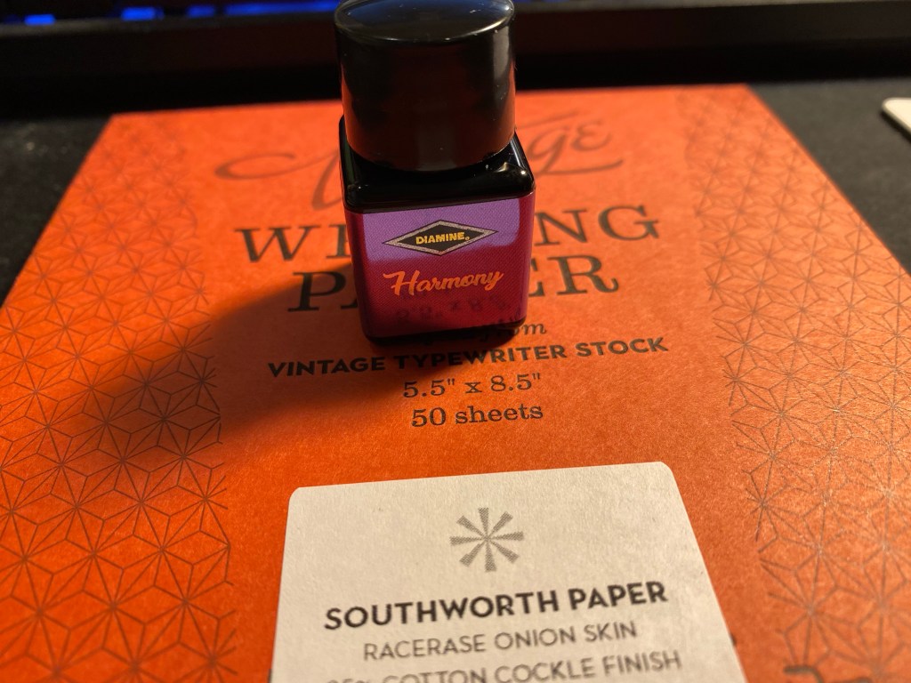
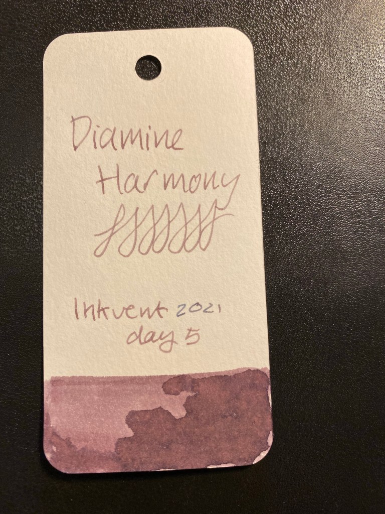
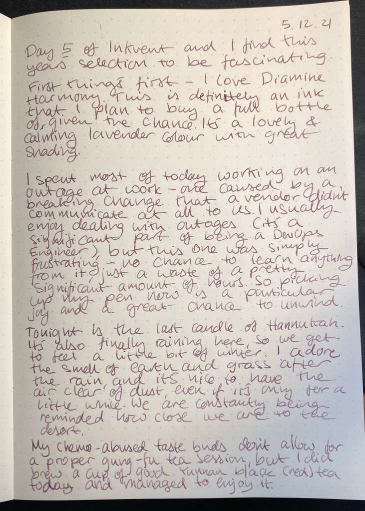
Day 5’s ink is Diamine Harmony, a standard ink in lavender (i.e. light, slightly pinkish-grey purple). As with all the Inkvent inks so far it’s far from what I’d expect to find in this calendar, and it’s elusive to photograph.
Diamine Harmony.
Here’s a Col-o-Ring swab of Diamine Harmony. It’s a pinkish-grey purple with a lot of beautiful shading. It goes down slightly bluish on the page and then dries to a lavender colour. A really interesting ink.
Col-o-Ring swab.
I used a Lamy Lx Palladium with a fine nib to test this ink out.
Lamy Lx Palladium and Col-o-Ring swab.
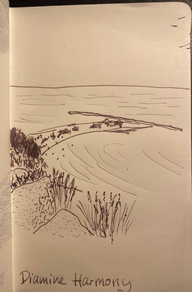
I drew the view of the Mediterranean from one of my morning walks to test this ink out. The photo doesn’t do this ink justice – it’s a more vibrant and less grey than it appears here. Diamine Harmony shades beautifully even in a fine nibbed pen. It’s a shade lighter than Diamine Seize the Night, and it doesn’t have the shimmer or the sheen of that ink, which makes it distinct enough from the other purple Inkvent calendar ink.
Diamine Harmony is very deserving of the name, and a lovely shade of lavender that I plan on adding to my ink stock. Is it the right ink to include in a Christmas themed advent calendar? I’m not so sure, but then again, it’s an interesting and optimistic colour, so I’m very happy that it’s there.
Check out the view of the Mediterranean from one of my morning walks this week:
Takes the edge off your problems, right?
This week was filled with catch up meetings and conversations with old friends, some of which I hadn’t talked to in years. They’re all lovely people and it was really great talking to them, and it’s something that’s going into my “soft planning” for next year: spending more time talking to friends and family. More about soft planning when I have a better idea of what it looks like.
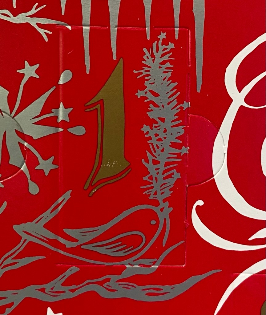
This week also marked the beginning of December and with it the opening of four out of five of my advent calendars (I’m saving one for the end of the month, to cheer me up in the interim between my last chemo treatment and my PET CT). I’m making daily posts (so far) reviewing the inks in my Diamine Inkvent calendar, and I’m enjoying the process very much. It’s fun to get to sketch and write with a variety of pens and inks, even though on Sunday to Wednesday this week I barely felt my fingers and writing was painful (due to chemo related neuropathy). I really enjoyed the Lego Star Wars advent calendar that I purchased last year, and this year’s calendar is Mandalorian themed, so I’m enjoying it even more. Lego has replaced running as my relaxation and reflection aid, at least until I can lace up again. This is what was behind door 1 in the calendar:
A tiny Razor Crest! Isn’t it adorable?
The third advent calendar is a Disney Pins one. I’m not a serious pin collector – I just buy them once in a while, if I like the design. I find some of them fantastic design objects, and the ones in this calendar have been perfection so far. Each one is designed like a Christmas stocking, but themed to a specific Disney movie. To see what I mean, check out the design on this Little Mermaid themed one:
Sebastian agrees that this pin is design perfection.
The fourth advent calendar is a Fancy Feast pet food one, and my cats love it.
Anyone else have cool or interesting advent calendars to share?
Health
Neuropathy has been really pronounced for most of this week. Typing has been a pain, holding a pen and writing has been a pain, but it’s still manageable and its all for a good cause (getting rid of my cancer once and for all), so I’m rolling with the punches. Things started to improve on Wednesday evening, and even though I’m still suffering from neuropathy and I won’t get a break until well after the treatments end, at least it’s now less painful and I can feel more of my fingers as I use them. Next week is chemo 11 of 12, and I’m kind of looking forward to it, as I can see the end of the treatments looming near. As for my mental health, I’ve had a bit of a breakthrough with my therapist that has been difficult but helpful and hopefully healing. Be kind to yourself this week, and in general. Life is tough enough without us adding any more pain and fear and hate to it.
Reading
I haven’t done as much reading as I would have liked this week, partly because I’m trying to stretch “Cibola Burn” to last me until my chemo next week. It’s an excellent piece of sci-fi writing, and I’m spacing my reading so that I get to read the final quarter of it as I’m getting my treatment.
Writing
A rough week for writing (see Health to see why), yet I’ve still gotten sample pages written for my Inkvent reviews, and I’ve journaled a lot. This is my current journal (a Moleskine Denim Skinny. Flared. Bookcut.), and so far the Inkvent inks have worked well in it. I write on just one side of the page when I’m using fountain pens in this notebook, to avoid dealing with the show-through, but there’s no feathering or spreading with these pens and inks (see Inkvent days 1-4 here to see which ones I’m using), and there’s very little bleed-through. As per my psychologist, very few people journal, and journalling is a good thing, so get thee to thy notebook stash (I know you have one. We all do), and start writing away. It’s worth it.
Moleskine Denim Skinny. Flared. Bookcut.
Other Things
This is the time of year when I usually start planning next year (i.e. my yearly plan/resolutions). This year that’s not going to happen, at least not in the same way. Yes, I’m finishing my treatments before the end of the year, but there’s still a chance that my cancer will return, and if it will, it usually comes back fast. I’m afraid to plan ahead the way I’ve planned ahead so far. So I’ve put my planning Baron Fig into a drawer and I’m working on “soft planning”. When I know what that is and how it looks like I’ll share it in a separate post.
Caveat: this year’s Inkvent appears to have elusive ink colours. I suggest reading my description of the inks and not going by the photos alone, and comparing my results with those of other reviewers.
The Diamine Inkvent calendar is an advent calendar with 24 tiny (12ml) bottles of fountain pen ink behind 24 doors, and a larger, 30ml, bottle of ink behind the 25th door. All the inks are limited edition, and, at the moment, only available through this calendar.
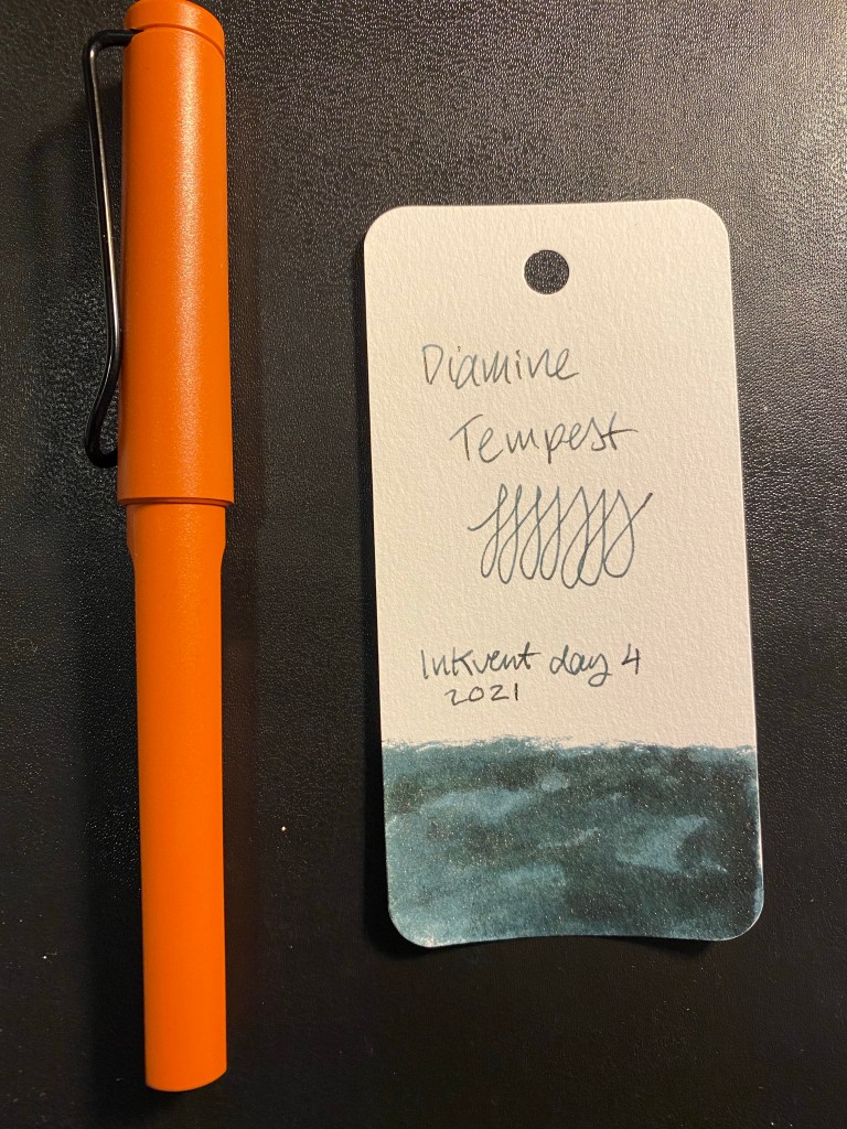
Day 4’s door.
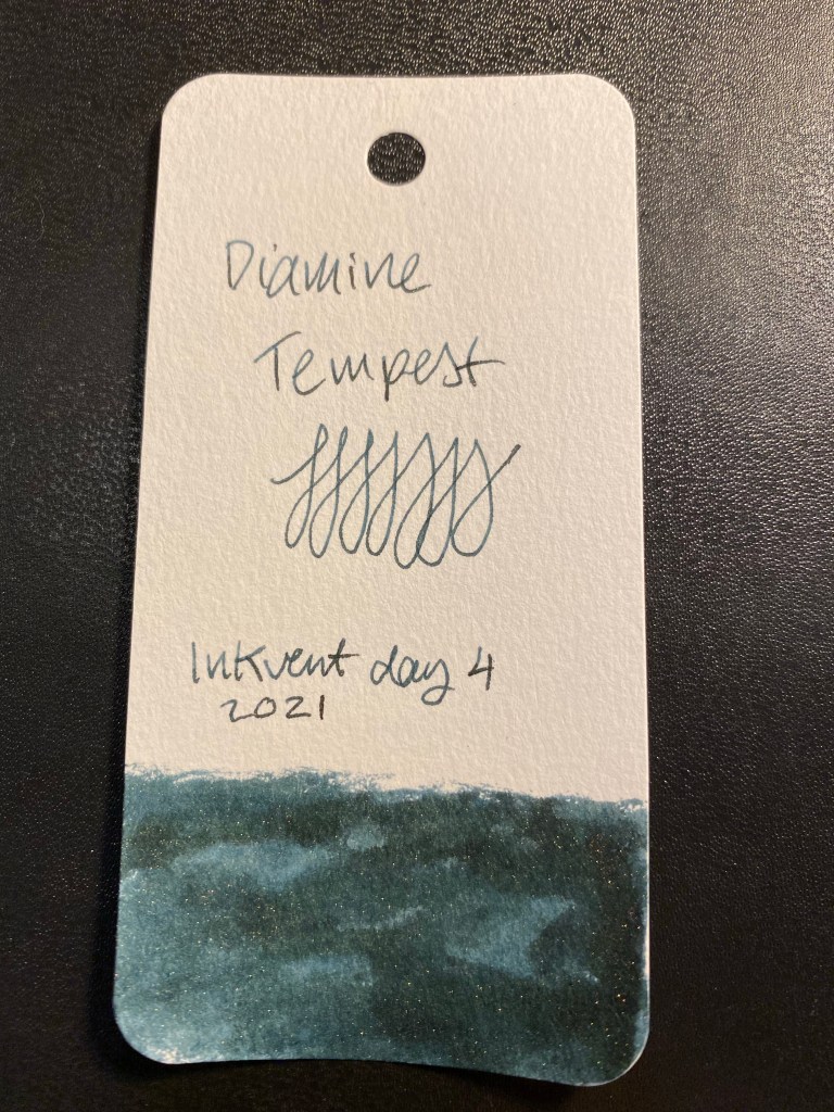
Day 4’s ink is Diamine Tempest. It’s a shimmering ink in an indigo/blue black colour with silver sparkles in it.
Diamine Tempest.
Here’s a Col-o-Ring swab of Diamine Tempest. It was photographed slightly lighter than it appears in real life. The basic colour is a gorgeous and rich Indigo or blue-black, and the shimmer is subdued enough to allow the ink’s shading to show through.
Col-o-Ring swab.
I used a Lamy Safari Terracotta with a fine nib to test this ink out.
Lamy Terracotta and Col-o-Ring swab.
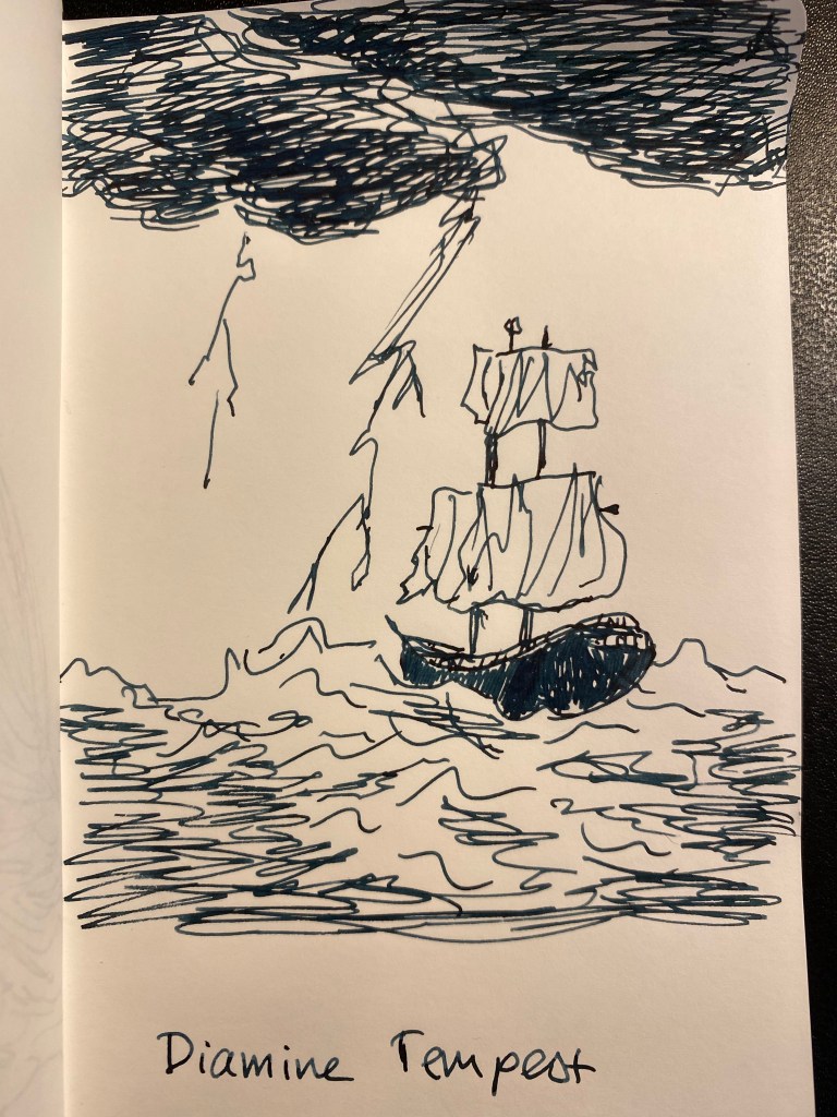
I had to draw a ship in a tempest to test out this ink. It’s quite a dark ink, and the shimmer isn’t in your face – it reminds me of last Inkvent’s Diamine Solstice.
This is not a festive or cheery ink, but I still love it. Something about having such a dark and “serious” colour paired with a subtle shimmer really speaks to me, and I’m quite likely to buy a full bottle of Diamine Tempest should I get the opportunity to.
Caveat: this year’s Inkvent appears to have elusive ink colours. I suggest reading my description of the inks and not going by the photos alone, and comparing my results with those of other reviewers.
The Diamine Inkvent calendar is an advent calendar with 24 tiny (12ml) bottles of fountain pen ink behind 24 doors, and a larger, 30ml, bottle of ink behind the 25th door. All the inks are limited edition, and, at the moment, only available through this calendar.
Day 3’s door.
Day 3’s ink is Diamine Ash, a standard neutral to slightly warm grey. Another surprising choice in what looks to be a very surprising calendar. I’m really enjoying the diversity of colour in this year’s Inkvent compared to the 2019 one.
Diamine Ash.
Here’s a Col-o-Ring swab of Diamine Ash. The ink shades beautifully, and goes down with a distinctive green tone that largely vanishes once it dries.
Col-o-Ring swab.
I used a Lamy Safari Savannah with a medium nib to test this ink out.
Lamy Safari Savannah Col-o-Ring swab.
I thought an owl sketch would be appropriate for this ink. It shades wonderfully, and it’s definitely not too light a grey to be useful.
I don’t have an ink in this shade of grey, even though I have a sizeable amount of grey ink bottles. The ink has a green hue to it that largely disappears once it dries, and I wonder if I applied a water wash to it if it would make its reappearance. Something for me to try out once I can use brushes again. As it is, Diamine Ash is an ink that I would consider buying a full bottle of.
The Diamine Inkvent calendar is an advent calendar with 24 tiny (12ml) bottles of fountain pen ink behind 24 doors, and a larger, 30ml, bottle of ink behind the 25th door. All the inks are limited edition, and, at the moment, only available through this calendar.
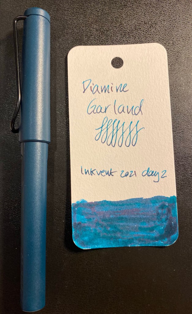
Day 2 door.
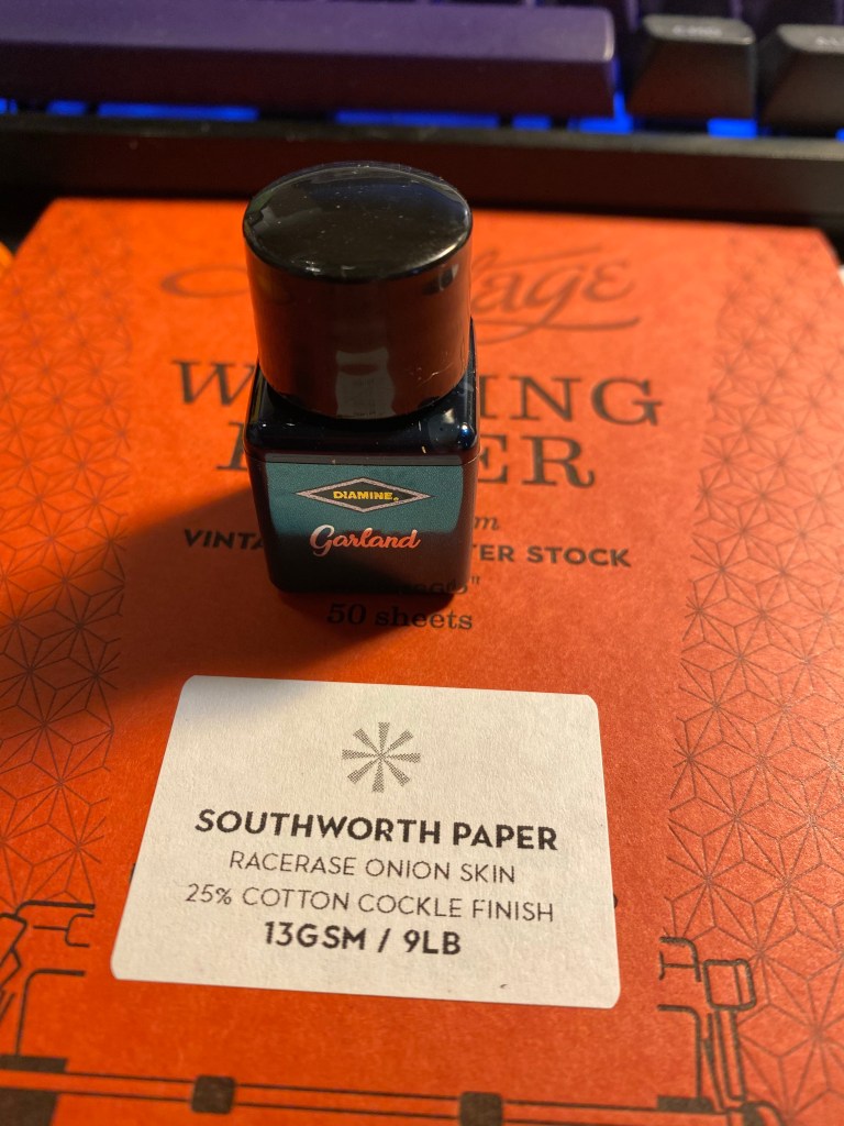
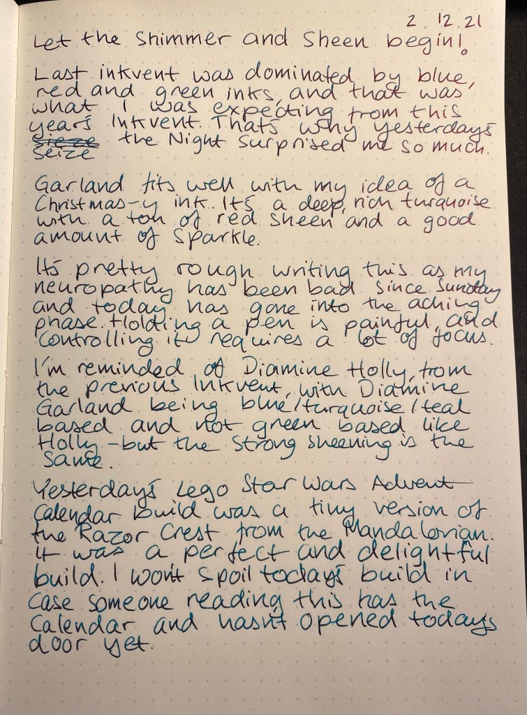
Day 2’s ink is Diamine Garland. It’s a shimmer and sheen ink, with a green-blue base, red sheen and green sparkles. As I guessed on day 1 of Inkvent, the label colour is meant to evoke the colour of the ink, though it’s far from a faithful reproduction of it.
Diamine Garland bottle.
Shimmer and sheen on the label:
It’s a shimmer and sheen ink!
Here’s a Col-o-Ring swab of it. The ink looks more blue than green here, but in reality it’s more of a green than a blue. If I had to compare the base colour to my Schmincke watercolours, it would be a Prussian green or a cobalt green turquoise.
Col-o-Ring swab.
I used a Lamy Safari Petrol fine nib to test this ink out. Again, cartridge converters for the win.
Lamy Petrol with Col-o-Ring swab.
I felt like sketching a cat, so I drew one lazing about on a yet to be hung garland. The photo doesn’t pick up the crazy amount of red sheen that Diamine Garland has. You can barely notice the shimmer with the sheen being so pronounced.
Diamine Garland looks a lot like someone took Diamine Holly from 2019’s Inkvent and added a splash of Prussian blue or indigo to it. I think that the shimmer gets a bit lost in this ink because of the strong sheen, and I’m not sure that the colour stands out enough from other inks in this colour range to justify ordering a bottle of it. It is Christmassy colour, and a pretty one, it’s just not one that is as unique as day 1‘s Seize the Night.
The Diamine Inkvent calendar is an advent calendar with 24 tiny (12ml) bottles of fountain pen ink behind 24 doors, and a larger, 30ml, bottle of ink behind the 25th door. All the inks are limited edition, and, at the moment, only available through this calendar.
Day 1 door.
The first thing that caught me by surprise is the bottle. The 2019 Inkvent calendar had tiny, tall and circular glass bottles. This year’s Inkvent has plastic bottles that are square and squatter and have wider mouths. That makes them much easier to use, with less of a chance for accidental spills. I like the redesign, even though I would have liked glass bottles better. However, as glass is more expensive, I understand the reasoning for going for plastic this year.
New bottle on the left, 2019 bottle on the right.
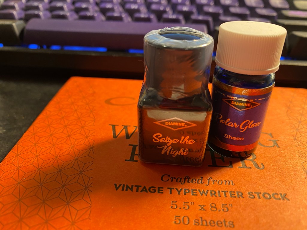
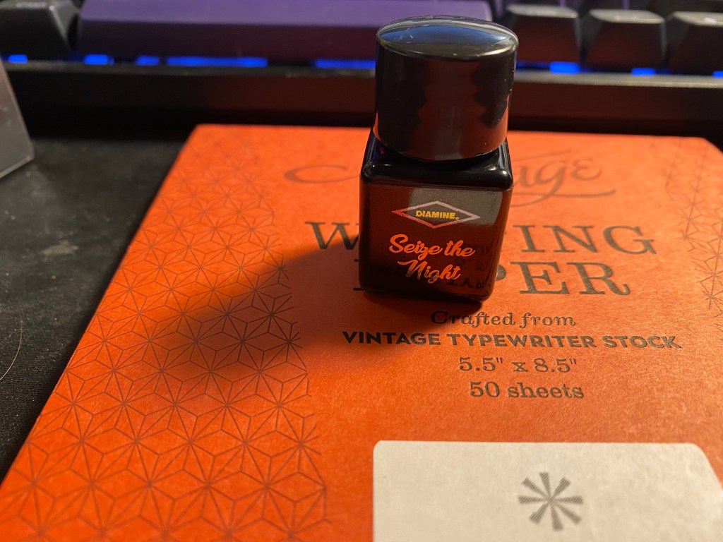
The day 1 ink is “Sieze the Night”. It’s a standard ink in a very non-standard colour. I’m not sure if the label on the bottle is meant to reflect the colour, as it did in the 2019 Inkvent, but if so they did a poor job of it.
Seize the Night.
The bottle comes wrapped in shrink wrap, likely to prevent leaks, and on the side of the label you can see what kind of ink it is (in this case standard). The plastic wrap is surprisingly difficult to open.
Label on the side marking it as a standard (i.e. not shimmer or sheening) ink.
So what’s the colour like? It’s a dusky purple that goes down on the page lighter and brighter than it dries. Seize the Night is a greyish-lavender ink with a good amount of shading and a slight golden sheen if you flood the page with it.
Here’s a Col-o-Ring swab of it. You can see the sheen on the swab, where the ink pooled.
Col-o-Ring swab of Diamine Seize the Night.
I used my Diplomat Elox Rings with an extra fine nib to test out this ink. A wider nib would have shown more shading, but even with this nib there’s a fair amount of shading going on, particularly on less absorbent paper.
Diplomat Elox Rings with the Diamine Seize the Night ink swab.
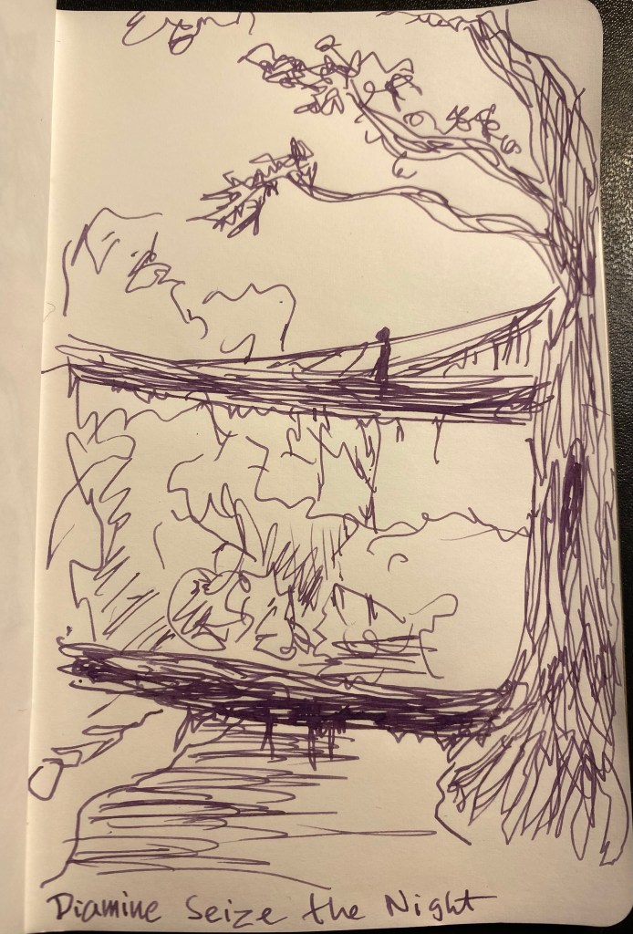
I read an article about villagers in India training the air roots of local trees into bridges across a local river, and decided to do a quick sketch of that scene to test the ink out.
I wasn’t expecting this ink shade at all in a Christmas themed ink sample set like the Inkvent. That being said, I love it. It’s a unique colour that is dark enough and muted enough to use in the office, but is also interesting and unique. From a distance it reads like a black/brown/grey until you take a closer look and its purple nature is revealed. It flows well, there’s plenty of shading to be had, and there’s a very good chance that I’ll be picking up a bottle of this should Diamine eventually offer them up for sale.
It’s Diamine Inkvent time! In 2019 Diamine came out with a fantastic fountain pen ink based advent calendar: the Inkvent Calendar. Behind each of the 25 doors was a tiny ink bottle (except for day 25, which got a larger bottle), each one of them was holiday themed and made specifically for the calendar. I created a review post a day for each any every one of those 25 inks. It was exhausting but worth it because it allowed me to select my favourites of the bunch . Eventually, as I’d hoped, Diamine reissued these inks in beautiful glass bottles, and so I was able to purchase full bottles of my favourites.
Front of the Inkvent calendar
This year Diamine came out with a new Inkvent calendar, this time also with 25 exclusive and thematically appropriate (at least by name) inks. I plan on posting a review of each one on the appropriate day. I’m not promising not to open some of the doors in advance. Due to my neuropathy and my treatments there will be days when I otherwise won’t be able to post.
This is meant to be a fun project, and I’m also hoping that Diamine comes out with larger ink bottles of the Inkvent line. So the reviews should help me select the few larger ink bottles that I may order.
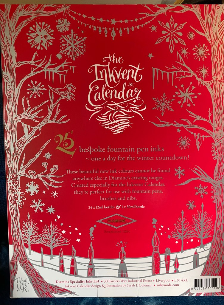
The back of the Diamine Inkvent calendar.
My plan is to use cartridge/converter fountain pens to test the inks. They’re less of a hassle to fill from tiny bottles, and they’re easy to clean. This calendar will contain inks with a lot of sparkles in them, so the cleaning aspect of the business is important.
So, expect a daily review, as we go out on an inkventure.
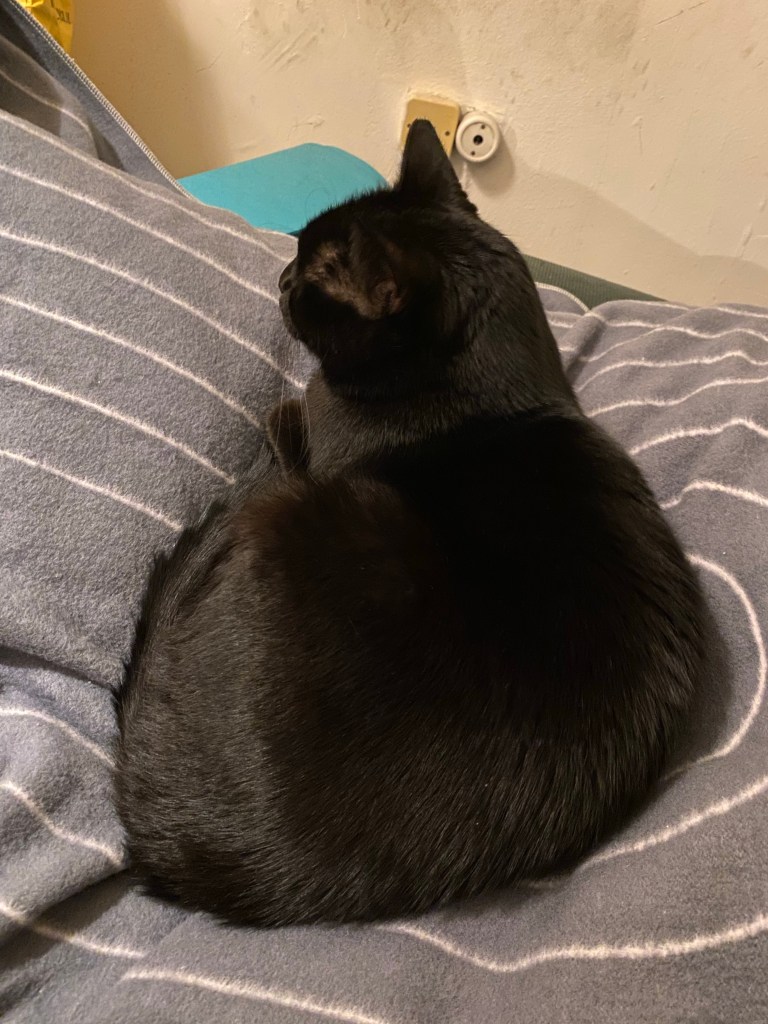
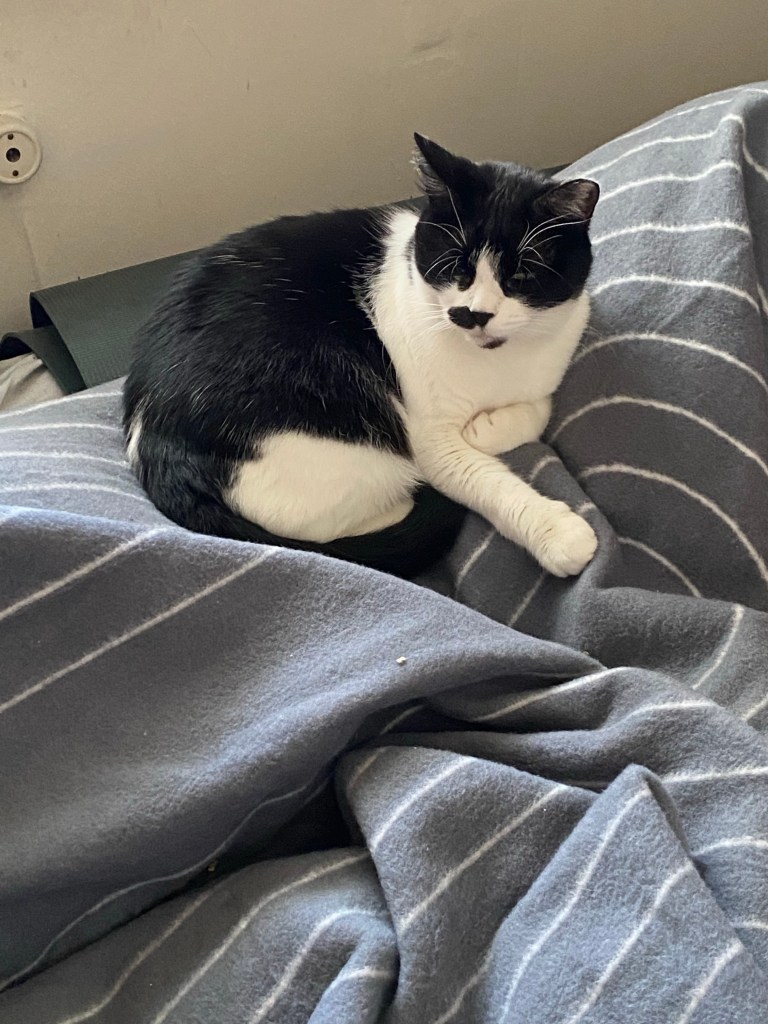
We’re still not getting a real winter yet, but I did get some new Rumpl blankets in this week and that was enough to get my cats into full winter mode. Hopefully there will be some rain next week to justify their need for winter cuddles.
The gentleman.The lady.
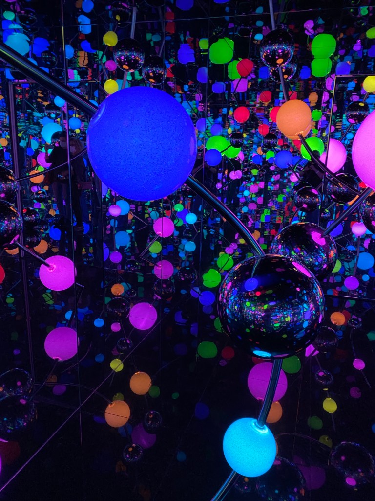
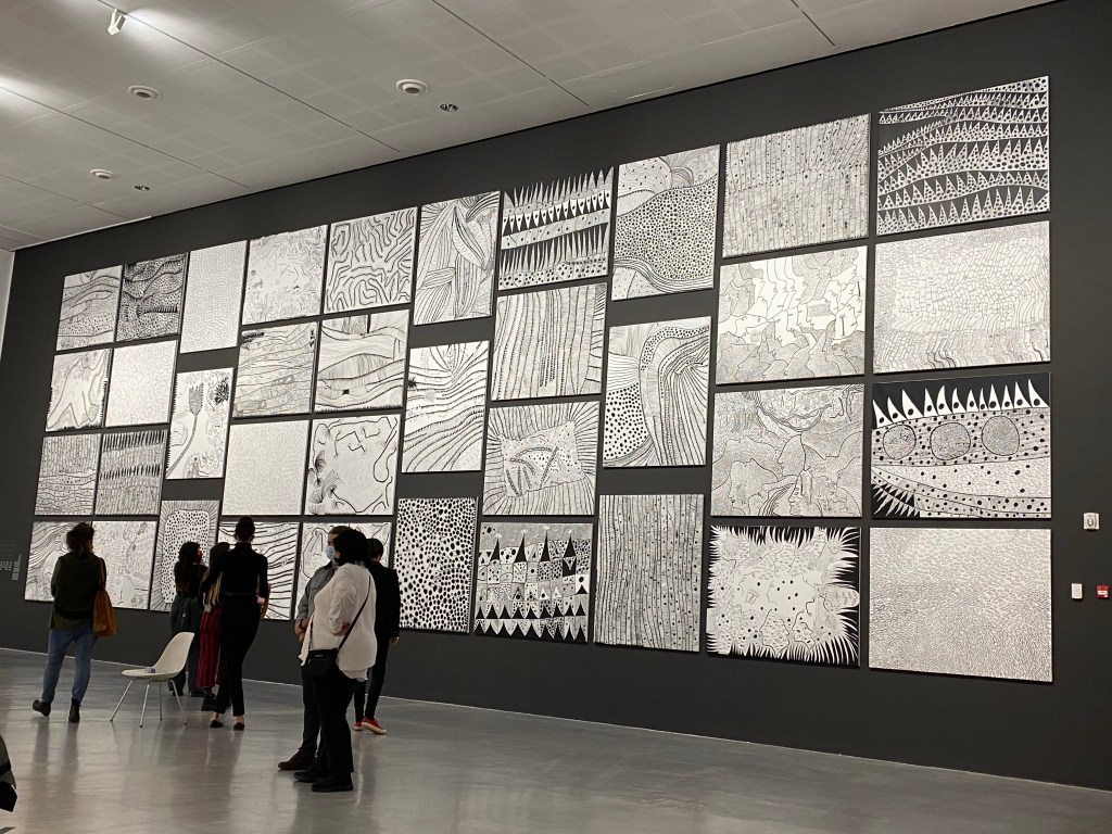
I dared to venture out on the day before my Chemo session, because I really wanted to see the Yayoi Kusama retrospective in the Tel Aviv Museum of Art. I arrived when the place was relatively empty, and wore a mask the entire time (as did almost all of the other visitors). The curation of the exhibit was phenomenal, and I enjoyed it very much. I loved seeing Kusama’s early sketches in her sketchbook, as well as her later sculptors and rooms. There was a new room, created specifically for this exhibit, the “Galaxy” room, which was my favourite:
Inside the Galaxy room.
Walking through the museum became a very colourful and oftentimes surreal experience. There’s nothing like being dwarfed by pink tentacles:
Pink tentacles in the atrium.
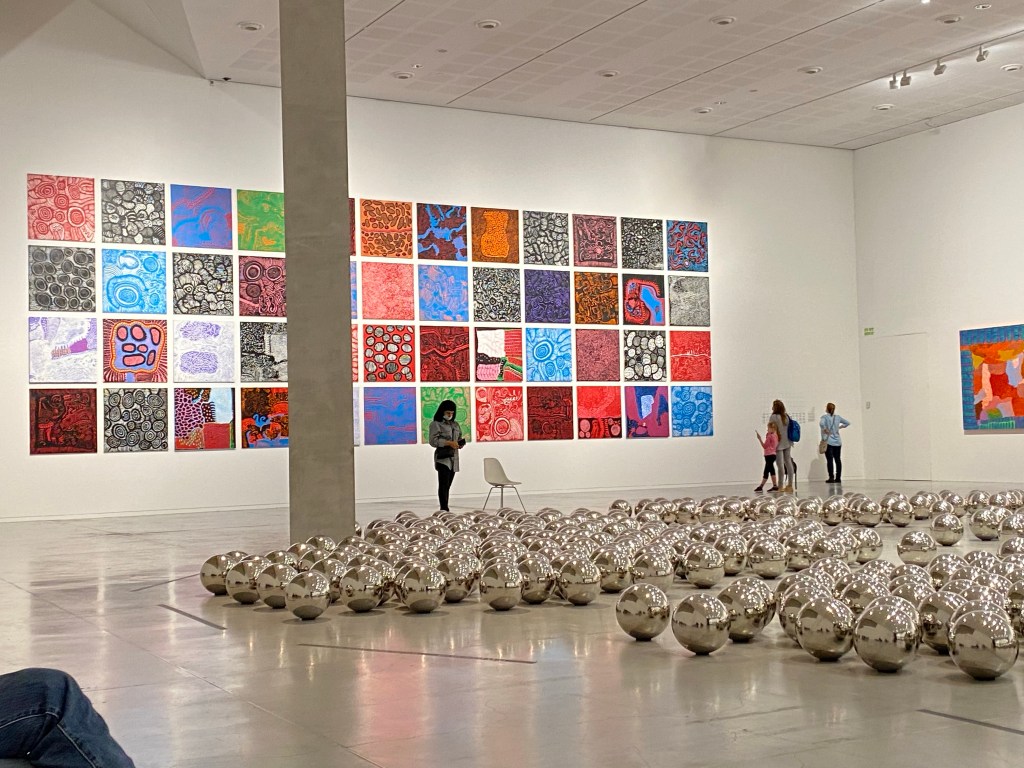
The penultimate room was phenomenal, with a steel ball exhibit on the floor that toyed with people’s need to view themselves (so many people lay down on the floor to take selfies), and two mosaics of Kusama’s paintings: one colourful and one in black and white, on opposite walls. It was very striking.
With my treatments getting progressively harder, flu season (yes, I’m vaccinated, but that doesn’t necessarily guarantee that I won’t get sick), and a new Covid variant on the rise I doubt that I’ll be going out much for the next few months. That just makes my visit to this colourful, interesting and joyful exhibition even more precious to me.
Health
I had my 10th Chemo treatment (the second treatment of the fifth cycle) on Tuesday, and this time I asked to get less steroids. So instead of a really, really, really, really, really large amount of steroids, I was given a really, really large amount of steroids. It was a risk (the steroids serve as anti-emetics and general boosters to help me get through the treatment), but so far it has paid off. I could sleep better and longer after the treatment, which helped me feel a little better. The treatments are getting harder, and as I suspected I now no longer have a break in my neuropathy. As I’m typing this, I feel about four out of ten fingers. The secret to typing like this is to be like Wile E. Coyote and not look down or think about typing as I type 🙂
Reading
I got less reading done than I expected this week, and I’m only about a third of the way through James S.A. Corey’s “Cibola Burn” (the Expanse #4). I also need to dedicate some time to update my Goodreads reviews. I have a few notes on books that I’ve read that I’ve yet to publish there. Luckily my reading journal is still around to help me keep track of things.
I’m enjoying the way that the Expanse novels unfold, with 3-4 viewpoints in each one, and large systems of government, military and industry are made human without being overly simplified.
Writing
I journaled a lot this week, but other than that I didn’t get any writing done. My neuropathy meant that holding a pen has become virtually impossible since Thursday evening. I really miss holding and using my pens.
Currently Inked
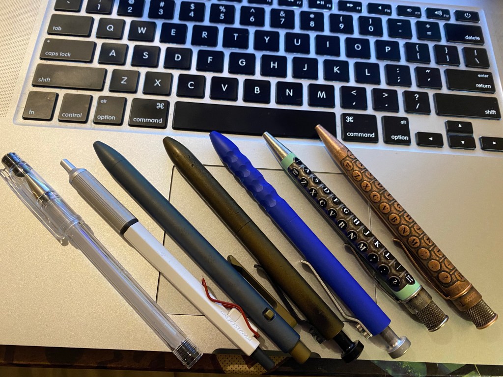
I’ve been focusing on my standard pens this week (while I could still hold them). The Retro 51 Typewriters have Monteverde gel ink refills installed, and I’m really enjoying them (I don’t like the standard Schmitt refill). The Karas Kustoms Periwinkle Bolt V2 has a dragonskin grip and a cerakote finish and is gorgeous. The other Bolt is the steampunk one, which I love and use regularly. The Tactile Turn Nautilus is the most unique and gorgeous of my standard pens, and the click mechanism is a lot of fun to fidget with. The Uni Jetstream Edge was a pen that I wasn’t expecting to enjoy very much, but I ended up writing the most journal pages with it this week. I can’t explain why I love writing with this pen so much, but I just do. The same can be said of the Pilot Hi-Tec-C next to it, which I’m about to run dry (a pen achievement, if ever there was one). The barrel is cracked, of course, but somehow the tip has remained intact and the gel ink refill hasn’t yet inexplicably stopped flowing.
From left to right: Pilot Hi-Tec-C, Uni Jetstream Edge, Tactile Turn Nautilus, Karas Kustoms Steampunk Bolt V2, Karas Kustoms Periwinkle Bolt V2, Retro 51 Typewriter green, Retro 51 Typewriter copper.
Other Things
I’m hoping that my neuropathy improves next week, so that I can get back to journalling. I’ve started working on some long term projects and with the encouragement of my therapist I may actually get back to planning more than two weeks ahead.
The seeds in my garden have started germinating, which is always a joy to see. Monday is going to be very dry and warm so I’ll have to keep a look out for their health and mine then.
As is usual for a Chemo week, a lot of my time was spent trying to fall asleep and failing, so productivity wise it’s not the best. Hopefully next week will be better.