Midori MD Notebook Journal A5 Review
I got this Midori MD Notebook Journal A5 Dot Grid as part of the Cult Pens Paper Box, which is no longer being offered. I’ve used and liked Midori paper before, as part of their Traveler’s Notebook offering, but I’ve never taken the opportunity to purchase one of their notebooks before. One of the main reasons I purchased the Paper Box was to give this notebook a try.
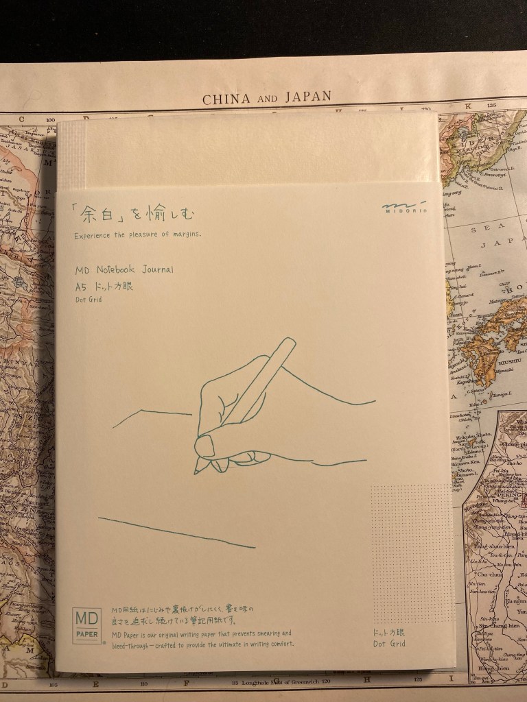
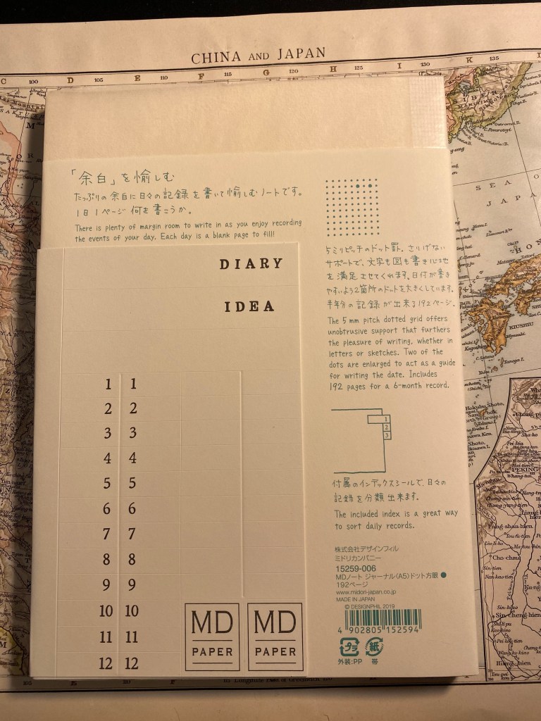
The MD Notebook Journal is a soft cover notebook with a minimalist design. It’s an A5 dot grid notebook that opens flat, has 192 fountain pen friendly pages, and comes with the bare minimum needed to turn it into a more structured journal: two enlarged dots for the dates and an index insert that you can use to mark the months. Everything you need to know about the notebook is thoughtfully written on its paper wrapper. Everything but the paper weight. I’d start a rant here, but I don’t think it will do something to solve the various standardization issues in the notebook/journal world, so I’m just going to note that I find it annoying. Write the gsm please. It’s not that hard.
The MD Notebook Journal comes wrapped in a crinkly parchment paper that is meant to protect the cardboard covers, and I kind of liked the way that it felt. On a whim I grabbed some washi tape and taped it to the cover as a cover protector. I don’t know how long it will last (I’ll probably need to add more tape later on), but for now I’m enjoying it.
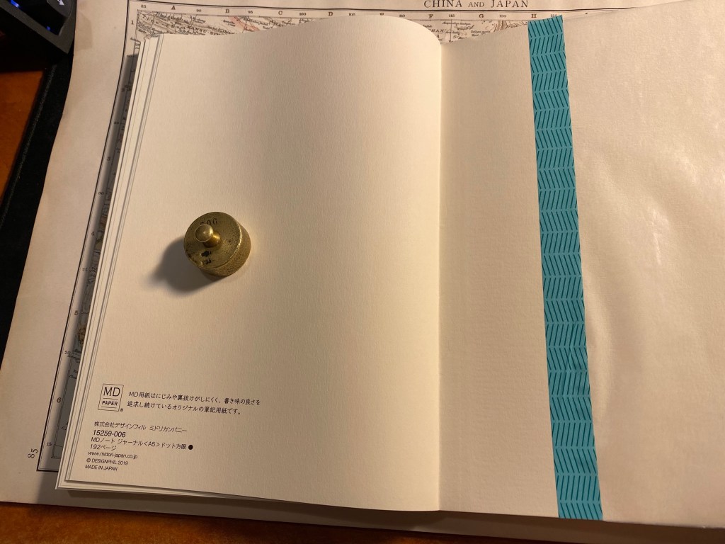
Inside the front cover is a place to write your details. As usual, I highly recommend writing your name and email, in case of loss.

The backend paper contains information about the notebook, and no pocket. It really isn’t missed on such a minimalist design, although you could easily tape an envelope here to serve as a pocket if you are so inclined.
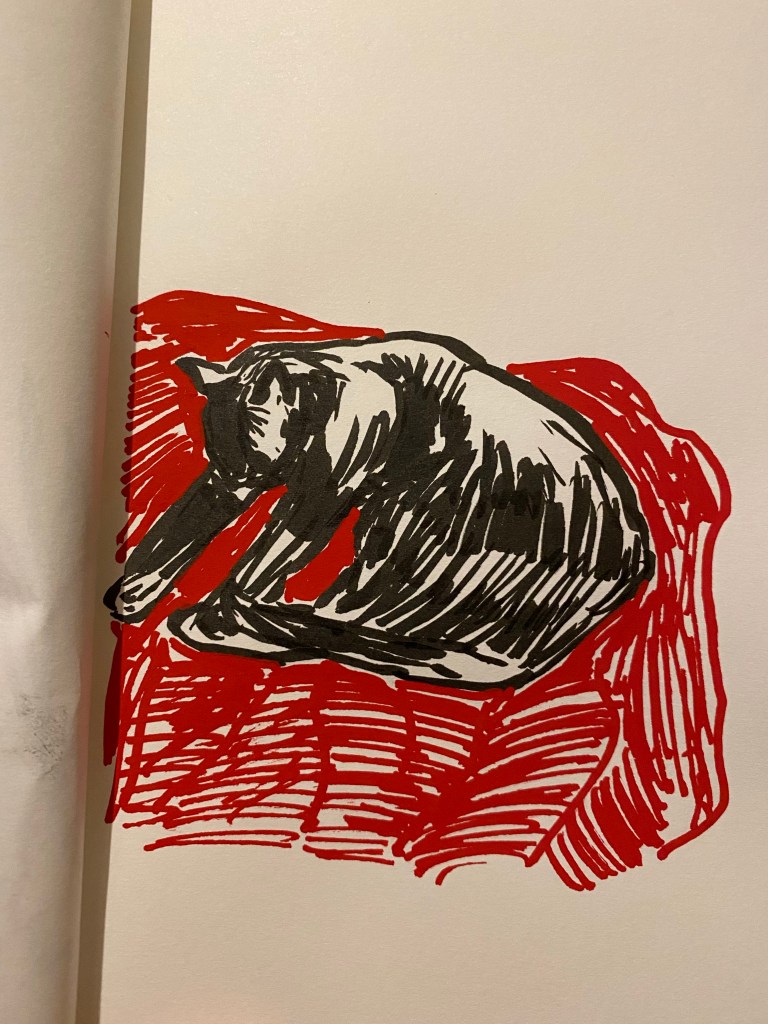
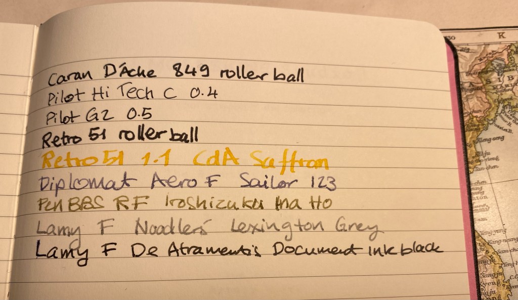
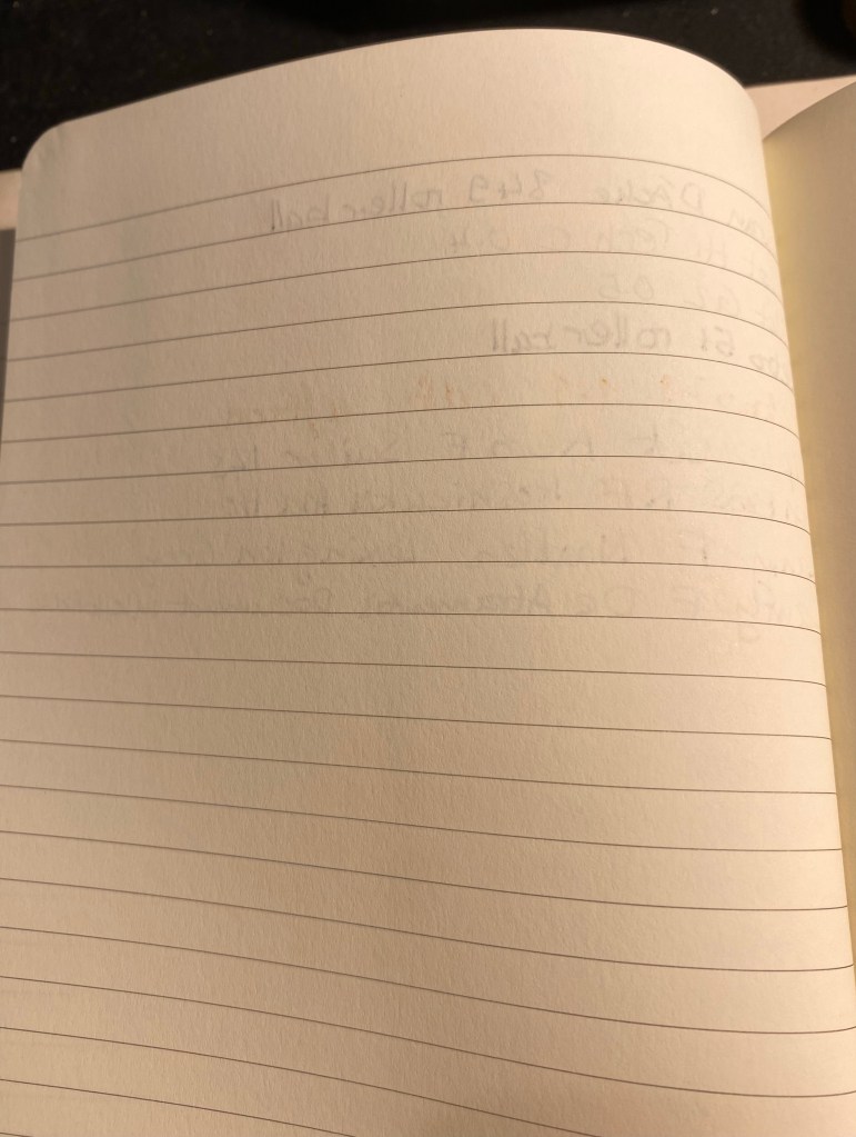
The MD Notebook Journal paper is fountain pen friendly and shows off the various properties of fountain pen ink very well. The drying time isn’t great, but that’s to be expected considering the coating on the paper.
Now for a little side note: I purchased the 2021 Diamine Inkvent calendar and I plan on reviewing all of the inks in it, opening each one on the relevant day, just like I did in 2019. I’ll be using old Tomoe River Paper and this MD Notebook Journal for the purposes of the review. So if you want to see this notebook get a little more use before giving it a go, stay tuned.
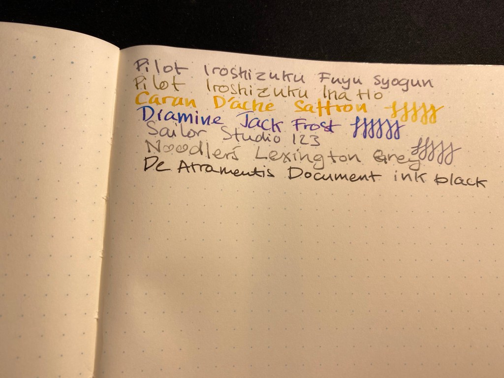
The paper in MD Notebook Journal isn’t very thick, so there is some show-through, but no bleed-through, with all the inks that I used. It wouldn’t bother me, but if you find show-through distracting, you might want to use lighter inks, fine and extra fine nibs, or just one side of the paper.

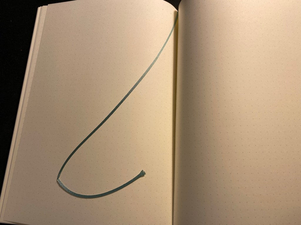
There’s a thin ribbon bookmark attached to the notebook, which is both charming and adds the only touch of colour (a lovely teal) to this minimalist journal.
I look forward to giving the Midori MD Notebook Journal A5 dot grid a thorough try out next month. From what I’ve seen of it so far it’s going to be a fun notebook to use (and I don’t even like dot grid notebooks normally). There’s something about the starkness of it that makes it appealing, in that it really is a sandbox that you can play in. I can imagine people placing it in various notebook covers, or covering the covers with stickers and drawings, or just trashing it with use.
A journal with endless potential and excellent paper – what more do you need?