Diamine Inkvent Calendar is an advent calendar with a tiny (7ml) bottle of ink behind 24 windows, and a larger, 30ml, bottle of ink behind the 25th window. All the inks are limited edition, and only available through this calendar. You can read more about the calendar here.
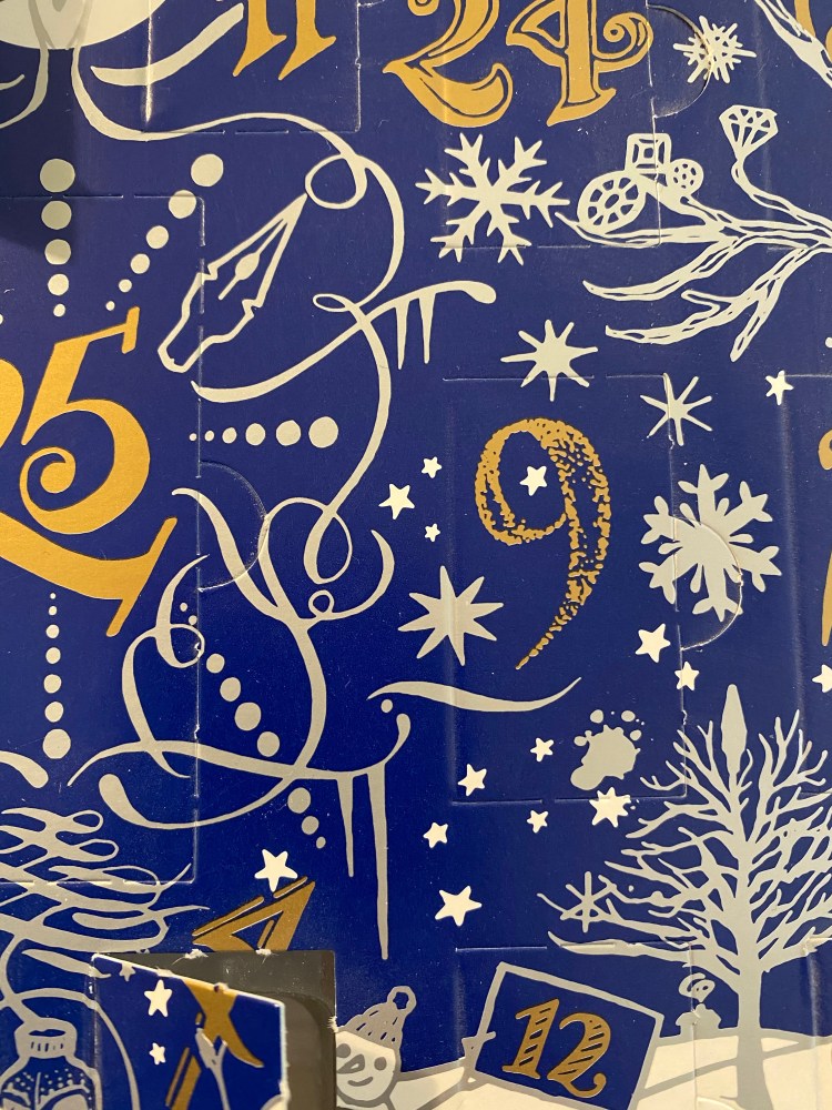
It’s day 9 of the Diamine Inkvent Calendar, and Diamine has toned back the shimmer and shine and gone back to standard inks for their Monday offering.
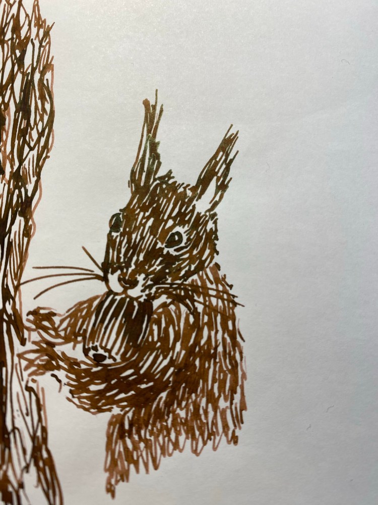
Day 9’s ink is Diamine Nutcracker, a slightly warmer, lighter and more interesting brown than Diamine Triple Chocolate.
Of course I drew a squirrel. What else would I draw?
Diamine Nutcracker shades a lot, and has reddish highlights to it. There’s a slight green sheen to it on Tomoe river paper, as you can see from the closeup below, but most of its charm is from its raw umber to burnt sienna shading.
If this ink would have been waterproof, it would have been a staple in my sketching kit. As it is, I’ll probably use it for ink sketches only, maybe with a slight wash. It’s a versatile and warm brown that I like much better than Diamine Triple Chocolate (even though Triple Chocolate has a better name).
Diamine Inkvent Calendar is an advent calendar with a tiny (7ml) bottle of ink behind 24 windows, and a larger, 30ml, bottle of ink behind the 25th window. All the inks are limited edition, and only available through this calendar. You can read more about the calendar here.
I was expecting something with a little pizzaz for day 8, and Diamine didn’t disappoint. Get ready for some bling…
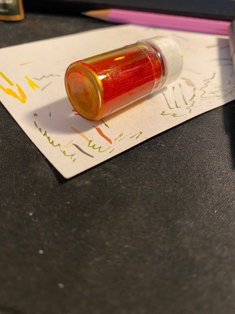
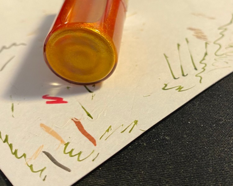
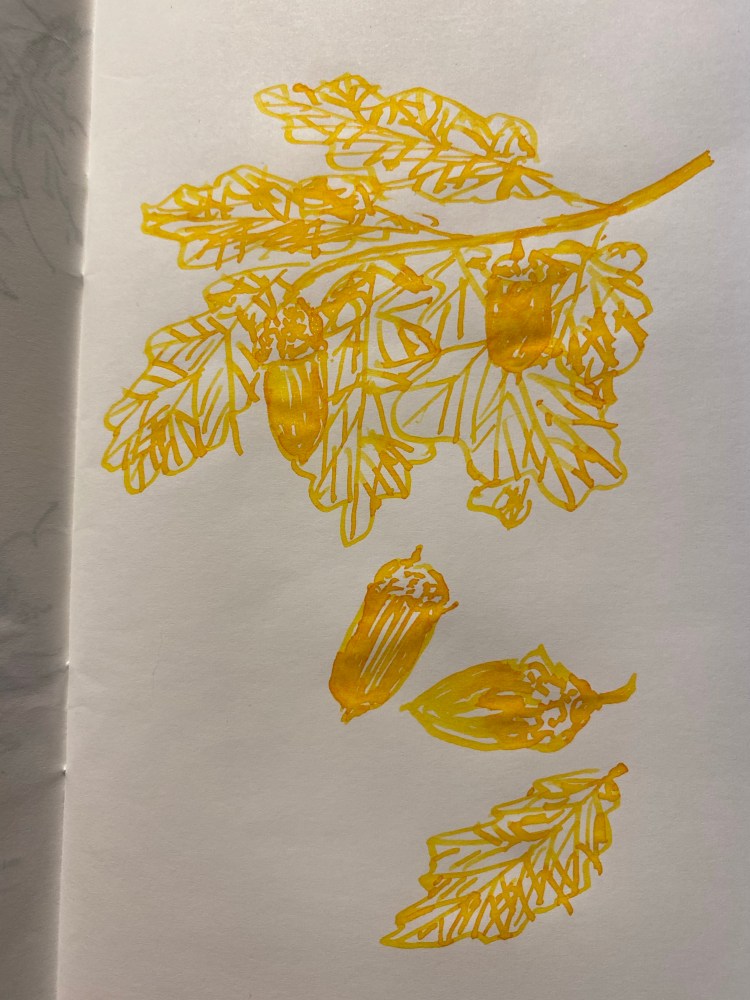
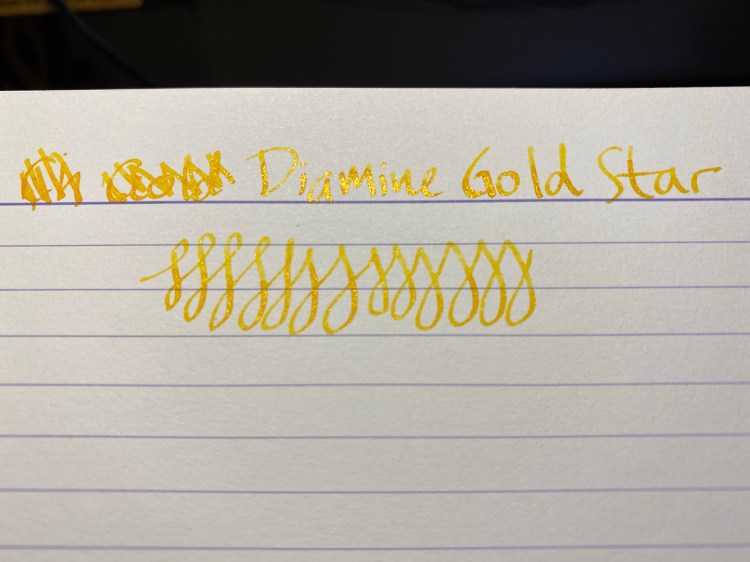
Diamine Gold Star is day 8’s ink, and calling it a shimmer ink doesn’t do it justice. I’m pretty sure that Diamine took their Sunshine Yellow ink and poured ALL OF THE GLITTER into it. The result is phenomenal.
Glitter
Even after shaking the ink for a bit, there’s a ton of particles that sink to the bottom of the bottle.
So much glitter.So shiny!How much glitter can such a tiny bottle hold?
This means that you have to really shake it well before filling your pen, and then shake your pen before use to get the full Gold Star effect. As it is, this ink is beautiful, because it shades so much. A wide nib and Tomoe river paper really make it shine (pun intended):
Even on Clairefontaine paper the shading and shimmer of this ink make it stand out:
This ink is wildly inappropriate for office use, but it’s so great for holiday cards, especially if you couple it with Diamine Snow Storm. Needless to say, Diamine Gold Star isn’t going anywhere near my vintage or more expensive pens, because I’m terrified of the amount of glitter sediment that I can see in the bottle.
Diamine Inkvent Calendar is an advent calendar with a tiny (7ml) bottle of ink behind 24 windows, and a larger, 30ml, bottle of ink behind the 25th window. All the inks are limited edition, and only available through this calendar. You can read more about the calendar here.
So what’s behind door number 2?
Day 2’s limited edition ink is Diamine Candy Cane. It’s a standard ink, midway between Diamine Amaranth and Diamine Coral, both excellent and unique pink inks. This ink shades a lot, even in a fine Lamy Safari (Coral) pen. It’s a dark enough pink to be readable, but still not something that I would recommend for an office setting. It’s great for personal correspondence, Christmas cards, and journalling.
The bottle is so tiny and cute.
The bottle is made of glass and is delightful, but a bit impractical for use. You need a cartridge converter or a syringe to fill a pen with this ink, or you can just use it with a dip pen or a brush.
Look at that shading! Yes, this was drawn on a Kanso Sasshi 3.5” x 5.5” Tomoe River Paper notebook, and Tomoe River paper makes everything pop, but even on “regular” Rhodia paper you can notice the shading. That’s not always true for such bright and light shades, like pink or coral.
If you enjoy the looks of this ink, I think that there’s a good chance that you’ll love Diamine Coral (it’s such an optimistic colour) or Diamine Amaranth (which is also a delicious looking ink, but darker than Diamine Candy Cane).
After I reviewed the Waterman Phileas I noticed that I have hardly reviewed the writing/drawing tools that I use most. So I making it a point to start to rectify that, at least a little bit.
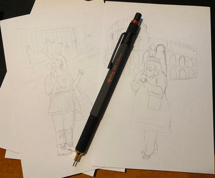
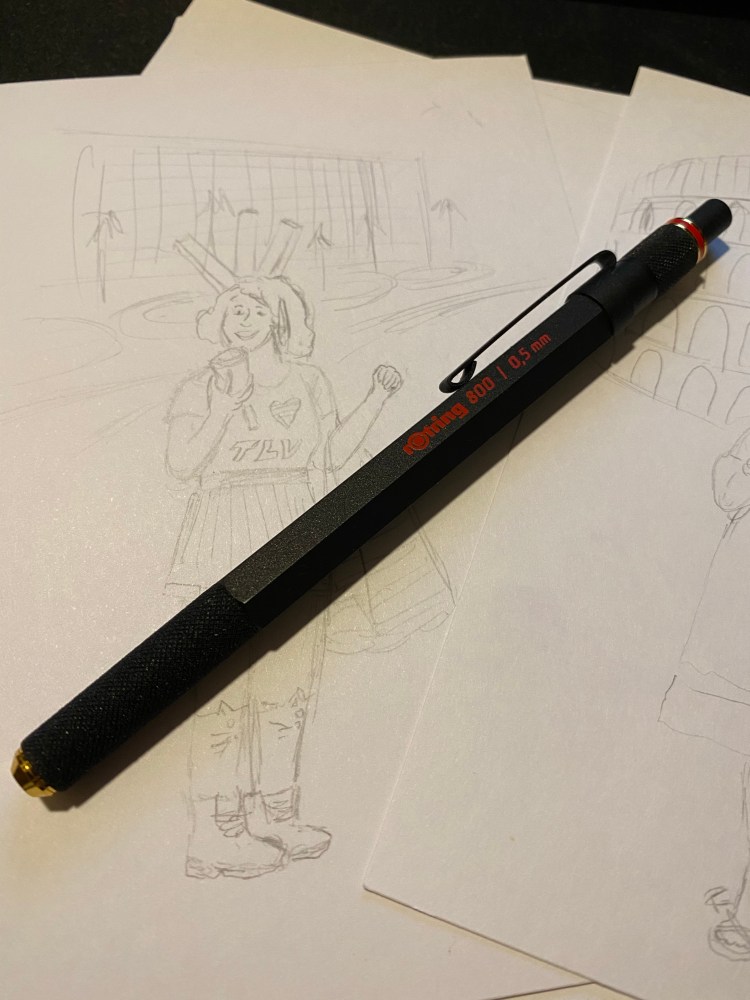
The Rotring 800 is Rotring’s high end drafting pencil, and it costs significantly more than its popular counterpart, the Rotring 600. It’s also my preferred drafting pencil, and the one pencil that’s a constant in my drawing kit. While I own the Rotring 600, and I agree that it’s a very good drafting pencil, I’ve abandoned it entirely for it’s more big brother, the Rotring 800.
This is a handsome, elegant drafting pencil.
The Rotring 600 and 800 are both full metal (brass) bodied drafting pencils. This means that they were built for drafting (architectural plans) and sketching, not so much for writing. You can use a drafting pencil for writing, but they’re not built for that (that’s what mechanical pencils are for). Drafting pencils are metal bodied with a knurled grip, a lead grade indicator, and a sleeve that both protects the lead and allows you to more easily use it with rulers and templates, and to get a better view of what you’re drawing.
Herein we get to the problem: both the Rotring 600 and the Rotring 800 are almost perfect drafting pencils. Each one has a significant flaw, which means that you have to decide when purchasing what are you willing to live without.
Retractable tip
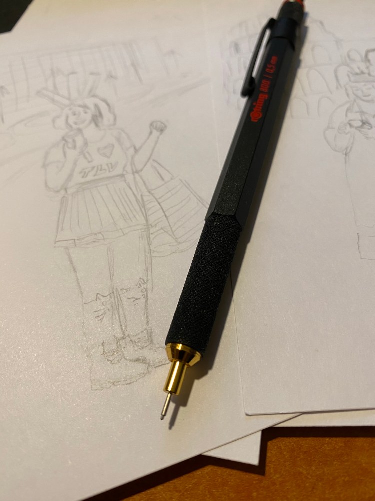
I think that the Rotring 800 is a slightly more good looking drafting pencil than the Rotring 600, and it weighs more than the 800. That’s nice, but that’s not “$20 more” nice. The reason to buy the Rotring 800 is the retractable tip. That’s it. The Rotring 600’s non-retractable, sharp-yet-delicate tip makes carrying it around an issue. It can bend and it can do damage – piercing through case fabric, clothes, and I wouldn’t carry it in my pocket (ouch!).
Retractable tip extended. The tip allows for precision work, and prevents the lead from breaking.
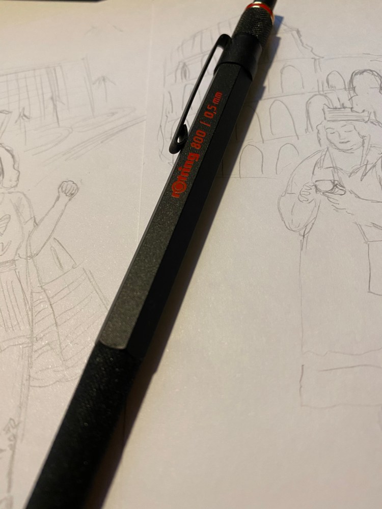
I carry my Rotring 800 in a Nock Co Sinclair, together with the rest of my sketching kit, and I really needed the retractable tip. For that I had to pay extra, and I also had to give up on a crucial drafting pencil feature that the Rotring 600 has and the Rotring 800 doesn’t have: the lead grade indicator. This is a basic feature of drafting pencils, and I have no idea why Rotring didn’t add it here. It doesn’t bother me too much as I don’t switch lead grades that often, but it’s still a baffling choice on Rotring’s part.
I love the texture on the pen grip and the pen itself: it’s beautiful and functional at the same time. This is a pencil that will not budge from your hands as you’re working with it. Also, the added weight of the retractable mechanism means that it’s perfectly balanced and you need to apply zero pressure on the lead.
There’s an eraser beneath this cap. I wouldn’t use it.
The Rotring 800 is a handsome, heavy and expensive drafting pencil. If you’re just getting to know drafting pencils the Pentel Graph Gear 1000 is what I’d recommend (it’s cheaper, lighter, has a great design, more tip sizes, and a lead indicator), as it really works as an excellent mechanical pencil as well as a drafting pencil. The Rotring is what I use because it aggravates my RSI least (YMMV),the added weight lets me work faster and yet retain control over my line, and I really needed the retractable tip (I ruined a Rotring 600’s tip). If you’re wondering whether to purchase a Rotring 800 (or 600) I highly recommend testing it out first, especially if you have small hands or have a “non-standard” way of holding a pencil, since you may find its weight uncomfortable.
The Waterman Phileas was my first fountain pen, one that I bought after careful research on eBay, shortly after they were discontinued. It cost me £15 at the time, a small fortune for me, and the most I had ever spent on a pen. My RSI was at its worst, and I had to take a lot of notes (I was still in the university), so I splurged mostly out of desperation. Internet research brought up fountain pens as something that could possibly help with my RSI, and so I decided to give it a try. I found the Fountain Pen Network and combed the boards for information about fountain pens for newbies like me. Two pens kept coming up as good first fountain pens to buy: the Lamy Safari, and the Waterman Phileas. It was relatively newly discontinued by Waterman, and so I could find it easily and buy it NOS from a reputable seller. It’s been over 11 years since I bought it, and it’s still one of my favourite pens, and one of my most frequently used ones.
Look how pretty this pen is!
The Waterman Phileas is named after Phileas Fogg, Jules Verne’s “Around the World in 80 Days” protagonist. It comes in blue, green, red and black, and is cartridge converter pen with a large two-tone steel nib. The nib and pen have an art deco look to them, and the pen is also designed to look somewhat like a cigar. It’s a classic “fountain pen” look that makes it appear more expensive than it is, and it’s part of the reason why you’ll see it popping up in various commercials, even to this day. It’s a very beautiful and elegant pen that just looks classy.
Unlike it’s cheaper sibling, the Waterman Kultur, the Phileas has a brass insert in the body, which means that it has got some heft to it, weighing (filled, with a converter) 24g, as opposed to the Lamy AL-Star’s 22g (filled, with a converter). The weight is perfectly balanced for writing, especially for beginners, since it encourages you to lay off putting pressure on the pen. The pen let you feel that it’s putting the pressure on for you.
The look of the Phileas is phenomenal, especially for the price, but it’s the nib that made me fall in love with it specifically and with fountain pens in general. I chose the extra fine nib, and it is nothing short of magical. Take a look for yourself:
From hairline to European fine – the Phileas line variation at work.
Yes, that’s line variation. No, it doesn’t come from applying pressure to the nib. It works like a less extreme Sailor Zoom nib: vary your writing angle just a bit and it will go from 0.4 mm lines to 0.7 mm ones. The nib is also smooth, but gives a little feedback, which reminds me a little of the feedback you get from using a really good pencil. Couple that with the fact that the Phileas is a cartridge converter (with a sizeable converter), and so very easy to clean, and you’ll understand why this is still my favourite sketching fountain pen.
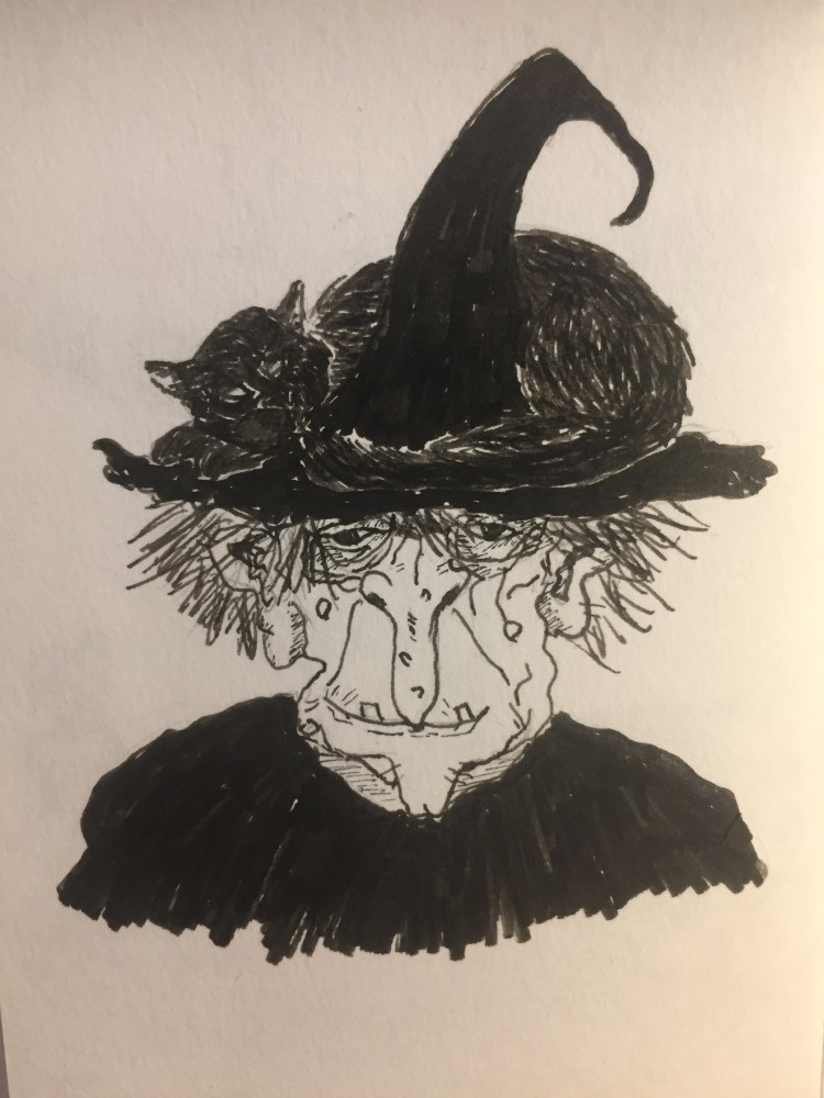
Drawn with a Phileas, except for the witch’s cloak and hat.
The Phileas accepts long international cartridges, and Waterman is one of the few makers that make those cartridges. They excellent (especially the blue-black) and very convenient when travelling with your fountain pen.
Look at that nib! It’s hard to photograph, but it’s such a great design.
Which brings me back to the beginning of my story. It’s 2019 and I have a substantial collection of fountain pens, most of them costing well over 10 times what the Waterman Phileas cost me. None of them are 10 times the Phileas as a pen. I could have stopped here, but the Phileas has proven to be a gateway into fountain pen madness for many people over the years. It’s a pen to fall in love with, in a way that I haven’t ever fallen in love with my Lamy’s, good-though-they-are. Its design is classic and timeless, and its quality is unparalleled for the price (yes, even today).
SO WHY HAS WATERMAN DISCONTINUED IT? WHY? WHY?
This should have been their Lamy Safari, TWSBI Eco or Pilot Metropolitan – a more classic version of the beginner’s fountain pen, as opposed to the other’s more modern design. It boggles my mind that they not only discontinued the Phileas, but also it’s cheaper cousin, the Kultur. What on earth are they doing over there? Do they not want new people to fall in love with their pens? It’s the same weird move with their ink line (their refusal to jump on the limited edition/shimmer/sheen ink bandwagon), but even more baffling. YOU WOULD SELL THESE WATERMAN!
So frustrating.
Anyway – if you can get your hands on a Waterman Phileas for a reasonable price, I highly recommend it. It’s a charming pen that will never go out of style.
The end of summer is upon us and my services as creator of kids’ colouring pages are now in high demand in the office, as desperate parents bring their kids to work for a few hours in lieu of camp or a sitter. After ruining several brush pens on these drawings I’ve settled on the best pen for this purpose: the Pilot V Sign Pen.
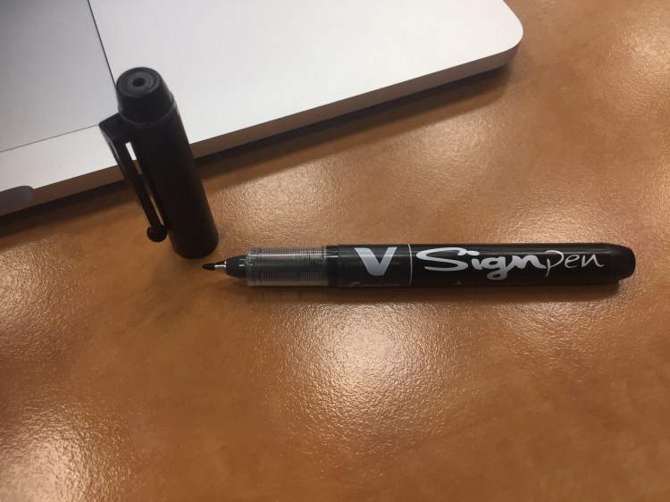
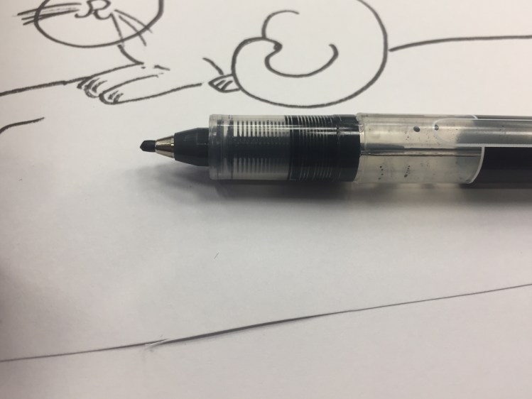
The Pilot V Sign Pen is a liquid ink pen with 2.0 mm bullet tip that creates the consistent kind of lines that kids seem to prefer.
The V Sign has a cheap looking plastic body, complete with ugly barcode printed on the barrel. It’s pretty ergonomic though, with a relatively wide barrel and a light weight body.
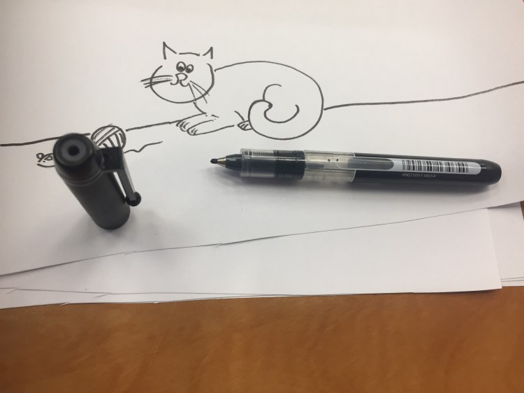
I just replaced my old V Sign Pen as it has run out of ink, and as you can see above and below, the tip does get worn down with use, though compared to most plastic tipped pens it’s super durable.
This V Sign works on cheap copier paper with a little bleed through and a lot of show through. It’s non-waterproof, and I’m pretty sure it’s not archival. It is, however, a lot of fun to use. For office doodles of this kind, it’s absolutely perfect; For anything else, I’d recommend something archival and waterproof instead.
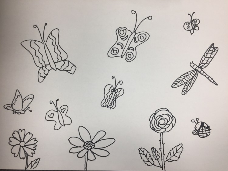
To all those parents out there, here are some colouring pages that I’ve drawn. Feel free to print them out for your own personal use, and gain a few minutes of peaceful bliss.
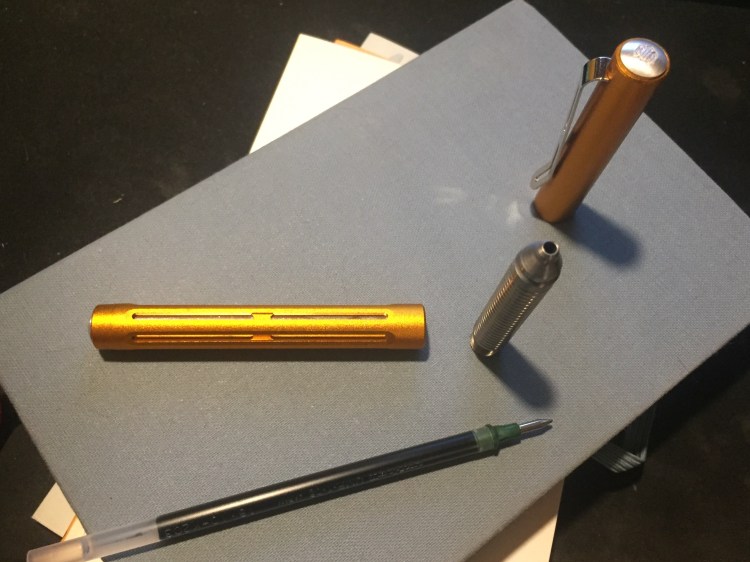
My Spoke Pen Orange Crush arrived a week ago, and I’ve been using it exclusively for journaling and meeting notes since then. How do I love thee? Let me count the ways…
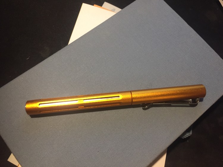
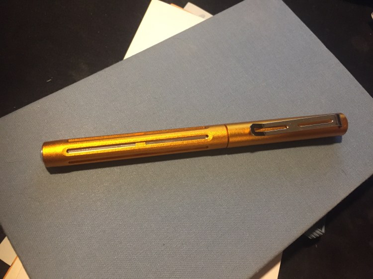
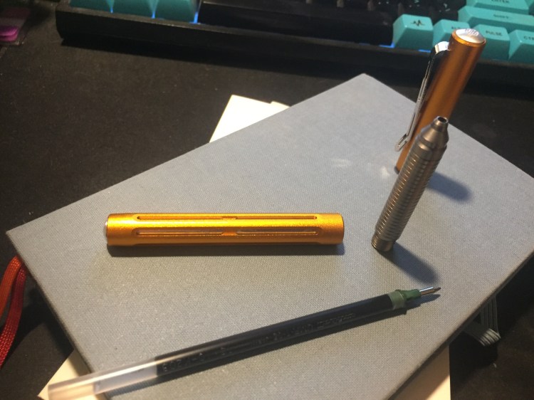
First comes the colour, because there’s just absolutely no way to ignore it. It’s nothing like I would have expected orange pen to be: it’s like an amalgamation of gold and bronze with a dash of copper. This is a rich and SHINY finish that sparkles and glows. You cannot ignore it, the very opposite of subtle, and yet it isn’t gaudy and doesn’t look cheap. Orange isn’t a colour that I’m overly fond of, but I’m glad that I picked it out for this pen: it’s perfect.
The second thing you notice about this pen is the weight. It’s super light, though it appears to be a solid and heavy looking pen. It shouldn’t have surprised me, as it’s made of aluminum, but the Spoke Pen still looks like it a heavy pen because there appears to be so much metal in use in it that it seems impossible for it to be so light. The first time I picked it up it really surprised me. It’s lighter than my beloved Ti Arto, even though it looks like it should be heavier. At first I had to consciously remind myself to use the Spoke Pen and not the Ti Arto when journaling, but now it’s become the pen I turn to for long writing sessions because it fatigues my hands less. Could it replace my Ti Arto as my favourite pen? Time will tell, but it’s entirely possible the way things stand now.
The Spoke Pen was designed entirely around Brad Dowdy‘s beloved Uni-ball Signo DX refill (UMR-1), but also accepts the Uni-ball Signo UMR-85N (my favourite refill), UMR-87N, and other refills of the same size. To change refills you unscrew the section, take out the old refill, and then the magic starts. When you put in a new refill it will appear to jot out quite a bit from the pen body. “There’s no way this thing will close back up again,” you think to yourself. Have faith, it does: there’s a hidden spring in the back of the pen, and you’re going to have to apply a tiny bit of force to push the section back close to the body, but once you start screwing the section back everything fits snugly back in place. The tolerances on this pen are flawless, as I’d expect from a pen with this provenance.
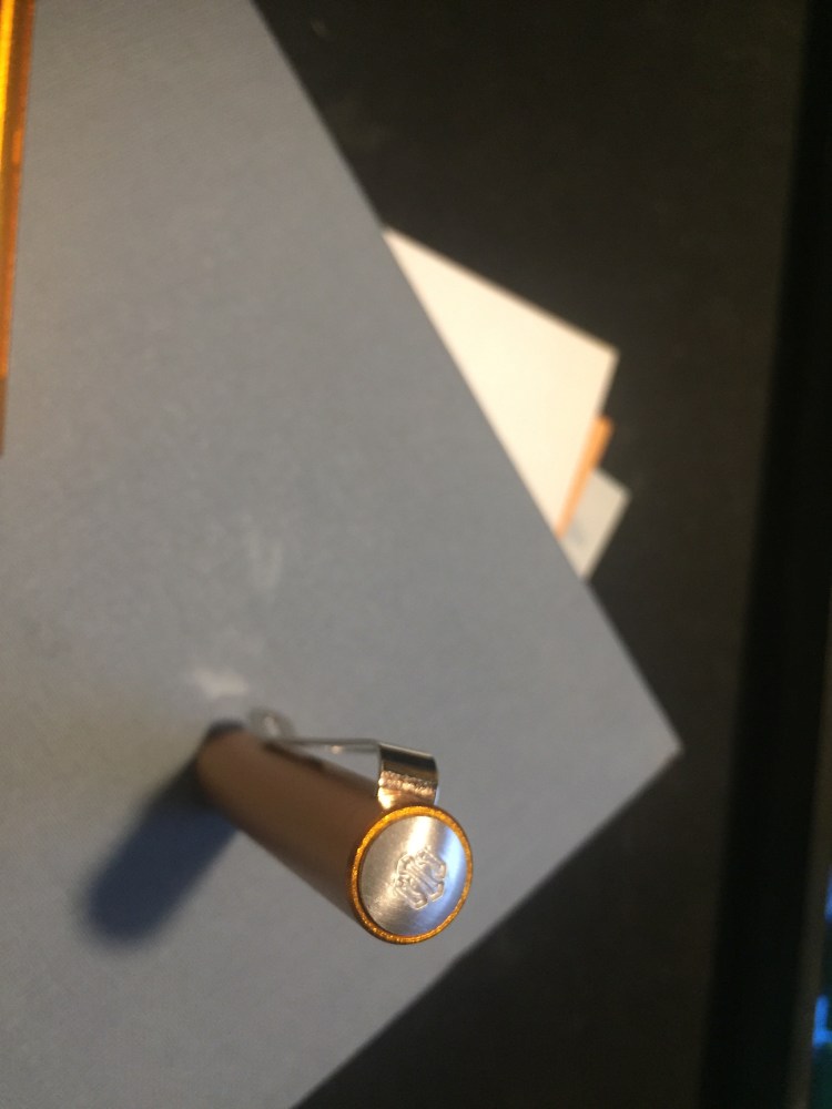
Machined pens seem to be divided into two schools of thought when it comes to branding: either the over the top, in your face, you can’t miss it branding style, or the barely branded one. The Spoke Pen belongs to the latter group, as there’s a discreet stamp of the Spoke logo on the top finial and that’s it. Very classy move.
The third great thing about this pen is the magnetic closure. I actually thought that this would be a more significant feature than the colour or the weight of the pen, but after using the Ti2 Techliner for a while the novelty of magnetic cap closures must have worn off for me. If the most important thing for you is the magnetic closure, then I recommend the Ti2 Techliner instead, as its magnets are significantly more powerful, and you can both cap and post the pen with them, even from a distance. The Spoke Pen’s cap magnet engages only halfway through capping the pen, basically functioning like the click at the end of a regular pen capping. It’s fun to use, and fun to fidget with, but I don’t think that it’s the pen’s main selling point.
Are there any cons to this pen? Of course, rarely anything in life is perfect. You may not like the Spoke Pen’s tactical aesthetic. If you carry the Spoke Pen in your pocket lint will probably get wedged in its “fins”. The clip looks like a determined person with something to prove could bend it out of shape (for normal use I think it’s perfectly fine). These are not issues for me personally, but they may be issues for you.
As it is, the Spoke Pen Orange Crush is one of my favourite (non-fountain) pens ever, and is looking to replace the Ti Arto at the top of my list. Kudos to Brian Conti and Brad Dowdy for creating such a great product out of the gate.
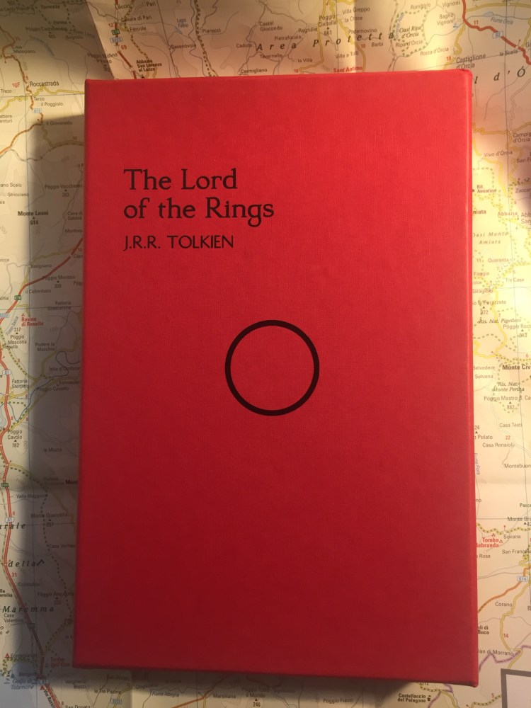
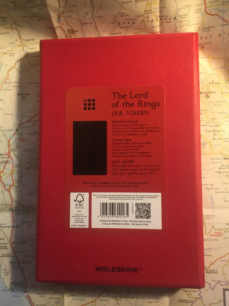
Say hello to the limited edition, numbered Lord of the Rings Moleskine box:
Bold and beautiful, right? This box is new to the 2019 edition of the LotR limited edition Moleksines (reviewed here and here), not to be confused with the more muted LotR limited edition notebooks that Moleskine published back in 2012.
This limited edition box is numbered, like all limited edition Moleskine boxes, and there are 9999 boxes available worldwide. For me this edition is all about the typography and the homage to Tolkien’s illustrations. Notice the fonts used on the front and back of the box, and the fact that the notebook’s details are printed in English, French and Tengwar, an Elven alphabet that Tolkien invented.
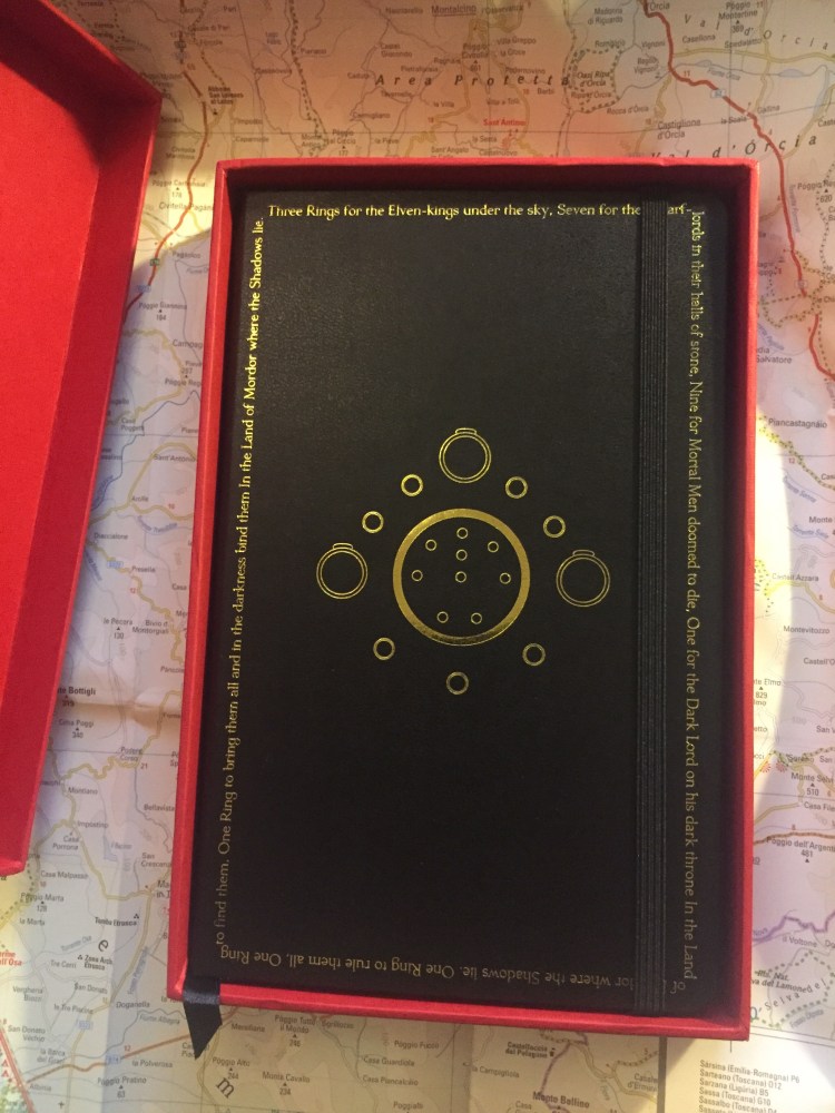
You open the box, and are met with this:
The contrast is impressive, and the combination of red, black and gold is striking.
The box itself is a well made cardboard box that can be used to store the notebook, or appropriated to store pens, pencils, pocket notebooks, etc. There’s a black satin ribbon attached so that you can easily pull the notebook out. Very elegant.
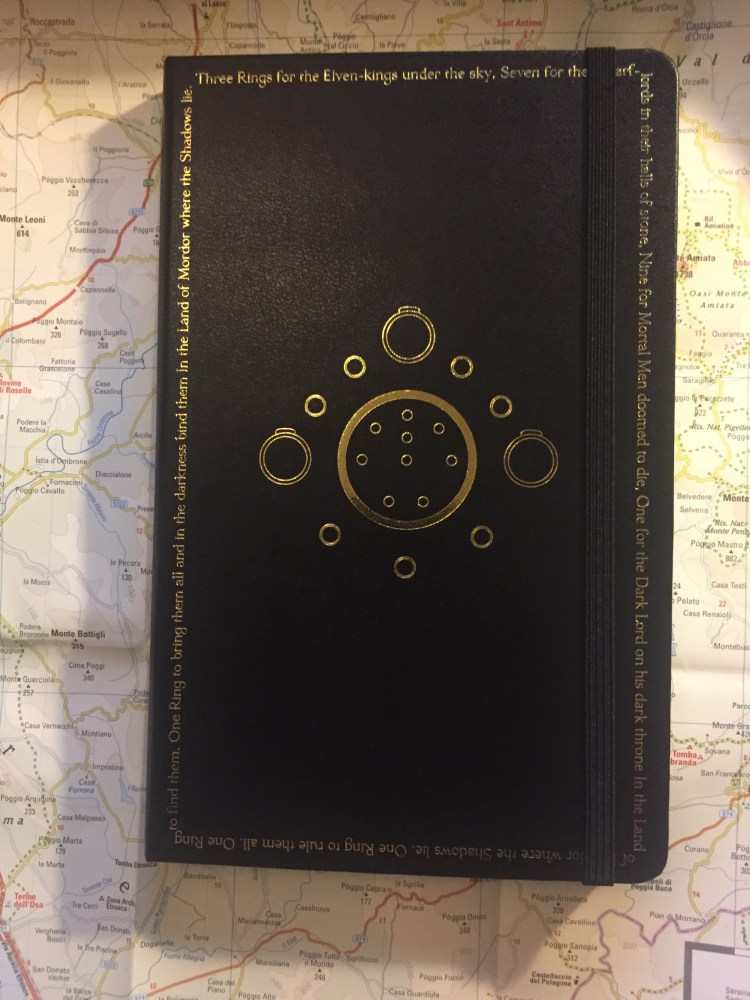
Now comes the notebook, the main event. It’s a large ruled Molkesine, with the famous “One ring to rule them all” poem embossed in gold all around the margins, and Tolkien’s illustration of all the rings embossed in gold in the centre.
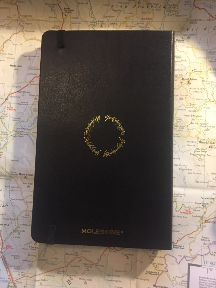
On the back the inscription on the One Ring appears, embossed in gold:
One Ring to rule them all, One Ring to find them, One Ring to bring them all and in the darkness bind them
Again, a dramatic edition that is still elegant and understated.
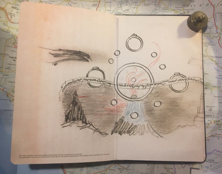
Inside is where all the fun is. The front endpaper shows a Tolkien illustration of Sauron presumably reaching over the Mountains of Shadow, ready to take over Middle Earth. It looks like this illustration inspired the red and black colour theme of this edition.
On the back is Tolkien’s illustration of the rings over Mount Doom with Barad-dûr in the background, and again the “One Ring to rule them all, One Ring to find them,/One Ring to bring them all and in the darkness bind them” inscription.
The illustration is aligned with the back pocket, and runs into the pocket itself.
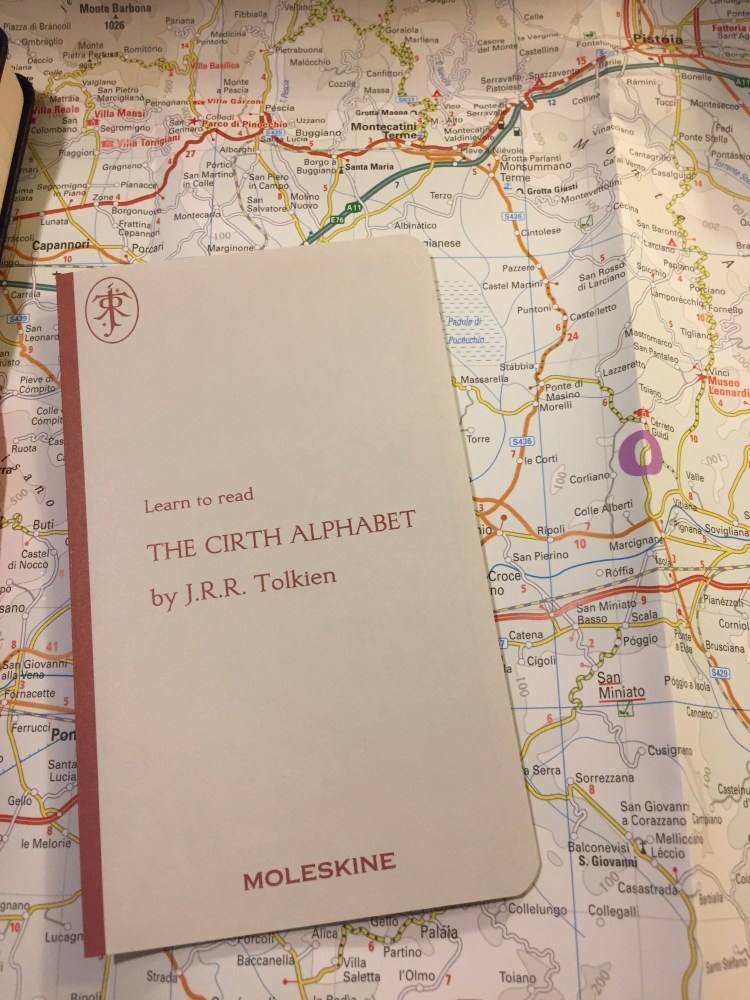
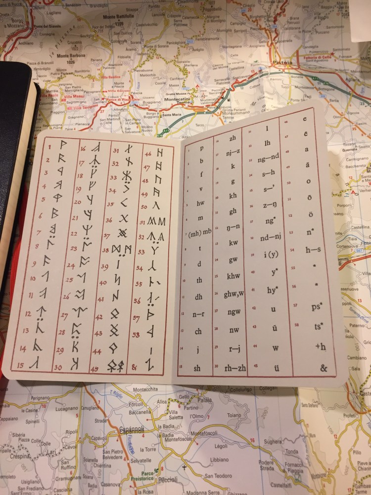
The add-on is the Cirth alphabet, as it is for all the notebooks in this series:
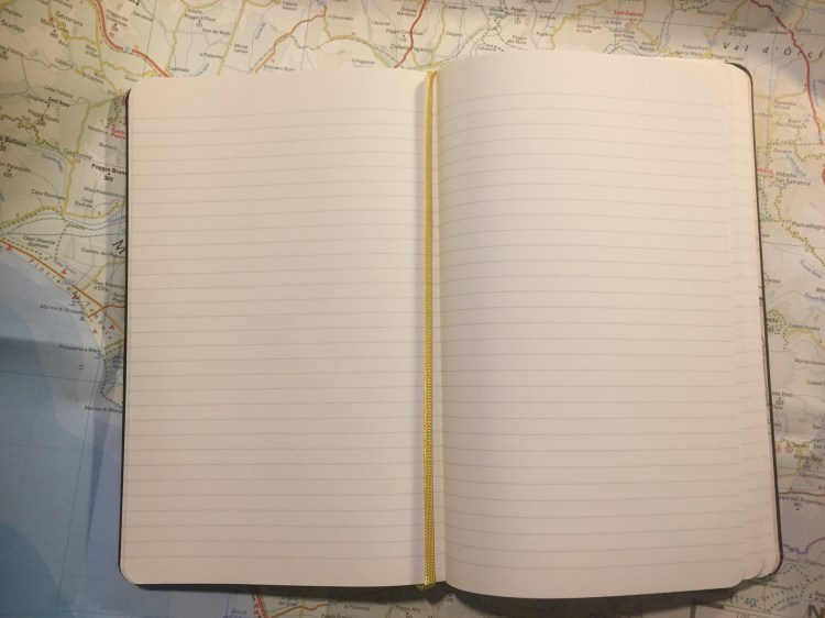
Which brings us to the one minor thing I don’t like about this edition: the colour of the ribbon bookmark. It’s a light yellow that glitters in the light because of the material its made of, and it’s clearly meant to evoke the One Ring. That’s a lovely idea, but I think that it fails on execution. The bookmark looks pale and vapid compared to everything else about the notebook, almost disappearing into the page. A red bookmark would have probably been better, since a gold one would probably come out tacky.
The 2019 Lord of the Ring Moleskine limited edition notebooks are very well designed. They pay beautiful homage to Tolkien’s illustration and work, and the limited edition box is no different. These are much better than their 2012 counterparts, and make great gifts for the LotR fan in your life.
As usual, these are well made, robust notebooks that can handle a beating with aplomb, but they aren’t, nor are they meant to be, fountain pen friendly. I use gel ink pens or ballpoints in mine, and recommend that you do too.
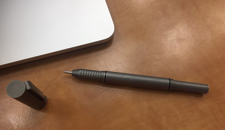
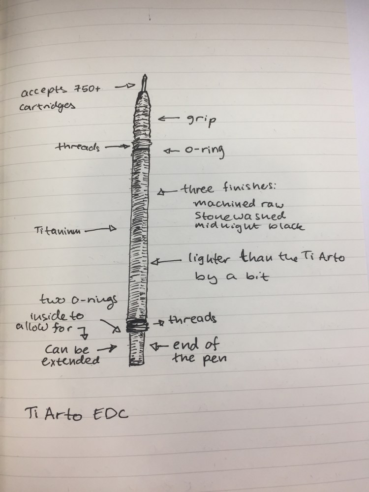
While the original Ti Arto is my favourite machined pen, the newer Ti Arto EDC comes in at a close second. Like its older BIGiDESIGN brother, the Ti Arto EDC is a machined titanium pen which can accept hundreds of different refills with no need for hacks or spacers and with no tip wiggle. Unlike the Ti Arto it comes in three different finishes, accepts many more refills, and can be adjusted in length.
The Ti Arto EDC looks a lot like a slightly slimmer version of the Ti Arto, with a bigger step down in the end section, and almost no gap between the section and the body.
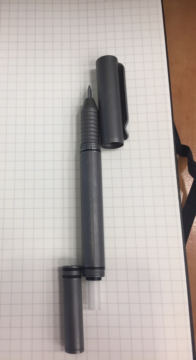
Those looks are a little deceiving, because this the Ti Arto EDC has a completely different build. The end of the pen can be extended or retracted, unlike the Ti Arto, where it is static. In the Ti Arto EDC the end of the pen is also what you unscrew to change refills, unlike the Ti Arto, where the grip unscrews. If you assume that they’re the same, as on a cursory glance it looks like the Ti Arto EDC’s grip section unscrews (and it really, really doesn’t).
The body of the Ti Arto EDC is slightly slimmer, and the entire pen is slightly lighter than the Ti Arto. It comes in a machined raw finish (like the Ti Arto), in a stonewashed finish (which you can see in the pictures) and in a midnight black finish (which you can see on my Ti Click EDC). Of the three, the stonewashed finish has the best grip and feel, and it also shows wear and tear the best.
The trick with the extendable end section is where the cleverness of this pen lies, and that’s what allows you to use more refill types in this pen, and to extend or compress this pen’s length (to the limits of the refill size). The two o-rings make the end section action super smooth, and the same dual thread design allows you to cap and post this pen super securely. Nothing on this pen is going anywhere without your permission.
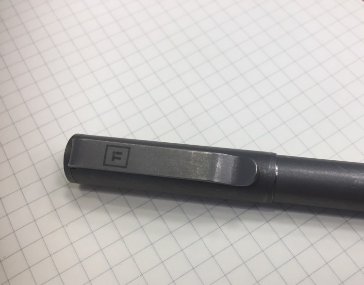
The Ti logo, elegant and understated, is the only branding on this pen. You can see how substantial the clip is and how the pen wear in the photo above. It’s like an old pair of jeans, so the stonewashed name for this finish is totally appropriate.
Fully extended, the Ti Arto EDC is the same length of the Ti Arto. However, depending on the refill you use, this pen can get pretty tiny.
I use the Uni-ball UMR-85N refill in this pen, and this is as far as it will contract. If you use a Parker or Schmidt refill the end section can be screwed in almost all the way. However, even partially extended the Ti Arto EDC is a more pocketable pen than its predecessor.
So why do I prefer the Ti Arto more? For longer writing sessions the Ti Arto’s wider girth makes it more comfortable to use than the Ti Arto EDC, although the difference is minor. The Ti Arto is also slightly less ungainly than the Ti Arto EDC, having a more streamlined design, with no step down. I don’t mind the Ti Arto’s gap between the grip and the pen body, and I don’t need a pen that accepts more refills than the Ti Arto. As you may have noticed by now, the choice between the Arto and the Arto EDC is likely going be one of personal taste and preference. Either pen is an excellent choice for a machined pen, an EDC pen, or a titanium pen.
Leuchtturm1917 entered the busy sketchbook market about a year or two ago, with a lineup of A6, A5 and A4 sketchbooks with white 180 gsm paper.
The covers of the Leuchtturm1917 sketchbooks come in a wide variety of colours, which is a rarity in this market. Usually you find sketchbooks in black, or maybe one or two other colours, but Leuchtturm has decided to offer these in all the colour options available in their regular lineup.
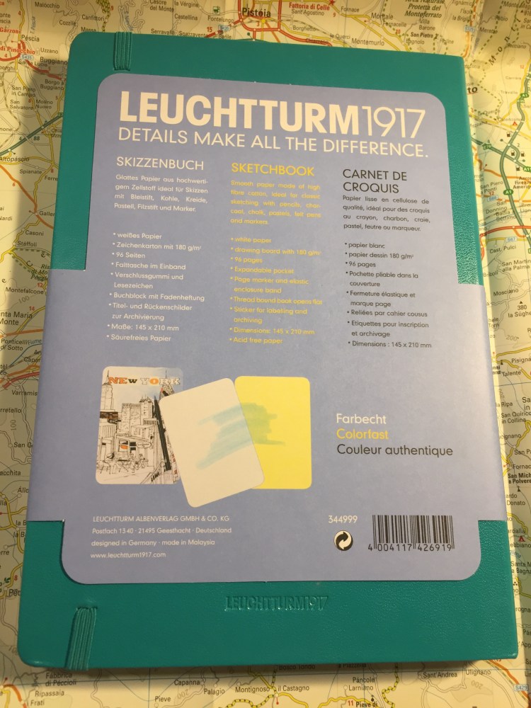
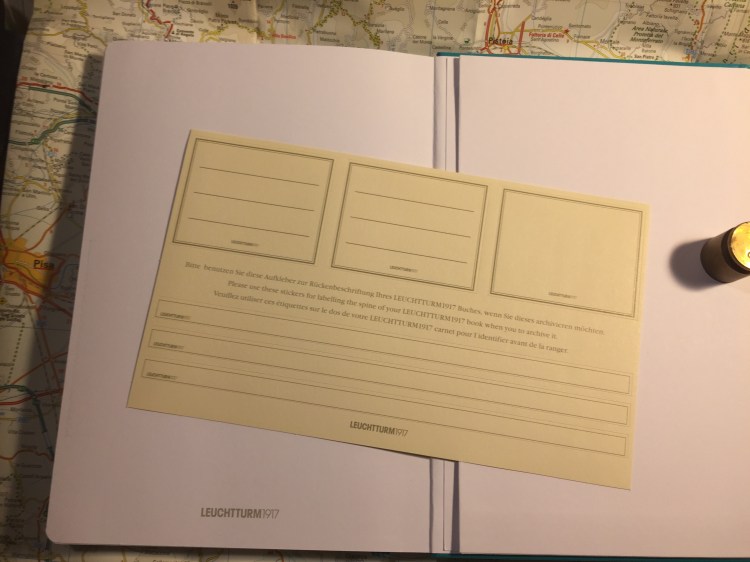
The sketchbook contains 96 pages of acid free 180 gsm paper, and it opens flat. There’s a note in the back packaging that says that the paper is colourfast, and shows a sketch made with a fineliner and markers. More on that later.
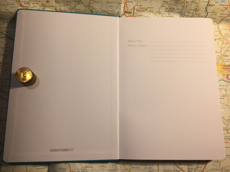
There’s a place to write your name and address on the front cover. I recommend writing your name and email address instead. It’s more practical, and more secure.
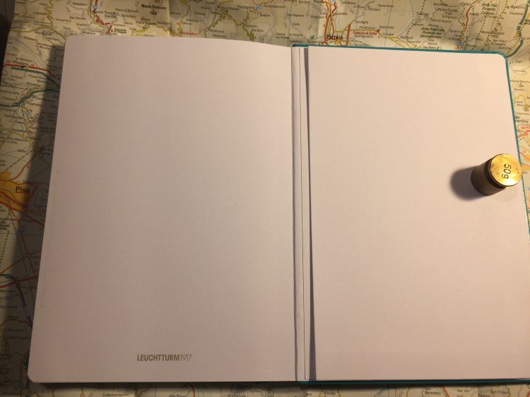
There is a back pocket. I don’t really think that it’s necessary in a sketchbook, but it’s nice to have.
Leuchtturm offers two unique things with its sketchbook. One is the offer to personalize it with an embossing of your choice. During last year’s Urban Sketchers they personalized the sketchbooks that they gave away as part of the symposium’s package, and the result is very nice.
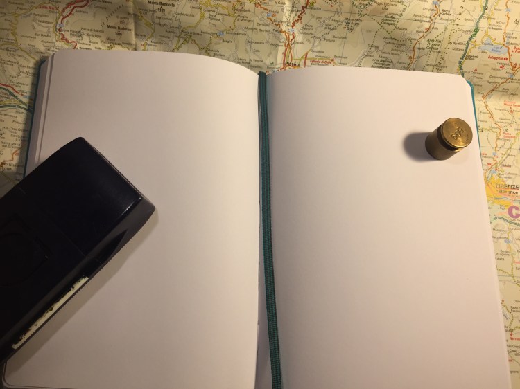
Now for the heart of the notebook, it’s paper. The pages lie flat with a bit of coaxing, and are thick and substantial. You have to really layer down markers for them to bleed through, and there’s no show through, meaning you can use each page on both sides.
So how does the paper behave? It depends on the medium. This sketchbook excels at dry media (pencils, couloured pencils, conte crayons, etc).
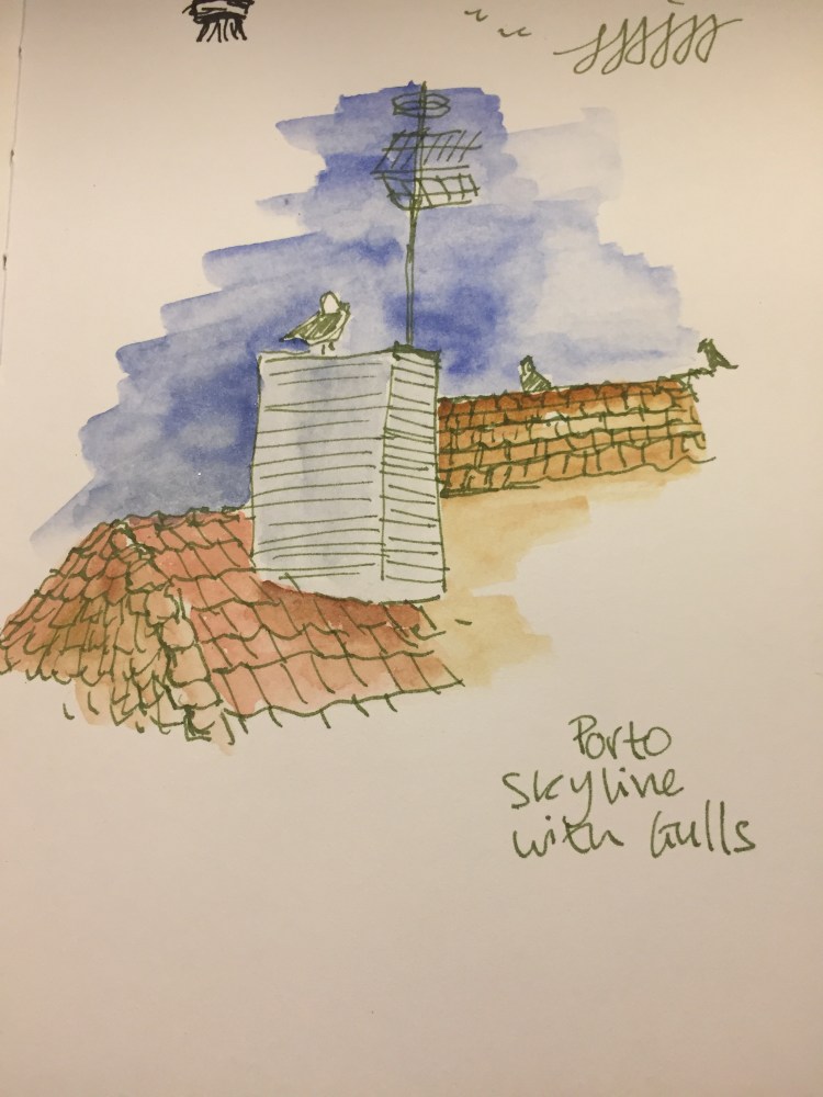
It’s pretty horrible with wet media, including fountain pen ink, watercolour washes, and ink washes. The paper buckles, shows off colour poorly, turns into a grainy mess, and and the ink feathers and spreads. I wouldn’t recommend it even for the lightest washes. All the vibrancy of my schminke watercolours turned into a muddy mess here (the sketch was done with a medium nibbed fountain pen and R&K Emma SketchINK):
Even with fineliners you’re going to have spread. If you like sharp lines, find a different sketchbook.
Again, even from a bit of a distance you can see the spread. That’s just a shame, because if the paper was a little less absorbent then this would be an excellent sketchbook.
This brings me to my frustration with the picture on the back end of the paper band, the one showing a tiny marker and fineliner drawing. This is my experience using markers and fineliners on this notebook:
There’s no option to layer or blend the markers, but that’s OK. This isn’t marker specific paper after all. But even for casual use, or just for use with fineliners/brush pens this paper isn’t great.
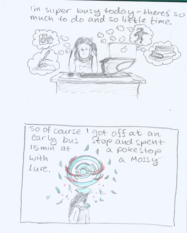
So do I recommend this sketchbook? It depends. If the way it looks makes you want to use it, then yes, it’s a notebook for you. I’ve been using this sketchbook for my journal comics mainly to test it out. Will I continue using it? Only because I already have a body of work in it. Otherwise, there are better options out there, ones that aren’t only pencil great, but also work with pen, ink and light watercolour washes (the Stillman and Birn Alpha sketchbooks come to mind).