Moleskine Spring 2019 Catalog

Chronicle Books has uploaded Moleskine’s Spring 2019 catalog and it is interesting.

Here’s a break down of what’s new and changed this season, as well as my take on some of their decisions. Some of these notebooks are already available, others will become available over the next few months. Pour yourself a cup of coffee, open the catalog, and dive in:

Classic Notebooks

  • Of the seasonal colours, I’m pretty sure Reef Blue and Daisy Pink will do well. It’s nice to see Scarlet Red, Sapphire Blue and Myrtle Green join their regular lineups. In the past black was pretty much their only offering, with an occasional red thrown in, but it looks like regular colour options are here to stay.
  • I’m curious about their new “medium” size, between the pocket and the large. There’s no sizing info in the catalog for this option and it appears to be available only in the hardcover notebooks. My guess is that it will be in the “Two-Go” size, which I think is a pretty useful size (11.5×18 cm or 4 1/2×7”).
  • Sad to see that they still haven’t brought back the reporter notebooks in squared paper, and how little love in general squared paper gets from Moleskine.
  • Great to see the new dotted (dot grid) options. These ought to be popular, and Moleskine didn’t dip their toe in with just pocket and large black hardcover notebooks, but is offering them in all their core colours and in what will likely be their best selling seasonal colour, Reef Blue. As is stands, dotted paper is getting more love than squared paper, which is not surprising. Squared paper is niche outside the stationery blogger/podcaster world.
  • “Classic notebooks expanded” is a new offering from Moleskine — a large hardcover or softcover notebook that has almost twice as many pages as a regular large Moleskine, with two ribbons instead of one. This may seem a bit unwieldy, but I use a large Moleskine daily planner as a meeting notebook and because of its size it’s still pretty convenient to use. If you plan on using your notebook a lot (as a daily journal for a year perhaps?) this may be a good option to check out.

Non-Standard Cover Material Notebooks

  • Leather notebooks – these aren’t available everywhere (Barnes and Noble have them), and I haven’t tried them, but they’re still on offering, with or without a box. I’d recommend that you spend your money elsewhere, unless you’re really looking for a corporate executive gift to put the company logo on.
  • Two-Go notebooks are still on offer, with four colour options (added last year) and in an excellent size, with thicker than usual paper and a surprisingly useful albeit non-standard blank-and-ruled format. If you haven’t given these a try I highly recommend them. They can handle fountain pens pretty well.
  • Blend notebooks, with their tactile, super fun and durable fabric covers now come in four new colours that promise to blend better in office settings than their current (and still produced) camouflage Blend offering. Black, Green, Blue and Beige are offered in a woven, slightly distressed look with contrasting elastic closure, as usual only in large size and with ruled pages. Definitely worth trying out if you haven’t had a chance to give their fabric covers a spin.
  • Denim notebooks, which first came out as a super popular and a very well designed limited edition offering, are now part of the regular lineup, sort of. The limited edition notebooks are still more attractive in my opinion, with their white contrasting branding label on the back and their white print on the front, but these notebooks, in Antwerp Blue and Prussian Blue (pocket and large, ruled only) are a great way to get some of that denim feel in your life without trying to get a hold of overpriced LE notebooks on the secondary market. Of the fabric covered notebooks that Moleskine (and Baron Fig) offer these feel the best, and I recommend these over the Blend notebooks for that reason.

I’m not a planner person, so I’m not going to go over Moleskine’s extensive planner collection.

Limited Edition Notebooks

  • This is where Moleskine excels beyond all current competition, and in my opinion they’re starting this year stronger than they finished last year.
  • Fall-Winter 2018 limited edition notebooks, Looney Tunes, Super Mario, 007, Astro Boy and Harry Potter are still available, though the very attractive Harry Potter notebooks (especially The Marauders’ Map edition) are starting to be harder to find.
  • Spring-Summer 2019 limited edition notebooks are Lord of the Rings, Basquiat, Wonder Woman, Bob Dylan and Gundam. Each is designed to appeal to a different demographic, and I think that they really nailed it this time.
  • This is not the first time that Moleskine is tackling the Lord of the Rings in a limited edition, but this edition is much, much more attractive and well designed than their previous rather lackluster attempt years ago. The covers, endpapers and special insert all seem spectacular, and this is one edition that I’ve already preordered and plan to review. The “geek” edition, this notebook is designed to appeal to the same people that bought the Harry Potter and Alice editions
  • Basquiat limited edition notebooks are for the hipstery crowd that liked the Kieth Haring limited editions, Dr Seuss editions and probably also enjoyed the Monopoly limited edition, but in an ironic way. These are extra expensive but they’ll probably be popular, considering Basquiat’s success on Uniqlo t-shirts. They’re offered in plain and ruled paper, though I wish Moleskine would have stepped up and offered a sketchbook Basquiat edition. In terms of the boxed set, this one comes with a pen (the regular editions come with stickers), so it’s probably a better deal than the slightly lackluster LotR boxed edition (comes with nothing, will sell like hotcakes, because LotR).
  • Wonder Woman is the comic book edition, and as usual it is the most colourful one, and where Molskine allowed themselves more creative freedom. Bold red and blue action packed covers that really celebrate the character in drawings and text, what more could you want? Ruled only, comes with stickers.
  • Bob Dylan limited edition notebooks are aimed at music lovers, as the Beatles, Rolling Stones and Blue Note editions were before them. These are really reminiscent of the Blue Note limited editions, and like other music themed limited editions, are pretty tame, design-wise. If you’re a Dylan lover, you’ll likely love this edition, and it will make for a great gift, especially around father’s day. Is it surprising then that these come out in April? Ruled only, comes with some pretty dull stickers. The numbered boxed edition is the best designed of the bunch in my opinion. These too are relatively expensive limited editions, though of course expect a difference between RRP and what you actually pay online and anywhere but the official Moleskine stores.
  • Gundam is the anime edition, and as usual is more subdued than the comic book edition, but still pretty colourful. Ruled only, comes with stickers.

Journals

  • I’ve no idea why Moleskine calls their Cahier and Volant offerings “journals” and not notebooks, but I guess you have to differentiate them somehow.
  • Cahiers, formerly available only in Kraft Brown and Black have been expanded to include Cranberry Red (a darker shade of red than the Scarlet Red, likely because of printing limitations) and Myrtle Green, but that’s not that new. What’s new is the three new seasonal colours, Brisk Blue (a darker shade of Reef Blue), Kinetic Pink, and Tender Yellow. I’d stay away from the yellow, as it will turn dirty and blah in about a day’s use, but the other colours are solid and fun. Kraft Brown is the most fun to decorate and make your own (with black in second place), but the other colours seem pretty vibrant for cardboard covers.
  • It is worth saying that of all of Moleskine’s offerings, the Cahiers got the most paper love in recent years, which is a very good thing as the old paper used in these notebooks was garbage. Not acid-free and super thin, it turned yellow and brittle with age very, very quickly. Now the Cahiers use the same paper as the regular notebooks, and they even got some dotted paper love.
  • Subject Cahiers, a new offering that is geared for academic note-taking (Cornell Notes anyone?), and is offered only in large and extra-large. If I was still working on my degree this would be something that I would probably look into using.
  • Volants have become more colourful as time has passed, with Moleskine moving them from a light and dark shade of the same colour to complimentary colours instead. They also got stickers to boost, but still only come in plain and ruled paper. They are the only notebook left that Moleskine offer in extra small, which is both not surprising and a bit of a shame.

There’s nothing new in the Pro Collection and I don’t use any of these business focused notebooks (I like to build my own meeting notes formats), and so I won’t go over these.

Art Notebooks

  • Moleskine’s art collection has gone through a significant overhaul in recent years, all for the better. The sketchbook paper is less pronouncedly ivory coloured, and the paper has less coating on it, which means that it can now take things like light washes, fountain pens, rollerballs, etc without them beading up on it.
  • The sketchbook also got some love in the form of new colours (Red and Sapphire Blue), which is always nice.
  • The recently added sketch album (which is a landscape formatted notebook with cahier covers) is now available in Kraft Brown, which is awesome, because they’re so fun to customize.
  • There’s also a sketch pad, which has less pages and I completely don’t understand. It appears to be a more expensive way to get a sketch album with less pages. Huh?
  • The ever popular (and justly so) Watercolour Album got recently expanded into a Watercolour Notebook (standard format, as opposed to the landscape album format). Now the Watercolour Notebook has been expanded to include the pocket, A4 and A3 size. This is a must buy for me, and will probably be pretty popular amongst urban sketchers.
  • The Music Notebook got a surprising new addition, a Music Cahier in extra large. Moleskine is one of the few stationery companies to offer this layout, and good for them for expanding it.
  • The Japanese Album and Storyboard notebooks are niche products and so unsurprisingly, got no love.

Themed Notebooks

  • Not much is new in this area. There are no new Passion Journals, no new City Notebooks and not much new with the Voyageur.
  • What is new is a Travel Kit, that contains the Ocean Blue Voyageur, a pen and a luggage tag. The Voyageur appears to be more popular than the Travel Journal, so I wonder how long before the Travel Journal is phased out.

As for the rest (the non notebook stuff), here my interest wanes, and this post has been long enough as it is. The catalog is 151 pages long, and full of eye candy, so even if you aren’t a Moleskine fan, take a look.
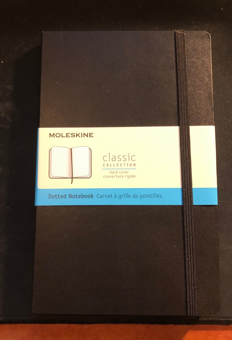
Moleskine Large Dotted Hardcover Notebook

So it appears that Moleskine has finally hopped on the dot grid bandwagon, releasing several of their classic collection notebooks in dot grid, even going as far as creating dot grid versions of some of their seasonal colours (gasp!). Next thing you know they’ll be releasing limited edition notebooks in squared and dot grid paper, and then where will we be? (Don’t worry, it’s not going to happen).

The classic Moleskine collection consists of their hardcover and softcover notebooks, in pocket, large and extra large. Currently the dot grid is offered in black covers, both in hardcover and softcover, and in underwater blue (such a pretty seasonal colour) and beige in softcover. However, it apparently was enough of a success for them to issue the dot grid option in all their classic collection core colours (black, red, blue sapphire, and myrtle green), and in seasonal reef blue (both hardcover and softcover). These colours will start being available in February-March, so it may be worth waiting a little while before purchasing (although some of the hardcover core colour options already seem available).

Now to the review. I got the classic large black hardcover notebook, as it’s probably Moleskine’s best selling notebook, and what people have in mind when they say “Molekine”.

Dotted paper gets a new band colour – blue.

First thing’s first, Moleksine have listened to customer feedback and significantly strengthened their notebooks’ elastic bands. They’re a little thicker and wider, and there’s little chance that they’ll turn into the floppy mess that some of their earlier elastic closures turned into after a few months of use.

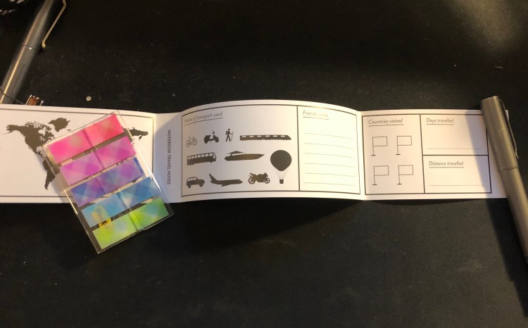
The sleeve also has a B-Side, this one is pretty travel oriented, and I love it because maps!

Phileas Fogg would have been proud.

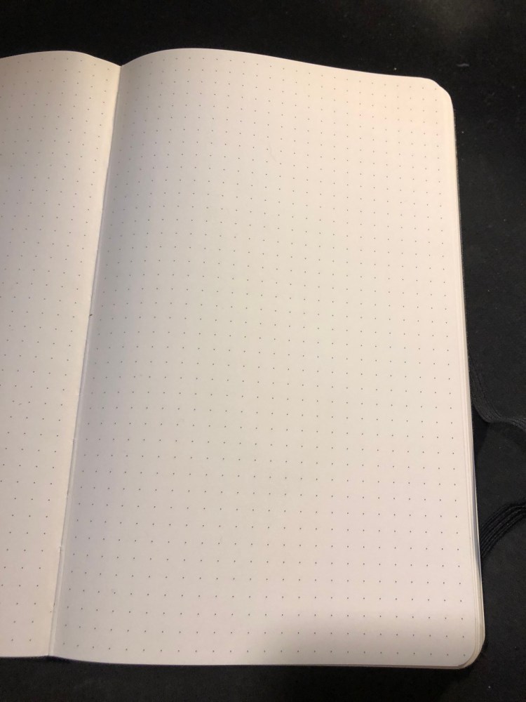
Which brings us to the paper. The dot grid pattern is medium grey, dark enough to be visible, light enough to not be too distracting. It also is very precisely aligned on all pages, if those kind of things bother you.

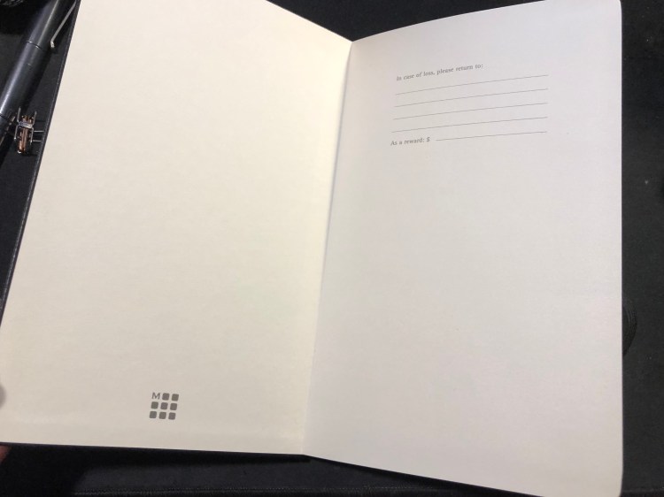
The “In case of loss” endpaper, with the Moleskine logo, a relatively recent addition.

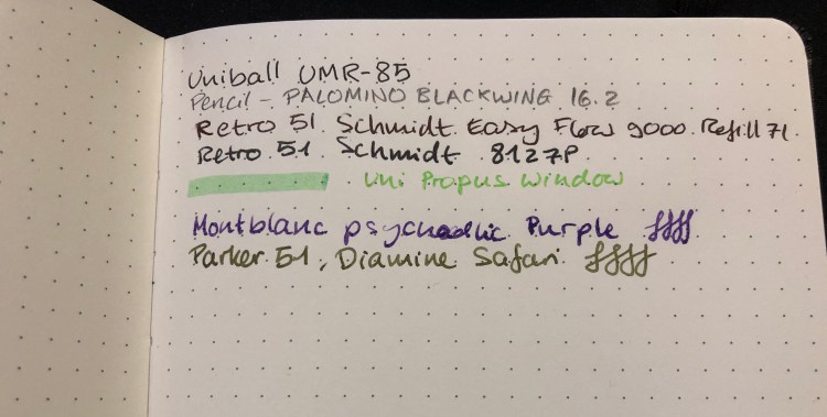
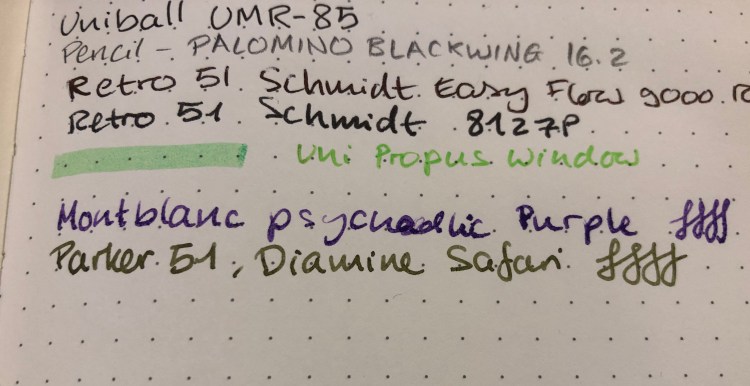
How does the paper perform? Better than you’d expect. Gel, ballpoint and pencil work well with the paper, but even fountain pen inks, including pretty saturated messes like the Montblanc psychedelic purple work pretty well. There’s no more weird spidering, as there used to be and the spreading is minimal (better than Baron Fig, well above average). If you don’t insist on super saturated inks, you’ll be able to enjoy using fountain pens in this notebook.
A closeup of my writing samples. Montblanc purple has behaved this way on Rhodia paper too, so I blame the ink, not the notebook:

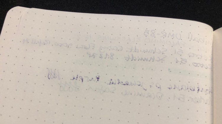
Show through is better than tomoe river paper, but not as good as Rhodia (I’ve had mixed results with Baron Fig, so I’m not using them for comparison here). Again, the only real problem was with the Montblanc ink, which is a problematic ink in general, so I’m not using it for comparison. I’d find this notebook to be usable on both sides of the page, but again, that comes down to preference.

Moleskine seems to be making an effort not only to come up with innovative limited editions, but also to give their regular line-up a bit of a refresh (with new added colours) and boost (with new dotted paper, better quality paper, and a fix for their elastic closure problems). That’s a move in the right direction, and one that I plan to enjoy.

I still need to figure out what’s going on with that Montblanc ink, though…

Moleskine James Bond Limited Edition Boxed Set

Completing my Moleskine James Bond limited edition reviews (see here for the Titles notebook and here for the Carbon one) is the crowning glory of them all: the boxed set.

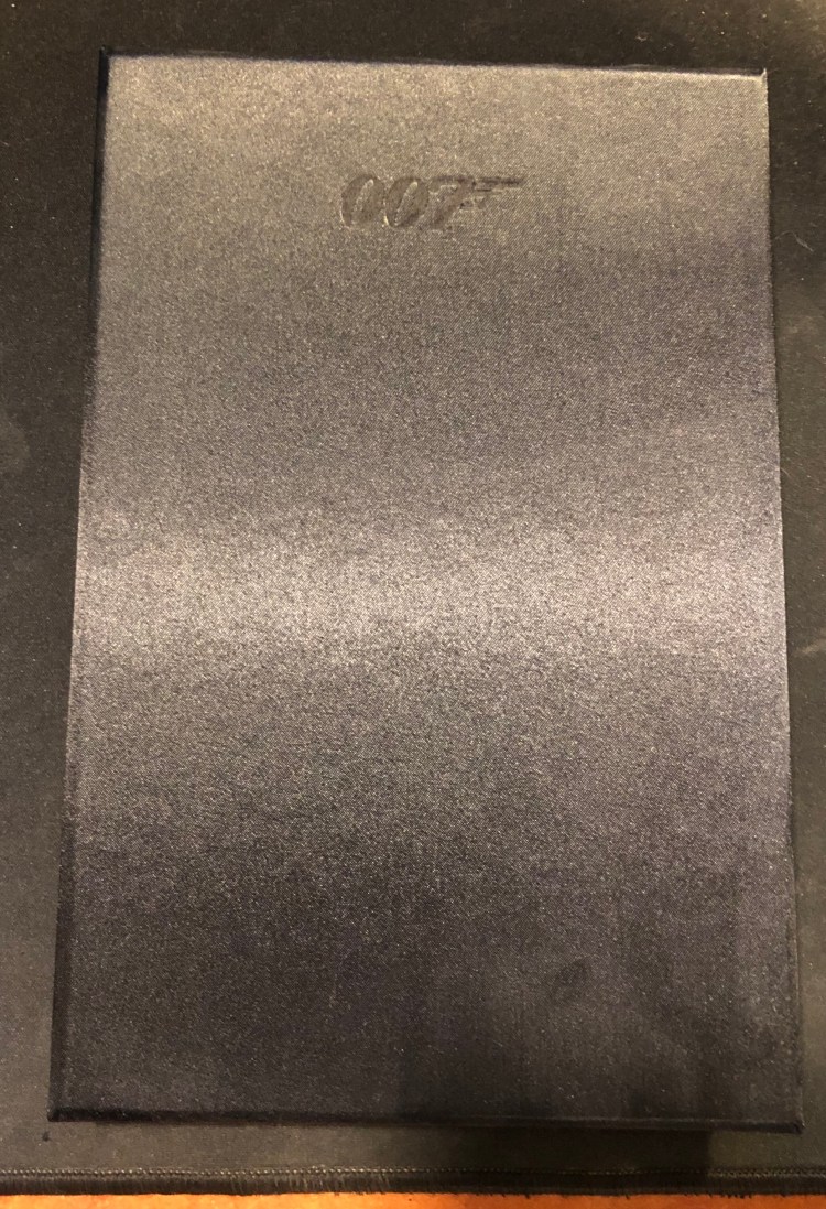
Unlike the other two notebooks, this is a numbered edition with 7007 notebooks total made worldwide. It comes in a silk covered box, with its own matching “tie” (to help you get the notebook out. It’s not really necessary, but adds another touch of luxury to this set), and is itself covered in black silk. All of this is terrifically excessive, like Q’s elegant little gadgets on an already over the top car. The result is a notebook and box that you just want to stare at and stroke every once in a while.
The Box
The “tie” inside the box

The notebook with its shiny silk cover:

Moleskine did a limited edition run of silk covered pocket notebooks years back, for the van Gogh museum in the Netherlands. They were all the rage, especially at a time when Moleskine was not doing limited editions except for special events, and they were exceptionally difficult to obtain. The silk on those covers was thinner and rougher, and after a bit of use tended to fray, likely because silk is not an easy fabric to work with, and the company had very little experience with fabric covered notebooks.

The James Bond Boxed Set comes after the Blend, Rolling Stones, Denim and Marauder’s Map fabric covered editions, and you can tell that they know what they’re doing now. The silk on the cover is densely woven and substantial, and unlike the van Gogh notebooks, it actually shines with sheen. It feels like the notebook is wearing a high end tuxedo and just waiting for a gorgeous woman in a skimpy dress and a silly name to bring it a martini, shaken, not stirred.

Front end page, with the well designed map and the number of the edition
Back end page, with all the titles beautifully aligned.

Like all previous boxed sets, the notebook comes unwrapped (the box itself is wrapped) and so without the paper slip and its B-side around it. The sticker sheet that comes with this edition is the same as the other notebooks in this range.

The set originally cost around $35 but you can get it now for $25. If you’re a James Bond fan this is the one to get out of this edition, with the Carbon coming in second place and the Titles in third. The only minus to this notebook is that it is so sexy there’s a good chance that you’ll feel uncomfortable using it (ah, double entendre. What’s a James Bond movie without it?).

Field Notes Rams Review

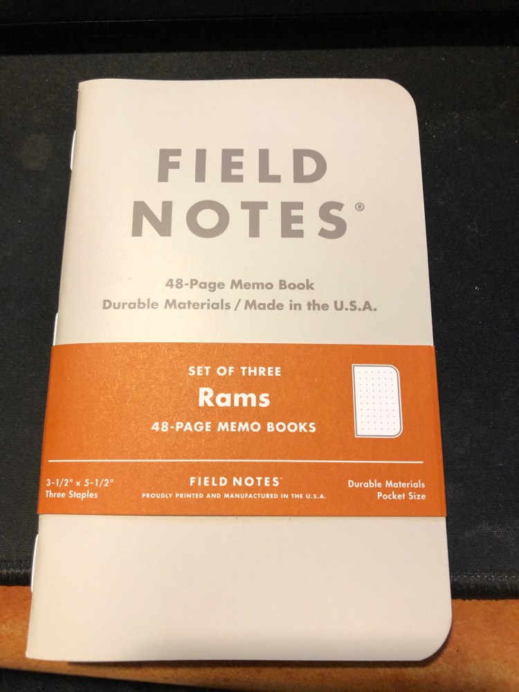
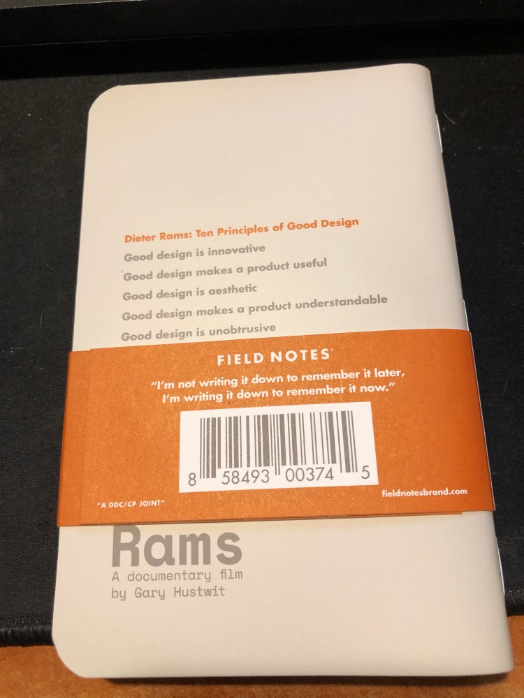
I got these notebooks because I like Field Notes more minimalist designs, and this is most certainly one of them. I’m not a fan of dot grid though, so I’m not sure whether I’ll actually enjoy using it.

The orange highlights go well with the cream coloured covers and the grey type.

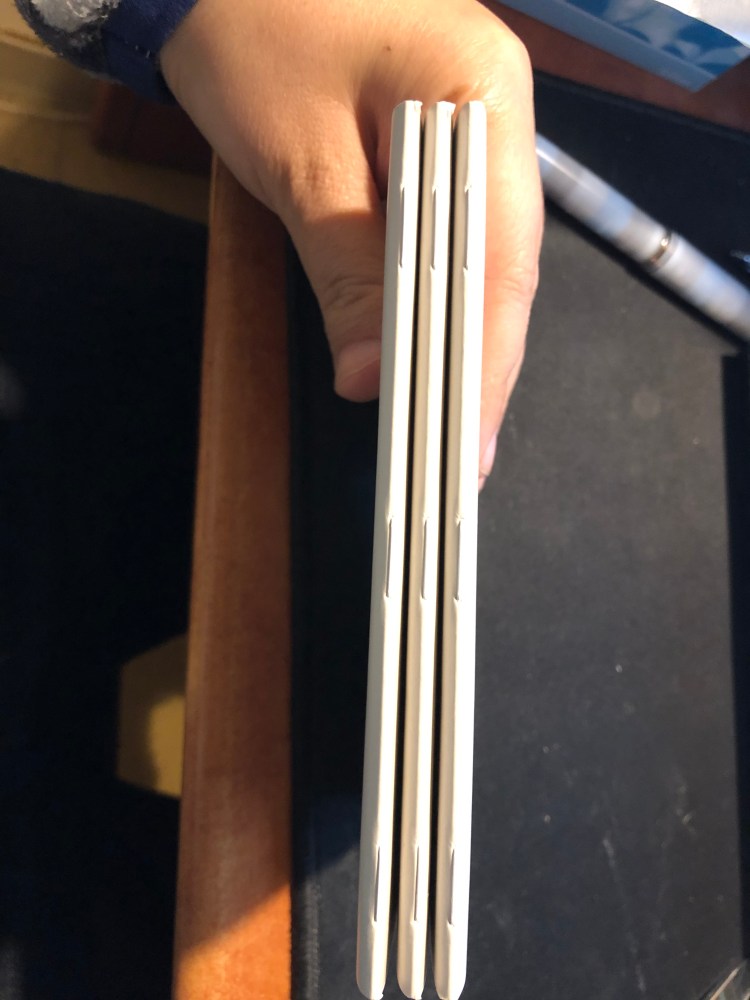
White staples, to complement the covers:

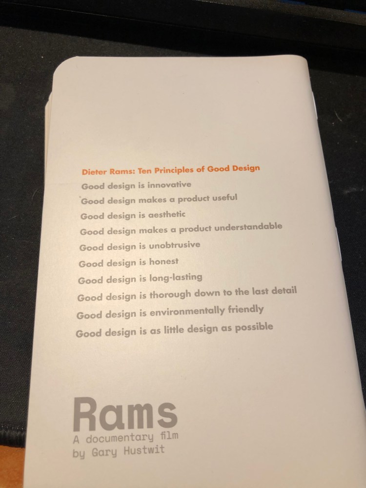
The best part of this notebook, Dieter Rams Ten Principles of Good Design:

Testing the pages a bit:

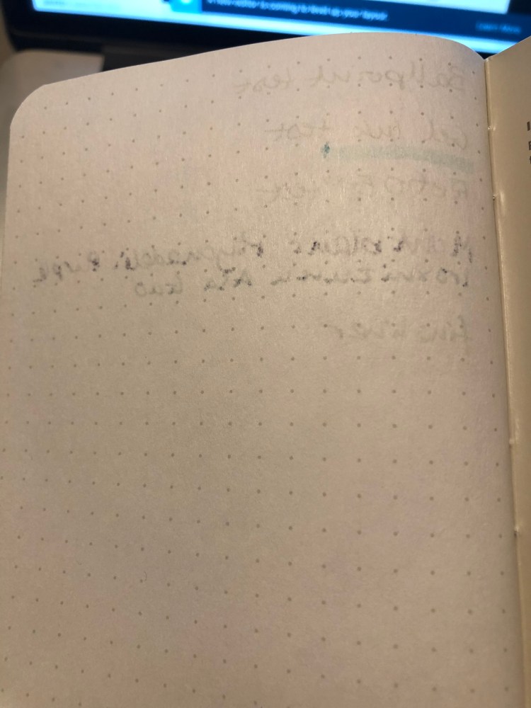
The reverse side of the page:

The Field Notes Rams edition is a utilitarian notebook that would be perfect with a Lamy 2000, provided that you’d fill the pen with something like Noodler’s Black. As it is, because of the dot grid, I have no idea when and how this edition will get into my rotation. If you prefer dot grid notebooks, this notebook is definitely worth checking out. Otherwise, the more colourful Three Missions or the more interesting Clandestine would probably be a better purchase.

This Year’s Field Notes

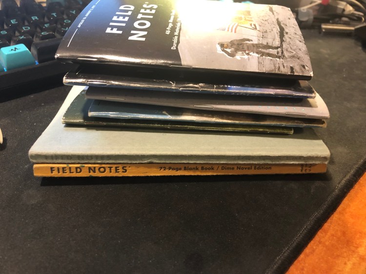
This year’s filled up Field Notes notebooks all piled up:

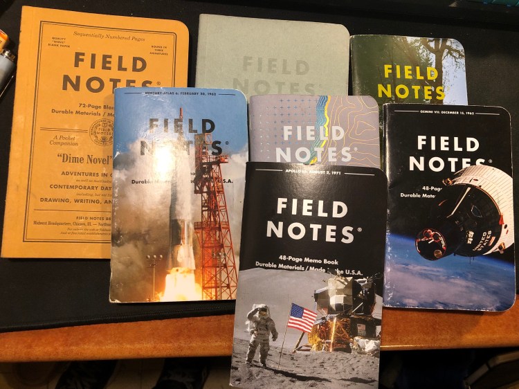
And spread out:

I use them mostly for to do lists, quick capture and tracking of various short term goals. The Signature Sketchbook is full of doodles, inktober drawings and rough sketches. My favourite by far has been “Dime Novel”. My least favourite has been surprisingly “Costal”. The cover and design are gorgeous but the reticle grid is just too dark to make it enjoyable to use.

Field Notes: In and Out

It took me about a month and a half to finish this one. Out: Field Notes Coastal (beautiful edition, but the reticle grid is a bit too bold and noticeable for my taste). In: Three Missions (another winning edition from this year).

Moleskine Looney Tunes Limited Edition Notebooks and a New Moleskine Two-Go

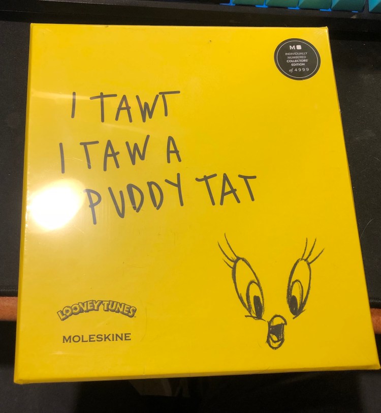
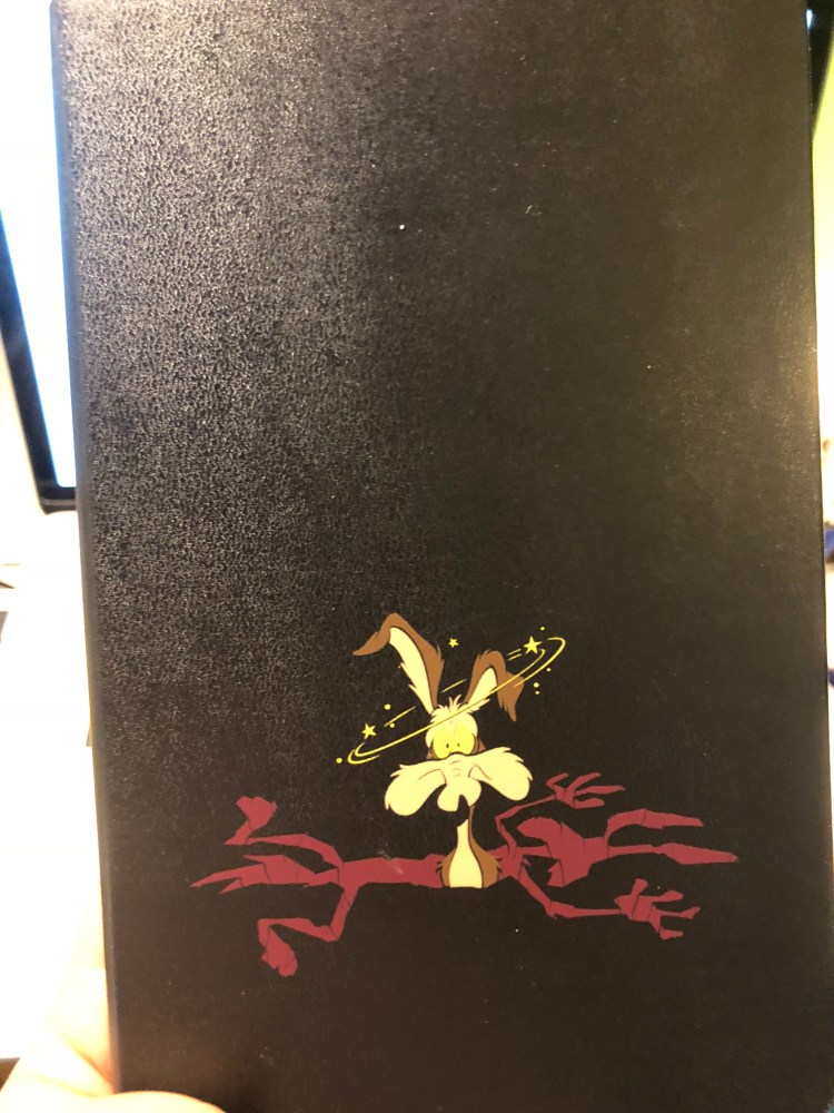
At almost the last minute of my trip to Paris I managed to sneak in a short visit to a Moleskine store, and was caught by surprise by their new Looney Tunes collection. I’m not a rabid Looney Tunes fan, but the Bugs and Wile E. Coyote were too well-designed to pass, and I’m curious enough about any limited edition that couples Tweety, drawing pencils and a sketchbook to give it a spin. These all obviously come with a Moleskine premium, but if you’re remotely into Looney Tunes, I’d recommend them.

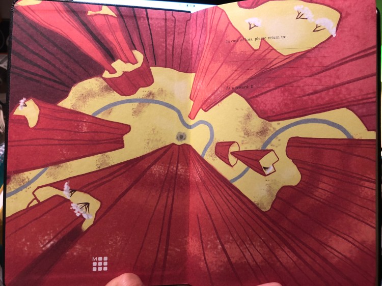
I’ve only opened the Wile E. Coyote notebook at the moment, though I have seen the others open in the shop and they are as tremendously well designed as the Wile E. Coyote one is. The endpapers are so colourful and a lot of fun, and they work with the cover design so well.

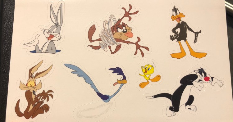
It comes with stickers of course:

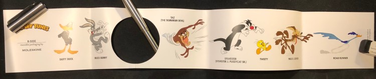
And a cute B-Side band:

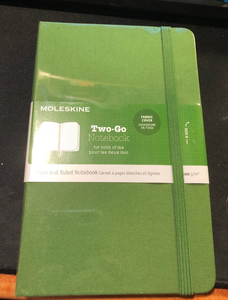
Another pleasant surprise was a new cover colour to the Moleskine Two-Go editions, green. The Two-Go notebooks have thicker paper than regular Moleskines, and they’re smaller than large Moleskines, with one side of the page blank and the other side ruled. I use them as my reading journals, and highly recommend them, especially if you were at all fond of the Arts notebooks of Field Notes’s “Arts and Sciences“.

Which Notebooks I’m Currently Using

I love reading about how other people use their notebooks and pens/pencils, so I decided to take the time to list what I’m currently using and how:

  • Field Notes Front Page – used in landscape mode with a Blackwing 16.2 to take notes while I work through the third draft of my novel. Something about the format of this notebook appeals to me, especially in landscape mode. I ignore the lines completely (easy to do, since they’re so faint). Also works well while I’m typing, since it’s thin enough not to get in the way. I just put it below my keyboard, a pause to jot a quick note when I need to.
  • Field Notes Dime Novel – I use this as a catch-all and home to do list notebook, using whichever fountain pen I have inked at the moment.
  • Moleskine Star Wars Lightsaber Duel – used as my daily journal, coupled with a Ti Arto with a uni-ball Signo 0.5 gel refill (UMR-85) and a Scotch glue stick to paste bits and bobs in. I’ve been using this combo for about two years now (with different Moleskine lined notebooks), and I couldn’t be happier with it.
  • Moleskine Large Squared  – used as my “bullet journal” at work. I’ve simplified the bullet journal system (removed the calendars entirely) and it’s now a daily checklist + work journal that serves to answer two questions: what am I going to do today, and what have I actually done. Keeps me sane and happy, especially when outages derail my day. I use a Zebra G-301 pen with this that I bought in Atlanta in 2012, and it is still going strong. I go through about a refill every two months, so this isn’t the most economical of systems…
  • Moleskine pocket square reporter – a new one for me. I’m using it to keep a running food journal, using a Retro 51 tornado slim graphite filled with a parker gel refill.
  • Paper for Fountain Pens notebook – together with sheafs of Tomoe River paper, this is what I use for my writing notes, quick drafts, and when I’m working through plot holes. I use whatever fountain pen I have going at the time, usually two pens with two different inks, Neil Gaiman style.
  • Moleskine two-go – I’m using this as my reading journal. I log all the books I read here. Previously I used two Field Notes Arts notebooks, but I ran out of them, so I moved to this. Using a Karas Kustoms grey RenderK in this, coupled with a Caran d’Ache Bicolor pencil to highlight things, and whatever other pencil I have laying around, for extra notes.
  • Baron Fig Three Legged Jester Confidant – using this to track my resolutions for several years now. Used to be my daily journal.
  • Moleskine softcover squared pocket reporter – using this to keep track of story ideas. I write in it with whatever is on hand.

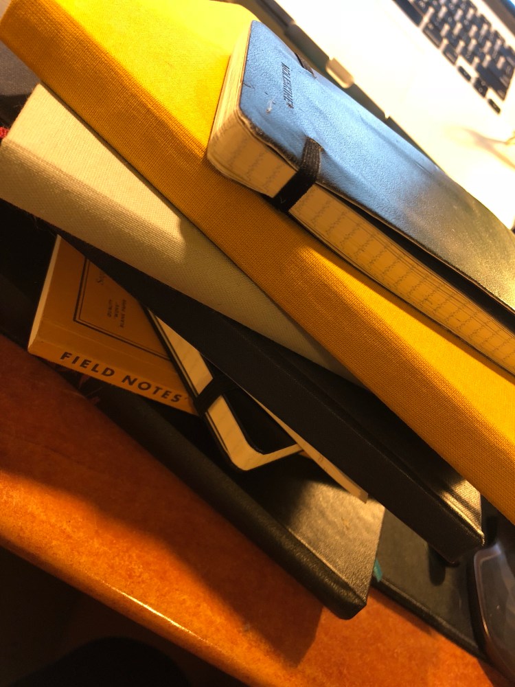
A large pile of notebooks

Vintage Friday: Boxes and Stapler

I love going to flea markets and rummaging for old things, particularly boxes to store stuff like notebooks and pencils, and old office supplies, which are oftentimes elaborately decorated and over engineered.

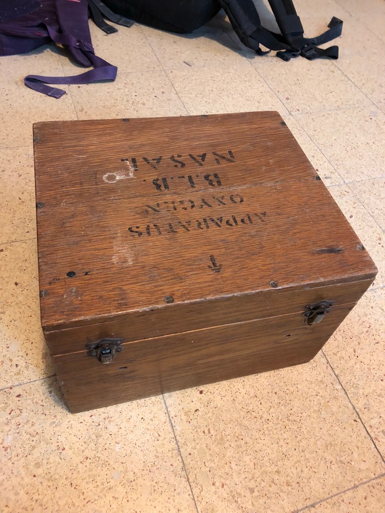
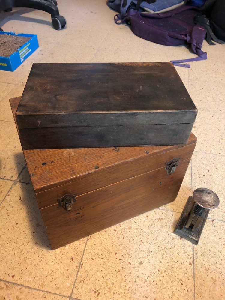
Three of my latest finds include an old army oxygen mask box, which I am using to store my used notebooks in:

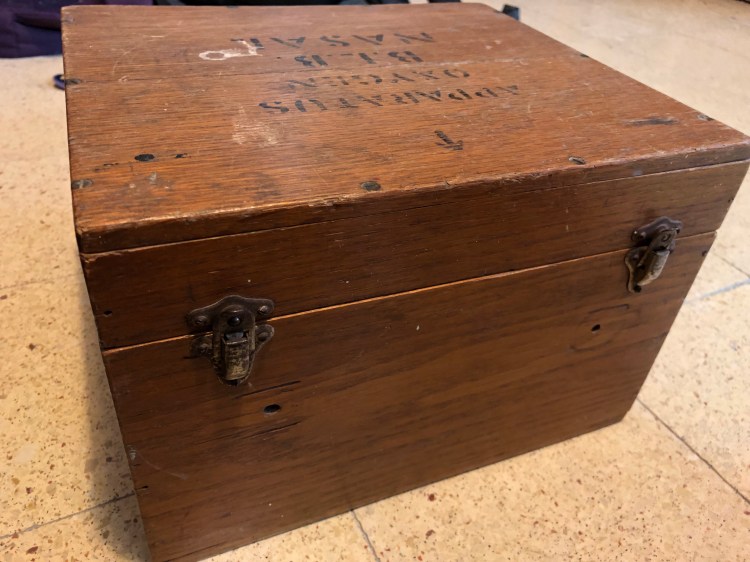
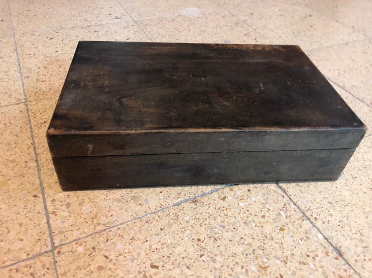
An old wooden box that is currently empty, but will house my Blackwing Volumes pencils, I think:

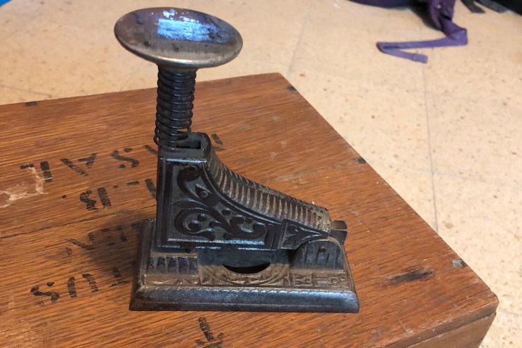
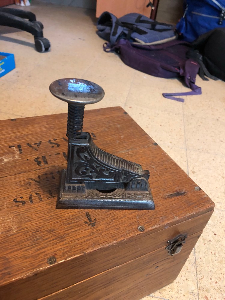
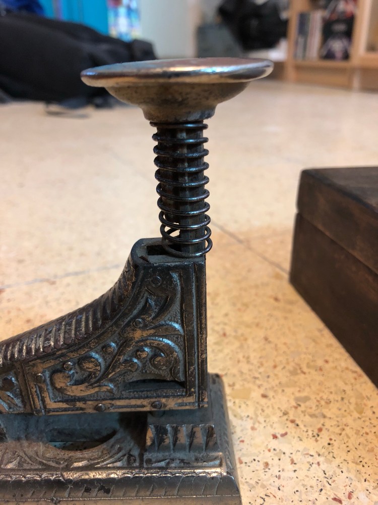
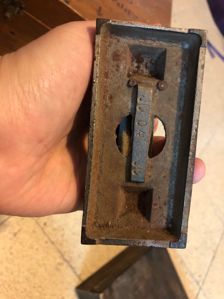
And a byzantine looking stapler, which is completely non functional (doesn’t accept modern staples), but was too wacky to leave behind:

Olive Traveler’s Notebook

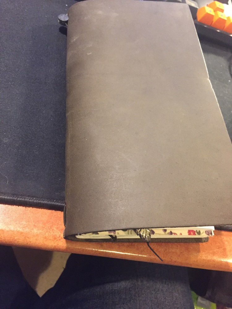
My new Traveler's Notebook arrived yesterday, the Olive limited edition, and I took some time tonight to customise it.

That's my favourite part of starting a new Traveler's Notebook – setting it up, making it my own – and the main reason I enjoy them so much. This is my fourth TN. I have a Camel limited edition from their 5 year anniversary, a black one, and a pocket one. The camel is my most used
one.
First I decorated the notebook it came with, using Windsor Newton gouache. I love ivy and the greenish tinge if the cover inspired me.

I added a leaf charm to the bookmark and slotted in another notebook — an old Midori sketchbook I had laying around.

That's it, now all that remains is to use it.

P.S. I read a review in some site that these TNs have a suede like feeling to them, but they feel like a normal TN to me.
P. P. S. These covers don't stay pristine for long (and that's their charm), so if you're precious about your things, these aren't for you.