Moleskine Basquiat Limited Edition Notebook Review

It is rare that I start using a notebook the moment I unwrap it, but the Basquiat Moleskine limited edition had that effect on me even though I originally didn’t plan to buy it.

The colour of the cover is what drew me to this notebook. It’s a purplish blue that contrasts beautifully with the orange elastic closure. I didn’t even pause to take a picture of notebook when it was still wrapped. That periwinkle cover makes Basquiat’s handwriting and art just pop. You can see the character in each line and it really does inspire you to grab a pen and write and draw and doodle.
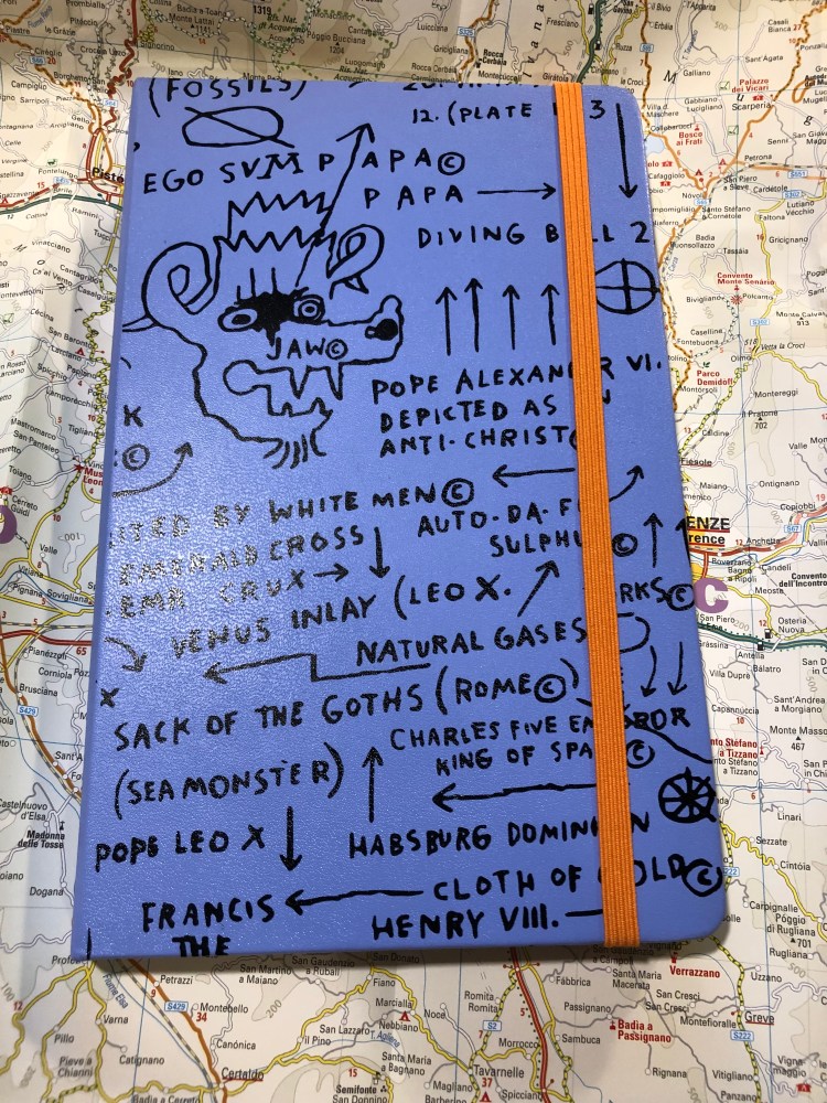
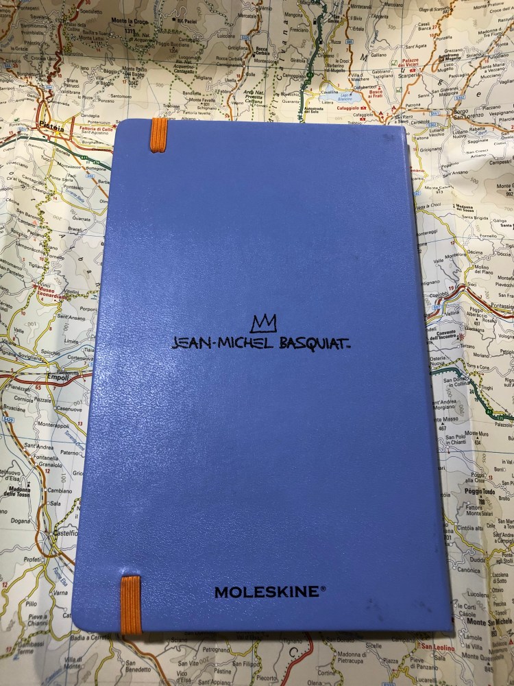
The back cover (a little smudged from my enthusiastic use, but nothing that a wet-wipe can’t remove) is understated, with just the Basquiat signature. I think that I’d prefer the Moleskine logo to just be debossed in, like they did in several other recent editions, but it’s not a dealbreaker for me that it’s boldly there.
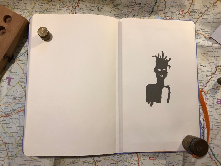
The front endpage echoes the front cover, with the addition of a pretty fitting Basquiat quote. I had already filled in the “In case of loss” details, so I hid them.
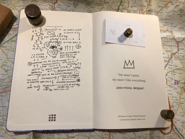
Look at that back endpaper. Is it not well designed? I like that they let the piece “breath”.
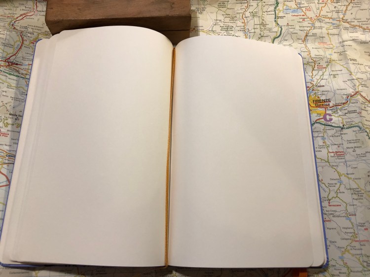
Unlike most Moleskine limited editions that come in lined paper, this notebook comes with blank pages. I like the choice, as it frees you to do whatever you want with the notebook: drawings and words will feel equally welcome here. Also, there’s an orange ribbon bookmark. What’s not to love about that?
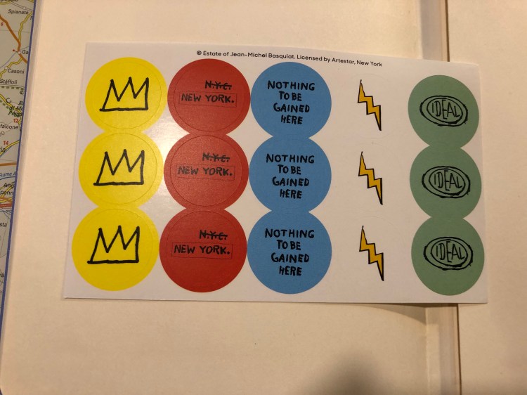
The stickers are a bit of a disappointment in my opinion in terms of colour choice. I would have liked it better if they kept to the orange and periwinkle colour theme. As it is, they clash a bit with the rest of the notebook.
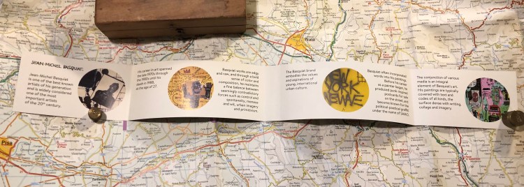
The B-Side of the paper band gives a little background on Basquiat, who he was and how he worked. It’s a nice little add on.
There are times when a notebook just makes you want to start using it, start writing and scribbling in it, start creating. The Basquiat Moleskine did that for me, and it is a fantastic addition to the Moleskine limited edition lineup for the year, and definitely a notebook that I recommend that you try.
 

Field Notes Rooster 2019 Limited Edition Notebook Review

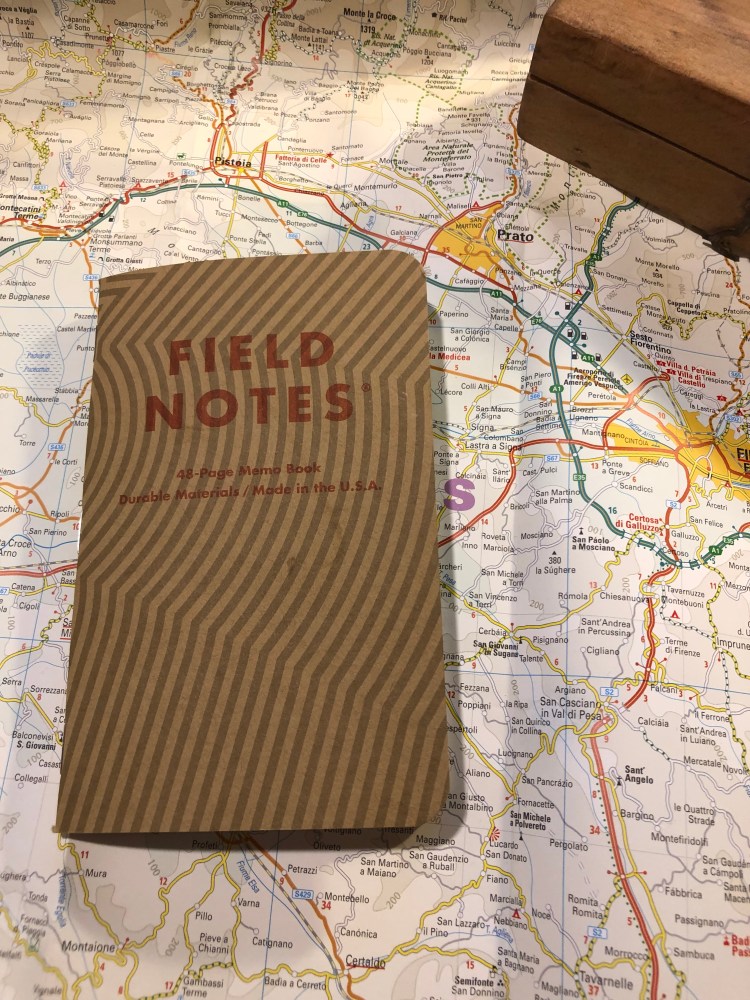
Field Notes is a major sponsor of the Morning News’ Tournament of Books, and every year they celebrate the tournament by creating a specially themed notebook for the occasion. The notebooks are sold as singles and 100% of the proceeds from them are donated to the 826 National, which provides free educational programs to under-resourced youth. This year, the Rooster Book looks like this:

The party is all in the back, with this year’s ToB Rooster logo:

I really feel like colouring it in crazy psychedelic colours.

The notebook is lined, and the craft front cover is pretty standard for a Field Notes:

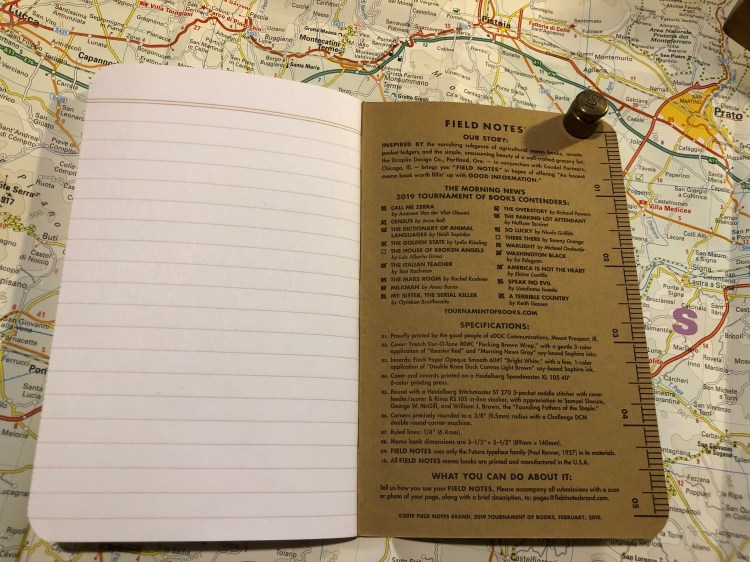
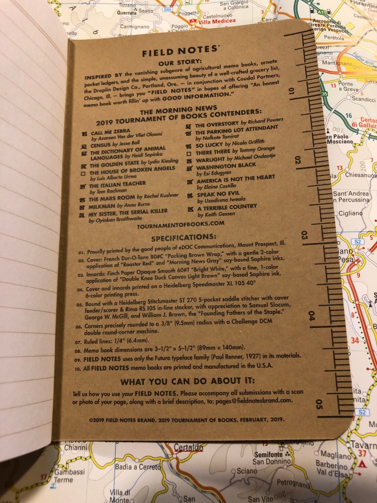
Again the back is where it’s at, with a list of this year’s Tournament of Books contenders.

You can check off the books that you’ve read, and I admit it was pretty fun checking almost all of them off.

This is a cool little edition that helps out two wonderful causes. The only thing I would change about it is its publication date. If Field Notes would have issued it at the time the list of contenders was announced then you could really use this notebook to follow along with the tournament. But I bought a few notebooks as a memento of my plan to read all the books in the tournament this year, and excellent for that.


Moleskine Pokémon Pikachu Limited Edition Notebook Review

Pikachu! I choose you!

This is the final large format Moleskine Pokémon limited edition notebook that I haven’t reviewed, and I think that it’s the one that Pokémon fans will most gravitate towards. Why? Because it’s Pikachu, and because it is so well designed.

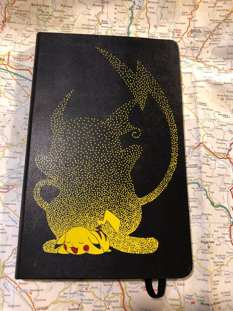
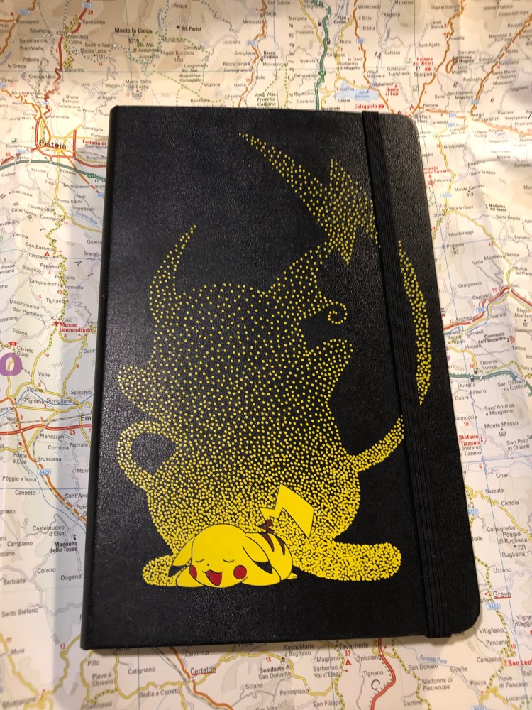
Like the Charmander edition cover, the Pikachu notebook front cover shows Pikachu dreaming of when he’ll be all grown up and kicking ass as Raichu. It’s a lovely, cute design.

I would have liked the elastic closure to be yellow, but it works in black too, and I guess that black is more pragmatic in that it doesn’t show dirt that much.

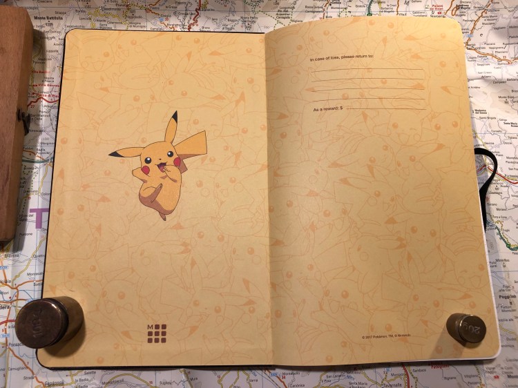
Pikachu is super skipping happy on the front endpapers, and the background of banana coloured Pikachus works really well. You can’t have enough Pikachus after all, as any Pokémon GO player will tell you.

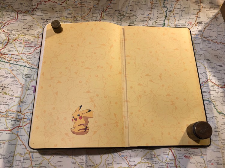
The back endpaper has the same background, and Pikachu resting from jumping around and fighting I guess. They probably posed him like this so you can see his stripes and tails, but I would have preferred him an an action pose with lightning maybe. Then again, it’s cute, and Pikachu is all about the cute. For those wondering, the background print is aligned on the back pocket of the notebook, and the webbing on the side of the back pocket is black.

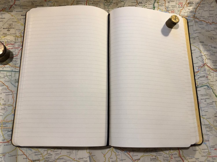
The pages are lined (I love Moleskine’s lined notebook line width, as it’s perfect for my handwriting size) and the ribbon bookmark is black, which works, but I would have liked a yellow one instead.

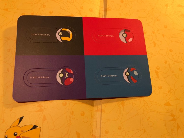
As in the Pokéball edition and the Charmander edition you get cardboard bookmarks instead of stickers as the little add-on in the notebook’s back pocket. These are really well designed and I’m going to hazard a guess that Moleskine would have preferred to make stickers for these editions, but they were limited by their contract with Nintendo. Nintendo sells a lot of Pokémon branded merchandise, and there’s probably a contract somewhere that gives some sticker company rights for the Pokémon brand.

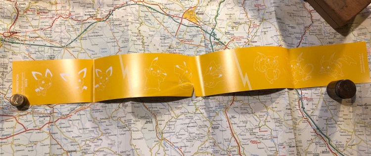
I accidentally tore the paper sleeve, and so the b-side on this one is pretty much ruined, but like the Charmander edition it’s Pikachu in all his evolutions: Pichu, Pikachu and Raichu.

Should you get this for the Pokémon fan in your life? Yes you should. All three notebooks in this series (and the pocket notebooks which I will not review) are excellent. This would be a great way to get someone to consider journalling, or keeping notes on a trip or during an interesting or difficult time in their life. These are now pretty heavily discounted all over the place, so they’re also kind of a nice little treat to buy for yourself.

Pika! Pika!

Field Notes: Out and In (Campfire and Fire Spotter)

Out: Campfire Night. I loved using this notebook despite my initial apprehensions about the orange grid and the photo covers (my favourite Field Notes Colours edition is “Balsam Fir”). The covers wear really well, and the orange grid isn’t as distracting as I thought it would be. I’ll still use this one for a while, until I finish reading the Tournament of Books books, as it has my logs in it.

In: Fire Spotter. I’ve started this notebook before, filled in two pages and abandoned it (I’m not a fan of dot grid). Decided to start using up the Field Notes notebooks that I started using and haven’t finished because it’s just a shame not to. Firespotter is a great edition if you like dot grid, and I love the debossing on the back cover.

Moleskine Wonder Woman Blue Notebook Review

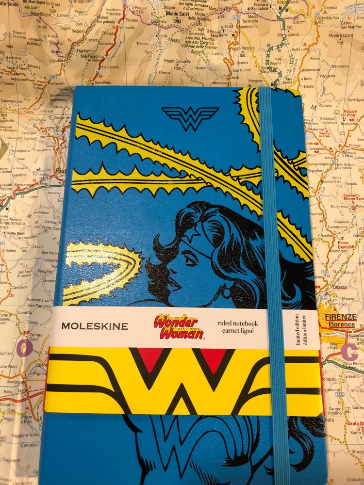
It’s the Moleskine of Truth! No, it’s actually just the Moleskine Wonder Woman Blue limited edition notebook. This is a brand new edition for Spring 2019, and there’s a red one too (expect a review later on).

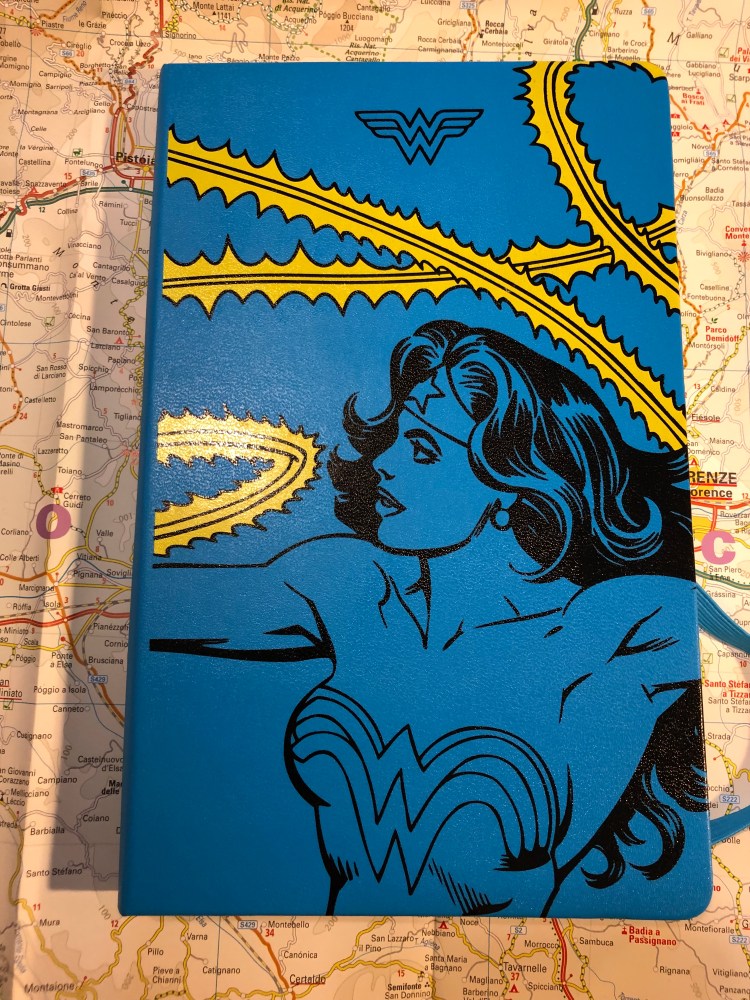
The notebook with the wrapper on makes you think that there will be a red element on the cover, but the print on it is only in black and yellow on the blue background.

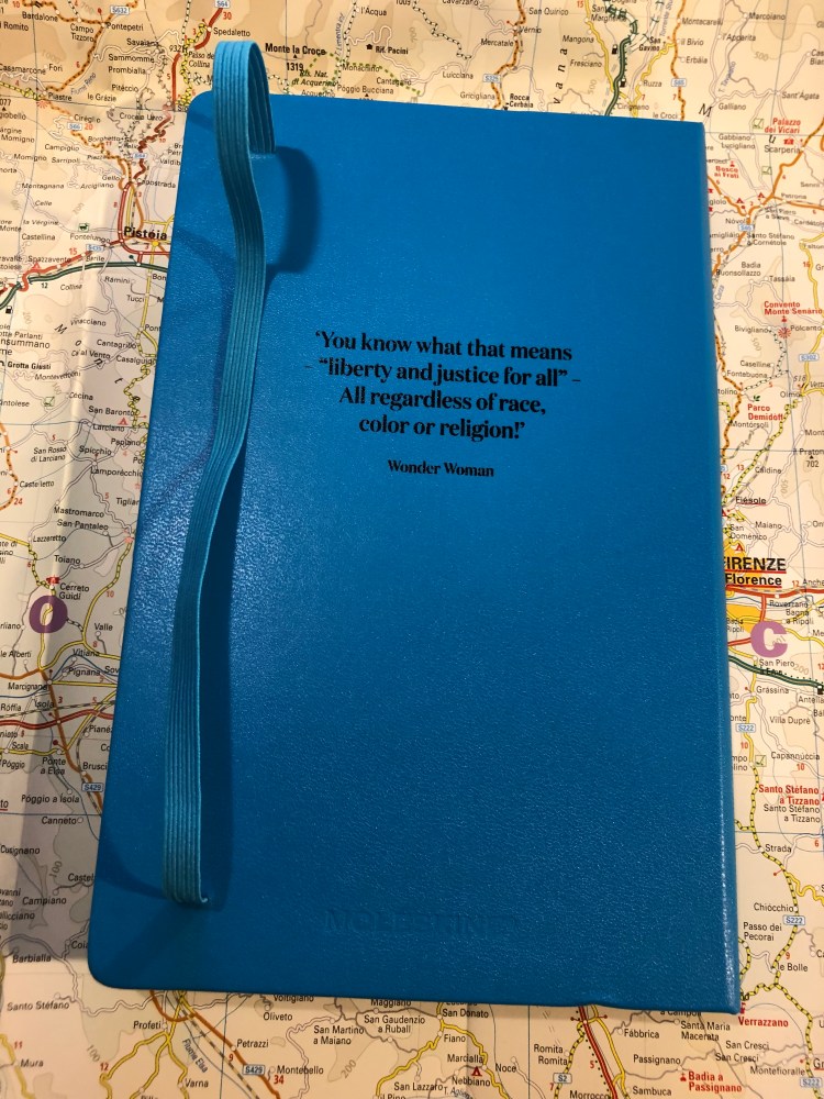
There’s a quote on the back of the notebook (there’s a different one on the red notebook), and it’s lovely. Go, Diana!
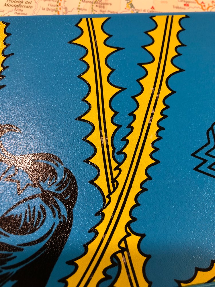
Now we come to the biggest issue I had with this notebook: it has some printing quality control issues. If you look closely you can see that on the yellow lasso print there are tiny bits of paper stuck to the cover. It feels as if there was a sticker there and someone removed it with bits left behind. They aren’t sticky and they are very easily removed with a wet wipe, but that’s not something I enjoy dealing with when unwrapping a brand new notebook. It’s only on the yellow parts of the print, so it is probably a leftover of the printing process, but it shouldn’t have slipped through.
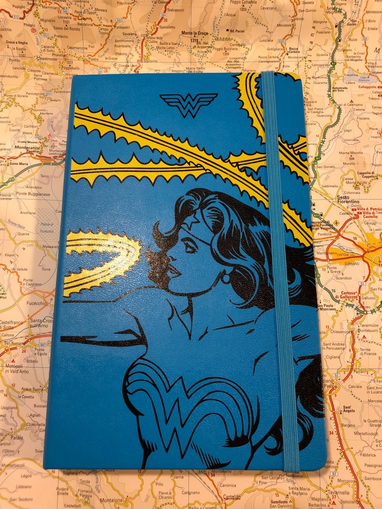
The front cover unwrapped:

I understand the design aesthetic here, but I don’t agree with it. It would have been nicer if it was black, yellow and red and it would have been even nicer if Diana (Wonder Woman) was in full colour. As it is, the lasso is more attention grabbing and vivid than she is, and it’s not the main point. This isn’t the “Lasso of Truth” limited edition notebook, is it?

Here’s the unwrapped back cover, which is a little plain compared to what Moleskine have done for Batman in past limited editions.

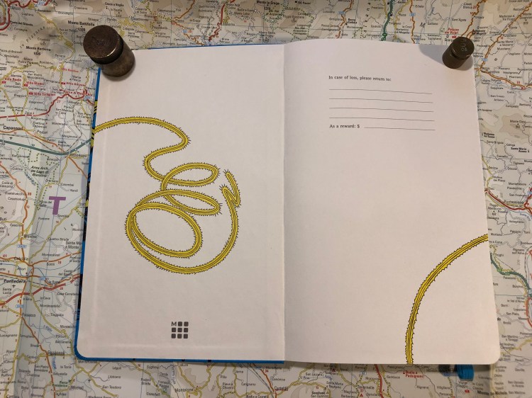
The front end paper plays with the lasso of truth design element, and again, I really wish that Diana was more represented in this edition. Maybe her doing her thing, or even a comic book page. She deserves the same excellent design that Moleskine made for Batman and Star Wars.

This is better! The back end page is where it is. You see Wonder woman using her lasso which… is mysteriously cut out mid back-pocket. What? Why? If only they hadn’t done that, or at least if it would have vanished into the pocket. It just looks weird here. I get that it disappears into the page so that it looks like she’s shutting the notebook’s cover, very clever and comic book-like, but take a step back and just look at the page layout. It’s… not good.

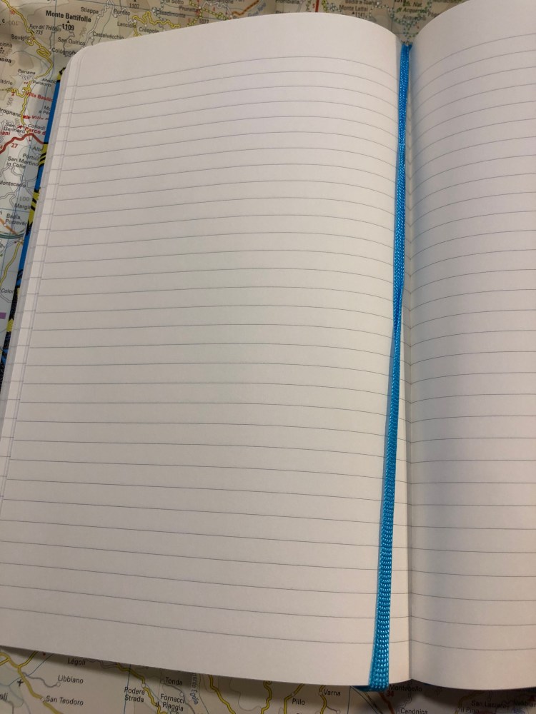
Inside are lined pages and a blue ribbon. The paper is the newer kind, so there’s no weird spidering, it’s good for gel ink pens, ballpoint, pencil, and certain fountain pens and inks (Noodler’s Black works with every fountain pen, all else needs testing, but generally speaking fine and extra fine nibs and inks that aren’t overly saturated or wet will work fine. The paper is thin, so there will be show through).

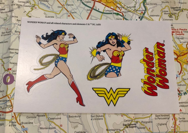
This edition comes with some nice stickers, and it would have been great if they would have been part of the cover or end paper design, but I’m not complaining, you’re complaining!

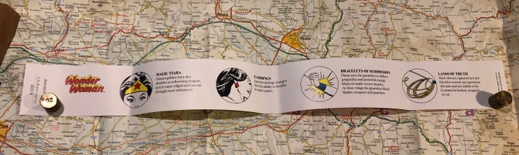
The best thing about this edition is the B-side of the wrapper, which explains what Wonder Woman’s stuff does. Of course the Lasso of Truth is there, it’s the Lasso of Truth edition, didn’t we already go over that?

The Wonder Woman fan in your life is probably going to love this edition, even though Moleksine can and does do better. It’s fun, it’s unusually colourful (most Moleskine limited editions feature black covers. They’re like Ford that way), and it will probably be on deeply discounted sale soon, so stock up then for gifting or as an everyday notebook.

Moleskine Limited Edition Pokémon Box Review

I was going to  write a review of the Moleskine Pikachu Pokémon limited edition notebook first, but I forgot that I gifted someone the copy that I had. After a bit of internal debate, I decided to write about the highlight of the Moleskine Pokémon limited edition set, the Pokéball Box, first, and order another copy of the Pikachu notebook for later review. As these make such great gifts, I suspect that this copy too won’t make it into my rotation but instead be snagged by a friend.

Last spring I was visiting London with my family, staying right next to a Moleskine store (my poor, poor wallet) and trying to take my luggage allowance into account (notebooks are heavy, and Moleskines are easily purchasable online after all), when I first saw these. At the time, I wasn’t into Pokémon, I hadn’t played the Nintendo games, and the Pokémon GO craze passed over me without leaving its mark. I thought I was safe. Then I saw this box at the store.

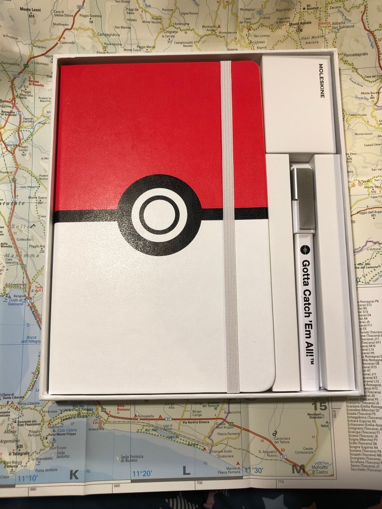
Such a simple design, but so effective

I left London without purchasing the box, but I kept thinking about it. As my family left on a flight two days after me and it turned out that they had weight to spare, they asked me if there’s anything I wanted from the Moleskine store. I considered for a while, and then asked for the Pokémon box. They ended up buying all three notebooks for me.

It’s been almost a year since then, and I’ve been swept into Pokémon GO as a way to handle my anxiety while dealing with my mom’s illness, and so when I photographed this box today, it was no longer an abstract thing that I had very little emotional ties to. The design, however, has not changed.

Unlike many other Moleskine limited edition boxes, this one comes with a Moleskine pen. The tradition started a few years ago with the Writing Box, and this year it’s part of the Basquiat box.

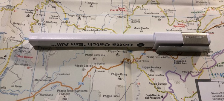
This isn’t a review of the Moleskine rollerball, but of the Pokémon box, so I’ll just point out two things: Strangely enough the logo on the clip is set so the Moleskine logo isn’t aligned with the Gotta Catch ‘Em All! logo. When one of them is right side up, the other isn’t. Also, the Gotta Catch ‘Em All is printed only on one side of the pen, which is disappointing. If you clip it to a notebook there’s a 50/50 chance that you won’t see the logo, unless you make sure the cap is positioned so the clip isn’t on the side of the logo.

The other thing that’s disappointing here is the choice of the body colour of the pen. Red would have been so much more functional, as the white is going to look grimy and tarnished just about the moment you start using it.

The pen uncapped. Now imagine in it bright red. So much better, right?

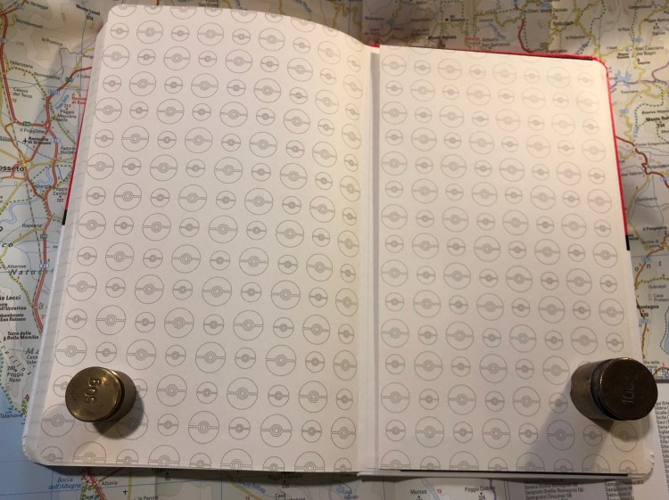
Inside the notebook you are greeted with a whole lot of Pokéballs, both on the front and back endpapers.

Front endpaper
Back end paper

The design even continues into the inner lining of the back pocket:

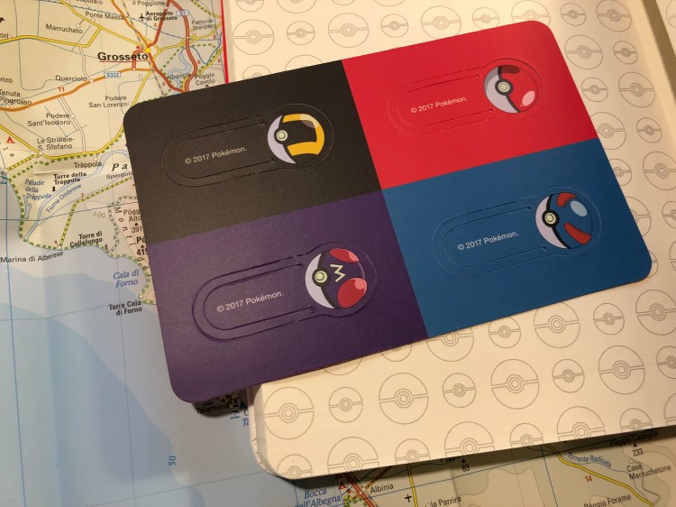
This edition comes with four Pokéball bookmarks, like the other Moleskine Pokémon limited editions.

All in all it’s a nice box, but in terms of design, it’s all in the cover. The endpapers are bland in my opinion, and they could have done a much better job on the pen. The initial price on these was pretty high, but as it’s now dropped somewhat, I still think that they make a great gift for the Pokémon lover in your life, though you might want to consider the other Moleskine Pokémon notebooks.

Moleskine Pokémon Charmander Limited Edition Review

Moleskine’s Pokémon limited edition notebooks are some of the most attractive and colourful ones that the company has come out with in recent years. Even if you aren’t a fan of the franchise you might want to pick one of these up, just for their design. Also, if you’re looking for a gift for the Pokémon fan in your life, look no further. Even if they aren’t a notebook fan they’re bound to love these gems.

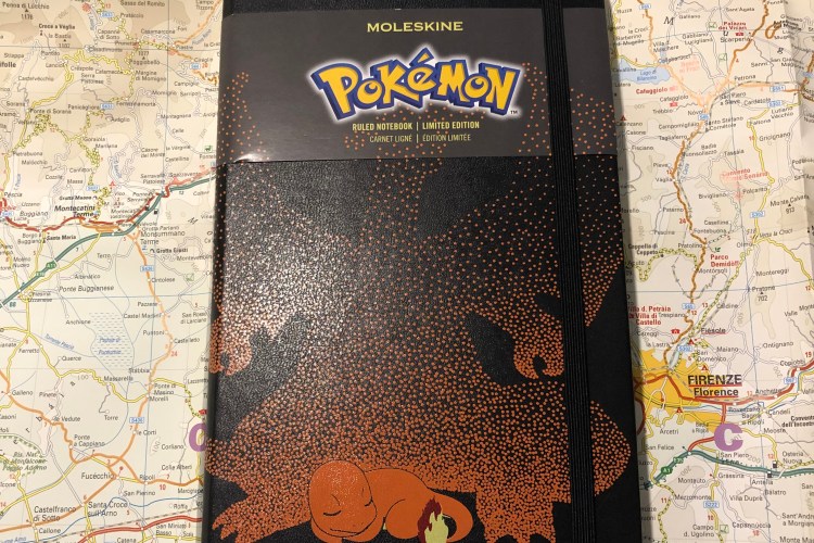
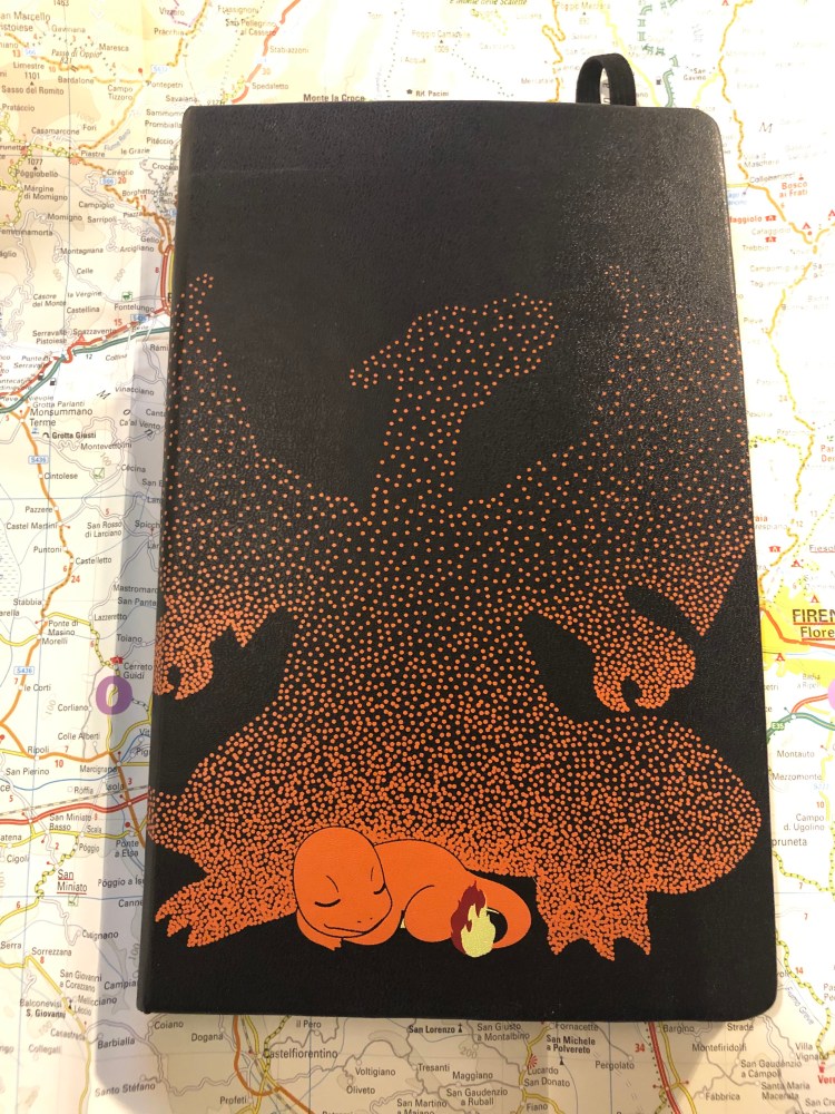
The cover design, with the paper wrapper still on, is fantastic. You can see little Charmander dreaming of when he’ll be all grown up and a Charizard. It’s cute, perfectly aligned with the wrapper, and the colour contrast with the black background really make Chaemander pop.

Dreaming Charmander
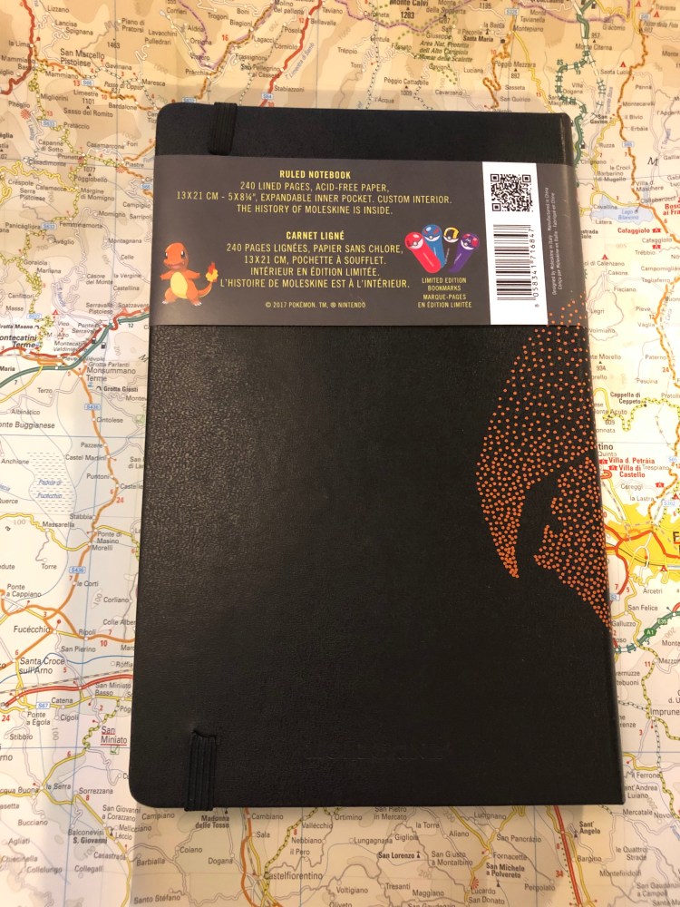
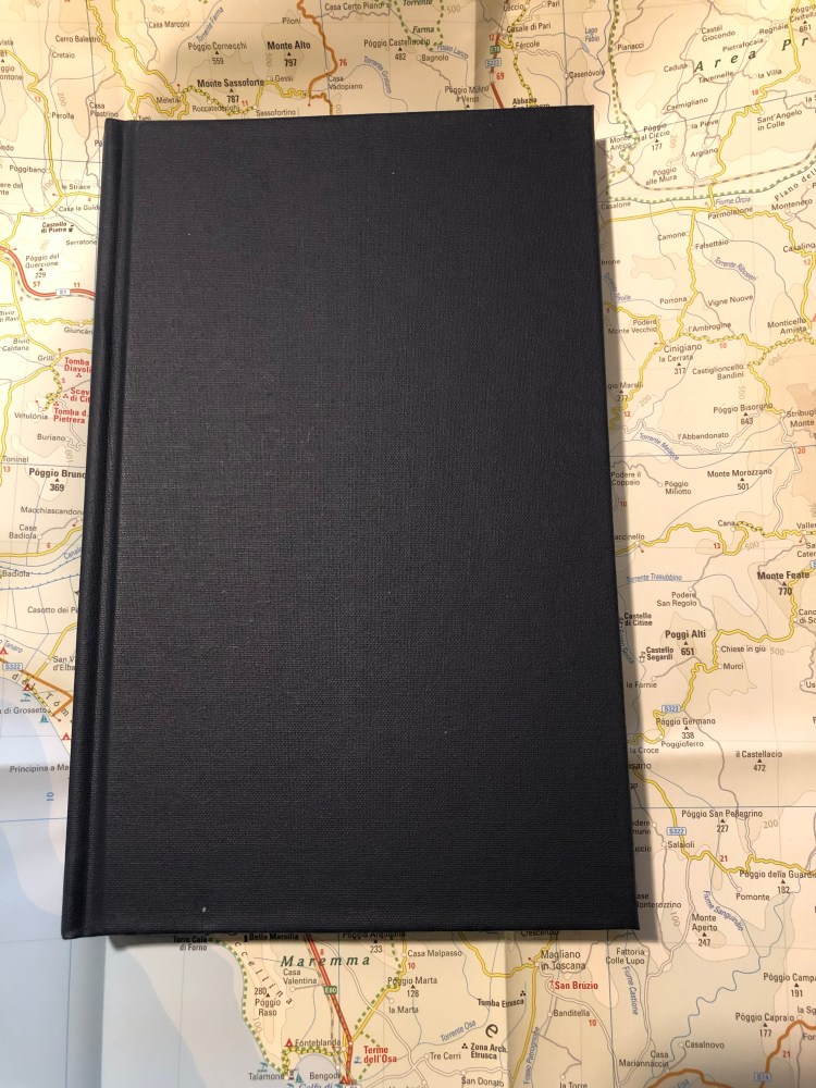
The back cover. I love how understated Moleskine’s logo is.


The cover looks great even without the wrapper, which is a thing because Moleskine has created designs in the past that look much better with the wrapper on than they do unwrapped. The only thing that could make this cover better is if dream Charizard was embossed on the cover, adding a little texture to it. On the other hand, that would have almost certainly made the design less durable over time, so I guess that’s it’s good that Moleskine went for a simple print this time.

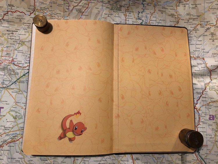
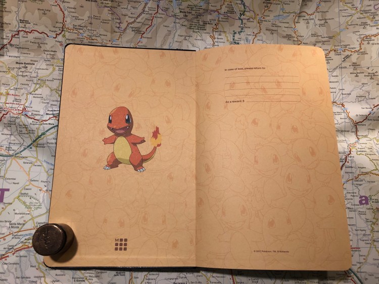
Inside the front cover you are greeted by a multitude of very happy Charmanders, and that design continues in the back.

Just look at the perfect alignment of the print on the back pocket. Also, way to go Moleksine for fully embracing the cute.


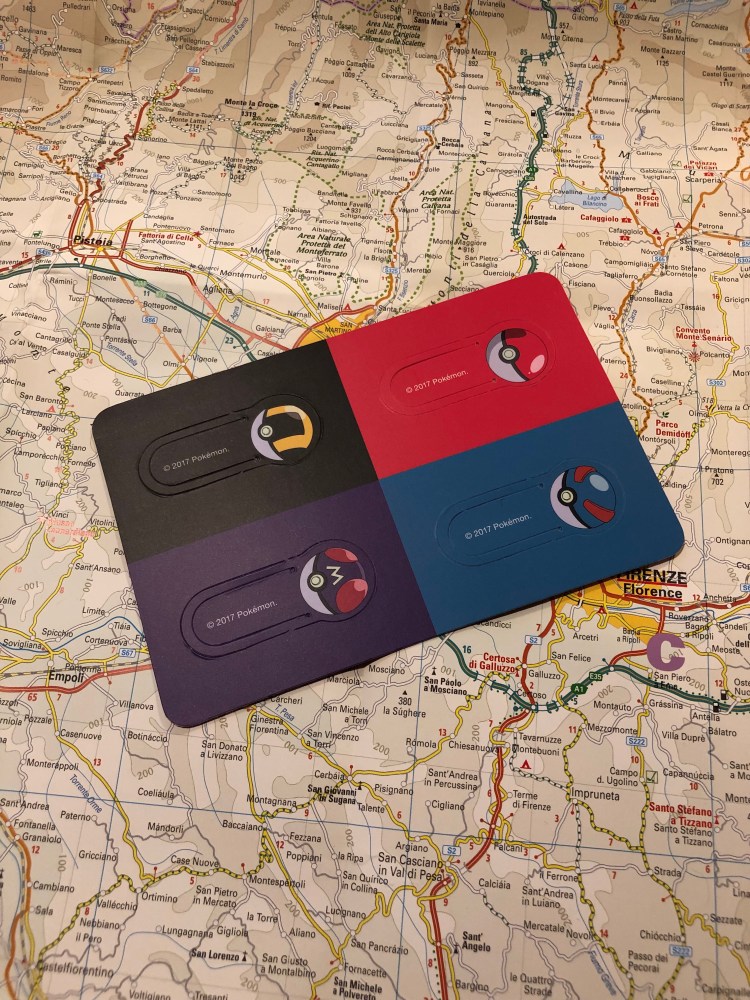
Instead of the usual specially designed sticker set, this edition gets Pokéball bookmarks. Again, these are super well designed, but like all bookmarks of this type, they’re not likely to hold up to much use.

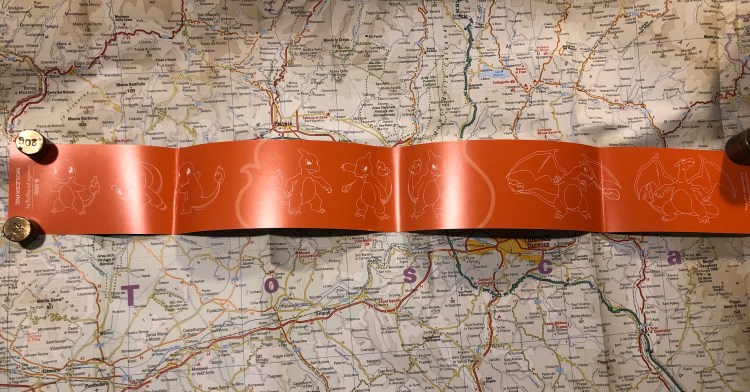
The B-side of the wrapper shows the various evolutions of Charmander (Charmeleon, Charizard), which is nice, if not Moleskine’s best B-side idea yet.

There are two more notebooks in the Moleskine Pokémon limited edition set and I’ll review those later on. Meanwhile, if you’re looking for a cool gift (that costs less than a Nintendo Switch) for the Pokémon lover in your life, this is definitely it.

A few journaling tips

Notebooks are meant to be used, and I use many of mine for journaling. Here are a few journaling tips that I’ve found useful over the years:

  • Don’t constrain yourself to pre-dated or restrictive formats, just pick a not too fancy lined or blank notebook (or dot grid or squared). The notebook just needs to be nice enough and special enough for you to want to crack it open and write in it, but not too nice to be intimidating.
  • Start with a title and a date. The title is a neat way to get yourself writing, and to help you search through previous entries later on.
  • Even lined notebooks can be doodled in.

  • Stick bits and pieces of things into your notebook to make it come to life. Business cards are great for this (restaurants usually make their cards extra interesting and colourful), as are ticket stubs, clothing tags, labels, etc. Write a little something about what you put in, or just let the graphics speak for themselves.
  • If you just feel like writing a line or a paragraph, then do it and don’t beat yourself up about it.
  • If you’re having an extra busy day that you want to remember but don’t have time to fully log, bullet points are your friend. You can always go back and flesh them out later if you feel like it.
  • Write 2-3 things as topics for each day to avoid describing your breakfast and what you did at work. Just document a few things that made the day memorable, special, interesting, fun, unique, or even just a thing or two that are on your mind right now and you want to hash out.
  • Did you see a TV show or movie you liked? Read a good book or went to a good restaurant? Write about it as a way to relive and capture your good experience.
  • Be kind to yourself and others. Put cringeworthy things elsewhere, or you won’t want to open that notebook again. I work through pain and loss in my journaling sometimes, but never anger. Obviously your milage may vary on this one, just be careful not to make yourself be afraid to open a pandora box that you created with your own writing.

Paper for Fountain Pens Notebook Review

Back in the (not so good) old days, Tomoe River Paper was an exotic kind of paper available only in bulk order from Japan, or through various indie creators that advertised mostly on the Fountain Pen Network. The magical paper that made all your inks shine (not literally, this was in the pre-sparkle days of ink, when shading is all we dared dream of in an ink) was very hard to obtain, and very expensive.

It was at that time, in 2013, when I was looking for reasonable priced Tomoe River Paper notebooks that could be shipped to Tel Aviv, that I ran into Paper For Fountain Pens, through the Fountain Pen Network. Since I just received my latest three-pack of notebooks from Jay at PaperForFountainPens.com, I decided that now would be as good a time as any for a review.

The notebooks that I ordered are the larger, 374 pages (187 sheets), ones, which are available only around this time of year. The regular notebooks have 320 pages, but are otherwise identical. Jay uses 52 gsm Tomoe River Paper for the notebooks, which are 4 3/4 x 8 3/8 inch page size; 5 1/4 x 8 1/2 inch cover size.

The notebooks used to be shipped with a paper cover, now they arrived vacuum packed as well, to protect them from the elements, and in a heavy duty box that prevents them from getting damaged by the postal services of the world.

Vacuumed packaging.
Paper wrapper.

Tomoe River Paper is much easier to find now and these notebooks aren’t cheap, as you are paying for the binding. The covers are very durable, made from a material that (with the binding) makes the whole notebook look and feel like a vintage hardcover book. It has that solid, over-engineered feel to it, and is very pleasant to use and hold.

The notebook isn’t inconveniently thick, even with the larger page count.

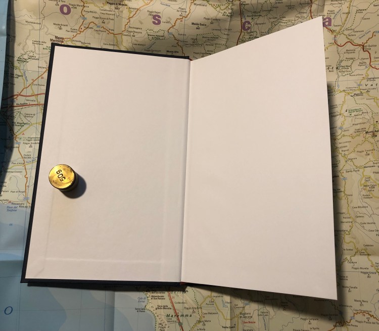
There are no frills to this notebook, just blank end papers, no elastic closure or bookmark, nothing but the paper and the covers. The pages lie flat, and the binding is extremely durable (I page a lot, a lot in my Paper for Fountain Pens notebook and not a page has wavered in my years of using it).

The front endpaper 

I’ve used the slimmer version of this notebook as a research notebook for my novel and it has held up well through years of use. I do, however, only keep it on my desk. Travelling with such fragile paper in a notebook with no elastic closure is a recipe for disaster, so if you do intent to use one of these beauties as your everyday carry notebook or journal, I highly recommend placing it in some kind of protective cover that you can zip up.

The back endpaper

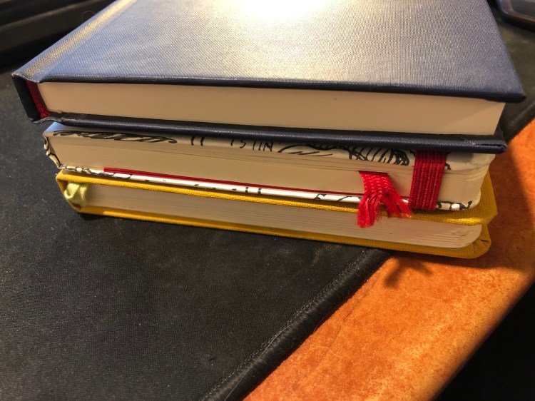
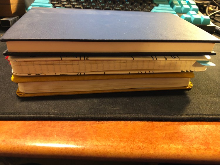
This notebook is slightly thicker than the Baron Fig Confidant and Moleskine large notebook, is about as wide as the Moleskine, but a tad taller.

Paper for Fountain Pens above a Moleskine Large notebook and a Baron Fig Confidant

You can see the difference in sizes with the notebooks stacked up. The Paper for Fountain Pens notebooks have thicker and heavier covers than the Moleskine and Baron Fig ones, but the lightweight paper in them keeps them from being overly heavy to carry around.

Paper for Fountain Pens above a Moleskine Large notebook and a Baron Fig Confidant

All in all I recommend these notebooks, with one caveat: they may intimidate you to a point where you won’t use them. There’s something about their book-like format that makes you feel that you can only write the next Booker prize winning novel in them. Notebooks should be used and not stacked and stared at, so if this one will scare you off, pick a more humble notebook instead. Otherwise, buy a three-pack of these — it’ll come out cheaper (particularly with shipping), and there’s an excellent chance that they’ll become your new favourite.