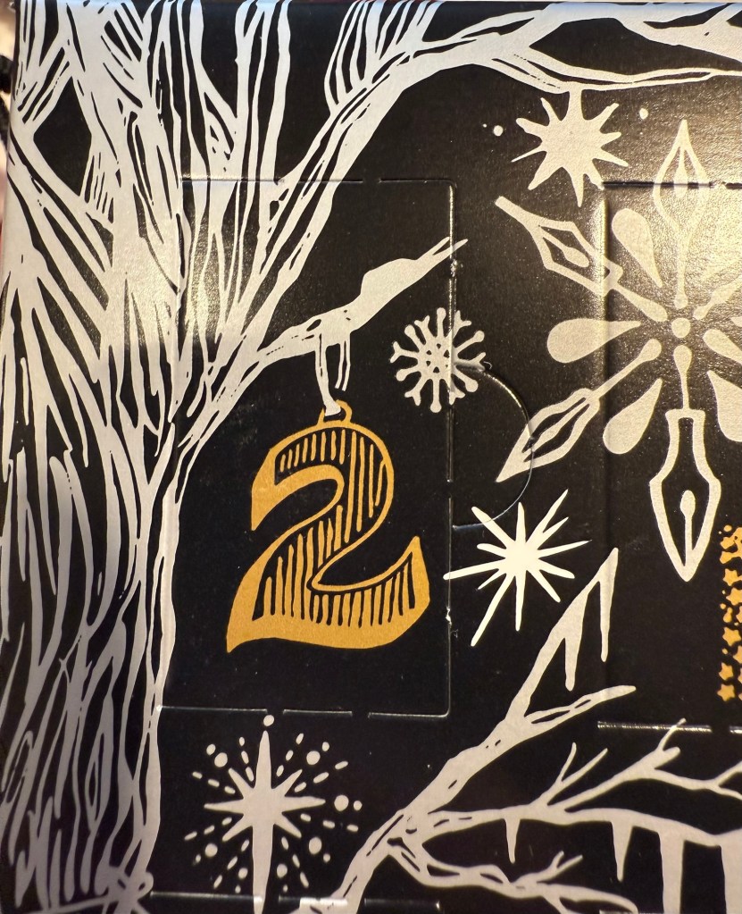
Diamine Inkvent 2024 Day 5
This is the Diamine Inkvent 2024 Day 5 door:

Day 5’s ink is Diamine Icy Lilac, a light bluish purple shimmer ink with silver shimmer. I used a Montrverde Giant Sequoia with an ominflex nib to test this ink out.

It’s difficult to properly photography purple inks, and doubly so when they have shimmer in them, so here’s a photo of a different angle of the Col-O-Ring swab of Icy Lilac.

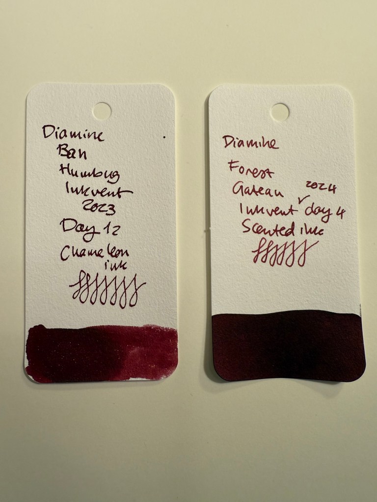
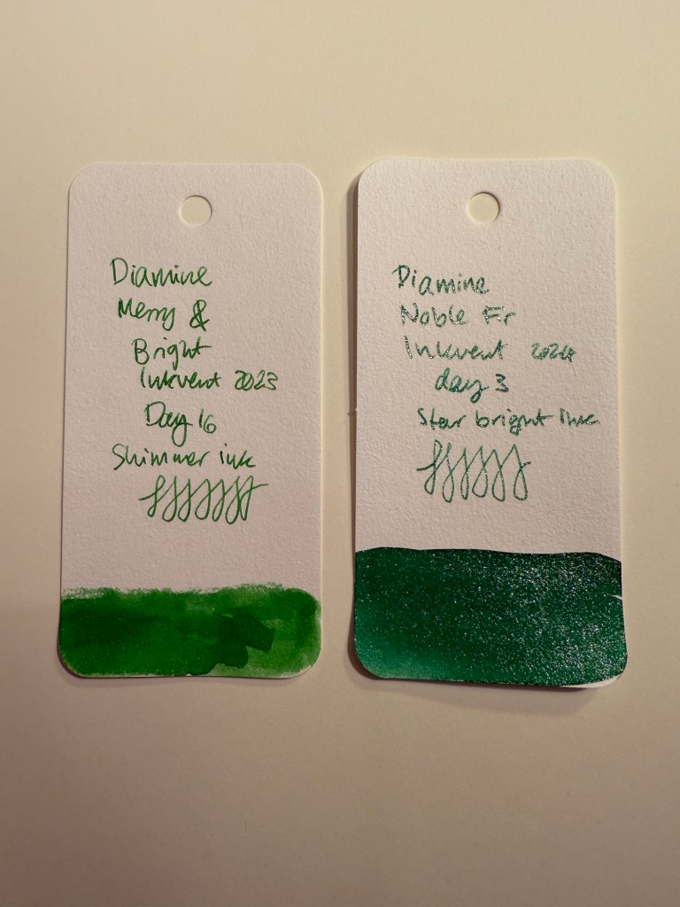
Since it’s hard to properly capture purple inks, here’s a comparison layout of a few other light purple inks from recent Inkvents. Icy Lilac is very close to 2021’s Night Shade (with added shimmer), and bluer than Memory Lane, Rainbow’s End and Jacaranda.

Diamine Icy Lilac is an attractive, wintery ink and the shimmer enhances what would otherwise be a slightly anemic colour. It’s dark enough to be readable, and light enough to pass for a dark grey when sketching. I used it in a figure drawing session (it’s a nude, which is why I won’t upload it here) and it worked well for that. If you’ve always wanted to sketch directly with ink, I recommend starting with a lighter coloured one, as opposed to black. A grey ink or even a bluish purple one like Icy Lilac works well for this: you can make mistakes without them being too glaring. And surprisingly I didn’t feel like the shimmer got in the way.

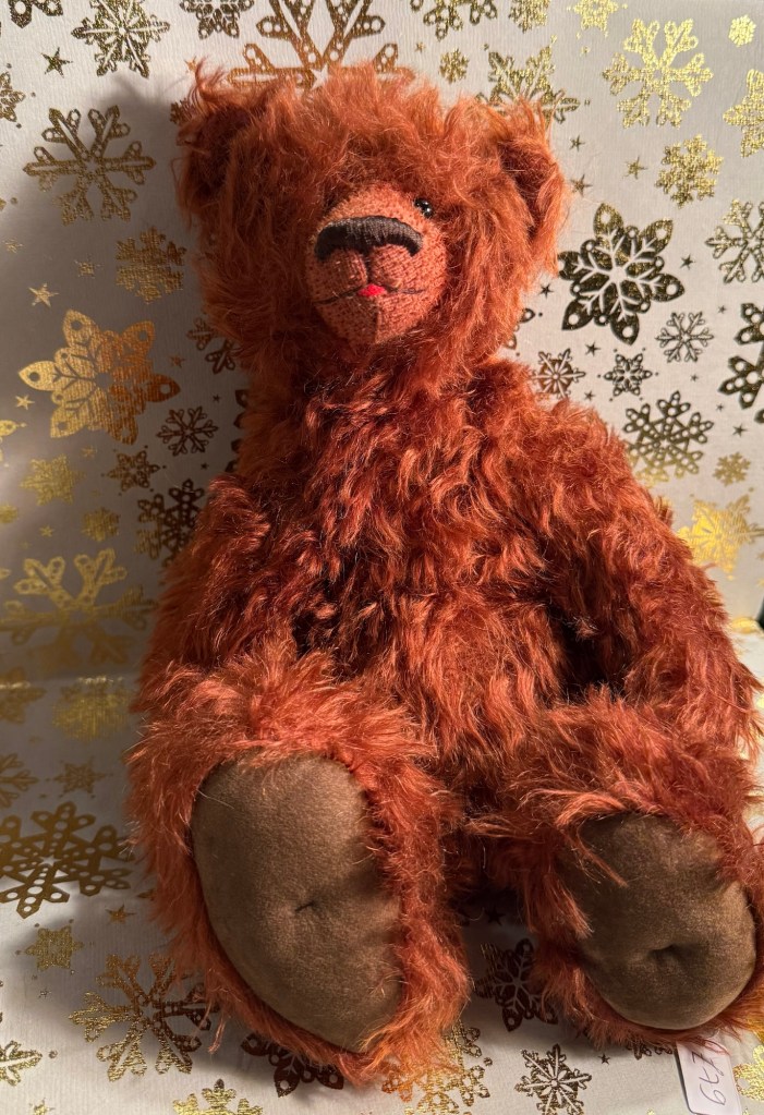
Here’s the bear sketch of the day. This is Wablemar, a German, Steiner bear designed by Antje Zahl. The shading of Icy Lilac make it work well for line sketches, as you can see here:
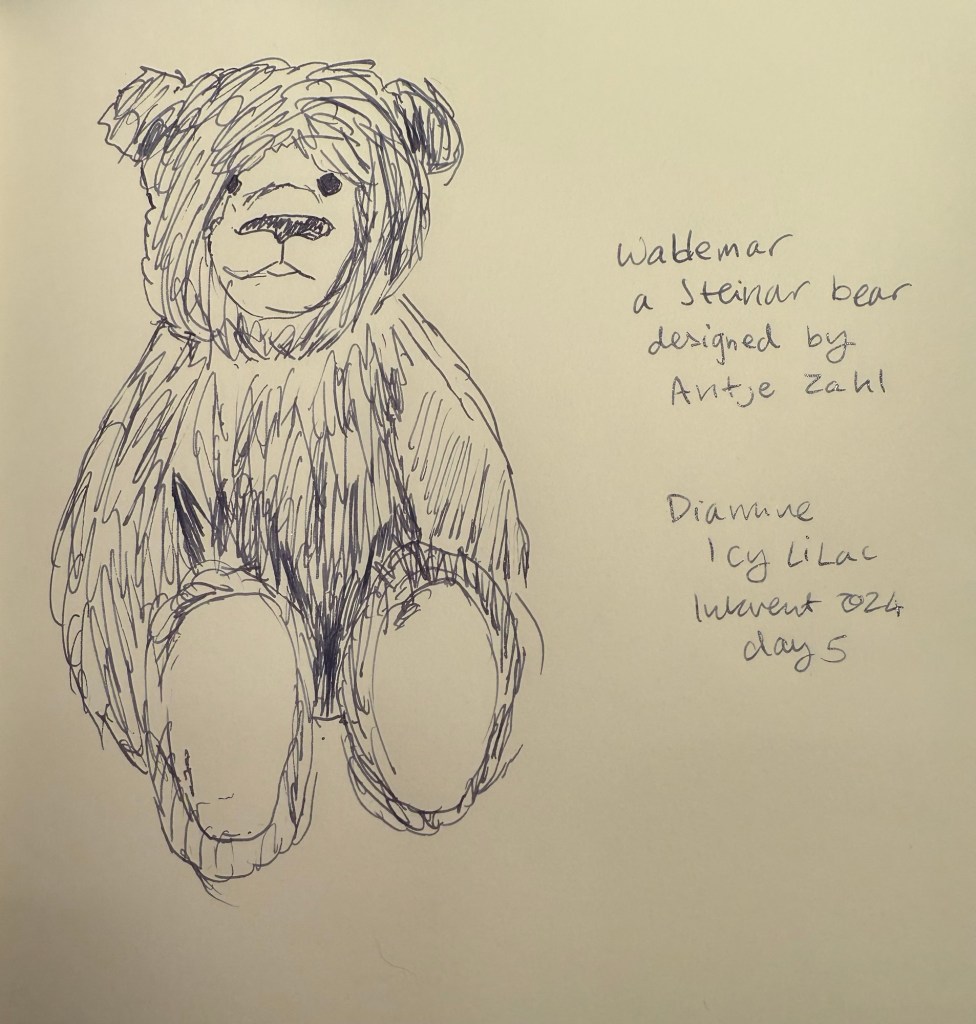
This is Wablemar the bear. I love his fur colour and his characterful face.
Diamine Icy Lilac is a wonderful bluish-purple ink that is light enough to be useful for sketching and dark enough to be readable. The silver shimmer add a wintery air to it, and though it means that I won’t be able to use it in my vintage pens, the ding to its practicality is worth the bump up to its seasonal theming. This is actually an ink that I would consider purchasing a bottle of, despite having a bottle of Diamine Memory Lane. We’ll have to see how it fares against the rest of the inks in the calendar in the end.
Do you enjoy purple inks? Would you consider sketching with Icy Lilac? Would this be an ink you’d purchase for yourself or as a gift?