Sketching Now Travel Sketching Course: Material List

I’ve started Liz Steel‘s Sketching Now Travel Sketching course this week, and so I’ll be posting about my progress throughout the course.

I travel a few times a year and while I already sketch during my travels, I want to improve my speed and gain enough confidence to sketch in less than ideal conditions. I rarely sketch standing up, and I don’t feel comfortable sketching while I’m waiting in line, for instance, and these are useful skills to have if you plan to sketch while on a trip that isn’t dedicated to sketching.

As usual with Liz Steel’s excellent courses, the first part is an introduction which includes an overview of the course, setting personal goals for the course, materials list/discussion and a review of where you are starting from.

I have decided to take a different approach to the materials requirements for this course. I have a pretty compact and set travel sketching set of materials, but I’m allowing myself to expand on it and change it a bit to experiment with some new techniques.

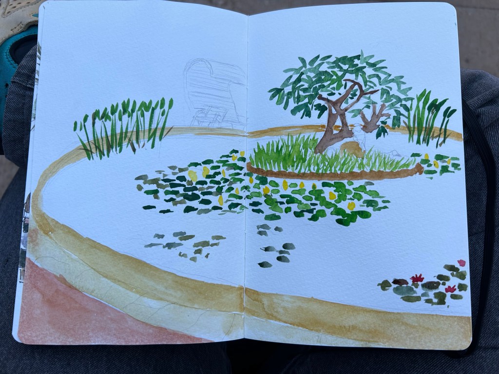
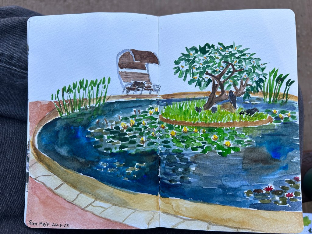
The first big change is the sketchbook I’m using. It’s a Hahnemühle A5 Watercolour Book, which includes 200gsm fine grain paper. I’ve never used it before, but as I regularly use the Stillman and Birn Alpha that Liz is using for the course and I’m not a huge fan of it, I decided to give this paper a spin instead. If it works it would be ideal for travel sketching, as it’s thin and lightweight, the paper takes watercolour washes much better than the Alpha, and I appreciate the elastic closure and hard covers. They are very convenient additions that should help me sketch while standing, and keep the sketches safe while I carry the notebook in my bag.

Hahnemühle A5 Watercolour Book

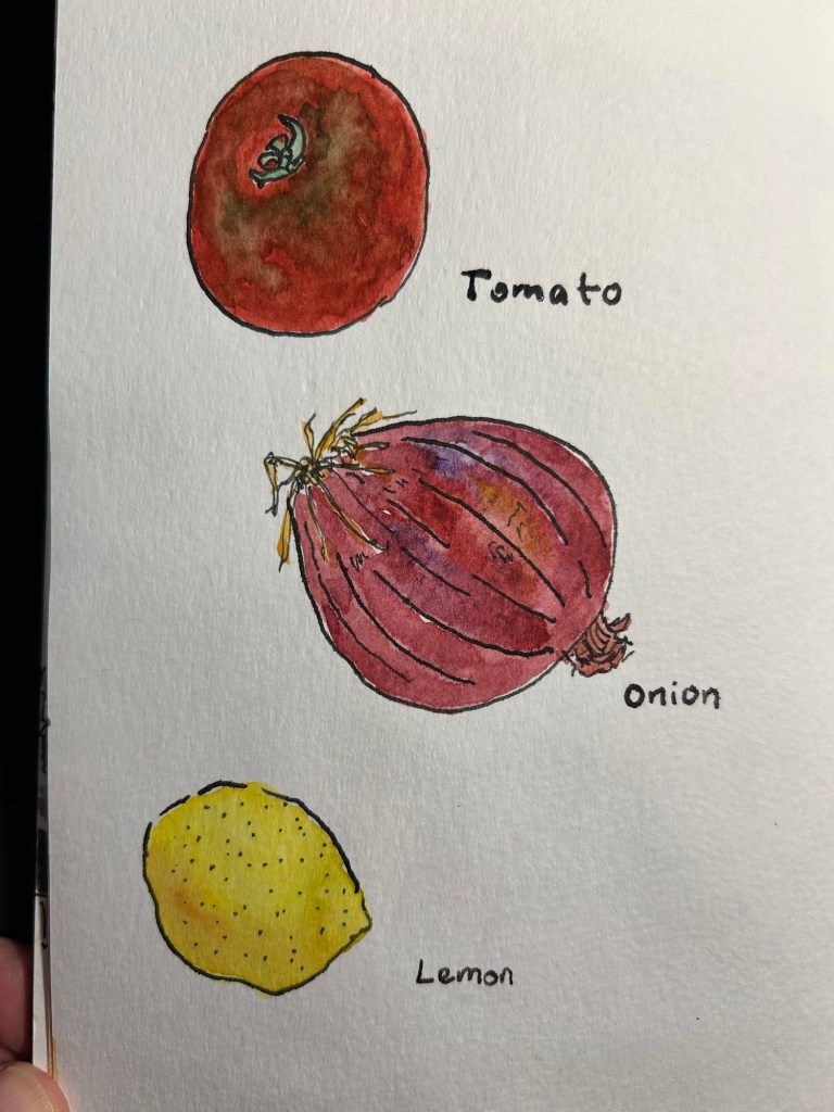
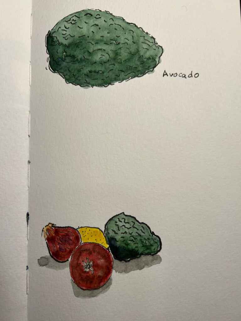
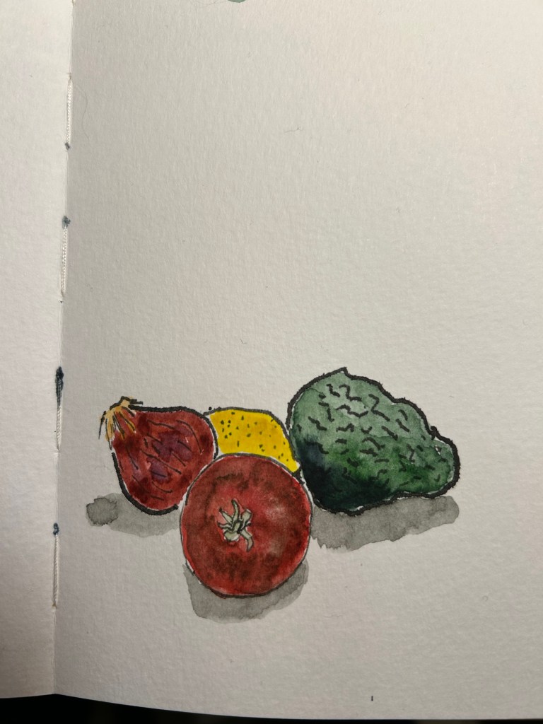
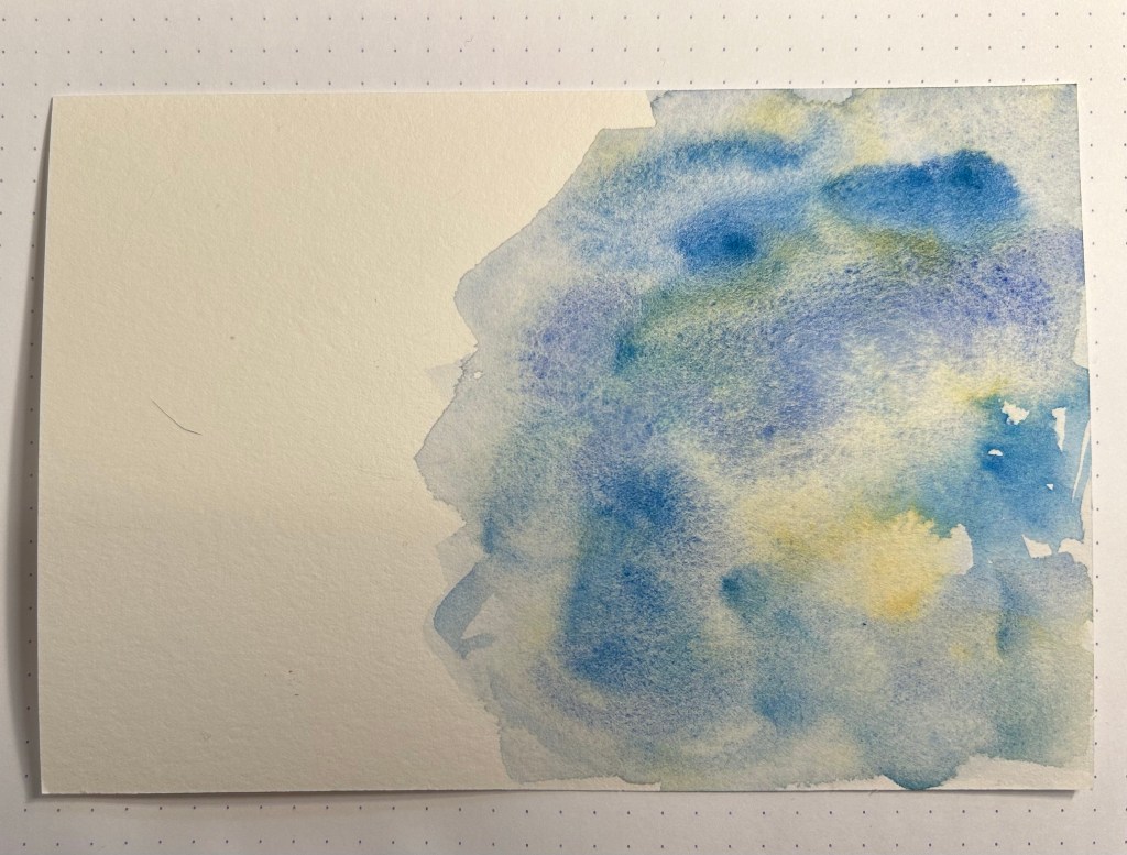
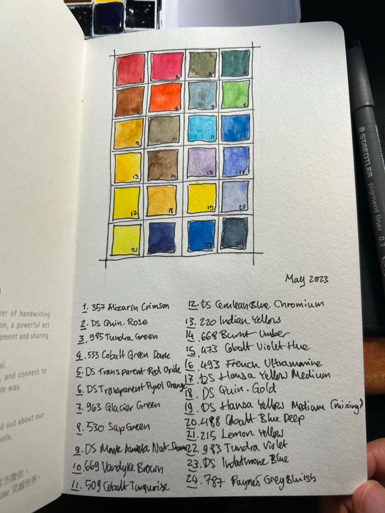
I’ve also changed my watercolour palette somewhat (it’s the bottom palette, not the top one). As I’m still not certain about it, I’m not fully documenting it at the moment. This course isn’t geared heavily towards watercolour, but I tend to like to sketch as quickly as possible on location when travelling, take a few reference photos and complete the sketch with watercolours later that evening.

The palette I’m using is the bottom one, with 24 colours, both Schmincke and Daniel Smith.

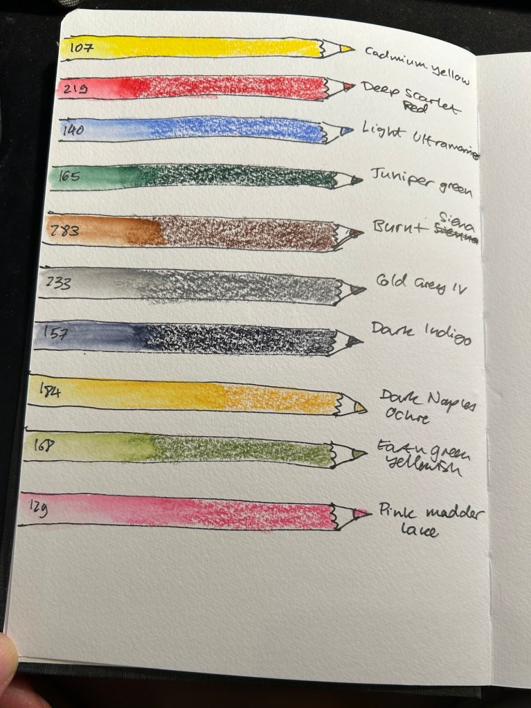
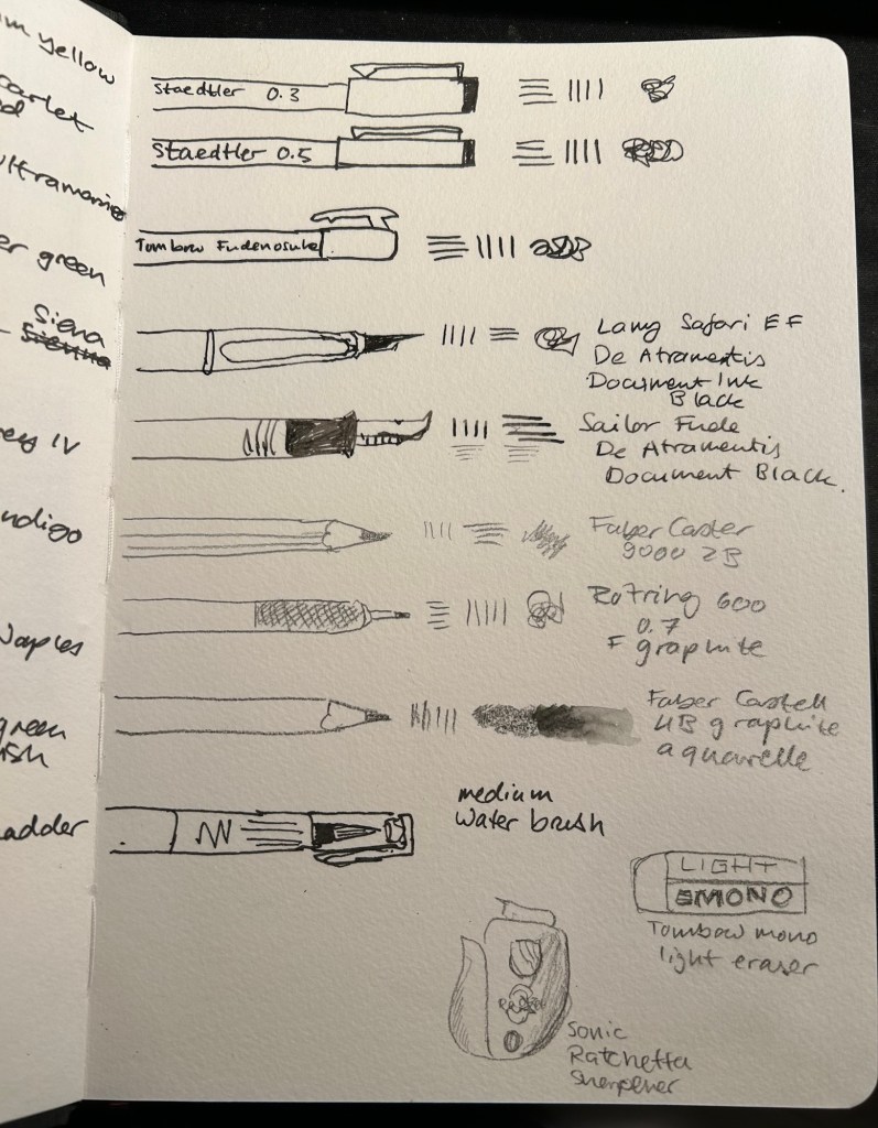
For the first time I’m adding watercolour pencils to my travel sketching kit. As Liz recommended I have a triad (yellow, red, blue), a green, a brown, a grey, a dark, and while she recommended having two lights, I have three. Why? Because having quickly available greens is very useful, the pink is useful for skin tones, and the ochre is too generally useful to be left out. All of these pencils are Faber-Castell Albrecht Durer.

Watercolour pencils.

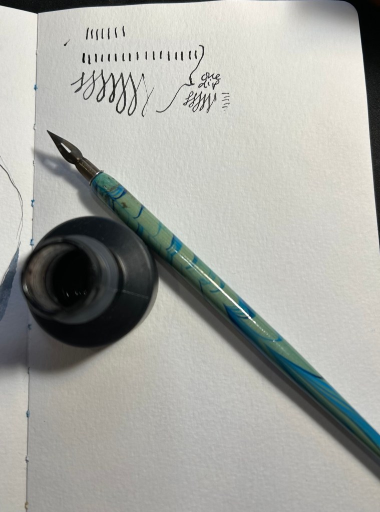
Dry media is also more than double what I normally carry on me. Here the point is to experiment, and it’s very likely that I will say goodbye to several of these tools during the course. I normally use only Staedler Pigment Liners in 0.3, 0.5 and sometimes 0.8 when I sketch, but here I’ll be adding a Tomboq Fudenosuke brush pen to the mix, two fountain pens (a Lamy Safari and a Sailor Fude both with De Atramentis Document Black), three pencils (Faber Catelll 9000 2B, Rotring 600 0.7 and for the first time ever, Faber Castell 4B graphite aquarelle), an eraser and a pencil sharpener. I’ll also be using a medium waterbrush instead of my usual fine one.

Sketching media.

All of these tools will be carried in a Nock Co case, with the exception of the watercolour tin and rag, and a brush case.

Nock Co case, watercolour tin and rag.

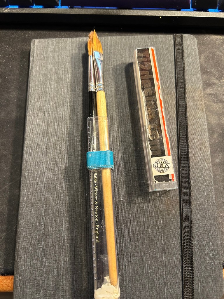
I don’t think that I’ll be using these too much during this course, but these are my travel ready brushes. I keep them in a Ti2 design tube with glue tac at the bottom to prevent the brushes from moving. The brushes are Windsor Newton Series 7 numbers 4 and 7 and Rosemary & Co dagger brush 772.

Brushes

That’s the whole kit, and now it just remains to try it out and see what works and what doesn’t.

Sketching with Iron Gall Fountain Pen Ink: Rohrer and Kilngner Ebony

I have recently purchased the Rohrer and Klingner limited edition Ebony iron gall ink, and I’ve filled one of my Lamy Safaris with it. While iron gall fountain pen ink can be corrosive to pens, and it does change colour over time, it does have a pretty nifty trait: it’s waterproof when dry.

So I made this quick sketch with my Lamy Safari extra fine nibbed fountain pen on a Cass Art recycled paper sketchbook:

And then I added some watercolour to the sketches (note that although this isn’t watercolour paper, the paper in this sketchbook does take light watercolour washes):

As expected, it worked pretty well. Note two things about the combination of iron gall ink and watercolour:

1. The ink must be dry before applying the watercolour.

2. As the water causes the paper fibers to expand, your ink lines may “spread” or display soft edges if you apply watercolour over them. You can see this in both sketches. Different paper will lead to different results, of course.

This was a fun little experiment, and a great way to test out this ink a bit more.

Full sketching kit.

Have you ever used iron gall ink with watercolour in your sketches?

Quick sketch: New sculpture

Am I starting a new sketch journaling habit? Too early to tell. Meanwhile, I’m having fun teaching myself to sketch fast and loose.

Cheap Cass Art sketchbook, Uniball Pin 0.8 and watercolours
The original

Dip Pens Part 2: Ink and Watercolour

This time I decided to combine testing out a new (to me) India ink, a new (vintage) nib and watercolours. The ink is US made Higgins Black Magic. The bottle shape is unique, and it’s a plastic bottle, not a glass one like my British made inks. While the very wide base of this bottle does cut down the possibility of you accidentally tipping it over, I don’t like the bottle design. The bottle opening is too narrow and tall, and it’s very easy to get ink on your nib holder and hands this way. The ink itself is less shiny and flows wetter than other India inks that I’ve tried, but that’s not a bad thing.

The nibs are Waverley Pen nibs, made in Birmingham (a British steel producing city), and made by Macniven and Camron Ltd.

The tin itself is a delight, with the Waverley Pen advertising doggerel on it (the Pickwick, Own and Waverley were all nibs made by the Macniven & Cameron company). I bought it for a few pounds at Spitalfields market, London, and would have bought the tin even if it was empty:

It’s not empty, but rather filled with dozens of Waverley nibs in excellent condition. I took one out, tested its flexing properties (medium flex), and then primed it as described here. To test a nib for its flexing properties you gently push the tines against your thumbnail (don’t ever do this with fountain pen nibs!).

Here’s the nib. It has a bit of kink to it that helps it hold more ink than it otherwise could hold:

I took one dip and tested out how much ink it holds. It’s quite a lot:

I decided to use it on a Moleskine Watercolour sketchbook. The paper isn’t ideal for dip pens (it’s not smooth and the properties that make it watercolour friendly mean that the ink will spread and feather no matter what), but I wanted to use it with watercolours. As in this case the line sketch wasn’t crucial to me (i.e. it didn’t need to be particularly accurate), I decided to accept some level of feathering and spread for a decent watercolour wash.

Here’s the ink sketch:

A closeup on the onion sketch shows how much line variation you can get from this kind of nib, just how expressive these nibs are, and some of the feathering and spread that I talked about earlier:

Watercolour brings these sketches to life, and makes the ink compromises worth it:

A closeup on the sketches:

The second page:

The group thumbnail:

There are a few things that you need to remember when combining dip pens and watercolours:

  1. You must let the ink completely dry or you’ll have a ruined drawing, and potentially a ruined brush (if this happens immediately wash your brush well, as India ink will destroy it if left to dry).
  2. The more cotton content in your paper the better the watercolour washes will be, and the worse the India ink will behave. I wouldn’t go over 25% cotton content.
  3. The rougher the paper the better the watercolour washes will be, and the worse the ink sketches will be.
  4. Hot pressed watercolour paper will give you washes with more sharp edges and hard transitions, but will be best for the India ink in terms of smoothness.
  5. Mapping nibs provide less dramatic lines, but they also lay down less ink and so the ink will dry faster and spread less. On the other hand they will snag more easily on rougher watercolour paper.

Have you tried combining the two mediums? If so, let me know how it went.

Two thank you cards and Schmincke Aqua Bronze review

I’m coming on my two year anniversary from the end of my chemo (it’s at the end of next month, so basically on Christmas Eve), and I have a check up with my hemato-oncologist in two days. I sketched this to give her with a box of pralines, a small token of my gratitude for the past two and a half years:

Bluebird watercolour

It’s a new kind of paper so it came out a bit more blotchy than I’d like, which made me want to play with it a bit more. I wanted to make another quick card for one of my mom’s doctors, who’s retiring, so I had some pigment fun:

If you don’t like granulating watercolours then you’d hate this paper.

I then used Schmincke’s Aqua Bronze rich gold to add some writing to it. Aqua Bronze is basically a small jar full of glitter powder that you mix with a little bit of water (a very, very small bit of water) on your palette and it turns into metallic watercolour. Unlike other metallic watercolours Aqua Bronze has good coverage and opacity, and it really pops off the page. It’s the very last thing you add to your drawing, after everything else has completely (and I mean completely) dried up. You need very little of the powder and even less water, a cheap plastic palette and a cheap synthetic brush and you’re all set.

Aqua Bronze in action

There are several different kinds of metallic hues, and they all work the same. Do remember that you want to use a cheap brush and a palette you don’t care about because this is glitter. You also don’t want to clean the brush in your regular water pot, or to use the same water for another drawing later on. Aqua Bronze sticks to everything, and you can’t ensure that it was completely cleaned out of your tools, so don’t use your best brush or your usual palette for this.

You mix up the powder with a tiny bit of water and a bit of patience (it takes less water and more time than you think) and then apply it to your dry drawing. The paint stays in place but if you brush your fingers on it, they will come out with a fine dusting of glitter. Here’s how it turned out:

If you want even more opacity, you’re going to have to use a paint marker. In this case I wanted the yellow in the abstract blue rose to be reflected in the thank you written in gold so I wanted the soft edges of the Aqua Bronze.

If you’re thinking about creating watercolour holiday cards and want to add a little bling to them, Aqua Bronze could be an option. I’d select one colour as the jars aren’t cheap, and I’d finish the sketches and then add the glitter highlights in one batch.

Schmincke Super Granulation Volcano Watercolour Trio Review

If you use watercolours you usually find yourself in one of two camps: those who want as much control of their painting as possible and so hate granulating watercolours, and those who love the magic of granulating pigments, and the unexpected effects they create. For the first few years that I was using watercolours I hated the “cauliflower” and “graininess” of granulating watercolours and so I actively avoided those pigments. Nowadays I have several granulating watercolours on my palette (and two super granulating ones) and I enjoy the watercolour magic and pigment parties that they create.

A few years ago Schmincke started issuing “super granulation” watercolours, which are watercolours with extra pronounced granulation effects and two different pigments in the same paint – something that created a dual colour effect and added tons of texture to any painting they were used in.

I reviewed the first of those paints here, and since then Schmincke have come out with three more series of super granulation paints: Shire, Desert and Volcano. Of the three the Volcano interested me the most as it seemed to fill in a gap that the very blue and green leaning previous sets were missing: warm, red hues. As Schmincke watercolours aren’t cheap, and the full volcano set came out to more than I was willing to pay for just to experiment with, I purchased a trio box of 5ml tubes to try out.

The test page

The trio I got contained 913 Volcano Red, 914 Volcano Violet and 915 Volcano Brown. The one that I was most interested in was the volcano red. The one that I ended liking the most is the one that I had the least expectation for: volcano brown.

Trio Super Granulation Volcano

I filled three half pans with paint and let them dry out for 24 hours (Schmincke watercolours are much easier to pan fill than Daniel Smith as they come out of the tube better and they dry quicker). I then did a colour swab for each, and a paint test with three paint consistencies (honey, milk, tea as Marc Taro Holmes calls them): the first with very little water, the second with more pigment than water and the third with very little pigment. In the case of the volcano brown I overdid the water in the tea swab, so it’s much lighter than the rest.

Volcano red is semi-transparent and semi-staining, volcano violet is semi-opaque and semi-staining, and volcano brown is semi-opaque and staining. The opacity-transparency spectrum in watercolours is important if you mix watercolours, as the more opaque a paint is the less well it mixes and the more chance you’ll get a “muddy” mixture out it. It is also important for layering, as opaque paints will not layer as well as transparent ones. For this reason I use opaque and semi-opaque paints sparingly, and usually only during the final stages of my painting.

Staining is a measure of how easy it is to “lift” the paint off the page with water or by dabbing it off, should you need to. The more staining the paint, the harder it is to lift without leaving a stain behind (this also depends on the paper you use, of course).

Looking at the paints, the volcano brown shows dual brown and red pigments, the volcano violet shows red and purple pigments, and the red shows red and maybe orange pigments, but it’s hard to tell. The volcano brown is the most dramatic and interesting of the three, though the volcano red is by far the most granulating of them.

Paint swabs and honey, milk, tea tests.

I tried to create a sketch using only these paints (on 100% cotton watercolour paper) and boy do they show their super granulating properties. while the volcano red by itself isn’t impressive, it does layer spectacularly well on the other two paints, and the volcano brown adds a lot of interest and drama to the painting. Of the three I’m likely to add the volcano brown into the rotation, and perhaps, for certain effects, the volcano red. The violet would come in handy if I was working on portraits maybe, but otherwise it reminds me of potter pink: a pigment that is too washed out to be of any regular use in my palette, and not worth the space when it comes to keeping it around for mixing purposes.

Volcano sketch

If you’re just building your watercolour palette, these paints are not for you. However, if you have an established palette and a certain style of painting that favours texture and layering, I’d recommend giving at least some of the Schmincke super granulation watercolours a try. They are bound to result in something interesting and unexpected.

Two Drawings: A Real Dog and a Pretend Cat

Drew this for a colleague about to go on maternity leave. It’s a small watercolour of her parents’ dog:

Drew this using Uni Posca paint markers. It’s a Loth Cat from Star Wars:

Both will be gifts. Which do you prefer?

Urban Sketchers Sketchwalk to Gan Meir

I went to a very special Urban Sketchers sketchwalk and drink and draw today. The event celebrated the end of a special sketch swap between a group of sketchers in Barcelona and in Tel Aviv, and there were sketchers there from all over the world (Spain, the Netherlands, Canada, India, etc). We met at Gan Meir in central Tel Aviv for a sketchwalk followed by a drink and draw at the top of Libling house. It was hot, it was humid, and I needed a break by the time I got to the garden, so I went to the nearby Stephan Austrian Bakery for a cold coffee and a Sachertorte, a rare but much needed treat.

Coffee and cake.

A lot of people came in to pick up an ice cream cone, including this little fellow:

For some reason he didn’t get any ice cream.

I then went back to the garden and started sketching the waterlily pool:

Work in progress

There was a group of ping pong players nearby, and I got hit by balls several times. I was also visited by several curious children. It’s all part of the Urban Sketching charm.

The waterlily pond complete

I then saw a group of kids with a metal detector, searching for treasure in the sand, so I sketched them quickly:

Treasure hunters.

This was our sketchbook throw down, and I loved seeing all the different styles and sketch subjects together,

Sketchbook throw down.

We then went to Leibling House nearby, and there saw some of the sketch swap participants’ work. We had a party on the roof, and I got to talk to sketchers from all over the world, and see so many different sketching styles.

The exhibition

I had to leave early, but I did get to check out Leibling House and see their Frankfurt Kitchen, which is pretty amazing:

Actual storage space, proper sinks for washing dishes and room to dry the dishes.
Storage space for dry goods, and foldable iron board. Perfect use of space.

What struck me most is how the sketchers from abroad saw and sketched the same tired old local monuments and tourist attractions. Through their work I got to see them with new eyes, and it made me want to visit them and try to sketch them myself. I also got to see Leibling House for the first time, and I plan on returning to it in the future, as it’s a wonderful museum and exhibition space.

My Current Palette

So after writing this post about the physical side of building a new watercolour paint box, here is my updated palette. I’m using a new Moleskine Portrait Watercolour Sketchbook as my sketchbook of choice for the watercolour part of Liz Steel’s teacup course (that starts today), and so I used the first page to create an index for my current palette.

My watercolour palette for May 2023

Every watercolourist’s palette is unique and full of choices that reflect their subject matter preference, the place they live in, and various personal idiosyncrasies. Please don’t copy anyones palette as-is (including mine), but rather understand the artist’s choices and tailor your palette choices to your own needs. To this end, I will explain some of the choices behind my paletter.

There are 24 half-pans in my palette, and 23 unique colours. Daniel Smith Hansa Yellow Medium now appears twice in my palette, once for mixing and once for using as an unmixed mid warm yellow. Yellow paints get dirty if you even look at them, and they are difficult to clean after a dab of this or that paint made its way to them. Of the three yellows in my palette I use DS Hansa Yellow Medium the most for mixing, which is why I opted to have a second half-pan of it this time (it’s a new change that I’m trying out).

Of the 23 paints, 15 are Schmincke Horadam and the rest are Daniel Smith. I’m pointing this out so that you feel comfortable mixing between paint manufacturers on your palette. This can be done so long as you are using the same grade of paint in each maker (artist grade, for example).

There are some classic examples of watercolour palette building in this palette and some that are a bit off. There are warm and cold sets of yellow (Hansa Yellow Medium, Lemon Yellow), red (Quin. Rose and Alizarin Crimson) and blue (French Ultramarine and Cobalt Blue deep), and there’s a rather standard set of earth tones (Pyrol Oxide, Monte Amiata Natural Sienna, Van Dyke Brown and Burnt Umber) but there’s some weird stuff too. I’ll be focusing mostly on the weird stuff.

There are three greens in my palette. I sketch mostly landscapes and having premixed greens saves a LOT of time. Of the three greens I use Sap Green the most, either by itself or lightening it with yellow or darkening it with blue. It also has a brightness and vivacity that you cannot obtain by mixing your own green. The two other greens are opaque (which means they don’t mix well), and cover two very common and difficult to mix green shades. Schmincke Tundra green is part of their super-granulating series, and has some pink undertones to it. It also covers a wide variety of olive coloured local plants. The Cobalt Green Dark is a brand new addition to the palette, replacing Schmincke’s forest green. This paint works as an “artificial” green, for things like benches and fences that were painted green, and a greyish-green for the many greyish-green local plants.

Then there are some “magic” paints. Schmincke Glacier Green is on the palette as a cool “glass” and sea blue, and it’s super-granulating and dual pigmented. You can see the pigment party going on with it in my swatch of this colour.
Liz Steel has influenced me to add an orange and a turquoise to the palette. They bring joy to the painting, the turquoise is useful as “glass” and “windows” when I want something brighter than the Glacier Green and the orange paint is much brighter and more alive than any mixed orange that I could ever hope to create. It’s useful to add a splash of colour to a painting, to help focus the eye in a certain area. The two Daniel Smith blues on my paletter are also Liz Steel inspired, and at least one of them may be on its way out due to low use.

Paynes Grey Bluish is one of my most heavily used pigments, as part of sky and sea scenes, denim jeans, as a shadow colour, for asphalt and to darken other mixes. A must have for me.

The two violets on the palette are also personal choices, though the Tundra Violet will likely be replaced with something else in the near future. Purples are very difficult to mix without getting muddy not registering as purple, which is why the Cobalt Violet Hue paint on my palette. The super-granulating Tundra Violet is much less useful, and may find its way out my palette.

I hope this gave you some insight as how to think about the pigment choices that you make for your palette. Again – create your own palette and don’t just force yourself to use a copy of someone else’s