The wonderful Liz Steel is starting a new teacup sketching course, and I decided to enrol to it. I don’t have many teacups, but I do love the ones that I have, and I think that they are interesting objects to sketch. As Liz points out, many teacups and coffee mugs have vivid memories tied to them, and they oftentimes have interesting shapes, colours and patterns. I was also looking for a way to kickstart my sketching again, and as this is a short course (just 4 weeks) I thought that this was a good place to start.
As is customary in Liz’s courses, I created a “pre course” sketch: a teacup sketch to demonstrate where I’m starting from. I started with a pencil sketch and then worked over it with a Staedtler pigment liner only to have the whole thing ruined when I used a new eraser that was too aggressive for the paper. You don’t often get to see failures on display, so I’m attaching the photo of my failed first attempt so that we can all learn from my mistake.
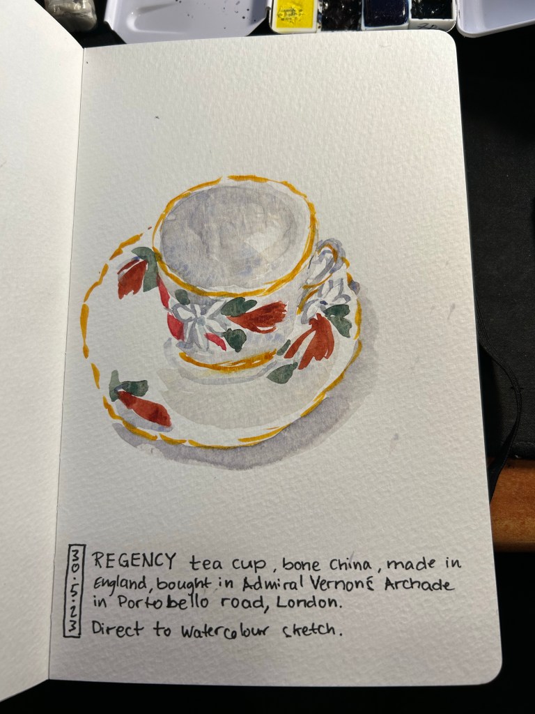
I then decided to risk going directly to watercolour. The teacup I sketched was both complex in terms of shape and pattern, so going this route was not something I would have chosen if not for my initial failure. The result came out better than I expected. It’s far from perfect but it’s not terrible. A start that I can improve upon, at the very least.
Direct to watercolour cup
Here is my failure sketch. You can see the mess of the paper. But if you don’t experiment and try new things, you don’t know what works and what doesn’t. That eraser is relegated to non-watercolour paper from now on, and it was a lesson worth learning on a sketch of this kind and not on something more precious.
Failed sketch.
Don’t be afraid to try stuff out. It’s worth it even if the result isn’t what you’d term a success.
I’ve recently misplaced my beloved watercolour paint box and after searching for it for more than two weeks, I gave up and decided to build a new paint box, with the hopes that the old one will show up one day. Good quality watercolour paint boxes and artist grade watercolours aren’t cheap, which is why I put this off for a while, but they do last for a very long time if you invest a little bit in them.
This post won’t be so much about my palette choices but rather more about the physical properties of the box that I use and the paints within it. If you have had a taste of watercolours and decided that you enjoy the medium and would like to create a long lasting field paint set, this post is for you.
For years I used the excellent Windsor Newton Cotman Watercolour Field Box. The box comes with a set of Cotman student grade watercolours that I gifted away (they aren’t worth your time. If there’s something worth investing in when it comes to watercolours it’s the paints. The order is paints -> paper -> brushes), a handy little built in water bottle and water cup, a sponge, and a foldable brush that is mediocre but usuable in a pinch (you’ll probably lose it shortly after buying the box, but that’s ok). The box officially holds 12 half pans, but in reality you can squeeze 14 half pans in with no effort. If you are getting into Urban Sketching this is an excellent set to have, a nifty little workhorse that will last you easily for a few years. For a very compact size you get a surprisingly large set of mixing areas, and while I’d only use the included water bottle as a backup because it holds very little water, it’s good to have around.
The pros of this kit are many: it’s small, light, well designed, cheap, easy to use, and holds a lot for such a small, pocketable package. The cons are why after three Field Boxes I finally switched over to my current setup: the boxes deteriorate and fall apart after 2-3 years of use at most, they are difficult to clean, and it’s difficult to switch out paints if you’re experimenting with your palette.
The build quality in particular has taken a hit in recent years, to the point where I cannibalise old Field Boxes for parts for the new ones. However, even the old boxes didn’t last for more than 3-4 years, because the plastic would deteriorate and the attached mixing flats would drop off, leaving you with very few mixing space in the end.
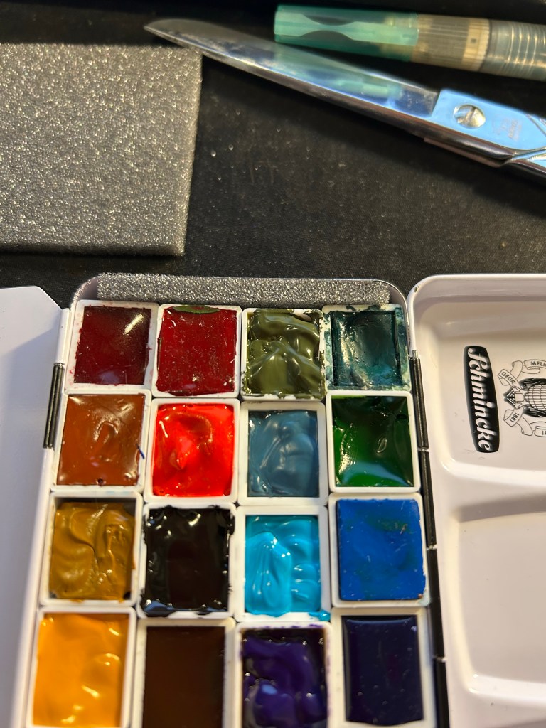
There are many pocket sized enamelled paint boxes, but after trying several generic ones, I found that Schmincke’s box is worth the extra money. Generic boxes didn’t have such a good mixing area configuration, and they tended to rust off on me. The Schmincke box can take a hell of a beating without the enamel flaking off, and when working with watercolours, as soon as there’s a chip in the enamel, rust will take hold of your box.
The box comes with an insert meant to allow for two rows of six half pans and a compact, foldable brush in the middle. I take that insert out and toss it. That leaves me the whole box for a whopping 24 half pans, or a mix of half pans and full pans. Here I my usual setup, which is about 60% Schmincke and 40% Daniel Smith watercolours. Some of them are paint filled half pans that I purchased, and most of them are half pans that I filled with paint myself. Buying tubes and filling your own pans is cheaper in the long run, particularly for paints that you use often.
Filling your own half pans with paint is very easy, and also exposes interesting properties of the paints that you use. For instance, Van Dyke Brown takes ages to cure, while all my yellow paints cure super fast. I’ll also note that Daniel Smith watercolours loose A LOT of volume after drying up, shrinking at times to almost 50% of their original volume. It always takes 2-3 passes to fill a Daniel Smith half-pan, and with Schmincke one pass is enough. So you can see the ugly crack in my Hansa Yellow Medium, where the paint shrunk to half its size and I filled the other half of the pan again.
On the other hand, Schmincke’s half pan packaging is infuriating. The pans come wrapped in wax paper which often sticks to the paint as you unwrap it (imagine peeling off a sticker and having bits of sticker left behind). You can see this on the Lemon Yellow on the bottom left and on the Cobalt Blue Deep on the second to last row, on the right. After much of a struggle I got the residue off the Cobalt Blue, but I left it to scrape off later from the Lemon Yellow. It is a hassle to remove these bits of leftover paper, and they ruin the paint.
Closeup on the paints in the set.
As there’s a bit of a gap left that allows the pans to travel freely in the box, I cut a bit of foam and put it in the box, creating a friction fit for all the pans. Removing a pan and switching it over is a breeze this way – you can always lift out the foam and then easily remove the paint pan.
Foam at work
The box has two large mixing areas, one divided into three large wells which I use to mix often use colours or paint for large areas. The second area is divided into six small wells (you can see this all in the first photo of the set) which are good for small mixes. As it’s enamelled metal it’s very easy to clean, and the set is much more robust than the W&N Field Box.
If you like to experiment with your palette (I always have 2-3 paints that I switch out every 3-4 months), and you are looking for an ultra durable compact field set, I highly recommend investing in the Schmincke 12 half-pan box and filling it with whichever paints you choose. Pre-made watercolour sets are always terrible (they include at least 1-2 colours that you will never ever use), and building a set that fits your needs is a crucial step in making your watercolour painting more streamlined and enjoyable.
What watercolour box do you use? Let me know in the comments, as I love hearing from other sketchers about their tool choices.
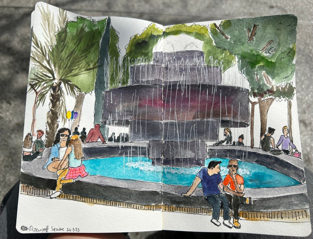
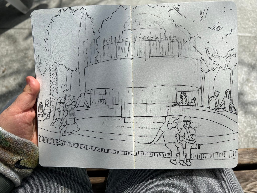
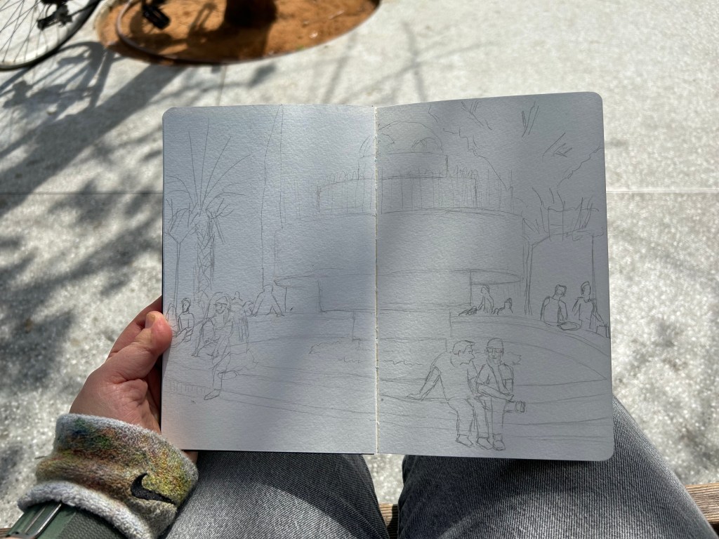
I went on a sketchwalk with our local Urban Sketchers chapter to Dizengoff Square, a central square in Tel Aviv that has been a gathering place since before there was a state of Israel. It was hot for the season, and the place was jumping with colour and activity. This was sketched on a Moleskine Watercolour A5 portrait sketchbook, with Staedtler fineliners and Schmincke and Daniel Smith watercolours. The white was added with a Uniball Signo Broad UM-153 gel pen. You can see some process photos below.
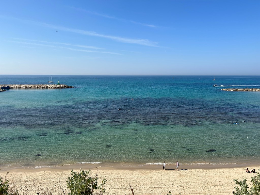
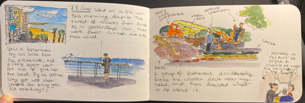
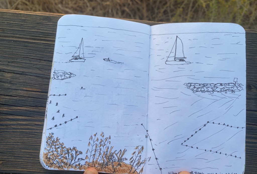
Last Friday there was an Urban Sketchers Tel Aviv sketchwalk to Atarim Square, which is right near the beach. The weather was scorching hot for this season, and I hadn’t planned for it (no hat, no sunscreen) so I worked as quickly as possible on this first sketch and then looked for subjects that I could sketch from the shade.
Sketch of the Tel Aviv Marina beach.
There were a lot of boats out and the sea was unbelievably blue and clear. You can see the rocks that make this beach not a bathing beach.
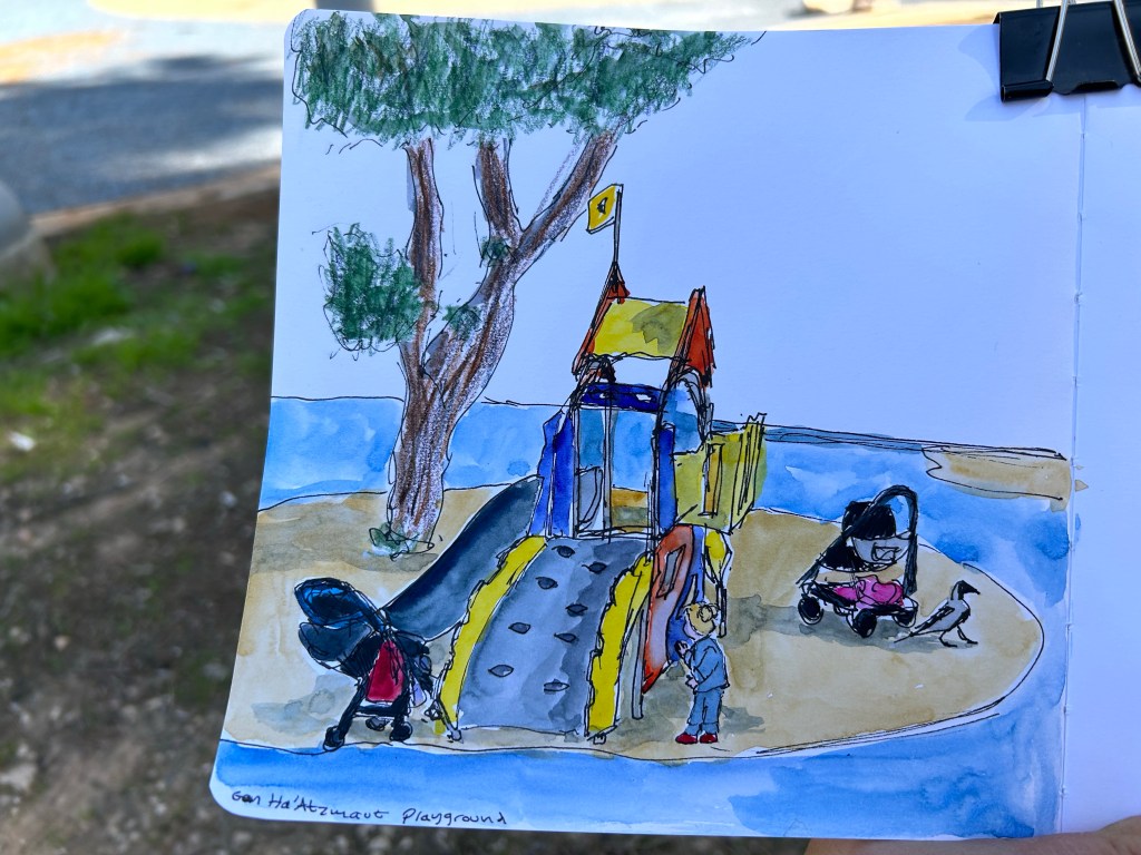
It was noon, which meant that there were very few places in the shade. I found one next to a playground and made a quick sketch of part of the scene there, making sure to obscure the little girl’s face. There was a huge crow prancing around quite fearlessly.
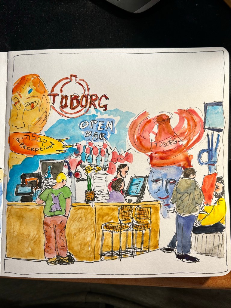
I spent a lot of time looking for places to sketch in the shade, so I ended up having to sketch this scene very quickly (less than 15 minutes), take some reference photos and add the watercolour later. It’s the local bar and reception for the nearby hostel.
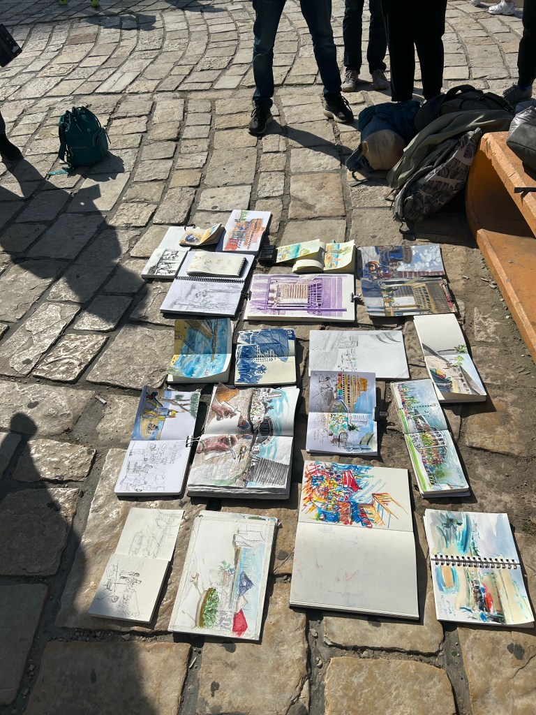
What I love about going to Urban Sketcher outings is seeing how everyone finds something different that catches their interest and is worth sketching in the same small area. Seeing all the different sketching styles is also a lot of fun.
Here’s the finished sketch of the bar/reception area from above. They have some wild graffiti on their walls, so this was really fun to paint.
I somehow managed to not review my favourite pigment/fine liner, despite it being one of the sketching tools that I use the most. While I know that the pigment liner from Sakura is more popular is stationery blogger circles, and Copic is thought to be the elite offering (it sure is in terms of price), Staedler’s pigment liners have been my go to pigment liners since I was a teenager, and they have always been the ones I compare all others to.
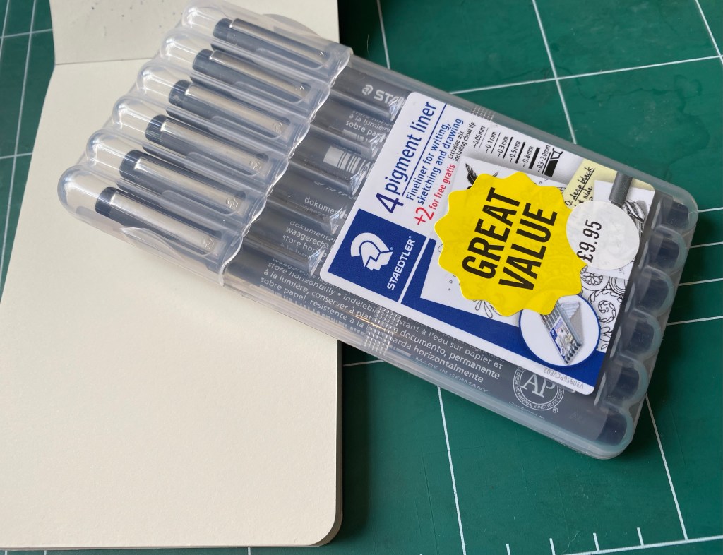
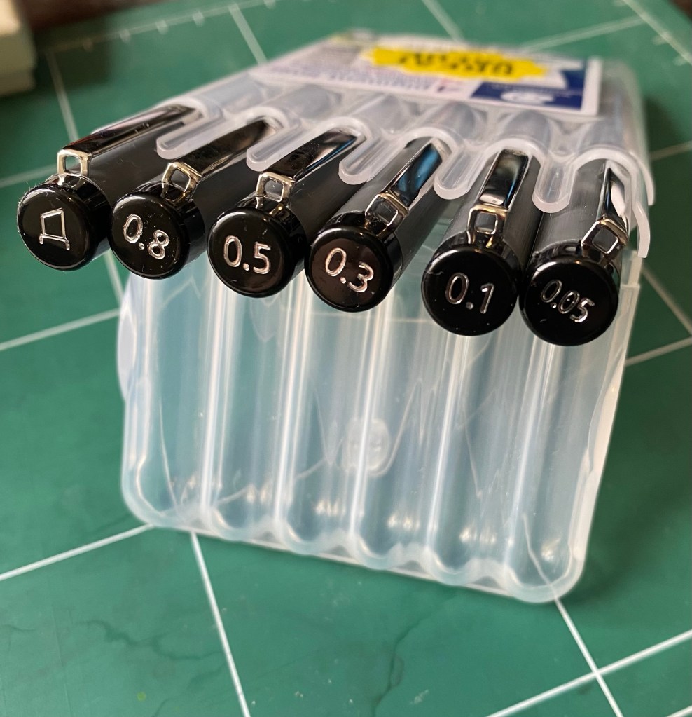
Pigment liner set bought at Cass Art in London
All pigment liners are expensive to purchase here, and Staedler is no different, which means that I always stock up on them when I go to Cass Art in London. This 6 pen set is always on sale, and you get a useful selection of pen widths. However, if you are just starting out, don’t buy a set – buy a 0.3 and a 0.5 and if you want to splurge add the 0.1 and the 0.8.
The full set: Calligraphy, 0.8, 0.5, 0.3, 0.1, 0.05
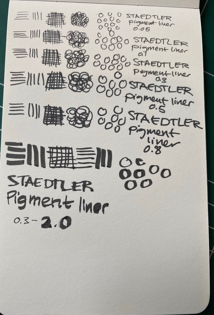
Whether you use Staedler pigment liners or ones from another brand (Sakura, Faber Castell, Copic, Uni-ball, etc), the 0.3 or 0.5 will likely be your base, bread and butter pen. I generally use the 0.3, unless I’m feeling shaky, I’m in a hurry and want to churn out sketches/illustrations, or I want to go for a dramatic effect, in which case I go for the 0.5 or the 0.8. The 0.1 is a pen that I use for the opposite effect – when I plan to use watercolour or an ink wash and I want the colour or wash to take precedent. The 0.05 is a pen that I used to use when I was younger and drew comics (it’s excellent for fine details), but I hardly ever reach for it now, unless it’s to work in small format with a colour wash of some sort following. It’s a fragile pen, so if you tend to lean on your pens, this one is not for you. How can you tell if you put a lot of pressure on your pens? Write a page with a gel ink pen and check the back of the page. Does it feel like braille lettering? Does your wrist hurt? Then you’re putting to much pressure to use this pen without ruining the tip, and you may have issues with the 0.1 tip as well. I used to write like that and it took some practice for me to be able to use these ultra fine tipped pens.
Line samples on a Moleskine pocket sketchpad.
So, why do I love the Staedtler pigment liner so much?
It puts down a consistent, black line. This seems obvious, but I’ve tried more than one pigment liner that puts down a dark grey or washed out black line and it’s always disappointing.
It’s a rock solid pen that won’t dry out, and has a robust tip. I’ve had terrible luck with Faber Castel and other makers where a capped (mind you, capped) pigment liner stopped writing reliably after a month or two. This has never happened with my Staedler’s, and I’ve had some for years.
The pen body. This is what makes the Staedler’s the best of the best in my personal opinion.
The Staedtler pigment liner’s pen body.
So, what makes the Staedler pen body so great? It’s a whole lot of small things that just add up. It’s light weight but doesn’t feel flimsy, and it has a matte finish with a subtle lined texture all around, so its easy to grip. It’s also a bit wider than many of its competitors, and unlike many of them, it has the pen width clearly marked on both the pen body and the pen cap. It also doesn’t have any sharp edges, which you’d think would be an obvious in pen design, but sadly isn’t. Finally, it caps and posts and uncaps with a solid click, and without having to apply a lot of pressure. You know the pen is capped and the pen is uncapped when you need it. And if you so care to uncap it with one hand, you can.
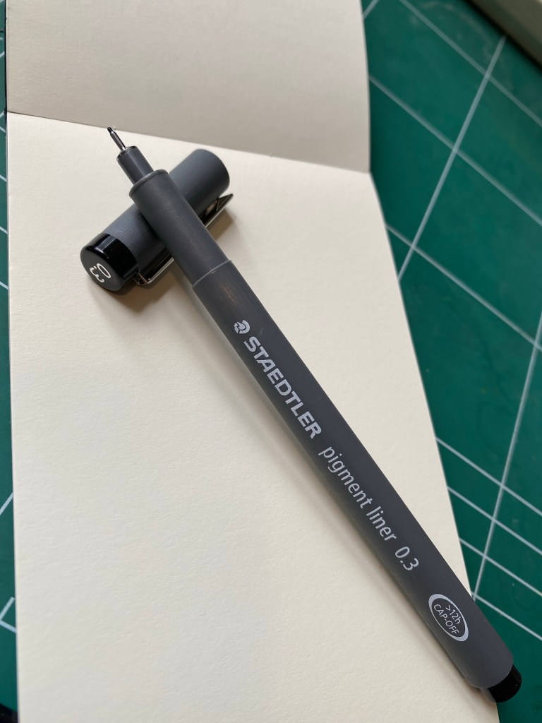
Here’s the 0.1 Staedtler in action. There’s a photo of the sketch I made after applying an ink wash (Sennelier Burn Sienna India Ink diluted in water and applied with a brush pen), and one of the same sketch after I applied blue watercolour.
Staedtler 0.1 pigment liner, and ink wash.Staedtler pigment liner 0.1, ink wash and watercolour.
During a private tour of Nazareth last year (a present from my wonderful family in between chemo treatments), I met the guide’s young boy. His father told me that he wanted to be a clothing designer when he grew up, so I broke out my sketching kit and gave him every Staedler pigment liner that I had on me. His eyes lit up once his father explained what these pens were. If you have a budding artist, designer, sketcher, doodler in your life and you’re wondering which gift to give them, two or three Staedler pigment liners will always be welcome.
There’s been a dearth of new posts this week because I just started a new job, and while it has been great so far, I still haven’t adjusted to it. After being a recluse (out of necessity) for the past year or so, it was a bit of a shock to the system to meet so many new people face to face. I’m not sure yet how my posting schedule or content will change in the coming days and weeks, but I’m hoping that it won’t change too much.
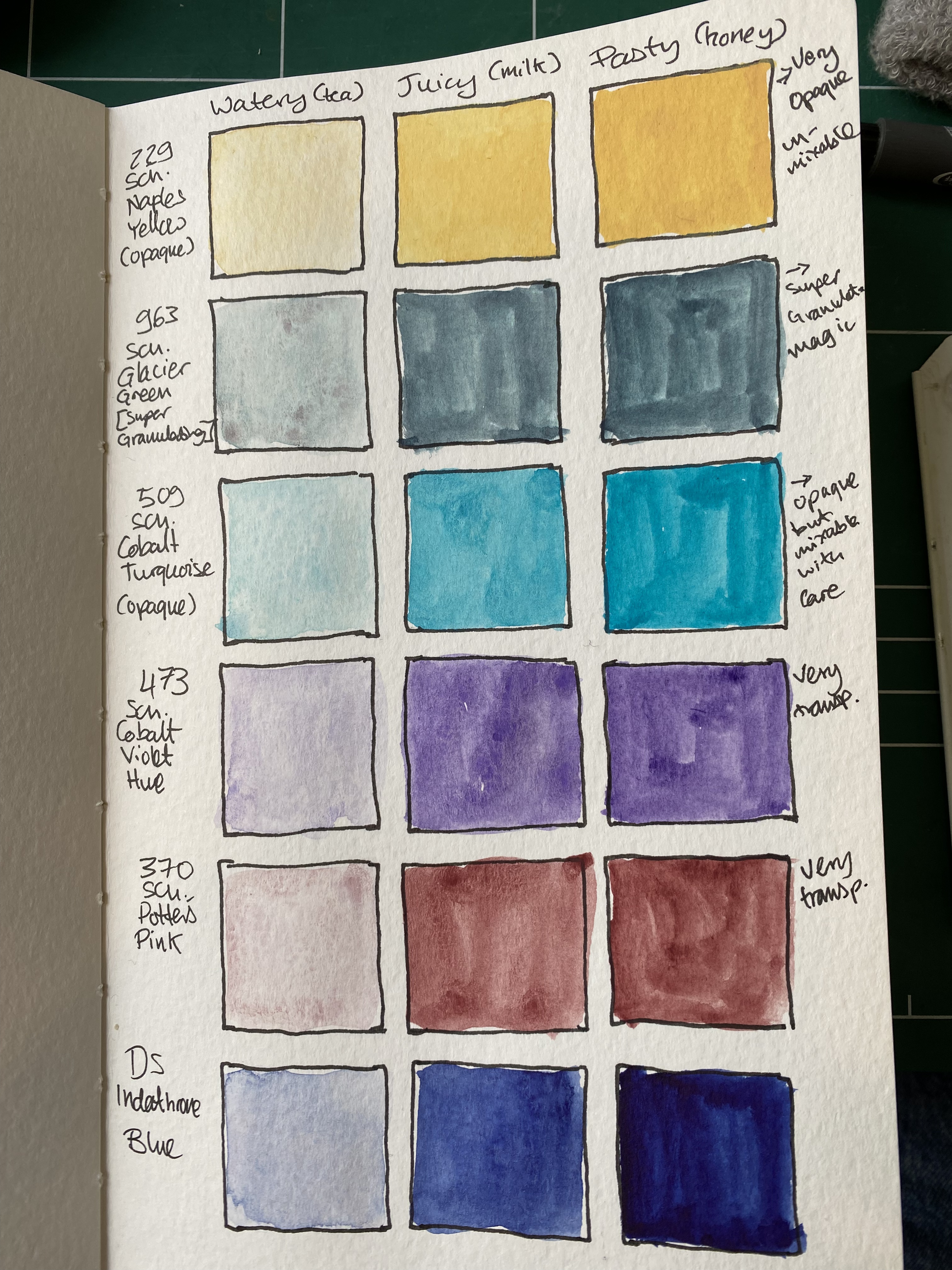
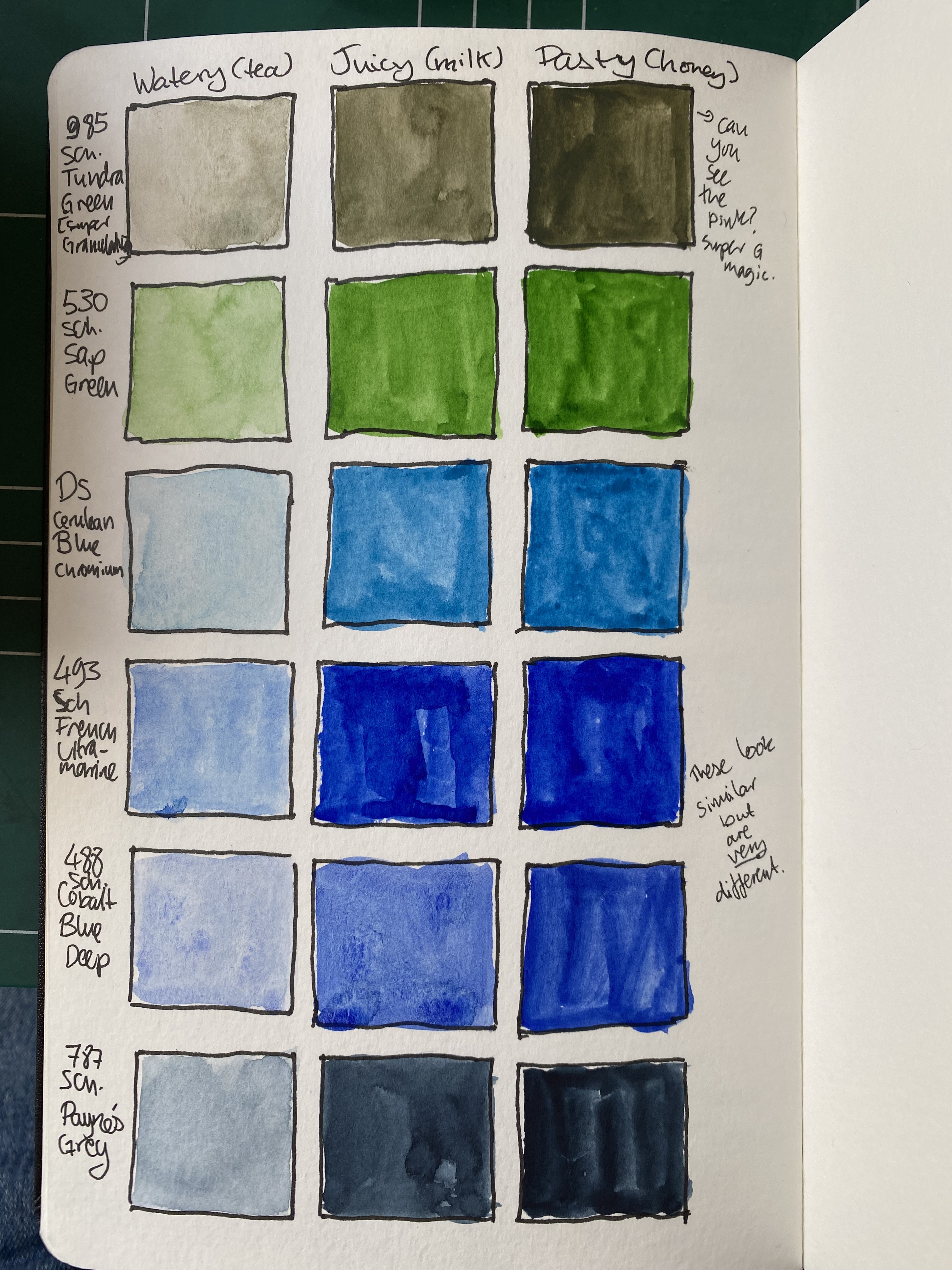
I’ve started the SketchingNow Watercolour course, and I’ve done the first week of classes. This week is all about washes, so I created a grid of all the colours in my palette, showing how each one looks as a watery wash, a juicy wash and a pasty wash (what Mark Taro Holmes terms tea, milk and honey). This was a lot of work, but it did give me a better feel for the potential of the paints in my palette.
There was also an exercise that involved sketching vegetables with a set of juicy washes. Here’s the sketch in progress:
And after it was done:
This was a pretty simple exercise, but nevertheless a lot of fun.
Reading
My reading has been quite eclectic lately. I finished reading “Our Country Friends” by Gary Shteyngart and it turned me off the Tournament of Books list for this year. I’ve got very little patience for the plights of unlikable privileged characters that potter about a story with zero plot except having sex or trying to have sex with each other, and whining about their lives all the time. I’ve read “Drive” by James S.A.Corey , the first short story in “The Expanse”. It’s completely skippable, so don’t feel the need to read it if you want to get into the series. Also, please don’t start “The Expanse” from this story – it may be chronologically first, but it’s their worst piece of writing so far. I’ve started reading Ali Smith’s “Companion Piece,” which is a companion piece to her fantastic seasonal quartet of novels. I like her writing so much that I bothered to get a signed hardcover of this book. So far it’s shaping up as an interesting read.
Finally, I’ve plunged back into Henry IIIV’s England with “The Mirror and the Light” by Hillary Mantel. Her writing is mesmerizing and she really brings Cromwell, his peers, family, rivals and the entire period to life.
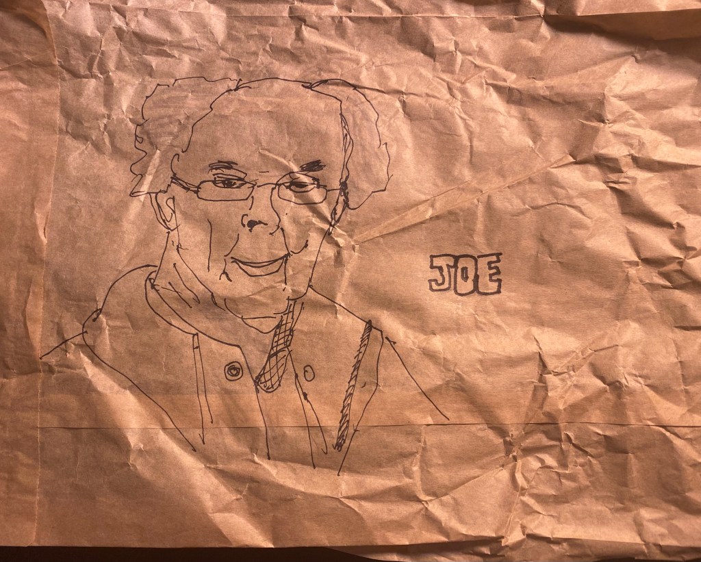
I’m experimenting with various kinds of new sketchbooks and sketching materials (as well as pens and ink) and I have thoughts about them. I just need to find some time to organize them into something coherent and write it all down. Meanwhile, here’s a quick sketch that I did on a paper bag during a zoom call, using a new brush pen that I’m trying out.