Diamine Inkvent 2024 Day 6

This is the Diamine Inkvent 2024 Day 6 door:
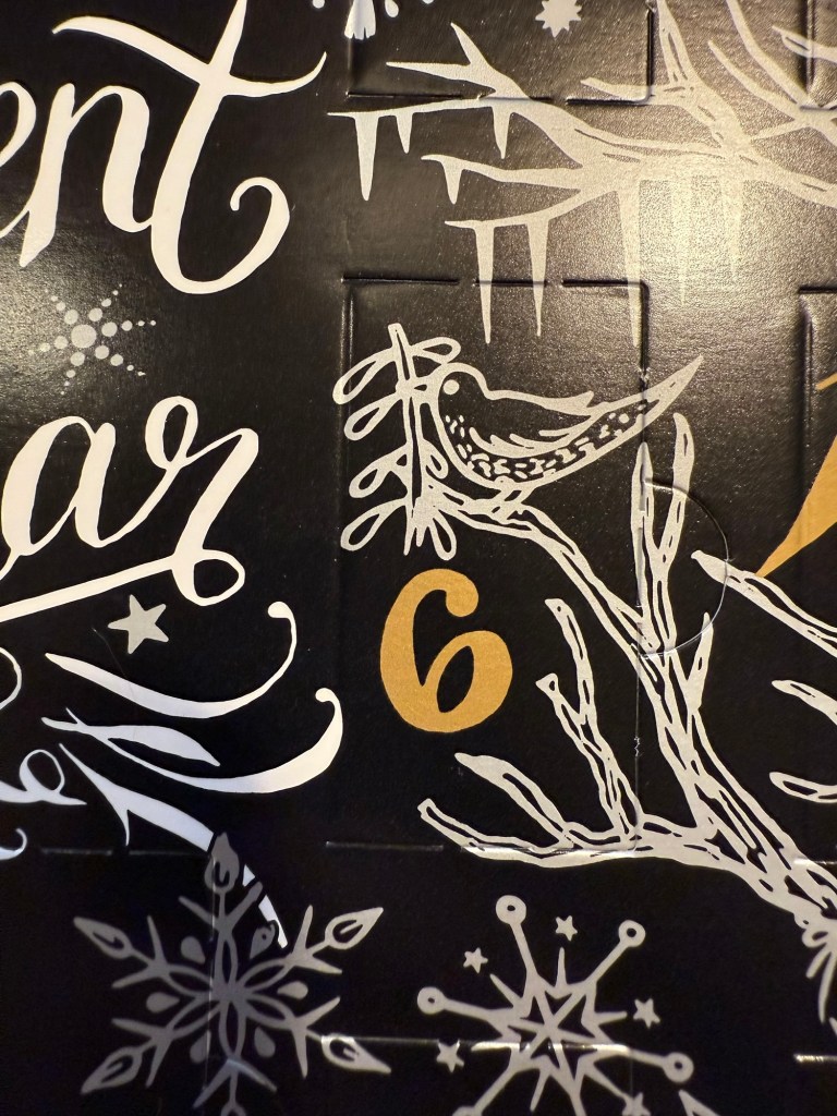
The door

Day 6’s ink is Diamine Cranberry, a saturated magenta coloured standard ink with a good amount of green sheen. I used a Lamy Safari with a medium nib to test out this ink.

Col-O-Ring swab of Diamine Cranberry

There’s a lot of sheen in this ink because it’s so saturated. You can see it in this angle of the Col-O-Ring swab:

Different angle of the Col-O-Ring swab

And on this writing sample on the original Tomoe River Paper:

Writing sample on original Tomoe River Paper

As the paper in the Rhodia pad that I’m using is more absorbent, you don’t see much sheen on it (sheen requires a saturated ink and a paper that is coated so the ink takes more time to dry). The ink itself is a lovely shade of magenta with very little shading because it’s so saturated. On uncoated paper Diamine Cranberry will likely bleed and feather, because it’s so wet and saturated. This is an ink that really needs top notch fountain pen friendly paper to shine (and sheen).

Writing sample on Rhodia paper.

Today’s bear sketch is of Franz, a small, limited-edition Dean’s Bear British made bear that I bought second hand at York. I was looking at the bear from above, hence the somewhat weird looking proportions of it. On Midori MD Cotton paper you really get to see Diamine Cranberry sheen, though you don’t get to see it shade very much.
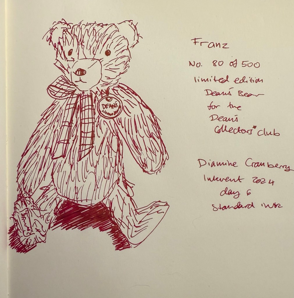
Bear sketch on Midori MD Cotton paper

Here’s an angled view of the sketch. You can see the sheen on the bear’s badge and his tie.

Different angle of the bear sketch

Here’s another angle. You can see the sheen in the shadow the bear casts. I wanted to show off the sheen so I added the shadow here – wherever there’s a lot of ink laid down, there’s a lot of sheen.
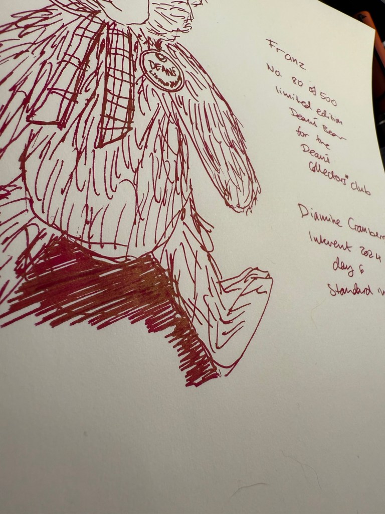
Another angle of the bear sketch

And here’s Franz, today’s bear:

The bear

I very rarely use pink or magenta inks so I don’t see myself buying a full bottle of Diamine Cranberry. In terms of practicality this ink is so-so: it’s a standard ink but it’s super saturated and on the red range of inks so it may stain pens, particularly white and light bodied pens. Also, Cranberry is a cheerful colour, but not something that is appropriate for every setting. In terms of seasonality, it’s a bit of a stretch, but a welcome one. You can’t have a calendar full of just green and red inks, and Diamine Cranberry adds to the Inkvent’s variety while still remaining a Christmasy ink.

Do you like sheening inks? Do you see yourself using Diamine Cranberry?

Diamine Inkvent 2024 Day 5

This is the Diamine Inkvent 2024 Day 5 door:

The door

Day 5’s ink is Diamine Icy Lilac, a light bluish purple shimmer ink with silver shimmer. I used a Montrverde Giant Sequoia with an ominflex nib to test this ink out.

Col-O-Ring swab of Diamine Icy Lilac

It’s difficult to properly photography purple inks, and doubly so when they have shimmer in them, so here’s a photo of a different angle of the Col-O-Ring swab of Icy Lilac.

Another angle of the Col-O-Ring swab of Icy Lilac.

Since it’s hard to properly capture purple inks, here’s a comparison layout of a few other light purple inks from recent Inkvents. Icy Lilac is very close to 2021’s Night Shade (with added shimmer), and bluer than Memory Lane, Rainbow’s End and Jacaranda.

Comparison swabs of Diamine Inkvent purples

Diamine Icy Lilac is an attractive, wintery ink and the shimmer enhances what would otherwise be a slightly anemic colour. It’s dark enough to be readable, and light enough to pass for a dark grey when sketching. I used it in a figure drawing session (it’s a nude, which is why I won’t upload it here) and it worked well for that. If you’ve always wanted to sketch directly with ink, I recommend starting with a lighter coloured one, as opposed to black. A grey ink or even a bluish purple one like Icy Lilac works well for this: you can make mistakes without them being too glaring. And surprisingly I didn’t feel like the shimmer got in the way.

Writing sample on Rhodia paper.

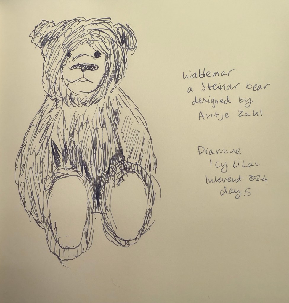
Here’s the bear sketch of the day. This is Wablemar, a German, Steiner bear designed by Antje Zahl. The shading of Icy Lilac make it work well for line sketches, as you can see here:

Sketch on Midori MD Cotton paper

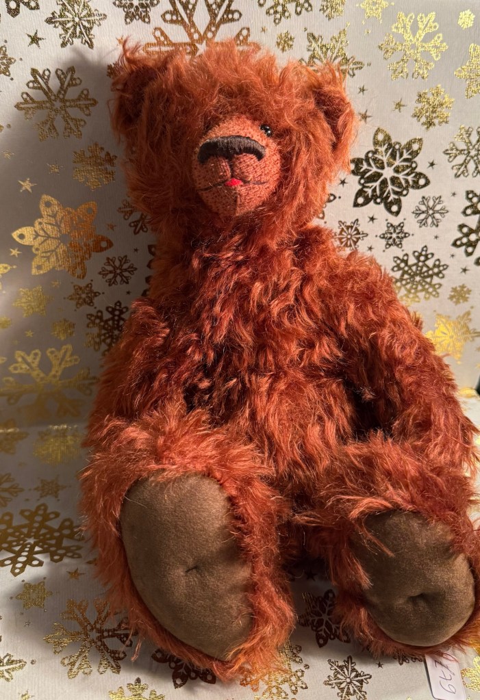
This is Wablemar the bear. I love his fur colour and his characterful face.

The bear

Diamine Icy Lilac is a wonderful bluish-purple ink that is light enough to be useful for sketching and dark enough to be readable. The silver shimmer add a wintery air to it, and though it means that I won’t be able to use it in my vintage pens, the ding to its practicality is worth the bump up to its seasonal theming. This is actually an ink that I would consider purchasing a bottle of, despite having a bottle of Diamine Memory Lane. We’ll have to see how it fares against the rest of the inks in the calendar in the end.

Do you enjoy purple inks? Would you consider sketching with Icy Lilac? Would this be an ink you’d purchase for yourself or as a gift?
Diamine Inkvent 2024 Day 4

This is the Diamine Inkvent 2024 day 4 door:

The door

Day 4’s ink is Diamine Forest Gateau, and unfortunately it’s a scented ink. The base colour is a rich, dark claret that is very saturated, and so doesn’t offer much shading. I used a Lamy Safari medium nibbed fountain pen to test out this ink.

Col-O-Ring swab of Diamine Forest Gateau

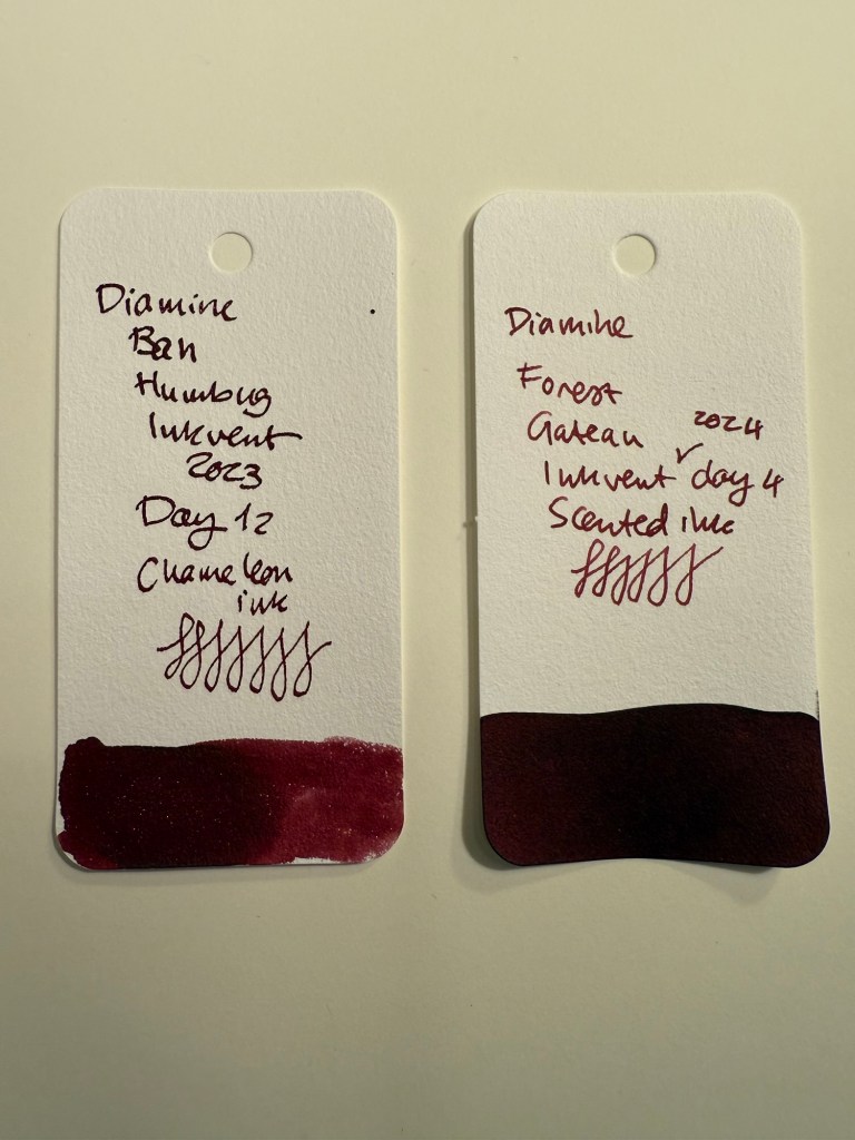
Diamine Forest Gateau is a darker shade of red than last year’s Diamine Bah Humbug. It also doesn’t shade as much as Bah Humbug and it doesn’t have the attractive Chameleon effect. What it does have is a smell.

Diamine Bah Humbug swab compared to Diamine Forest Gateau

I don’t like scented inks for two reasons:

  1. They always smell like cheap potpourri. It doesn’t matter if they’re supposed to smell like violets, strawberries or chocolate, they always smell artificial and sickly sweet.
  2. They always have terrible ink flow: they’re ultra wet and bleed easily.

Even if I disregard the smell and the flow, the ink itself isn’t too great as it doesn’t offer much beyond a nice base ink colour. There are a lot of dark red inks in the market that have nice shading, better flow, and oftentimes some other point of interest. And they don’t stink.

Writing sample on Rhodia paper

Today’s bear is one of my favourites because of his unique face style. I like the base ink colour of Forest Gateau so this would have been a nice ink to use for this sketch if the ink itself was better behaved. As it is, I will dumping it out of the pen and cleaning it as soon as this review is up.

Sketch on Midori MD Cotton paper

This is the bear. He’s got a round, elongated face and ears way at the back of his head. And surprisingly, no name.

The bear

I obviously won’t be buying a bottle of Forest Gateau. If you enjoy scented inks, then maybe this one’s for you as it fits nicely enough theme-wise. In terms of practicality it scores low in my opinion because of the scent and because of the flow.

Do you like scented inks? What do you think of Diamine Forest Gateau?

Diamine Inkvent 2024 Day 3

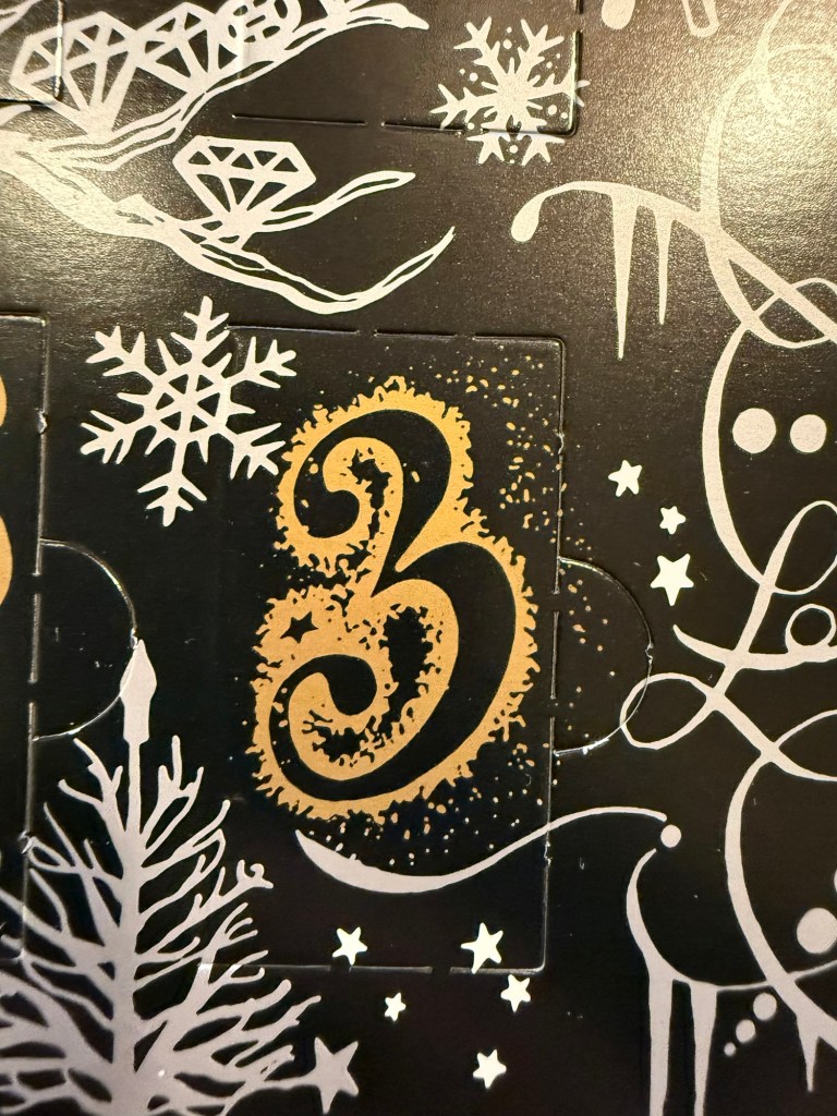
This is the Diamine Inkvent 2024 day 3 door:

The door

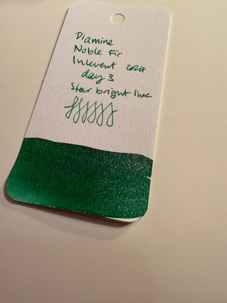
Day 3’s ink is Diamine Noble Fir, an apple green star bright ink. Star bright inks feature extra shimmer, as in all the shimmer that Diamine could plausibly get their hands on. It shimmers, I promise, you won’t be able to miss it. I used a Lamy Safari with a medium nib to test this ink out.

Col-O-Ring swab of Diamine Noble Fir

Here’s a close up on the ink, wherein you can see that it is indeed a star bright ink, and you can see some of its shading properties.

Close up of the Col-O-Ring swab of Diamine Noble Fir

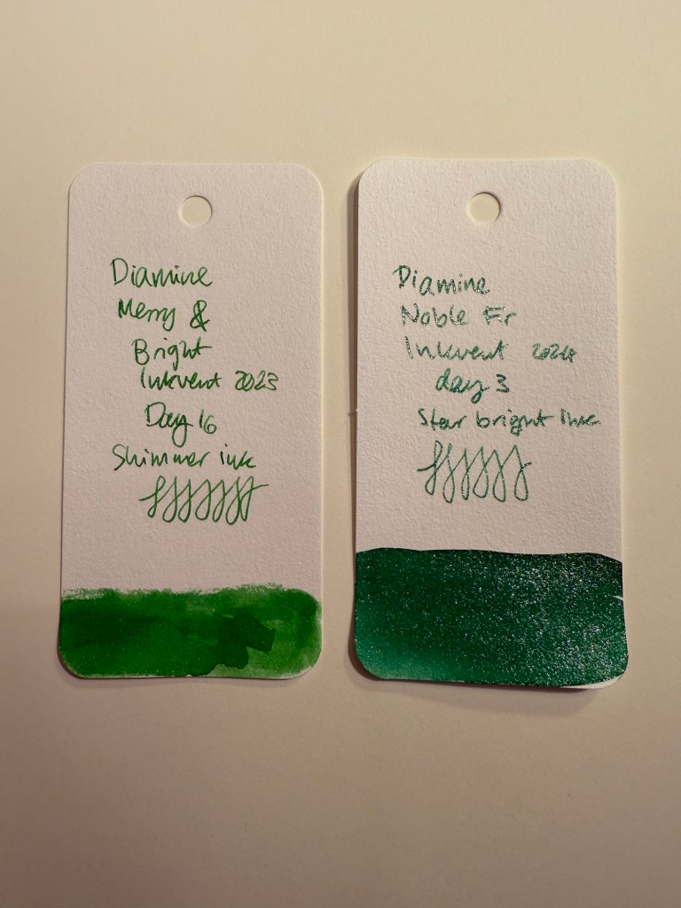
If this ink feels somewhat familiar, it’s because it’s basically last year’s Diamine Merry and Bright but one shade darker (and bluer) and with a lot more shimmer. You can see the two side by side below and also see the difference between what Diamine calls a shimmer ink and what they call a star bright ink.

Col-O-Ring swab comparison of Diamine Merry and Bright and Diamine Noble Fir

Here’s a writing sample on Rhodia paper with this ink. Diamine Noble Fir flows well, has some shading and a ton of silver shimmer. More than you think is healthy for any pen, which is why this ink will get nowhere near one of my vintage fountain pens.

Also, I kind of wish that they would have called it “Diamine Elphaba” after seeing and enjoying the movie “Wicked”. It’s too sparkly for Elphaba, I know, but it’s also nowhere near dark enough to be called “fir” and yet here we are.

Writing sample on Rhodia paper

Here’s a closeup on the writing sample, where you can see the ink shading and the shimmer.

Closeup of the writing sample.

Today’s sketch features a German bear which is called “Spooky” for some reason. It’s not spooky at all. You can see some of the shading properties of this ink and again the ever present shimmer.

Sketching sample on Midori MD Cotton paper

And here’s Spooky, the not-at-all spooky bear. There’s actually something about him that reminds me of Elmo from Sesame Street.

Spooky the bear.

In terms of practicality, Diamine Noble Fir scores higher than you’d think. This isn’t by any means an everyday ink, but for the holiday season it’s pretty much perfect. Select your pen carefully and clean out the ink once you’re done writing all those cards and letters, but Noble Fir is surprisingly well behaved. It’s also the most Christmasy of all the inks we’ve seen so far, so it scores very high on the theming side. Would I buy a bottle of this? No, as I don’t have a need to write a thousand holiday greeting cards. I will, however, enjoy writing this pen dry as soon as possible, before it becomes impossible to get all the glitter out of it.

Which pen would you use Diamine Noble Fir with? Do you see yourself needing or wanting a full bottle of this ink in your collection?

Diamine Inkvent 2024 Day 2

This is the Diamine Inkvent 2024 day 2 door:

The door

Day 2’s ink is Diamine Wilted Rose, a standard ink in a dark dusty rose shade. I tested it using a Lamy fine nibbed fountain pen.

The Col-O-Ring swab

Diamine Wilted Rose has an interesting colour and a good amount of shading. It’s dark enough to be seen on both white and cream paper (and it would work particularly well on cream coloured paper). It’s well behaved though it’s a wet ink, so I would shy away from using it in wide nibs. I find the decision to include it in a Christmas themed product like the Inkvent calendar a bit peculiar, but Diamine have made stranger choices in the past.

Writing sample on Rhodia paper

As Diamine Wilted Rose is pretty similar to last year’s Diamine Masquerade (minus the shimmer), I decided to compare the two swabs. Wilted Rose is darker and redder than Masquerade, and more easily readable. It is also a wetter ink that shades a bit less than Masquerade as it’s more saturated.

Which one of these do you prefer? I like Masquerade’s colour more, but Wilted Rose is a more practical choice.

Diamine Masquerade and Wilted Rose comparison.

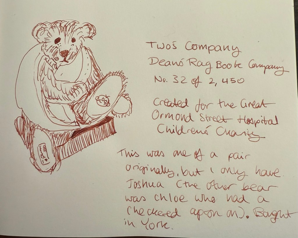
Today’s bear sketch features a charity collectible teddy bear that was originally part of a pair, but when I purchased him had been separated from his counterpart. Joshua has his paw in a sling, and has a lovely Dean’s Bears face. There’s something childish and innocent about him, which fits the charity he’s supporting very well.

You can see Diamine Wilted Rose’s shading well here, much better than in the writing sample, likely due to the Midori MD Cotton paper.

Sketching sample on Midori MD Cotton paper

Here’s Joshua from the Two’s Company Dean Rag Book company. He’s a British bear, and I bought him second hand in York from a store called Mary Shortle’s.

Joshua the bear

Diamine Wilted Rose scores relatively high on practicality, as it’s a standard ink that is readable. It’s not a perfectly practical ink, as it’s on the wet side and you can’t use this shade of ink for everything. It is a good ink for journaling and personal correspondence though, as it’s an interesting colour of ink with a good amount of shading. I wouldn’t hesitate to use in my vintage pens.

In terms of theming, I think that it likely adds variety and interest to this year’s Inkvent but it’s not a very “Christmasy” colour (nor does it have a very festive name). It’s a good addition to the Diamine lineup, and while I don’t see myself buying a full bottle as I don’t use pink very often in my pens, it is a much better purchasing choice than yesterday’s Baltic Breeze.

What do you think? Do you use pink inks in your pens often, and would you buy a bottle of Diamine Wilted Rose? Would you rename the ink to something more seasonally themed?

Diamine Inkvent 2024 Day 1

This is the Diamine Inkvent 2024 day 1 door:

The door

Day 1’s ink is Diamine Baltic Breeze a shimmer periwinkle blue ink:

The bottle

The sample came out a bit rough because I tried to use a dip pen for the first few lines of writing.

The Col-O-Ring sample

Diamine Baltic Breeze is a gorgeous dusty, purplish blue in with a good amount of shading and a copper shimmer that really makes the ink come to life. This is a wet ink that will sheen if used in wide nibs.

Writing sample on a Rhodia

On the Rhodia there was some feathering and a lot of show through and bleed through, but as I was using a wide 1.1 Monteverde nib, this is to be expected. On the Midori paper there was still some feathering, but you can also see the richness and depth of this ink.

Sketch on Midori MD Cotton

Here’s a closeup on the shading, shimmer and sheen of this ink, and you can also see where it feathered a bit.

Sketch close up

And here is the bear that I sketched, Topaz, made by Dean’s Bears and bought in York.

Diamine Baltic Breeze is a gorgeous ink that doesn’t score high on the practicality side. It’s a wet ink that is pretty saturated, so it takes a while to dry, and the shimmer, feathering and bleeding doesn’t help it in the every day use department. I won’t be getting a bottle of this, but I think that it’s a great ink for the calendar, as it fits thematically and is an attractive ink. Sometimes a sample is all that you need to enjoy an ink.

What do you think of Diamine Baltic Breeze? Do you see yourself buying a bottle?

Diamine Inkvent 2024: Spoiler Free Introduction

It’s Inkvent time again!

As I have done every year since Diamine started issuing their Inkvent calendars, I will be reviewing each of the inks in the calendar, publishing one post per day for 25 days, and then a summary post looking back at the calendar as a whole. As a reminder, there are 24 doors with 12ml bottles of fountain pen ink behind them, and one 30ml bottle of ink behind door 25. All of the inks in the Inkvent calendar are new for the calendar, and they will all likely be issued in full “black edition” glass bottles sometime mid 2025.

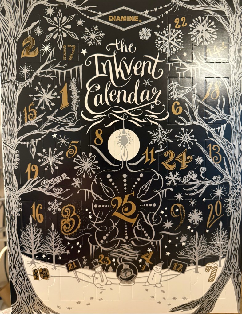
The Diamine Black Edition 2024 Inkvent Calendar

This year’s calendar is the Black edition. You can find my review of the 2019 Blue edition starting here, the 2021 Red edition starting here, the 2022 Green edition starting here, and the 2023 Purple edition starting here.

This year I will be using a Rhodia lined notebook for my writing samples (it’s a fairly standard fountain pen friendly paper that should be a good baseline for the ink), a Midori MD Cotton notebook for the bear sketches that I will be doing (the MD Cotton is a more expensive alternative to the Rhodia, but features better paper), and a Col-O-Ring for the ink swabs. I tried to use dip pens at the start of the first sample, to save me needing to fill and clean up 25 fountain pens, but as I didn’t like the ink flow with my dip nibs, I will be filling up 25 fountain pens again this year. It’s a mammoth undertaking, and as I have taken a break from posting for a while, I’m a bit daunted by the prospect.

But we do hard things because they’re worth doing, and in this case they will help me get back to a regular posting schedule and a regular sketching schedule.

Diamine Aurora Borealis Ink

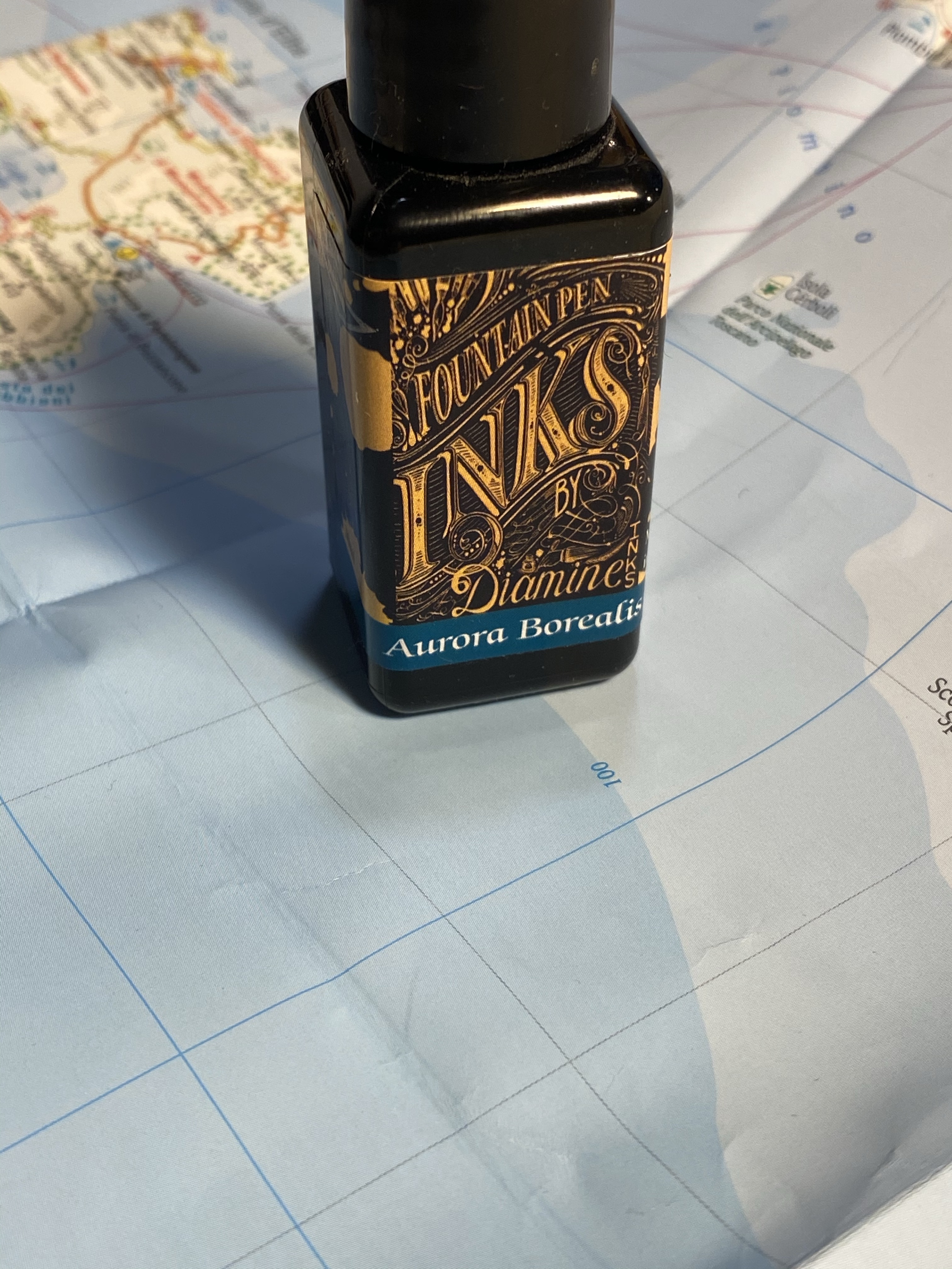
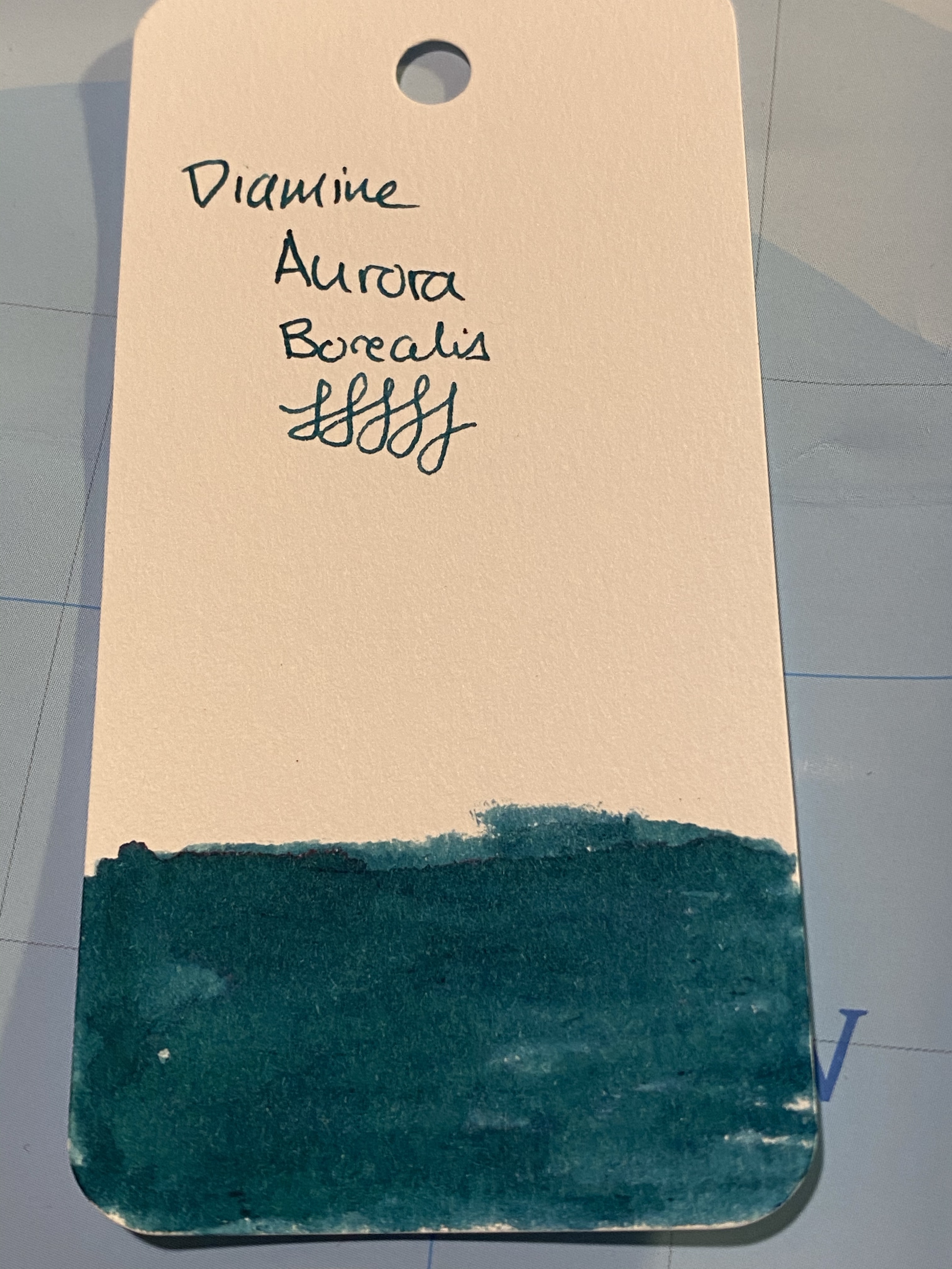
Diamine Aurora Borealis fountain pen ink was created by Diamine in collaboration with the /r/fountainpens reddit community, who chose the colour. I love teal inks, but at first I thought that I had enough inks that are close enough in colour to skip this one. I have no recollection of how it landed in my basket during my last Cult Pens purchase 🙂

Beautifully designed label.

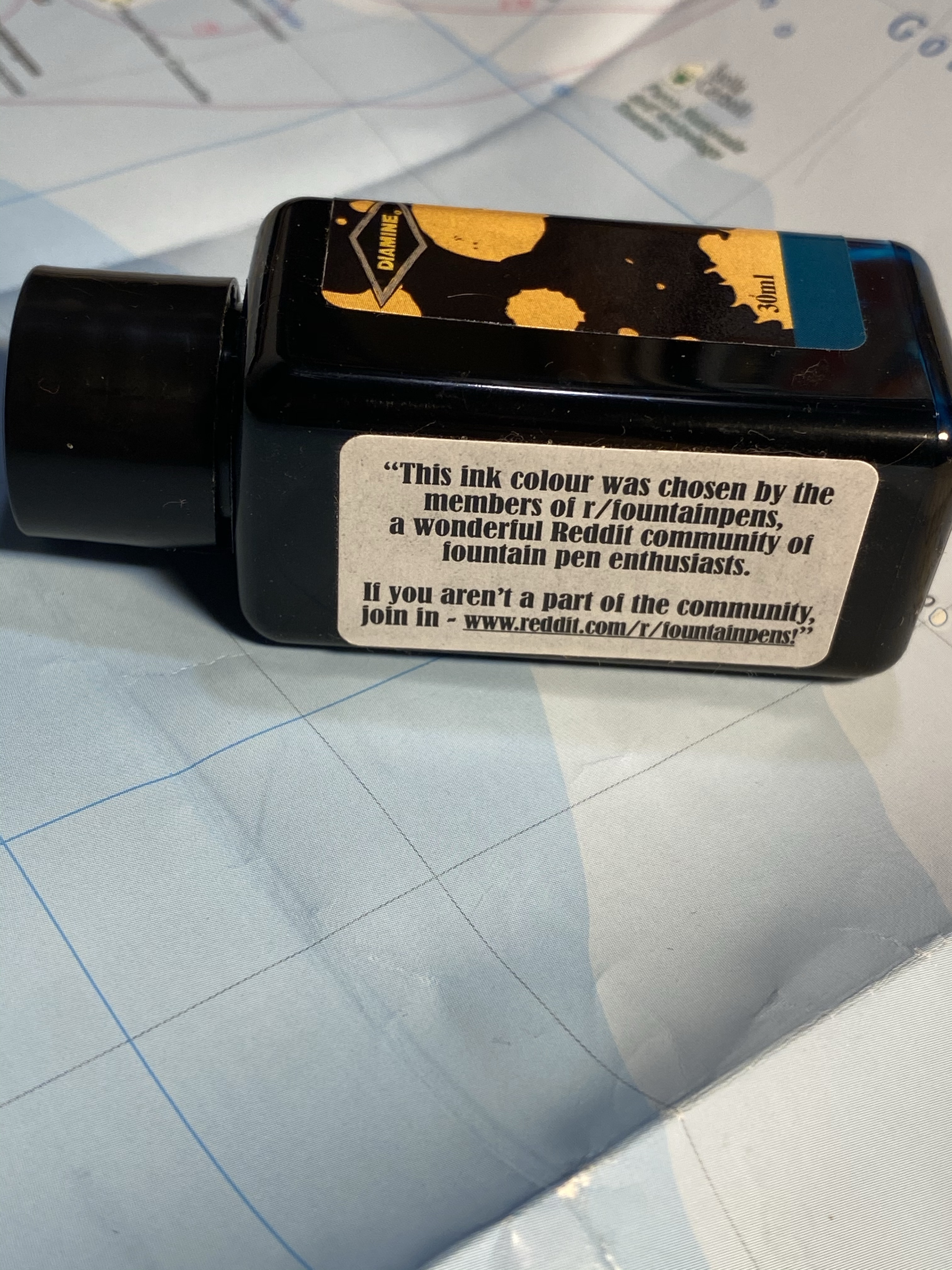
I don’t normally spend much time on the packaging, but Diamine’s 30ml plastic bottles are deep and wide enough to allow for filling even chunky pens, and their (relatively new) label design is splendid. This bottle is unique in that it has another label, crediting the /r/fountainpens community with selecting the ink colour:

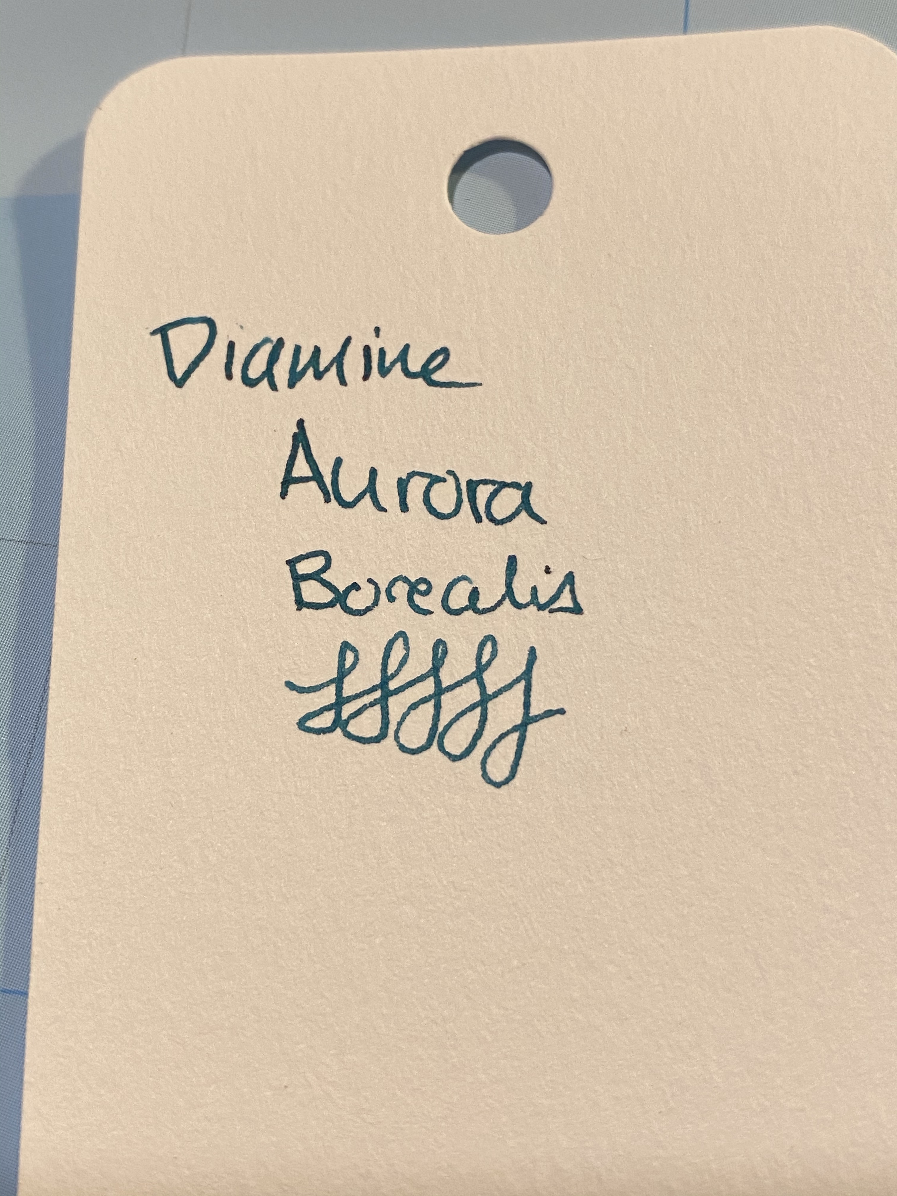
Aurora Borealis is a dark teal with some red sheening, and a good amount of shading for such a saturated ink. It also dries surprising fast for such a saturated ink (although I wouldn’t call it a fast drying ink).

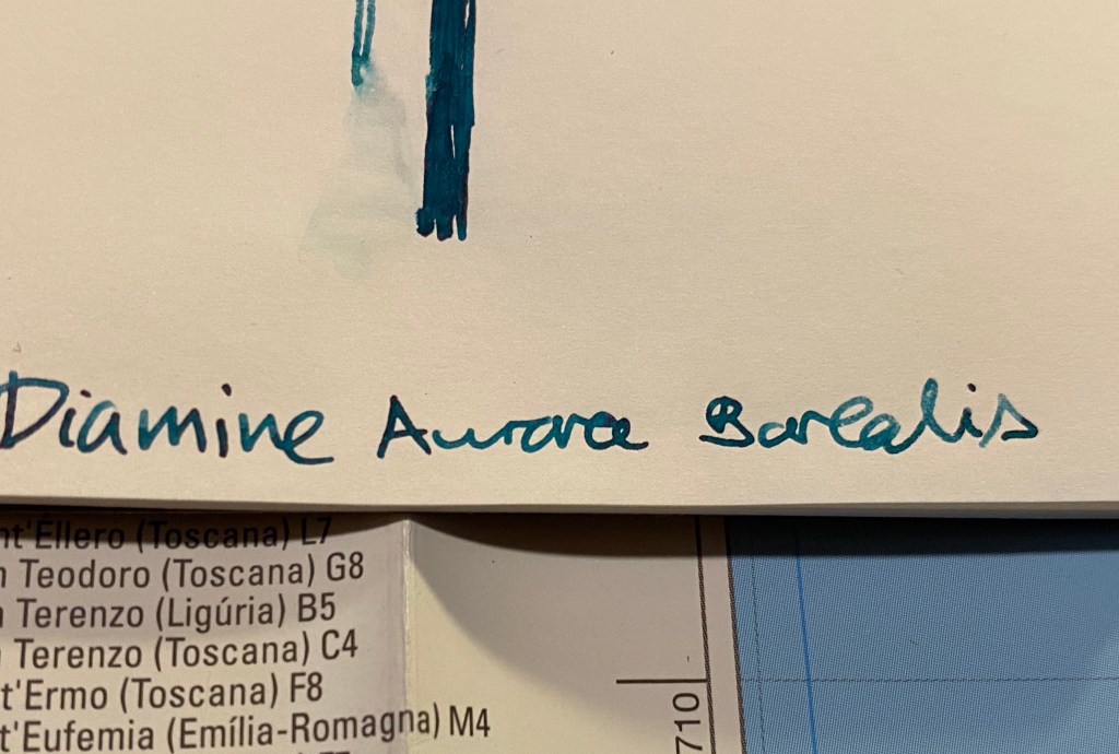
Swab on a col-o-ring card.

You can see a bit of the red sheen here, on the top of the “A” in aurora:

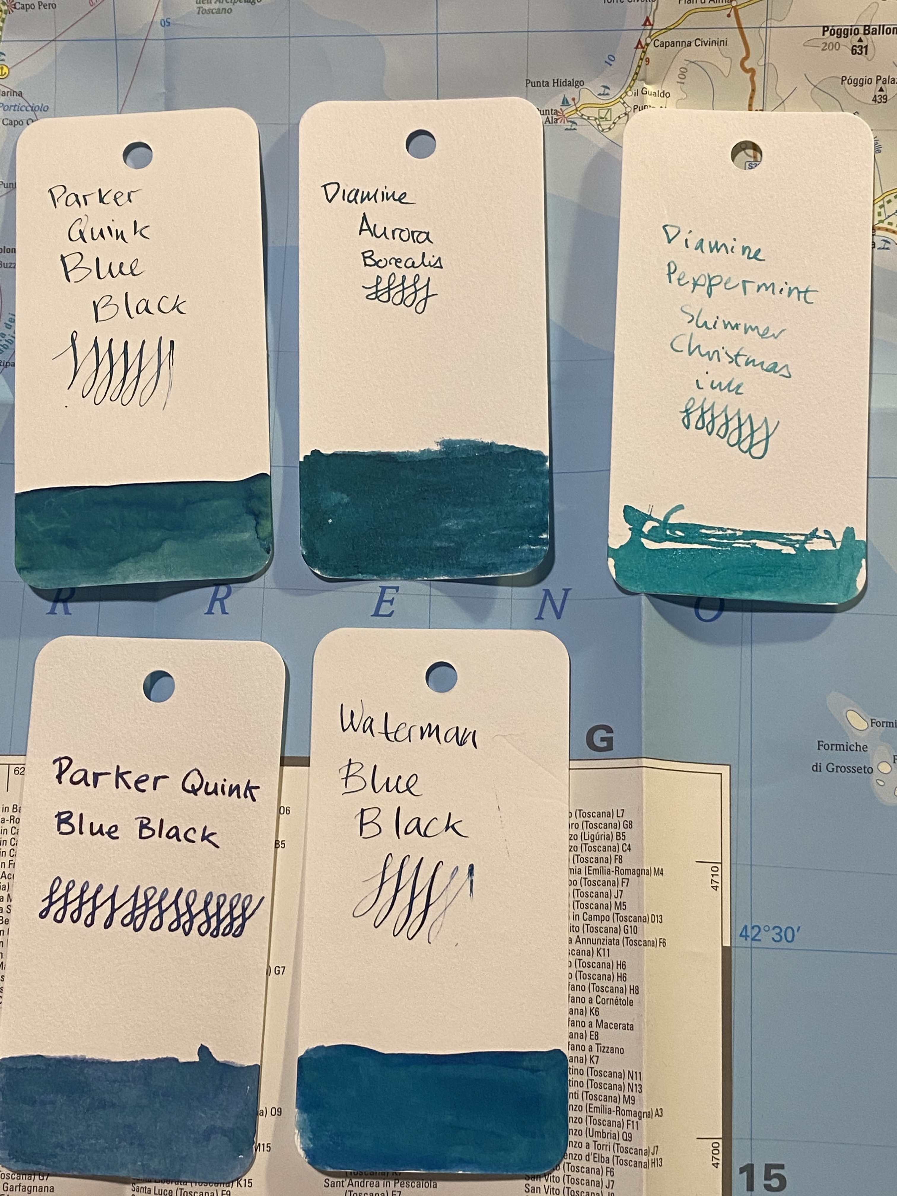
I a few inks that are in the region fo Diamine Aurora Borealis, but not many of them are swabbed. I will say that the ink is dark enough to be fine for office use, and that is still shows plenty of interest and character:

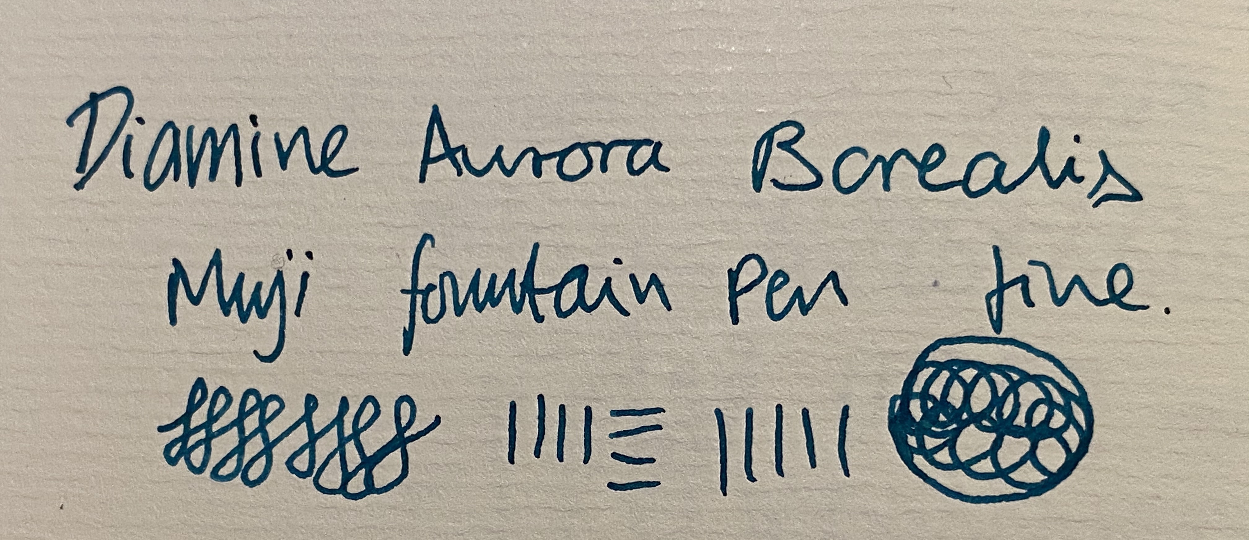
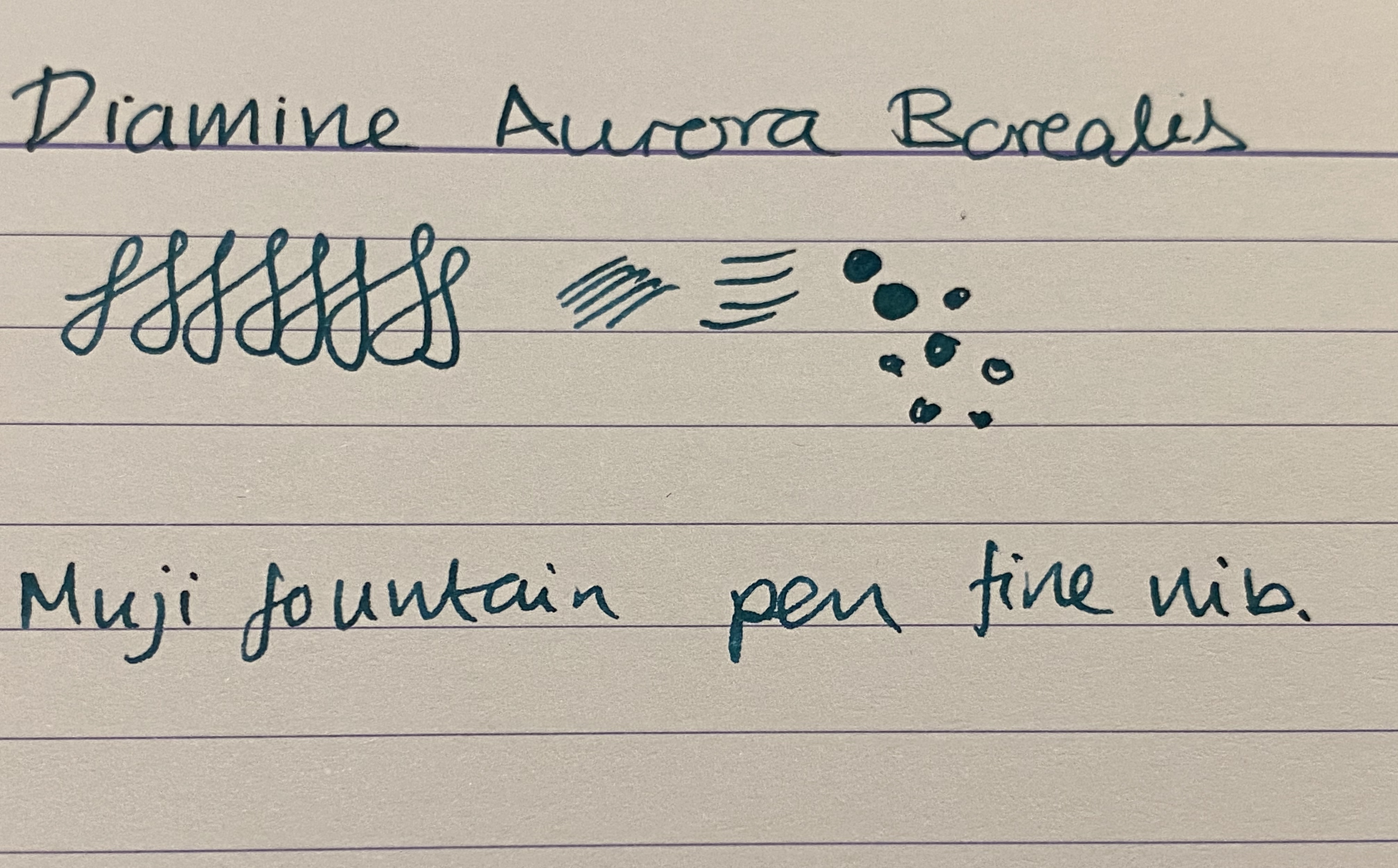
I tried it also on Paperblanks paper, and on Rhodia paper. In both cases the ink dried darker than it looked when I was writing with it, although the photos picked up less colour than it originally had. The best colour reproduction is in the final photos of Tomoe River Paper, further below. It is worth pointing out though that if you have a wet nib, you’re going to see darker results than you’d expect from the swabs.

Paperblanks

In any case Aurora Borealis came out much darker than it appears on Goulet Pens site, for instance, although not as dark as it appears here:

Rhodia

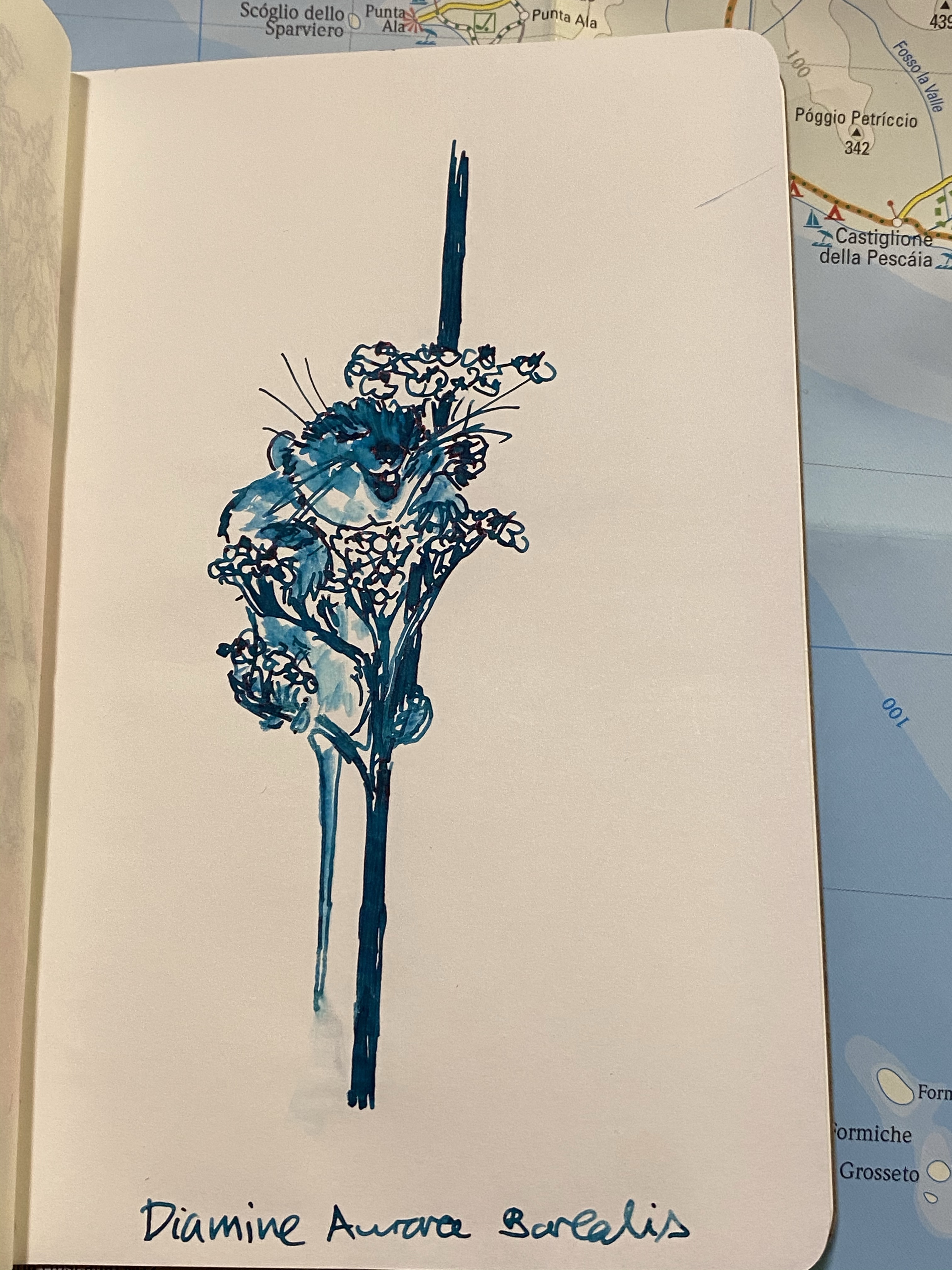
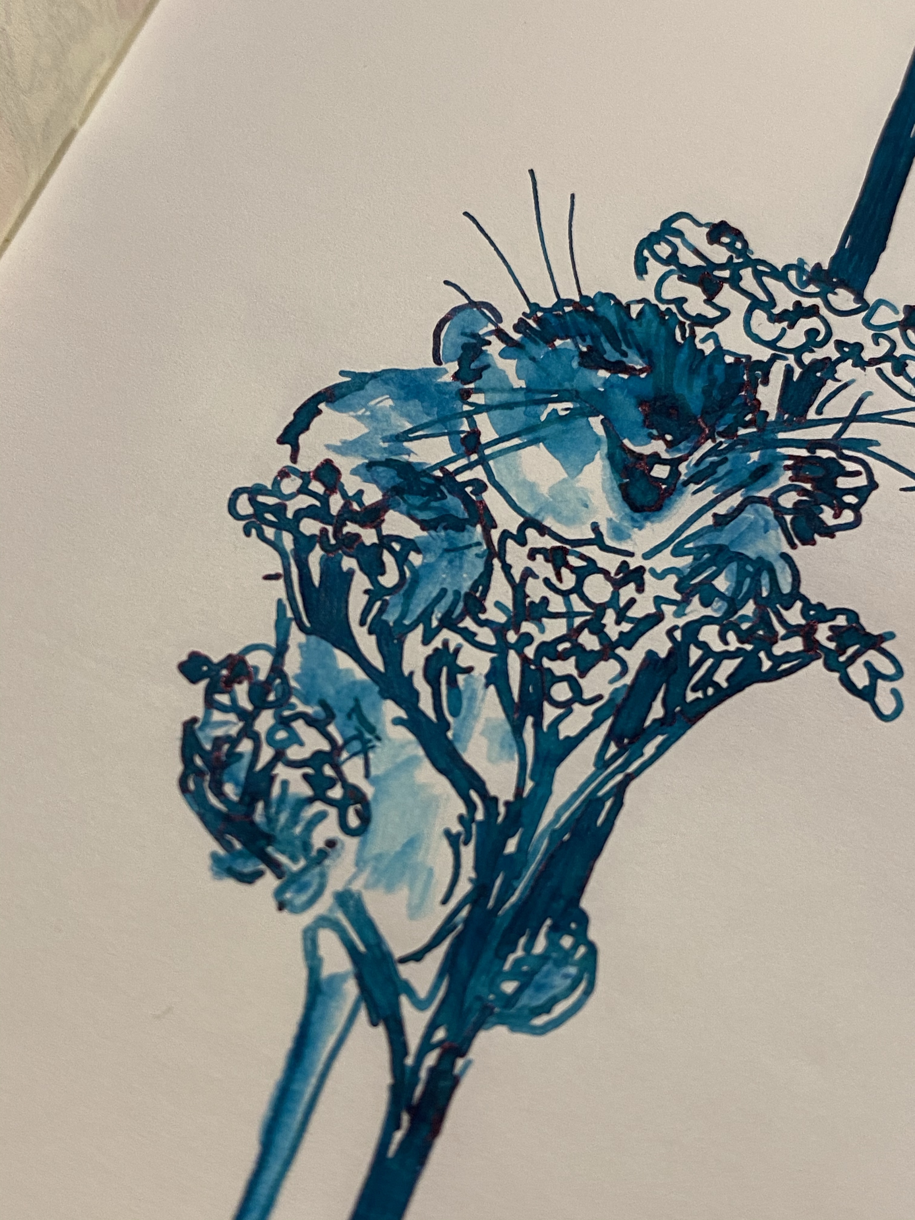
I gave the ink a spin on some (old) Tomoe River paper, and “opened” it up with some water and a fine brush. As is the case with most Diamine inks, Aurora Borealis isn’t waterproof or water resistant, and doesn’t market itself as such. It is, however, a lot of fun to draw with:

You can see red sheening on the happy little dormouse’s nose, as well as on the flowers. You can also see the shading in the flowers:

This is the best sample of all the properties of this ink: the relatively dark colour, the shading, and the slightly red sheen:

Diamine Aurora Borealis is fun dark teal ink that will likely appeal to anyone who likes teal/turquoise inks. It’s inexpensive and unassuming, and so you can take an interesting ink for a spin without spending Sailor or Iroshizuku money.

Spoke Roady Gecko Pen Review

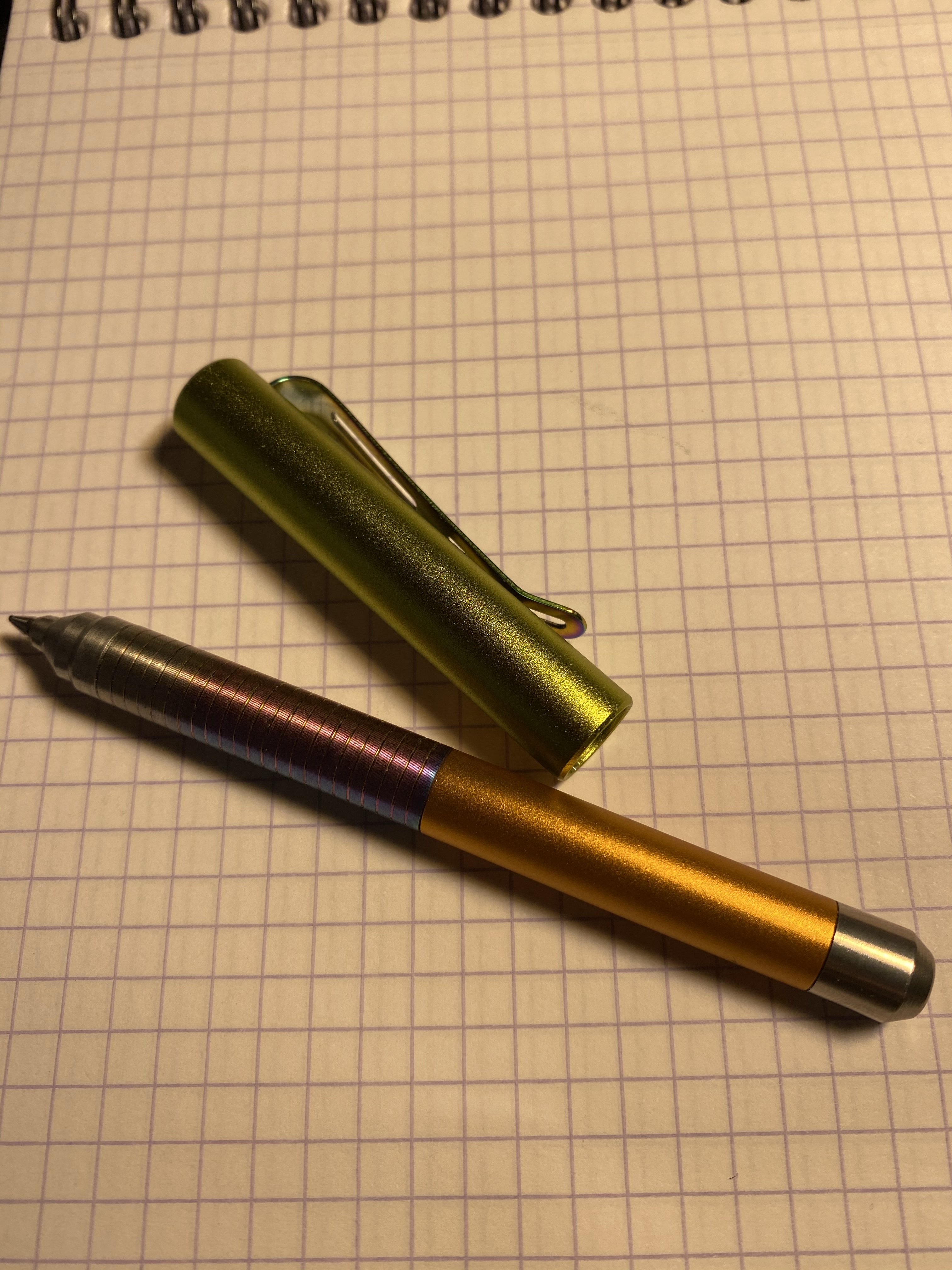
The Spoke Design Roady Gecko pen about a week ago, and I’ve been using it constantly since then. The Roady is an EDC pocket pen made of machined aluminum that is built around the Uni-ball Jetstream SXR-600 refill. Unlike its predecessor, the excellent Signo DX compatible Spoke Pen, the Roady is capable of accepting a wide variety of Parker style refills, including the Fisher Space Pen refill, much beloved in EDC circles.

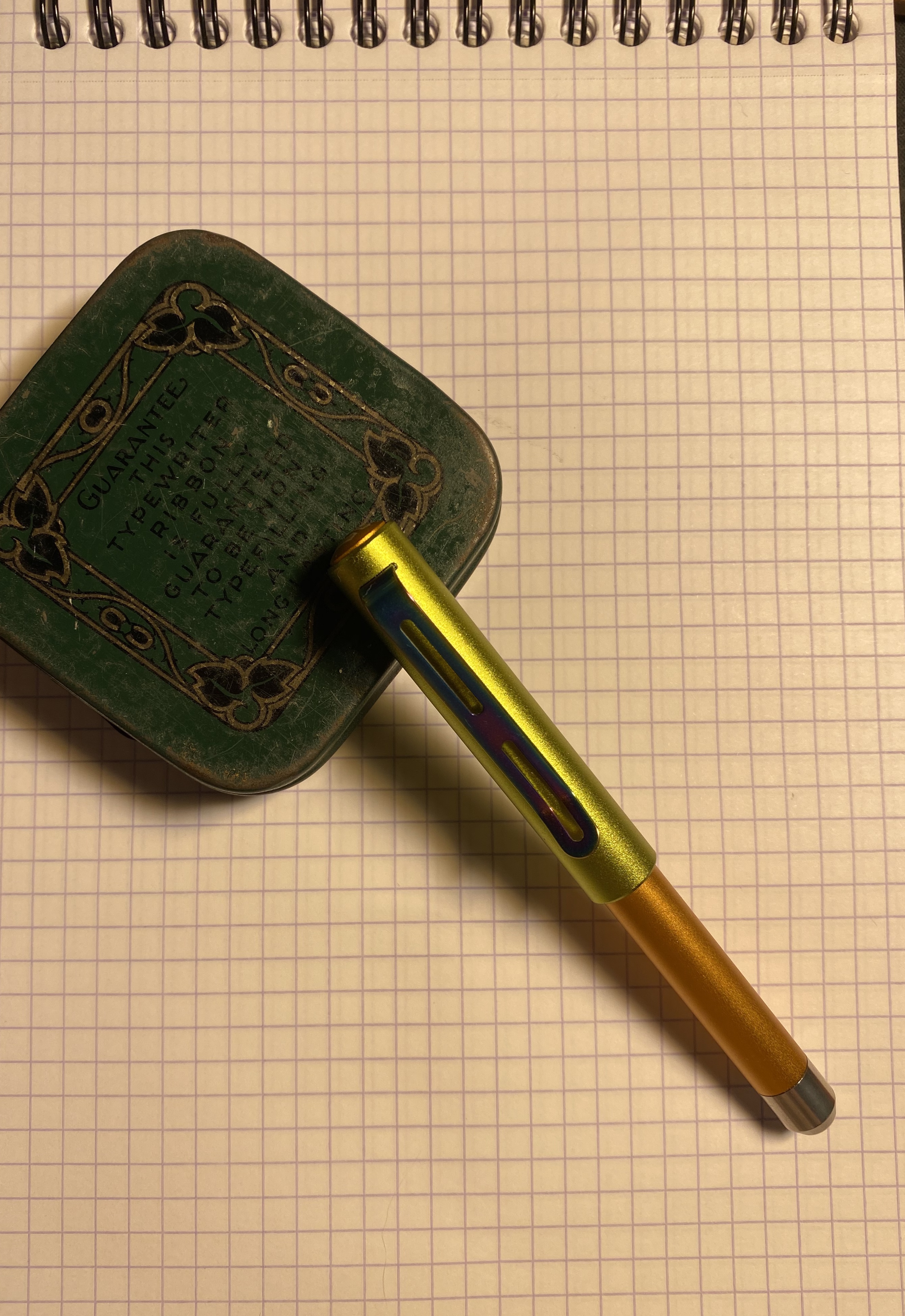
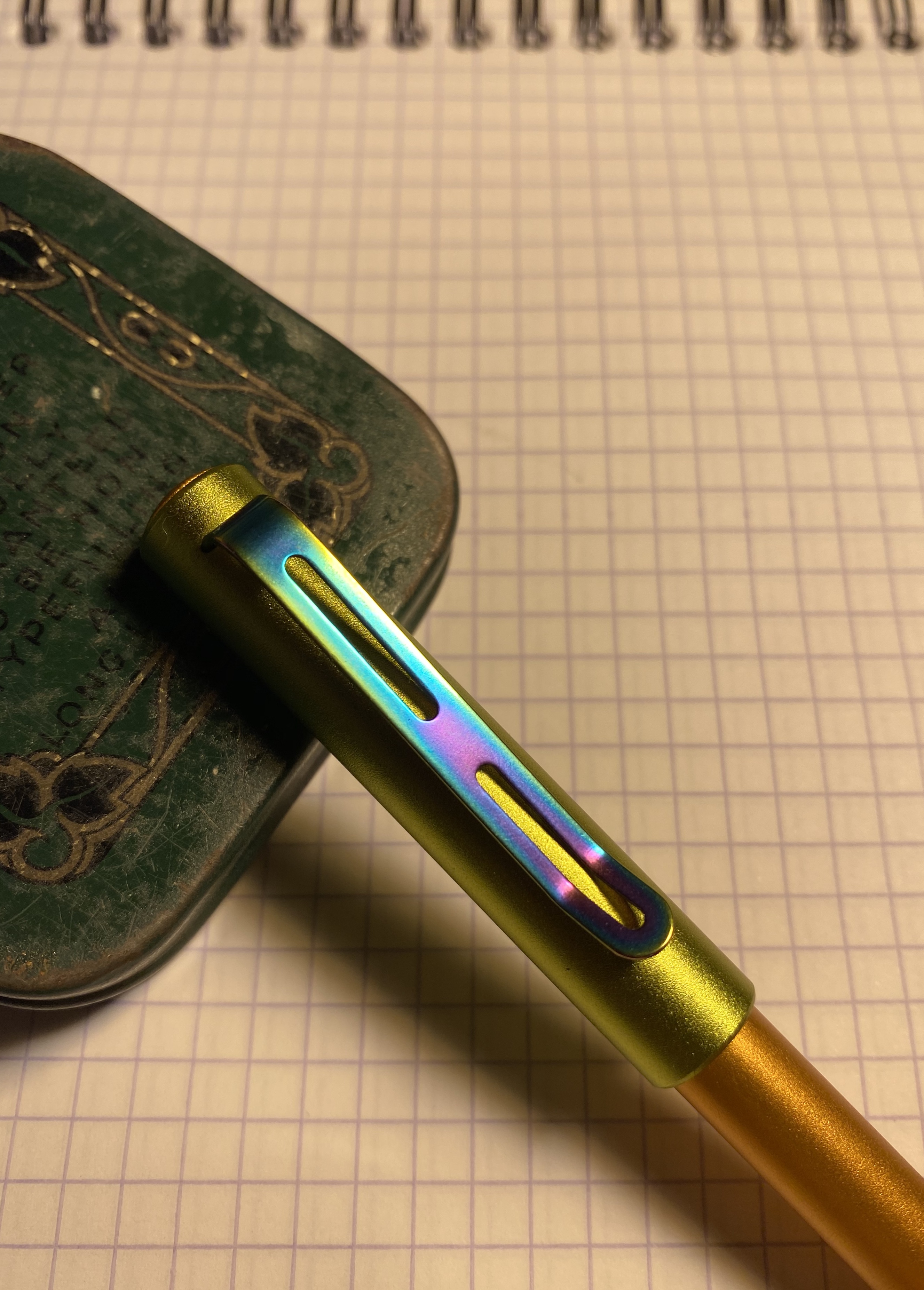
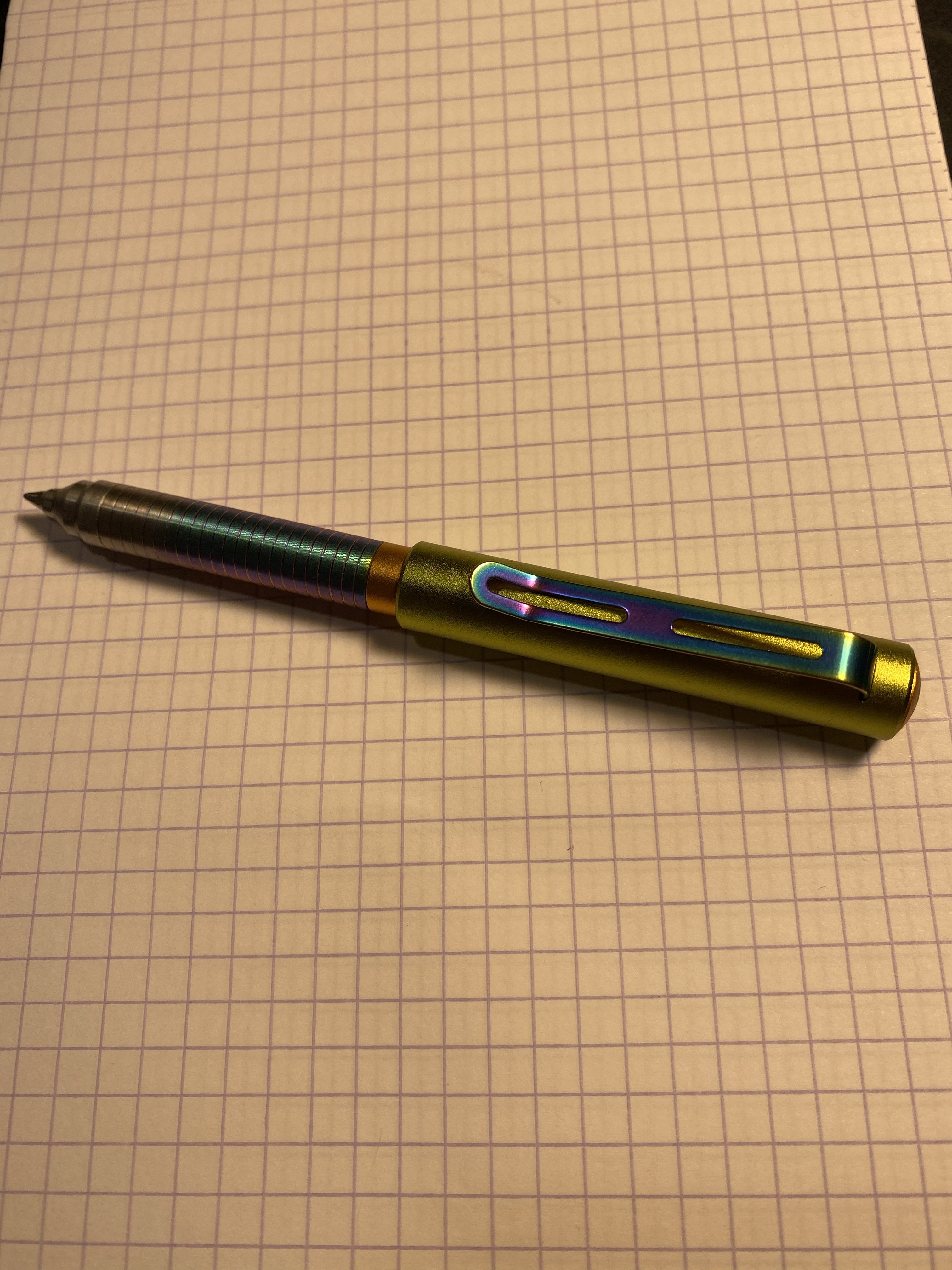
I don’t usually go for flashy pens, but something about the design of the Roady and the colour options offered made me grab the Gecko. This charmingly named colourway has a lime green cap, an orange barrel and finial, and rainbow coloured grip and clip. The result is even better in person than it is in photos – a pen that makes you smile and is bound to draw attention to itself.

Capped the Spoke Roady is tiny, and ought to fit comfortably in your pockets, if you have some.

There are a few other colourways with similar rainbow patterns on their grip and clip. The result is gorgeous, and I’m glad that Spoke Design haven’t offered these only as limited edition pens, or charged an additional markup for them. That is commendable and impressive, particularly in today’s machined pen market.

Rainbow clip.

Trying to write with the Spoke Roady unposted is asking for trouble, as it’s verging on golf pencil short in its body length. This is a pen clearly designed with posting in mind.

Too short for comfort unposted.

When posted the Spoke Roady becomes a viable EDC pen, although it’s still on the short side. This means that it’s great for short notes on the go, which is what it’s intended for, and not the best for long note taking sessions. The Roady posts using magnets, making a satisfying click when posted. It’s not as great a fidget toy as the Spoke Pen is, not that this should ever dissuade you from purchasing it.

Capped and ready for work.

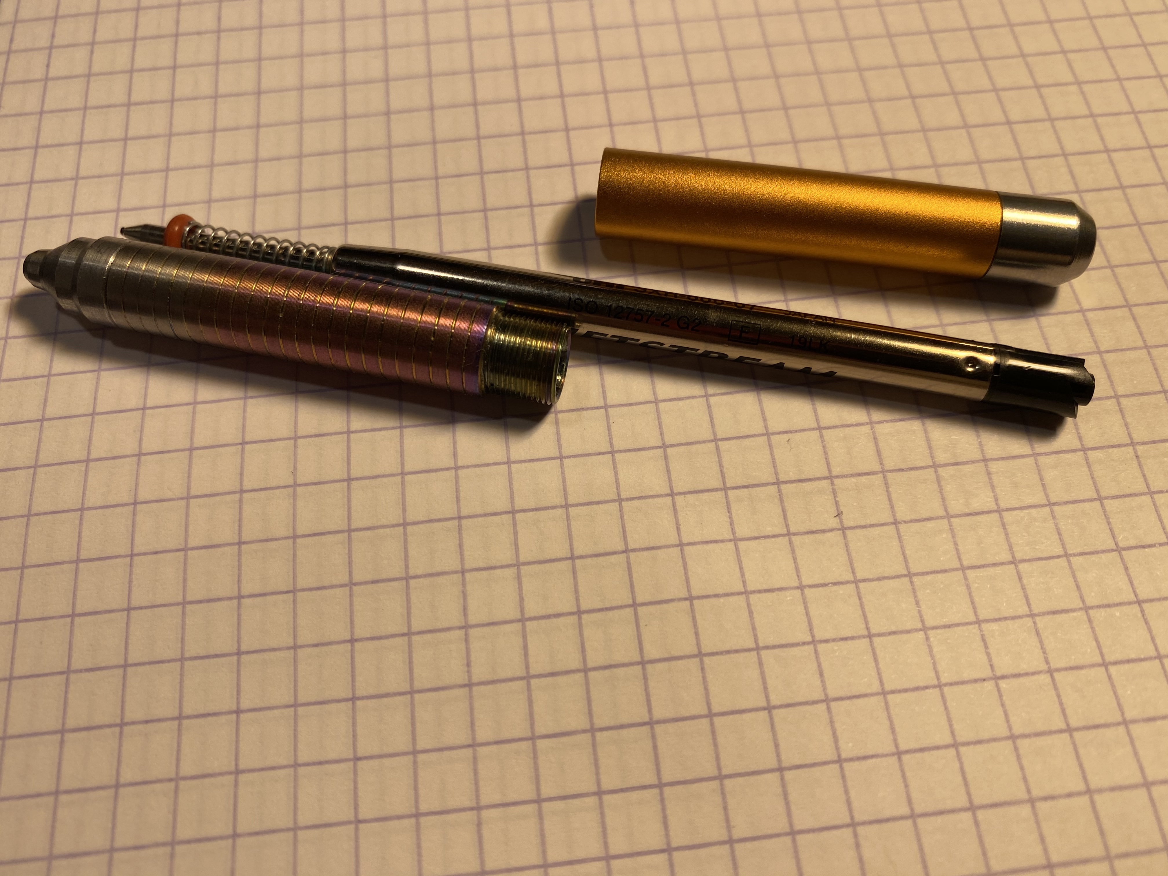
For some reason the refill came shipped in a separate sleeve and not inside the pen. This is a peculiar choice since the refill came in a Uni-ball refill bag, but with the spring and o-ring already installed, and for some reason a bit of tubing meant to be used as a spacer of some kind? It’s not really clear. Also, while you get a cool sticker and generally nice packaging with the Roady, you don’t get an explanation of any kind with the pen. That’s a shame because it assumes that everyone will know how to handle the refill when it comes to changing the pen’s refill. It feels like a missed opportunity for Spoke.

The refill, Jetstream SXR-600

Here’s the Spoke Roady next to the Spoke Pen. If you can only afford one pen and you’re out and about a lot and like wild colours, then I’d recommend getting the Roady. Otherwise, get the Spoke pen, especially if you like writing in fine lines. Both are good pens, just each one is suited for a different use case.

Roady on the left, Spoke Pen on the right.

Writing sample on Rhodia paper. The Jetstream SXR-600 in 0.7 is an excellent refill choice in the Parker refill category, and the Parker style refill itself is a great choice for an EDC type of pen.

The Roady is a great little pen to have handy, and it’s reasonably priced for a machined pen. I won’t be surprised if I end up buying one or even two more.

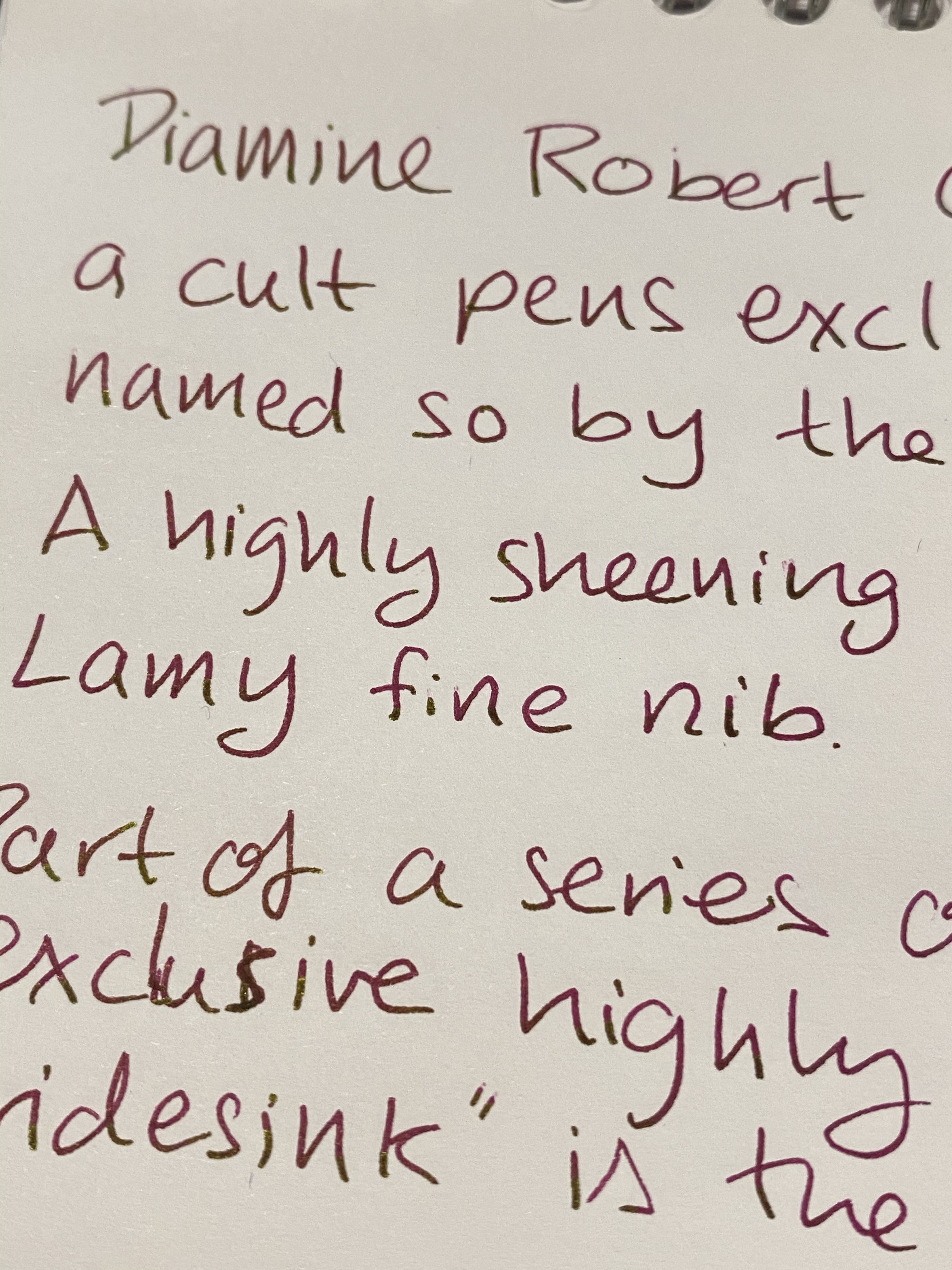
Cult Pens Iridescink by Diamine: Diamine Robert

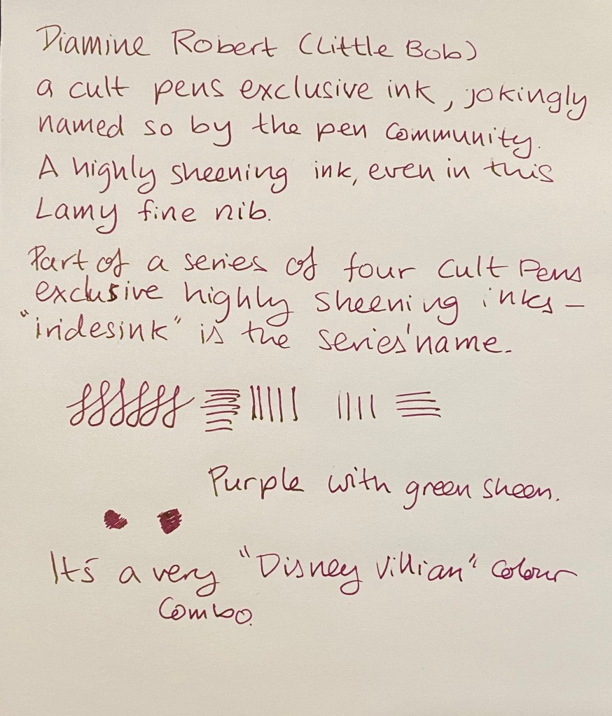
When Cult Pens and Diamine came out with their first two “Iridescink” shimmering inks together they turned to the fountain pen community to name them, jokingly suggesting Robert and Maureen as possible names. The fountain pen community duly said “challenge accepted” and voted that the inks be called “Robert” and “Maureen”. I thought that this was a charming anecdote until I actually purchased three of the now four Cult Pens/Diamine Iridescink inks and realized that I with names like Robert, Maureen and Christine I would never be able to tell which ink is which.

This, of course, is a minor problem for an otherwise solid addition to the world of fountain pen inks. These inks are super sheening and generally well behaved, with a good solid base colour and an interesting sheen hue on top of it.

Robert, a purple ink with a green sheen (I will forever have to consult a guide when trying to remember which ink is called what), is one of the most attractive inks in the bunch. It features a reddish purple somewhat reminiscent of Diamine Amaranth, and a gorgeous green gold sheen.

On Rhodia paper with a Lamy fine nib you can see the green sheen on almost every downstroke. It’s also well featured in the swap I took in my Col-o-ring.

For the biggest sheen effect, of course there’s nothing like tomoe river paper. Here’s a quick sketch that I did on a Kanso Sasshi tomoe river booklet. As you can see the ink isn’t waterproof or water resistant (not that Cult Pens or Diamine claim that it is), and you can barely see the base colour in most places because of the heavy green sheen.

So why did I say that Diamine Robert is “generally well behaved” and not just “well behaved”? Because if you leave it unused in a pen for a day or two you may find that you need to “prime” the pen for a bit to get it to start to write. Once it gets going the ink flows well, but this is the sort of behaviour that makes me wary of using this ink in vintage pens. Your milage may vary, as ink flow changes with altitude and weather, but for now this gorgeous ink is relegated to “just” my modern pens. That’s more than good enough for me.