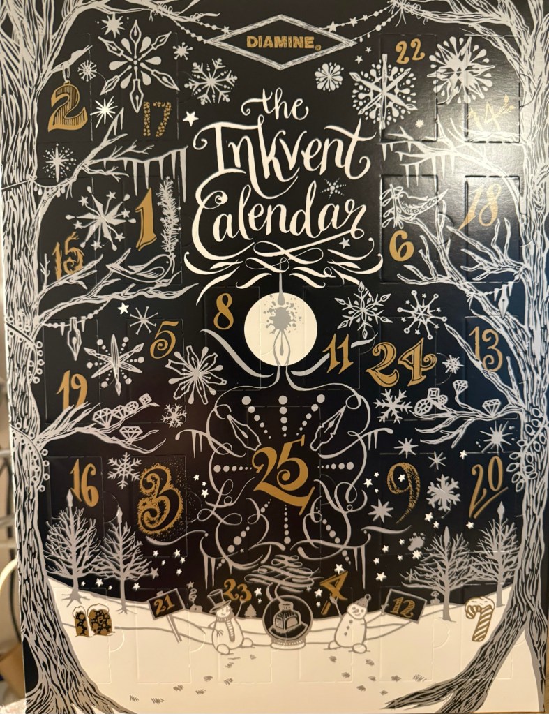
As I have done every year since Diamine started issuing their Inkvent calendars, I will be reviewing each of the inks in the calendar, publishing one post per day for 25 days, and then a summary post looking back at the calendar as a whole. As a reminder, there are 24 doors with 12ml bottles of fountain pen ink behind them, and one 30ml bottle of ink behind door 25. All of the inks in the Inkvent calendar are new for the calendar, and they will all likely be issued in full “black edition” glass bottles sometime mid 2025.
The Diamine Black Edition 2024 Inkvent Calendar
This year’s calendar is the Black edition. You can find my review of the 2019 Blue edition starting here, the 2021 Red edition starting here, the 2022 Green edition starting here, and the 2023 Purple edition starting here.
This year I will be using a Rhodia lined notebook for my writing samples (it’s a fairly standard fountain pen friendly paper that should be a good baseline for the ink), a Midori MD Cotton notebook for the bear sketches that I will be doing (the MD Cotton is a more expensive alternative to the Rhodia, but features better paper), and a Col-O-Ring for the ink swabs. I tried to use dip pens at the start of the first sample, to save me needing to fill and clean up 25 fountain pens, but as I didn’t like the ink flow with my dip nibs, I will be filling up 25 fountain pens again this year. It’s a mammoth undertaking, and as I have taken a break from posting for a while, I’m a bit daunted by the prospect.
But we do hard things because they’re worth doing, and in this case they will help me get back to a regular posting schedule and a regular sketching schedule.
We just had the 2024 Pelikan Hubs event and I wanted to talk about which Pelikan fountain pens I brought with me to the event, and to note a few things that may be useful for those looking to get into Pelikan fountain pens.
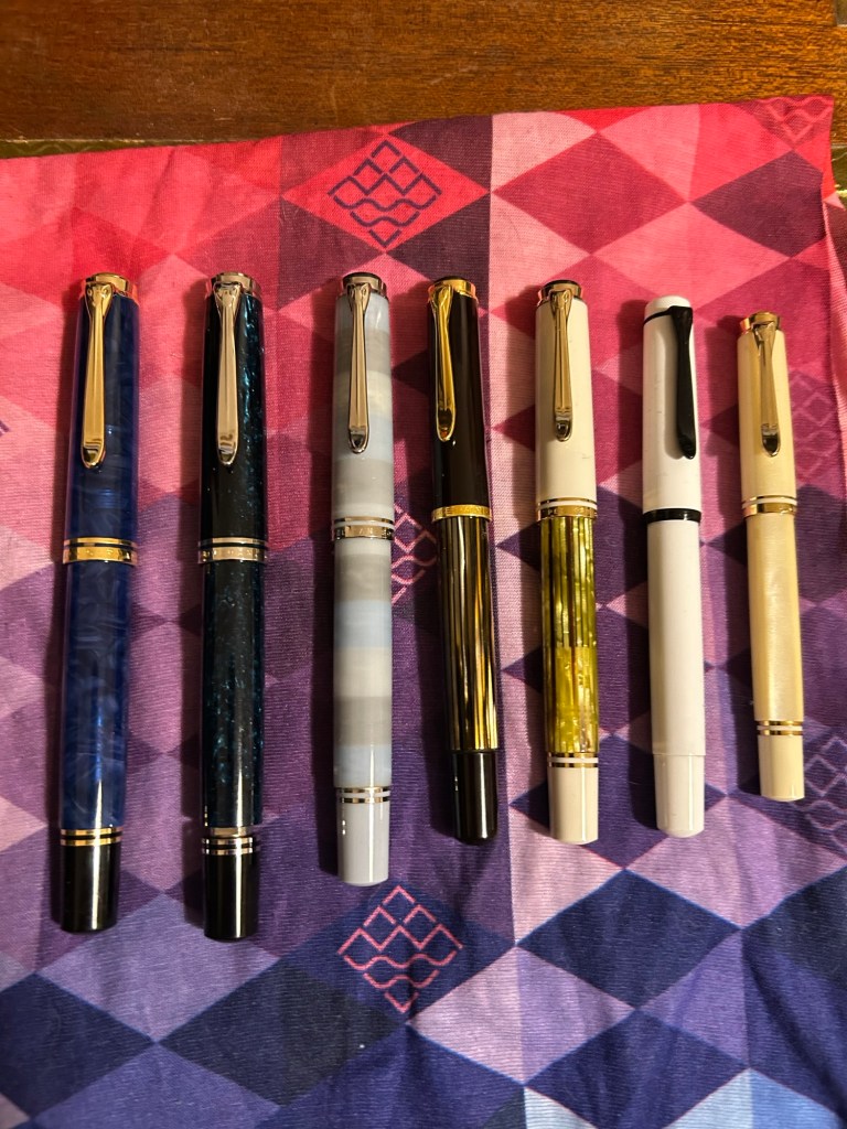
This was my flock:
From left to right they are:
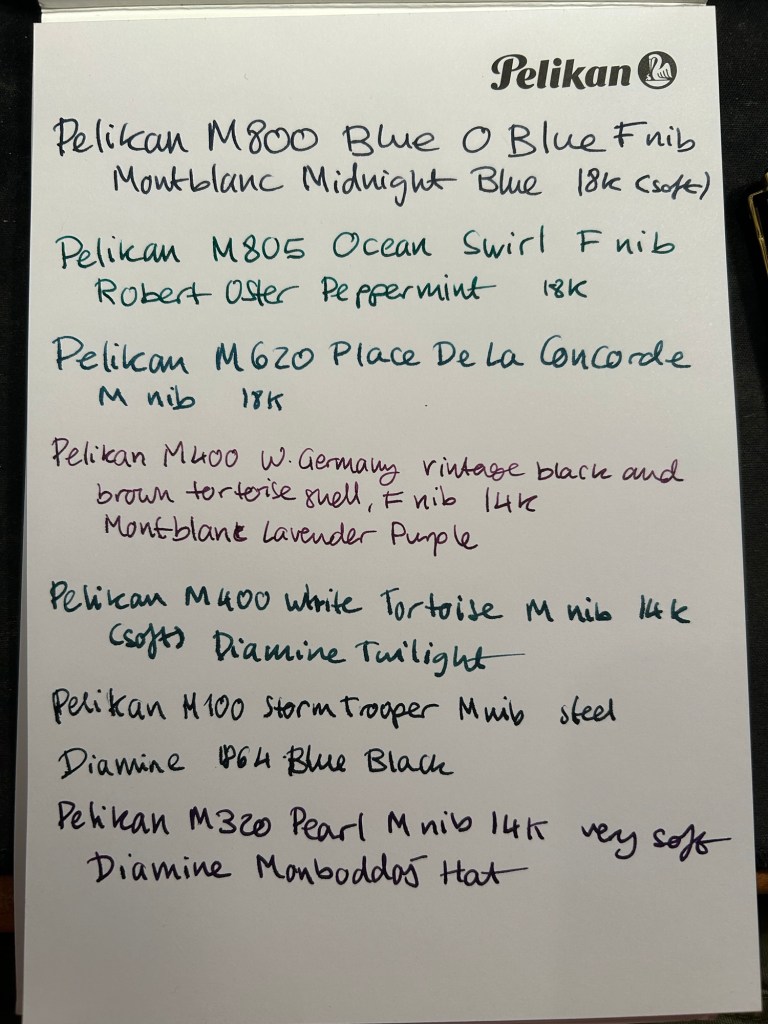
Pelikan M800 Blue O Blue – one of the most expensive pens in my collection, and one that I (partially) got as a gift for my birthday. This pen has an 18 Karat fine nib that is soft and springy. Note: Some of Pelikan’s gold nibs are softer than others, so it’s worth testing the pen out before you buy it, especially if you’re not used to Pelikan nibs. This pen has a semi transparent blue swirly body and a typical Pelikan wide and juicy nib.
Pelikan M805 Ocean Swirl – gorgeous, gorgeous pen that draws attention every time I use it. The depth and shade of the material is something else, and the palladium trim and rhodium plated 18k nib work very well with the turquoise and black shades of this pen’s body. This pen also has a fine 18k nib but this one is much firmer than the one in the Blue O Blue.
Pelikan M620 Place De La Concorde – so, so glad I got this pen though it was expensive for me at the time. This was part of Pelikan’s city series and the only Pelikan I have in the M600 size, which is just a shade longer than the M400. There’s marbling in this pen’s stripes, as is befitting its name, and the 18K M nib is wide and juicy and of a standard Pelikan nib firmness.
Pelikan M400 W. Germany vintage black and brown tortoise shell – I brought this pen so that people could compare the old tortoise shell design to its modern counterpart. There’s just one band on the cap, the bottom and top finials are more rounded and there’s the old Pelikan logo engraved (not screen printed) onto the finial. The nib design is also completely different, though it still feels like a standard fine 14k Pelikan nib (wide and on the firm side).
Pelikan M400 white tortoise shell – this is the modern counterpart of the previous pen, and it has a 14k medium nib that is on the soft side. Both the black and white tortoise shell pens have semi transparent pen bodies so you can easily see the pen level through them.
Pelikan M100 storm trooper – on the rarer side of Pelikans, this steel nibbed fountain pen has a medium nib that feels just as good as Pelikan’s gold nibs. While I understand why Pelikan didn’t want to continue making M100 still nibbed fountain pens, I kind of wish they would have. These could have been slightly higher end alternatives to Lamy’s Al Stars and Safaris – a step down from the M200.
Pelikan M320 Pearl – the rarest Pelikan in my flock, and always a crowd pleaser. This fountain pen is tiny, and came as part of a set with Pelikan brown ink and a nice presentation box. I bought it more than 10 years ago in Berlin, and nobody was interested in them because of the pen’s size. It’s a piston filler, a fantastically well made pen and it has a very soft 14k medium nib.
Here’s a writing sample for all these pens:
Writing sample on a Pelikan Hub 2022 notepad
Did you go to a Pelikan Hub this year? If so, which pens did you bring with you?
Yesterday Pelikan celebrated their annual Pelikan Hubs event, and we had a local Pelikan Hub. Since 2014 the German pen company has invited its fans to gather in groups all around the world and for one evening celebrate their love of Pelikan fountain pens and ink. The events are well organized, with a local volunteer in each country organizing the Hub location and orchestrating the event. And every year Pelikan gives Hub participants a generous gift for their participation.
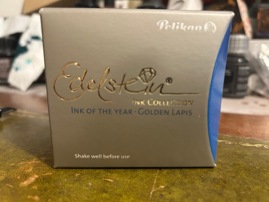
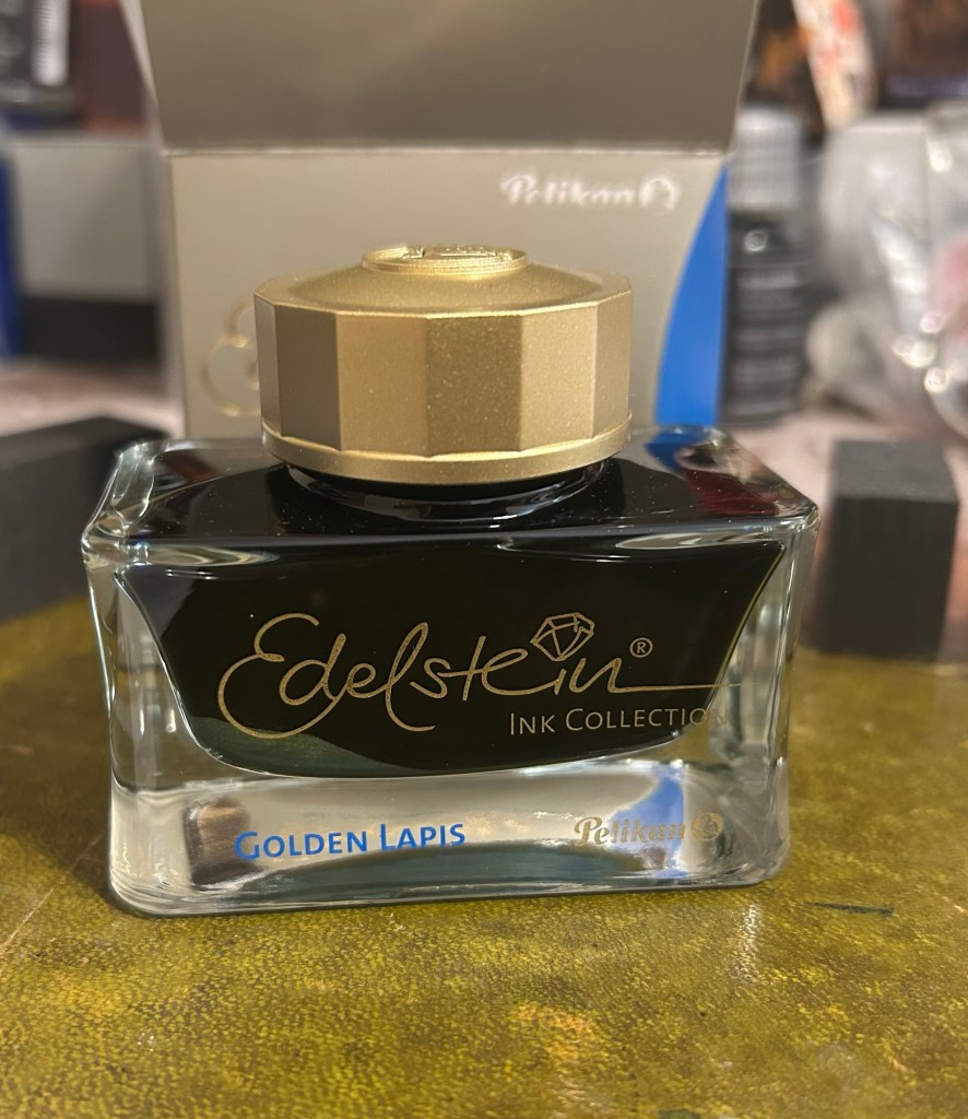
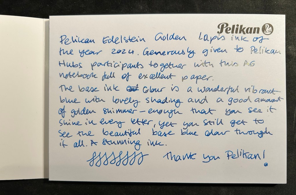
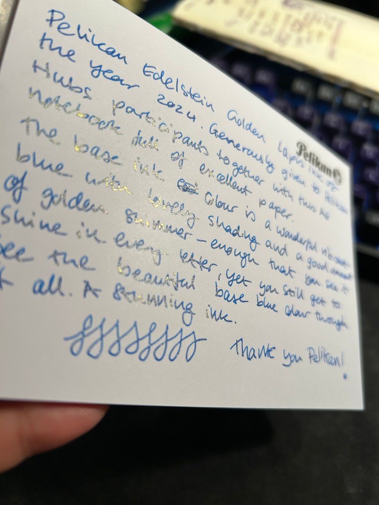
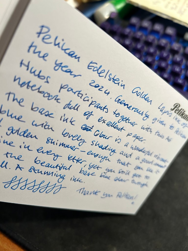
This year was no different, and Pelikan Hub participants got a full sized bottle of Pelikan’s premium ink collection, Edelstein, in the Ink of the Year 2024 colour: Golden Lapis.
Pelikan Edelstein Ink of the Year Golden Lapis
As is customary with luxury inks, the bottle is a glass work of art:
Edelstein ink bottle.
The extra thick base and wide opening work well with Pelikan Souveran pens which tend to be wider barrelled and often difficult to impossible to fill with certain ink maker’s narrow and tall ink bottles. With certain Sailor ink bottles and Diamine’s 30ml plastic bottles there’s a risk of your M400 or M800 not fitting into the bottle or of tipping the bottle while trying to fill the pen with ink. There’s no risk of that with Edelstein bottle design, though when the ink level runs very low its likely you’ll need to get creative when trying to fill your pens with ink.
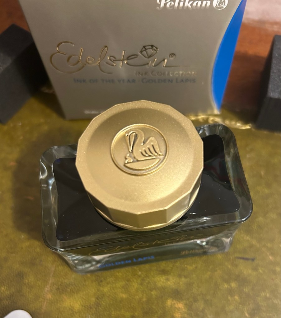
The golden cap has the modern Pelikan logo on it, with a Pelican and one chick:
The Edelstein cap
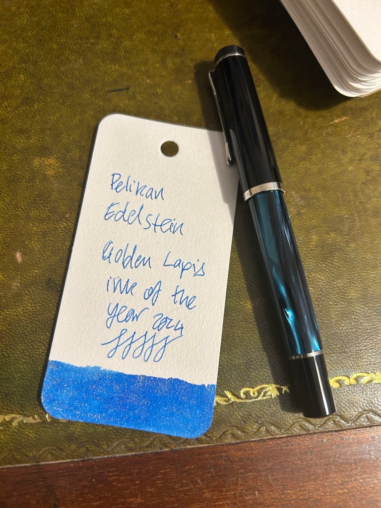
I filled a Pelikan M205 Petrol Marbled EF pen with the ink and used it for the swab and writing sample below. Here’s Golden Lapis on a Col-O-Ring card:
Pelikan Edelstein Golden Lapis ink swab
We got a nice A6 writing pad with bristol thick fountain pen friendly paper in it as part of the Pelikan Hub 2024 gifts. The paper is great though I wish there wasn’t a Pelikan logo on each page mostly because it takes so much space. The paper is thick enough for both sides of it to be useful, so it’s a shame to have to flip the page over and write only on one side if you want the full A6 page to yourself.
The A6 notepad that we received as part of the Pelikan Hub
Pelikan Edelstein Golden Lapis is a gorgeous ink, period. The base rich, turquoise-y blue reminds me of Pilot Iroshizuku Asa Gao and that is high praise. The colour is rich, vibrant and has a good amount of shading that sets it apart from standard blues. To this fantastic base ink Pelikan added lots of fine, golden shimmer, and the result is stunning. Viewed directly from above the shimmer is present but subtle, oftentimes taking on the look of sheen:
Writing sample on the Pelikan A6 pad
But tilt the page slightly and the amount of gold in each letter makes the page glow:
Tilt it to the other side and the shimmer “vanishes”, which allows you to see the lovely blue ink’s colour shading much better:
Pelikan Edelstein Golden Lapis is a spectacular ink that manages to be unique in a market overflowing with blue inks with gold shimmer. The combination of the base colour, its shading properties, and the good spread of the shimmer make this an ink worth having in your collection if you’re a shimmer ink fan.
As for the Hub I participated in: it was fantastically well organized and I had a lot of fun meeting other fountain pen enthusiasts and seeing the pens they brought.
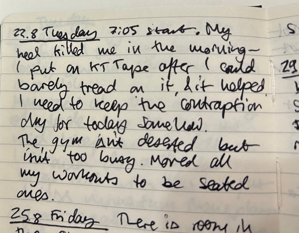
It’s a battered Moleskine pocket hardcover lined notebook, a limited edition Mickey Mouse one from years ago. There was a series gash in the spine, so I fixed it with some gaffer tape. I use a Zebra G-450 gel ink pen, and it lays down a bold, 0.7 black line.
I don’t use this notebook during every gym session, but when I’m trying out new things, when I’ve got a lot on my mind, or when I’m trying to solve a specific problem I take it with me. I don’t write details about my workout (rep numbers, weights, etc) as I have an app for that.
So what do I write in this notebook?
How things felt during the workout, particularly when I’m trying something new or if I’m recovering from an injury.
Notes on other gym goers bad behavior. I don’t want to confront them, but I do get frustrated when people don’t return weights, don’t use a towel or wipe down the equipment, and hoard equipment during the gym rush hour. Writing it down allows me to let off steam and focus on more productive things (like my workout, or returning equipment that I know is no longer in use back to its place, or on anything else).
Ideas or projects that I’m brainstorming at the moment. I oftentimes use a workout to think about something I’m considering or something I’m stuck on. I jot a few notes in between sets to not forget the ideas I came up with during that time.
Things I want to journal about later, in my “regular” journal. These are usually things that I forgot to journal about and want to get back to later in the day, when I have time to sit down and better process them.
The main point of this journal is to get me as much as possible off my phone. It’s tempting to check the news for the umpteenth time, or doom scroll various feeds, or play mindless games while you wait between sets. My goal is to bring these habits down to a minimum, and this journal is a useful tool in the search for less screen time.
Sample entry from last year. I write with gym gloves on, hence the atrocious handwriting.
I originally thought that it would be embarrassing to use a notebook in the gym, but I decided that “so what, who cares” is the attitude to take in this case. People do much more embarrassing things at the gym and nobody comments on it. I use an inconspicuous notebook that isn’t at all precious, and a hardy, inexpensive, inconspicuous gel ink pen to go with it. Both have survived falls and encounters with misplaced weights, so they are gym hardened, Don’t bring large, colourful notebooks with you, and don’t bring pens that look expensive or draw attention to themselves. You’re going for the “boring, not worth paying attention to” look here.
Would you consider taking a pen and notebook with you to the gym? If you already do, how do you use your gym notebook?
Just as I wrote a post about Moleskine no longer making store exclusive limited edition notebooks, my brother went to Paris (during the Olympics) and found not one but two store exclusive limited edition notebooks. Moleskine have officially cooperated with the Paris 2024 Olympic games and they have outdone themselves.
The first notebook is a large lined hardcover notebook that could be purchased standalone, or as part of a set that included three Olympics themed charms (in the colour of the medals) and a pen. The box was sold out, as were the charms (and yet it was still on display in the store window, because reasons). The notebook was still available and it is glorious, a perfect example of Moleskine’s design prowess.
This is the notebook still in the wrapper:
Wrapped notebook from the front
The front facing part of the wrapper has a discreet Paris 2024 logo sticker on the right side. The back part of the wrapper is anything but discreet. There are games logos, games sponsors, multiple designations of the officialness of the notebook, as well as pictures of the notebook cover and the lined interior with its bookmarks (more on them later). It’s busy back here:
Wrapped notebook from the back.
Removing the wrapper reveals the notebook itself. The Olympic logo is given its pride of place, and the rest of the cover is given over to a celebration of the Paris 2024 font. The only colours here come from the foiled gold of the flame and the Olympic rings. It’s a classic and sleek design:
Front cover unwrapped.
I expected the back cover to just be more of the Paris 2024 font in black on white. Instead there’s a set of letters that are gold foiled, and I really like the effect. It’s chic, classy and very well thought out. The Moleskine logo is there, but it doesn’t call attention to itself, and the black rubber band almost disappears from view:
Back cover unwrapped
Inside the front endpapers have the usual in case of loss section, the Paris 2024 logo prominently displayed, the Moleskine logo, small and discreet, and a letter in French:
The front enpapers
Here’s the letter, from Tony Estanguet, the head of the organizing comittee for Paris 2024 and an Olympic champion. Note that it, unlike the “In Case of Loss” part uses the Paris 2024 font. It’s written in French and is a celebration of the Paris 2024 games and their uniqueness (first opening ceremony not in the stadium, first games with gender parity, first games with Breaking, 100 years since the previous Paris games, first event open to participation by the general public – Marathon for All). It ends with a celebration of the notebook in your hand, which is a nice touch.
Close up on the letter.
The back endpapers have logos of the various Olympic events. As usual, these are well placed and the back pocket and the endpaper prints match perfectly. It’s the little details that matter in these notebooks, and Moleskine always nails them.
Back endpaper
Inside the back pocket are some Olympic themed treats: four sticker sheets, and a folded map of the event locations.
Stickers and folded map
The stickers feature the Phryges, the Olympic mascots for the 2024 games, participating in various sports:
First two sticker sheetsSecond two sticker sheets
Then there’s a stylized map of the various events locations in Paris, France and Tahiti:
The map.
Finally, inside the notebook are not one, not two, but three ribbon bookmarks in the colour of the Olympic medals:
The bookmarks.
All in all this is an extremely well thought out design, one that takes pride in the games and cares about every little detail. It’s a worthwhile memento of the event, and it just shows what Moleskine can do in terms of localized special editions when they put their minds to it.
The second notebook is a soft cover cahier created for those who want a cheaper, more colourful and lightweight alternative commemorative notebook from the event. Here it is wrapped:
Wrapped front cover
Here’s the back cover. Again, lots of info here (the price was half that of the hardcover).
Wrapped back cover.
The front cover features a very colourful illustration of Phryges doing various game related things alongside iconic Paris monuments and symbols. There’s a lot of playfulness here, and it’s a delight to look at all the little details here:
Front cover.
The cover has a pleasant texture to it. The back cover has a Phryge in the back waving hello above the Moleskine logo in white:
Back cover
Moleskine clearly love the Paris 2024 font because it is once again the star in both front and back endpapers, this time with only the numerals in use:
Front endpaper
There’s a pocket in the back:
Back endpaper
The paper is blank, and it’s stitched using blue thread – very fetching. It lies flat with little effort:
Paper and stitching
Here’s a writing sample on the paper (both notebooks feature the same standard Moleskine paper – 70/gsm ivory coloured acid-free paper:
Writing sample
Close up on the writing. Fountain pens show the same strange mottled pattern that they do in this kind of paper, and wider, juicier fountain pens will spread:
Closeup on the writing sampleCloseup on the writing sample
There is see through and bleeding with the fountain pens and the rollerballs. This paper works best with gel ink pens, ballpoint pens, fineliners and pencils:
Back of the page
All in all these notebooks are well worth their price in my opinion. They are well designed, provide a lovely memento of the Paris 2024 games, and they are unique to the Paris Moleskine stores. I only wish that Moleskine would create more of these for their stores. They were clearly a success in Paris, for good reasons.
What do you think about these notebooks? Would you purchase one or both of them?
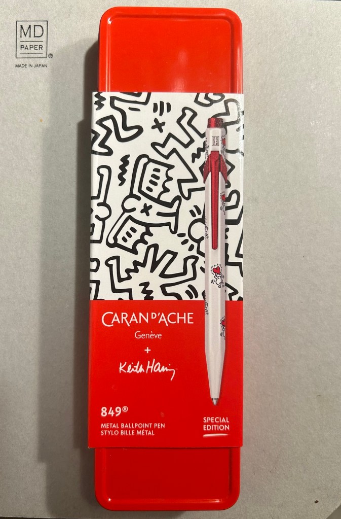
The Caran d’Ache 849 ballpoint is a classic which I have already reviewed in the past. While I rarely use ballpoints, I have several of these pens (all with gel refills that I have swapped instead of the Caran d’Ache Goliath ballpoint ones). Why? Because of their excellent limited edition designs.
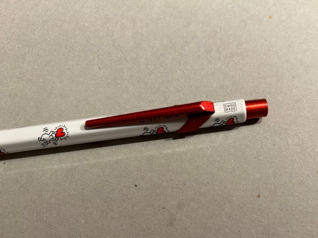
While I was in London in April I picked up two new limited edition 849s – The Keith Haring edition in red and white, and the latest 849 Nespresso collaboration.
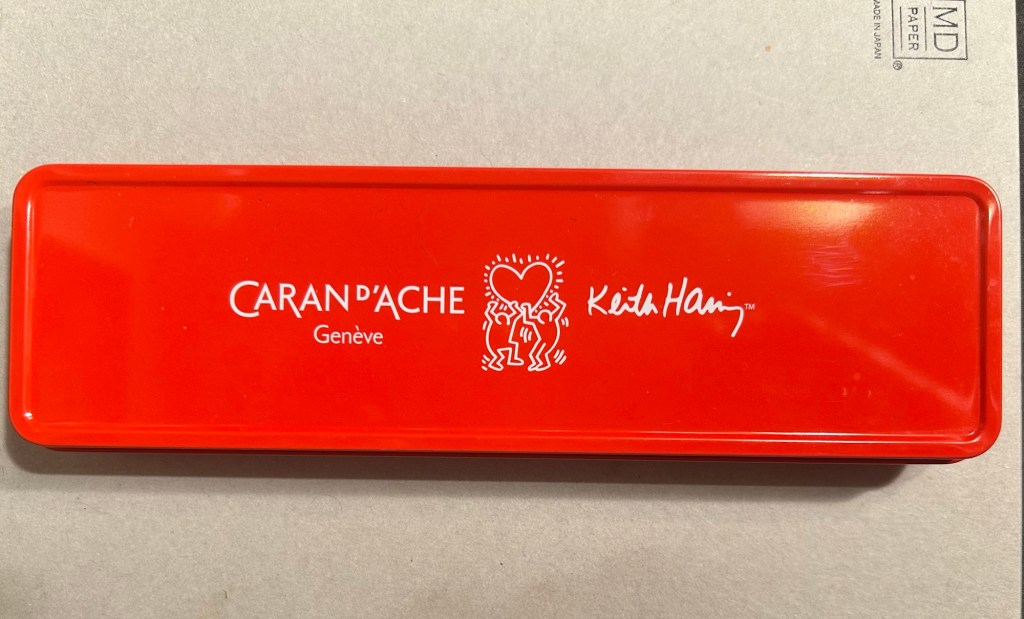
The box
The Keith Haring edition comes in black and in red and white. I think that the red and white edition is nicer, and it appears that so do other 849 fans: the black edition is still widely available but most places have long sold out of the red and white edition.
The box is very nice, and makes for a nice gift pack.
Outer box
Inside the box you also get to see some of Haring’s work.
Inside the box
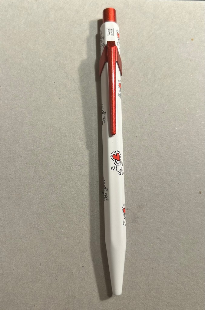
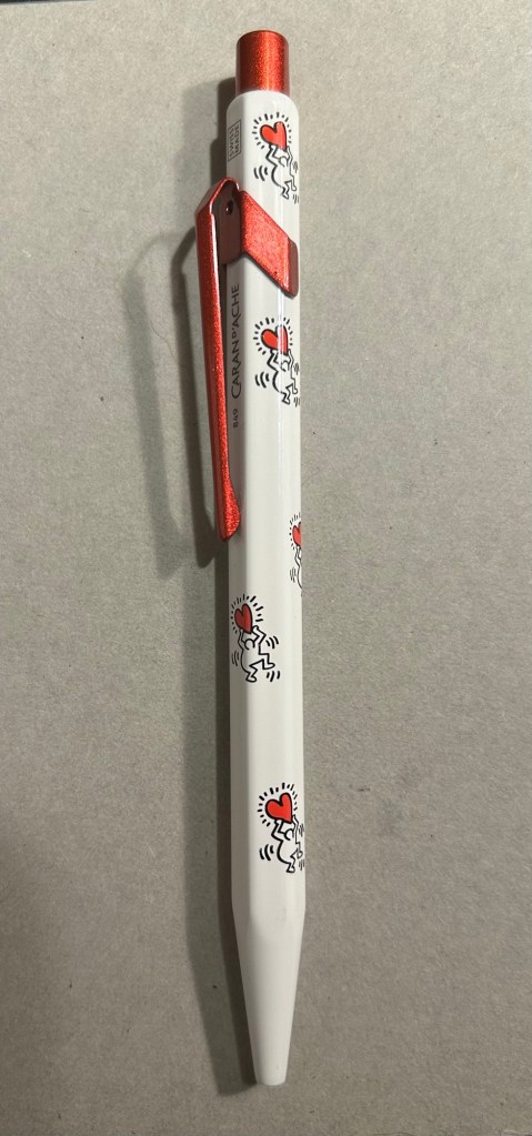
The pen itself is white, with a sparkly red knock and clip. The paint on these feels like lacquer, and the look is sleek and bold. There are dancing people holding red hearts all over the pen (so you get some Keith Haring artwork, but it’s not overcrowding the pen), and the pen body’s finish is the standard 849 glossy finish.
The Keith Haring 849
The knock and clip are probably the most striking thing about this pen. Surprisingly Caran d’Ache didn’t put any Haring branding on the pen, not even hidden with their branding under the clip.
You can see the branding on top.
The paint on the clip and knock look like someone poured them out of red glitter paint, and then waited until they set. All in all the result, together with the Keith Haring artwork and the included box, is one of the best 849 gift pens I have seen.
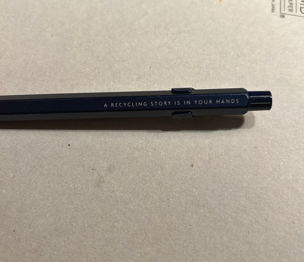
The Caran d’Ache Nespresso Kazaar edition, the 6th Caran d’Ache and Nespresso shared edition, is a bit different than previous editions. Unlike previous editions that featured a silver clip and knock, the Kazaar edition is monochrome. The dark blue pen has a clip and knock in matching colours, and the result is much better than previous pens in this series.
The Kazaar 849
As usual the pen is made at least in part from aluminium from Nespresso Capsules. The pen body has a bit of a matte texture to it, which makes it slightly easier to grip. It comes by default with the excellent Goliath refill, this time in black (the Keith Haring 849 also came with a black Goliath refill).
The pen touts its recycled origins.
The 849 Nespresso came in the same sort of recycled cardboard box that previouseditionscame in. It makes for a good gift pen, even though some may find the dark navy blue colour a bit… boring.
Swiss made. The colour matching on the knock, clip and pen body is superb.
If you like the idea of the 849 Nespresso but don’t much like the colour of the Kazaar one, I’d recommend waiting for the next edition. I have a feeling that it too will feature monochrome hardware, and it might be in a brighter colour as Nespresso are starting to run out of drab capsule colours.
The Goliath refill in action
Note to those who prefer gel ink refills and plan to swap the 849 refill out: the tolerances on these 849 pens are a bit weird. There are 849’s in which you can easily swap the refill for any Parker style refill with no issue, and those in which if you swap the refill you find that the knock won’t properly engage it. This is something worth taking into account if you plan on swapping the refill in the pen – there’s a risk that it won’t work with the specific pen you own. I’d recommend in this case to try swapping the refill before you purchase the pen if possible, or resign yourself to using a ballpoint. The Caran d’Ache Goliath refills are several cuts above what you get in a standard, disposable ballpoint, so the loss shouldn’t be too great.
What about you? Do you like the 849? Do you swap its refill?
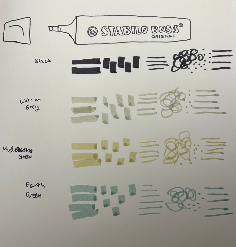
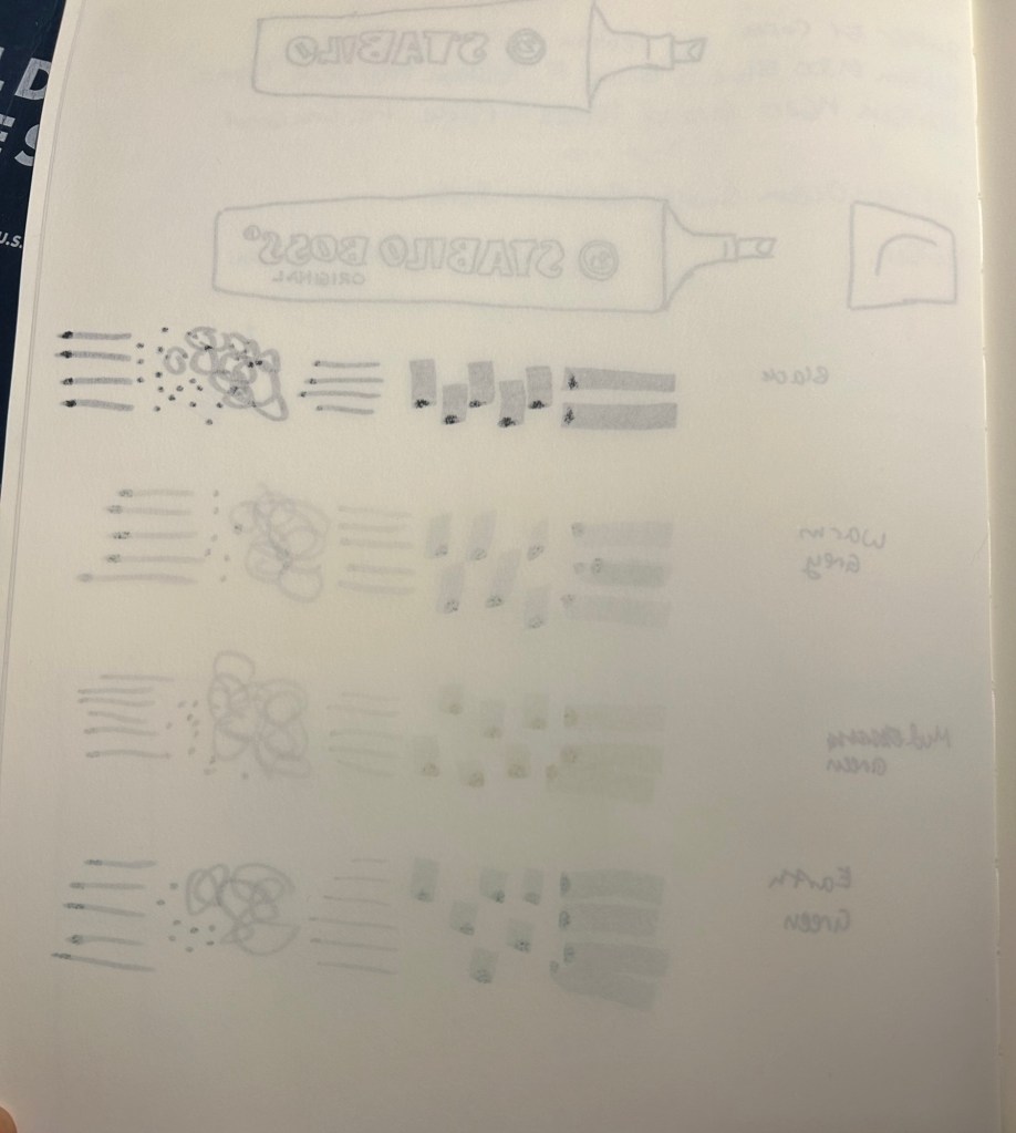
Stabilo make THE highlighters – Stabilo Boss – chunky, reliable, classic. Over the years they’ve added pastel colours to their original neon coloured highlighters, and just recently they’ve expanded their pastel highlighter lineup to include the NatureCOLORS. The NatureCOLORS lineup can be bought separately, or in a wallet of all 6 new colours, or a wallet of 8 that includes two black “marker” pen. The 6 new colours are Warm Grey, Earth Green, Mud Green, Beige, Umber and Sienna. The black “marker” is just an opaque black “highlighter”.
From top to bottom, black marker, warm grey, mud green, earth green.
I first saw these in a bookstore in Paris, and while I hardly ever use highlighters, the black marker and the natural tone of the other highlighters made me buy four of them to try out while sketching. As usual with Stabilo, there’s no indication on the pen body what colour it is beyond the colour of the pen body and a number that you have to look up on their site.
Testing the pens out
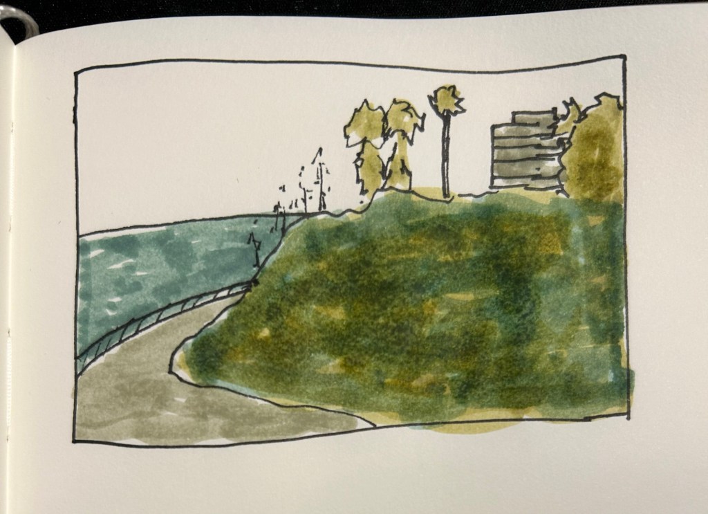
I used these pens for quick landscape thumbnails and sketches, and they work pretty well with a few caveats:
They bleed through everything but the thickest paper.
They spread on almost every paper.
They aren’t archival (so they will fade and discolour with time)
They are chunky, which means they aren’t the most portable of pens (even though they’re light)
They can be awkward to hold and manipulate at times.
Bleedthrough
They’re also not at all built for layering and mixing, which means that trying to create layers with them will just leave you with a soggy paper mess:
They don’t layer well, as evidenced by the grassy hill in this sketch.
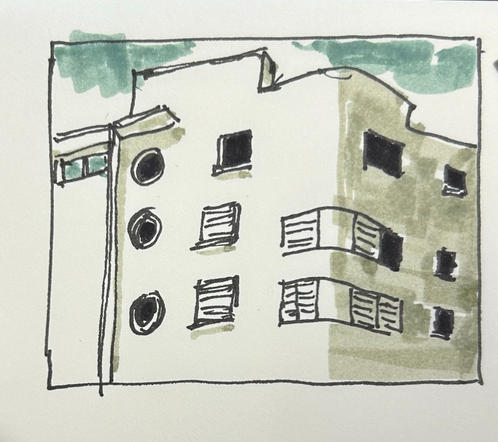
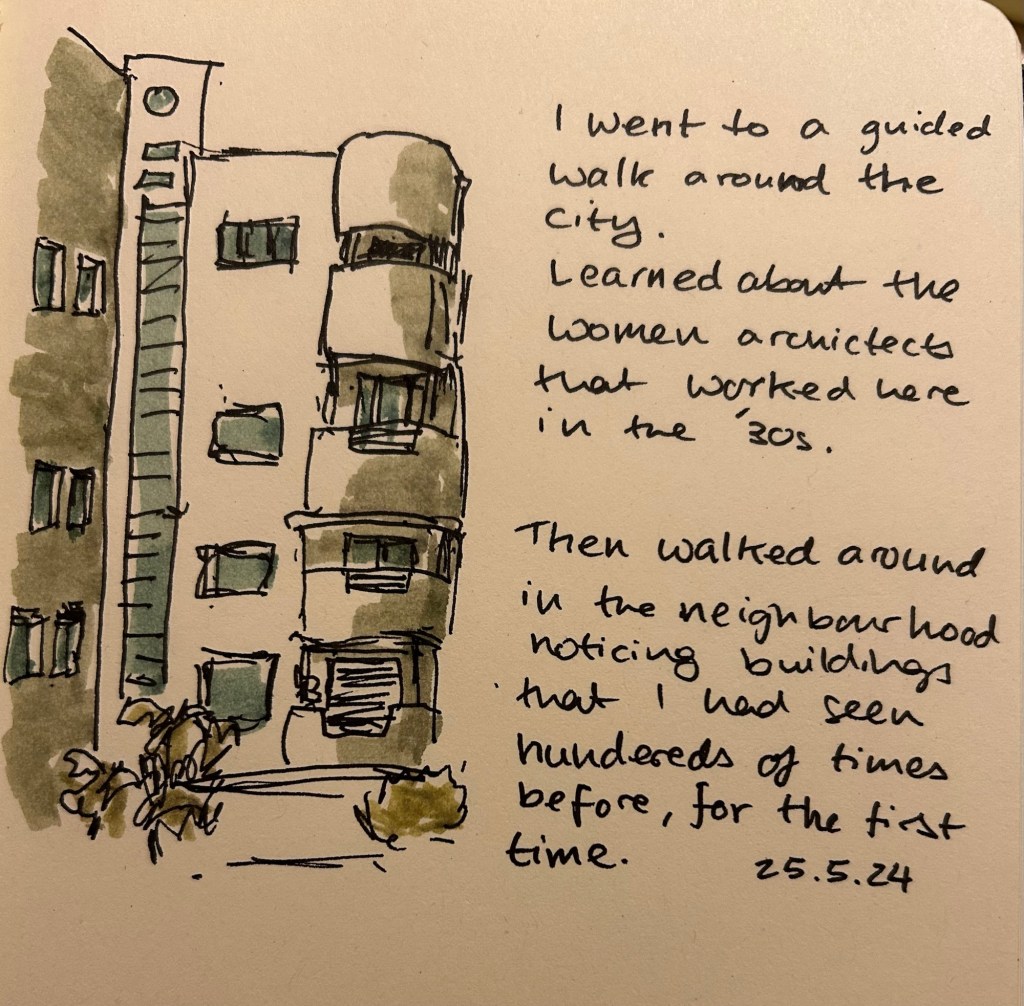
So what are they good for? They work well for quick impression sketches, particularly of buildings, where you can get shading and shadows down very quickly. I used them on an architecture walk to get an impression of the buildings and they worked very well.
What they’re good at – blocking the windows, shading the building, impression of a cloudy sky.
It’s difficult to be accurate with them, but in these sort of sketches I’m not looking for accuracy, just of an impression, a quick note of what I saw and what caught my eye. A photo is great, but it doesn’t highlight what made me stop and take a second look at a building.
They even work decently well on cream coloured paper.
Yes, copic markers could do the job, but they cost much, much more than a Stabilo Boss marker, they aren’t as readily available, and they dry out very quickly. Sometimes you need a cheap workhorse to get the job done, and for this new use I think the Stabilo Boss NatureCOLORS work just fine.
I have recently purchased the Rohrer and Klingner limited edition Ebony iron gall ink, and I’ve filled one of my Lamy Safaris with it. While iron gall fountain pen ink can be corrosive to pens, and it does change colour over time, it does have a pretty nifty trait: it’s waterproof when dry.
So I made this quick sketch with my Lamy Safari extra fine nibbed fountain pen on a Cass Art recycled paper sketchbook:
And then I added some watercolour to the sketches (note that although this isn’t watercolour paper, the paper in this sketchbook does take light watercolour washes):
As expected, it worked pretty well. Note two things about the combination of iron gall ink and watercolour:
1. The ink must be dry before applying the watercolour.
2. As the water causes the paper fibers to expand, your ink lines may “spread” or display soft edges if you apply watercolour over them. You can see this in both sketches. Different paper will lead to different results, of course.
This was a fun little experiment, and a great way to test out this ink a bit more.
Full sketching kit.
Have you ever used iron gall ink with watercolour in your sketches?
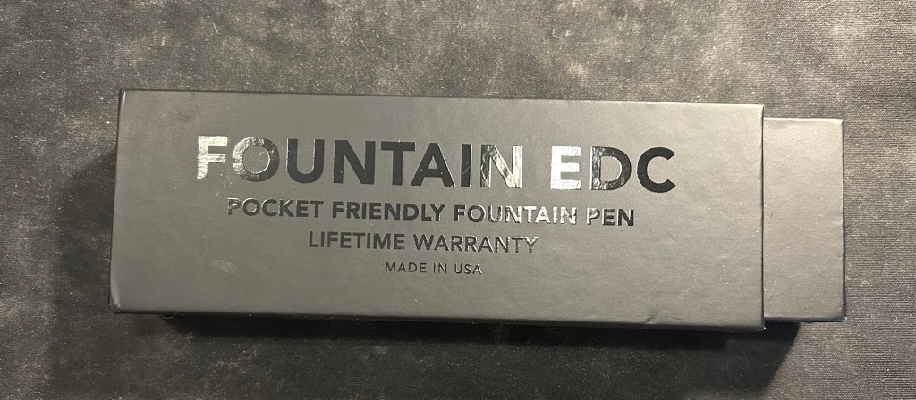
When they originally came out with the Fountain EDC, their first fountain pen offering, I decided to not purchase it. I don’t generally like metal fountain pens, and I rarely use pocket fountain pens because of the hassle of posting them every time you write.
Fountain EDC box
So how did I end up with a Fountain EDC?
I backed their kickstarter of course. Big Idea Design launch all of their products via kickstarter, and this one was no different: a kickstarter for an Ultem Fountain EDC made in the USA in their new machine shop there.
You got a sticker and a little badge if you backed the project. Very cool.
The ultem rage swept through the fountain pen community in recent years (? it could be months, time is meaningless to me since cancer and COVID), and left me cold. I found the material ugly, and the fact that it was touted as extra light and durable didn’t make it more attractive to me. It’s basically a plastic that’s available in black or a singularly ugly orangey-yellow, with certain chemical properties that aren’t very applicable to fountain pens (are you steaming your fountain pens or boiling them regularly? If so, ultem might be for you but fountain pens are clearly not). I’m being cynical, I know, but there’s a twist, I promise. It all works out in the end.
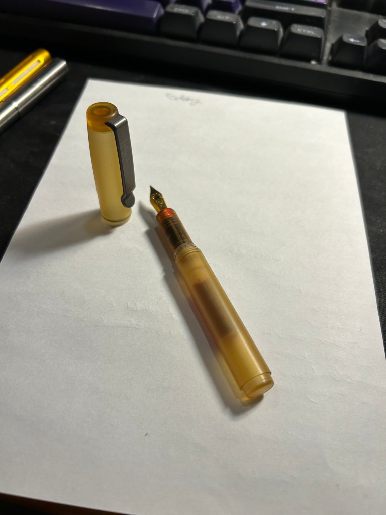
Tiny, light and ugly – the Ultem Fountain EDC
Big Idea Design generally work with titanium, so seeing them use another material was intriguing. It was also a material that is perfect for an EDC type of pen, as it’s both light and durable. The yellowish colour also works well with the matte grey of the titanium hardware that they selected for this pen, and unlike other ultem pens, the price of this one was reasonable. So I decided to try the ugly plastic and see what all the fuss was about.
Ultem Fountain EDC in all of its… glory?
So I backed the kickstarter and the pen arrived very quickly (Big Idea Design kickstarters work like that. They deliver on time, and fast). The box was the usual great Big Idea Design box that they’ve been using in recent years, and it came with a sticker and a tiny velcro rubber patch – very cool.
I was stunned by weight of the pen.
It’s a pocket pen, so it’s bound to be light, and I knew that ultem is supposed to be light, but it’s jarring how light it is. The ultem had a nice, matte finish, the ugly yellow did work well with the brushed titanium clip, but the entire weight of the pen is basically in that clip and the (Kaweco) nib.
The pen, posted as it is when you write with it.
This pen has to be used posted, it’s just too short to use it unposted, much like the Kaweco Sport. There’s a step in the back and an o-ring on the cap that make posting supposedly more secure, but you need to make sure you’re applying enough pressure when posting or the cap will go flying off. On the plus side, the cap is made of ultem so it will likely be unscathed, but it really isn’t the most convenient experience.
The Fountain EDC capped
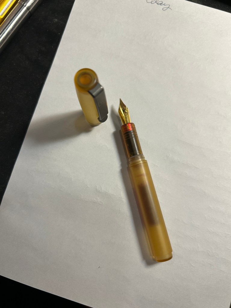
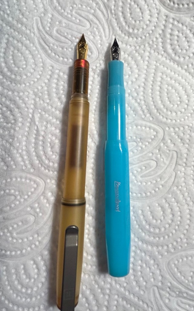
In terms of size it’s about the size of a Kaweco Sport, just a smidge longer, when capped:
Fountain EDC on the left and Kaweco Sport on the right
However, things are different when the pens are posted: the Fountain EDC is significantly longer than the Kaweco Sport. It would be much more comfortable for long writing sessions than the Kaweco Sport if not for two flaws in the design: the cap posting, and the ink flow.
I mentioned the cap becoming easily unposted before, but it’s worth mentioning again. The design of the pen is such that you really need to push the cap on to pen body and check that the o-ring is engaged, otherwise the slightest jarring will pop the cap off.
The second flaw is the most major one with this pen, and it’s a big enough deal that it makes me not recommend this pen until Big Idea Design solve it. The pen has a very, very hard time starting. It’s not related to the cartridges you choose to use, but rather to the design of the nipple that connects to the cartridge. Enough Kickstarter backers had this issue for Big Idea Design to post a YouTube video addressing it. They say that it’s the coating they put on that nipple, and that taking a pin and scraping that coating off should help. Well, I did the procedure more than once with various tools and it helped a bit, but the pen still requires literal shaking every paragraph or so to get the ink flowing again after it dries out.
Fountain EDC drying out sample
As this is the only fountain pen I used as I was travelling for three weeks, this was very frustrating. I love the feel of the pen, but the ink flow issue, the cap issue, and the weird balance with the ultra-light ultem material that makes this pen very back-weighted when posted makes this not a product that I would recommend.
The back-weighting and the cap posting issue should have been taken into account during the design process. The flow issue should have definitely been caught during production, especially as it’s a made in the USA pen (i.e. local to the Big Idea Design people, in a shop owned and operated by them).
So bottom line:
I really wanted to recommend the Fountain EDC but I really don’t. The pen needs to be redesigned to have better flow, better balance and better capping.
Ultem itself is as ugly as I thought it would be, but it’s a lightweight and durable material with a nice feel to it, so I get the hype a bit better now.
Product design is difficult, even for experienced designers.
With One Week 100 People I’ve been using my fountain pens much more to sketch with, and I fell in love with them again as sketching tools. There’s something about the expressiveness of the line that they bring in that reminds me of pencil more than of fineliner pens when it comes to sketching – a combination of their varying line width and the varying ink shade.
I’ve also purchased more fountain pens than I planned, buying two Franklin Christoph pens from the pen models that they’re retiring: A model 46 in Polar Ice with an extra fine nib and a pocket 66 Italian Ice with a flex extra fine nib. These two join the Leonardo Momento Zero Grande 2.0 Galattica that I purchased from Pen Chalet last month, and the Leonardo Momento Zero Nuvola rose gold that finally arrived this month after I purchased it from Fontoplumo and it was stolen during transit. Fontoplumo were wonderful, and replaced the pen immediately, so I intend to purchase from them again.
I haven’t purchased so many new fountain pens since before the pandemic, but the Leonardo Nuvola was a gift to myself to celebrate two years from chemo, and the Galattica was a gift to myself for surviving a hellish month with my father in hospital. The Franklin Christophs were unexpected purchases made only because they were retiring these models and I was curious about these materials (I already have an Antique Glass model 66 and I love it).
Writing samplesThe pens
So far the biggest success in terms of nib has been the flex extra fine Franklin Christoph Pocket 66 Italian Ice. The nib has only a slight springiness to it, and I wouldn’t call it a flexible nib in the true sense of the word, but it works well for both sketching and writing. Diamine Earl Grey is one of my favourite inks (a bluish grey with tons of character that is legible even with very fine nibbed pens), so I didn’t hesitate filling an eyedropper pen with it. As eyedroppers have such a tremendous ink capacity, you always need to take into account just how much you love the ink you use in them.
The Leonardo Momento Zero Nuvola was a surprise in terms of the resin on the pen body (I was already familiar with LMZs fantastic fine flex nibs, and great pen and converter design). I was expecting a light blue pen with white “cloud” blotches and black outlines. In reality the black outlines are in a semi transparent brown resin, the white is more off-white/cream, and there’s real depth to the design. A very unusual resin that is both classic and unexpectedly unique.
Caran d’Ache discontinued their ultra-expensive and ultra-sought-after ink series “Colours of the Earth” in 2013 and I managed to get a bottle of the entire series besides Carbon right after they announced they wouldn’t be making them (I had bottles of Amazon, Safron and Sunset before they were discontinued because those were the ones that interested me the most). These inks are well over 10 years old and still fantastic, though the Amazon (the green ink) has darkened a bit and so lost some of its depth. The Caran d’Ache bottles are both gorgeous to look at and terribly designed.
Diamine Coral is the most optimistic of inks, a brightly bright coral ink that glows on the page and works best in generous nibs. I felt like a pick-me-up so I filled the Woodshed pen with it.
I made some interesting eexperiments with notebooks and tried a few new pencils, but this post is getting a little out of hand and so I’ll write about those in a separate post.
Did you use any interesting stationery last month?