Moleskine James Bond Titles Limited Edition

Moleskine recently came out with three James Bond themed limited edition notebooks, and after a bit of scrambling, two orders that were cancelled on me, and a bit of trouble with the post office I finally got them. To be honest, if I had that much trouble getting any other recent Moleskine limited edition, I would have probably given up already, but this one is special, for two reasons. The first and main one is my dad. He introduced me to James Bond, we watched all the movies together (some on TV, the later ones in the theatre), and it’s our “thing”. The second one is that I have a thing for maps, and once I saw the map on the endpaper, I knew I had to have them.

All three large notebooks are pretty great, but the Titles edition is probably the weakest among them. The front cover (and only the front cover) has a print of shiny black on the usual matt black of all the James Bond title logos. It’s so interesting seeing them together, with their various fonts and embellishments . It’s also hard to photograph because the gold 007 embossed on the cover of all three editions reflects so much light. Shiny!
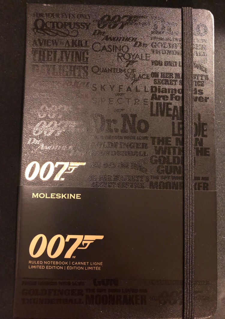
But there are two minuses here: one, the design doesn’t wrap around the notebook, it’s only on the front cover, and two, the titles only appear to be embossed, in reality they add no real texture to the notebook. This is such a shame because the other two notebooks in the series, the Carbon and the Box Set are so very tactile. It takes this notebook down several pegs, from the “great” to the “just OK”. It’s on par with the Star Wars Ships and Lightsaber Duel editions for me. Another very good edition that missed becoming excellent by so little that it becomes mediocre.
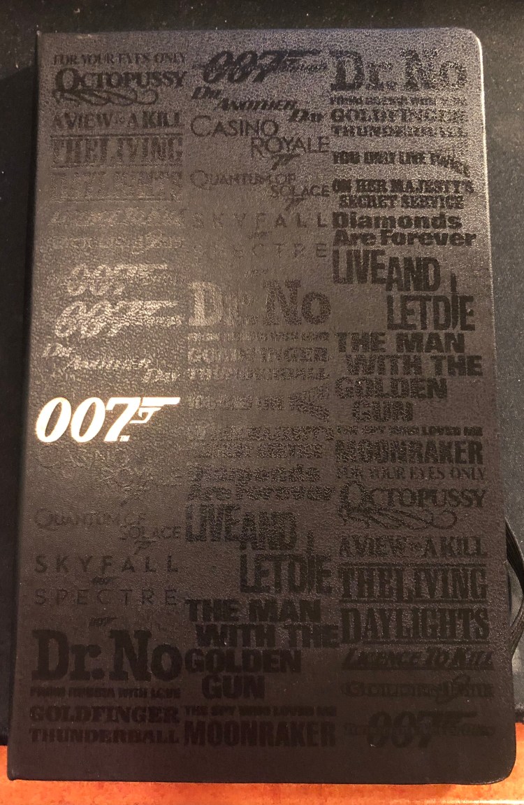
Everything else about this edition is stunning. I love the map, and the idea of having it there and tying it to globetrotter Bond through the B-side of the paper sleeve around the notebook (keep reading, I’ll explain it all later on). You could easily use a white pen to mark your own travels if you are planning to use this as a travel journal.
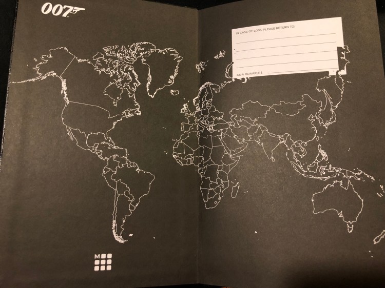
The back end paper is also great, with the titles cover design printed on it. Can you imagine now how much better this notebook would have looked like if it had this design on the spine and back cover too? Embrace the typeface, embrace the titles Moleskine!

They do get extra browny points for aligning the pocket with the type on the endcover. That is not something trivial to do, and it gives it all a nice touch.
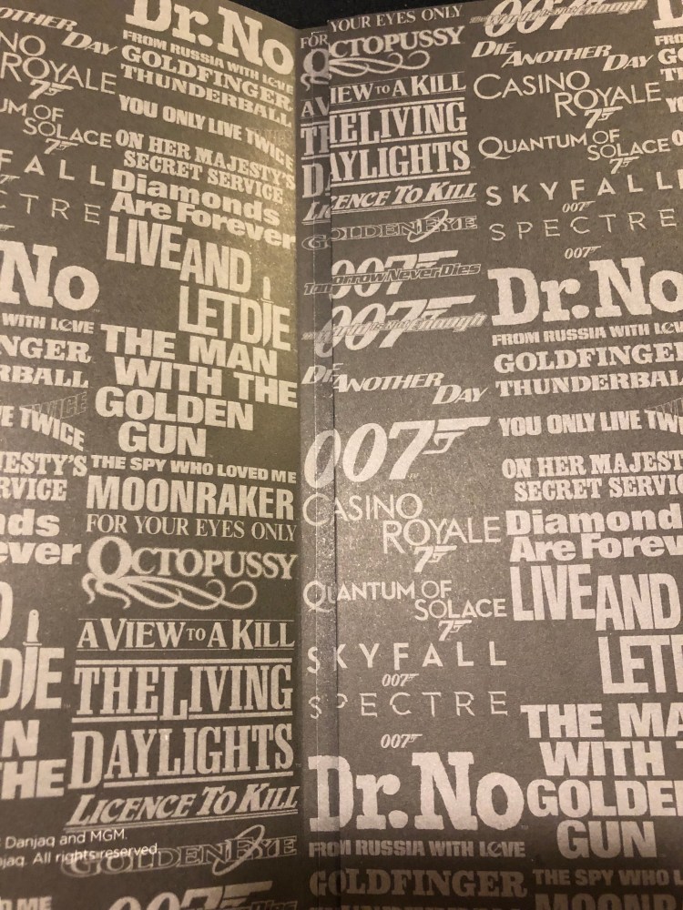
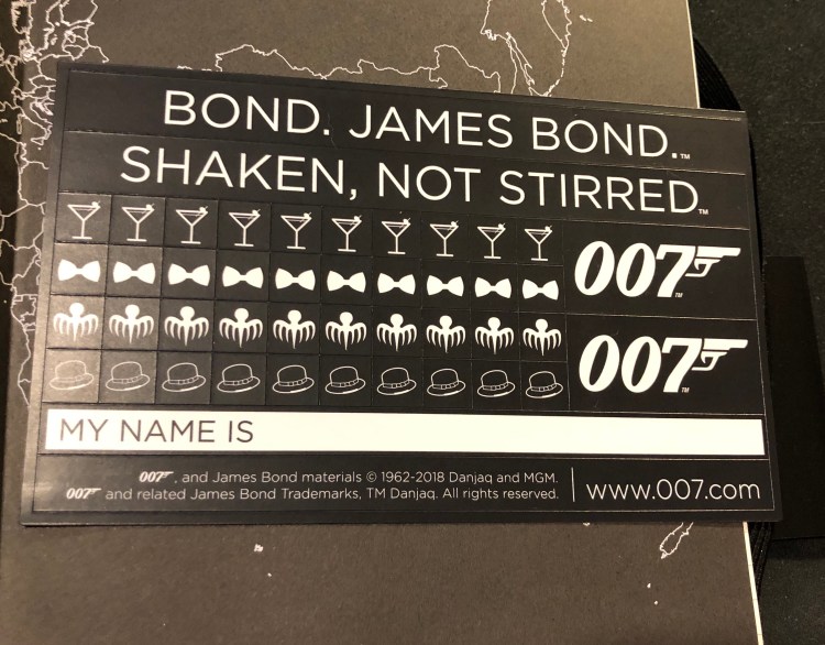
Like most Moleskine limited editions, this one comes with stickers which are pretty understated, and would probably come in handy if you’re planning to use this notebook as a personal or a travel journal.
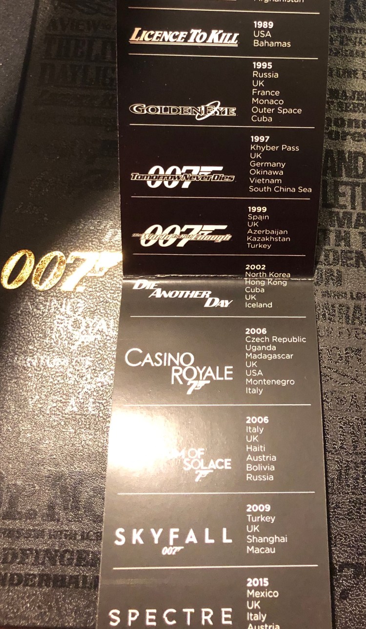
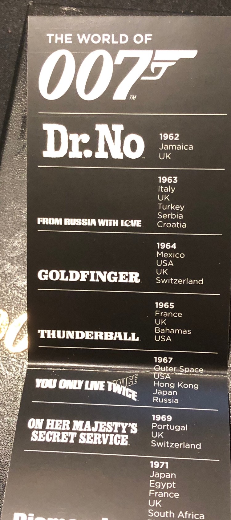
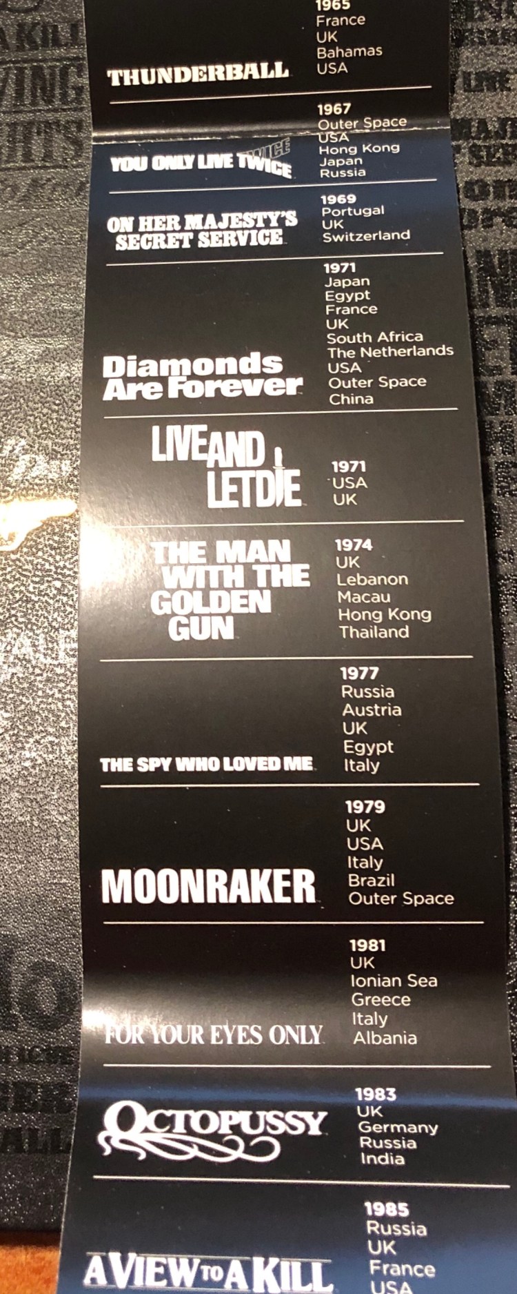
Remember the map on the front endcover? Well if you’re a huge James Bond fan, you can mark his travels on that map using the B-side of the sleeve. It has a list of James Bond film titles printed on it, with the date it came out on and the places the movie takes place in printed on it.
So, should you get this notebook?

If you’re a James Bond fan, then yes. If you’re looking for an interesting travel journal or a gift for a cool dad, then also yes. If you’re just looking for an alternative with a twist for your run-of-the-mill Moleskine large hardcover notebook, then I’d recommend the James Bond Carbon for a more understated but unique look, or one of the more colourful limited editions that Moleskine has issued lately.

Wait, what about the paper? It’s the same Moleskine fair of recent years. Expect significant ghosting and some bleed through to the other side of the page, no spreading but a little bit of spidering when using fountain pens, and a very smooth surface that may cause darker pencils to smear. It’s great for ballpoint, gel pens, highlighters (no spreading!), and certain kinds of fountain pen ink (Noodler’s black, Waterman Blue and Blue Black, and too many Diamine inks to list. Avoid J. Herbin and other watery inks like the plague) with medium or finer nibs. I don’t mind the ghosting (it’s the same as on Tomoe River Paper) and use both sides of the page, but that’s obviously up to you.
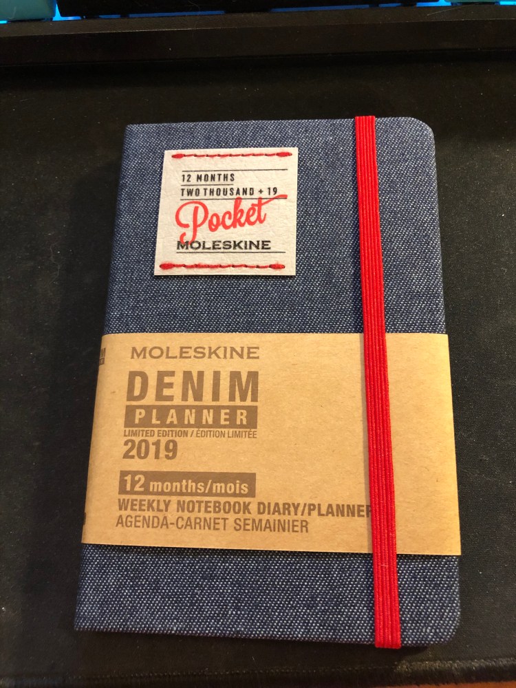
 

Moleskine Denim 12 Months 2019 Pocket Weekly Planner review

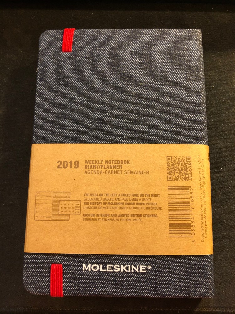
The Moleskine Denim 12 Months 2019 Pocket Weekly Planner arrived today, and it is a beauty.

I’m not a big planner user, but over the past year I’ve used a weekly planner just to get a better idea of how my week looks like and how to plan ahead accordingly. The slim, minimalist setup of the Moleskine Pocket Weekly planners is perfect for this.

Beyond the regular planner editions, Moleskine offers a wide variety of planners in their various limited edition designs (Harry Potter, Star Wars, Peanuts, Le Petit Prince and more), among them in their Denim collection, which is one of my favourites.

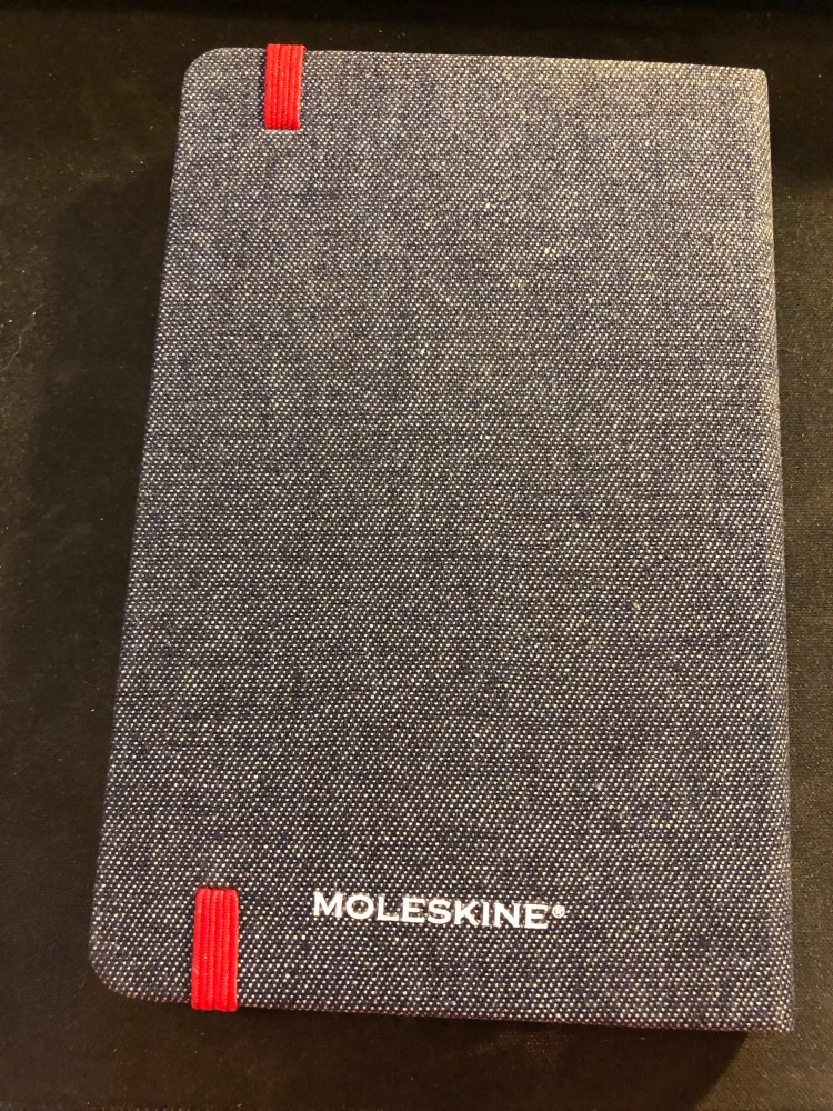
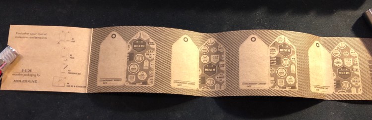
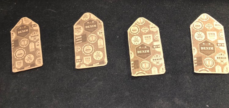
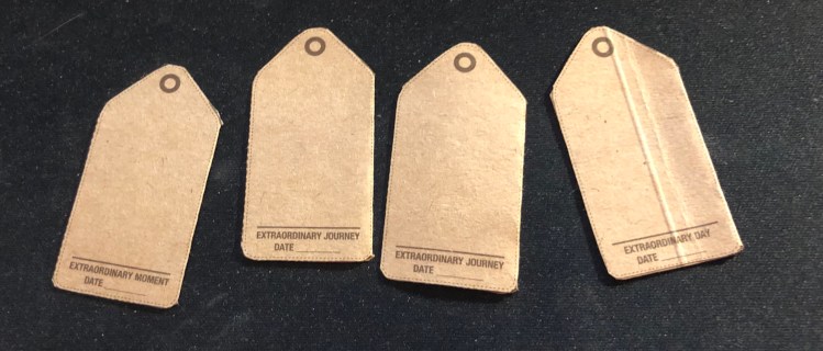
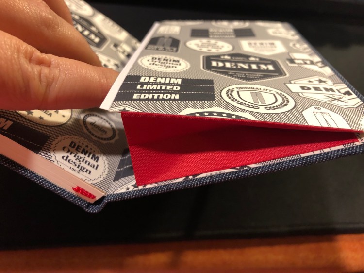
The covers are covered in Denim fabric, with jeans-like labels on them. The craft sleeve around the planner turns with a few minutes of work into bookmarks perfectly sized for the planner:

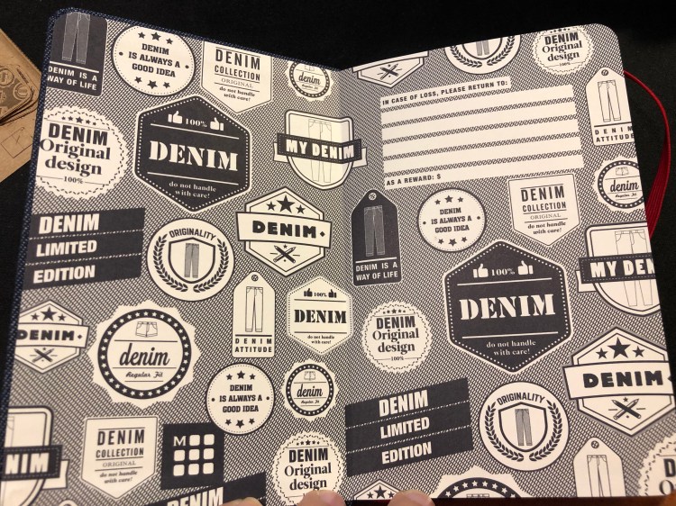
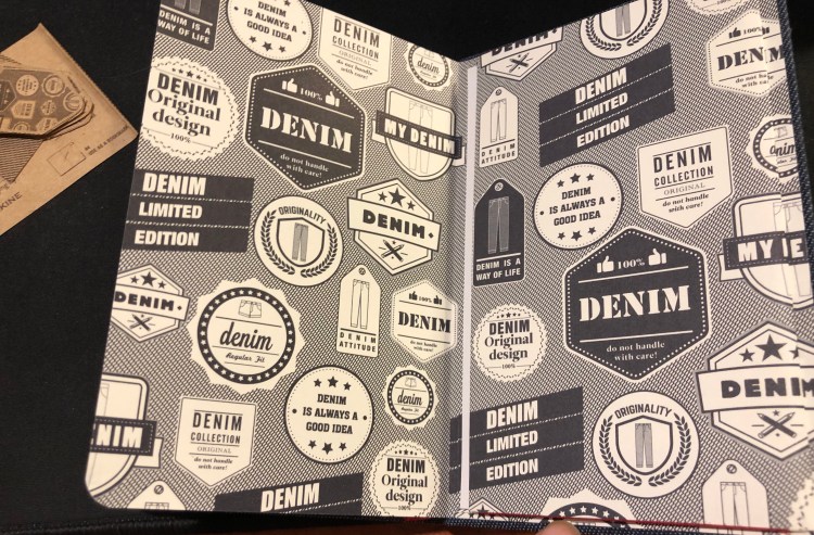
The endpapers are really nicely designed to evoke various denim labels, and the red elastic closure is echoed in the small back pocket:

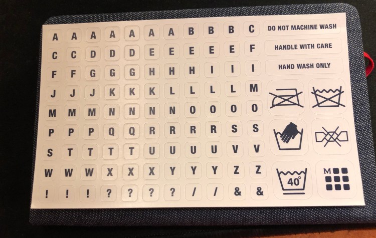
As usual with Moleskine limited editions, it comes with a little something extra in the back pocket, this time stickers:

As for the internals, it’s the same as other Moleskine weekly planners, with a weekly schedule on the left side of the spread and a ruler page on the right, monthly calendars and information pages at the beginning of the planner, and a few general planning pages.

If you’re looking for a pocket weekly planner that’s beautiful, lightweight and not overly structured, I highly recommend this planner.

Cat sleeping sketch

My brother’s cat sleeping. Staedtler pigment liner 0.3 on Moleskine pocket sketchbook.

Jaffa in the Sunshine

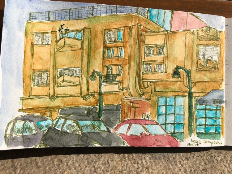
It looks like another year without winter here. I drew this during an Urban Sketchers sketch crawl, but since the sun was right in my face and it was blazing hot (31 degrees centigrade), I didn’t place the shadows properly.

Moleskine large watercolour notebook, Lamy Safari medium, Rohrer and Klingner Emma SketchINK, Schmincke watercolours.

#inktober Day 6: vintage drawing pins tin

I like old tins, and this one is one of my favourites, because of the sheer amount of fonts packed into such a tiny box.

Drawn with a Pilot dual tipped brush pen on a blank Moleskine Star Wars notebook and coloured with Caran d’Ache Pablo pencils.

Moleskine Looney Tunes Limited Edition Notebooks and a New Moleskine Two-Go

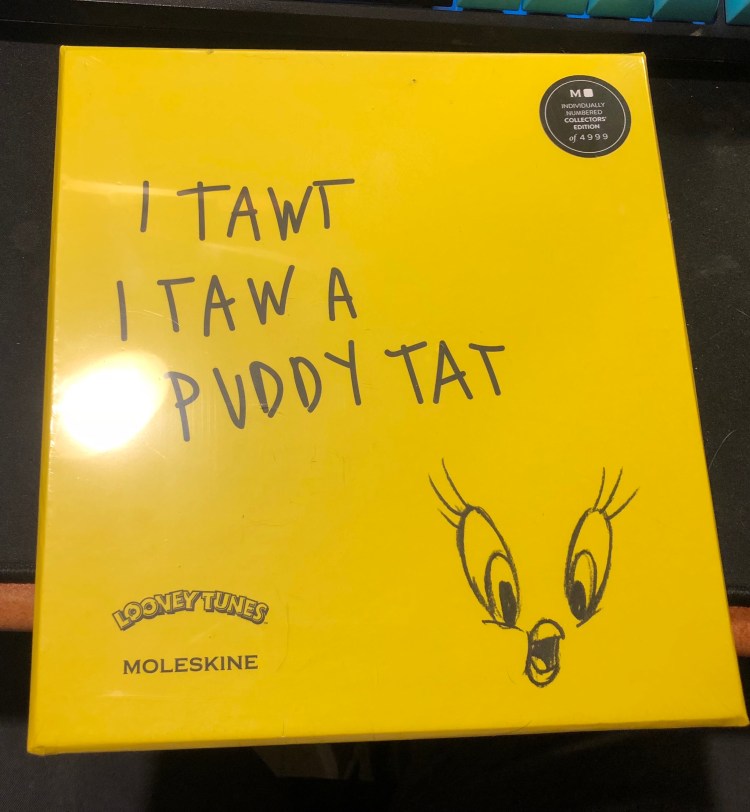
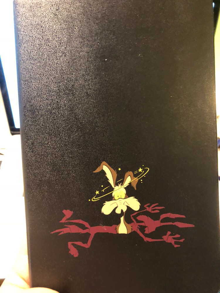
At almost the last minute of my trip to Paris I managed to sneak in a short visit to a Moleskine store, and was caught by surprise by their new Looney Tunes collection. I’m not a rabid Looney Tunes fan, but the Bugs and Wile E. Coyote were too well-designed to pass, and I’m curious enough about any limited edition that couples Tweety, drawing pencils and a sketchbook to give it a spin. These all obviously come with a Moleskine premium, but if you’re remotely into Looney Tunes, I’d recommend them.

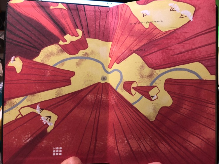
I’ve only opened the Wile E. Coyote notebook at the moment, though I have seen the others open in the shop and they are as tremendously well designed as the Wile E. Coyote one is. The endpapers are so colourful and a lot of fun, and they work with the cover design so well.

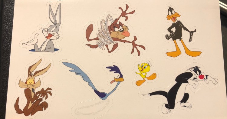
It comes with stickers of course:

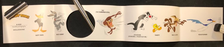
And a cute B-Side band:

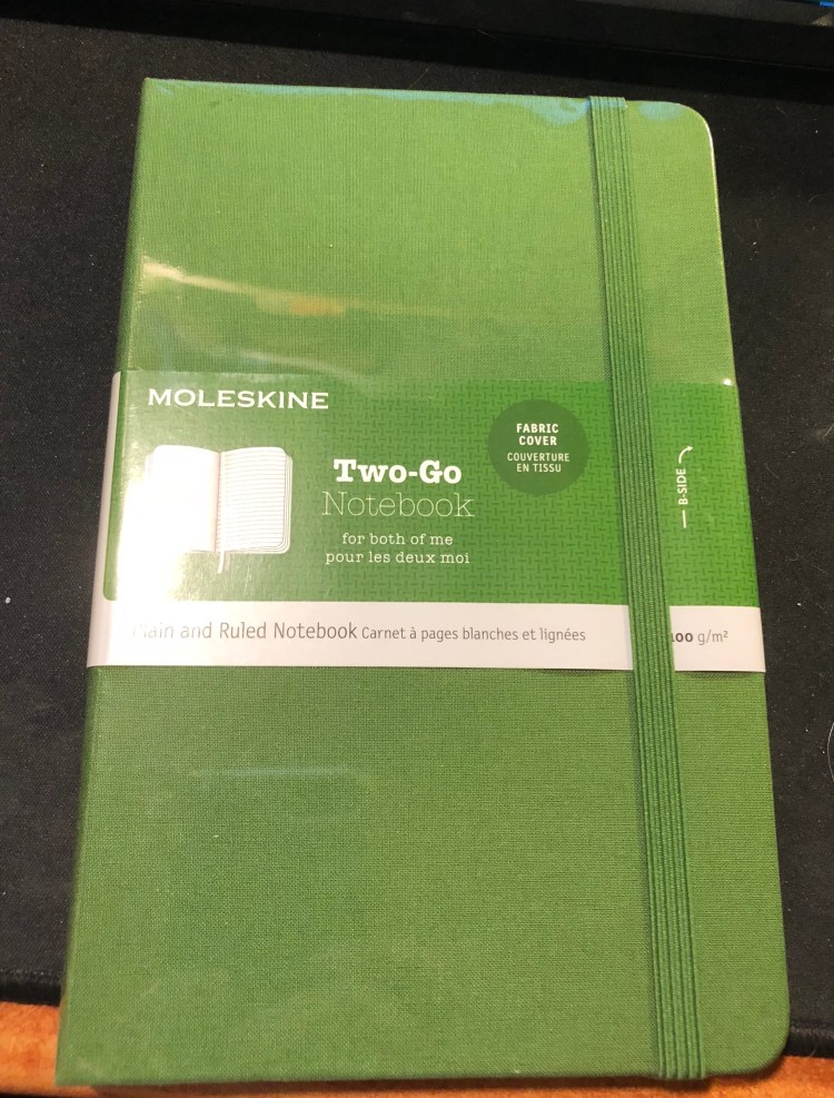
Another pleasant surprise was a new cover colour to the Moleskine Two-Go editions, green. The Two-Go notebooks have thicker paper than regular Moleskines, and they’re smaller than large Moleskines, with one side of the page blank and the other side ruled. I use them as my reading journals, and highly recommend them, especially if you were at all fond of the Arts notebooks of Field Notes’s “Arts and Sciences“.

The Embassy

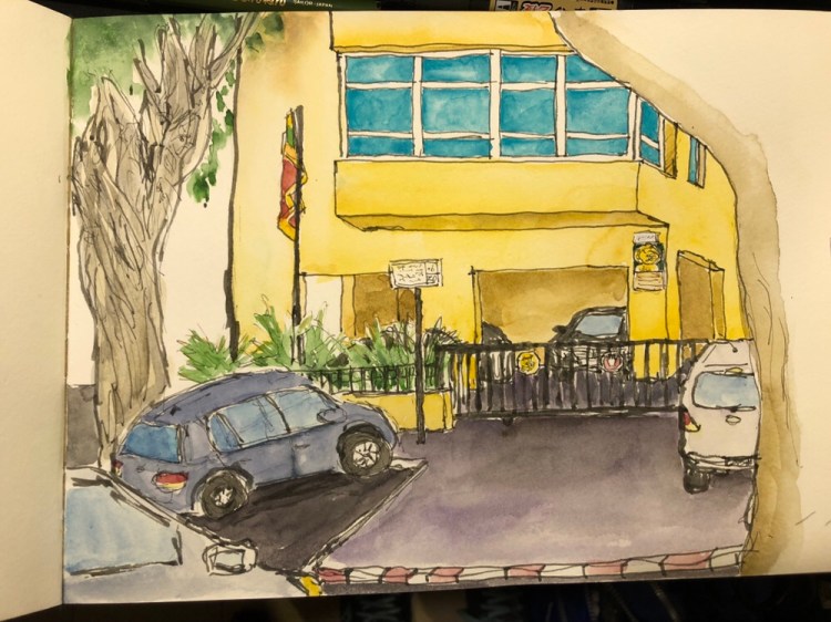
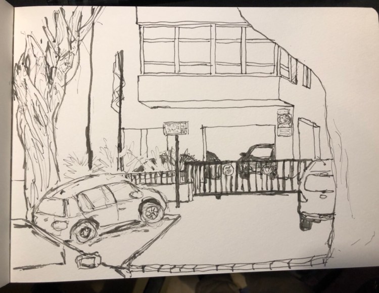
I went back and finished my sketch of the embassy today. I would have probably spent a little more time on it but I was eaten alive by mosquitoes, so I cut my sketching short. You can find the initial ink sketch here. As usual, I used Schminke watercolours.

Work in Progress: the Embassy

Lost daylight while I drew this, so I couldn’t complete it in time. Will go back to I add watercolour, hopefully soon.

Drawn on a Moleskine A4 watercolour notebook, with a Sailor Fude 55 degree nib fountain pen filled with Noodler’s Lexington grey. This is the first time I’ve used the Sailor Fude pen, and it is taking some getting used to. Depending on the angle you hold it, it either creates thick, brush-like lines, medium lines, or extra fine lines (when flipped over and used upside down).

A Glimpse into How I Journal

I like my journals to be filled with little sketches and bits and pieces that I collect here and there (labels, business cards, etc). It brings the entries to life, especially when I read through them later on.

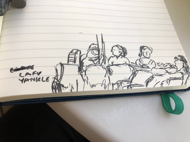
So for instance yesterday I created a 3 minute sketch of a group of ladies enjoying themselves at a local cafe:

And here’s today’s page, about to be filled with notes:

So if you go to lunch somewhere, remember to grab their business card so that you can stick it in your notebook later.