#Inktober day 2: Tranquility
Pelikan M620 Place de la Concorde medium nib, Pilot Iroshizuko Asa Gao ink and a waterbrush on Field Notes Signature sketchbook.

A blog about writing, sketching, running and other things
Pelikan M620 Place de la Concorde medium nib, Pilot Iroshizuko Asa Gao ink and a waterbrush on Field Notes Signature sketchbook.
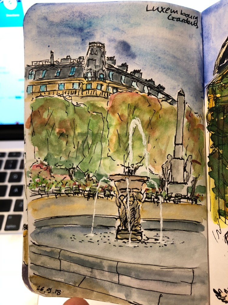
A quick sketch in Luxembourg Gardens, Paris on a Stillman and Birn pocket Alpha. Still learning how much water this paper can take, and that’s the first use of a Uniball Signo white pen for the water in the fountain. I’m very pleased with this little trick I learned in the Urban Sketchers Symposium in Porto.
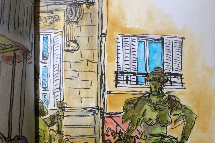
Made this quick sketch while waiting outside the Musee d’Orsay, and coloured it later with watercolours.
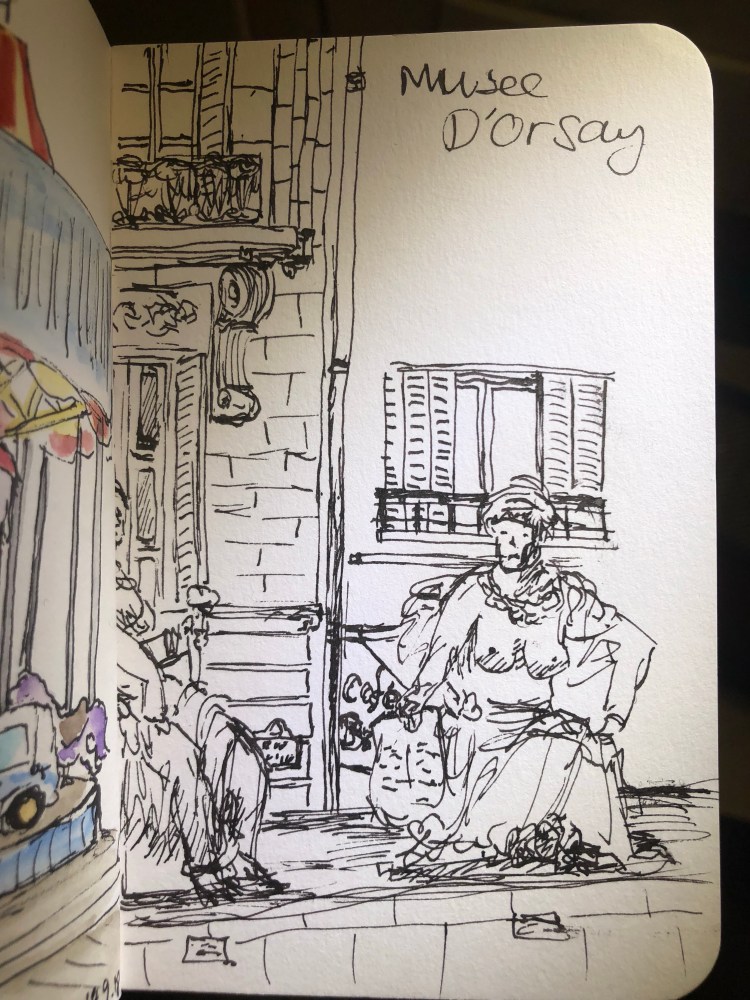
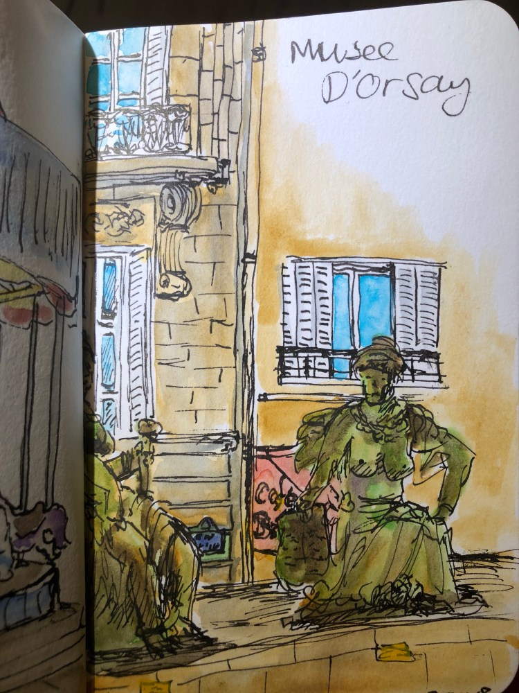
Stillman and Birn Alpha, Super5 0.7 fountain pen, Rohrer and Klingner Lotte SketchINK, Schmincke watercolours.
Though I’m a fan of the colour blue, I tend to shy away from blue inks, since they tend to be boring. That’s why I wouldn’t have splurged on a (pretty expensive) bottle of Pilot Iroshizuku Asa Gao myself – I got it as a gift with a pen purchase a few years ago.
Online pictures of this ink tend to give it a more purplish tint than it actually has. In reality it’s a slightly dark cobalt blue. It scanned a bit lighter than it looks like on the page:

Here it is in natural light, for a bit of reference (this is bit darker than it actually is):

This is the pen I used for this review, a medium nib Pelikan M620 Place de la Concorde:
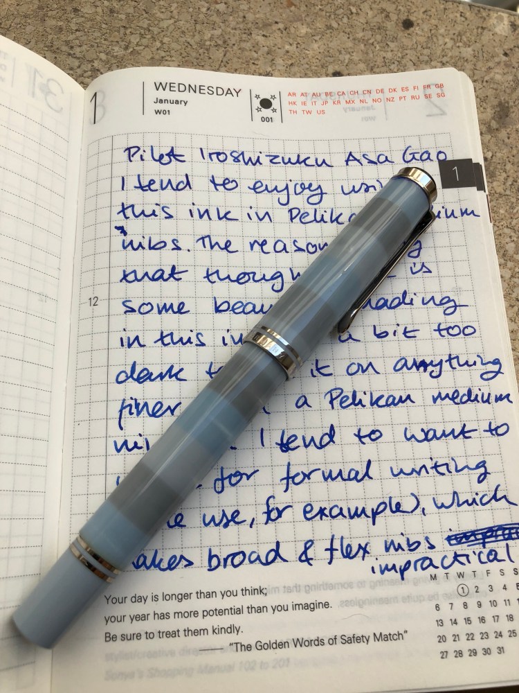
There’s some red sheen to it, but you’ll probably only see it on Tomoe River Paper, and then only if you look closely. The shading is a little less subtle, but not by much. You’ll see a bit of it using medium nibs and broader, again, particularly on Tomoe River Paper. It’s a “dirty little secret” ink – the kind that looks pedestrian to all but the knowledgable observer. A fun way to put a zing into office work, as it is totally appropriate for office writing.
As usual with Pilot Iroshizuku inks, the bottle and packaging is gorgeous, the ink is well behaved enough for vintage pens, and it cleans out pretty easily without staining. A good choice for a demonstrator pen, if you’re looking for something that will fly under the radar.
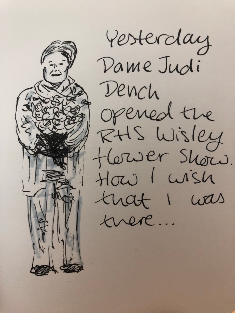
Field Notes signature sketch book, Super5 0.7 calligraphy nib, Rohrer & Klingner Lotte SketchINK.
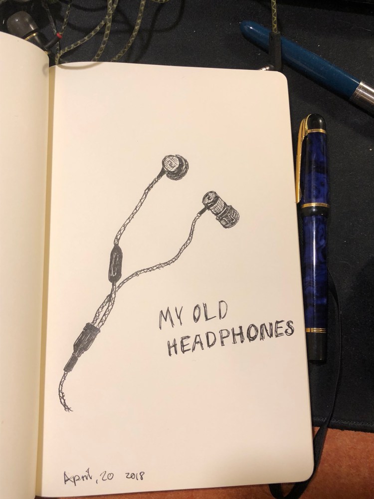
A quick sketch on a Moleskine Star Wars Limited Edition plain paper with a Waterman Phileas fountain pen (Extra Fine) filled with Colorverse Selectron pigment ink. I thought I’d test how Moleskine friendly the new Colorverse Selectron ink is (it is), while also creating a farewell sketch to my old headphones.
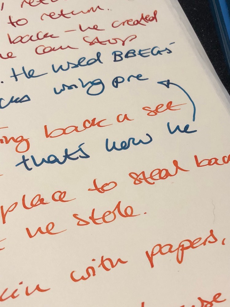
Just discovered a giant plot hole that I somehow missed on my second draft. Now back to pen and paper to try to figure it out. At least I can use pens and ink and paper that I love…
I just received a pack of the Field Notes Signature blank page edition and noticed that on the front of the band it said,”Sketch Book” right below the “Plain Paper”. I opened it up and saw that unlike my beloved Dime Novel edition, these notebooks had no page numbers (a plus for me) and their pages were white and not cream coloured. That made me decide to break them out for a very quick sketching opportunity, to see how well they faired.
The notebook doesn’t open flat, and it tends to want to close on itself, so I used a clip to keep it open when I was sketching. Ideally you’ll need two clips and maybe a backboard of some kind to use it comfortably. The paper, as is normal with sketching paper, doesn’t take washes too well. It’s relatively thin and it buckles pretty easily, so only the lightest of washes should be attempted with it.
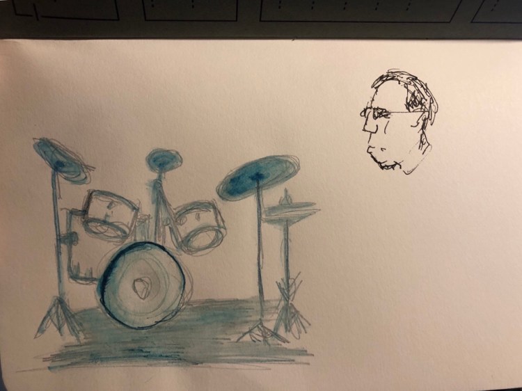
The drum set above was sketched with a Sanford No-Blot Pencil. You can see the paper buckling even though very little water was applied with a water brush.
The paper fared better with fine brush pens:
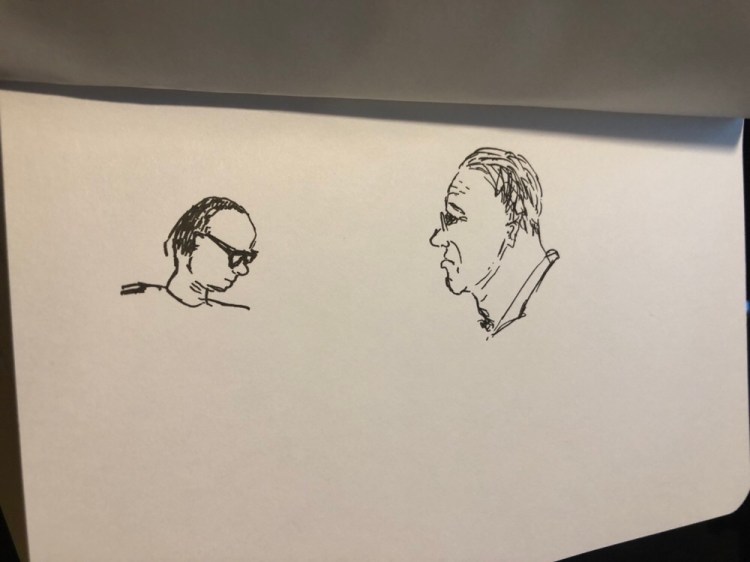
A tiny bit of spread when you lay down the ink too thickly: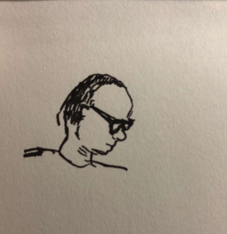
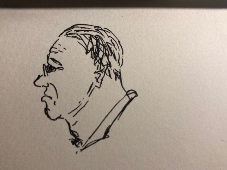
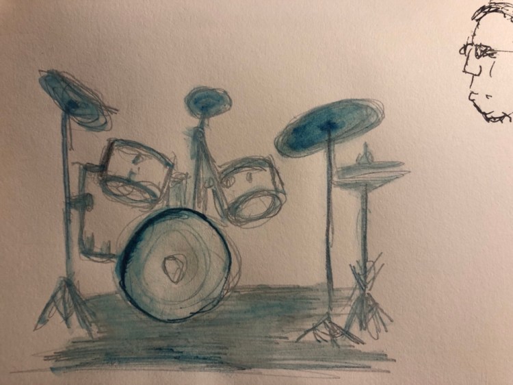
Zero complaints when it comes to pencil sketches:
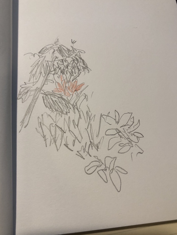
As is to be expected with this kind of paper, it works well with pencils and coloured pencils, having just enough tooth to make it work well with them, but not so great with fine and extra fine fountain pens and thin technical pens.
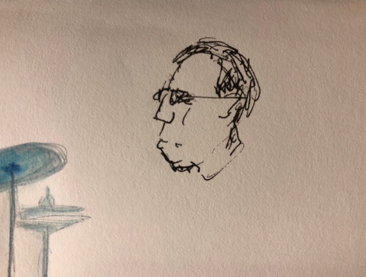
As you can see above, the Extra Fine Waterman Phileas (with Colorverse Selectron pigment ink) stuttered on the page.
The Signature also suffers from being an awkward size for a sketchbook: too large to be truly pocketable, too small to allow for anything more than tiny, quick sketches.
As a sketchbook, I’d not recommend it. There are better options in the market, ones that open flat, in better sizes, with hardcovers (a plus when sketching on the go), that take washes a bit better than the Signature does.
That being said, it’s a fountain pen friendly Field Notes, and so long as you’re not set on using nibs that in the extra fine realm or using this notebook as your main sketchbook, it’s a nice little thing to carry around and play with. There’s nothing wrong with a notebook that can take a little doodle next to your todo list…


Either Moleskine have improved the quality of their paper, or Robert Oster ink is magical, but it definitely doesn't suffer from feathering/spidering/spread. There's some show through, and in wider nibs, a bit of bleed through, but nothing that makes it unusable. That's pretty surprising for such saturated ink, and good news for those looking for Noodler's ink replacements.
Tested with fine, medium and 1.1 stub nibs with equal success.
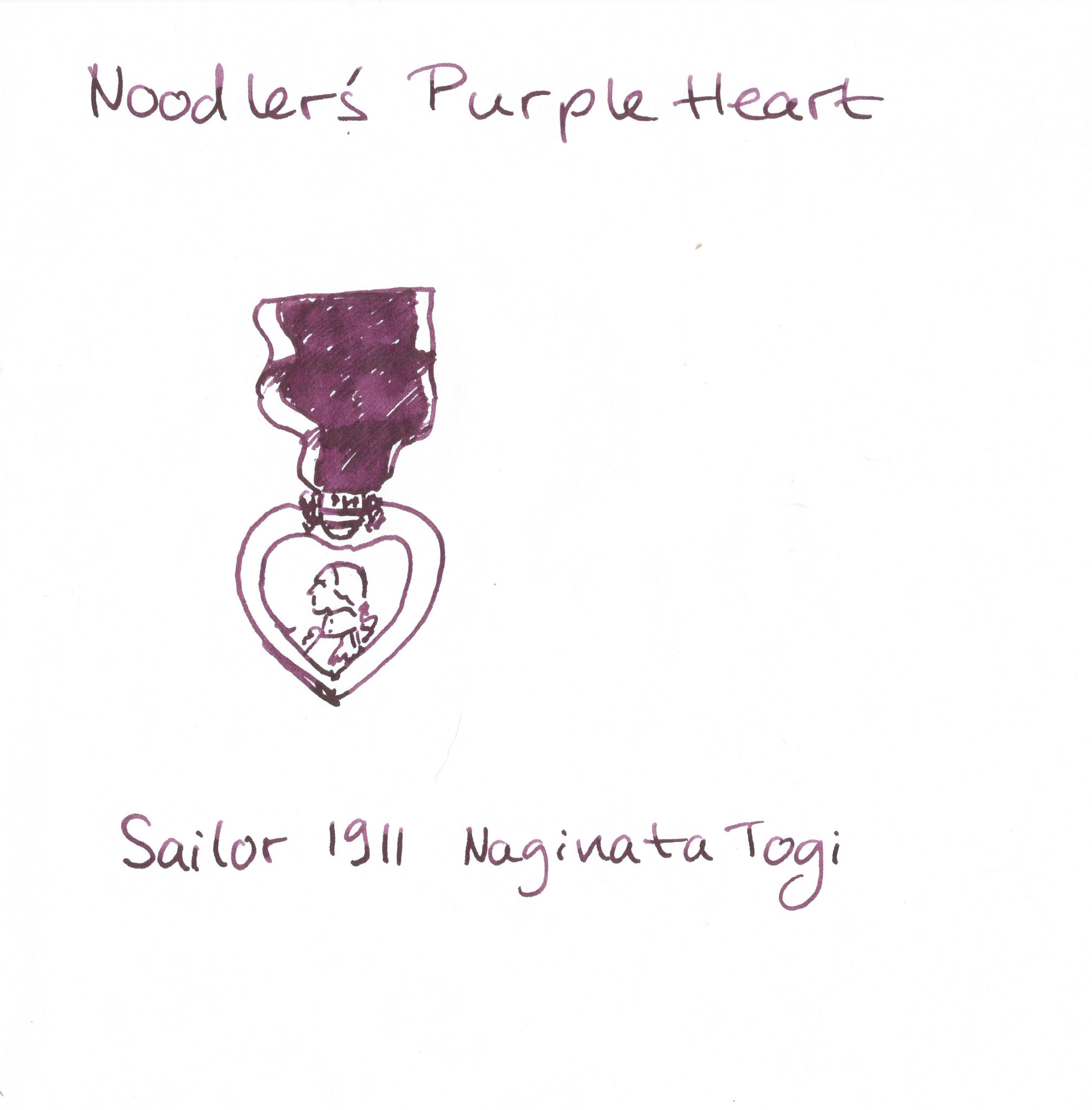
Another selection from Noodler’s, Purple Heart is one of Nathan’s less imaginatively named colours (I mean the man has an ink called “Black Swan in Australian Roses” in this colour range, so “Purple Heart” is a bit on the dull side).
A dusky, reddish purple that shades nicely, this ink closely resembles the much better named Tyrian Purple from Diamine. Except it is about $2 cheaper. And shades less. And is harder to clean out of your pen. And is more difficult to obtain.
This is the kind of ink that you buy when you are trying to show your rebel side at work, after you have had your fill of the excitement that blue-blacks have to offer. Dark enough to not call too much attention to yourself, but unique enough to make your heart flutter, this would be a decent ink to pick up after you have a good selection of black, blue, blue-black, brown, dark green, grey and that cool-ink- with-the-sparkly-bits-in-it.
Properties-wise Purple Heart got the very short end of the stick — it had nothing going for it except its tantalizing colour. It is not waterproof or water-resistant. It takes a long while to dry — meaning that it is not going to be a lefties favourite. It is not particularly Field Notes and Moleskine friendly (a lot of bleed through and show through, which makes the other side of the paper practically useless), nor does it have any earth shatteringly interesting properties. It is lubricated, which means that it flows well, and plays particularly well with piston fillers (until you have to clean them out, at least).
So why did I pick this ink over its Tyrian counterpart? Because I am stupid. This ink is a Goulet Pens exclusive, and at the time that was all it took to get me to bring out the space credits. I know — I am that silly. It is a nice enough ink for me to not feel too bad for having it (after all there is nothing more sustaining than using an offbeat ink during the most boring meeting in the world), but faced with a similar choice today, Diamine’s Tyrian Purple would get my vote. After all, that ink that was so good looking on the page that you could stare at it for hours, loses a lot of its lustre after you are forced to stare at it for hours going down the drain.

