TWSBI GO and J Herbin Caroube de Chypre Ink Review
I’ve tried shimmering fountain pen inks (inks with little sparkly bits in them) only once before, when J Herbin first started producing them, and they ruined a Lamy Safari pen and converter with their non-removable sparkle. Over time more and more reviews came out lauding these pretty, shiny inks and saying that they’re completely fountain pen friendly nowadays, yet I kept my distance. No amount of glitter was worth another ruined pen, after all.
Enter the TWSBI GO, which is a a TWSBI nib connected to a toy pen that is so cheap that it practically has “Bay State Blue ready” written on it (I still don’t recommend going anywhere near the stainiest of stainy inks, no matter how gorgeous it is).
The packaging is bewilderingly good for such a cheap fountain pen. A cardboard sleeve over a plastic box that puts the cardboard Lamy Safari packaging (and price point) to shame.
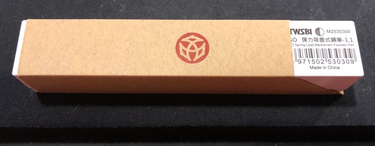
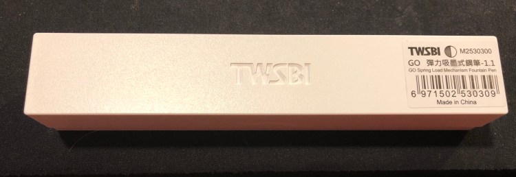
Then you open the box, and laugh. The pen looks and feels like a child’s toy, with its cheap feeling plastic, its light weight and ridiculous spring filling mechanism. It takes the ugly duckling bit a step beyond what even other TWSBI functional but ugly pens, like the ECO, have.

But then you start to write with it, and the silly little body has good ink capacity, is easy to fill, and most importantly, it has a TWSBI nib. TWSBI nibs are phenomenally good for the price, and they come in 1.1 stub sizes, which are super fun to use.
Here’s a writing sample with a TWSBI GO 1.1 stub, which I did late at night when I was pretty tired, and so I spelled TWSBI phonetically, so whoopsie.
The ink is J Herbin’s Caroube de Chypre, which I had bought but not yet used. It’s a light, coffee brown ink with a medium amount of shading and some gold sparkle that is just-impossible-to-photograph-unless-you-pour-half-a-bottle-of-the-stuff-on-the-page-so-you’re-going-to-have-to-trust-me-on-this-it-is-pretty.
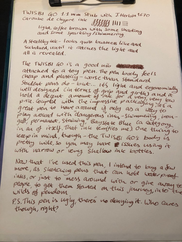
Can you get away with using this ink in a work setting? I believe you can, since the colour itself is pretty tame and the sparkle isn’t in your face, but just glints in the light in certain angles.

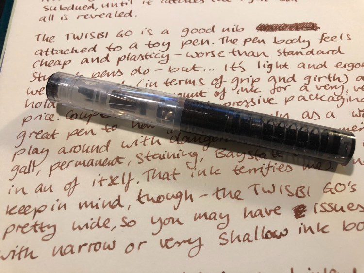
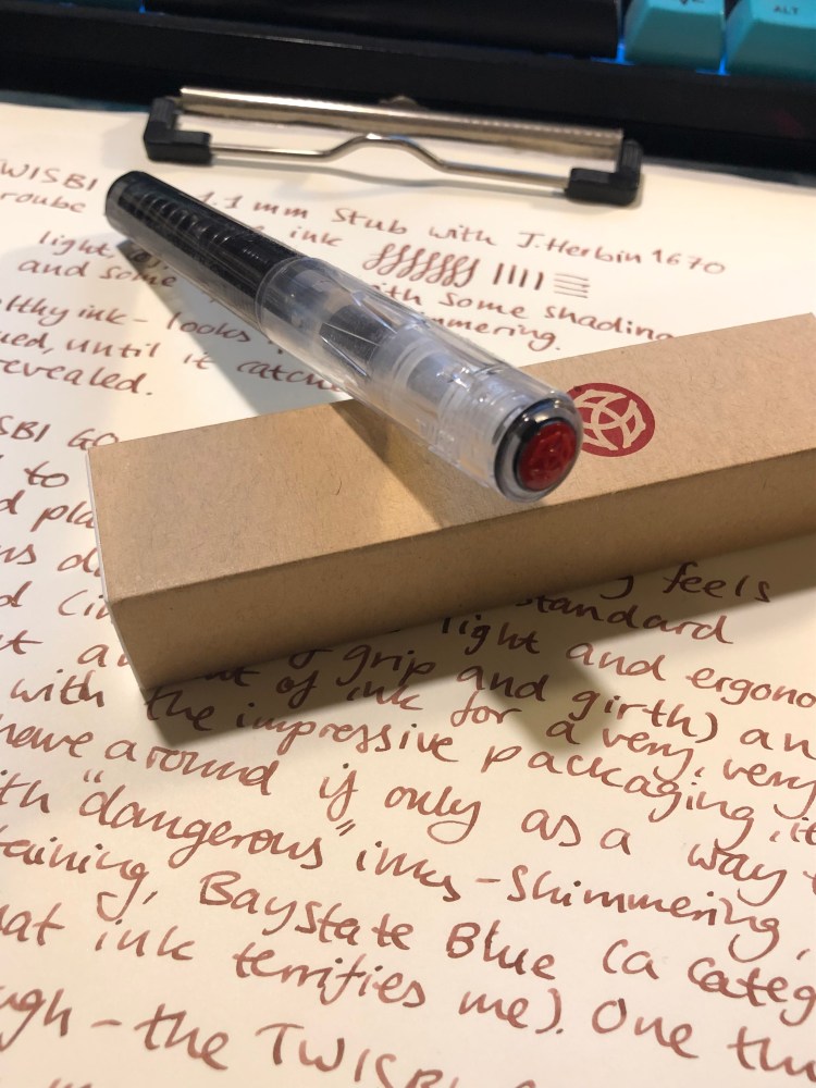


The pen itself is a paragon of practicality: super light, super comfortable grip, good ink capacity, excellent nib and feed, easy to use filling mechanism. For less than $20 that’s a tremendous feat on TWSBI’s part and it makes this pen a “no-brainer”. Whether you’re a beginner or a hardened collector, you should have at least one of these in your pen case. It’s a great workhorse, good for experimenting with “dangerous” inks (keep well away from Bay State Blue, yes you, I’m talking to you. I can see what’s in your shopping cart), good as a loaner pen to get more people into the wonderful world of fountain pens, and even good for people experimenting with nib grinds. In the beginner fountain pen category it is uglier than even the platinum preppy, but when it comes to bang for your buck, this pen puts all others to shame.