PenBBS 535 Pen of the Year of the Ox Review

Happy fountain pen day everyone! I hope you get the chance to enjoy your pens today. I thought I’d celebrate with a review of one of the more interesting fountain pens that I have: the PenBBS 535 Pen of the Year of the Ox.
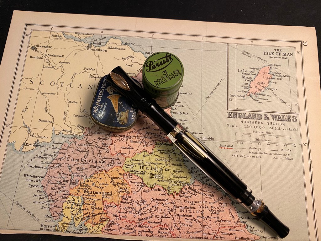
I like pens with interesting filling mechanisms, and I’ve purchased pens from PenBBS before and really enjoyed them so I decided to give this unusual (and inexpensive) pen a try. What’s unusual about it? Well it’s a long pen with an uncommon silhouette, a filling mechanism that doubles as an ink stop, and it has a gem as a roll-stop.

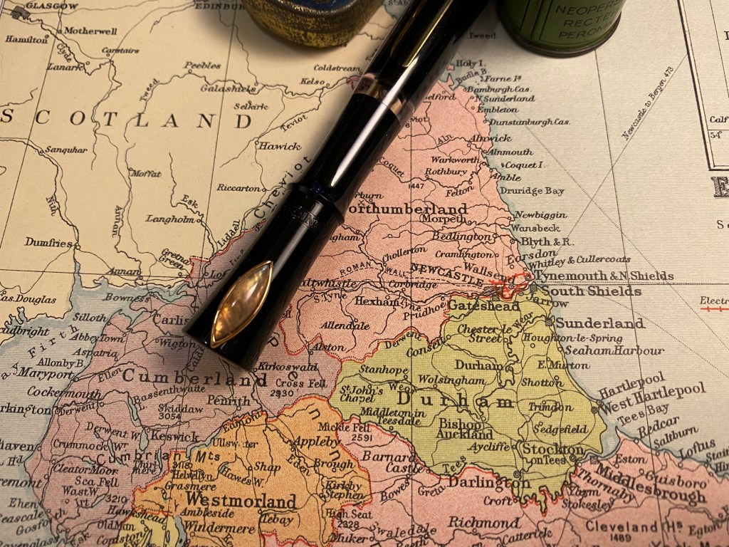
Let’s start with the pen body. It’s long. A Lamy Safari/AL-Star is 13 cm long uncapped. The PenBBS Year of the Ox is 15 cm long uncapped, and about 16 cm long when you unscrew the blind cap to allow for ink to flow (more on that later). That means that it holds a massive amount of ink (make sure you love the ink that you plan to use in this pen), all of which you can see since the main body part is transparent. The cap, blind cap and grip are black with rose gold detailing which is very attractive, and the cap and nib have special Year of the Ox inscriptions (2021 is the year of the ox in the traditional Chinese calendar). I have no idea why this wavy, long silhouette was chosen for the pen, but it reminds me of a bamboo stalk, particularly when capped, and I quite like it.
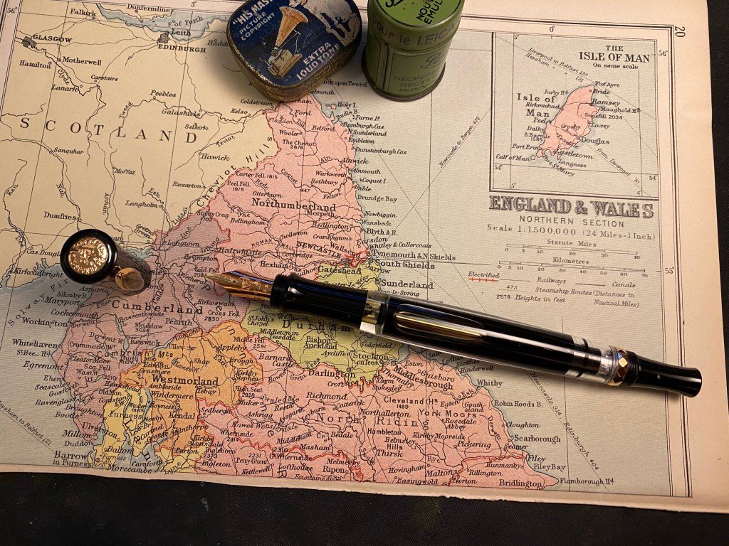
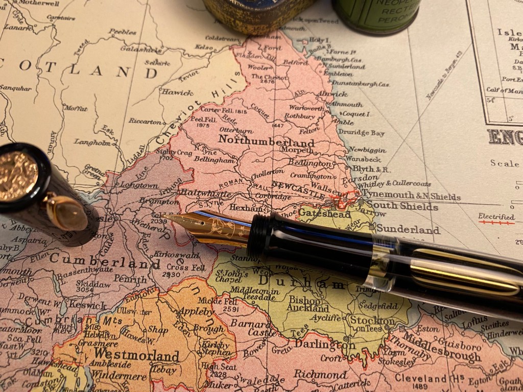
There is an engraving of an ox head on the rose-gold coloured steel nib, and the pen cap has a rose-gold coloured medallion on it with an engraving of an ox in the middle and “PenBBS 2021 Year of the Ox” engraved around it.

The grip section is surprisingly comfortable to use, as at first glance I was worried that perhaps it would be too narrow for comfort. There’s a slight step at the end where the threads go, and you can see from the picture below that there are very few threads for the cap. This is the weakest part of this pen’s design. While it makes gripping the pen very comfortable (no threads in the way), it makes capping the pen a hassle at times. It’s easy to miss the threads and have the pen not be properly capped. The cap itself is unlined and very short, particularly when compared to the long pen body. It is designed this way so you can post it on the back using the threads and the bottom of the piston.
You can see the threads on the piston below. Apart from checking that the cap can be posted in this way, I chose not to post this pen. It’s not that the posting affects its balance, as the cap is light and doesn’t weight down the back of the pen, but that the threads are so short and shallow that it’s not worth the hassle to use them to post the cap. Plus, I don’t post my pens’ caps anyway.
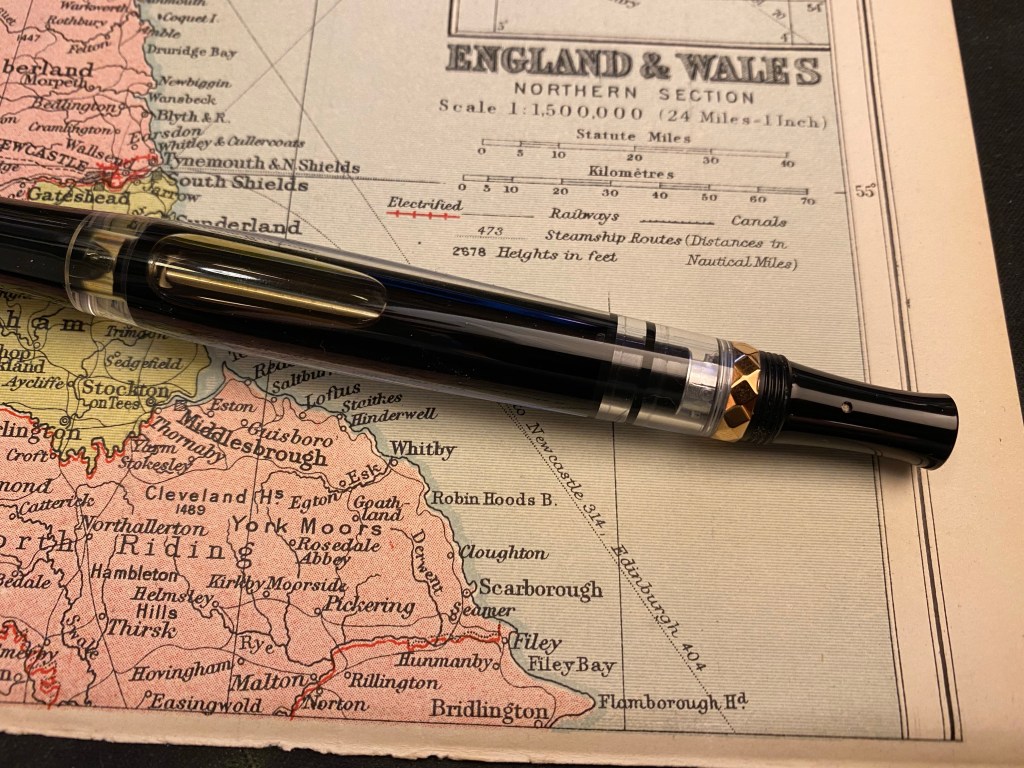
You also can see the filling mechanism in the previous photo. This is a little complicated to understand and hard to explain, but there’s a good video here showing how it works. You basically twist the piston nob to engage the piston mechanism and fill the pen with ink, and then twist it in another direction to disengage the piston and just allow the plunger rod to move.This allows you to return the piston to place, and is also the mechanism you’ll use to unscrew the piston blind cap and allow ink to enter the transparent chamber at the top of the pen and into the nib. I know this explanation is confusing – please check out the video to see the mechanism in work. It’s pretty easy to get it going once you’ve seen someone demonstrate it to you.

Is this the most convenient filling mechanism? No, not by a long shot. But it fills the pen entirely in one shot (something you can’t get with most converters), and allows the pen to have a really large ink capacity. This and the very decent nib turn this pen from a novelty item into an actual workhorse. This is a pen that is a joy to use, and you can use it for pages and pages of writing.

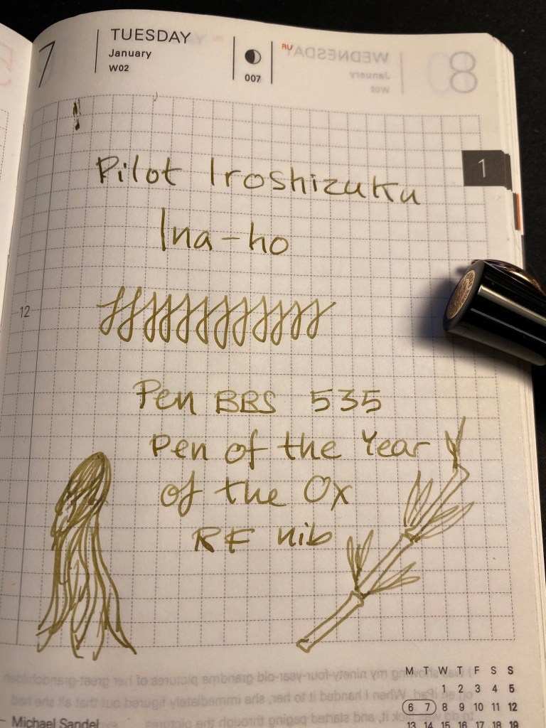
The Year of the Ox pen comes with a labradorite roll-stop, which is very cool looking and ensures that each and every pen is unique. I have no idea why labradorite was chosen, but I like its colour and I think that it works well with the rose-gold on the pen. It’s also what inspired me to fill this pen with Pilot Iroshizuku Ina-Ho.
To start writing with the Year of the Ox pen you need to unscrew the piston until ink can enter the small chamber near the pen grip. You can see the mechanism at work here:

The RF (round fine, or just simply fine) nib is smooth but not glass smooth, and if you plan on sketching with this pen, flipping the nib gives you a very good extra fine line. The nib and the ink capacity really make this pen something you can probably use throughout NaNoWriMo without having to stop for refills.
I wasn’t expecting much from the PenBBS 535 Pen of the Year of the Ox, because it really does look like a novelty pen. But somehow, the pen’s design, it’s weight, it’s large ink capacity and its good nib make for the ideal workhorse pen. This is a pen that’s fun use and fun to have lying around on your desk. Just be sure to fill it with an ink you really love, because you’re going to be using it for a while…

Yom Kippur 2021

I had a strange Yom Kippur this year, as is to be expected. I decided to commemorate it in my sketchbook, this time using Faber Castel Albrecht Durer watercolour pencils in addition to my usual Schmincke and Daniel Smith watercolour mixture.

Drawn on a Stillman and Birn Alpha. Ink is Iroshizuku Ina Ho (lines), Robert Oster Fire and Ice (heading and text) and Sailor 123 (2021).

Esterbrook Estie Sea Glass Review

I am a huge fan of the original, vintage Esterbrook fountain pens. They are beautiful, versatile workhorses that are easyto find and affordable, provided you’re not after the rarer colours/models/nibs. If only they didn’t have lever fillers, one of my least favourite filling systems, they would have been my go to vintage pens.

I don’t buy vintage brand reboot pens. In my early days of fountain pen use there was a lot of hype about the reboot of Conklin. Conklin fountain pens had an interesting filling mechanism that I wanted to check out, but they were all too expensive for me at the time. Then came the brand reboot in the mid 2000’s which made the pens more affordable and more widely available. So I bought a Conklin Mark Twain in 2009, and it was terrible. It looked and felt like a $10 pen, it skipped and hard started all the time, and it fell to pieces after the first use. I still keep it as a reminder to be circumspect with my purchases in the future. The experience made me leery of vintage brand reboots, and so when Esterbrook was rebooted I stayed clear of their pens. They didn’t look like Esties, they looked like generic fountain pens, so I decided that this too must be a QC nightmare money grab that would ruin the Esterbrook name.

I was wrong.

My photos do not do this pen justice. The Esterbrook Estie Sea Glass. It’s gorgeous, trust me.

After a mountain of good new Esterbrook reviews came in, and after I reconciled myself to the idea that the new Esterbrooks did not look like the old Esterbrooks I decided to give the Esterbrook Estie a try, and picked up a Sea Glass with a journalling nib. I normally don’t buy pens with gold hardware, but this was what was available at the time, and so a gold hardware Esterbrook Estie Sea Glass it is.

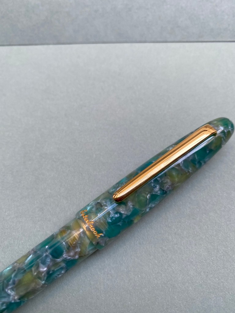
First of all, the pen is gorgeous. It has the classic cigar/torpedo shape that many fountain pens share, but the material of the Sea Glass pen sets it apart. It’s partly translucent, partly chatoyant, and vibrant without being Benu loud.

You can see some of the effects in the pen body here, but my photos don’t do it justice.

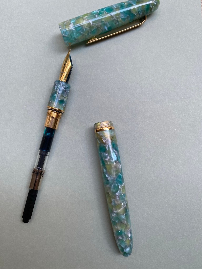
What took me by surprise is the capping mechanism. It reminded me of a child safe pill bottle, where you also have to push down as you twist to get the bottle to open. The mechanism does work well to make sure that the Estie doesn’t dry up or accidentally uncap itself, but it also means that it takes longer and a bit more effort to uncap the pen. If you write in short bursts this mechanism is going to be an annoyance.

You can see the capping mechanism threads. Esterbrook gets bonus points for making them attractive.

The “cushion cap” mechanism is well made and is attractive and unobtrusive when writing, so I don’t think it detracts from the pen. It’s just something to be aware of, since it is so unusual. It reminds me a bit of the Visconti Homo Sapiens caps.

The cushion cap inside.

The nib has scrolls and the Esterbrook branding on it, as well as a four digit number, like the old Esterbrook nibs. You can unscrew the nib and replace it with a vintage Estie nib, though I’ve been enjoying my Gina Salorino medium stub journalling nib enough to not want to change it. The fact that Kenro industries, the makers of the new Esterbrook, have teamed up with nibmeisters to offer custom nib grinds is amazing. Apart from the journalling nib they also offer an architect grind.

The nib.

The pen is branded on the cap lip below the clip with an “Esterbrook” imprint in gold script. I really don’t like the branding, as I feel like it cheapens the pen. If it were just an imprint then I think it would have been classier.

When the branding calls too much attention to itself…

The Esterbrook Estie is a cartridge-converter pen, and it comes with an excellent converter. The fact that this isn’t a lever filler like vintage Esties is great, as it’s much easier to fill, clean and check how much ink you have left in a converter, plus sometimes cartridges are convenient.

Cartridge converter at work.

The Esterbrook Estie is on the larger side but not heavy, with its weight distributed closer to the nib. It makes for a very comfortable writing experience, especially for me now. The cap posts, but I wouldn’t post it because it makes the pen overly long and unwieldy.

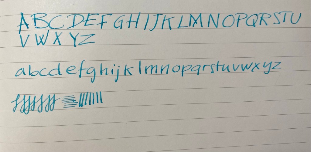
Here’s a writing sample with the journalling nib. It’s a lot of fun to use, and very forgiving to whatever writing angle you use it with:

Writing sample.

The Esterbrook Estie is more than a reboot to an old beloved brand. It’s a fantastic pen to select as your first “more than $100” fountain pen. It’s very well made, comfortable to use, has a classic fountain pen look, and an interesting selection of nibs that you can get directly from the manufacturer. It’s also very forgiving: easy to clean due to the combined cartridge-converter system and nib unscrewing, not likely to dry up or leak due to the cushion cap, and comes with easy and cheap ways to customise the nib post-purchase if you find that your tastes have changed. There are a lot of vintage Estie nib units out there.

The pen that I was leery of buying turned out to be one of the best fountain pens I have.

Silvine Memo Book Review

I bought this notebook in 2019, when I was last in London. Silvine is a well known UK notebook brand, and ever since I read about them in Roald Dahl’s work I have been looking to try them out.

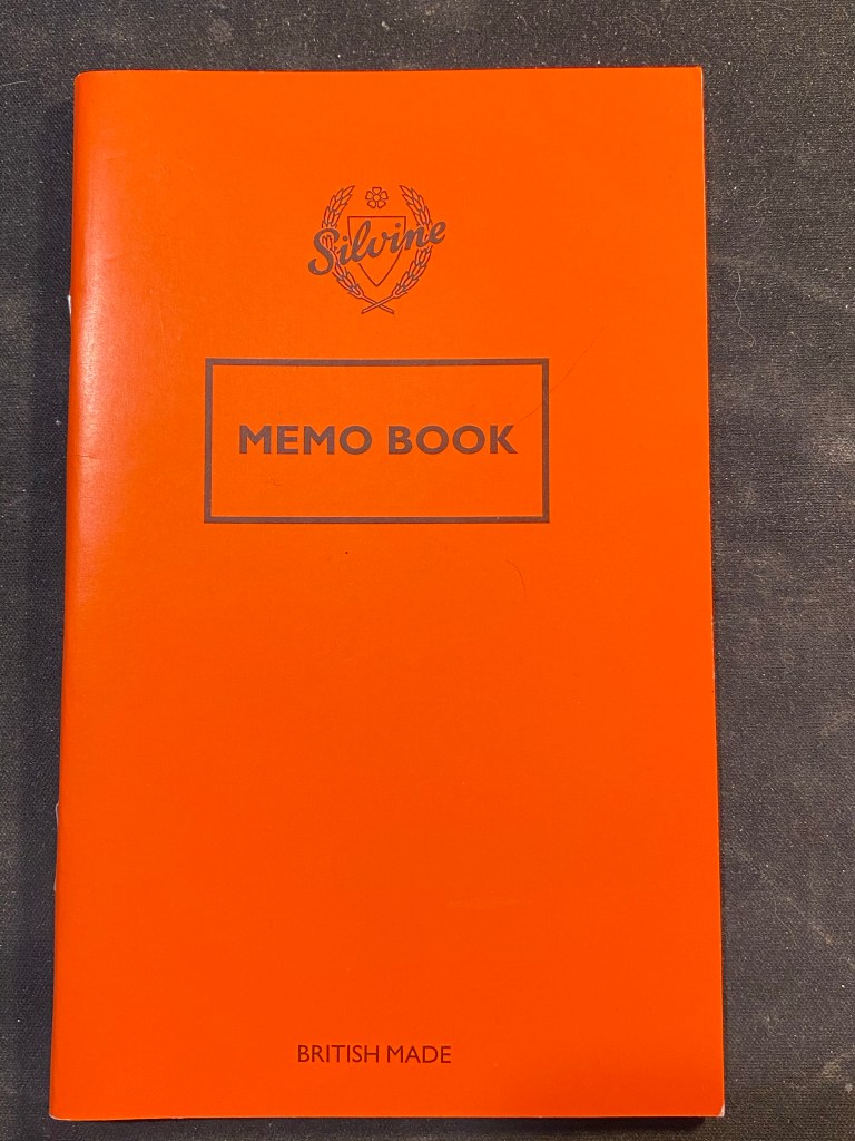
Front cover.

The Silvine Memo Book is a 159x95mm feint ruled staple bound notebook with zero frills. The cover is made of construction paper, thinner than the standard Field Notes one. The corners aren’t rounded, and there’s no printing on the inside of the cover. The front cover is a big believer in the “says what it does on the tin” school of thought: it’s a British made memo book by Silvine.

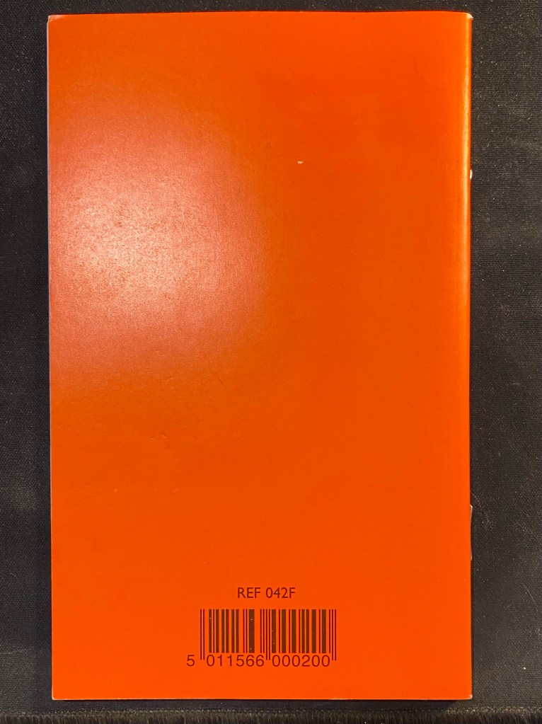
Back cover.

The back cover has an ugly barcode and ref printed on it, and it really would have looked better with that barcode printed on the inside. Then again, this notebook is not about looks.

Inside cover and ruling.

The grey ruling is 7mm wide, with margins left on the top and bottom of the page. It’s a bit wide for the format, but I’m guessing that they took their standard ruling and applied it indiscriminately to all their notebooks. The paper is where the Silvine Memo Book surprisingly shines.

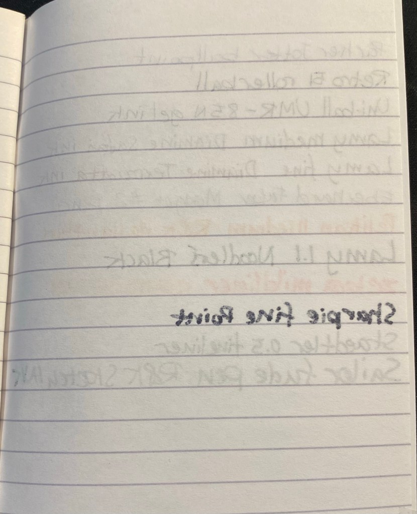
Paper test.

The paper is smooth and coated, which means long drying times (though still shorter than Rhodia or Moleskine paper), but it’s also fountain pen friendly. The ink doesn’t feather or spread, and while there is some ghosting, unless you use stub nibs with dark inks the other side of the paper will still be usable. Very juicy nibs cause a small amount of bleed through, and the Sharpie, as usual is a mess, but otherwise Silvine have created a paper that can handle pretty well everything you throw at it.

Ghosting and bleed through test.

The format of this notebook means that its place is on a desk, where you can use it to jot down a quick note with whatever is lying around. It’s not built for pocket carry (in terms of size or construction), and I would have liked the ruling to be 6mm or even 5 mm at this size, but as it is I don’t regret buying the Silvine Memo Book, if only for nostalgic value. It reminds me of Dahl’s short stories, and I like that it’s doing its own thing and not trying to be a Field Notes clone. If you’re in the UK, I’d have one or two of these lying around, just for the paper inside.

Carmel Market at Lockdown

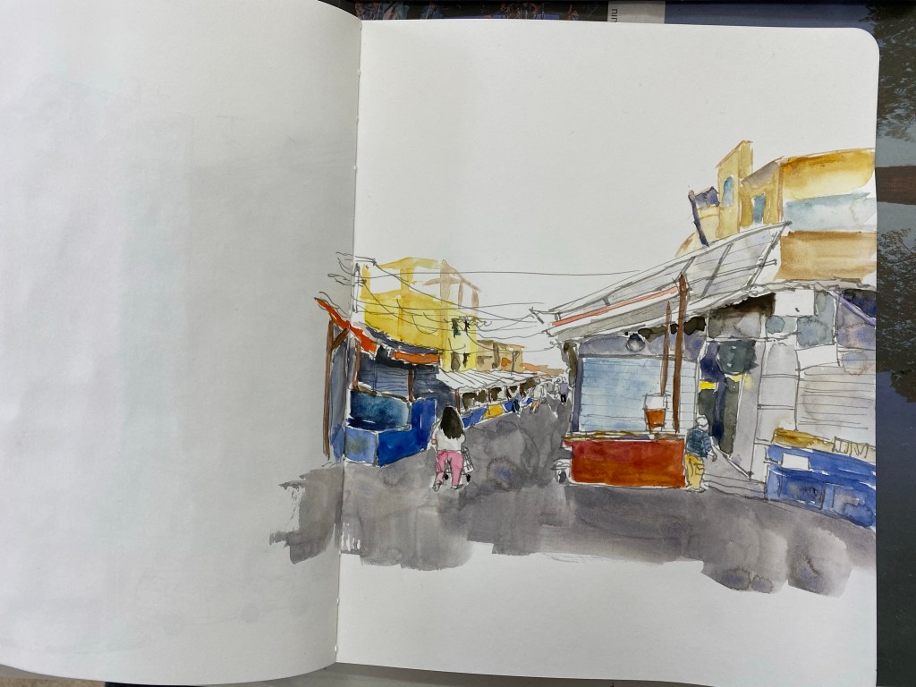
Carmel Market, Tel Aviv, during the third lockdown.

This is the first time that I’ve used my new watercolour palette and I’m still figuring stuff out. I’m also using an 8’’x10’’ Stillman and Birn Alpha which is a large format that I’m still getting used to and isn’t the best for smooth washes. I’m embracing the patchiness here and letting the paint do its thing. More importantly, despite temptation I’m not making any adjustments to the new palette now, as I need more time with it.

Also, the Sailor Fude 55 degrees fountain pen is magic. I used one here with Noodler’s Lexington Grey.

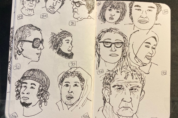
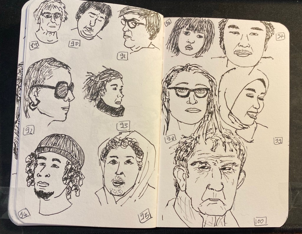
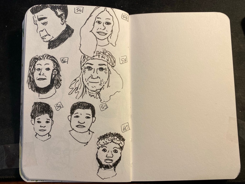
OneWeek100People 2021: Day 5

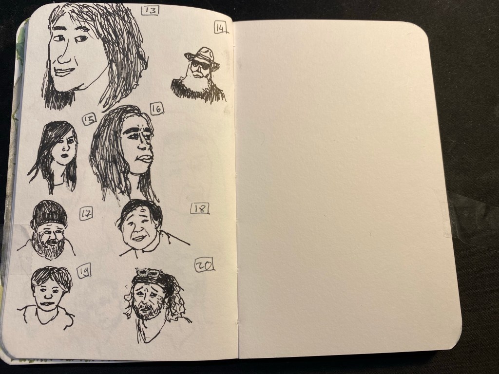
Day five of the One Week 100 People challenge, the final day of the challenge. I made it, using only pen and ink, and focusing on portraits the whole way through! It was tough but rewarding, and if I’d change one thing about it is get a better ink than Platinum Carbon. It kept drying up on me, and for the last four drawings I switched to a Lamy Safari fine with Noodler’s Black. That also wasn’t ideal, but it was better than the Platinum. I really want to test out the De Atramentis Document inks, but with shipping rates and reliability being what they are I’m stuck with three equally poor alternatives: Noodler’s Black, Platinum Carbon Ink and Rohrer and Klingner SketchINK. They all dry up in the nib and are hard starters, and the best of the bunch in terms of flow (Noodler’s) is the least waterproof of them all.

Anyway, I really recommend the One Week 100 People Challenge to anyone who wants to improve their people drawing skills, and I plan on doing it again next year.

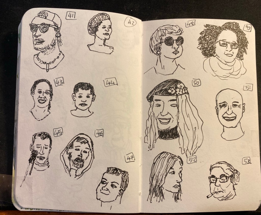
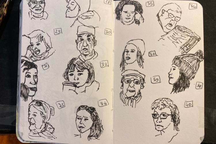
OneWeek100People 2021: Day 3

Day three of the One Week 100 People challenge. It appears that the street photographers aren’t exactly catering to sketchers, or they’d take more profile pictures than they currently do 🙂
I’m getting into a pretty good rhythm, and more importantly I’m getting better at figuring out where to start each portrait. Many start with a general outline, others start with the hair, or the nose->eyes->lips. Every day it gets a little easier to draw people, and though 20 people a day is still far from easy, I do feel like I’m getting the most out of this challenge this year because of my choice to work directly in pen and with no shading or paint.

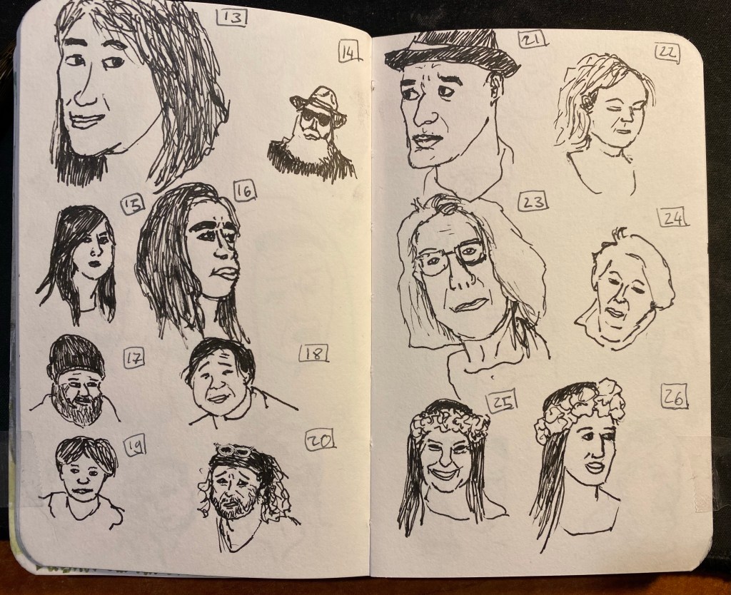
OneWeek100People 2021: Day 2

Day two of the One Week 100 People challenge and today was more challenging than yesterday, mainly because I started late and had trouble finding decent photographs. Photographers apparently love photographing blurry people, masked people, people with their backs to them, other photographers (while they are taking photographs and their face is half covered by the camera), or people from a large distance. Some of them also love photoshopping their subjects to death, so I’m now able to find a half decent subject only every five or six photographs. Thankfully the pool is huge and varied, with people in all ages and from all over the world, so while things are slowing down a bit, I’m still grateful for the the opportunity to enjoy the work published in this wonderful group. Even if I can’t use all of the photos there, I am thoroughly enjoying perusing through all of them.

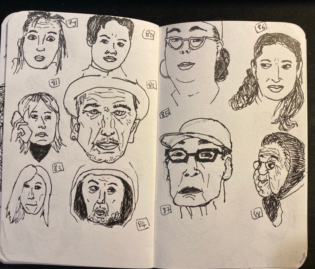
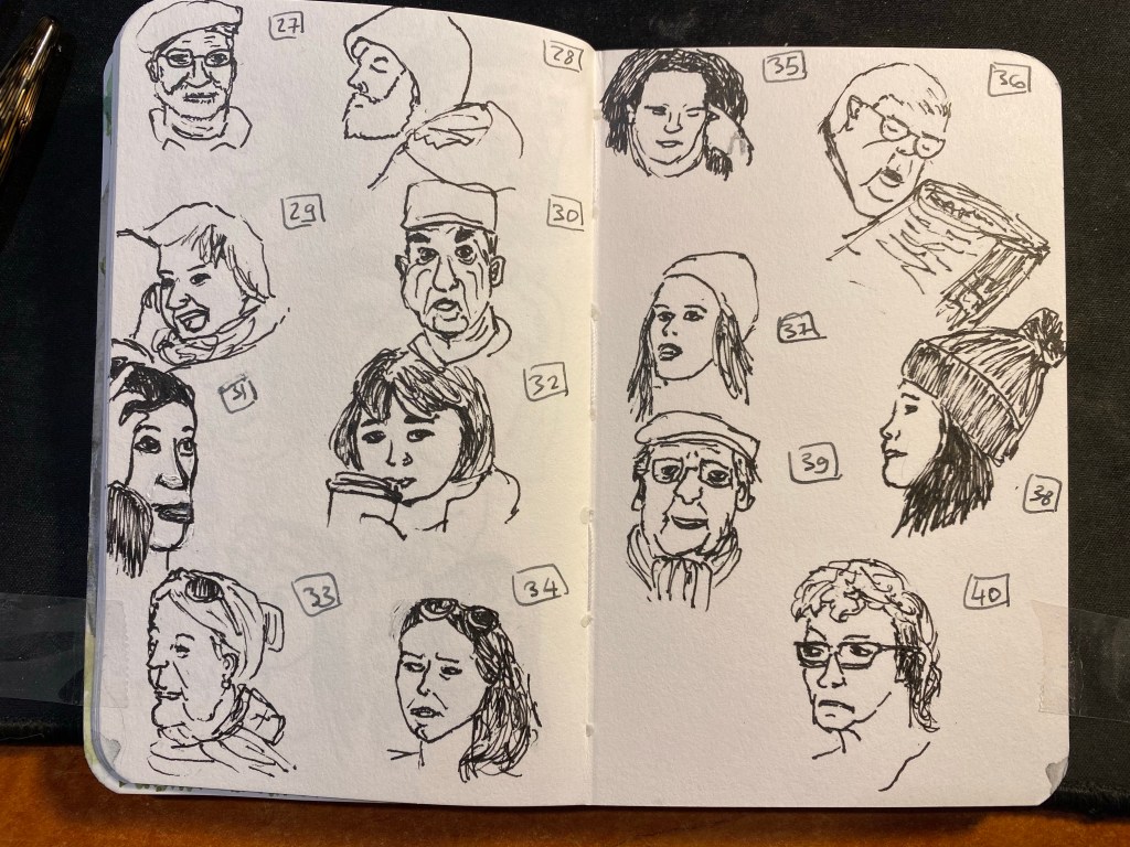
OneWeek100people 2021: Day 1

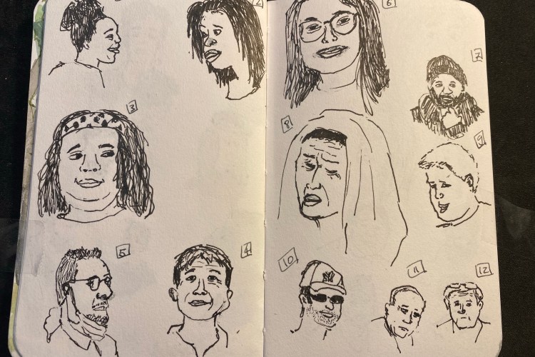
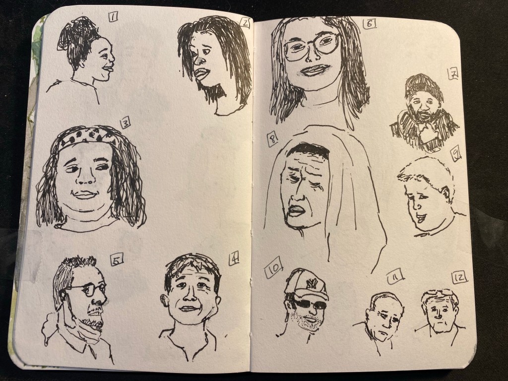
I’m doing the One Week 100 People challenge again this year (I skipped it last year but I have done it before). It’s a challenge that I find difficult but very rewarding, and this year perhaps more so than in the past. I’ve decided to work from Flickr photos, to challenge myself to draw every clear face that I see in the photo pool that I’m using, to work fast and directly in pen and ink. I’m also not hiding behind watercolour at the moment, but we’ll see for how long my resolve holds. These all took a minute or two each, and were drawn with a TWSBI Vac 700 with an EF nib and Platinum Carbon ink on a Stillman and Birn pocket softcover Alpha. There’s some feathering and spread with this ink, which I’m not enjoying, so I may switch to Staedtler Pigment Liner pens later this week.

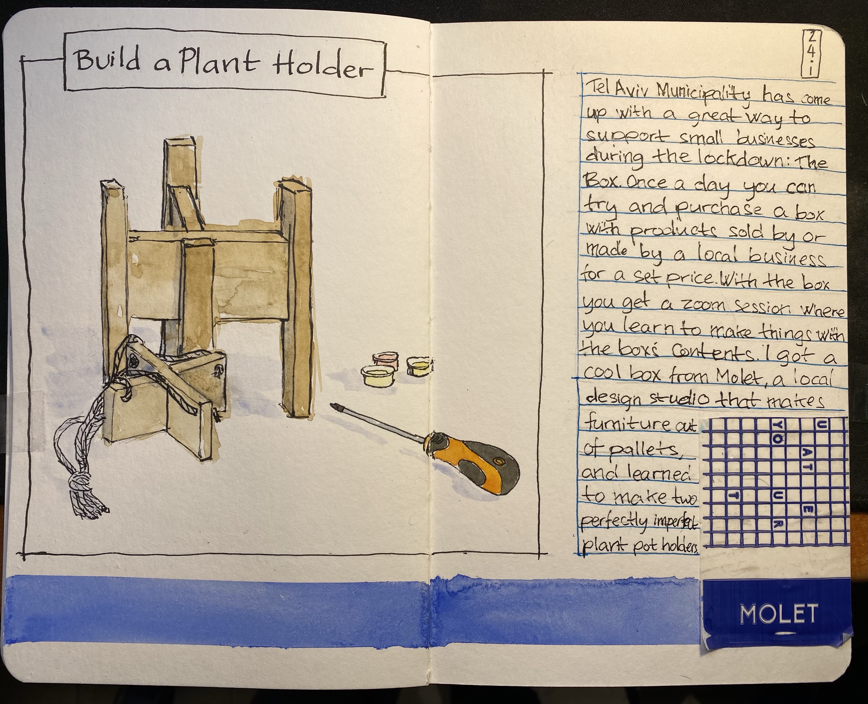
Build a Plant Holder

Sketchbook spread with two wooden X shaped plant holders, a screwdriver and some tiny paint pots. There's a sticker with the Molet logo on the right.

Tel Aviv Municipality has come up with a great way to support local businesses during the lockdown. Once a day at 11:00 they open the option for around 30-40 people to purchase a box from a local business. The box costs 50 NIS, and comes with a zoom session with the store owner, where you learn about their business and make something together. There was a beer box, a sushi box, a stationery box, a magic shop box, a cocktail box, a pickles box, and more. The boxes proved to be more popular than city hall envisioned, so after a few days they limited it to one box per resident. Luckily I managed to get three boxes before the limit took place, and this was the first one. We learned how to make two plant holders out of reclaimed pallet wood from a lovely design studio in Jaffa called Molet. They create kits and give workshops using wood pallets and the results are charming and fun. My dad had a workshop with them before the pandemic and really enjoyed it, and I’ll try and get the people at work to go to a workshop there once we can.

This sketchbook page was created as part of Liz Steel‘s Sketchbook Design course and explores using collage and colour blocks as design elements.