Ghosts of Planner’s Past: Bullet Journalling

I’ve been putting off writing this post because of all the planning systems I discussed, this Bullet Journalling (BuJo) is such a big topic and the system that I’ve used the most and the longest, apart from GTD. This will be the last post in this series as I’m planning on starting another series of posts on a different “how I use my notebooks” kind of topic. The previous posts are here: Chronodex, Weekly Planners, Daily Planners, Filofax, GTD and Friends.

So, Bullet Journalling was started by Ryder Carroll as a very utilitarian, relatively simple, glorified to do list combined with a calendar and some forward planning. At first glance it looked like another GTD system, and it’s clear that they share a common ancestry. This is the first video that Ryder Carroll published on the topic. He’s using a Moleskine squared large notebook here (he’ll switch to a Leuchtturm once he hears about the brand from the Pen Addict podcast, and he’ll land a collaboration deal with them later on), and there are no Instagram worthy spreads, metaphysical musings on how BuJo can transform you into a more enlightened human being, or attempts to upsell anything. It’s like the early days of Moleskinerie and 43folders posts – a guy finds a way to manage his to do list that works for him, and may work for others and so he shares it. Ryder Carroll knows how to explain complex things succinctly and clearly, and the video is beautifully made. It gained a lot of traction at the time, although it’s clear that Carroll prefers that you don’t watch that version of the BuJo explanation.

This is version of bullet journalling is what I started using, and what I still sort of use to this day. Why sort of use? Well, because the basis of the system is a daily to do list with a monthly calendar (and a monthly review), an index and a set of “collections” which are basically project to do lists. I still use the daily to do list and “collection” lists, so I sort of bullet journal. But I also sort of don’t – because none of this is new or unique. To do lists with checkboxes written out on notebooks, with project lists alongside them? There’s a monster list of those. You can’t get a book deal and a stationery collaboration based on that, right?

The official Leuchtturm1917 Bullet Journal

Wrong. About a year passes from the original video, and Carroll signs a deal with Leuchtturm1917 and suddenly there’s an official Bullet Journal and a new video. Stuff gets added to the system. A future log. A whole set of new symbols instead of checkboxes. There’s an added aura of importance and self improvement sprinkled on top. This system will help you be a better person, not just a more productive one.
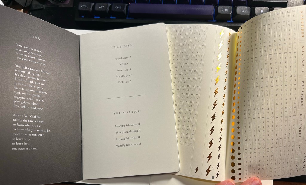
The included pamphlet – with a poem about BuJo no less – and sticker sheet

This is where the Bullet Journal system starts taking a problematic turn for me (and others, gathering by the comments to the videos). It starts becoming an Instagram thing. People spend hours making gorgeous, Instagram worthy monthly spreads. They spend money on templates, markers, stickers, and notebook bling for this. There’s an army of BuJo influencers. It’s no longer a “getting things done” system, it’s a “make pretty planner pages” system. Carroll inflates the system’s importance and “holistic” approach more and more. Out of curiosity I bought the second edition of the official Leuchtturm1917 Bullet Journal. My PTSD makes planning a real struggle now, and I was at the point where I was willing to try anything. Well, for quite a bit of money you get an overly thick notebook full of Leuchtturm paper, which is tolerably useful with fountain pens. Don’t expect Tomoe River levels of fountain pen friendliness, as there is spreading, and it doesn’t show off the full properties of all your cool inks. Then again, it’s not really meant for that. There’s also an added 12 (!) page manual about the system and a large sheet of planner stickers (and three ribbon bookmarks). There’s also stuff printed on the end papers that shows you how you can divide the dot grid page using the supplied markings. If you create tables often, I guess it’s useful. What I mostly feel using it is that it’s a lot.
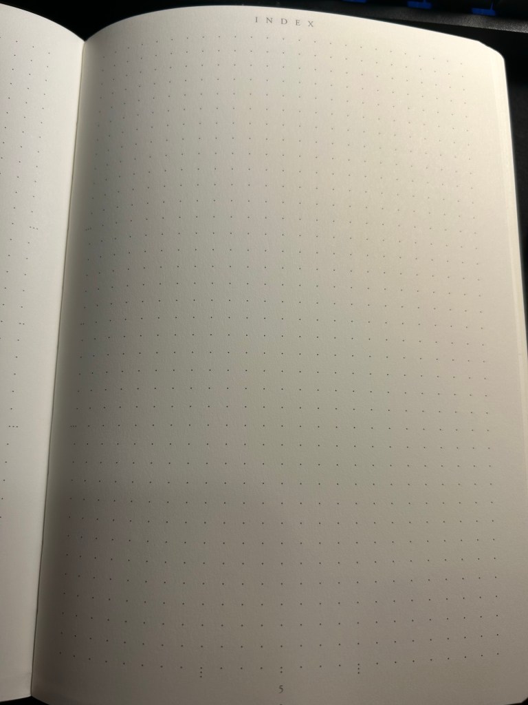
Index page

Have you ever tried to write an essay using Microsoft Word? Have you ever been able to do that without futzing with the formatting, the alignment, the spacing, etc? Word is a program created with printing in mind, and it shows. Writing applications like Scrivener supply you with full screen blank canvases that contain zero formatting prompts because that’s how you get the actual writing done. What the Leuchtturm1917 Bullet Journal does is give you all the tools you need to distract yourself from actually planning your stuff as quickly and efficiently as possible so you can move on to get them done. It’s full of calls to design pages, and I had a hard time at first training my brain to ignore the noise that the notebook came with. Ignore the wide margins, the little division markings, the pages with titles, the stickers and the pamphlet.
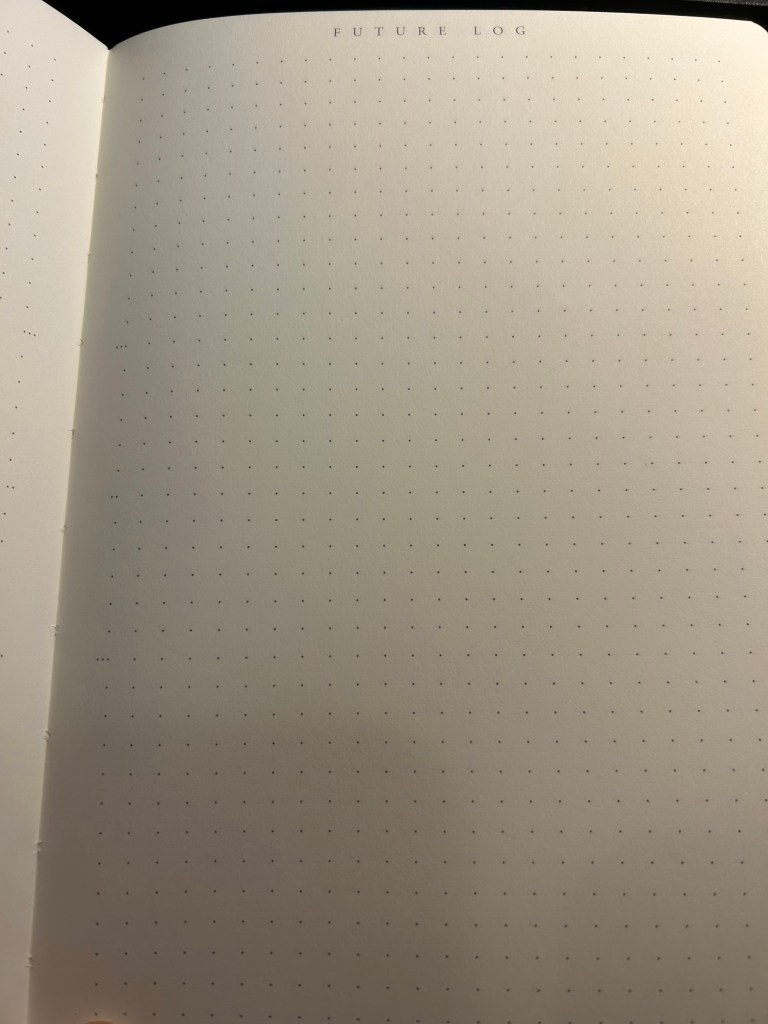
Future log

But back to the Bullet Journal system itself: stripped of its self-importance and its need to preen for Likes and Favs, is it still useful as a planning system?

Let’s take a look at it part by part:

  • Index – I didn’t keep one. I think I might have tried this during the first month, but I gave up quickly on this. It’s too much hassle for very little gain. How many times a month do you actually need to find something in your notebook, and when do you not just flip through it? There were many GTD systems with indexes and indexing systems, and I never found the indexes useful.
  • Monthly log – I keep a version of this separately on a small “Rebel Plans” pad from the Well Appointed Desk. It contains a monthly calendar that’s shaped like a calendar (and not a list of days), with important days in the month circled in a different colour, with basic monthly goals and big monthly milestones/events marked on it. I keep it before my eyes constantly as I work, and so having it tucked away in a notebook doesn’t work for me. I also find listing on paper the events of the day for the entire month a waste of time. That’s what digital calendars are for, and they’re much better than paper ones for it.
  • Future log – a new invention made for the official bullet journal notebook. I tried using it and found it to be useless for me. If you want true long term goal tracking, I suggest you try the theme system journal or something of the kind.
  • Daily log – this is the heart of the system, and it works because it’s a to do list. See also my post about GTD. I fluctuate between using the dash-plus annotation system and simple checkboxes, but you can use whatever works for you, of course. The important part is, of course, defining your tasks properly – actionable, doable in a short amount of time, and something that you can and should be doing.
  • Reflections – these are just a rebranding of GTD reviews. These work well if you do them, but it’s been my experience that it’s very easy to stop doing them because who wants to review what you didn’t get to complete as planned?

So there’s good stuff in Bullet Journal if you are able to strip it down from its anxiety inducing beauty contest trends. The question is, will you be able to ignore all the Bullet Journal page design noise and make use of this as a pragmatic planning system, or will you get carried away and start decorating pages and comparing monthly spreads with people who do this for a living, as you buy yet another template and another BuJo perfect pen? I’ll leave you to answer that one for yourself.
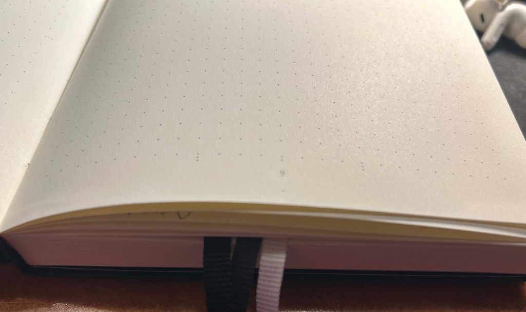
Three ribbon bookmarks and divider markings closeup. You can also see the white margin all around the dot grid page.

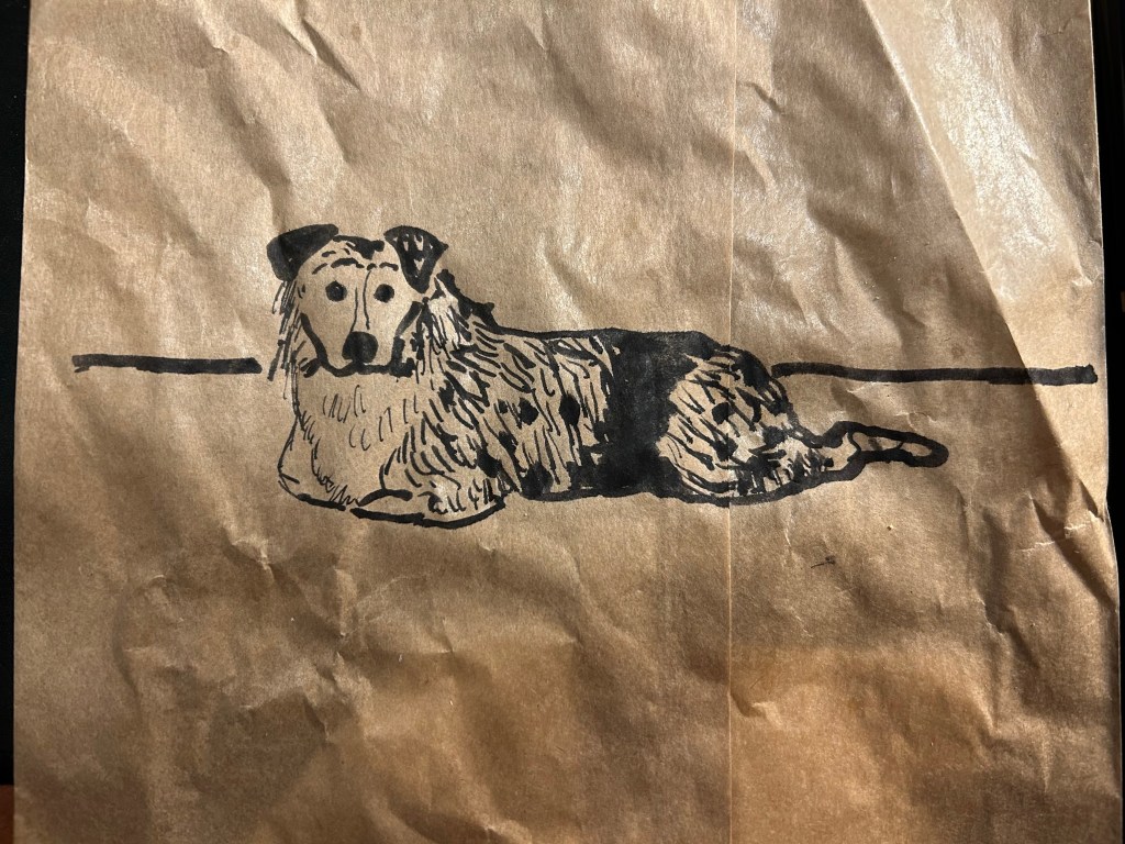
Brown Paper Bag Sketch

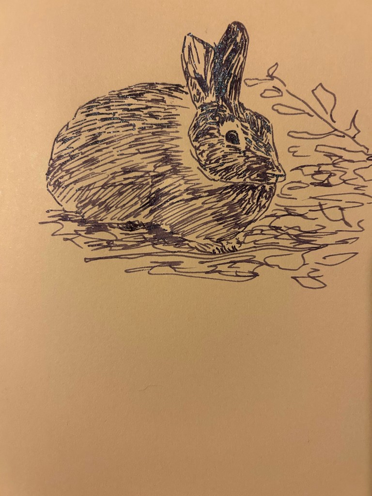
This is a 5 minute sketch of Belle, the Australian sheepdog. It was done with a Sailor Fude 40 degree fountain pen and Graf Von Faber-Castell carbon black ink on a paper bag that held my sandwich.

Franklin Christoph x Stilo e Stile 03 Sparkling Rock

This review has been languishing in my drafts for the past two months, as life (and particularly work) has gotten so hectic. As I wrote the Franklin Christoph x Stilo e Stile 03 Sparkling Rock dry today, I thought that it was about time to finish this review and publish it.

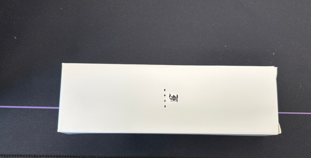
The outer box

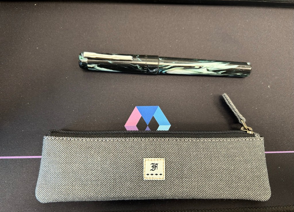
I don’t write much about packaging since I don’t care much for it, unless it is clearly overdone and something that unnecessarily added to the price. Franklin Christoph’s packaging is one of my favourites as the outer box is simple and elegant enough to be sent as a gift to someone, without being flashy. But what makes it even better is that many of their pens come with a pen pouch. These pouches are fantastic, and the one that I got features a velvety interior that protects the pens from scratches, and a grey, denim-y like external fabric that I really like.

Pen and pouch.

This collaboration between Franklin Christoph and Italian pen store Stilo e Stile is a model 3 pen with a gorgeous black, white and green resin with chatoyance, sparkle and a great deal of depth to it. Photos flatten it out and do it no justice. It’s a breathtaking material.

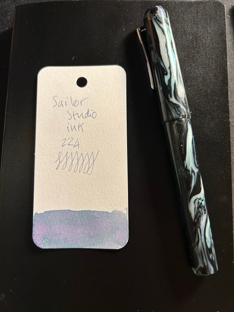
I purchased an extra-fine nibbed pen, and used it for writing and a bit of sketching using the Sailor Studio 224. The 224 grows a bit darker with time, but still features a lot shading and some gorgeous dual colouring. I was worried that it would be too light to be readable, but that was not the case.

Pen and Ink: Sailor Studio 224 ink sample written with the 03 Sparkling Rock

I have a few Franklin Christoph pens and I love the pens that they make, but this is the first Franklin Christoph pen that I have that has a pen clip. So while the model 03 is as well made and well balanced as the other Franklin Christoph’s I’ve tried, I did notice that the finial above the clip had a tendency to screw itself a bit loose sometimes. It never got to the point where it screwed off and got lost, and I doubt that it will, so it wasn’t really an issue, just something that I noticed. The clip is secured to the cap with a screw, and is robust and springy, and completely unaffected by the state of the finial.

Closeup on the finial and clip. My camera has issues with photographing the pen material.

This is the Sparkling Rock 03 as I used it, uncapped and unposted (you can technically post it, but I don’t see why as it’s long enough and clearly better balanced to be written unposted), and it is perfectly sized to be comfortable for long writing sessions. Unless you grip your pen with your fingers right on top of the nib, the two ridges in the end won’t bother you. I found them useful as they helped me position my hand better.

03 Sparkling Rock

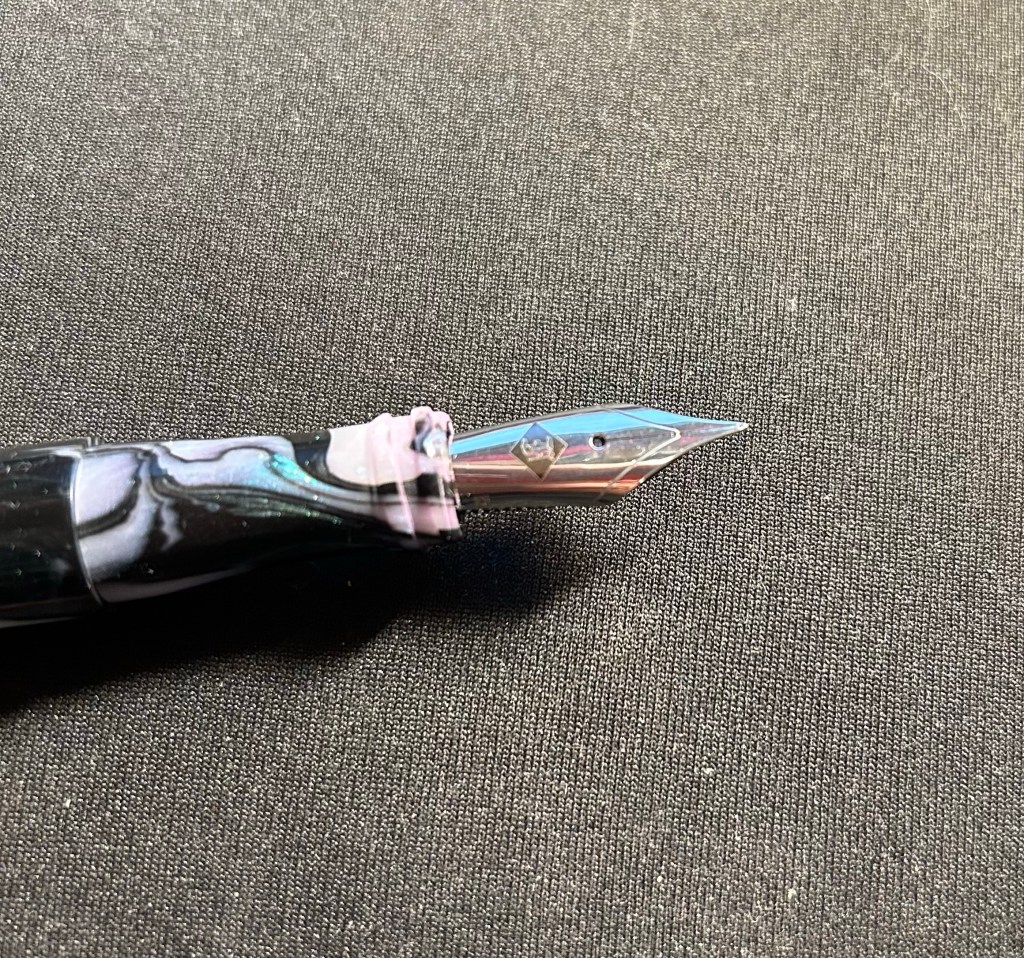
The nib unit is a standard number 6 nib, and screws out easily, for both cleaning and swapping out. The pen itself, like all Franklin Christophes, is a cartridge-converter, and comes with a good quality converter.

Franklin-Christoph nib

This brings me to the reason for this review: in a pen market that features ever increasing limited-editions in ever increasing prices, Franklin Christoph offers a refreshing alternative. You can go to their website, find a variety of pen shapes in a variety of resins, know that you are getting a very good quality pen that will be a breeze to clean and maintain, and in many cases to convert to an eyedropper if you so please. And the prices aren’t eye watering. You can even splurge on an interesting nib grind, allow yourself to experiment a little, knowing that in the worst case you can easily swap out a nib on your own. It’s the ultimate fountain pen for those venturing out of the beginner pen group and wanting to experience something better, without paying gold nib prices or going the vintage route. It’s also very tempting to collect more and more of them, as you try out different shapes, sizes and resins, which explains why there are quite a few members in the 50th pen club (after buying 49 FCs you get the 50th, personalized, and for free).

Belle the Aussie

Trying out a new sketching setup so I decided to sketch Belle. She’s a young Australian Shepherd that belongs to a colleague and regularly comes to the office.

Quick Update and Currently Inked

I returned on Saturday afternoon from a 17(!) day trip to London, York and Paris, and I’m still in the process of adjusting back to my routine. It was a perfect trip and a perfect break from the hard reality that I normally live in, and so it’s been tough getting back. I missed my cats, and I missed my running routine, but I didn’t miss the slew of doctor appointments and medical related bureaucracy surrounding my cancer and my mom’s cancer, and I didn’t miss the political situation here at all.

So I’m trying to find comfort in journalling, in talking to friends, in enjoying the things that I got from abroad (of course I bought pens, paper, pencils, ink, cool vintage stationery, art supplies, etc). And I’m returning to blogging regularly. I have quite a few reviews in the works, and one more post in the “Ghosts of Planner’s Past” series, plus as I’m getting back to my reading routine more books will be featured here.

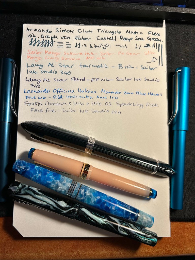
For now I’ve filled up four new fountain pens (none of which I’ve bought on this latest trip). The ASC Triangolo is a pen that I don’t remember buying at all, which is extremely unusual, and likely means that I bought it at Mora Stylos in 2022, on my first trip after finishing Chemo. Chemo brain is a real thing and I have chunks of that time (during treatment and a few months after it) that are completely missing in a very scary sort of way. The pen itself is an Omas 360 look alike, made with gorgeous arco verde material and has a “magic flex” nib. It’s the largest and one of the heaviest pens that I own, and the nib has issues (both problems starting and issues where it puts down too much ink). I filled it with Faber Castell Deep Sea Green, which from my experience is a drier ink, but that didn’t seem to affect it much. I doubt that I’d get much help from the Pen Family (their QC and service isn’t known to be the best though I will give them a try), so it’s a matter of seeing if I can fix it myself, and seeing what I can do to get it tuned locally, considering that the main guy working on pens here has recently retired. The ASC Triangolo is the big green striped triangular pen right beneath the writing.

The Sailor Pro Gear Slim Manyo Cherry Blossom is a pen that I bought on a whim in Choosing Keeping in London last year. I haven’t inked it since I bought it, but now I did, using the bottle of Sailor Manyo Sakura ink that came with it. This pen, unlike the Triangolo, perfectly fits my tiny hands (it’s the pink pen with the blue finials).

The two Lamy AL Stars (one on each side of the page) are a recent purchase from Pen Chalet. I wanted to try out a Lamy B nib, and I really liked the AL Star Petrol 2023 special edition, and the Tourmaline (2020?) one. They’re filled with Sailor Ink Studio inks that I purchased in Choosing Keeping during my last trip there.

The Leonardo Momento Zero Blue Hawaii and the FC Sparkling Rock travelled with me to London and back. They were a joy to use, and I’m glad that I took them along as they caused no issues – no leaks, etc – and were fun to use when I journaled during my trip.

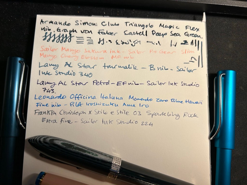
Here’s a bit of a closer look at the writing sample. The Triangolo’s is unfortunately a mess. The Ink Studio 340 and 224 are my favourite inks of the bunch, though the Ama Iro and 743 are also great. The Sailor Manyo Sakura is too light of my tastes, especially in such a fine nib (the Sailor MF is like a Lamy EF).

Break out a nice pen or pencil to use. It’s the little things that can help make your day.

Currently Inked: Things Are Getting Out of Hand

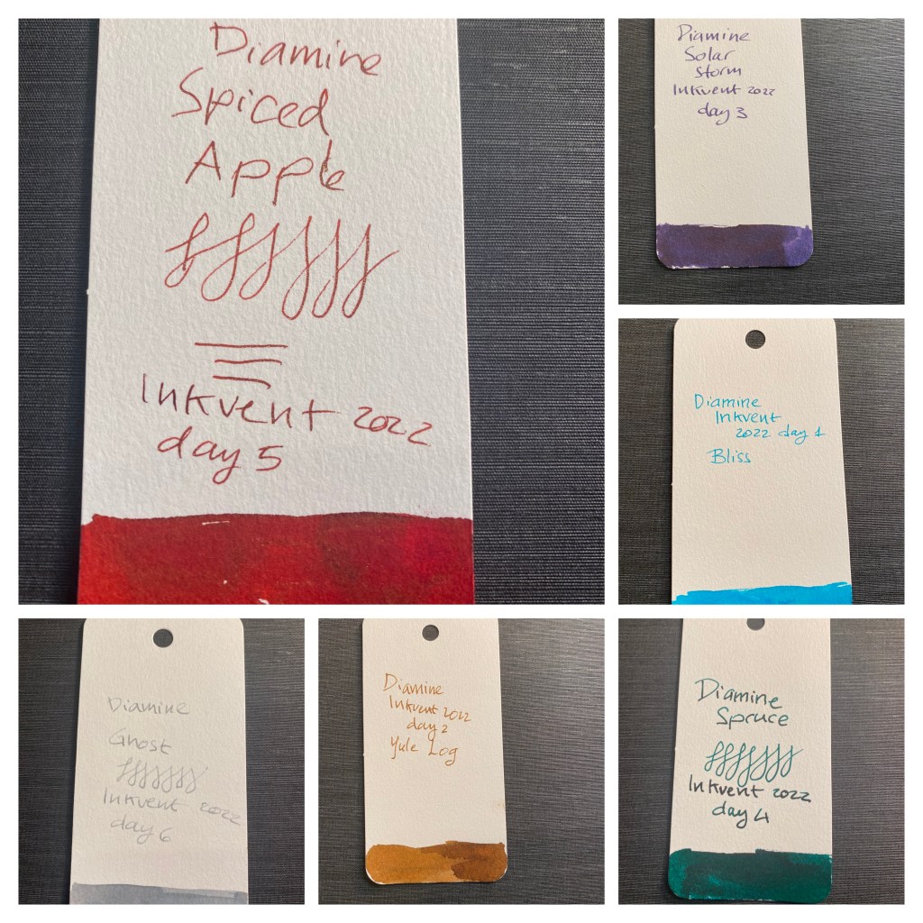
I just finished logging my currently inked pens on the wonderful fountain pen companion and I was a bit shocked to discover that I have 30 fountain pens inked up (each one with a different ink). This is of course the result of the Inkvent madness and my insistence on actually filling pens with the samples in the calendar instead of just using a dip pen.

I’ve written Solar Storm (day 4) dry and I’ve dumped Spruce (day 3) because of the smell, but I’ve kept Pick Me Up (day 15) despite the smell, because of the rich chocolate shade that it has. Since creating this list I’ve also written Jingle Berry (day 8) dry and Spiced Apple (day 5) is about to join it. I’m likely going to be forced to dump and clean out some of these pens, but my goal is to try and write and sketch as many of them as possible dry.

Parker Vacumatic Shadow Wave and How I Look at Vintage Pens

Our local fountain pen brick and mortar shop is closing down at the end of the month, and it’s a crying shame. There’s been a steady stream of collectors visiting the store to say goodbye and stock up on supplies, and on Thursday I joined them. I bought a few bottles of ink, a few fridge magnets with reproductions of old fountain pen adverts (most of them for Parker, of course), and there was a single tray of vintage pens.

“None of them work, I’m afraid,” the proprietor’s daughter said.

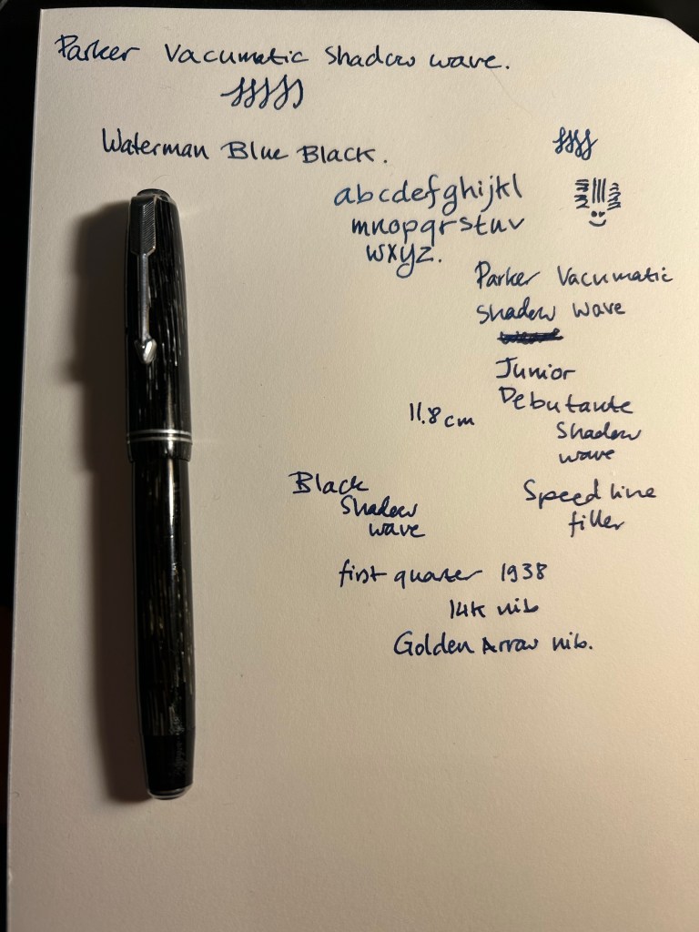
But I saw a Parker Vacumatic Shadow Wave among the lot, and I have a very hard time leaving Parker Vacumatics and 51s behind. I picked it up and took a quick glance. It was clearly a user grade pen, but I didn’t care – it was a speedline Vacumatic, which meant that it was fairly easy to fix. I asked her if they could perhaps be mistaken, and was there a chance that the pen worked. She brought out a cup of water and tried it out. It didn’t seem to hold any water, and she showed it to her dad, the proprietor and a well known pen repairman. “Oh, I can fix it, no problem. It just needs a filler swap”.

So today, in the midst of a rainstorm, I went to pick it up after its repair. It’s still a user grade pen, because it’s full of little nicks and scratches, and it has a well worn name engraved into it. But that’s part of what I love about vintage pens, and it’s something that I just can’t get with modern ones. I got a gold nibbed pen with a unique filling system and lovely material (that allows you to see the ink levels through it), in a classic design, for less than $130. And I got a bit of history, as this little workhorse has been around since the first quarter of 1938, and it’s still doing its job. Finally, there’s the mystery of it: puzzling out the model and the date code, maybe trying to find out about its previous owner (in this case, a Mary Thompson. It’s part of why I have no problem with engraved vintage pens), imagining what it’s been through over the decades. This pen is almost 85 years old. It’s a Junior Debutante, so it isn’t surprising that it belonged to a lady. It was likely a gift, and one wonders for what occasion and who the gift giver was. It was at the cusp of a world war that would change a lot of things for women. Was Mary Thompson starting out at her first job? Had she graduated from college? Did the pen pass to her children? How did end up in a pen shop in Tel Aviv 85 years later?

Yes, there’s a risk when buying vintage pens. There is also always a story, and a chance of a greatly rewarding experience, not to mention the possibility of getting a pen with a nib that writes like this (it’s a fine italic nib with nice amount of spring to it):

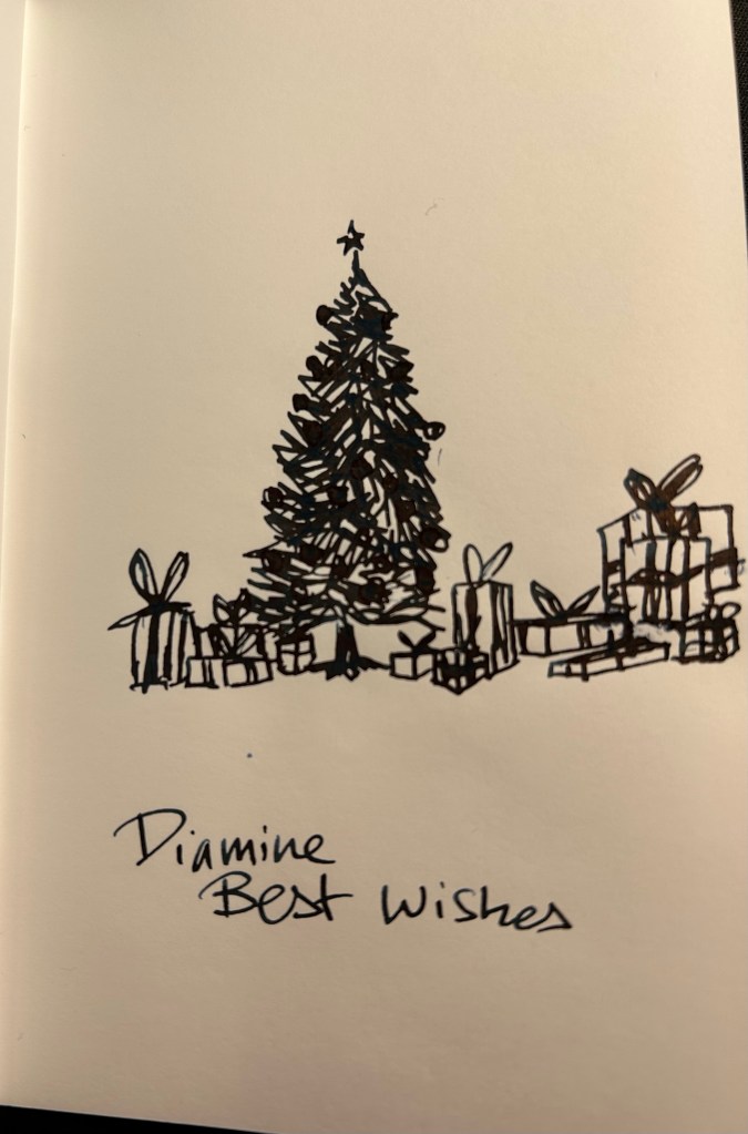
Diamine Inkvent 2022 Day 25: Best Wishes and Closing Thoughts

It’s the final day of Inkvent, and so it’s time to both review the final, 30ml bottle of the set, and review the calendar in its entirety.

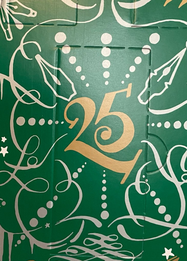
Door 25

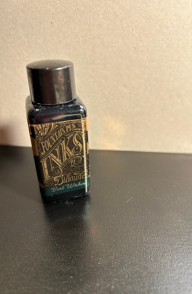
Day 25’s ink is a larger, 30ml bottle. It’s called Best Wishes, and it’s a very dark and saturated green with green shimmer and a lot of red sheen.

Best Wishes 30ml bottle

It’s quite a dramatic combination, the dark green base being almost black, the red sheen being very prominent and the green shimmer on top. More Halloween appropriate perhaps than Christmassy.

Col-o-Ring swab

My camera had a rough time photographing this ink. It’s the combination of the shimmer and the dark ink maybe that made it a bit blurry. In any case, the base ink is so dark that you can hardly tell that it’s a green at times.

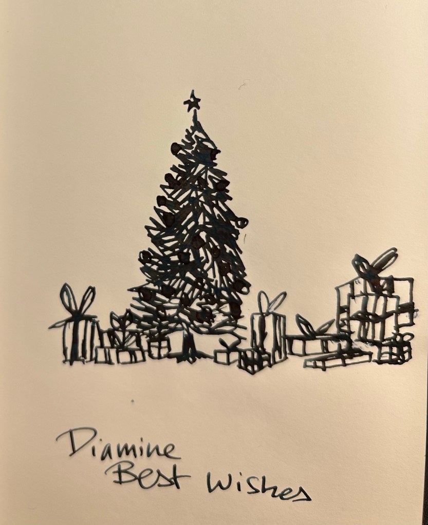
52 gsm Tomoe River paper sketch

Here it is from another angle:

52gsm Tomoe River paper sketch.

This ink takes ages to dry, because it’s so saturated. I smudged the sketch above and this writing sample took a good long time to properly dry. If you’re left handed, I’d steer well away from Diamine Best Wishes. If you like the drama, then maybe it’s the ink for you. Personally I would have preferred a lighter or more interesting green with a chameleon effect and no sheen.

Writing sample on 68gsm Tomoe River paper

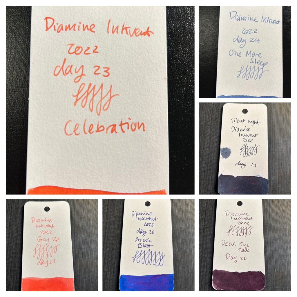
It’s summary time! Looking at this year’s Inkvent, I’m very pleased with the selection of inks, the spread of ink properties amongst them, and the overall value of this experience. I like that we got new chameleon inks, and I appreciated that there were less red inks in this year’s edition, and quite a good number of uniquely coloured inks. Reviewing the whole 25 inks involved, I think that Dusted Truffle, Memory Lane, Solar Storm, Ghost, Olive Swirl, Arctic Blast, Deck the Halls, and One More Sleep are the stand outs for me. Olive Swirl, Memory Lane, Dusted Truffle and Deck the Halls are inks that I plan on buying full bottles of once the green edition bottles come out. Ghost and Arctic Blast might join them too. If you like red inks, the Spiced Apple is fantastic. There are other great inks to have here, depending on your personal taste.

It was quite an endeavour, to fill fountain pens 25 times with ink and write, sketch and post a review of an ink a day. I don’t know if Diamine will create a 2023 Inkvent calendar, or if I will be able to write another set of reviews like this, but it was a wild and fun ride creating these reviews for the blog this year.

Merry Christmas to all who celebrate. I hope you got some cool pens and ink under the tree.

Diamine Inkvent 2022 Day 24: One More Sleep

Merry Christmas to all who celebrate! It’s day 24 of Diamine Inkvent.

Door 24

Day 24’s ink is Diamine One More Sleep, a standard grey blue ink.

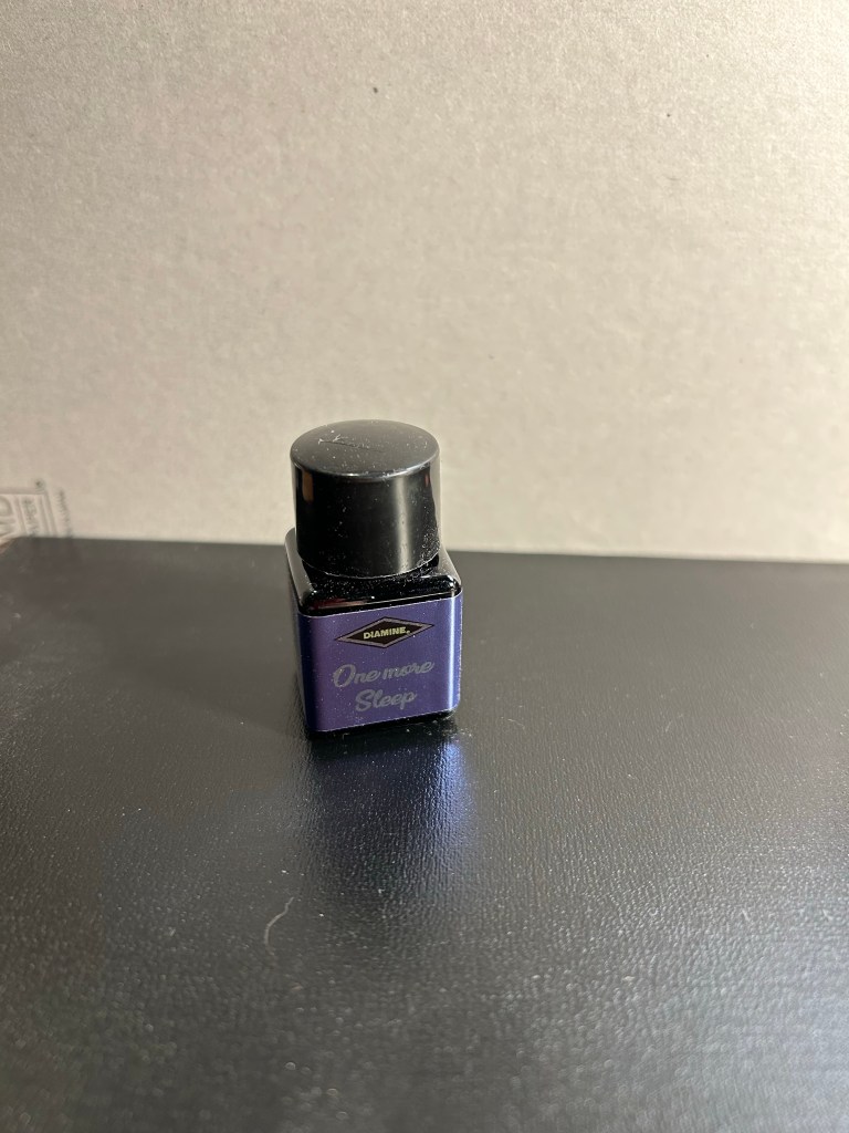
One More Sleep bottle

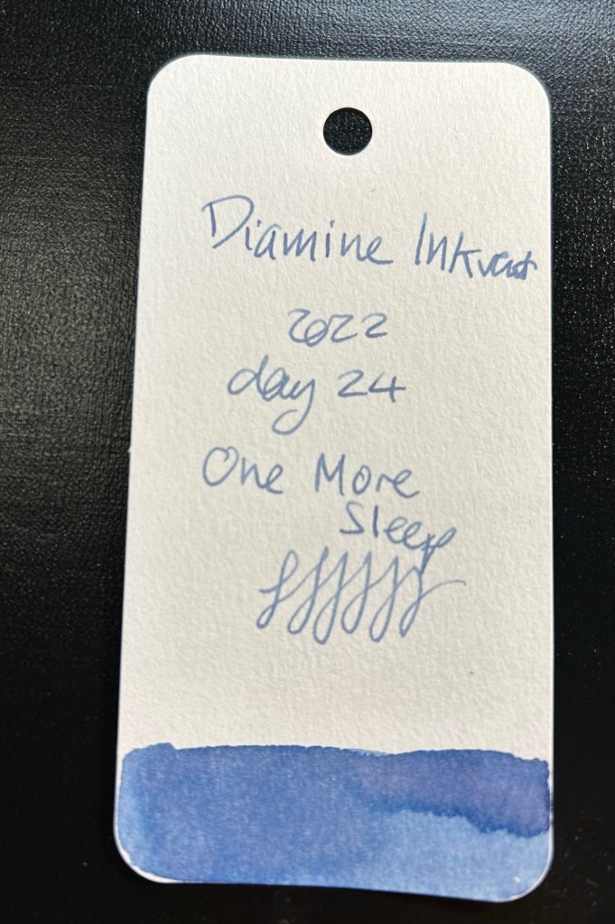
Diamine One More Sleep is a lovely grey blue with a lot a shading and a hint of lavender in the background.

Col-o-Ring swab

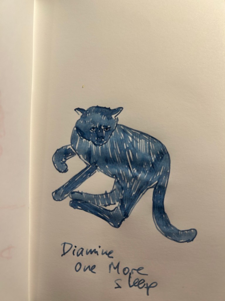
I love this shade of ink as it works well for sketching and for writing. It’s also a calm and relaxing colour, very appropriately named.

Sketch on 52gsm Tomoe River paper

Today’s writing sample is a little melancholy, as I reflect on the wave of well established pen shops that are closing down by the end of the year. This ink colour seems to encourage reflection, something I find myself doing more often since I received my cancer diagnosis a year and a half ago. If you don’t have an ink in this bluish grey light purple shade I recommend getting one, whether it’s Diamine One More Sleep or something similar by a Japanese or Korean maker.

Writing sample on 68gsm Tomoe River paper