Inktober 5: Tel Aviv Marina Boats
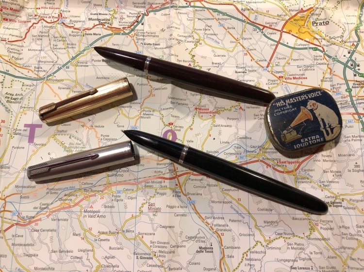
Parker Vacumatic Oversize with Pilot Iroshizuku Shin Kai.
A blog about writing, sketching, running and other things
Parker Vacumatic Oversize with Pilot Iroshizuku Shin Kai.
I’ve been on a fountain pen purchasing hiatus for a while, as I’ve been trying to use what I have rather than buying more pens that will see little or no use. Also, money is a thing, and this hobby can get really expensive really quickly.
So when reviews of the PenBBS pens started coming out I largely ignored them, even though they were generally very positive. That changed when I saw the PenBBS Hawaii: here was a chance to get a pen with a Kanilea Pen Company kind of vibe, but at a price that I can afford. To be honest, despite the reviews, at this price point ($39) I thought that I’d get a cheap, plasticky feeling pen that wouldn’t really be a piston filler.
I was wrong.
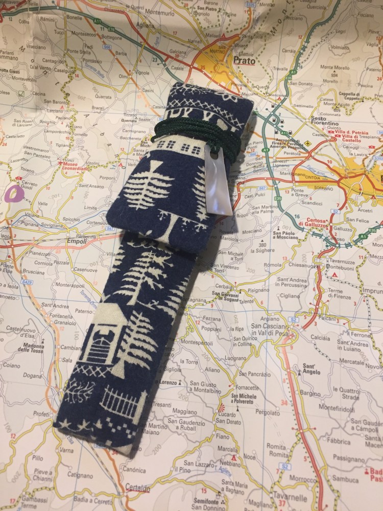
This is what arrived in the mail:

Then I took this out of the sleeve:
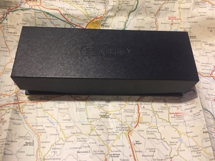
I don’t usually care much about packaging, but this is worth noting. Even if the packing would have just been a sturdy cardboard box inside a sleeve it would have been mind-blowing for this price. But it’s so much more than that.
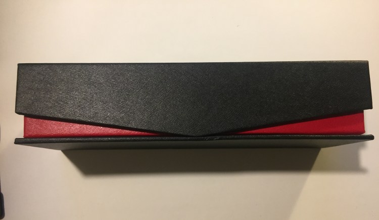
That black box is designed like the boxes high end Pelikans come in (including a cushioned interior). It’s designed. There’s texture to it, a logo and the edges are rounded up so you can see the red colour underneath. The box even comes with magnetic closure. It’s well-made enough and good-looking enough to be used as a display box.
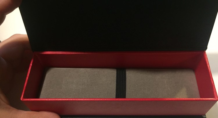
But that’s not enough for PenBBS. You paid $39 remember? You’re going to get so much more than your money’s worth. The pen comes in a beautifully made sleeve. Somebody bothered to make a sleeve (a lined and sewn sleeve, not a cheap felt glued one, mind you), and then took the time and effort to make it a display piece: something that you’d proudly carry around with you.
But the pen is the thing, right? As amazing as the packaging is, we’re here for the writing experience, not the unboxing one. So here it is, the PenBBS 309 Hawaii:
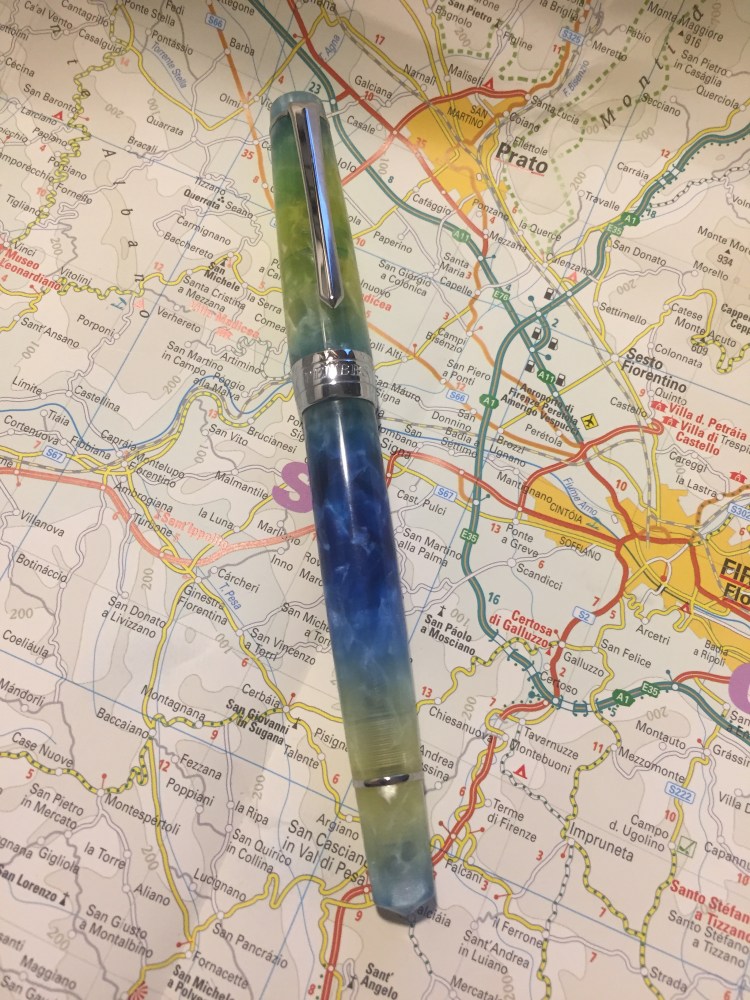
Isn’t it pretty? The pen is semi-translucent, with a lot of depth and chatoyance. It’s also pearlescent in places, as you can see in the tip or near the section. I filled it with Sailor Bungubox June Bride Something Blue ink and you can see some of the colour coming through the body (and a slight smear of ink in the cap, where I didn’t clean it properly after filling before capping it).
The only thing that I don’t quite like about the pen design is the super wide metal band on the cap. It has “PenBBS” and “309” engraved on it, but it cheapens the pen because of its width, not because of the branding.
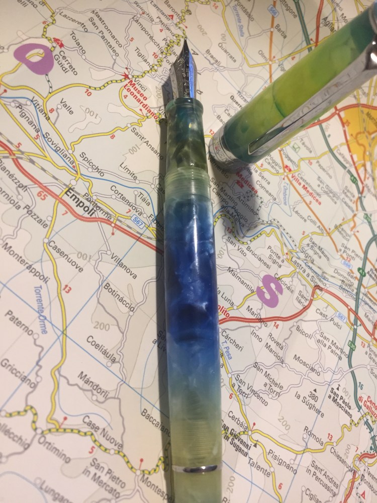
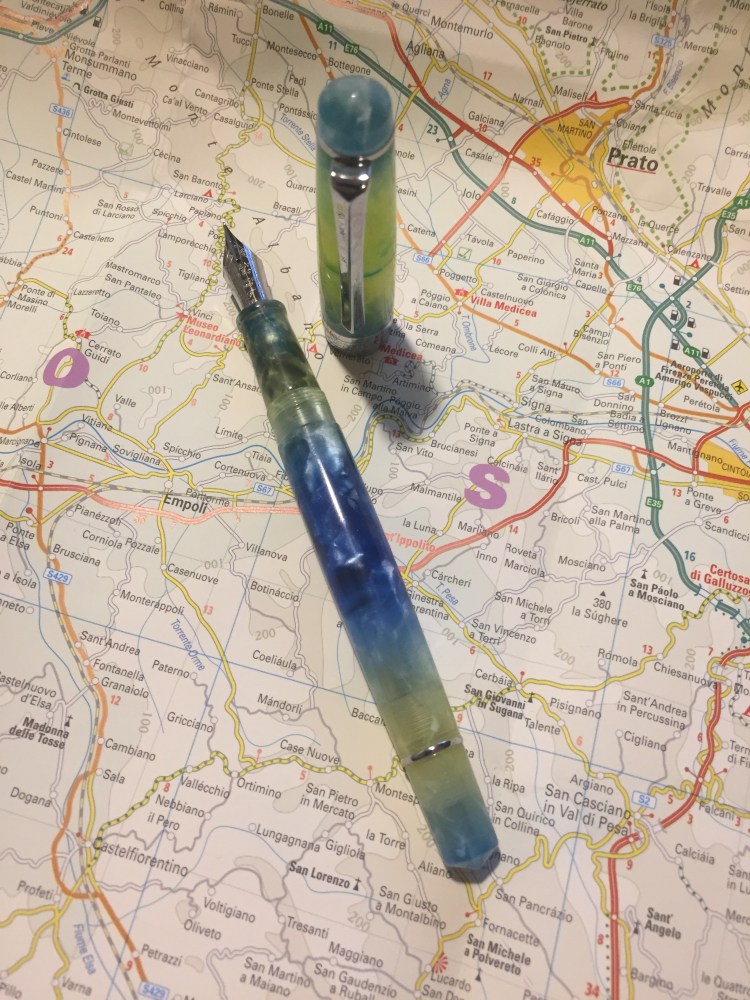
The nib looks great, with some thoughtful scrolling engraved on it, as well as the nib width (fine. It only comes in fine). The pen is quite standard in its width and weight, and very comfortable to use in long writing sessions. The section looks sleek, but is much less so than the Lamy Studio, and the lip on the edge prevent your fingers from accidentally hitting the nib and getting inky.

The fine steel nib offers a tiny bit of line variation as you tilt in (not the flex kind of line variation that appears as you apply pressure on the nib). It’s smooth but does provide feedback, and depending on how you hold it, you may feel more or less of that slight feedback as you write. I enjoyed writing with it, and because it’s a light acrylic pen, its comfortable for really long writing sessions.

Because its a fine nibbed pen I thought that I’d try it on my current journalling Moleskine. To my surprise this pen and ink combo worked fine on that paper. There are a few dots of show through here and there, but nothing that bothers me. Again, YMMV, and this LotR Moria Moleskine isn’t advertised as having fountain pen friendly paper, but I’ve been enjoying journaling with my PenBBS on it.
The PenBBS 309 is a piston filler, which for this price is unconscionable, especially considering that the piston mechanism works smoothly (and without squeaking) out of the box. The Pelikan piston fillers do feel better than the PenBBS one, but they come at a much higher price.
Whether you’re just starting with fountain pens or you have a sizeable collection already, the PenBBS 309 is well worth purchasing and trying out. I look forward to trying other PenBBS pens after this one, and I love that companies like PenBBS allow people to have a great fountain pen experience at such an affordable price.
Since there’s a good chance that people reading this post, about buying your first vintage fountain pen, will want to purchase a Parker 51, I thought I’d write a separate post with a few extra tips on how to get a good, working Parker 51 at a decent price.
So, one of these pens costs upwards of $400 and the other can be purchased for closer to $40. Which is which?
This is one of the dilemmas facing a new Parker 51 buyer: you’ve heard that this is a great vintage pen, but you can’t make heads or tails of its market value. How do you know what to buy and that you aren’t being ripped off?
Here are a few things worth knowing, if you want to buy a Parker 51 that you actually intend to use. If you’re looking to buy a pen to collect, this is not the guide for you. I’m assuming that you want a good, writing pen that will last you for years and won’t break the bank.


The answer is to flip the pen and look at the flip side of the nib. The tipping material looks like a shiny dot on the tip of the nib. If there’s no shiny dot and you just see the gold nib, the tipping material is gone. You’ll also feel it immediately when writing, as the pen will drag over the paper instead of floating on it, and may even be scratchy. Parker 51 nibs don’t get misaligned very often, so a scratchy nib usually means the tipping material is gone.


Bottom line: you can get a phenomenal gold nibbed pen in a beautiful Jetson design for less than $100 if you know what not to pay for. Now can you tell which pen is the Plum?
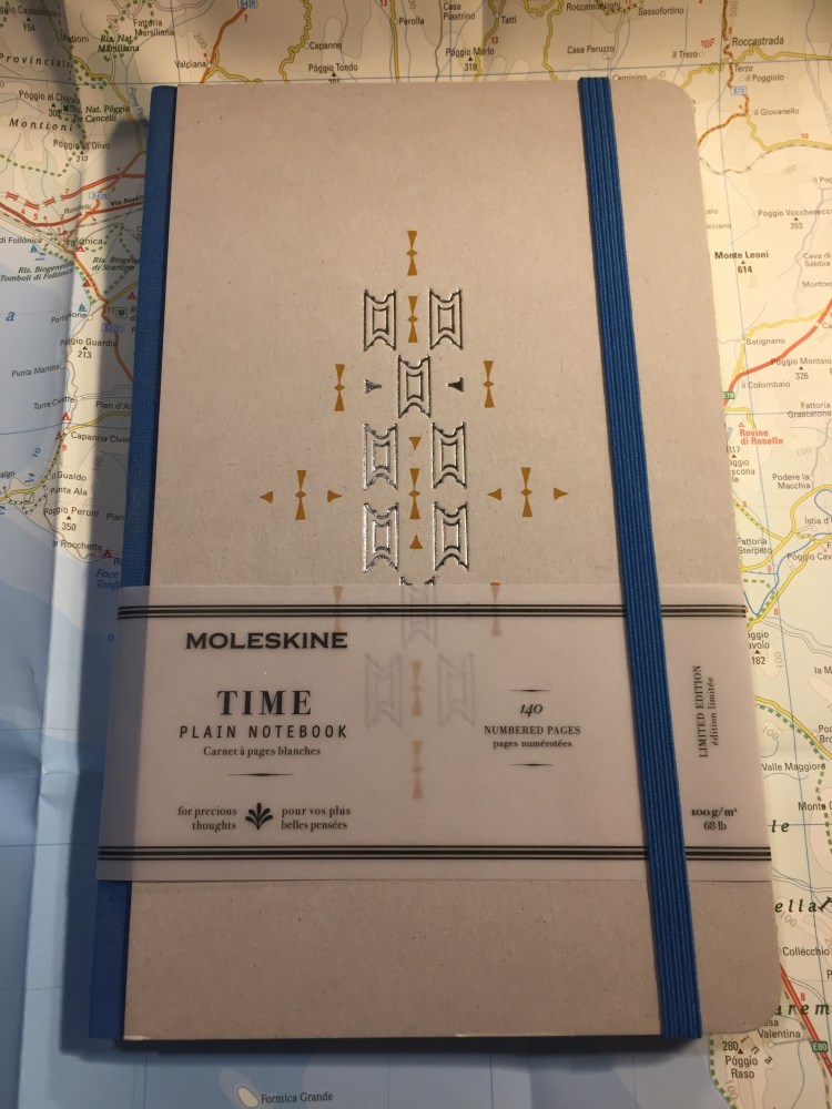
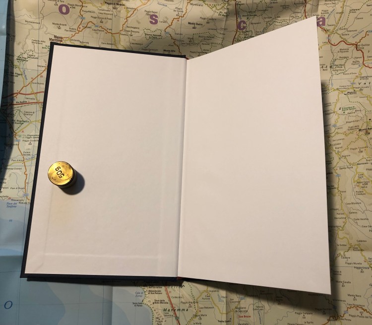
Every once in a while Moleskine comes out with something completely new. About a year ago it was the Time limited edition notebooks: a new format of notebook, with thicker paper, and a distinct new design.
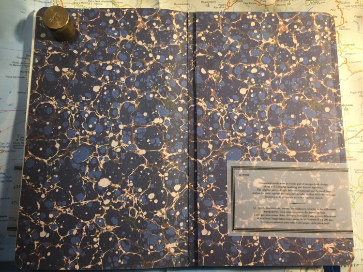
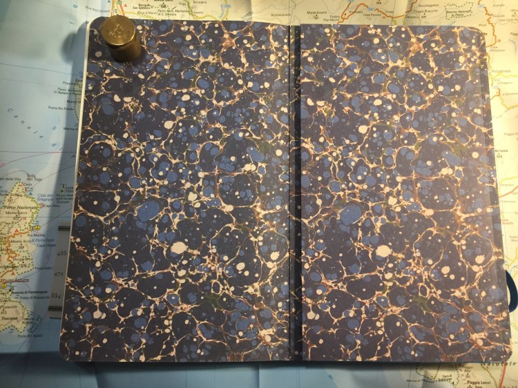
This is the Blue Time notebook. Each one has a different colour theme (blue, black, green and brown), a different motif embossed on the cover in foil, and comes in either ruled (lined) or plain (blank) pages.
The Time notebook is thinner than a regular Moleskine, but feels substantial because of its thick chipboard covers. This is a notebook clearly designed to sit on your desk and not be bashed around in your bag, as the covers bruise and stain easily.
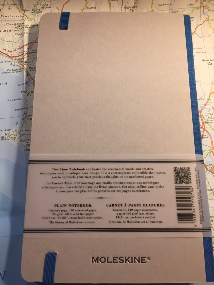
The Time notebooks have 140 pages of 100 gsm white, acid-free paper. They are themed around old ornamental motifs and paper making techniques, and so they feature marbled paper for their endpapers.
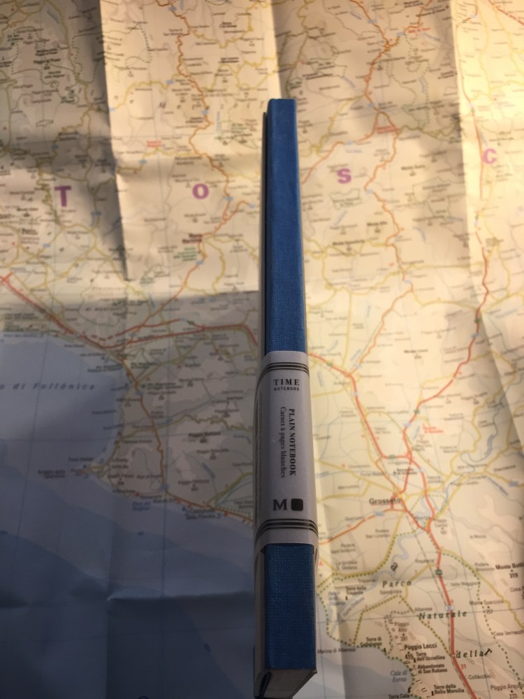
The spine is fabric covered, and the pages are set and sewn like any Moleskine notebook, so apart from the very first and very last page, they all open flat.
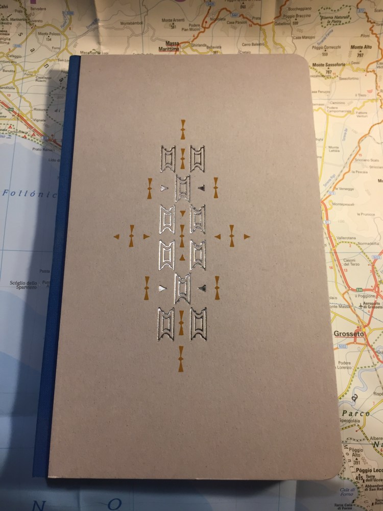
The foil emboss/deboss on the cover is beautiful and understated. The Time notebook features an elastic band and a back pocket, but no ribbon bookmark. Perhaps Moleskine thought that the index and numbered pages are enough.
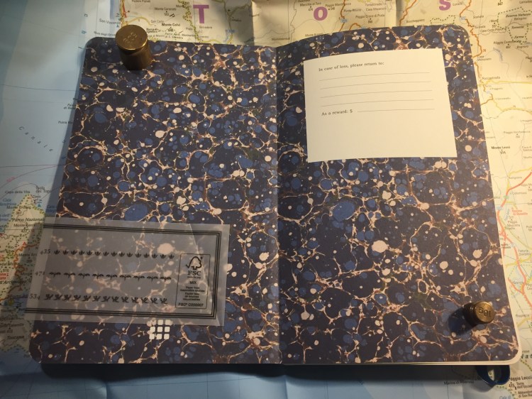
I love the transparent band, and the way they dealt with the “In case of loss” area on the front endpaper.
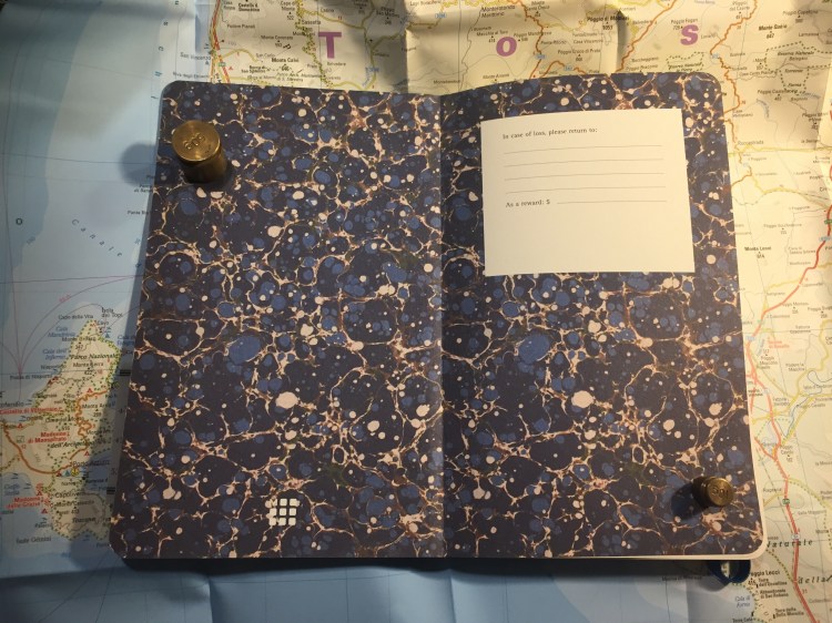
The marbling effect on the endpapers is gorgeous, even though it’s a print and not actual hand marbled paper.
Again, someone bothered to align the pocket and back cover prints. Well done.
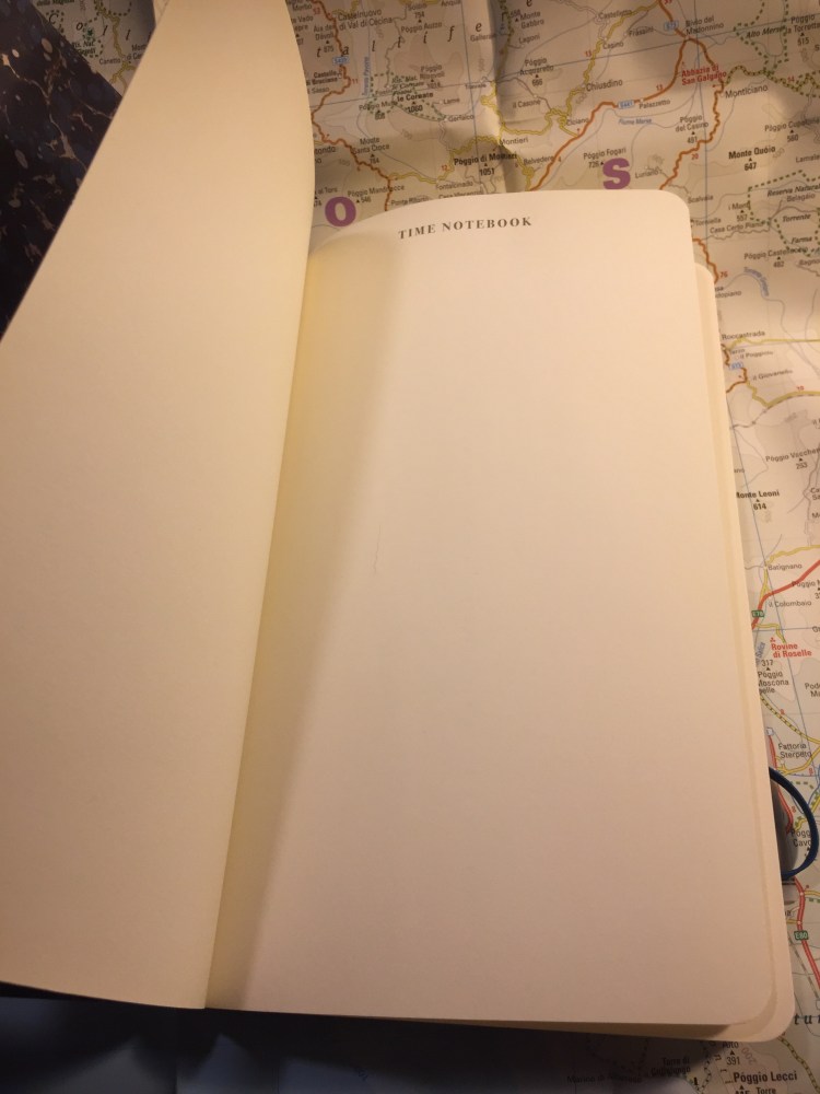
Since the first page of the notebook doesn’t open flat, Moleskine just put a blank page with a title there. I wish they would have done another throwaway page like that after the last page, but they didn’t.
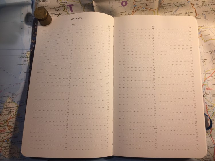
The index! Two pages, and suitable for people with tiny hand writing and short titles for their pages. It’s a nice idea, though.
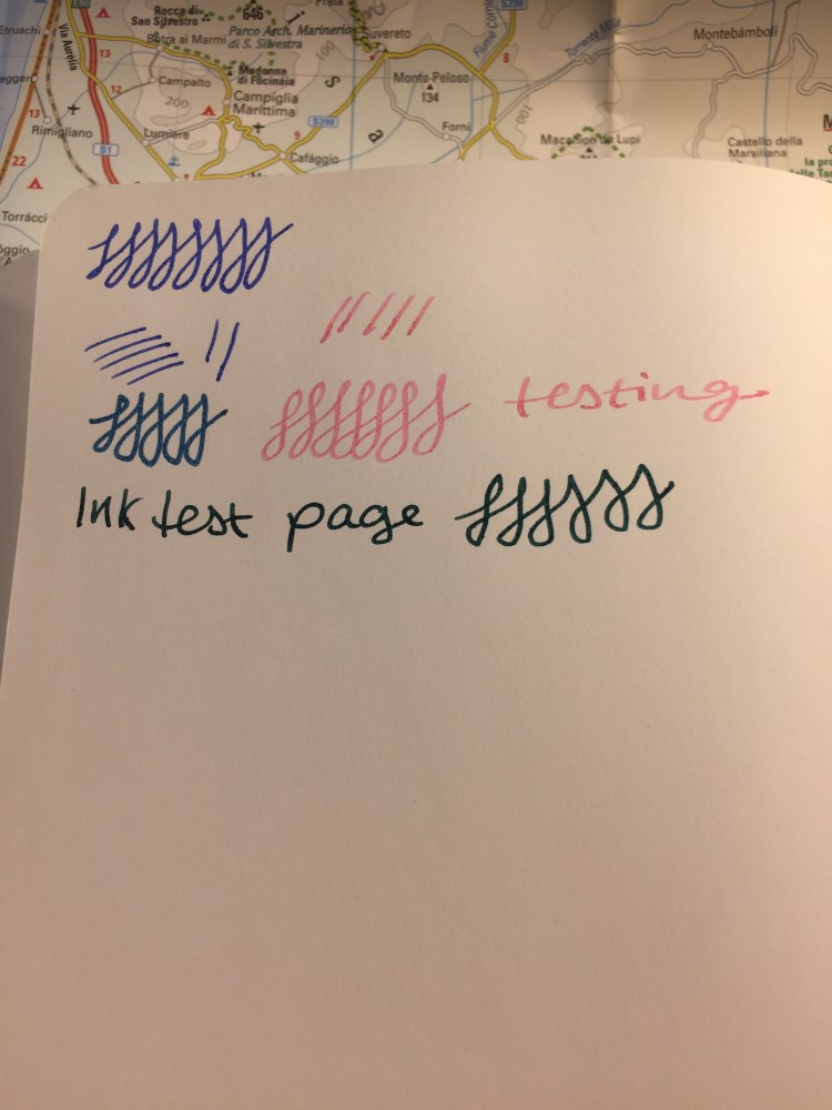
The pages of this notebook are numbered, and… fountain pen friendly. Not sort of fountain pen friendly, actually, deliberately fountain pen friendly. This is a notebook “for precious thoughts” after all.
I deliberately tested this notebook with juicy, italic and stub nibs, and it handled it like a champ. The paper shows some shading, though not as much tomoe river paper, obviously, and fast drying times. If you use nibs that lay down a lot of saturated ink there will be a tiny bit of bleed through and some show through, but for medium or fine nibs you likely won’t encounter this issue.
The other side of the page:
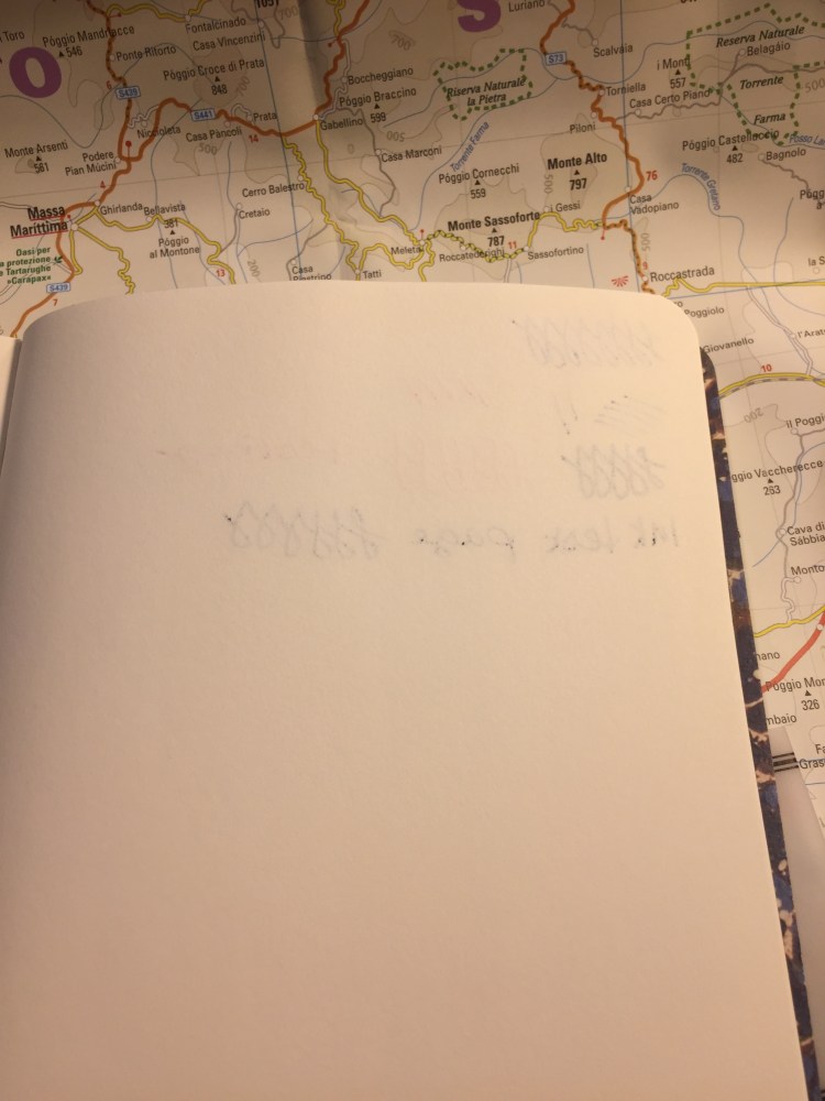
The paper is smooth, but not glass smooth, so it will work well with pencil if that’s what you prefer to use.
Moleskine doesn’t make the Time notebook collection anymore, but you can still find them pretty easily. I wish that this paper and format were available in other editions, or even in their regular lineup, and I’m glad to see that they’re still experimenting with their formats, not just with cover designs.
If you can get your hands on one of these notebooks and the format appeals to you, I recommend it.
I don’t use pink ink. My favourite ink colours are turquoise, teal, blue black, royal blue, and purple. I enjoy brown and green inks every once in a while. Black and grey inks are a staple in my collection. But pink ink? It’s a combination of two things that I don’t like: light coloured inks that are difficult to read, and inks on the red/yellow area of the colour wheel.
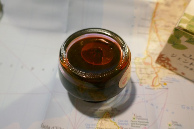
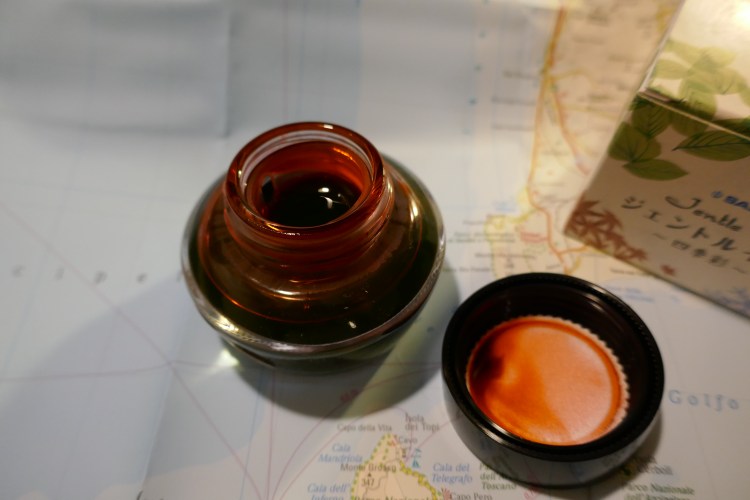
But a while back I got swept in the Sailor ink craze, and for some reason I decided to purchase a bottle of Sailor Jentle Four Seasons Sakura Mori ink.

Sailor designed an ink bottle that has little chance of tipping over and spilling, and the box it comes in is beautifully designed, but… If you use oversized nibs, you are going to have a serious problem filling your pen, even with Sailor’s nifty little inkwell in ink bottle trick.
You see, inside the bottle Sailor places a little plastic inkwell. You fill your pen by turning the bottle upside down, and then the right way up. This forces ink into the plastic inkwell, and allows you to fill your pen even when the ink level in the bottle drops with use.
How is the ink itself? It’s darker than I thought, yet it isn’t a very saturated ink. There’s a bit of shading, and I think that’s part of what makes this ink readable. Take a look:
This was drawn and written with a Pilot Metropolitan cursive italic medium on tomoe river paper. Sakura Mori is definitely a usable ink, in that it can be more or less clearly read (I wouldn’t use it on tinted paper), but it’s also definitely not for standard office use. It is a fun and cheerful colour, and I was surprised by how much I enjoyed using it.
Will I buy 10 more bottles of various shades of pink? Not likely. I am glad, however, that I gave this ink a try. It put a smile on my face, and after all, that’s what this hobby is all about.
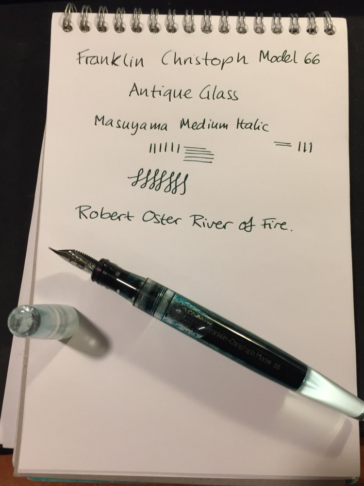
Every once in a while Franklin Christoph comes out with a batch of their pens in “Antique Glass”, a clear acrylic with a bit of a green tint to it that makes it look like an old coke bottle. The material is both minimalist and beautiful. It allows you to show off the ink that you’re using while still having a pen that has more character than a run-of-the-mill demonstrator. Franklin Christoph’s pens and the nibs that they use are excellent and very well priced. The result is that these limited runs having a waiting list (from which a 100 names are drawn), and there’s a good chance that you won’t be able to even get on that. I had to wait for two years until I was able to purchase mine.
The wait is worth it though.
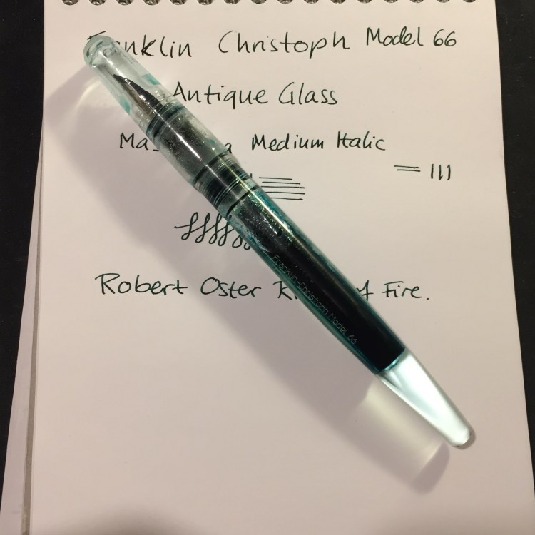
The Franklin Christoph Model 66 is a long and sleek pen that can’t be posted. The pen is light but still substantial, because of the extra acrylic in the finial. I was worried at first that it would be top heavy, but the Model 66 is perfectly balanced, and one of my favourite pens for long writing sessions.
The Model 66 is a demonstrator pen that is built to be eye-droppered. Yes, you can use the supplied converter or cartridges, but what’s the point of having a pen that looks like this if not to eye dropper it? Franklin Christoph even supply the requisite o-rings and silicone grease, making it super easy to transform it into an eye dropper.
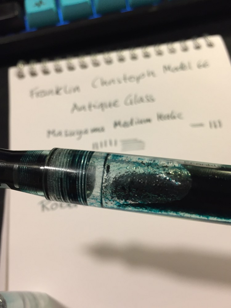
The pen body is made of smooth acrylic on the outside, but is pebble textured on the inside. The result shows off the ink colour and the pen colour even more, but it also means that staining inks have even more surface area to stain. I decided early on to use only turquoise, teal, blue and green inks in this pen, as even if they stained the pen it would work well with its “natural hue”.
You can see the greenish “antique glass” tint best in the cap.
In terms of design, this is a desk pen and is designed as one, so it has one flat side which keeps it from rolling off the table even though it’s a clipless pen.
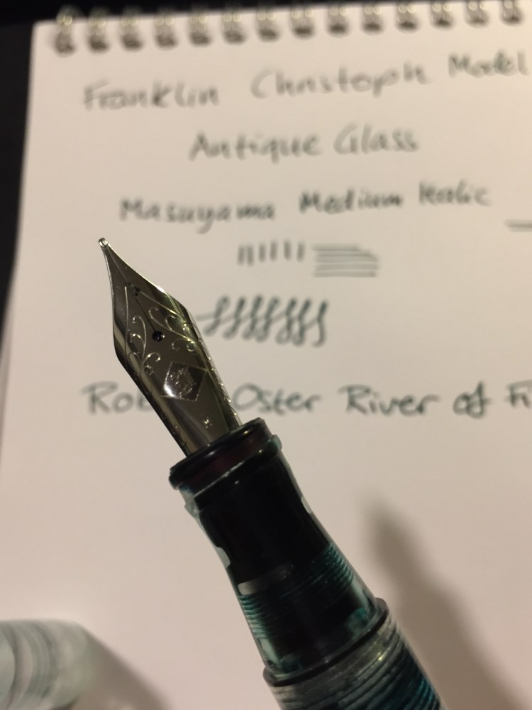
There’s a wide variety of Jowo nibs that you can order with your pen, and I decided to pay a little extra for a Mike Masuyama medium italic nib. The nib is buttery smooth, and the feed keeps up with flow. This italic isn’t super sharp, which is a plus for me, and together with the large ink capacity that an eye-dropper pen offers, it’s writing heaven.
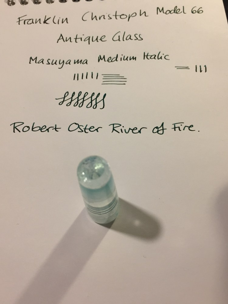
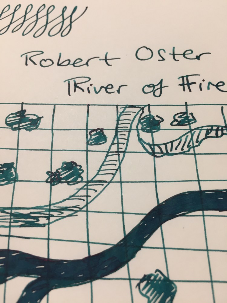
The Franklin Christoph Model 66 Antique Glass with a Mike Masuyama medium italic (what a mouthful) is build to show off interesting inks. Although I would never use shimmering inks in it, it’s great for inks that shade or sheen. And Robert Oster is the king of sheening inks.
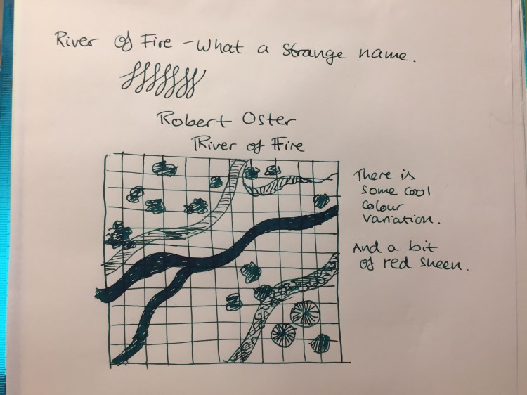
The River of Fire is a dark teal ink that has significant red sheen and a good amount of shading.
As usual with inks of this kind, the paper and nib affect how much sheen or shading you see. This nib is perfect for that, and the paper I used here is Tomoe River Paper, which brings out the best in every ink.
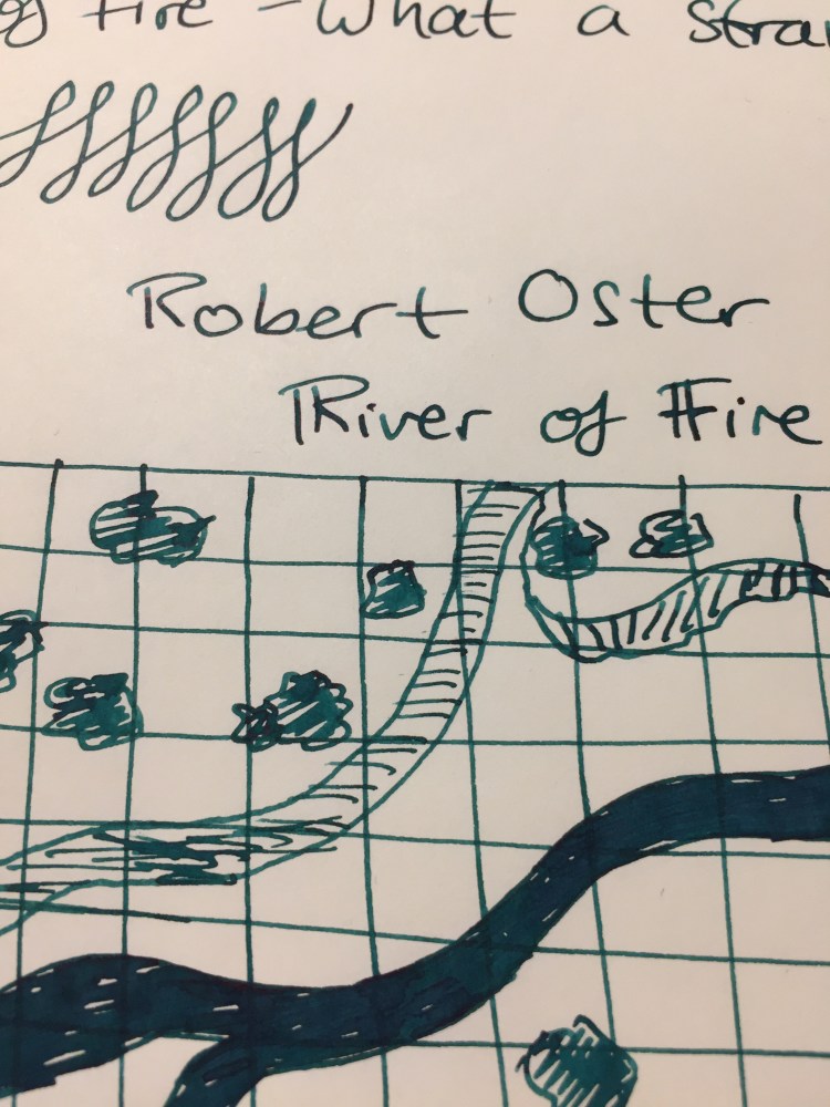
You can see a bit of the properties of the ink here, particularly the shading, but this ink really does have a lot of sheen. It’s just difficult to photograph, so you can only see a bit of the golden red that happens where the ink pools.
This is such a pretty ink. Look how much variation and interest it offers:
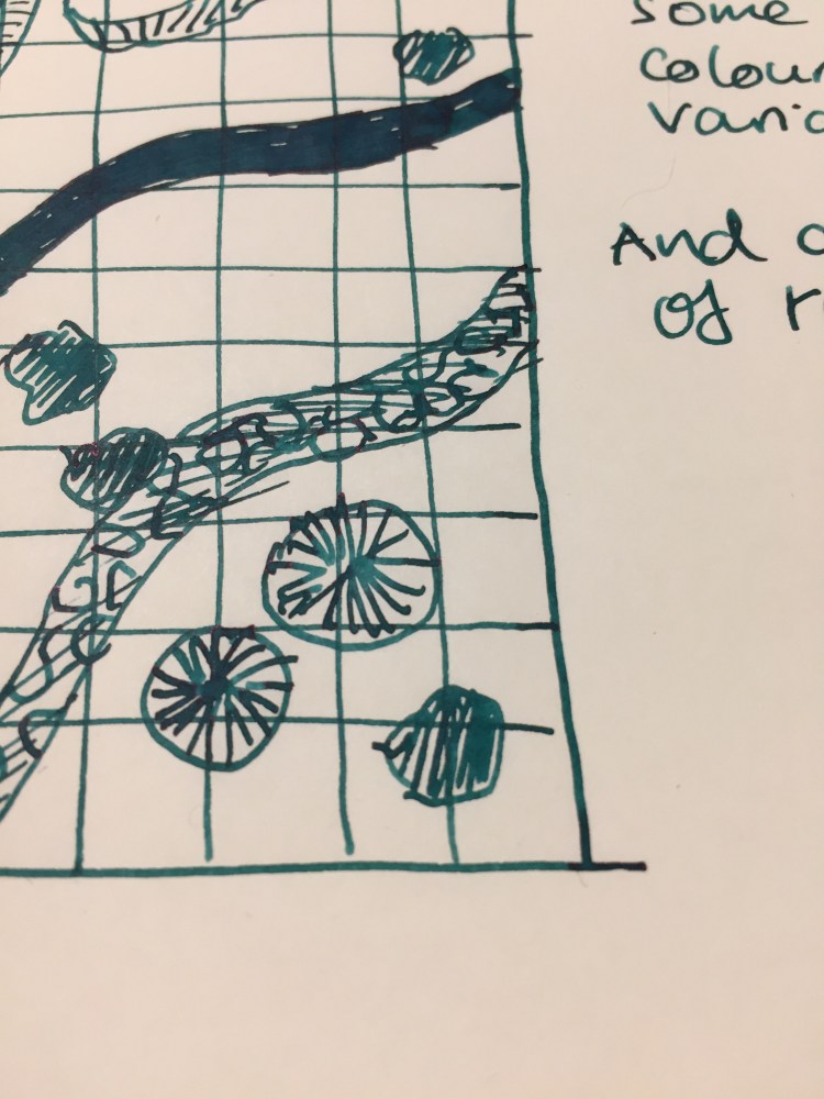
So, if you can get on one of the Franklin Christoph antique glass waiting lists, I highly recommend it. As for the Robert Oster River of Fire, I think that it’s a gorgeous ink, but it’s not unique enough in Robert Oster’s large ink offering. If you have something in the turquoise or teal shade in their lineup, then there’s probably no need to buy the River of Fire. If yo don’t then I recommend this ink since it’s wild and yet dark enough to “pass” in an office setting.
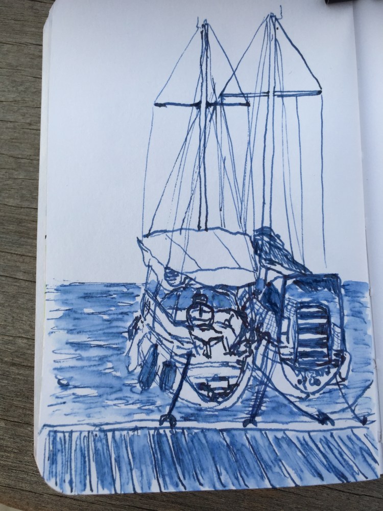
A quick sketch on location of the Eurovision 2019 Tel Aviv Euro Village as it was filling up.

Leuchtturm1917 Sketchbook, Super5 0.7 fountain pen and Rohrer and Klingner Lotte ink.
A few years ago I used to be really on the FOMO limited edition fountain pen ink band wagon, but over the last two years my ink purchases have petered out to nothing. At some point I realized that any limited edition ink that I buy is bound to be pretty damn close to an ink that I already own, and a person can only have too many inks (IMHO). How many inks can you use at one given time anyway?
The precious few new bottles of ink that I have have all been given to me as part of large (vintage) fountain pen purchases, and so I haven’t felt comfortable reviewing them. You don’t look a gift horse in the mouth, do you? Then again, the gift was from the store, not the ink maker, so here we are.
The Montblanc Beatles Psychedelic Purple limited edition ink comes in a very groovy box, that is very well designed. Normally I couldn’t care less about ink packaging (excepts as it pertains to price — looking at you Pilot Iroshizuku. You started the trend and you know it), but someone really put some thought in this.

Look at that design:

I’ve never seen an ink bottle’s cap protected before, but then again this is Montblanc:

The bottle itself is pretty conservatively designed, but classically pretty:

The ink itself is a rich, saturated purple with a good amount of shading (despite being pretty dark), and a very slow drying time. It’s one of the few cases where the actual ink matches the colour of the packaging. There’s some sheen to the ink, but I’ve seen it sheen only on Tomoe River Paper, and it’s super hard to photograph.

I love this ink’s shade of purple (it’s slightly more to the red side of purple than the blue), but this ink was a hot mess in terms of behaviour on various papers. This ink is usable only on Rhodia/Clairfontaine and Tomoe River Paper, it becomes a bleeding, spreading monster on everything else. It also takes a really long time to dry (not surprising, as it’s a very saturated ink), which means that it’s going to be a no-no for left handed users and you really have to take care where you put your hand when you write with the stuff.

And that’s the thing. This is an expensive, not readily available ink that is finicky and temperamental in a hue that’s not so rare as to be unobtainable. Why spend good money and time buying it if you can probably get a spot on match from Diamine? Montblanc Psychedelic Purple cost about $40 when it came out and $80 now for a 50ml bottle. Diamine Majestic Purple costs $15 for an 80ml bottle. You do the math.
If you enjoy hunting for limited edition inks as part of the hobby, that’s fine. Just don’t get swept away by the marketing and the hype. Remember: there’s a very good chance that that expensive limited edition ink is not very different from the ones that you already have and don’t use, or that you can get a similar hue for less than half the price from Diamine.
Back in the (not so good) old days, Tomoe River Paper was an exotic kind of paper available only in bulk order from Japan, or through various indie creators that advertised mostly on the Fountain Pen Network. The magical paper that made all your inks shine (not literally, this was in the pre-sparkle days of ink, when shading is all we dared dream of in an ink) was very hard to obtain, and very expensive.
It was at that time, in 2013, when I was looking for reasonable priced Tomoe River Paper notebooks that could be shipped to Tel Aviv, that I ran into Paper For Fountain Pens, through the Fountain Pen Network. Since I just received my latest three-pack of notebooks from Jay at PaperForFountainPens.com, I decided that now would be as good a time as any for a review.
The notebooks that I ordered are the larger, 374 pages (187 sheets), ones, which are available only around this time of year. The regular notebooks have 320 pages, but are otherwise identical. Jay uses 52 gsm Tomoe River Paper for the notebooks, which are 4 3/4 x 8 3/8 inch page size; 5 1/4 x 8 1/2 inch cover size.
The notebooks used to be shipped with a paper cover, now they arrived vacuum packed as well, to protect them from the elements, and in a heavy duty box that prevents them from getting damaged by the postal services of the world.


Tomoe River Paper is much easier to find now and these notebooks aren’t cheap, as you are paying for the binding. The covers are very durable, made from a material that (with the binding) makes the whole notebook look and feel like a vintage hardcover book. It has that solid, over-engineered feel to it, and is very pleasant to use and hold.
The notebook isn’t inconveniently thick, even with the larger page count.

There are no frills to this notebook, just blank end papers, no elastic closure or bookmark, nothing but the paper and the covers. The pages lie flat, and the binding is extremely durable (I page a lot, a lot in my Paper for Fountain Pens notebook and not a page has wavered in my years of using it).
I’ve used the slimmer version of this notebook as a research notebook for my novel and it has held up well through years of use. I do, however, only keep it on my desk. Travelling with such fragile paper in a notebook with no elastic closure is a recipe for disaster, so if you do intent to use one of these beauties as your everyday carry notebook or journal, I highly recommend placing it in some kind of protective cover that you can zip up.

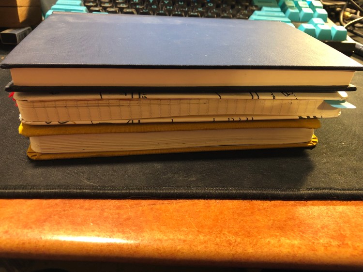
This notebook is slightly thicker than the Baron Fig Confidant and Moleskine large notebook, is about as wide as the Moleskine, but a tad taller.
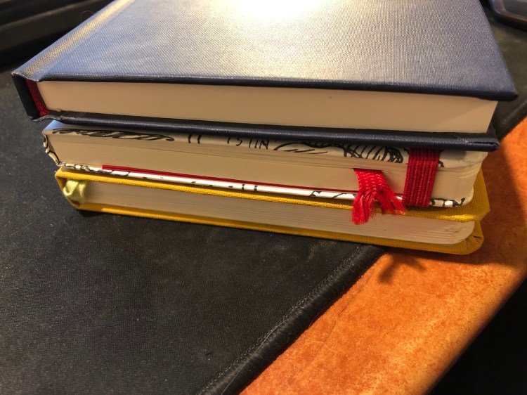
You can see the difference in sizes with the notebooks stacked up. The Paper for Fountain Pens notebooks have thicker and heavier covers than the Moleskine and Baron Fig ones, but the lightweight paper in them keeps them from being overly heavy to carry around.
All in all I recommend these notebooks, with one caveat: they may intimidate you to a point where you won’t use them. There’s something about their book-like format that makes you feel that you can only write the next Booker prize winning novel in them. Notebooks should be used and not stacked and stared at, so if this one will scare you off, pick a more humble notebook instead. Otherwise, buy a three-pack of these — it’ll come out cheaper (particularly with shipping), and there’s an excellent chance that they’ll become your new favourite.
I wrote the first few chapters of my first novel longhand, with fountain pen on loose sheets of A4 tomoe river paper. As I realized that I would have to type everything into Scrivener before I could even start editing, the lazy programmer within me balked. It was fine doing this with quick drafts, but writing an entire novel longhand was not for me.
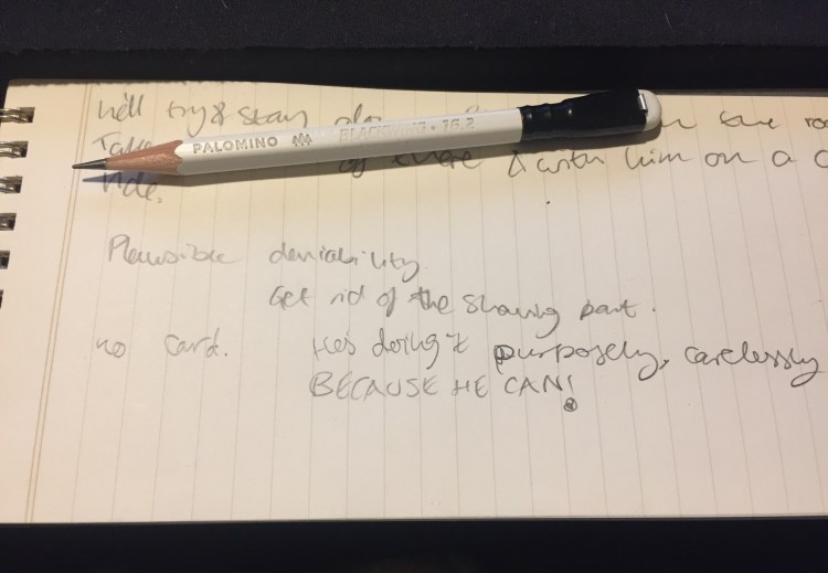
I still use pen, pencil and paper a lot in my writing though. I use a fountain pen (anything that doesn’t have a flex or novelty nib will do — from extra-fine to 1.1mm stubs) and loose sheets of A4 and A5 tomoe river paper to work on my outlines, for quick drafts, to test plot options out, or when I’m really, really stuck in my writing. A Field Notes Byline is constantly under my keyboard, horizontally. Yes, I know that the lines don’t go that way, but I ignore them. The form factor is perfect for that, and the ruling is pale enough for me to easily ignore it. I use a Blackwing 16.2 or 24 with it, to quickly capture any ideas that may come up during my writing, to remind myself where I was going with an idea or what I need to fix a previous place, to brainstorm names, etc. It serves as a scratch pad that allows me to maintain my writing flow and still remember things along the way.
So, even if you do all your writing using Ulysses or Scrivener (hopefully not Word), I recommend that you incorporate some analogue tools in your process. You’re bound to find them useful, particularly when you’re stuck or you’ve dug yourself into a hole.
