I don’t use pink ink. My favourite ink colours are turquoise, teal, blue black, royal blue, and purple. I enjoy brown and green inks every once in a while. Black and grey inks are a staple in my collection. But pink ink? It’s a combination of two things that I don’t like: light coloured inks that are difficult to read, and inks on the red/yellow area of the colour wheel.
But a while back I got swept in the Sailor ink craze, and for some reason I decided to purchase a bottle of Sailor Jentle Four Seasons Sakura Mori ink.

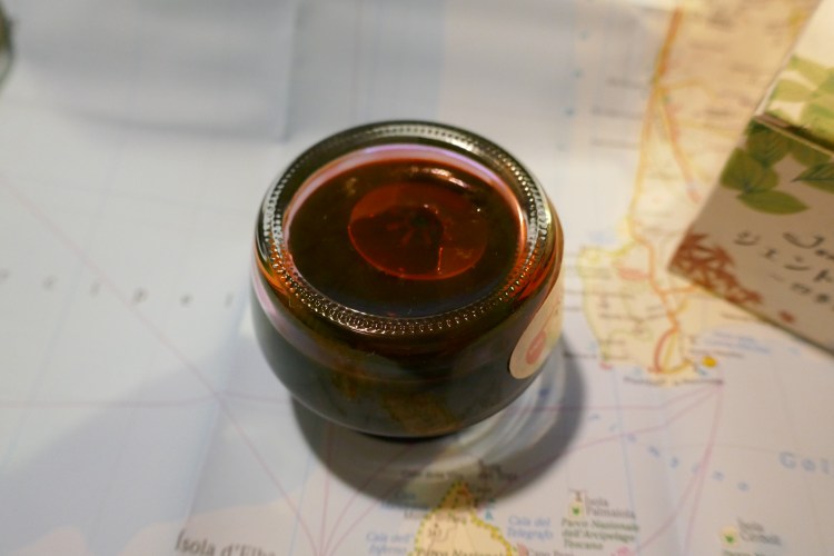
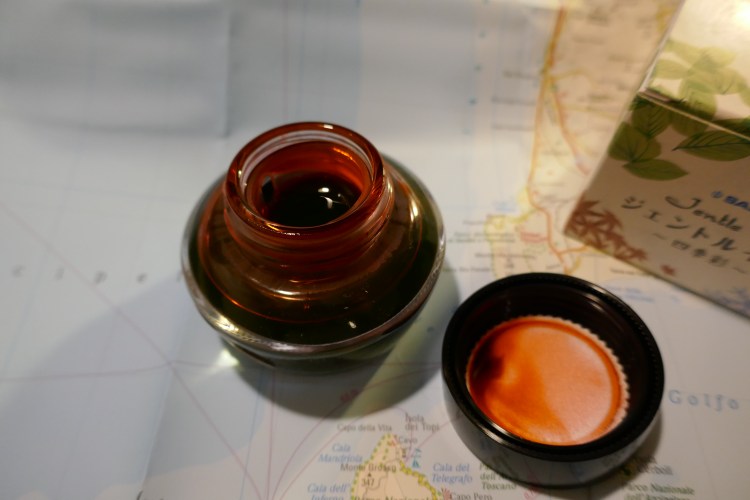
Sailor designed an ink bottle that has little chance of tipping over and spilling, and the box it comes in is beautifully designed, but… If you use oversized nibs, you are going to have a serious problem filling your pen, even with Sailor’s nifty little inkwell in ink bottle trick.
You see, inside the bottle Sailor places a little plastic inkwell. You fill your pen by turning the bottle upside down, and then the right way up. This forces ink into the plastic inkwell, and allows you to fill your pen even when the ink level in the bottle drops with use.
How is the ink itself? It’s darker than I thought, yet it isn’t a very saturated ink. There’s a bit of shading, and I think that’s part of what makes this ink readable. Take a look:
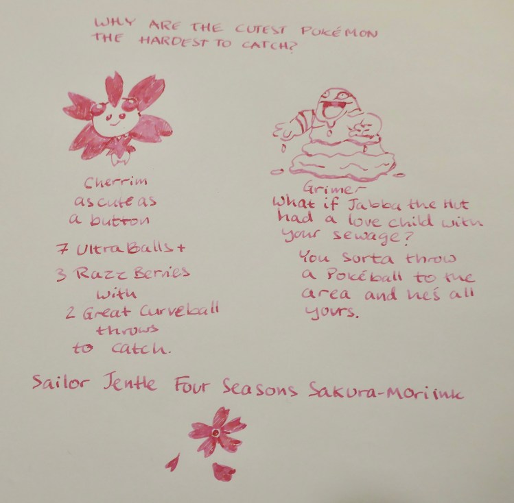
This was drawn and written with a Pilot Metropolitan cursive italic medium on tomoe river paper. Sakura Mori is definitely a usable ink, in that it can be more or less clearly read (I wouldn’t use it on tinted paper), but it’s also definitely not for standard office use. It is a fun and cheerful colour, and I was surprised by how much I enjoyed using it.
Will I buy 10 more bottles of various shades of pink? Not likely. I am glad, however, that I gave this ink a try. It put a smile on my face, and after all, that’s what this hobby is all about.
