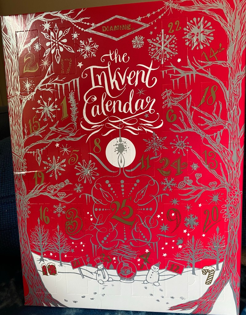
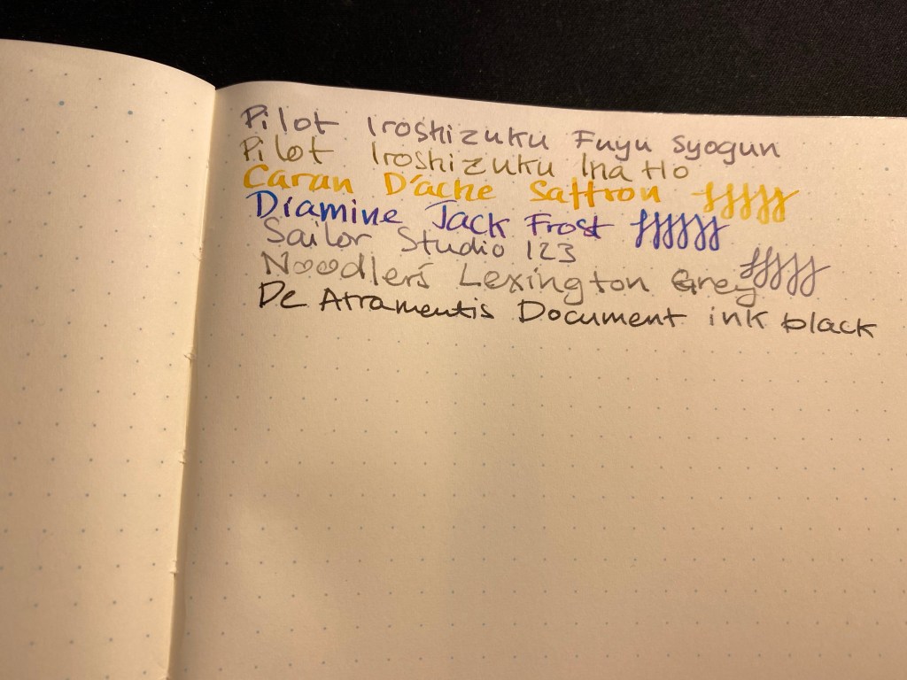
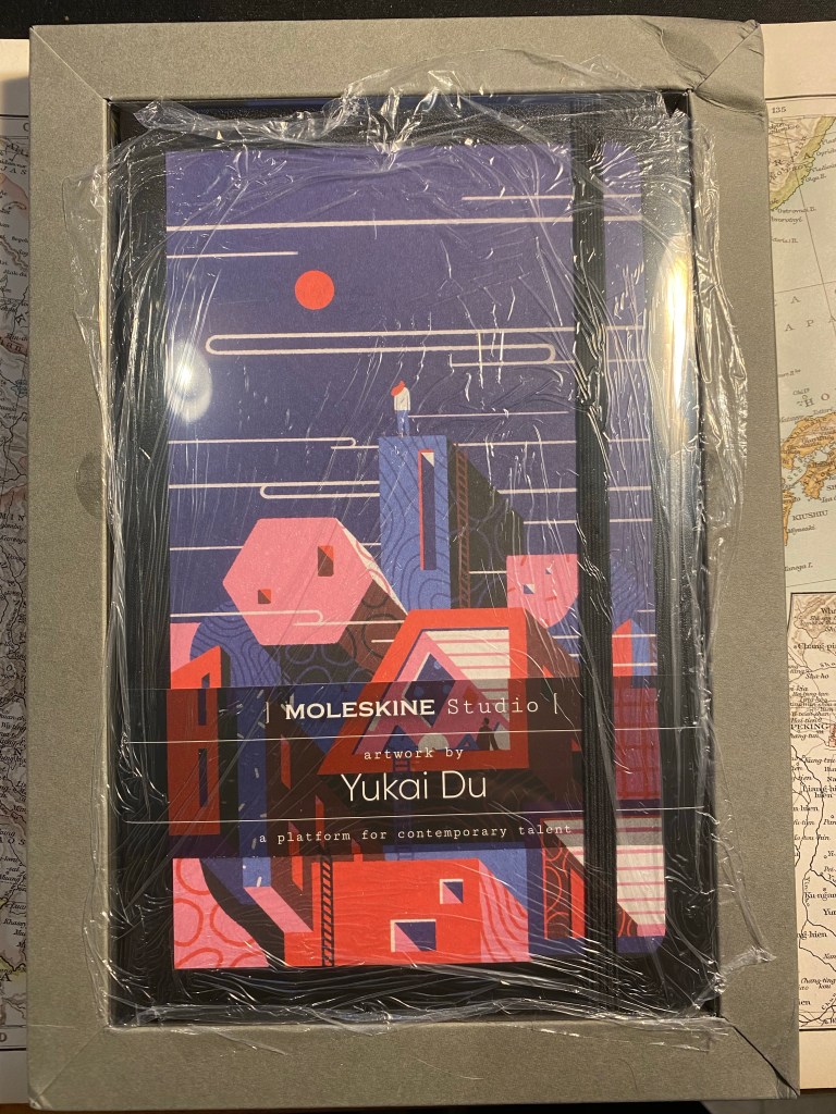
Diamine Inkvent Day 1

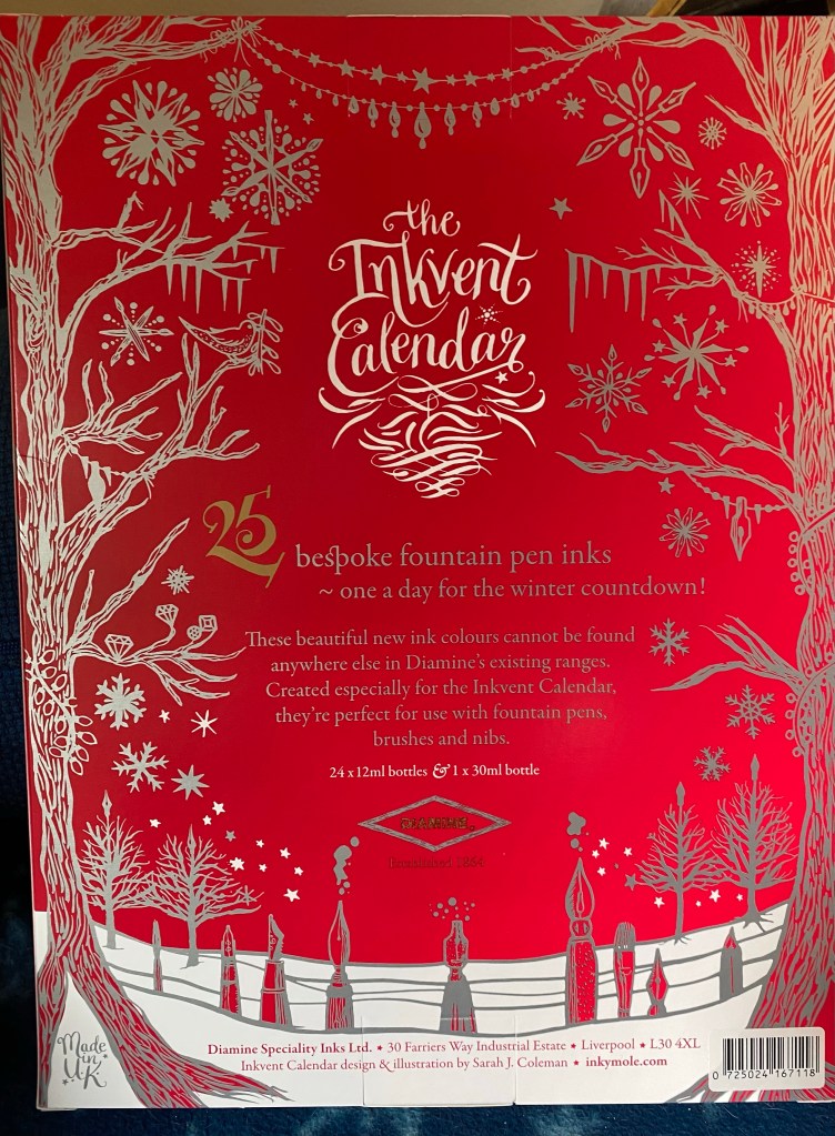
The Diamine Inkvent calendar is an advent calendar with 24 tiny (12ml) bottles of fountain pen ink behind 24 doors, and a larger, 30ml, bottle of ink behind the 25th door. All the inks are limited edition, and, at the moment, only available through this calendar.
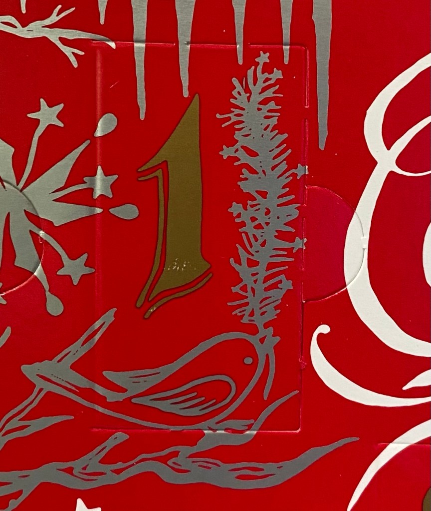
The first thing that caught me by surprise is the bottle. The 2019 Inkvent calendar had tiny, tall and circular glass bottles. This year’s Inkvent has plastic bottles that are square and squatter and have wider mouths. That makes them much easier to use, with less of a chance for accidental spills. I like the redesign, even though I would have liked glass bottles better. However, as glass is more expensive, I understand the reasoning for going for plastic this year.
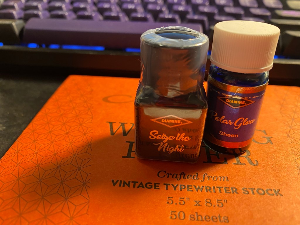
The day 1 ink is “Sieze the Night”. It’s a standard ink in a very non-standard colour. I’m not sure if the label on the bottle is meant to reflect the colour, as it did in the 2019 Inkvent, but if so they did a poor job of it.
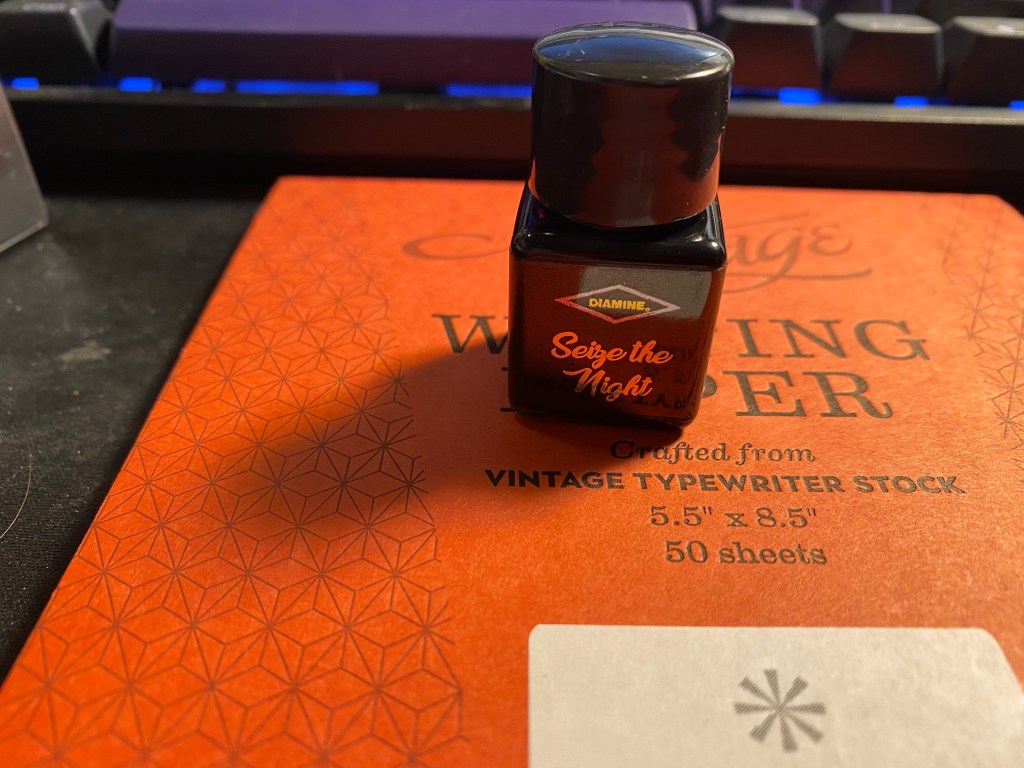
The bottle comes wrapped in shrink wrap, likely to prevent leaks, and on the side of the label you can see what kind of ink it is (in this case standard). The plastic wrap is surprisingly difficult to open.

So what’s the colour like? It’s a dusky purple that goes down on the page lighter and brighter than it dries. Seize the Night is a greyish-lavender ink with a good amount of shading and a slight golden sheen if you flood the page with it.
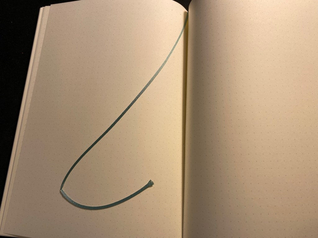
Here’s a Col-o-Ring swab of it. You can see the sheen on the swab, where the ink pooled.

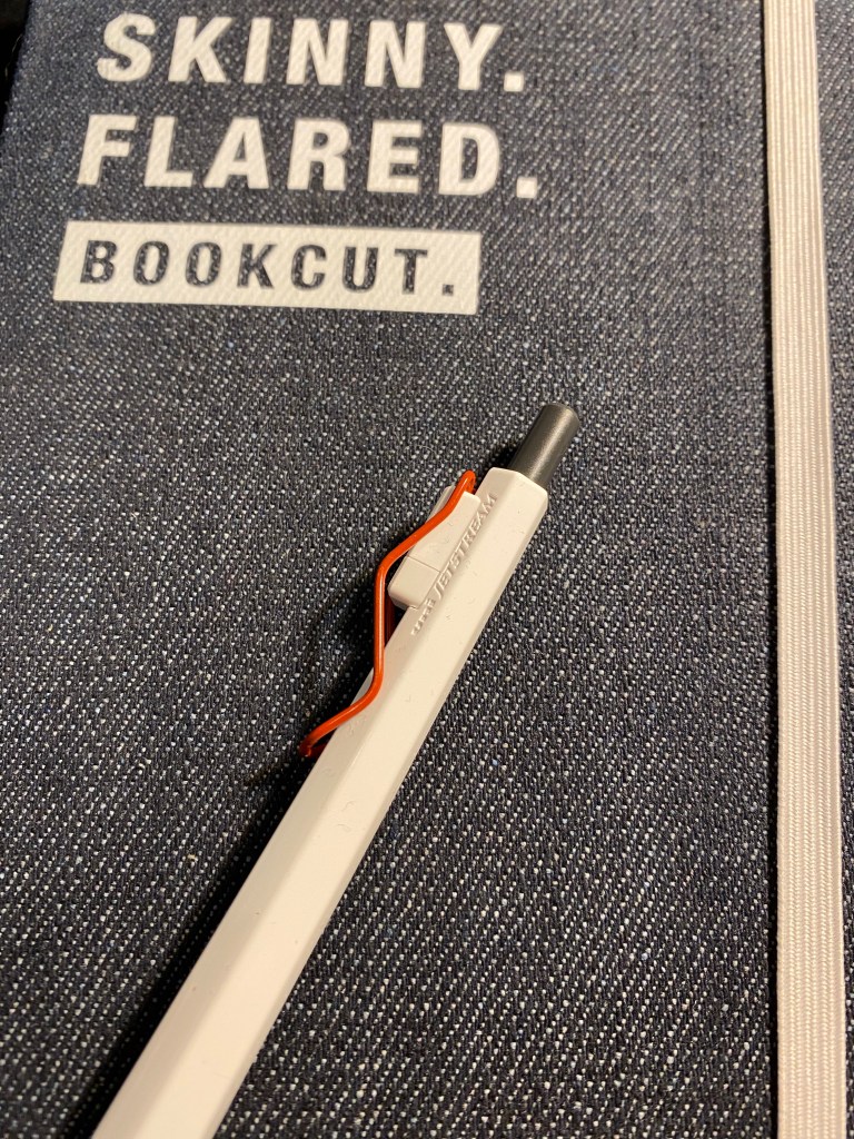
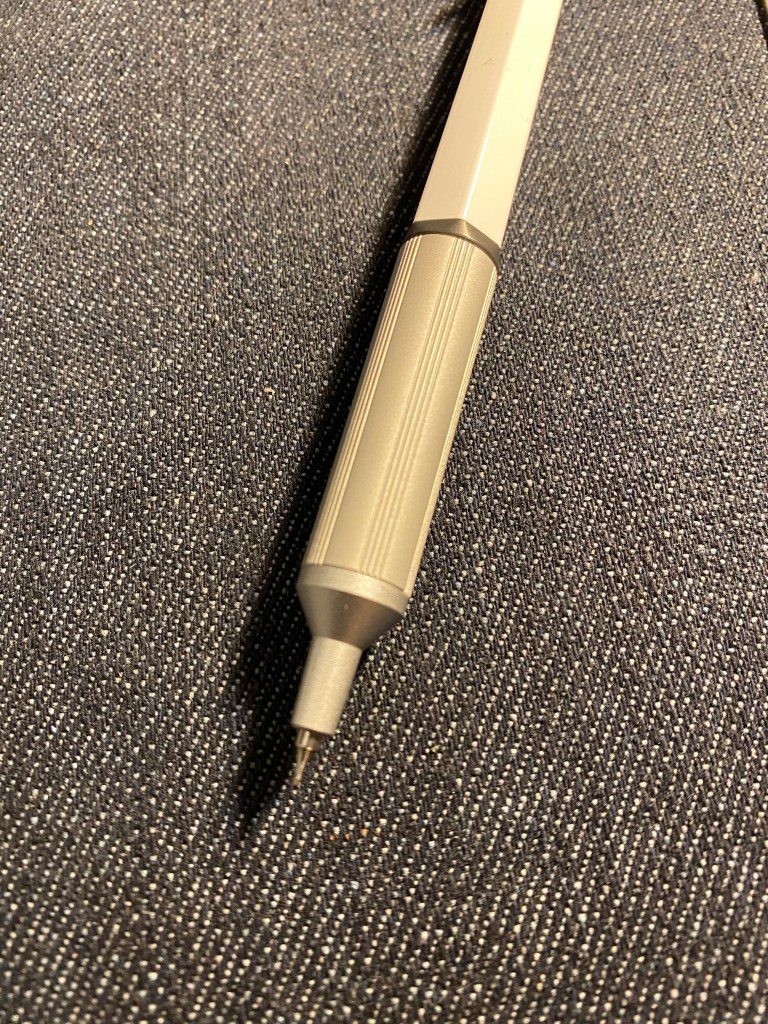
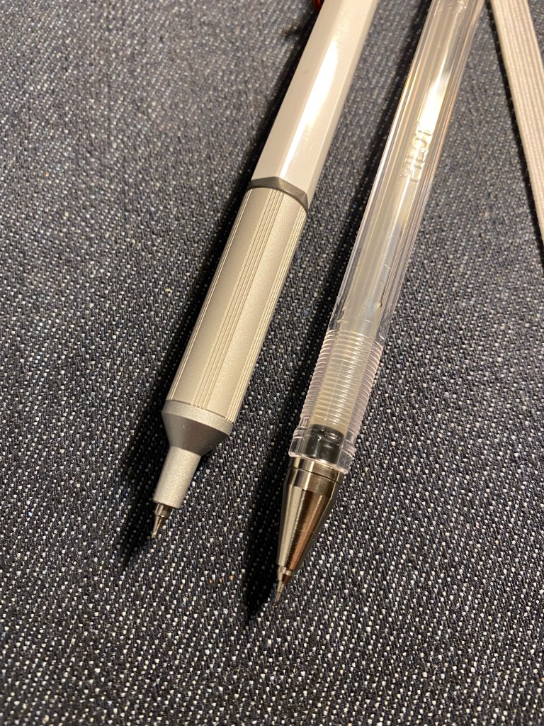
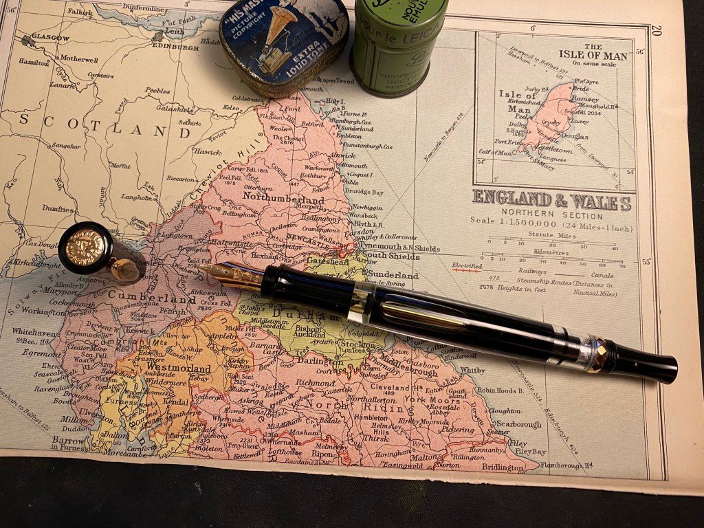
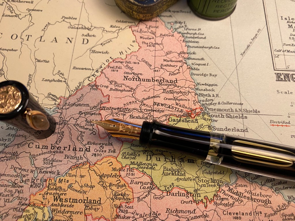
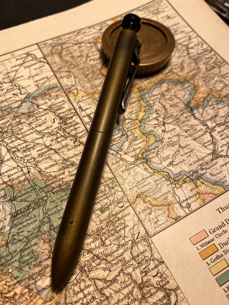
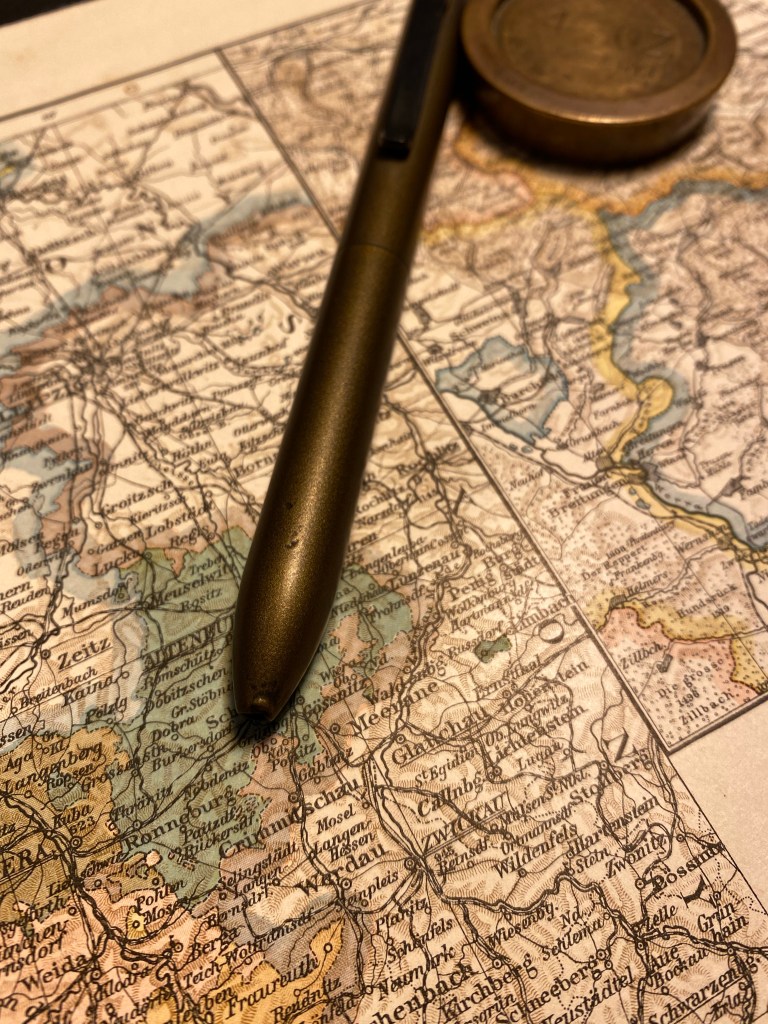
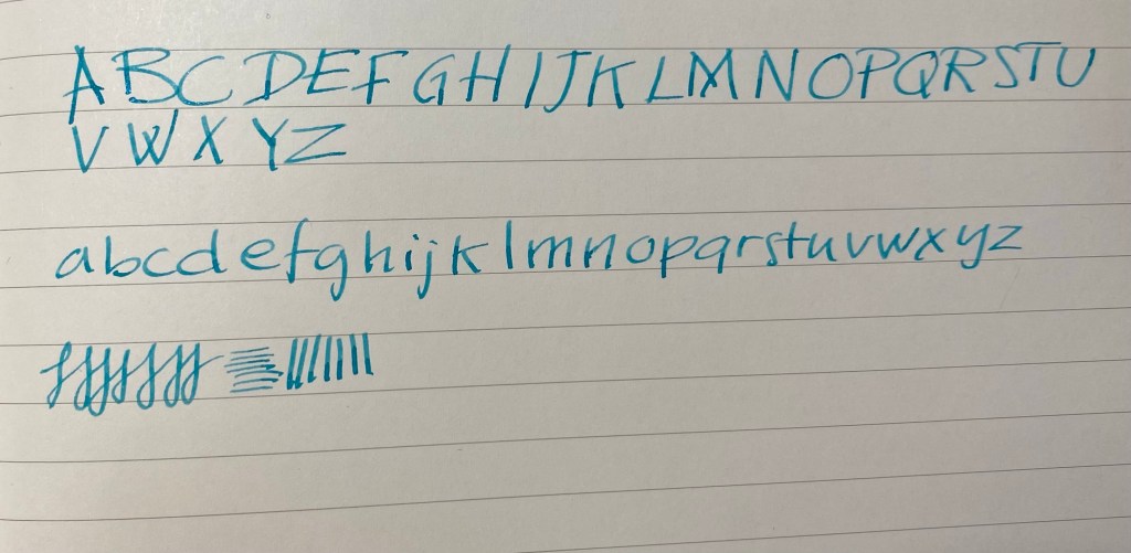
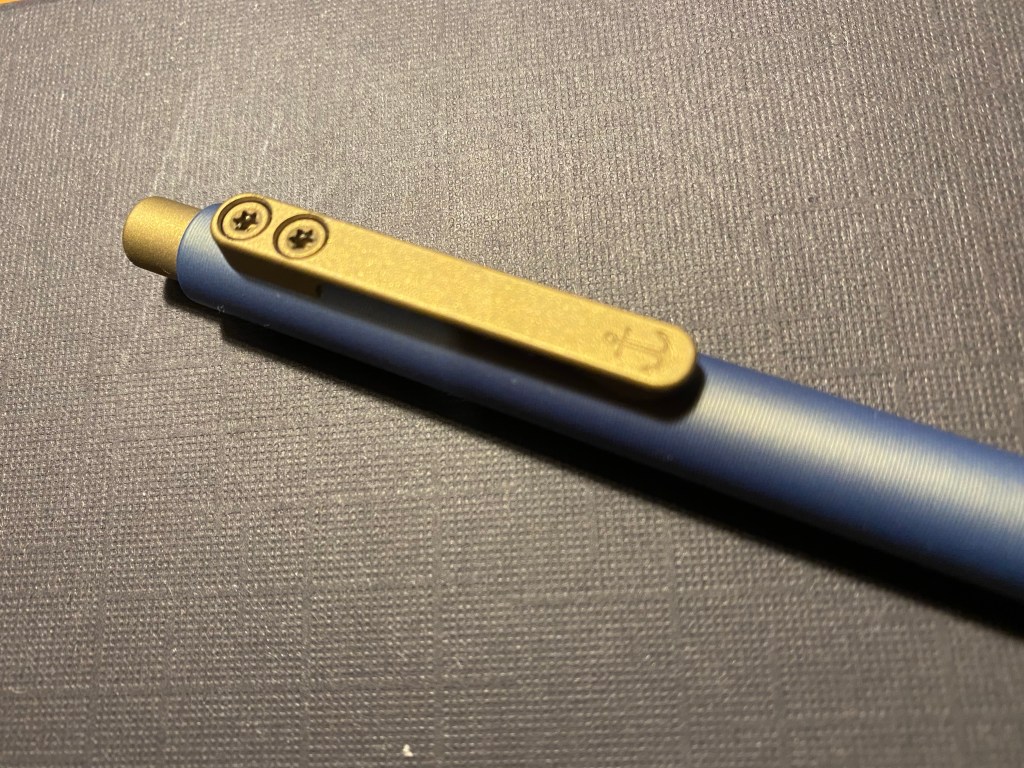
I used my Diplomat Elox Rings with an extra fine nib to test out this ink. A wider nib would have shown more shading, but even with this nib there’s a fair amount of shading going on, particularly on less absorbent paper.

I read an article about villagers in India training the air roots of local trees into bridges across a local river, and decided to do a quick sketch of that scene to test the ink out.
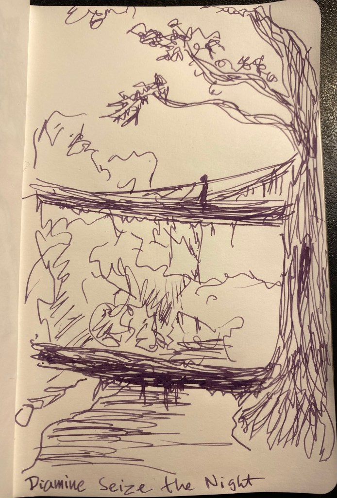
This was drawn on a Kanso Sasshi 3.5” x 5.5” Tomoe River Paper notebook (the notebooks I have were bought in 2016, and so they contain the old Tomoe River paper).
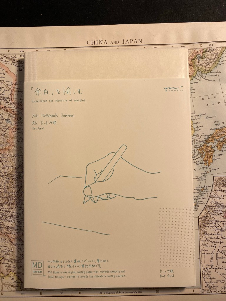
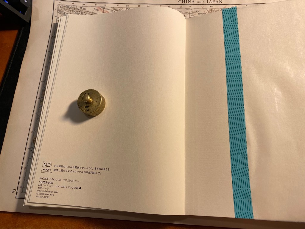
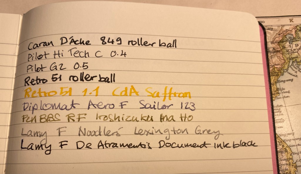
Finally, I wrote a page in my Midori Journal:

I wasn’t expecting this ink shade at all in a Christmas themed ink sample set like the Inkvent. That being said, I love it. It’s a unique colour that is dark enough and muted enough to use in the office, but is also interesting and unique. From a distance it reads like a black/brown/grey until you take a closer look and its purple nature is revealed. It flows well, there’s plenty of shading to be had, and there’s a very good chance that I’ll be picking up a bottle of this should Diamine eventually offer them up for sale.