Vintage copy pencils are magic (albeit oftentimes poisonous magic). You take an ordinary looking and behaving pencil and dip it in water and purple, turquoise or blue ink comes out. The Sanford NoBlot is probably the most well known pencil in this category but there were dozens of others made by various pencil companies. The Israeli pencil manufacturer “Jerusalem Pencils” had a copy pencil by the worldly and sophisticated name of “Park Avenue” (very Israel in the ’70s and 80’s). Of the local vintage pencils available in Israel it’s not the easiest pencil to find, although it’s also not the hardest.
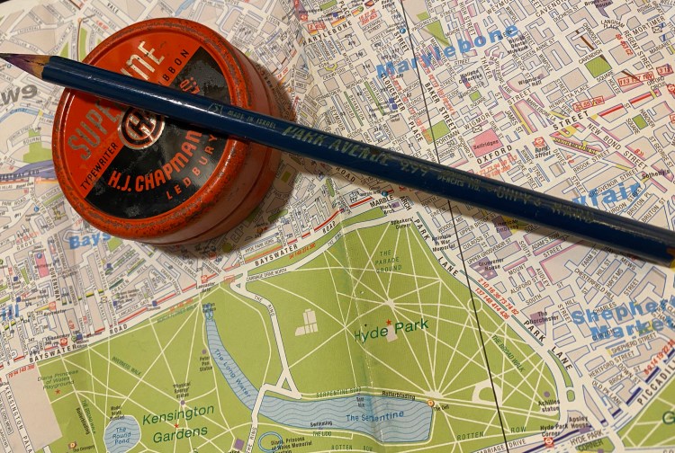
Not the prettiest pencil, but not too shabby.
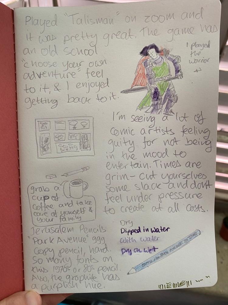
When dry the Park Avenue writes like an F grade pencil, with a bit of a purplish hue. It’s not as hard and light as an H grade pencil, yet it is lighter and harder than an HB. It erases well when dry, and doesn’t smudge.
When wet the pencil lines turn purple, and so much more bold. You can either dip the pencil tip in water, write dry on wet, or for more gentle effects use a wet brush over the dry lines. Just don’t be tempted to lick the pencil tip or chew on it, as there’s a good chance that the lead is poisonous.
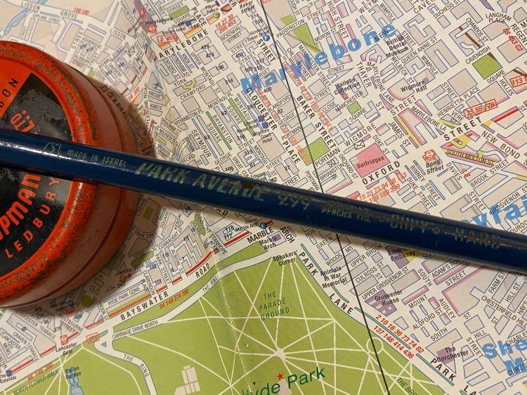
The Park Avenue is a deep royal blue pencil with a yellow imprint on it. Apart from the Jerusalem Pencils logo and the 999, I counted four different fonts printed on the barrel of what was meant to be a utilitarian office workhorse. This is in line with many vintage pencils, and this over-design, pride and attention to detail is why I like them so much.
The imprint is worn off but you can still see all the fonts.
The Retro 51 System is what piqued my interest in Retro’s Tornado rollerballs again. It is such a handsome, well designed pen. There are surprisingly few black Retro 51 limited/open numbered editions, which is in some ways not surprising. The company’s aesthetic leans towards the colourful or the metallic, not so much the “dark/stealth/tactical” side of the pen world.
A handsome, handsome pen.
I haven’t reviewed the Retro 51 System so far because it was such a huge hit when it came out, there were half a dozen reviews of it practically from day one. What did I have to add to the conversation? Plus, there was some confusion after the first 300 pens ran out and Mike Dudek put up another 300 pens for sale: people thought it was a very small limited edition, while it was always sold as a numbered, open edition. I didn’t want to take part in the drama, and I think that this pen is iconic enough to warrant discussion outside the hardcore Retro 51 collectors’ circles. Dudek and Retro 51 took a concept that could have been a “Smithsonian gift shop pen” idea, and turned it into a little work of art.
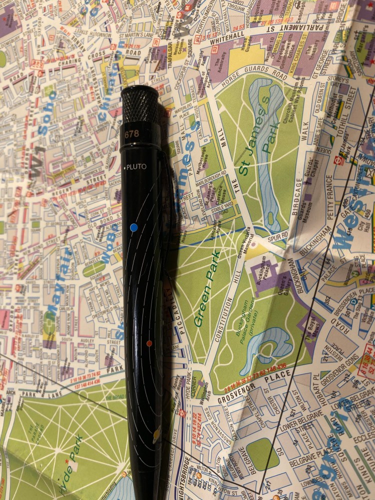
Pluto is on there, and you can see some of the “dark matter” streaks that Dudek designed into the pen.
The Retro 51 System isn’t cheesy, though it certainly could have been. Retro do design cheesy pens at times (its part of their design aesthetic), and the solar system has been over-productized for the past 50 years. Yet there’s something about the care put into creating this pen, from the choice to put Pluto on the map but to the side, to the choice to leave the texture to the “dark matter” stripes and let the planet designs speak for themselves, that makes it a utilitarian work of art. This pen was clearly designed be people who love everything about space and the solar system, and also everything about pens. It doesn’t glow in the dark, because it doesn’t need to. It has a classic, classy look that will also wear well with time.
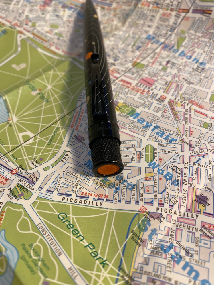
One of the favourite things about this pen is the finial/top disc: it’s clear orange, a representation of the sun. It glows bright against the black background of this pen’s hardware, and really makes the pen pop – to whoever is writing with it.
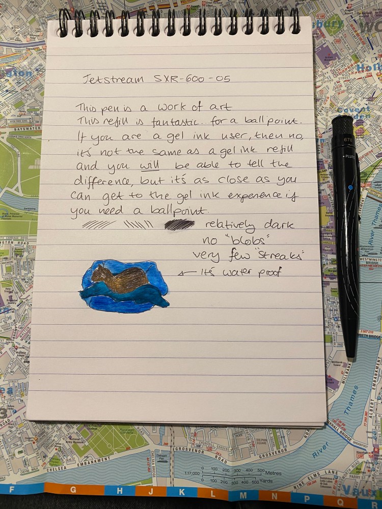
Around the time I got this pen the Uni-ball Jetstream SXR-600 (Parker style) refill started appearing on the market. I was looking for a replacement to the Schmidt refill, and I had yet to meet my favourite Ohto Flash Dry refill, so a Uni-ball refill that made Brad Dowdy happy seemed like a good one to try. The Uni-ball SXR Jetstream SXR-600 in 0.5 is a Jetstream hybrid gel-ballpoint refill, one that lays very thin, neat, relatively dark lines. It’s probably the best ballpoint refill that you can get these days, and it is waterproof, fade proof and resistant to all kinds of fraud. It is not, however, fully a gel ink refill, nor does it remotely feel one, despite what the marketing says. It’s a best-in-class ballpoint refill, which most people will want to buy in 0.7 I think, as the 0.5 refill lays down a really fine line. If you’re looking for a replacement refill for Retro 51s, something that’s less messy and lays down a clean, fine line, the Uni-ball Jetream SXR-600 is probably the pen for you.
There’s something about black fountain pens and black ink that make them popular beyond what common sense would dictate. The blacker they are the more popular they are, especially if you add the word “stealth” somewhere in their name or the copy. Apparently everyone wants to be a ninja.
There’s so little nib and so much nib creep that investing in a black coated nib unit for this VP seems pointless to me.
Colorverse Selectron is a pigmented ink that I obtained as part of the Electron/Selectron Multiverse box. Colorverse have lately started to sell some of these paired inks as individual bottles, and so if orange isn’t your thing (Electron is orange, don’t ask me why) you may be able to obtain just Selectron soon enough.
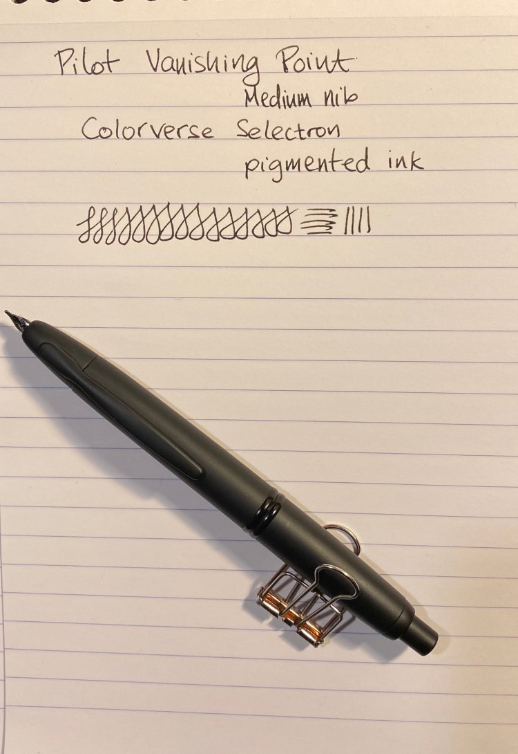
I bought this Matte Black Vanishing Point from Goulet Pens in 2013 I think, but it hasn’t seen much use in recent years. As part of my move to both use my fountain pens more and see if there are any that I might want to part with I dusted this one off and filled it with an “appropriately” coloured ink.
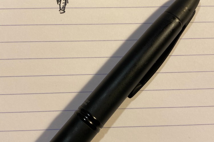
Is this not a handsome pen? Yes it is. Just don’t look too close.
I’ve written about Colorverse Selectron before as part of other reviews. I initially thought that it would be a perfect drawing ink, as it’s pigmented and fountain pen friendly I was hoping that it was also waterproof. As you’ll see later on, it is not.
In terms of the ink itself, there’s nothing remarkable about it. It’s a solid black with some sheen when layered and no variation, which is what you usually want from a black ink.
Ugh! You looked too close and now you can see where the coating has rubbed off! 😦
The Matte Black Pilot Vanishing Point is a VP like all VPs: a pen with a great nib, a body design that you either love or can’t use (depending on how you grip your pen) and a solid click mechanism. It still has a converter that holds about a drop and a half of ink and is annoying to fill, and it still suffers from nib creep.
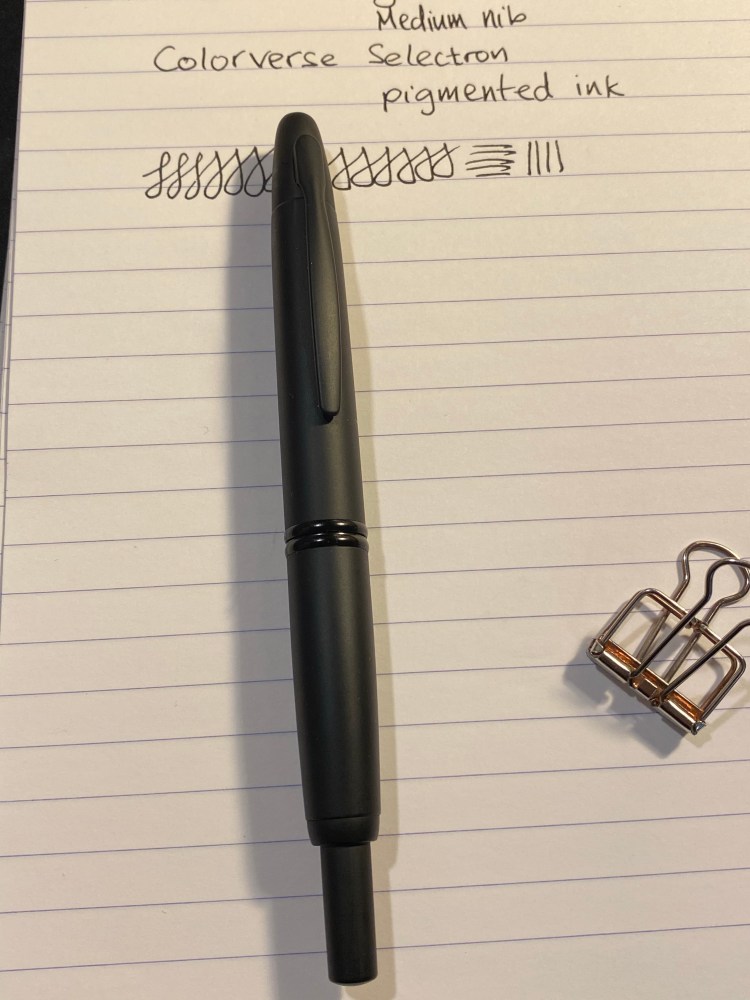
The novelty here is in the matte finish, which is both very nice and not very durable. I hardly used this pen and already the coating is becoming glossy where I usually grip it. It’s a shame because the coating feels great and looks great when it’s unblemished, as in the body of the pen:
Pretty, pretty matte coating.
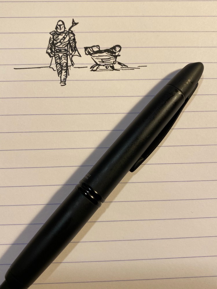
Like some other pigmented inks, the Colorverse Selectron is Moleksine friendly: there’s no feathering, spreading and bleed-through with fine/medium nibs (show through is going to be there no matter what). It’s also a fun ink to draw with:
I started watching “The Mandalorian” and I love it, can you tell?
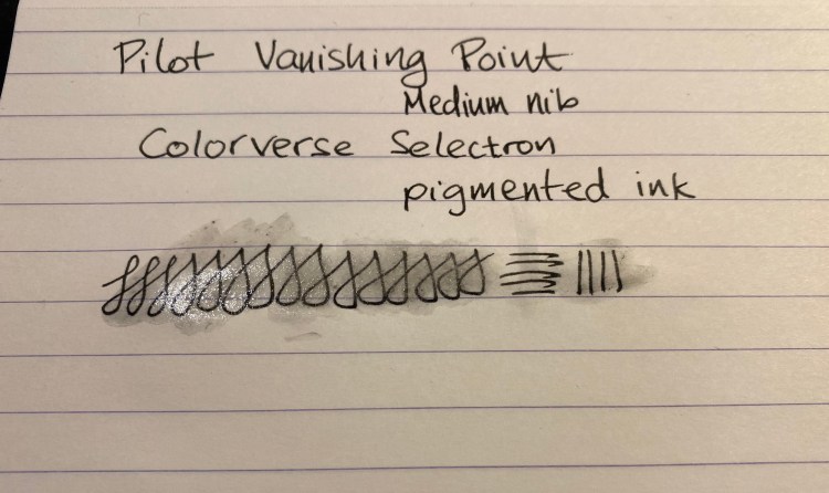
And here are the results of the waterproof test:
Look at this mess… Not at all waterproof. You’ll be able to read your notes after a spill though.
Matte coated pens are difficult to do well, and Pilot haven’t done a stellar job with this Vanishing Point. Black fountain pen inks are a dime a dozen, and Colorverse haven’t done much beyond packaging and copy to create one that stands out. If I could have tested these in person they would have probably both remained on their respective shelves, but the online hype of the time swept me away. I’m much more wary of it and FOMO in general over the past two years.
Invest in things that will stand out and stand the test of time. And take care of yourselves (and your pens) in these troubling days.
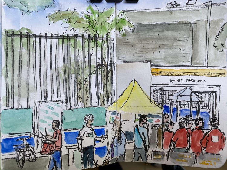
A sketch on location of my polling station in Tel Aviv (don’t be creepy) on election day.
While I was sketching an elderly volunteer came for a chinwag in the shade, and then stayed and chatted for a good long while. I guess he was lonely. And later two girls came around selling cookies and lemonade for charity, so I bought a cookie and talked to them while they watched me draw and tried to sell their wares.
Diamine Inkvent Calendar is an advent calendar with a tiny (7ml) bottle of ink behind 24 windows, and a larger, 30ml, bottle of ink behind the 25th window. All the inks are limited edition, and only available through this calendar. You can read more about the calendar here.
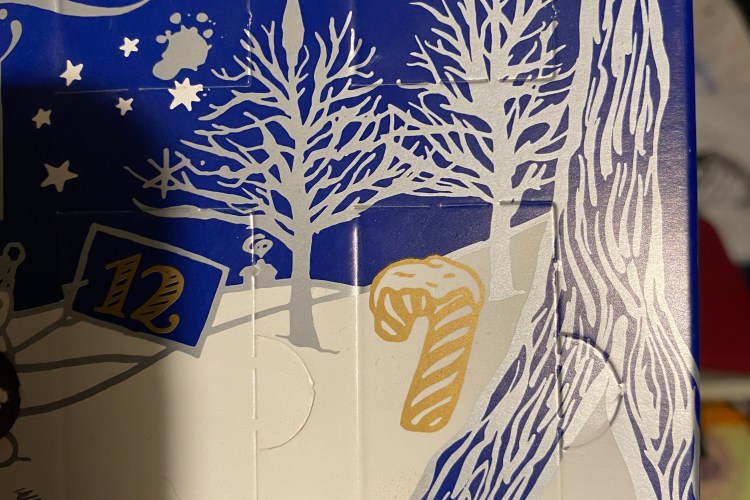
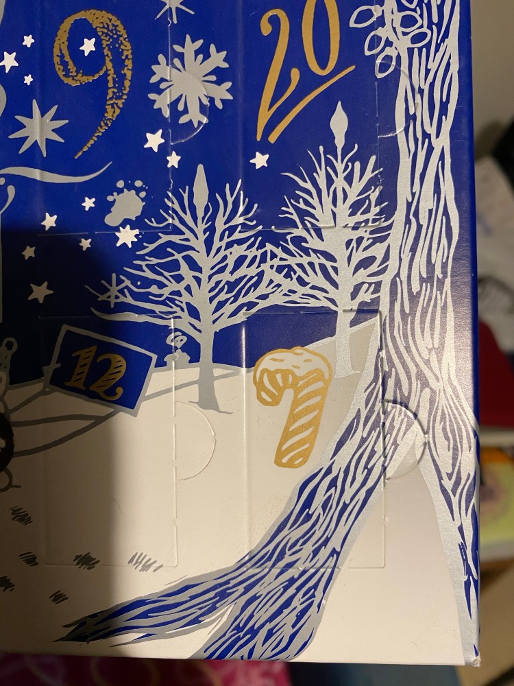
I almost missed the 7, it was so well disguised as a candy cane. I’m a little sorry that Diamine didn’t go punny and put Diamine Candy Cane behind this door.
Instead, Day 7’s ink is Diamine Mistletoe. This is a darker, greyish green that’s labeled as “standard” but shades pretty well.
This was drawn on a Kanso Sasshi 3.5” x 5.5” Tomoe River Paper notebook using a Pelikan Pelikano. The colour reminds me a little of Rohrer and Klingner’s Emma SketchINK, Diamine Evergreen and even Diamine Umber. I plan on using this ink for sketches, maybe even opening it up a bit with water, we’ll see. This is bound to be one of the less unique colours in the calendar but also one of the more “useful” ones. This is also one of the few inks in the set that I’d trust around vintage pens.
Diamine Inkvent Calendar is an advent calendar with a tiny (7ml) bottle of ink behind 24 windows, and a larger, 30ml, bottle of ink behind the 25th window. All the inks are limited edition, and only available through this calendar. You can read more about the calendar here.
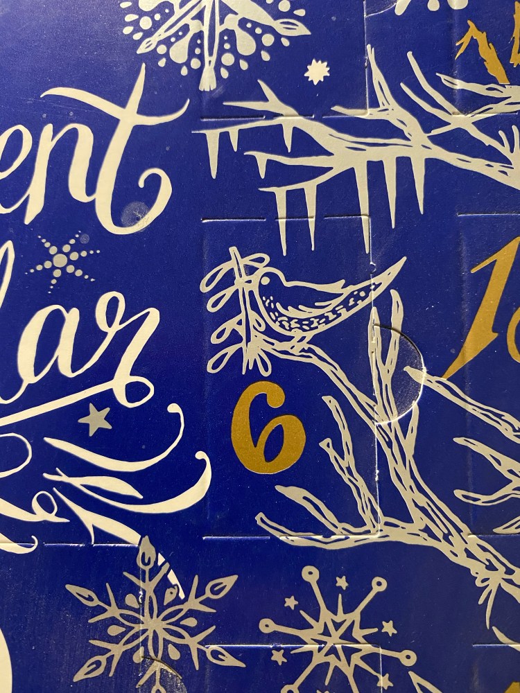
Day 6’s door has a bonus bird, which is nice. It also has the best named ink of the bunch so far. Allow me to introduce you to:
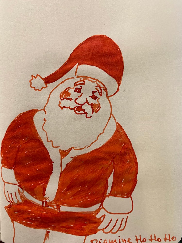
Diamine Ho Ho Ho! This delightfully named ink is a orangey-red that shades beautifully.
Like all the rest of the Inkvent reviews, this was drawn on a Kanso Sasshi 3.5” x 5.5” Tomoe River Paper notebook, which really makes the best properties of each ink shine. Here it’s the shading, that goes from a dark orange to fire engine red, and is really warm and cheery.
This was drawn using a Pelikan Pelikano medium (which should be called a broad, but it’s Pelikan, so hey), and you can see the shading in almost every stroke above. I tried not to draw over the same place twice, just so you can get a better feeling for the shading properties of this ink.
The above was written on Clairefontaine paper, so you can see that the ink shades on it as well. This is a terribly impractical ink for day to day use (you can’t even mark papers with it, it’s too cheerful and bright for that), but it’s an excellent ink for Christmas cards or Christmas themed art.