Happy Pi Day!

A blog about writing, sketching, running and other things

There’s something about black fountain pens and black ink that make them popular beyond what common sense would dictate. The blacker they are the more popular they are, especially if you add the word “stealth” somewhere in their name or the copy. Apparently everyone wants to be a ninja.
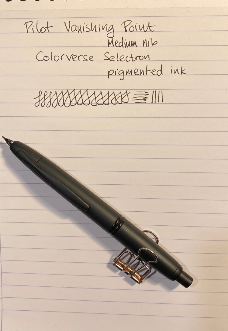
Colorverse Selectron is a pigmented ink that I obtained as part of the Electron/Selectron Multiverse box. Colorverse have lately started to sell some of these paired inks as individual bottles, and so if orange isn’t your thing (Electron is orange, don’t ask me why) you may be able to obtain just Selectron soon enough.
I bought this Matte Black Vanishing Point from Goulet Pens in 2013 I think, but it hasn’t seen much use in recent years. As part of my move to both use my fountain pens more and see if there are any that I might want to part with I dusted this one off and filled it with an “appropriately” coloured ink.
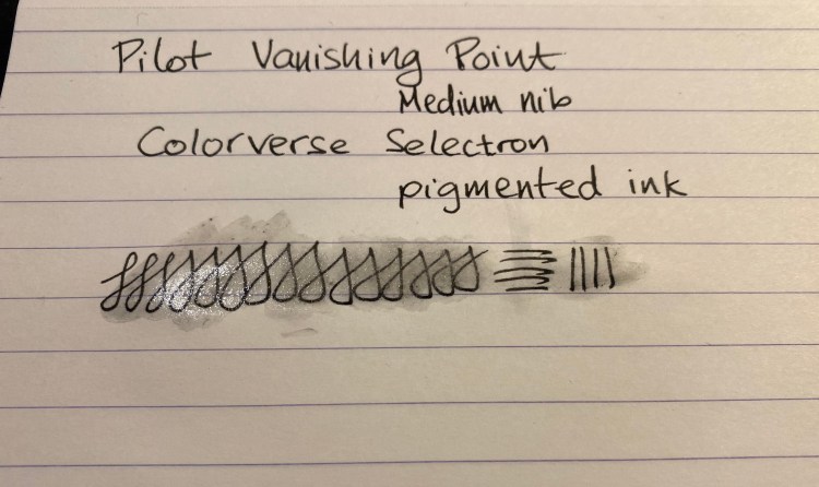
I’ve written about Colorverse Selectron before as part of other reviews. I initially thought that it would be a perfect drawing ink, as it’s pigmented and fountain pen friendly I was hoping that it was also waterproof. As you’ll see later on, it is not.
In terms of the ink itself, there’s nothing remarkable about it. It’s a solid black with some sheen when layered and no variation, which is what you usually want from a black ink.

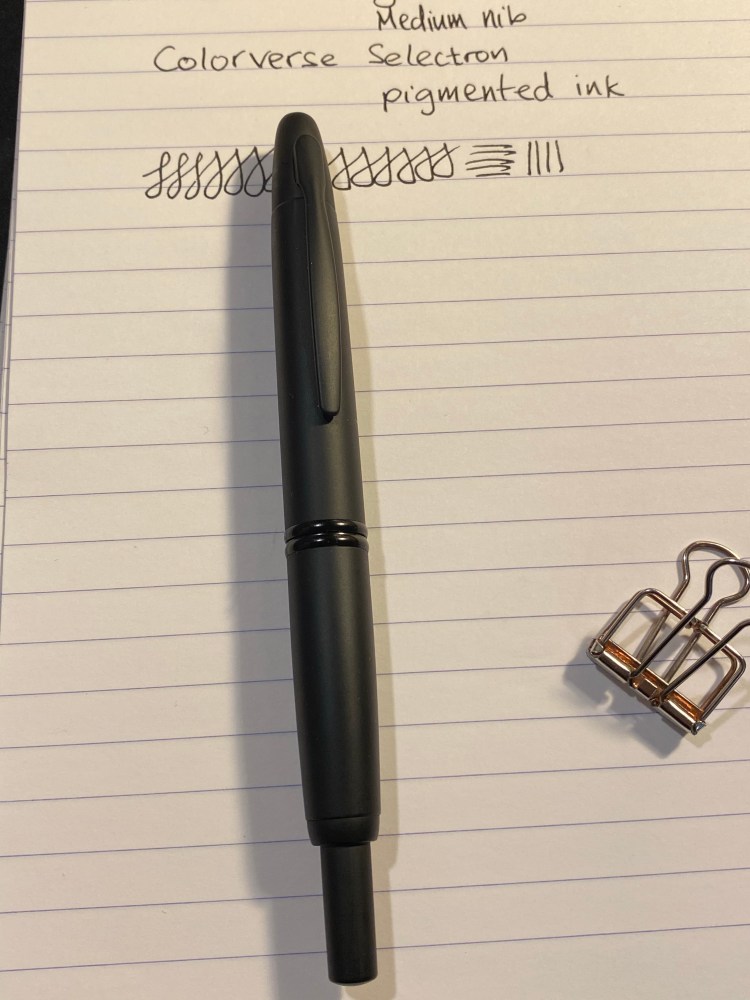
The Matte Black Pilot Vanishing Point is a VP like all VPs: a pen with a great nib, a body design that you either love or can’t use (depending on how you grip your pen) and a solid click mechanism. It still has a converter that holds about a drop and a half of ink and is annoying to fill, and it still suffers from nib creep.
The novelty here is in the matte finish, which is both very nice and not very durable. I hardly used this pen and already the coating is becoming glossy where I usually grip it. It’s a shame because the coating feels great and looks great when it’s unblemished, as in the body of the pen:

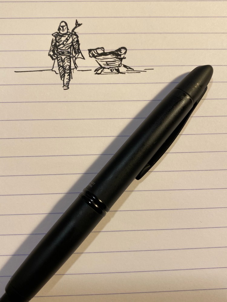
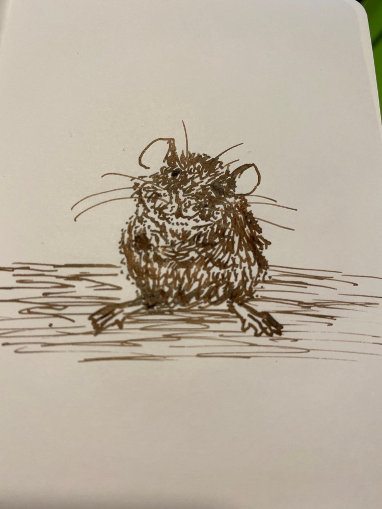
Like some other pigmented inks, the Colorverse Selectron is Moleksine friendly: there’s no feathering, spreading and bleed-through with fine/medium nibs (show through is going to be there no matter what). It’s also a fun ink to draw with:
And here are the results of the waterproof test:
Matte coated pens are difficult to do well, and Pilot haven’t done a stellar job with this Vanishing Point. Black fountain pen inks are a dime a dozen, and Colorverse haven’t done much beyond packaging and copy to create one that stands out. If I could have tested these in person they would have probably both remained on their respective shelves, but the online hype of the time swept me away. I’m much more wary of it and FOMO in general over the past two years.
Invest in things that will stand out and stand the test of time. And take care of yourselves (and your pens) in these troubling days.
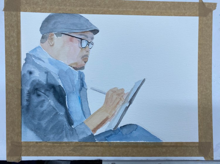
Decided to work on a more conventional piece, and so I drew a watercolour portrait of Urban Sketcher Rob Sketcherman at work.
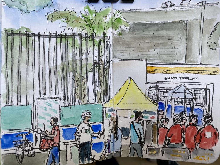
A sketch on location of my polling station in Tel Aviv (don’t be creepy) on election day.
While I was sketching an elderly volunteer came for a chinwag in the shade, and then stayed and chatted for a good long while. I guess he was lonely. And later two girls came around selling cookies and lemonade for charity, so I bought a cookie and talked to them while they watched me draw and tried to sell their wares.
Schminke watercolours, Staedtler pigment liners, Stillman & Birn pocket Alpha.
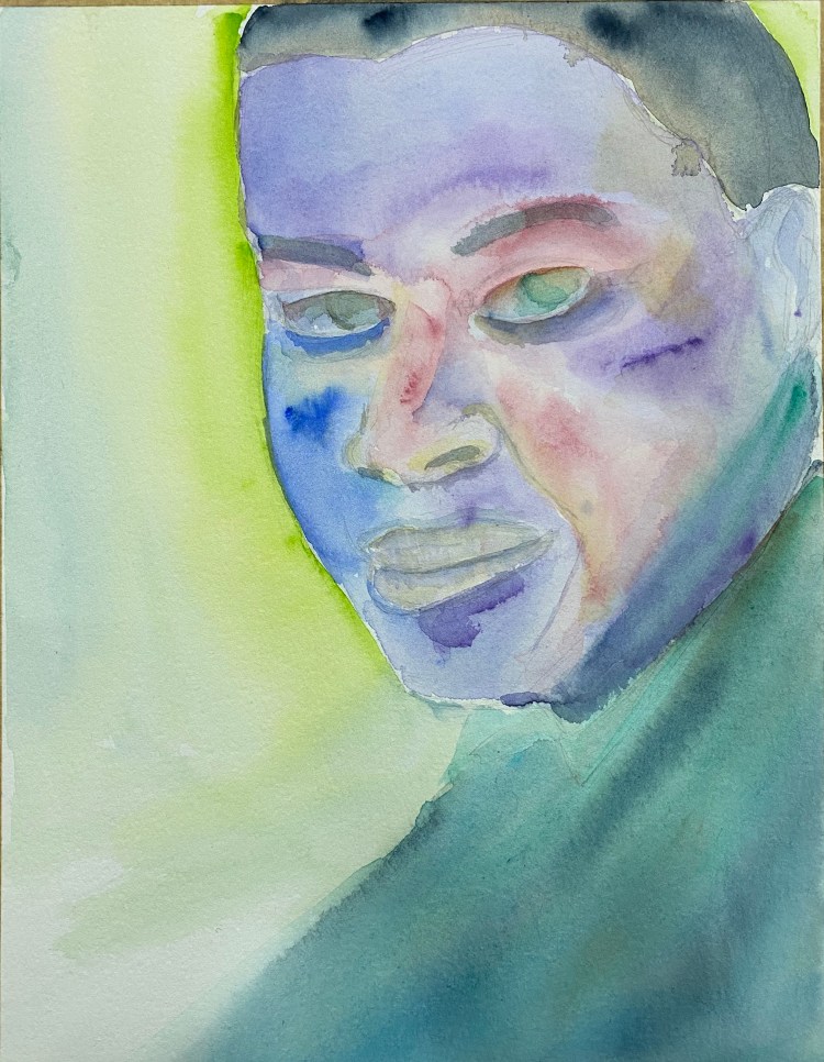
Decided to really play with this one.


Drawing with watercolours in the dark is challenging. German Colony Christmas market, Haifa, Israel.


Diamine Inkvent Calendar is an advent calendar with a tiny (7ml) bottle of ink behind 24 windows, and a larger, 30ml, bottle of ink behind the 25th window. All the inks are limited edition, and only available through this calendar. You can read more about the calendar here.
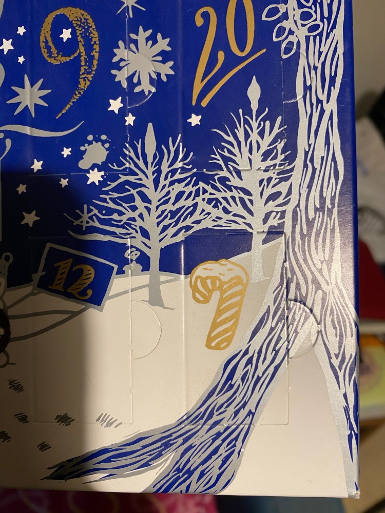
I almost missed the 7, it was so well disguised as a candy cane. I’m a little sorry that Diamine didn’t go punny and put Diamine Candy Cane behind this door.

Instead, Day 7’s ink is Diamine Mistletoe. This is a darker, greyish green that’s labeled as “standard” but shades pretty well.

This was drawn on a Kanso Sasshi 3.5” x 5.5” Tomoe River Paper notebook using a Pelikan Pelikano. The colour reminds me a little of Rohrer and Klingner’s Emma SketchINK, Diamine Evergreen and even Diamine Umber. I plan on using this ink for sketches, maybe even opening it up a bit with water, we’ll see. This is bound to be one of the less unique colours in the calendar but also one of the more “useful” ones. This is also one of the few inks in the set that I’d trust around vintage pens.

Diamine Inkvent Calendar is an advent calendar with a tiny (7ml) bottle of ink behind 24 windows, and a larger, 30ml, bottle of ink behind the 25th window. All the inks are limited edition, and only available through this calendar. You can read more about the calendar here.
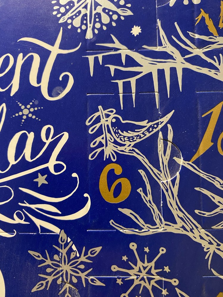
Day 6’s door has a bonus bird, which is nice. It also has the best named ink of the bunch so far. Allow me to introduce you to:

Diamine Ho Ho Ho! This delightfully named ink is a orangey-red that shades beautifully.
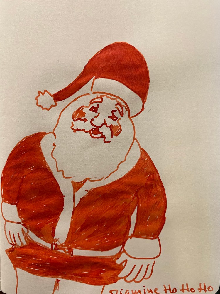
Like all the rest of the Inkvent reviews, this was drawn on a Kanso Sasshi 3.5” x 5.5” Tomoe River Paper notebook, which really makes the best properties of each ink shine. Here it’s the shading, that goes from a dark orange to fire engine red, and is really warm and cheery.

This was drawn using a Pelikan Pelikano medium (which should be called a broad, but it’s Pelikan, so hey), and you can see the shading in almost every stroke above. I tried not to draw over the same place twice, just so you can get a better feeling for the shading properties of this ink.

The above was written on Clairefontaine paper, so you can see that the ink shades on it as well. This is a terribly impractical ink for day to day use (you can’t even mark papers with it, it’s too cheerful and bright for that), but it’s an excellent ink for Christmas cards or Christmas themed art.

Diamine Inkvent Calendar is an advent calendar with a tiny (7ml) bottle of ink behind 24 windows, and a larger, 30ml, bottle of ink behind the 25th window. All the inks are limited edition, and only available through this calendar. You can read more about the calendar here.
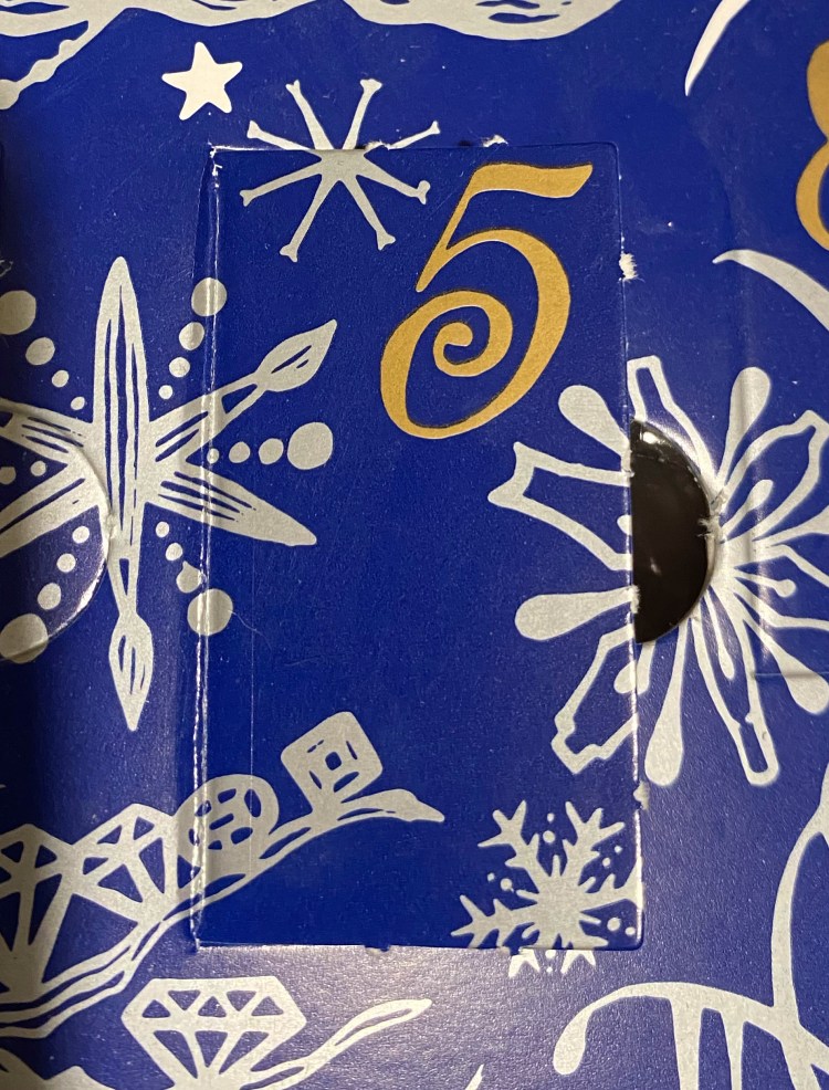
What’s behind door number 5? Ink that has sheen, shimmer, or shading?

No. It’s a brown. *sigh*
Day 5’s ink is Diamine Triple Chocolate, which is a standard brown ink. Like really bog standard. The best part about this ink is its name.
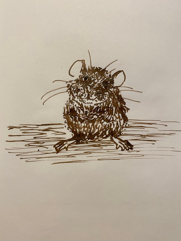
I use brown and sepia inks for drawings, and I used to use Waterman Havana brown ink regularly at work, so I know that brown is one of those ink colours that offers perhaps the most opportunity to play with in terms of shade. It can be very dark, tend towards green or purple, have a reddish hue, or a golden one. Diamine has a great brown ink, called Chocolate Brown, as part of their standard lineup, and it is one of my favourites. It’s dark with golden highlights, and it shades like mad, but is dark enough to be acceptable for office use. So I was expecting a lot out of an ink called Diamine Triple Chocolate. Was it triple times as good as Diamine Chocolate Brown?
No it was not. The shade isn’t as rich and dark as you’d expect from the name, it’s middle of the road in terms of its hue, and even what little shading was present wasn’t interesting or pronounced. It’s not a terrible ink, and so far this is the only ink in the Inkvent Calendar that I would fill a vintage pen with, but for a festive calendar, and with such a name, I expected a bit more.

Diamine Inkvent Calendar is an advent calendar with a tiny (7ml) bottle of ink behind 24 windows, and a larger, 30ml, bottle of ink behind the 25th window. All the inks are limited edition, and only available through this calendar. You can read more about the calendar here.

Day 4’s window isn’t exactly aligned with the printing, but you get a cute snowman with it, so who cares?
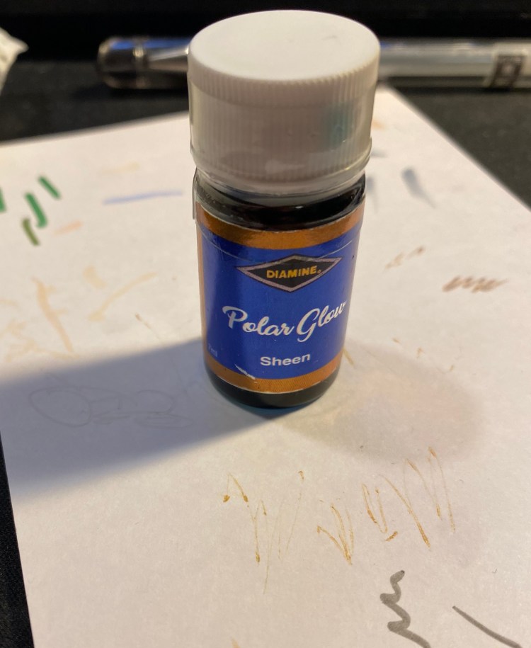
The day 4 ink is Diamine Polar Glow, which is a royal blue ink that has sheen. How much sheen you ask? Well…
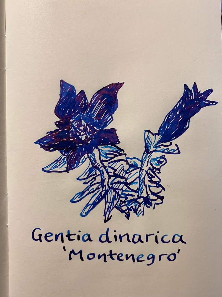
There’s so much red in that gloriously rich blue. I used a vintage italic Waterman ideal nib, and this was drawn on a Kanso Sasshi 3.5” x 5.5” Tomoe River Paper notebook, so this is probably close to maximum sheen, but still, it’s impressive.
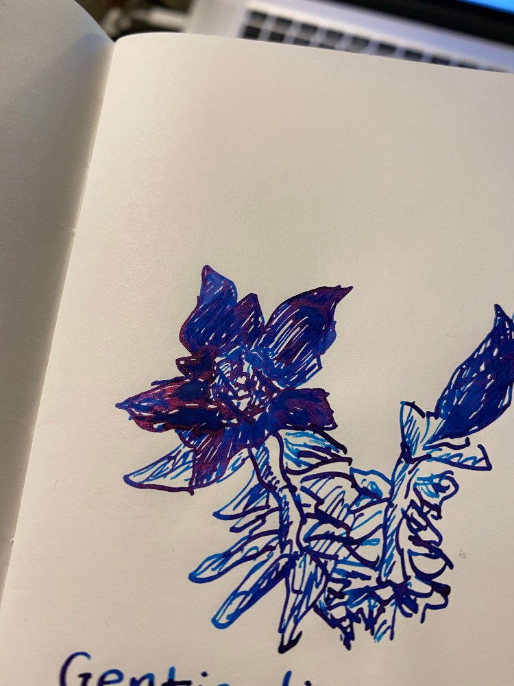
Even as a standard ink, Diamine Polar Glow pops. The blue is deep, rich, and yet shades a lot, from cyan to royal blue (you can see it in the leaves in the drawing above). The red sheen just adds a little extra zing to it, without overshadowing the already good qualities of the ink.

This is an ink designed for wide, broad, italic, flex nibs that lay down a lot of ink. It really shows it’s best properties on Tomoe River paper, but even on Rhodia/Clairefontaine paper I could see sheen in every letter (using the same broad italic nib).
Would I buy a bottle of this, if Diamine offered it? Probably yes, since it’s dark enough for office use, but is also more interesting and appealing than a run-of-the-mill dark blue.
