Uni Pro M9-552 Mechanical Pencil Review

First review of the year! I bought the Uni Pro M9-552 mechanical pencil a while ago in London, I believe. Never having heard of it before, and noting that it was an inexpensive drafting pencil, I decided to give it a try. I wasn’t disappointed: the Uni Pro M9-552 has a terrible name, but it’s a very good drafting pencil AND a very good mechanical pencil, which is not the same thing.
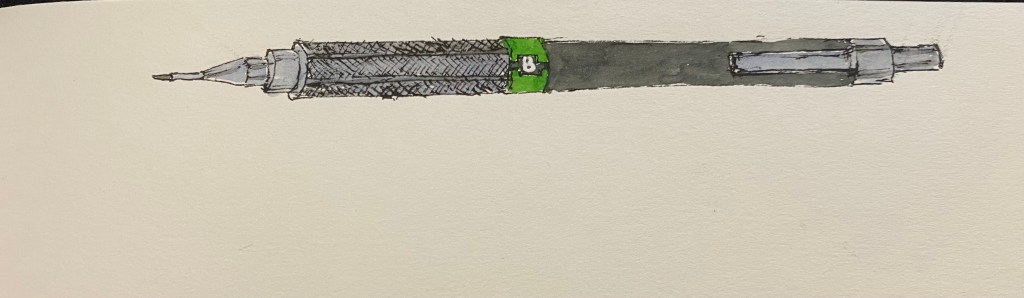
The Uni Pro has a plastic body, a knurled aluminium grip and an aluminium cap and clip. This makes for a light pencil that is weighed towards the tip, which is what makes this a good mechanical pencil and not just a good drafting pencil. It’s very comfortable to hold and write or draw with, even for long periods of time, because of the weight distribution and the knurling on the grip. The knurling provides excellent grip without cutting into your hands.
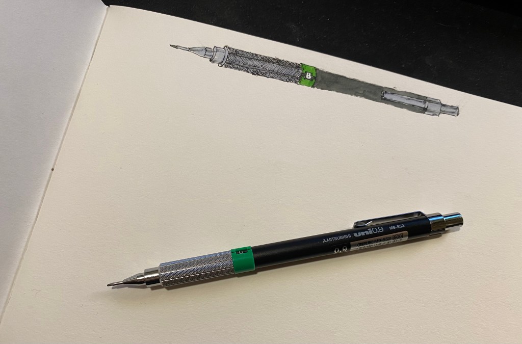
Like all drafting pencils, it has a long lead sleeve and a lead grade indicator. I like the touch of colour that it provides to this otherwise very utilitarian design. The cap has the lead width, 0.9, engraved into it, and under it is the usual refillable eraser. It will do in a pinch, when you don’t have a block eraser around and have very little to erase.
This isn’t a lead review so I’m not posting a writing sample, but I will say this – if you haven’t tried writing or drawing with a 0.9 lead mechanical pencil, I recommend giving it a go. You get most of the line variation and expressiveness of a woodcase pencil, but without having to stop and sharpen it all the time.

The Uni Pro M9-552 is a good choice of drafting pencil, with its light weight making it a good choice for people with small hands or those that are looking for a drafting pencil that can also serve as a mechanical pencil (i.e. a daily writer). The Uni Pro 552 series also includes a 0.5 pencil (with a red lead grade indicator), 0.7 pencil (blue indicator), 0.3 pencil (yellow indicator), and even a 0.4 pencil (orange indicator, at a rare lead width).