Pencil Revolution Handmade Peekaboo Pride Notebook

In my sizeable collection of notebooks and sketchbooks I have maybe one or two handmade ones. I tend to not buy handmade notebooks because the paper quality is oftentimes sacrificed in favour of cool covers or bindings. However, when I saw the Peekaboo Pride notebook on Pencil Revolution’s Etsy store, I couldn’t help but give it a try. The binding looked amazing, and I trust Johnny Gamber when he says that the paper inside is good.
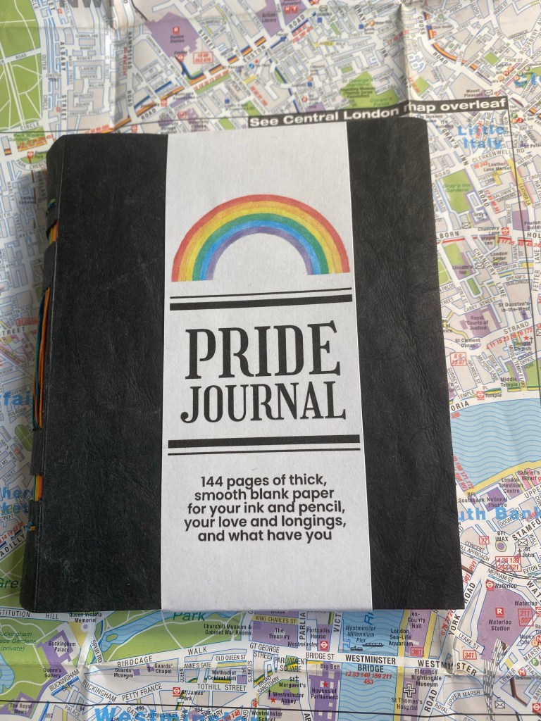
I love this cover band. It made me smile.

The notebook is small, 10cm x 12.5cm, and beautifully made. Every little detail is well designed, starting from the band that the notebook came wrapped in. You see the care and character in every part of this little notebook, which is precisely why you’d want to buy a handmade notebook in the first place.
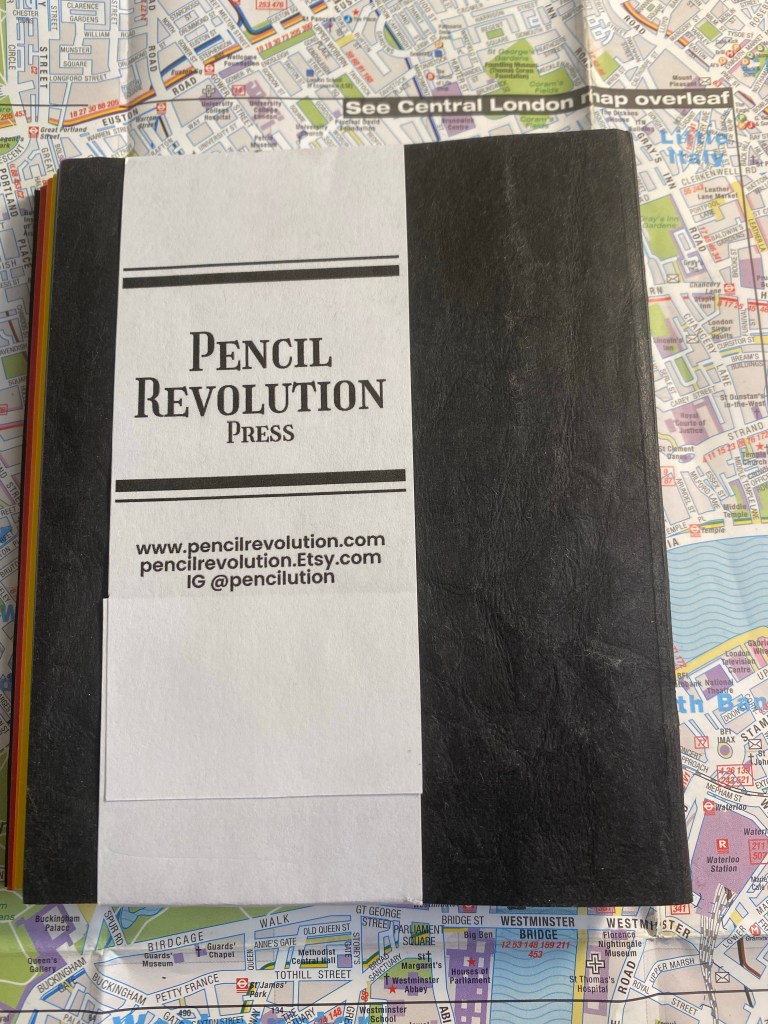
Back of the band.

The cover is made of “Kraft-Tex” which is a textured, durable, flexible, card-stock like paper. It’s ripe for customisation if you enjoy customising your notebooks.
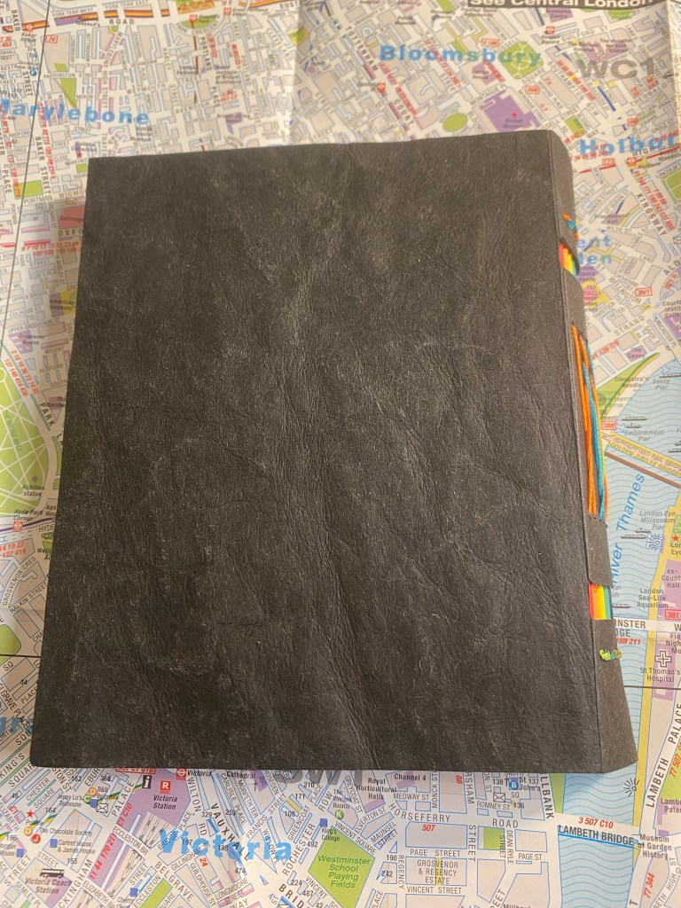
The cover.

The spine is where the notebook really shines, and it’s what gives the notebook it’s “peekaboo” name. The notebook is made of six signatures the colour of the pride flag, and the cutouts in the spine allows you to see their colours. The threads used for binding are also pride coloured, and the result is stunning:
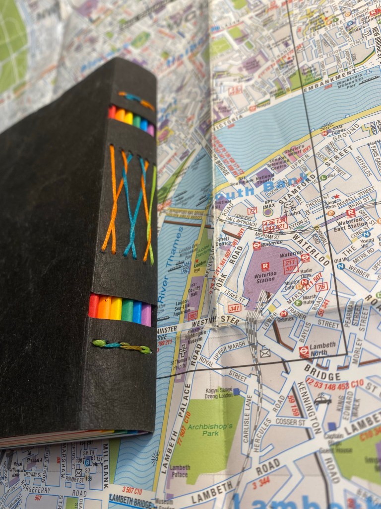
Peekaboo spine with pride signatures and threads showing.

The cover of the first signature has a Pencil Evolution stamp embossed on it. That, together with a label inside the inside of the back cover is the only branding on the notebook. Very subtle and tasteful.
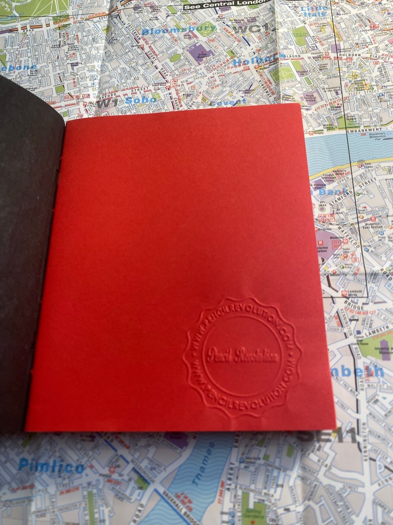
Pencil Revolution stamp.

I just love the back label. There’s such pride of craftsmanship here:
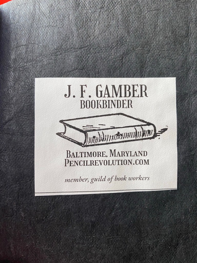
Back label.

Here’s a look at the colourful signatures from inside. Everything about this little notebook is perfect, and makes me smile:
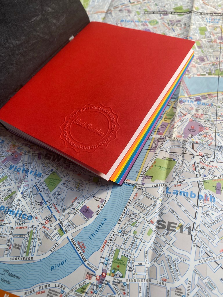
Pride colours on show.

And inside each signature you get glimpses of the multicoloured thread used to bind this notebook.

You can see the thread change colour on the top.

I was worried that the paper wouldn’t be fountain pen friendly, but I had nothing to worry about. The Neenah’s Astrobrights paper is very fountain pen friendly, despite not being coated paper. That means that inks dry quickly on the page, and it means that you can use this little notebook for pen and ink wash sketches.
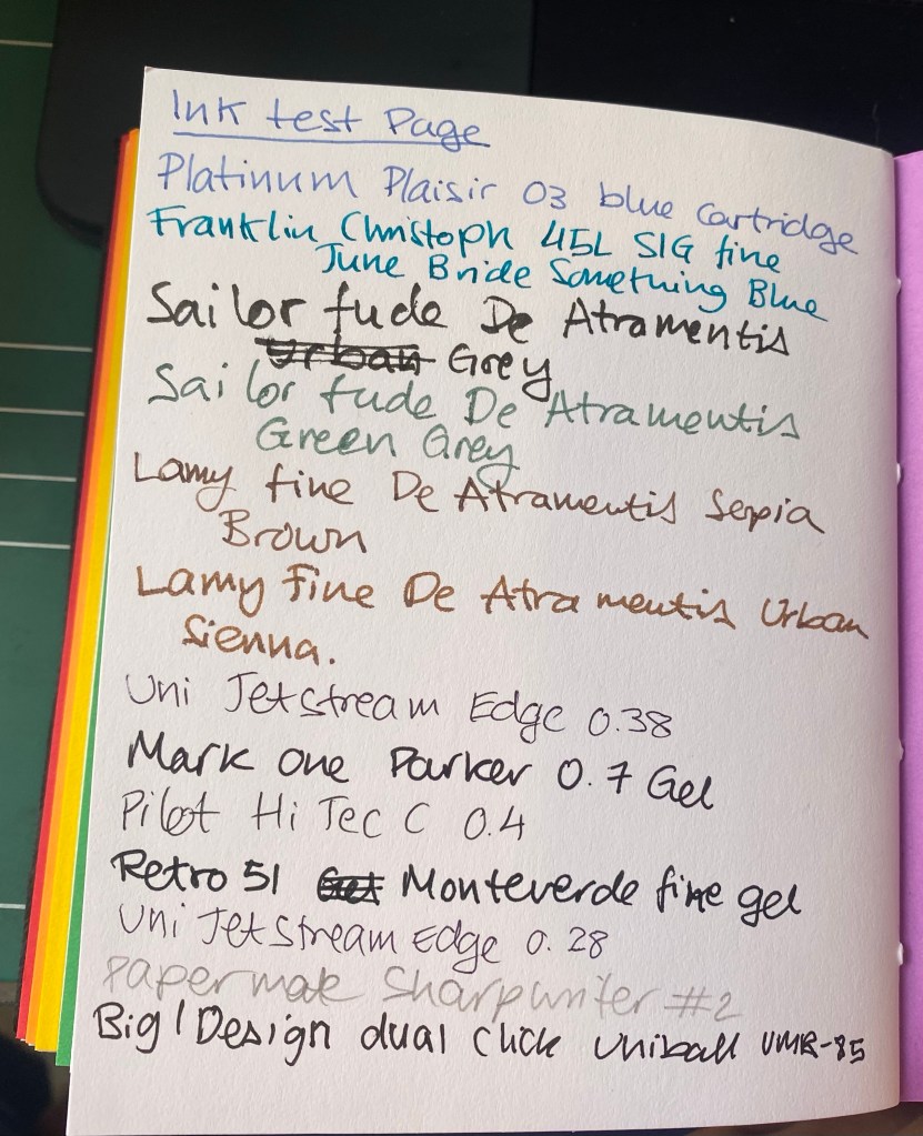
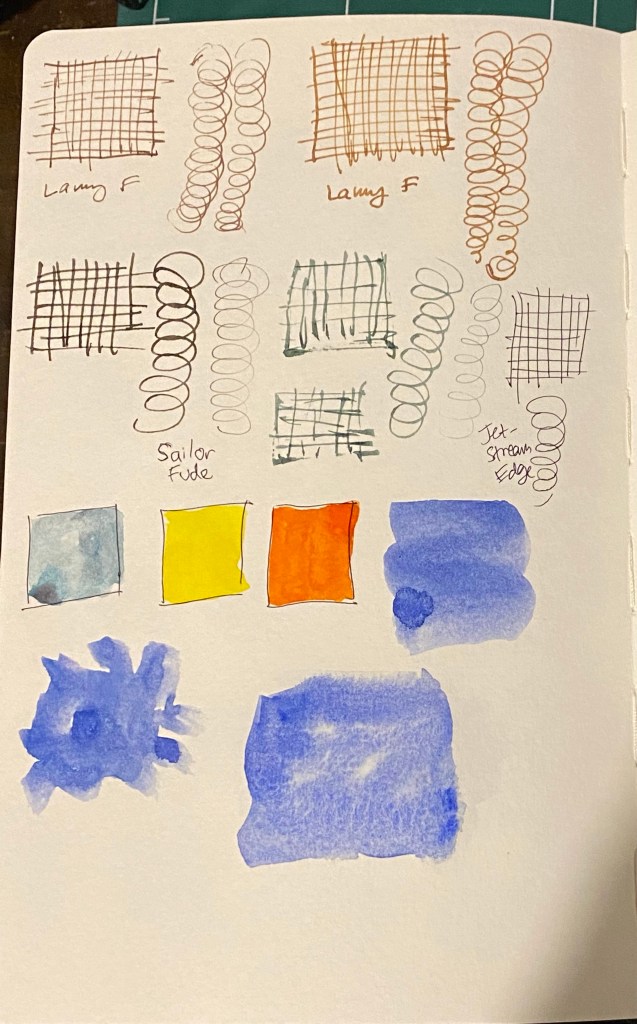
Testing various inks and pens.

There’s no bleed through, even with the Sailor Fude nibs that lay down a lot of ink, and there’s very little show through.
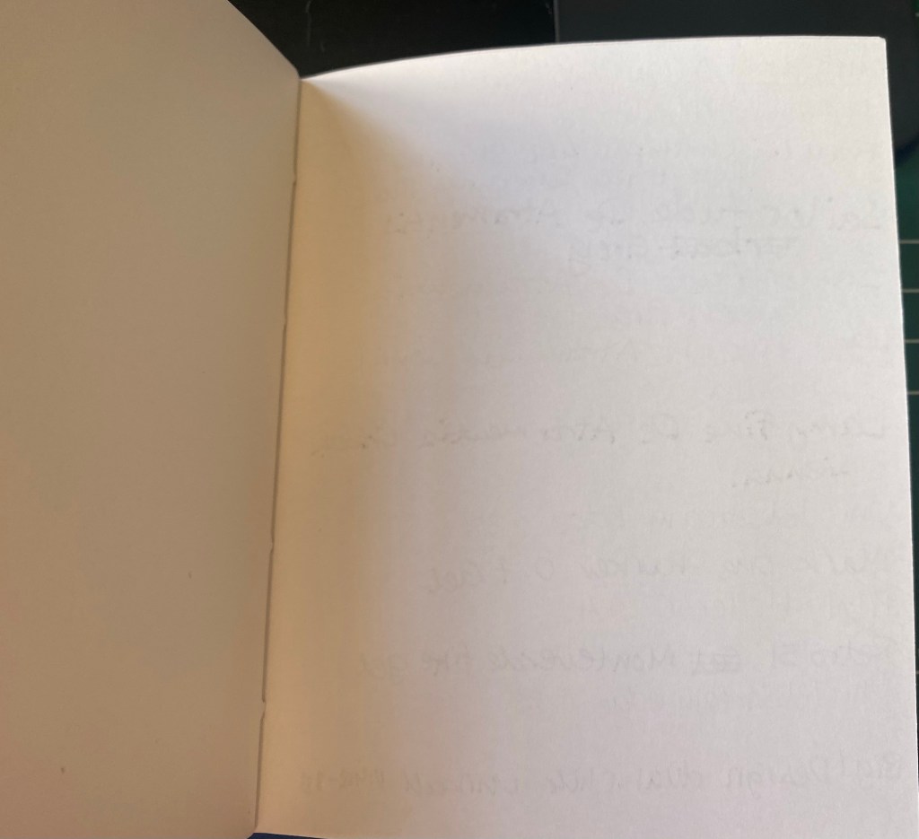
Very well behaved paper.

The paper was so well behaved that I decided to see how well it would take to an ink and wash sketch. Here’s the basic sketch, done with a Staedtler 0.1 pigment liner.
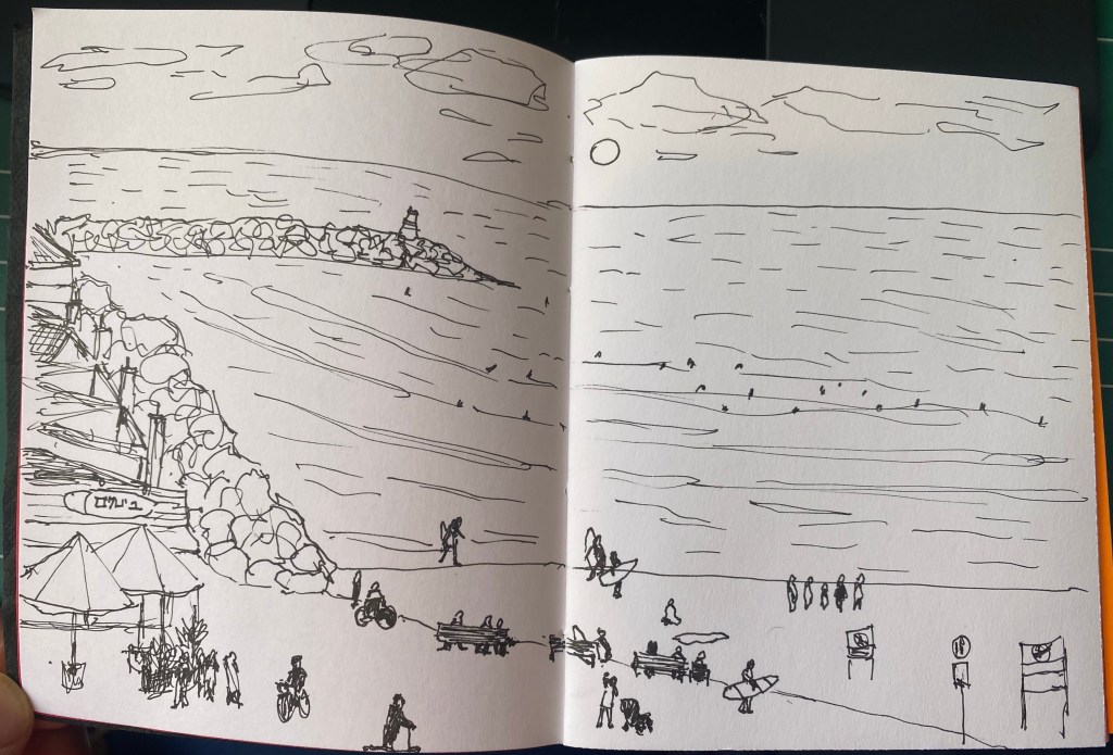
Initial sketch.

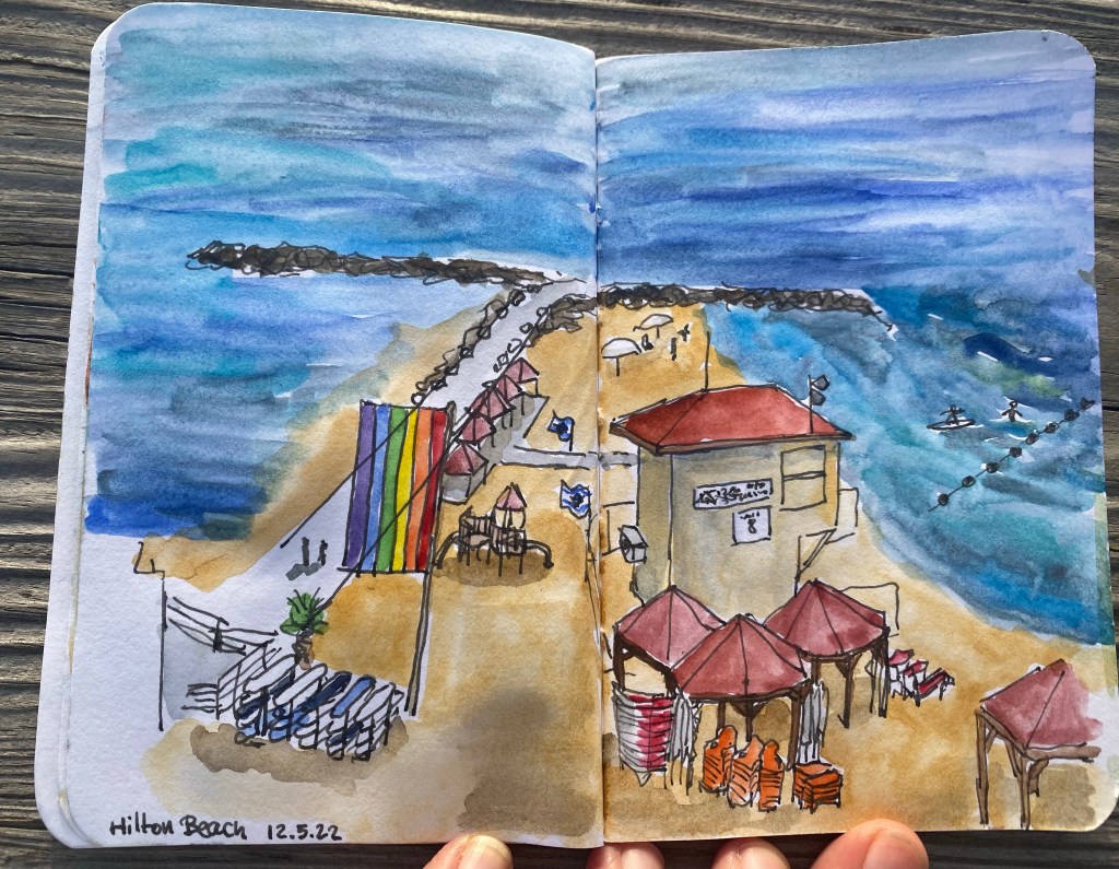
Then I laid down ink washes, and the paper behaved beautifully. It didn’t deteriorate, the colours popped on it, and it was fun to use.
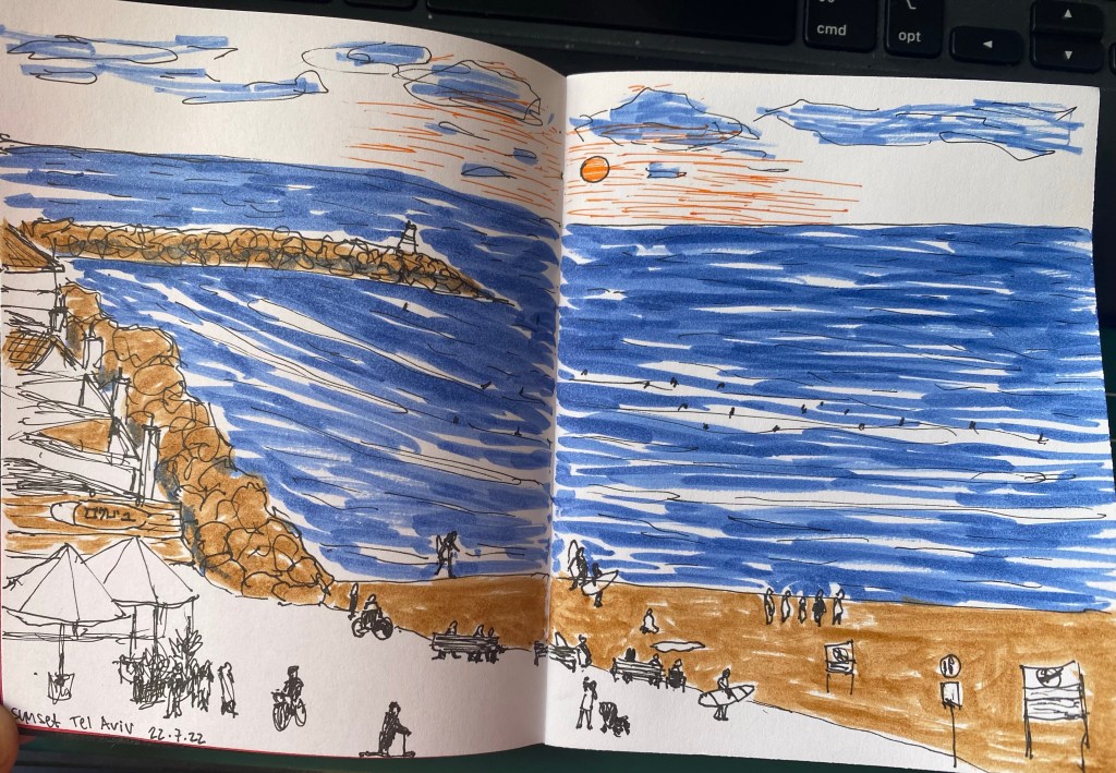
Sketch of the Tel Aviv beach on the paper.

Here’s the other side of the paper. It’s amazing that there’s no bleed through and very little show through. This paper behaves better than my Stillman and Birn Alpha with ink washes.
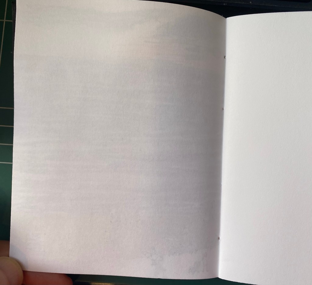
Back side of the sketch.

The Peekaboo Pride notebook is phenomenally well made, with excellent paper, and it’s just a joy to use. I’m close to finishing my pocket Stillman and Birn Alpha, and this little notebook will be the next sketchbook in line to replace it. I won’t be using it for watercolour (no paper this thin has a chance of handling watercolour washes), but it’s great for pen and ink sketches, and for ink washes.
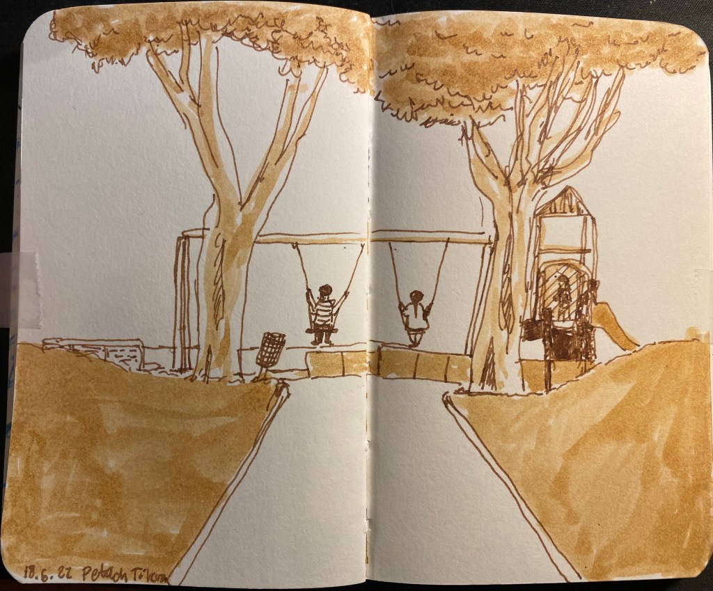
Ink Wash Sketches

Inspired by Gabi Campanario I’ve taken some waterbrushes and filled them with diluted shellac based ink from Sennelier. At first I only had Burnt Sienna ink that I bought years ago from Cornelissen and Son (one of my favourite art supply shops in London), but I purchased a bottle of Prussian Blue and Cobalt Blue to add to it. The bottles have pipettes which make using them to fill a waterbrush convenient, unless the brush has a valve on the body, in which case you’ll need to dip it inside the bottle, and you’ll have issues filling it fully.

Here are some sketches done with the Burnt Sienna. The first one was done with a fountain pen and a single waterbrush filled with pretty diluted Burnt Sienna and was drawn on a Stillman and Birn Pocket Alpha. This was when I discovered that the ink dried lighter than I thought, and that layering it on this paper isn’t really an option. I didn’t get enough of a gradient, and it didn’t take long for the paper to start to disintegrate from the ink. Note also that the ink dries fast, and getting perfect washes with a waterbrush is practically impossible, even in such a small format. But I liked the result enough to experiment with it some more.

First try with ink in a waterbrush.

I then filled another waterbrush with a much less diluted Burn Sienna and water solution. Here’s the same Stillman and Birn Pocket notebook but a sketch with a little more gradient because I used two different ink/water ratios. I like the result better, especially on the trunk.

Second try, more contrast.

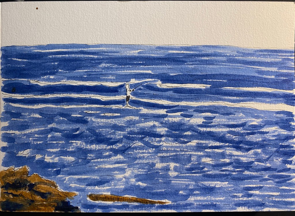
Then I got the Sennelier Prussian Blue that I ordered, and I filled two brushes with it, one diluted with water at about a 50/50 ratio, and another practically undiluted. I had enough of the Alpha paper, so I switched to 300 gsm cold press watercolour paper from Clairefontaine. Here’s the sketch, done with a Staedtler 0.1 pigment liner (I didn’t want the lines to distract from the wash):

Sketch done with Staedtler pigment liner of a fisherman in the sea.

And here is the result with the ink washes applied:

Result with ink wash.

I used the dark blue for the shadows on the rocks, and this time I could actually work with the ink (due to the quality of the paper) and blend between the Burnt Sienna and the Prussian Blue.

I loved this result enough to give these ink washes more tries. I will say that there have been some issues with them so far:

  • Many of my waterbrushes (most of my Pentel ones) didn’t allow the ink to flow to the brush bristles.
  • Some of my brushes leaked, and so I won’t be carrying them around in my bag without a ziploc bag to protect my bag contents from them.
  • The Cobalt Blue ink that I bought contains copper. It came with a warning label, and I’m not going to use it before I make sure I have a leak proof brush for it.
  • The behaviour of the ink is entirely dependent on the quality of the paper, more than any medium I’ve used before (including watercolour).
  • Waterbrush bristles deteriorate pretty quickly, and make fine detail work and brush control more difficult.

All that being said, I enjoyed using them enough in my sketches to continue using them for a while, and I recommend giving shellac (calligraphy) ink in a waterbrush a spin.

PS – these inks are NOT FOUNTAIN PEN FRIENDLY!
If you put them in your fountain pen they will ruin it.

SketchingNow Watercolour Course Introduction

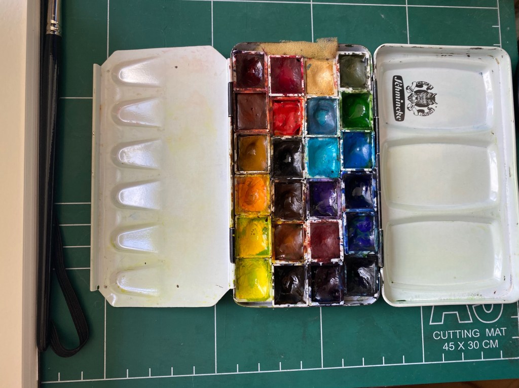
I’m starting Liz Steel’s SketchingNow Watercolour course next week, and so I spent the weekend completing the three intro lessons to the course. It was nice practicing a bit of brush control after such a long time (for over 6 months I haven’t been able to properly hold and control a brush because of my peripheral neuropathy), and I cleaned my palette after a long time.

Metal watercolour tin filled with half pans of paint.
Clean palette
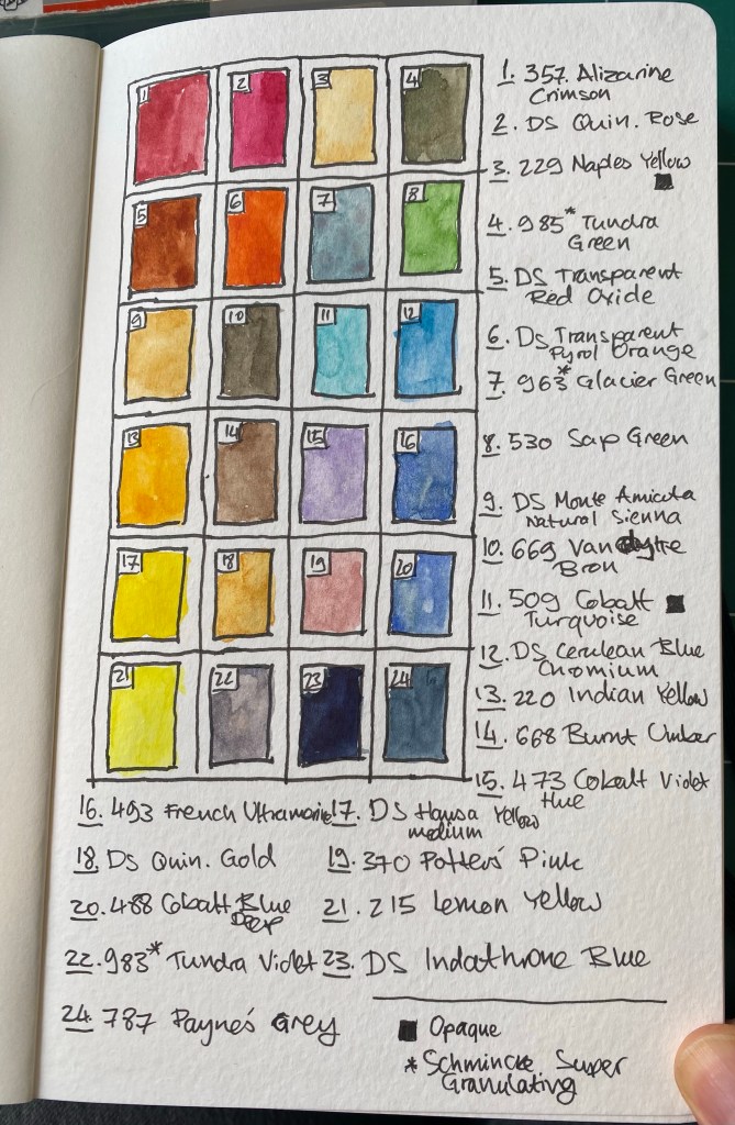
A sketch of the paints in my palette with a legend.
Intro lesson 1 exercise

My palette is large and I still have 3-4 colours on it that I’m still not sure about. This is the first page of a brand new Moleskine Large Watercolour Sketchbook, the new one in portrait format. Drawing your palette is a great way to start your sketchbook and get over the initial fear of “ruining it”.

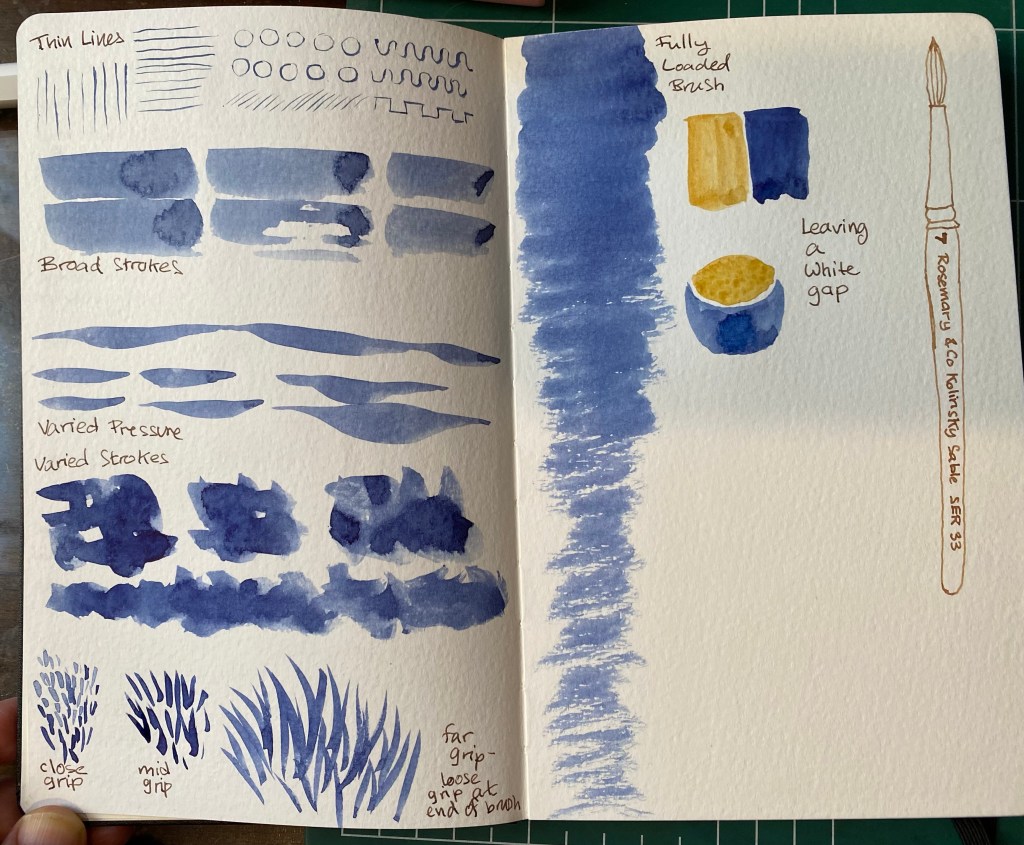
Intro 2 exercise – testing the brush

The brush is a Rosemary & Co Kolinsky Sanle one, and I haven’t used it before.

Intro 3: testing the paper. Check out the granulation on the ultramarine.

Overall these were good intro lessons to watercolour sketching and good warmup exercises.

Cocktail Party

Quick sketch of people making cocktails in the dark. Uni-ball Jetstream Edge 0.38 on a Stillman and Birn pocket Alpha.

Surfers in the Sea

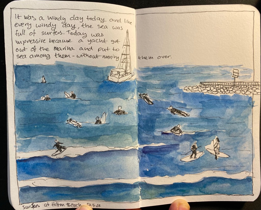
I went on a walk this morning, and as the wind was up, the surfers were out in full force. I decided to take a quick break and sketch them in my pocket Stillman & Birn Alpha sketchbook, and I used a Staedler 0.05 fineliner for a change. I used to love the 0.05 for the fine line it gave, but I haven’t used it for years, and while my neuropathy was bad I couldn’t have used it. As my neuropathy is improving with the weather, I decided to give the 0.05 a spin.
This was sketched on location and painted later on.

A sketch of surfers and a yacht in the sea, enclosed in a drawn frame and with a bit of text describing the scene on the top left corner.

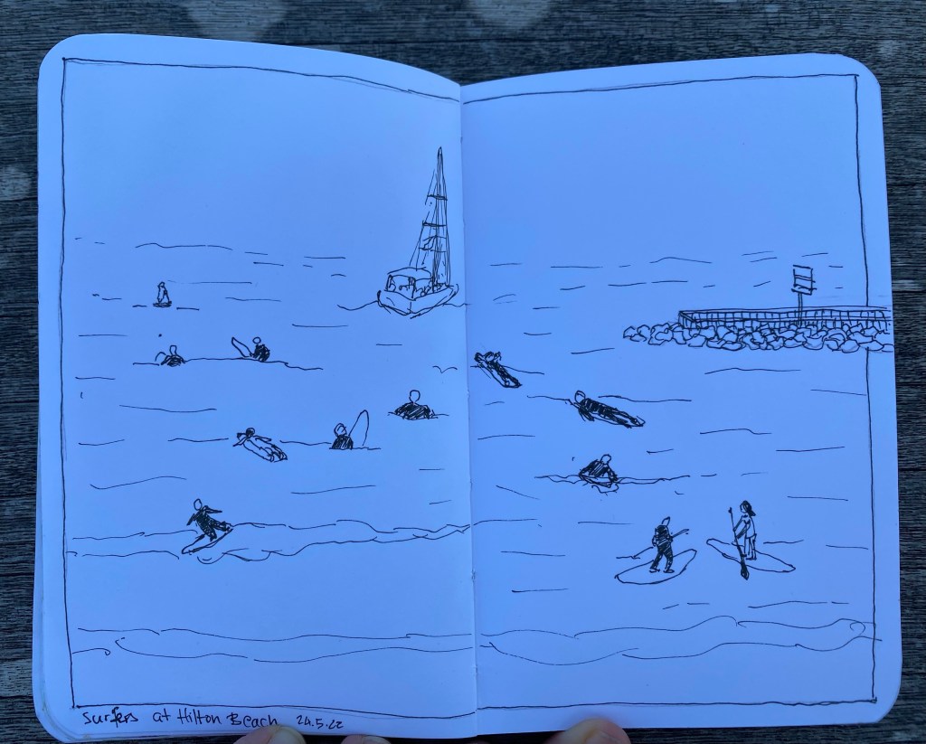
The sketch as it was on location:

Surfers and yacht sketch as above, minus the text and with the sea not painted in blue.

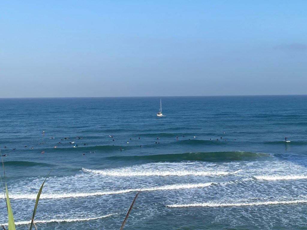
And the original scene once I finished sketching:

A photo of a yacht in the distance and surfers in the sea

Paperchase Fine Liners and Sketching on a Paper Bag

On my last day in London I went to Paperchase, a local stationery chain, and “splurged” on some stickers and a set of fine liners. I say “splurged” with velociraptor quotes as Paperchase branded products are generally inexpensive, even if they do tend to be of middling quality. This set of fine liners proved to be no different: they can be described as OK at best. The caps require some force to snap back on, the clips quite easily (and unintentionally) pop out, and the colours are muted and pale. They would work well as muted, fine lined highlighters, but if you’re planning to sketch or colour with them, I’d opt for something from Staedler instead.

Paperchase Fine Liners. The packaging, as with all Paperchase products, is on point.

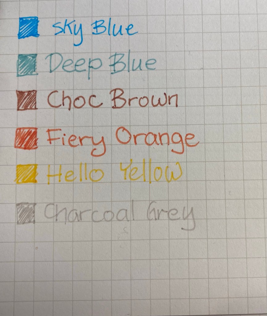
The set that I got had the following colours: Sky Blue (which is a turquoise), Deep Blue (which is a teal, and not at all deep or blue), Choc Brown (which is a reddish brown, and far too light to be named after chocolate), Fiery Orange (which is very reddish and not at all fiery), and Hello Yellow (the only aptly named pen of the bunch). You can see a writing sample on Maruman Mnemosyne paper.

Writing sample of Paperchase Fine Liners.

I was inspired to sketch a scene from one of my runs this week using only these fine liners and a used paper bag from the local farmers’ market (it had peppers in it). The set doesn’t have a green, so I layered the Deep Blue on the Hello Yellow to create the green that you see here. I kind of like the result, and as I have a few more used paper bags laying around I may play with them as well.

Sketch of the Reading Power Station on a used paper bag.

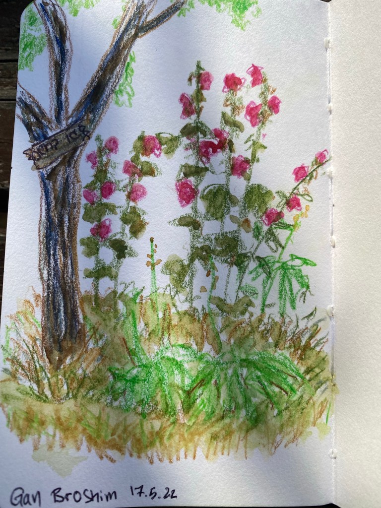
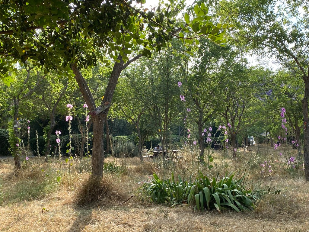
Gan Broshim

Quick sketch with watercolour pencils and watercolours.

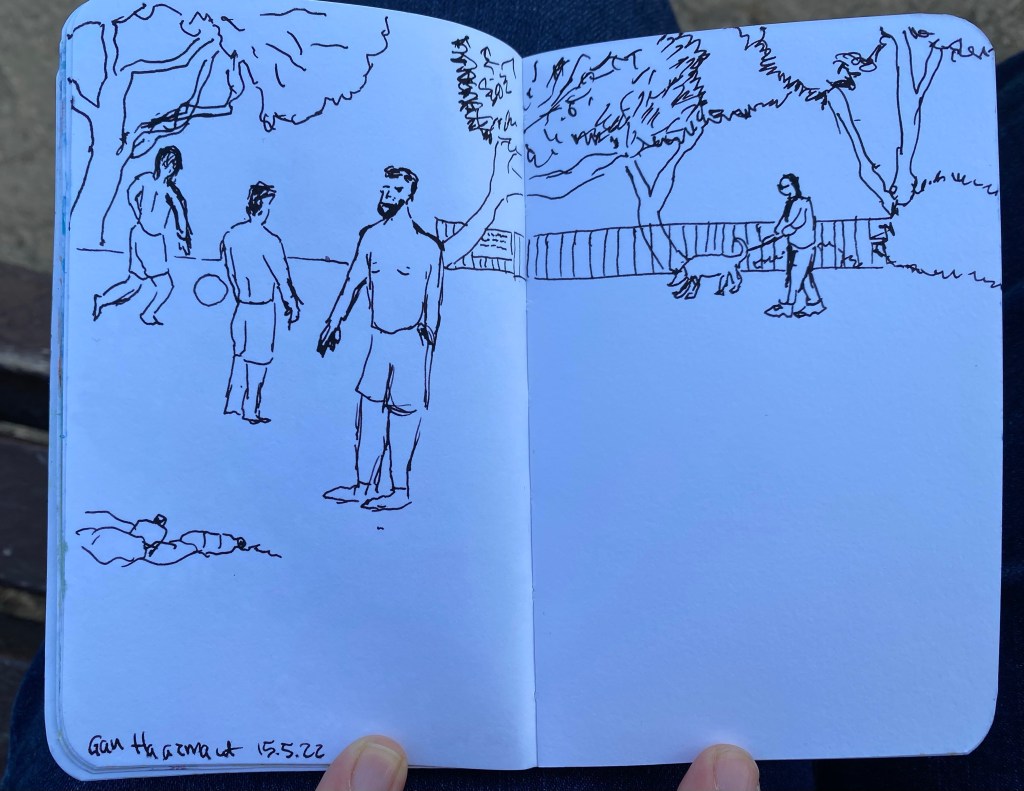
Soccer Players

A quick fountain pen sketch with my vintage Waterman 52 fountain pen and Waterman Havana Brown ink (now called absolute brown) on a Stillman and Birn pocket Alpha.

Weekly Update: Flowers and Races

This week was busy and filled with milestones. On Sunday I celebrated my 40th birthday. That’s not something that I was sure that I’d get to celebrate: in June and July last year I thought that I was dealing with a much more aggressive form of lymphoma, and I was unsure if I’d live to 40. Being where I am right now in terms of health and life in general makes me feel lucky and blessed.

On Wednesday I participated in my first race since 2019 (I missed a race in early 2020 due to Covid concerns, and then all the local races were cancelled until late 2021, when I was dealing with cancer). I was worried about the crowds triggering my post trauma, and the start of the race was challenging, but then the crowds cleared up and I had a great time.

I sketched a bit this week, working with watercolour pencils and watercolours. I’m still experimenting a lot, and still trying to work out how to sketch plants and foliage. Here’s a very quick sketch from a local garden, done with ballpoint, Faber Castell Albrecht Durer watercolour pencils and watercolours (Schmincke Horadam and Daniel Smith) on a Stillman and Birn pocket sketchbook. I didn’t feel like sketching so I just did a quick study of some rocks and plants, experimenting with textures.

Quick experimental rock and plant sketch.

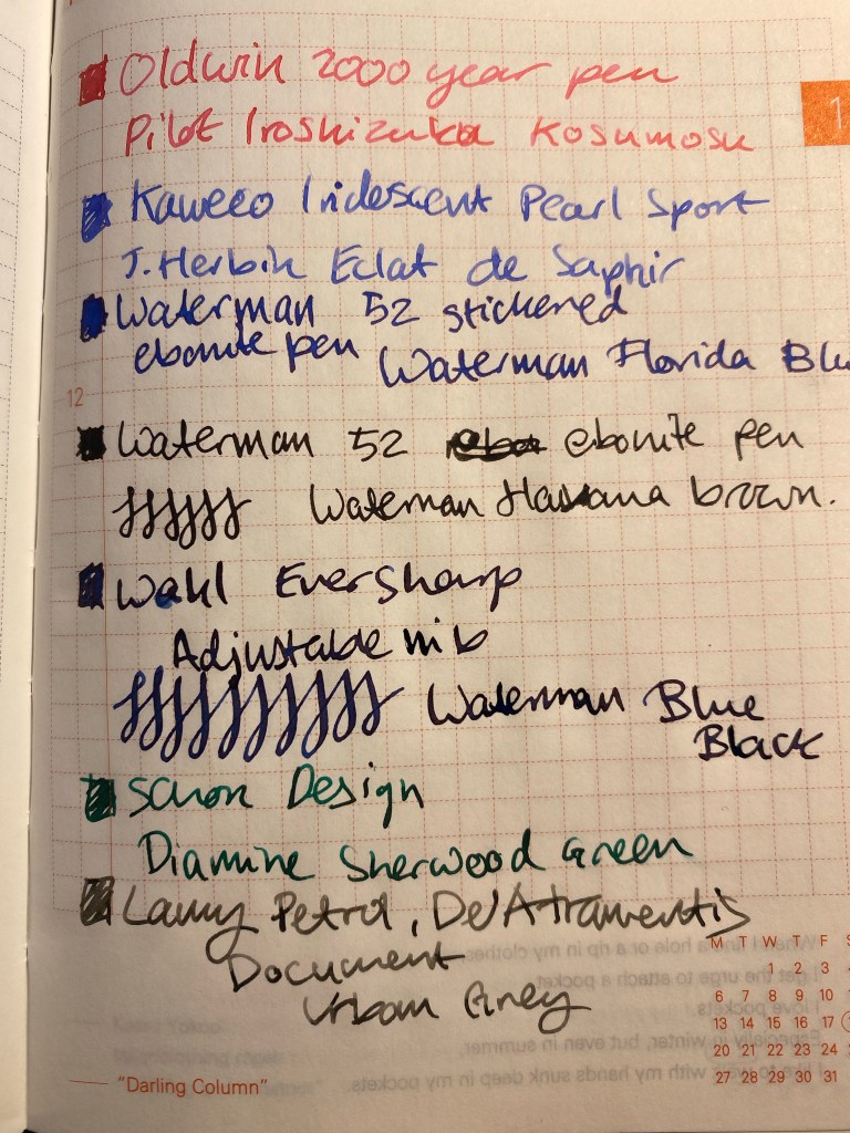
I’ve inked up all of the fountain pens that I bought on my latest trip. That’s an Oldwin 2000 Years of History pen in silver (gorgeous, with a fantastic nib, but very heavy as it’s large and has a silver body), two Waterman 52s, with lovely flexible nibs. One of the pens is still stickered, and yet in the spirit of use the good china, I inked it. There’s also a Wahl Eversharp in the Kashmir colourway. I think that it’s an Equiposed that somehow got an adjustable nib on it, but I bought it for the phenomenal nib, not the pen body as much. All four pens were bought at Mora Stylos in Paris, and I am very happy with them.

I also popped a J. Herbin Eclat de Saphir cartridge into the Kaweco Collection Sport Iridescent Pearl pen that I bought in Present and Correct in London. It was very difficult not to buy up that entire shop, especially since I visited it twice.

The other two pens were inked up before my trip and are probably going to be written dry this week or the next: a Lamy Safari Petrol with a fine nib that I use for sketching as it has De Atramentis Urban Grey document ink in it and that’s waterproof, and a Schon Design Pocket 6 in 3D Teal that has a Diamine Sherwood Green cartridge in it.

From top to bottom: Oldwin 2000 Years of History, two Waterman 52s (the bottom one is stickered), Lamy Safari Petrol, Kaweco Collection Sport Iridescent Pearl, Schon Design Pocket 6 3D Teal, Wahl Eversharp Equiposed.

The Oldwin is inked with Pilot Iroshizuku Kosumosu, a new ink that I got as a gift from the lovely Mr. Mora. I don’t have many pink inks so it will be nice to give this ink a try.
I still am having terrible luck with J. Herbin inks. Their regular lineup is so watery and desaturated, it’s always been a bit of a let down, especially when compared to the vibrant colours on their labels.
All the vintage pens are filled with Waterman ink, as it’s safe on vintage pens and very easy to clean out. There’s Florida Blue (now called Serenity Blue), Havana Brown (now called Absolute Brown) and my desert island ink, Waterman Blue Black (now called Mysterious Blue).

Ink samples of the all the pens on original Tomoe River Paper.

In terms of reading, I finished reading Ben Aaronovitch’s “Amongst Our Weapons” and it was a really fun read. His previous novel in the “Rivers of London” series, “False Value” got me a little worried that he’d lost his touch (it wasn’t bad, it just wasn’t nearly as good as his previous seven books), but “Amongst Out Weapons” is a return to form.
I’ve also finished reading Agatha Christie’s “A Murder is Announced” and boy does she know how to write. The characters, setting, period come to life, and you can sense an intelligent and keenly observing mind at work.
I’m now back with the Tournament of Books, this time with “Our Country Friends” by Gary Shteyngart. If I find this book tiresome, I may yet give up on the Tournament of Books list as I’ve got more than enough good books that I can’t wait to dig into.

Next week is very busy, so I’m not sure if I’ll have time for any long posts. In the meanwhile, please remember to take a break from social media and enjoy your life: call a friend, take a walk, listen to a family member, be kind to someone, volunteer in some way. And if you are on social media, please be kind.