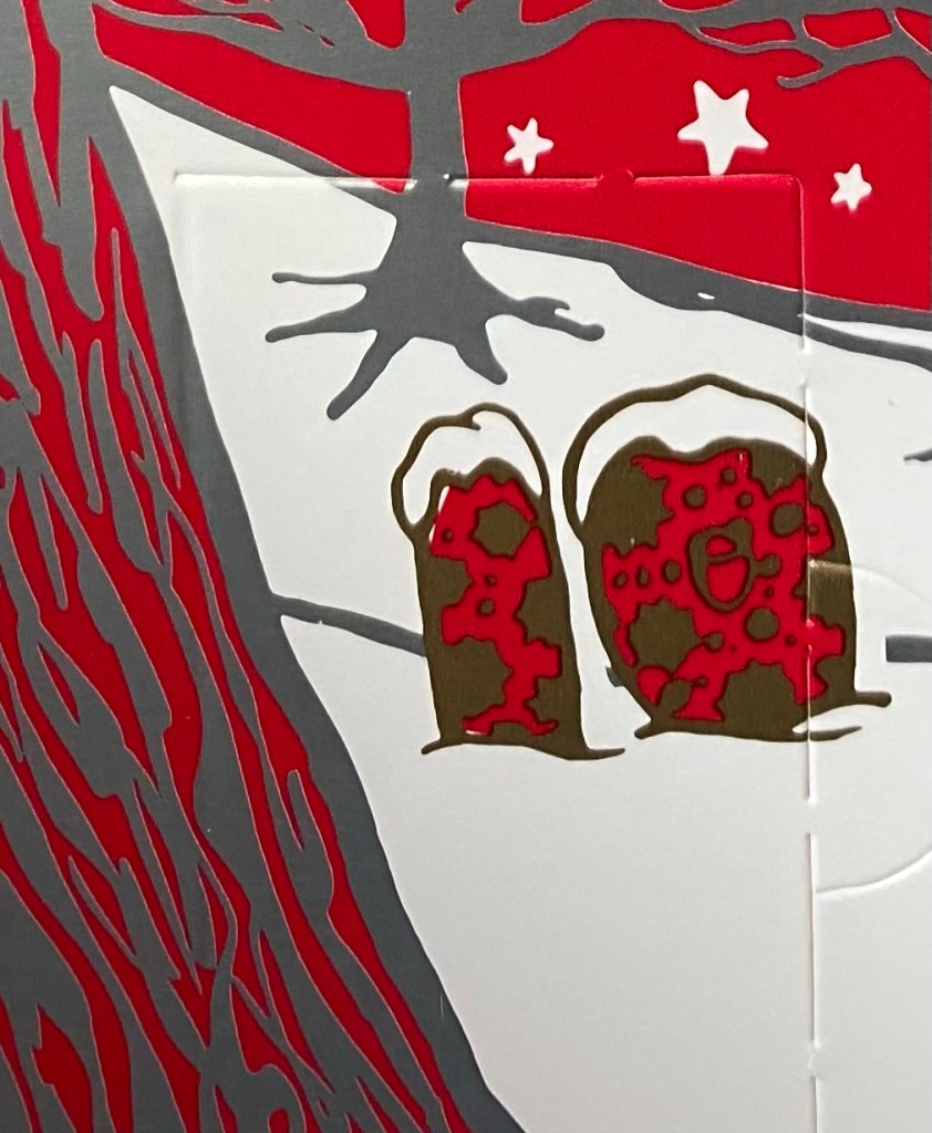
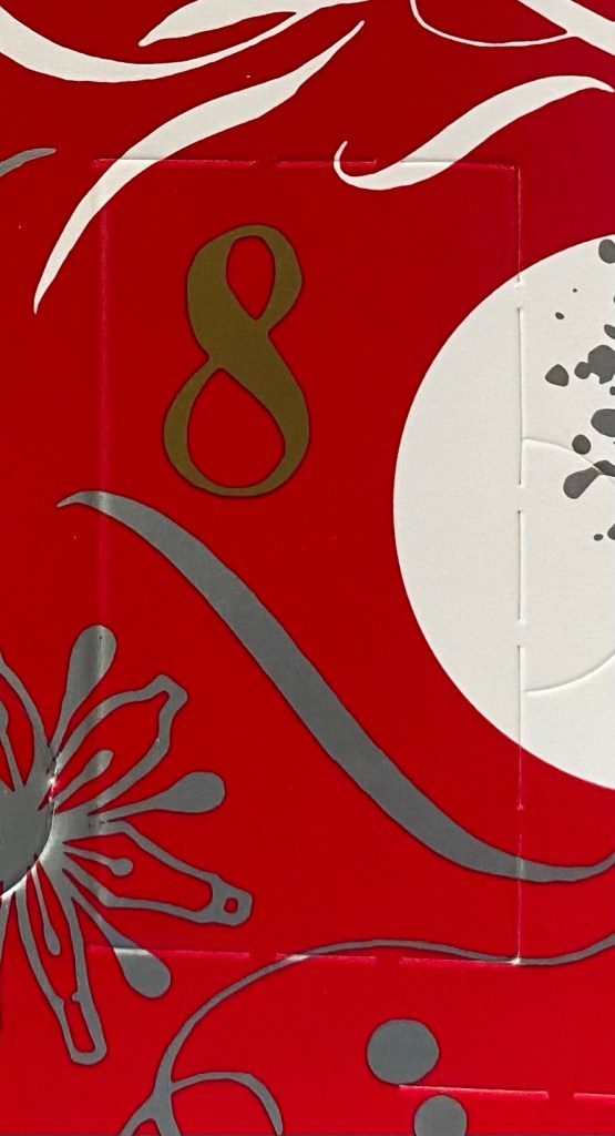
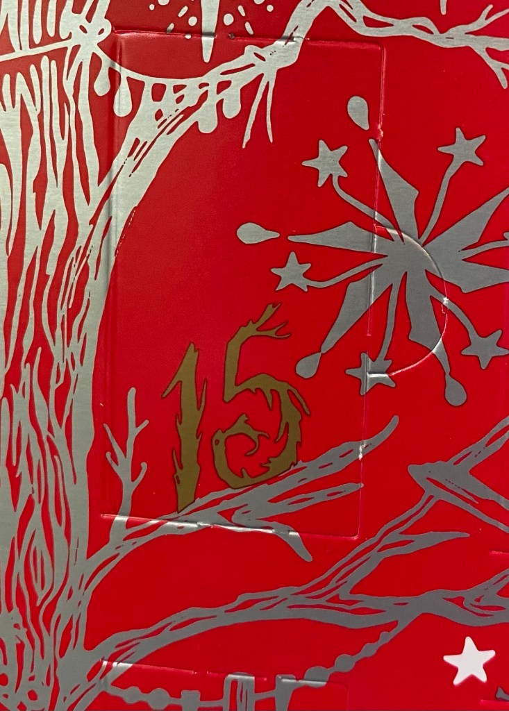
Diamine Inkvent 2021 Day 15

Caveat: this year’s Inkvent appears to have elusive ink colours. I suggest reading my description of the inks and not going by the photos alone, and comparing my results with those of other reviewers.
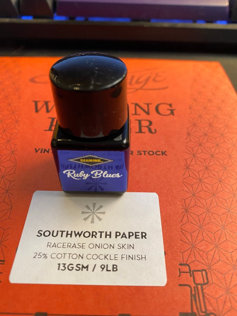
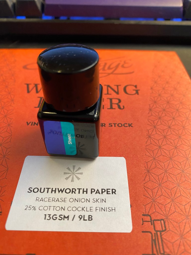
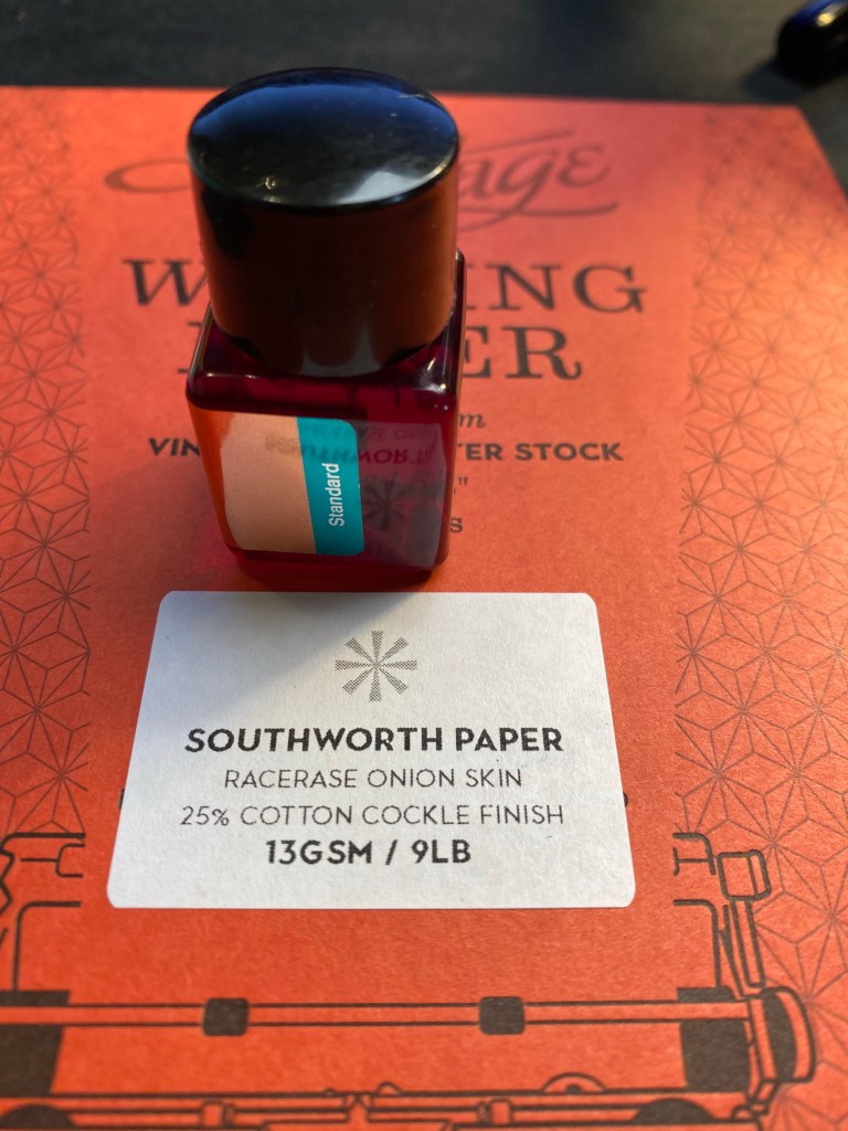
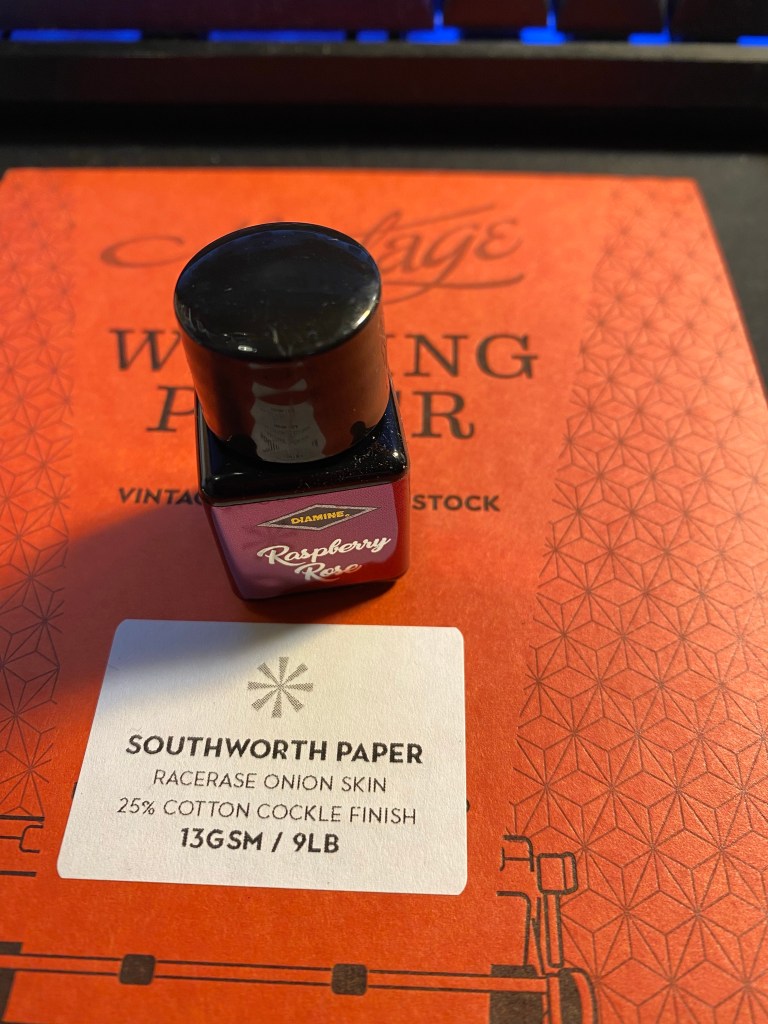
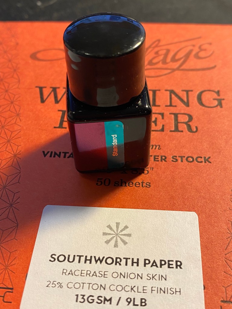
The Diamine Inkvent calendar is an advent calendar with 24 tiny (12ml) bottles of fountain pen ink behind 24 doors, and a larger, 30ml, bottle of ink behind the 25th door. All the inks are limited edition, and, at the moment, only available through this calendar.
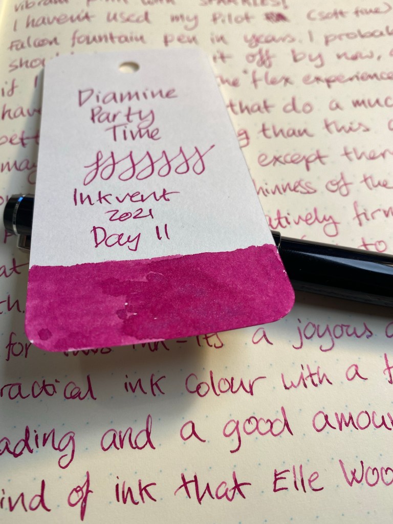
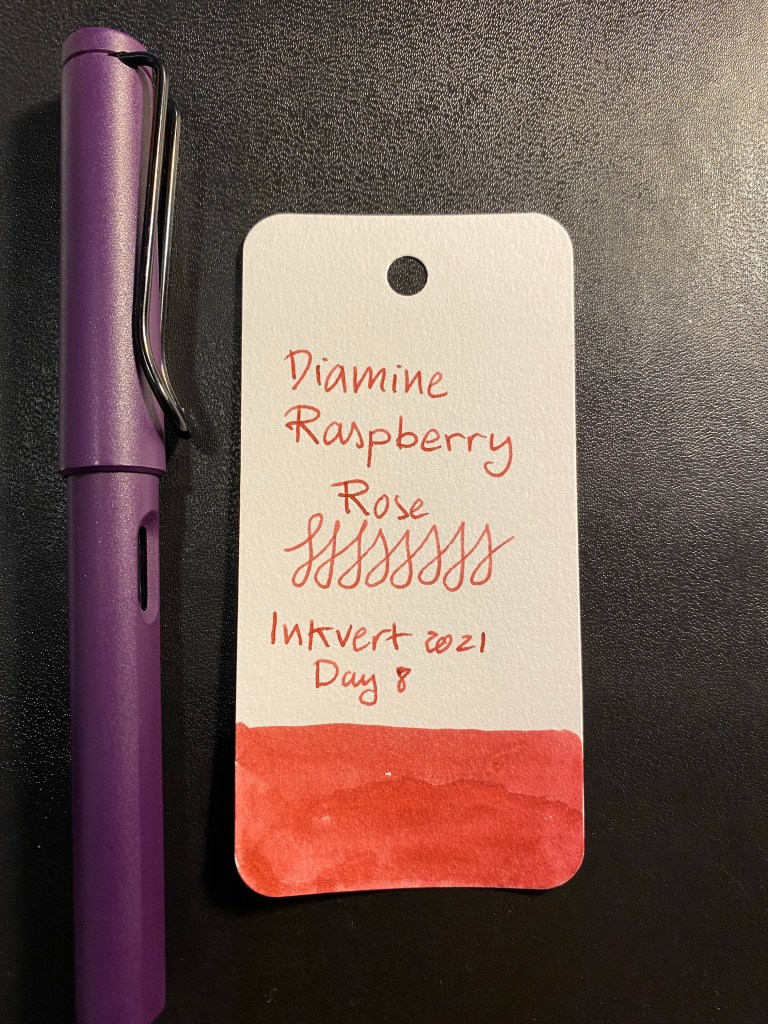
Day 15’s ink is Diamine Night Shade, which is a slightly periwinkle-ish blue with a lot of shading.

It’s a standard ink in a peculiar colour.

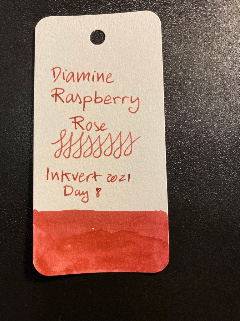
Here’s a Col-o-Ring swab of Diamine Night Shade. It’s lighter here than it was in my later writing and drawing samples – it’s not an issue of photography here, the ink itself is illusive in colour. It does shade a lot no matter how it looks like.
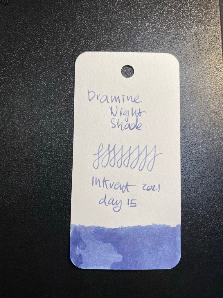
I used a Kanilea Haleakala Silhouette with a fine nib to test out Diamine Night Shade.

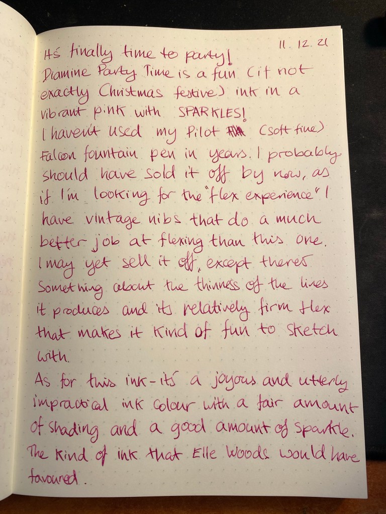
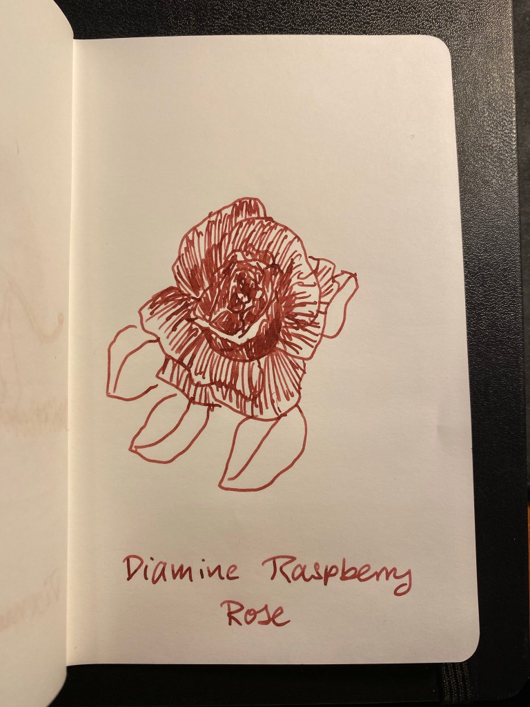
I decided to draw a quick rough sketch of some Night Shade flowers, and then I swabbed a bit of ink onto the page to test out this ink on Tomoe River paper. The ink looks like a standard blue black until it dries, and then sometimes it stays in the standard blue black range and sometimes takes a more periwinkle shade.

This was drawn on a Kanso Sasshi 3.5” x 5.5” Tomoe River Paper notebook (the notebooks I have were bought in 2016, and so they contain the old Tomoe River paper).
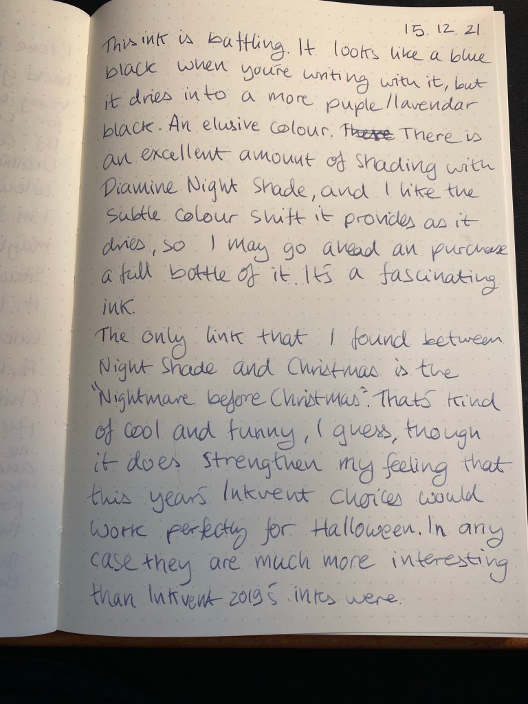
Finally, I wrote a page in my Midori Journal:
Why Night Shade and Christmas? Likely because of “The Nightmare before Christmas”. Do I find Diamine Night Shade to be festive? Maybe if it had some silver shimmer to it. As it is, it’s an interesting and somewhat baffling ink that I will need to test some more on different kinds of paper and maybe with another pen before I decide whether I like it enough to prefer it over an ink like Diamine Harmony or not.