The wonderful Liz Steel is starting a new teacup sketching course, and I decided to enrol to it. I don’t have many teacups, but I do love the ones that I have, and I think that they are interesting objects to sketch. As Liz points out, many teacups and coffee mugs have vivid memories tied to them, and they oftentimes have interesting shapes, colours and patterns. I was also looking for a way to kickstart my sketching again, and as this is a short course (just 4 weeks) I thought that this was a good place to start.
As is customary in Liz’s courses, I created a “pre course” sketch: a teacup sketch to demonstrate where I’m starting from. I started with a pencil sketch and then worked over it with a Staedtler pigment liner only to have the whole thing ruined when I used a new eraser that was too aggressive for the paper. You don’t often get to see failures on display, so I’m attaching the photo of my failed first attempt so that we can all learn from my mistake.
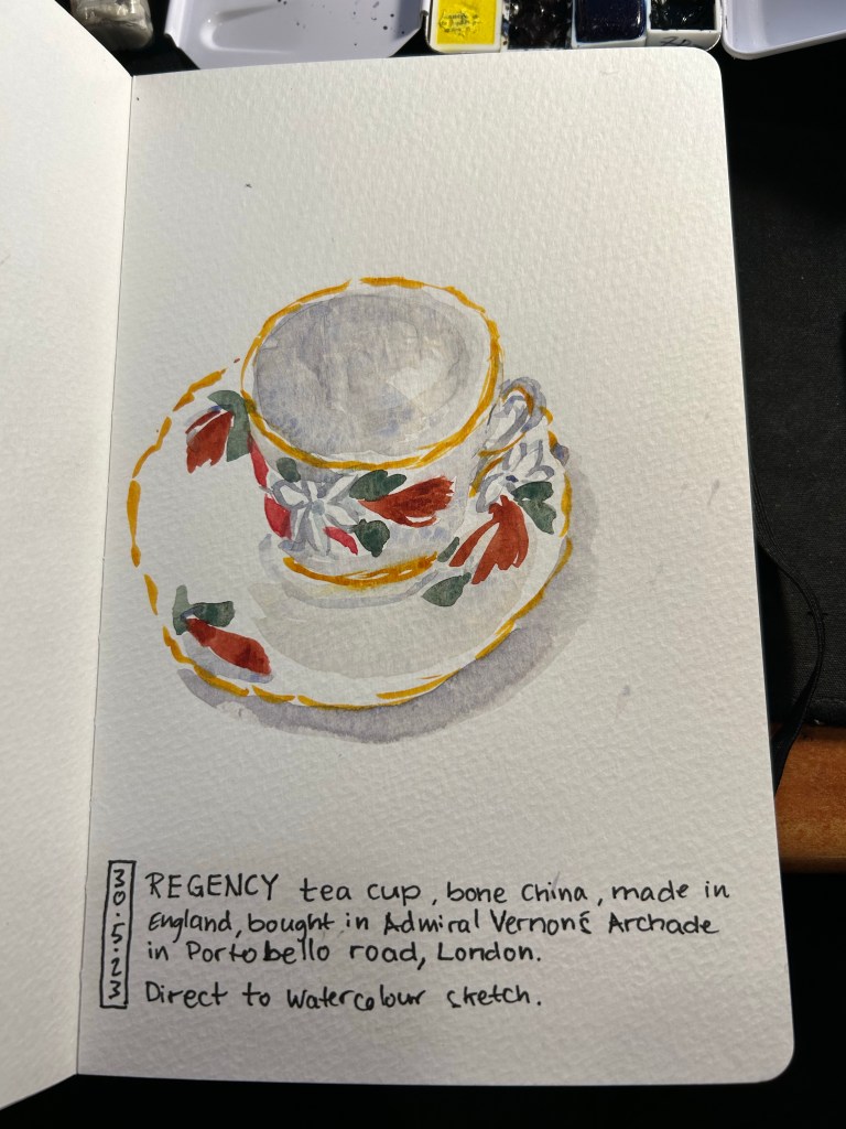
I then decided to risk going directly to watercolour. The teacup I sketched was both complex in terms of shape and pattern, so going this route was not something I would have chosen if not for my initial failure. The result came out better than I expected. It’s far from perfect but it’s not terrible. A start that I can improve upon, at the very least.
Direct to watercolour cup
Here is my failure sketch. You can see the mess of the paper. But if you don’t experiment and try new things, you don’t know what works and what doesn’t. That eraser is relegated to non-watercolour paper from now on, and it was a lesson worth learning on a sketch of this kind and not on something more precious.
Failed sketch.
Don’t be afraid to try stuff out. It’s worth it even if the result isn’t what you’d term a success.
I’m working on my backlog of posts after about a month of hiatus (work and health related) so here’s a look into more of my haul from my latest London trip.
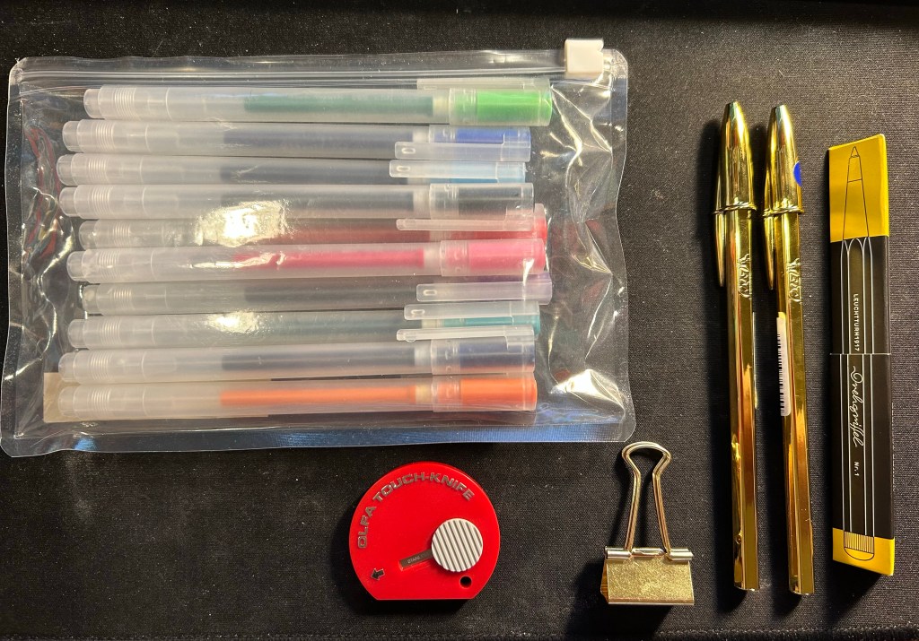
Muji happened to have a sale on its standard pen sets, so I bought a pouch of these 0.38 gel pens (I think that Zebra makes their refills but I’m not sure) to have around. There are 10 pens in the set, and my plan is to bring them into the office to have them around as occasional highlighters, pens to doodle with or pens to loan with no expectations of seeing them again.
The red Olfa Touch Knife was an impulse buy and is the thing I use most from this bunch. I used it while gift wrapping books, I used it to open packages, and I’m using it now to open Lego bags for my current build (the large Disney Castle). This is a nifty and handy little tool and I’ll probably buy another one at some point as a backup. The bronze paper clip is just a nicer version of the clip that I use to keep my pocket Stillman and Birn Alphas shut, as they don’t come with any kind of elastic closure.
The gold bics are from Present and Correct and they made me laugh. I plan on giving one away to a designed friend, in the hopes that it will make her laugh too. I used to use them so much when I was a teenager (before gel ink pens became widely available) and I hated them so much that having a gold one is just beyond perfect.
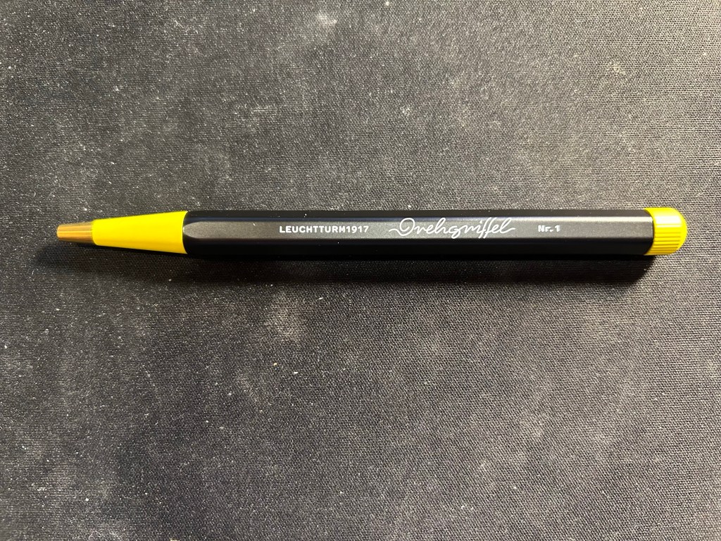
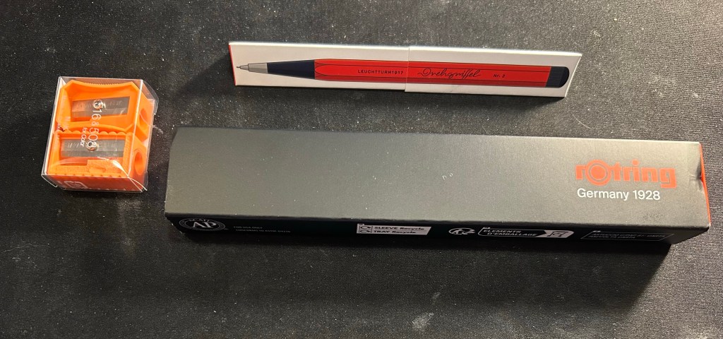
The black and yellow pen is the Bauhaus edition of the Leuchtturm1917 Drehgriffel Nr. 1 ballpoint. It’s a twist mechanism aluminium and brass hexagonal ballpoint pen that comes with a blue refill. I reviewed the gel ink version (identical apart from the refill) here. I purchased this pen in London Graphic Centre near Seven Dials/Covent Garden, and it was completely an impulse buy. Should you buy one yourself? If you’re in need of a pocketable ballpoint that doesn’t use a click mechanism, then maybe. Ergonomically it’s not the best for long writing sessions, and the twist mechanism doesn’t make it great for quick deployment, so there are better options in the market. The design is very fetching, and if you like it you might be willing to overlook the pen’s shortcomings. The Bauhaus edition was created as a companion to Leuchtturm’s Bauhaus notebooks.
Drehgriffel Nr. 1 Bauhaus ballpoint.
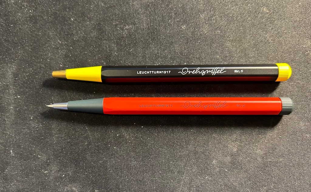
I bought the Drehgriffel ballpoint to accompany the Drehgriffel mechanical pencil that I bought at the same time. The pencil is fire engine red and grey with silver trim, and the pen is black and yellow with brass trim, and the pencil is slightly heavier than the pen, though they’re both the same size.
Pen on top, pencil on the bottom.
I also got two carrying cases, one a blue Cordura pen case from Midori. The case is called the two way pouch, and it appears very well made.
Midori two way pouch.
The pouch is divided into two identical compartments (hence the name) each with a small divider/pocket inside. It also has a prominent and robustly built handle. I am considering using this pen case for my Caran d’Ache neocolors, but we’ll see.
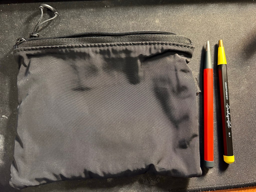
The second case is a heavily discounted net pouch from Muji. This is going into my travel backpack as a way to keep easily lost bits and bobs together and easily found.
The net side of the Muji case
The net is just on one side of the case, which is perfect, as it allows you to see what’s inside the pouch and also have this little bag have some sort of body and structure to it due to the solid side.
The solid side of the Muji case next to the Drehgriffel pencil and pen.
I also bought a solid plastic box for the my neocolors at Muji, but I decided not to use if for them in the end. It was too small for them and they rattled around in it and made a racket every time I walked, and I didn’t like that.
All in all this was probably my most “impulse buy” bit of the trip, and I’m OK with that. Compared to previous years I’ve really toned down my “must try all the pens in the world to find just the perfect one!” tendencies. If you’re reading this I assume that you can relate. Now to just use it all…
I’ve recently misplaced my beloved watercolour paint box and after searching for it for more than two weeks, I gave up and decided to build a new paint box, with the hopes that the old one will show up one day. Good quality watercolour paint boxes and artist grade watercolours aren’t cheap, which is why I put this off for a while, but they do last for a very long time if you invest a little bit in them.
This post won’t be so much about my palette choices but rather more about the physical properties of the box that I use and the paints within it. If you have had a taste of watercolours and decided that you enjoy the medium and would like to create a long lasting field paint set, this post is for you.
For years I used the excellent Windsor Newton Cotman Watercolour Field Box. The box comes with a set of Cotman student grade watercolours that I gifted away (they aren’t worth your time. If there’s something worth investing in when it comes to watercolours it’s the paints. The order is paints -> paper -> brushes), a handy little built in water bottle and water cup, a sponge, and a foldable brush that is mediocre but usuable in a pinch (you’ll probably lose it shortly after buying the box, but that’s ok). The box officially holds 12 half pans, but in reality you can squeeze 14 half pans in with no effort. If you are getting into Urban Sketching this is an excellent set to have, a nifty little workhorse that will last you easily for a few years. For a very compact size you get a surprisingly large set of mixing areas, and while I’d only use the included water bottle as a backup because it holds very little water, it’s good to have around.
The pros of this kit are many: it’s small, light, well designed, cheap, easy to use, and holds a lot for such a small, pocketable package. The cons are why after three Field Boxes I finally switched over to my current setup: the boxes deteriorate and fall apart after 2-3 years of use at most, they are difficult to clean, and it’s difficult to switch out paints if you’re experimenting with your palette.
The build quality in particular has taken a hit in recent years, to the point where I cannibalise old Field Boxes for parts for the new ones. However, even the old boxes didn’t last for more than 3-4 years, because the plastic would deteriorate and the attached mixing flats would drop off, leaving you with very few mixing space in the end.
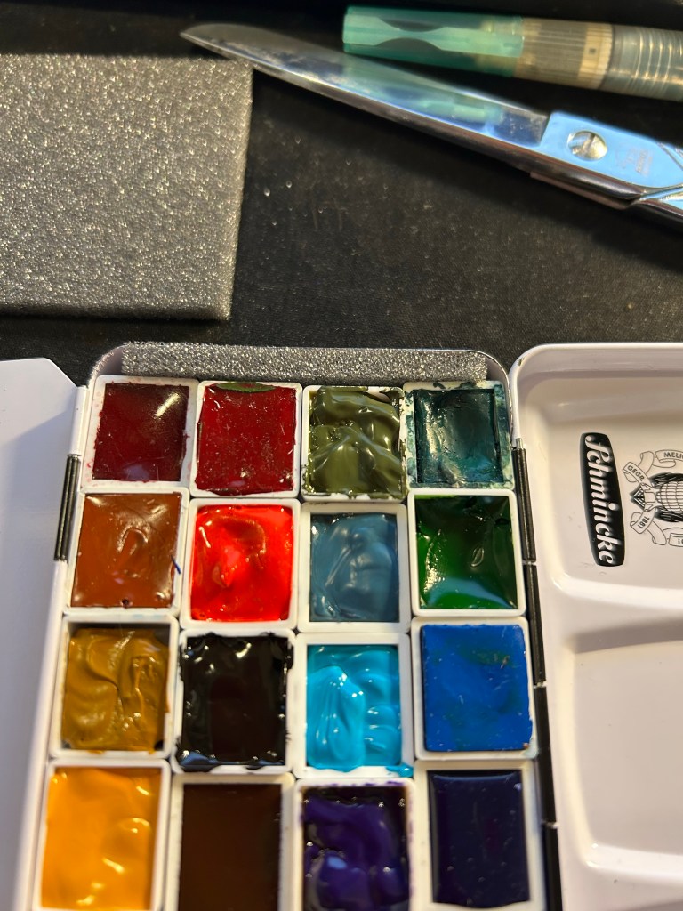
There are many pocket sized enamelled paint boxes, but after trying several generic ones, I found that Schmincke’s box is worth the extra money. Generic boxes didn’t have such a good mixing area configuration, and they tended to rust off on me. The Schmincke box can take a hell of a beating without the enamel flaking off, and when working with watercolours, as soon as there’s a chip in the enamel, rust will take hold of your box.
The box comes with an insert meant to allow for two rows of six half pans and a compact, foldable brush in the middle. I take that insert out and toss it. That leaves me the whole box for a whopping 24 half pans, or a mix of half pans and full pans. Here I my usual setup, which is about 60% Schmincke and 40% Daniel Smith watercolours. Some of them are paint filled half pans that I purchased, and most of them are half pans that I filled with paint myself. Buying tubes and filling your own pans is cheaper in the long run, particularly for paints that you use often.
Filling your own half pans with paint is very easy, and also exposes interesting properties of the paints that you use. For instance, Van Dyke Brown takes ages to cure, while all my yellow paints cure super fast. I’ll also note that Daniel Smith watercolours loose A LOT of volume after drying up, shrinking at times to almost 50% of their original volume. It always takes 2-3 passes to fill a Daniel Smith half-pan, and with Schmincke one pass is enough. So you can see the ugly crack in my Hansa Yellow Medium, where the paint shrunk to half its size and I filled the other half of the pan again.
On the other hand, Schmincke’s half pan packaging is infuriating. The pans come wrapped in wax paper which often sticks to the paint as you unwrap it (imagine peeling off a sticker and having bits of sticker left behind). You can see this on the Lemon Yellow on the bottom left and on the Cobalt Blue Deep on the second to last row, on the right. After much of a struggle I got the residue off the Cobalt Blue, but I left it to scrape off later from the Lemon Yellow. It is a hassle to remove these bits of leftover paper, and they ruin the paint.
Closeup on the paints in the set.
As there’s a bit of a gap left that allows the pans to travel freely in the box, I cut a bit of foam and put it in the box, creating a friction fit for all the pans. Removing a pan and switching it over is a breeze this way – you can always lift out the foam and then easily remove the paint pan.
Foam at work
The box has two large mixing areas, one divided into three large wells which I use to mix often use colours or paint for large areas. The second area is divided into six small wells (you can see this all in the first photo of the set) which are good for small mixes. As it’s enamelled metal it’s very easy to clean, and the set is much more robust than the W&N Field Box.
If you like to experiment with your palette (I always have 2-3 paints that I switch out every 3-4 months), and you are looking for an ultra durable compact field set, I highly recommend investing in the Schmincke 12 half-pan box and filling it with whichever paints you choose. Pre-made watercolour sets are always terrible (they include at least 1-2 colours that you will never ever use), and building a set that fits your needs is a crucial step in making your watercolour painting more streamlined and enjoyable.
What watercolour box do you use? Let me know in the comments, as I love hearing from other sketchers about their tool choices.
“Drive Your Plow Over the Bones of the Dead” by Olga Tokarczuk (the Nobel prize in literature winner) is an astounding novel.
Imagine an Agatha Christie like murder mystery (and that already is high praise, because Christie knew how to spin a murder mystery plot like few other writers do). Now set it in a “Fargo” like setting, including the hostile weather, the small town, the eccentric people, and the quirky, pragmatic and deeply insightful main character (if this is ever made into a movie, Frances McDormand would make a perfect Mrs. Duszejko). Now cast it all in fantastic prose, tie it to Blake, to Eastern European history, to morality plays and religious texts, and finally, to the ultimate revenge narrative, “The Count of Monte Cristo”. Mrs. Duszejko isn’t a brooding sailor exposing the cruelty, corruption and foibles of upper-class French society, but she most definitely is woman in her 60s doing the same for the chauvinistic, cruel, corrupt, hunting neighbours around her.
Tokarczuk created a Character (with a big, bold, capital “C”) like no other. Mrs. Duszejko is the heart, the essence, the meaning and the end of “Drive Your Plow”. She is our way into the story, she maps out our way through it, and she judges us in the end. How we feel about her after the final page says more about us than it says about her. She is a character both full of contradictions and yet an integrated, believable whole at the same time. She is an engineer and a teacher, with a solid STEM background, that is also an astrology believer and practitioner. She is a non-religious person that constantly talks about God, a recluse that keeps making friends, a cynic that somehow manages to see good in people at their worst moments. She’s rational and pragmatic, and also deeply emotional and oftentimes impulsive. She’s powerful and fit, and a frail invalid. And she’s completely, utterly, with every molecule of her being, a real and believable human being. She’s a more believable person than I am, astrology and all.
The way that Tokarczuk ties the men’s treatment of Mrs. Duszejko (and other women) to the way they treat animals is masterful. “Drive Your Plow” could have been a parable, an allegory, a morality play, and yet it performs all that and so much more without driving the reader away. Like “Fargo,” it could have been a meaningless farce in less adept hands, and yet it manages to deal with issues that we have learned to be cynical about (the value of life, particularly as deemed valuable or useless by important men) with great earnestness and sensitivity.
There is much of Agatha Christie in the construction of the plot (particularly “And Then There Were None” and “Murder on the Orient Express”). There is much of Blake in the morality and moral outlook of certain characters. There is much of Dumas in the social observations tied to the revenge plot, and there are many post modern writers that are echoed in Mrs. Duszejko’s first person narrative. The result, however, is entirely unique, entirely Tokarczuk’s own, and well worth reading even if you have never enjoyed any of the authors echoed in the narrative. “Drive Your Plow Over the Bones of the Dead” is a modern masterpiece, and one that is deeply moving and thought provoking at the same time.
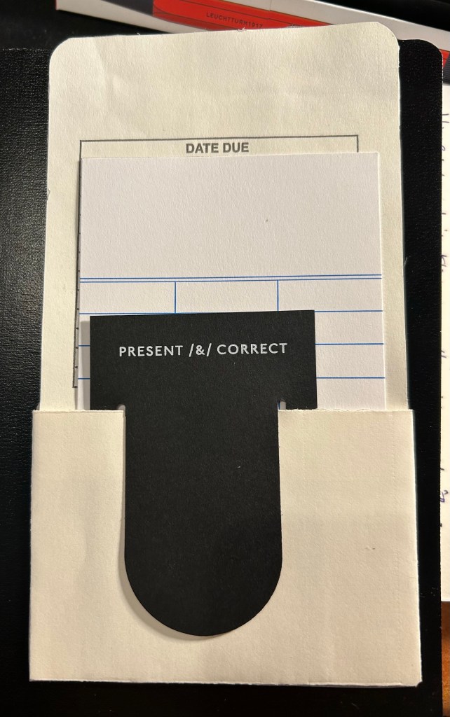
I love Present and Correct’s packaging and I didn’t want to throw it away, so I repurposed it as bookmarks using some washi tape and scissors.
This was originally glued to a paper bag.
The have these cool vintage lending slips glued to their paper bags so I cut it off the bag, and used washi tape on the back to tidy things up a bit. I’m currently using this in the book that I’m reading (Drive Your Plow Over the Bones of the Dead), and I love it.
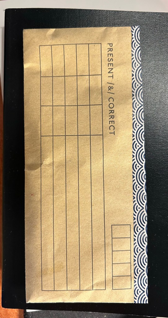
The next bookmark is messy but I don’t care. I took a slightly crumpled brown envelope that contained pencils, cut out the interesting part and taped it shut with washi tape. I didn’t bother using a ruler so it’s a bit wonky but I don’t care. The result is still useful and I like its imperfections.
It took a few minutes to create these, and they make me smile. I enjoy giving new life to old packaging, and I hope this and my paper bag sketches inspire you to give it a try yourself.
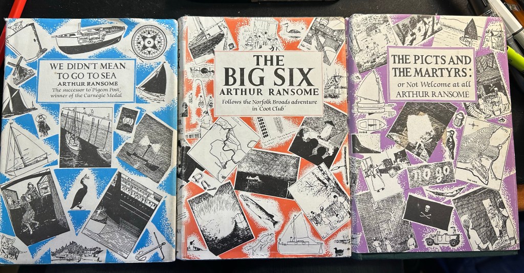
While I’ve really cut down on physical book purchases, especially while I’m abroad, I always end up buying a few books, and this last trip was no different. On Thursdays there’s a decent antique market in Spitalfields (it also includes several food carts and a good selection of vintage clothes stalls, plus it’s a few minutes away from Brick Lane), and I oftentimes find interesting things there. I’ll likely write a separate post about my haul there, but I did get three Arthur Ransome Swallows and Amazons series books: We Didn’t Mean to go to Sea”, “The Big Six” and “The Picts and the Martyrs”. They’re hardbacks in decent condition, with the dust jackets and the original Ransome illustrations, and I’m very glad that I found them half hidden in a comics and book stall. Ransome is an excellent British children’s book author, and if you liked the Famous Five and the Secret Seven or Kipling’s children’s book writing you’ll likely enjoy Ransome’s work.
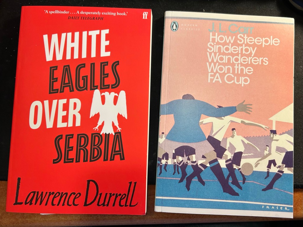
The other two books are paperbacks that I bought at Waterstone’s Piccadilly while waiting for a friend (I’m not to be trusted in bookstores). I’ve been wanting to read something by Lawrence Durrell for a long time and “White Eagles Over Serbia” seems like a good place to start. J.L. Carr is a superb writer, and although I’m not sold on “How Steeple Sinderby Wanderers Won the FA Cup”‘s subject matter, “A Month in the Country” was good enough for me to want to give this a try.
I still have April’s book backlog to finish reading, but these two books are next on my list.
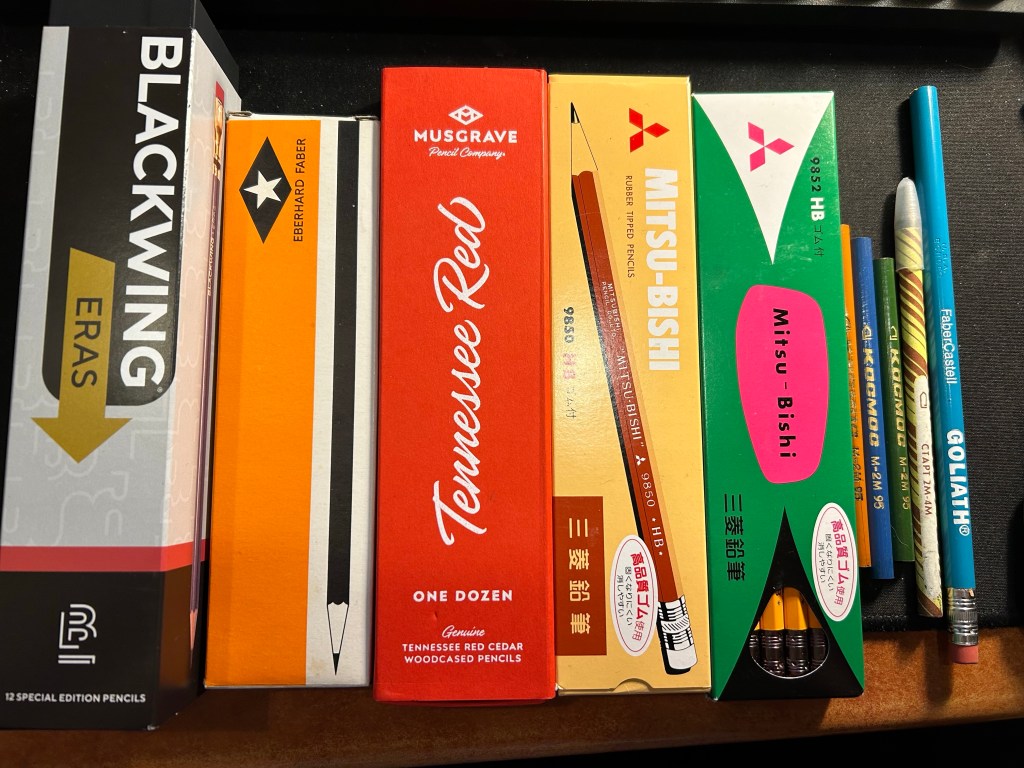
While I was in London I went to Present and Correct and purchased mostly woodcase pencils (and some paraphernalia). Here’s a breakdown of what I got there and why:
Blackwing Eras – I also purchased the previous Eras pencils from Present and Correct. These are very expensive (and overpriced) but after hemming and hawing I decided to splurge. These have the extra firm Blackwing core, which I enjoy writing and sketching with, with a little bit of zing with the nostalgic arrow punch design. I have a project in mind for them, and will feature them in a separate post them.
Eberhard Faber pencils. These are vintage, and I’ll post a review of them separately, but they are gorgeous and I love vintage pencils, so these were the first thing that I got once I saw them.
Musgrave Tennessee Red – I have several boxes of these, and yet I got another one. These pencils are gorgeous, and they’re great for both writing and sketching. Some people find their corners too sharp and prefer the rounds, but I’ve yet to obtain the round Tennessee Reds, so I can’t compare between them. I wrote a review of them here.
Mitsu-Bishi 9850 and 9852 – Japanese pencils. The 9850 is for “office use” and the 9852 is a “master writing” pencil. I have only one or two 9850s and I wanted a pack because they are excellent pencils. I haven’t tried the 9852s I think, and anything with that wild green and pink package with “master writing” on it is a must.
Loose USSR vintage pencils and graphite stick – I got these as a gift for my purchase at Present and Correct, together with the…
Faber Castell Goliath – a wide barrelled vintage, USA bonded pencil that was meant for school children just learning to write.
Woodcased pencil haul (and one graphite stick – the one to the immediate left of the Goliath)
I also got a set of salmon coloured Japanese pencil sharpeners there – I have another two sets that I bought there and enjoyed – one that I’ve gifted and one that I regularly use. There are surprisingly few pencil sharpeners of this kind that are actually good, and these are very convenient for my sketching kits as they are small and light.
I also got two mechanical pencils, one from London Graphic Centre in Covent Garden, and one from Gibert Joseph in Paris:
Sharpener set and two mechanical pencils
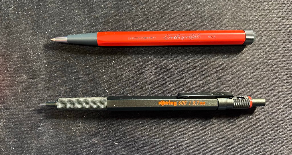
The top pencil is the Leuchtturm1917 Drehgriffel Nr. 2 mechanical pencil (purchased at London Graphic Centre). I will be writing a review of it once I get to use it a bit more, but for now I’ll just say that it’s an attractive desk object.
The bottom pencil is the rotring 600 in camouflage green. It’s the rotring 600 – one of the best drafting pencils out there – and the colour is a dark racing green that makes it look black upon casual glance. I bought this pen at Gibert Joseph in Paris and was about to go for the red rotring 600 when I realized that what I had thought was a standard black rotring 600 was indeed the green one. The colour is difficult to reproduce, but I find it fetching and intriguing, so I’m glad that I went for it instead of its red or blue counterparts.
Drehgriffel above and rotring 600 below
Overall I’m happy with my purchases, and can’t wait to start using them.
I returned on Saturday afternoon from a 17(!) day trip to London, York and Paris, and I’m still in the process of adjusting back to my routine. It was a perfect trip and a perfect break from the hard reality that I normally live in, and so it’s been tough getting back. I missed my cats, and I missed my running routine, but I didn’t miss the slew of doctor appointments and medical related bureaucracy surrounding my cancer and my mom’s cancer, and I didn’t miss the political situation here at all.
So I’m trying to find comfort in journalling, in talking to friends, in enjoying the things that I got from abroad (of course I bought pens, paper, pencils, ink, cool vintage stationery, art supplies, etc). And I’m returning to blogging regularly. I have quite a few reviews in the works, and one more post in the “Ghosts of Planner’s Past” series, plus as I’m getting back to my reading routine more books will be featured here.
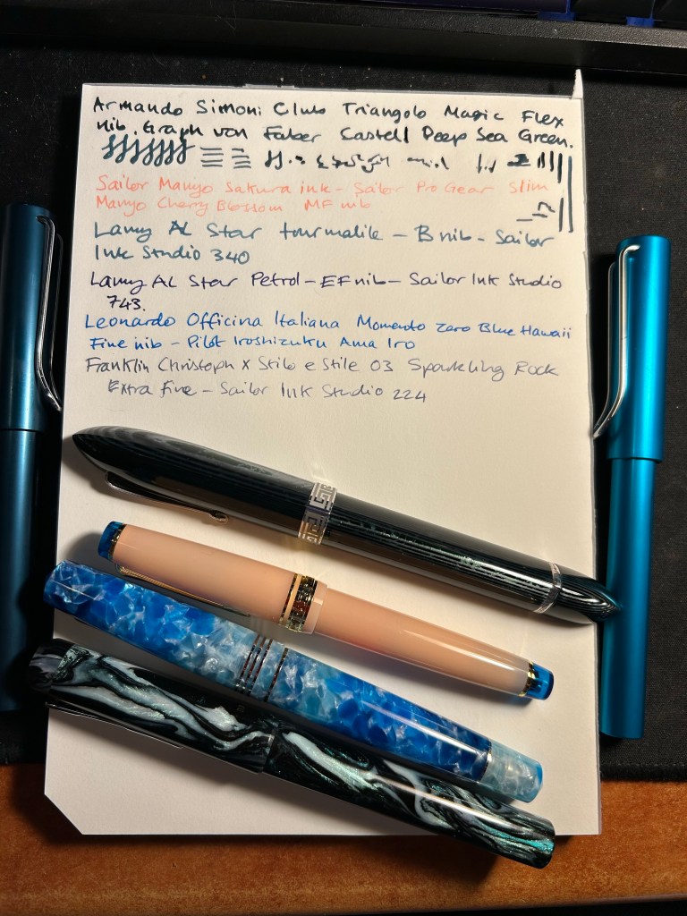
For now I’ve filled up four new fountain pens (none of which I’ve bought on this latest trip). The ASC Triangolo is a pen that I don’t remember buying at all, which is extremely unusual, and likely means that I bought it at Mora Stylos in 2022, on my first trip after finishing Chemo. Chemo brain is a real thing and I have chunks of that time (during treatment and a few months after it) that are completely missing in a very scary sort of way. The pen itself is an Omas 360 look alike, made with gorgeous arco verde material and has a “magic flex” nib. It’s the largest and one of the heaviest pens that I own, and the nib has issues (both problems starting and issues where it puts down too much ink). I filled it with Faber Castell Deep Sea Green, which from my experience is a drier ink, but that didn’t seem to affect it much. I doubt that I’d get much help from the Pen Family (their QC and service isn’t known to be the best though I will give them a try), so it’s a matter of seeing if I can fix it myself, and seeing what I can do to get it tuned locally, considering that the main guy working on pens here has recently retired. The ASC Triangolo is the big green striped triangular pen right beneath the writing.
The Sailor Pro Gear Slim Manyo Cherry Blossom is a pen that I bought on a whim in Choosing Keeping in London last year. I haven’t inked it since I bought it, but now I did, using the bottle of Sailor Manyo Sakura ink that came with it. This pen, unlike the Triangolo, perfectly fits my tiny hands (it’s the pink pen with the blue finials).
The two Lamy AL Stars (one on each side of the page) are a recent purchase from Pen Chalet. I wanted to try out a Lamy B nib, and I really liked the AL Star Petrol 2023 special edition, and the Tourmaline (2020?) one. They’re filled with Sailor Ink Studio inks that I purchased in Choosing Keeping during my last trip there.
The Leonardo Momento Zero Blue Hawaii and the FC Sparkling Rock travelled with me to London and back. They were a joy to use, and I’m glad that I took them along as they caused no issues – no leaks, etc – and were fun to use when I journaled during my trip.
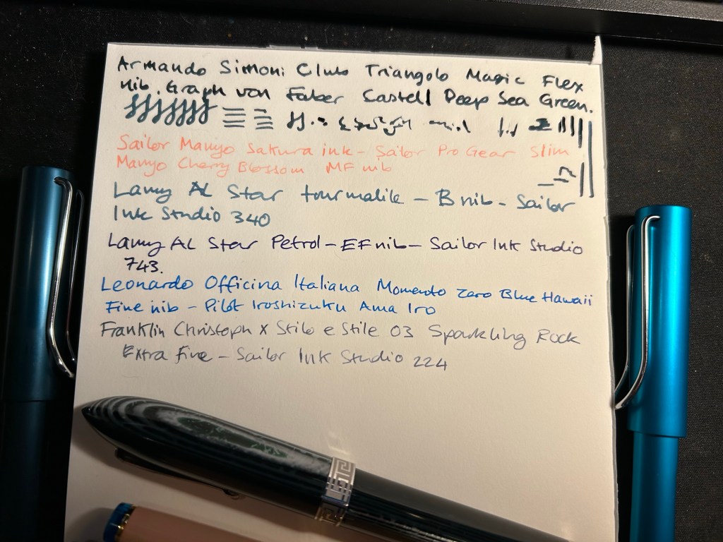
Here’s a bit of a closer look at the writing sample. The Triangolo’s is unfortunately a mess. The Ink Studio 340 and 224 are my favourite inks of the bunch, though the Ama Iro and 743 are also great. The Sailor Manyo Sakura is too light of my tastes, especially in such a fine nib (the Sailor MF is like a Lamy EF).
Break out a nice pen or pencil to use. It’s the little things that can help make your day.
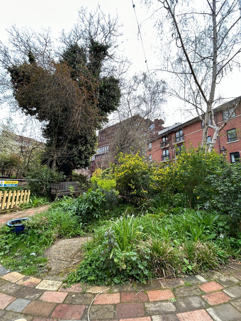
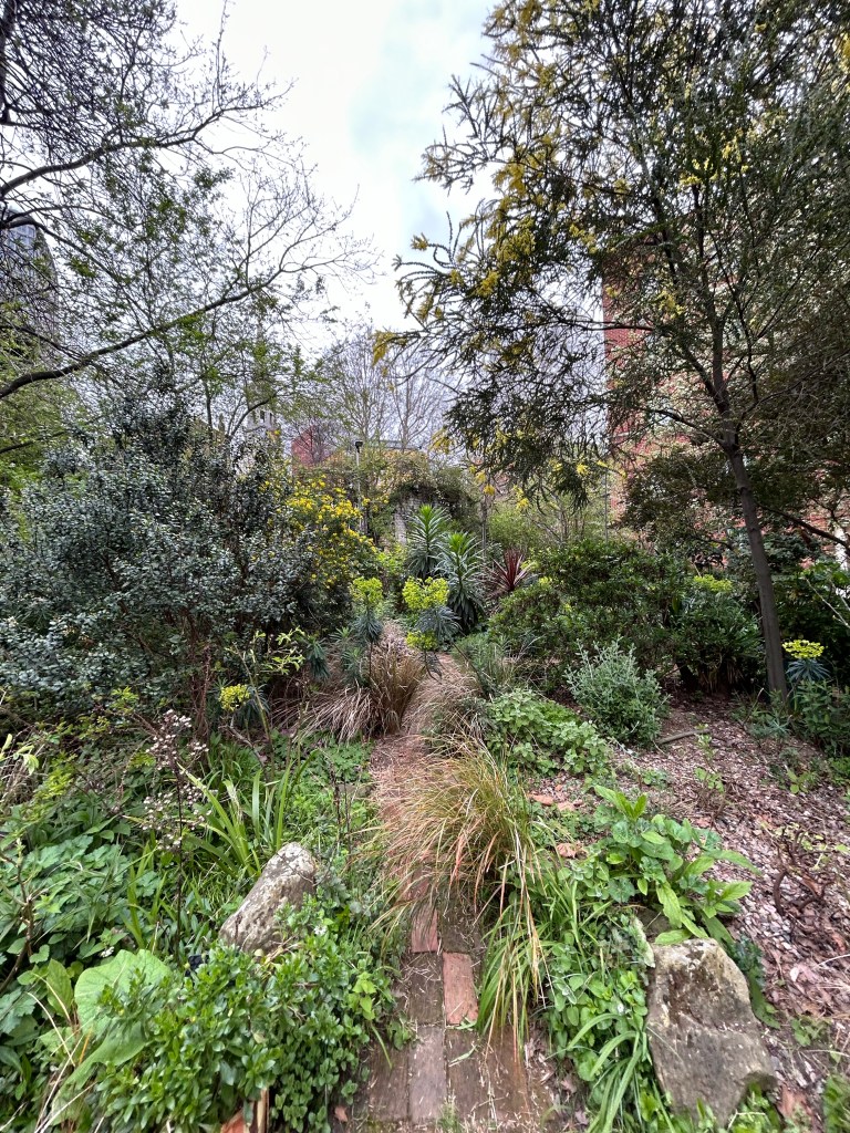
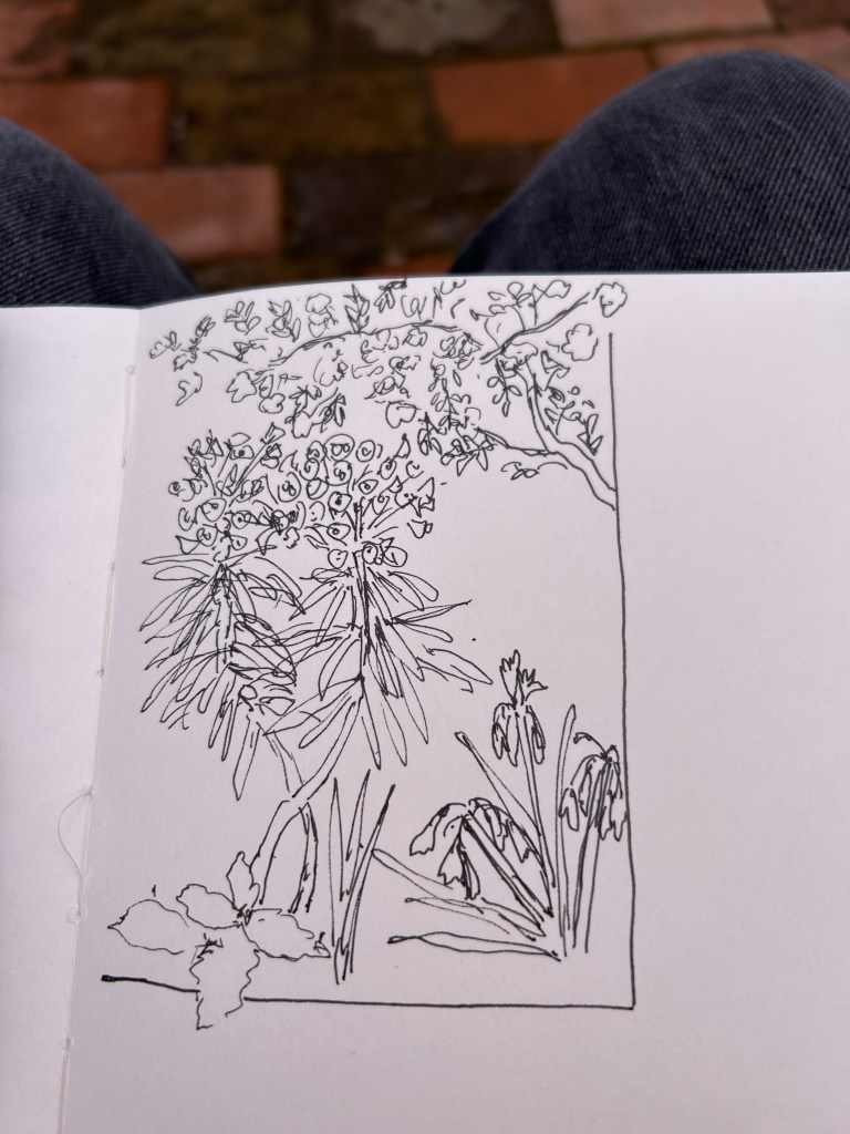
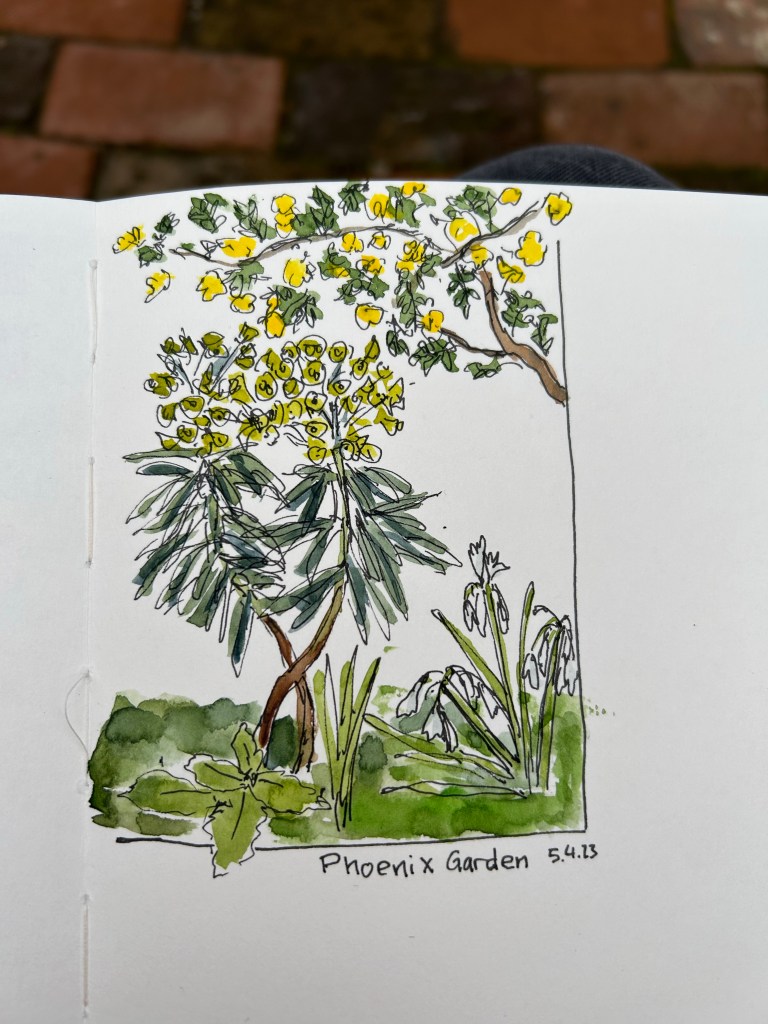
The Phoenix Community Garden at the heart of Soho, London is one of my favourite places on earth. How much do I love this place, that was brought to greenery out of the ashes of a parking lot? I visualised it while I was going through my first and very painful biopsy. I won’t go into the gory details, but suffice to say that it took a very powerful positive memory to help me keep my body still during the intense pain of the procedure.
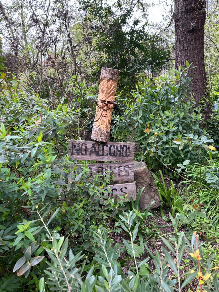
I love this new sign.
The garden is a haven for plants, people and wildlife in the heart of a busy city, and it is full of character. You get to see how bits of masonry and bobs of donations are recycled into a joyful mishmash of urban gardening.
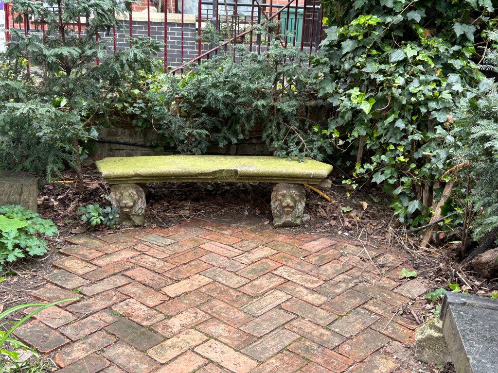
No two benches here are alike, every pot and container has something weird or unique going on (from smurfs to little signs).
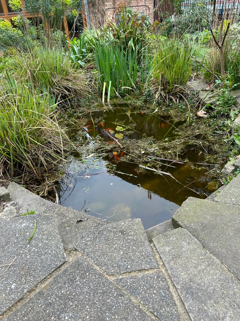
There’s a pond surrounded by broken paving that even has some goldfish moseying along in it.
And the place is cleverly built to be full of books, crannies, corners and elevation shifts, making it look much larger than it is.
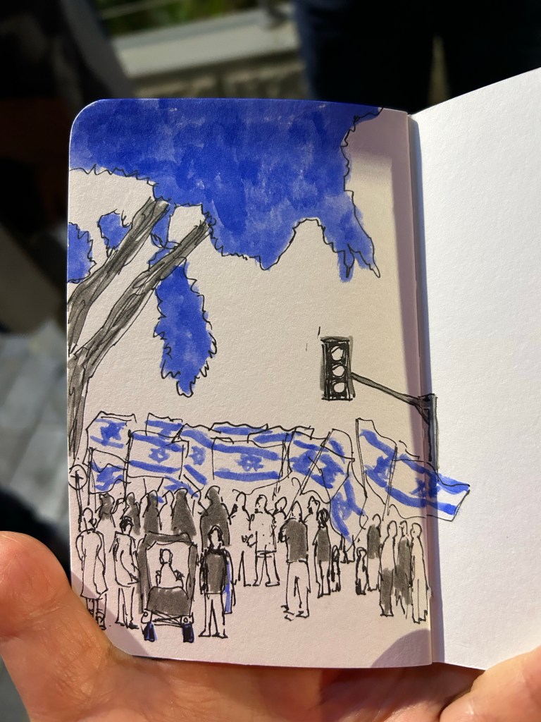
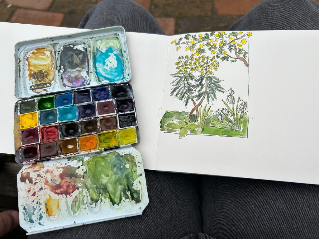
I managed to get a quick sketch in before the rain started, nothing too fancy as my neuropathy was terrible today.
Find yourself a bit of green to find joy in today. We could all use a bit more of that.