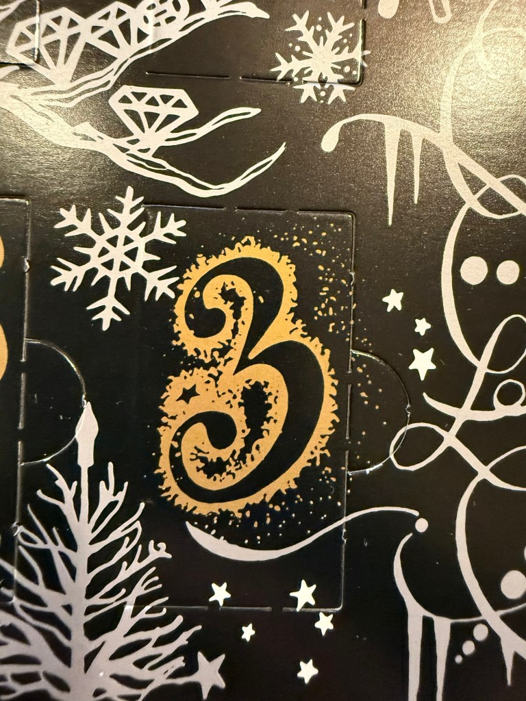
Diamine Inkvent 2024 Day 7
This is the Diamine Inkvent 2024 Day 7 door:

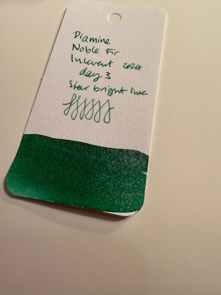
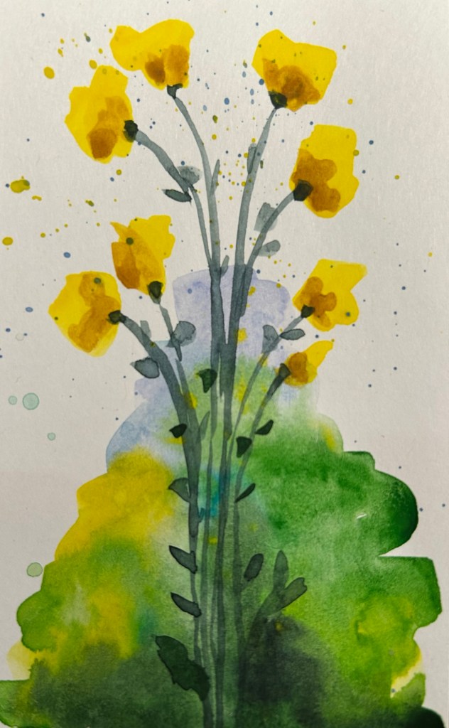
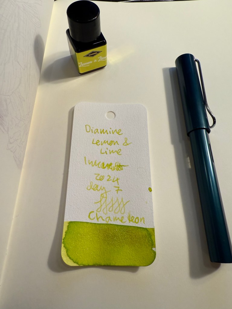
Day 7’s ink is Diamine Lemon and Lime – a light lime green ink with green to gold chameleon shimmer. I used a Lamy AL Star broad nibbed fountain pen to test this ink out.
Here’s another angle of the swab, where you see a bit more of the chameleon ink in effect:

And a closer look at the swab that also shows some of the shading in this ink:

Here’s Diamine Lemon & Lime on the original Tomoe River Paper, which really shows off the shading properties of this ink:

Here’s Diamine Lemon & Lime on a Rhodia paper notepad. This ink dries a bit darker than it writes, but is still pretty unreadable because it’s so light. The photo darkened this writing sample a bit and this pen lays down a good amount of ink, which also helped a bit with legibility. It’s an interesting ink and a unique one, due to the combination of the base ink colour and the chameleon effect.

Here’s a close up of today’s bear sketch, made on Midori MD Cotton paper. You can see the shading properties of this ink and a bit of the chameleon shimmer. I laid down a lot of ink but as it’s a very light, unsaturated ink there was no bleeding or show-through.
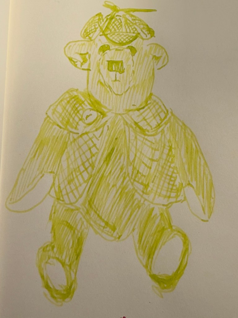
Here’s a look at the full sketch. If you look at the writing sample you can see how hard it is to make the writing out because there’s so little contrast between the Lemon & Lime ink and the white page.

Today’s bear is one of the few that I have that have clothes. His name is, unsurprisingly, Sherlock, and I purchased him in York. He’s a Canterbury Bear, designed and made in England by Maude and John Blacktown.

Diamine Lemon & Lime may add some interest and bright cheeriness to this year’s Inkvent, but it’s a completely impractical ink because it’s too light to be legible and it has the chameleon shimmer added to it, which makes it harder to clean out of a pen. It’s somewhat appropriate thematically, but I still don’t ever see myself using it, let alone buying a full bottle of it. I will actually be dumping it out of the pen and cleaning it the minute this review has been posted.
What do you think of Diamine Lemon & Lime? Do you see yourself using it? Do you use yellow or very light green inks?