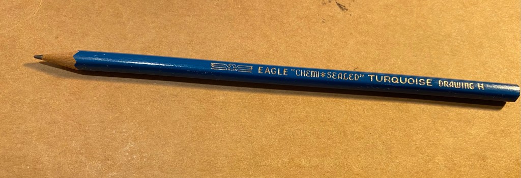
Watercolours are scary to work with, because unlike other drawing mediums (except ink washes), they have a mind of their own and don’t stay where you put them, and they don’t mix like other mediums, because of their transparency. There’s also a lot of very cheap, poor quality watercolours out there that the beginner may be tempted to buy, that will only be able to produce “grainy” or washed-out drawings. So, here’s how to build your first watercolour palette:
Which company should I choose?
Any company that has artist grade watercolours that has several series of paints, with different price points for each series, is a good choice. The key word is “artist” and not “student” grade, and that Cobalt Blue (expensive) should not cost the same as Yellow Ochre (cheap).
Quick explanation: student grade pigments are low quality pigments whose only winning quality is that they’re cheap. Your time and work are worth more than that, trust me. Artist grade pigments are much higher quality, and since we live in a “post truth” world, don’t trust the label, check that there’s a price difference between different pigments. Certain pigments cost more, and the companies that use them want you to pay for that. Usually companies will have about 4 “series”, with 1 being the cheapest, and where you’ll find most of the browns, and series 4 being most expensive and where you’ll find most of the blues and some yellows and reds. Don’t fall into traps like “this is a Japanese maker,” or “these are hand made,” — every good quality maker will have grades to their paints. It’s not a “Western” or “Big Company” thing — it’s economical common sense.
OK, artist grade and several, differently priced series, but really, which company should I choose?
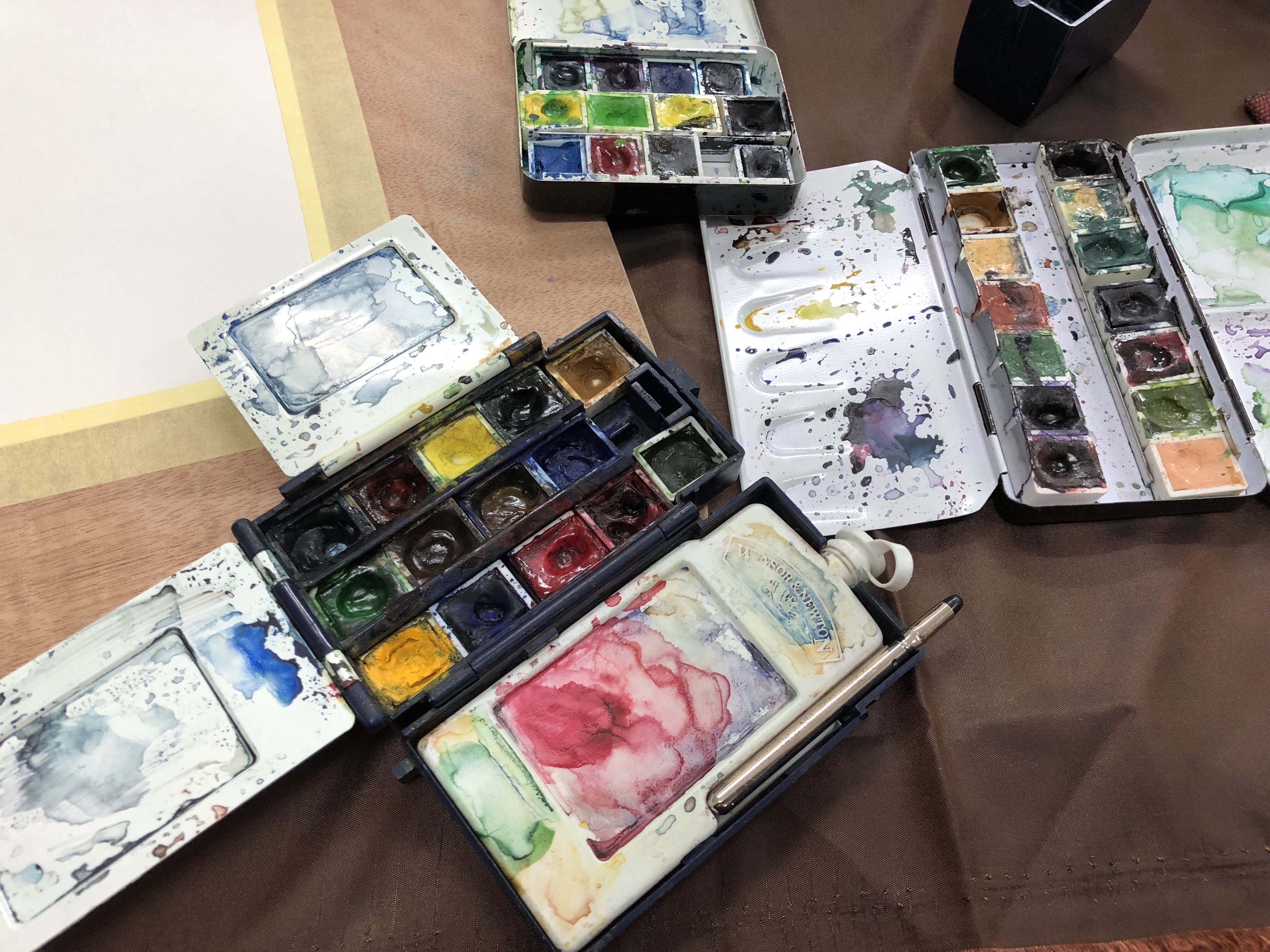
It depends what you’re going for and where you live. If you live in the US, Daniel Smith is a good option, since they’re the most readily available. The problem is they come in tubes, which isn’t the most economical or convenient of ways to start working with watercolours. If you want to start with Daniel Smith you’ll either need to buy empty half-pans and fill them, waiting for a few days for them to set, or buy a plastic watercolour palette with wells, fill them and wait for them to set.
Winsor and Newton Professional half-pans are probably the best place to start, if you can get them (and they’re pretty widely available). These are excellent and affordable. Just avoid the Cotmans paints, which are their student grade ones. Make sure that there’s “professional” printed on the label. They are the goldilocks of watercolour pigments
Schmincke Horadam (not Academie) is what I use, and is the favourite of many watercolourists as it has the most vibrant pigments that are the easiest to lift and rework. They’re more expensive and difficult to obtain, and if you’re used to other pigments their vibrancy might scare you off at first. (BTW – Schmincke is pronounced shmin-keh, and not schminkee. It’s a German company).
Sennelier is even more difficult to find, and is the opposite of Schmincke, being more subdued and transparent. If you really want to get into glazing, these may be for you, otherwise, I wouldn’t recommend them.
White Nights watercolours are also good, a midway between W&N and Schmincke, but they’re difficult to find, particularly outside of sets.
Which should I pick: Half-Pans, Full-Pans or Tubes?
Half-pans.
Quick explanation: you’re starting out, so half-pans are the best, and should last you for a long, long time, since you use so little pigment in watercolour painting. This will also let you experiment with different pigments later on, maybe even switching companies without breaking the bank. When you get into “heavy” use, you can switch to full-pans, or tubes, which are the most economical of options, if you actually get to use them.
Which colours to choose?
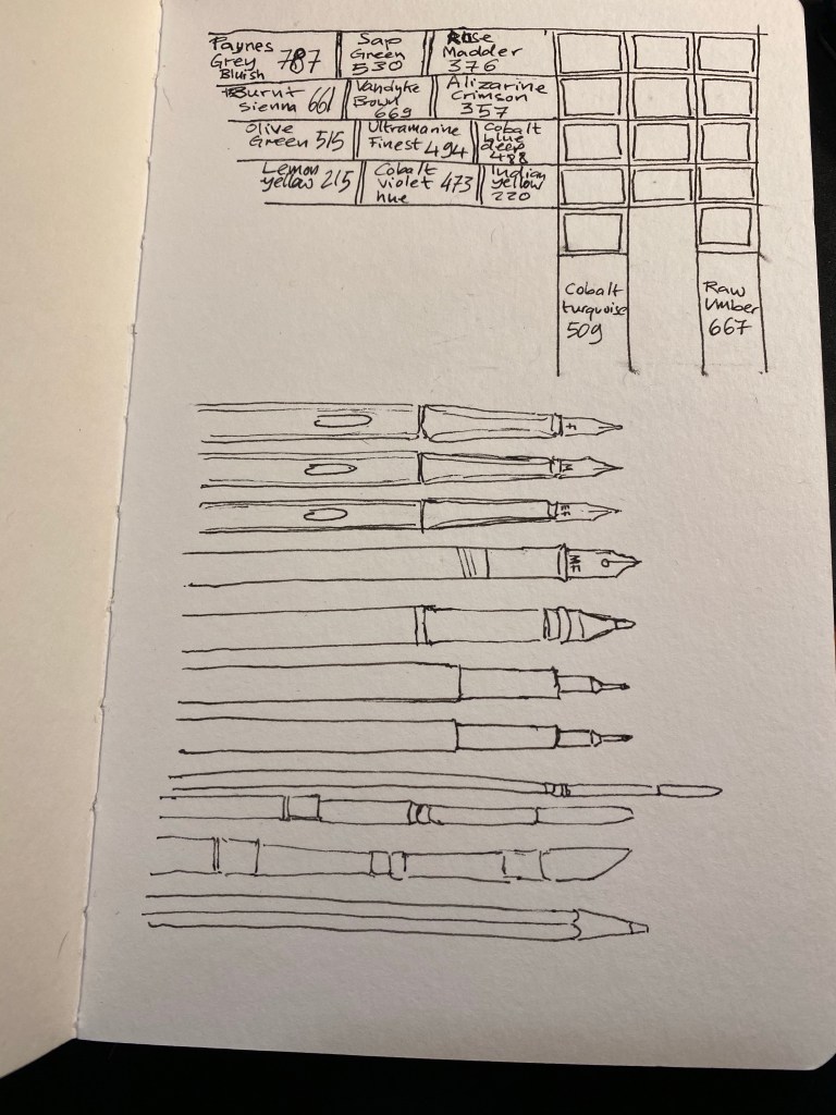
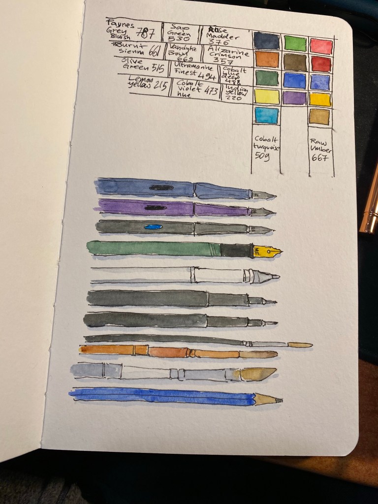
Start with these: Lemon Yellow, Raw Ochre, Burnt Sienna, Raw Umber, Ultramarine Blue, Cobalt Blue, Sap Green, Alizarine Crimson, Payne’s Grey (blue tone).
Every company will have them, although their names may differ a bit.
Later on I’ll discuss how to understand pigment labels (so you can pick your own), and which ones to pick for different kinds of drawing, but with these you’ll be able to draw landscapes, portraits and still-life, and they’re all transparent pigments, which means they mix well and glaze well, without creating “muddy” effects.
Quick explanation: this is the standard, classic watercolour palette, except that I’ve switched a few pigments with others that mix better. That’s why there’s no Cadmium Yellow or Cadmium Red here. Payne’s Grey is God’s little gift to watercolourists — you’ll use it a lot for shading and mixing, and as an added bonus, except the Cobalt Blue, these are all series 1 and 2 paints, which make them cheap.