Paris London 2025 Part 3

In September I traveled to Paris and London. See part 1 of my travelogue here and part 2 here.

I met up with a dear friend for a pre-theatre tasting meal at Chotto-Matte, a trendy restaurant that combines Mexican and Japanese cuisines. I am not a foodie, and I will now confess that this was the first time that I’ve had sushi (I hate the smell and taste of fish and seaweed and everything that comes from the sea and so I’ve avoided it), and I really enjoyed it. It was the best meal that I had in London, and the company, the weird design and the very attentive service added to it.

I had the vegetarian pre-theatre menu, which meant that mine had no fish, seafood, meat or chicken in it. It was phenomenal.
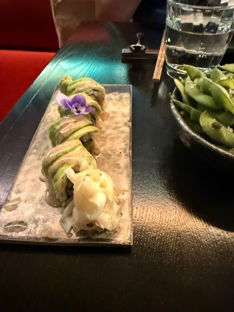
On the right is the Edamame, which we shared and was good, and in the centre is Truffled Avocado Roll – Cucumber, sesame seeds, yuzu truffle soy. It was light and refreshing.
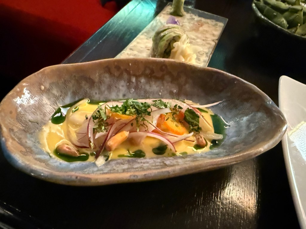
Lychee Ceviche – Leche de tigre, chive oil, sweet potato, Peruvian corn, coriander. One of the biggest surprises of the meal. Delicious, zingy and the textures were phenomenal.
Yasai Miso Crispy Sushi – Picante miso vegetables, takuan, shiso cress. Sticky but very good.
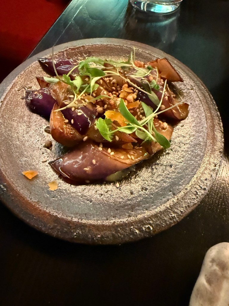
Nasu Miso – Aubergine miso, apricot, puffed soba, sesame seeds. Aubergine like I’ve never tasted it before. Again, a lot of great textures here and a ton of deep flavours.
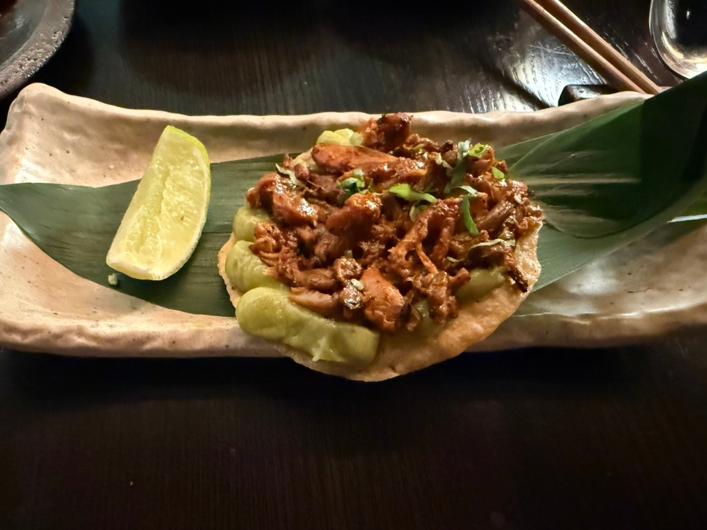
King Oyster Mushroom Tostada – Pulled mushroom, smoked aji panca chilli, guacamole, lime, coriander. I’m not normally a mushroom fan, but this was smoky, “meaty” and satisfying.
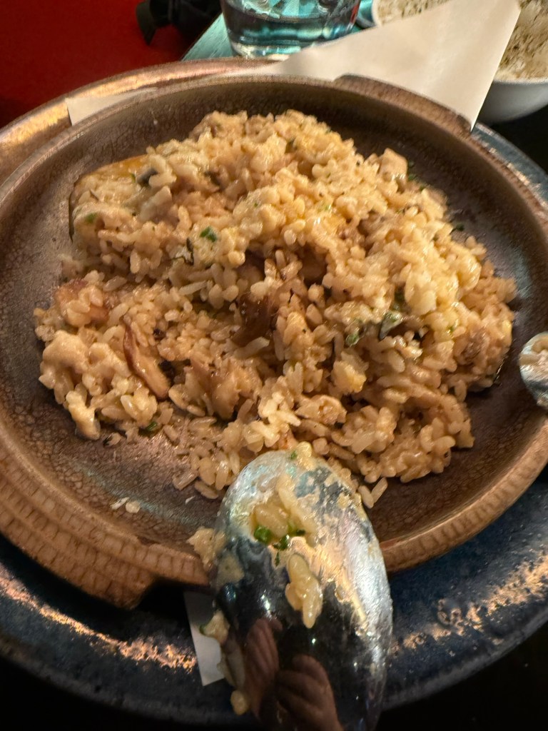
Truffled Mushroom Rice – Sweet corn & queso fresco dip, jalapeño, coriander, corn tostadas. This was a rice heavy meal, and at this point I could eat no longer. I had about three spoonfuls and no more. It was a good dish, but it lacked the depth of flavour and the uniqueness of the rest of the dishes.
Milk Soft Serve Ice Cream with toasted almonds, chocolate sauce. It’s ice cream, it was good, but we had to rush to the theatre so we didn’t get to finish it. It wasn’t a particularly interesting desert though.

This is definitely a place that I’d return to for a special occasion.

We then went to see the classic musical, “The Producers”, and it was excellent. The cast was brilliant, and it’s a very good musical with some great (if disturbing) songs. Mel Brooks is a comedy genius, and this musical still packs a punch.
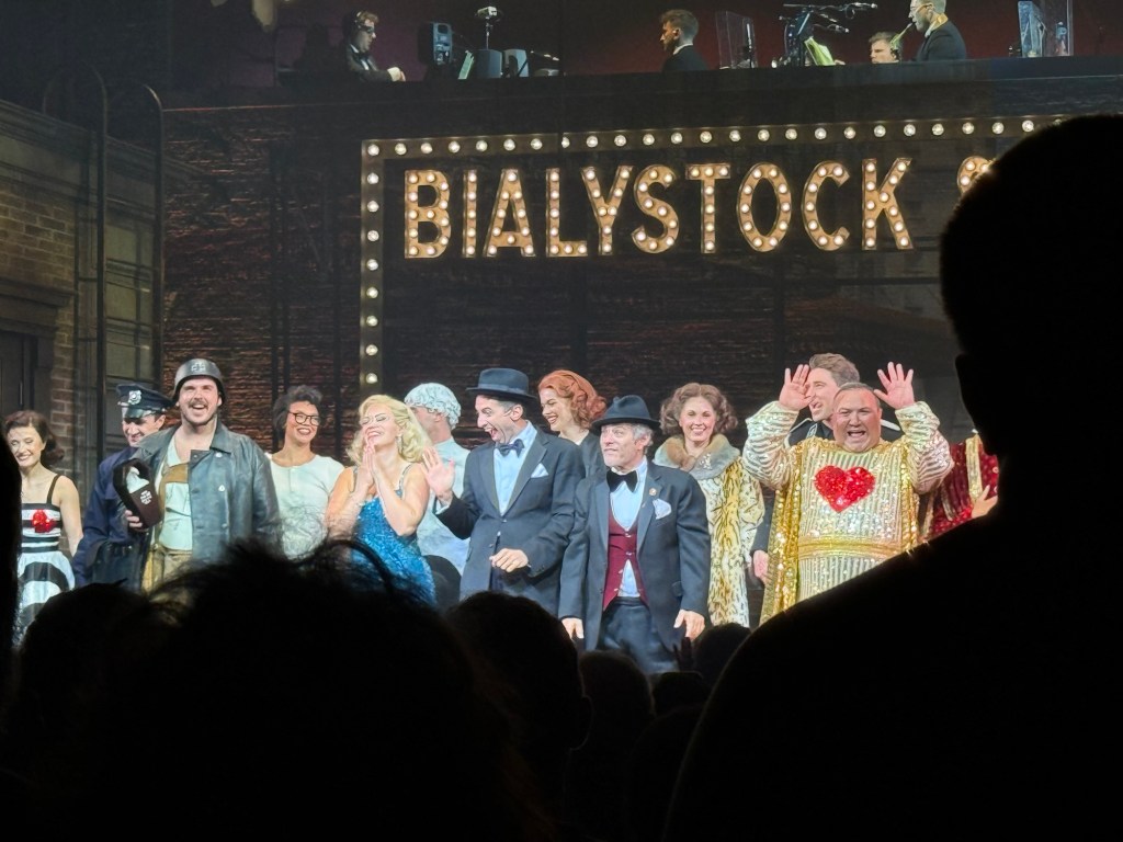
The Producers

We also went to Spitalfields market, which meant that I could sketch this guy:
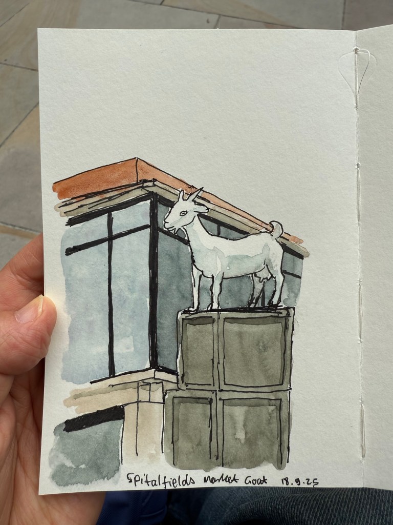
Sketch of a statue of a goat in Spitalfields market.

This was my very first sketch in the new Pith Kabosu sketchbook that I purchased at Cass Art. I debated whether to buy this sketchbook or not, as it had smooth, 200gsm paper and it opened flat, but I wasn’t sure it would work with watercolours. The great sellers at Cass Art told me it would, as they use it themselves, and they were right. It’s now my “daily driver” having replaced the Stillman and Birn pocket beta. The beta has thicker and more textured paper but the Pith Kabosu is slightly larger, has a more durable cover, and opens flat much better than the Stillman and Birn does. I later returned and purchased two more of these sketchbooks, they were so good.

I later sketched this seller in his stall, after purchasing an old set of folding rulers from his stall. I decided to paint him and the flag but left the rest of the stall as line drawings.
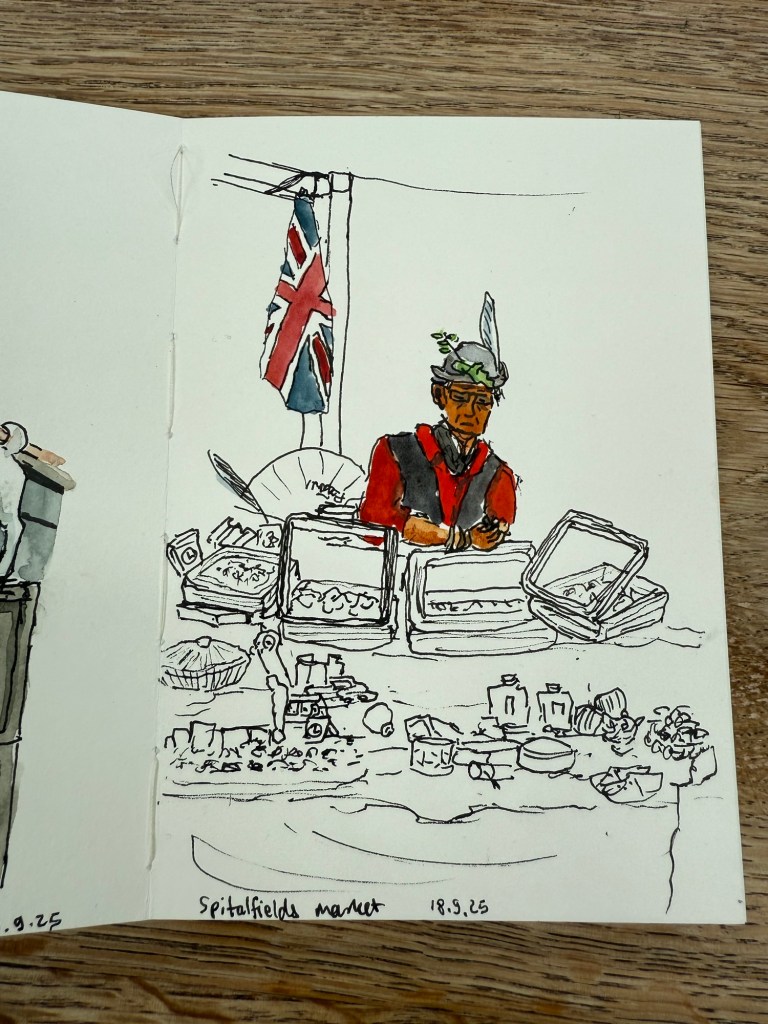
Spitalfields market

The Pith Kabosu is also cheaper than the Stillman and Birn and as it has smoother paper, works better for ink sketches and dry medium (pencils of various kinds, for example). It means that I’m more inclined to bring it out and make quick sketches in it, even if I don’t get to adding watercolour to them.

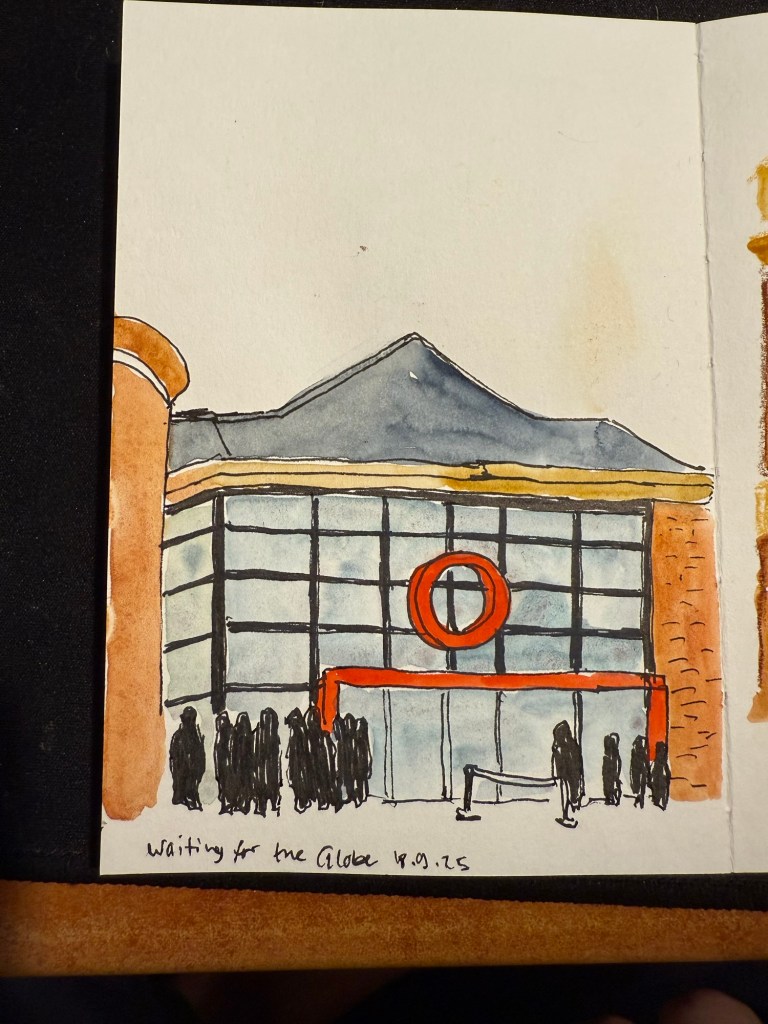
We then went to the second play at The Globe – Shakespeare’s Twelfth Night. We arrived early so I sat in the Starbucks across the entrance and sketched the place:
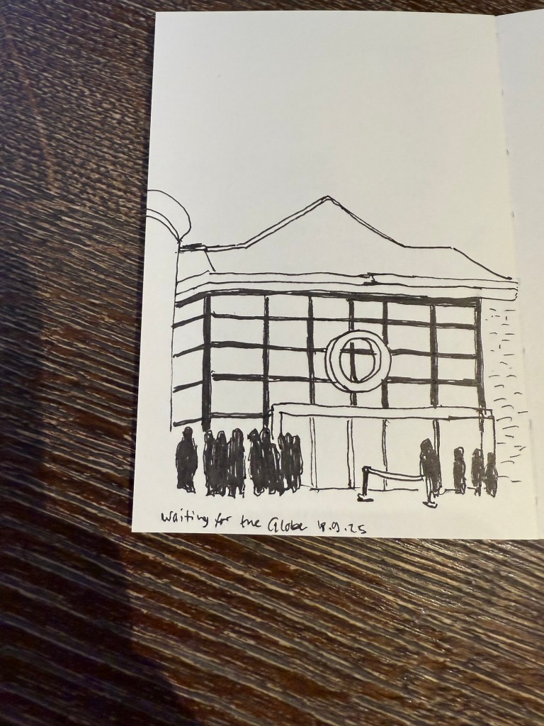
I originally didn’t have time to add colour to this. I just bashed out this 5 minute sketch and then added watercolour later, from reference photos.

I later added colour to the sketch. In hindsight I would have gone for a looser sketch, but I was still unsure what this paper could and couldn’t do. The answer is – practically everything. Only very heavy washes make the page buckle.
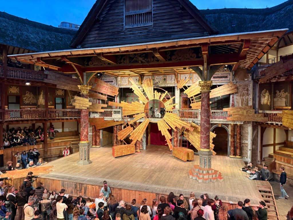
This was a regular Shakespeare play, and so there was some set design. this is the stage:
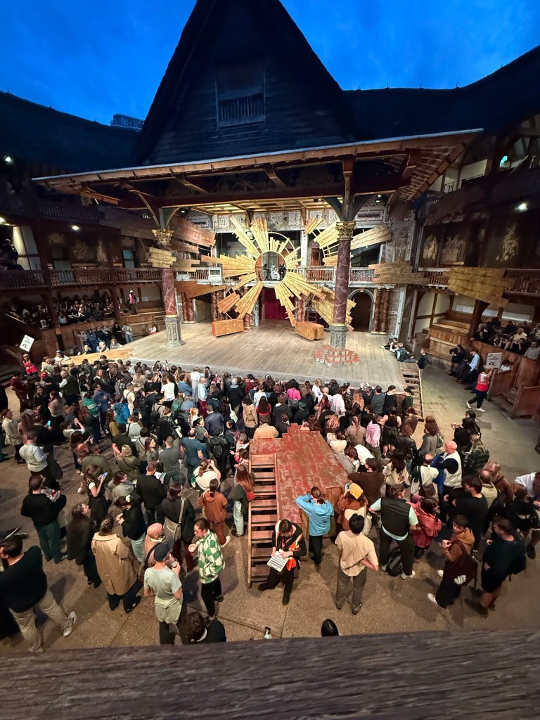
And in the yard where the groundlings are you can see another bit of the stage that isn’t normally there, but was used to represent the beach and other locales in the play.
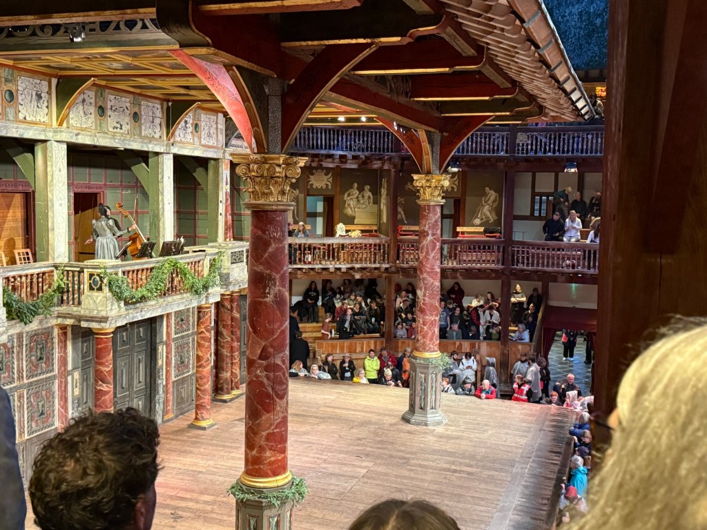
I enjoyed the play a lot, and would recommend seeing plays at the Globe if you can tolerate the extremely uncomfortable seats (yes, even with the cushions).

We went to the Cartier exhibition at the Victoria and Albert museum. The exhibition is sold out, and it’s well considered, but we found it a bit dull compared to the Marie Antoinette exhibition at the same museum.

This is the Patiala necklace that was part of the exhibition. It was made by Jacques Cartier for the Maharaja of Nawanagar in 1928. He also made the Maharaja of Nawanagar’s necklace, later named the Jeanne Toussaint in the “Ocean’s 8” movie (it was a recreation made by Cartier for the movie).

My favourite parts were the film where they showed how a Cartier leopard is made, and the famous mystery clocks. There was a whole room dedicated to them, and it was fabulous.

Next post will be the last in the series. You can read it here.
Paris London 2025 Part 2

In September I traveled to Paris and London. See part 1 of my travelogue here.

I went to see two plays in The Globe theatre in London. The first was a one night only performance of Midsummer Night’s Dream that was a reenactment of how the actors in Shakespeare’s time would have performed a play. The actors didn’t rehearse the play beforehand, and they didn’t have the full text of the play to work with, just their lines and their cues and staging directions. They practiced the dances alone, and they had no idea what their fellow actors would do during the performance. Now this is Midsummer Night’s Dream so all the actors and everyone in the audience knew exactly how the story unfolds, but the lack of rehearsals made this a very live performance.

The Globe stage before the show

The play was sold out in minutes and I’m glad that I managed to get tickets at all. It was an amazing experience. As this was a one night performance the stage was the bare Globe stage – nowhere to hide as the audience surrounds the actors practically from all sides. There was a lady on stage in period costume, sitting with the full text and helping actors in the very few times that they fumbled. The energy was beyond description. It was the most electric staging of Shakespeare that I have ever seen. Everybody was “on” all the time because they weren’t entirely sure what would come next.

It was a raw performance – I later saw another, standard Shakespeare play there and it was much more polished because it was clearly rehearsed and performed several times before we saw it. Yet that was what made this performance so special – the actors’ reaction to their fellow actors was genuine and unvarnished. They were having fun, improvising, owning the text in a way they normally never do. The highlight was the play within the play at the end – seeing the actors laugh to the point where they had trouble saying their lines because Bottom was so very, very hilariously over the top was amazing.

The musicians at the Globe.

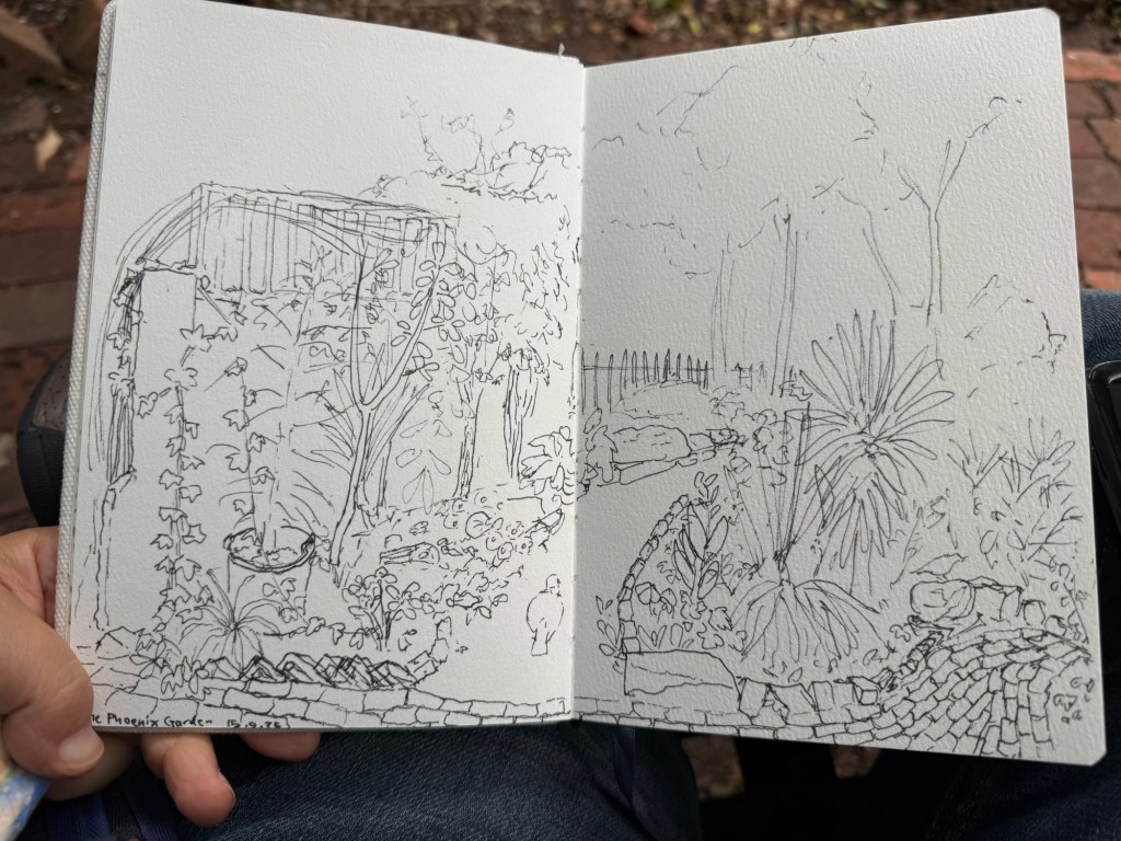
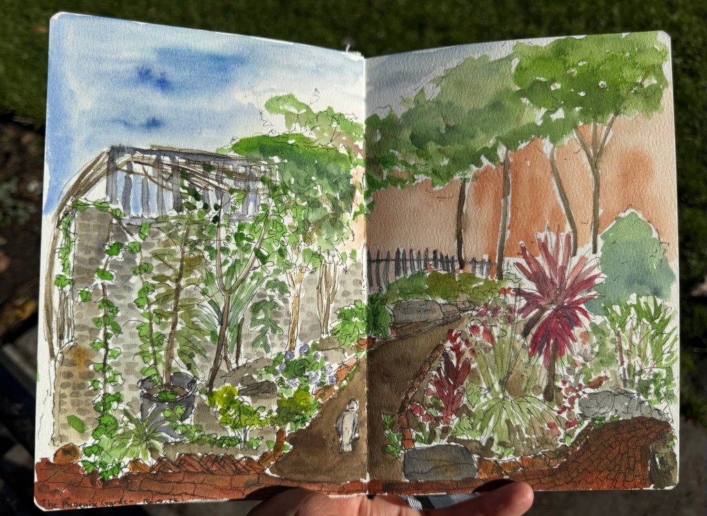
One of my favourite places in London is the Phoenix community garden. I spent a lot of time there, and sketched it several times. This was my first and longest sketch of the garden, done on the wonderful Etchr Lab cold pressed watercolour sketchbook:

Fineliner sketch – no pencil underdrawing.
Final sketch.

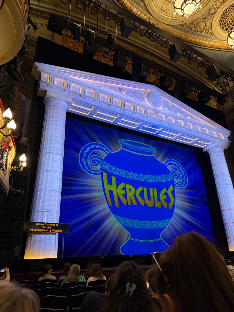
We went to see Disney’s Hercules – a new musical in West End. I wasn’t expecting much as I’m not a fan of the movie, but the musical was one of the best that we saw in the London. The production is stunning, the music is great, the actors were talented – particularly Megara – and the only minus is that Hades was a bit over the top even by the movie standards. They would do better to cut down on the amount of his jokes because they lose their impact otherwise. The Disney merch machine was out in full force that night, and I was one of only a handful that didn’t leave with something from their store.

Hercules the Musical

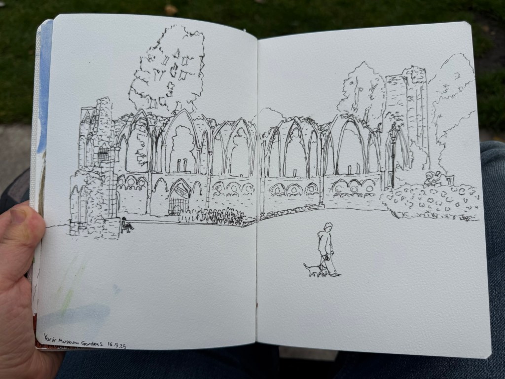
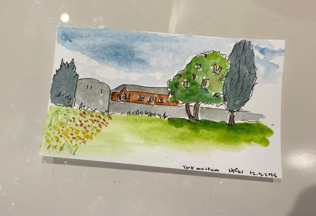
We spent a day in York, and I started it with a sketch of the York Museum grounds, also in my Etchr Labs watercolour sketchbook:

Fineliner sketch
Complete watercolour.

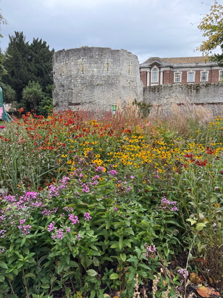
York is full of wonderful bits of history that are just layered freely on each other:

York museum

I did a very quick sketch of this scene later on, on an Exacompta Bristol card:

Quick sketch on Brisol card

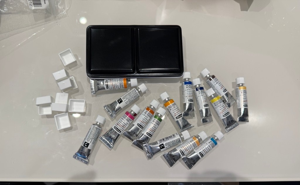
I also bought a decent amount of watercolour paints – enough to build out two new palettes that I want to try.

This post is getting long and photo heavy, so I will be completing this trip journal in two additional posts.

Edit: you can read part 3 here.

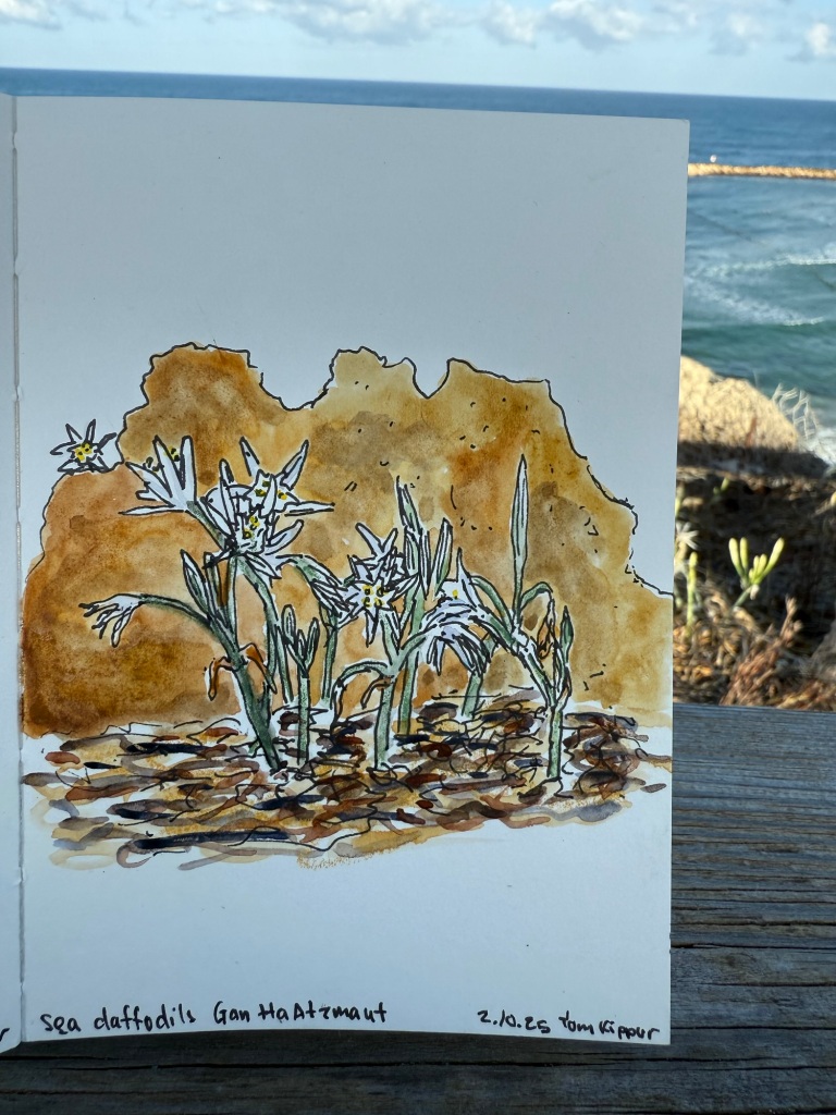
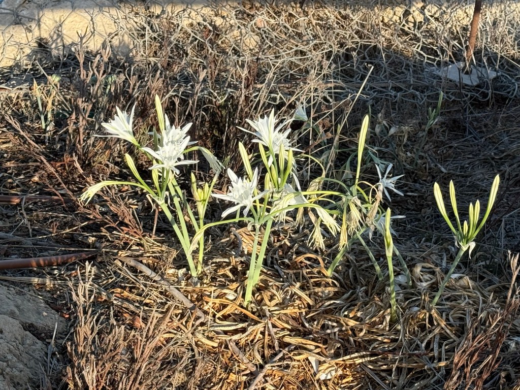
Sea Daffodils

The sea daffodils are in bloom, so I made a quick watercolour sketch of them during my Yom Kippur walk.

Paris London 2025 Trip Part 1

I recently returned from a pretty long trip to Paris and London with my family. I ended up sketching a lot more than I normally do during trips, largely thanks to things that I learned during the Urban Sketchers Symposium in Poznan (more on that in a later post). Here is part 1 of some highlights from my trip.

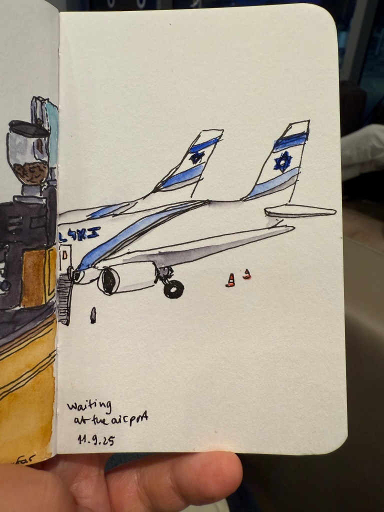
Quick sketch in a Stillman & Birn pocket beta while I was waiting for my flight

Centre Pompidou, my favourite museum in the world, was closing down until 2030 (!) so I went to pay it a last visit. Already parts of the colourful outside facade have been repainted white, and I’ve never seen the area around the museum so deserted.

The iconic Pompidou facade

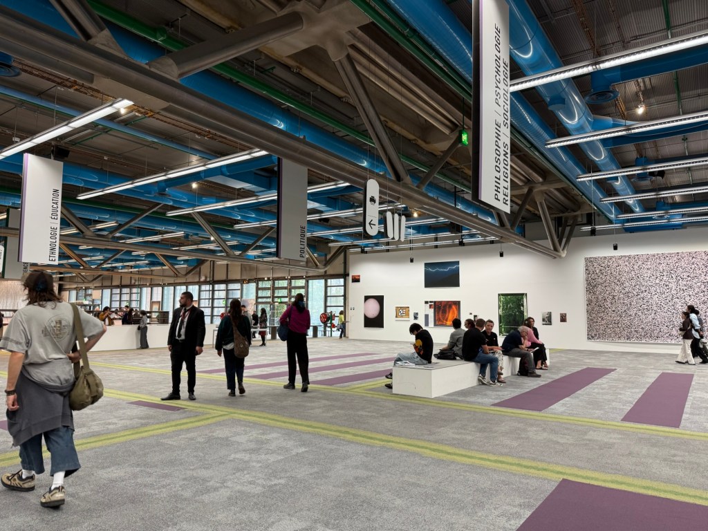
The library was the only area still accessible, and it had been turned into a giant project playground for German photographer Wolfgang Tillmans to work with. It was something that only Pompidou could do, and it was breathtaking, thought provoking, fun, interesting, and unique. I wish I could have spent hours there, but at this point in my trip I became badly ill and for the entire Paris leg of the trip I was struggling.

The Pompidou library transformed.

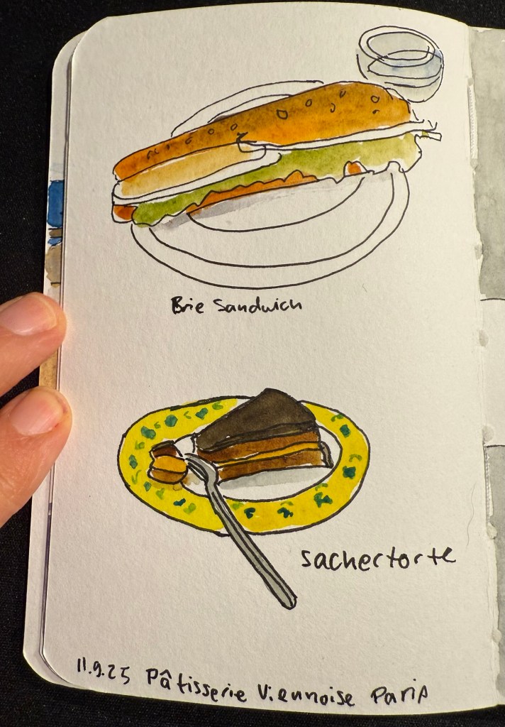
I ended up largely not eating in Paris, but this was my first meal there – in the fantastic Patisserie Viennoise in the Latin Quarter.

Stillman and Birn pocket alpha watercolour sketch

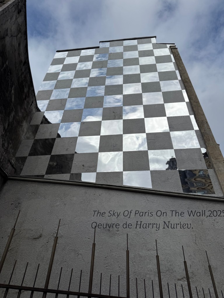
We also went to a new museum, the Bourse de Commerce and I saw this great artwork on the way there:

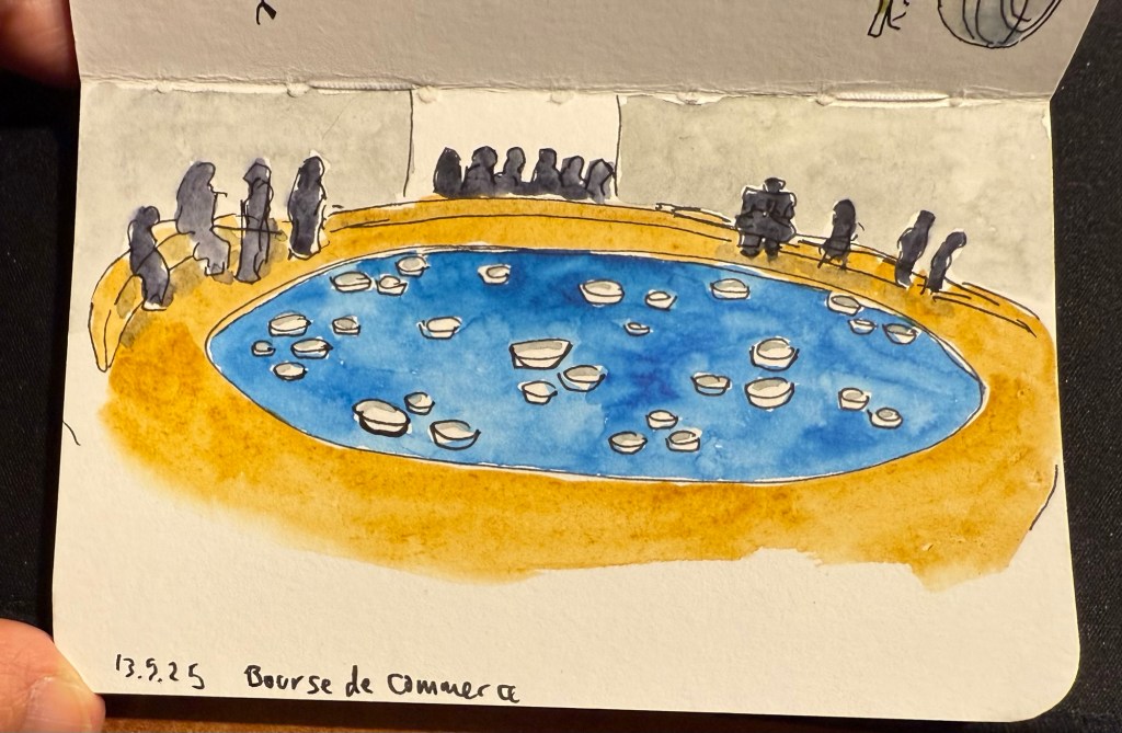
The museum was in between putting up exhibitions, so while a large part of it was closed we managed to view some great and moving art pieces with relatively few crowds and at a discounted price. I did a VERY quick sketch while I was there:

Stillman and Birn pocket alpha watercolour sketch

This is the artwork that I was sketching.

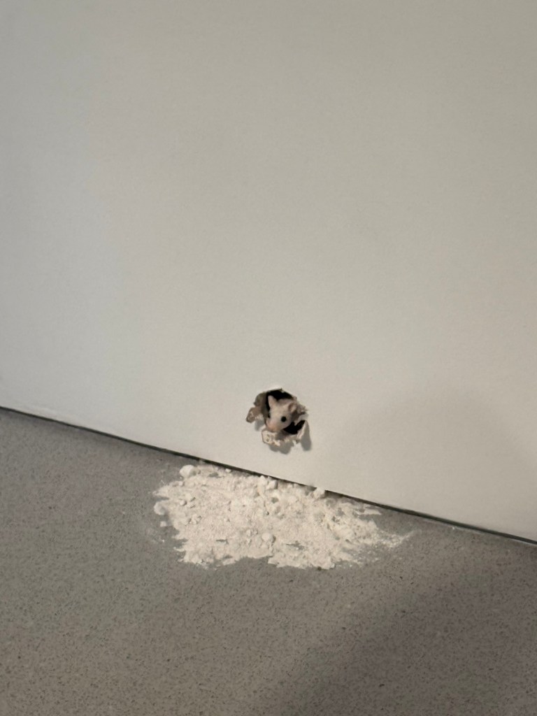
And this little fellow is also part of the art exhibits there:

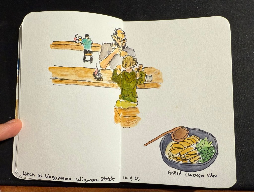
We then took the Eurostar to London. This is where I switched sketchbooks – this sketch of a boy and his father having lunch at a table across from me at Wagamama is the last sketch I created in my Stillman and Birn pocket beta. The beta has decent watercolour paper but it’s not half as good as the paper in my Etchr labs watercolour sketchbook, and the glued in pages make it a struggle to create full page spread sketches, as you can see here:

Last trip sketch in the Stillman and Birn pocket beta.

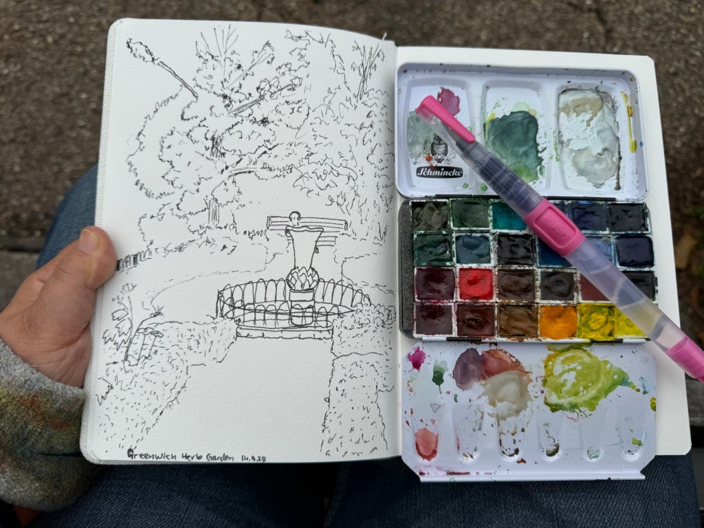
I created my first sketch in an Etchr lab cold pressed watercolour notebook while in the Greenwich Park herb garden and the paper is astonishingly good. Here’s the ink sketch (my tree sketches have gotten so much better thanks to a workshop I took in Poznan):

Etchr lab watercolour sketchbook sketch

And here is the watercolour:

The paper not only makes the colours pop, it actually allowed me ample time and space to work with the washes, adding layers of well blended colours that gave depth and life to the scene. Never have I ever seen the importance of good quality watercolour paper demonstrated so well. I have about half a dozen sketches of this garden throughout the years and this is by far the best one.

That’s it for part 1, I’ll try and upload part 2 later this week.

Edit: part 2 can be found here.

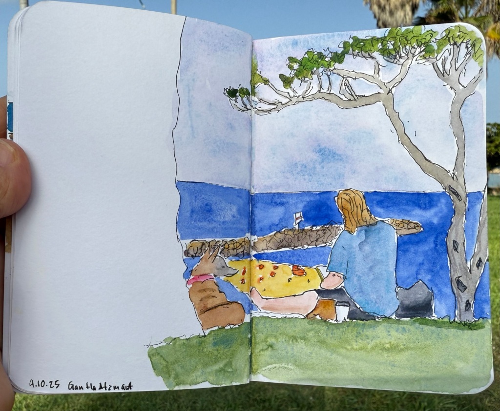
Urban Sketching – Girl with Dog

Quick watercolour sketch in the park today.

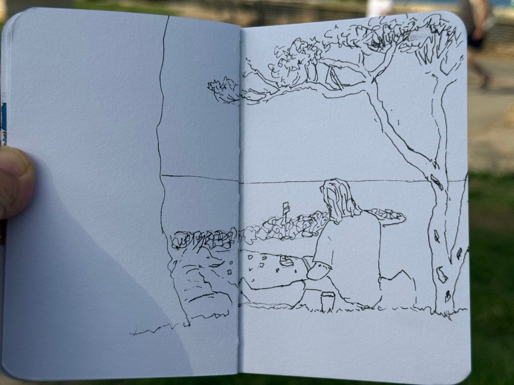
Pen sketch before watercolours:

I’ve been travelling and sick hence the delay in posts, but I have a few posts drafted already so hopefully more to come soon…

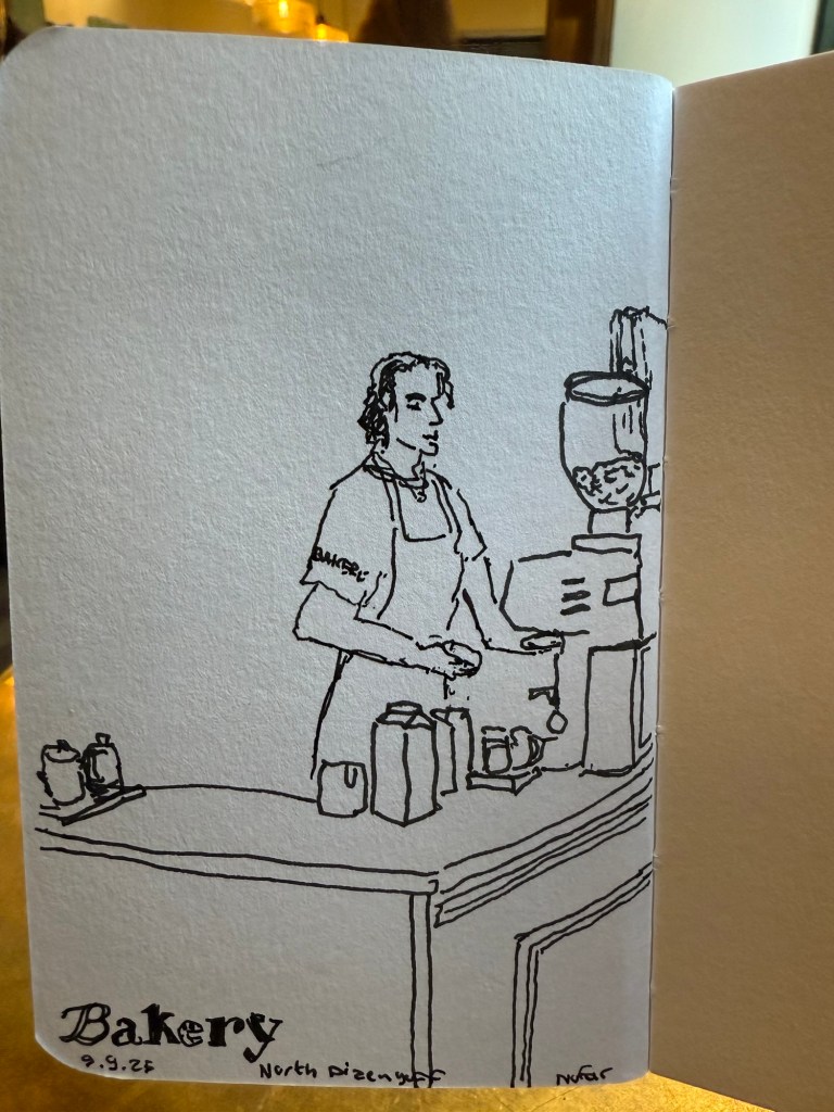
Morning barista sketch

Went on a 5k run and then went to my favourite cafe and did a quick sketch of the barista. Had more time this morning than last time so this sketch is more detailed.

Before watercolour was added.

Weekly Update: Model Sketches

It’s been a hectic week as my team at work is basically crumbling: our new senior member is leaving after just two months, the team lead is leaving after a bit more than a year, and the other team member is on holiday until the end of the month. That just leaves me with two trainees to hold the fort for a while, and it’s far from ideal. As I’m also working my way through an intense certification course, posts on this blog have taken (and will likely continue to take) a bit of a hit.

Reading

I’ve finished reading Looking for a Ship by John McPhee and I’ve reviewed it here. It’s a fascinating narrative of a now extinct world, that of the American Merchant Marine. I’ve now started reading Oliver Burkeman’s Four Thousand Weeks as well as Legends and Lattes by Travis Baldree.
Stationery

My Field Notes order has arrived, as has the 2024 Hobonichi Techo (yes, 2024) that I bought with a Black Friday discount. The Hobonichi will be used to supplement my 2014 Hobonichi when it comes to testing out inks. The 2024 Techo has’s got paper that is close enough to original Tomoe River Paper that’s in my 2014 Techo, though from my understanding the 2025 Hobonuchi’s have worse paper than the 2024 ones, so take that into account if you’re considering buying one. I have posts planned for both purchases, and hopefully I’ll get the time to write them.

Model Sketching

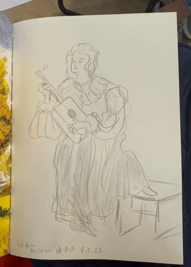
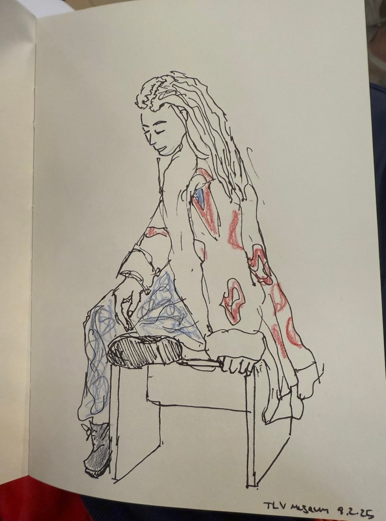
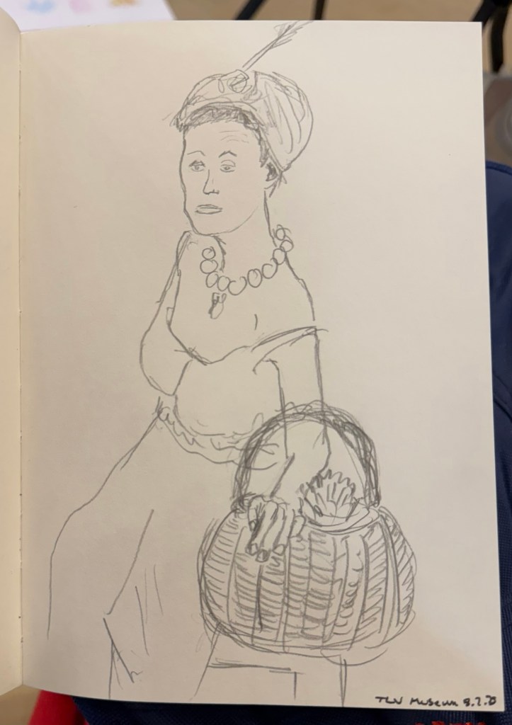
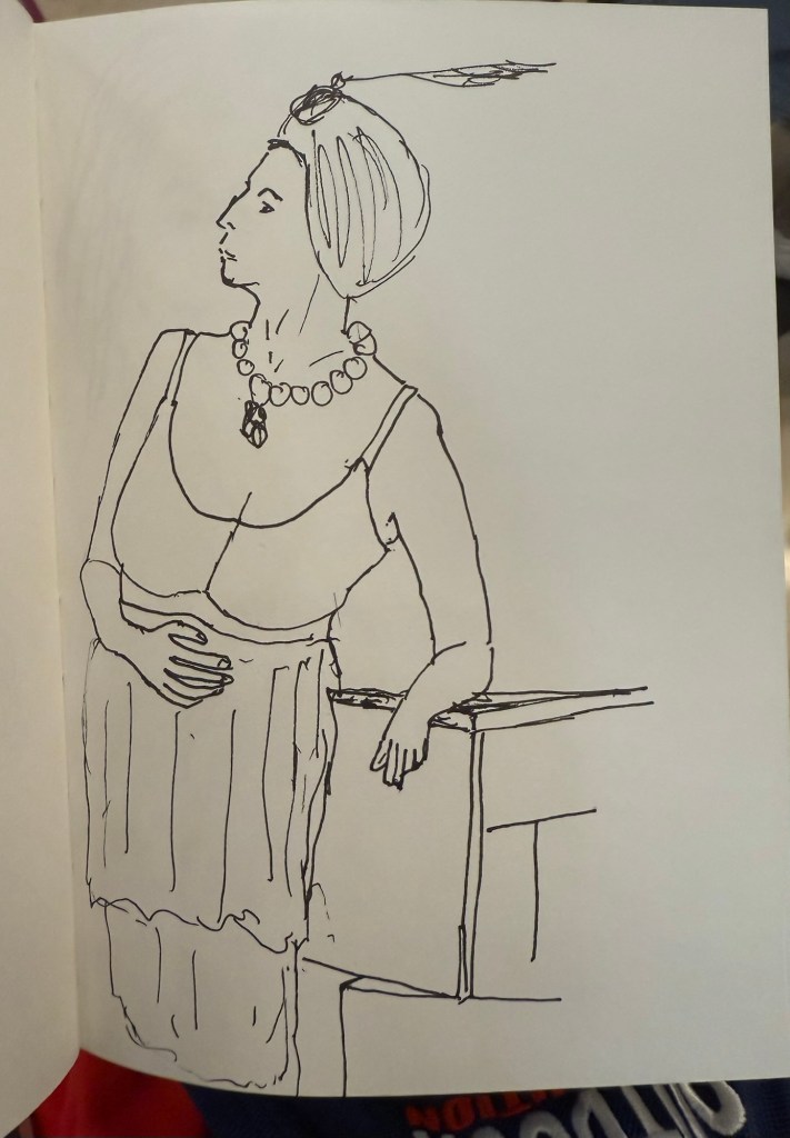
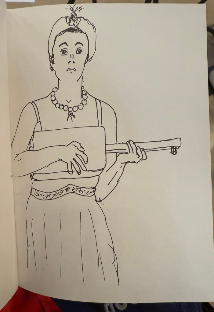
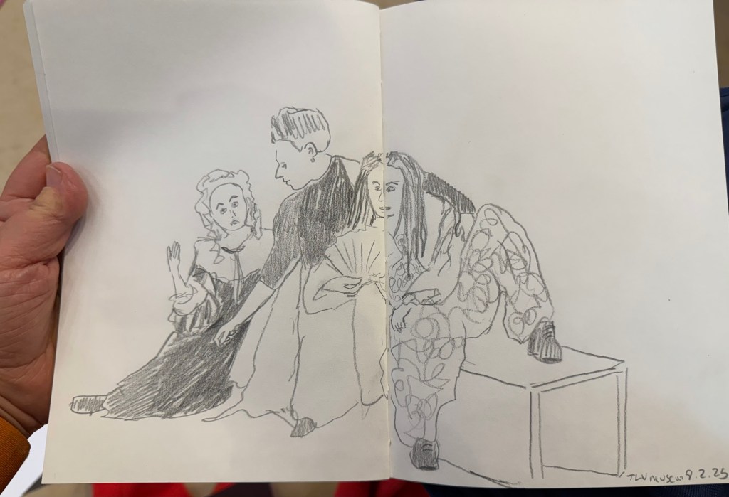
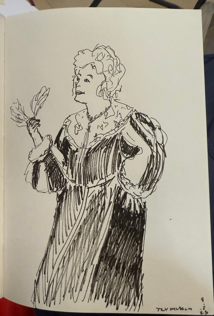
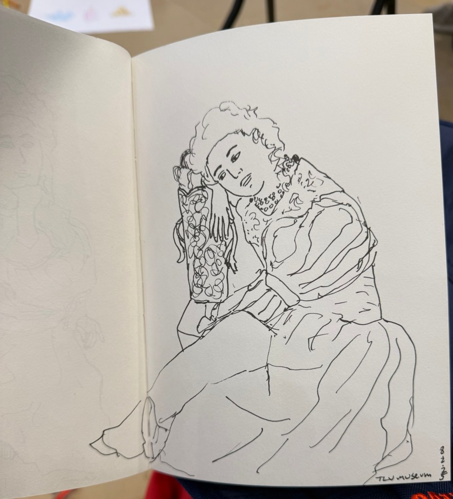
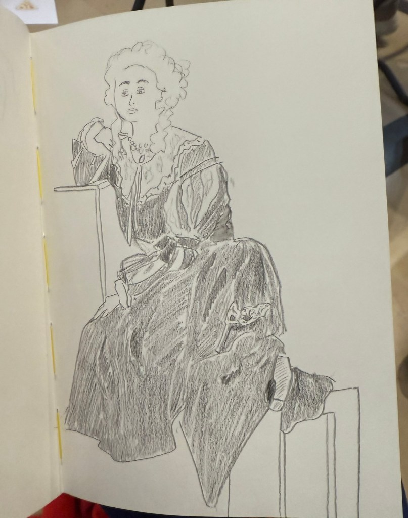
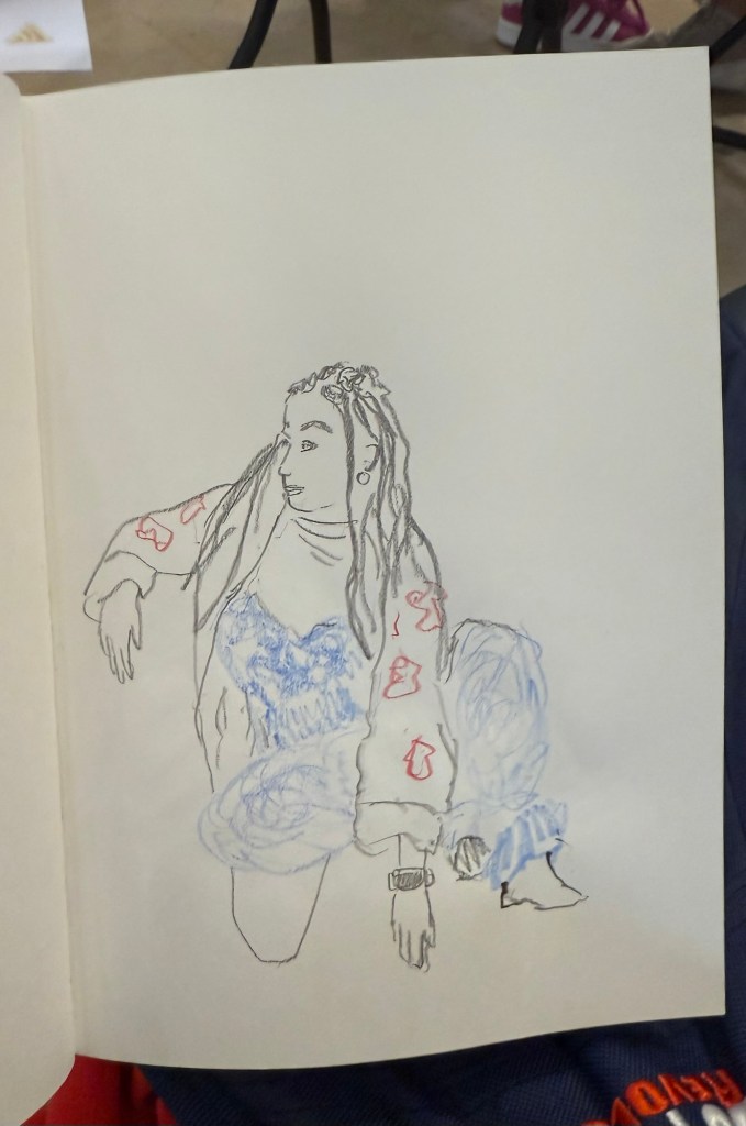
I went to the Tel Aviv Museum of Art today for a special sketching event that they organized: three models dressed in clothing that reflected some of the artwork in the collection, posing for sketches for 3 hours. These were mostly 10 minute sketches, with the last two poses being 20 minute ones. The last pose was a rare treat – a group pose, which is something you don’t get to sketch a lot.

In general when sketching models, whether clothed or not, you have one model that poses. Here there were three, and they switched places, so wherever you sat you got to sketch all three (and you could always sketch a model that was a bit further than the one right in front of you). The museum was busy, and there were children’s plays being shown in the auditorium, and so a lot of kids were around us, sketching on bits of paper with coloured pencils, with parents and grandparents cooing with delight and hovering around. It was wonderful to see how joyously kids took to sketching, whether it was the ladies in the dresses before them, or just anything that came into their imagination.

Here are the sketches I made throughout the event. The sketchbook I used was by French maker Pascale Éditions (it was lovely), and I used a Faber Castell 9000 2B pencil, a Faber Castell 4B Graphite Aquarelle pencil, various Faber Castel Albrecht Dürer watercolour pencils, a Tombow brush pen, and a 0.5 Staedtler Pigment Liner (this was my most used sketching tool).

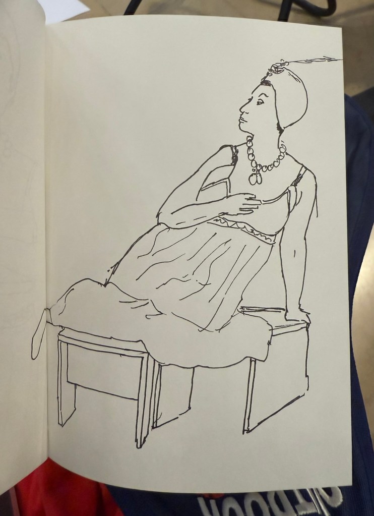
First sketch. Warming up, so trying to keep it as loose as possible.
20 minute sketch, so I had time for some shading.
The only sketch where I wet the paper slightly with a waterbrush before sketching
20 minute final group pose
Potato quality photo of the three models

Have a great and creative week!

Majohn Q1 Bent Nib Fude Fountain Pen Review

First thing’s first: if you are looking for a writing pen, then the Majohn Q1 mini fountain pen is likely not for you. While you can purchase it with an extra-fine, fine or medium nib, it’s weird body shape would likely make it uncomfortable for long writing session, and as it’s an eyedropper filler, it’s designed to have a giant ink capacity, normally suitable for long writing sessions.

If, on the other hand, you are looking for a fountain pen to sketch with, the Majohn Q1 may be a very worthy addition to your kit.

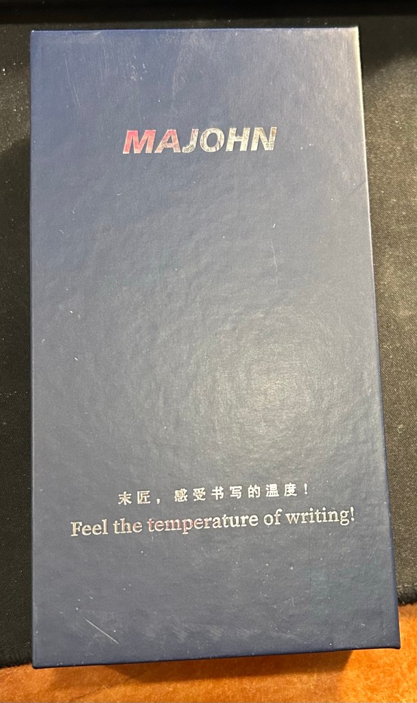
The box. I love the “Feel the temperature of writing!” inscription on it.

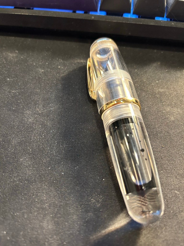
I purchased the Majohn Q1 bent nib fountain pen after seeing Paul Heaston use it in one of his sketches. “What is THAT?!” I asked, and immediately set out on getting one. This weird looking fountain pen reminded me of the Tombow Egg pen (google it. I’ll wait), which I always wanted and never got because I couldn’t afford one at the time. The Majohn Q1 appears to have almost the exact same design as the Tombow Egg, with a few minor details in the trim and molding of the grip section. I purchased mine on Amazon for $22.

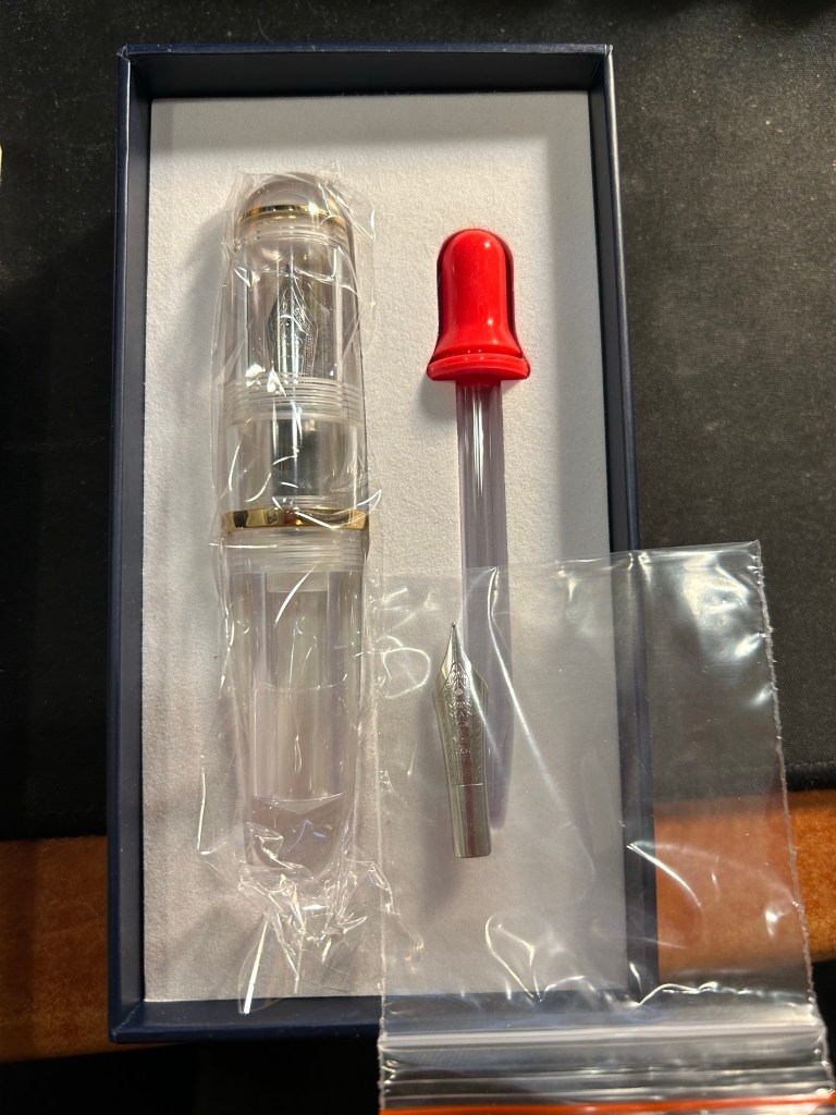
What’s in the box: fountain pen with bent nib installed, eyedropper, and a spare medium nib.

The box the Majohn Q1 arrives in is good looking enough to gift someone. Inside there’s the pen with the Fude/bent nib installed, a spare medium nib (the bent nib is an “aftermarket” installation) and a glass eyedropper that you can use to fill the pen with. The pen itself comes installed with an o-ring so that it can safely be eyedroppered. I filled mine with De Atramentis Black Document ink, which is waterproof when dry.

I filled the pen only to 3/4 and still it holds a tremendous amount of ink, especially for such a small pen.

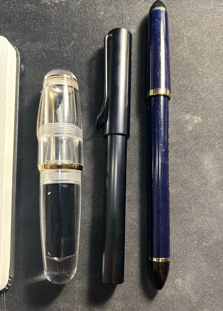
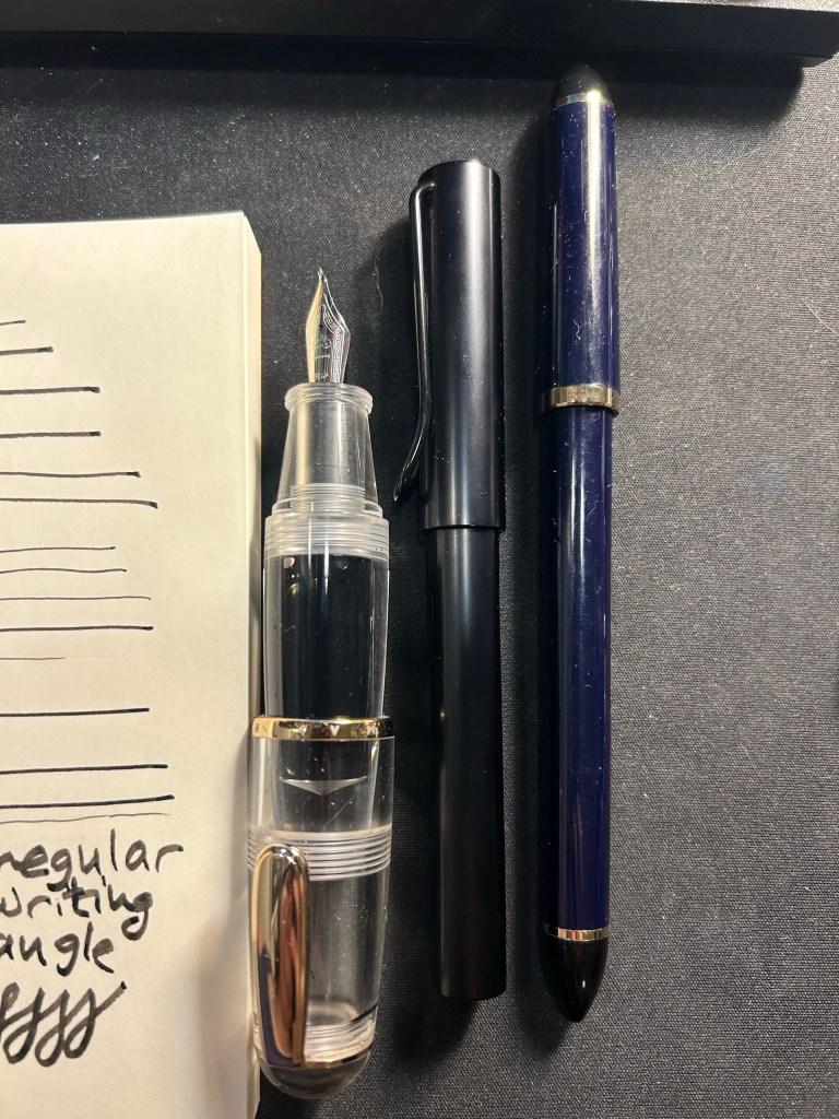
Now the Majohn Q1 is a very small pen, that holds a very, very large amount of ink. That’s why I was interested in it, as I thought that it would be a perfect fountain pen to add to my urban sketching kit. I currently use a Sailor Fude DE Mannen fountain pen for my urban sketching, and it’s a favourite among urban sketchers for the expressive, painterly lines it creates. It is, however, very long and pretty unwieldy: difficult to pack, and sometimes awkward to hold. Here are the Majohn Q1, a Lamy AL Star and a Sailor Fude pen laid next to each other, for size comparison:

As you can see, the Majohn Q1 is pocket pen sized in length, and very, very wide. It can’t be used unposted, as is to be expected with pocket pens, but once it’s posted, it just becomes an extra wide standard length fountain pen:

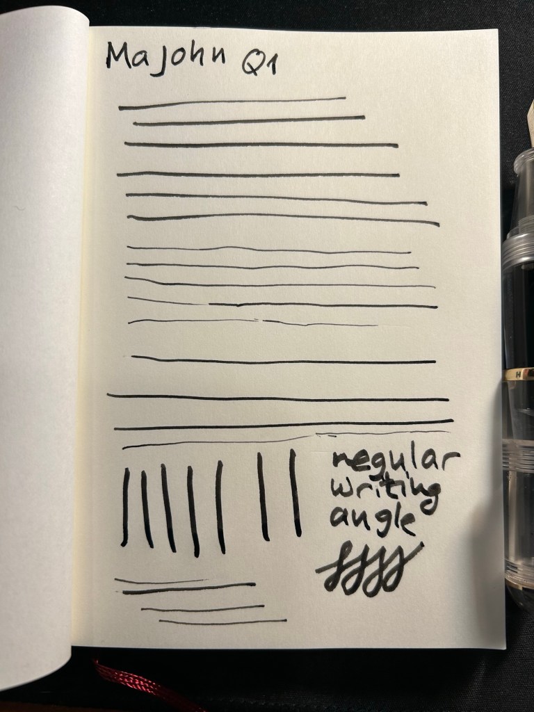
The point of this pen is the bent/Fude nib, so here it is, in all the different line widths it can create:

And here’s the Sailor Fude for comparison:

The Majohn Q1 offers much more line width control and consistency than the Sailor Fude, but you sacrifice some of the painterly quality and dynamism of the Sailor Fude to achieve that control.

The Majohn, like the Sailor, isn’t perfect in terms of gripping experience. While it’s much easier to grip the Majohn in a variety of different angles to get a variety of different lines, there’s a pretty pronounced step between the pen body and the grip section that can be uncomfortable if that’s where your fingers naturally land on. For me, I grasp the pen either closer to the nib, or not on the section at all but rather on the pen body. I’d recommend trying it out first, but for $22, it might be worth it just to buy the pen and try it out for a while.

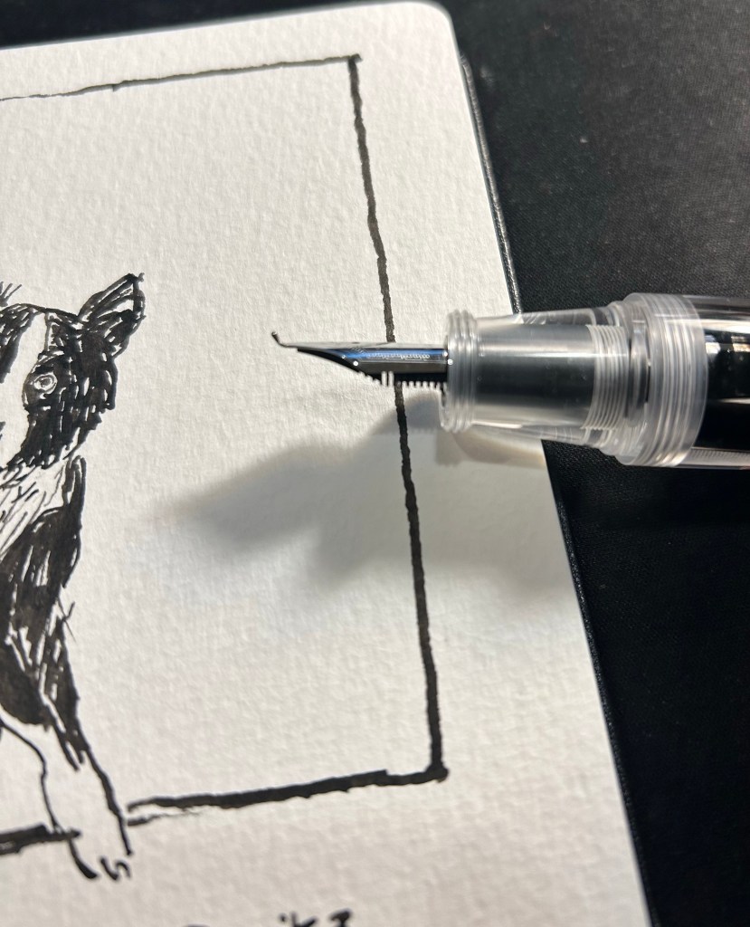
Bent nib and grip section closeup.

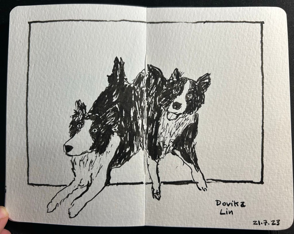
Here’s a sketch of a friend’s border collies sketched with the Majohn. As you can see, it’s relatively easy to get both a good level of control with this pen, a lot of line variation, and some of that painterly quality to the line that makes it more interesting and expressive.

Majohn Q1 bent nib, De Atramentis Document Ink Black, Moleskine Pocket Watercolour notebook.

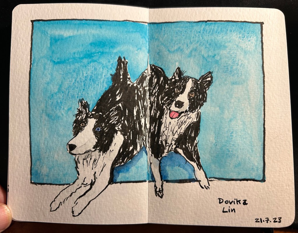
Here’s the complete sketch, just for fun:

Schmincke watercolours added.

If you’re at all interested in fountain pen sketching, and especially if you are an urban sketcher, I recommend giving the Majohn Q1 bent nib fountain pen a try. It’s easier to control and to transport that a Sailor Fude, and holds a much larger ink capacity, which is great for long sketching sessions or when you need to block out a large section with ink. For such a low price you get quite a lot, and the learning curve is much less steep than with a Sailor Fude DE Mannen fountain pen. I don’t do calligraphy, but I assume that it could be worth a try for calligraphy as well, especially if you are looking for a travel friendly solution. And who knows, maybe you’ll get to feel the temperature of writing while using it…

One Week 100 People Day 1: The Protest Edition

I’m participating in the One Week 100 People challenge again this year, and this time with a new goal: to use new techniques, materials or styles when I sketch. It will likely take me more than 5 days to finish sketching 100 people, but that doesn’t matter that much to me.

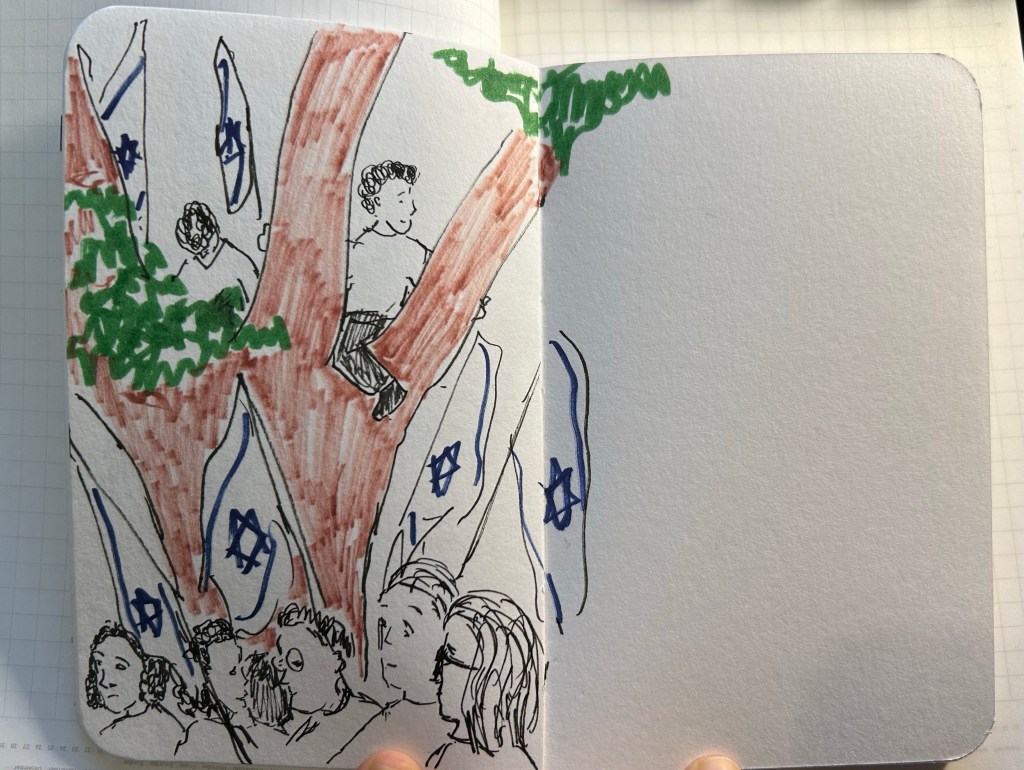
I started a bit early this year, with a series of sketches of faces of protestors in the pro-democracy protest on Saturday. All apart from the girl in the brown beret (which was a warmup sketch done with Copic markers, Faber Castell Pitt brush pens and blue pencil) were sketched in the protest.

I stopped using copic markers very quickly as they soaked through the Stillman and Birn Alpha paper.

At a certain point I decided that I wanted to sketch the scene a bit more.
These were all done with a fine, hard kuretake brush pen, and Faber Castell Pitt brush pens.

Here’s a bit of the chaos of the scene. Everyone was moving all the time, which made sketching challenging.
That’s 27 people for day 1.

Starting To Get Back To Normal

I met with friends for a meal for the first time in a little over a year and it was glorious. We were all vaccinated, and so we could sit down and talk over food and drinks in Tel Aviv that was starting to get back to normal. There are still plenty of signs that Covid is still with us: we were masked at first as was the staff, the first place we chose to go to had closed down and due to the new occupancy rules it was difficult to find a place that could seat us. None of that mattered as we sat down and talked and laughed for hours. I hadn’t realized how much I missed meeting people face to face until I finally had a chance to do so.
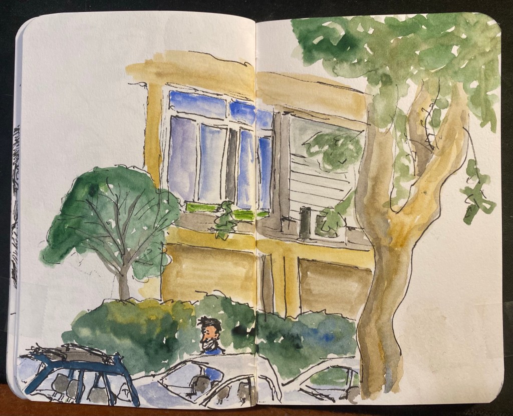
As I was waiting for everyone to arrive I sat on a bench and drew the first thing that I saw in the dusky evening. In the end I ran out of time and light, but I decided to leave the drawing as is and not fix it at home. A true Urban Sketch that will forever capture the moment for me.