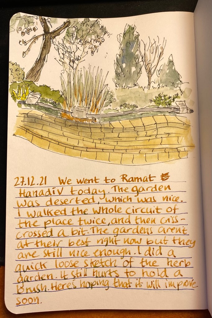
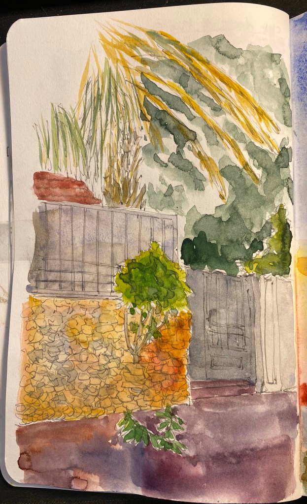
Hanadiv Gardens
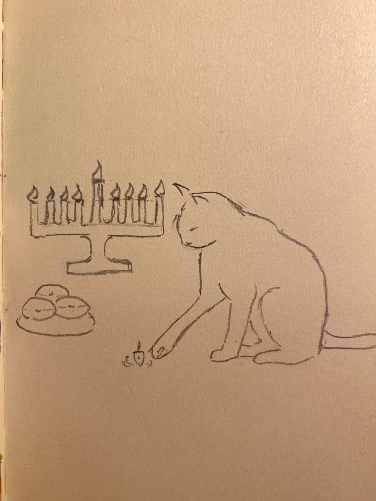
Drew this today and it was super painful to draw. Here’s hoping that things with my hands improve soon because I miss drawing.
A blog about writing, sketching, running and other things
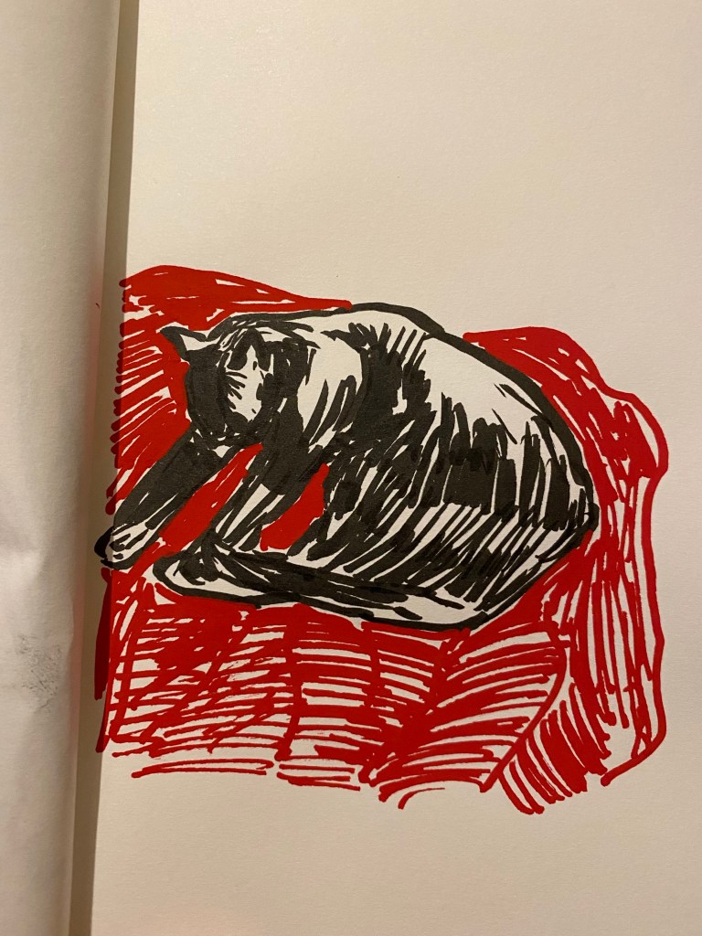
Drew this today and it was super painful to draw. Here’s hoping that things with my hands improve soon because I miss drawing.

I was planning on posting a review this week, but I had chemo this week and it really took me to town. Two days of practically no sleep (due to steroids) and the terribly hot and dry weather we’ve been having meant that I had to spend more time than I planned letting my body recover from the wallop it received mid-week. As I’m typing this I can barely feel my fingers due to neuropathy (a common side effect of my treatment), which means that typing, writing and drawing have been a challenge.
HOWEVER, I’m still here, still smiling, still picking up my pens and journalling, and even messing around with new art supplies that don’t require the precision and control that my beloved watercolours do.

I’m not sure if I’ll dedicate a review to the Sakura Pigma BB brush pen, but I will say that it’s a super soft, relatively wide brush pen that is very expressive and fun to use for spontaneous sketching. The Marabu Yono, which I got as part of a notebook package from Cult Pens, is a delight. I’ve never used acrylic markers before, and I love using this one. This is definitely opening up a whole world of possibilities for me.
I got Chemo number 9 of 12. Had a scary new side effect of the treatment or the blood thinners I’m on (likely the blood thinners), but I weathered that too. Next week I hope to get back to walking after the few days off I took for recovery (and because of hazardous weather). Also got to see a psychologist that works with cancer patients. Hopefully he’ll help me deal with the anxiety of what lies ahead.
I was planning on reading “Cibola Burn” by James S.A. Corey but Hilary Mantel’s “Bring Up the Bodies” has utterly mesmerised me and I haven’t been able to put it down. The quality of the writing, research and characterisation is evident in every page, and the result is a bewitching narrative – no mean feat considering the fact that very little happens in the book and the ending is well known.
None whatsoever apart from my journal and my three good things, and even they were backlogged for half the week. A combination of sleeplessness and neuropathy (which, if you’re wondering, feels like what your hands feel like after they’ve grown numb and then started to prickle back to life) made writing unattainable for most of the week.
No change from last week because I didn’t write much. I’m about to write my Kanilea dry, after which I’ll probably hold off inking any new pen since I’m gearing up for my new Diamine Inkvent calendar. Like last time, I’m planning on filling 25 pens with 25 inks, and unlike last time I’m planning on writing them all dry.
I’ve been building Lego sets as a form of meditation and relaxation. I’m currently working my way through the Lego Harry Potter’s Collector’s Edition, and will probably finish it next week.
I’m starting to get back to podcast listening. I used to listen to 3-4 hours of podcasts a day, every day. When I learned that I had cancer I stopped listening to podcasts entirely, and I’ve discovered that there are still podcasts that I can’t listen to right now. On my current listening list are: The Pen Addict, Maintenance Phase, and Reconcilable Differences.
I’m playing with green watercolour mixtures and drawing better foliage, so I took the opportunity to make this quick line sketch during one of my walks. I worked on the watercolours later, and I’m pretty happy with the results.
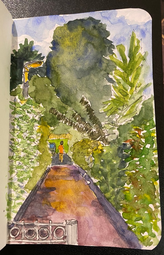
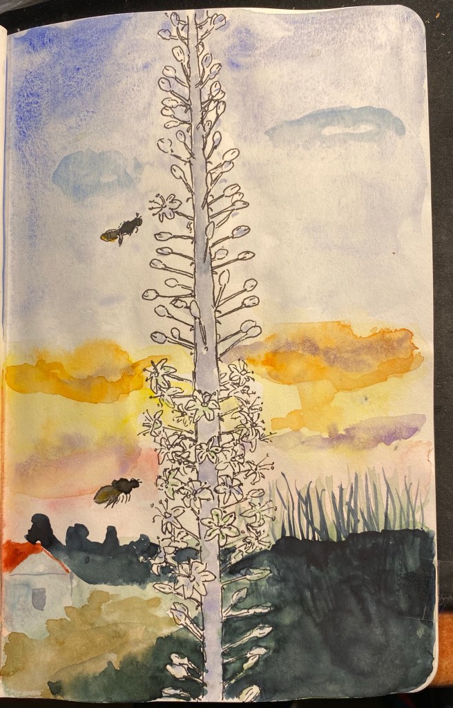
While I was taking a walk a few days ago I saw this tree branch grow out of a tiny crack in a solid stone wall and I was impressed enough by its tenacity and resilience to draw it. By chance this drawing is on the opposite page of the one I made for my last health update, which seems appropriate.
I underwent a PET CT on the 9th of September, and thankfully the results were good. The treatment is working, kicking my cancer’s ass and not just making me feel bad. I went through another round of Chemo on the 12th, my fifth round so far, and the side effects are stronger and taking longer to fade away between sessions. This is to be expected, as the Chemo’s effects are cumulative, but I’ve decided to be like that tree: resilient. I’m making minor adjustments to get me through the post-Chemo days, working out ways to help me ride out the pain and unpleasantness of the worst of the side effects. It’s hard to pick up a pen or brush in the first days after treatment, and I sometimes lose fine motor control. So I’m using larger and lighter pens, and I take photos of things that I want to draw instead of working on location. At home I can take my time while sketching, take breaks, experiment with looser drawing. The drawing above isn’t large or complicated, but it took me two days to complete (one for line work and one for the watercolour).
Resilience. One treatment at a time.
I had a strange Yom Kippur this year, as is to be expected. I decided to commemorate it in my sketchbook, this time using Faber Castel Albrecht Durer watercolour pencils in addition to my usual Schmincke and Daniel Smith watercolour mixture.

Drawn on a Stillman and Birn Alpha. Ink is Iroshizuku Ina Ho (lines), Robert Oster Fire and Ice (heading and text) and Sailor 123 (2021).
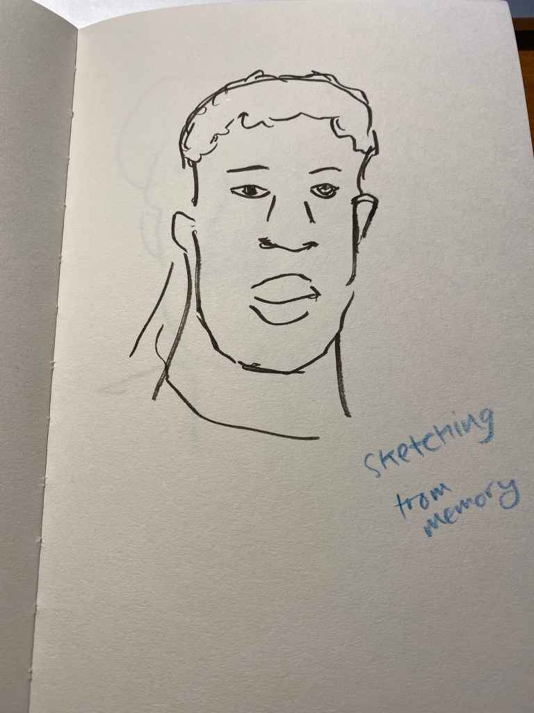
It’s been a while since my last update, so I thought that I’d write a new one. On August 24th I had my fourth chemo treatment, and it went rougher than the ones before it in terms of side effects. The worst of the bunch has been my neuropathy, which until now has been not so bad. This time however, both my hands were numb and tingly, and the tips of my fingers actually hurt. It’s been hard typing, holding a pen, drawing. It’s not that I’ve stopped doing these things, it’s just that it’s been a challenge to overcome the pain, to focus more to get my hands moving the way that I want them to. But I haven’t given up, and I’ve managed to type, write with my pens, and even create this drawing:
Not bad for someone with semi functioning fingers, right?
My hands have gotten better with time, but they are getting better slowly, and they still haven’t returned to normal. I’ve discovered that lighter fountain pens with bigger barrels are the best in terms of being easy on my hands, and although my handwriting has suffered a bit due to the pain, it is still recognizably my handwriting.
What’s next? On Thursday I have a PET CT which will determine what the rest of my chemo treatment will be, and on Sunday I’ll have the fifth chemo treatment. I’m not looking forward to either of these things, and as the PET CT is approaching my anxiety levels are rising (I really need good results on it). Meanwhile I’m trying to distract myself with work, books and season 2 of “Ted Lasso”. Here’s hoping for good results, and less pain for the Jewish New Year.
There is a local group of illustrators and animators that have set up a delightful new tradition during the pandemic: they meet up every Tuesday morning on Zoom for a sketch/doodle session, where they do quick, loose sketches and doodles just to warm up and experiment. Once a month the morning Tuesday meeting is replaced by a night Monday meeting with a guest artist leading the session with various prompts. Tonight my Urban Sketchers chapter head lead the session, and through her I joined the fun.
As I’m neither an illustrator or an animator, I’m posting everything here as quickly as possible before I see the other artists’ amazing work and lose my nerve.
We started with the suggestion to just doodle while we waited for people to join. I was using a new sketchbook that was very cheap, laid flat and had thick textured paper (good for pencil). I used a Caran d’Ache Fixpencil with a 2B lead, and a Tombow brush pen throughout this one hour session.
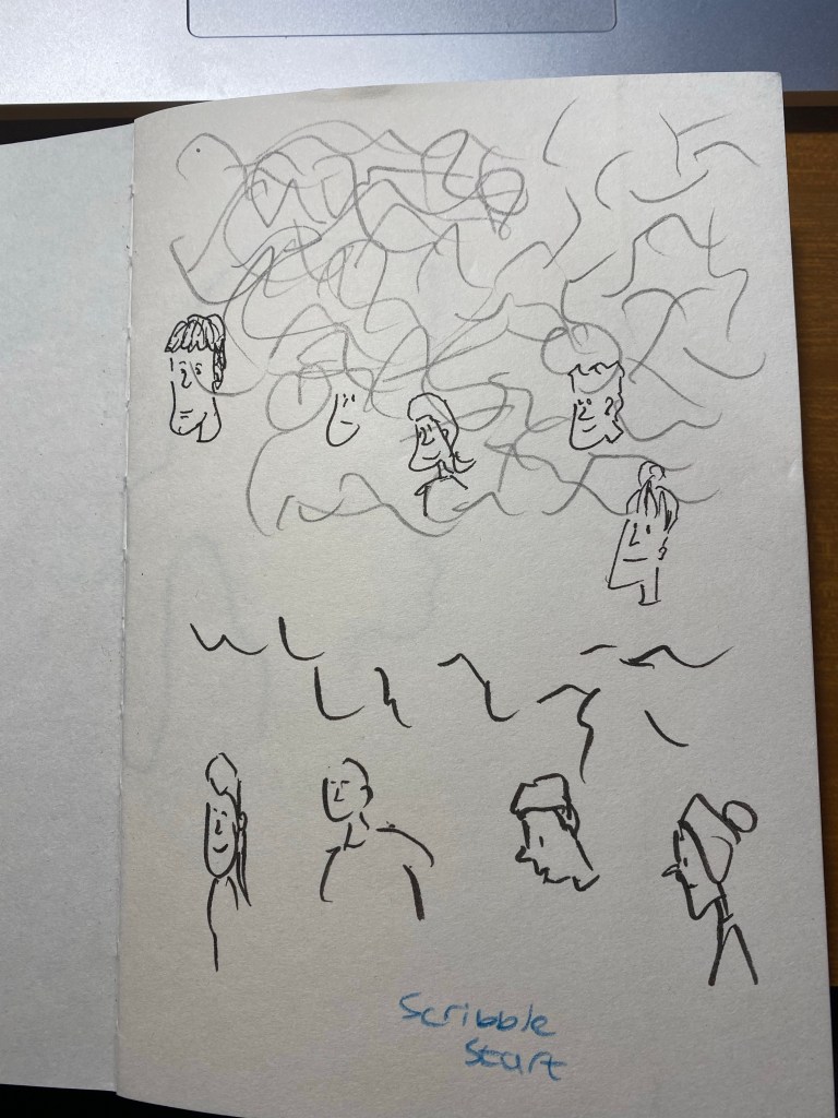
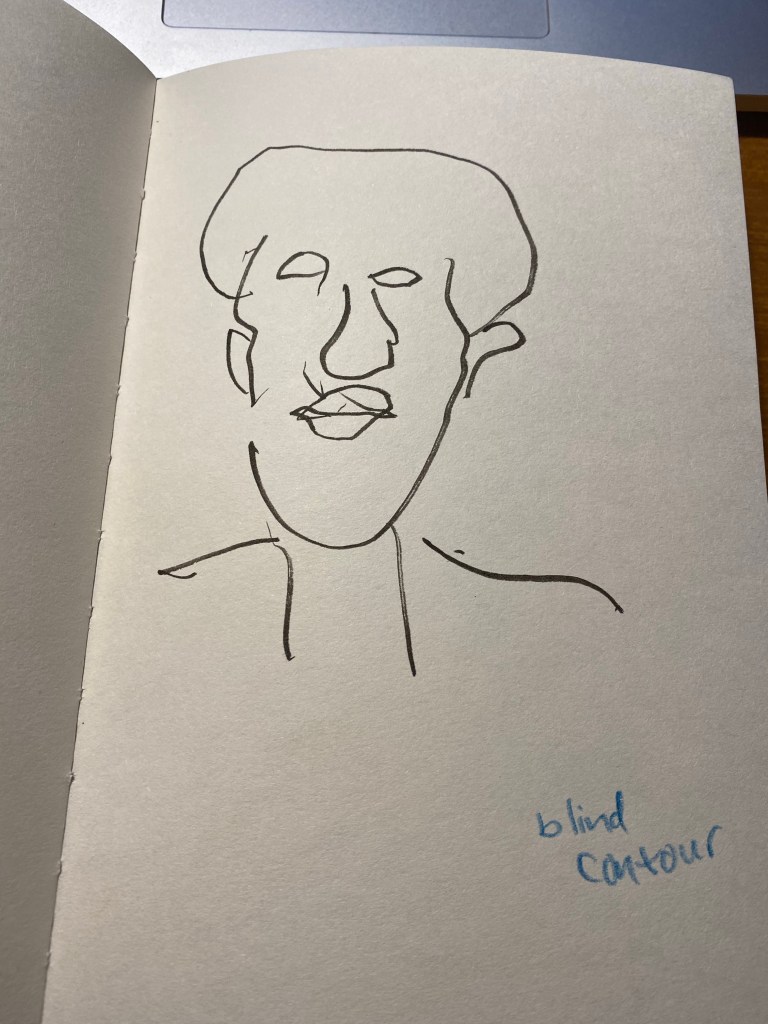
We started with a few blind contours, which I haven’t done for years, and so I kept catching myself automatically glancing down at the page. Definitely something I need to practice to get used to drawing these again. We were using Shutterstock films as our models, so that subject was moving around, some of them quite a lot. The idea was to get used to sketching people in motion, grasping as quickly as possible what captured their character.
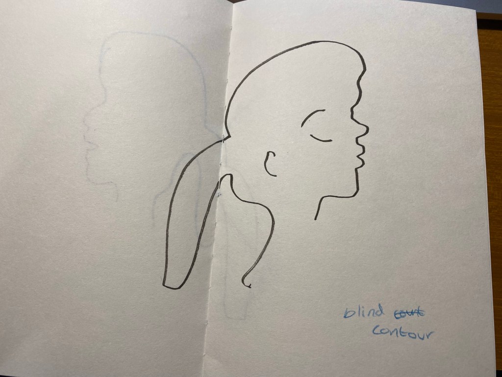
This looks good if you don’t know what the original looked like. I do, however, like the boldness and flow and expressivity of the lines here. Something to recapture in the future.

Then we did an exercise where we had 10 seconds to look at a moving person and try to remember what made them them, and then draw a portrait of them from memory. As Marina suggested, it’s easier if you describe the person to yourself in a few sentences.
The second subject drawn as a blind contour:
And from memory:
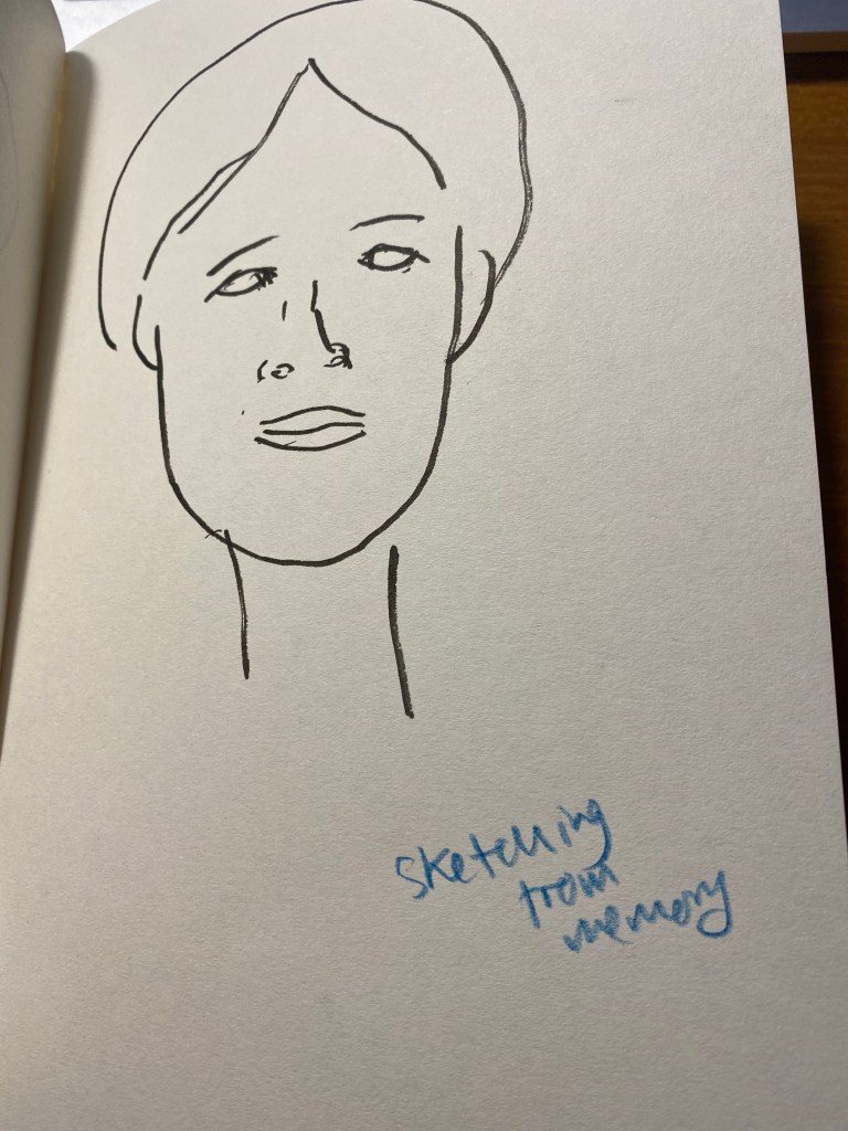
We only had a minute for each portrait, and that was too little for me. It’s a good challenge to practice in the future (working under such short time limits with such complex, moving subjects).
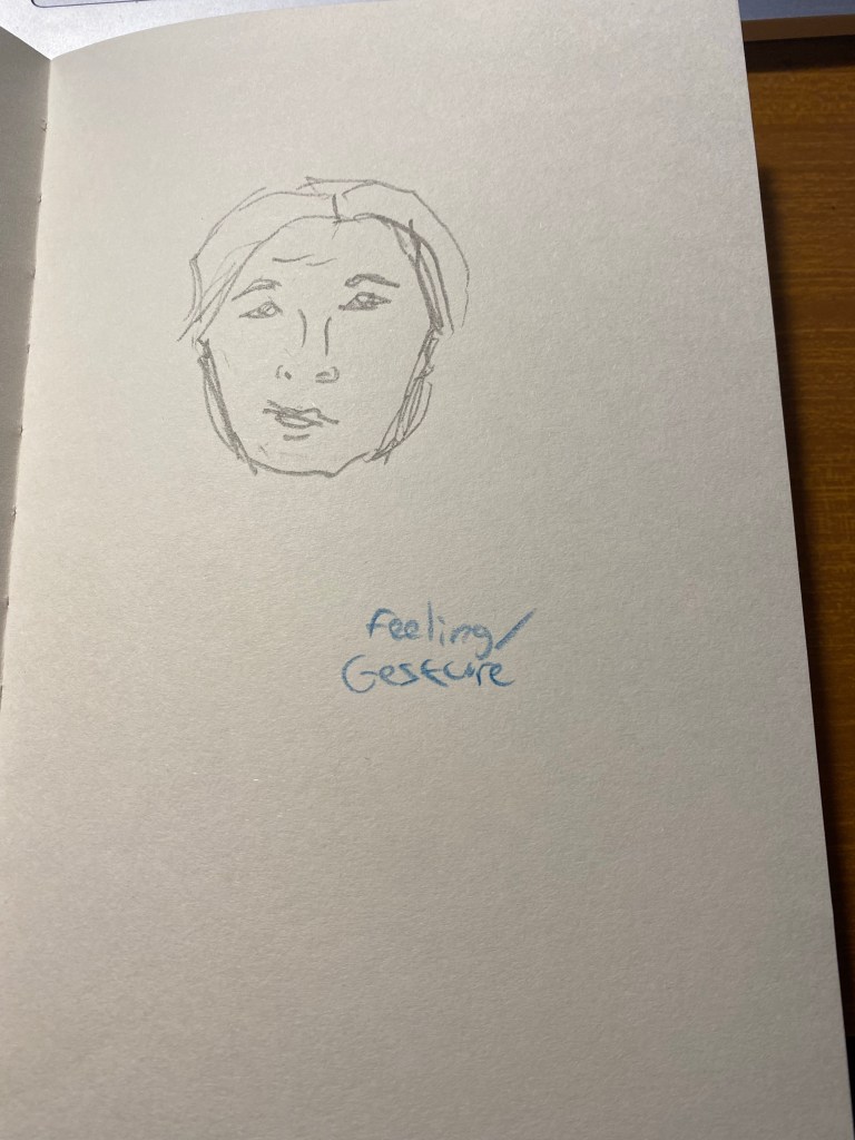
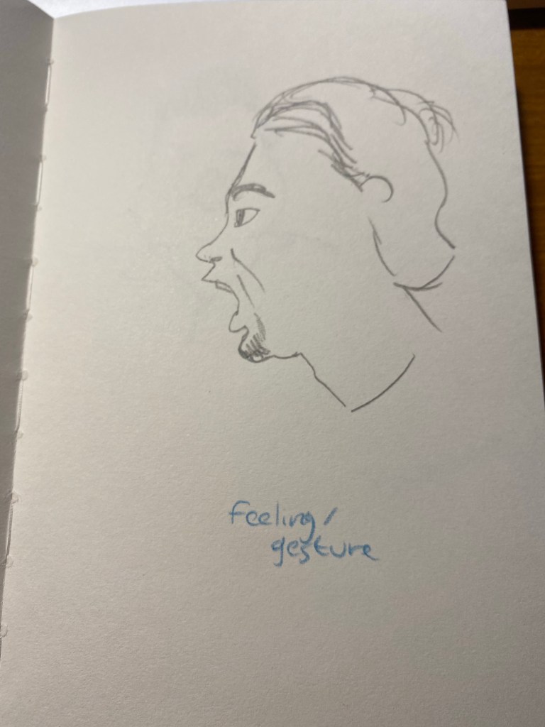
The next exercise was to capture the subjects feelings. Again, a 2 minute time limit would have been more in my wheelhouse.
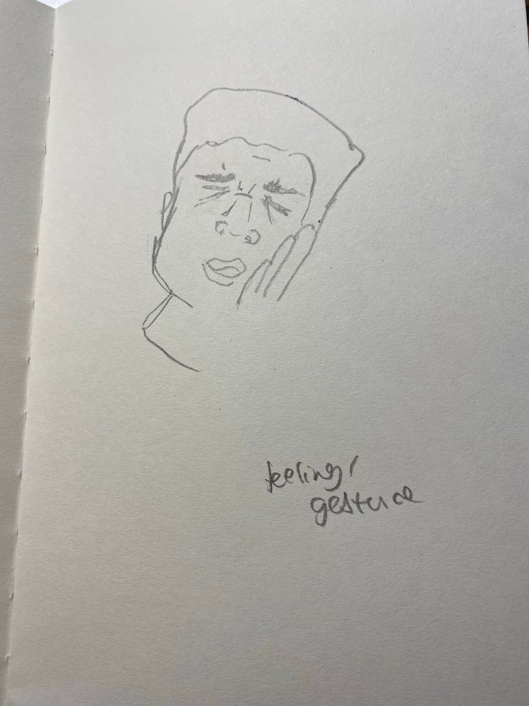
The second subject for this exercise went through every emotion in the book so I couldn’t settle on one.
The third was just fun though:
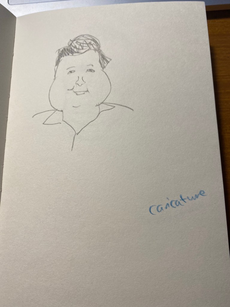
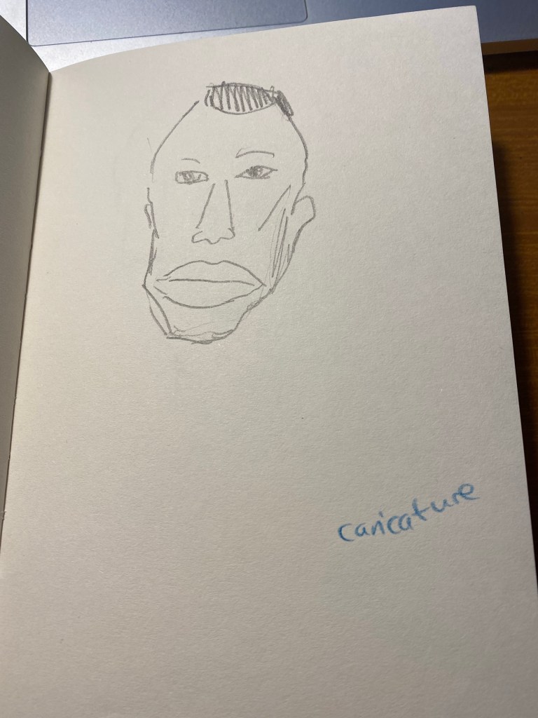
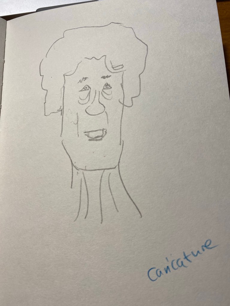
Then we did a caricature exercise, where we tried to draw people as not overly stylized caricatures. We has a minute for each, and I was starting to warm up at this point:
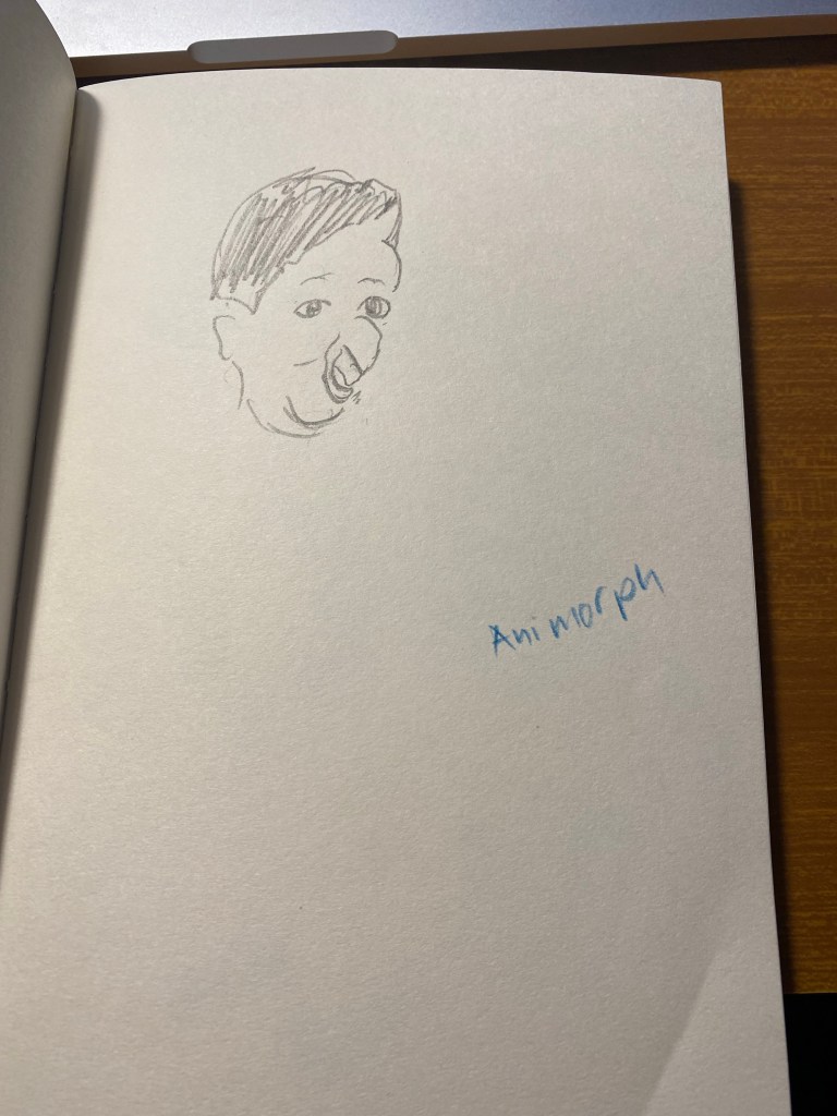
The next exercise was a strange one – to draw a person as if he was morphing into an animal and we caught them in the middle of the morph.
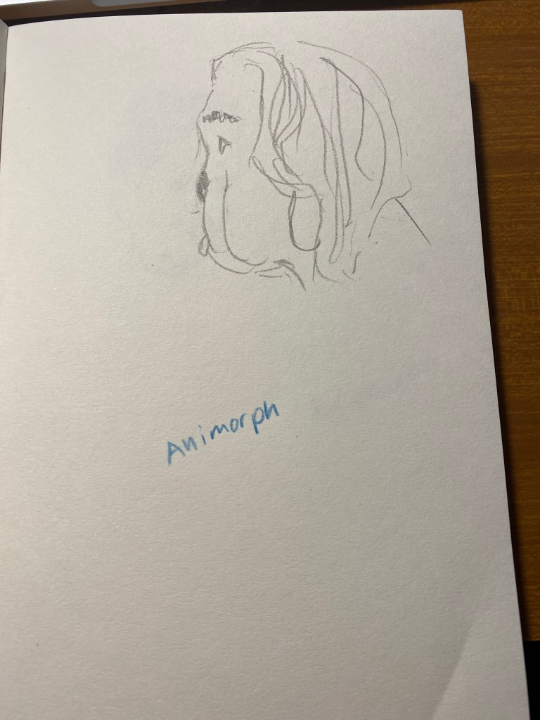
This was fun and very creative:
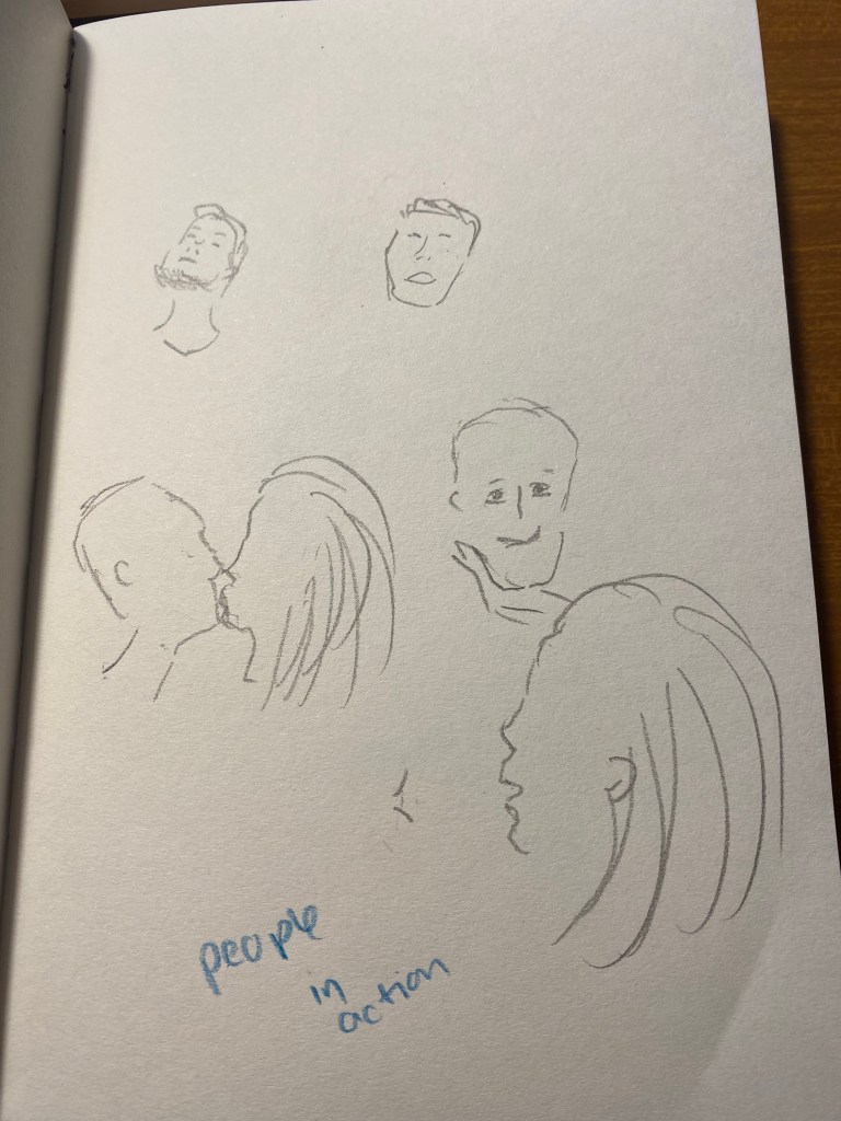
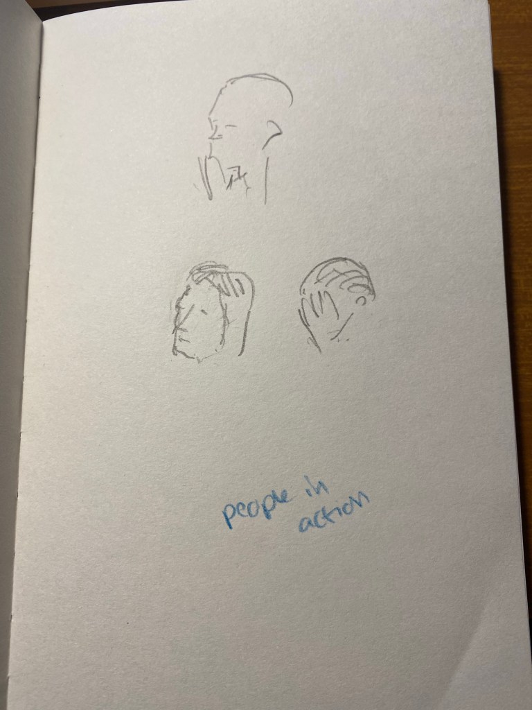
The next one was to draw people in action, in one minute. To capture as many gestures as possible. I guess that the animators had a field day with this one, but I really struggled.
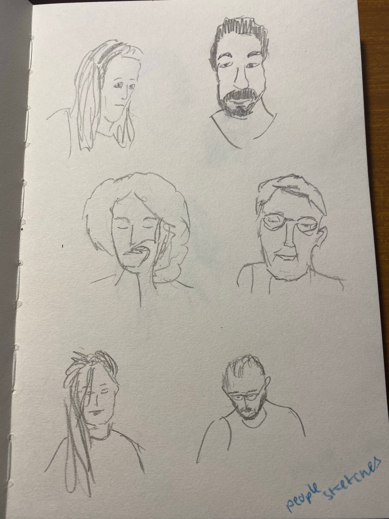
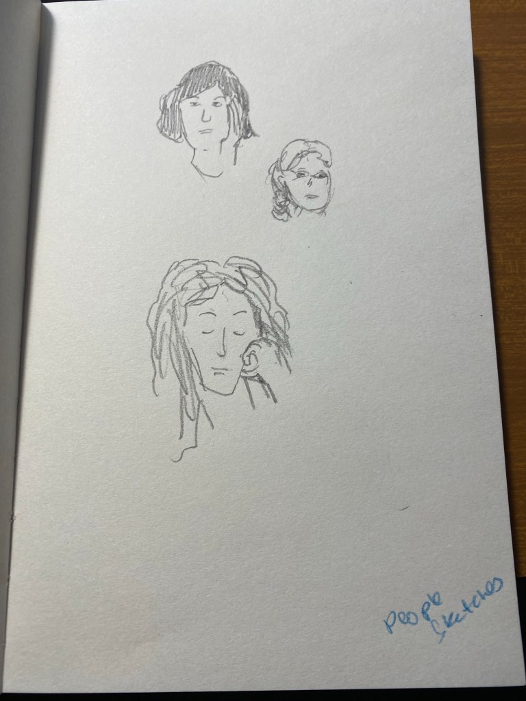
Finally we had 15 minutes to draw each other. I had a lot of fun with this, and the earlier exercises really did help me warm up and loosen up and work faster.
These exercises are definitely something that I’ll try to warm up before drawing portraits, and they’re also just a lot of fun to do. If you have a minute, a pencil and a blank page I recommend that you give them a go.
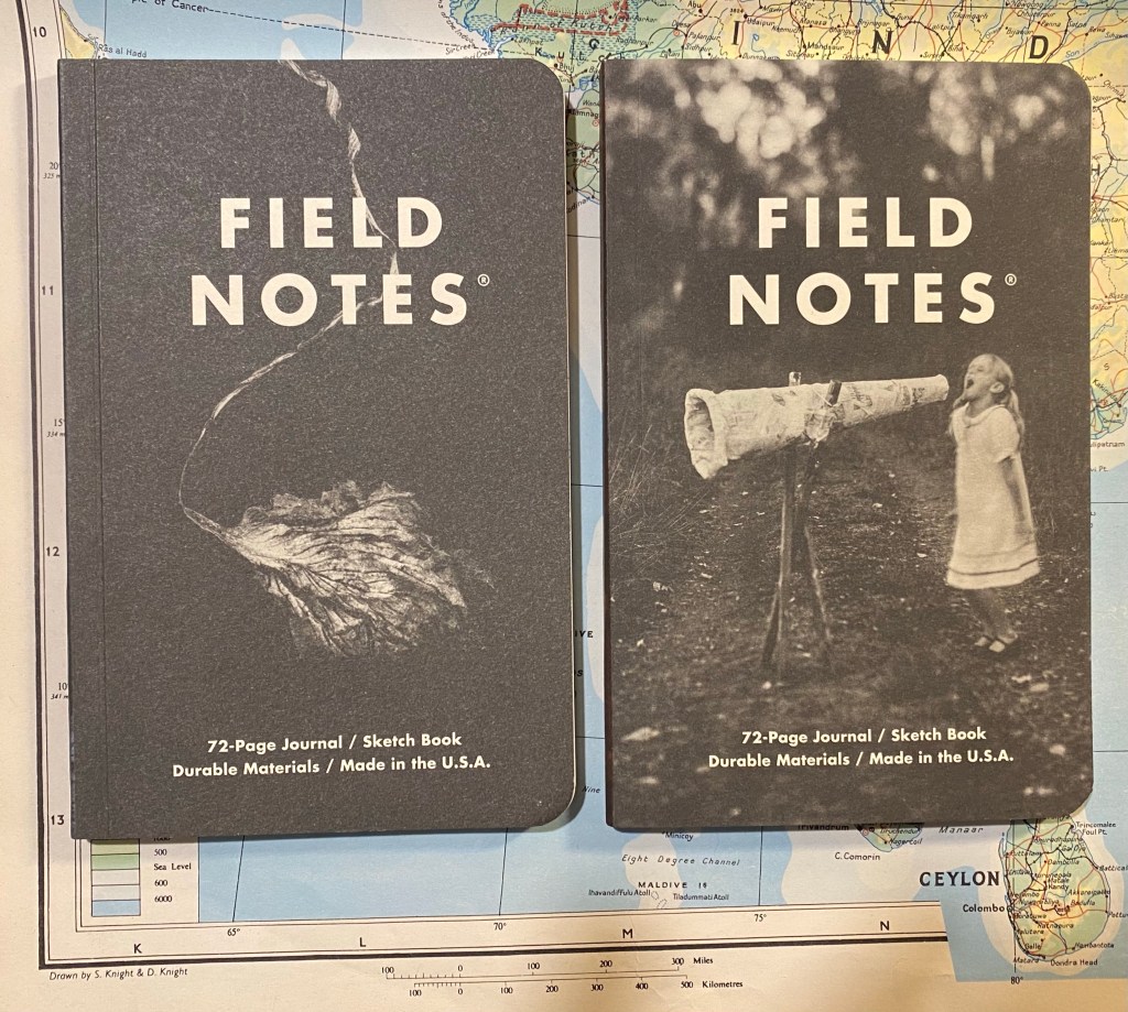
I am a big fan of Field Notes, so when I saw that they came out with a sketchbook in collaboration with musician Maggie Rogers, I had to give it spin. The Maggie Rogers Field Notes are in the “Dime Novel” size, and are bound with and contain Strathmore paper. That is a promising start: an uncommon sketchbook size, with artist quality paper inside.
The Maggie x Field Notes edition comes with two sketchbooks in each pack, one with a red tinted spine and one with a blue tinted spine. On the cover of each is a Joshua Meier photo that was featured on Maggie Rogers’s first two albums: Blood Ballet is on the red tinted one on the left, and The Echo is on the blue tinted one on the right.
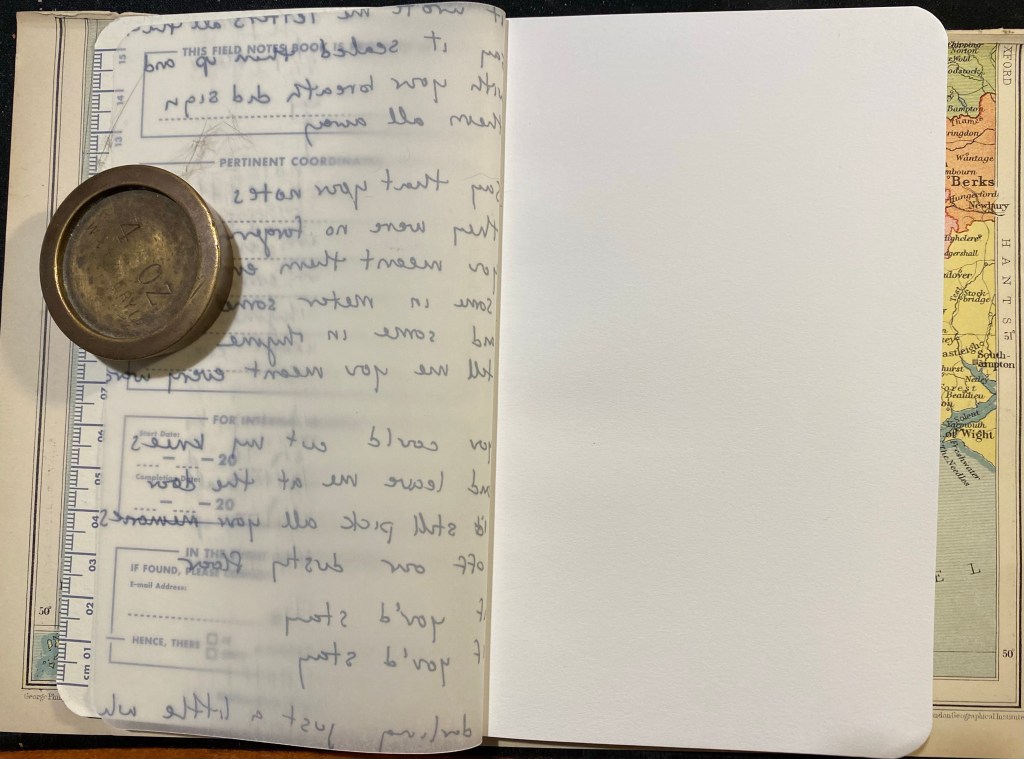
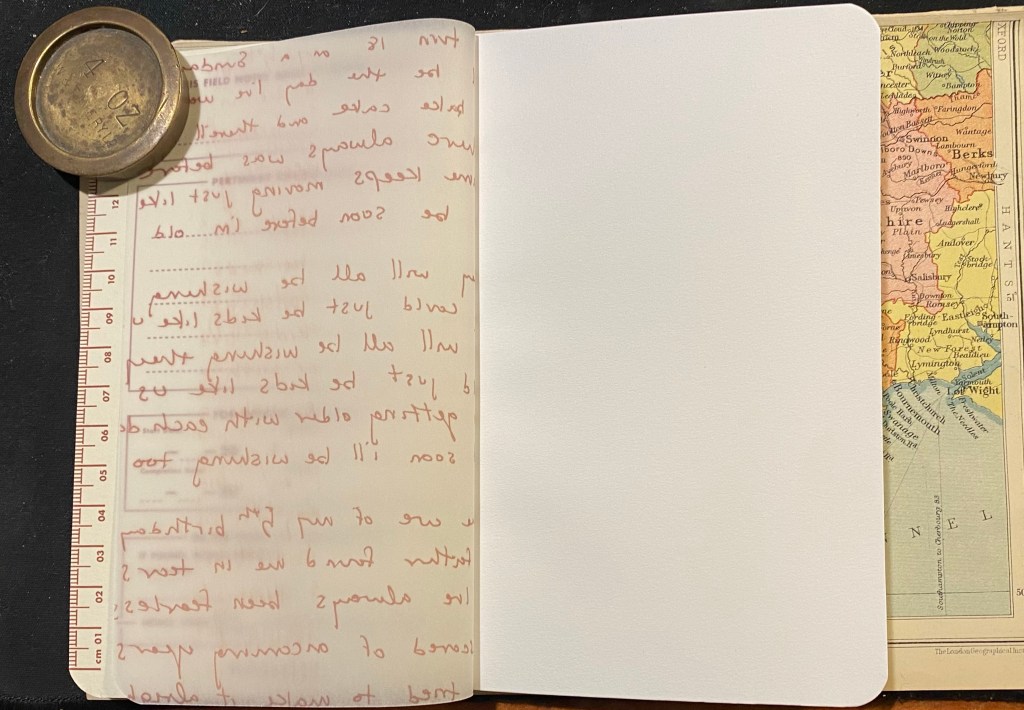
Beyond the normal “Pertinent Coordinates” design on the front cover, there is a vellum fly-sheet in each sketchbook featuring Maggie Rogers’s original hand-written lyrics. It’s a nice touch that really adds to this edition’s design.
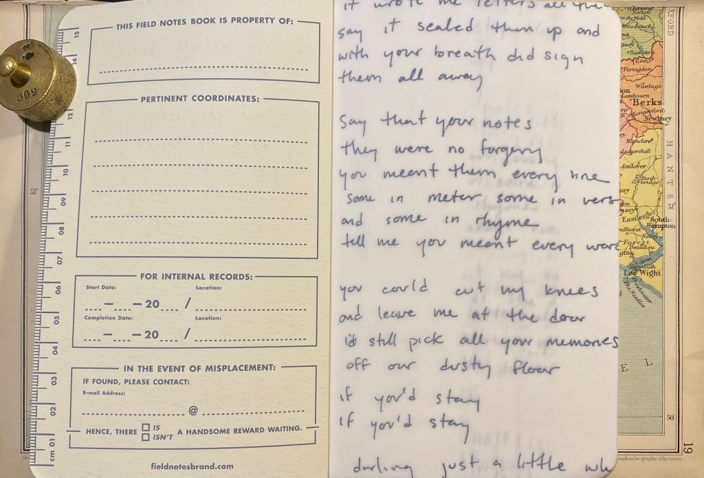
I also like the decision to print these on vellum and not on Strathmore paper that is in the rest of the sketchbook. It gives the words an airy feeling that doesn’t weigh too heavily on the user. You don’t feel the need to compete with them, so to speak.
The inside of the back cover features Field Notes’ usual spiel and some information about Maggie Rogers and this collaboration. As usual, it also lists all of the technical details of this sketchbook, which I love. It would have been nice to get the Strathmore paper weight in a more standard gsm notation.

The red, Blood Ballet edition of the notebook is the same as the blue one, just with a red brown tint to it.


So, to business. How does the Maggie Rogers Field Notes perform as a sketchbook? For that I tested it with some Uni Pin fineliners and brush pen, a Fixpencil with 2B lead, and finally with light watercolour use. Unsurprisingly, considering the paper inside is light weighted Strathmore, it’s a good sketchbook to have in your bag or coat pocket. It’s versatile and not too precious to make you feel bad about “ruining” pages.
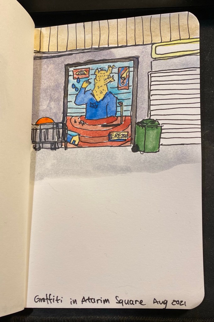
The first sketch that I made was done with a grey Uni-Pin 0.5 fineliner. The paper isn’t entirely smooth, but I no problem using the fineliner on it. The ink doesn’t spread or feather, but it does show through and even bleed through to the other side. I won’t be using both sides of the paper here.

You can see the show through and even a spot or two of bleed through here. I really don’t recommend drawing on both sides of the page here.

The next drawing was done with a Uni Pin brush pen. The paper isn’t glass smooth, and that actually makes it more fun to draw on. There was no spread and less bleed-through than with the fineliner somehow. I still wouldn’t use the other side of the page, because it will show through.

The paper shines with pencil, and I had a lot of fun sketching this palm using a Fixpencil with a 2B lead. If pencil is your medium of choice, you are going to love this little sketchbook.

As for watercolour, you can use the Maggie Rogers Field Notes sketchbook for light washes in a pinch, but it’s clearly not made for this. Washes come out patchy and grainy, and while the paper holds and doesn’t buckle too much if you are vey careful and only use a small amount of water on it, I really wouldn’t use it for watercolour.
The reverse side of the paper shows just how much it buckled under the strain of even a small amount of water (pun intended).
I think that the Maggie Rogers Field Notes is a nice sketchbook to try out quick ideas and vignettes in. It’s a nice sketchbook that’s not too nice, the vellum fly-sheet actually reduces the pressure of the first blank page, and so long as you don’t insist on using watercolour with it, it’s versatile and will do as your main pocket sketchbook in a pinch. Its main weaknesses (the thinness of its paper and the binding that doesn’t allow the pages to open flat so you can’t use a whole spread) actually work together to make this a sketchbook that encourages you to burn through it. It’s not precious. It’s not too nice. It’s a workman-like sketchbook, which works perfectly with the Field Notes brand.
On the day before our last of our latest trip to London we went to see the Royal Style in the Making exhibition at Kensington Palace, colloquially known as the “Diana Wedding Dress Exhibition”. The tickets included a visit to Victoria’s childhood rooms in the palace, and the exhibition had other dresses on display, but you knew immediately what it was about once you entered the exhibition pavilion.
The dress was prominently displayed, most of the visitors (not many, due to Covid restrictions) were congregated around it, and it was HUGE. The thing was large, and puffy like an overdecorated wedding cake, and had a train that was just bananas. I can’t imagine what it was like being cramped with so many meters of lacy, embroidered fabric in the back of a car on her way to St. Paul’s Cathedral. Looking at that dress I thought to myself that it ended up being more symbolic of Diana’s life than designers Elizabeth and David Emanuel had envisioned. She was stuffed into an overly symbolic, stifling, uncomfortable life that made it difficult for her to show her best qualities: her warmth, her ease with human connection, her genuine care for people, and the simple way she just lit every room she entered.

There were two other dress designs in the exhibition that caught my eye. The first was a salmon coloured dress that David Sassoon created for Princess Diana as her wedding day dress and she ended up wearing as a “working” dress. It’s much more sensible, colourful, chic and warm and it although it still has terrible 80’s style stamped over it, you can see how it would have worked well on her at the time.
The second dress is prototype of the Queen Mother’s Coronation dress, and it is sleek, chic, and yet also intricate and sophisticated. Of all the dresses in the exhibition, this dress best stood the test of time, and I could see it be worn by an A-level star at the Met Gala.
If you are in London and you can get tickets to this exhibition, I do recommend going, both to see Victoria’s childhood rooms, and to see the dresses on display (although fair warning, there aren’t many of them). Princess Diana had a good eye for fashion and how it would allow her to connect with people (she didn’t wear hats because you can’t cuddle a child with a hat, and she liked costume jewellery because it gave the children she picked up something to play with), and to send subtle and not so subtle messages about what was going on in her life (search for the black sheep sweater or the fabulous “revenge dress” to see what I mean).
