Uni Do! Posca Paint Marker White Extra Fine Review

I am on a quest in search for a white, waterproof pen that reliably lays down a thin, opaque line. You’d think that this wouldn’t be so hard to find, but this combination (opaque-and-thin-and-waterproof-and-reliable) has so far proven to be elusive. The closest so far has been the Uni-ball Signo Broad UMR-153 white gel ink pen, but it tends to dry out and blob, so it is far from perfect.

The Uni Do! Posca paint marker in white, extra fine (0.7) is a welcome addition to the white pen field. It’s waterproof, water-based (so not smelly like other paint markers), lightfast, and can be used on a multitude of surfaces. I’m going to focus its use on paper, but if you’re looking for a way to label a dark coloured object, this may be the pen for you.
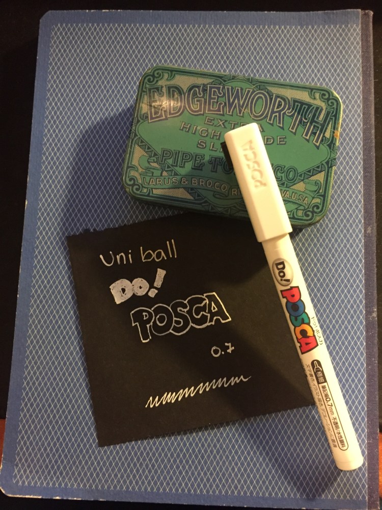
The Do! Posca’s design is pretty well designed. The pen is narrow enough in diameter for you to comfortably use it like a regular pen, and the square cap keeps the pen from rolling off the table, and looks great. The pen body is much too busy for my liking, but that’s a minor quibble.

There’s a tiny metal ball inside the pen, and you need to shake it well before use to get the paint ink flowing. When you use the Do! Posca for the first time you need to prime it by shaking the pen thoroughly and then pressing the plastic tip in several times until the white paint flows. I had no problem getting the pen to start up after a good shake, but I’d recommend keeping it horizontally and cap it immediately after use.
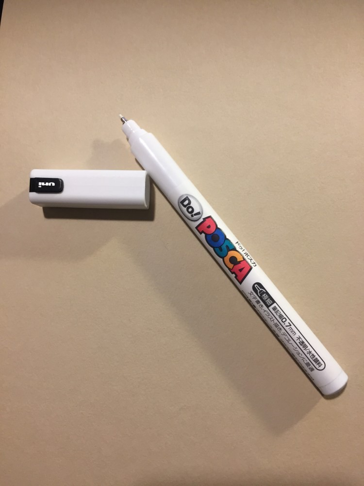
The Uni Do! Posca doesn’t blob, and it’s excellent for small details. I wouldn’t use it to fill in large expanses of white, as it offers pretty poor coverage and doesn’t layer well. If you’re looking to use it for highlights, correction or detail work, this is the pen for you.
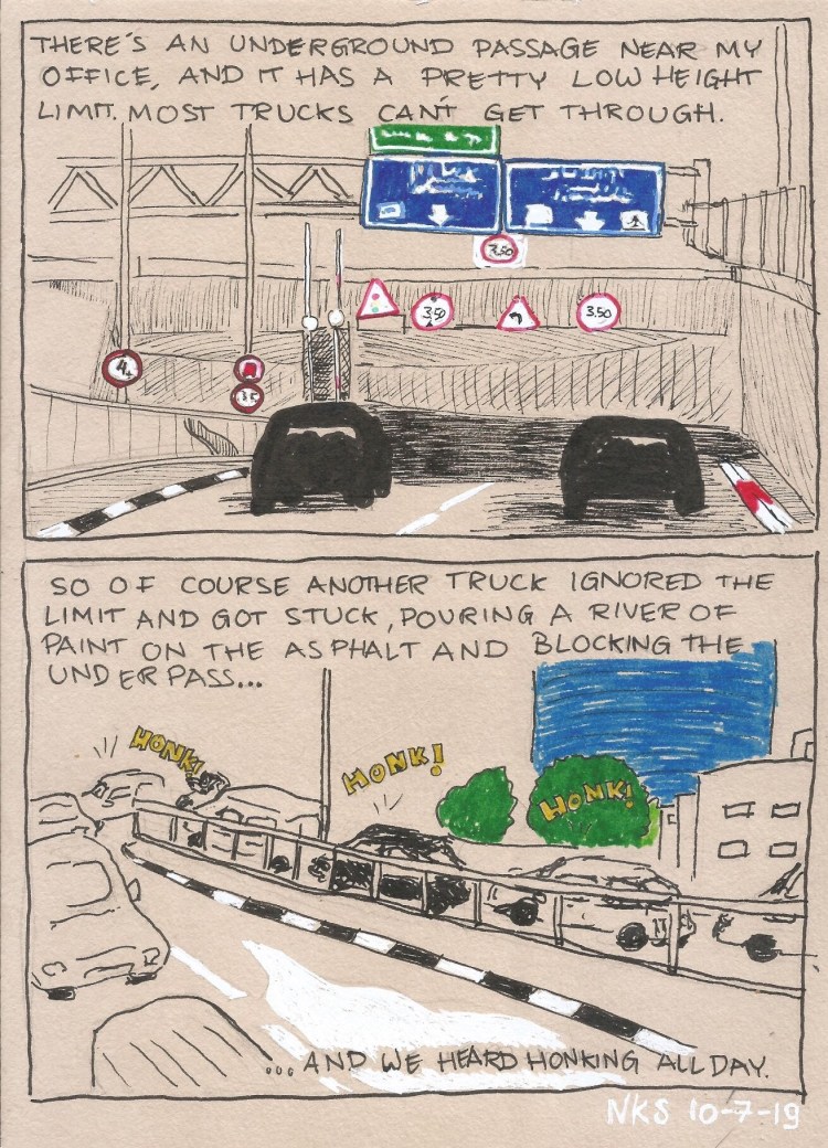
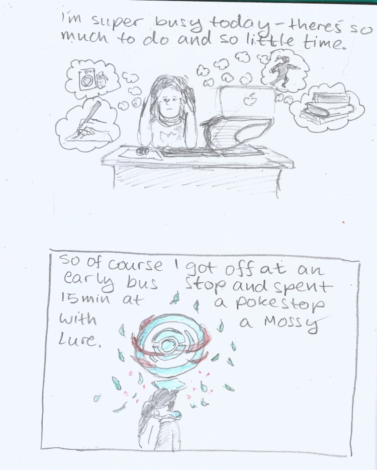
I drew this journal comic on a Clairefontaine Paint On Naturel A5 pad.

The Uni Do! Posca extra fine paint marker in white was available for a time at Jetpens, but now you can find it easily enough on eBay. If you’re looking for an opaque, extra fine, waterproof white pen, I highly recommend it.
The Master Pencils Union No. 84 Pencil Review

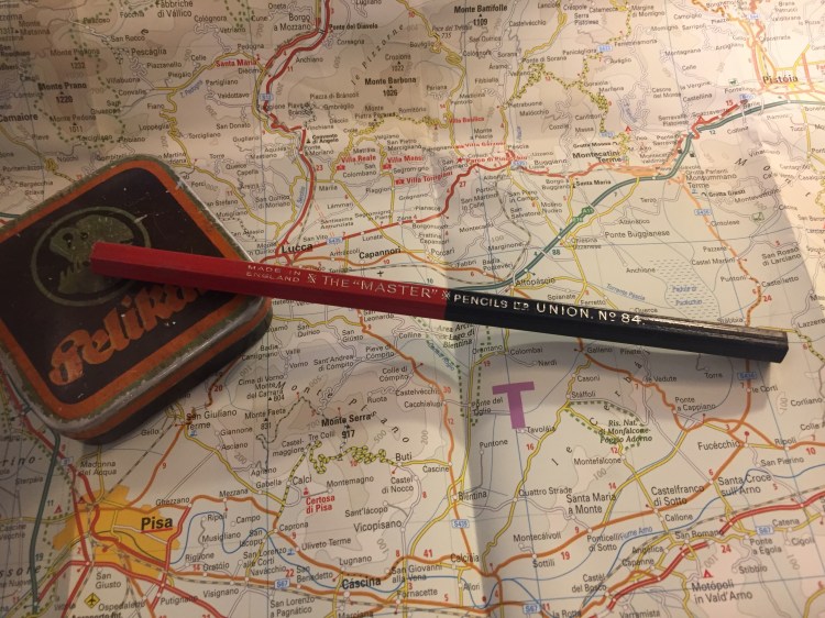
My latest flea market find is a red/blue Union No. 84 pencil from The “Master” Pencils Ltd, the English pencil company that also created the Golden Master pencils that I reviewed in the past.

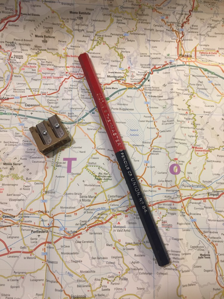
The Union No. 84 is an oversized pencil, with a red and navy core. I love the choice of font for the imprint: it looks clean and professional.

The pencil is thick, built like a children’s pencil, and so the cores are extra large as well.

The navy core, almost black in appearance:

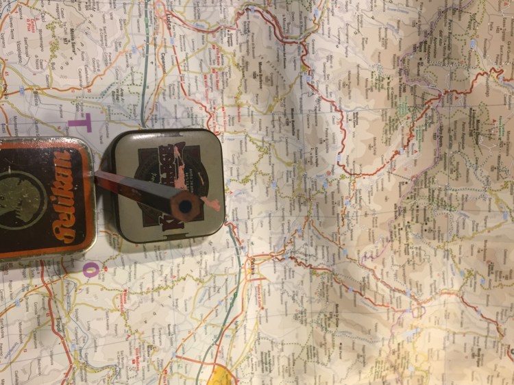
Finding a sharpener that can sharpen this pencil was a challenge. You’ll need one that’s designed for children’s pencils, yet is high quality enough to handle wood that has toughened over time, and a core that is still soft and brittle. I went with the M+R double brass sharpener Nr. 0603. Beware of the red core when you sharpen this pencil, as it can stain your hands.

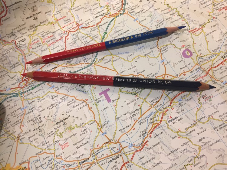
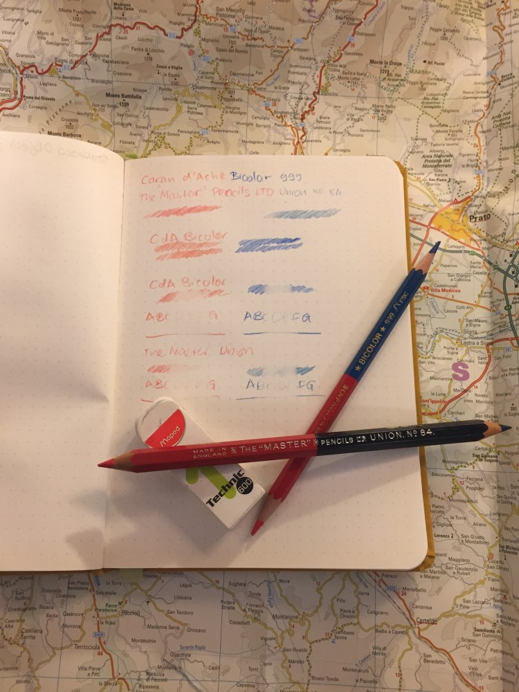
Here’s the Union No. 84 next to the Caran d’Ache Bicolor 999, the golden standard for red/blue pencils. You can see their size differences quite clearly.

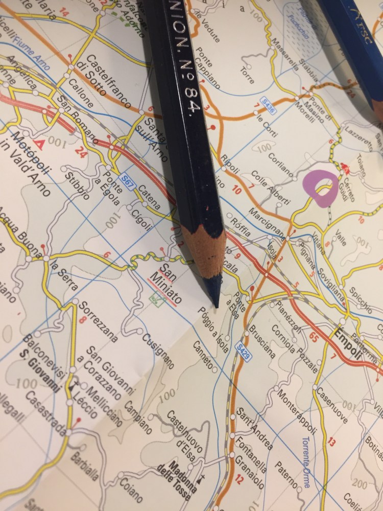
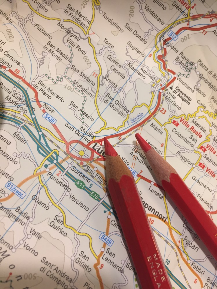
The navy tip of the pencil:

The red tip of the pencil:

The red tip of the pencil was much softer and more crumbly than the navy tip, but even though I was worried about it, it didn’t break with use.

I tested the Union No. 84 against the Bicolor 999, and discovered a few interesting things. The Union’s blue is indeed a shade darker than the Bicolor’s but it’s not as dark as I would have expected. The red shades of both pencils are virtually identical. The Union feels more like a pencil than the waxy Bicolor, with more feedback, and more shading possible when some pressure is applied. Both pencils erase poorly, but the Union erases better than the Bicolor, particularly the Union red, which doesn’t stain the paper.

I tested the pencils on a Baron Fig Confidant, my go-to pencil testing paper, and erased them with the Maped Technic 600.

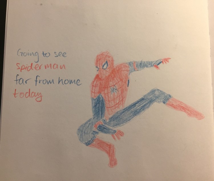
The Master Union No. 84 is a lot of fun to draw with, beyond being useful for highlighting and correcting text. It feels like a proper pencil, and not a waxy crayon, and it shades enough to allow for doodles like this one:

The Union No.84 is great and fun, and so was the Spiderman movie. I highly recommend them both.

Blackwing 811 Review

It’s the insane, glow in the dark Blackwing, and I managed to snag a box!

OK, enough with the hype. Plenty of other reviewers have given this limited edition pencil a spin, but my experiences and thoughts about “The Library Pencil” seem to be different enough to warrant a few quick words about the Blackwing 811.

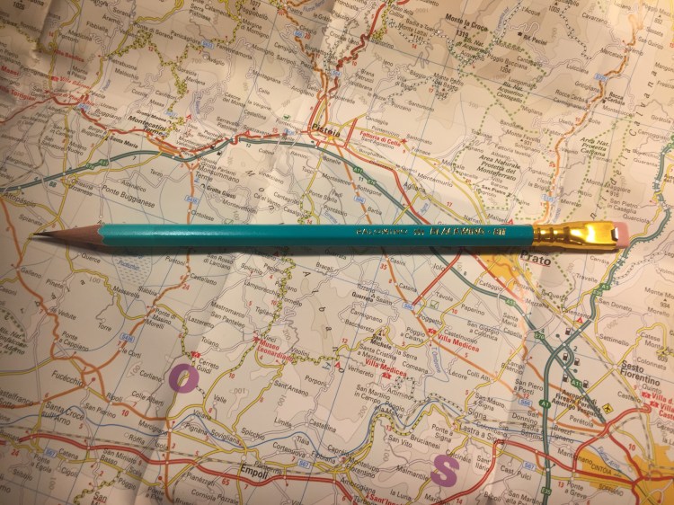
First of all, the pencil is attractive. It’s darker than a banker’s lamp (I have one, so I checked), and the gradient is very well done. This could have looked cheap and tacky but it doesn’t. I would have liked a darker ferrule and I think that the pink eraser is ugly, but even so it’s a pretty attractive pencil.

The lighter part of the gradient disappears for the most part on the first sharpening, so that’s a shame. The coating on the pencil is grippier than the coating on the Blacking 54, 56, 24, 725 and 530 (and lacquered pencils in general), but less grippy and gritty than the coating on the Blacking 4. It has a matte feel.

It’s got a “firm” core, which means it has the Blacking 602. I absolutely hate that Blackwing doesn’t write its firmness on the barrel, or use “standard” hardness ratings, or makes it easy to see what the core grade is on the box or on their site. That’s like buying a fountain pen and not knowing whether you’ll get a fine or a broad. It’s bad enough that manufacturers play fast and loose with pencil grades within the standard 10H-10B range. Having a company invent its own grade and not even have it make sense, and then not even make it visible is a big no-no in my book.

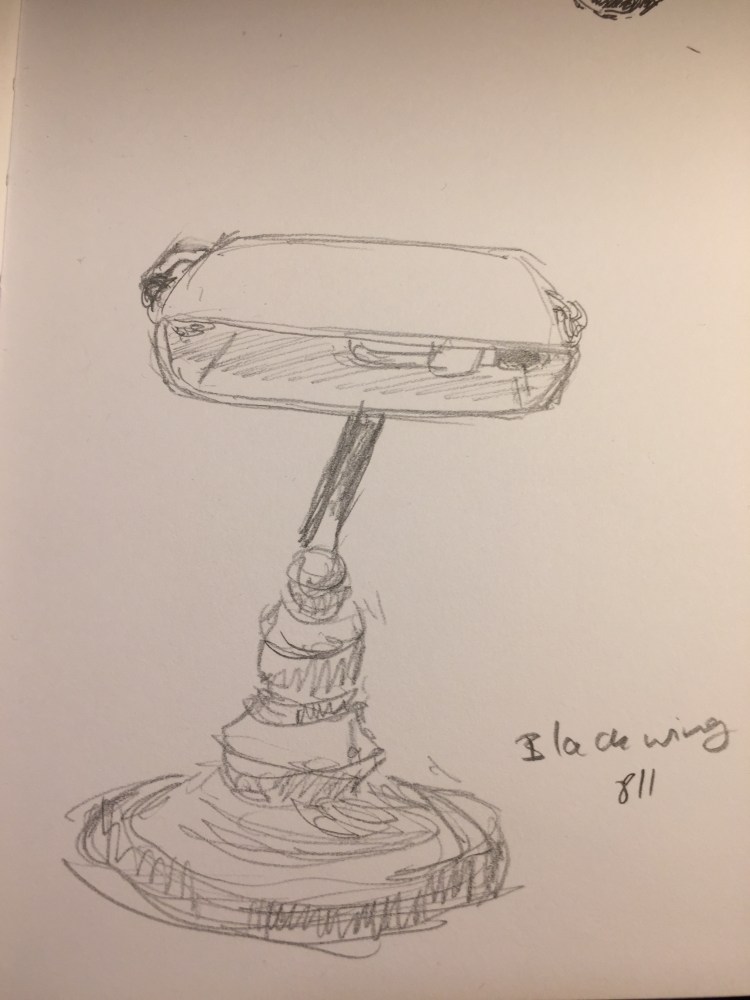
Here’s a sketch of my banker’s lamp (which is a bit wonky after my cat dropped a giant pile of books on it) done with the Blackwing 211. I’d say it’s a B or a 2B, depending on the maker, but in no way is it a pencil that I’d call “firm”. It’s great for quick sketches, but I wouldn’t recommend it for under-drawings.

How I Use Pencils in Watercolour Portraits

Continuing my “how I use the stuff I haveposts, I thought that I’d show how I use pencils when I’m working on a series of portraits of the same person.

Since I work in watercolour which is notoriously not great for correcting and changing your mind mid painting, when there’s a face that I know that I’ll want to explore I usually create a “construction” sketch which I transfer to paper several times. I can then paint the portrait in different tones, or focus on a certain aspect that interests me, or take it to really wild places without spending too much time on the technicalities of the preliminary sketch.

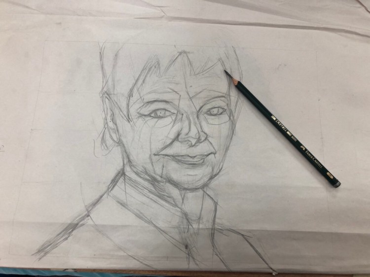
I start the “construction” sketch on newsprint paper. It’s much more detailed and “searching” than it needs to be, but that doesn’t matter much. Ultimately only the lines that will help me construct the face and note where the major light and dark transitions are will remain. I draw this with a Faber Castell 9000 2B or 3B pencil that’s sharpened with a pocket knife to allow me to use it without having to pause for sharpening. Newsprint paper is pretty transparent and also generally too fragile for regular erasers, so I use a kneaded eraser to lift off unnecessary lines, or simply ignore them.

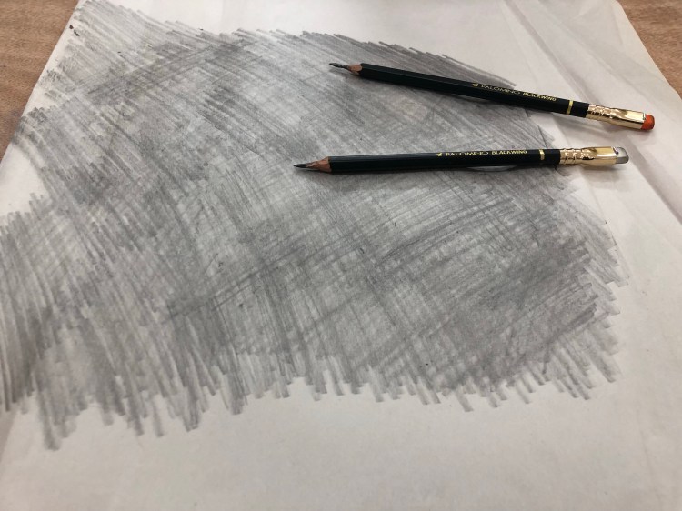
Once I’m done with that, I flip the page to the other side and scribble on it with a Faber Castell 9000 6B or Palomino Blackwing MMX. These are again sharpened with a pocket knife, and the point is to get as much coverage as possible. If I’m doing a lot of transfers then I might have to repeat this process, adding more graphite to the back of the sketch.

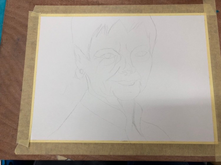
I then transfer the most important lines in my sketch on to a piece of watercolour paper. This is done by placing the newsprint paper with the sketch over the watercolour paper and going over the lines in the sketch with a 2H pencil (I use a Faber Castell 9000 2H, but this isn’t that important). The pencil needs to be a hard pencil for the lines to transfer to the paper below, but it can’t be too hard or too sharp or it will rip the newsprint paper. It’s also important to put just enough pressure when you’re tracing so the graphite on the underside of the sketch transfers to the paper, but not too much to bruise the watercolour paper. Using a 300 gsm watercolour paper helps protect it, but it’s mostly a matter of practice. When you’re done you get something like this:

The lines are pretty faint, which is great when working with watercolour, because they don’t distract too much from the figure once you start working.

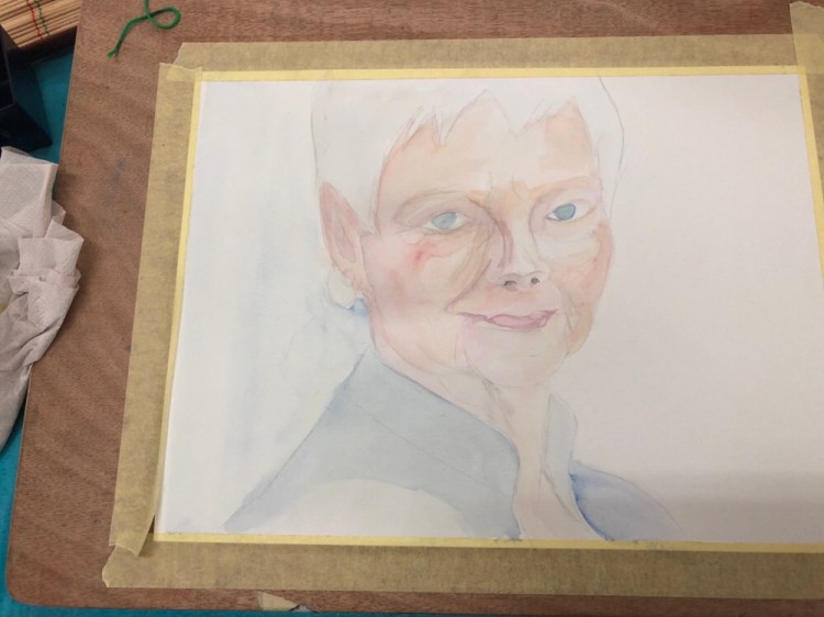
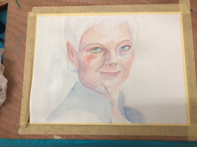
I created about five watercolour portraits of Dame Judi Dench from this sketch so far, and there’s a good chance that I’ll go explore her some more in the future.

#Inktober 17: Swollen

My favourite prompt so far because it gave me an excellent excuse to draw the pufferfish.

Super5 fountain pen with 0.7 calligraphy nib, Rohrer and Klingner Lotte SketchINK on a Field Notes Signature sketchbook with shading done with a Faber Castell PITT Light Indigo brush pen.