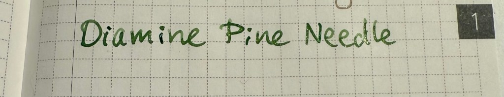
Currently Inked Pens March 2025

Of February’s pen lineup only two pens remain inked, the Parker 51 with Waterman Purple, and the Leonardo Momento Zero Bohemian Twilight with Pilot Iroshizuku Tsuki-yo. As they’re both running low on ink, it’s time for a new pen lineup, with a slightly different theme than last month’s one:

  • All the pens are modern (last time I had more vintage pens than modern ones in rotation) and ones that I haven’t inked in years.
  • All the inks are ones that I haven’t used in years or ever, apart from one that was in the last rotation but I still haven’t figured out so it got another go.
  • The ink colours are much brighter than those that I used in February.

Here’s March’s rotation:

Writing sample on Midori MD Cotton paper

Here’s a bit more about every pen and ink combo:

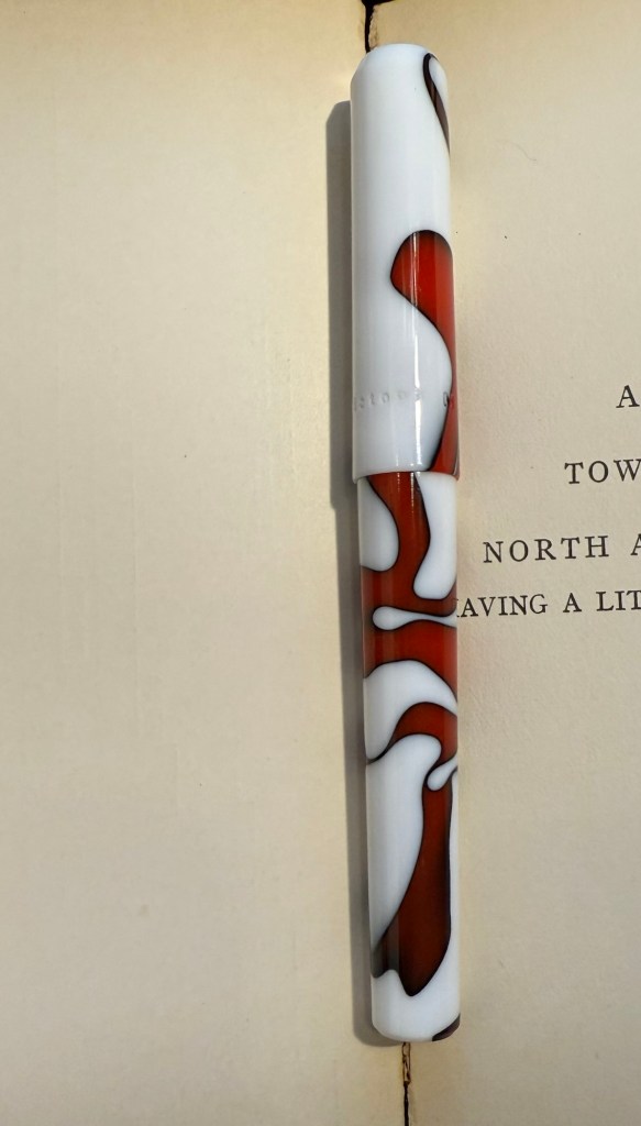
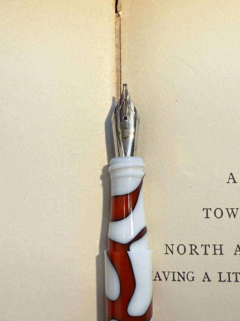
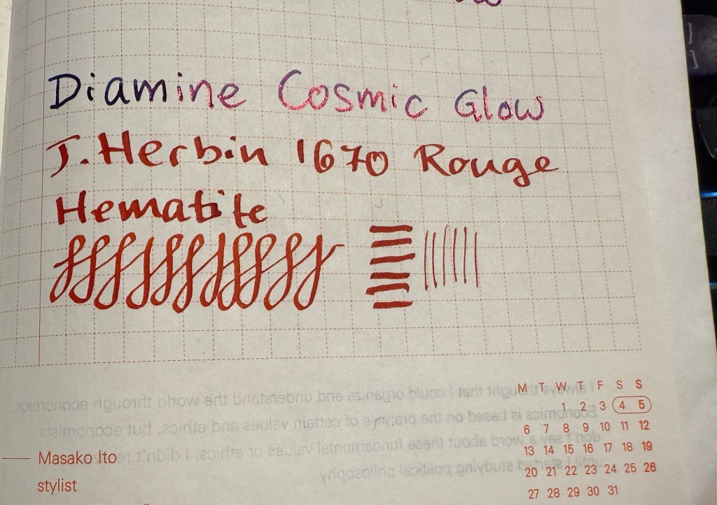
  • Franklin Christoph 03 modified prototype- Red/White/Black motion with a 1.1 HPSteel cursive calligraphy nib. This is a new pen that I bought last year as my chemo anniversary pen (I buy myself a present every year to mark the occasion). I love the unusual resin colour and pattern, and I like FC’s HPSteel 1.1 nibs. They are just wide enough to really show off the ink without becoming a nightmare to use because it takes ages for the ink to dry.
    As nice as the pen is (and it is), the ink is the star in this one in terms of interest: it’s the ORIGINAL J.Herbin 1670 Rouge Hematite, which means that it has NO GLITTER and NO SHEEN. It’s just a deep, bright red with some nice shading and good outlining, but it isn’t full of gold glitter and sheen to the point where you can’t see the base colour. Yes, this is also the bottle that had the problematic crumbly wax cover on the cap, but I really think that I prefer this version to the one they issued later (I have both). I don’t normally use red inks, but this one was perfect for this pen.
The FC 03
The HPSteel 1.1 nib
Original Rouge Hematite compared to Cosmic Glow on original Tomoe River paper. Note the lack of sheen or shimmer.
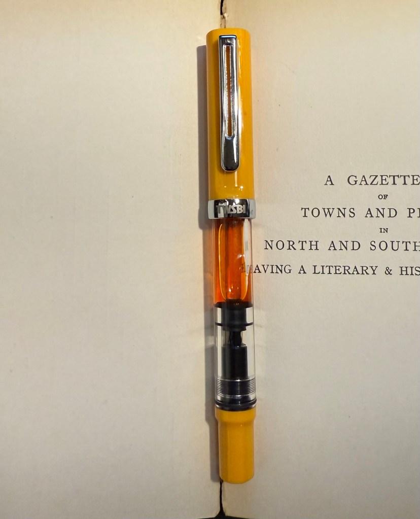
  • TWSBI ECO Saffron fine nib filled with Rohrer & Klingner Helianthus ink. I use yellow inks even less often that I use red inks, but this ink is fairly readable for a yellow ink. It is, however, not going anywhere near a vintage pen as it has a tendency to crust over (as many yellow inks do). I wanted something bright, cheerful and different, and this ink checked all three. The TWSBI ECO is a phenomenal pen for those starting out with bottled fountain pen ink, and I can’t recommend it enough.
TWSBI ECO Saffron
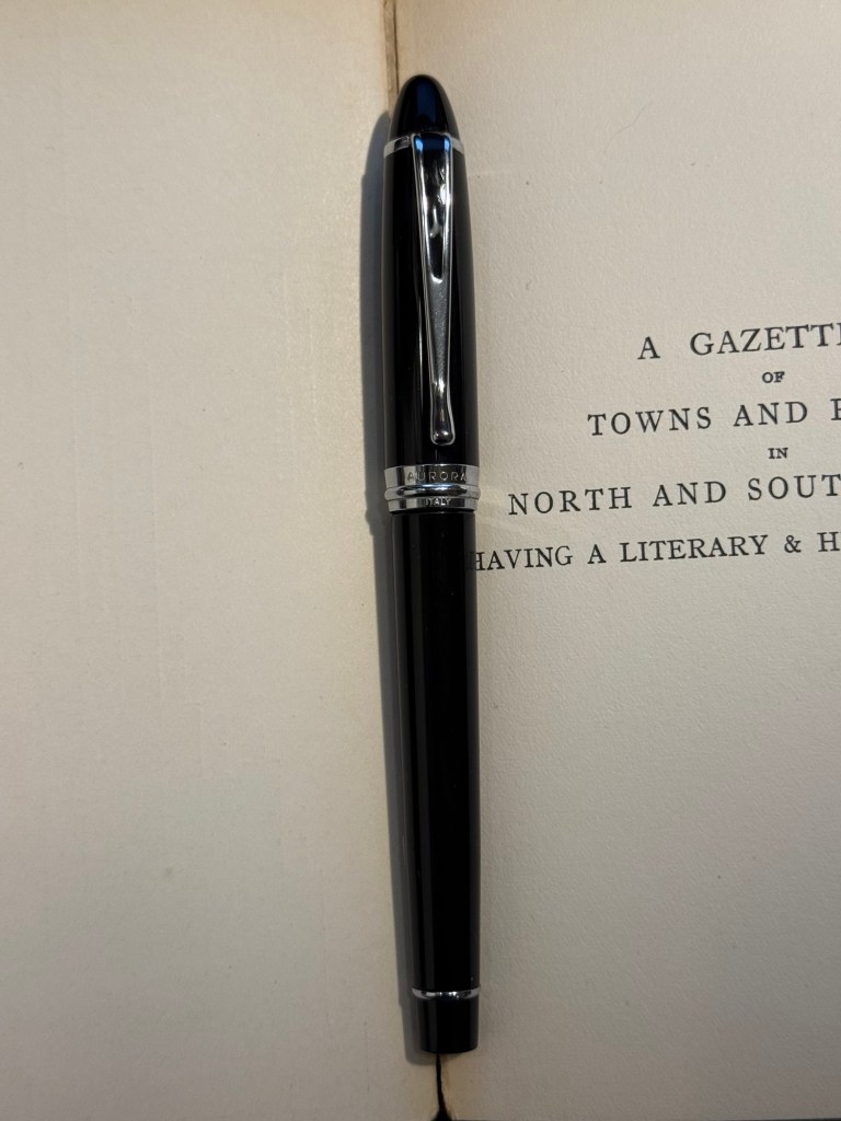
  • Aurora Ipsilon medium nib with Rohrer & Klingner Alt-Goldrün ink. This is my one and only Aurora pen, which I bought years ago in Florence, Italy. Aurora nibs are nice enough, but the pens are priced well above what I believe that they are worth, so I have steered clear of them over the years. The Ipsilon is small pen, but you can’t post it, which is annoying for such a small pen. R&K Alt-Goldrün is a fantastic ink colour – a non standard green with plenty of shading and character – and the only reason I haven’t used it more is because it was tucked away behind two rows of other ink bottles. If you are just starting out with green inks, give Alt-Goldrün a try.
Aurora Ipsilon
The Ipsilon nib looks ridiculously small but it’s just the design of the section that makes it appear that way. Comparison photo to a TWSBI ECO nib.
  • Leonardo Momento Zero Blue Hawaii Fine nib with Diamine Steel Blue ink. I have used this pen fairly recently compared to some of the others in this rotation, but the ink has been one that I actually forgot that I have. I love teal and turquoise inks, and Diamine Steel is a beautiful member of this group. There’s a hint of shading with it, and it just pops off the page so nicely. If you want a different take on “boring blue” inks, I highly recommend it.
Leonardo Momento Zero Hawaii
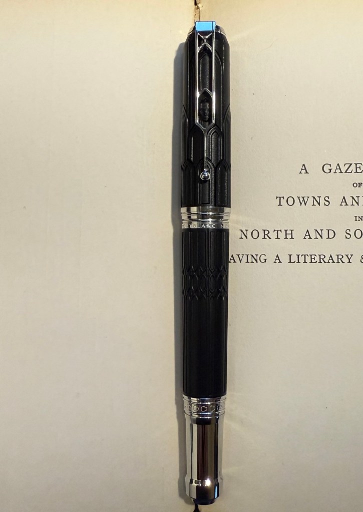
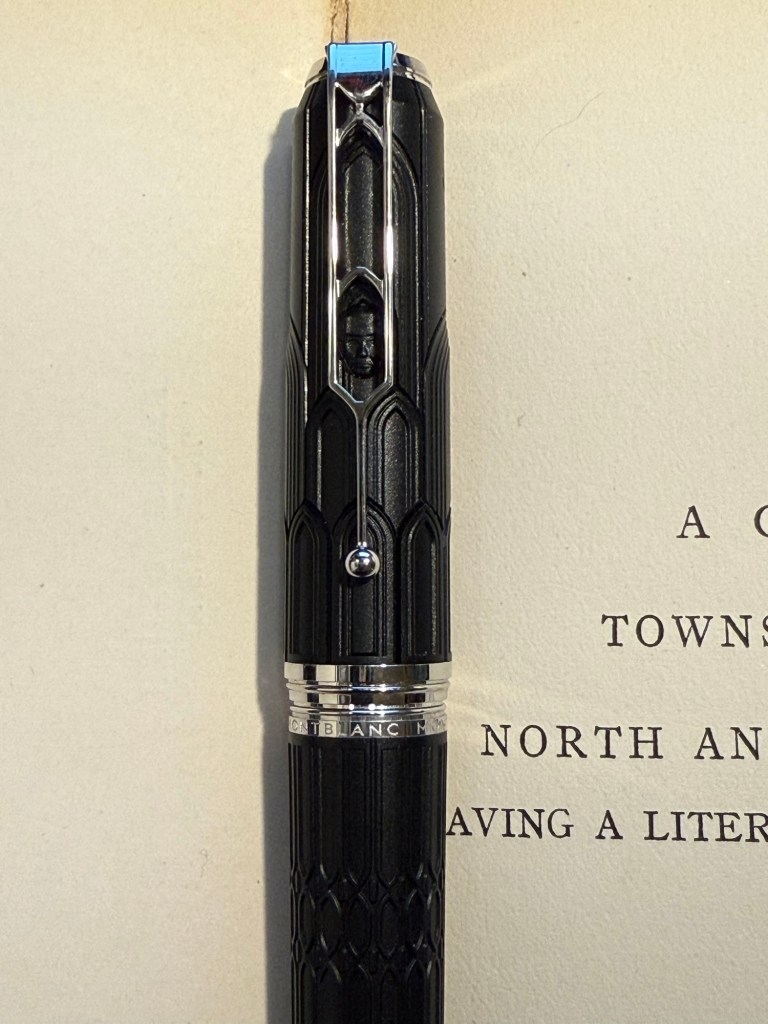
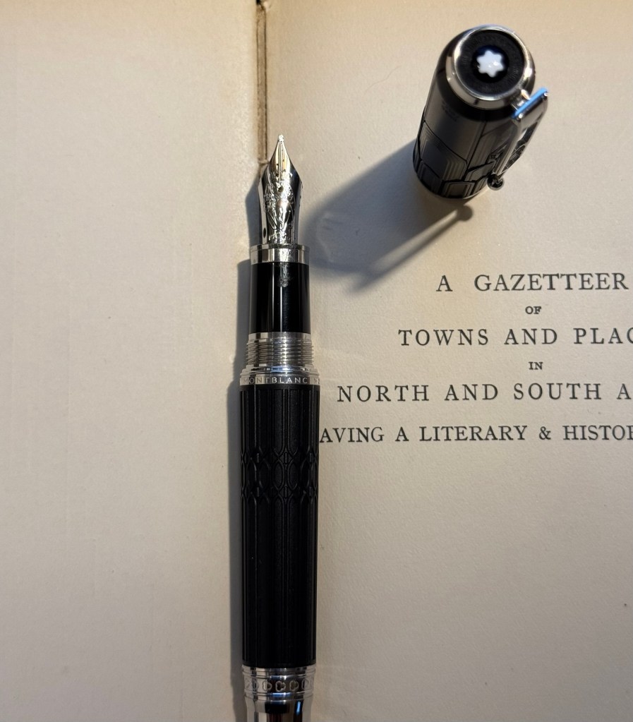
  • Montblanc Writer’s Edition Victor Hugo medium nib with Montblanc Around the World in 80 Days ink. I bought this pen in Mora Stylos in Paris before they closed mainly because I adore the Notre Dame de Paris cathedral and it’s featured on this pen. Hugo has the honour of being the saviour of this extraordinary cathedral, and though I shy away from Montblanc limited editions (talk about overpriced) I thought this one was worth purchasing. The ink was last in rotation, in a vintage Montblanc, last month. I just can’t get over how unrelated it is to the green-gold elephant on the box, and I’m not sure what to make of it. I was expecting it to be more like Alt-Goldrün than like the bluish-grey (Payne’s Grey really) that it is.
The Montblanc Writer’s Edition Victor Hugo
The Victor Hugo death mask on the cap
The nib, which features Victor Hugo
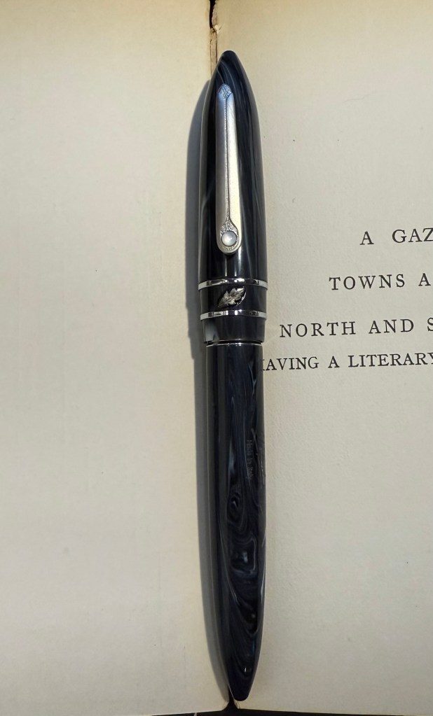
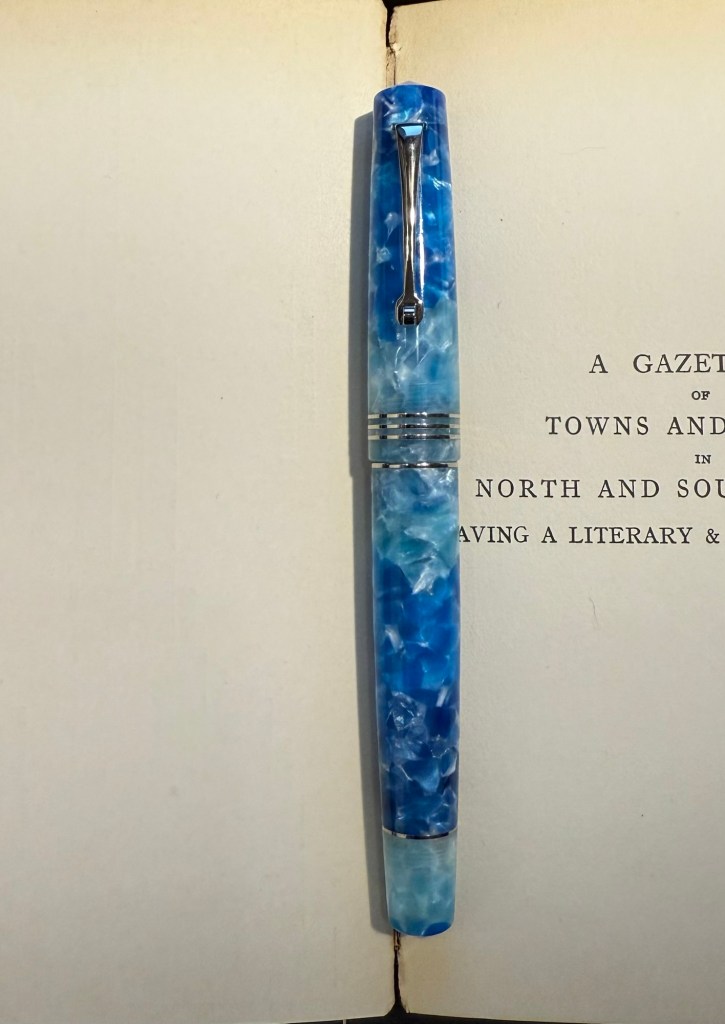
  • Finally, speaking of a pen and ink combo that have gotten “lost” in my collection: the Stipula Model T marbled grey pen was also an Italian purchase, and it has a very peculiar fine “flexy” titanium nib. I would characterize the nib as springy, and as my other titanium nib Stipula does, it squeaks sometimes as you write with it. The ink is one that I bought in 2013 in Fahrney’s pen store in Washington DC. Since then I haven’t opened it and used it, mainly because Fahrney’s Tempest Blue is a blue ink, and I don’t use blue inks often. It shades nicely, but other than that it looks close enough to my benchmark blue, Waterman Florida Blue (now renamed to Waterman Serenity Blue), for me not to bother using it often. Waterman Serenity Blue is a best-in-class blue in my opinion because it’s so well behaved, gentle and easy to clean out of pens that you can safely use it in any pen that you have, particularly vintage ones.
The Stipula Model T. A very sleek design.
The Model T titanium nib.

Weekly Update: 10K Race, Field Notes Sketchbook and Poetry Anthology

Another busy week at work coupled with a packed weekend means that this update will be bullet-point style:

  • I ran my first race of the year, a 10K in what turned out to be surprisingly warm weather. I’ve been using the Nike Running Club App’s 10k race plan, for both this race and the one I ran in Disney World last October and it’s proven to be fantastic. I wish I could say the same about the app, which has lately had annoying audio issues that have made it downright unusable at times.
  • In preparation for next week’s One Week 100 People challenge I’ve been using a Field Notes Sketchbook, and I’ve grown to appreciate its portability. It’s not suited for wet media, but for pen, ink and pencil it works well. All the sketch photos here were done on a Field Notes Sketchbook, and I’ll be reviewing it sometime in the future.
  • I’m down to only five inked fountain pens, and I’ll likely write one or two of them dry next week. I’ll be updating my pen rotation sometime late next week, possibly looking to add some more spring-time ink colours to the darker inks I currently have in use.
  • I’ve finished reading Legends and Lattes by Travis Baldree, bringing my February book count to three. The book was just the sort of cozy, light read that I needed at the time, and I enjoyed it enough to immediately buy the sequel (which is actually a prequel) Bookshops and Bonedust.
  • I spent an annoyingly long time downloading all of my kindle books to my laptop before Amazon locked that option out. I’ve also moved to using Kobo to buy eBooks. I will admit that it’s not as convenient as buying ebooks from Amazon, but I’m angry enough at them for the change to put in the extra effort required. I bought Bookshops and Bonedust on Kobo and then used the Amazon “Send to Kindle” website to transfer my purchase (it was easy because Travis Baldree, bless him, demanded that the book be DRM free). I also bought another book (a bit on that in the next bullet) that had DRM applied, so I had to do some Calibre work to strip it of DRM before sending it to my Kindle. Next time the whole process should take only a minute or two extra beyond the usual Kindle book purchasing process, and again, for me it’s worth it.
  • After listening to Oxford poetry professor Tara Stubbs’s wonderful Demystifying Poetry podcast (Apple Podcasts, Spotify) I bought my first poetry book in years, the anthology “Staying Alive”. Even if you’re not a poetry lover, give the podcast a listen. It’s well worth your time.

Have a great week!

Zebra 301 A Ballpoint Pen Review

I mostly use fountain pens when I write. If not fountain pens then gel ink pens. I rarely write in pencil, but I often sketch with pencils, and sometimes when I plan, I pencil things in. Pencil is great for writing impermanence, even though pencil marks last longer than pen ones – unless erased.

Yet there’s always a ballpoint on my desk and in my bag. I don’t like writing with ballpoint – the lines are as dark as I prefer, even with hybrid ballpoints like Uniball Jetstreams, and they oftentimes streak and blob. So why do I have a ballpoint at hand at all times?

Because ballpoint pens are a useful tool. The ink is waterproof , they’re good for signing things, and they’re robust enough to handle being tossed into a bag or a pocket. Ballpoint pens are also good for sketching – you can get a decent amount of shading and character with them (providing you don’t use a Jetstream).

One of the best bang for your buck ballpoints is this pen:

Zebra 301A BP

So why do I like the Zebra 301 A BP 0.7?

  • It’s made from aluminium, so it’s light and ultra durable. It also wears really well.
  • I love the pen body design and colour.
  • The grip and click mechanism are good: well designed and well made. You get a decisive click from this pen, and the plastic grip has enough texture to it to make writing as comfortable as possible without all the lint gathering, stickiness and durability issues of softer grips.
  • No tip wiggle.
  • It comes with a good, dependable, black refill that is replaceable.
Clip and click mechanism

I like the Zebra 301 A BP enough that I bought a large box of them and I frequently give them away as gifts. People like getting nice pens and if you’re used to cheap, plasticky, disposable ballpoints it’s nice getting a pen that’s a grade or two above what you find in the office supply cabinet.

Grip

Here’s a quick sketch done with a Zebra 301A BP 0.7 on a Field Notes Sketchbook. Ballpoint pen sketching isn’t my favourite technique, but it is a very useful technique for quick urban sketching.

Big Idea Design Base Line Bolt Action Review

I’m a big fan of Big Idea Design pens, ever since I bought their Ti Arto (still their most innovative and all around useful pen). I have their Ti Click EDC and liked it enough to buy the Cerakote version, their Ti Arto EDC, the Ti Mini (and the Mini Click and Mini Bolt), their Dual Side Click, their Fountain Pen EDC, their Bolt and Slim Bolt, Pocket Pro, some of them in several versions. I’m on their mailing list whenever they come out with a new Kickstarter (Big Idea Design use Kickstarter as a pre-order system, with very little risk to backers and a nice discount on whatever new product they’re working on), and I tend to back almost every new pen they come out with.

Base Line Bolt Action sketched on Moleskine paper with a Base Line Bolt Action

So when I got the email about the new Base Line Bolt Action titanium pen Kickstarter, I backed it. Unsurprisingly the Kickstarter was successful and the pen arrived in time. While the base price of the Base Line Bolt Action pen is $65 (including free world wide shipping), the Kickstarter price I paid was $55. I’m mentioning the price up front because this is one of the main selling points of this pen.

So what do you get for $65 all-inclusive? The Base Line Bolt is a short (116mm or 4.59 inch length, 11 mm or 0.435 width) full metal machined pen, with a titanium (or brass, or copper) body and clip, a Schmidt P900 ballpoint refill (it’s compatible with Parker style refills) and a bolt action mechanism that is smooth and fun to fidget with. As usual for Big Idea Design, the brass and copper versions cost the same as the titanium one.

You also get a decent enough package, one that is good enough to ship to someone as a gift. Even after our local post office mangled the package, it came out mostly intact with just a few dings. It’s a solid shrink wrap covered cardboard box, with the pen nestled inside on a foam insert.

The front of the box

The pertinent information about the pen is printed on the back of the box, with a reference to the Big Idea Design YouTube channel, where you can learn more about the pen.

The back of the box

The pen itself is well protected inside the box and comes wrapped in a plastic sheath. While I would have preferred a more environmentally friendly box, I appreciated the packaging because considering the shape that the padded envelope came in, I would have likely gotten a less than pristine pen without it.

The Base Line Bolt arrives well packaged.

Moving on to the pen itself, the Base Line Bolt is an interesting departure for Big Idea Design. Normally the pens that they make feature some sort of clever mechanism that allows for things like supporting every kind of pen refill there is, or having two kinds of click mechanisms on the same pen. The Base Line Bolt is instead focused on price point: when everyone else is raising their prices, can Big Idea Design make a good, affordable, machined metal bolt action pen?

The Base Line Bolt

The answer is “it depends”. Big Idea Design isn’t really inventing the wheel with the Base Line Bolt – the pen itself is a combination of the Ti Pocket Pro, and the Slim Bolt Action pen. It is, however, cheaper than both of these pens, which is again, the Base Line Bolt’s main selling point. As the name suggests – if you’re looking to get into your first machined pen, or you’re looking for a bread-and-butter EDC pen, the Base Line Bolt is what Big Idea Design expect you to buy. I largely agree with them, but more on that later.

The bolt mechanism, clip and finial of the pen, down to the T8 Torx screw and stepped machining, was first conceived with the Bolt Action pen. If you sliced off the business part of these two pens (and ignored the orange Cerakote on the Carryology pen), these two pens would be identical:

The Carryology version of the Bolt Action pen on top, and the Base Line Bolt on the bottom

Compare the Ti Pocket Pro with the Base Line Bolt and you can see what Big Idea Design were going for: they’re almost identical in length and in design (and they ship with the same refill), with the Base Line Bolt just being a slimmer, slightly longer version of the Pocket Pro, that supports less refill types. The difference here lies in the mechanism – the Ti Pocket Pro is a twist pen, and the Base Line Bolt is a bolt action pen. My guess is that the bolt action will be more popular because it looks good, works well, and is a fun fidget toy.

Ti Pocket Pro in metallic Cerakote blue on top, Base Line Bolt pen in the middle, black DLC with Damascus bolt and clip Bolt Action pen on the bottom

Another way to look at the Base Line Bolt is as an oversized Mini Bolt Action pen, but one way or another, this isn’t a pen that they had to factor in a lot of R&D time to design. They’ve done it before, and they know that it works. Thus the innovation in this pen lies mostly in its price point, which is also what Big Idea Design emphasizes in their marketing.

Mini Bolt in black DLC on top Base Line Bolt in the middle, Uniball Signo RT on the bottom

The Base Line Bolt is great as an everyday carry pen that you have in your bag or pocket and use to jot down a few words, maybe sign a document, or leave a note on someone’s desk. It’s too small and the Schmidt P900 ballpoint refill that it comes with is too frustrating to use in long writing sessions (the refill skips every once in a while). The choice of the design, the refill it comes with, and the refill compatibility (Parker style refills) is geared towards that – a pen used to write a paragraph or two at a time, not much more.

If you want a pen for longer writing sessions, you need to look at Big Idea Designs larger pens: the Ti Arto, the Bolt Action or Slim Bolt, the Click or Dual Click pens, etc. The Base Line Bolt is build to be the Ti Pocket Pro’s counterpart: the same pen with a bolt mechanism that supports only Parker refills, for a lower price.

Close up on the bolt and the finial

The biggest minus of the Base Line Bolt is that you need a separate tool to take the pen apart and change the refill. This isn’t the first Big Idea Design pen to require this, but I still don’t like this design choice. That being said, my assumption is that the audience for this pen (namely the EDC crowd) will have a way to deal with a T8 Torx screw. The pen ships with a decent enough refill (the Schmidt P900 costs around $1 retail, while the Parker costs $4-5, which explains why you won’t find pen sellers that use the Parker refills), and a ballpoint is the obvious choice for an EDC pen. Gel refills tend to deal poorly with temperature swings, and aren’t normally waterproof, which makes them less viable as an EDC pen refill choice.

Should you buy this pen? It depends:

  • If you’re looking for a gift pen for someone new to machined pens, this is a great choice that costs a fraction of what other machined pen manufacturers ask for titanium, copper or brass machined pens. The closest competitor in price and quality is Karas Kustoms, and you’re getting a different beast there (they make great pens, just not as compact).
  • If you’re new to machined pens and want a compact EDC pen, then the Base Line Bolt is a great choice for you.
  • If you’re curious about bolt action pens, or copper and brass machined pens, then this is likely the cheapest way you can try them out for yourself (using a high quality pen with great warranty and support).
  • If you’re looking for an EDC pen that is sleek and without the “tacticool” vibe of aggressive knurling or glass breakers, then the Base Line Bolt is a great choice.
  • If you are looking for a workhorse pen, one that you can write your next novel with, the Base Line Bolt isn’t for you.
  • If you already have a good selection of machined pens, particularly Big Idea Design pens, then you’ll likely not find the Base Line Bolt to be very exciting or particularly interesting. I’d skip this pen.
  • If you want to experiment with many refill types, pick the Ti Pocket pro or any one of the Big Idea Design’s full sized pens (the Ti Arto supports the most refills).

The Base Line Bolt is a solid addition to the Big Idea Design pen portfolio, and at $65 all-inclusive you get a lot of pen. Mine will reside permanently in my bag, as an “emergency pen” for those times where I need a pen but I haven’t brought my pen cases with me.

Diamine Inkvent 2024 Summary

For the introduction post to 2024’s Inkvent, see this post.

Diamine Inkvent 2024 Black Edition is the fifth edition of their Inkvent calendars, and I’m sorry to say that it’s by far the worst. Partly it’s 2023’s Inkvent Purple Edition’s fault, as it’s the strongest of the Inkvent calendars to date and so it created high expectations for the Black Edition. But there were several things that went wrong with this year’s calendar that made it an overall disappointing experience:

  • There are four previous Inkvent calendars, and there’s only so many ink shades in the world. The black edition featured a lot of inks that were pretty similar to ones seen in earlier Inkvent calendars.
  • This year’s “special effect” was “Extreme Sheen” and it just doesn’t have the same impact as effects like Chameleon and Star Bright that we saw in previous calendars.
  • The “Extreme Sheen” effect didn’t improve all the inks it was applied to.
  • Almost a third of the inks in this calendar were in the “dark and bland” range: grey, brown, black. There’s only so much joy a brown ink can spark.
  • There were very few bright inks and not all the bright were great (see Lemon & Lime and Fruit Cocktail discussed below).
  • A good number of the inks had very little festive appeal. This wouldn’t have been a big deal if Diamine hadn’t set the festive bar so high: they deliberately name their inks for festive or wintery things. Previous Inkvent calendars did much better in this regard (the first ones, the Blue Edition and Red Edition took this a bit too far), so it’s hard not to be disappointed in the Black Edition’s performance on this front.

Here’s all this year’s inks in order (read further on for a breakdown of each group and buying recommendations):

All the 2024 Inkvent Col-O-Ring ink swabs

Blues

There were six blue inks in this year’s Inkvent:

  • Two shimmer inks, Diamine Baltic Breeze and Diamine Icy Lilac. These are nice inks that are very similar to one another and similar to previous blue shimmer inks from past Inkvents. These go into the “nice but not exciting” category, and score decently on festive appeal.
  • Two “Extreme Sheen” inks, Diamine Vibe and Diamine Cosmic Glow. These feature the new effect for this year’s Inkvent and feature it well. Overall these are two of the strongest inks in this year’s calendar in terms of “wow” effect, even though they’re not exactly holiday themed.
  • One chameleon ink, Diamine Snow Globe. The chameleon effect is always nice and interesting, but the base blue ink is nothing new, and it also goes into the “nice by not exciting” category.
  • One Star Bright ink, one of only two Star Bright inks in the calendar, Diamine Chilly Nights. The fact that there are only two Star Bright inks in this calendar contributed to this year’s Inkvent being so underwhelming. There is no greater wow effect than a Star Bright ink on a dark ink, and Diamine Chilly Nights really delivers on that front. The base blue black is very nice, and if you enjoy using shimmer inks then Diamine Chilly Nights is definitely an ink to consider.

All in all the blues in this year’s Inkvent were the strongest overall group by far.

All the blue Inkvent Col-O-Ring ink swabs

Pinks and Reds

There were five pink and red inks in this year’s Inkvent:

  • Three standard inks, Diamine Wilted Rose, Diamine Cranberry and Diamine Lullaby. Diamine Wilted Rose is a nice and interesting “antique” rose colour, Cranberry is a decent but not overly unique ink, and Diamine Lullaby is on the “barely readable” spectrum. Of these three the standout ink is Diamine Wilted Rose, and it’s not a “star” ink by any measure.
  • One scented ink, Diamine Forest Gateau. I loath scented inks so I won’t elaborate on this one.
  • One chameleon ink, Diamine Winterberry. This is the standout ink in this group, one of the few bright and festive inks in this calendar, and a great ink to buy if you’re looking for a “Christmas greeting cards” ink. A breath of fresh air among the washed out and dark colours of this year’s calendar.
All the red and pink Inkvent Col-O-Ring ink swabs

Greens

There were only four greens in this year’s Inkvent:

  • Three chameleon inks, Diamine Lemon & Lime, Diamine Mint Twist and Diamine Pine Needle. Lemon & Lime is unusable even in a wide and generous nib as it’s way too bright and light to be readable. Diamine Mint Twist is the standout ink in this group, the one with the most unique base ink colour. Pine Needle is nice enough, but there have been plenty of inks in this colour before.
  • One “Star Bright” ink, the only other one in the calendar, Diamine Noble Fir. It’s not as impressive as Diamine Chilly Nights because the base ink colour isn’t dark enough for the Star Bright effect to have the most impact. It’s a good, bright green ink though.
All the green Inkvent Col-O-Ring ink swabs

Oranges

There are three oranges in this year’s Inkvent:

  • Two “Extreme Sheen” inks, Diamine Grotto and Diamine Sleigh Ride. Of the two Diamine Grotto is a great ink, and Sleigh Ride is poorly named and features a rather unattractive combination of an orange base and green-brown sheen. If you like rust effects you might enjoy it, otherwise, Diamine Grotto is the better choice.
  • One scented ink, Diamine Fruit Cocktail. I think that this is the worst ink in this year’s calendar for having a combination of scent and zero shading.
All the orange Inkvent Col-O-Ring ink swabs

Darks – Greys, Browns, Blacks

There were seven (!) inks in this category in this year’s Inkvent:

  • Three standard inks, Diamine Marley, Diamine Tundra, and Diamine Potpourri. Of the three Diamine Marley is by far the best, with Diamine Potpourri being too light to be readable (I could have placed this ink in the pinks category, but it’s so greyish and washed out that it felt more in place in this category), and Diamine Tundra being greyish brown, if you’re into that shade.
  • Two shimmer inks, Diamine Nutmeg and Diamine Salted Caramel. Of the two I prefer Diamine Salted Caramel, though there have been similar enough inks in previous Inkvents for you to feel free to skip this one.
  • One chameleon ink, Diamine Wishing Tree. The strongest ink in this group and one of the best inks of this year’s Inkvent, Wishing Tree has a great combination of a fantastic base ink colour and a lot of added interest from the chameleon effect.
  • One “Extreme Sheen” ink that was supposed to be the highlight of this calendar, Diamine Good Tidings. I found it far from “extreme sheening” and the sheen effect was a very unattractive dirty yellow.
All the dark Inkvent Col-O-Ring ink swabs

Summary

So these are the inks that I would consider buying from this year’s calendar (with the addition of Diamine Winterberry if you see yourself needing a festive red ink): Diamine Marley (interesting duo-chrome ink), Diamine Wishing Tree (duo-chrome interesting base shade ink with great chameleon effect), Diamine Grotto (great base orange ink with attractive extreme sheen), Diamine Mint Twist (unique green with a chameleon effect), Diamine Vibe (attractive dark turquoise ink with great extreme sheen), and Diamine Cosmic Glow (great royal blue base ink and wild extreme sheen).

All the inks that I would consider buying Inkvent Col-O-Ring ink swabs

As a reminder, this year’s Inkvent wasn’t sold out, which means that if you’re interested in these inks and haven’t yet gotten the calendar you can expect it to be on sale in various places soon enough. It’s a great way to get a good amount of varied ink samples, and each little bottle is good for at least 2-3 fillings (plus there’s a big 30ml bottle in day 25).

Midyear, at around June or July, Diamine will come out with the “Black Edition” of these inks. These are 50ml editions of the Inkvent 2024 Black Edition inks, in gorgeous glass bottles. They make for great gifts, and are worth getting as they’re very well priced for the “premium ink” experience.

I have 20 fountain pens filled with Inkvent inks in rotation at the moment, and it will take me a while to work my way through them. Will I do Inkvent again next year? I don’t know. The price plus shipping has gotten steeper every year, and this year’s calendar was a pretty big disappointment in my opinion. When pre-orders start for next year’s Inkvent (if there will be one), I’ll have to really consider it.

What are your favourite inks from this year’s Inkvent? What did you think of the Inkvent Black Edition?

Diamine Inkvent 2024 Day 25

This is the Diamine Inkvent 2024 Day 25 door:

The door

Day 25’s ink is a full 30ml bottle of Diamine Good Tidings, a black ink with what is meant to be gold Extreme Sheen. I used an Esterbrook Estie with a Journal nib to test this ink out.

Col-O-Ring swab

I don’t think that I could be more disappointed in a “grand finale” Inkvent ink. Diamine Good Tidings would obviously need to be black because this is the Black Edition of the Inkvent calendar, but the choice to make it an “Extreme Sheen” ink was a poor one. I understand the logic behind this choice (“Extreme Sheen” is a new ink property for this year’s calendar, so of course the ultimate ink of the year needs to have this property), but the result is very underwhelming. The sheen is barely observable, and the result is just a deep black ink.

Different angle of Col-O-Ring swab

Even on original Tomoe River Paper you can barely see the sheen, and when it appears it makes Good Tidings a less attractive ink to behold, not a more attractive one. The choice of silver shimmer or a chameleon effect would have been better for this ink. When the sheen does appear it’s a sickly yellow colour, not the gold that Diamine were likely going for.

Writing sample on original Tomoe River paper

On Rhodia paper Good Tidings simply looks like a very saturated black ink, with no visible sheen. The drying times aren’t great, but if you’re looking for a solid black fountain pen ink Diamine Good Tidings is pretty good.

Writing sample on Rhodia paper

On Midori MD Cotton paper the sheen becomes more visible, but it’s far from what I would term “extreme sheen” and it mostly fades to the background. You can barely see hints of it in the writing in today’s bear sketch:

Bear sketch on Midori MD Cotton paper

Only at a sharp angle and close up you can see the yellowish gold where the ink pooled, such as in the eyes. The nib I used lays down a generous amount of ink, so I would have expected to see more of the sheen than actually appeared here:

Close up of the sketch on Midori MD Cotton paper

The final bear for this year is Tossi, designed by Margarete Nedballa, numbered 115 out of 399 and made by Clemens Bear (so he’s a German bear). I don’t normally like clothed bears, but I liked this fellow’s hat and the way that it matched his unusual nose, which is why I got him. He’s from a store in York called “Christmas Angels” which was wonderful and is now closed (it didn’t survive the pandemic). It was dedicated to Christmas toys and decorations all year round, and had a collectors’ teddy bear room on the top floor.

The bear

Diamine Good Tidings is a nice black ink that I will likely use quite a bit, but for the crowning glory of this year’s Inkvent it’s a bit of a disappointment. I was expecting something with more pizzazz, more of a wow effect.

That’s it for this year’s Inkvent. I will be posting a summary post with buying recommendations and an overview of all the inks over the weekend. In the meanwhile have a Merry Christmas, a Happy Hanukah, and peaceful holidays.

Diamine Inkvent 2024 Day 24

This is the Diamine Inkvent 2024 Day 24 door:

The door

Day 24’s ink is Diamine Salted Caramel, a caramel brown ink with bronze shimmer. I used a Diplomat Elox fountain pen with an extra fine nib to test out this ink.

Col-O-Ring swab

Diamine Salted Caramel is a raw sienna brown ink with a good amount of shading and a good amount of shimmer that shows through even with an extra fine nib. The bronze shimmer gives it a festive, golden sparkle.

Close up of Col-O-Ring swab

Here’s a closer look at the shimmer effect in this ink:

Different angle of Col-O-Ring swab

On original Tomoe River paper you can see both the shading and the shimmer quite significantly:

Writing sample on original Tomoe River paper

However, even on more absorbent Rhodia paper and with an extra fine nib the shimmer and shading are evident. As only the day before yesterday featured a brown ink with shimmer (Diamine Nutmeg), it was a bit surprising to see another brown ink with shimmer make its appearance. I like Salted Caramel more than Nutmeg, though, because it’s a warmer shade of brown.

Writing sample on Rhodia paper

Here’s another look at the Rhodia paper writing sample, where both shading and shimmering are apparent:

Different angle of writing sample on Rhodia paper

And here’s a comparison of Diamine Nutmeg to Diamine Salted Caramel:

Col-O-Ring swab comparison of Diamine Nutmeg to Diamine Salted Caramel

I enjoy sketching with brown inks, and Diamine Salted Caramel was no different. I did have some weird flow issues at start, but they passed so maybe it was a one time thing. Salted Caramel shades beautifully, and so it’s nice to loosely sketch with it.

Bear sketch on Midori MD Cotton paper

You can see where I had flow issues on the top right corner of Pumpkin’s head (the faded brown lines beneath the more prominent ones):

Close up of bear sketch on Midori MD Cotton paper

This tiny, tiny bear is called Pumpkin and she’s 3 of 4, made by Maddy Aldis, and is very, very heavy as she’s filled with lead shot. I love her wild look and her pastel rainbow colours, which is why I got her.

The bear

I would have liked to have seen a different shade of ink, one that isn’t brown, but having Salted Caramel make its appearance on day 24 isn’t the end of the world. It’s a nice, warm brown with lovely shading and shimmer, and it’s not its fault that Diamine Nutmeg was there two days before it. It’s a great festive ink to write greeting cards with, and I had fun sketching with it.

What do you think of Diamine Salted Caramel? Do you prefer it to Diamine Nutmeg?

Diamine Inkvent 2024 Day 23

This is the Diamine Inkvent 2024 Day 23 door:

The door

Day 23’s ink is Diamine Pine Needle, a sap green with chameleon shimmer in green and blue. I used a Lamy AL Star with a broad nib to test out this ink.

Col-O-Ring swab of Diamine Pine Needle

Here’s a close up of Diamine Pine Needle’s Col-O-Ring swab. There’s a bit of shading with this ink, and the chameleon shimmer adds interest to what otherwise would be not the most interesting shade of green.

Close up of Col-O-Ring swab of Diamine Pine Needle

Here’s the Col-O-Ring swab from a different angle, where you can better see the chameleon shimmer:

Different angle of Col-O-Ring swab of Diamine Pine Needle

Diamine Pine Needle is definitely one of the more festive inks in this year’s calendar, and it’s delightfully neither grey nor brown, which is an added bonus. I use sap green as the base green of my watercolour palette so it was nice to get to see it in a different context and with a bit of chameleon pizzazz added.

Writing sample on Rhodia paper

Here’s the chameleon effect on the Rhodia paper. You can also see that Diamine Pine Needle shades quite nicely:

Different angle of writing sample on Rhodia paper

You can see the shading more clearly on original Tomoe River paper:

Writing sample on original Tomoe River paper

Even without the chameleon shimmer Pine Needle would have been a nice ink, but with it it’s one of the best inks in this year’s Inkvent. Here’s today’s bear sketch on Midori MD Cotton paper:

Sketch on Midori MD Cotton paper

A different angle to show off the chameleon shimmer of Diamine Pine Needle:

Different angle of sketch on Midori MD Cotton paper

Today’s tiny bear is Oliver, a one of a kind handmade bear by June Kendall for Hardy Bears, a small English maker. His mohair is two toned and gorgeous and I love his classic teddy bear look in minuscule size.

The bear

Diamine Pine Needle isn’t really the blue green shade of pine needles, but I don’t care much. It’s a nice, festive ink with a good amount of shading and lovely chameleon shimmer, and it’s one of the brightest inks in this year’s Inkvent. It’s like a breath of fresh air after all of the drab and muted colours we’ve seen this year.

What do you think of Diamine Pine Needle? Do you like this shade of green?

Diamine Inkvent 2024 Day 22

This is the Diamine Inkvent 2024 Day 22 door:

The door

Day 22’s ink is Diamine Nutmeg, a greyish-brown ink with gold shimmer. I used a Levenger True Writer fountain pen with a fine nib to test out this ink.

Col-O-Ring swab of Diamine Nutmeg

Diamine Nutmeg has a mousy brown base colour with a good amount of shading, and with gold shimmer that saves this ink from being a bland, depressing disappointment.

Close up of Col-O-Ring swab of Diamine Nutmeg

The gold shimmer does two things for Diamine Nutmeg: it warms up what would otherwise be a “cold” brown, and it adds interest and life to this ink.

Different angle of Col-O-Ring swab of Diamine Nutmeg

This year’s Inkvent seems laden with grey, brown, and dark inks, and Diamine Nutmeg fits right in with this crowd. What “saves” it is the gold shimmer, because otherwise it would be the last sort of ink colour you’d want to see in a holiday themed calendar.

Writing sample on Rhodia paper

Here’s a close up on some of the shading and the glitter. This is a rare case where I would have actually welcomed more glitter:

Close up of writing sample on writing paper

On original Tomoe River paper you see more of the shading:

Writing sample on original Tomoe River Paper

The photo of today’s bear sketch came out weirdly dark, I don’t know why. In any case, Diamine Nutmeg is a nice enough ink to sketch with, and as I expected it shades even more on Midori MD Cotton paper than it does on Rhodia paper, but still I wouldn’t call it a very interesting ink.

Bear sketch on Midori MD Cotton paper

Here’s a close up of the shading and the shimmer:

Close up of bear sketch on Midori MD Cotton paper

Today’s bear is an unnumbered Clemens bear (so he’s a German bear). I love his solid squatness and his squashed face, which is why I got him.

The bear

I don’t know what made Diamine lean into the darker and more muted side of the ink colour spectrum this year, but the result isn’t inspiring or festive. Diamine Nutmeg is saved somewhat by its shimmer, and it most certainly fits its name, but I still don’t see myself wanting to use it with any regularity.

What do you think of the ink selection this year so far? Do you like Diamine Nutmeg?

Diamine Inkvent 2024 Day 21

This is the Diamine Inkvent 2024 Day 21 door:

The door

Day 21’s ink is Diamine Cosmic Glow, and Extreme Sheen ink that has a royal blue base colour and extreme pink sheen. I used a Lamy Safari fountain pen with a medium nib to test out this ink.

Col-O-Ring swab of Diamine Cosmic Glow

Diamine Cosmic Glow utterly earns its name and its Extreme Sheen designation. The base colour is a very rich, deep, saturated purplish blue, and the pink-purple sheen overlays much of it, literally making it glow.

Close up of Col-O-Ring swab

Here’s an angled view of the Col-O-Ring swab, where you can better see the extent of the sheen on this ink:

Different angle of the Col-O-Ring swab

Diamine Cosmic Glow sheens less than Diamine Vibe but it still shows a lot of sheen on every letter, even with fine nibs, even on relatively absorbent Rhodia paper:

Writing sample on Rhodia paper

Here’s an angled view of the writing sample where you can see the sheen:

Different angle of writing sample on Rhodia paper

On original Tomoe River paper the sheen is even more clear:

Writing sample on original Tomoe River paper

And you can see it well on Midori MD Cotton paper in today’s bear sketch:

Sketch on Midori MD Cotton paper

A closer look at the sheen on Midori MD Cotton paper (you’ll notice that since Diamine Cosmic Glow is a very saturated ink, there’s no shading visible with this ink):

Different angle of sketch on Midori MD Cotton paper

Today’s bear is very special and precious to me. I bought it a long time ago in a beautiful store in Greenwich, London that no longer exists. It was in the Greenwich market, part of an array of wonderful and unique shops that no longer exist in the market, and it sold doll houses and doll house things for collectors, and collector’s teddy bears. People who were trying to create doll houses that were period specific would go there and could find everything, from the house to the wallpaper, furniture, dolls, cutlery, stoves, etc. You could build a Victorian house, including servants and servant quarters, or a ’60s flat, all to the highest level of precision. Apart from that they had a stunning, large and wide selection of collectors’ teddy bears, and the patience to explain the ins and outs of hand made, limited edition teddy bears to a new collector like me. I purchased Midnight Micky (this bear’s name) because he was a black bear, and the only black bear in a store with hundreds of bears on display. The couple that ran the store explained that black bears are difficult to make, and so there’s very few of them. Midnight Micky is one of two bears made by hand by a small English maker, and I cherish him very much both because I love his looks and because he’s one of the few bears I have from that lovely shop, Greenwich Bears.

The bear

Diamine Cosmic Glow is likely going to be one of this Inkvent’s stars, and not only because so many of this year’s inks are on the darker or more muted side of things. Its rich and beautiful base royal blue colour in itself would make it pop, but with the added glow of extreme purple-pink sheen it really becomes a super-star. I wouldn’t trust this ink with a vintage fountain pen, and it takes a good long while to dry, but it’s a fabulous ink and one that I would consider buying a full bottle of.

What do you think of Diamine Cosmic Glow? How do you think it compares to Diamine Vibe?