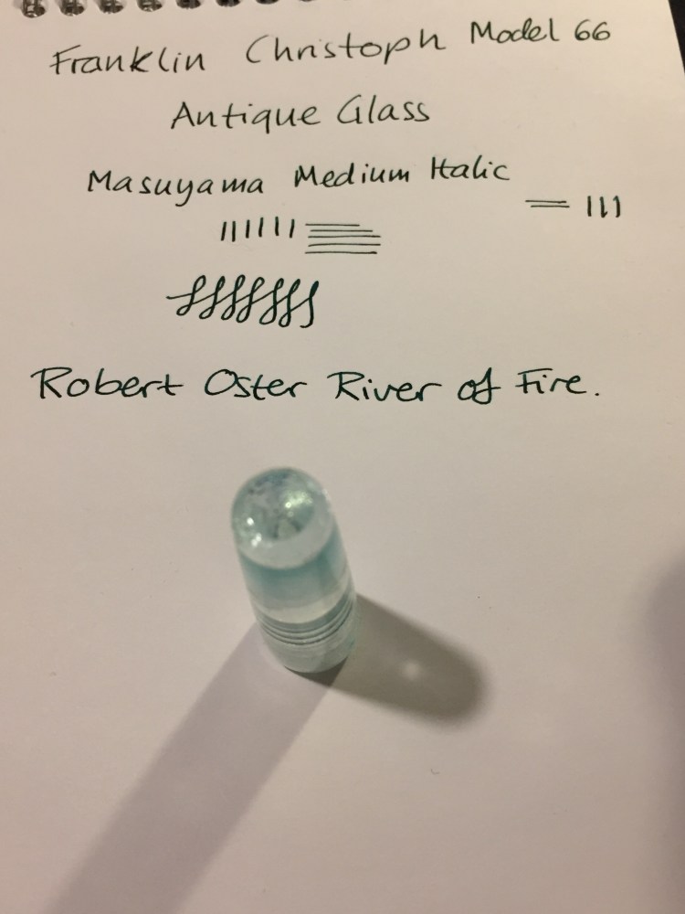
PenBBS 309 Hawaii Fountain Pen Review

I’ve been on a fountain pen purchasing hiatus for a while, as I’ve been trying to use what I have rather than buying more pens that will see little or no use. Also, money is a thing, and this hobby can get really expensive really quickly.

So when reviews of the PenBBS pens started coming out I largely ignored them, even though they were generally very positive. That changed when I saw the PenBBS Hawaii: here was a chance to get a pen with a Kanilea Pen Company kind of vibe, but at a price that I can afford. To be honest, despite the reviews, at this price point ($39) I thought that I’d get a cheap, plasticky feeling pen that wouldn’t really be a piston filler.

I was wrong.

This is what arrived in the mail:

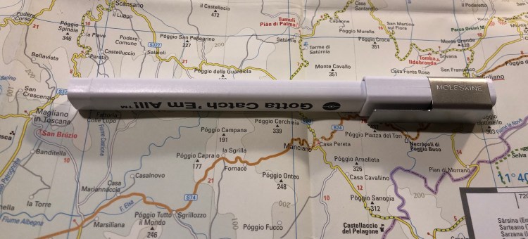
Then I took this out of the sleeve:

img_0654

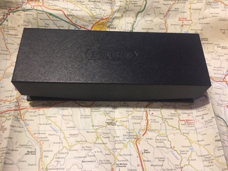
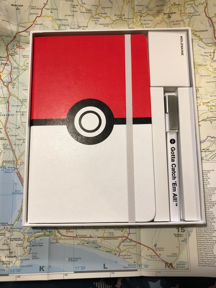
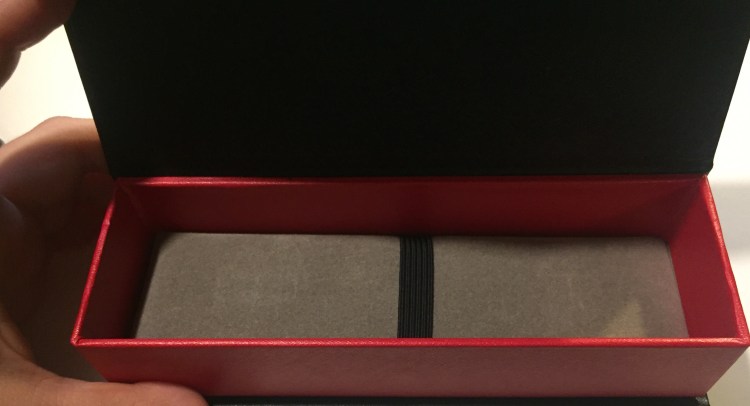
I don’t usually care much about packaging, but this is worth noting. Even if the packing would have just been a sturdy cardboard box inside a sleeve it would have been mind-blowing for this price. But it’s so much more than that.

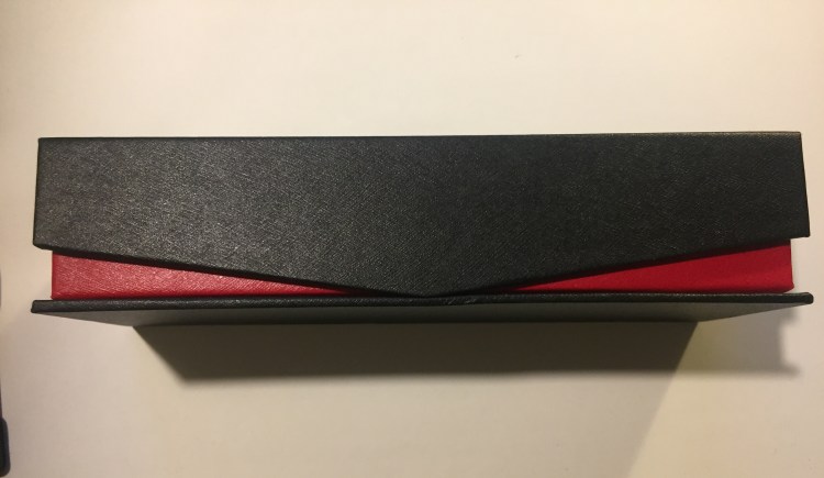
That black box is designed like the boxes high end Pelikans come in (including a cushioned interior). It’s designed. There’s texture to it, a logo and the edges are rounded up so you can see the red colour underneath. The box even comes with magnetic closure. It’s well-made enough and good-looking enough to be used as a display box.

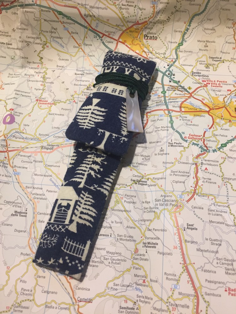
But that’s not enough for PenBBS. You paid $39 remember? You’re going to get so much more than your money’s worth. The pen comes in a beautifully made sleeve. Somebody bothered to make a sleeve (a lined and sewn sleeve, not a cheap felt glued one, mind you), and then took the time and effort to make it a display piece: something that you’d proudly carry around with you.

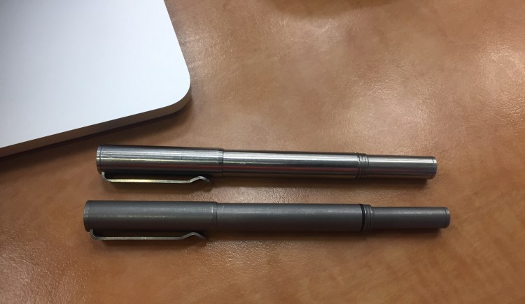
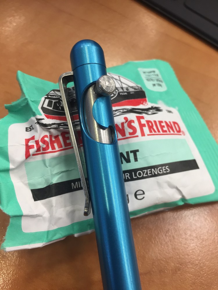
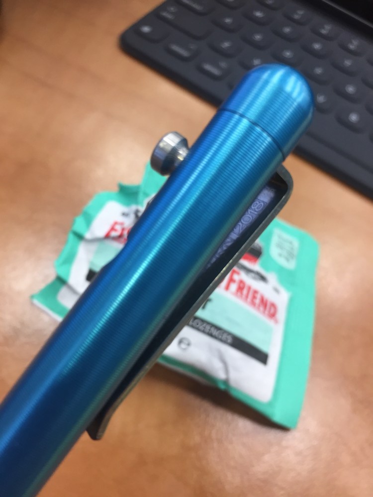
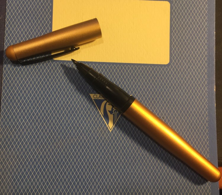
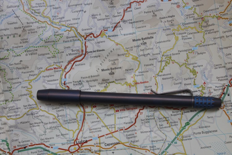
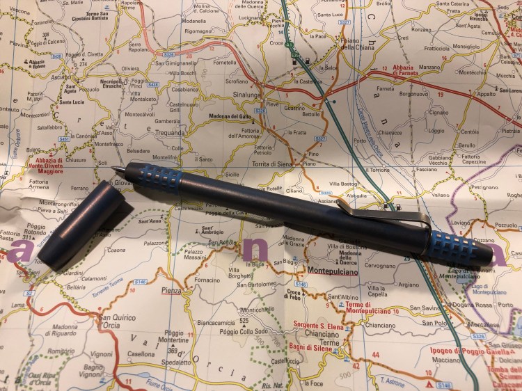
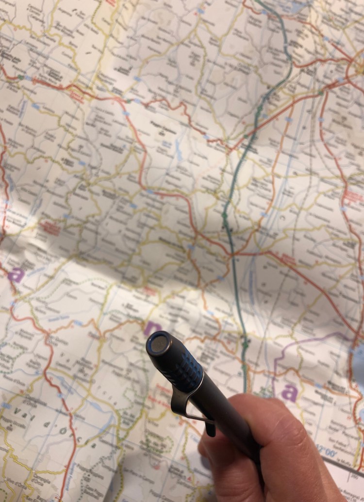
But the pen is the thing, right? As amazing as the packaging is, we’re here for the writing experience, not the unboxing one. So here it is, the PenBBS 309 Hawaii:

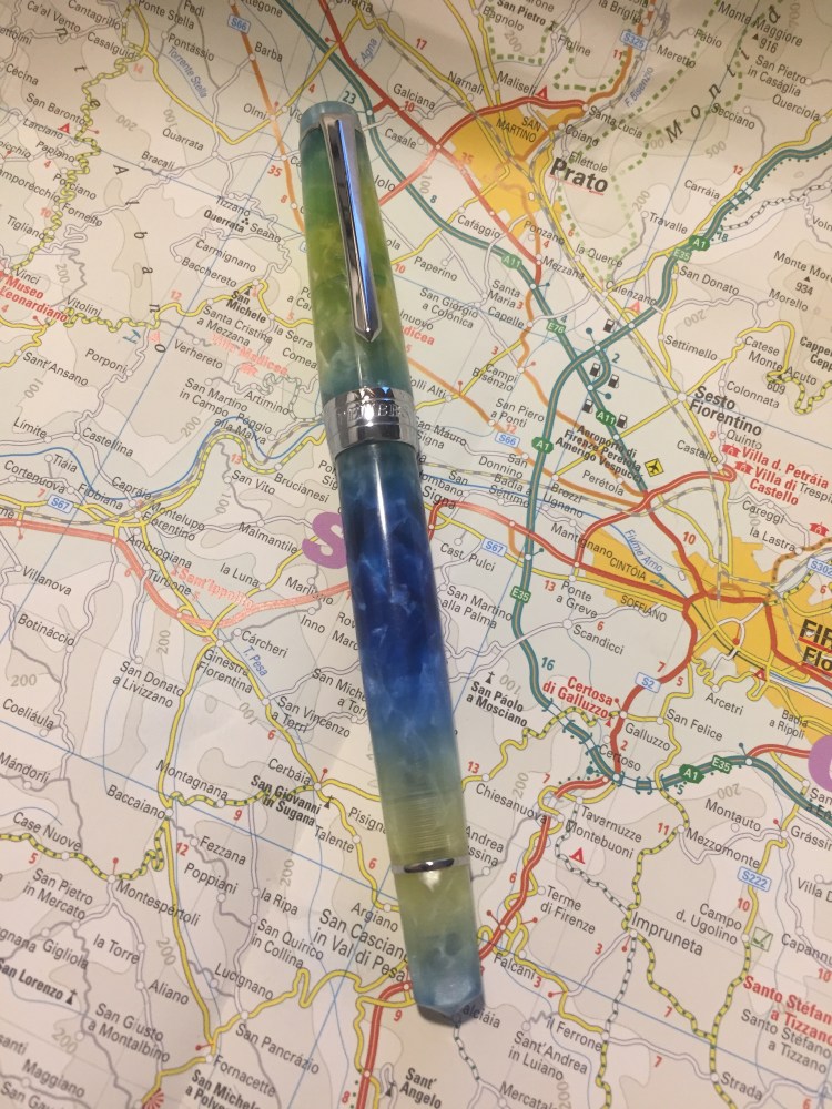
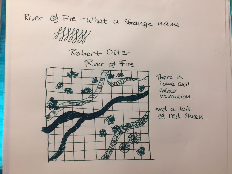
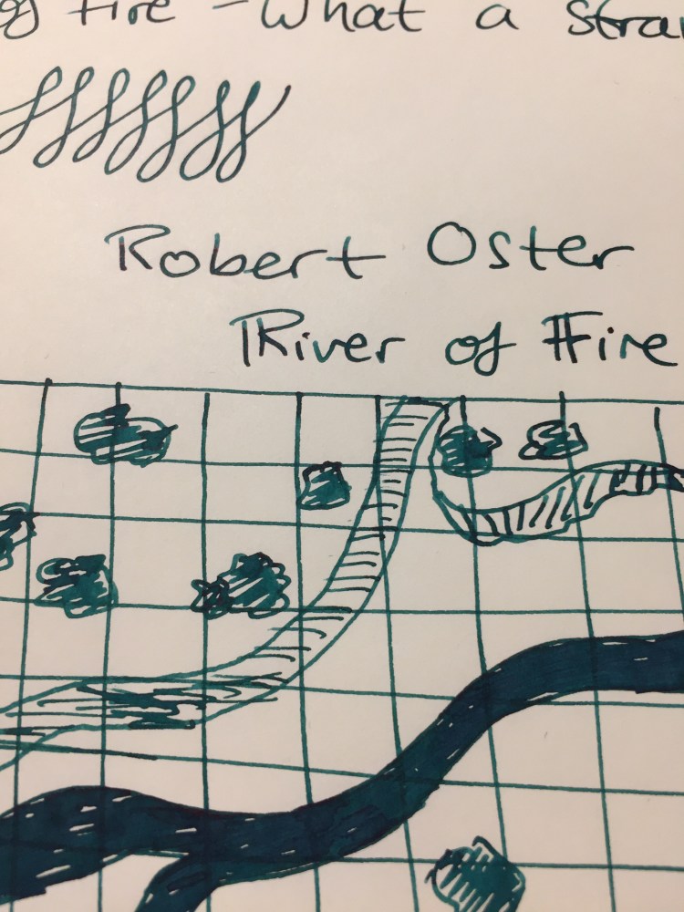
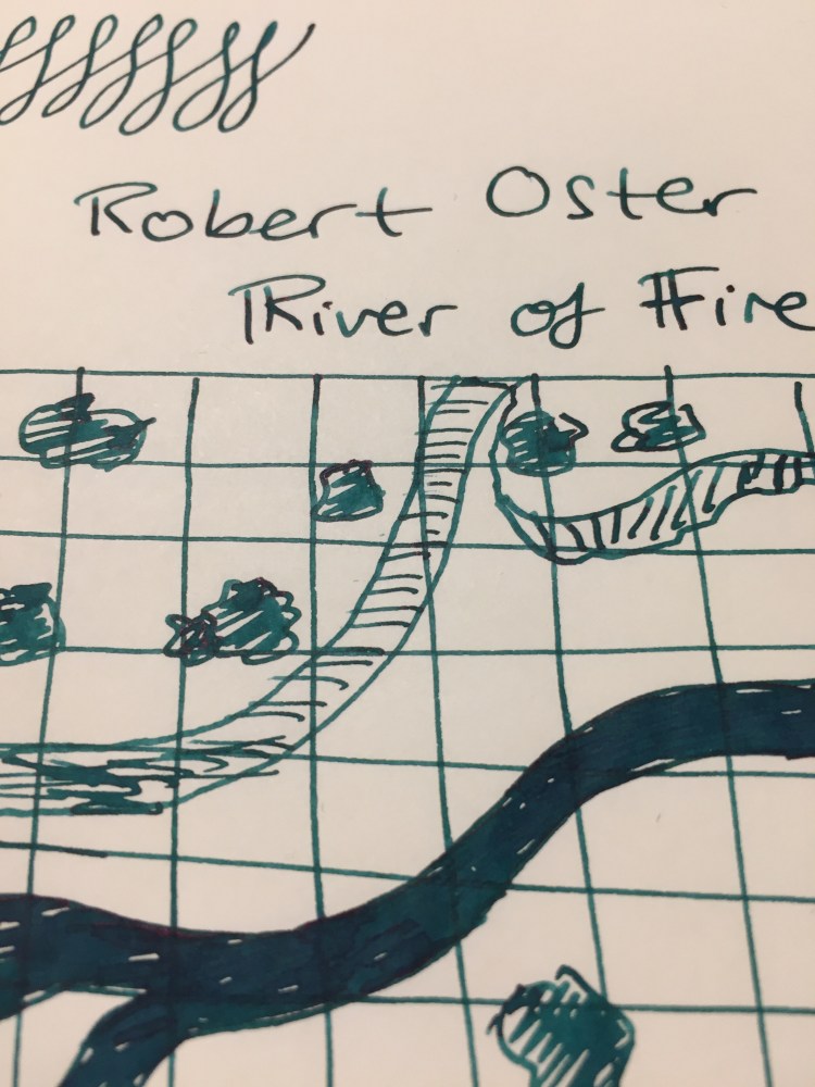
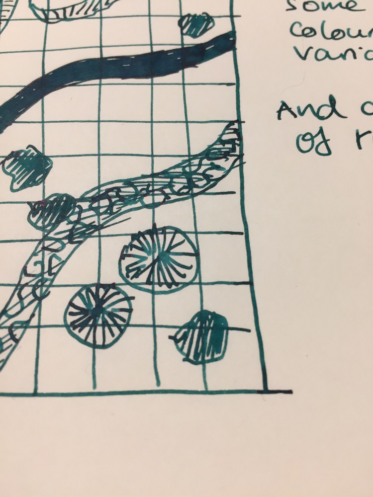
Isn’t it pretty? The pen is semi-translucent, with a lot of depth and chatoyance. It’s also pearlescent in places, as you can see in the tip or near the section. I filled it with Sailor Bungubox June Bride Something Blue ink and you can see some of the colour coming through the body (and a slight smear of ink in the cap, where I didn’t clean it properly after filling before capping it).

img_0657

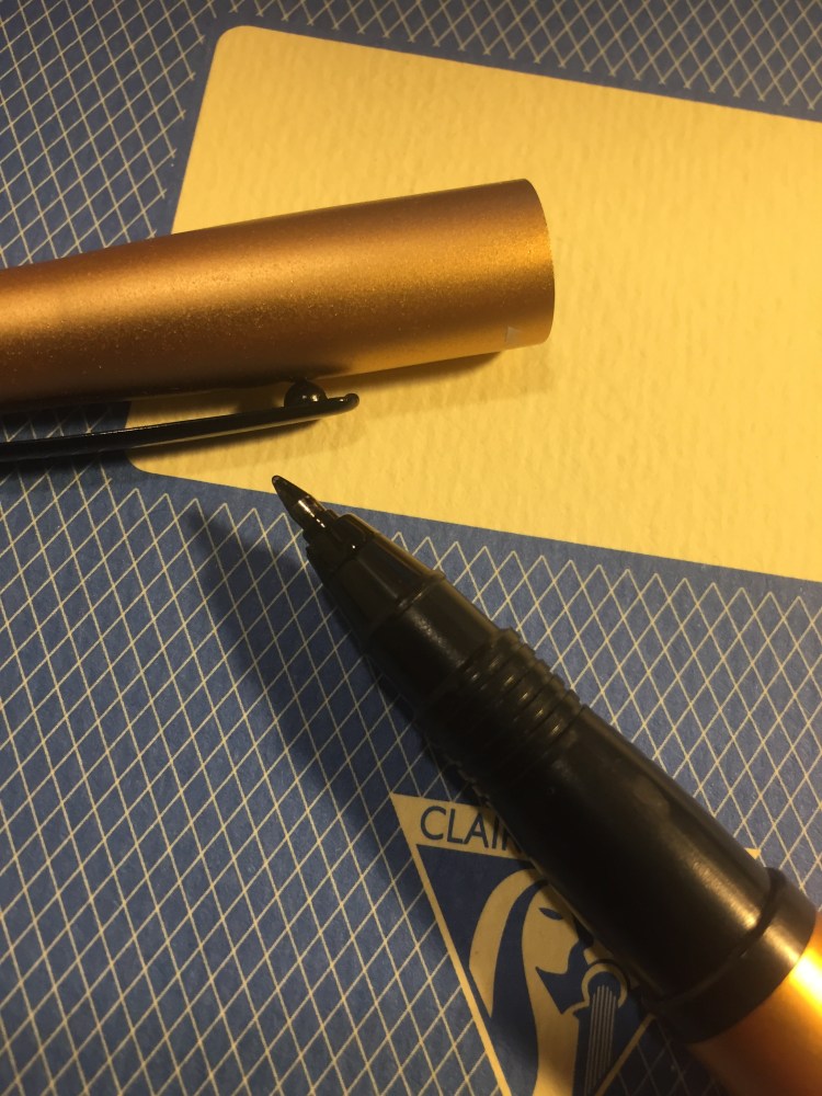
The only thing that I don’t quite like about the pen design is the super wide metal band on the cap. It has “PenBBS” and “309” engraved on it, but it cheapens the pen because of its width, not because of the branding.

img_0659

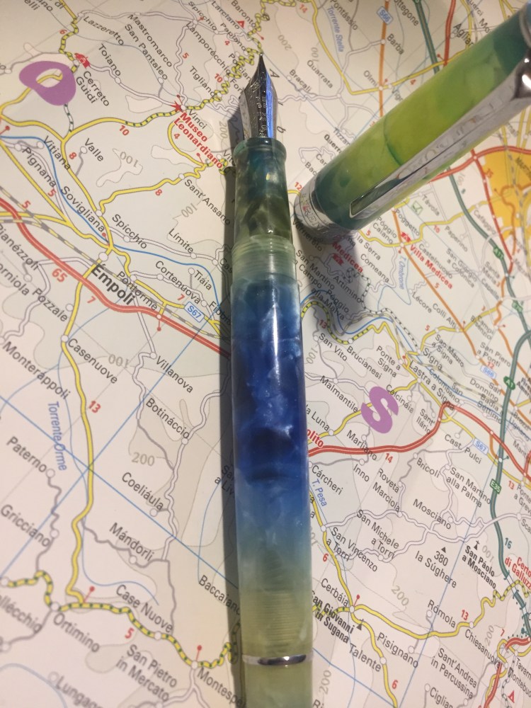
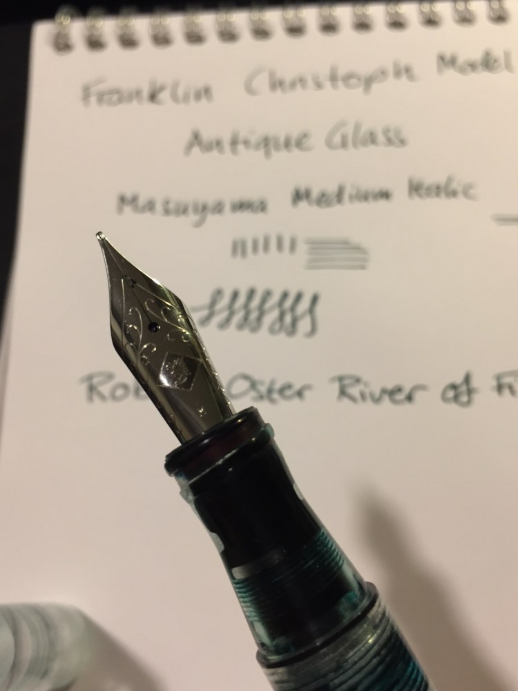
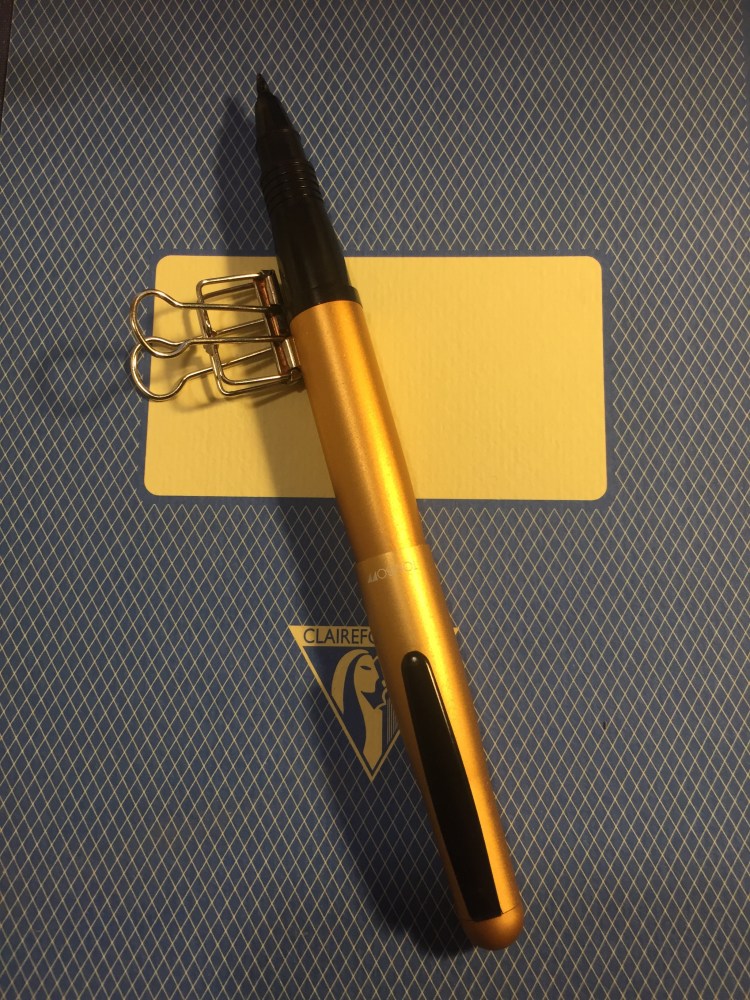
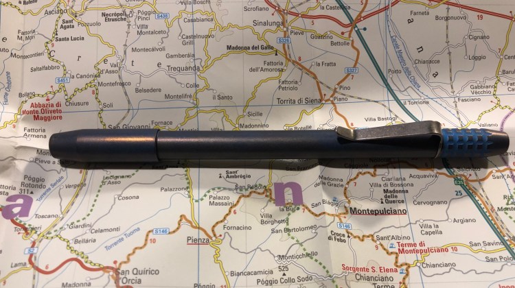
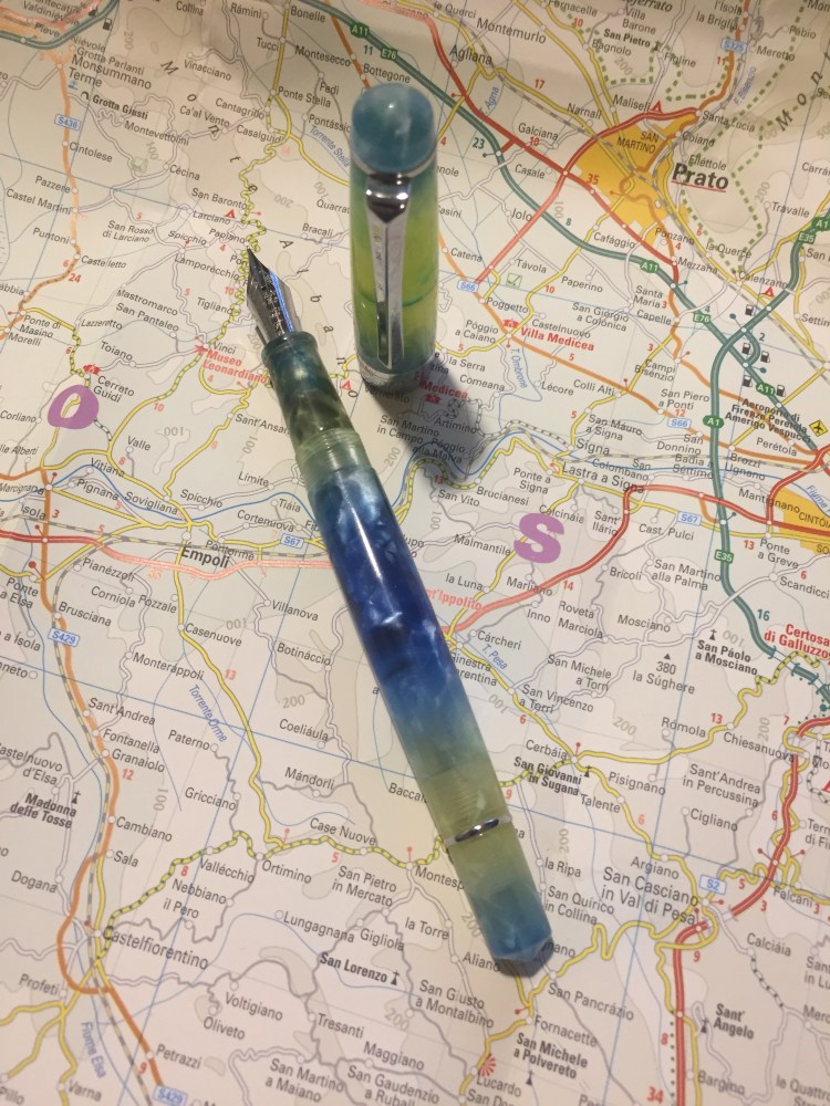
The nib looks great, with some thoughtful scrolling engraved on it, as well as the nib width (fine. It only comes in fine). The pen is quite standard in its width and weight, and very comfortable to use in long writing sessions. The section looks sleek, but is much less so than the Lamy Studio, and the lip on the edge prevent your fingers from accidentally hitting the nib and getting inky.

img_0664

The fine steel nib offers a tiny bit of line variation as you tilt in (not the flex kind of line variation that appears as you apply pressure on the nib). It’s smooth but does provide feedback, and depending on how you hold it, you may feel more or less of that slight feedback as you write. I enjoyed writing with it, and because it’s a light acrylic pen, its comfortable for really long writing sessions.

img_0641.jpg

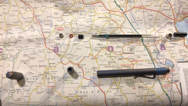
Because its a fine nibbed pen I thought that I’d try it on my current journalling Moleskine. To my surprise this pen and ink combo worked fine on that paper. There are a few dots of show through here and there, but nothing that bothers me. Again, YMMV, and this LotR Moria Moleskine isn’t advertised as having fountain pen friendly paper, but I’ve been enjoying journaling with my PenBBS on it.

img_0640

The PenBBS 309 is a piston filler, which for this price is unconscionable, especially considering that the piston mechanism works smoothly (and without squeaking) out of the box. The Pelikan piston fillers do feel better than the PenBBS one, but they come at a much higher price.

Whether you’re just starting with fountain pens or you have a sizeable collection already, the PenBBS 309 is well worth purchasing and trying out. I look forward to trying other PenBBS pens after this one, and I love that companies like PenBBS allow people to have a great fountain pen experience at such an affordable price.


Ti Arto EDC Review

While the original Ti Arto is my favourite machined pen, the newer Ti Arto EDC comes in at a close second. Like its older BIGiDESIGN brother, the Ti Arto EDC is a machined titanium pen which can accept hundreds of different refills with no need for hacks or spacers and with no tip wiggle. Unlike the Ti Arto it comes in three different finishes, accepts many more refills, and can be adjusted in length.

The Ti Arto EDC looks a lot like a slightly slimmer version of the Ti Arto, with a bigger step down in the end section, and almost no gap between the section and the body.

Those looks are a little deceiving, because this the Ti Arto EDC has a completely different build. The end of the pen can be extended or retracted, unlike the Ti Arto, where it is static. In the Ti Arto EDC the end of the pen is also what you unscrew to change refills, unlike the Ti Arto, where the grip unscrews. If you assume that they’re the same, as on a cursory glance it looks like the Ti Arto EDC’s grip section unscrews (and it really, really doesn’t).

The body of the Ti Arto EDC is slightly slimmer, and the entire pen is slightly lighter than the Ti Arto. It comes in a machined raw finish (like the Ti Arto), in a stonewashed finish (which you can see in the pictures) and in a midnight black finish (which you can see on my Ti Click EDC). Of the three, the stonewashed finish has the best grip and feel, and it also shows wear and tear the best.

The trick with the extendable end section is where the cleverness of this pen lies, and that’s what allows you to use more refill types in this pen, and to extend or compress this pen’s length (to the limits of the refill size). The two o-rings make the end section action super smooth, and the same dual thread design allows you to cap and post this pen super securely. Nothing on this pen is going anywhere without your permission.

The Ti logo, elegant and understated, is the only branding on this pen. You can see how substantial the clip is and how the pen wear in the photo above. It’s like an old pair of jeans, so the stonewashed name for this finish is totally appropriate.

Fully extended, the Ti Arto EDC is the same length of the Ti Arto. However, depending on the refill you use, this pen can get pretty tiny.

I use the Uni-ball UMR-85N refill in this pen, and this is as far as it will contract. If you use a Parker or Schmidt refill the end section can be screwed in almost all the way. However, even partially extended the Ti Arto EDC is a more pocketable pen than its predecessor.

So why do I prefer the Ti Arto more? For longer writing sessions the Ti Arto’s wider girth makes it more comfortable to use than the Ti Arto EDC, although the difference is minor. The Ti Arto is also slightly less ungainly than the Ti Arto EDC, having a more streamlined design, with no step down. I don’t mind the Ti Arto’s gap between the grip and the pen body, and I don’t need a pen that accepts more refills than the Ti Arto. As you may have noticed by now, the choice between the Arto and the Arto EDC is likely going be one of personal taste and preference. Either pen is an excellent choice for a machined pen, an EDC pen, or a titanium pen.

Uni Do! Posca Paint Marker White Extra Fine Review

I am on a quest in search for a white, waterproof pen that reliably lays down a thin, opaque line. You’d think that this wouldn’t be so hard to find, but this combination (opaque-and-thin-and-waterproof-and-reliable) has so far proven to be elusive. The closest so far has been the Uni-ball Signo Broad UMR-153 white gel ink pen, but it tends to dry out and blob, so it is far from perfect.

The Uni Do! Posca paint marker in white, extra fine (0.7) is a welcome addition to the white pen field. It’s waterproof, water-based (so not smelly like other paint markers), lightfast, and can be used on a multitude of surfaces. I’m going to focus its use on paper, but if you’re looking for a way to label a dark coloured object, this may be the pen for you.

The Do! Posca’s design is pretty well designed. The pen is narrow enough in diameter for you to comfortably use it like a regular pen, and the square cap keeps the pen from rolling off the table, and looks great. The pen body is much too busy for my liking, but that’s a minor quibble.

There’s a tiny metal ball inside the pen, and you need to shake it well before use to get the paint ink flowing. When you use the Do! Posca for the first time you need to prime it by shaking the pen thoroughly and then pressing the plastic tip in several times until the white paint flows. I had no problem getting the pen to start up after a good shake, but I’d recommend keeping it horizontally and cap it immediately after use.

The Uni Do! Posca doesn’t blob, and it’s excellent for small details. I wouldn’t use it to fill in large expanses of white, as it offers pretty poor coverage and doesn’t layer well. If you’re looking to use it for highlights, correction or detail work, this is the pen for you.

I drew this journal comic on a Clairefontaine Paint On Naturel A5 pad.

The Uni Do! Posca extra fine paint marker in white was available for a time at Jetpens, but now you can find it easily enough on eBay. If you’re looking for an opaque, extra fine, waterproof white pen, I highly recommend it.

Ti Arto Review

It’s strange that I haven’t yet reviewed the pen that I use most, but that’s life, I guess. The Ti Arto is a titanium machined pen that accepts 200+ refills, and it has been my EDC and journaling pen since November 2016. There’s no pen I use more, and no pen I like more than this one.

Since the Ti Arto bashes around freely in my bag, it’s got quite a few scratches on it. I personally like that it shows some wear and tear, but as not everyone feels the same, I thought I’d take a few photos that show how the Ti Arto looks like when it’s not brand new.

The Ti Arto is made out of solid titanium, and doesn’t get dented even if you drop it. It does, however, show micro-abrasions and scratches.

None of these scratches is deep enough to be felt – they’re at surface level only. So it really is just an aesthetic thing. If you like your pen to look brand spanking new, the Ti Arto comes with a protective felt sleeve. I personally wouldn’t bother: this isn’t a fountain pen, but a tough, machined, EDC pen. It’s built to tumble around in your bag.

Now to the review proper: the Ti Arto was originally launched on Kickstarter, and became available on the BigiDesign site sometime in 2016. The pen is machined out of solid aluminium, and made to easily accept 200+ refills with no tip wiggle or need for spacers.

The Ti Arto is well balanced, both capped and uncapped, and very comfortable to use, even for someone with small hands that likes to write a lot. Unlike some other machined pens, the Ti Arto’s cap will stay on, even after years of use and after the threads start to wear out a bit. See that semi opaque silicone ring just below the threads? That’s the magic that makes sure the cap closes nice and tight. No refill is going to dry out or leak in this pen.

If you want to post the Ti Arto you can, by threading the cap to the back of the pen. The resulting pen is a bit longer, but still well balanced, and the cap doesn’t rattle when you write. It does take time to screw the cap on, so if you uncap and post often it will become a chore. Since the Ti Arto isn’t a fountain pen, though, there should be no problem leaving the pen uncapped for a while.

I use the Uniball Signo UMR-85N refill in this pen (the same refill that goes into the Signo RT). To change the refill you unscrew the section, pop the refill in, screw the section almost all the way back on, then tip the pen body forward until the refill tip protrudes, and then you tighten the section. Since you probably aren’t going to actually use 200+ different refills in this pen, I recommend finding a refill that you enjoy and buying replacement refills in boxes of 10 or 12 on Amazon or eBay. I go through a box and a half to two boxes of UMR-85N refills a year in this pen, and it takes less than a minute to switch out the refill.

Here’s are a few points about the Ti Arto, drawn and written with the Ti Arto:

If you are looking to own just one good pen, or if you’re looking for an EDC or machined pen, the Ti Arto is the pen you should buy. I’ve tried a good number of machined pens so far, including all the other (non-stylus) offerings from BigiDesign and nothing comes close to this pen.

Franklin Christoph Antique Glass Model 66 and Robert Oster River of Fire Review

Every once in a while Franklin Christoph comes out with a batch of their pens in “Antique Glass”, a clear acrylic with a bit of a green tint to it that makes it look like an old coke bottle. The material is both minimalist and beautiful. It allows you to show off the ink that you’re using while still having a pen that has more character than a run-of-the-mill demonstrator. Franklin Christoph’s pens and the nibs that they use are excellent and very well priced. The result is that these limited runs having a waiting list (from which a 100 names are drawn), and there’s a good chance that you won’t be able to even get on that. I had to wait for two years until I was able to purchase mine.

The wait is worth it though.

img_0226

The Franklin Christoph Model 66 is a long and sleek pen that can’t be posted. The pen is light but still substantial, because of the extra acrylic in the finial. I was worried at first that it would be top heavy, but the Model 66 is perfectly balanced, and one of my favourite pens for long writing sessions.

img_0221

The Model 66 is a demonstrator pen that is built to be eye-droppered. Yes, you can use the supplied converter or cartridges, but what’s the point of having a pen that looks like this if not to eye dropper it? Franklin Christoph even supply the requisite o-rings and silicone grease, making it super easy to transform it into an eye dropper.

img_0224

The pen body is made of smooth acrylic on the outside, but is pebble textured on the inside. The result shows off the ink colour and the pen colour even more, but it also means that staining inks have even more surface area to stain. I decided early on to use only turquoise, teal, blue and green inks in this pen, as even if they stained the pen it would work well with its “natural hue”.

img_0225

You can see the greenish “antique glass” tint best in the cap.

In terms of design, this is a desk pen and is designed as one, so it has one flat side which keeps it from rolling off the table even though it’s a clipless pen.

There’s a wide variety of Jowo nibs that you can order with your pen, and I decided to pay a little extra for a Mike Masuyama medium italic nib. The nib is buttery smooth, and the feed keeps up with flow. This italic isn’t super sharp, which is a plus for me, and together with the large ink capacity that an eye-dropper pen offers, it’s writing heaven.

img_0223

The Franklin Christoph Model 66 Antique Glass with a Mike Masuyama medium italic (what a mouthful) is build to show off interesting inks. Although I would never use shimmering inks in it, it’s great for inks that shade or sheen. And Robert Oster is the king of sheening inks.

The River of Fire is a dark teal ink that has significant red sheen and a good amount of shading.

I felt like drawing a D&D map here, I don’t know why.

As usual with inks of this kind, the paper and nib affect how much sheen or shading you see. This nib is perfect for that, and the paper I used here is Tomoe River Paper, which brings out the best in every ink.

You can see a bit of the properties of the ink here, particularly the shading, but this ink really does have a lot of sheen. It’s just difficult to photograph, so you can only see a bit of the golden red that happens where the ink pools.

This is such a pretty ink. Look how much variation and interest it offers:

So, if you can get on one of the Franklin Christoph antique glass waiting lists, I highly recommend it. As for the Robert Oster River of Fire, I think that it’s a gorgeous ink, but it’s not unique enough in Robert Oster’s large ink offering. If you have something in the turquoise or teal shade in their lineup, then there’s probably no need to buy the River of Fire. If yo don’t then I recommend this ink since it’s wild and yet dark enough to “pass” in an office setting.


Tactile Turn Aluminium Glider Review

I use a lot of machined pens at work, mostly because they make taking dull meeting notes a bit more fun. Fountain pens just aren’t pragmatic for meeting notes because I have to cap and uncap them every minute or so (and the Pilot Vanishing Point has the most attention grabbing click that you can imagine). Pencils are for real thinking — problem solving, brainstorming, designing — or doodling during long phone calls. So I have a fair amount of non-tactical machined pens, and they see a fair amount of daily use. So of course I’ve reviewed hardly any of them…

The Tactile Turn aluminium Glider is a pen that I bought during the popular Tactile Turn Slider and Glider kickstarter a while back. I’m not a fan of Tactile Turn’s naming convention, as I find it confusing, but I am a fan of everything else about this pen.

I purchased the blue aluminium Glider, which uses Pilot G2 refills and came with a 0.38 Pilot G2 refill, and splurged on a Damascus steel bolt.  The pen is well designed, well balanced, and features a ridged texture that makes it extra grippy. It’s a joy to write with, and although it has some heft it’s still comfortable to use over long periods of time.

The Damascus steel bolt isn’t just pretty, it’s added texture make the bolt mechanism an even better fidget toy than it already is. Click away thoughtfully at meetings to keep yourself awake, or just count the number of rings on the pen to pass the time.

Tactile Turn 2018

The only logo on the pen is very cleverly hidden beneath the formidable clip. The clip, the pen and the anodization have endured well so far after months of daily use. It is worth noting though that this pen doesn’t bash around in my bag like my Big Idea Design pens do.

The Pilot G2 0.38 spattered to its death prematurely (sadly quite common with this refill), so I grabbed a Muji click gel pen with a 0.5 blue black refill (which is a white label Zebra or Uni-Ball refill), cut it to size and I couldn’t be happier with the combo.

There are so many machined pens in recent years, and quite a few of them have bolt mechanisms. The Tactile Turn Glider is so far the best that I’ve tried:

  • The bolt mechanism is smooth and engages easily and only when you want it to.
  • The Glider’s shape and weight make it a good looking pen that’s also usable.
  • The ridges are both functional (providing traction that prevents your fingers from slipping) and add an interesting design element.
  • The clip is industrial grade strong and durable, and the anodization seems to be very durable as well.
  • The Glider is very well priced, making it the perfect introduction to machined pens.

If you are looking to buy just one machined click pen, the Tactile Turn Glider should be it.

Tombow Object Rollerball Review

In the early 2000s the Tombow Object fountain pen was one of the recommended beginner fountain pens on the market. That was in the pre-Pilot Metropolitan and pre-TWSBI days, when the beginner fountain pen choices were pretty sparse. I have the Tombow Object fountain pen and I’ll review it at a later time, but a few years ago I saw its rollerball counterpart on clearance sale, and so I risked the purchase.

I’m not a rollerball person, since they tend to behave like the worst of fountain pens (ink spreading, feathering, bleeding through and leaking out of the pen) without the good parts (line variation and versatility in ink colour). But the Tombow Object rollerball intrigued me because it shares the same body as the Tombow Object fountain pen but is significantly cheaper, and so I was hoping that even if it turned out to be an annoying pen to use, I could just use it as a way to get some colour variety with my Object fountain pen.

And why would you want that, you ask? Well, just look at that anodization:

The hairline on the body is just a smudged drop of ink. 

The Tombow Object is a metal bodied pen (brushed aluminum body and cap that gives it a great texture) with a plastic section and a steel clip. That gives it some heft, but still keeps it light enough to be comfortable to use both capped and uncapped. There’s a satisfying snap when you cap the pen, and it stays on very securely. The tip doesn’t rattle or wiggle around, and the clip does an admirable job of being a good pocket clip and preventing the pen from rolling about. The pen has a beautifully designed taper on both ends that gives it a bit of character, and an unobtrusive “Tombow” and “Japan” printed in white on the cap. Although this colour is called gold, it’s a coppery-gold, close to a champaign colour you can sometimes see on cars.

The appeal of the Tombow Object has always been the fantastic anodization colours that were offered, each one really vibrant (except for the silver, which was boring). As you can see from the photo above, like all aluminum pens, it can be dented and nicked. This is probably a pen that you want to keep on your desk and not bashing around in your bag or pocket.

Another reason to keep this pen on your desk is that it tends to leak. There’s a slip mechanism in the cap that both prevents the ink from drying out and from leaking beyond the tip of the pen, but as you can see in the photo below, you need to be careful when you start using the pen where you grip it, or just accept ink stains on your fingers (or keep a paper towel at hand).

The pen uses a proprietary Tombow Object refill, which is always a shame. I wish that I could just pop in any fountain pen ink cartridge in there instead.

The slip cap also allows you to easily post this pen, although I don’t recommend it. For one thing, it isn’t necessary as the pen is long enough as it is, and for another, because the pen leaks into the cap you’ll just spread ink on the pen body.

It’s ink test time! Here’s a sampling of how the Tombow Object rollerball behaves on different kinds of paper:

Clairefontaine Back to Basics A5 notebook (90 gsm, fountain pen friendly paper)
Reverse side of Clairefontaine Back to Basics A4 notebook. 
Leuchtturm 1917 Reporter notebook.
Reverse side Leuchtturm 1917 Reporter notebook.
Baron Fig Confidant notebook
Reverse side Baron Fig Confidant notebook
Field Notes 50#T paper (Firespotter).
Reverse side Field Notes 50#T paper (Firespotter).
Moleskine 70 gsm paper (Antwerp Blue Denim). 
Reverse side Moleskine 70 gsm paper (Antwerp Blue Denim). Note: there was less bleed through the more this pen was used (you can see in the Object and in my review of this notebook) but there was still significant show through. 

None of this is great, but to be frank, this is generally in keeping with rollerball behaviour, and one of the reasons that I really don’t like the Retro51 Schmidt rollerball refills. The Object behaved best on the Clairefontaine paper, and even displayed some fetching line variation. It’s still a “one side of the page only” type of pen though.

As for the cap-and-body switching hack, it only partially works. You can take the body of a Tombow Object rollerball and switch it with one from a Tombow Object fountain pen, but the plastic insert in the cap that prevents the ink from drying up or leaking is incompatible between models. The pen just won’t snap shut with the “wrong” type of cap.  It does still allow for some crazy cap/body combos, but that a whole different ballgame.

So would I recommend this pen? It is beautifully designed, looks great, is comfortable to use and you can find it on the secondary market for the price of a Retro51 or slightly cheaper. The enormous downside to this pen is that it uses a proprietary refill (I have not yet tried to hack it to see if it can accept other refills). So if  you like this pen I would recommend stocking up on those refills, because Tombow might not offer them for sale forever. The Tombow Object and the Tombow Egg which use them have both been discontinued for a few years now, which is a great pity.

Mark One and Ohto Flash Dry Review

After waiting for over two months, my Mark One (purchased post Kickstarter) finally arrived. The pen, by Studio Neat, is made of aluminium and features a ceramic finish and a custom click mechanism. It also comes with a Schmidt P8126 rollerball refill (the same kind that Retro51 uses in their pens), which is absolutely horrible, so I switched it with an OhtoFlash Dry 0.5 gel ink refill instead.


The pen comes in a cork box that is very pretty, but not really functional. If you have tons of spare room on your desk you can reuse it as a pen tray for the Mark One, but as I don’t the box will just go to recycling. I would have preferred a simpler box, of the kind that TWSBI or Lamy uses, but this is a great box if you plan to give someone the Mark One as a gift.

The Mark One box is held closed by a piece of cardboard that doubles as an instruction sheet for the pen. That’s a nice idea, and the sheet is well designed and clear.

The box without the sheet doesn’t have a sealing mechanism (it’s just two pieces of cork), so it’s not really built to be a pen case, just a pen tray.

I chose the white and copper Mark One, which is very popular based on the waiting times on the Studio Neat website.

The pen is very comfortable to hold and use for long periods of time. It looks heavy but is super light, and the ceramic finish makes it very grippy. The wide barrel helps ensure that you don’t slip into “death grip” mode even if you have a tendency to.

The click mechanism is excellent and very solid and satisfying to use. It’s also very far from silent. The pen tip doesn’t rattle, and the pen looks as gorgeous as the pictures make it appear.

The Ohto Flash Dry 0.5 gel ink refill (PG-105NP)  is a needle point, parker refill that dries in a flash. It’s very dark and produces a line that is slightly wider than the Uniball 0.5 gel ink refills, but it somehow doesn’t smudge. Even on Moleskine, Rhodia and Tomoe River paper the OHTO Flash Dry dries almost instantaneously. It’s a left hand writer’s dream, and an excellent gel ink refill in and of itself. I have no idea why this refill hasn’t gotten more reviews, since there are so few parker style gel ink refills to begin with, not to mention good ones or ones that dry in a second or less. Maybe it’s because I don’t think it’s the kind of refill that’s widely available. It is, however, totally worth the price and effort.

Here’s a sample from my journal (which is a Moleskine). New Moleskines don’t have the spidering problem that they used to have, and there is no spreading or smudging with this pen/ink combo. The show through is a more significant than with a Uniball UMR-85 refill (the Signo 207), but the line is also wider and a good deal darker.

Here’s a writing sample on a Field Notes, where the first line (“Mark One”) was written with the original refill, and the rest with the Ohto Flash Dry.

Here’s the refill, which is available at JetPens and CultPens (I am not an affiliate of either):

I highly recommend the Mark One, as it’s a beautiful pen that’s just a joy to use. I would recommend switching the Schmidt refill out for the Ohto Flash Dry 0.5, or just using the Flash Dry in any parker compatible pen that you’ve got. It’s one of the best refills out there, especially if you’re left handed or tend to smudge your writing.

Ti2 Techliner Review

Ever since I first saw a review of the Ti2 Techliner on The Pen Addict I have wanted this pen. At the time it was on Kickstarter, and I wasn’t comfortable with paying that much for a pen that I wasn’t sure that I would get.

Later on it was for sale on the Ti2design website, but that site looked dodgy enough for me to hesitate giving them my money. This is an expensive pen, especially considering that it’s not a fountain pen, and I was unsure if I wanted to spend the money on it. It didn’t help that Ti2design noted that it was no longer using the Uniball Signo 207 refills (which are my absolute favourites), but have switched to Uniball Jetstream refills (which I’m not a fan of). As the FAQ at the Ti2design site said, the two were not interchangeable, due to different nose cone designs on the refill, each requiring a different combination of magnets, spacers and o-rings.

That turned out to be wrong, but more about that later.

When JetPens got the Ti2 Techliners, I decided to take the risk and buy the fallout titanium edition, hoping that I could hack a Uniball Signo 207 refill into it. It arrived super fast in the ugliest, cheapest looking packaging I have ever seen. It was just a plastic tube with a bit of paper stuck on it, not even in a clean and professional way. I don’t care about packaging, but if I would have bought this as a gift for someone I would be hugely embarrassed if it arrived like that. It’s a $92 pen — they couldn’t even splurge for a nicely designed cardboard tube? The TWSBI GO costs a third and comes with much, much nicer packaging.

IMG_3525

The pen itself is gorgeous in my opinion. It’s obviously got a design that not everyone will like, but you can see that every detail has been considered and designed. The fallout finish is stunning, with a blue hue over the tumbled titanium finish giving it a purplish glow, especially at the raised edges of the pen (the top of the cap, the grip knurls, etc.).

IMG_3527

The cap closes magnetically, which is very satisfying, and it posts magnetically too. Those magnets close with a satisfying click (what a great fidget toy), and they are STRONG. That means that the pen will attract various metal knickknacks lying around, and you need to be careful where you place it.

I photographed it both in natural light and warm light, just to try and bring out the colour a bit more, but neither photo does it justice.

The knurling on the grip is pretty comfortable to use, but if you have a death grip and you use it for long periods of time, it will start digging into your fingers. This is also a long pen, both capped and uncapped, at 14.1 cm uncapped, 14.7 capped and 15.5 posted. It is well balanced though, so even with my tiny hands it didn’t feel unwieldy.

The knurling is tumbled so that it won’t cut into your hands, and it looks great with the fallout finish. It’s one of the most comfortable machined pen grips that I’ve used so far, and the only reason that it may encourage a bit of “death grip” is that the pen is long and it may feel like you need to. You don’t.

You can see the purply-copper finish a bit here, on the capped end, and see the clip too. JetPens only sells the Ti2 Techliner with the clip, but if you go to Ti2design’s site they’ll sell you one without one. The clip looks nice and does a decent job.

The uncapped end of the pen also has knurling on it, and looks cool.

I like the truncated nose cone design, and it shows off the magnet that holds the refill in place and allows the cap to snap on. There may be those that don’t like it, but I really think that it works on this pen, especially since it’s repeated on the end of the pen.

The end of the pen is also truncated, and you can see the magnet that allows posting here too.

This brings us to the insides of the pen and some things worth knowing before you buy this pen. The pen comes with two magnets, two spacers and an o-ring, and a Uniball Jetstream SXR 0.7 ballpoint refill. That’s a great refill if you like ballpoint pens, but otherwise and unlike what the Ti2design FAQ says, you can totally use other refills in this pen. Jetpens has a list of compatible refills here, and the Uniball UMR gel refills (the Signo 207 refills) totally fit. You could have 0.38 mm gel refill in this pen!

Before unscrewing the pen and changing the refill, do take a moment to:

  1. Go to the Ti2 Techliner FAQ page, just to understand which parts go where. The magnets are directional, so if you put them back the wrong way in your pen won’t cap or post. Just take it apart again and flip the magnets. You can’t get the front and back end magnets or spacers confused, as the front ones have a hole in them for the refill, and the back ones are solid.
  2. PUT THE CAP FAR, FAR AWAY BEFORE STARTING!!!! The cap has a magnet inside it, and if you’re not careful you front magnet (which is tiny and light) will get sucked into it, and you’ll need a pair of tweezers and some effort to get it out. Save yourself the hassle and put the cap away first before you disassemble the pen.

I love the Ti2 Techliner and I’m happy with my purchase. Do I recommend it? If you like the aesthetic and aren’t shocked by the price, then yes. I wouldn’t give it as a gift (not until the packaging is sorted out), and I’d recommend the Ti Arto over it because it’s much more versatile, but in my opinion this is still a very well designed, beautiful pen.

Just beware of the magnets…

Moleskine Limited Edition Pokémon Box Review

I was going to  write a review of the Moleskine Pikachu Pokémon limited edition notebook first, but I forgot that I gifted someone the copy that I had. After a bit of internal debate, I decided to write about the highlight of the Moleskine Pokémon limited edition set, the Pokéball Box, first, and order another copy of the Pikachu notebook for later review. As these make such great gifts, I suspect that this copy too won’t make it into my rotation but instead be snagged by a friend.

Last spring I was visiting London with my family, staying right next to a Moleskine store (my poor, poor wallet) and trying to take my luggage allowance into account (notebooks are heavy, and Moleskines are easily purchasable online after all), when I first saw these. At the time, I wasn’t into Pokémon, I hadn’t played the Nintendo games, and the Pokémon GO craze passed over me without leaving its mark. I thought I was safe. Then I saw this box at the store.

Such a simple design, but so effective

I left London without purchasing the box, but I kept thinking about it. As my family left on a flight two days after me and it turned out that they had weight to spare, they asked me if there’s anything I wanted from the Moleskine store. I considered for a while, and then asked for the Pokémon box. They ended up buying all three notebooks for me.

It’s been almost a year since then, and I’ve been swept into Pokémon GO as a way to handle my anxiety while dealing with my mom’s illness, and so when I photographed this box today, it was no longer an abstract thing that I had very little emotional ties to. The design, however, has not changed.

Unlike many other Moleskine limited edition boxes, this one comes with a Moleskine pen. The tradition started a few years ago with the Writing Box, and this year it’s part of the Basquiat box.

This isn’t a review of the Moleskine rollerball, but of the Pokémon box, so I’ll just point out two things: Strangely enough the logo on the clip is set so the Moleskine logo isn’t aligned with the Gotta Catch ‘Em All! logo. When one of them is right side up, the other isn’t. Also, the Gotta Catch ‘Em All is printed only on one side of the pen, which is disappointing. If you clip it to a notebook there’s a 50/50 chance that you won’t see the logo, unless you make sure the cap is positioned so the clip isn’t on the side of the logo.

The other thing that’s disappointing here is the choice of the body colour of the pen. Red would have been so much more functional, as the white is going to look grimy and tarnished just about the moment you start using it.

The pen uncapped. Now imagine in it bright red. So much better, right?

Inside the notebook you are greeted with a whole lot of Pokéballs, both on the front and back endpapers.

Front endpaper
Back end paper

The design even continues into the inner lining of the back pocket:

This edition comes with four Pokéball bookmarks, like the other Moleskine Pokémon limited editions.

All in all it’s a nice box, but in terms of design, it’s all in the cover. The endpapers are bland in my opinion, and they could have done a much better job on the pen. The initial price on these was pretty high, but as it’s now dropped somewhat, I still think that they make a great gift for the Pokémon lover in your life, though you might want to consider the other Moleskine Pokémon notebooks.