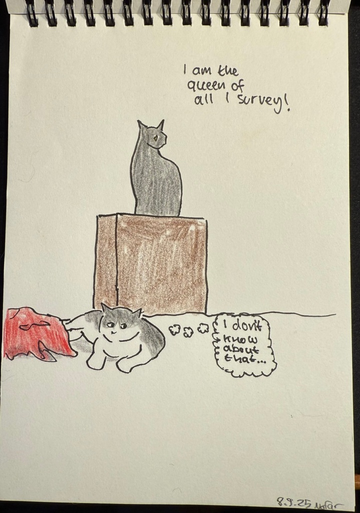
Quick cat sketch
My parents’ cats in action.
A blog about writing, sketching, running and other things
My parents’ cats in action.
Used a Bic Crystal ballpoint pen, a set of Stabilo Pastel highlighters and a pocket Moleskine sketchbook to create this journal comic. Was inspired to use things that I already had laying around, not in use, to fill in a page in a long abandoned sketchbook. I was actually surprised at how relatively well the highlighters worked here.

Diamine Inkvent Calendar is an advent calendar with a tiny (7ml) bottle of ink behind 24 windows, and a larger, 30ml, bottle of ink behind the 25th window. All the inks are limited edition, and only available through this calendar. You can read more about the calendar here.
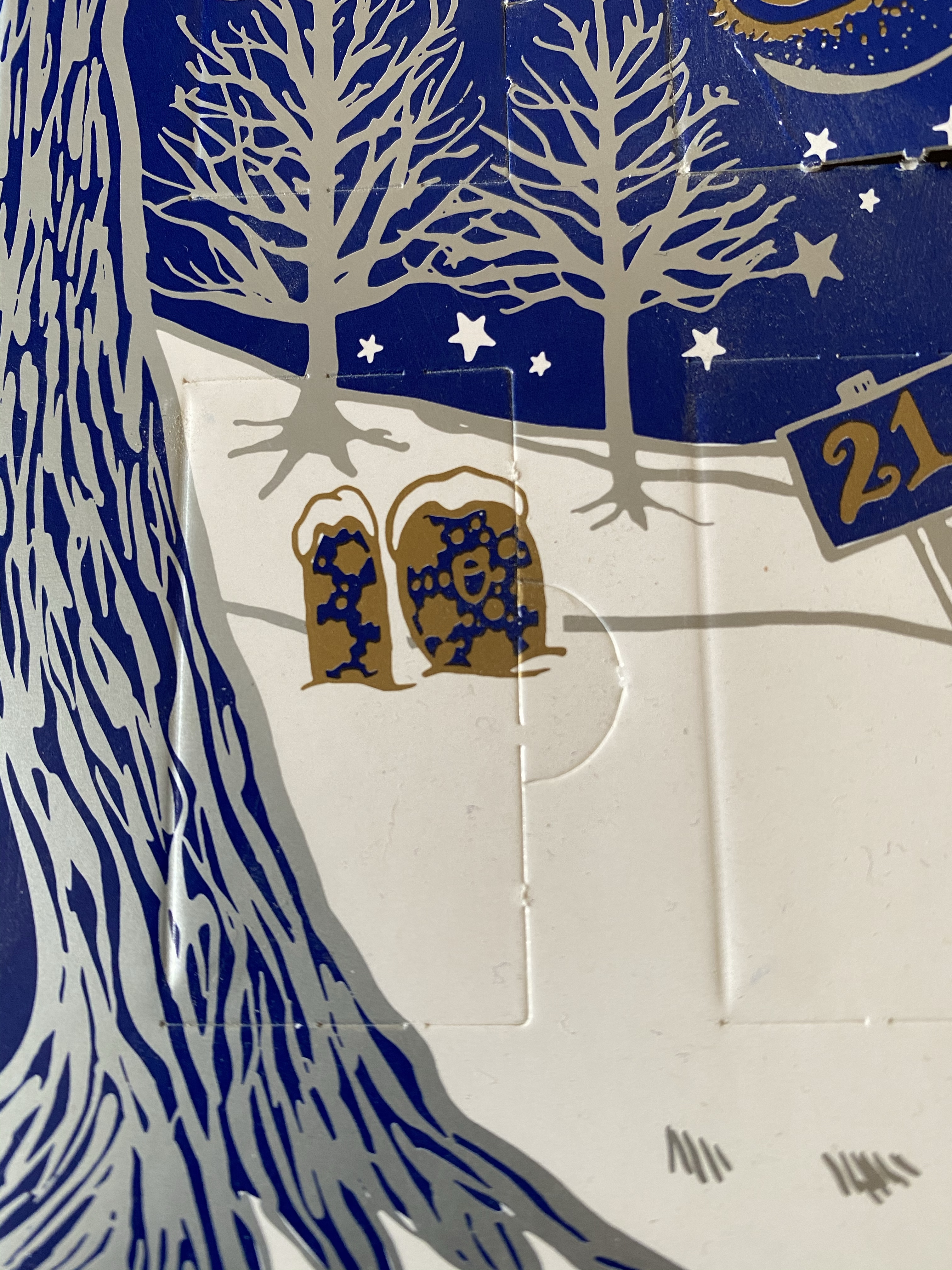
It’s day 10 in the Diamine Inkvent Calendar, and so far there hasn’t been a truly weird ink in the bunch. That’s about to change…
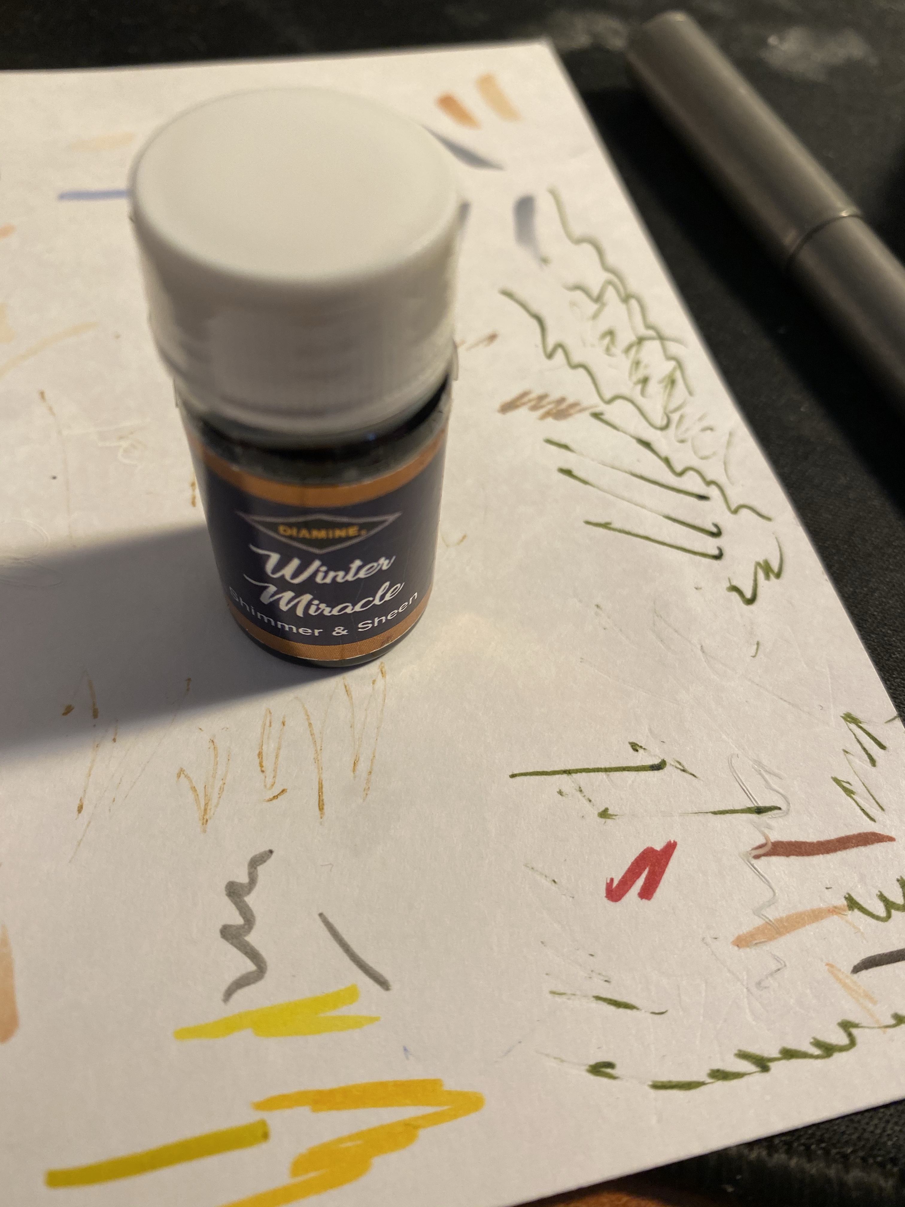
Day 10’s ink is Diamine Winter Miracle, a sheen and shimmer dark purple ink. Now, purple is notoriously difficult to photograph, but if you look at photos of Winter Miracle and say to yourself, “huh, it looks almost black”, that’s not a photography issue. Diamine Winter Miracle is a super saturated, deep, dark eggplant purple with some shimmer (much less than Gold Star) and a significant amount of green sheen. It looks like black with an attitude.
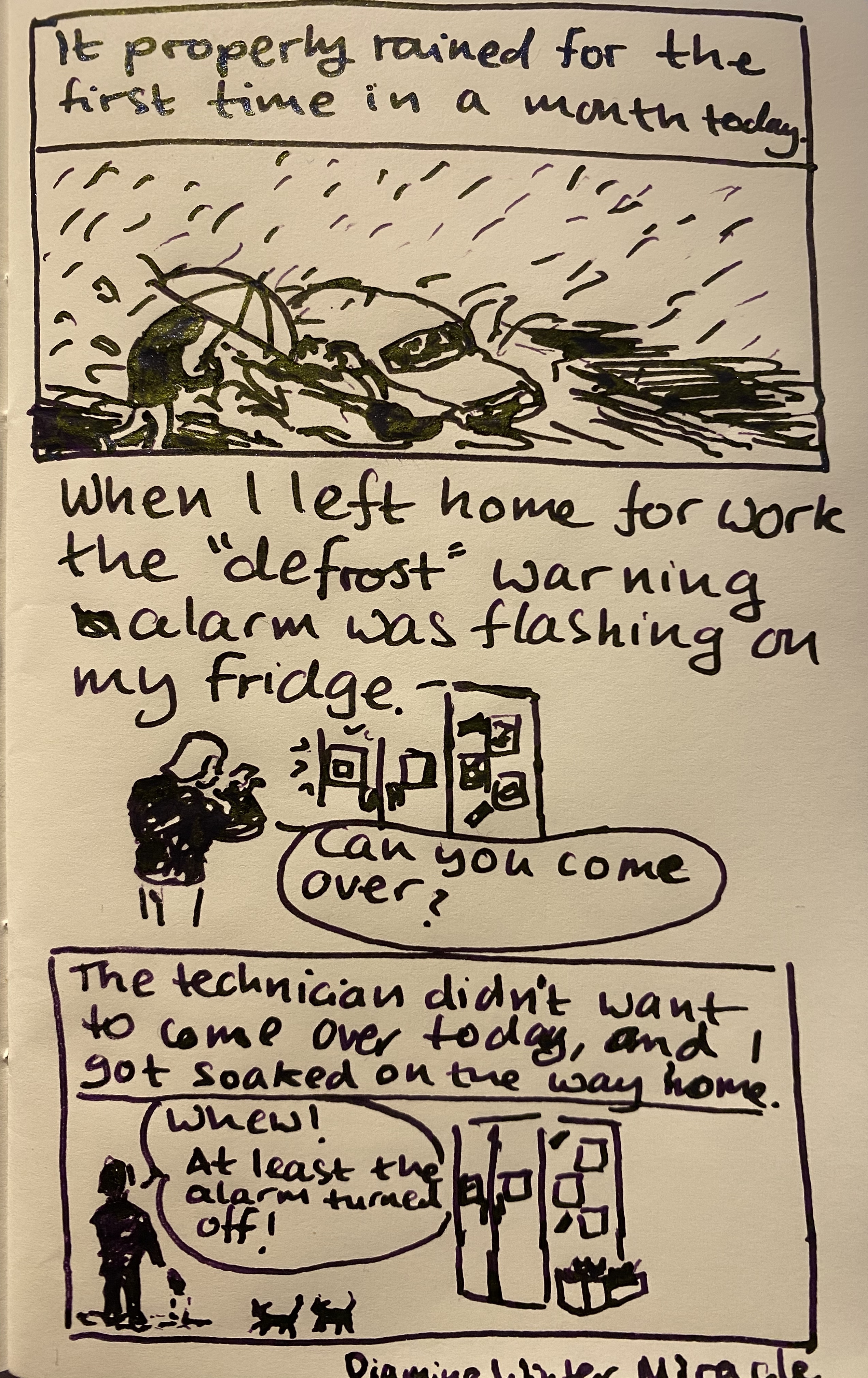
Tomoe river paper makes this ink look wild, especially when viewed at an angle to the light.
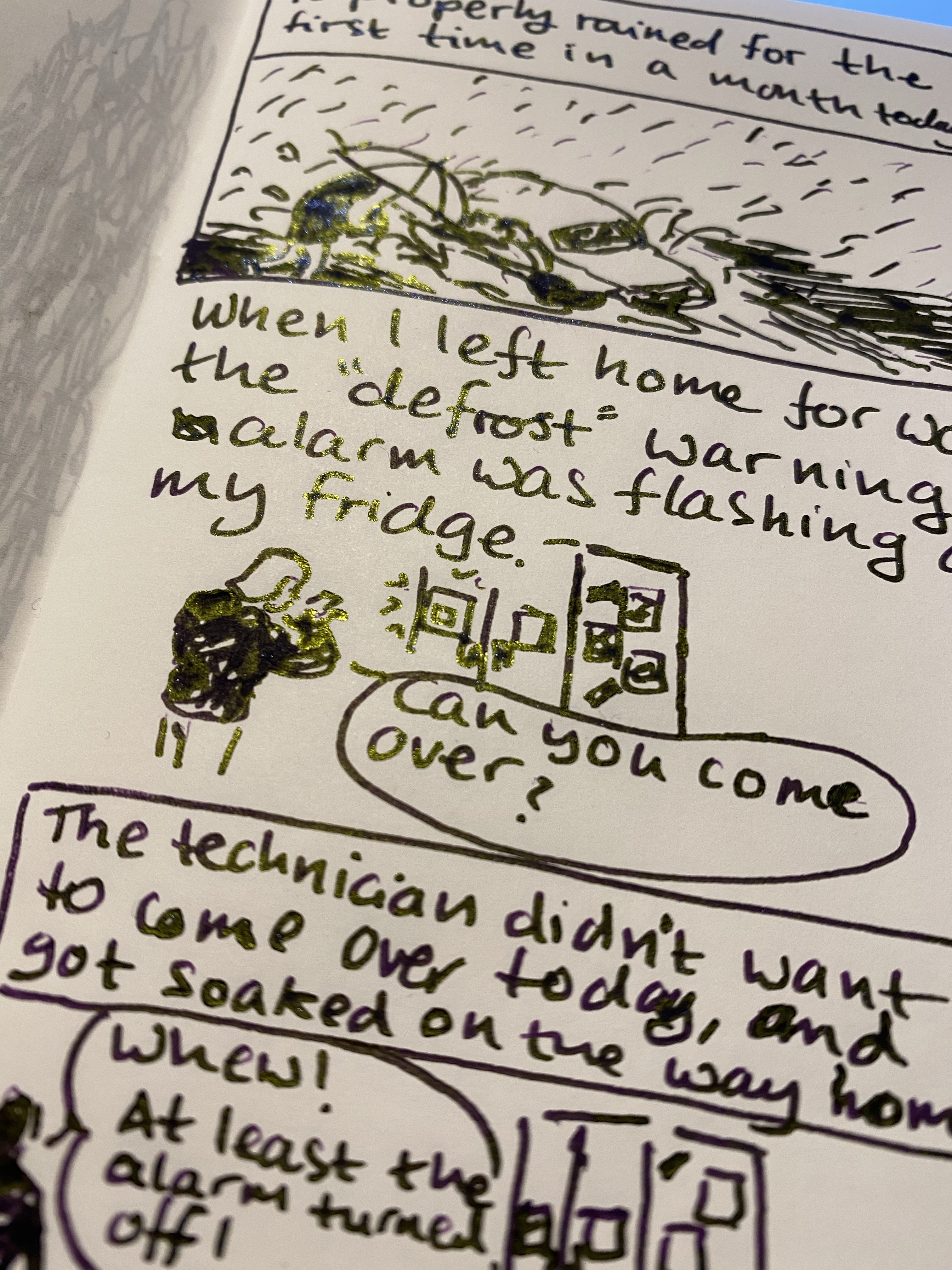
Winter Miracle was so unusual that I went ahead and filled a Pelikan Pelikano Up with it. The medium Pelikan nib (that’s a broad for every other maker) really shows off this interesting and unique ink, and it’s dark enough to pass as black at a cursory glance. I even wrote down next year’s resolutions with it.
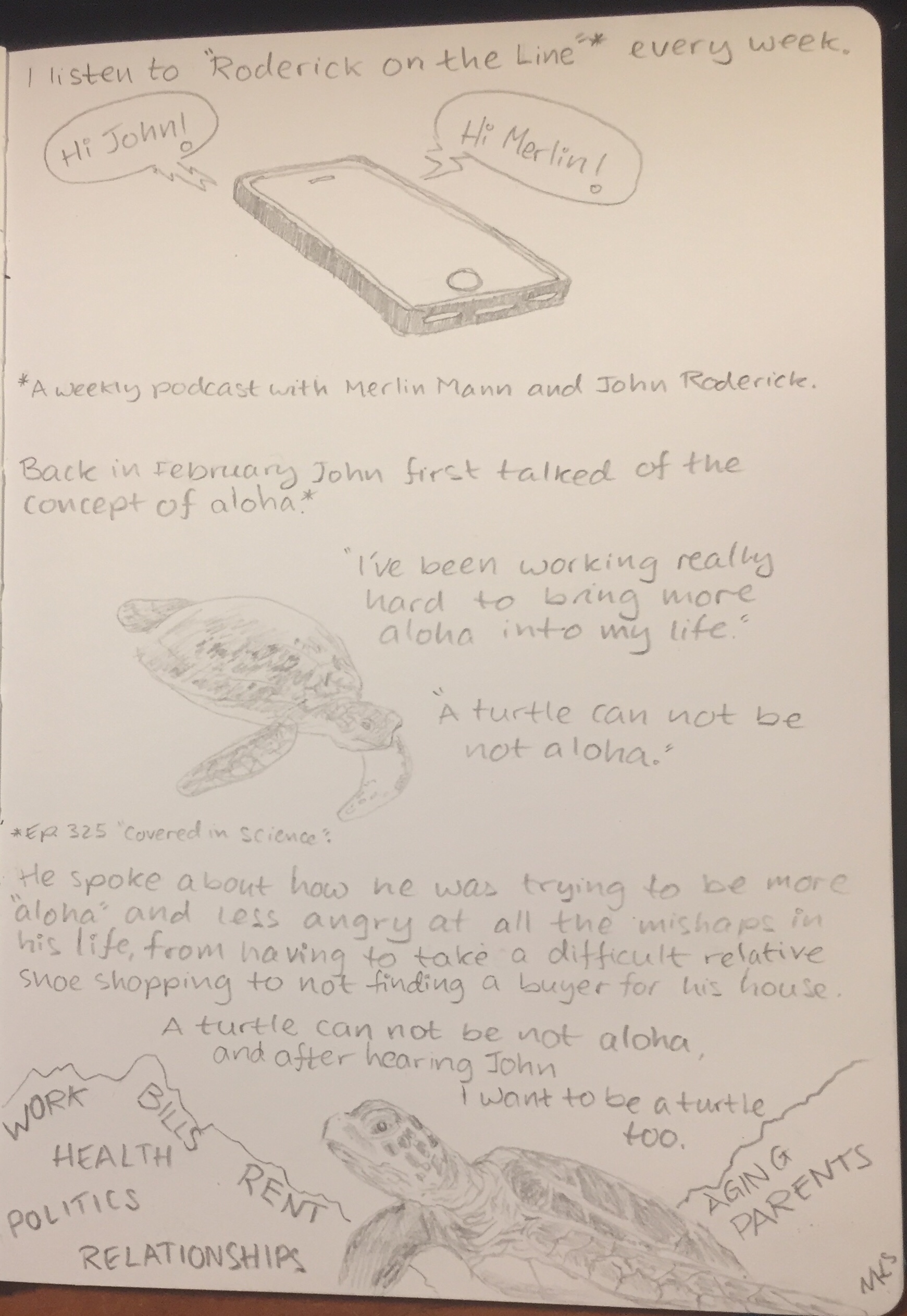
I have too many pencils which I don’t take the time to use. Inspired by this episode of the Pen Addict podcast I decided to literally do a random draw: I randomly drew a pencil from the pile, and then I randomly drew something with it. Today’s pencil: the General’s Pacific 365 #2.
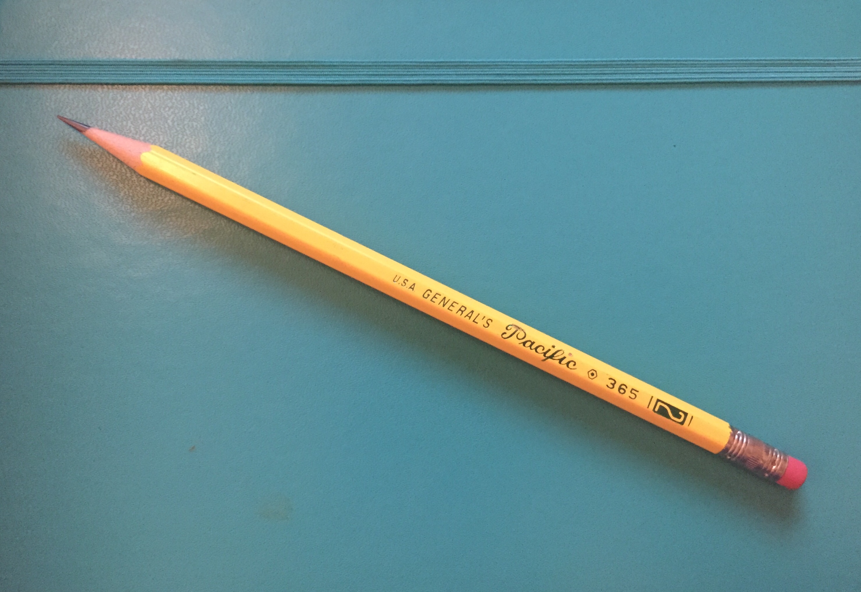
It’s a classic looking #2 (or HB) pencil, with for some reason three or four fonts on the barrel, depending how you count the numerals. It’s made in the USA, out of California incense cedar, and has a little red thing on the top that looks like an eraser, but trust me, I wouldn’t try to use it as one.
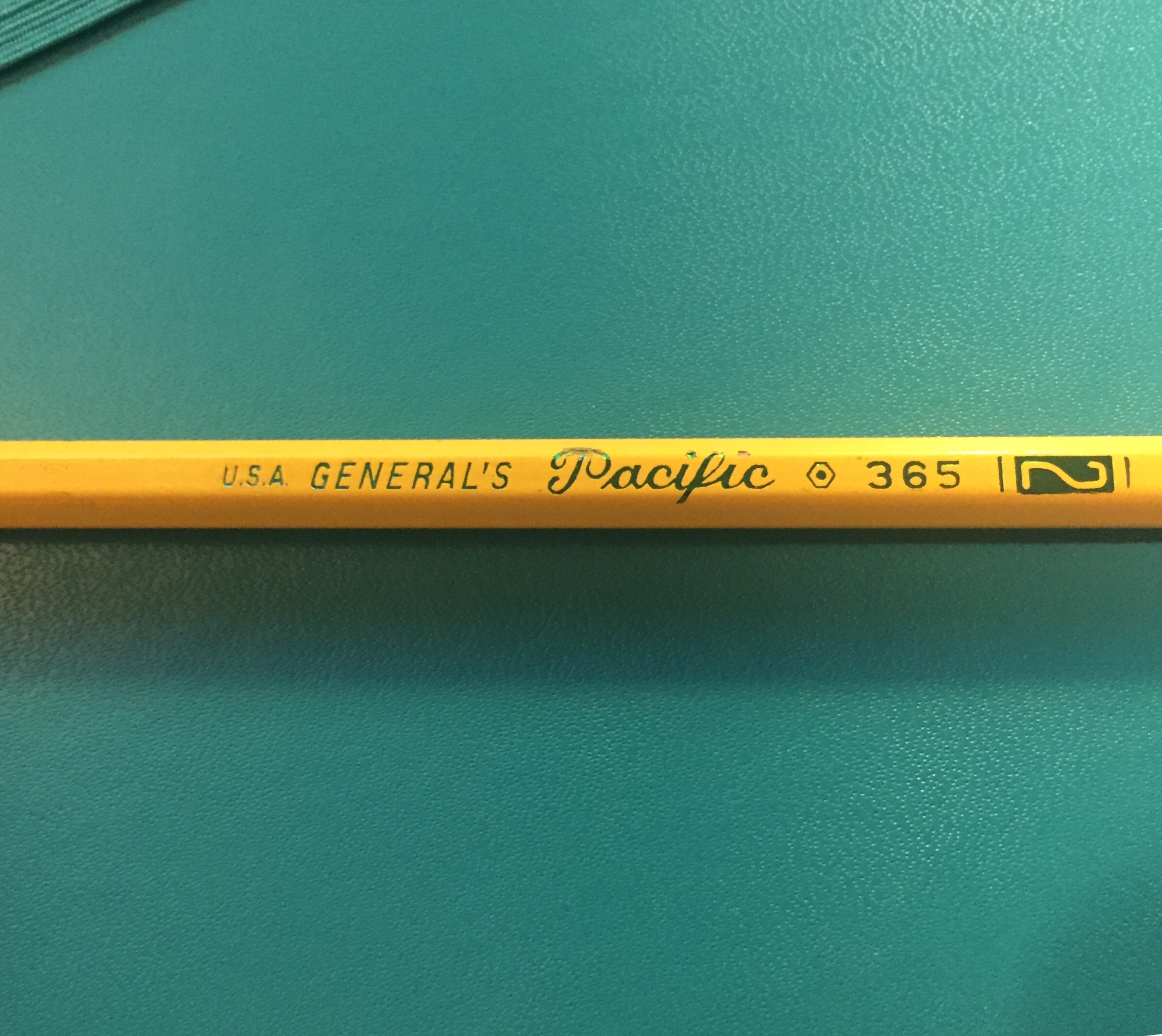
The green foil imprint quality is not great, with the “Pacific” imprint chipping the pencil’s coating. The coating itself is pretty thinly layered, but the core is perfectly centred and sharpens like a charm.
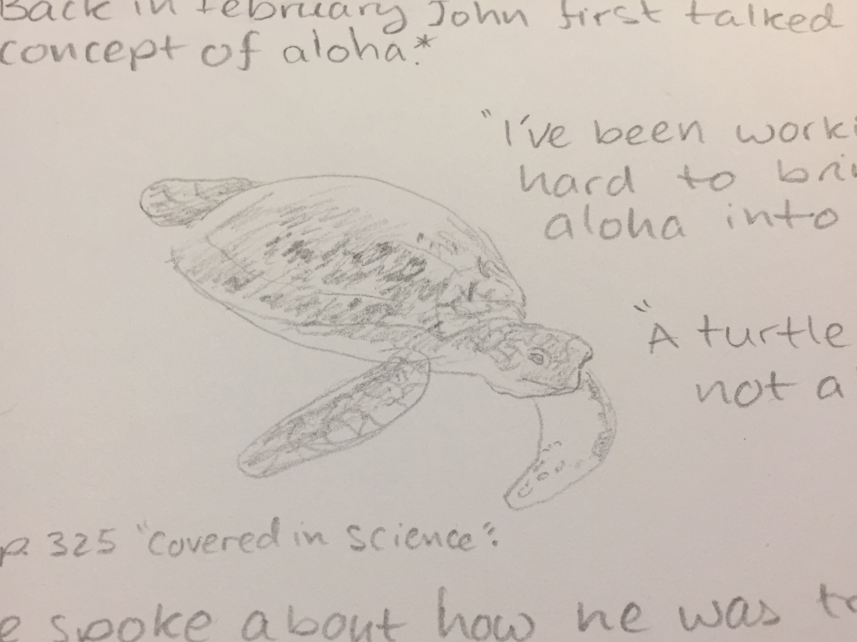
You can see the available shades that the General’s Pacific is capable of producing in the closeup of the sea turtle above. If you’re looking for a #2 writing pencil that could do for a quick sketch in a pinch, the Pacific ought to do the job. It doesn’t smudge and holds a point very well.
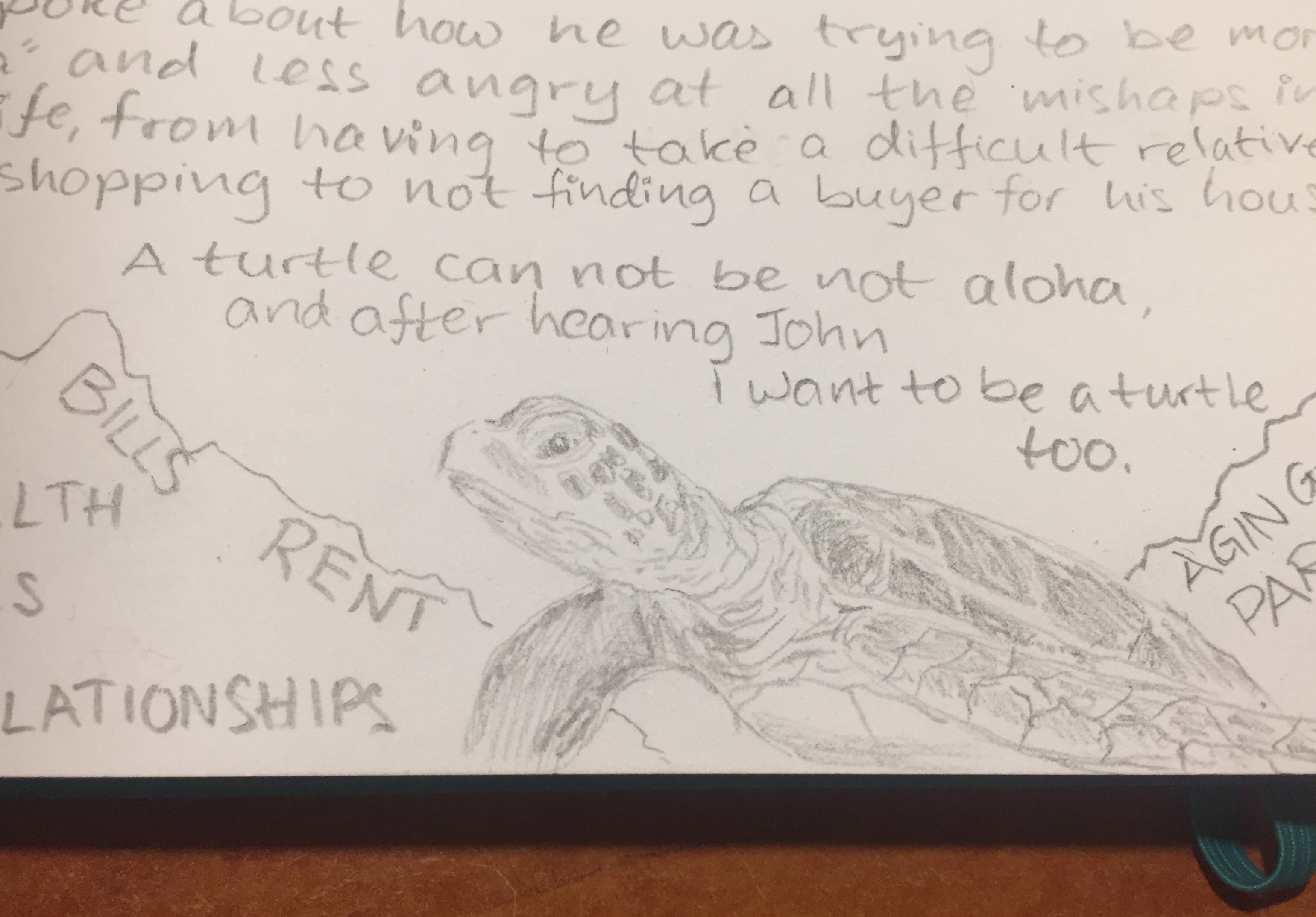
I erased a word between the “S” and the “LATIONSHIPS” on the left side of the closeup above. It erased out pretty well, even though the writing was dark and done with some pressure.
The phone above shows you the maximum darkness I was able to produce with the General’s Pacific. It’s not bad, considering that this is clearly not a pencil made for drawing, but one made primarily for writing.
If you’re buying from CW Pencils and are looking to add a workhorse cedar pencil with a fondness for fonts to your order, the General’s Pacific is a pretty good choice.
May we all be more turtle.
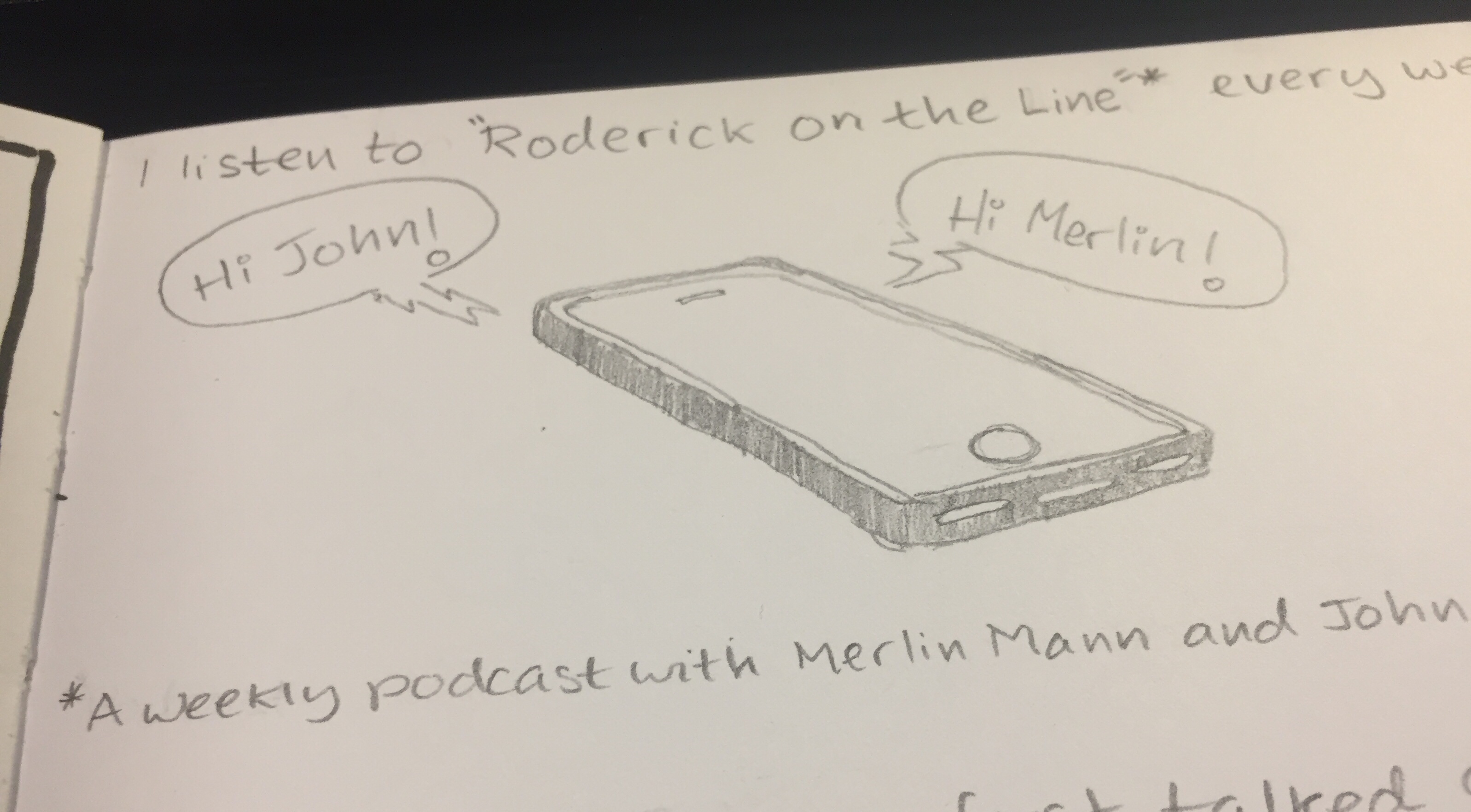
Roderick on the Line podcast episodes referenced:
Leuchtturm1917 sketchbook, Kuretake Zig Mangaka pens, Deleter Neopiko-Line-3 pens, Caran d’Ache Pablo coloured pencils, Faber Castell Albrecht Dürer coloured pencils.
A box of these beauties was languishing together with other art supplies in a stall in London’s Spitalfields market. I saw the box, saw their name, “The ‘Golden Master’ Pencil” and I couldn’t resist.
Just look at this design:

Who doesn’t want “Silken Graphite”? Or “A High Grade Pencil in Hexagon Cedar”? I’ve rarely seen a company take such pride in a pencil, outside of the Japanese market.
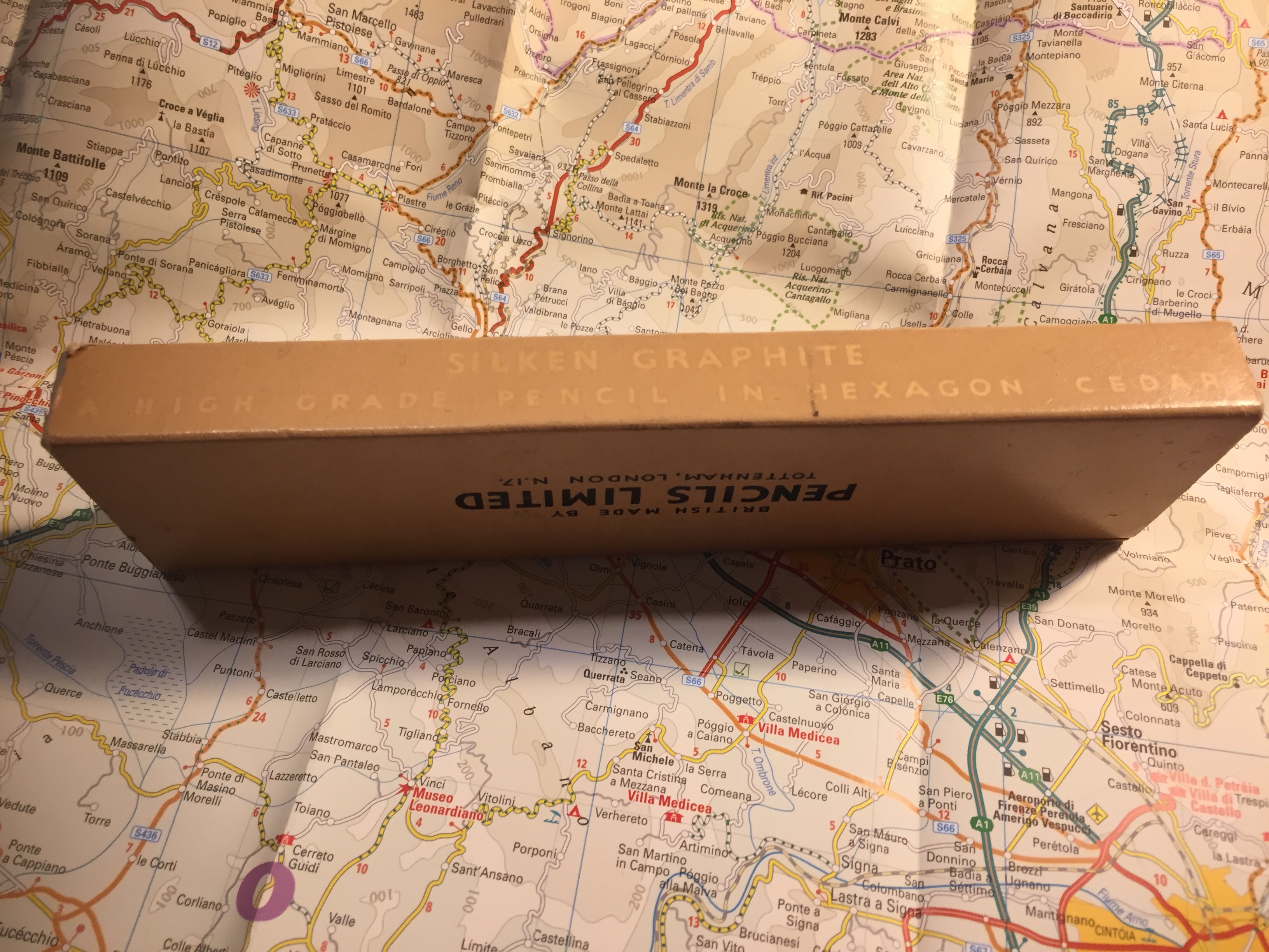
British made, from an era where Britain made things — and in London, too!
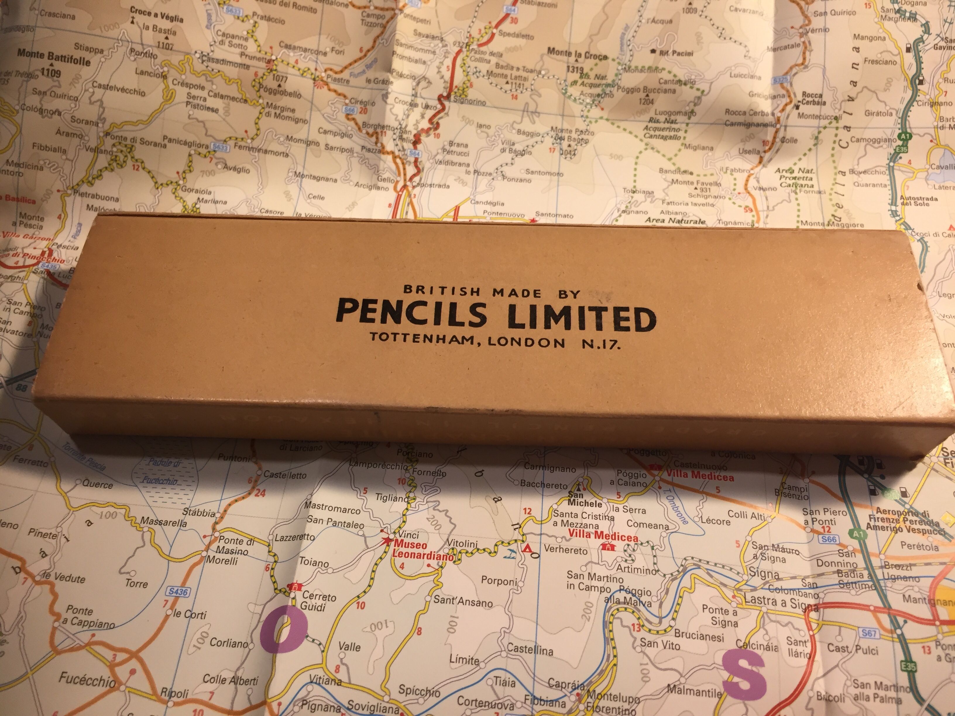
The pencils aren’t really Golden Master HB, but 2B (a bonus from my point of view). They’re labeled as such on the pencil, and strangely enough as two Bs on the box. I’ve never seen 2B pencils labeled that way. I wonder if they printed six Bs for their 6B pencils. I doubt they’d have room on the box.
In any case, the pencils slide out of the box in a sort of cardboard tray that is pretty robust. It works just like an old Eagle Pencil box, and I wish that more modern pencil makers would use this design.

The pencil itself has a good coating of yellow lacquer that has withstood the test of time, and has “Made in England”, “Golden Master”, “Silken Graphite”, “Pencils LTD.” and the grade stamped on it in gold foil.

The hexagonal shape is sharper, has sharper edges, than more modern pencils do. It doesn’t cut into your hand, but you feel it, and I have a feeling that without the lacquer this pencil wouldn’t be as nice to use.
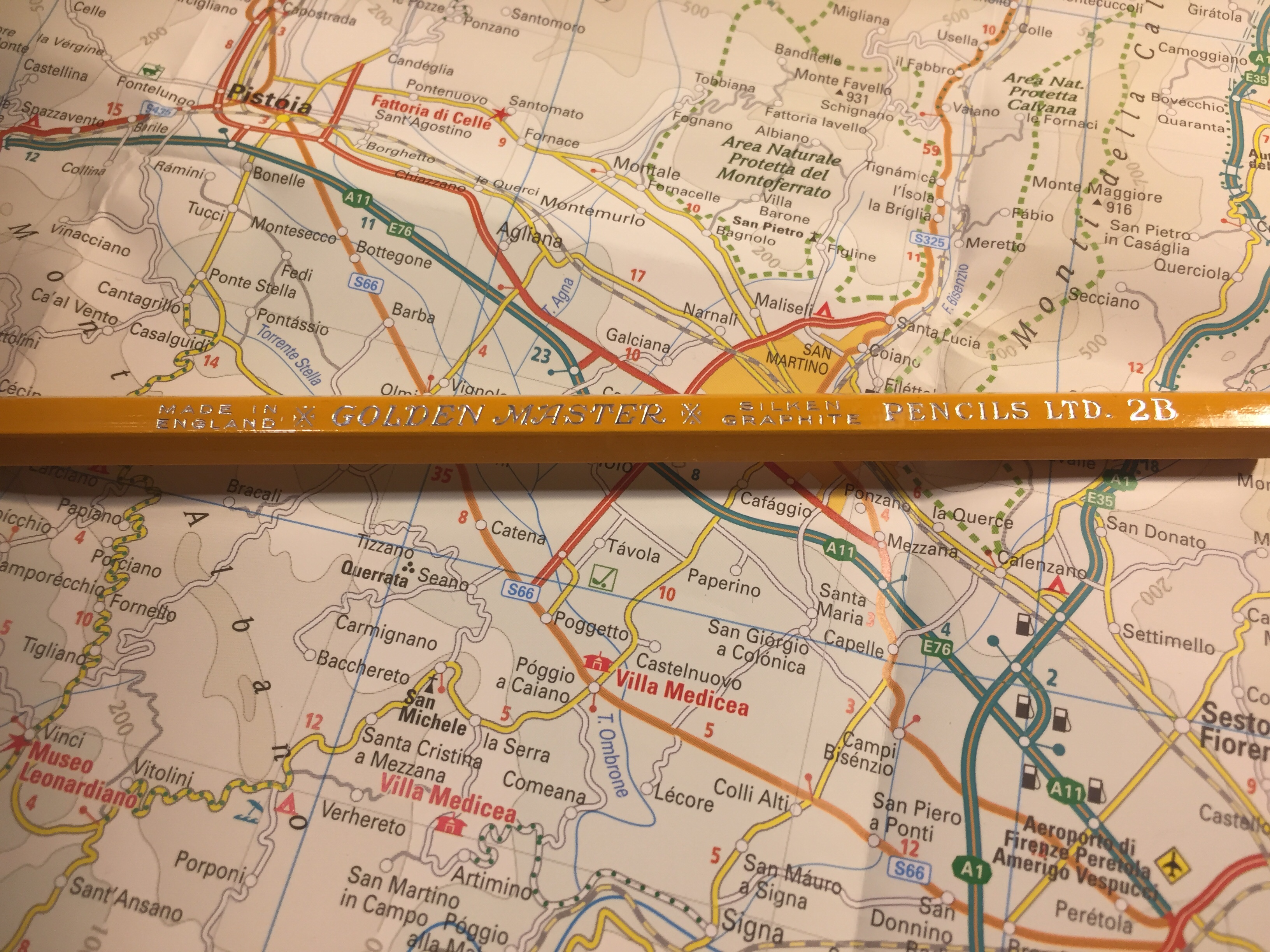
The pencils come unsharpened in the box, and they’re a standard pencil size. As you can see there’s no eraser and no ferrule, but I don’t mind that. I rarely use pencil erasers, but rather keep a block eraser on my desk, or scribble things out if I’m writing.

I drew a journal comic with this pencil. It’s very smooth and holds a point forever, but it’s not a 2B pencil in terms of darkness. It’s closer to a standard B, but there’s a chance that time has done wonky things to make the graphite lighter. It erases well, and every core in the box that I have is perfectly centred. If you can get your hands on these, I recommend giving them a try. They’re great pencils, and I wish that they were still in production today.