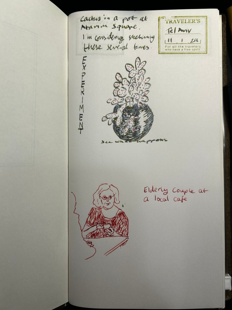
Quick sketch with a Kaweco fountain pen and waterbrush
2 minute sketch with a Kaweco sport M nib and J.Herbin Bleu Pervenche and a Kuretake water brush.

After applying water:

A blog about writing, sketching, running and other things
2 minute sketch with a Kaweco sport M nib and J.Herbin Bleu Pervenche and a Kuretake water brush.
After applying water:
In April 2010 back when I was relatively new to collecting vintage fountain pens, I purchased a vintage Radius Comet on the Fountain Pen Network. The body was brown laminated celluloid, just like Parker striped Vacumatics, and you could see the ink levels through the stripes, just like with a Parker Vacumatic, and it had a jewel on the cap, just like a Parker Vacumatic. It was, however, a piston filler, unlike the Parker Vacumatic, and it had a superflex gold nib, also unlike a Parker Vacumatic. So even though I had never heard of the brand before and there was very little information about them to be found, I took the risk and bought the pen. It cost €120 shipped.
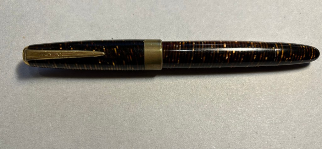
The pen was obviously user-grade, as there was brassing and tarnishing on the hardware, a lot of micro-scratches on the body, and some ambering in parts of the celluloid. It’s still a good looking pen, though.

The design of the clip and the jewel on the end of the cap was clearly influenced by the ultra popular Parker Vacumatic.
Even though the celluloid has darkened and ambered with time, you can still clearly see the ink levels through the stripes. As a piston filler it has an impressive ink capacity, which works well with the flex nib, as it can lay down a good amount of ink when fully flexed.
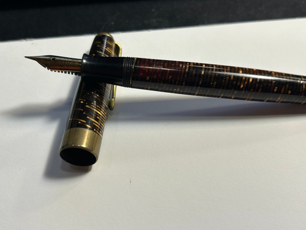
It works perfectly – the filling system is and always was a joy to use, and the nib… Well, the literally don’t make nibs like this any more:

When you apply no pressure it’s a wonderfully smooth fine nib, but when fully flexed it goes up to broad/double broad territory. The feed keeps up with the ink flow with ease, and I’ve never had a hard start with it, ever.

Leonardo has revived the brand in recent years, and now you can buy a brand new Radius with a cartridge/converter system, resin body and (obviously non-flexible) steel nib for around €150, not including shipping. No modern pen manufacturer is capable of creating a pen like the vintage Radius or any of its contemporaries, neither in body material, nibs or filling systems at the price that they were once made. It’s a question of both volume and lost knowledge and tooling, which means that the vintage and new Radius pens have very little to do with each other beyond having the same brand name.
Buying vintage is always a risk in a way buying modern pens isn’t, but the value for money still cannot be beaten. I might buy a modern Radius at some point in the future (I like their designs and I’m curious about the pens), but I have no doubt that in terms of looks, nib and filling system it won’t be able to hold a candle to its well-worn and well-loved vintage namesake.
A 5 minute sketch in pen and watercolour on a Stillman and Birn Pocket Alpha.
I started the month ready to spend the first half of it in hospital, with my dad. So the fountain pens I chose were all expendable pocketable pens that I was willing to have stolen (apart from the Schon Design Pocket 6 which was a leftover from January and never left my desk). So that meant I inked 4 Kaweco Sport fountain pens using various ink cartridges that I had on hand.

The portable lineup:
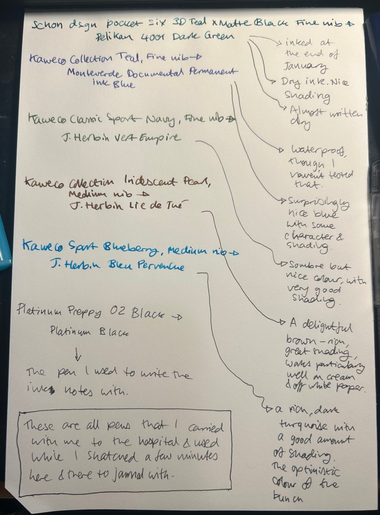
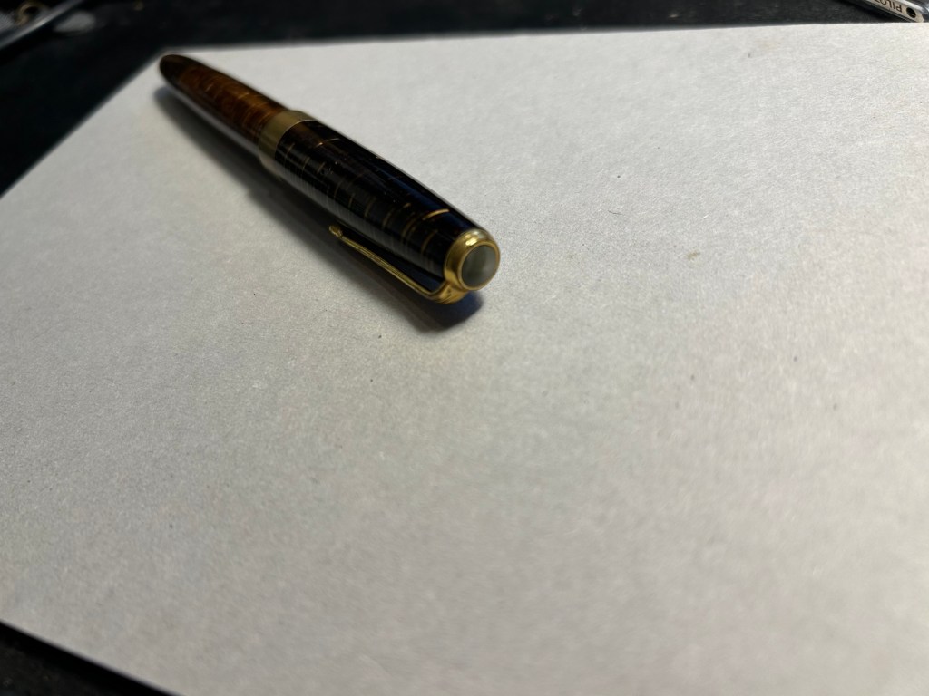
Once my dad got out of hospital and back home, I decided to celebrate by “shopping” from my collection. I inked up a Parker 51 Plum (use the good china!), a Parker Vacumatic, a Franklin Christoph 45L Turqish (spelled like that on their site) Crush that I had purchased but hadn’t inked before, and a vintage Radius Comet (because I heard that the brand was being revived).
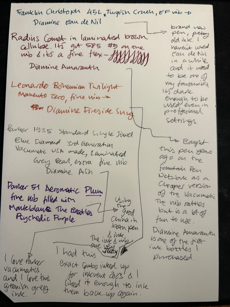
The Franklin Christoph EF nib isn’t the best companion to the Eau de Nil as the ink tends to dry in the nib, causing hard start issues. The Radius is a flexible nib of the vintage kind, which means it’s really flexible and not just springy. It also rattles, which makes me not carry it around with me — it stays at home at my desk. The Leonardo is a beautiful pen with a beautiful ink that I refilled immediately — the only Inkvent 2023 ink I did that with. The two vintage Parkers are phenomenal, as usual. The extra fine nib on the vacumatic somehow really well with Diamine Ash, though I was worried at first that the combination would be too light to be readable. The Parker 51 Aeromatic is a treat to use. It’s the rare Plum colour, and it’s got a fantastic nib (as all 51’s have) which pairs very nicely with the Monteblanc The Beatles Psychedelic Purple.

In terms of paper I’ve been using Kokuyo A4 KB paper which I cut to half size (so A5) to manage my daily to do list. The paper is relatively cheap and very fountain pen friendly. I’m also able to use both sides of the page despite there being some show through.
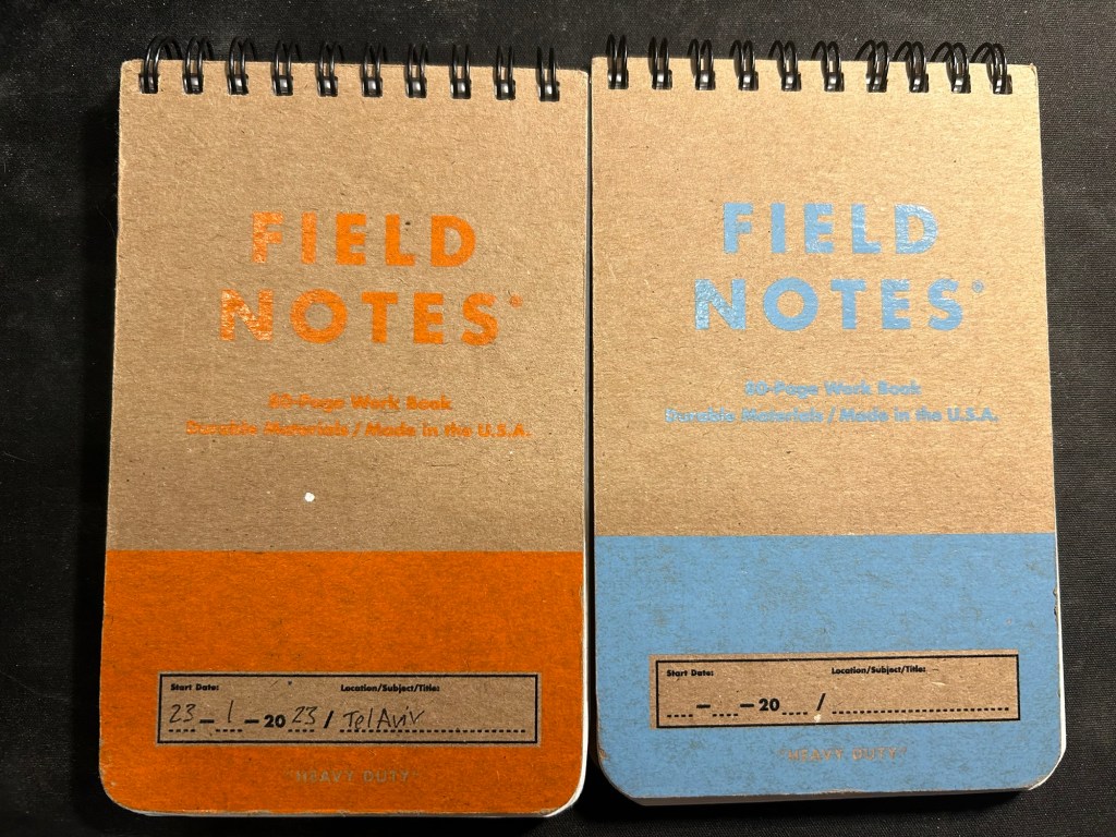
I’ve got a Field Notes Heavy duty on my desk at home and at work, and I just bought a new stock of them. These are where I jot down quick notes, phone call details, doodles during boring meetings. When they’re filled up they get tossed out as nothing in them is permanent — everything important in them moves to somewhere else as I work my way through them.
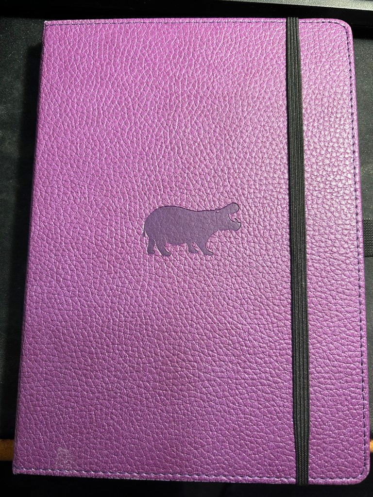
I have finally found a use for my Dingbats notebooks (beyond giving them away as gifts, as I have in the past): this lined purple hippo one is my blog notebook. I discovered that I have a much easier, much quicker time writing blog posts if I first draft them on paper, and this is where I do it in. I’ll likely write a dedicated post to this notebook soon.
Apart from them I still use the notebooks I used last month.
I’ve been using the Drehgriffel Nr. 2 as my daily driver. I use pencils extensively to plan, as my plans tend to change, and there’s something about this solid little mechanical pencil that makes me want to use it.
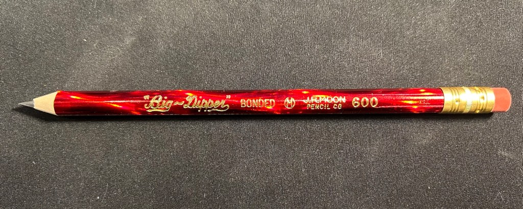
Apart from that I brought two pencils into the rotation, to try to use. One is from my last purchase from the late and great C.W. Pencils Enterprise, and it’s the “Big Dipper” J.R. Moon Pencil Co 600. It’s an oversized pencil, the kind of pencil that kids who are learning to write are expected to use. I’ve been having pretty significant neuropathy in my hands lately and I thought that this would be nice and easy to use, as after all it’s designed for kids just learning to develop their fine motor skills. So far it’s been a disappointment – the eraser and ferrule make it very top heavy, and I’ve been having a hard time manipulating it. I can’t imagine kids using this pencil and having an easy time with it. I like the over the top red foil with gold writing look though, so I haven’t given up on it yet.
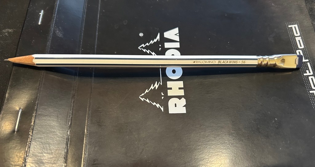
The second pencil is a Blackwing Volumes 56, the baseball themed one. The core is soft and dark, and I’ve been using it for quick and loose sketches. I’m trying to ease into one week 100 people by training myself to work faster than I normally would.
What did you use in February? Any planner changes? Pencil revelations? Pen preferences?
This time I decided to combine testing out a new (to me) India ink, a new (vintage) nib and watercolours. The ink is US made Higgins Black Magic. The bottle shape is unique, and it’s a plastic bottle, not a glass one like my British made inks. While the very wide base of this bottle does cut down the possibility of you accidentally tipping it over, I don’t like the bottle design. The bottle opening is too narrow and tall, and it’s very easy to get ink on your nib holder and hands this way. The ink itself is less shiny and flows wetter than other India inks that I’ve tried, but that’s not a bad thing.
The nibs are Waverley Pen nibs, made in Birmingham (a British steel producing city), and made by Macniven and Camron Ltd.

The tin itself is a delight, with the Waverley Pen advertising doggerel on it (the Pickwick, Own and Waverley were all nibs made by the Macniven & Cameron company). I bought it for a few pounds at Spitalfields market, London, and would have bought the tin even if it was empty:
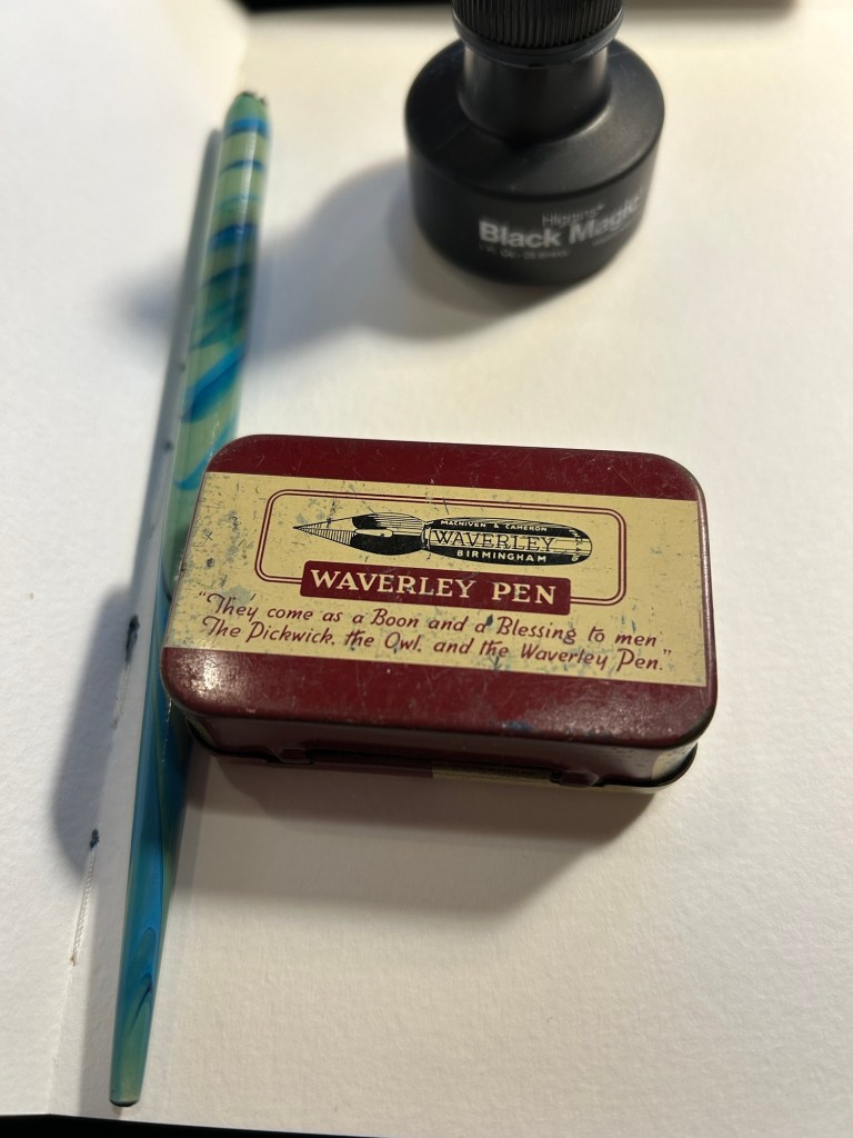
It’s not empty, but rather filled with dozens of Waverley nibs in excellent condition. I took one out, tested its flexing properties (medium flex), and then primed it as described here. To test a nib for its flexing properties you gently push the tines against your thumbnail (don’t ever do this with fountain pen nibs!).
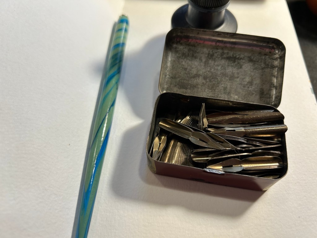
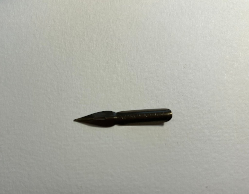
Here’s the nib. It has a bit of kink to it that helps it hold more ink than it otherwise could hold:
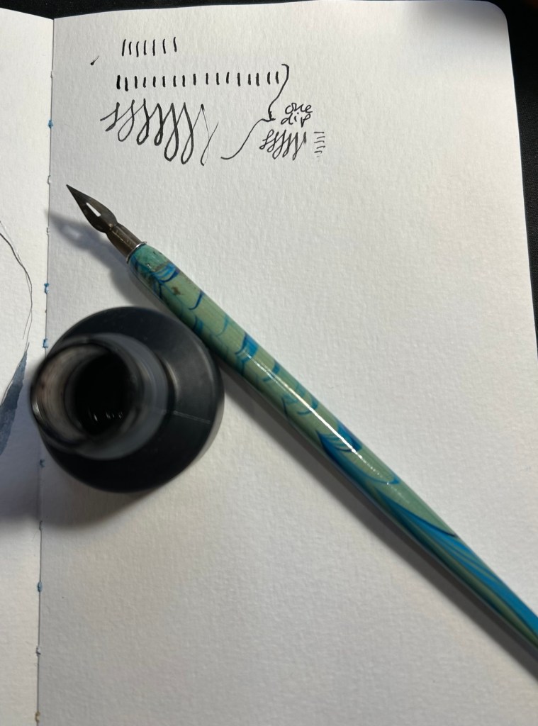
I took one dip and tested out how much ink it holds. It’s quite a lot:
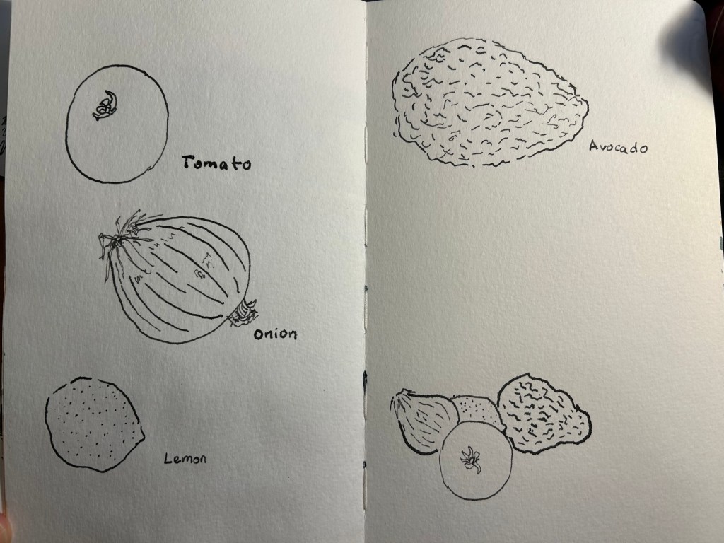
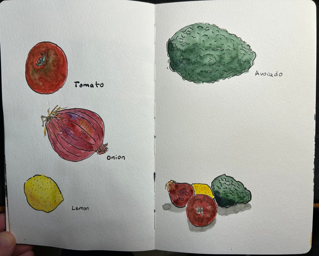
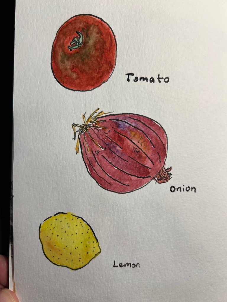
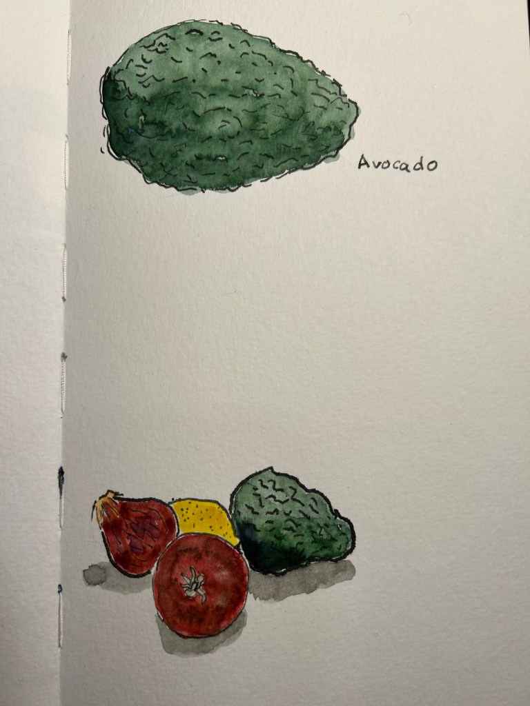
I decided to use it on a Moleskine Watercolour sketchbook. The paper isn’t ideal for dip pens (it’s not smooth and the properties that make it watercolour friendly mean that the ink will spread and feather no matter what), but I wanted to use it with watercolours. As in this case the line sketch wasn’t crucial to me (i.e. it didn’t need to be particularly accurate), I decided to accept some level of feathering and spread for a decent watercolour wash.
Here’s the ink sketch:
A closeup on the onion sketch shows how much line variation you can get from this kind of nib, just how expressive these nibs are, and some of the feathering and spread that I talked about earlier:

Watercolour brings these sketches to life, and makes the ink compromises worth it:
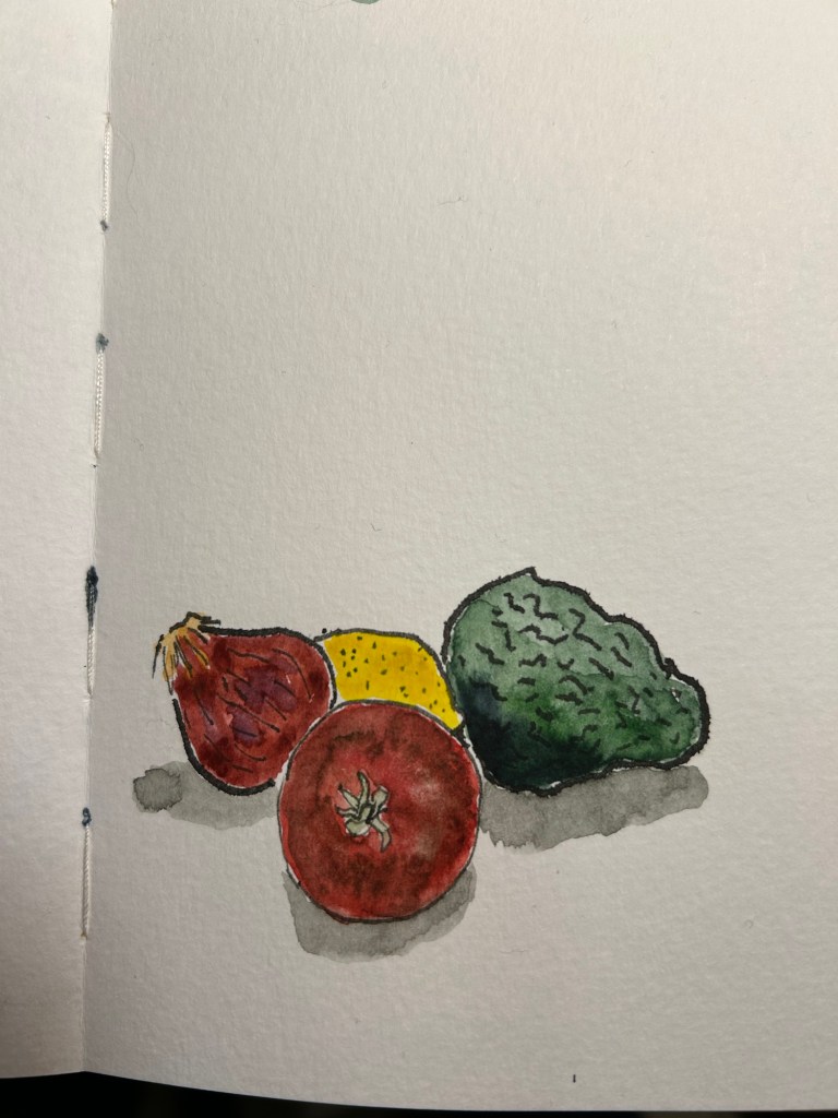
A closeup on the sketches:
The second page:
The group thumbnail:
There are a few things that you need to remember when combining dip pens and watercolours:
Have you tried combining the two mediums? If so, let me know how it went.
It’s been a while since I used my dip pens, and since I had a project in mind for them, I thought I’d document parts of it here.
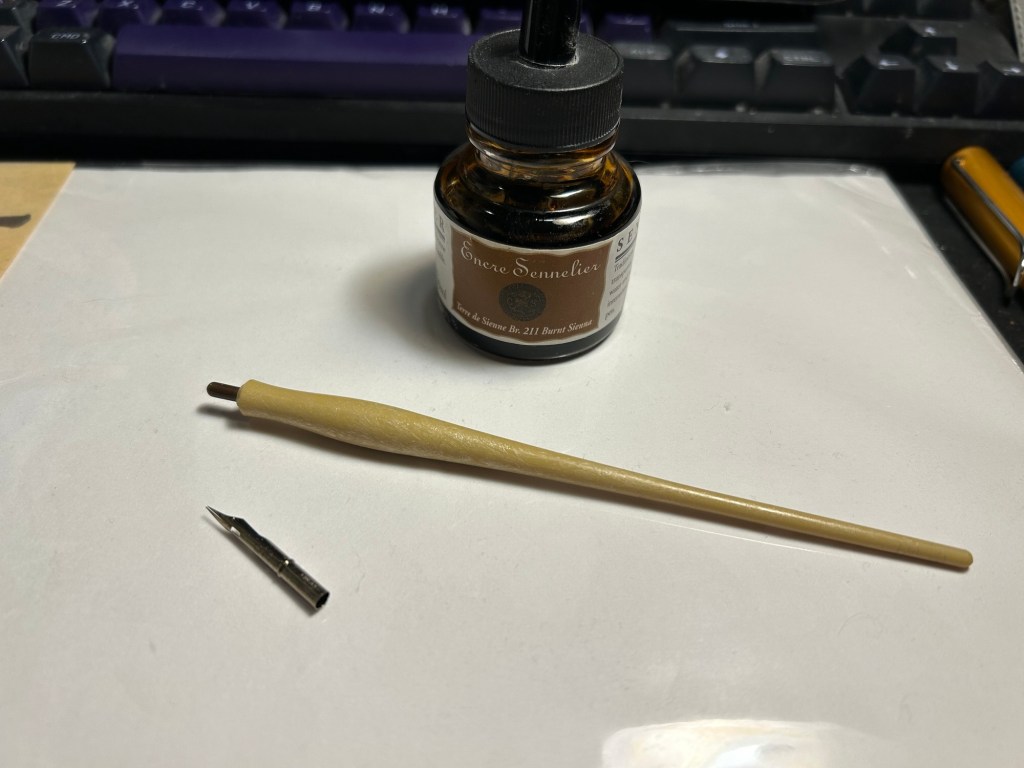
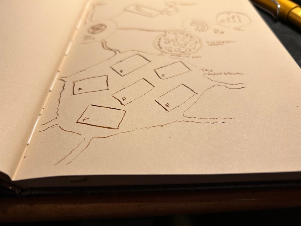
I was looking to draw a map, part of a series of maps for a D&D game. Since I was trying to get a certain look to these maps, I pulled out a mapping nib and a mapping nib holder, and some Sennelier Sepia ink.
The ink is shellac based and meant to be used in dip pens only. If you use it in a fountain pen it will destroy it upon first use. You only need to see how sticky these inks are once to understand that, but most of them helpfully provide warnings on the bottle.
The nib is a Leonardt 801 mapping nib, made in England by the British company Manuscript and purchased, together with the mapping nib holder at Cornelissen & Son in London. They have the largest and best variety of dip nib supplies that I’ve ever seen, and are used by many illustrators and cartoonists. The beauty of dip nibs, however, is that they’re pretty easily and cheaply obtainable. Speedball sells a kit that includes a wide variety of nibs, including a mapping nib, and two holders (a standard one and a mapping one, known as a crow quill).
What’s the deal with a mapping nib? It’s a small, round nib with an end that’s actually a cylinder, and you pop it onto the little peg at the top of the holder. Mapping nibs allow for very thin lines, and yet also a good line variety as the tines are sensitive to pressure.
If you’ve used a fountain pen before and then try to use a dip pen, you’ll likely be surprised by several things. The first is that most dip pen nibs, and mapping nibs in particular, are very sensitive to pressure. The slightest push down will give you more line variation that you’ll get from even the most flexible of flexible fountain pens. The second is that there’s no tipping material. That means more feedback from the page, and that you need to be aware of the directionality of the nib if you don’t want it to snag and spray ink everywhere. This is also why the paper you want to use will be smooth. Smooth surface cartridge paper is your friend.
India ink (the shellac based ink used for dip pens) lays on top of the paper and retains a level of gloss and a dimensionality that you just don’t get with fountain pen paper. You can feel the ink lines with your fingers once the ink dries. The ink dries quickly, and is sticky and staining when wet, so beware of nice clothes and wash your hands well once you’re done.

The nib itself needs to be prepared before you use it for the first time. New nibs are coated in oil and sometimes with wax before being packaged. This prevents them from rusting, and helps them not stick to each other too much as they’re being packaged. If you use a new nib without preparing it, you’ll be disappointed. It will carry little to no ink, and you’ll find yourself dipping the nib again and again. The map above was made with 4-5 dips only, using a new nib, but one that I prepared.
How do you prepare a dip nib? The simplest and safest way (no, don’t take a lighter to it) is as follows: gently clean the nib with water and dish soap (you can use a soft toothbrush if you want, but it doesn’t really require scrubbing) and then put it in cup with boiling water for 1-2 minutes. Then fish the nib out and dry it very, very, very well with a paper towel. You don’t want to air dry the nib at any point or it will rust.
You can use fountain pen ink with dip pens, but I don’t recommend it. Fountain pen ink is thin and water based, so it doesn’t cling to the nib like India inks. You’ll be dipping a lot more often, and your results won’t be as good. If you plan on using a dip pen to test out fountain pen inks, know that your test will only show the colour properties of the ink but not its flow (wet/dry). Also don’t use a mapping nib for that – mapping nibs are best used for small sketches, maps, things that require very thin lines and some line variation.
When I work with a dipping nib I keep the nib constantly wet with ink (not water!), and immediately when I’m done I either wash the ink from the nib and dry it very well, or I wipe the ink off with a cotton rag if I just plan to take a short break. Ink left to dry on the nib may clog it (particularly with mapping nibs), and soaking a nib in water will cause it to rust.
You may find dip nibs in flea markets for very cheap, usually in a pile in a little box. Check if they aren’t rusted (don’t buy rusted nibs), and then clean them as you would a new nib (water, soap, heat).
I’ll be going over various kinds of India inks and various kinds of nibs in future posts, but in the meanwhile if there’s anything that interests you in dip nibs let me know in the comments.
I’m still working my way through the Inkvent inks (9 pens left to write dry), and I’m trying to sketch more even on busy weeks. So I dusted off an old Traveler’s Notebook that I set up years ago and didn’t fill, and I started playing with fountain pens.
Diamine Inkvent 2023 is over and what an Inkvent it was! This year’s calendar was my favourite by far, mostly because of the break from the usual red-green-gold run of inks, and the very low volume of “filler inks”. This lineup is strong and interesting:
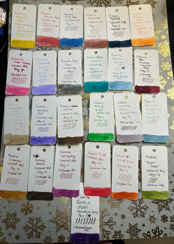
Grouping the inks by colour family you can see how different this year’s Inkvent is compared to previous ones (2019, 2021, 2022).
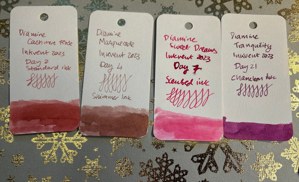
Pinks: I think these are the most pink inks we’ve had in an Inkvent Calendar and I’m all for it. The scented ink was terrible, but as there were only two scented inks out of 25 and only one that was really bad (Sweet Dreams) I’ll give Diamine a pass. Both Cashmere Rose and Masquerade were stand out inks, worth considering full bottles of.
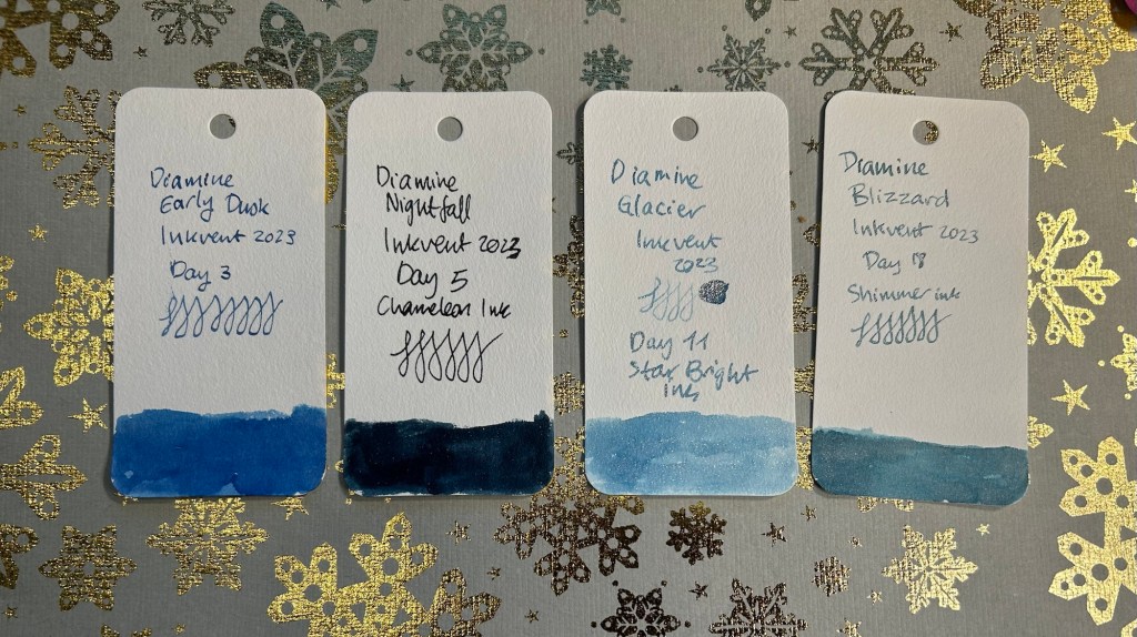
Blues: It was a stand out year for blues, with not a boring ink in the bunch. Glacier brought all-of-the-glitter, all of it, and Early Dusk, Nightfall and Blizzard are all interesting inks even though they are blue (one of the more standard of ink shades).
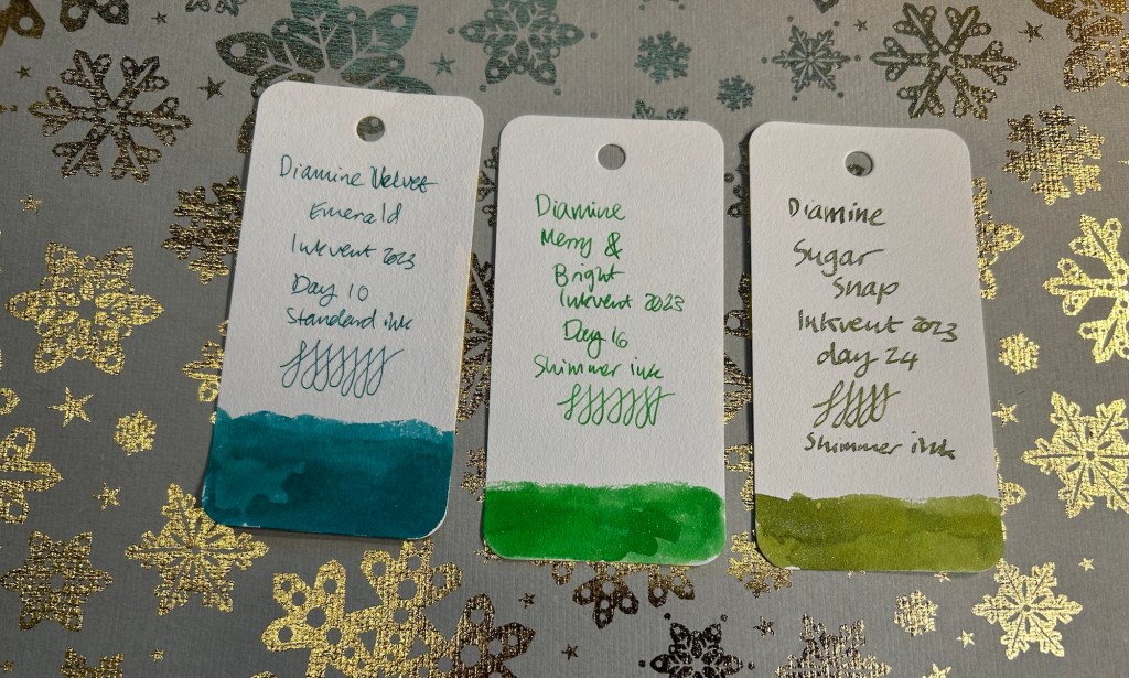
Greens: This Inkvent had only three green inks, with Velvet Emerald more of a teal colour. Of the three Diamine Sugar Snap stands out.
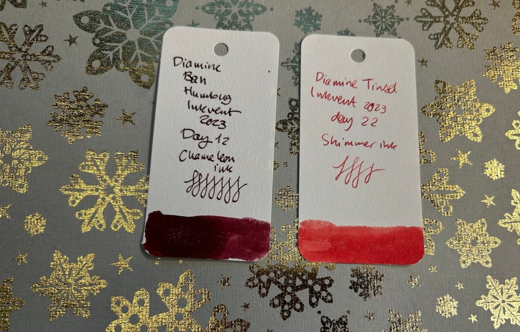
Reds: The first Inkvent calendar to feature just two red inks, but both of them solid choices. Go for Bah Humbug for a darker take or Tinsel of a brighter one. As I don’t really use red inks, the choice to include only two red inks this year was a boon for me.
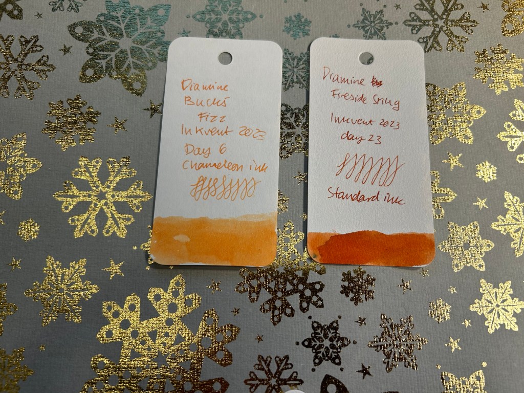
Oranges: two oranges this year, one utterly unusable (Buck’s Fizz) and one wonderful (Fireside Snug).
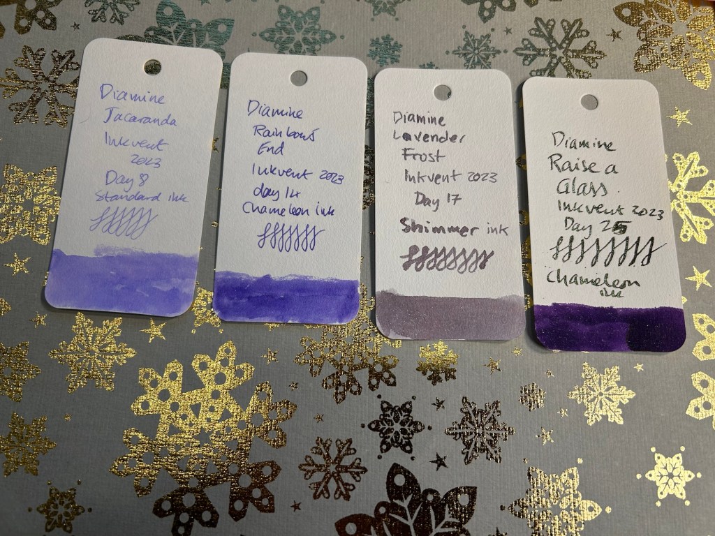
Purples: Who’s surprised that this year the purple Inkvent calendar featured no less than four purple inks? Nobody. All of these are great but Jacaranda is my favourite.
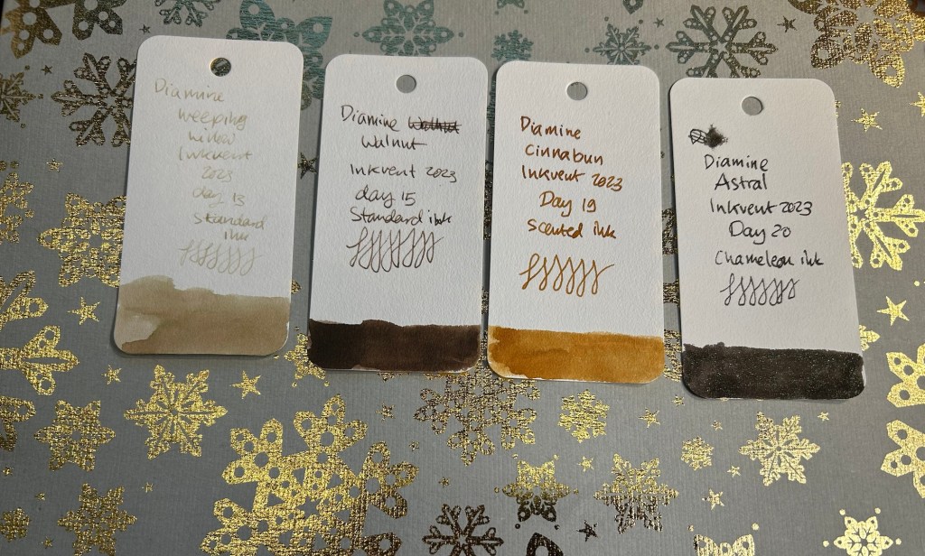
Browns/Earth Tones: There are four of these this year if you include Atral (which is a black/brown ink) and Weeping Willow (which is a duo-chrome ink). Weeping Willow is stunning and the number one ink that I’ll purchase from this year’s Inkvent.
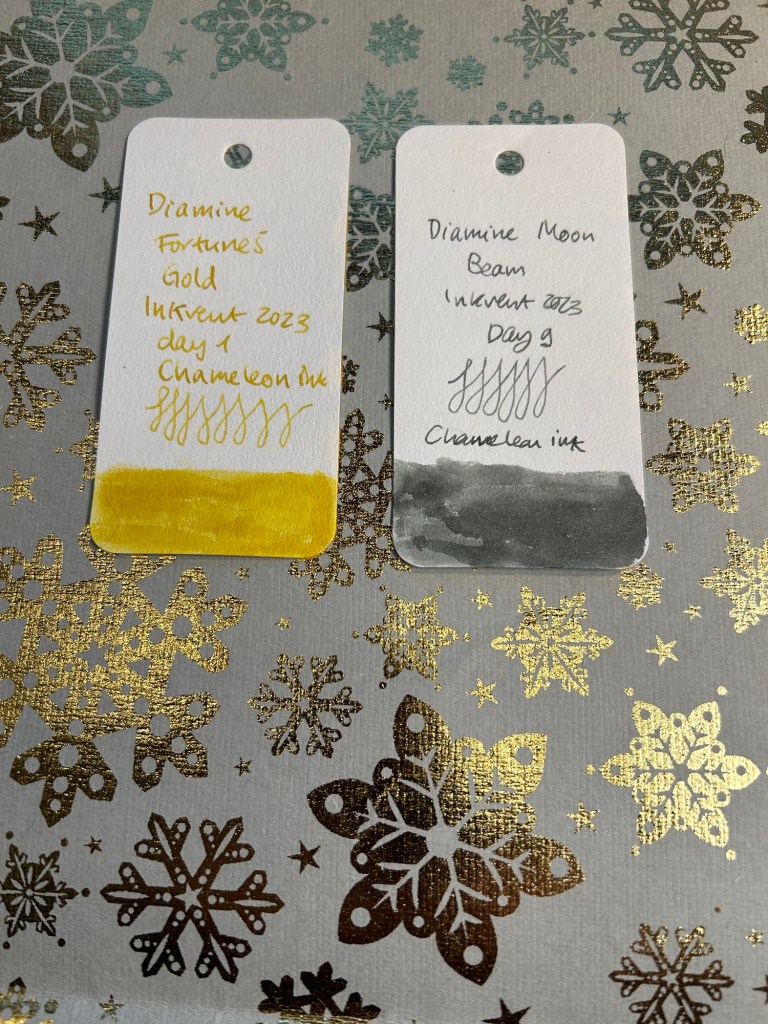
Outliers: the only yellow ink this year is Diamine’s Fortune’s Gold and that’s fortunate as I don’t use yellow inks. Sadly Diamine Moon Beam is the sole grey ink in the lineup, but at least it’s a very pretty one.
Which inks are my favourites? These seven:
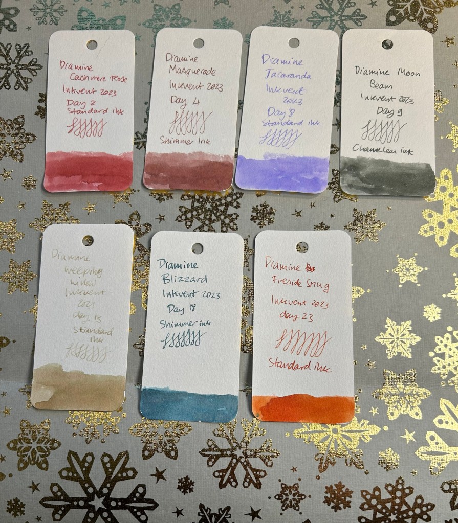
They all have interesting base ink colours and oftentimes something else going on. I have too many inks already so I won’t be buying 7 more bottles to add to the collection, but of the 7 the top three are Weeping Willow, Jacaranda and Fireside Snug, and I may buy bottles of those.
What did you think of this year’s Inkvent? Do you plan on purchasing any of the Inkvent 2023 inks?
If you haven’t purchased the Inkvent 2023 calendar it’s likely that you’ll be able to purchase it at a discount now. It’s a great way to get some cool inks to play around with, particularly if you like shimmer inks but don’t see yourself getting full bottles of them.
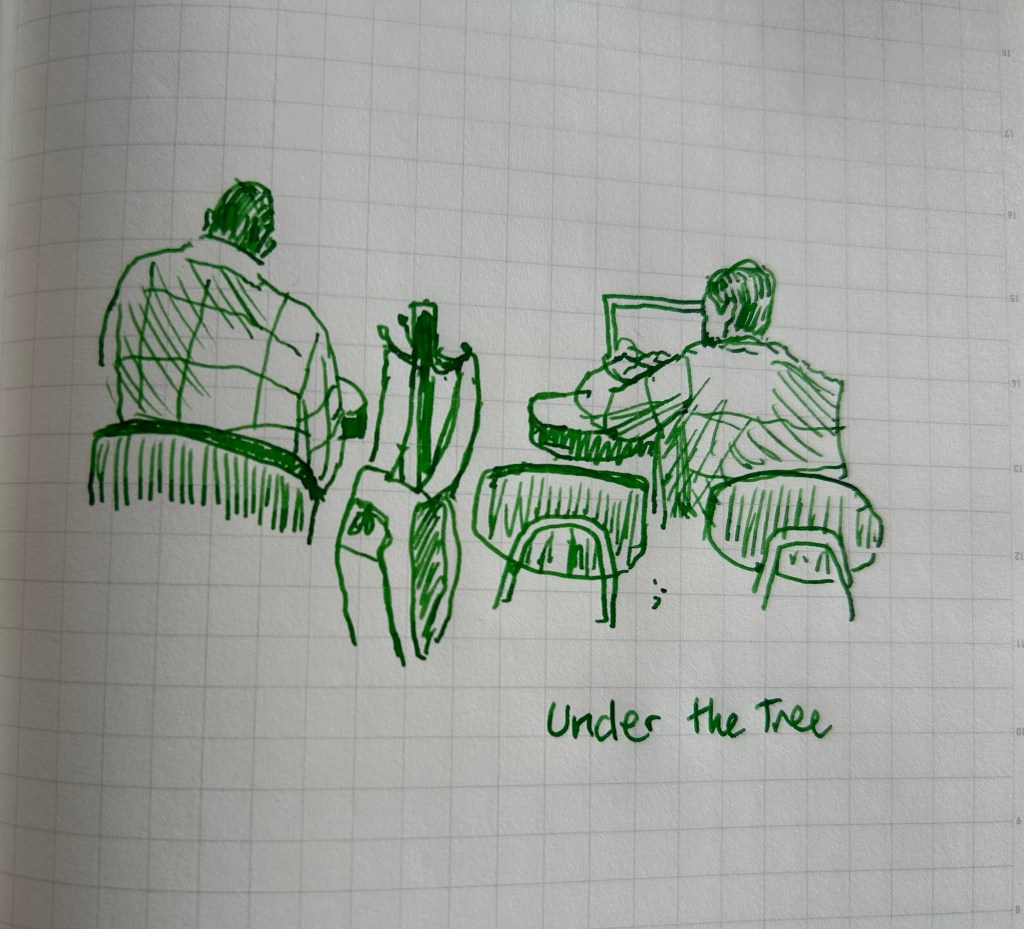
A quick cafe sketch in my Stalogy B5 with a Lamy Safari Diamine Merry and Bright.
This is the Diamine Inkvent 2023 day 25 door:
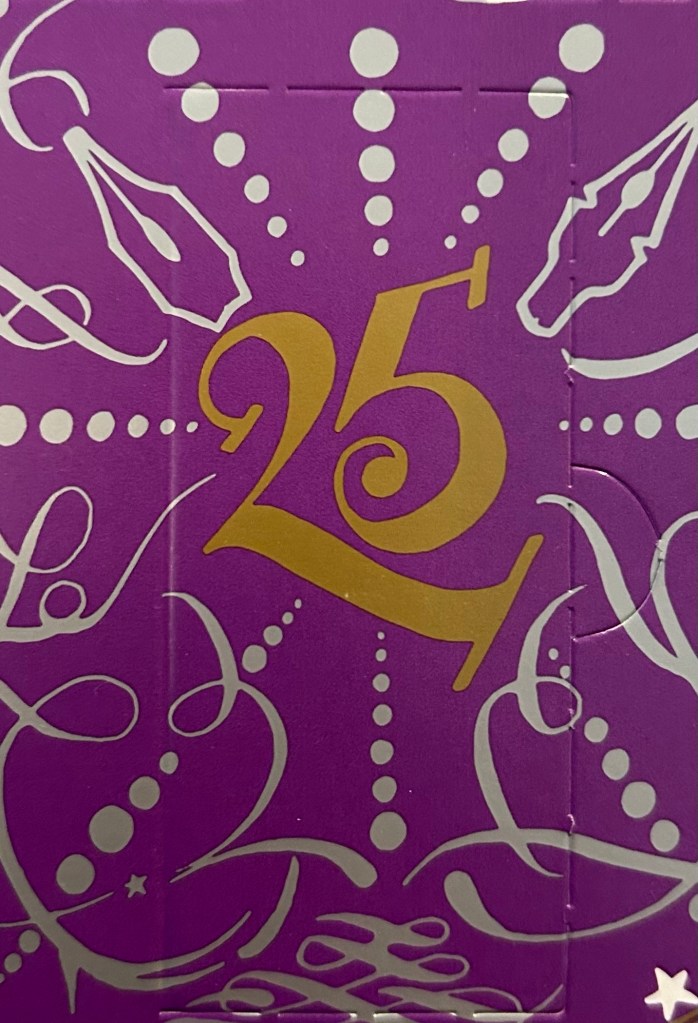
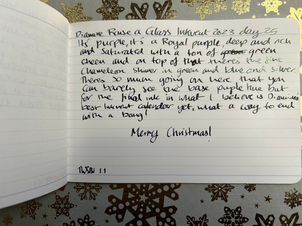
Day 25’s ink is Diamine Raise a Glass.
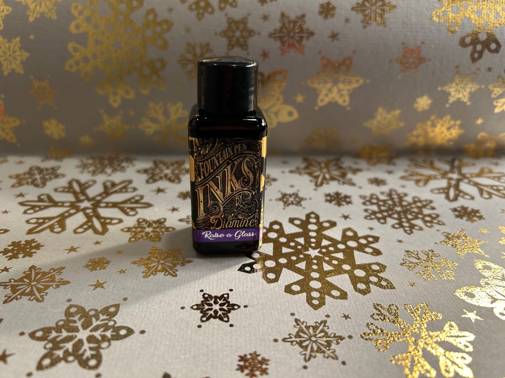
It’s the final ink of Inkvent, and as usual it’s a 30ml bottle of ink in the colour of the calendar: purple.
Diamine Raise a Glass is a dark royal purple with green sheen and what I think is chameleon shimmer (the bottle isn’t marked so it could just be regular shimmer, but it looks like a chameleon shimmer to me).
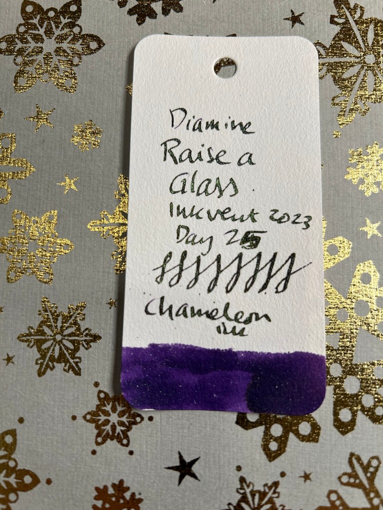
This ink is Diamine throwing everything it has on this ink: a super saturated, rich, dark purple base with a lot of green sheening and then the chameleon shimmer on top. The base ink is so dark it often appears to be black, and the chameleon shimmer works well with it. This is an ink for wide nibs and patient people as it takes a looong time to dry.
I smudged this sketch because I forgot how long this ink takes to dry and wasn’t careful enough. This is Arthus and he’s my favourite bear. I bought him 20 years ago at Hamley’s Toy Store in Regent street, London. They have a rather hidden display for collector’s bears and once I saw him I knew I had to have him despite his high price tag. The seller at the till was so taken with him she held him in her arms and had trouble letting him go. The sketch was done from an above angle that doesn’t do him justice, but look at his photo later on and you’ll see why the lady reacted as she did: Arthus is a bear that begs to be picked up and cuddled.
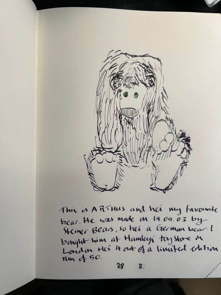
Here’s Arthus, my absolute favourite, in all his cute glory:

This brings this year’s Inkvent to a close. I will post a summary post with all the inks side by side as well as in colour groups tomorrow. In the meanwhile: Merry Christmas to all who celebrate!
