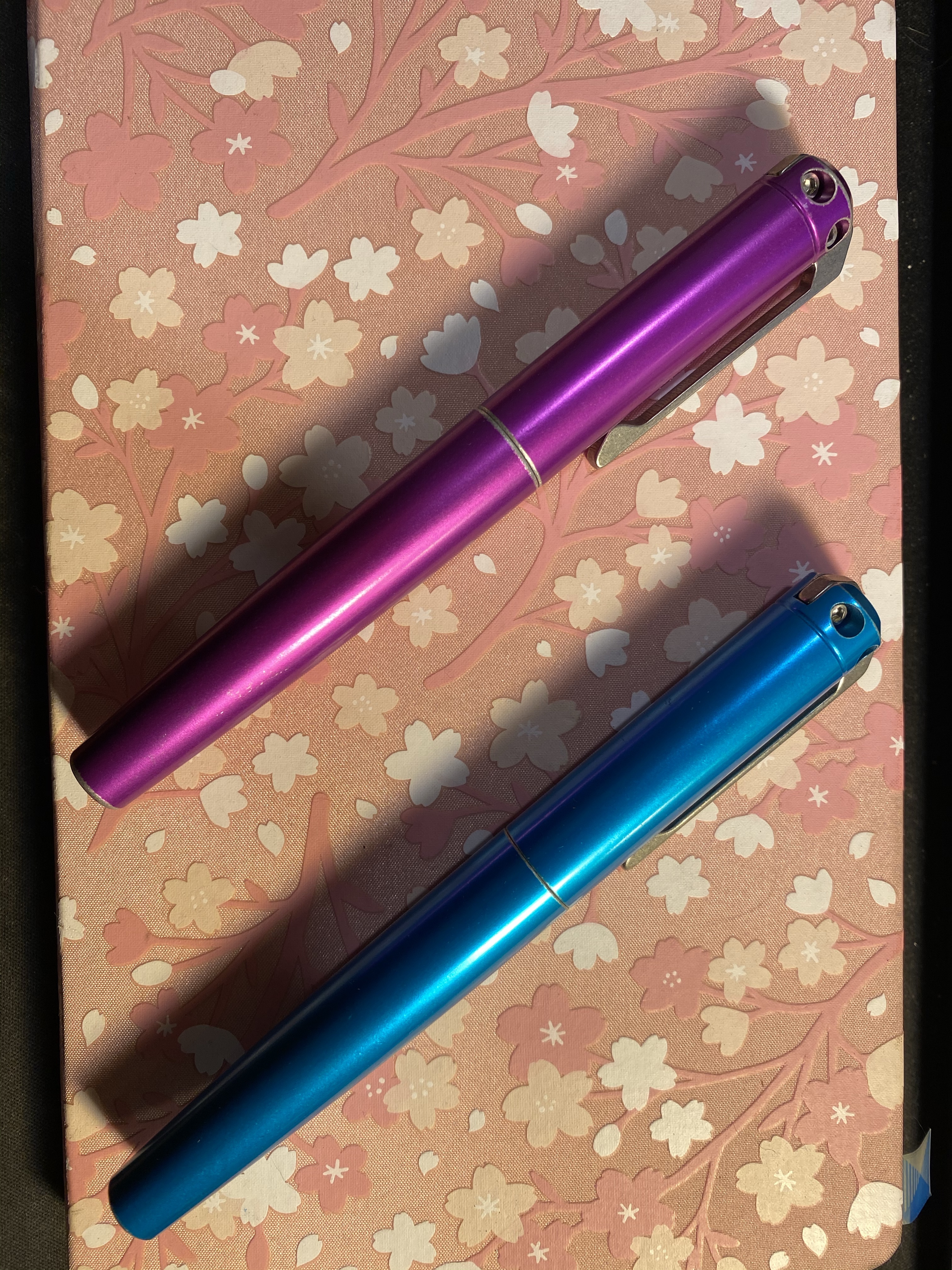
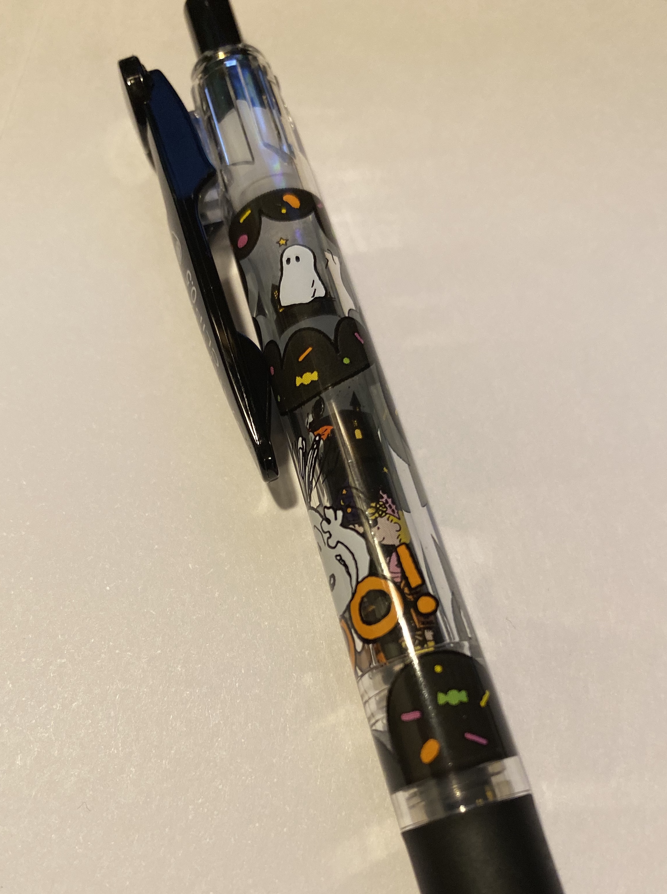
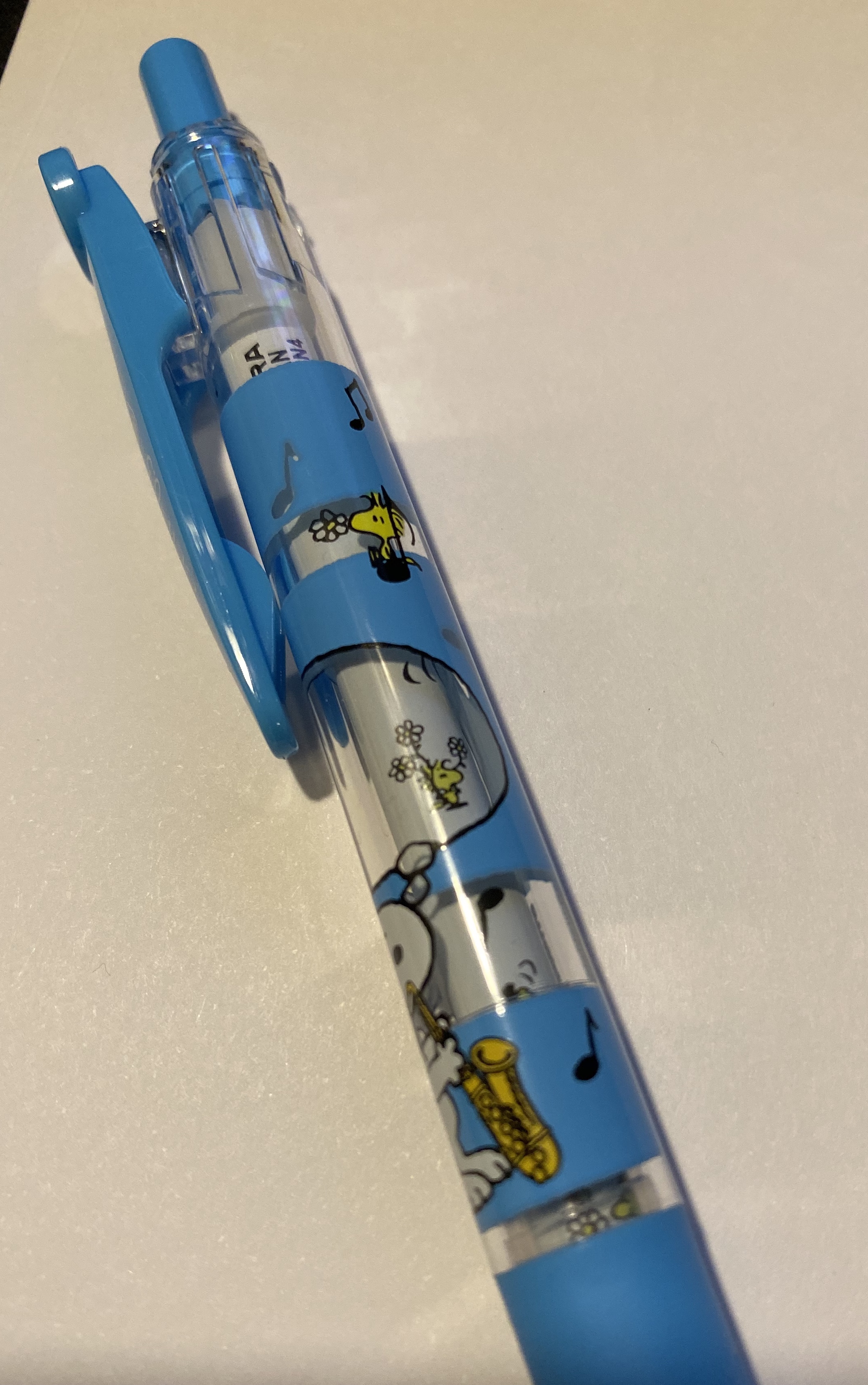
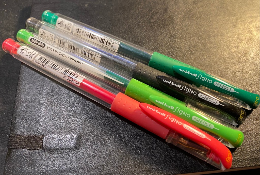
Uni-ball Signo Needle 0.38 Review

I am a huge fan of the Uni-ball Signo line, and the Signo RT 0.5 is my favourite gel pen body and my favourite gel ink refill (UMR-85N). In second place is the Uni-ball Signo DX (UMR-1 refill) and its less common brother: the Uni-ball Signo Needle, which is basically a Signo DX with a needle tip instead of a cone tip.

I don’t have a white gel ink fine enough for the branding on the cap, so image that it’s there.

Like the Uni-ball Signo DX the Uni-ball Signo Needle isn’t as commonly found in the wild of stationery stores as the Pilot G2 or Pilot Hi-Tech-C. It does, however, come in a wide variety of colours, and unlike the Pilot G2 doesn’t blob and smear like crazy. It also has a needle tip that doesn’t wither the moment you look at it, unlike the Pilot Hi-Tech-C. It’s a workhorse needle tip gel pen with an excellent refill that doesn’t dry out even after spending years on your desk, and allows you to use it without worrying about babying its fragile needle tip.

Comfy, reliable workhorse needle point gel pens.

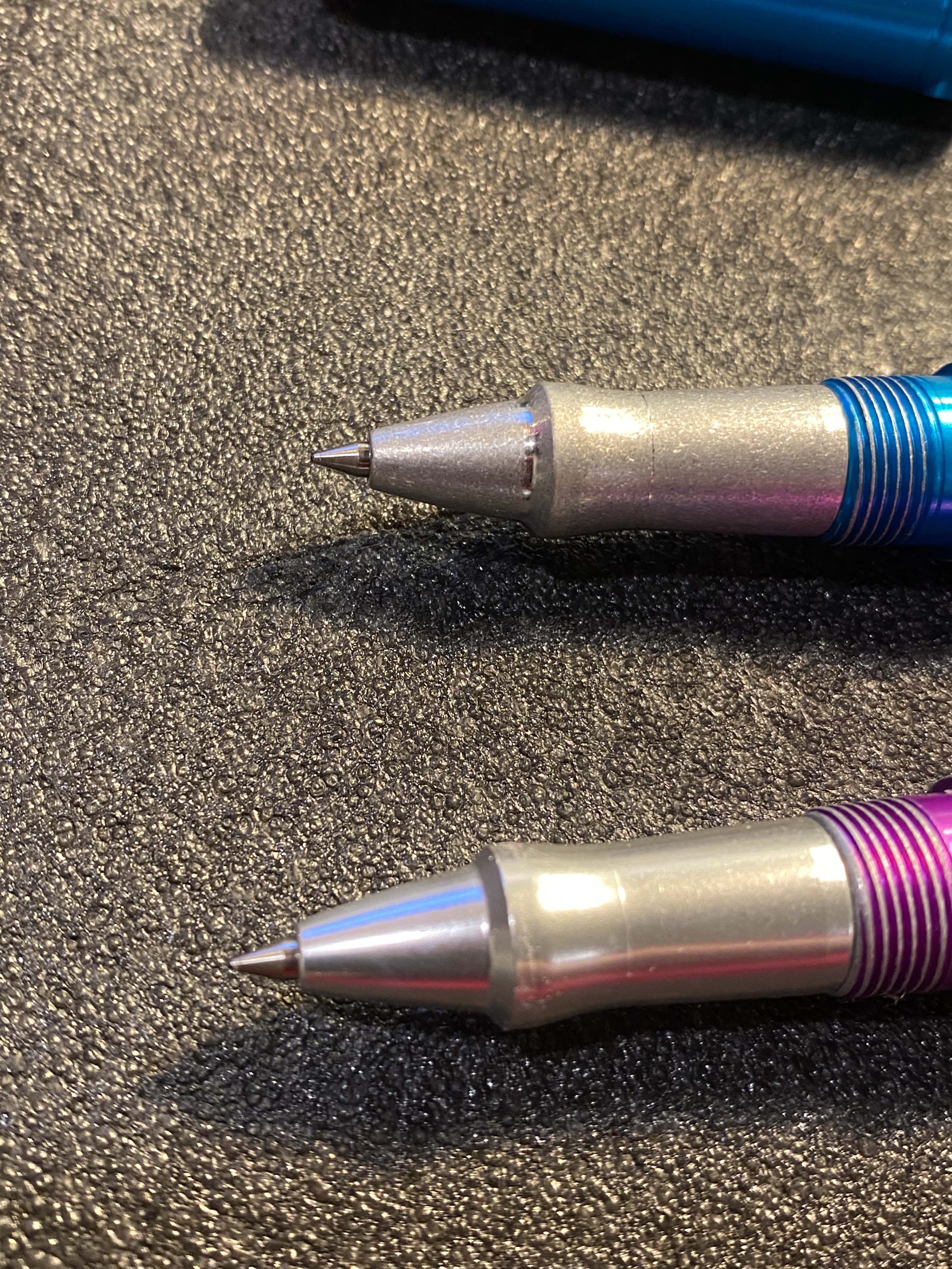
I love the Pilot Hi-Tec-C but I’m well aware that I have thrown more of them away than I have been able to use (the tip bends, the ink dries up and the pen no longer writes, there are “bubbles” in the refills of the even more delicate multi-pen variants of this pen). I’ve yet to have thrown a Uni-ball Signo pen away, needle point pens included. The magic happens in the tip design, which isn’t a two part deal like in the Hi-Tech-C but rather is a DX tip that has been shaped into a needle point, as if someone had taken it between two fingers and squeezed it to form a needle tip. The result is a tip that is stronger with no weak points that are prone to bending.

The smarts are all in this pen’s tip design.

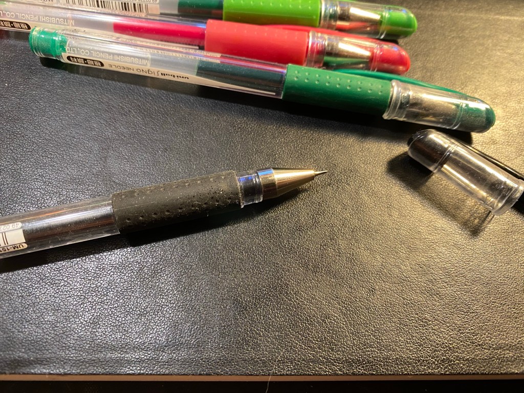
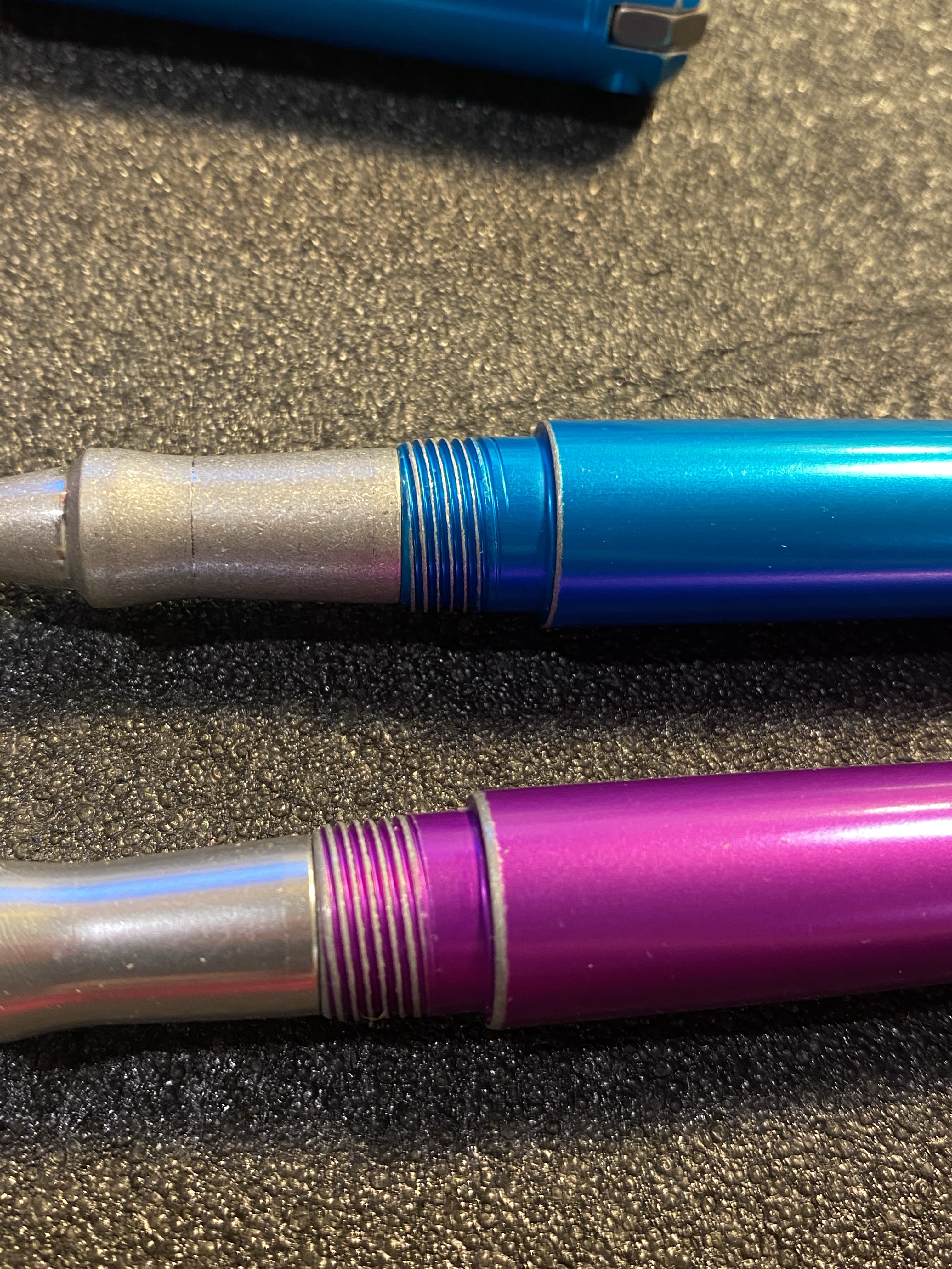
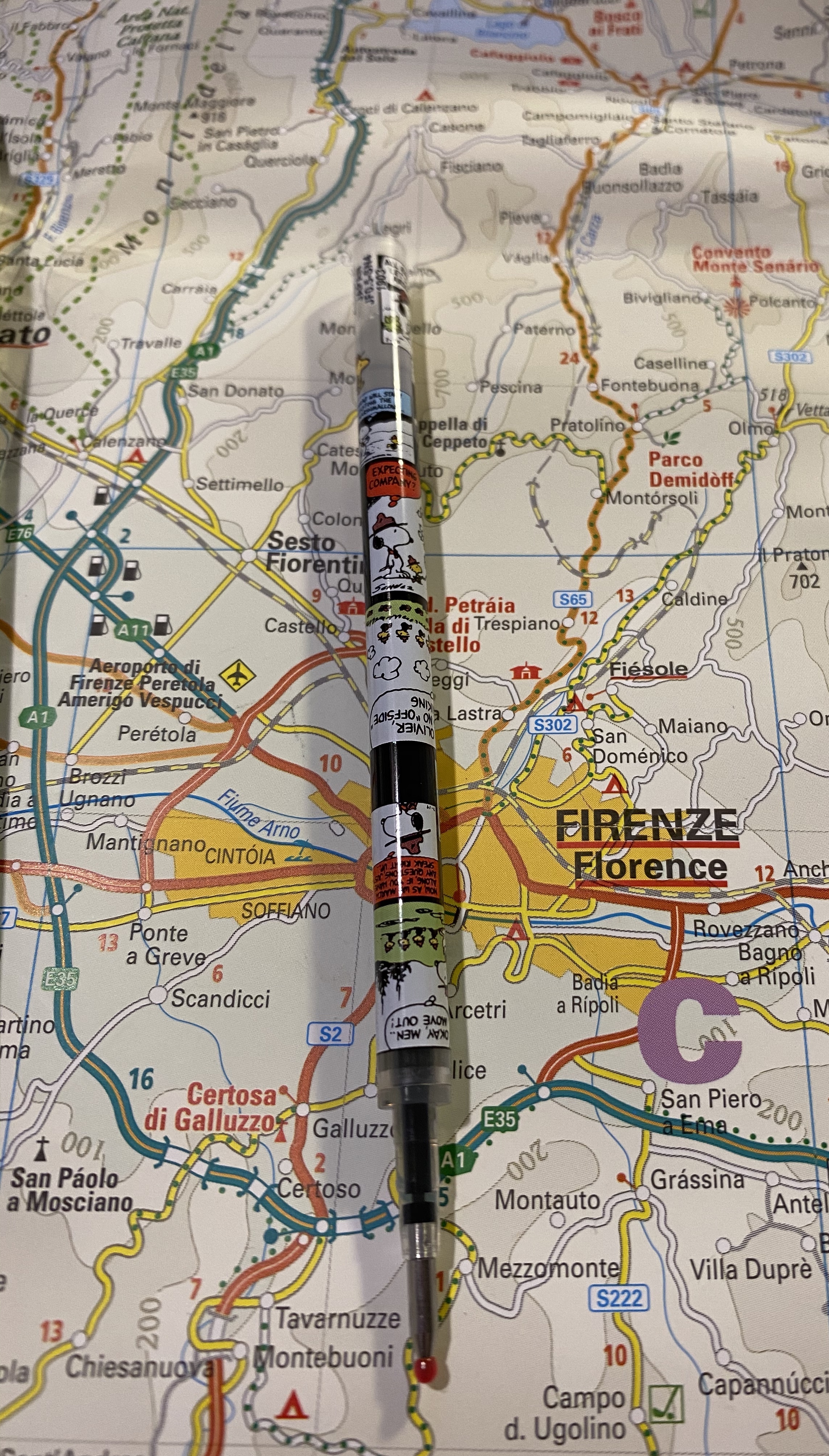
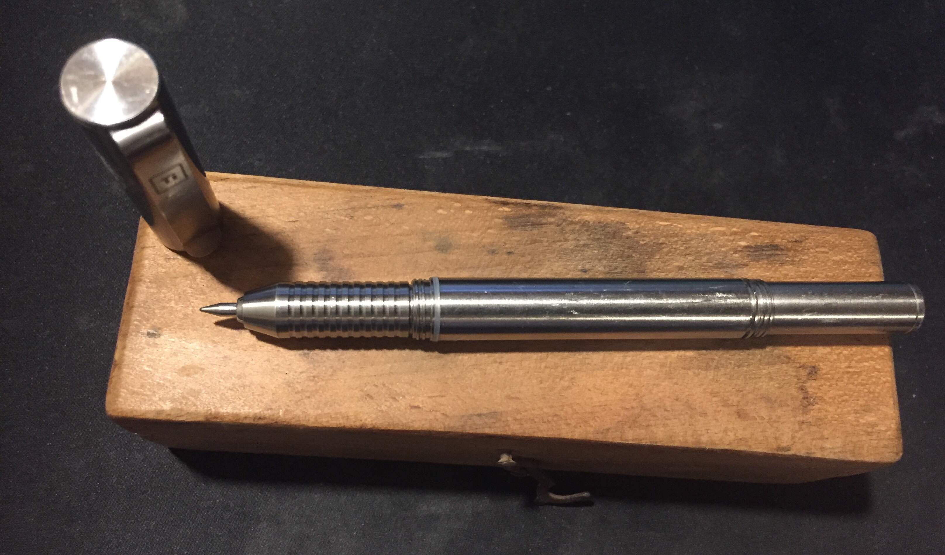
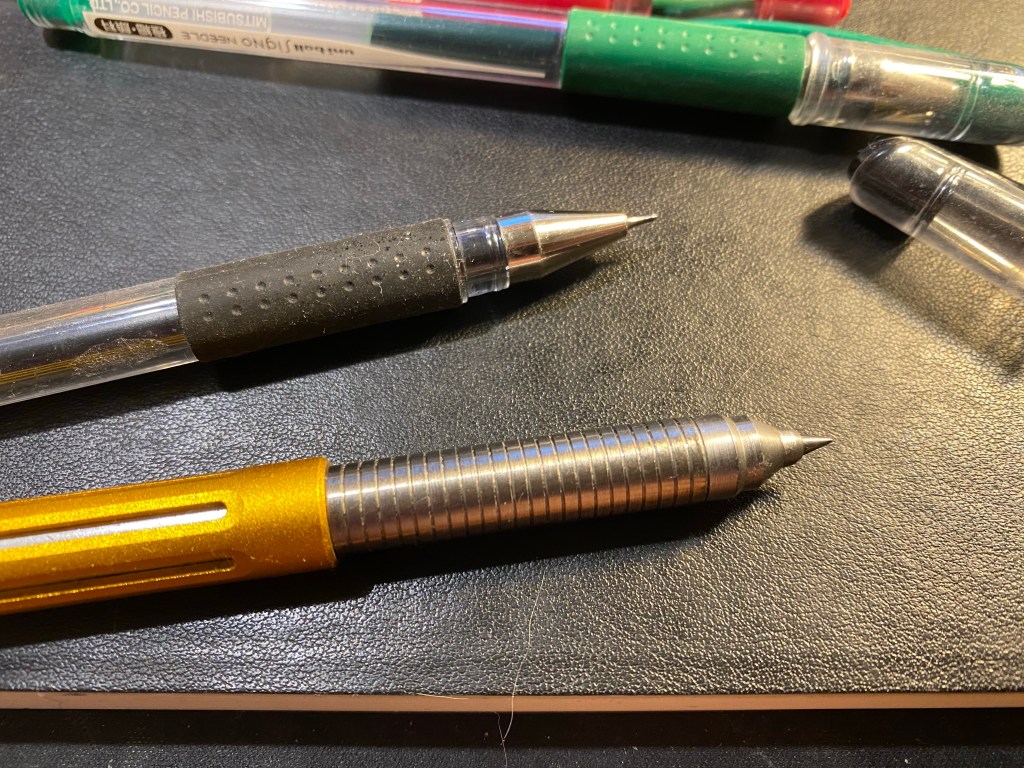
You can see the difference between the Signo Needle tip on the top, and Signo DX tip in my Spoke pen on the bottom. It’s basically the same tip just tapered more acutely.

Needle tip on the top, DX tip on the bottom.

In terms of refills, the Signo Needle uses a UMR-1ND refill, which is the same as the Signo DX’s UMR-1 refill just with a different tip attached. This means that there are very few machined pens on the market that will fit the UMR-1ND refill because of the way the front of the refill is designed. However…

UMR-1 refill on the top, UMR-1ND refill on the bottom.

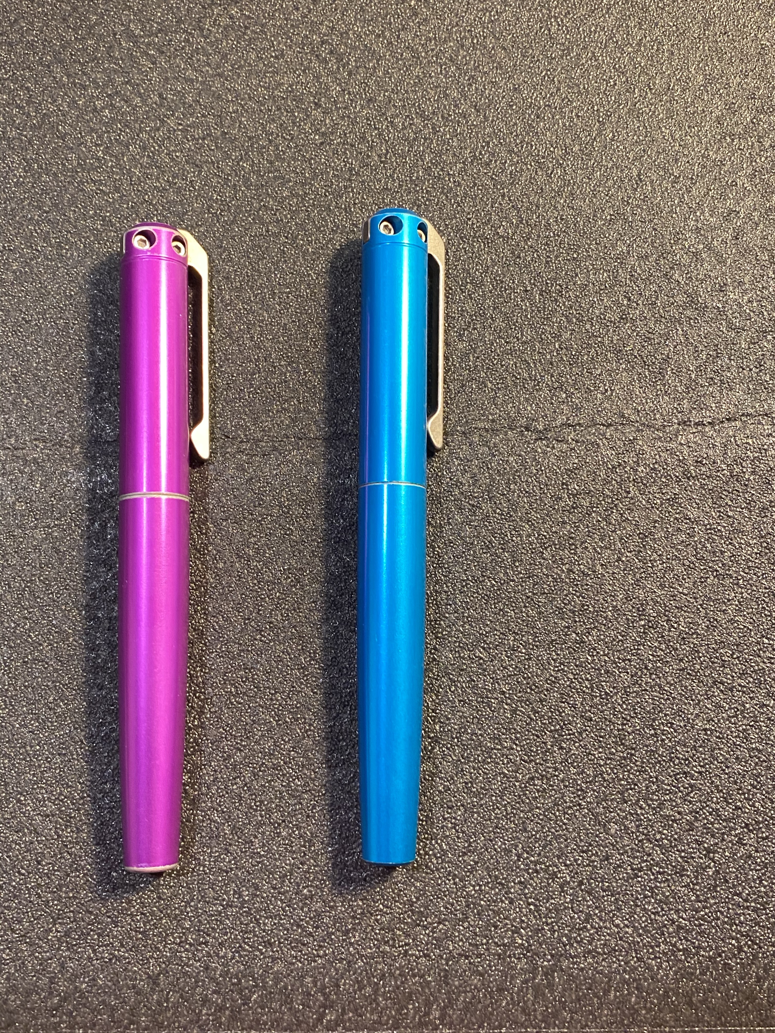
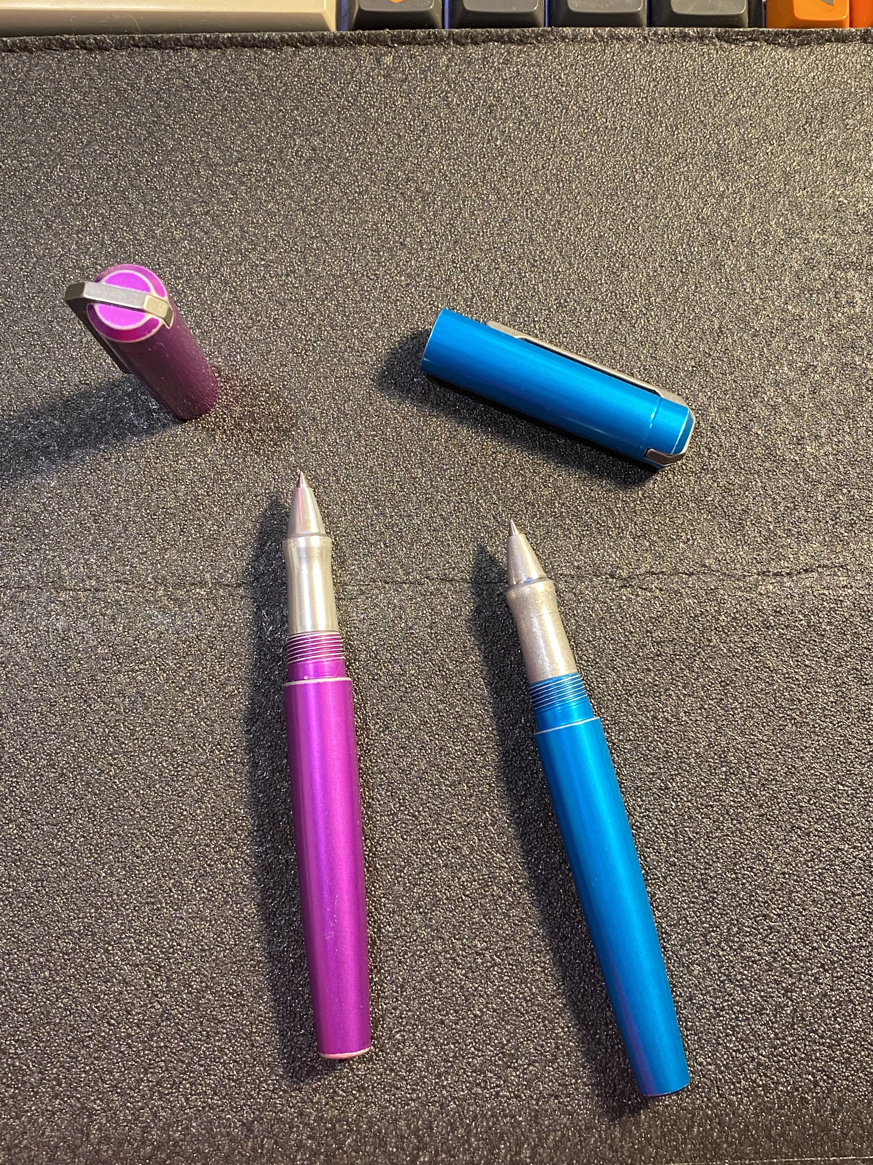
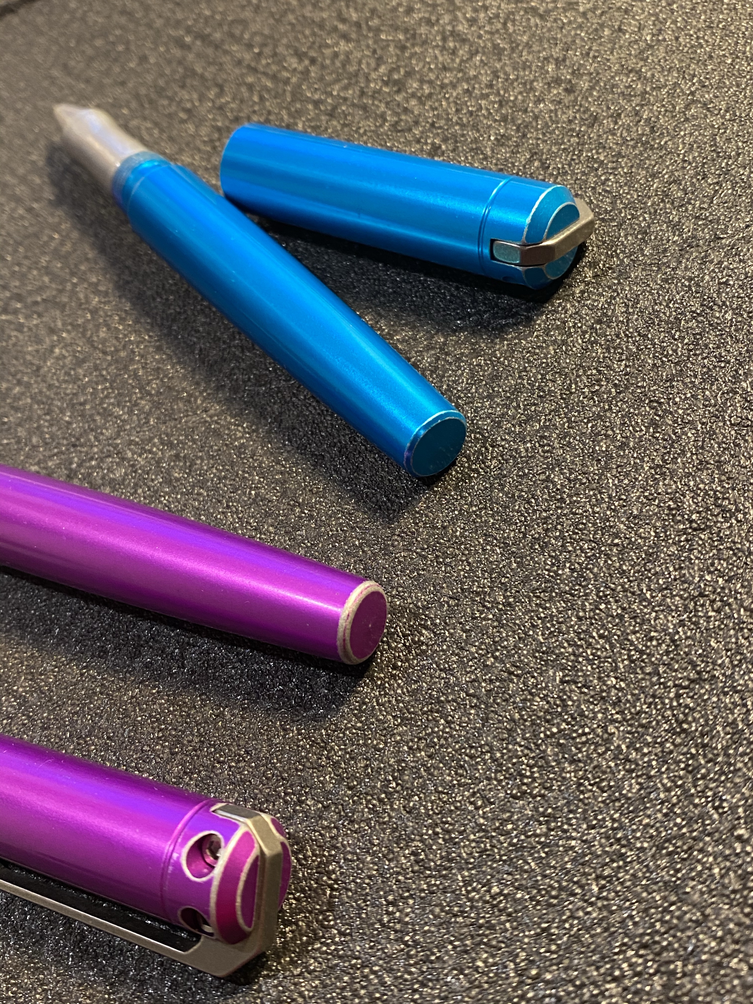
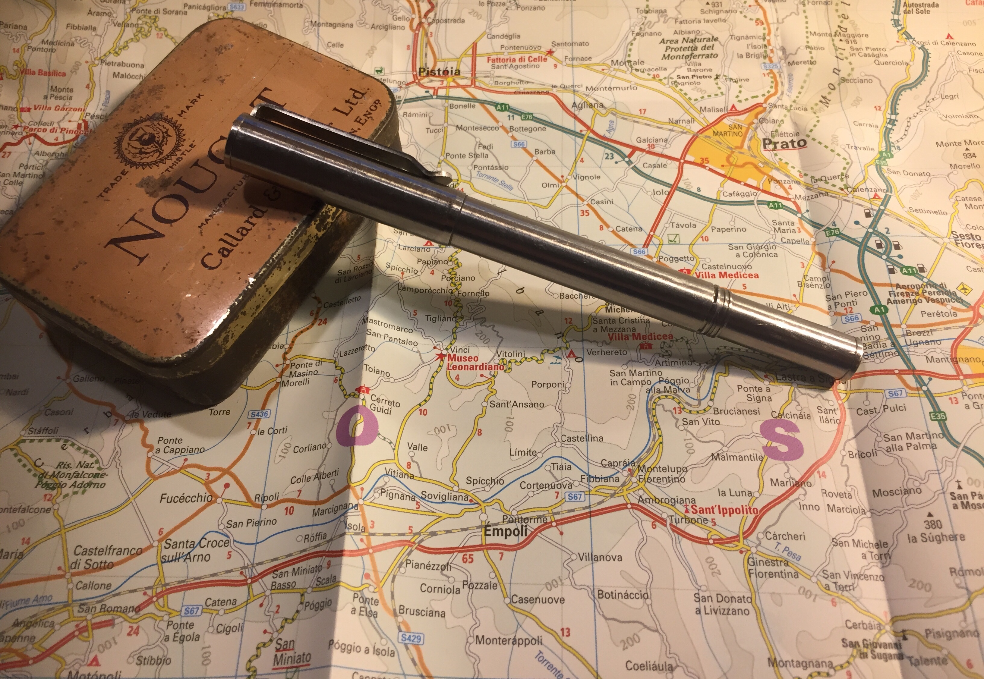
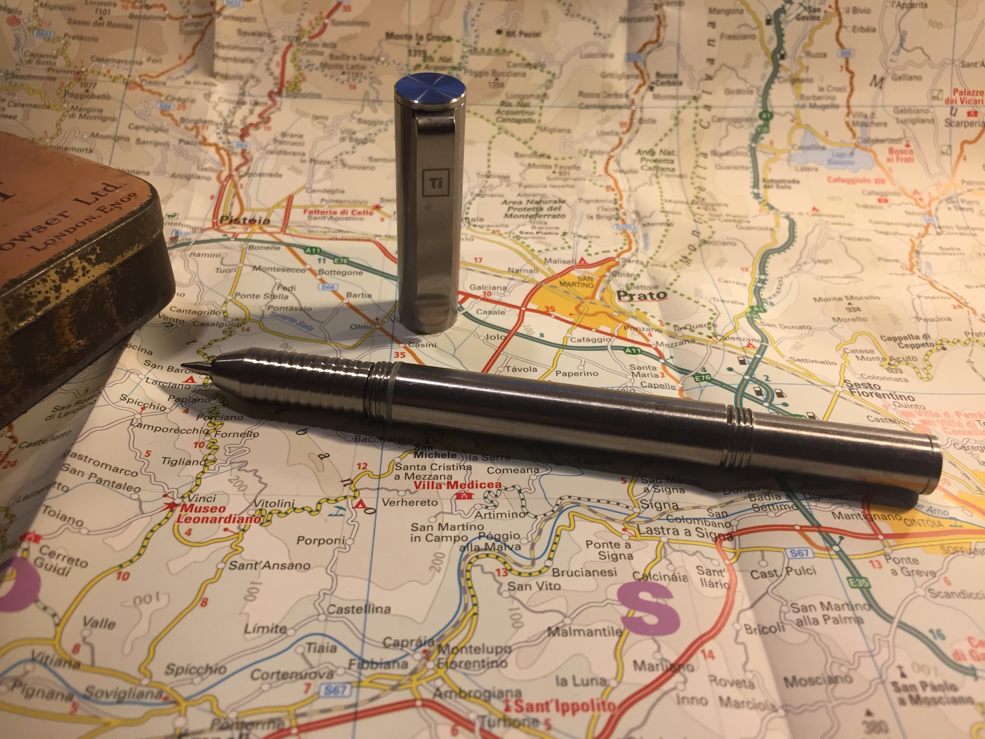
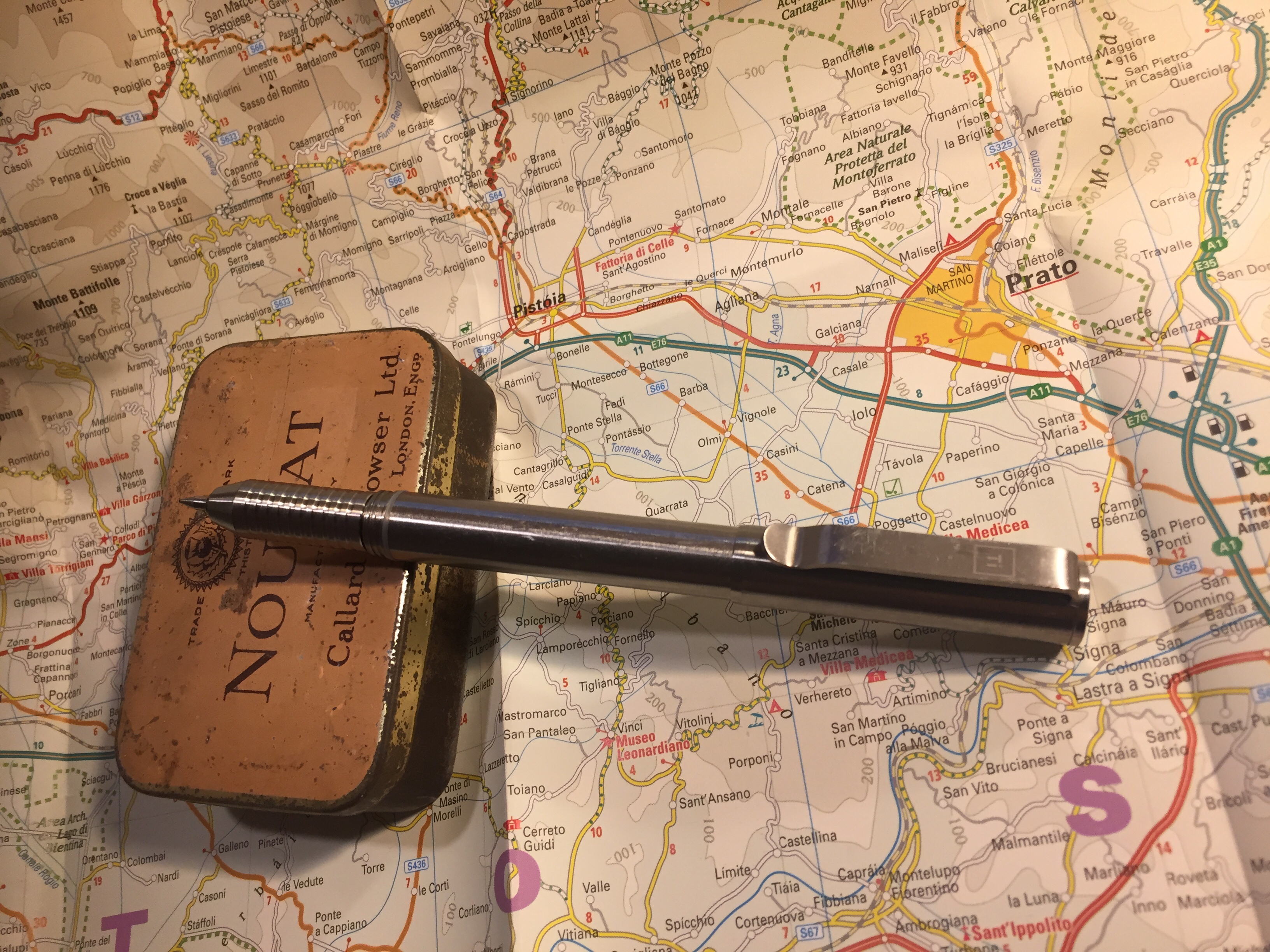
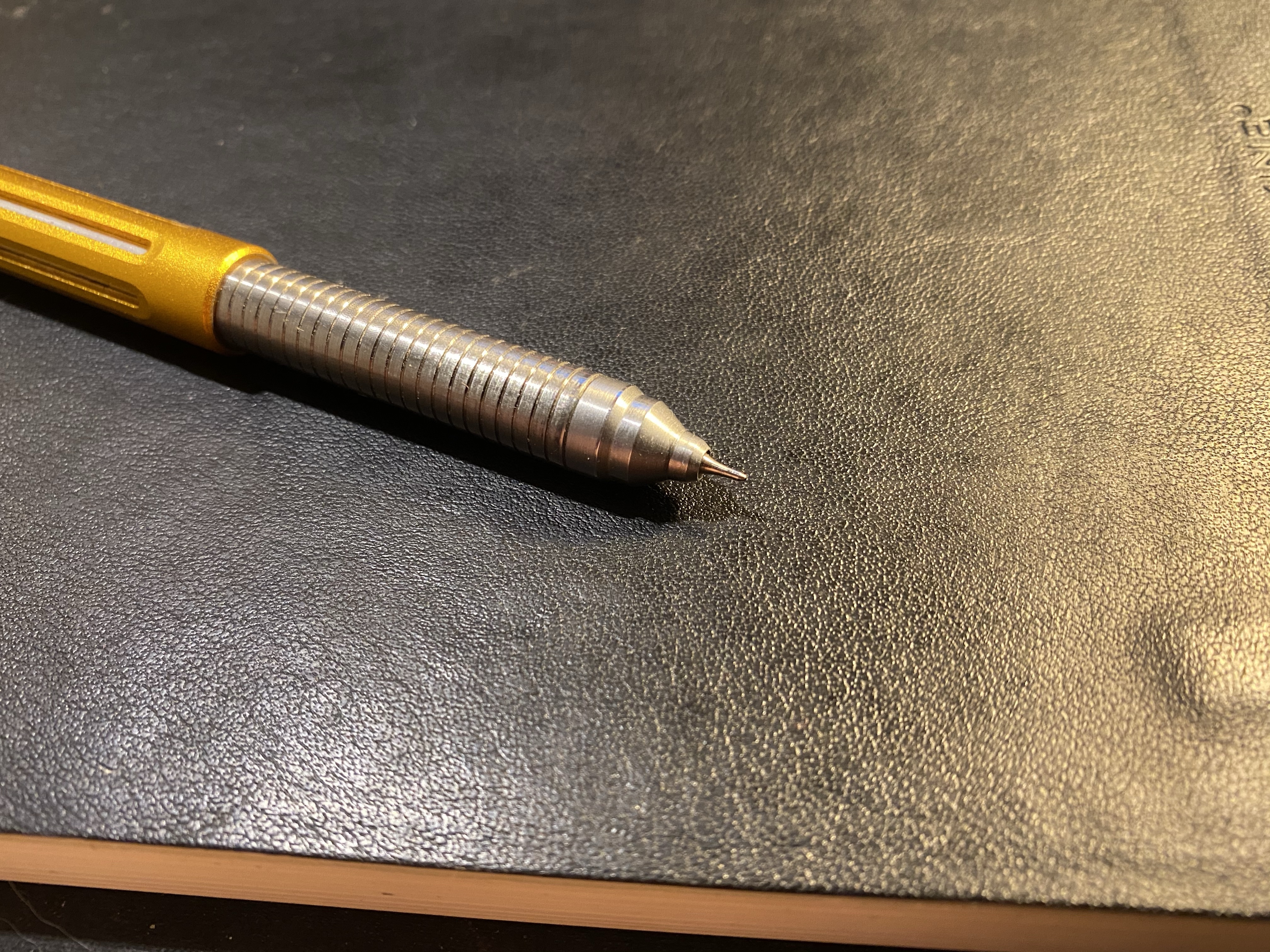
The Signo Needle refill does fit the Spoke pen! This is a fun bonus of them having the same refill design as the DX (minus the tip). So now not only can you have a reliable needle point gel ink pen with a variety of refills, it will also fit one of the best machined pens on the market (at least in my opinion).

Spoke pen orange crush with the UMR-1ND refill.

I will point out that there is a tiny gap between the pen tip and the grip if you do use a UMR-1ND refill in the Spoke pen, however, the refill doesn’t wiggle in the pen and the gap doesn’t extend into the pen body – it’s just an aesthetic thing.

Tiny gap between the pen tip and the Spoke grip.

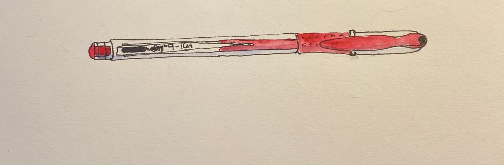
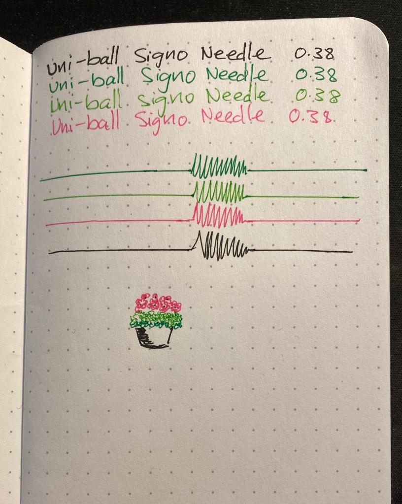
Here’s a writing sample with the Signo Needle 0.38. As you can see the lines are crisp and consistent even though I’ve had some of these pens lying around my desk for years. They are a tiny bit wider than the Hi-Tech-C 0.38 lines (just as the Signo DX 0.38 lines are wider than the Hi-Tech-C but thinner than the Pilot G2 0.38).

If you’re looking for a needle tip gel ink pen and are tired of throwing out broken Hi-Tech-Cs (or don’t like their somewhat spartan pen body), give the Signo Needle 0.38 a chance. It may be slightly more expensive than a Hi-Tech-C, but it will ultimately turn out to be cheaper because you’ll have a pen that you can actually use from start to finish.

Karas Kustoms Battleworn Ink 2.0 Rollerball

I am a big fan of Karas Kustoms machined pens, and up until recently I owned all of their lineup except for the Ink rollerball. So when Karas offered a grab bag of matching battleworn Ink 2.0 rollerballs I decided to roll the dice and purchased two of them. There’s always a risk when buying grab bag pens, but I had some tremendous luck and got two pens that are not only in some of my favourite colours, but also in colours that I don’t yet own. I was also fortunate enough to get one pen with a tumbled aluminum grip and one with a regular one, which means that I had a chance to experience both of my preferred grip styles in these pens.

Beautifully designed machined pens.

First thing’s first: the anodization on these pens is spectacular. The colours are really vibrant, and the Battleworn finish does not take away from that. They pop out in any pen lineup, rivalled only by my Spoke pen in terms of brightness:

From left to right: Karas EDK, original Render K, Battleworn Render K, Retrakt V2 , Ink 2.0, Retro51 Dino Fossil, Spoke Pen Orange Crush, Ink 2.0, Caran d’Ache 849

As you can see from the lineup photo above, the Ink 2.0 is a big, chunky pen. It’s larger than any other pen that Karas offers, and while it’s about the same length as the Spoke Pen, it’s much wider. Even so, this is not an overly heavy pen, and the added girth does make for a pleasant writing experience. This is a workhorse pen, built to last, and build to accompany long writing sessions.

The Ink 2.0 uncapped.

There’s quite a distance between the tip of the pen and the threads, and so there’s little chance of them getting in the way of your grip. Despite that, Karas has taken the precaution of ensuring that the threads aren’t overly sharp. Do take into account though that despite the 2.0 name, this is the older version of the Karas Ink rollerball, and so it has the old version of the threads and the cap. The threads on the new Ink V2 (I know, the naming could have been better, but at least it’s consistent across their lineup) are shorter, and have a flat area before them. This serves to even further place your fingers away from the threads, and is required for their Sta-Fast cap system. This system adds an o-ring to the cap, and prevents the pen from unthreading itself. My Ink 2.0s don’t have this system, and so they unthread themselves rather too easily, although nowhere nearly as bad as the original Render K. Again, this is a problem that you won’t encounter if you’re purchasing a new Ink V2 from Karas site right now, and they do a good job of clearly pointing the differences out.

You can see the differences in the tumbled grip and the regular aluminum grip.

The grip on the Ink rollerball is really where the pen’s design shines. It has such a unique profile, with the flare right before the tip cone. It makes for a very comfortable grip section, with added “grippiness” provided by the tumbled finish, should you choose to get it. The grip also comes in black anodized, brass and copper.

Unusual but beautiful design.

A closeup on the old threads shows the difference in the levels of Battleworn finish between these pens. The cyan pen was clearly less tumbled than the magenta one, so I am considering switching the grips between the two, to complete the extra Battleworn look.

The new Ink V2 threads don’t look like this.

Here you can see even better the different levels of Battleworn finish between these pens:

My pens arrived with a Pilot G2 large 0.5mm gel ink refill, and so far I haven’t replaced it. It’s very easy to unscrew the section and replace the refill with anything else that you like, and Karas does a fairly good job on their site, listing popular refills that fit their pens.

I think that the Karas Ink is one of their most beautiful and well designed pens, and there’s a good chance that I’ll buy the Ink V2 once I see a colour and finish combo that catches my eye. Everything from the robust clip design, the placement of the visible screws on the cap, to the length and girth of this pen and especially the grip design is well thought out. It’s clearly a step up from the (excellent) Render K, and if you’re looking for an impressive yet practical machined pen, the Karas Ink V2 is probably the pen for you.

Broken Lamps and New Pens

My little cat (I have two, a little black and white cat, and big black cat) managed to drop a desktop table sharpener on my banker’s lamp and it cracked the glass lampshade clear in half. So I had an interesting but unexpected project today: I bought a replacement lamp shade and took the lamp apart to get rid of the broken glass pieces. A youtube video and a Philips screwdriver took care of the taking apart bit; let’s just hope that I can put it back together again.

Broken shade halfway through dismantling.

I got my Battleworn INK 2.0 Karas Kustoms grab bag rollerballs today. This was my first Karas Kustoms grab bag and my first ink rollerball and I’m very pleased with both the colours that I got and the way the INK 2.0s look and feel. These are chunky but relatively light pens, and I look forward to using them and maybe reviewing them in the future.

Karas Kustoms Battleworn INK 2.0 purple and cyan.

The INK 2.0 uses the Pilot G2 LG2RF refills, which are larger than the usual G2 refills, and built a little different. I haven’t yet tried to swap them out for a different refill, but I suspect that they won’t accept my beloved Uni-ball UMR-85, which is something I was aware of ahead of time.

These are the pens and some of the notebooks that I’ve been using today (I’m not getting much fountain pen use lately): my beloved Orange Crush Spoke pen, and the new purple Karas Kustoms Battleworn INK 2.0 rollerball.

These two pens look great together. Spoke on the left, INK 2.0 on the right.

Field notes came out with a new addition to their National Parks series, which I’ll probably pick up on my next purchase there. They’ve got an offer for a free decal for purchases made by the 30th of August if that speaks to you.

Creative Draw: Koh-I-Noor Magic pencil, TWSBI JR Pagoda 0.7 and Pilot Juice Up 0.4

Things have been tough lately and I haven’t been in the mood to draw anything, write anything, post anything. So I decided to make myself create something, as silly and small as it could turn out to be, just to see if I can draw myself out of the funk.

I dug into my largest art and stationery supply drawer, and picked out three random items: a Koh-I-Noor Magic pencil, a TWSBI Jr Pagoda 0.7 mechanical pencil, and a Pilot Juice Up 0.4 in blue ink. Nothing good could come out of this random draw, I thought to myself, but I’ll draw something anyway:

The Koh-I-Noor Magic pencil comes in many varieties, some of the actually pragmatic. This Magic pencil is just ridiculous. It’s a giant, glittery, neon mess that makes me smile.

The TWSBI Jr Pagoda is a solid mechanical pencil, but in the battle against the Uni-ball Kuru Toga or any kind of drafting pencil it is always going to lose. I enjoyed using this underdog, and I think that design-wise it’s a very good mechanical pencil.

The Pilot Juice Up is excellent, and Pilot should replace all of its Hi-Tec-C pens with this refill (and perhaps even with this design). The refill gives Uni-ball gel refills a run for their money, and the barrel design is both sleek and ergonomic. This is a phenomenal pen that I really need to use more.

This turned out to be a fun exercise in creativity, and it made me smile for a bit. Will I do it again? Perhaps, perhaps, perhaps.

Old Favourites: Zebra G-301 review

In 2013, while I was at a convention in Boston, I went into the FedEx at the convention centre to collect a package. As I was waiting in line my eye caught the Zebra G-301 pen on a rack near the till. I’d heard good things about the Zebra F-301, but it’s a ballpoint pen and I wasn’t a fan of those. The Zebra G-301 was a gel pen. In stainless-steel. For just a few bucks.

Of course I bought it.

Fast forward six (!) years and that same Zebra G-301, the exact same one, is still on my desk, and is still my daily workhorse pen in the office. Here’s how it looks now:

Impressive, right? The imprint is almost gone (mine didn’t have the Zebra logo etched into the clip, so it now looks like an unbranded pen), and the plastic grip is a little worn with use, but otherwise the pen looks practically brand new.

The pen costs $2.5 on JetPens. I’ve been using it for my daily to do list and for general planning and meeting notes every day for six years. It just shows that a pen doesn’t need to cost hundreds of dollars to be a good, solid workhorse that’s a joy to use.

Oh wait, I haven’t actually reviewed it yet…

The Zebra G-301 has a stainless steel body that is durable, gives it more heft than a plastic bodied pen, and yet isn’t too heavy to be uncomfortable to use or unwieldy. The plastic grip has no give, so if you like mushy grips it’s not for you. Otherwise it gets the job done. The branding is classy (one font, understated, sleek and modern), and well suited for office use. The pen is durable, and the click mechanism isn’t mushy and lasts for years.

New and Old

The only possible downside of the Zebra G-301 is the refill. It’s proprietary, on the expensive side (a pack with two refills costs $1.90 on JetPens, almost as much as the pen), and they don’t last long if you write a lot with them (I get about 2 months out of each refill). I also only use the G-301 refills (theSteel JK 2 pack), so they come only in black or blue, and only in 0.7mm. JetPens also notes that the Zebra Sarsa JK refills fit the Zebra G-301, which come in 0.5 and also in green and red, but they cost a little more per refill. As I view the Zebra G-301 as an office use pen, I don’t mind the ink limitations.

Writing Sample

I never thought when I picked up this pen back in 2013 as an impulse buy that I’ll be using it six years later. I like it so much that I bought a backup a few years ago, because I was sure a $2.5 pen wouldn’t last for long and I didn’t want to be stuck without it. The replacement is still in its blister pack, as you can see in the photos above, and the original G-301 is still going strong on my desk. I wonder if I’ve accidentally stumbled on the modern equivalent of the Esterbrook Dollar Pen.

Zebra Sarasa Clip Peanuts Limited Edition Review

The Zebra Sarasa Clip is an excellent gel ink pen, with a unique and well done clip design. I have a bunch of the black and blue black pens laying around at home and in the office, and although I prefer the Uniball Signo line of pens, I do use them and recommend them to people looking for an upgrade from the Pilot G2.

I don’t usually buy limited edition disposable pens because there has to be a limit, and I already own way too many pens. I can’t afford to start collecting all the Uniball and Zebra collaborations with various (usually animated) IPs. But sometimes Japanese makers manage to floor you with just how far they’ll go with their big-box, disposable pen lines, and the Zebra x Snoopy Sarasa clip line is that case. I just had to buy it once I saw it surface on JetPens.

Yes, I bought all of them. I don’t have a problem, you have a problem!

This is the 4th (!) limited edition Zebra Sarasa Clip Peanuts limited edition, and it consists of two sets of 4 pens (each in a plastic, resealable pouch), plus three extra stand-alone pens (two black and one blue-black). The clips have a drawing on Woodstock on the top and Snoopy’s head near the Sarasa logo. Each pen body has an opaque drawing of Snoopy and Woodstock doing something together, and two of the pens (the orange, which is part of a set B, and one of the black pens, which is part of set A) are Halloween themed.

The pen body is still the usual Sarasa transparent body, which brings us to what made me do a double take:

The refills have Peanuts drawings on them.

If you look closely at the transparent part of the pen body you can see the refill prints.

Here’s a close up of the “Boo” black pen:

And here’s the blue “Saxophone” pen:

The green pen has the most transparent parts, and so shows it off the best:

This is so wild. You can barely see the refills from up close, not to mention from a distance, so Zebra totally did not need to do this. Regular refills would have worked just fine. Instead, this is what you get:

This is why I love Japanese stationery so much: the utterly unnecessary but charming attention to detail.

The Sarasa pens are excellent gel ink pens, and I like the colour choices in this set (especially the orange). I personally would have replaced the red in the set with a blue black, but red is a classic pen colour so I guess it would have been strange if it wasn’t there:

Sometimes you just want a pen that will make you smile when you pick it up, and Zebra has really delivered on that with these limited edition pens. For $12 a set and $3 a single these are a nice, not overly expensive pick-me-up. They aren’t available on JetPens anymore, but you can probably still find them on Etsy or eBay (or just wait for the 5th limited edition, which will surely show up eventually).

Two Years of Daily Journaling

This week I celebrated two years of daily journaling. While I’ve been keeping journals for years, until the last two years I’ve only done so sporadically. Journaling was something that I did only when things got really rough, to keep myself going, or when I was travelling, to preserve the memories of my trip. I used pocket notebooks for my sporadic journals, as it was more important for me to capture things than to reflect on them. It was a utilitarian process, not an enjoyable one. I knew that once I decided to really start a journaling habit, that would have to change.

These are all the journals which I’ve used during the past two years.

So the first thing I did was pick a notebook that I knew I’d want to use, and use daily. The only rules were that it had to make me happy, and that it had to be large enough for me to be able to actually write in it, not just jot things down. I wasn’t looking for the best notebook with the best paper in the best format (I don’t think that exists, actually, but for us stationery geeks the search is always on), just a good enough notebook for me.

My notebooks of choice.

I also decided very early on that I couldn’t use a fountain pen for this, because I wanted a pen that I could write with even not under the most ideal circumstances. I was also planning for both the notebook and the pen to bash around freely in my bag. These were going to be used and look used.

Can you see how bloated these notebooks are? Moleskine makes them sturdy enough to take a beating. 

I chose Moleskine large ruled hardcover notebooks as my notebook of choice, and the uni-ball Signo RT 0.5 gel ink pen as my pen/refill (UMR-85N) of choice. I wanted a sturdy lined notebook that I’d enjoy using and looking at once it was done, and after years of neglecting the Moleskine for other notebooks I came back to it because of some of their limited edition designs. I knew that I was going to use the uni-ball Signo RT 0.5 as my pen or refill of choice (inside a BigiDesign Ti Arto or Ti Arto EDC), so I didn’t need fountain pen friendly paper. I had decided to pick up the steady journaling habit by starting with a travel journal, which I already had some experience with, and then carrying on from there. On the first evening of a trip to London I happened to walk by the Moleskine store in Covent Garden, and I decided to go in and check out what they had. There was a beautifully designed Batman limited edition notebook in exactly the kind of format I was looking for, and it was only available for sale at the Moleskine stores. I bought it, unwrapped and stamped it with the Moleskine Covent Garden stamps, and I haven’t looked back.

That pen and notebook combo has hardly changed over the years. What has changed is the format I use to journal, and the amount of daily journaling I do. When I started out I was used to only jotting a few lines down here and there when I journaled, so I knew I couldn’t expect to write 4-5 pages per day right from day one. Starting with just a paragraph to half a page a day, I pretty quickly moved to one page per day of just writing.

Then I saw a Neistat Brothers video on Youtube and realized that I could use my journal as a visual capturing device as well, and anything could go in it, so long as it made me remember a moment or a place.

Limited Edition Cola Zero tab created for the 2019 Eurovision song contest in Tel Aviv. I don’t even drink Cola Zero, but this little piece of metal is still totally evocative to me.

That’s when the notebooks really started to get bloated. From clothing labels to business cards and ticket stubs, if I can put glue on it and it’s visually appealing or evocative, it goes in. I almost always also write a little note for future me, to remind myself what I’m looking at and why it’s there. That change really made these notebooks a kind of personal artifact for me, and I can’t say how precious they’ve all become.

A bit of cat themed washi tape and a Uniqlo shirt label. Sometimes things go in because I find them visually appealing or they make me smile.

At a certain point I started getting ambitious, moving from writing one page a day to two pages, then four pages, then six. That’s when I had to take a step back and make sure that I wasn’t burning out on journaling for all the wrong reasons. I enjoy writing and I enjoy journaling, but I’m also trying to write fiction, and my journal can’t become something that consumes that, an excuse for not writing. It’s also easy to get carried away and want to finish the notebook as fast as possible just so you can open a fresh one, or brag (even if it’s only to yourself) that you’ve finished a notebook. Nowadays I write one or two pages a day for most days, moving up to more pages only if I really have something special to write about.

Doodling seasonal fruit in the margins.

Life also happens, and oftentimes it’s scary and ugly, a black hole that threatens to consume all that is good in your life, including journaling. My mom got unexpectedly and very seriously ill last year, and we’ve been struggling with her disease ever since. When she was in hospital I couldn’t bring myself to journal. I backlogged those (thankfully few) dark days, and I realized that I would have to accept that as much as journaling is important to me, family comes first, so backlogging is going to have to become acceptable. I try to backlog as little as possible, but some days just demand that.

If I want to remember a good meal I’ll sometimes draw it.

I also draw a little in my notebook, tiny thumbnails of things that I want to remember later, or that I just feel like drawing. These are usually food doodles, as I don’t really like to photograph my food.

I still use my journal in trips, and ticket stubs and bit and bobs like these make it more interesting.

If you’re looking for some journaling tips, I wrote two posts on that subject here and here. If there’s one thing I can leave you with it’s that if you want to journal, you need to figure out a way to it make it work for you, and be ready to adapt as your life changes over time. There is no perfect journaling system, or perfect journaling notebook, there’s only what works for you.

Go write.

Ti Arto Review

It’s strange that I haven’t yet reviewed the pen that I use most, but that’s life, I guess. The Ti Arto is a titanium machined pen that accepts 200+ refills, and it has been my EDC and journaling pen since November 2016. There’s no pen I use more, and no pen I like more than this one.

Since the Ti Arto bashes around freely in my bag, it’s got quite a few scratches on it. I personally like that it shows some wear and tear, but as not everyone feels the same, I thought I’d take a few photos that show how the Ti Arto looks like when it’s not brand new.

The Ti Arto is made out of solid titanium, and doesn’t get dented even if you drop it. It does, however, show micro-abrasions and scratches.

None of these scratches is deep enough to be felt – they’re at surface level only. So it really is just an aesthetic thing. If you like your pen to look brand spanking new, the Ti Arto comes with a protective felt sleeve. I personally wouldn’t bother: this isn’t a fountain pen, but a tough, machined, EDC pen. It’s built to tumble around in your bag.

Now to the review proper: the Ti Arto was originally launched on Kickstarter, and became available on the BigiDesign site sometime in 2016. The pen is machined out of solid aluminium, and made to easily accept 200+ refills with no tip wiggle or need for spacers.

The Ti Arto is well balanced, both capped and uncapped, and very comfortable to use, even for someone with small hands that likes to write a lot. Unlike some other machined pens, the Ti Arto’s cap will stay on, even after years of use and after the threads start to wear out a bit. See that semi opaque silicone ring just below the threads? That’s the magic that makes sure the cap closes nice and tight. No refill is going to dry out or leak in this pen.

If you want to post the Ti Arto you can, by threading the cap to the back of the pen. The resulting pen is a bit longer, but still well balanced, and the cap doesn’t rattle when you write. It does take time to screw the cap on, so if you uncap and post often it will become a chore. Since the Ti Arto isn’t a fountain pen, though, there should be no problem leaving the pen uncapped for a while.

I use the Uniball Signo UMR-85N refill in this pen (the same refill that goes into the Signo RT). To change the refill you unscrew the section, pop the refill in, screw the section almost all the way back on, then tip the pen body forward until the refill tip protrudes, and then you tighten the section. Since you probably aren’t going to actually use 200+ different refills in this pen, I recommend finding a refill that you enjoy and buying replacement refills in boxes of 10 or 12 on Amazon or eBay. I go through a box and a half to two boxes of UMR-85N refills a year in this pen, and it takes less than a minute to switch out the refill.

Here’s are a few points about the Ti Arto, drawn and written with the Ti Arto:

If you are looking to own just one good pen, or if you’re looking for an EDC or machined pen, the Ti Arto is the pen you should buy. I’ve tried a good number of machined pens so far, including all the other (non-stylus) offerings from BigiDesign and nothing comes close to this pen.