Diamine Inkvent 2024 Day 3
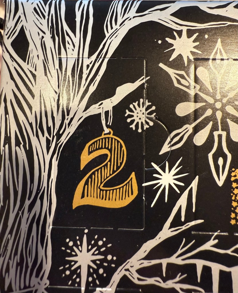
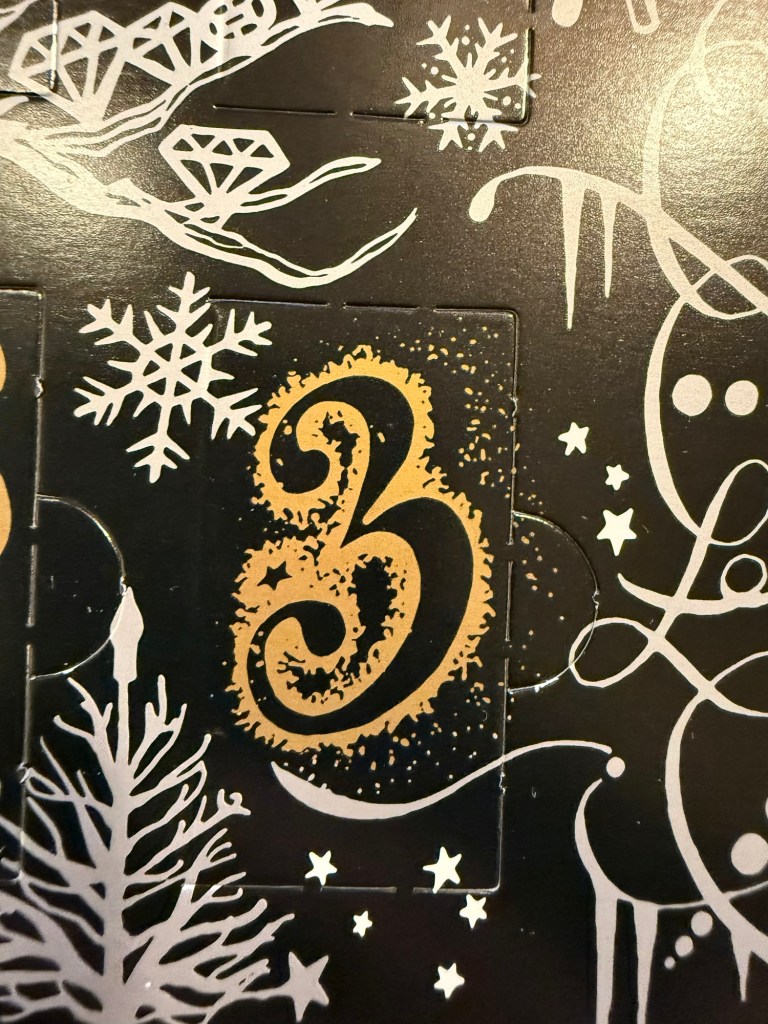
This is the Diamine Inkvent 2024 day 3 door:
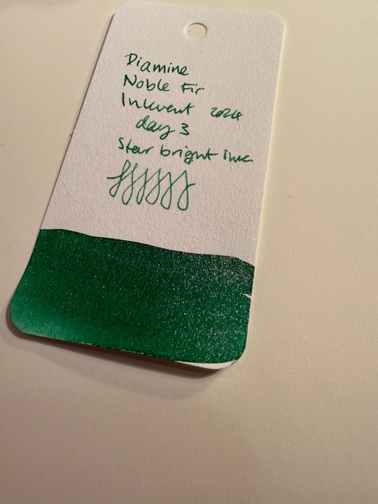
Day 3’s ink is Diamine Noble Fir, an apple green star bright ink. Star bright inks feature extra shimmer, as in all the shimmer that Diamine could plausibly get their hands on. It shimmers, I promise, you won’t be able to miss it. I used a Lamy Safari with a medium nib to test this ink out.

Here’s a close up on the ink, wherein you can see that it is indeed a star bright ink, and you can see some of its shading properties.
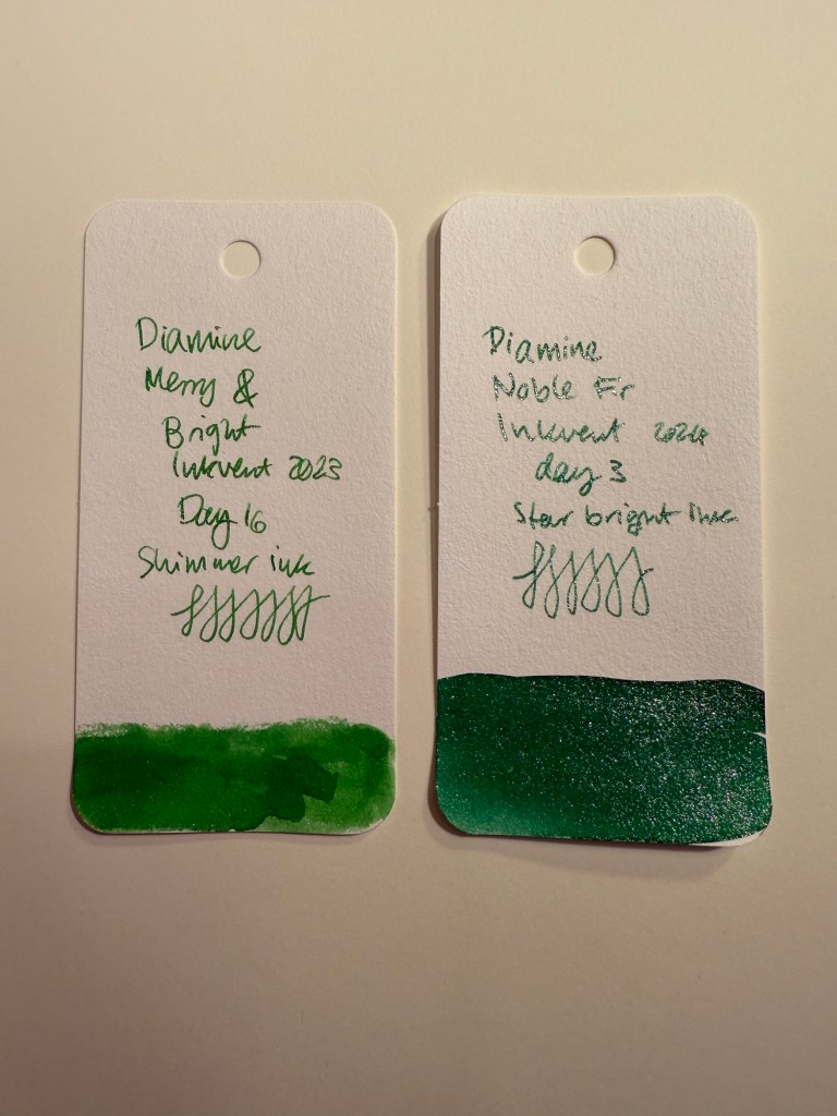
If this ink feels somewhat familiar, it’s because it’s basically last year’s Diamine Merry and Bright but one shade darker (and bluer) and with a lot more shimmer. You can see the two side by side below and also see the difference between what Diamine calls a shimmer ink and what they call a star bright ink.
Here’s a writing sample on Rhodia paper with this ink. Diamine Noble Fir flows well, has some shading and a ton of silver shimmer. More than you think is healthy for any pen, which is why this ink will get nowhere near one of my vintage fountain pens.
Also, I kind of wish that they would have called it “Diamine Elphaba” after seeing and enjoying the movie “Wicked”. It’s too sparkly for Elphaba, I know, but it’s also nowhere near dark enough to be called “fir” and yet here we are.

Here’s a closeup on the writing sample, where you can see the ink shading and the shimmer.

Today’s sketch features a German bear which is called “Spooky” for some reason. It’s not spooky at all. You can see some of the shading properties of this ink and again the ever present shimmer.

And here’s Spooky, the not-at-all spooky bear. There’s actually something about him that reminds me of Elmo from Sesame Street.

In terms of practicality, Diamine Noble Fir scores higher than you’d think. This isn’t by any means an everyday ink, but for the holiday season it’s pretty much perfect. Select your pen carefully and clean out the ink once you’re done writing all those cards and letters, but Noble Fir is surprisingly well behaved. It’s also the most Christmasy of all the inks we’ve seen so far, so it scores very high on the theming side. Would I buy a bottle of this? No, as I don’t have a need to write a thousand holiday greeting cards. I will, however, enjoy writing this pen dry as soon as possible, before it becomes impossible to get all the glitter out of it.
Which pen would you use Diamine Noble Fir with? Do you see yourself needing or wanting a full bottle of this ink in your collection?