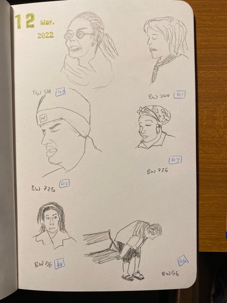
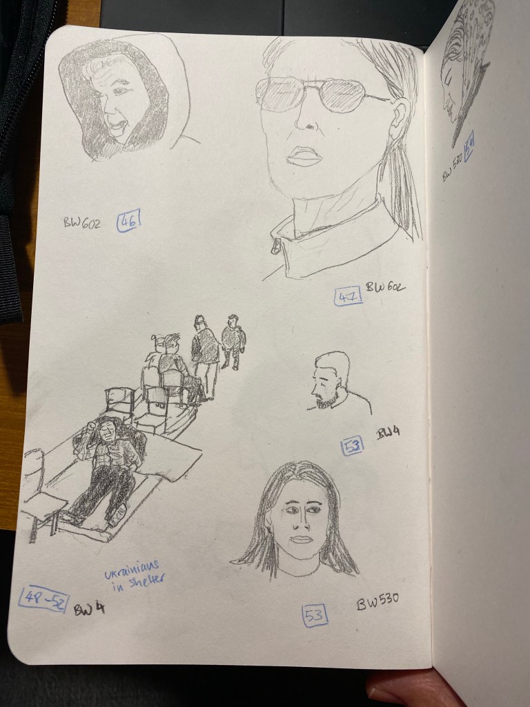
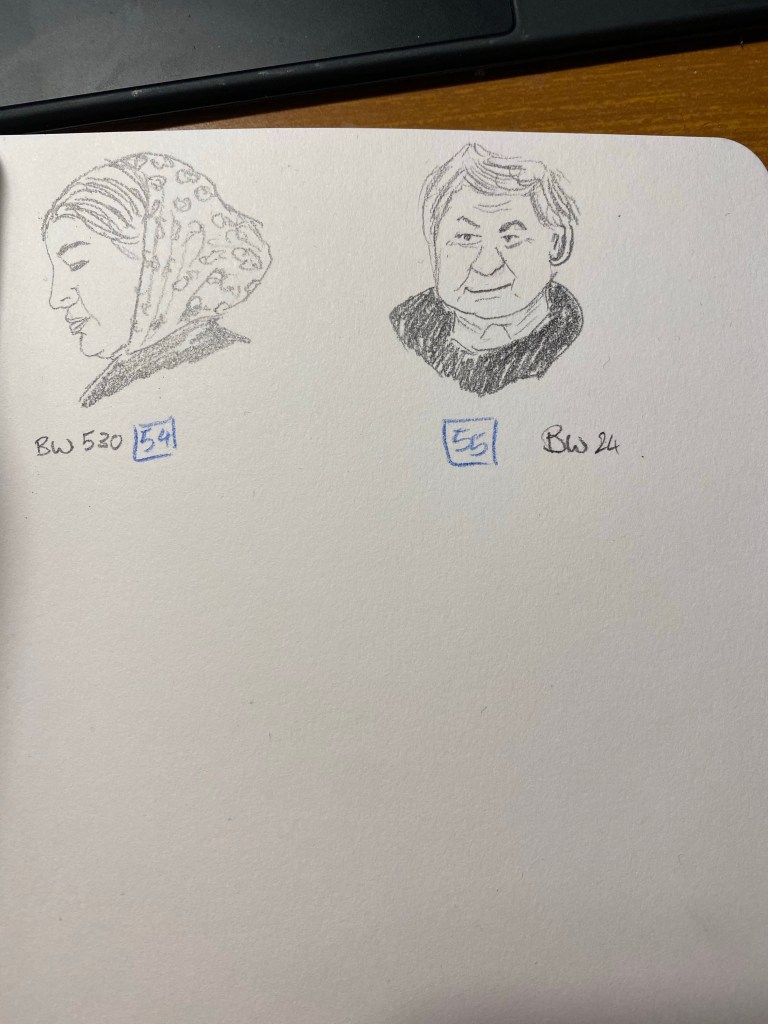
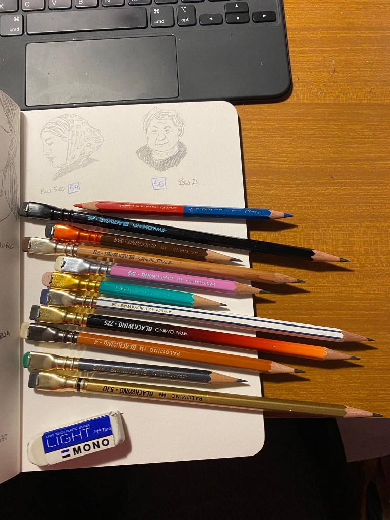
As I expected I didn’t reach 100 people sketches in 5 days, but I still intend to get to 100 sketches, so I’m plowing on. My hands are still wrecked with neuropathy so today’s sketches are all pencil sketches, all of them using various Blackwings. Hopefully tomorrow I’ll be able to get back to ink and watercolour, but if not I’ll break out my vintage pencils and give them a spin.
My hands still really hurt, but I don’t want to give up the challenge, so I pushing on with pencil sketches. I’ve pulled out my Blackwings and am giving them a spin.
Yesterday I finished my fifth reading journal, and so I thought that it would be a good opportunity to write a post about how I set up my reading journal.
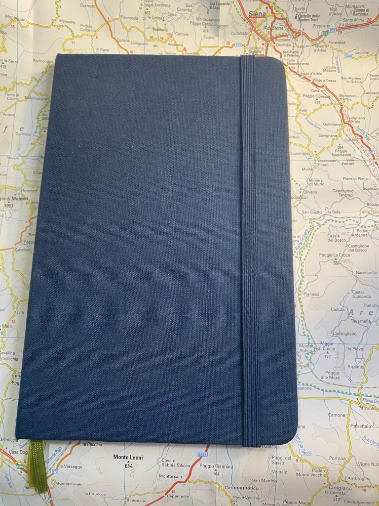
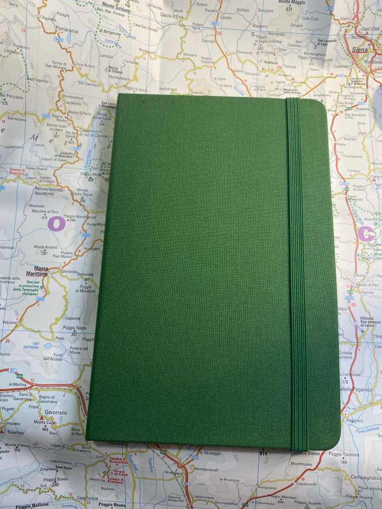
I use my reading journal to keep track of what I read and to encourage me to read more. This is the journal that I’ve just finished, a Moleskine Two-Go:
Moleskine Two-Go. The perfect size and format for my needs.
I used to use a Field Notes Arts and Sciences notebook for my reading journal, but once I got back to reading more it made sense to move to a larger journal. For the past three years I’ve used the Moleskine Two-Go, and I fill one book journal a year (70 books are logged in each notebook).
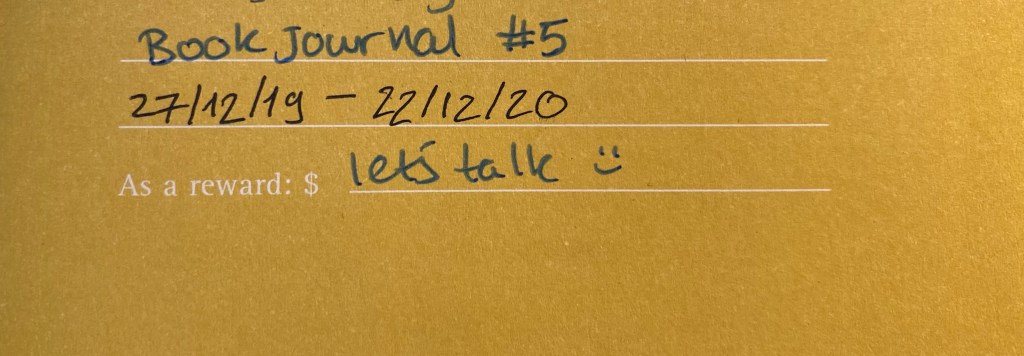
Start and end date for this reading journal.
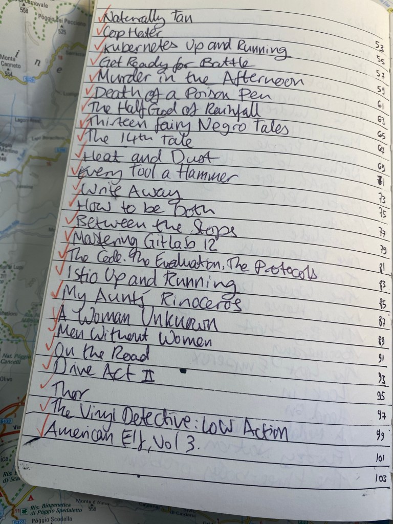
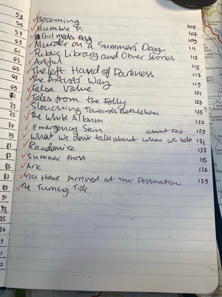
This is the setup in my old reading journal. Three pages of index:
First index page. Red checkmarks for books that I’ve read.
The Moleskine Two-Go comes with pages that are blank on one side and lined on another, which is perfect for my use case, except for the second index page, which I need to rule myself:
Ruled second index page.
I missed a line on the second index page, so the index numbering came out a little wonky. It’s only for me, so I don’t mind.
Off by one error in my index.
Here’s a sample of a complete page. I talked more about my thoughts behind the design in a previous post, but you can get the gist by looking at this sample. I like drawing something that captures the book for me on the opposite page, which is why I love the Moleskine Two-Go format.
I remember really not liking this book, and this is a reminder of why.
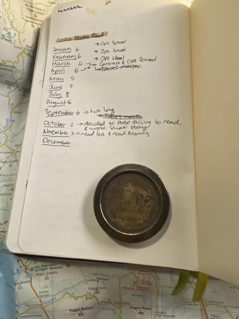
At the very last page of the journal I keep a log of how many books I read that month. It’s ten books so far for December, but the month isn’t done yet so that line isn’t filled.
Number of books per month tracker.
Here is my new reading journal, a Moleskine Two-Go, this time in green (my previous ones were in light grey, dark grey and navy):
Front cover.
I love the texture of the fabric colours on this, and the shade of green is interesting. The two contrasting bookmarks and the endpapers are grey.
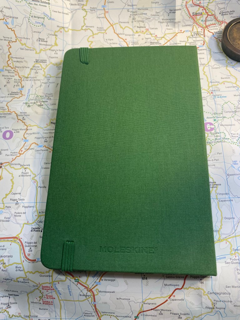
Back cover
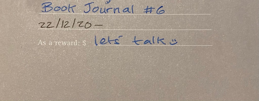
The first page, marking when I started the notebook and which journal number it is. This notebook doesn’t leave my desk yet I still write my name and email in case I misplace it somehow.
Front page
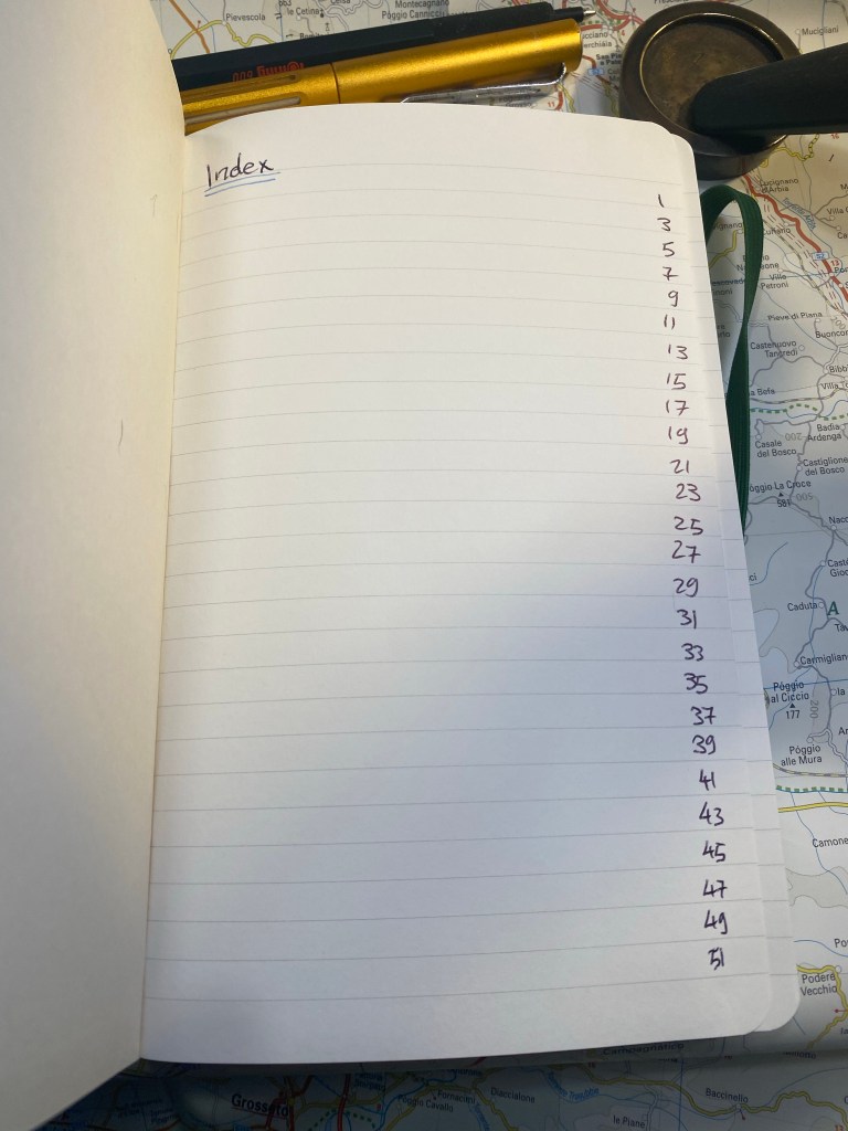
Next comes the index page. Since this is my third Two-Go reading journal I already know to number the pages until 139 (I number odd pages only, since my reviews are on odd pages), which comes out to 70 books.
Index page.
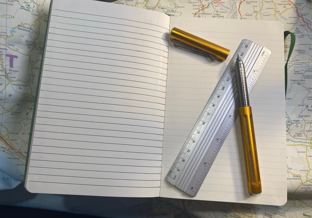
I rule the second page, because I tried just winging it on the first year and it didn’t come out great.
Spoke pen for the win.
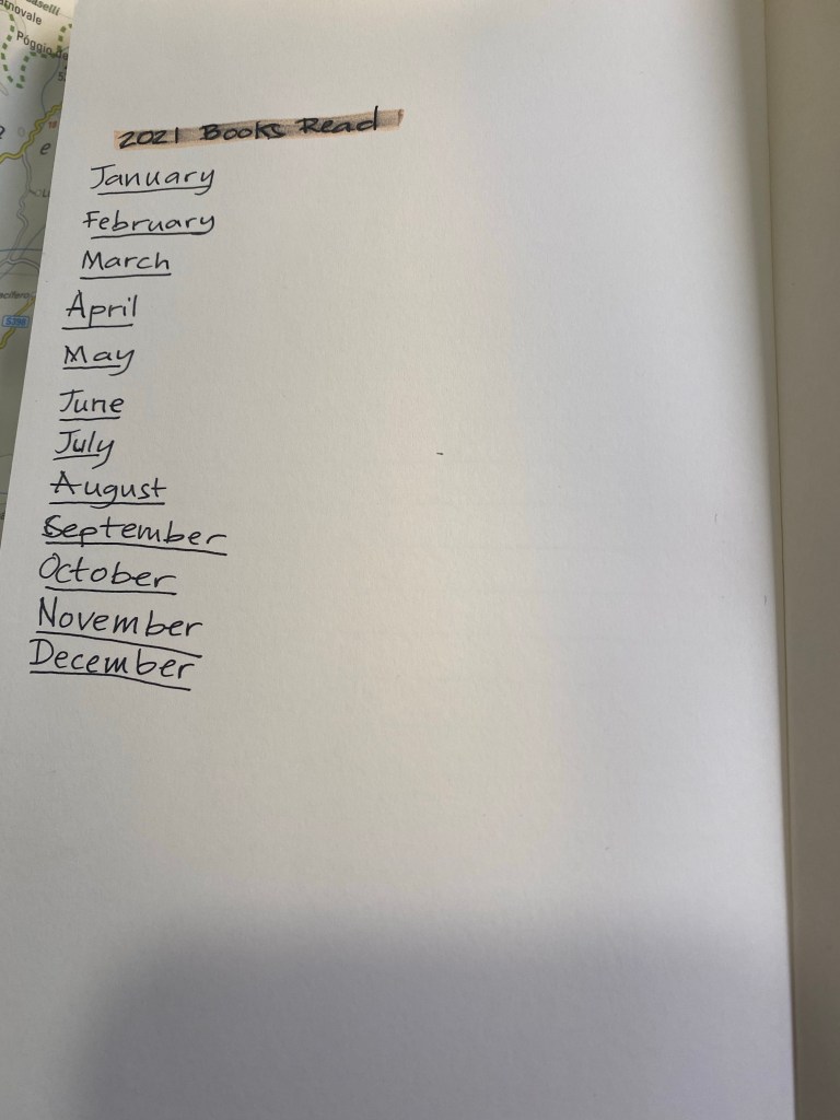
On the last page I create my books per month tracker:
Zebra mildliner highligher smears gel ink, but I still like it.
I number all the pages of the index, but only the first 25 pages of the actual book journal. I will continue numbering pages in batches as I add books to the journal. The great advantage of using a completely unstructured book here is that I can do whatever I want with it, including starting the numbering after the index pages and not on the first notebook page.
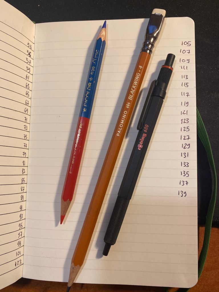
These are the pen and pencils that I’ll be using in this journal. The Rotring 600 is a ballpoint, and the only ballpoint that I regularly use. The Caran d’Ache Bicolor has been my companion in these notebooks for several years. I use it to highlight things, and sometimes in my book scene sketches. I used the Blackwing 611 in my previous reading journal, and this time I’ll be using the Blackwing 4.
Caran d’Ache Bicolor, Blackwing 4, Rotring 600 ballpoint.
The first non fiction book in this journal:
The Good War
The first fiction book in this journal:
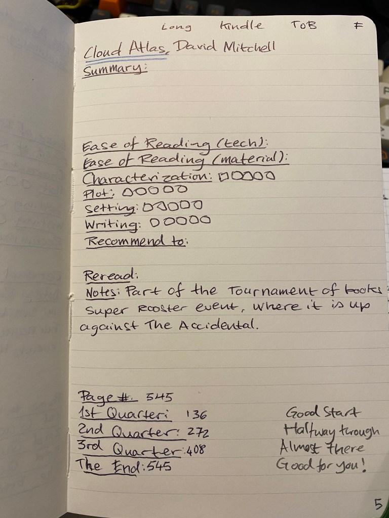
Cloud Atlas. ToB means Tournament of Books.
That’s my new reading journal all set up and ready to go. I hope that this inspires you to keep a reading journal of your own, one that will encourage you to read more and help evoke the memories of reading a specific book.
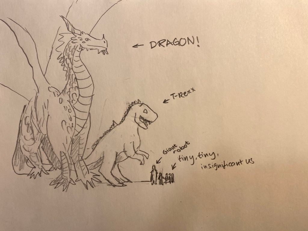
Our D&D group found itself next to a colossal sleeping white dragon, and one of the characters suggested that we could take it on. I grabbed my Blackwing (811) and created a quick illustration of relative sizes to emphasise just how crazy that idea was.
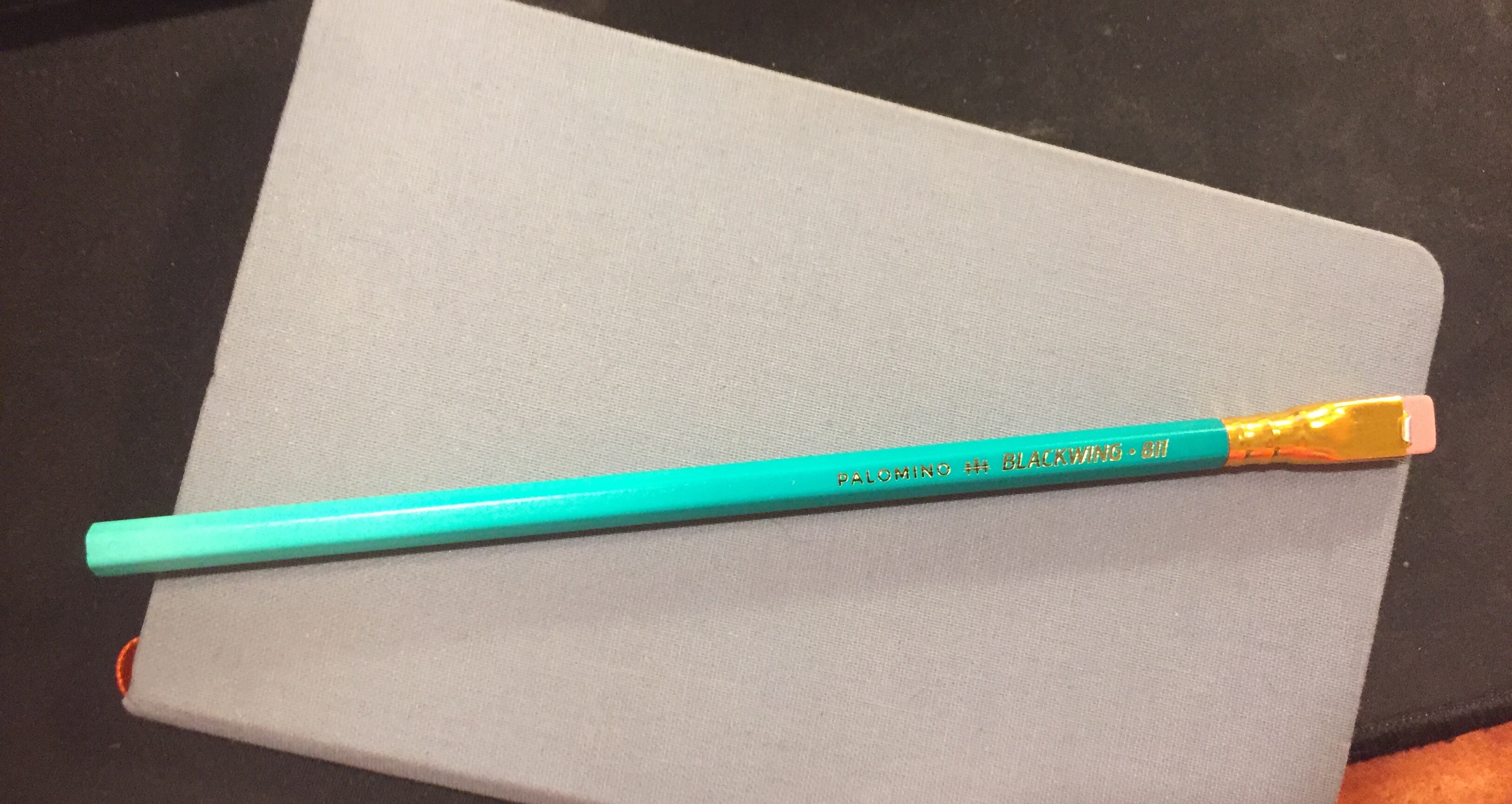
It’s the insane, glow in the dark Blackwing, and I managed to snag a box!
OK, enough with the hype. Plenty of other reviewers have given this limited edition pencil a spin, but my experiences and thoughts about “The Library Pencil” seem to be different enough to warrant a few quick words about the Blackwing 811.
First of all, the pencil is attractive. It’s darker than a banker’s lamp (I have one, so I checked), and the gradient is very well done. This could have looked cheap and tacky but it doesn’t. I would have liked a darker ferrule and I think that the pink eraser is ugly, but even so it’s a pretty attractive pencil.
The lighter part of the gradient disappears for the most part on the first sharpening, so that’s a shame. The coating on the pencil is grippier than the coating on the Blacking 54, 56, 24, 725 and 530 (and lacquered pencils in general), but less grippy and gritty than the coating on the Blacking 4. It has a matte feel.
It’s got a “firm” core, which means it has the Blacking 602. I absolutely hate that Blackwing doesn’t write its firmness on the barrel, or use “standard” hardness ratings, or makes it easy to see what the core grade is on the box or on their site. That’s like buying a fountain pen and not knowing whether you’ll get a fine or a broad. It’s bad enough that manufacturers play fast and loose with pencil grades within the standard 10H-10B range. Having a company invent its own grade and not even have it make sense, and then not even make it visible is a big no-no in my book.
Here’s a sketch of my banker’s lamp (which is a bit wonky after my cat dropped a giant pile of books on it) done with the Blackwing 211. I’d say it’s a B or a 2B, depending on the maker, but in no way is it a pencil that I’d call “firm”. It’s great for quick sketches, but I wouldn’t recommend it for under-drawings.
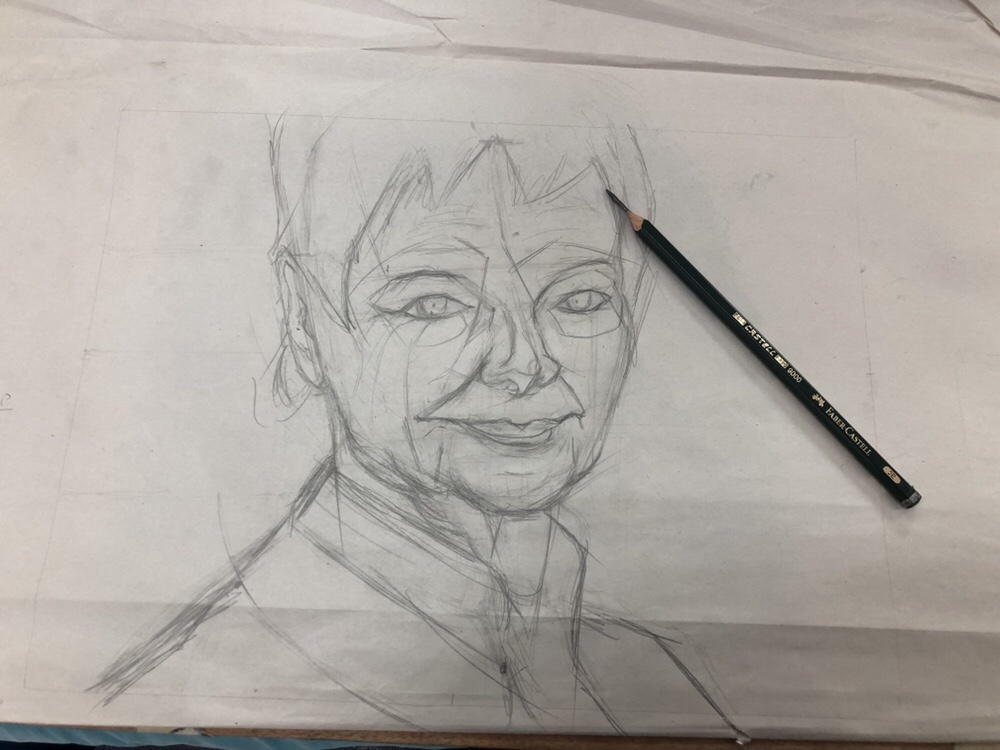
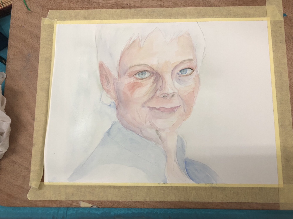
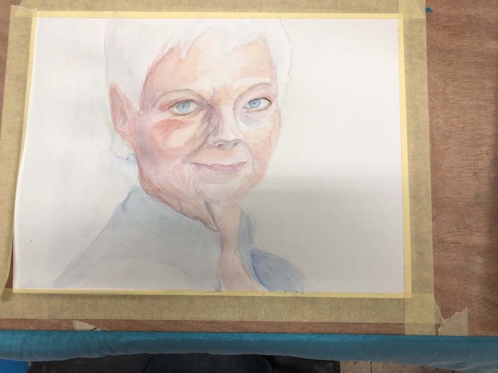
Continuing my “how I use the stuff I have” posts, I thought that I’d show how I use pencils when I’m working on a series of portraits of the same person.
Since I work in watercolour which is notoriously not great for correcting and changing your mind mid painting, when there’s a face that I know that I’ll want to explore I usually create a “construction” sketch which I transfer to paper several times. I can then paint the portrait in different tones, or focus on a certain aspect that interests me, or take it to really wild places without spending too much time on the technicalities of the preliminary sketch.
I start the “construction” sketch on newsprint paper. It’s much more detailed and “searching” than it needs to be, but that doesn’t matter much. Ultimately only the lines that will help me construct the face and note where the major light and dark transitions are will remain. I draw this with a Faber Castell 9000 2B or 3B pencil that’s sharpened with a pocket knife to allow me to use it without having to pause for sharpening. Newsprint paper is pretty transparent and also generally too fragile for regular erasers, so I use a kneaded eraser to lift off unnecessary lines, or simply ignore them.
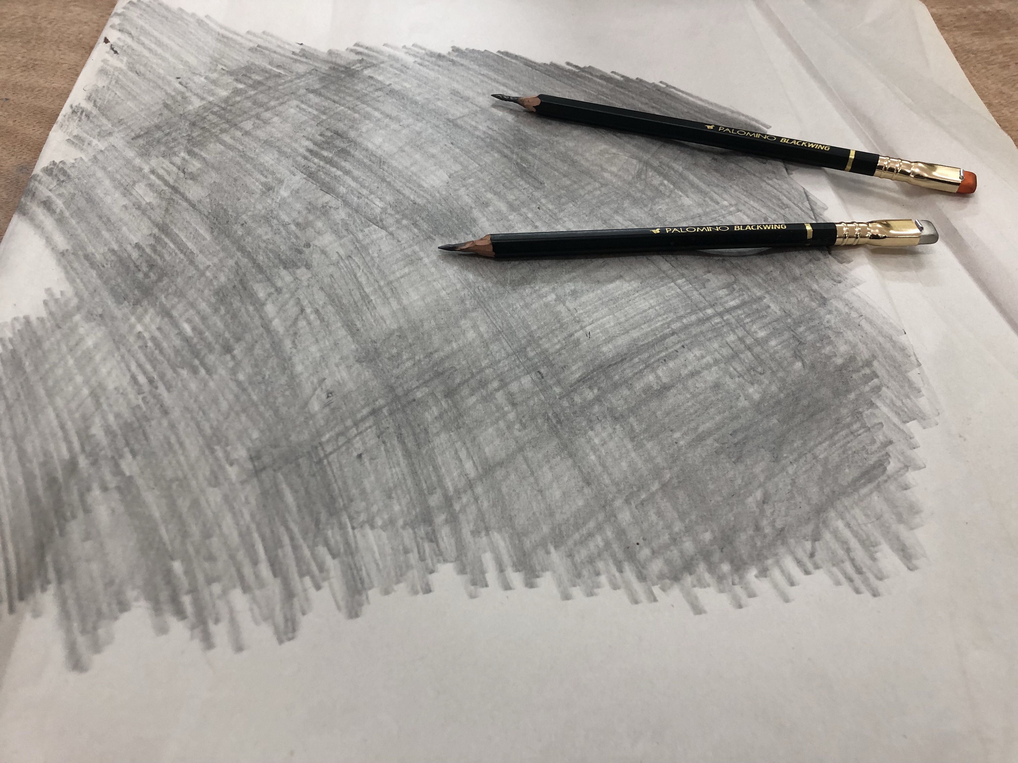
Once I’m done with that, I flip the page to the other side and scribble on it with a Faber Castell 9000 6B or Palomino Blackwing MMX. These are again sharpened with a pocket knife, and the point is to get as much coverage as possible. If I’m doing a lot of transfers then I might have to repeat this process, adding more graphite to the back of the sketch.
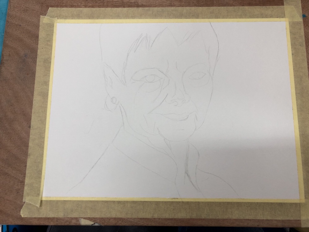
I then transfer the most important lines in my sketch on to a piece of watercolour paper. This is done by placing the newsprint paper with the sketch over the watercolour paper and going over the lines in the sketch with a 2H pencil (I use a Faber Castell 9000 2H, but this isn’t that important). The pencil needs to be a hard pencil for the lines to transfer to the paper below, but it can’t be too hard or too sharp or it will rip the newsprint paper. It’s also important to put just enough pressure when you’re tracing so the graphite on the underside of the sketch transfers to the paper, but not too much to bruise the watercolour paper. Using a 300 gsm watercolour paper helps protect it, but it’s mostly a matter of practice. When you’re done you get something like this:
The lines are pretty faint, which is great when working with watercolour, because they don’t distract too much from the figure once you start working.
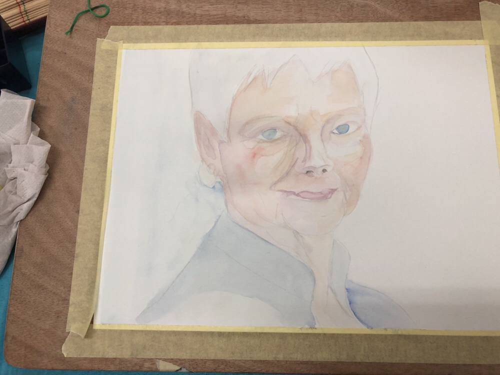
I created about five watercolour portraits of Dame Judi Dench from this sketch so far, and there’s a good chance that I’ll go explore her some more in the future.
I wrote the first few chapters of my first novel longhand, with fountain pen on loose sheets of A4 tomoe river paper. As I realized that I would have to type everything into Scrivener before I could even start editing, the lazy programmer within me balked. It was fine doing this with quick drafts, but writing an entire novel longhand was not for me.
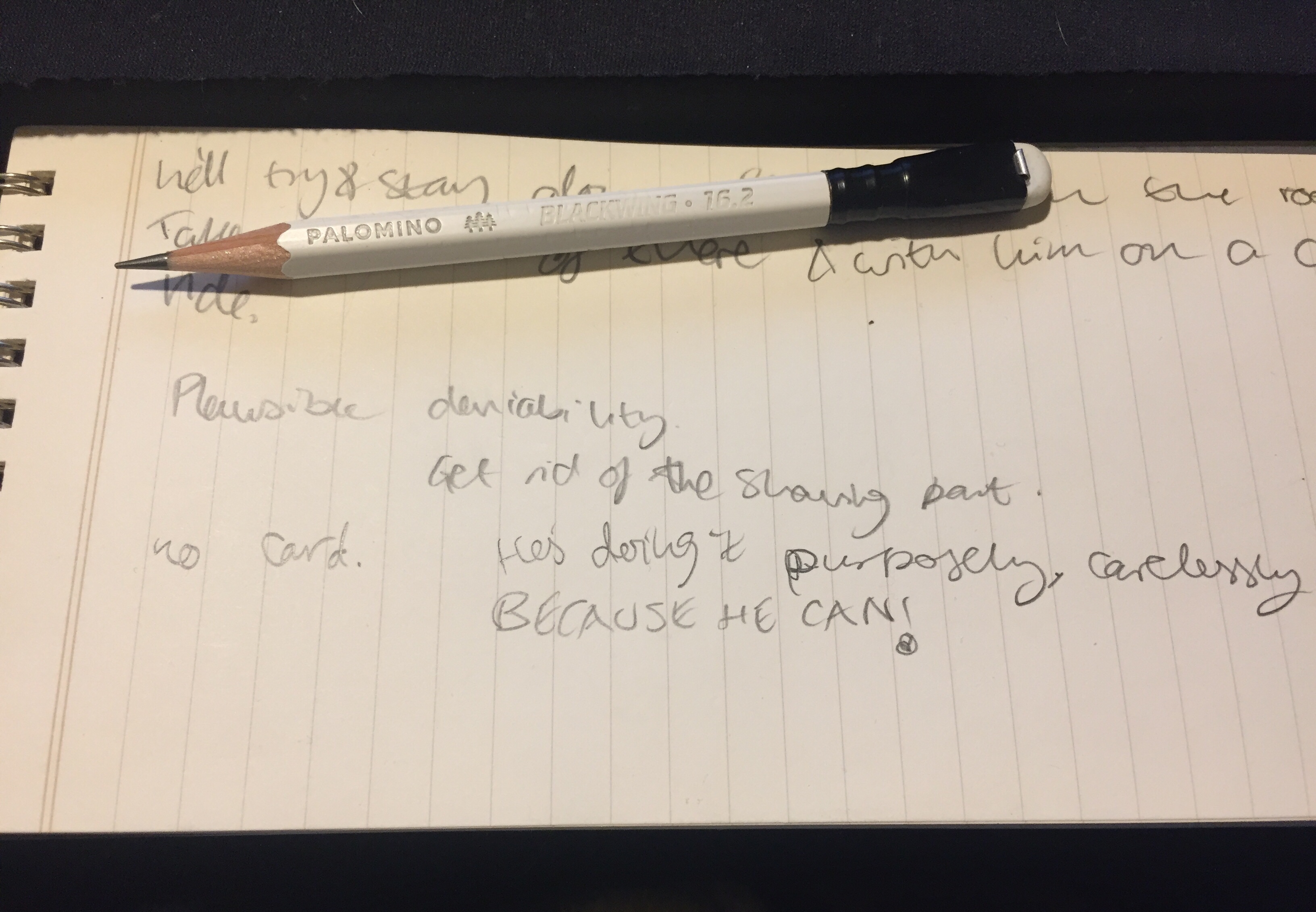
I still use pen, pencil and paper a lot in my writing though. I use a fountain pen (anything that doesn’t have a flex or novelty nib will do — from extra-fine to 1.1mm stubs) and loose sheets of A4 and A5 tomoe river paper to work on my outlines, for quick drafts, to test plot options out, or when I’m really, really stuck in my writing. A Field Notes Byline is constantly under my keyboard, horizontally. Yes, I know that the lines don’t go that way, but I ignore them. The form factor is perfect for that, and the ruling is pale enough for me to easily ignore it. I use a Blackwing 16.2 or 24 with it, to quickly capture any ideas that may come up during my writing, to remind myself where I was going with an idea or what I need to fix a previous place, to brainstorm names, etc. It serves as a scratch pad that allows me to maintain my writing flow and still remember things along the way.
Messy, messy handwriting, because getting things down on paper is more important to me then keeping them pretty.
So, even if you do all your writing using Ulysses or Scrivener (hopefully not Word), I recommend that you incorporate some analogue tools in your process. You’re bound to find them useful, particularly when you’re stuck or you’ve dug yourself into a hole.
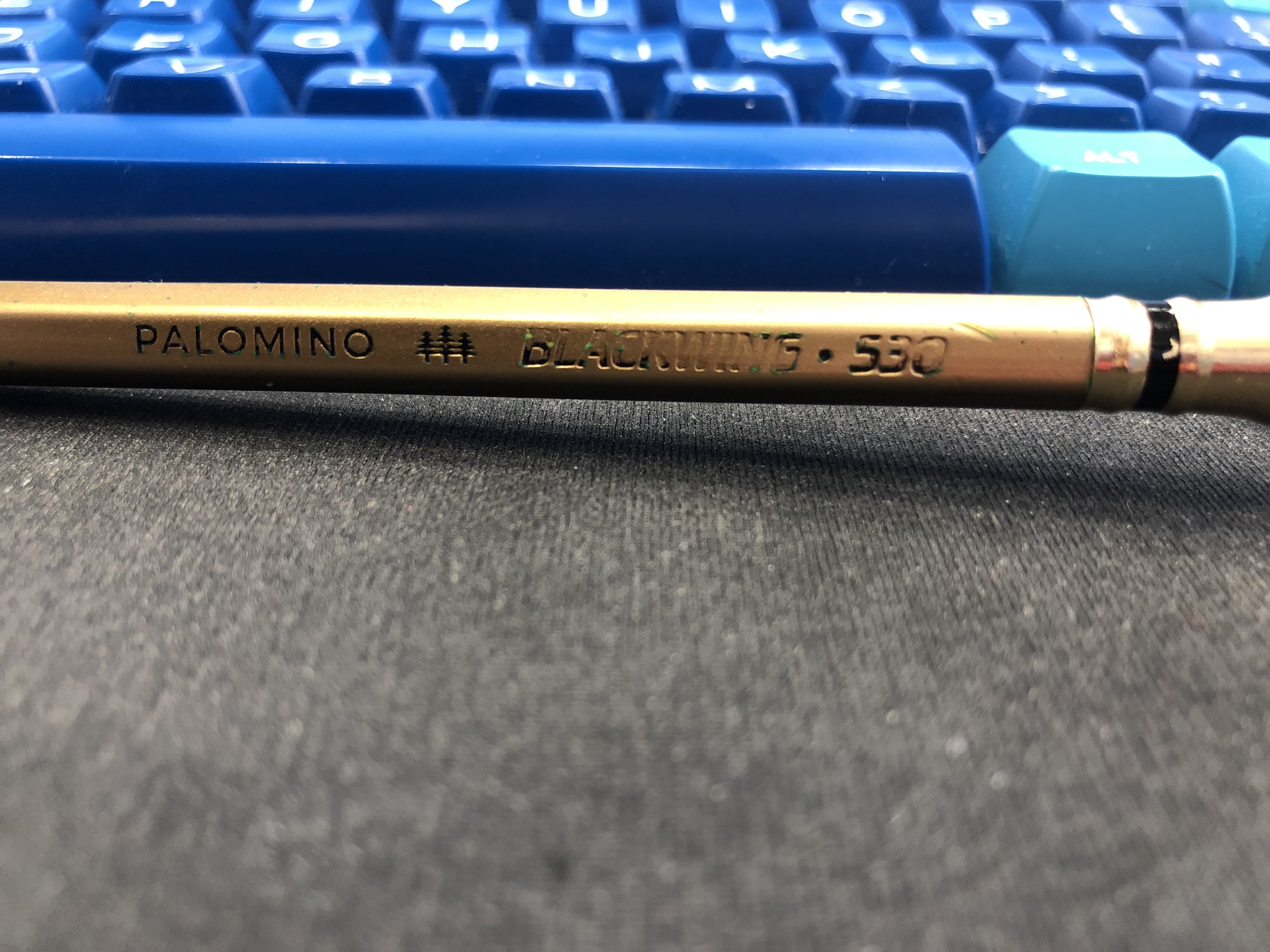
I did not like the Blackwing 530 when it came out (too much bling for my taste), but now that pencil that I’ve been using has gotten worn down and dinged a bit an underpainting of verdigris has been revealed, and I love the effect. It’s just a little reminder that I should give things a chance even if I didn’t fall in love with them at first glance (also this pencil is super difficult to photograph, because of the bling, so forgive me for the potato quality photo).