I enjoy sketching with grey inks, so I oftentimes have a pen filled with a grey ink of some kind or another. Today’s selection is the Pelikan Souverän M605 Stresemann with a medium nib (which as it’s a gold nibbed Pelikan, verges on the broad) filled with Diamine Silver Fox. Silver Fox is from Diamine’s 150th anniversary collection (one of the original ones they issued), and is a slightly warmish medium grey with fantastic shading.
African elephants are pretty fun to sketch, so I may be tempted to sketch another one of them later this month.
If you’re looking for a grey ink that’s well behaved, offers a lot of shading, is readable even in fine nibs and is slightly on the warmer side of the grey spectrum, then I recommend giving Diamine Silver Fox a try.
I like inks that are on the teal/turquoise range so I almost always have a pen inked up with something in that shade (I currently have three – this Robert Oster Peppermint, Robert Oster Fire and Ice and a Graf von Faber Castell Turquoise). I sketched this white rhino without considering the background — which was just plain rock face, and so something that I should have changed up.
White Rhino sketch in Peppermint
The pen body is from Woodshed Pens, and the nib is a Franklin Christoph fine. I like this combination, as it allows some sheen and shading to appear and yet is still relatively quick drying.
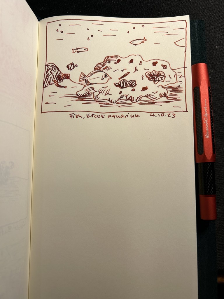
Diamine Monaco Red is a dark red/maroon like colour that has darkened even more in my Kaweco AC Sport Carbon red fountain pen. The fine nib still shows the significant shading this ink has. Google photos brought up this aquarium photo from Epctot’s “The Seas” aquarium so I decided to sketch it even though it was much better suited for watercolours. The fish in the foreground looked so worried that I thought it was worth a try.
I’m not a fan of red inks, but Diamine Monaco Red seems to be dark enough and well behaved enough for me to enjoy it. There’s also something particularly satisfying with crossing to-do list items with red ink: this thing is DONE.
Day 3 of Inktober is for pelicans, and I resisted the urge and didn’t sketch this pelican with a Pelican. Instead I sketched it with a Kaweco Sport in frosted blueberry with a medium nib and a Graf von Faber Castell turquoise ink cartridge.
Pelican, Animal Kingdom, Disney World, Florida
We have flocks of pelicans passing in the country on their yearly migration, and they are impressively big and impressively loud birds when disturbed. I have a penchant for turquoise and teal inks, so you’ll see quite a lot of this hue during the coming weeks. I like the shade and shading of the Graf von Faber Castell turqoise, so I may yet buy more cartridges once this pack runs out.
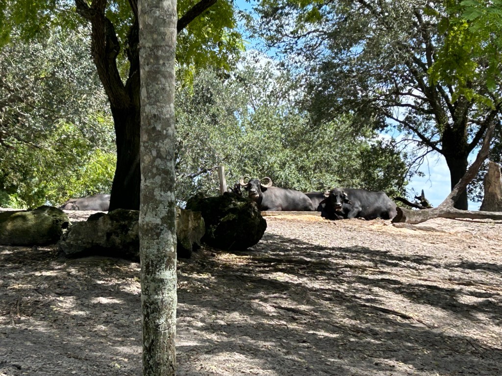
It’s day 2 of Inktober, and it’s water buffalo time. These are big, impressive and pensive beasts that you don’t want to mess with. They were chewing their cud in the sun, keeping an eye on us as we admired them from a distance when we saw them at Animal Kingdom, Disney World.
Water buffalo sketch, Animal Kingdom
I sketched them using a Lamy Safari fine nib and Platinum Carbon ink. Carbon ink lays down a shiny black line that takes forever to dry and so is my least favourite waterproof black fountain pen ink to sketch with (De Atramentis Document Ink is first place, with R&K Sketch Ink Lotte and Noodler’s Bulletproof Black in the middle of the pack). Since I was afraid of smudging the ink, it’s kind of a barebones sketch.
There was a delightful cast member standing nearby, ready to answer questions, and he was a massive Star Wars fan. He clocked my brother and I’s Star Wars Celebration shirts and we started talking Star Wars while standing in front of these guys and gals’ paddock. Of course he got a cast compliment from us (talking to him made our day), and we got to hear about past Star Wars events at the parks from behind the scenes.
The funny thing is that if we would have rushed past their paddock on the way to see the tigers (like everybody else did), we wouldn’t have had this moment and memory, and the tigers everyone was rushing to see decided to hide in the shade anyway.
It’s October and that means Inktober time. This year I’ve decided to participate in the challenge but to do it a bit differently than I did in previous years:
It’s still 30 ink sketches in 30 days. I’m using fountain pens for the entire challenge.
I’ve limited myself to the Traveller’s Notebook airlines edition insert. I’ll post a review of it later this month, but the idea was to deliberately use a notebook that I thought was too precious to use before.
I’m not following the official prompts (as usual). I never liked them, and this year’s prompts are no different.
I’m not posting these to social media. At all. I’ll be posting them here and here only.
Now without further ado, here’s Inktober day 1’s sketch:
Pink giraffes laying down to chew their cud, Animal Kingdom Lodge, Florida.
The giraffes aren’t originally pink, of course, but I sketched them with Pilot Iroshizuku Kosumosu ink and a Franklin Christoph 03 Iterum Sedona Spa fountain pen with a Nagahara fine cursive italic. It’s a beautiful combo, and fine cursive italics are great for getting interesting line variations while sketching with pen and ink.
Traveller’s Notebook and fountain pen.
Giraffes rarely sit down in the wild, as that’s way to risky for them (it takes to much time to get up and run, should they need to). In captivity they will sit down if they feel safe and comfortable, and it’s quite a sight. We saw these two during a night time safari at Animal Kingdom Lodge in Walt Disney World, Florida. Giraffes are suffering from poaching, from habitat fragmentation and from habitat lost, and many giraffe sub-species have only a few hundred individuals left. If you want to help them, the giraffe conservation fund focuses on these elegant and fascinating creatures: https://giraffeconservation.org
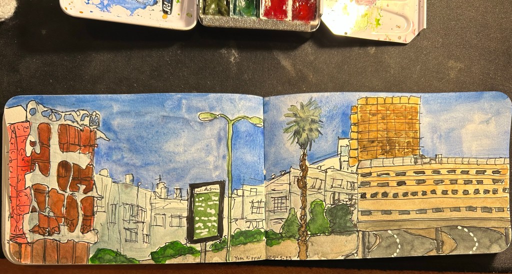
It was Yom Kippur today, a day when no cars drive around in Israel. I took the chance to go outside and sketch one of the most iconic buildings in the area.
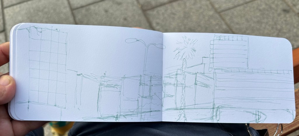
I used my Pelikan 140 KEF fountain pen with De Atramentis Green Grey Document ink as an under sketch:
Sketch on Stillman and Birn Epsilon 51/2 X 3 1/2 in. sketchbook
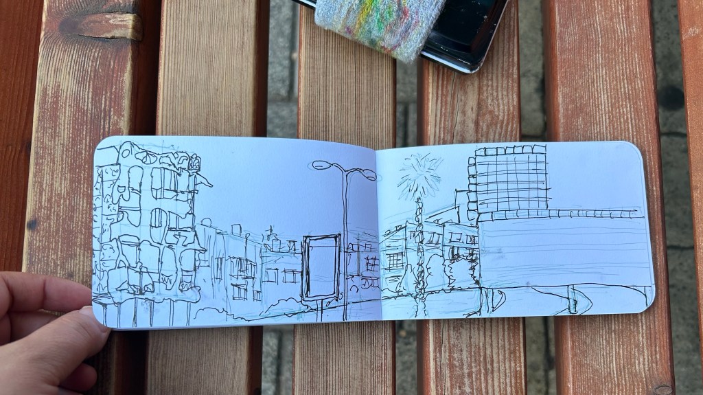
I then drew the line work with a Lamy Safari F nib and Platinum Carbon Black. The ink takes a while to dry, and it smudged a few times.
Line sketch.
It was getting hot, so I finished the watercolour at home:
St Jude is a research hospital in US that treats children who have cancer. They treat children both from the US and from outside the US, free of charge. If you know the US health system, you know what a big deal that is. They make their research freely and globally available, which in a world governed by the rush for profit, is also a big deal. They’re also spearheading an effort with the WHO to make cancer treatment more accessible and affordable to children around the world (Global Initiative for Childhood Cancer). 80% of children in high income countries survive cancer, but only 20% of children in low income countries do – and that’s because cancer medications (chemotherapy, immunotherapy, etc) are incredibly expensive. I live in a high income country and have a high income myself, but if my treatments weren’t funded by our healthcare system, I would have gone bankrupt.
Blood cancers (just like the one I had) are the most common cancers in children, and they are brutal. The cancers are aggressive, the treatment is aggressive, and any child that has to go through that, wherever they live in the world, wherever they happen to have been born, deserves the best chance that they can get — and I am saying that as an adult who’s lived through the experience.
They say that you need to repeat things 7 times for people to remember and act on them, so I’ve linked to the campaign 14 times in this post, just to be doubly sure you get the message.
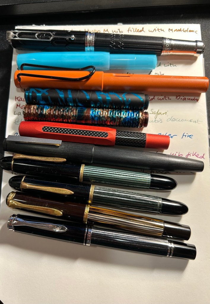
I’ve recently switched out most of my fountain pens and inks for a new batch, so here’s a quick overview of them (from top to bottom):
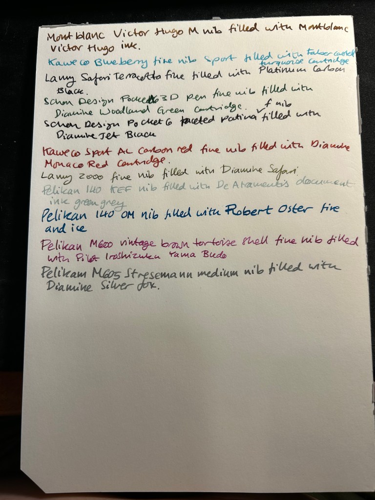
Currently inked writing sample
Montblanc Victor Hugo medium nib filled with Montblanc Victor Hugo ink. I bought this at Mora Stylos just before they closed, mainly because the design is based on the Notre Dame de Paris, which I adore. It’s a weird design and quite a hefty pen, but I enjoyed the nib, despite it being a medium. The ink, also limited edition (but knowing Montblanc is likely a relabeled existing ink) is a nice, warm brown with a good amount of shading. As I post this I’ve written this pen dry.
Kaweco Sport Frosted Blueberry fine nib filled with a Graf von Faber-Castell turquoise cartridge. This is the only fountain pen that I took with me on my recent trip to the US, and I used it on the plane (not during takeoff and landing).
Lamy Safari Terracotta fine nib filled with Platinum Carbon ink. I wanted a waterproof ink for my sketches, and I haven’t used Platinum Carbon for ages. The Safari Terracotta is the perfect coloured pen for this season.
Schon Design Pocket Six 3D Teal x Matte Black pen with a fine nib filled with a Diamine Woodland Green cartridge. This pen is already been written dry by the time I’ll post this.
Schon Design Pocket Six Faceted Patina fine nib filled with a Diamine Jet Black cartridge. Schon Design pens made me enjoy pocket fountain pens, and Diamine Jet Black is proving to be a solid, dark black ink (not greyish or brownish).
Kaweco Sport AL Carbon Red fine nib filled with a Diamine Monaco Red cartridge. The perfect pen and ink match. I don’t normally use red inks, but Monaco Red skews towards the raspberry side of things, and is very pleasant.
Lamy 2000 fine nib filled with Diamine Safari. Before I filled a flock of Pelikans, this was supposed to be my workhorse pen. Diamine Safari is great for sneaking unusually coloured inks into serious office settings without drawing attention to yourself.
Pelikan 140 KEF nib filled with De Atramentis green grey document ink. Another sketching combo, perfect for watercolours when I want my line work to melt into the background. KEF stands for Kugelspitze Extra Fine – or Ball-tip extra fine. It’s a very forgiving and rather firm gold extra fine nib. I inked this up on the Friday of the Pelikan hubs even though I didn’t go to a hub. The 140 is a piston filler from the 1950s with a gold nib that was dirt cheap and is an utter workhorse. It’s user grade due to the brassing, but brassing adds character.
Pelikan 140 OM nib filled with Robert Oster Fire and Ice – Pelikan stopped making OM nibs in 2014 because they’re scratchy and unpleasant to write with if you don’t hold them at the right angle. But at the right angle this nib is phenomenal, and it works great with inks that shade and sheen – and Robert Oster Fire and Ice is definitely one of those. You can see a visible sheen at the edges of each letter, and it makes them all glow. I inked this to celebrate the Pelikan hubs.
Pelikan M600 brown tortoise shell fine nib inked with Pilot Iroshizuku Yama-Budo. This is a vintage M600 from the 1980s, with West Germany printed on the band. It’s a lovely workhorse, like all Pelikan Souveräns, and the Yama Bodu ink manages to shade even with the Pelikan fine nib. Also inked for the Pelikan hubs.
Pelikan M605 Stresemann medium nib filled with Diamine Silver Fox. I haven’t had a grey ink in rotation for a while, and Silver Fox is an interesting and dark grey with plenty of shading, particularly with a juicy Pelikan medium nib. Also inked for the Pelikan hubs.
I rarely write reviews that trash products— because I tend not to waste my time and money on products that could potentially be bad. However, I was stuck in Tampa’s airport on a very long connection due to inclement weather and so I browsed their bookstore and found this:
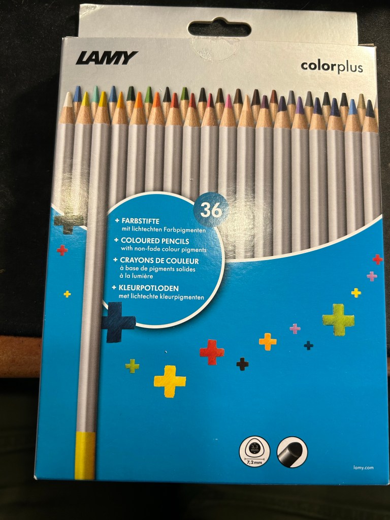
Lamy ColorPlus 36 coloured pencils
Well it says Lamy on the box, so it can’t be bad, right? And it was just $15 for 36 pencils…
This is where the red flags should have popped up, but they didn’t. I bought the pencils.
When I got home and opened the box, my heart sank. The leads were broken on almost all of the pencils. Now the box was in my trolley, well protected from dropping or crushing, so there was really no reason for this amount of damage. I checked the back of the box:
“Highly resistant to breakage” it is not.
The pencils are triangular shaped, which is supposed to make them ergonomic. It makes them more unpleasant to sharpen, as there’s a steep “bump” whenever you turn the pencil to another side.
Triangular pencils
The colour selection is weird — there are a lot of various shades of brown, but no ochre. The browns themselves are nothing like the colours that you’d expect from their labelling. I use the term “labelling” loosely here, because there’s no colour labelling on the pencils, just a dip of colour that is vaguely similar to the actual pencil colour produced.
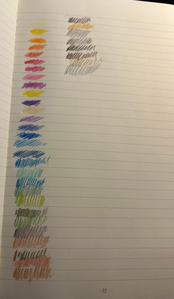
Pencil samples
The 36 shades chosen are wild – way to many similar brown, not enough greens, too many purples and blues, and of course utterly useless white and the bewildering gold and silver which are neither gold nor silver. Obviously the pencils crumbled while creating these samples so there are some duplicates here.
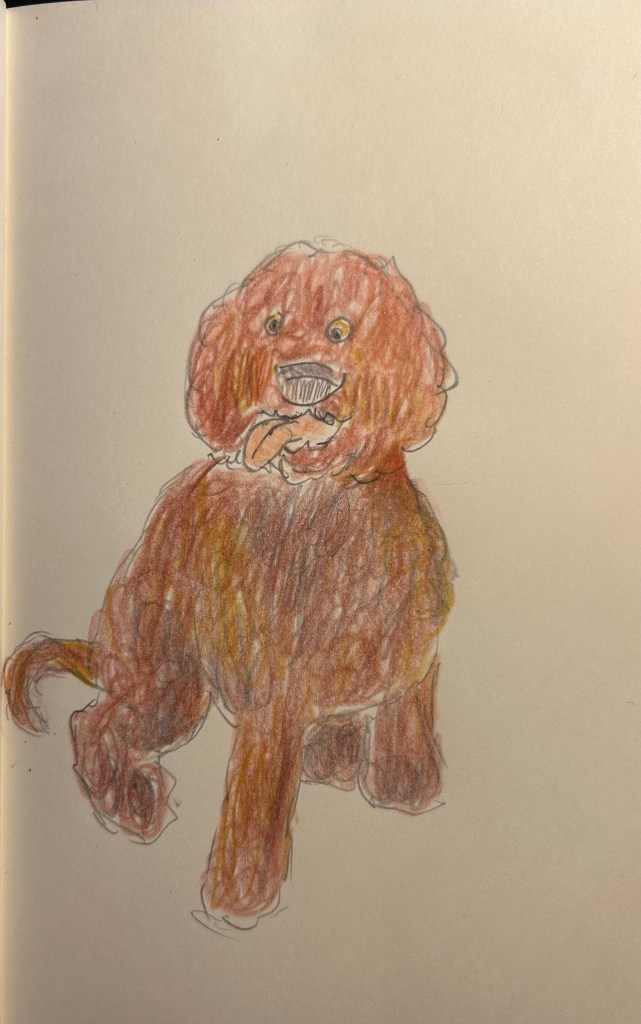
The pencils are very waxy, which means after 2-3 layers maximum the paper will be clogged and subsequent layers won’t be registered. The pencils also crumble easily —- even with very light pressure applied. Creating this sketch with them was nightmarish, as the leads kept crumbling, and I couldn’t get the shades that I wanted to the layering that I was trying to achieve.
Quick dog sketch
I honestly don’t understand why this product exists. It’s too expensive and not robust enough for children’s use, it’s definitely not artist grade (poor pigment, layering and no labelling), and even student grade pencils are properly labelled these days. In any case, save your money to buy better pencils. You deserve them.









 Writing at Large