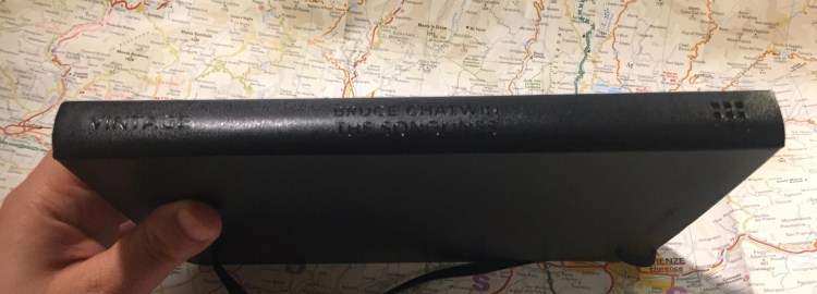
Ti Arto Review

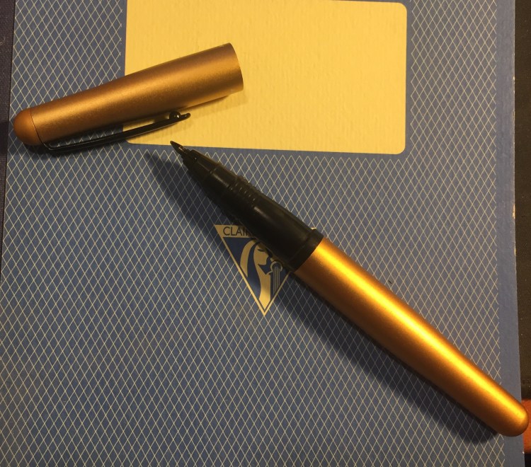
It’s strange that I haven’t yet reviewed the pen that I use most, but that’s life, I guess. The Ti Arto is a titanium machined pen that accepts 200+ refills, and it has been my EDC and journaling pen since November 2016. There’s no pen I use more, and no pen I like more than this one.

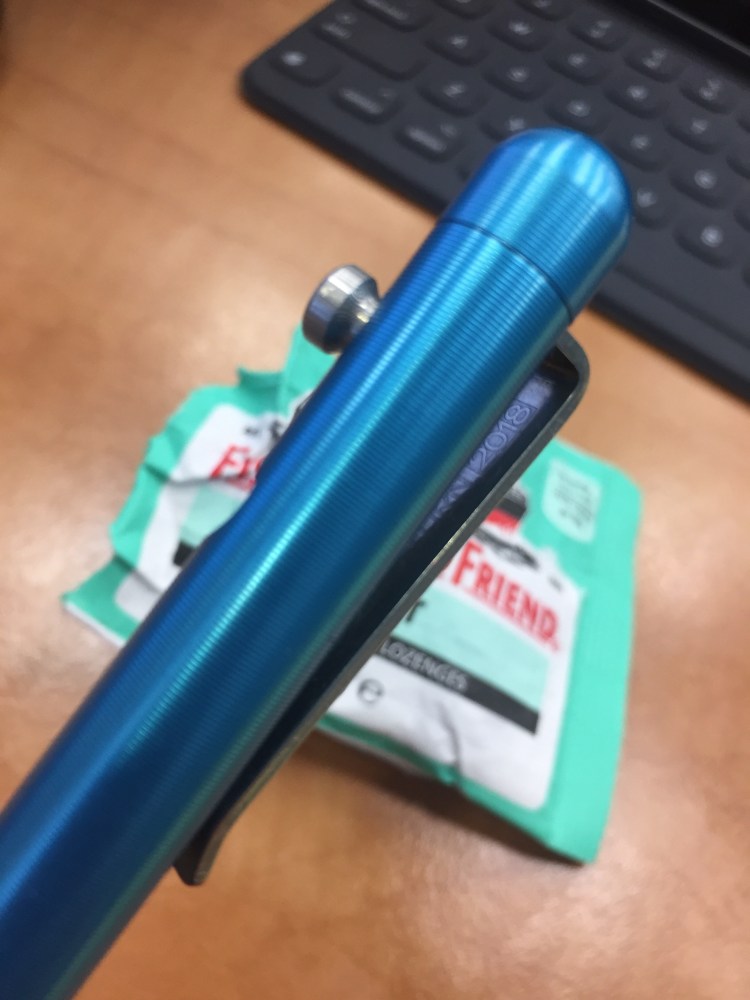
Since the Ti Arto bashes around freely in my bag, it’s got quite a few scratches on it. I personally like that it shows some wear and tear, but as not everyone feels the same, I thought I’d take a few photos that show how the Ti Arto looks like when it’s not brand new.

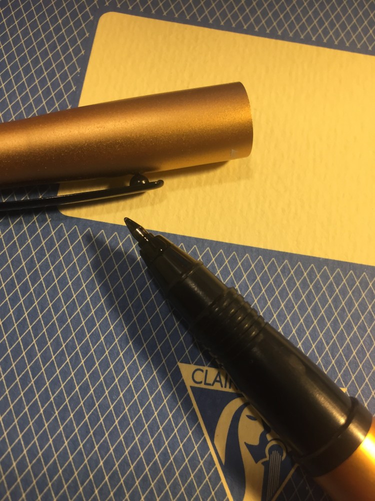
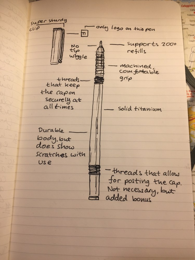
The Ti Arto is made out of solid titanium, and doesn’t get dented even if you drop it. It does, however, show micro-abrasions and scratches.

None of these scratches is deep enough to be felt – they’re at surface level only. So it really is just an aesthetic thing. If you like your pen to look brand spanking new, the Ti Arto comes with a protective felt sleeve. I personally wouldn’t bother: this isn’t a fountain pen, but a tough, machined, EDC pen. It’s built to tumble around in your bag.

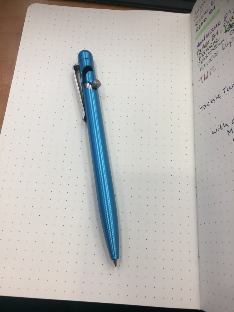
Now to the review proper: the Ti Arto was originally launched on Kickstarter, and became available on the BigiDesign site sometime in 2016. The pen is machined out of solid aluminium, and made to easily accept 200+ refills with no tip wiggle or need for spacers.

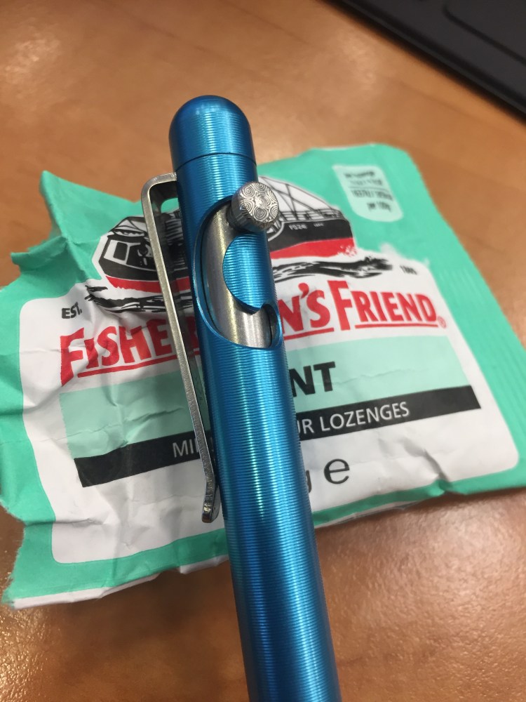
The Ti Arto is well balanced, both capped and uncapped, and very comfortable to use, even for someone with small hands that likes to write a lot. Unlike some other machined pens, the Ti Arto’s cap will stay on, even after years of use and after the threads start to wear out a bit. See that semi opaque silicone ring just below the threads? That’s the magic that makes sure the cap closes nice and tight. No refill is going to dry out or leak in this pen.

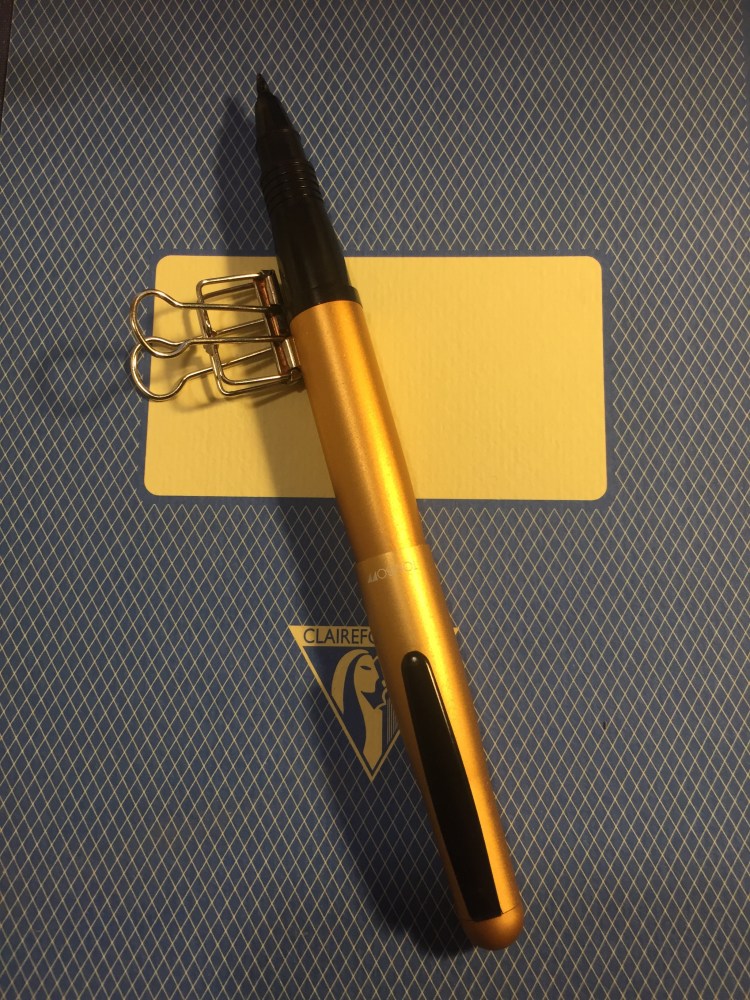
If you want to post the Ti Arto you can, by threading the cap to the back of the pen. The resulting pen is a bit longer, but still well balanced, and the cap doesn’t rattle when you write. It does take time to screw the cap on, so if you uncap and post often it will become a chore. Since the Ti Arto isn’t a fountain pen, though, there should be no problem leaving the pen uncapped for a while.

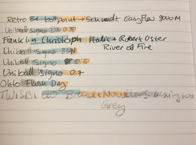
I use the Uniball Signo UMR-85N refill in this pen (the same refill that goes into the Signo RT). To change the refill you unscrew the section, pop the refill in, screw the section almost all the way back on, then tip the pen body forward until the refill tip protrudes, and then you tighten the section. Since you probably aren’t going to actually use 200+ different refills in this pen, I recommend finding a refill that you enjoy and buying replacement refills in boxes of 10 or 12 on Amazon or eBay. I go through a box and a half to two boxes of UMR-85N refills a year in this pen, and it takes less than a minute to switch out the refill.

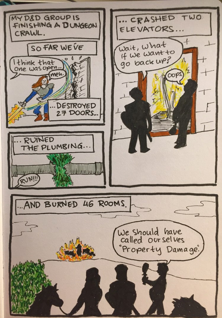
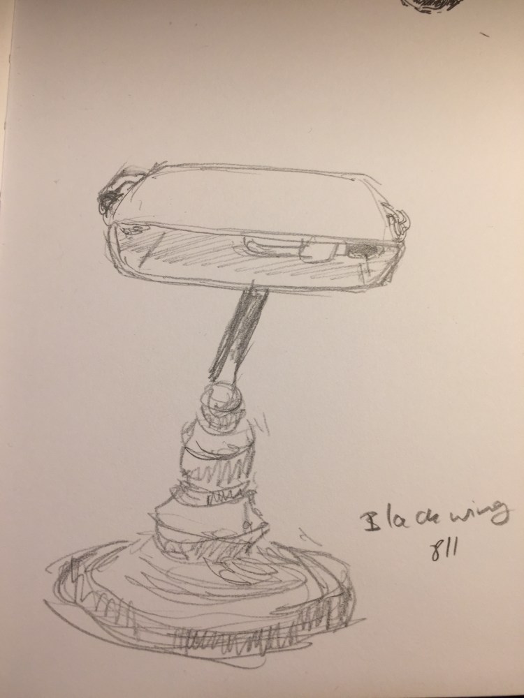
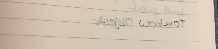
Here’s are a few points about the Ti Arto, drawn and written with the Ti Arto:

If you are looking to own just one good pen, or if you’re looking for an EDC or machined pen, the Ti Arto is the pen you should buy. I’ve tried a good number of machined pens so far, including all the other (non-stylus) offerings from BigiDesign and nothing comes close to this pen.

Property Damage: A Deleter Neopiko Line 3 Review

Property Damage

I have been using the Deleter Neopiko Line 3 felt tip pens for a while now as my journal comics pens, just to try them out. I didn’t bother buying all of the lineup (pro tip: you never need all of the tip sizes in felt tip pens), instead choosing to focus on the tip sizes that I would use the most.

The cat logo is cute.

First thing first: the barrel design. These are wide enough and light enough to be comfortable for long use, but otherwise the Neopiko Line 3 has a terrible design.

You can’t tell which pen is which without looking at the cap, which is a fatal design flaw in these kinds of pens. I normally use several felt tip pens at the same time, and can oftentimes accidentally cap one pen with another one’s cap. That’s no big deal with the Staedtler, Copic or Faber Castell felt tip pens, as you just look at the pen body when using them to know which is which, but you just can’t afford to make this mistake with the Deleter Neopiko’s. You won’t mix up the 2.0 with the 0.2, but try telling between the 0.3 and the 0.5 when you’re in the middle of a drawing.

Another design drawback is also related to the cap: it’s requires a lot of force to use. This means that you can’t easily cap it with one hand, and if you draw to any extent with felt tips you know how bad that is.

These two choices on Deleter’s part meant that when I was using these pens I had to change my drawing method, working not panel by panel as I usually would, but pen by pen. You’ll see what I mean in a moment, when I review each individual pen.

The Deleter Neopiko Line 3 comes in the following tip sizes: 0.03, 0.05, 0.1, 0.2, 0.3, 0.5, 0.8, 1.0, 2.0, and Brush. These are pretty common tip choices in this kind of pens, with perhaps only the 2.0 tip size being unique to Deleter. I recommend not buying the 0.03 or 0.05 because they are much too fine (in any maker), and skipping the 0.2, as these pens do allow for some line variation (as all felt tips do), so you won’t be able to tell the difference between the 0.2 and the 0.3 in use.

To showcase the pens in use, I decided to create a journal comic and show step by step how and when I use each of these pens.

The Deleter Neopiko Line 3 2.0 pen is what made me try out this pen lineup. It’s a fun and unique tip size that’s just perfect for comic borders or if you like big, bold lines in your drawings. This is the only pen in the Neopiko line 3 lineup that I recommend buying, despite the barrel design flaws.

The 0.8 tip size got very little use in my first journal comics with this set. Normally I would use this tip size for the panel borders, but I was using the 2.0 for that, so I had to remind myself to use it in other places. This is my least favourite of the lineup, as it was scratchy and gritty, and offered a lot of resistance, especially when drawing vertical or rounded lines. It was as if the tip had split, although in reality it hadn’t.

The 0.5 Deleter Neopiko Line 3 (wow to Japanese companies like long names for their products) is one of their most useful tip sizes. You can basically do with the 0.5 and the 0.1 for very fine detail, and the 2.0 for absolute fun, and you’re set for 99.9% of what you’d need for comic line work.

The 0.3 Neopiko is the second most useful pen in this lineup, and one that I used probably the most. If you don’t draw super small, it can probably even replace the need for a 0.1 tip pen for you.

As you can see, the 0.1 Neopiko Line 3 didn’t get much use in this comic, but when you need it, you need it. This is as fine as I would go, though, as already the tip is tiny and fragile, liable to break with too much pressure.

The Deleter Neopiko Line 3 brush pen is useful for filling in black areas, and not so much as a brush pen. It’s very firm, offering very little line variation or brush-like qualities. The only reason to buy it is to get big areas filled with black that is identical in shade to your other line work.

So, is the Deleter Neopiko Line 3 a contender against the Staedtler pigment liner? No, not even close. It is, however, worth giving the 2.0 a go, and if your drawing method is already a pen size by pen size one, then you might want to give these a go. They are waterproof, marker and eraser proof (once dry), and archival.

Zebra Mildliner Review and Journal Comic

I love highlighters, so long as they’re not the blindingly neon ones, as I find them distracting. So when JetPens first offered the Zebra Mildliner Double-Sided highlighters, I had to give them a try. Theoretically, like all highlighters, they are supposed to help you organize your notes. In reality they just add a little colour to my usual mess.

Highlighter pen bodies tend to be on the chunkier side, oftentimes square shaped. The Zebra Mildliners are just slightly thicker than usual pens, and very light. If for some reason you have hours of highlighting ahead of you, these ought to be pretty comfortable to use.

As their name suggests, these highlighters are double-sided. One size is a small chisel tip, and the other is an even smaller bullet tip. I had a hard time achieving coverage with the chisel tip in one go, but I’m not a stickler for these sort of things so it didn’t matter much to me. I was more interested in the Zebra Mildliner’s muted, and rather original colour palette.

This is a close up of the three Mildliner colours that I got: Mild Grey, Mild Orange and Mild Smoke Blue.  None of these colours are standard: the orange looks more like a peach than a traditional orange, the mild smoke blue looks like a muted teal or a light blue black, and I’ve never heard of a gray highlighter before. It sounds like an oxymoron: grey highlighter. But here it is, and it’s pretty cool (no pun intended, plus it’s a warm grey anyway).

Apart from having fun with these in the journal comic above, I tried these on a variety of pens and inks. I’ve been using these highlighters for over six months now, but I don’t highlight over anything but gel pens normally. As expected, these behaved the best with fineliners (see the comics above) and with ballpoint pen. This being Clairefontaine paper may have made the Uniball Signo gel refill drying times long enough for the highlighter to smudge the text a bit even after a full minute. The Ohto Flash Dry is just a miracle refill, but the Noodler’s Lexington Grey just floored me. I never expected to see a fountain pen ink stand up to highlighter so well, so quickly, especially with such a broad nib and on this paper. Phenomenal.

The Zebra Mildliner Double-Sided highlighters come in 15 colours. I don’t recommend buying them all; find yourself a “standard” colour, a “wild” colour, and another that’s your favourite. Despite what I personally may think, you can have too many highlighters.

Franklin Christoph Antique Glass Model 66 and Robert Oster River of Fire Review

Every once in a while Franklin Christoph comes out with a batch of their pens in “Antique Glass”, a clear acrylic with a bit of a green tint to it that makes it look like an old coke bottle. The material is both minimalist and beautiful. It allows you to show off the ink that you’re using while still having a pen that has more character than a run-of-the-mill demonstrator. Franklin Christoph’s pens and the nibs that they use are excellent and very well priced. The result is that these limited runs having a waiting list (from which a 100 names are drawn), and there’s a good chance that you won’t be able to even get on that. I had to wait for two years until I was able to purchase mine.

The wait is worth it though.

img_0226

The Franklin Christoph Model 66 is a long and sleek pen that can’t be posted. The pen is light but still substantial, because of the extra acrylic in the finial. I was worried at first that it would be top heavy, but the Model 66 is perfectly balanced, and one of my favourite pens for long writing sessions.

img_0221

The Model 66 is a demonstrator pen that is built to be eye-droppered. Yes, you can use the supplied converter or cartridges, but what’s the point of having a pen that looks like this if not to eye dropper it? Franklin Christoph even supply the requisite o-rings and silicone grease, making it super easy to transform it into an eye dropper.

img_0224

The pen body is made of smooth acrylic on the outside, but is pebble textured on the inside. The result shows off the ink colour and the pen colour even more, but it also means that staining inks have even more surface area to stain. I decided early on to use only turquoise, teal, blue and green inks in this pen, as even if they stained the pen it would work well with its “natural hue”.

img_0225

You can see the greenish “antique glass” tint best in the cap.

In terms of design, this is a desk pen and is designed as one, so it has one flat side which keeps it from rolling off the table even though it’s a clipless pen.

There’s a wide variety of Jowo nibs that you can order with your pen, and I decided to pay a little extra for a Mike Masuyama medium italic nib. The nib is buttery smooth, and the feed keeps up with flow. This italic isn’t super sharp, which is a plus for me, and together with the large ink capacity that an eye-dropper pen offers, it’s writing heaven.

img_0223

The Franklin Christoph Model 66 Antique Glass with a Mike Masuyama medium italic (what a mouthful) is build to show off interesting inks. Although I would never use shimmering inks in it, it’s great for inks that shade or sheen. And Robert Oster is the king of sheening inks.

The River of Fire is a dark teal ink that has significant red sheen and a good amount of shading.

I felt like drawing a D&D map here, I don’t know why.

As usual with inks of this kind, the paper and nib affect how much sheen or shading you see. This nib is perfect for that, and the paper I used here is Tomoe River Paper, which brings out the best in every ink.

You can see a bit of the properties of the ink here, particularly the shading, but this ink really does have a lot of sheen. It’s just difficult to photograph, so you can only see a bit of the golden red that happens where the ink pools.

This is such a pretty ink. Look how much variation and interest it offers:

So, if you can get on one of the Franklin Christoph antique glass waiting lists, I highly recommend it. As for the Robert Oster River of Fire, I think that it’s a gorgeous ink, but it’s not unique enough in Robert Oster’s large ink offering. If you have something in the turquoise or teal shade in their lineup, then there’s probably no need to buy the River of Fire. If yo don’t then I recommend this ink since it’s wild and yet dark enough to “pass” in an office setting.


Moleskine Lord of the Rings Moria Limited Edition Review

A few years ago Moleskine came out with a series of rather plain Lord of the Rings limited edition notebooks. This year they’ve had a redo, and this time they’ve decided to invest a little more in the cover designs. The result is a series of notebooks that really does the LotR justice.

The Moleskine Lord of the Rings Moria limited edition is a proof that even if you choose grey as your colour scheme, you don’t have to create a dull product (I’m looking at you Blackwing volume 10).

Notice how even the font on the paper band has been changed to fit the LotR design sensibility.

Every little detail counts, including the choice of colour for the paper band (it just pops), and the Tolkien symbol on the spine.

I’ve decided to use this notebook as my next journal. You can check out just how many things I pack into my journals by comparing the two notebooks’ thickness. They’ve got the same page count (192).

The front cover features a drawing of the entrance to Moria, in dark grey on a light grey background. The drawing continues on the spine and the back. You can see members of the fellowship (in gold foil) standing in front of Moria’s gates, the monster about to attack from the lake, and the carving of the two trees and the entrance runes. A description of the scene is given in gold foil, also in the LotR font.

The back cover. You can see the gate rune to Moria in detail, and the Moleskine logo hardly at all. It’s just debossed into the cover. The elastic band matches the dark grey of the drawing.

Inside the front and back cover is some of Moleskine’s finest work in terms of endpaper design. The front features a sketch of the Misty Mountains and lands to the south and the east, and also the “In case of loss“. You can see Tolkien debating which name to use for various places.

The back includes a contour map of the Misty Mountains around Mirrormere. Again, the drawing is perfectly aligned with the back pocket (it might not seem so in the photo, but trust me, it is), a small but not trivial design feature.

This is a lined notebook, with a light grey ribbon. The paper works well with pencil, ballpoint, gel ink pen, fineliners and Noodler’s Bulletproof black.

The add on to this edition is also unique: an insert with the Cirth alphabet that Tolkien invented.

Inside the insert:

The B-side of the paper band includes a timeline for the Lord of the Rings trilogy, focusing on Frodo and Sam’s journey.

If you love the Lord of the Rings this edition is a no brainer —  I highly recommend it. Even for non-fans this is a very well designed, grey/red/black and white edition that proves that you can create beautiful things even with a limited palette.


Golden Master Pencil Review

A box of these beauties was languishing together with other art supplies in a stall in London’s Spitalfields market. I saw the box, saw their name, “The ‘Golden Master’ Pencil” and I couldn’t resist.

Just look at this design:

Who doesn’t want “Silken Graphite”? Or “A High Grade Pencil in Hexagon Cedar”? I’ve rarely seen a company take such pride in a pencil, outside of the Japanese market.

British made, from an era where Britain made things — and in London, too!

The pencils aren’t really Golden Master HB, but 2B (a bonus from my point of view). They’re labeled as such on the pencil, and strangely enough as two Bs on the box. I’ve never seen 2B pencils labeled that way. I wonder if they printed six Bs for their 6B pencils. I doubt they’d have room on the box.

In any case, the pencils slide out of the box in a sort of cardboard tray that is pretty robust. It works just like an old Eagle Pencil box, and I wish that more modern pencil makers would use this design.

The pencil itself has a good coating of yellow lacquer that has withstood the test of time, and has “Made in England”, “Golden Master”, “Silken Graphite”, “Pencils LTD.” and the grade stamped on it in gold foil.

The hexagonal shape is sharper, has sharper edges, than more modern pencils do. It doesn’t cut into your hand, but you feel it, and I have a feeling that without the lacquer this pencil wouldn’t be as nice to use.

The pencils come unsharpened in the box, and they’re a standard pencil size. As you can see there’s no eraser and no ferrule, but I don’t mind that. I rarely use pencil erasers, but rather keep a block eraser on my desk, or scribble things out if I’m writing.

I drew a journal comic with this pencil. It’s very smooth and holds a point forever, but it’s not a 2B pencil in terms of darkness. It’s closer to a standard B, but there’s a chance that time has done wonky things to make the graphite lighter. It erases well, and every core in the box that I have is perfectly centred. If you can get your hands on these, I recommend giving them a try. They’re great pencils, and I wish that they were still in production today.

Journal Comic 21-6-19.jpeg

Tactile Turn Aluminium Glider Review

I use a lot of machined pens at work, mostly because they make taking dull meeting notes a bit more fun. Fountain pens just aren’t pragmatic for meeting notes because I have to cap and uncap them every minute or so (and the Pilot Vanishing Point has the most attention grabbing click that you can imagine). Pencils are for real thinking — problem solving, brainstorming, designing — or doodling during long phone calls. So I have a fair amount of non-tactical machined pens, and they see a fair amount of daily use. So of course I’ve reviewed hardly any of them…

The Tactile Turn aluminium Glider is a pen that I bought during the popular Tactile Turn Slider and Glider kickstarter a while back. I’m not a fan of Tactile Turn’s naming convention, as I find it confusing, but I am a fan of everything else about this pen.

I purchased the blue aluminium Glider, which uses Pilot G2 refills and came with a 0.38 Pilot G2 refill, and splurged on a Damascus steel bolt.  The pen is well designed, well balanced, and features a ridged texture that makes it extra grippy. It’s a joy to write with, and although it has some heft it’s still comfortable to use over long periods of time.

The Damascus steel bolt isn’t just pretty, it’s added texture make the bolt mechanism an even better fidget toy than it already is. Click away thoughtfully at meetings to keep yourself awake, or just count the number of rings on the pen to pass the time.

Tactile Turn 2018

The only logo on the pen is very cleverly hidden beneath the formidable clip. The clip, the pen and the anodization have endured well so far after months of daily use. It is worth noting though that this pen doesn’t bash around in my bag like my Big Idea Design pens do.

The Pilot G2 0.38 spattered to its death prematurely (sadly quite common with this refill), so I grabbed a Muji click gel pen with a 0.5 blue black refill (which is a white label Zebra or Uni-Ball refill), cut it to size and I couldn’t be happier with the combo.

There are so many machined pens in recent years, and quite a few of them have bolt mechanisms. The Tactile Turn Glider is so far the best that I’ve tried:

  • The bolt mechanism is smooth and engages easily and only when you want it to.
  • The Glider’s shape and weight make it a good looking pen that’s also usable.
  • The ridges are both functional (providing traction that prevents your fingers from slipping) and add an interesting design element.
  • The clip is industrial grade strong and durable, and the anodization seems to be very durable as well.
  • The Glider is very well priced, making it the perfect introduction to machined pens.

If you are looking to buy just one machined click pen, the Tactile Turn Glider should be it.

Moleskine Bruce Chatwin Songlines Anniversary Limited Edition

In 1987 Bruce Chatwin published “The Songlines”, his classic travel narrative about Australia. In the book he describes his favourite notebooks, moleskines, which he purchased at various Parisian bookstores:

In France, these notebooks are known as carnets moleskines: ‘moleskine’ in this case, being its black oilcloth binding. Each time I went to Paris, I would buy a fresh supply from a papeterie in the Rue de l’Ancienne Comédie. The pages were squared and the end-papers held in place with an elastic band. I had numbered them in series. I wrote my name and address on the front page, offering a reward to the finder. To lose a passport was the least of one’s worries: to lose a notebook was a catastrophe.

In 1995 Maria Sebregondi read this account and decided to try and revive those moleskine notebooks as a brand. She approached a small Italian design company, Modo & Modo, and in 1997 the Moleskine (capital M) came to life.

In 2017 Moleskine came out with a collaboration with Vintage Books that celebrated the 20th anniversary of Moleskine and the 30th anniversary of “The Songlines”. The result is stunning, and perhaps a bit thought provoking.

Moleskine created a version of “The Songlines” that looks like a hardback Moleskine, including the elastic band and the back pocket, and contains the full text of the book, an excerpt from Chatwin’s biography about his trip to Australia, an explanation of what they owe this text and how they see their future, and several blank pages for notes. To this edition they attached a plain, large softcover Moleksine. Not a limited edition Moleskine, just a regular plain softcover Moleskine. We’ll get to that decision later.

The paper band on this edition is phenomenal. There’s no B-side (this came out before Moleskine started to play with the B-side of their paper bands), but it’s extra wide and extra long and embossed so I kept it in the back pocket, as it’s so pretty.

As you can see, “The Songlines” book is considerably thicker than the softcover Moleskine that it comes with. The text is 293 pages long, and together with the biography excerpt it comes to 320 pages long. Then add the blank notes pages and you get a considerably larger “notebook”. It’s still very well bound, with the pages opening flat and the standard Moleksine paper. I wonder if the size of the book made them realize that they can create a Moleskine Expanded. In any case, it’s a really fun book to hold.

On the back cover the paper band explains the history of Moleskine with “The Songlines” and what this edition celebrates.

When you remove the paper band you get two simple looking Moleskines, one embossed with Chatwin’s name, the title of the book and the publisher’s name. The second is a regular plain softcover Moleskine, and in between the two is a cardboard separator with “Enjoy your travel writing” written on it.

Here are the book and the notebook side by side.

The spine of the book, with the Vintage books and Moleskine logo.

The beautiful, beautiful endpapers of “The Songlines” book.

The title page:

At the end of “The Songlines” there’s an explanation of what Moleskine’s history with this book is.

The excerpt from Nicholas Shakespeare’s “Bruce Chatwin” biography:

The notes pages:

And the back end-papers:

This brings me to the peculiar and somewhat thought provoking move of including a plain large softcover Moleskine with this well designed and produced book. To be honest, I was disappointed at first. Why wasn’t this a limited edition with the same colourful end-papers? Why was it a softcover and not a hardcover Moleskine, like the original 1997 notebook?

After giving it some thought and reading “The Songlines” I think I can guess why. This edition is about the book, not so much about lionizing Moleskine as a brand. It’s a tip of the hat to the man to whom which the company owes so much. The notebooks he describes don’t seem to be half as well designed as Moleskines (no rounded pages, no back pocket, no ribbon marker), and they appear to be softcover plain or ruled notebooks. Moleskine brought out their equivalent, and I kind of like the gesture. There’s another, much less quoted moleskine scene in “The Songlines” that I think that this applies to:

‘Nice notebook,’ he said.

‘I used to get them in Paris,’ I said. ‘But now they don’t make them any more.’

‘Paris? he repeated, raising an eyebrow as if he’d never heard anything so pretentious.

Sometimes keeping it simple and being aware and respectful of your inspiration is all that’s required.

Blackwing 811 Review

It’s the insane, glow in the dark Blackwing, and I managed to snag a box!

OK, enough with the hype. Plenty of other reviewers have given this limited edition pencil a spin, but my experiences and thoughts about “The Library Pencil” seem to be different enough to warrant a few quick words about the Blackwing 811.

First of all, the pencil is attractive. It’s darker than a banker’s lamp (I have one, so I checked), and the gradient is very well done. This could have looked cheap and tacky but it doesn’t. I would have liked a darker ferrule and I think that the pink eraser is ugly, but even so it’s a pretty attractive pencil.

The lighter part of the gradient disappears for the most part on the first sharpening, so that’s a shame. The coating on the pencil is grippier than the coating on the Blacking 54, 56, 24, 725 and 530 (and lacquered pencils in general), but less grippy and gritty than the coating on the Blacking 4. It has a matte feel.

It’s got a “firm” core, which means it has the Blacking 602. I absolutely hate that Blackwing doesn’t write its firmness on the barrel, or use “standard” hardness ratings, or makes it easy to see what the core grade is on the box or on their site. That’s like buying a fountain pen and not knowing whether you’ll get a fine or a broad. It’s bad enough that manufacturers play fast and loose with pencil grades within the standard 10H-10B range. Having a company invent its own grade and not even have it make sense, and then not even make it visible is a big no-no in my book.

Here’s a sketch of my banker’s lamp (which is a bit wonky after my cat dropped a giant pile of books on it) done with the Blackwing 211. I’d say it’s a B or a 2B, depending on the maker, but in no way is it a pencil that I’d call “firm”. It’s great for quick sketches, but I wouldn’t recommend it for under-drawings.

Tombow Object Rollerball Review

In the early 2000s the Tombow Object fountain pen was one of the recommended beginner fountain pens on the market. That was in the pre-Pilot Metropolitan and pre-TWSBI days, when the beginner fountain pen choices were pretty sparse. I have the Tombow Object fountain pen and I’ll review it at a later time, but a few years ago I saw its rollerball counterpart on clearance sale, and so I risked the purchase.

I’m not a rollerball person, since they tend to behave like the worst of fountain pens (ink spreading, feathering, bleeding through and leaking out of the pen) without the good parts (line variation and versatility in ink colour). But the Tombow Object rollerball intrigued me because it shares the same body as the Tombow Object fountain pen but is significantly cheaper, and so I was hoping that even if it turned out to be an annoying pen to use, I could just use it as a way to get some colour variety with my Object fountain pen.

And why would you want that, you ask? Well, just look at that anodization:

The hairline on the body is just a smudged drop of ink. 

The Tombow Object is a metal bodied pen (brushed aluminum body and cap that gives it a great texture) with a plastic section and a steel clip. That gives it some heft, but still keeps it light enough to be comfortable to use both capped and uncapped. There’s a satisfying snap when you cap the pen, and it stays on very securely. The tip doesn’t rattle or wiggle around, and the clip does an admirable job of being a good pocket clip and preventing the pen from rolling about. The pen has a beautifully designed taper on both ends that gives it a bit of character, and an unobtrusive “Tombow” and “Japan” printed in white on the cap. Although this colour is called gold, it’s a coppery-gold, close to a champaign colour you can sometimes see on cars.

The appeal of the Tombow Object has always been the fantastic anodization colours that were offered, each one really vibrant (except for the silver, which was boring). As you can see from the photo above, like all aluminum pens, it can be dented and nicked. This is probably a pen that you want to keep on your desk and not bashing around in your bag or pocket.

Another reason to keep this pen on your desk is that it tends to leak. There’s a slip mechanism in the cap that both prevents the ink from drying out and from leaking beyond the tip of the pen, but as you can see in the photo below, you need to be careful when you start using the pen where you grip it, or just accept ink stains on your fingers (or keep a paper towel at hand).

The pen uses a proprietary Tombow Object refill, which is always a shame. I wish that I could just pop in any fountain pen ink cartridge in there instead.

The slip cap also allows you to easily post this pen, although I don’t recommend it. For one thing, it isn’t necessary as the pen is long enough as it is, and for another, because the pen leaks into the cap you’ll just spread ink on the pen body.

It’s ink test time! Here’s a sampling of how the Tombow Object rollerball behaves on different kinds of paper:

Clairefontaine Back to Basics A5 notebook (90 gsm, fountain pen friendly paper)
Reverse side of Clairefontaine Back to Basics A4 notebook. 
Leuchtturm 1917 Reporter notebook.
Reverse side Leuchtturm 1917 Reporter notebook.
Baron Fig Confidant notebook
Reverse side Baron Fig Confidant notebook
Field Notes 50#T paper (Firespotter).
Reverse side Field Notes 50#T paper (Firespotter).
Moleskine 70 gsm paper (Antwerp Blue Denim). 
Reverse side Moleskine 70 gsm paper (Antwerp Blue Denim). Note: there was less bleed through the more this pen was used (you can see in the Object and in my review of this notebook) but there was still significant show through. 

None of this is great, but to be frank, this is generally in keeping with rollerball behaviour, and one of the reasons that I really don’t like the Retro51 Schmidt rollerball refills. The Object behaved best on the Clairefontaine paper, and even displayed some fetching line variation. It’s still a “one side of the page only” type of pen though.

As for the cap-and-body switching hack, it only partially works. You can take the body of a Tombow Object rollerball and switch it with one from a Tombow Object fountain pen, but the plastic insert in the cap that prevents the ink from drying up or leaking is incompatible between models. The pen just won’t snap shut with the “wrong” type of cap.  It does still allow for some crazy cap/body combos, but that a whole different ballgame.

So would I recommend this pen? It is beautifully designed, looks great, is comfortable to use and you can find it on the secondary market for the price of a Retro51 or slightly cheaper. The enormous downside to this pen is that it uses a proprietary refill (I have not yet tried to hack it to see if it can accept other refills). So if  you like this pen I would recommend stocking up on those refills, because Tombow might not offer them for sale forever. The Tombow Object and the Tombow Egg which use them have both been discontinued for a few years now, which is a great pity.