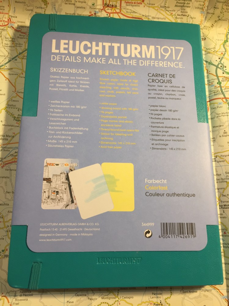
Leuchtturm1917 Sketchbook Review
Leuchtturm1917 entered the busy sketchbook market about a year or two ago, with a lineup of A6, A5 and A4 sketchbooks with white 180 gsm paper.
The covers of the Leuchtturm1917 sketchbooks come in a wide variety of colours, which is a rarity in this market. Usually you find sketchbooks in black, or maybe one or two other colours, but Leuchtturm has decided to offer these in all the colour options available in their regular lineup.

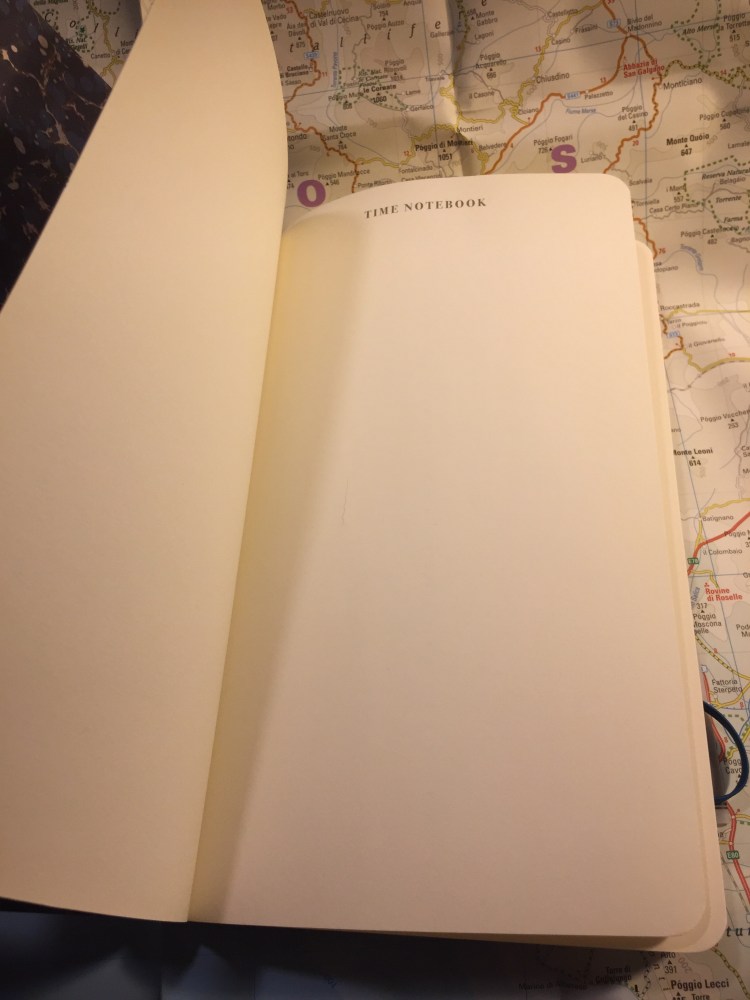
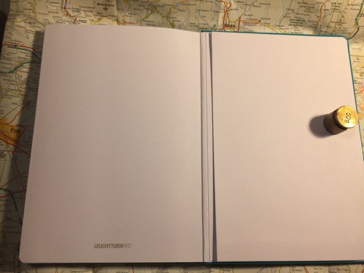
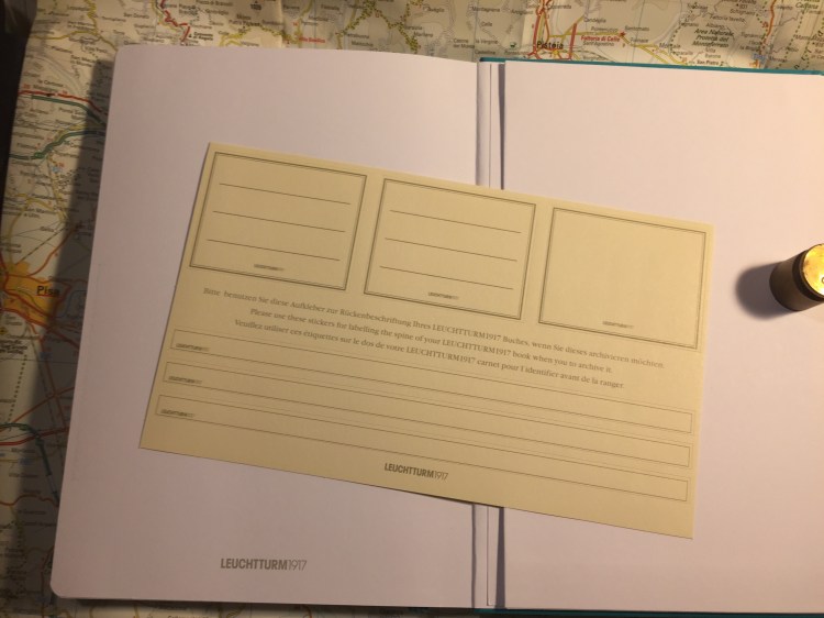
The sketchbook contains 96 pages of acid free 180 gsm paper, and it opens flat. There’s a note in the back packaging that says that the paper is colourfast, and shows a sketch made with a fineliner and markers. More on that later.
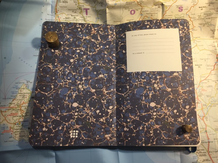
There’s a place to write your name and address on the front cover. I recommend writing your name and email address instead. It’s more practical, and more secure.
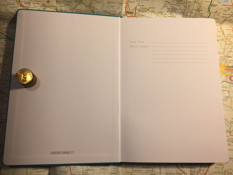
There is a back pocket. I don’t really think that it’s necessary in a sketchbook, but it’s nice to have.
Leuchtturm offers two unique things with its sketchbook. One is the offer to personalize it with an embossing of your choice. During last year’s Urban Sketchers they personalized the sketchbooks that they gave away as part of the symposium’s package, and the result is very nice.
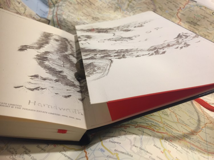
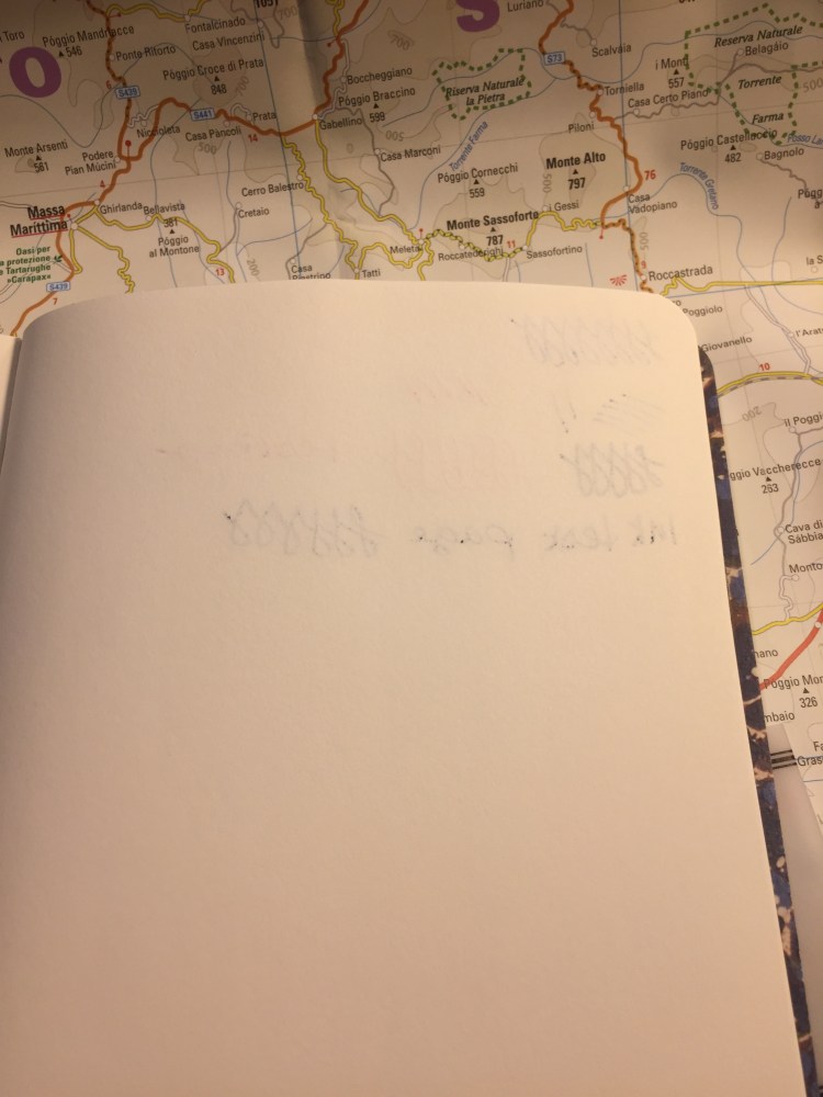
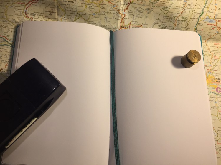
Now for the heart of the notebook, it’s paper. The pages lie flat with a bit of coaxing, and are thick and substantial. You have to really layer down markers for them to bleed through, and there’s no show through, meaning you can use each page on both sides.
So how does the paper behave? It depends on the medium. This sketchbook excels at dry media (pencils, couloured pencils, conte crayons, etc).
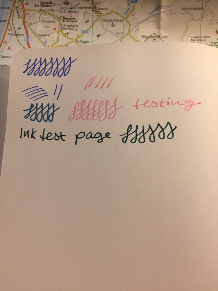
It’s pretty horrible with wet media, including fountain pen ink, watercolour washes, and ink washes. The paper buckles, shows off colour poorly, turns into a grainy mess, and and the ink feathers and spreads. I wouldn’t recommend it even for the lightest washes. All the vibrancy of my schminke watercolours turned into a muddy mess here (the sketch was done with a medium nibbed fountain pen and R&K Emma SketchINK):
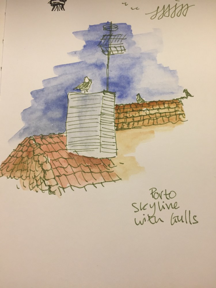
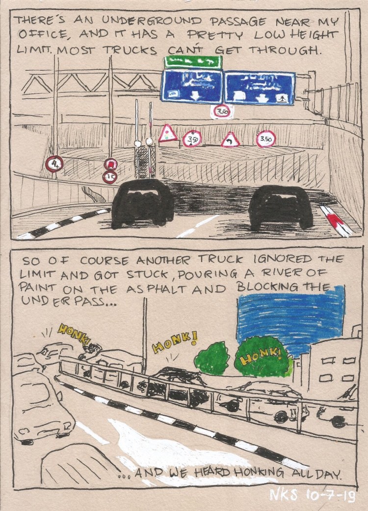
Even with fineliners you’re going to have spread. If you like sharp lines, find a different sketchbook.
Again, even from a bit of a distance you can see the spread. That’s just a shame, because if the paper was a little less absorbent then this would be an excellent sketchbook.
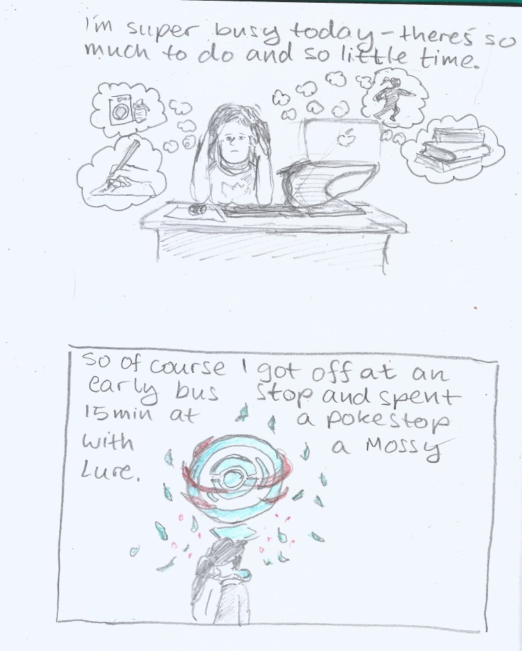
This brings me to my frustration with the picture on the back end of the paper band, the one showing a tiny marker and fineliner drawing. This is my experience using markers and fineliners on this notebook:
There’s no option to layer or blend the markers, but that’s OK. This isn’t marker specific paper after all. But even for casual use, or just for use with fineliners/brush pens this paper isn’t great.
So do I recommend this sketchbook? It depends. If the way it looks makes you want to use it, then yes, it’s a notebook for you. I’ve been using this sketchbook for my journal comics mainly to test it out. Will I continue using it? Only because I already have a body of work in it. Otherwise, there are better options out there, ones that aren’t only pencil great, but also work with pen, ink and light watercolour washes (the Stillman and Birn Alpha sketchbooks come to mind).