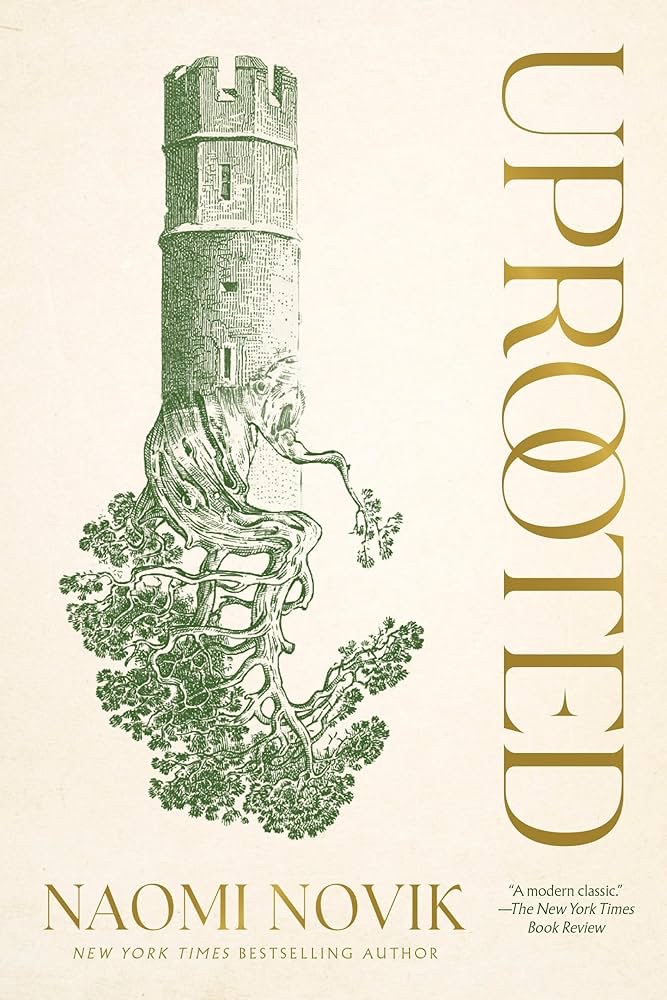
A fairy tale for grown ups, Uprooted by Noami Novik is a beguiling novel about being deeply rooted in a place, and yet also uprooted, a perpetual stranger in your homeland and community.
“Our Dragon doesn’t eat the girls he takes, no matter what stories they tell outside our valley. We hear them sometimes, from travelers passing through. They talk as though we were doing human sacrifice, and he were a real dragon. Of course that’s not true: he may be a wizard and immortal, but he’s still a man, and our fathers would band together and kill him if he wanted to eat one of us every ten years. He protects us against the Wood, and we’re grateful, but not that grateful.” Agnieszka loves her valley home, her quiet village, the forests and the bright shining river. But the corrupted Wood stands on the border, full of malevolent power, and its shadow lies over her life. Her people rely on the cold, driven wizard known only as the Dragon to keep its powers at bay. But he demands a terrible price for his help: one young woman handed over to serve him for ten years, a fate almost as terrible as falling to the Wood.
The next choosing is fast approaching, and Agnieszka is afraid. She knows-everyone knows-that the Dragon will take Kasia: beautiful, graceful, brave Kasia, all the things Agnieszka isn’t, and her dearest friend in the world. And there is no way to save her. But Agnieszka fears the wrong things. For when the Dragon comes, it is not Kasia he will choose.
Like all good fairy tales and myths, Uprooted has a compelling, readable narrative that sweeps you from the first paragraph about “Our Dragon” to the very end (which like good fairy tales also ends with Agnieszka talking about the Dragon). It evokes Polish and Russian folklore, Greek mythology, and classic fairy tales in a Polish medieval setting. You can tell just how much Novik knows and loves the source material she draws on, and how much respect she has for the cultures that wove these stories of magical beings, wizardry and mythic beasts to deal with the dark terrors of their world.
Novik is a magical story teller and Uprooted manages to be both very much part of the fantasy world that she creates, and also a timeless tale about identity, belonging, and love. There is a lot of heart in this adventure, a lot of compassion for the characters within it. Novik manages to create not only a very believable world, but a cast of real, nuanced characters: heroes with flaws, villains that you understand and feel compassion for.
Naomi Novik is a phenomenally good fantasy author, and this book justifiably won awards. If you liked her Scholomance series you will love Uprooted, and I am looking forward to reading more of Novik’s work.
Have a happy new year! Here’s hoping that 2026 will be much better than 2025 was.
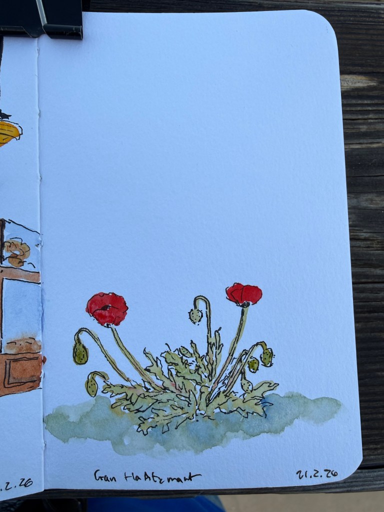
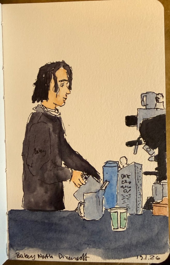
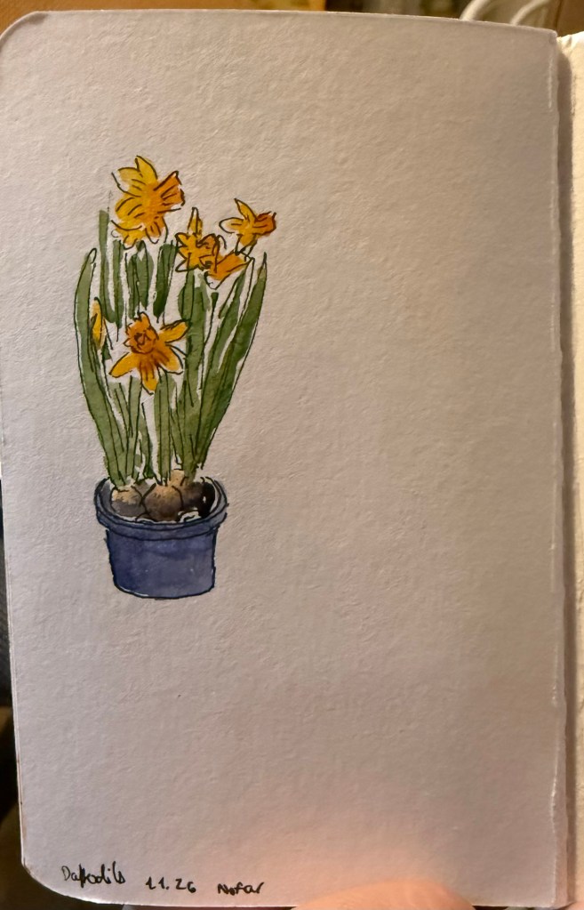
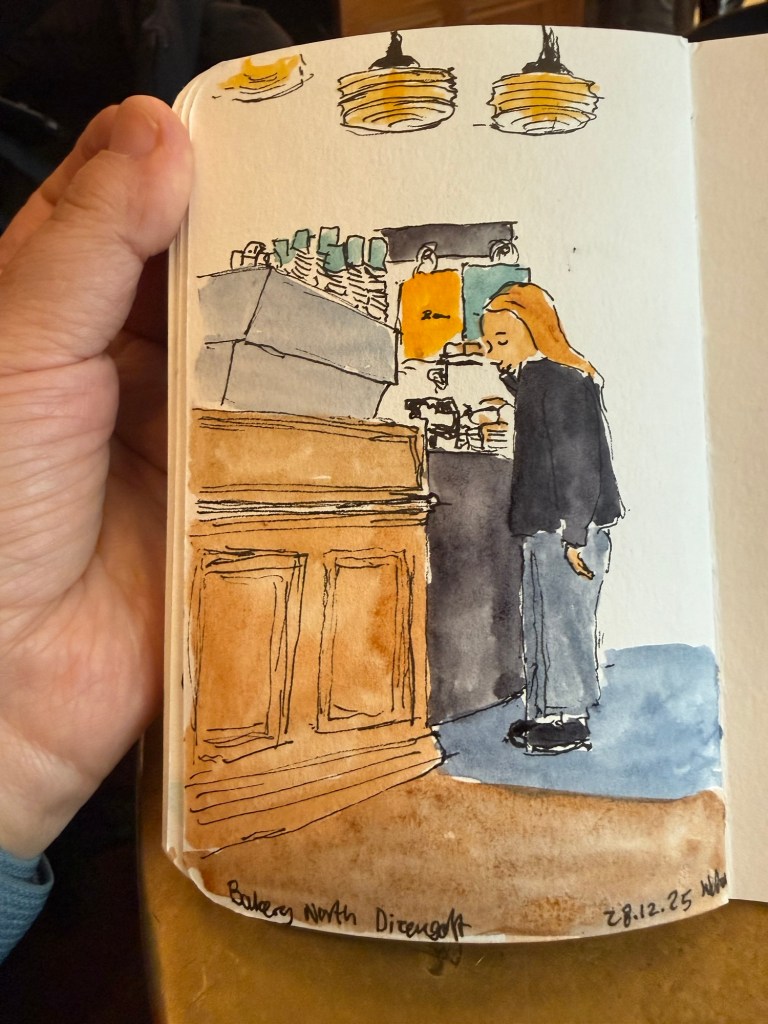
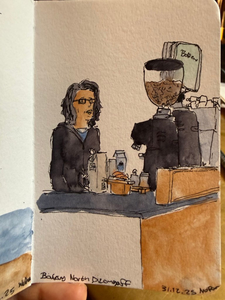
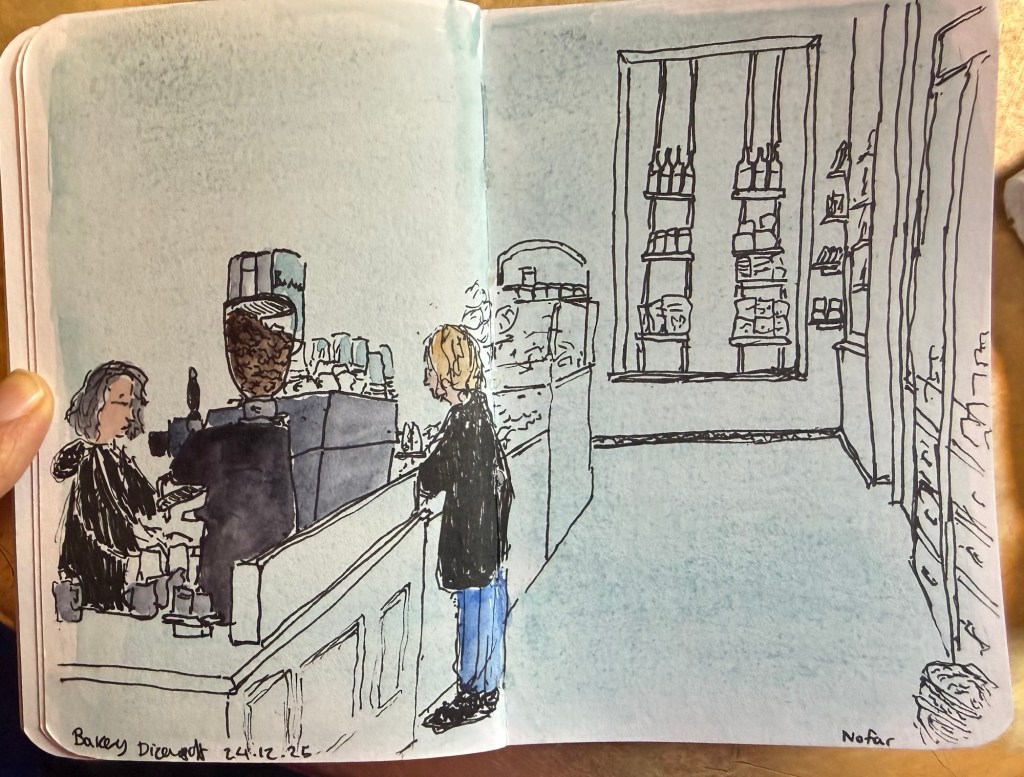
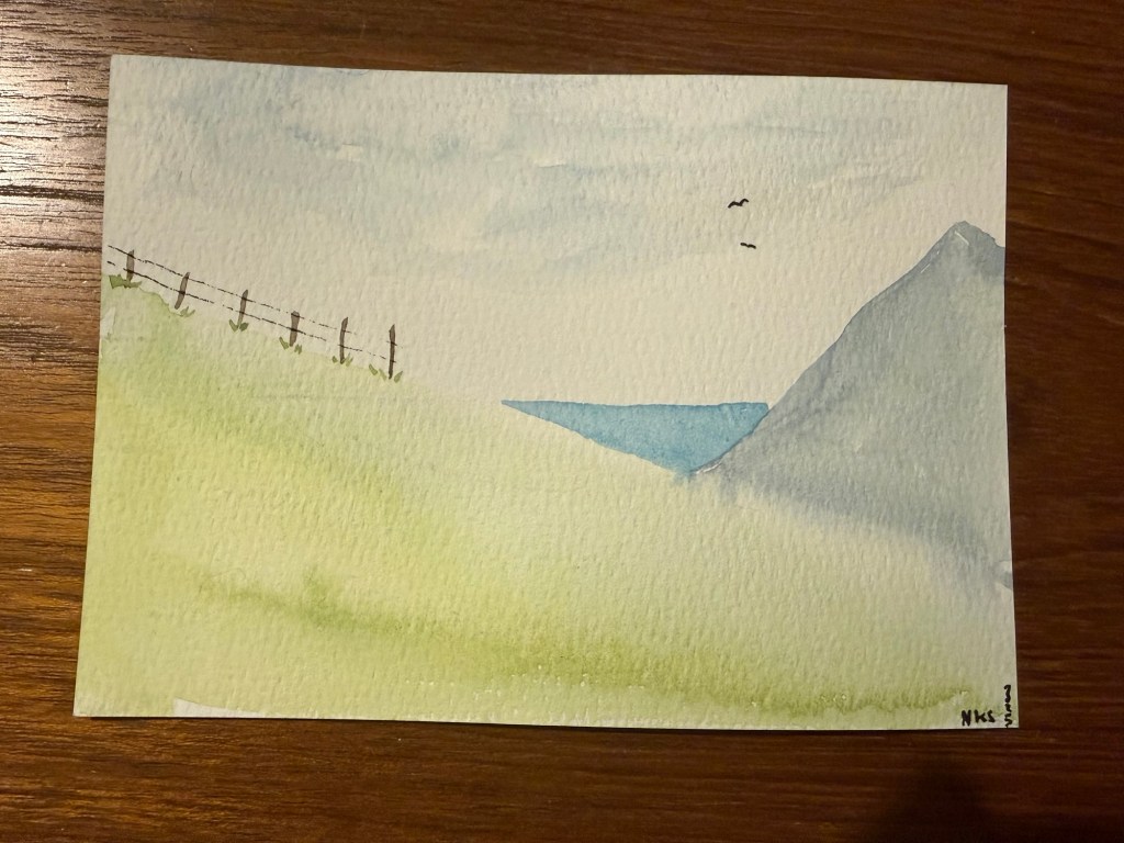
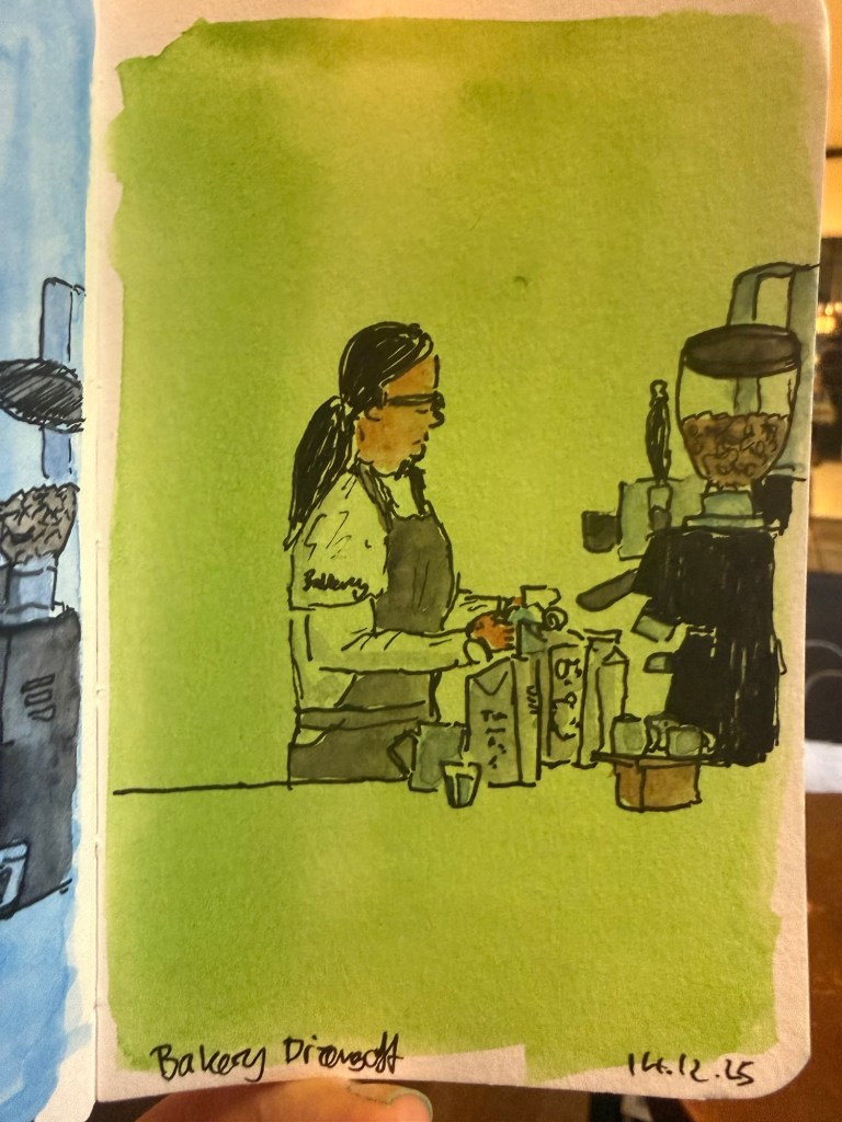
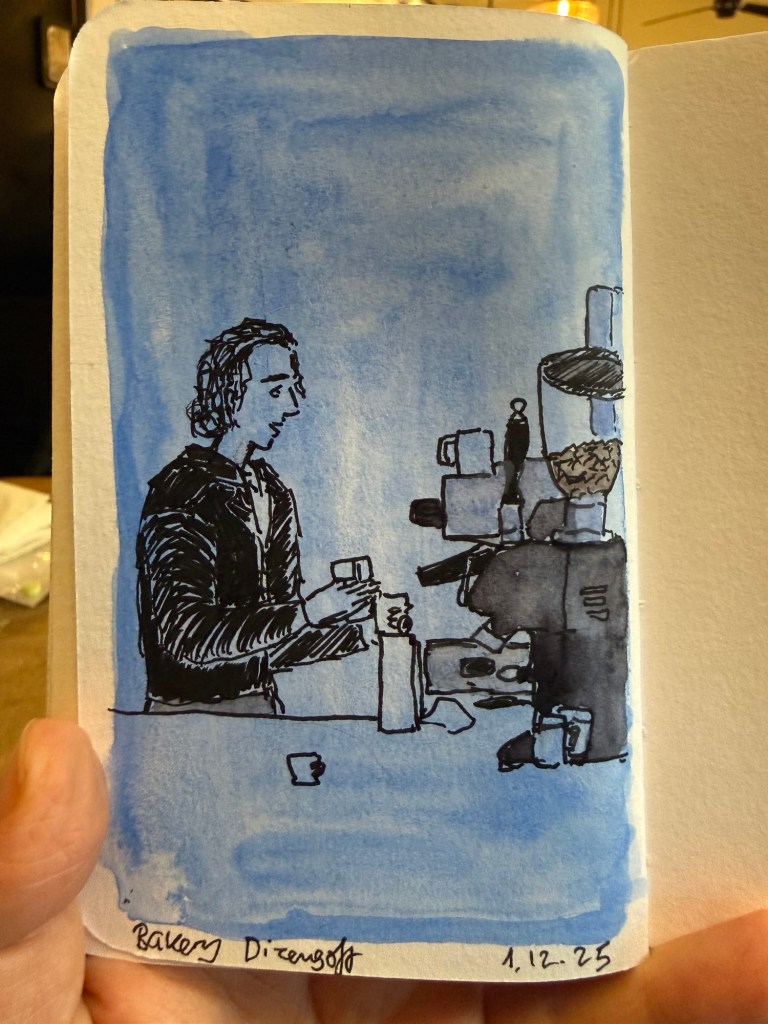
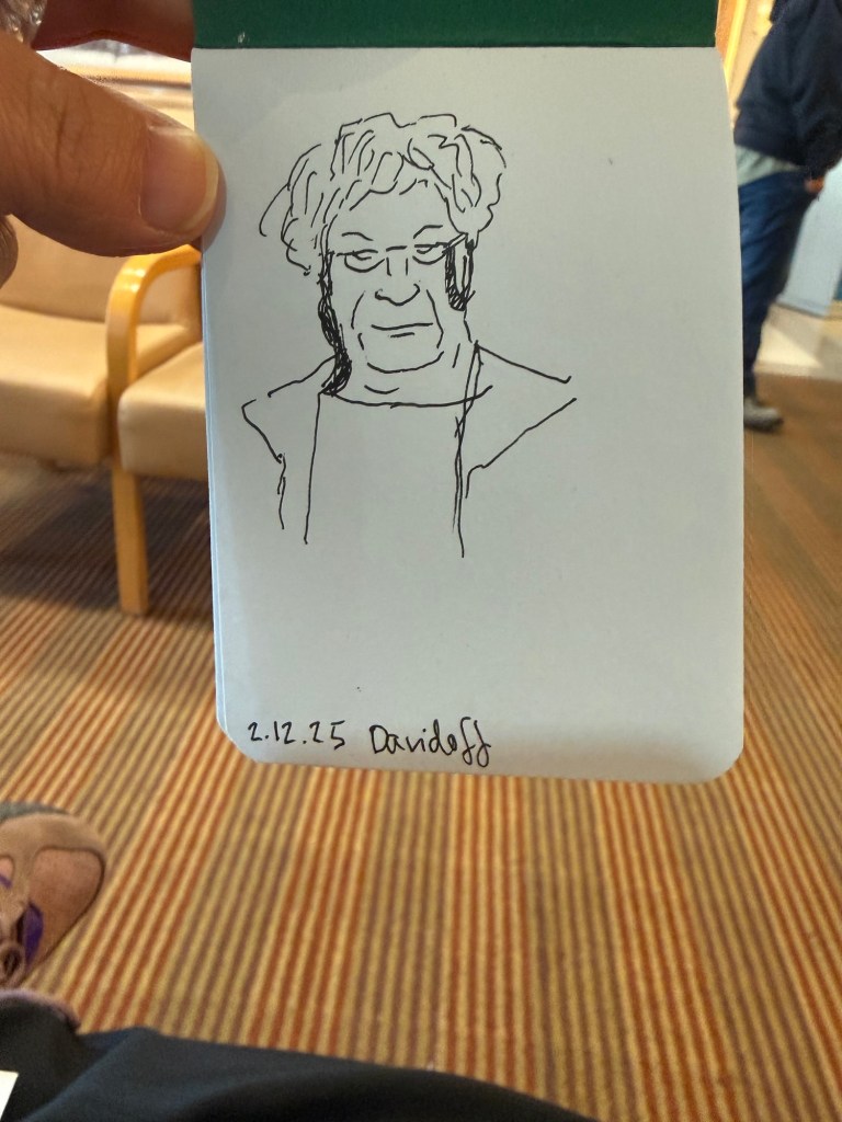
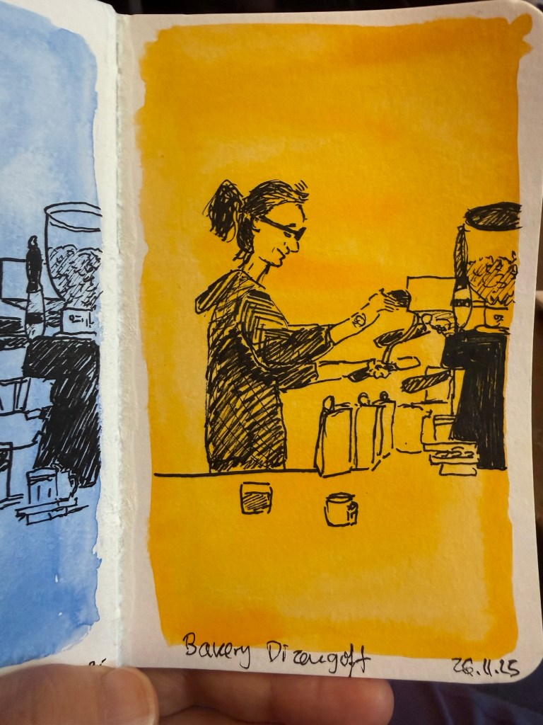
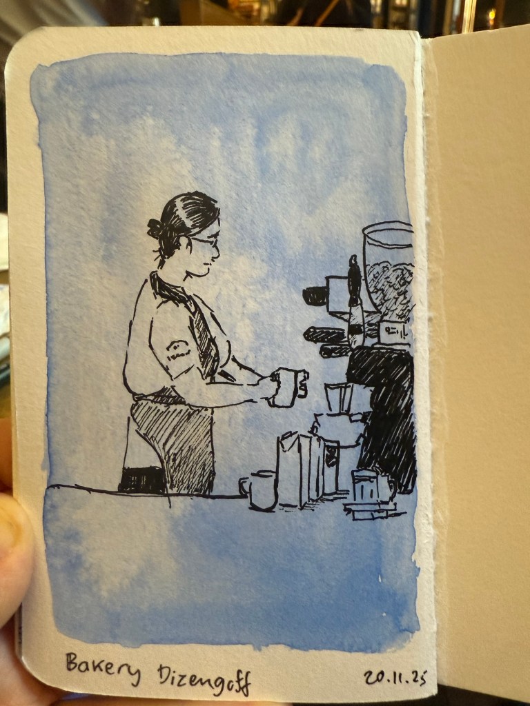
Here are a few recent sketches (mostly) from my Stillman and Birn pocket beta notebook.
Daffodils What to choose? Cafe sketchBarista at work (very fast sketch)Favourite cafe spreadTiny landscape (not from my sketchbook- drawn on a card as a gift)Barista sketch on green background Barista sketch on blue background Sketch in a doctor’s waiting office (not on Stillman and Birn)Barista sketch on a yellow background Barista sketch on a blue background
Diamine Inkvent 2025 the Teal Edition is over, and what a wild ride it has been. The 2025 edition introduced Pigment inks, which are waterproof when dry, and some interesting ink colour and property combinations.
Inkvent for me is a chance to play with inks that I normally wouldn’t try out, and it’s also a blogging, sketching and writing challenge. This year was more challenging than previous years, as I had received this calendar late, and so about half of the reviews were done on the actual day they were published, and the rest were only done a day or two in advance. I’m glad that I got it done, and I’m also glad that I chose a new streamlined format, as it helped me focus and get the reviews done on time.
Its the 6th year in a row that I’ve been creating these review posts, from the very first Inkvent calendar in 2019 (Blue Edition), through 2021 (Red Edition), 2022 (Green Edition), 2023 (Purple Edition), 2024 (Black Edition) and now this year, 2025 Teal Edition (Diamine didn’t create a 2020 Inkvent calendar. That was the Covid year).
Here’s a summary of this year’s Inkvent, first by ink colour, then property, and finally my personal favourites.
By Ink Colour
This is the full lineup of the Inkvent 2025 Teal Edition inks:
All the Inkvent 2025 inks
Unsurprisingly blue inks dominated this year’s calendar with a total of 7 inks in the blue/turquoise/Teal range. Both the first and the last inks for this year were teal inks, which is a given considering this is the Teal Edition of the calendar. Of these inks Dream Catcher is a sorry miss for me, as you don’t get to see the lovely base ink colour due to the extreme sheen (which also makes this a messy, slow drying ink with potential flow issues) and Overcast is lovely but much too light to be readable for me.
The blues
Four reds and pinks were in this year’s Inkvent, which is a pretty low number for an average Inkvent calendar. These were all decent Inkvent inks, and I’m pretty pleased with this lineup.
Reds and Pinks
There were four earth tones in the calendar, with Smoky Tobacco being my least favourite ink ever. Apart from that, it was a good and interesting year for earth tones inks.
Earth tones
There were only 3 green inks in this year’s inkvent, with Fir & Fog being one of my favourites, Bittersweet being too light for my tastes and Laurel being gorgeous but made worse by extreme sheen.
Greens
Only two purple inks were in this year’s inkvent, with Energy being destroyed by sheen, and Gala being nice but a bit bland and light for my tastes.
Purples
And then there were 5 “wildcard” inks. Bubbly in gold, Molten Basalt the weird unspecified dark colour, Ambiance the only orange ink, Chaos the other weird ink and Pineapple Spritz the only yellow ink.
Wildcards
By Ink Properties
This year was a year for Standard, Chameleon, Shimmer, Extreme Sheen and Pigment inks. I would have liked to see more Pigment inks and less Extreme Sheen ones, but that’s because I want to use them in my sketching.
There were three Shimmer inks, all of them pretty and fitting a holiday themed calendar. Shimmer inks have sparkly bits in them, but unlike Chameleon ink it’s one shade of shimmer, and usually larger shimmer particles.
Shimmer
There was thankfully only one Scented ink this year, but to make up for that, it was truly, truly awful.
Scented
There were three Pigment inks, and while I liked antler and carousel I wish that they hadn’t chosen to make the bubblegum pink ink a Pigment ink. Pigment inks are waterproof.
Pigment
The only Sheen ink this year was Energy, and the sheen really detracted from it. It made it look like there was a thick layer of dust on this ink.
Sheen
There were three Extreme Sheen inks, and all of them would have been better served by not being extreme sheen inks. In particular Laurel suffered from the extreme sheen treatment, because the base dark green is very nice, but you get to see so little of it through the red sheen.
Extreme Sheen
There was one Pigment Chameleon ink, Pineapple Spritz. I would have really liked this ink to have been just a pigment ink and not a pigment chameleon (with fine glitter in multiple shades).
Pigment Chameleon
There was one ink with Pigment Shimmer, Brrr! and again, I would have probably selected this ink as one of my favourites if it didn’t have both the Pigment and Shimmer properties.
Pigment Shimmer
There was one Shimmer and Sheen ink, the last but not least Myrrh the Merrier. I expect the last ink in the calendar to have Diamine going all out, and they did well with this ink.
Shimmer and Sheen
There are no less than five Chameleon inks in this calendar, and it’s clear that Diamine are (rightfully) proud of their Chameleon shimmer.
Chameleon
There were 6 Standard inks, which is always good to see. These inks may be shading, or have a bit of sheen to them, but they’re generally good, well behaved inks that you can use with the knowledge that they won’t be too difficult to clean out of a pen.
Standard
My Favourites
While I have more than enough inks in my collection so I’m probably not going to rush out to buy any of these once Diamine issues the Teal Edition full bottles of them some time in July 2026, these inks are my favourites this year:
My favourites
Celestial Skies is just a pretty teal with excellent shimmer that makes it truly shine. Carousel is one of the pigment ink that I’ve had the most fun sketching with. Fir & Fog is so excellent that it’s the first and only ink that I’ve written dry. Molten Basalt is an interesting alternative to black ink. Antler will be a useful sketching ink, and Myrrh the Merrier is delightful.
These inks almost made the cut, but there’s just something about them that made them a bit of a disappointment:
Almost there
Marie Rose is interesting, but I found that I personally don’t enjoy using the colour. Laurel would be perfect without the extreme sheen, and Brrr! should have been a pigment ink and lost the shimmer.
Will I be doing Inkvent next year? Probably. It’s a challenging challenge to get all the reviews up, but in the end I do find that I enjoy the process.
What was your favourite Inkvent ink? Will you be participating next year?
The final day! The day we’ve all been waiting for! The day with a full bottle of ink in the colour of this year’s calendar (i.e. teal)! And they let the resident dad on the team name it…
Day 25’s ink is Diamine Myrrh the Merrier. I told you it was named by a dad – and a dad that’s very pleased with himself right now 🙂
It’s a shimmer and sheen teal ink, with blue shimmer and red-purple sheen.
Col-o-ring swab
This ink is pretty, it’s got character and shimmer and sheen – but thankfully it’s still a teal ink. You can see the lovely base colour beyond all the pizzazz.
Close up on the sheen and shimmer
I have been using Myrrh the Merrier for my journaling and general writing for the past three days, and it flows well for a shimmer and sheen ink. Yes, if you leave it uncapped for a while you’ll have a hard start, but for a sheen and shimmer ink it’s been impressively well behaved.
Sketching and writing sample on Apica CD paper
You can see the sheen, but you can also see the ink colour.
Close up on the sheen
This year’s final bear is Candy by June Kendall, a one of a kind British artist bear.
The bear
As opposed to last year’s day 25 ink which was disappointing and an ink that I don’t ever see myself using, this year’s Myrrh the Merrier ink is delightful and actually fun to use.
That’s all for the individual ink reviews for this year’s inkvent. In a day or two I’ll post my summary post, discussing the calendar as a whole and highlighting some of my favourites.
Day 24’s ink is Diamine Antler, a raw umber (i.e. brown) pigment ink. This is the perfect classic shade of ink for sketching, and I can’t wait to use it with my watercolours.
Col-o-ring swab
Diamine Antler won’t be a favourite for everyone, being a brown ink, but it’s a useful colour for sketching, and it’s an interesting brown. It’s “flat” in terms of shading (or in this case, lack thereof), but the colour itself has a hint of red in it, and yet isn’t a strictly warm colour. It’s hard to explain, but if you’ve used raw umber in sketching you’ll know what I mean.
Sketching and writing sample on Apica CD paper
Today’s bear is Braeburn, the only bear that I’ve ever bought online. He was part of a limited edition series that Dean’s Rag Book Co (my favourite bear makes, now defunct) issued, with each bear themed around a species of apple. This fellow is Braeburn:
The bear
I will be testing out Diamine Antler with some watercolours. I think that it could be a good ink to have in rotation – provided I don’t already have a similar pigment ink on hand.
Did you like Diamine Antler or was it too boring and brown for you?
Day 23’s ink is Diamine Let it Snow, a turquoise ink with chameleon shimmer. It’s a lovely ink (turquoise is my favourite, and it’s utterly appropriate for this year’s inkvent) with some nice shading as a bonus.
Col-o-ring swab
Here’s a closeup on the magical chameleon effect:
Close up of col-o-ring swab
I had issues with leaking with this ink. I’m not sure if it’s the ink or the pen, but the result was very messy. I’ll be keeping an eye out on this one, and maybe testing this ink a different pen. I tested in a fine nibbed Lamy Safari that I’ve had and used for years without issues. In any case, the ink itself is nice, and it shades even in a fine nib:
Sketching and writing sample in an Apica CD notebook
Today’s bear is a German bear from Clemens Bears – a relatively big manufacturer. He’s number 667 out of 777 and he’s called Keoki. I love his puppy like face and his paper hat.
The bear
Setting aside the leaking issues, I love Diamine Let it Snow. I think the colour is perfect, the name is perfect and the chameleon effect and the shading make it an interesting ink. What did you think? Did you have flow issues with this ink?
Day 22’s ink is Diamine Pineapple Spritz, a mustard coloured pigment chameleon ink. While I guess that the name is appropriate (I don’t drink so I’m not very familiar with cocktails) I really wish that it was just a pigment ink and not also a chameleon one.
Col-o-ring swab
If Pineapple Spritz was a pigment ink it would be an interesting ink to sketch with. Yellow tends to disappear in watercolours, but also still have enough presence to affect the drawing – a bit like red does. As it’s a chameleon ink as well it’s going nowhere near my watercolours and my brushes. The last thing I need is glitter stuck on everything forever.
Closeup of the col-o-ring swab
Since I wasn’t going to use this for sketching and because Diamine Pineapple Spritz is both a pigment and a chameleon ink, plus it’s yellow (which tends to crystalise), I just opted to test this by dipping a Pilot Metropolitan medium nib in it, rather than filling the pen and dealing with cleaning it later. Because it’s a mustard yellow it’s fairly legible, and would work decently well for greeting cards and highlighting things. In that case though I’d prefer it to be chameleon only, as the pigment property doesn’t add much and it will make it more difficult to clean out the pen.
Sketching and writing sample on Apica CD paper
Today’s bear is also a Holbins Bear, hand made in England. Her name is Fiji and her sweater has a tiny crochet flower on it.
The bear
I personally don’t find a need for an ink in the shade of Diamine Pineapple Spritz. It would have been nice to try it out as a sketching ink if it was only a pigment and not a chameleon one, but as it is I don’t ever see myself using it. What do you think?
Day 21’s ink is Diamine Chaos. That’s right – Diamine Chaos. This is a dark purple, almost black ink, that’s “extreme sheen” – which means you basically see green sheen everywhere. I’m flummoxed by both this ink and Diamine Energy back in day 2. They both feel like Halloween inks more than Inkvent inks.
Col-o-ring swab
This ink isn’t brown, but the effect of so much golden-green sheen makes it appear to be brown instead of the really quite interesting deep purple that it is.
Close up on the extreme sheen
There must be someone in Diamine with a particular kind of humor if they included this ink in the calendar, and then called it “Chaos”. It’s a bit of a cynical outlook on this time of year, but I’m here for it.
Writing and sketching sample on Apica CD paper
How much sheen is “extreme sheen”? A lot:
Close up on the sheen
Today’s bear is called Flippy. He’s made in England by Hoblins Bears, and he’s tiny and adorable.
The bear
Diamine Chaos feels a bit out of place in an Inkvent calendar. I wish that it didn’t have the extreme sheen effect, because the base ink colour is actually really interesting. As it is, you barely get to glimpse it under all of the golden green sheen, and because the ink is so saturated it will likely bleed through and show through all but the thickest paper. In short – it’s not an ink that I see myself purchasing.
Are you a fan of Chaos’s sheen? What did you think of this ink?
Day 20’s ink is Diamine Ambiance, a tomato red or orange-red chameleon ink with some shading. It’s an interesting colour, but also a peculiar one. It’s somewhere between red and orange, and for a chameleon ink with some shading to it, it’s somehow quite… flat.
Col-o-ring swab
Inks in this hue tend to have either zero shading or rather wild and striking shading, and Diamine Ambiance falls closer to the zero shading area.
Close up on the shading and chameleon effect
I’m not in love with the colour either. Diamine Ambience seems to lack conviction to me – either be a red, or be an orange, don’t be a wishy-washy in-between-er. I’m also not sure where the name comes from and how it’s related to the holiday/winter theme.
Writing and sketching sample on an Apica CD notebook.
Today’s bear is Pumpkin, by Maddy Aldis. It’s tiny but very heavy – filled with lead shot.
The bear
I used a Pilot Metropolitan with a CM nib, and yet the flow of Diamine Ambience wasn’t great. Inks in the yellow/red/orange range tend to have somewhat problematic properties – they tend to crystalize, for example. I’m slightly worried about this ink and I doubt that I’ll have much use for it so I’ll likely be cleaning it out of the pen soon. Overall, I’m not a fan of Diamine Ambience.