I am trying something new here, to see if I can start using this blog to update on what’s going on with me plus as an accountability aid. Let’s see if it sticks.
Health
I spent the week recovering from Chemo number 8. I started the week with muscle aches and pretty strong neuropathy that made typing and writing a real pain, but by mid week the muscle aches subsided and the neuropathy, while still with me, is much less sever. Next week is Chemo number 9 out of 12. Getting into the home stretch, but the side effects are getting more pronounced. I no longer try to work on the day of the Chemo, and I may need to take a day off on the day after as well, but we’ll see. Next week I also finally get to see a psychologist at the cancer treatment centre. I’ve been on the waiting list for two months, so I really hope our appointment will go well.
Reading
I finished Kazuo Ishiguro’s fantastic “Klara and the Sun”. Not a breezy read and a very typical Ishiguro book, but I enjoyed his treatment of AI and humanity in this novel. It starts slow, and builds up a world and an atmosphere like few writers can. Highly recommended.
Started reading Hilary Mantel’s “Bring Up the Bodies” and will likely also start reading “Cibola Burn”, the 4th Expanse book by James S.A. Corey. Mantel is mesmerising as usual, but a bit too demanding to read during Chemo. That’s what “Cibola Burn” is for.
Writing
Got some writing done on my non fiction project, although not as much as I would have liked. I’m still writing in my notebook so I’m not counting words, but I estimate I got about 5 pages of writing in. Not great, but better than nothing, especially considering the material involved. I’m also considering picking up work on a novel that I stopped working on once the pandemic hit. I’ll have to rework the premise quite a bit, but I believe that the core of the story still works.
Currently Inked
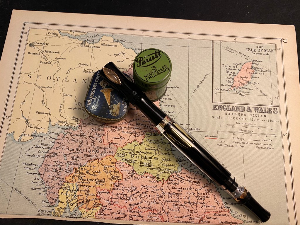
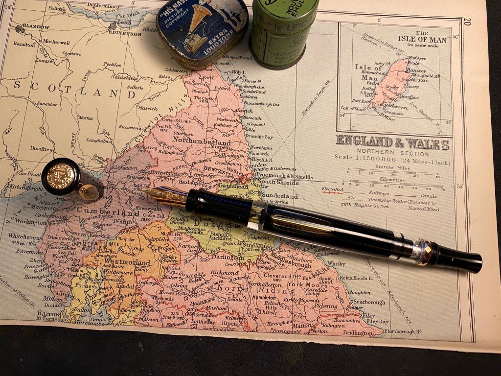
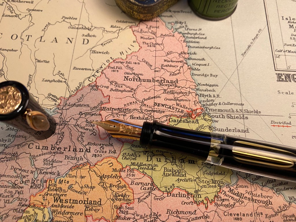
I wrote my Diplomat Aero Champagne fine nib pen with Sailor Studio 123 dry this week. I really enjoyed the pen and the ink, so I think that they’ll be back in rotation pretty soon.
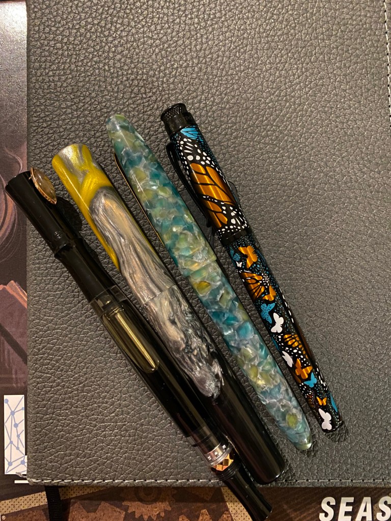
From left to right: PenBBS, Kanilea, Esterbrook, Retro 51
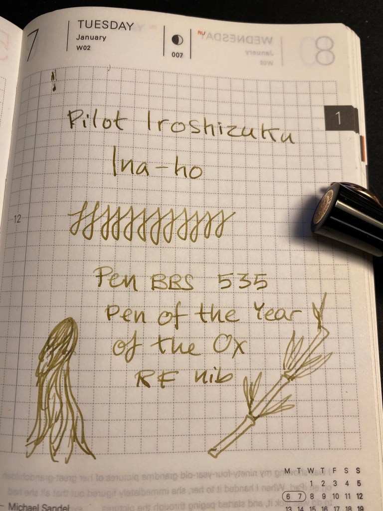
The PenBBS Year of the Ox pen and the Kanilea pen have been my journalling pens this week, with the first being filled with Pilot Iroshizuku Ina-Ho and the second with Diamine Earl Grey, both wonderful shading inks. The Retro 51 Monarch has a stub nib and is filled with Caran d’Ache Saffron, and the the Esterbrook Estie Sea Glass is filled with Diamine Jack Frost. Both are in use for my “Three Good Things” entries.
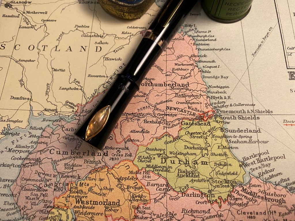
Happy fountain pen day everyone! I hope you get the chance to enjoy your pens today. I thought I’d celebrate with a review of one of the more interesting fountain pens that I have: the PenBBS 535 Pen of the Year of the Ox.
I like pens with interesting filling mechanisms, and I’ve purchased pens from PenBBS before and really enjoyed them so I decided to give this unusual (and inexpensive) pen a try. What’s unusual about it? Well it’s a long pen with an uncommon silhouette, a filling mechanism that doubles as an ink stop, and it has a gem as a roll-stop.
Let’s start with the pen body. It’s long. A Lamy Safari/AL-Star is 13 cm long uncapped. The PenBBS Year of the Ox is 15 cm long uncapped, and about 16 cm long when you unscrew the blind cap to allow for ink to flow (more on that later). That means that it holds a massive amount of ink (make sure you love the ink that you plan to use in this pen), all of which you can see since the main body part is transparent. The cap, blind cap and grip are black with rose gold detailing which is very attractive, and the cap and nib have special Year of the Ox inscriptions (2021 is the year of the ox in the traditional Chinese calendar). I have no idea why this wavy, long silhouette was chosen for the pen, but it reminds me of a bamboo stalk, particularly when capped, and I quite like it.
There is an engraving of an ox head on the rose-gold coloured steel nib, and the pen cap has a rose-gold coloured medallion on it with an engraving of an ox in the middle and “PenBBS 2021 Year of the Ox” engraved around it.
The grip section is surprisingly comfortable to use, as at first glance I was worried that perhaps it would be too narrow for comfort. There’s a slight step at the end where the threads go, and you can see from the picture below that there are very few threads for the cap. This is the weakest part of this pen’s design. While it makes gripping the pen very comfortable (no threads in the way), it makes capping the pen a hassle at times. It’s easy to miss the threads and have the pen not be properly capped. The cap itself is unlined and very short, particularly when compared to the long pen body. It is designed this way so you can post it on the back using the threads and the bottom of the piston.
You can see the threads on the piston below. Apart from checking that the cap can be posted in this way, I chose not to post this pen. It’s not that the posting affects its balance, as the cap is light and doesn’t weight down the back of the pen, but that the threads are so short and shallow that it’s not worth the hassle to use them to post the cap. Plus, I don’t post my pens’ caps anyway.
You also can see the filling mechanism in the previous photo. This is a little complicated to understand and hard to explain, but there’s a good video here showing how it works. You basically twist the piston nob to engage the piston mechanism and fill the pen with ink, and then twist it in another direction to disengage the piston and just allow the plunger rod to move.This allows you to return the piston to place, and is also the mechanism you’ll use to unscrew the piston blind cap and allow ink to enter the transparent chamber at the top of the pen and into the nib. I know this explanation is confusing – please check out the video to see the mechanism in work. It’s pretty easy to get it going once you’ve seen someone demonstrate it to you.
Is this the most convenient filling mechanism? No, not by a long shot. But it fills the pen entirely in one shot (something you can’t get with most converters), and allows the pen to have a really large ink capacity. This and the very decent nib turn this pen from a novelty item into an actual workhorse. This is a pen that is a joy to use, and you can use it for pages and pages of writing.
The Year of the Ox pen comes with a labradorite roll-stop, which is very cool looking and ensures that each and every pen is unique. I have no idea why labradorite was chosen, but I like its colour and I think that it works well with the rose-gold on the pen. It’s also what inspired me to fill this pen with Pilot Iroshizuku Ina-Ho.
To start writing with the Year of the Ox pen you need to unscrew the piston until ink can enter the small chamber near the pen grip. You can see the mechanism at work here:
The RF (round fine, or just simply fine) nib is smooth but not glass smooth, and if you plan on sketching with this pen, flipping the nib gives you a very good extra fine line. The nib and the ink capacity really make this pen something you can probably use throughout NaNoWriMo without having to stop for refills.
I wasn’t expecting much from the PenBBS 535 Pen of the Year of the Ox, because it really does look like a novelty pen. But somehow, the pen’s design, it’s weight, it’s large ink capacity and its good nib make for the ideal workhorse pen. This is a pen that’s fun use and fun to have lying around on your desk. Just be sure to fill it with an ink you really love, because you’re going to be using it for a while…
When I received the Nock Co newsletter Brad Dowdy sent, letting people know that he was closing the company down, the first thing I did was rush to buy every case I could lay my hands on. After I had secured my order I let myself feel the full measure of regret that such a great company is soon going to be no longer.
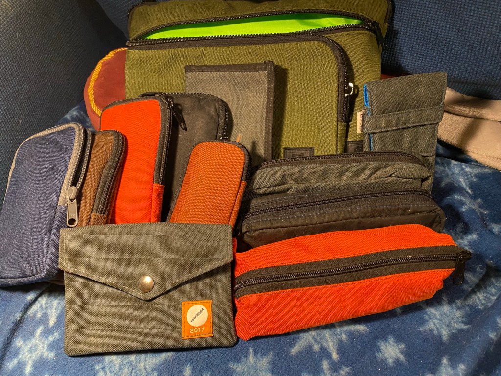
I use Nock Co cases a lot. This is just what I scrounged from a quick pass around the house:
Final Nockshot? A bevy of Nock Co cases.
The Nock Co website is still up and there’s still some stock left, so I thought this would be a good opportunity to write how I use some of my Nock Co cases, and recommend that you go get a case or two or more while they’re still around.
Sadly the Sinclair, my go to Urban Sketching case is out of stock at the moment. If it will be restocked or you find one in the secondary market I highly recommend it. Like all Nock Co cases it is built to last, and like all Nock Co cases it can hold much, much more than is advertised. My Sinclairs hold a slew of brush pens, fineliners, a mechanical pencil and an eraser, a waterbrush and a folded up piece of paper towel. I have several of these Urban Sketching kits deployed in several sketching bags, ready to go when I am.
The Tallulah is not sold out, and is also a must have case for Urban Sketchers. It holds a mini version of what my Sinclairs hold (again, it can hold so much more than the advertised two pens) and is compact enough for me to be able to toss it and a Stillman and Birn pocket alpha into my purse as an ultra portable urban sketching kit.
Got coloured pencils? Like sketching with woodcase pencils? The Chimneytop is for you. That’s where I keep my coloured pencils and their graphite counterparts. The design is simple but effective in that the middle zipper allows you a better view and access to the pencils you’ve placed inside.
The Brasstown is also sold out at the moment, but if it comes back in stock it’s a must have. This is where I keep the fountain pens and machined pens that I have in rotation. If they aren’t in a Sinclair, they are in a Brasstown. The Brasstown keeps them safe from scratches, and can hold even the widest barrelled pen. Like all the other cases, it can hold much more than advertised.
You really can’t go wrong with a Nock Co case, and I’m really going to miss them. The design, the material, the construction quality – there are many case makers out there but not many that get it so right all the time.
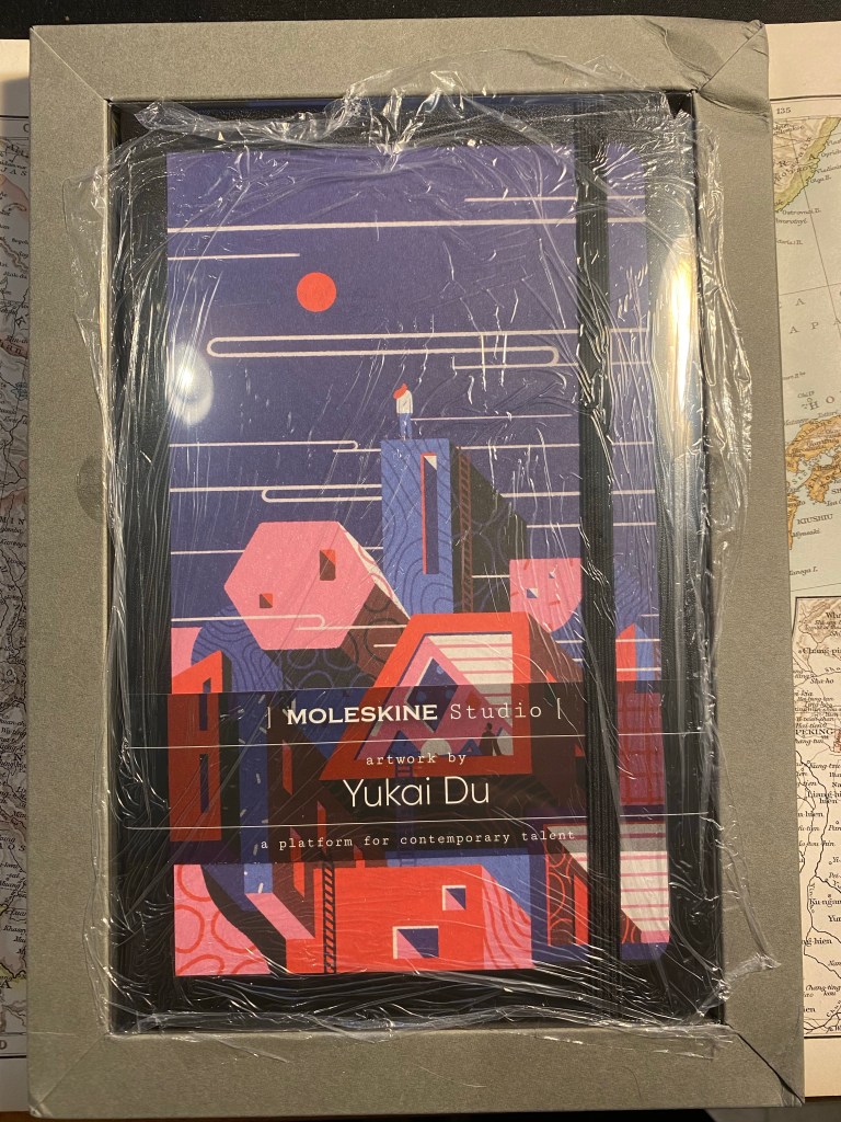
Cult Pens offered a paper box about a month ago. For £25 you got 3 notebooks, 2 sketchbooks, 1 fineliner, 1 marker, 4 pencils, 4 pens and a handful of Smile Clips. I don’t usually buy boxes of stationery (I especially avoid mystery boxes), but as I was interested in trying out the Moleskine Studio that was already part of the box, and as I was interested in most of the rest of the box’s contents, I decided to give it a try.
The box is no longer being offered, but if it was I’d suggest that Cult Pens would do better to pack the notebooks in an actual well-fitted box and not in a zip-lock bag that bumps around in a large box. The result is that the corner of the Moleskine Studio box was crushed, and one of the pads that came in the box was also damaged.
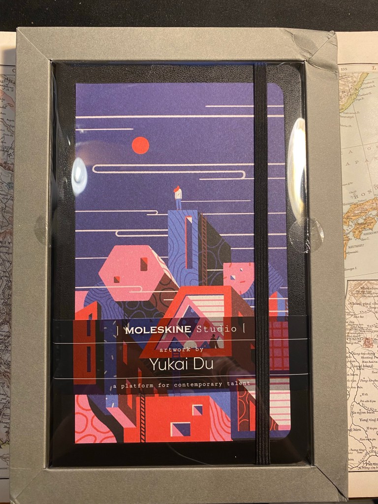
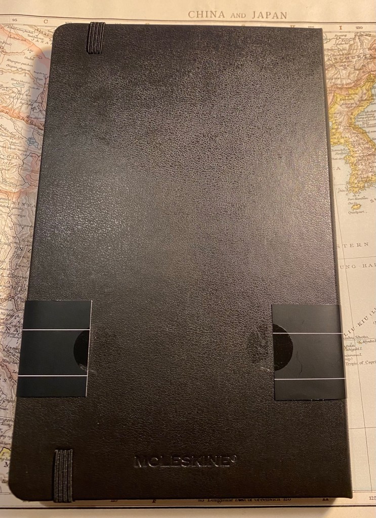
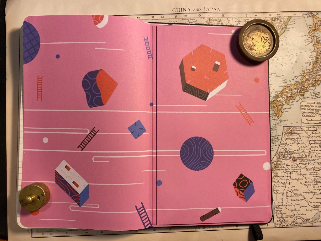
Now for the Moleskine Studio: this is a new offering from Moleskine, made in collaboration with six artists. Each artist’s artwork is featured on the front cover, on the end papers, on a sheet of themed stickers, and on the box the notebook comes in. The box serves as a frame for the artwork, allowing you to hang it if you wish. The notebooks are available in Plain or Ruled layouts, and, here’s the really interesting bit, contain 100 gsm ivory coloured paper.
Here’s the box as I received it:
Crushed corner, weird cling film wrapping – there’s a lot going on here
So the notebook’s box/frame came with a crushed top right corner, which is unfortunate. The notebook itself was covered with cling film, a form of packaging I’ve never seen come from Moleskine before, and a plastic cover that was attached to the box/frame. While the frame is designed to be reusable, I’ve purchased another Moleskine Studio that came completely without it, and I have a feeling that there’s very little chance for the frame to survive shipping without being mangled. As it is, I feel that there’s way too much packaging here.
Box frame, notebook, and plastic cover.
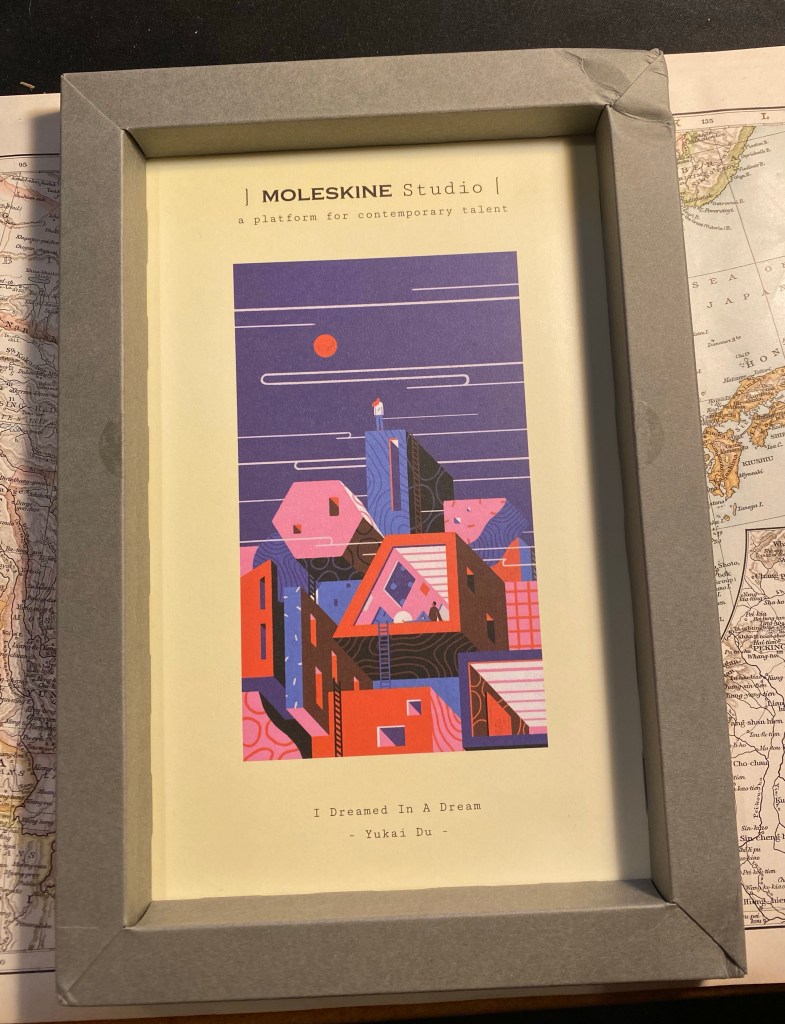
The frame with the artwork inside:
Yukai Du’s “I Dreamed In A Dream”
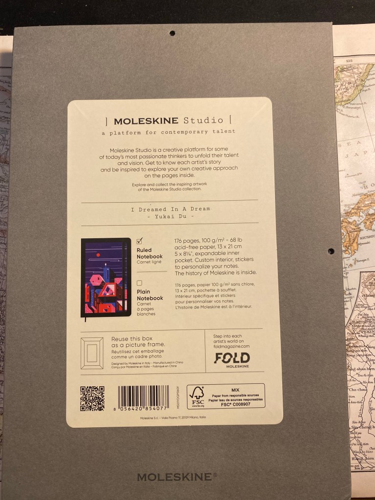
The flip side of the frame. You can see that there are holes for hanging the frame, as well as information about the paper in the notebook (gasp!). I wish Moleskine would print this info on every notebook they sell.
The back of the frame box.
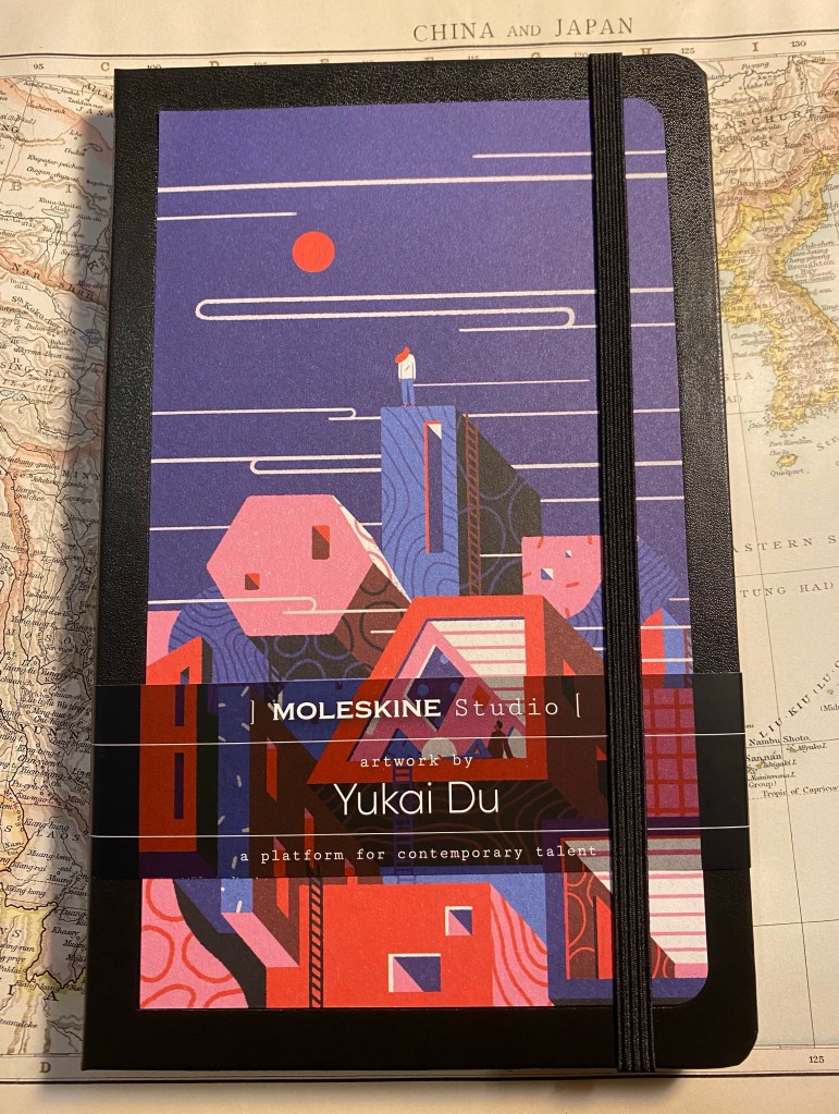
Here’s the notebook, and here’s where I start having more serious reservations about Moleskine’s manufacturing choices regarding this lineup. The artwork isn’t printed on the notebook cover, it’s glued onto it. I have a feeling that the glue isn’t going to last long, and in general it just cheapens an otherwise premium notebook experience.
Front cover (with paper wrap still on)
The back cover is a bit weird in that the paper wrap doesn’t reach all the way around and is just stuck to the cover with two stickers. The stickers are easy to remove and don’t leave any residue, but it’s the only Moleskine I’ve seen with this setup and I can’t help but wonder why.
Back cover.
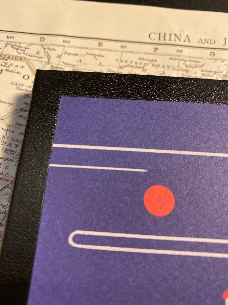
Here’s a closeup to the glued artwork on the cover. I’m also a little disappointed that the artwork hasn’t been signed by the artist, Yukai Du.
Closeup on the glued corner of the artwork.
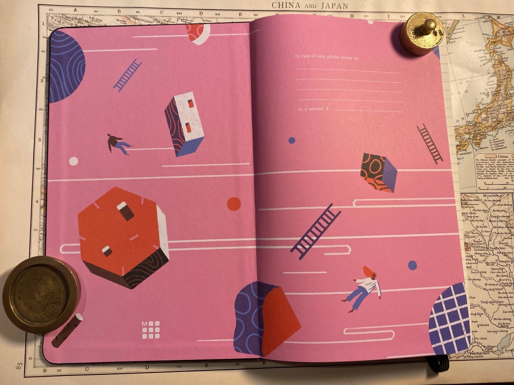
Inside the front covers is more of Yukai Du’s work, and it’s wonderful. This is where Moleskine shines, and I wish these artists could have had their work properly printed or even embossed on the covers of a Moleskine. They deserve it.
Inside the front cover, with “In case of loss”.
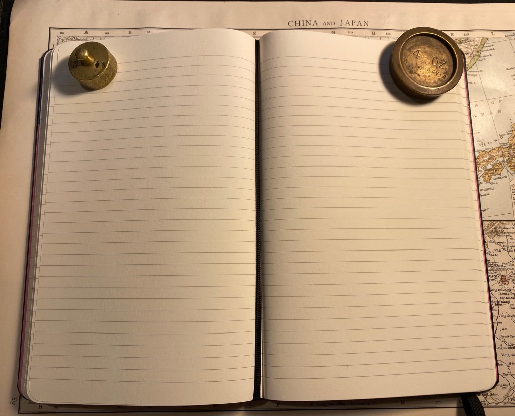
The paper is very good (not your standard Moleskine affair, which has its particularities). Ivory coloured, 100 gsm, not glass smooth but not textured, and it lays flat. There’s some writing samples ahead, but spoiler alert, yes it’s fountain pen friendly. There’s also the famous ribbon bookmark, which I wish was pink but in this case is black.
Paper and bookmark.
The back cover end papers feature more of Yukai Du’s artwork, perfectly aligned on the back pocket.
Inside the back cover.
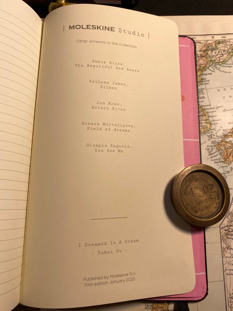
On the last page in the notebook, usually left blank, Moleskine has featured more information about the Moleskine Studio edition. In their marketing they’re calling this a new platform for collaboration with artists, and this page makes me think that this is going to be an ongoing project for them. I hope that they do continue with these, as the overall result is very good.
The last page.
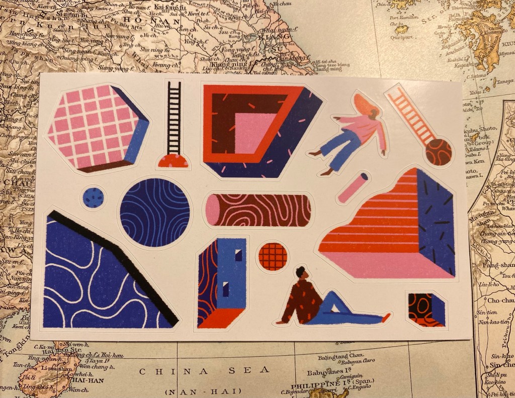
Here’s the sticker page that comes with this edition. Again, very well made:
Sticker page.
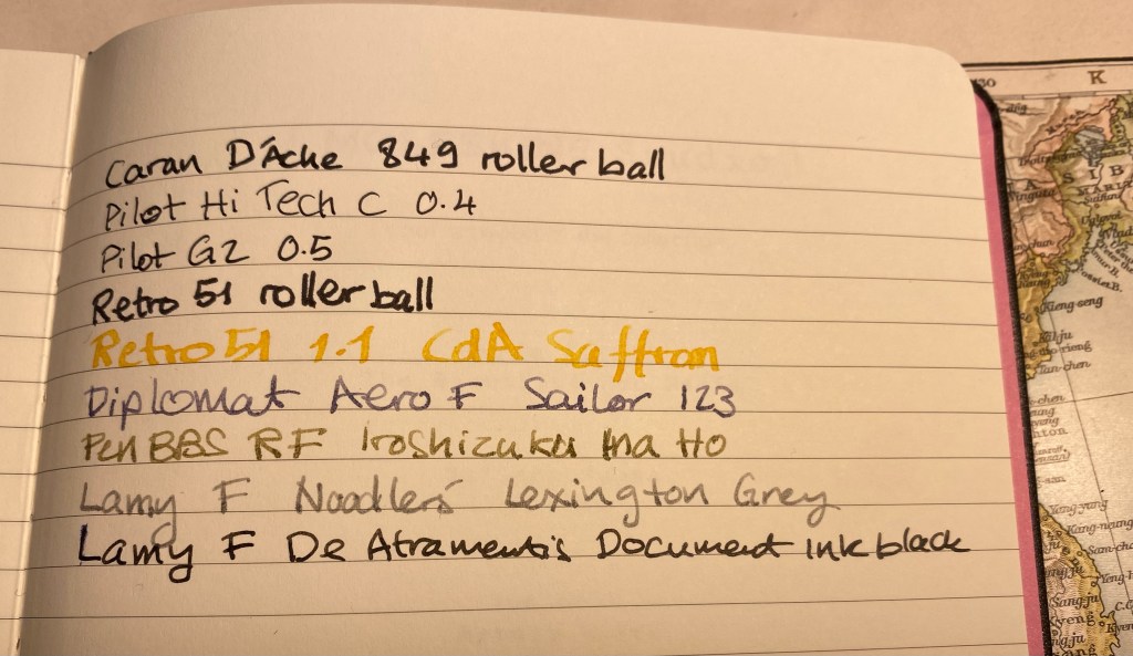
Finally, the paper. I was hoping that this is going to be a fountain pen friendly Moleskine and it is. There’s no feathering, no spreading, no bleed through and very little show through with this paper (there’s more show through with the rollerballs than with the fountain pens). Your milage may vary, but I am very happy with this paper, and a Moleskine Studio is going to be my next journalling notebook.
Ink test.
The reverse side of the page:
The reverse side of the page.
Overall, the Moleskine Studio is a strong new offering from Moleskine, one that really plays to their design strengths. It’s not perfect, but I hope to see them iterate and improve on it with time, and I hope that many artists get to have their artwork featured on an iconic notebook.
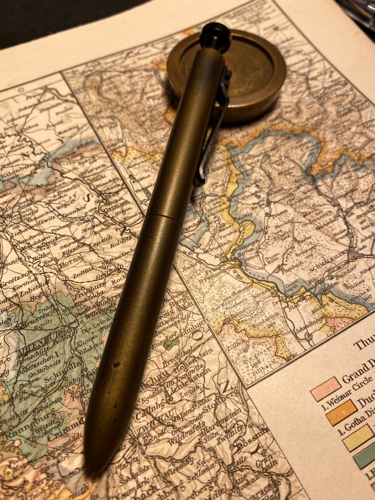
I wasn’t planning on reviewing the Karas Kustoms Steampunk Bolt V2 pen because I was sure that it would be sold out by the time I got to it. Somehow, however, there appear to be a few still on sale on the Karas Kustoms site.
Dinges and Cerakote finish work together to create a really unique pen.
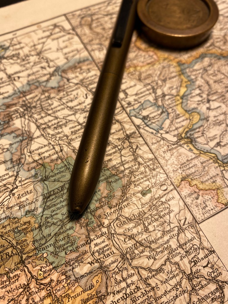
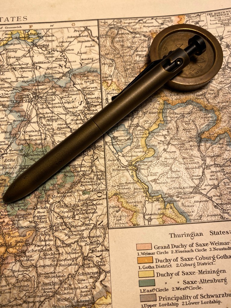
The Steampunk Bolt v2 has the same aluminium body and shape as the anodised Bolt V2, but it’s gotten a distressed bronze treatment in Cerakote. The basic Bolt pen has been dinged before the Cerakote finish has been applied, and the result is fantastic. The pen really earns the “Steampunk” title.
Big dent in the end of the pen, smoothed over and covered with bronze coloured Cerakote.
The Cerakote finish is smooth but not slippery, and really fantastic to hold. It’s also nothing like any other Cerakote finished pen that I’ve seen so far: it really gives the pen a bronze look without the bronze weight or smell. The pen is light (for a machined pen – don’t compare it to plastic), and well balanced. The black anodised bolt mechanism is as smooth to engage as ever, and works well with this finish.
Every ding adds to this pen’s looks. It’s just going to look better with time, I think.
There are two caveats to take into account with this pen (and other Karas Kustoms Bolt V2 pens):
The pen comes with a Pilot G2 LG (as in large) 0.5 refill. I haven’t been able to customise it to work with my beloved Uni-Ball UMR-85 refills (the bolt won’t engage). It’s a decent enough refill, but I wish that it had been built around the standard G2, and so had more customisation options.
There is a slight amount of play in the tip which makes it faintly click at times when you write.
All in all this is a very good machined bolt action pen, with a fantastic and very unique finish.
I last posted about my planner and to do list setup here. To recap, my planning system includes two large Moleskine hard cover squared notebooks, one in which I plan my week, and one in which I use as a daily to do planner. I started using this setup once Covid hit and I started working from home. It worked very well for a year and a half.
I was hospitalized for a month, in which I discovered that I have zero control over my time or how my day will shape out. When I got out I was already on a Chemo regiment. I had to make adjustments to my life, this time because of my personal health, not a global pandemic.
Score (another) one for self-made planners.
My old system was generic enough that it fit into my new lifestyle with very little adjustment. The weekly notebook stayed mostly the same, as you can see below. The main difference is that I manage less stuff there and more using reminders in Fantastical. It’s not that I don’t like paper planners any more, it’s just that Chemo Brain is a possible side effect of my treatment and I don’t want to risk not getting something important done because I forgot to check my weekly planner at the right moment, or I saw something there but didn’t remember it after I’ve seen it.
So why keep the weekly planner at all? Because it helps me see how the week is shaping up, and because it allows me to do a little long term planning, despite everything. All my plans at the moment are in two week batches (dictated by my chemo regiment), and this layout allows me to manage them.
Another addition to this notebook is a few tracker pages, marked by tabs. Some track purchases that I’m waiting for, some track bureaucracies that I need to take care of, others list things that I want to get done eventually but I haven’t decided yet when or how.
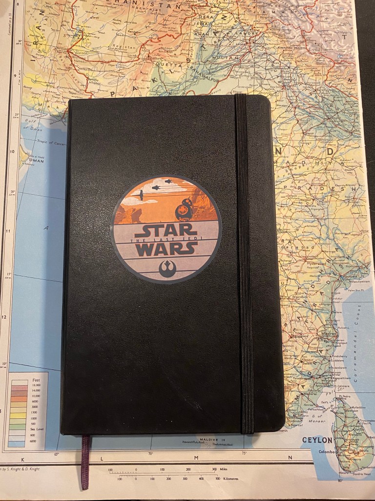
As for my daily planner notebook, I just finished one and started another. Here’s the finished notebook:
Moleskine Large Hardcover squared with a Star Wars The Last Jedi decal on the cover.
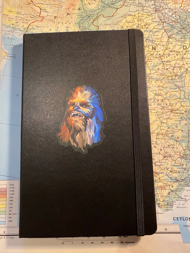
Here’s the new notebook. I love using these decals to make these notebooks my own:
Moleskine Large Hardcover squared with a Star Wars Chewbacca decal on the cover.
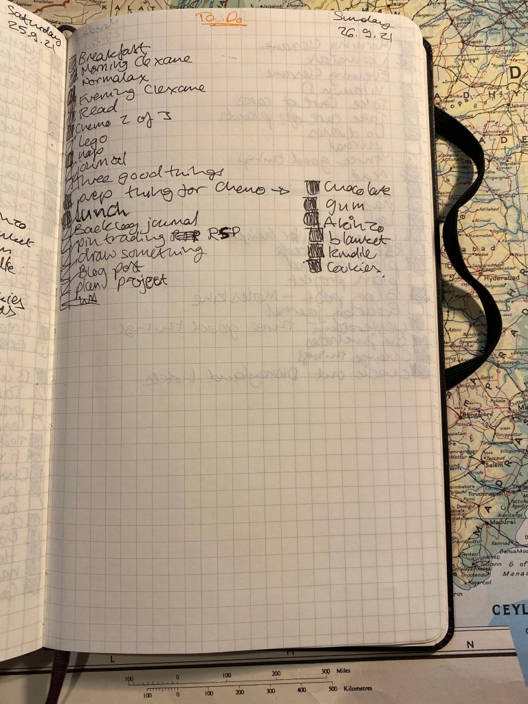
I used to manage every day on a full spread, with personal to dos on one side of the page and professional ones on a another. Since my life is less busy now than it used to be, I’ve downsized my to do to one page per day, with personal and professional mixed in (I work from home). This is a sample of my least busiest day: it’s a chemo day and I wasn’t planning on working after this treatment since it was a long one. Door to door I was in the hospital from 6:40 to 14:00, and completely wiped out after it. I don’t usually list my meals or naps in my notebook, but chemo days are so crazy (in terms of what my brain does on steroids) that I have to write everything down. Things that I didn’t do get a strike in them and are moved forward to another day.
Everybody has different needs from their planner, and those needs oftentimes change unexpectedly, and out of sync with “planner season”. It’s one of the reasons why I find making your own planner, working just a few days or a week or two ahead is the best and most consistent way for me to manage my time. There are some great planning systems out there, but if you’ve struggled with using them, or if your circumstances make you need a very flexible system, I highly recommend picking up a squared or lined notebook and creating your own.
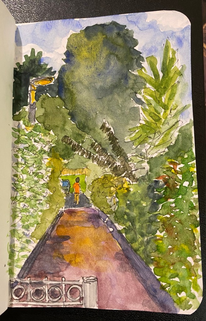
I’ve been trying to draw better foliage, which made me want to investigate the various greens I can mix from my current palette. So for the first time I dedicated time and a few sketchbook pages to experiment with green watercolour mixes. I thought that the process would be tedious and boring, but it ended up being very interesting. Mixes that looked like mud on the palette came to life on the page. I discovered a whole host of green hues that I had no idea that I had access to. And once again I fell in love with Schmincke’s Glacier Green.
Note: DS stands for Daniel Smith and Sch for Schmincke. The paper is Stillman and Birn Alpha.
Please consider donating to St. Jude Children’s Research Hospital if you haven’t already. They really do excellent work and deserve all the support that they can get.
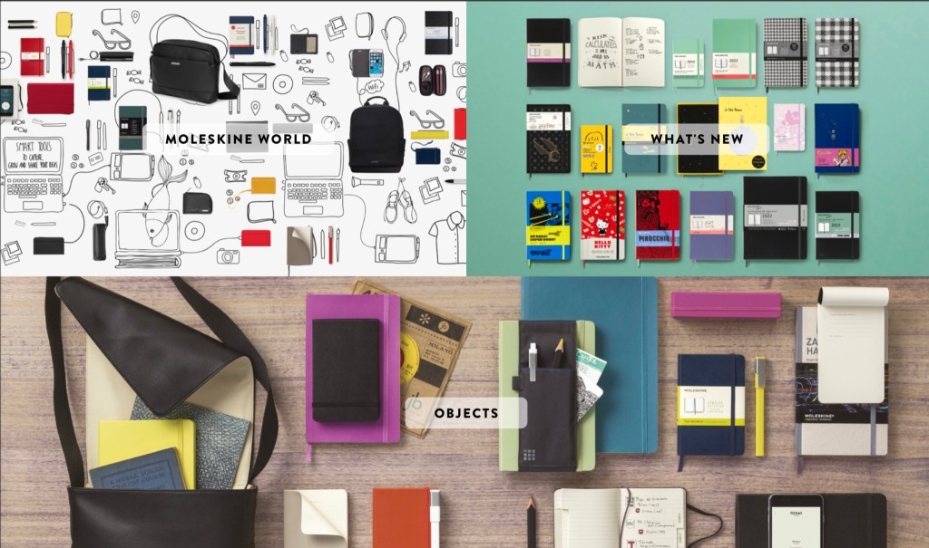
A few days ago I found Moleskine’s Winter 2021 Catalog, and was dismayed to discover that many of my favourite notebooks are discontinued (“while supplies last”). So this is going to be mostly a “stock up on these if you like them” review of the catalog, not so much a “look at these cool new things from Moleskine,” mainly because most of the cool new things were published earlier in the year.
So here are the main discontinued notebooks, in order of their (dis)appearance in the catalog:
The Classic Reporter notebook, already available only in Pocket is now going to be available only in the Ruled option, both in hard cover and soft cover options. The Squared ruling is long gone and now the Plain option is disappearing from most dealers. This is your last chance to get it if you use it. As I used to use a Plain Pocket Reporter as a PigPog PDA and every few years I return to it, I’ve stocked up on a few for future use. I really wish that they wouldn’t have discontinued these, as they were some of my favourite notebooks from their lineup.
Dotted and Squared rulings are being discontinued in the Scarlet Red and Sapphire Blue Pocket and X-Large notebooks in both hard cover and soft cover. For some reason they’ll still be available in Myrtle Green in these sizes. Earth Brown and Reef Blue look like they are also being gradually phased out, likely to make room for next year’s spring colours. If you like these colours, especially in Plain ruling and in Pocket or X-Large sizes, now is the time to get them. I’ll wager that these colours are going to be completely phased out by the Spring 2022 catalog.
Moleskine Two-Go notebooks, which were my favourite new addition to their lineup are being completely phased out by the look of things. I’ve stocked up on as many as I can justify, as I use them as my reading journals. The size, the paper and the blank/lined ruling were perfect for this use, and I am going to sorely miss them. Moleskine seem to be replacing them with the Classic Notebooks Double Layout (more on that below), but the paper is 70gsm and not the 100gsm of the Two-Go notebooks.
Most of the Moleskine Blend notebook collection is being gutted, which is also a sore loss. Nobody makes fabric covers as well as Moleskine does (sorry Baron Fig), and some of my favourites were in this collection. The Denim collection, especially those with the writing on the covers (Hand Wash, This is Yours, etc) were fabulous, and in general this collection was well designed and executed. Only the new black and white checked and patterned 2021 notebooks that are new to the catalog remain. I guess that at leas we have hope that not all the Blend line is being discontinued.
Cahier notebooks are also seeing less options in the Squared and Dotted rulings. I have no idea why they seem to be less popular than other ruling options. Tender Yellow seems to be making its way out of the lineup, so if that’s a colour that you like you probably need to stock up.
Pearl Grey is being discontinued from the Pro Notebook lineup, and if you like the XXL notebooks not in Black now is the time to stock up on the Forest Green.
The Address Book is no longer going to be offered in X-Large. I can understand why – my guess is that the Pocket and the Large ones sell much better.
The Sketchbook in A3 is going to be offered only in Black from now on. Scarlet Red and Sapphire Blue are being discontinued in that size.
The Sketch Album in XXL is being discontinued.
As usual, I’m not going to delve into the wild and woolly world of Moleskine Smart and Moleskine accessories. It’s just too much, even for me.
Here are the new additions to the lineup, in order of their appearance in the catalog:
Moleskine Studio notebooks, which feature both 100gsm paper and an interesting design concept are my favourite new additions to the lineup. I already purchased one, which for some reason arrived sans box and and artwork, but oh well.
Classic Notebook Double Layout seem to there to in part replace the Two-Go, although they are offered in 70gsm paper and with regular and not fabric lined covers. Time will tell how popular they will be.
Moleskine Blend gets two additions to the lineup (everything else is being discontinued). They are both black and white patterns, which is classic but also a little boring. I wish they’d kept more innovation going in this part of their lineup.
Planners – everything is new here so I won’t go over them. There’s probably a planner option for everyone in this lineup, if planners are your thing.
Limited Editions – everything here is marked new, but apart from the Sakura everything has appeared in a previous catalog (if memory serves). The Sakura is gorgeous as usual, the rest of the lineup (Le Petit Prince and Hello Kitty in particular) are going to be very popular (the Pinnochio ones being the exception).
Logbooks are getting two new colour options – Coral Pink and Lavender Violet. You’ll often find them sold as “Bullet Journals” and the new colours appear to be flying off the shelves.
Moleskine National Geographic Taveller’s Notebook isn’t marked as new but I don’t recall seeing it before. It’s intriguing enough for me to purchase one, even though I wish they would have put thicker paper and less pages in this notebook. Hopefully I’ll be able to get back to travelling after my treatment and put this notebook into good use.
I’m playing with green watercolour mixtures and drawing better foliage, so I took the opportunity to make this quick line sketch during one of my walks. I worked on the watercolours later, and I’m pretty happy with the results.