My Flock of Fountain Pens for the Pelikan Hubs 2024
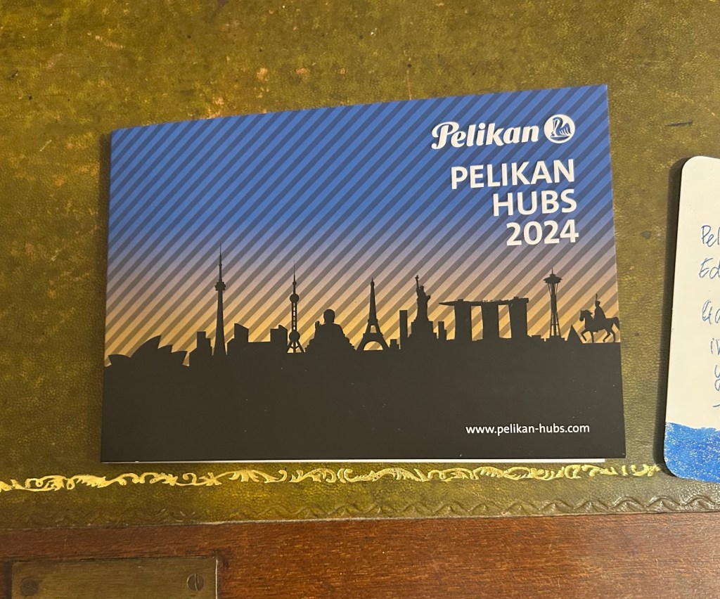
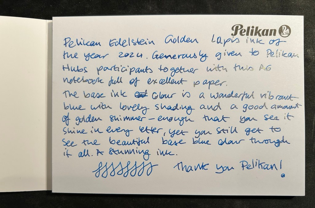
We just had the 2024 Pelikan Hubs event and I wanted to talk about which Pelikan fountain pens I brought with me to the event, and to note a few things that may be useful for those looking to get into Pelikan fountain pens.
This was my flock:
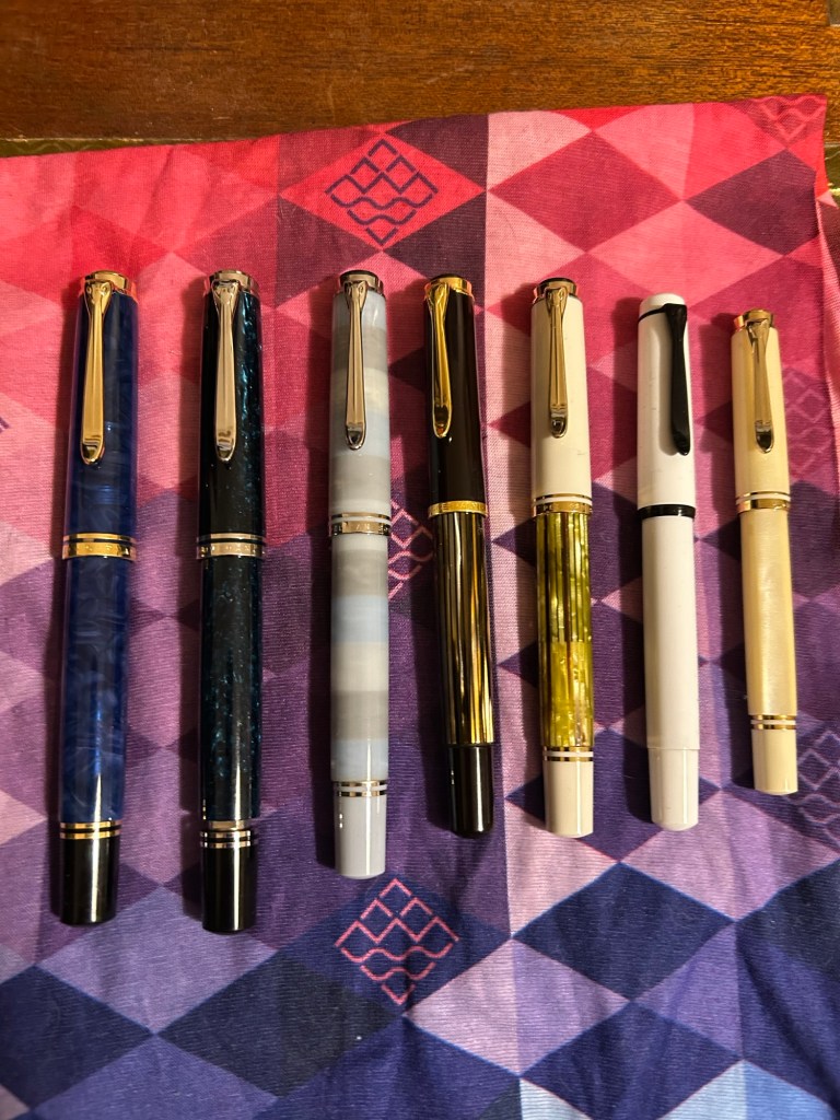
From left to right they are:
- Pelikan M800 Blue O Blue – one of the most expensive pens in my collection, and one that I (partially) got as a gift for my birthday. This pen has an 18 Karat fine nib that is soft and springy. Note: Some of Pelikan’s gold nibs are softer than others, so it’s worth testing the pen out before you buy it, especially if you’re not used to Pelikan nibs. This pen has a semi transparent blue swirly body and a typical Pelikan wide and juicy nib.
- Pelikan M805 Ocean Swirl – gorgeous, gorgeous pen that draws attention every time I use it. The depth and shade of the material is something else, and the palladium trim and rhodium plated 18k nib work very well with the turquoise and black shades of this pen’s body. This pen also has a fine 18k nib but this one is much firmer than the one in the Blue O Blue.
- Pelikan M620 Place De La Concorde – so, so glad I got this pen though it was expensive for me at the time. This was part of Pelikan’s city series and the only Pelikan I have in the M600 size, which is just a shade longer than the M400. There’s marbling in this pen’s stripes, as is befitting its name, and the 18K M nib is wide and juicy and of a standard Pelikan nib firmness.
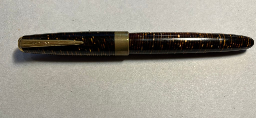
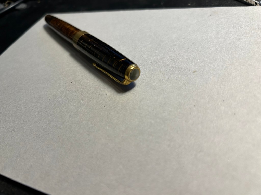
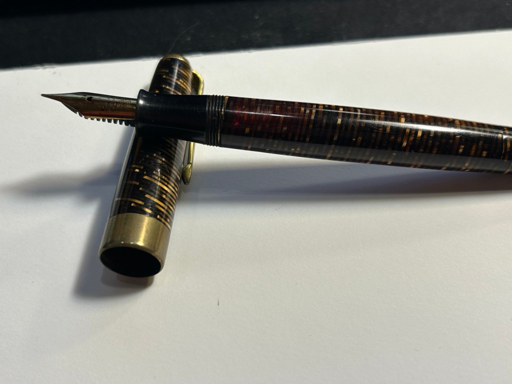
- Pelikan M400 W. Germany vintage black and brown tortoise shell – I brought this pen so that people could compare the old tortoise shell design to its modern counterpart. There’s just one band on the cap, the bottom and top finials are more rounded and there’s the old Pelikan logo engraved (not screen printed) onto the finial. The nib design is also completely different, though it still feels like a standard fine 14k Pelikan nib (wide and on the firm side).
- Pelikan M400 white tortoise shell – this is the modern counterpart of the previous pen, and it has a 14k medium nib that is on the soft side. Both the black and white tortoise shell pens have semi transparent pen bodies so you can easily see the pen level through them.
- Pelikan M100 storm trooper – on the rarer side of Pelikans, this steel nibbed fountain pen has a medium nib that feels just as good as Pelikan’s gold nibs. While I understand why Pelikan didn’t want to continue making M100 still nibbed fountain pens, I kind of wish they would have. These could have been slightly higher end alternatives to Lamy’s Al Stars and Safaris – a step down from the M200.
- Pelikan M320 Pearl – the rarest Pelikan in my flock, and always a crowd pleaser. This fountain pen is tiny, and came as part of a set with Pelikan brown ink and a nice presentation box. I bought it more than 10 years ago in Berlin, and nobody was interested in them because of the pen’s size. It’s a piston filler, a fantastically well made pen and it has a very soft 14k medium nib.
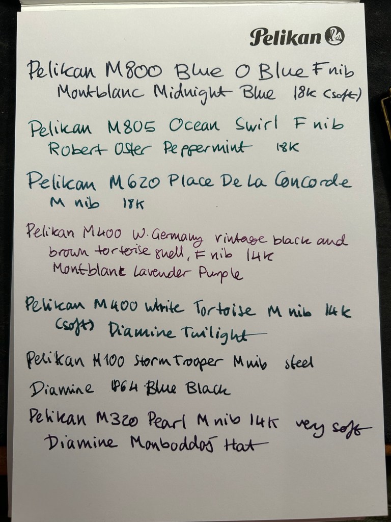
Here’s a writing sample for all these pens:
Did you go to a Pelikan Hub this year? If so, which pens did you bring with you?