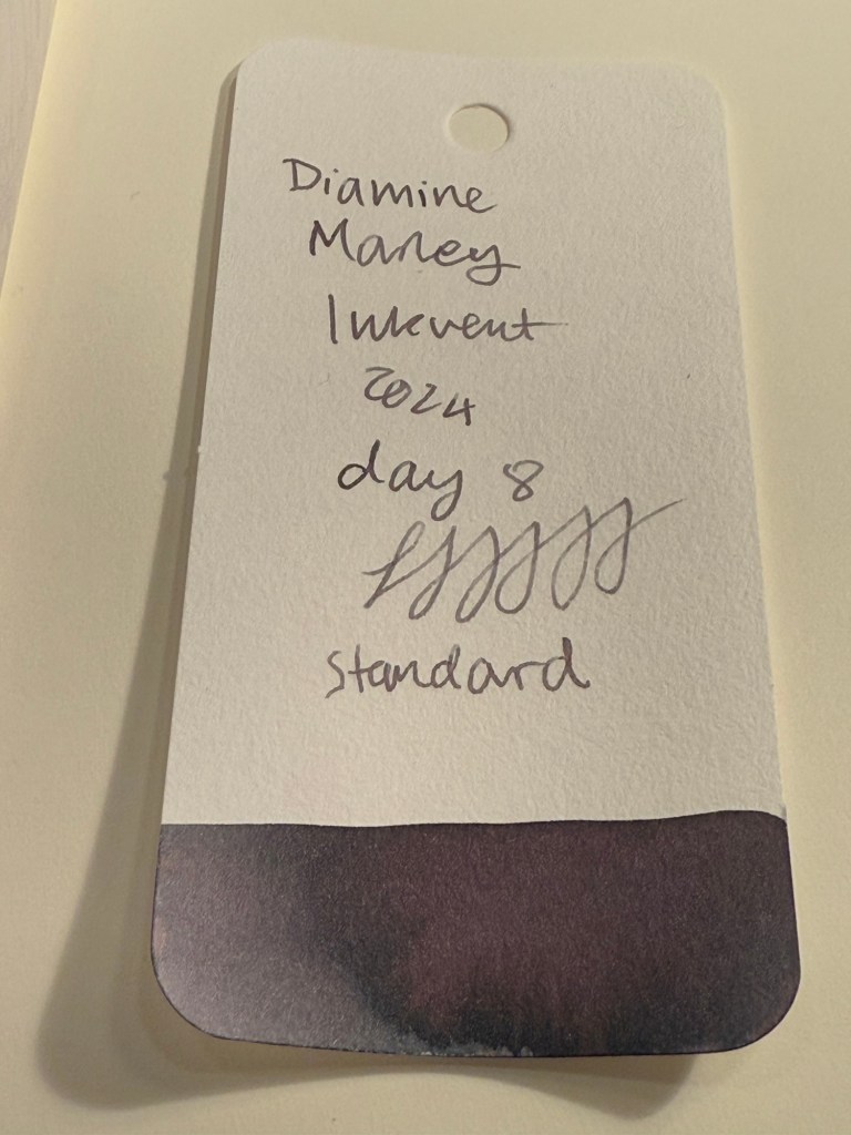
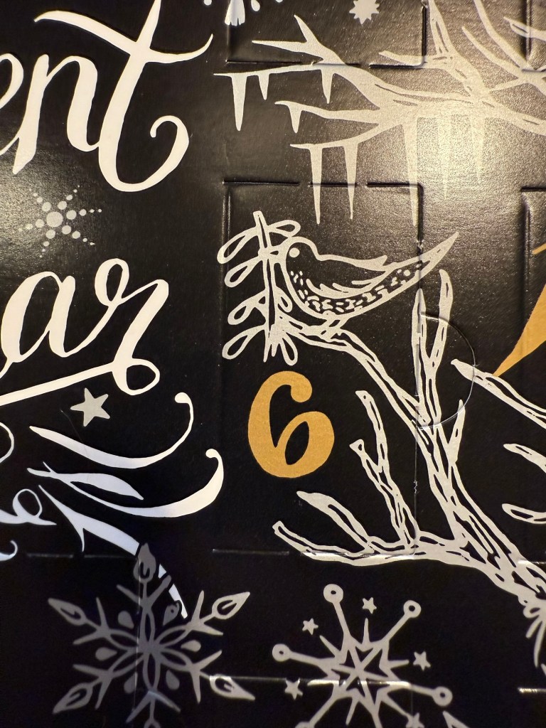
Diamine Inkvent 2024 Day 12
This is the Diamine Inkvent 2024 Day 12 door:

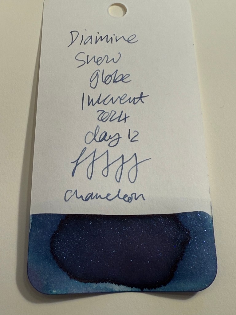
Day 12’s ink is Diamine Snow Globe, a dark blue ink with Chameleon shimmer in blue, silver, pink and purple. I used a Pelikan M205 fountain pen with an extra fine nib, that like most Pelikan nibs writes on the wider side.

Diamine Snow Globe is a lovely, shading dark blue ink and the chameleon effect gives it interest. The resulting ink is a nice, festive, readable blue that would work well on greeting cards.
On original Tomoe River Paper you can see the shading of Diamine Snow Globe quite well. It’s a also clear that it’s a lighter blue than Diamine Chilly Nights and the shimmer effect of the chameleon is much less pronounced than the star bright shimmer effect.
Diamine Snow Globe is perfect if you want a more subtle “wow” effect than Diamine Chilly Nights provides. You can see it in this angled photo of the original Tomoe River Paper writing samples:

If Diamine Chilly Nights is the marching band of shimmer on dark blue inks, then Diamine Snow Globe is the jazz quartet. The chameleon shimmer is finer, less visible, and changes colour constantly in different lighting conditions and in different angles. Of the two Diamine Chilly Nights is more impressive, but Diamine Snow Globe is more classy and would never be mistaken for a gel ink.

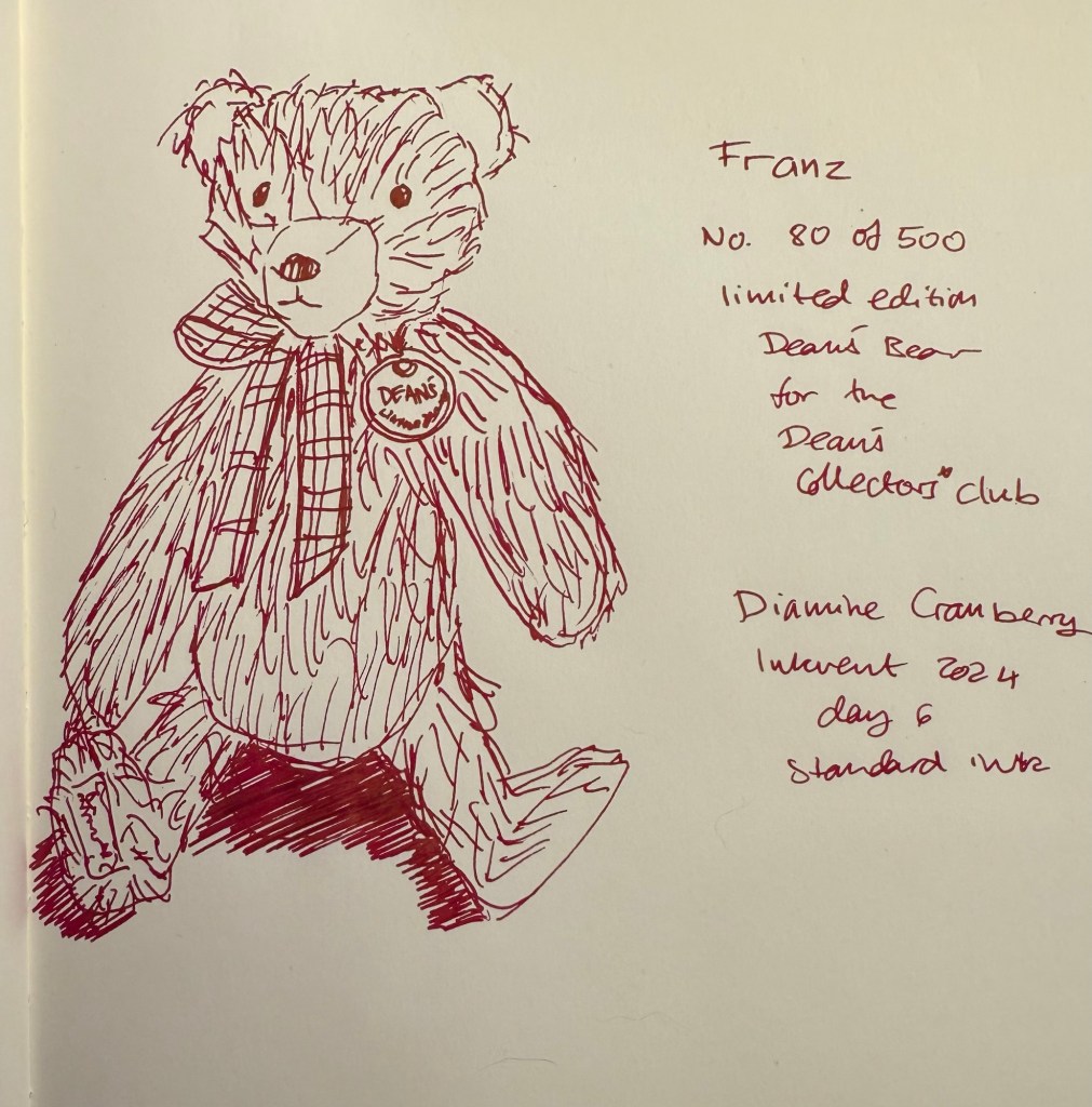
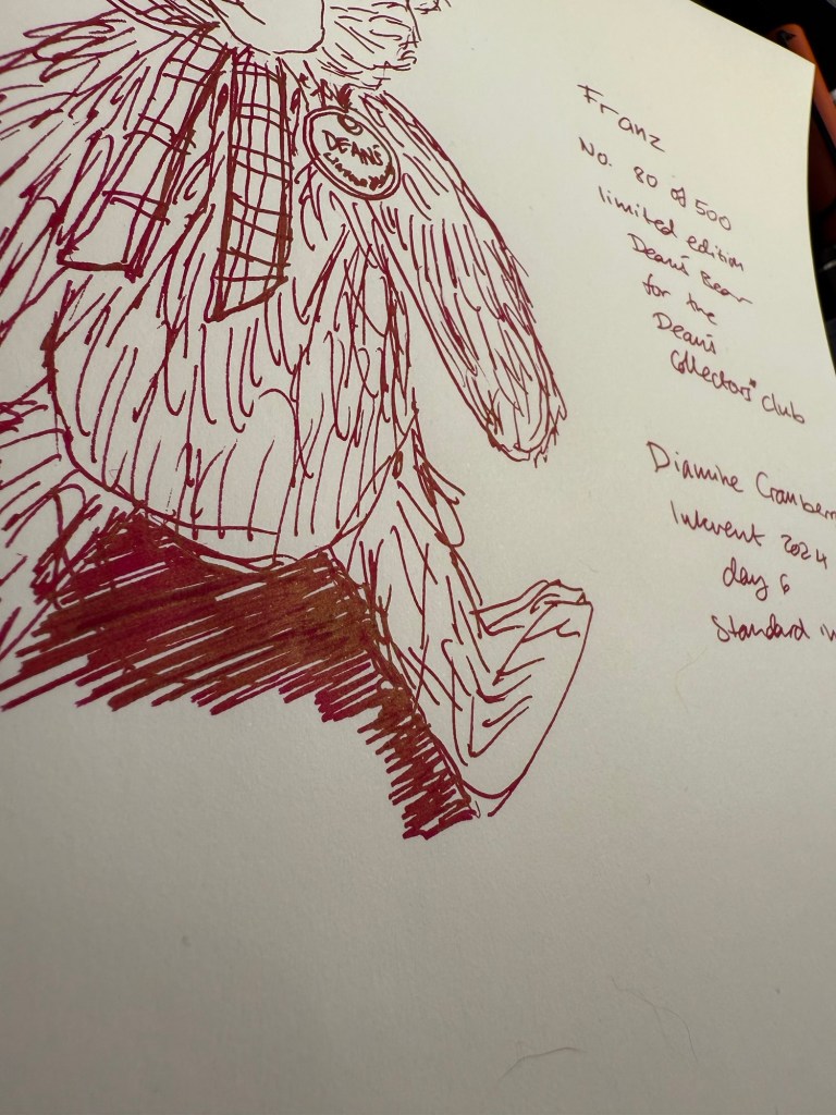
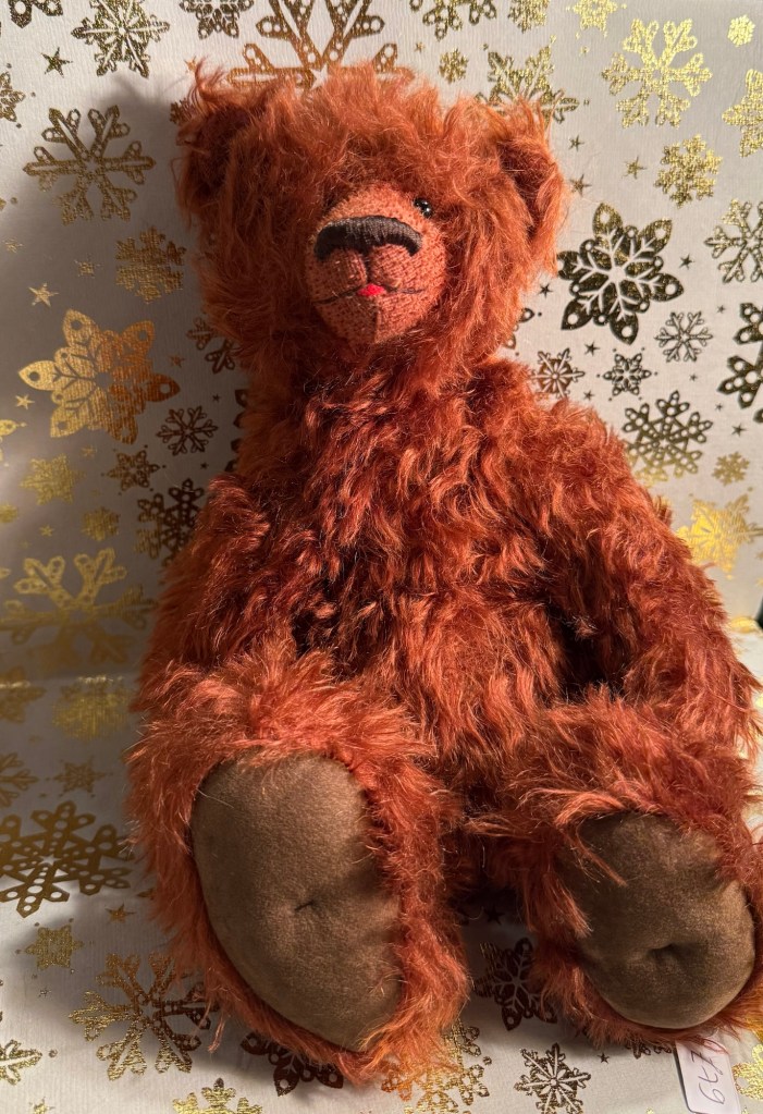
Today’s bear is Beezy, a one of a kind bear made by June Whitehead. The sketch is angled because this bear isn’t really designed for standing, and I didn’t want to sketch him seated because I’ve sketched too many seated bears lately.

I couldn’t get a decent photo of the chameleon effect, but here’s a photo that better shows off the shading properties of this ink and hint of chameleon sparkle:

Here’s Beezy the bear. I love his face, it’s so unusual for a teddy bear.

Diamine Snow Globe is slightly more practical than Diamine Chilly Nights because chameleon shimmer will be easier to clean out than star bright shimmer. It’s also less impressive, so if you’re looking for a dark blue inks with some kind of shimmer effect you might opt for Chilly Nights over Snow Globe if you’re going for the wow effect. Personally I don’t see a need for either of them in my ink collection, so I won’t be buying a full bottle of this ink.
What do you think? Do you prefer Diamine Chilly Nights or Diamine Snow Globe?