I’m posting this at a bit of delay, as we’re having a cold spell and my neuropathy has really been giving me tough time. Logically I should have given up on this project, but I’m stubborn, so I won’t.
These were all sketches with Lamy Safaris and various De Atramentis Document inks.
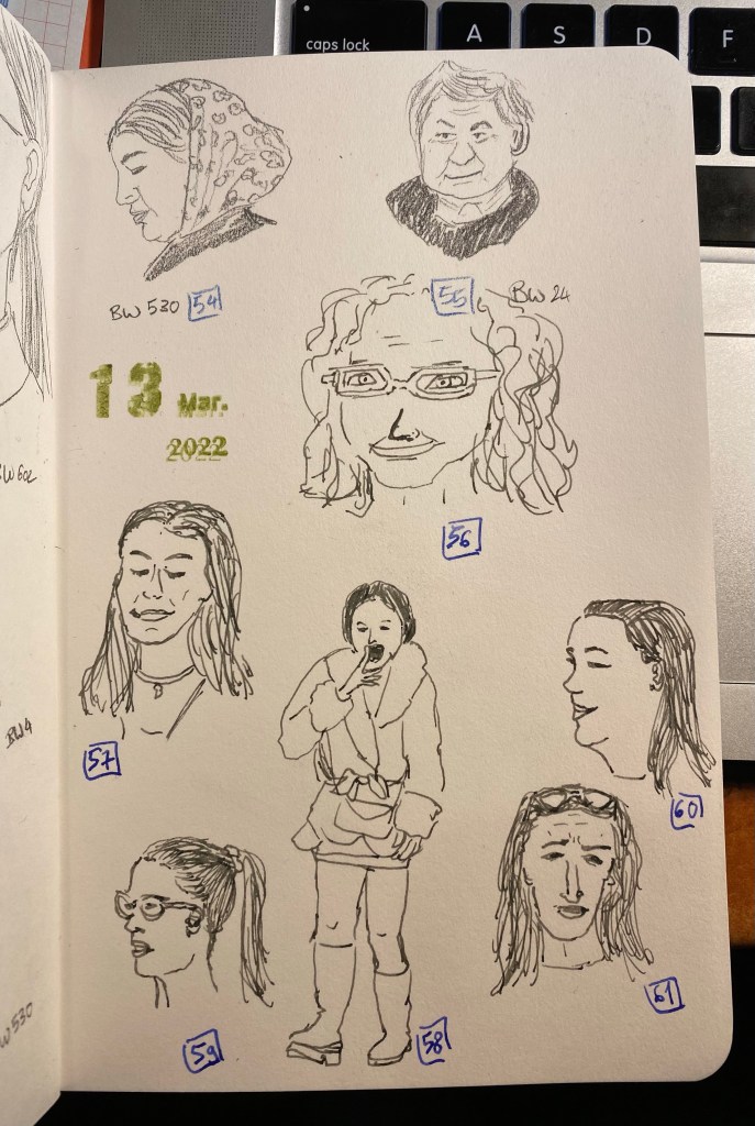
We’re having a cold snap this week, which means bad news for my hands. So there’s only 6 new sketches today, but at least I am back to pen and ink, and I haven’t been confined to gesture drawings (not that they’re bad, I just wanted to practice my portraits).
Drawn with a Lamy Safari Petrol fine nib, De Atramentis Document Urban Grey ink on a Stillman and Birn Alpha.
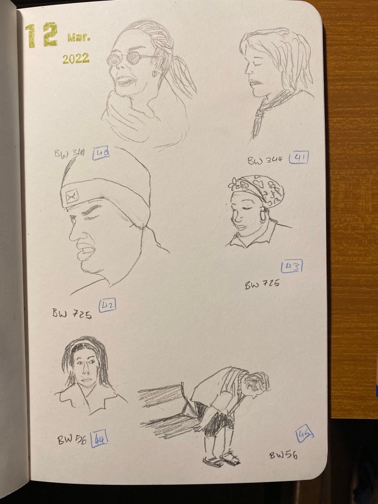
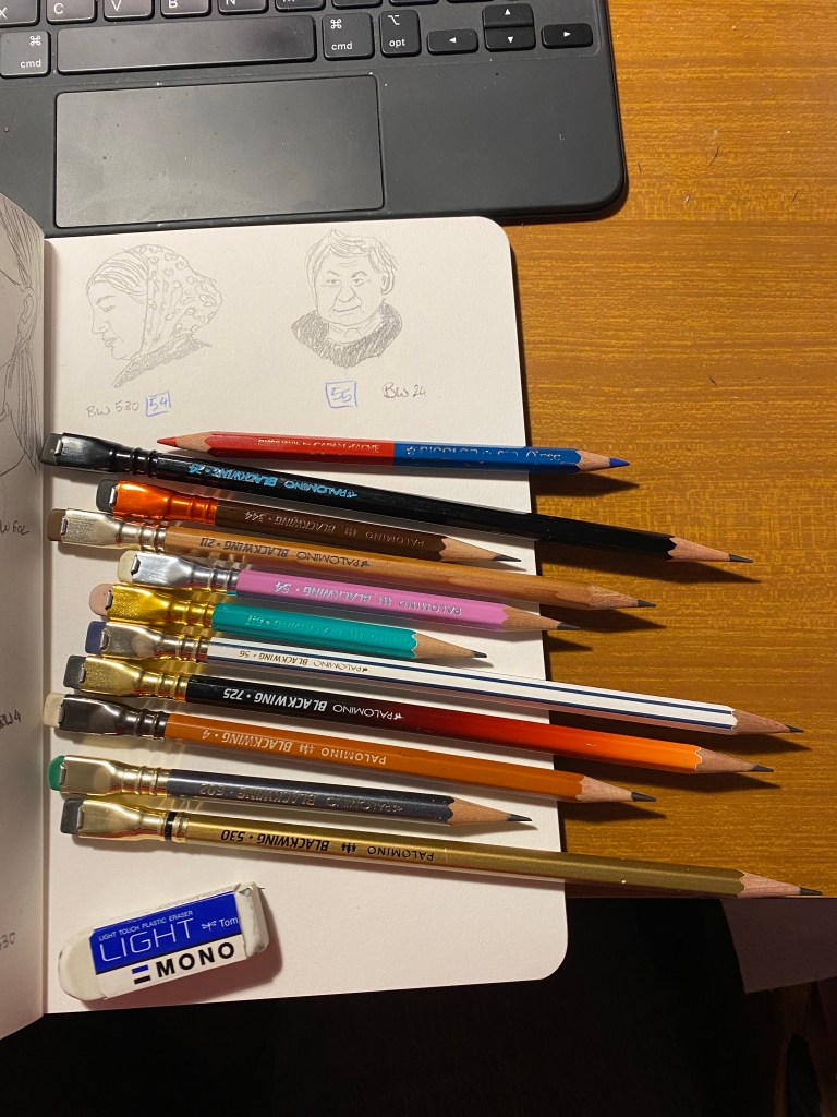
As I expected I didn’t reach 100 people sketches in 5 days, but I still intend to get to 100 sketches, so I’m plowing on. My hands are still wrecked with neuropathy so today’s sketches are all pencil sketches, all of them using various Blackwings. Hopefully tomorrow I’ll be able to get back to ink and watercolour, but if not I’ll break out my vintage pencils and give them a spin.
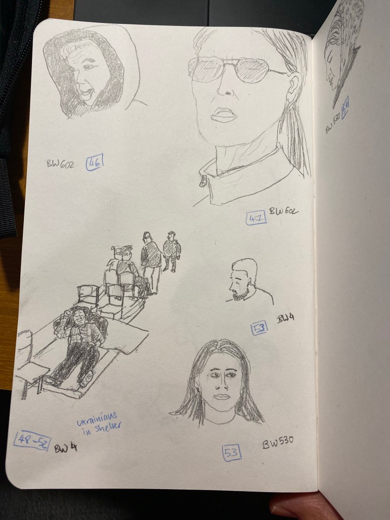
My hands still really hurt, but I don’t want to give up the challenge, so I pushing on with pencil sketches. I’ve pulled out my Blackwings and am giving them a spin.
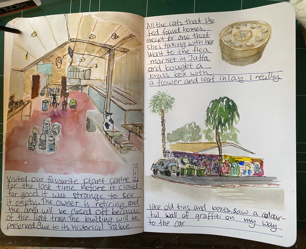
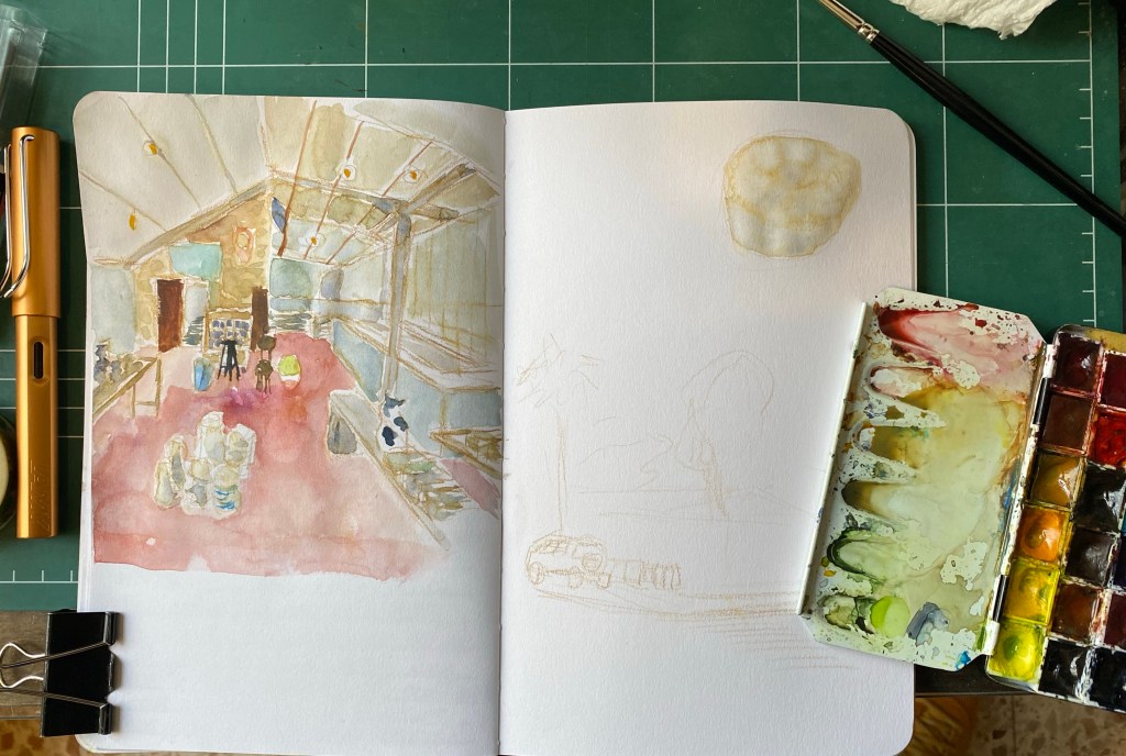
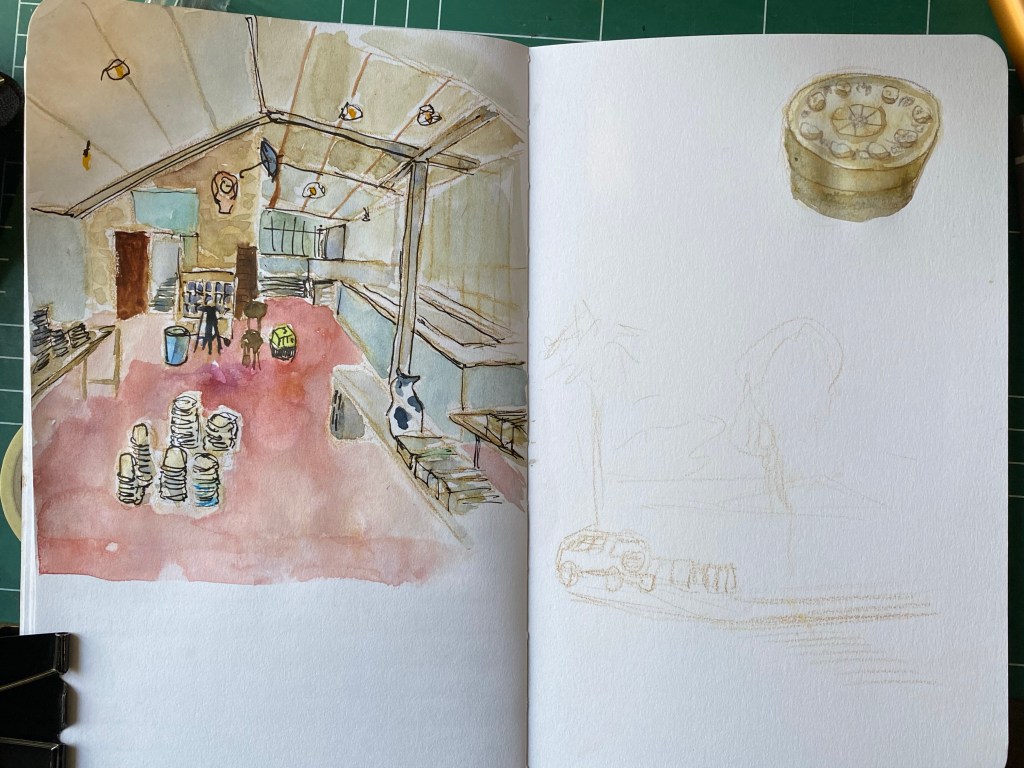
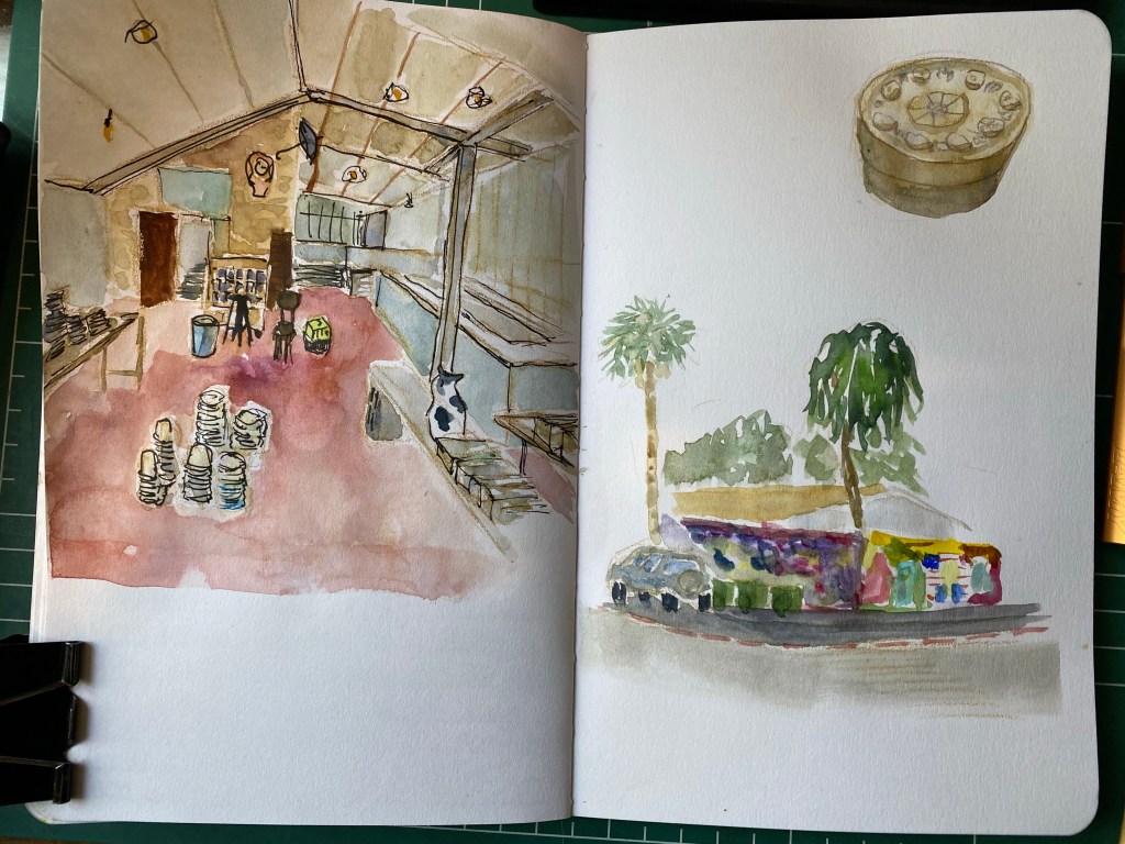
Sketched this spread despite my hands killing me throughout the sketch. I still have poor control over the brush but I sketched it despite that because I really missed drawing. So glad that I got it done.
Here are some process photos:
Initial sketch with watercolour pencil.First pass with colour.Second pass with colour and ink.First pass for the drawing on the bottom right.
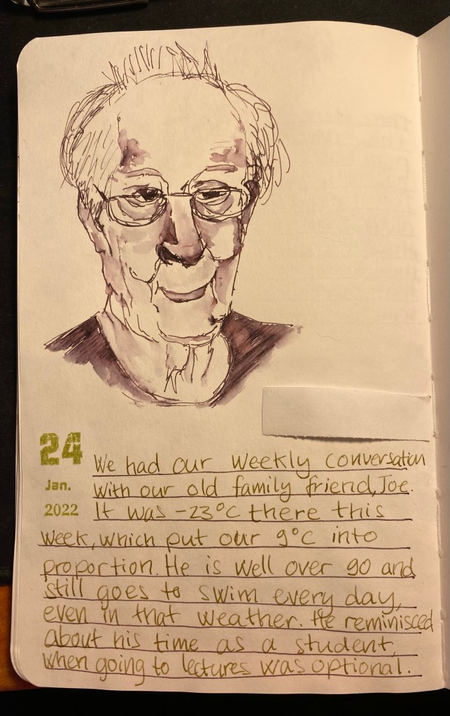
We had our weekly zoom call with our old family friend, Joe. I did my best to sketch him while we talked. It was slow, hard work and came out only so-so, mainly because my neuropathy is really bad lately (which is also why there’s been a dearth of posts). Still, I’m glad that I tried.
Sketch of our old friend, Joe.
Drawn with a Lamy LX Palladium, fine nib, filled with Diamine Harmony (an Inkvent 2021 ink).
Writing done with a PenBBS 535 Year of the Ox, RF nib, filled with Pilot Iroshizuku Ina-Ho.
The sketchbook is a Stillman and Birn Alpha 5.5’’ x 8.5’’.
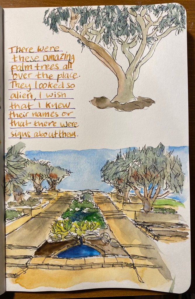
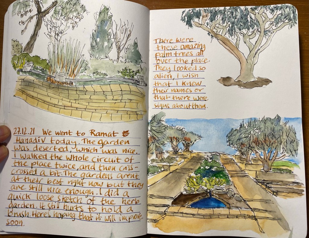
I’ve been trying to draw better foliage, which made me want to investigate the various greens I can mix from my current palette. So for the first time I dedicated time and a few sketchbook pages to experiment with green watercolour mixes. I thought that the process would be tedious and boring, but it ended up being very interesting. Mixes that looked like mud on the palette came to life on the page. I discovered a whole host of green hues that I had no idea that I had access to. And once again I fell in love with Schmincke’s Glacier Green.
Note: DS stands for Daniel Smith and Sch for Schmincke. The paper is Stillman and Birn Alpha.
I had a strange Yom Kippur this year, as is to be expected. I decided to commemorate it in my sketchbook, this time using Faber Castel Albrecht Durer watercolour pencils in addition to my usual Schmincke and Daniel Smith watercolour mixture.
Drawn on a Stillman and Birn Alpha. Ink is Iroshizuku Ina Ho (lines), Robert Oster Fire and Ice (heading and text) and Sailor 123 (2021).
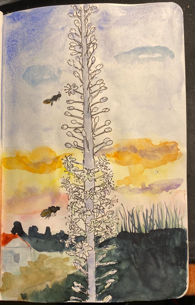
It’s been a while since my last update, so I thought that I’d write a new one. On August 24th I had my fourth chemo treatment, and it went rougher than the ones before it in terms of side effects. The worst of the bunch has been my neuropathy, which until now has been not so bad. This time however, both my hands were numb and tingly, and the tips of my fingers actually hurt. It’s been hard typing, holding a pen, drawing. It’s not that I’ve stopped doing these things, it’s just that it’s been a challenge to overcome the pain, to focus more to get my hands moving the way that I want them to. But I haven’t given up, and I’ve managed to type, write with my pens, and even create this drawing:
Not bad for someone with semi functioning fingers, right?
My hands have gotten better with time, but they are getting better slowly, and they still haven’t returned to normal. I’ve discovered that lighter fountain pens with bigger barrels are the best in terms of being easy on my hands, and although my handwriting has suffered a bit due to the pain, it is still recognizably my handwriting.
What’s next? On Thursday I have a PET CT which will determine what the rest of my chemo treatment will be, and on Sunday I’ll have the fifth chemo treatment. I’m not looking forward to either of these things, and as the PET CT is approaching my anxiety levels are rising (I really need good results on it). Meanwhile I’m trying to distract myself with work, books and season 2 of “Ted Lasso”. Here’s hoping for good results, and less pain for the Jewish New Year.