Weekly Update: Model Sketches

It’s been a hectic week as my team at work is basically crumbling: our new senior member is leaving after just two months, the team lead is leaving after a bit more than a year, and the other team member is on holiday until the end of the month. That just leaves me with two trainees to hold the fort for a while, and it’s far from ideal. As I’m also working my way through an intense certification course, posts on this blog have taken (and will likely continue to take) a bit of a hit.

Reading

I’ve finished reading Looking for a Ship by John McPhee and I’ve reviewed it here. It’s a fascinating narrative of a now extinct world, that of the American Merchant Marine. I’ve now started reading Oliver Burkeman’s Four Thousand Weeks as well as Legends and Lattes by Travis Baldree.
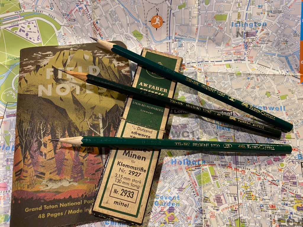
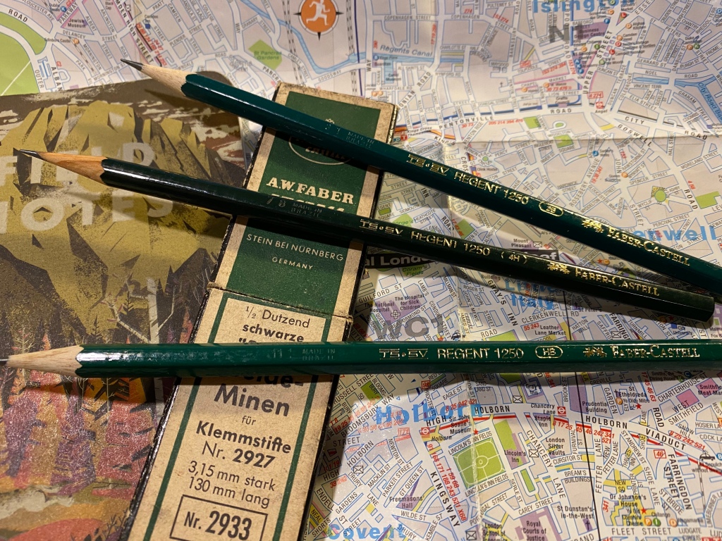
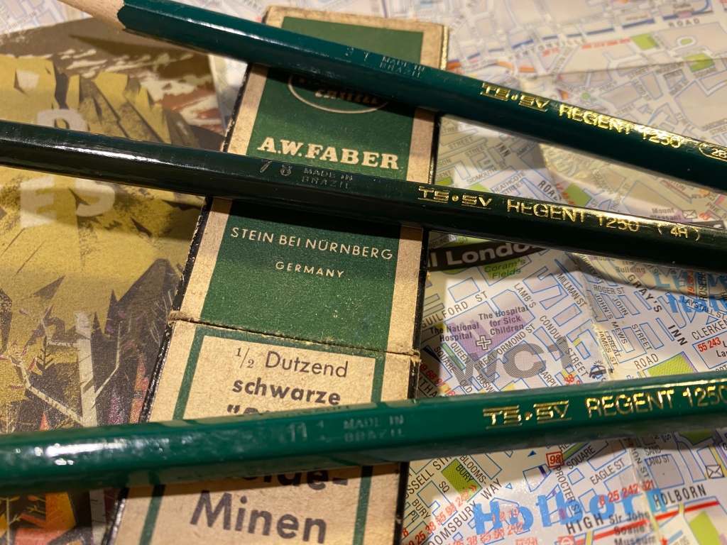
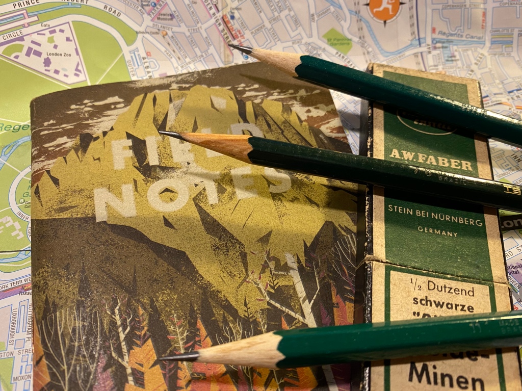
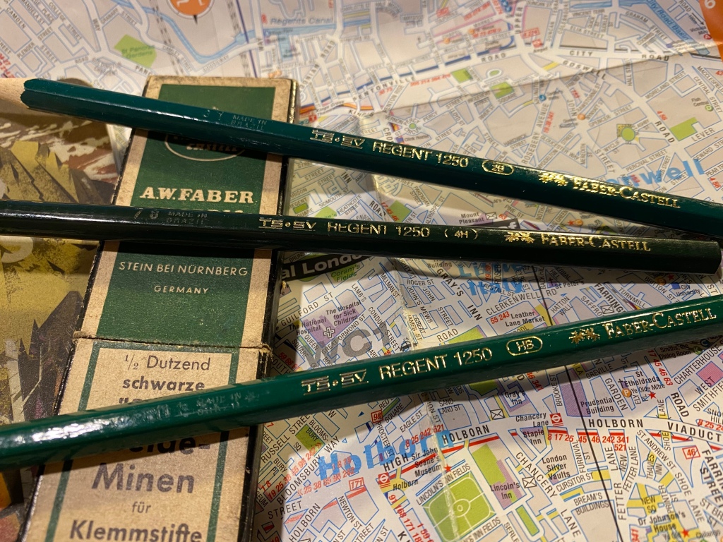
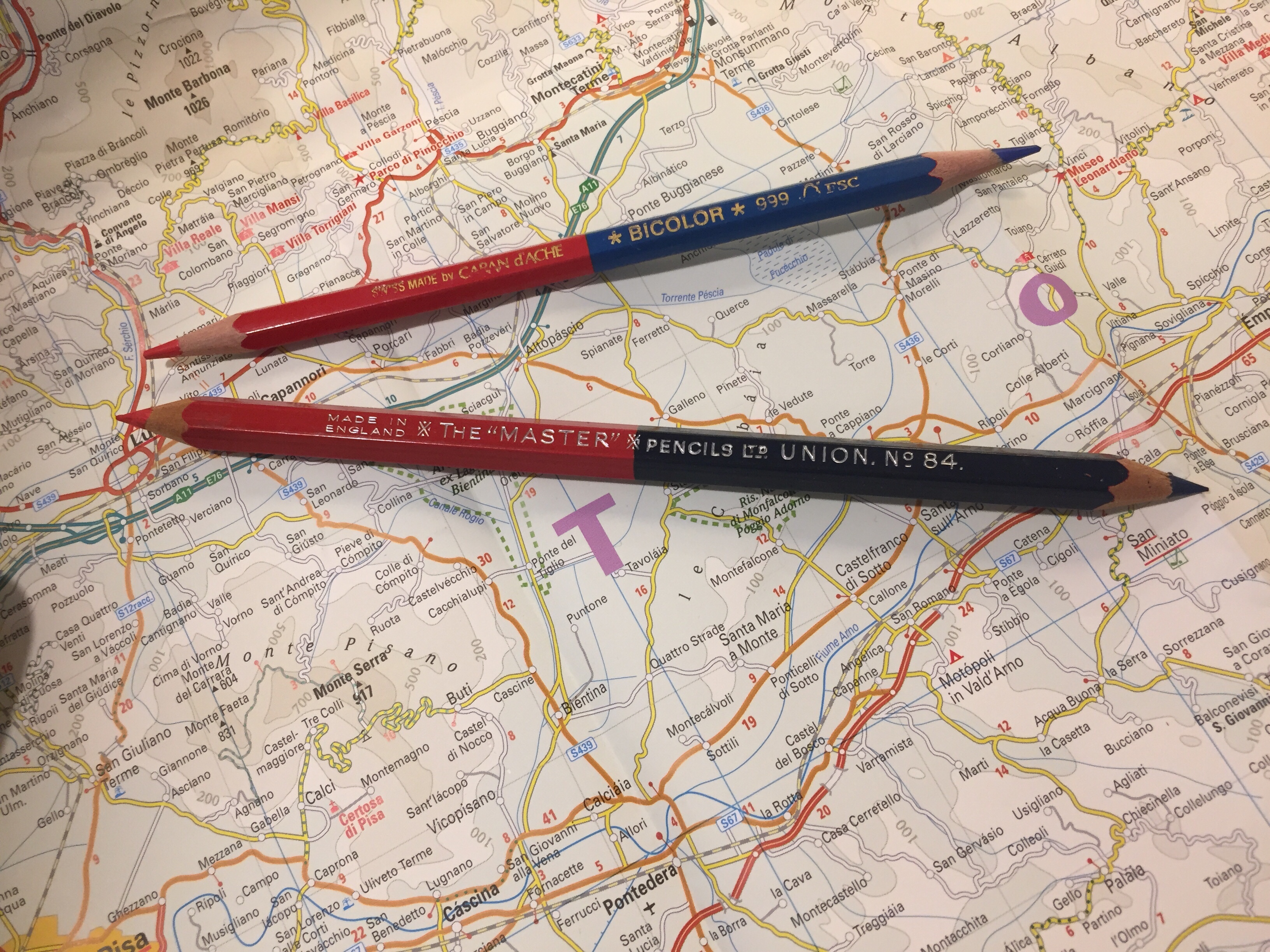
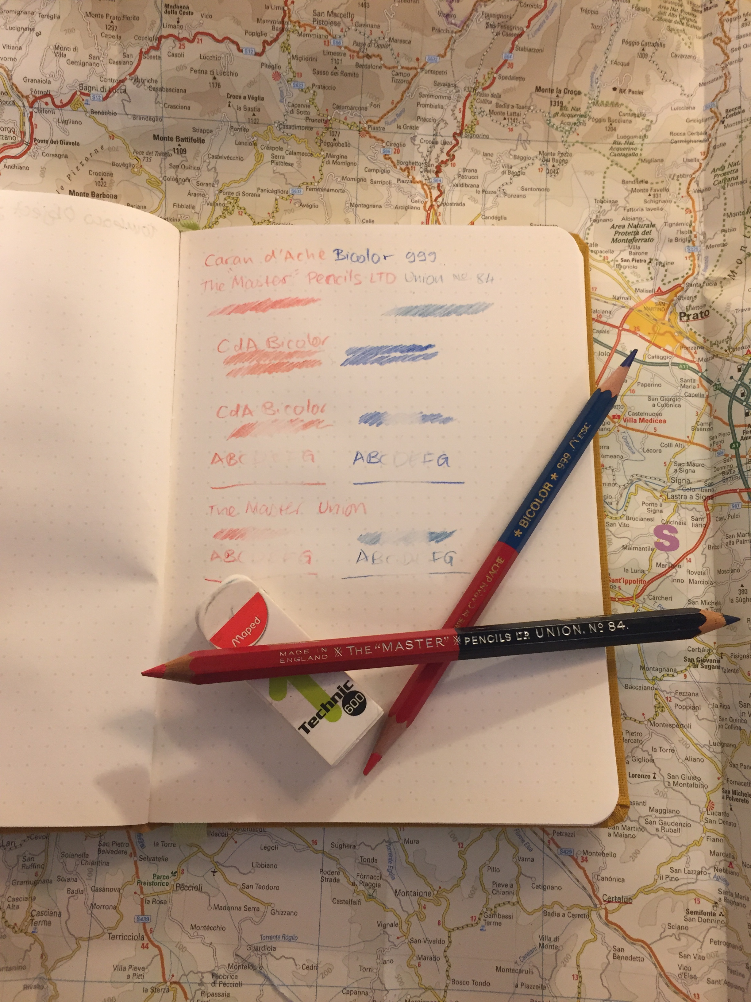
Stationery

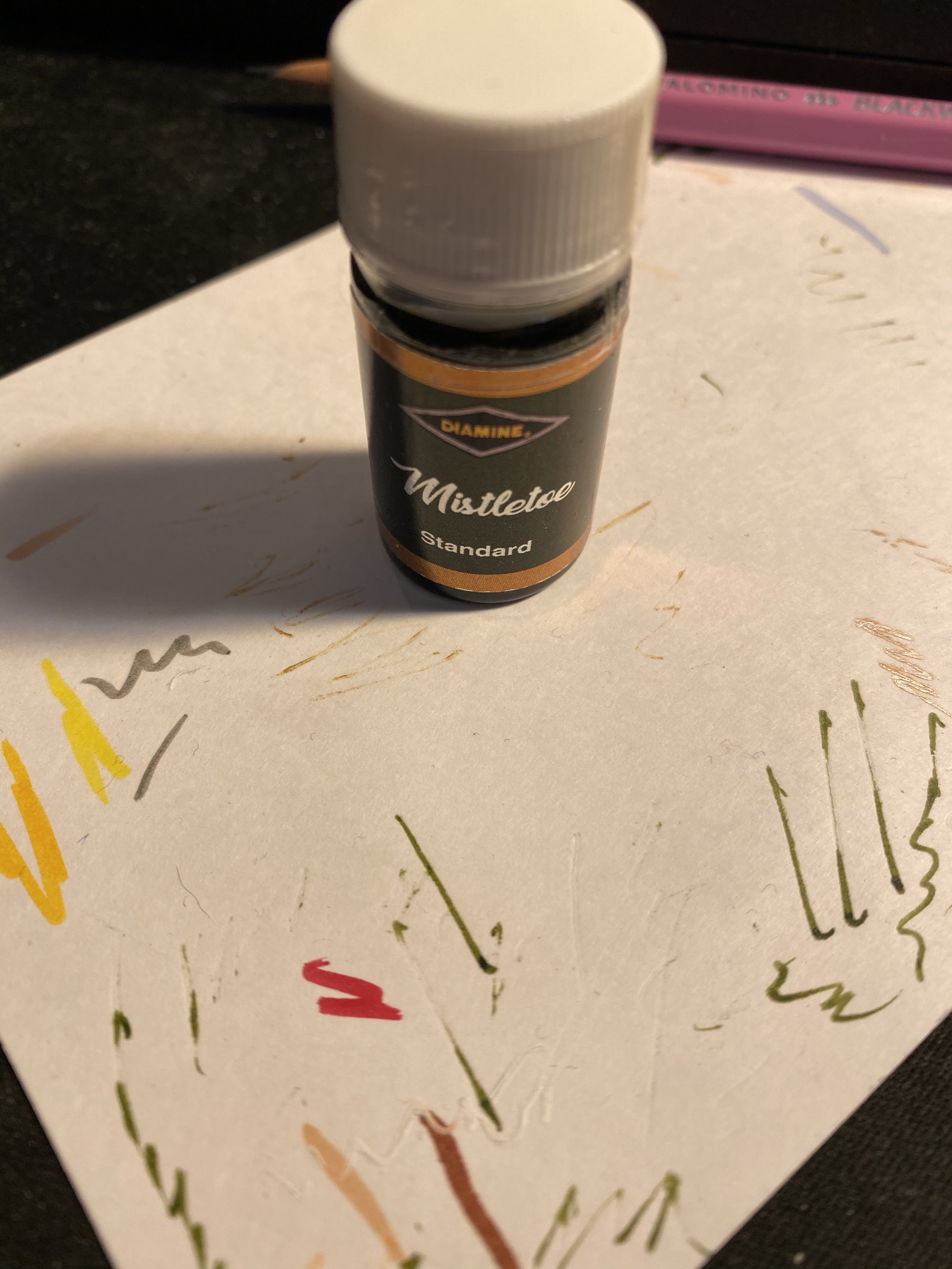
My Field Notes order has arrived, as has the 2024 Hobonichi Techo (yes, 2024) that I bought with a Black Friday discount. The Hobonichi will be used to supplement my 2014 Hobonichi when it comes to testing out inks. The 2024 Techo has’s got paper that is close enough to original Tomoe River Paper that’s in my 2014 Techo, though from my understanding the 2025 Hobonuchi’s have worse paper than the 2024 ones, so take that into account if you’re considering buying one. I have posts planned for both purchases, and hopefully I’ll get the time to write them.

Model Sketching

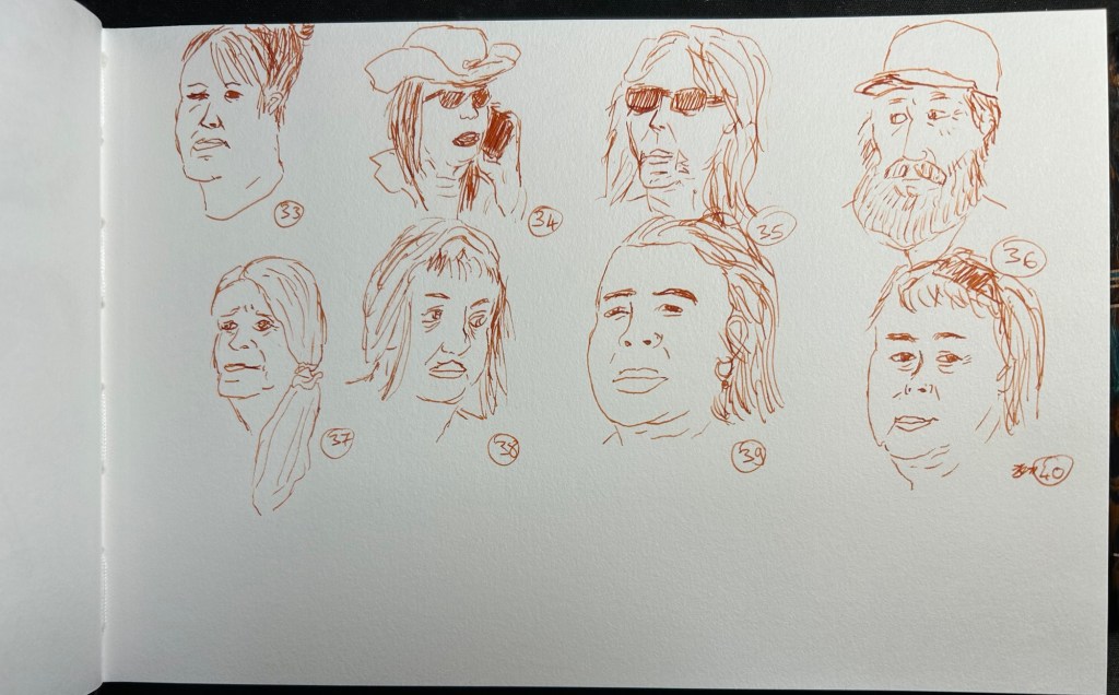
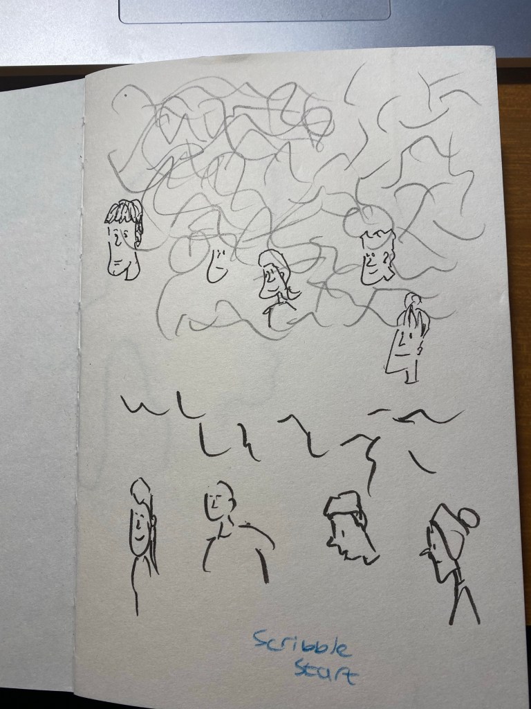
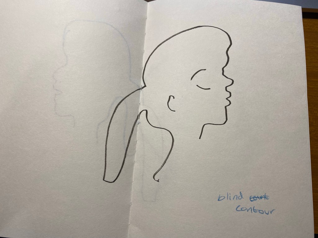
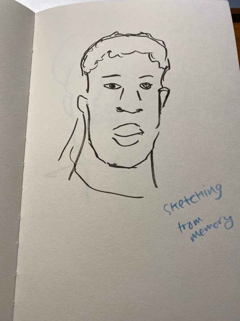
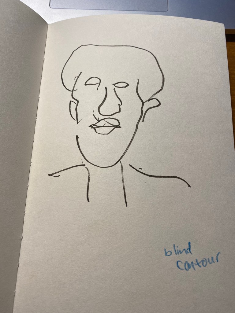
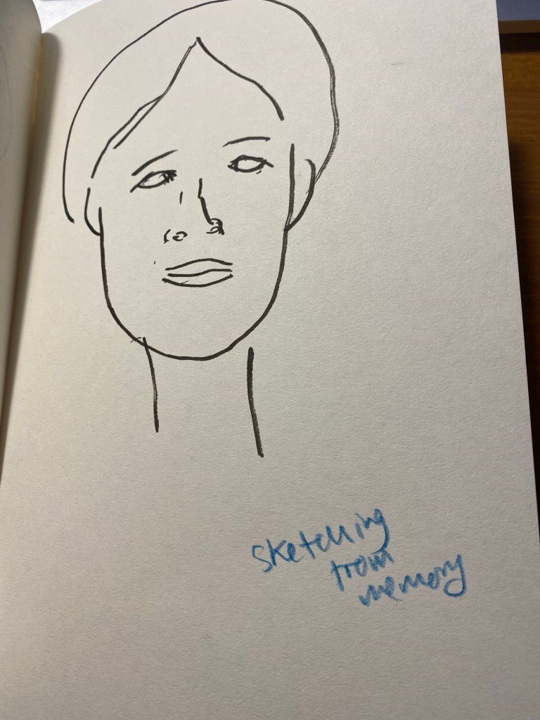
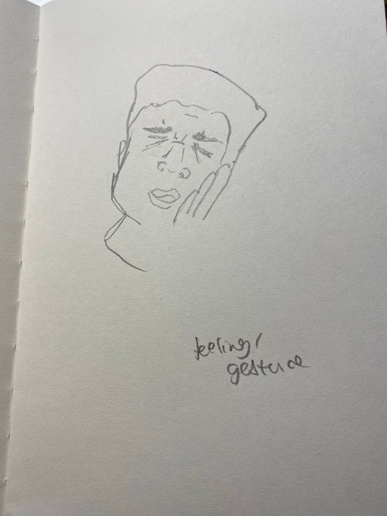
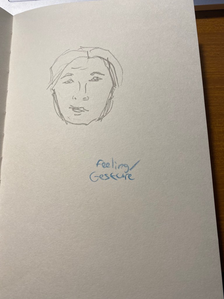
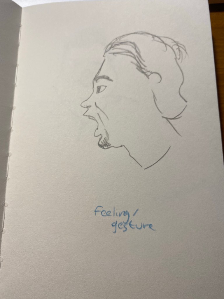
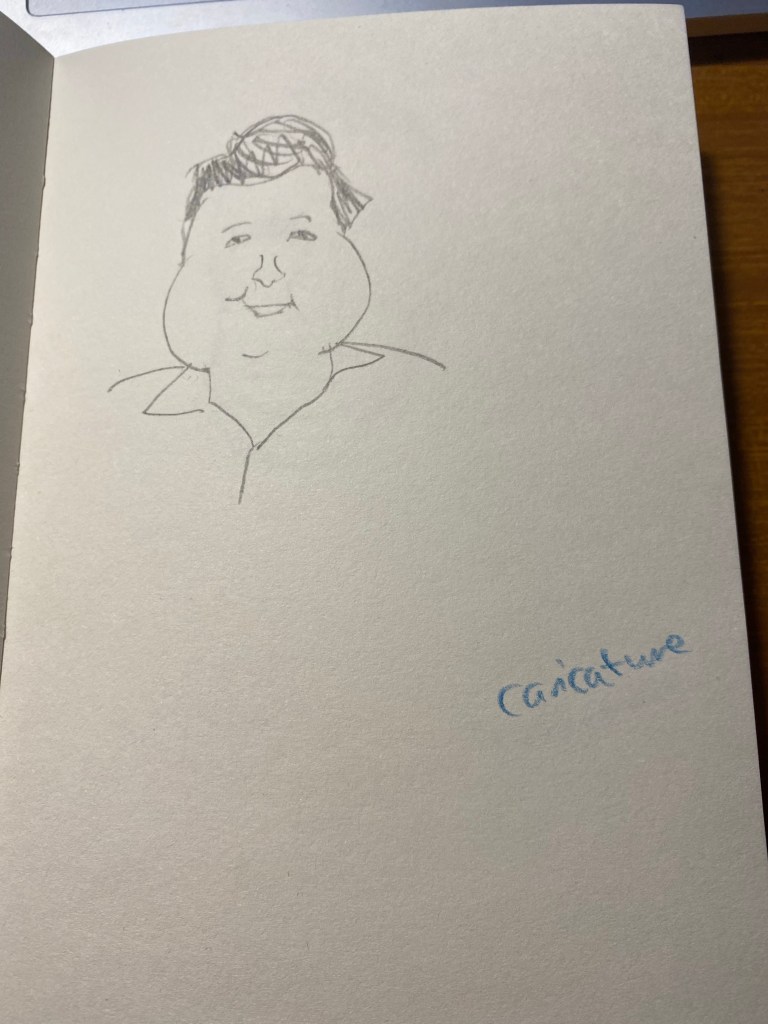
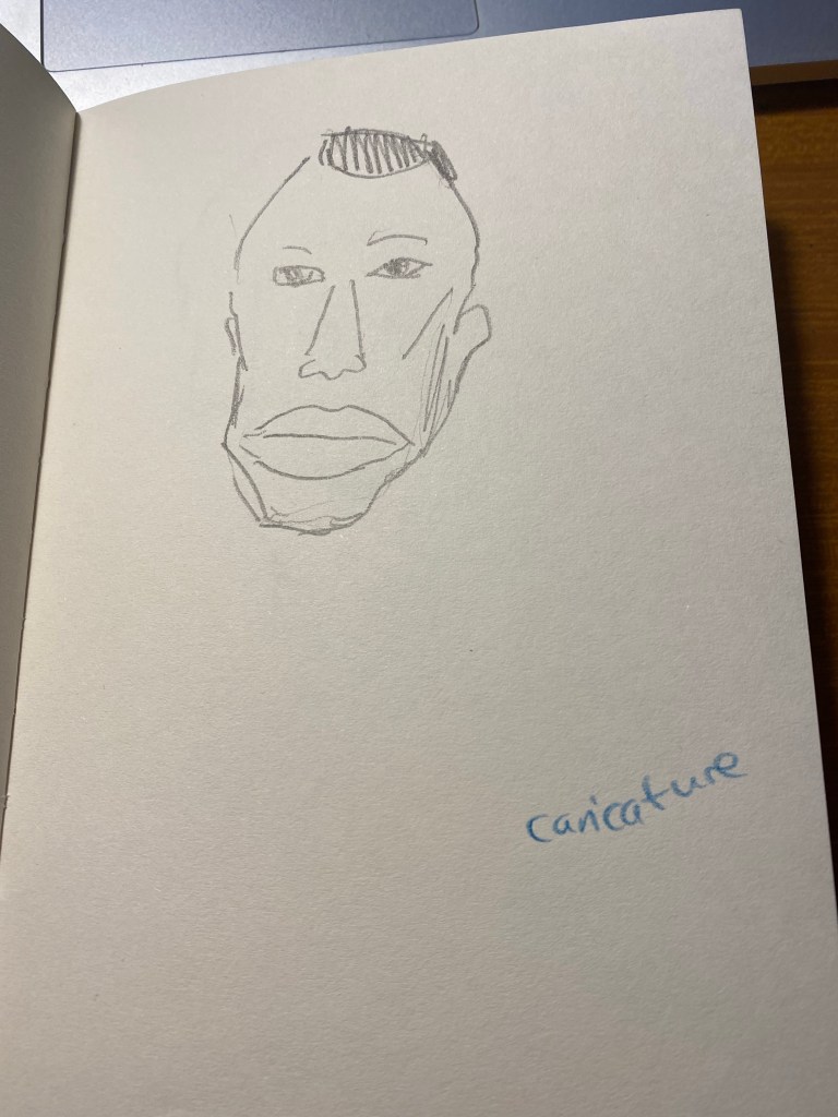
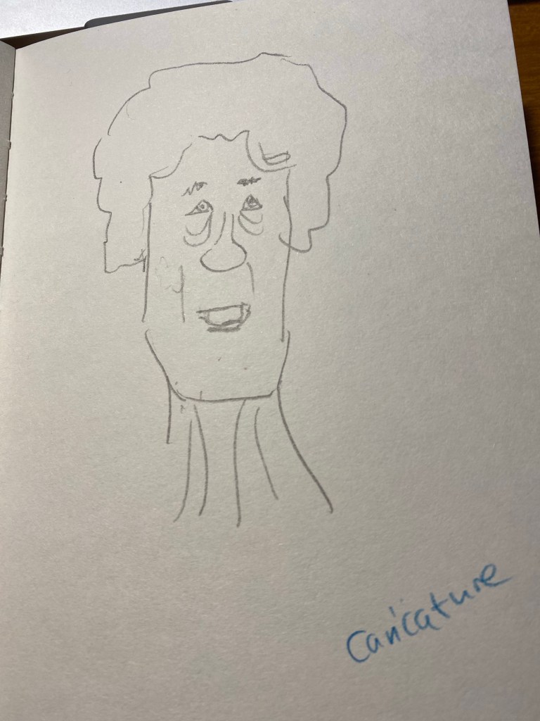
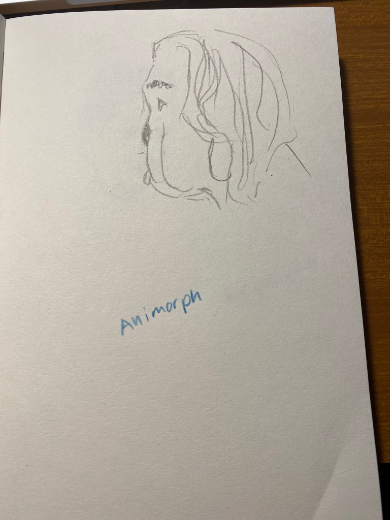
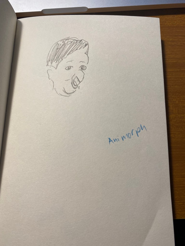
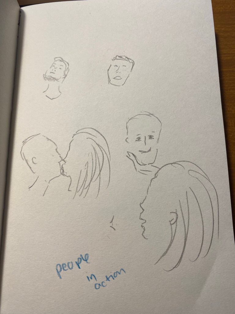
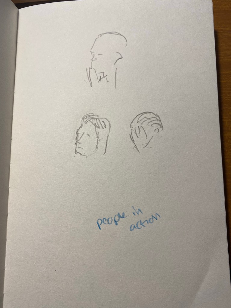
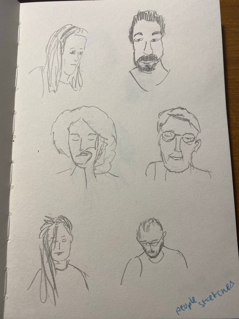
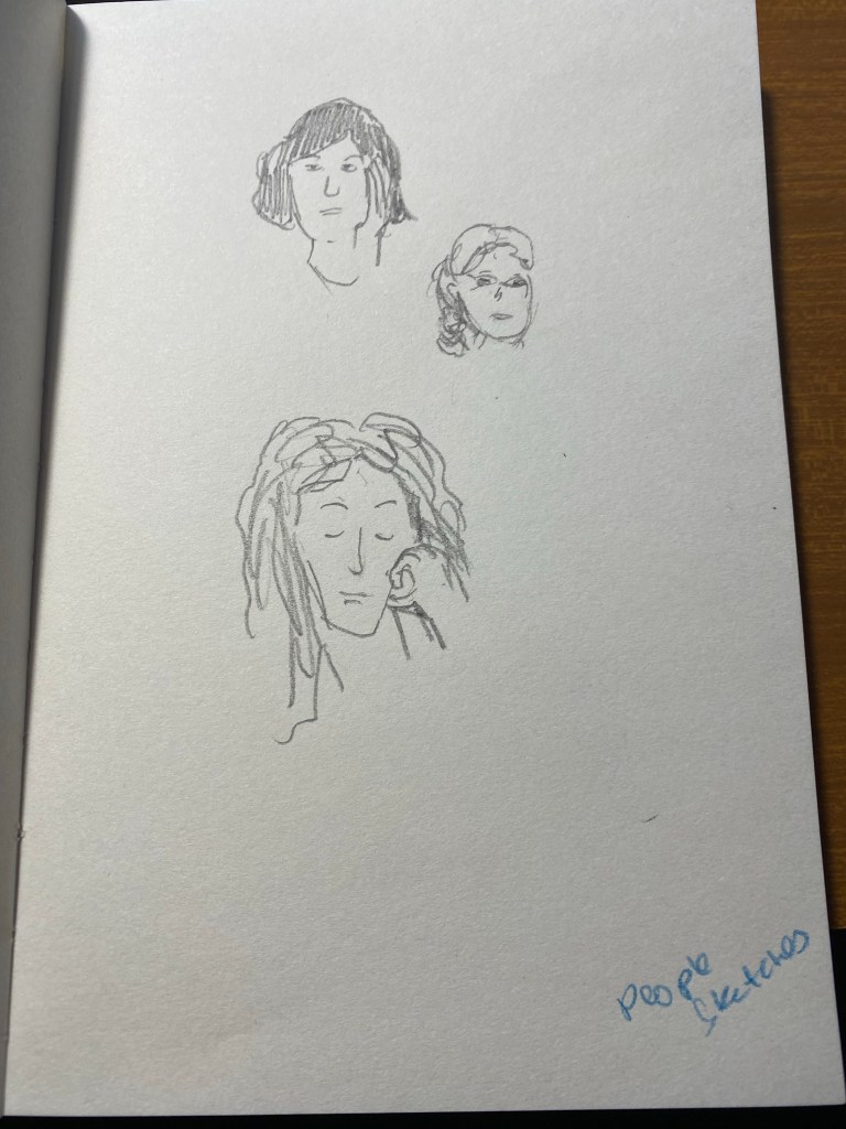
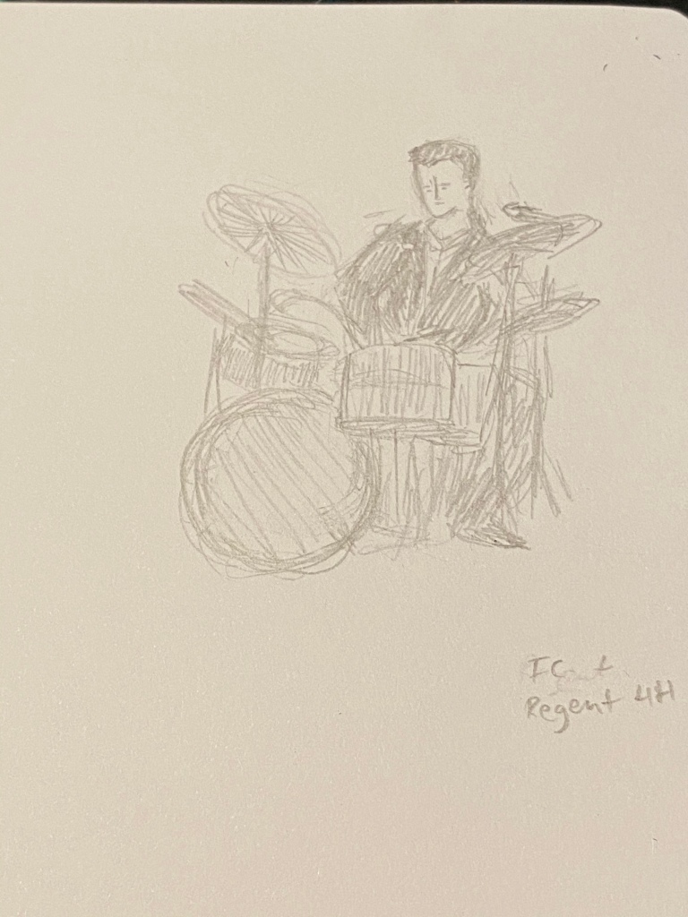
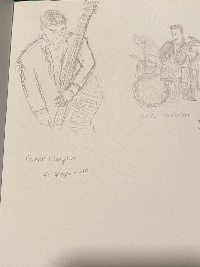
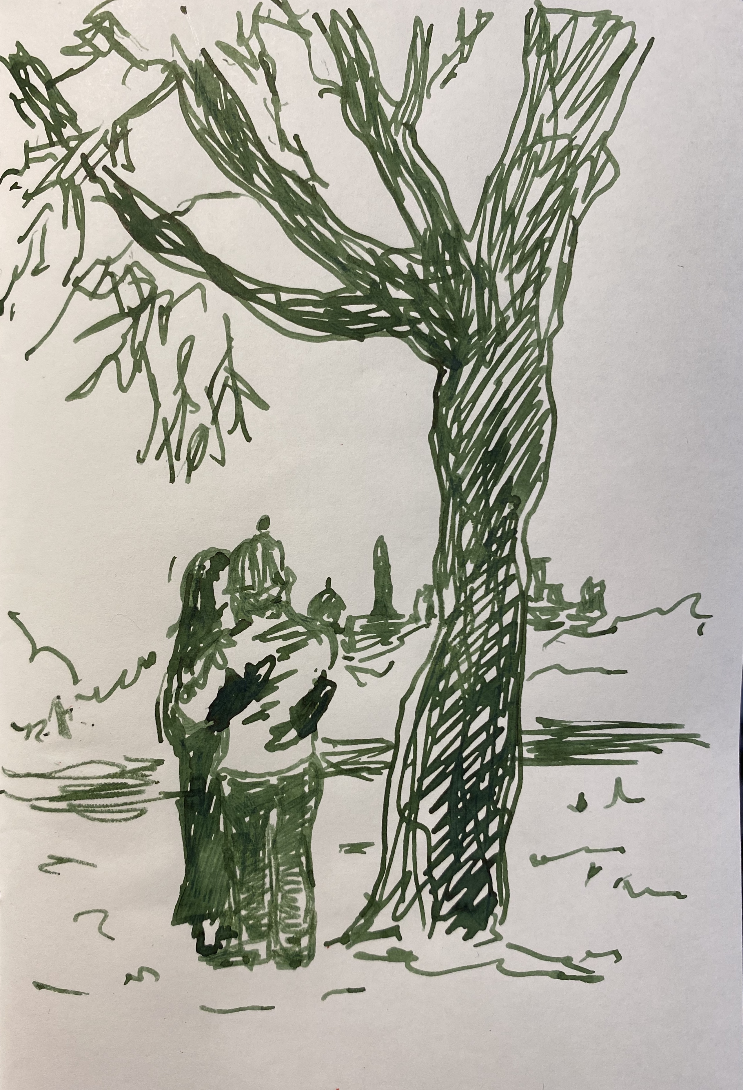
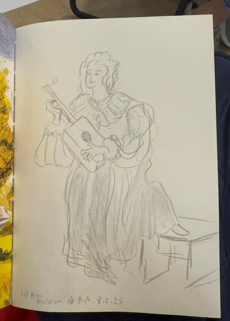
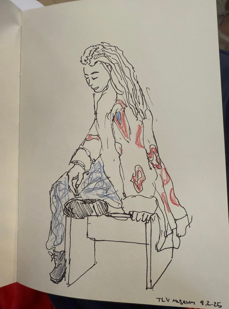
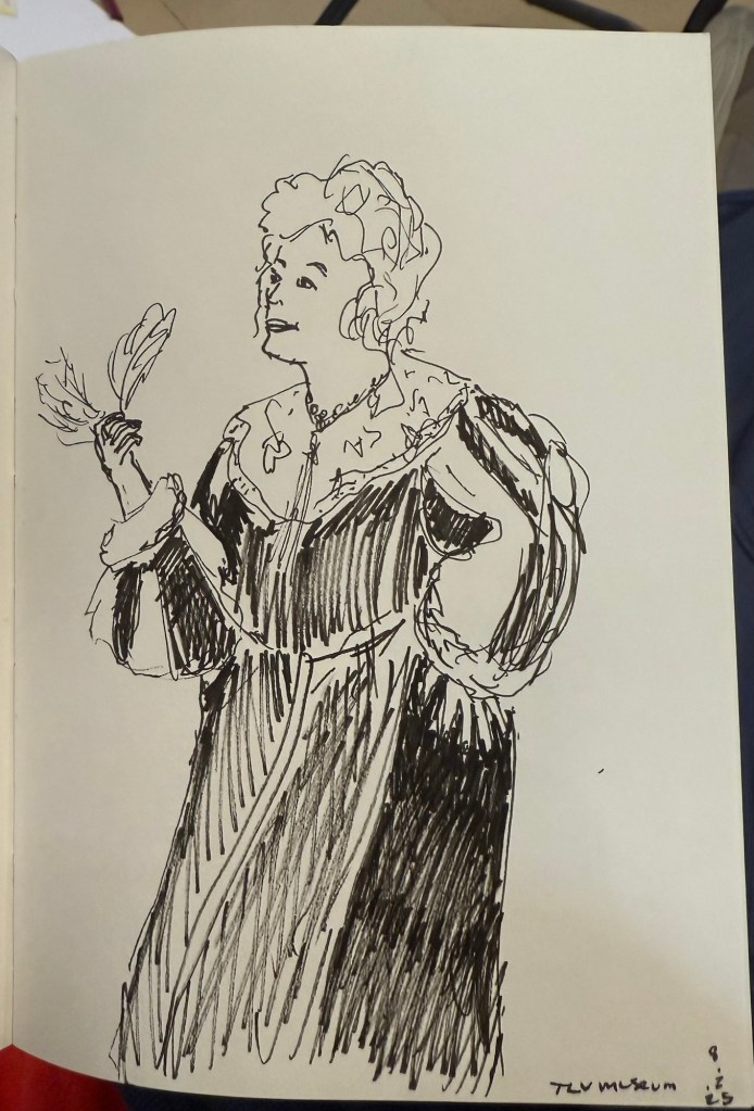
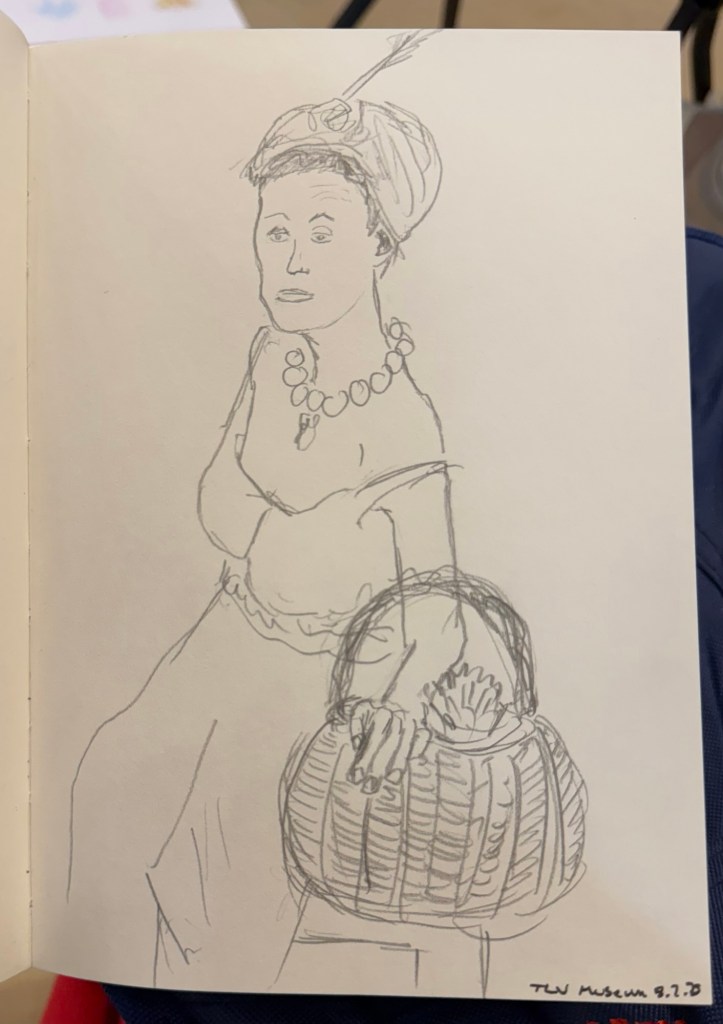
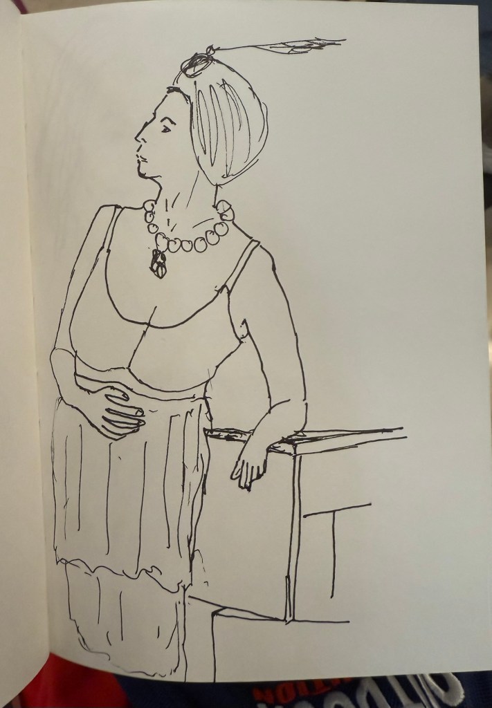
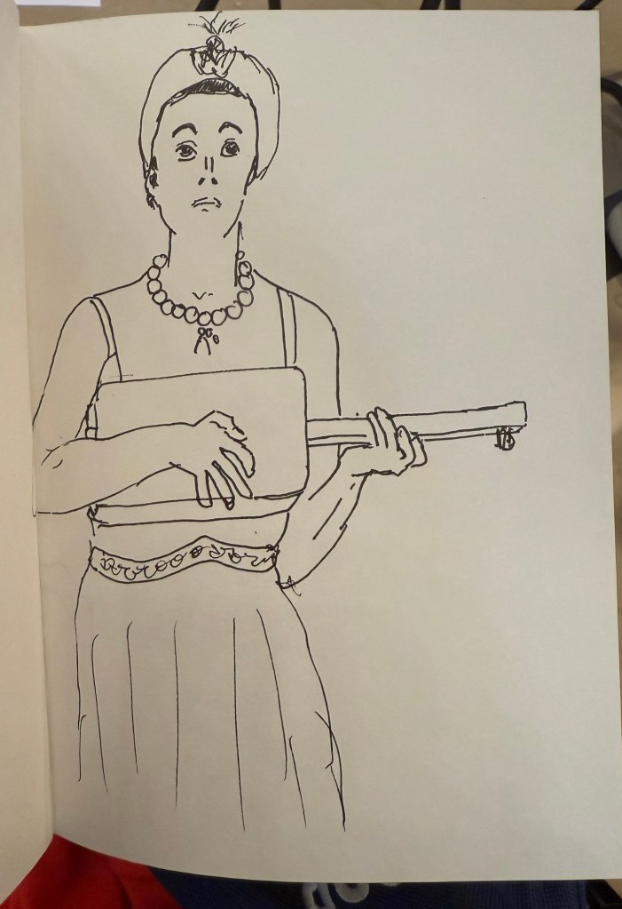
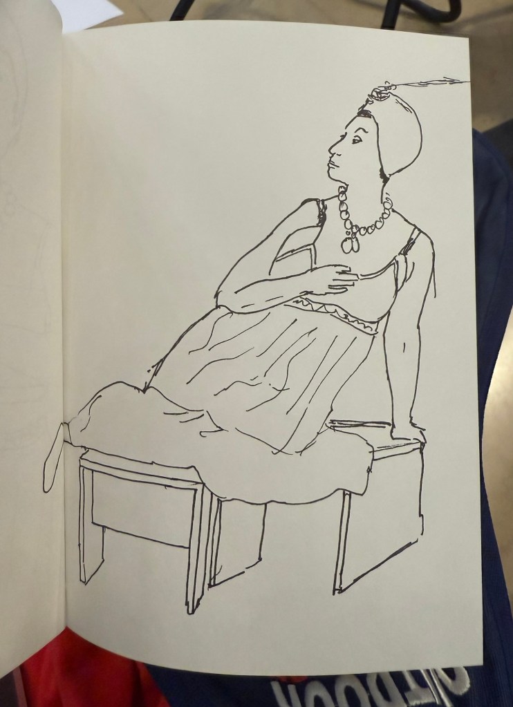
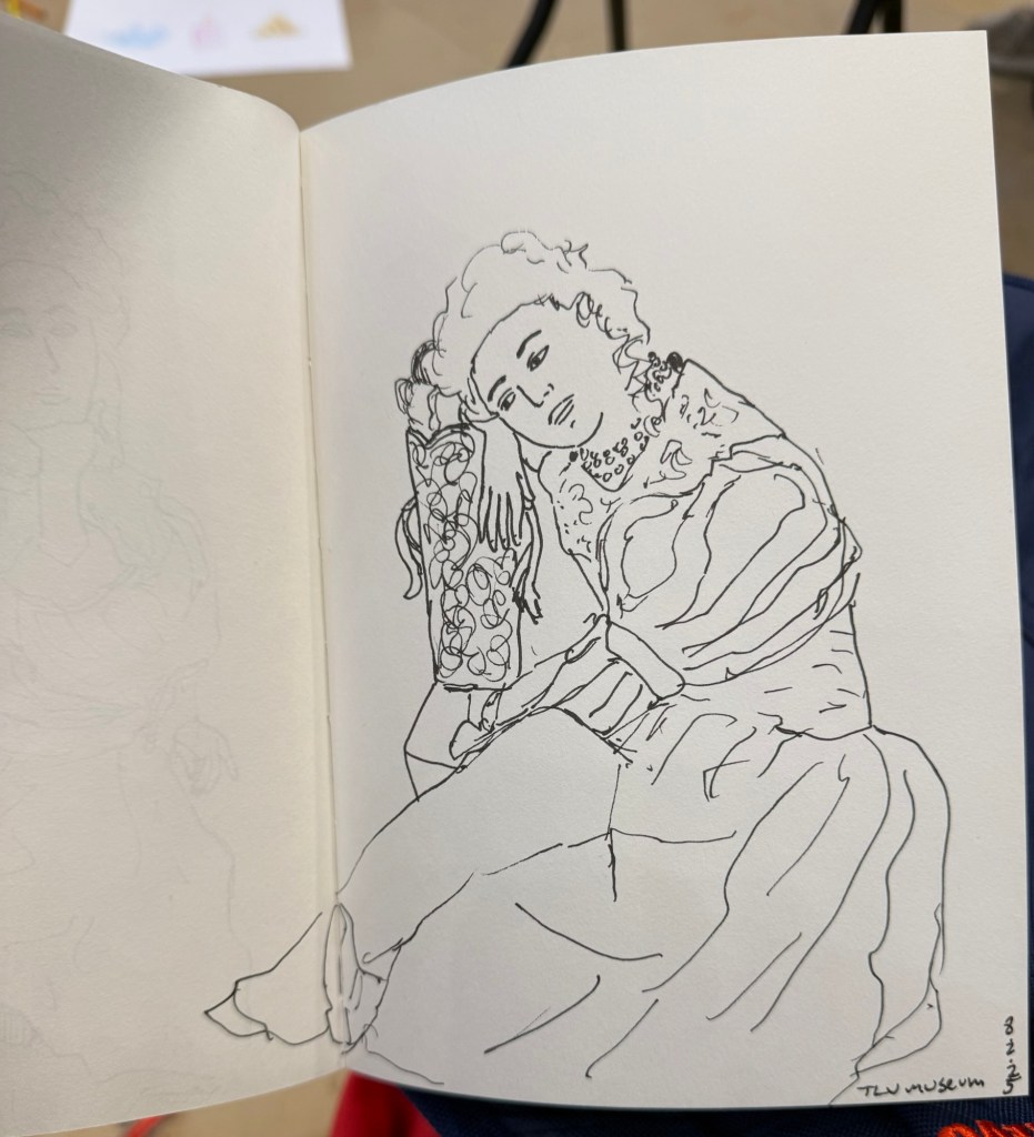
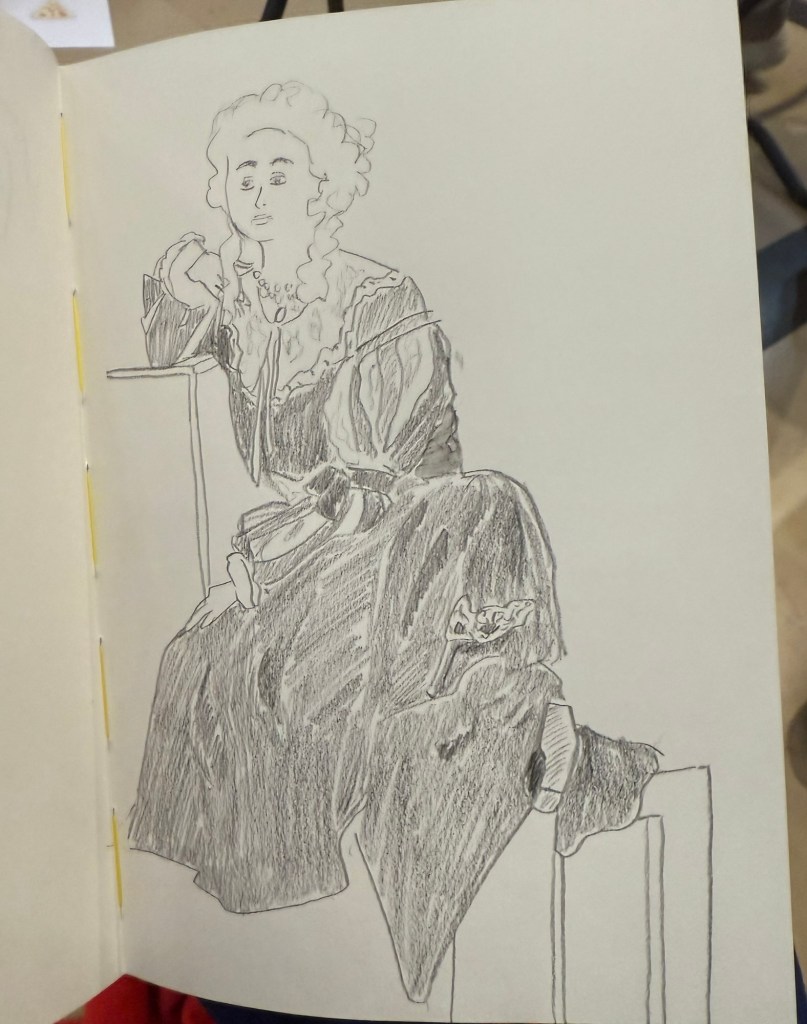
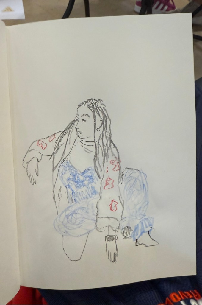
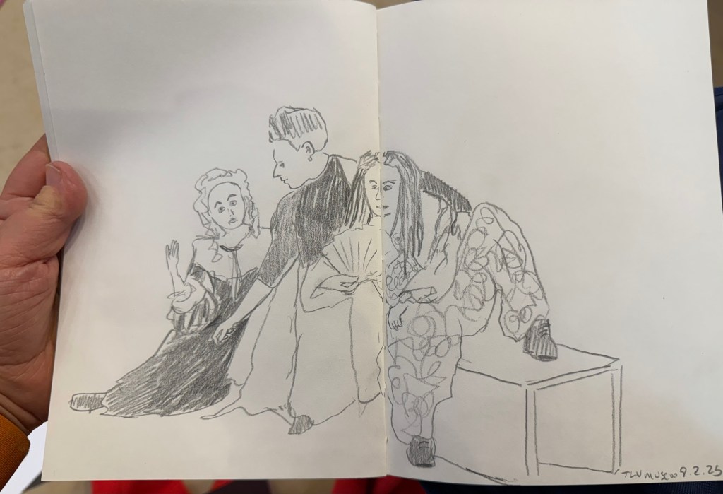
I went to the Tel Aviv Museum of Art today for a special sketching event that they organized: three models dressed in clothing that reflected some of the artwork in the collection, posing for sketches for 3 hours. These were mostly 10 minute sketches, with the last two poses being 20 minute ones. The last pose was a rare treat – a group pose, which is something you don’t get to sketch a lot.

In general when sketching models, whether clothed or not, you have one model that poses. Here there were three, and they switched places, so wherever you sat you got to sketch all three (and you could always sketch a model that was a bit further than the one right in front of you). The museum was busy, and there were children’s plays being shown in the auditorium, and so a lot of kids were around us, sketching on bits of paper with coloured pencils, with parents and grandparents cooing with delight and hovering around. It was wonderful to see how joyously kids took to sketching, whether it was the ladies in the dresses before them, or just anything that came into their imagination.

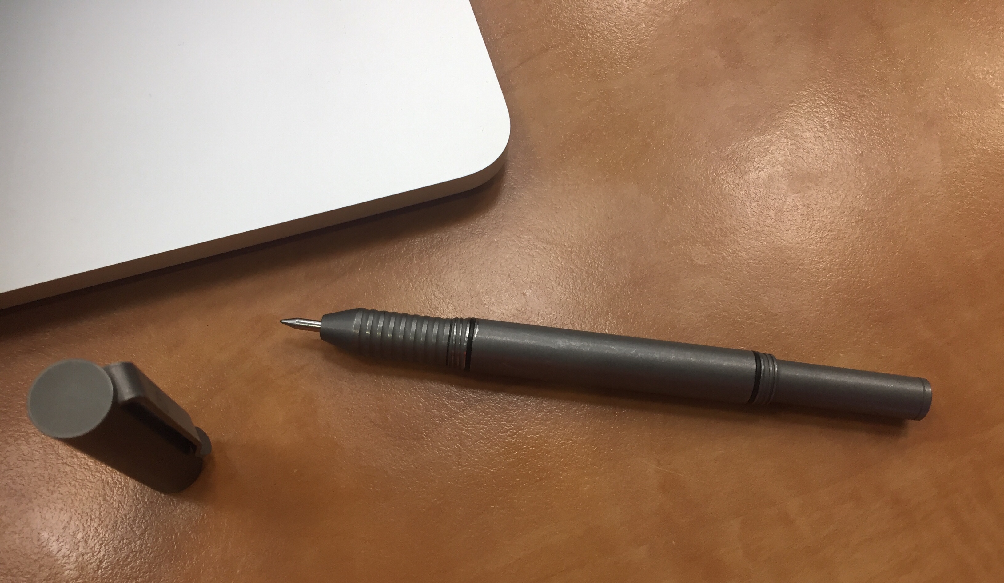
Here are the sketches I made throughout the event. The sketchbook I used was by French maker Pascale Éditions (it was lovely), and I used a Faber Castell 9000 2B pencil, a Faber Castell 4B Graphite Aquarelle pencil, various Faber Castel Albrecht Dürer watercolour pencils, a Tombow brush pen, and a 0.5 Staedtler Pigment Liner (this was my most used sketching tool).

First sketch. Warming up, so trying to keep it as loose as possible.
20 minute sketch, so I had time for some shading.
The only sketch where I wet the paper slightly with a waterbrush before sketching
20 minute final group pose
Potato quality photo of the three models

Have a great and creative week!

Sketching Now Travel Sketching: Eiffel Tower and Big Ben

So the first week of actual lessons in Liz Steel’s Sketching Now Travel Sketching course started and already there’s been a slight change of materials.

As this week will be entirely focused on line drawings, I’m switching to a non-watercolour sketchbook. For the first part of this week’s exercise, which includes working from reference photos, I’m using the Midori MD Cotton notebook in A4. It’s neither a proper sketchbook nor the A5 size format that Liz recommended, but as she also requested to upload as few photos as possible to this week’s gallery (and no more than 6) and as we have quite a bit of work to do, I decided to at least use a large notebook so I can fit more than one or two sketches on a page and thus avoid the need to stitch photos.

Eiffel Tower

We have several scenes we need to sketch as quickly as possible, starting with just 7 lines to define the scene. The 7 lines idea worked quite well with the Eiffel Tower but broke down completely for me once we got into a complex building like the Big Ben. That’s when I decided to just work with shapes and let the architecture details on the building help me determine its length and proportions.

Big Ben

Generic rules like “start with just 7 lines” are nice ideas on paper, but they oftentimes break down when we’re faced with reality. I think that the 7 lines idea would actually slow me down when sketching on location (it slowed me considerably while I was at home, and it failed completely with the Big Ben), but the basics of contour, shapes, perspective, proportion hints work no matter what.

I will try the 7 lines for the rest of the week, to see if it’s just a matter of practice, but I suspect that it isn’t.

One Week 100 People 2024 Day 8 (Final Day)

So I was sick, which made sketching impossible for a few days. I’m still sick but I’m slightly better, so I sat down and powered through the rest of the missing sketches.

As I mentioned last time 61-68 were draw from life, the rest from earthsworld. This site is so much better for reference photos than the flickr gallery I used in previous years that it affected both my speed and my sketching quality. Also, I had a lot more fun sketching these portraits this year. The Leonardo Momento Zero Bohemian Twilight fine nibbed fountain pen was the perfect sketching companion, and Diamine fireside snug performed well on the Stillman and Birn Alpha paper. The larger landscape format also helped make these a joy.
Here are the previous days’ sketches: day 1, day 2, day 3, day 4, day 5, day 6, day 7.

This sketching challenge is always great to do, as it really pushes me outside my comfort zone. If you haven’t yet, I highly recommend giving it a try.

And as usual, which one is your favourite?

One Week 100 People Day 4

Three things happened today:

  1. My shoulder is feeling better.
  2. I have more time.
  3. I found the wonderful Earthworld thanks to Tina from Fuelled by Clouds and Coffee and started using it for reference photos.

The result is sketches 12 to 40 (yes, I got that many done in a single sitting). The fact that I have much better reference photos made such a huge difference, as I didn’t have to waste time digging through urban landscape photos in search for half decent portraits. Also, the Earthworld photographs feature People with a capital P – frumpy, old, ugly, real and incredibly beautiful to sketch. The great Leonardo Momento Zero Bohemia Twilight fountain pen with its fine nib and Diamine Fireside Snug also added to the fun – I love this pen and ink combo so much I’m likely going to use it for the rest of the 60 sketches.

Number 12 was added to this page
I love 14, 17, 18, 20 and 21
I picked up speed with these as I warmed up
Number 36 and 37 really came out well, I think

So, now which one is your favourite? I have too many to choose from.

Sketch/Doodle Session

There is a local group of illustrators and animators that have set up a delightful new tradition during the pandemic: they meet up every Tuesday morning on Zoom for a sketch/doodle session, where they do quick, loose sketches and doodles just to warm up and experiment. Once a month the morning Tuesday meeting is replaced by a night Monday meeting with a guest artist leading the session with various prompts. Tonight my Urban Sketchers chapter head lead the session, and through her I joined the fun.

As I’m neither an illustrator or an animator, I’m posting everything here as quickly as possible before I see the other artists’ amazing work and lose my nerve.

We started with the suggestion to just doodle while we waited for people to join. I was using a new sketchbook that was very cheap, laid flat and had thick textured paper (good for pencil). I used a Caran d’Ache Fixpencil with a 2B lead, and a Tombow brush pen throughout this one hour session.

Doodling before we started. Testing out the paper. Warming up.

We started with a few blind contours, which I haven’t done for years, and so I kept catching myself automatically glancing down at the page. Definitely something I need to practice to get used to drawing these again. We were using Shutterstock films as our models, so that subject was moving around, some of them quite a lot. The idea was to get used to sketching people in motion, grasping as quickly as possible what captured their character.

Not so blind contour.

This looks good if you don’t know what the original looked like. I do, however, like the boldness and flow and expressivity of the lines here. Something to recapture in the future.

Blind contour.

Then we did an exercise where we had 10 seconds to look at a moving person and try to remember what made them them, and then draw a portrait of them from memory. As Marina suggested, it’s easier if you describe the person to yourself in a few sentences.

Portrait from memory.

The second subject drawn as a blind contour:

Blind contour.

And from memory:

Portrait from memory in a minute.

We only had a minute for each portrait, and that was too little for me. It’s a good challenge to practice in the future (working under such short time limits with such complex, moving subjects).

The next exercise was to capture the subjects feelings. Again, a 2 minute time limit would have been more in my wheelhouse.

Can you guess what he’s feeling?

The second subject for this exercise went through every emotion in the book so I couldn’t settle on one.

Feeling? Gesture?

The third was just fun though:

What is he feeling?

Then we did a caricature exercise, where we tried to draw people as not overly stylized caricatures. We has a minute for each, and I was starting to warm up at this point:

The next exercise was a strange one – to draw a person as if he was morphing into an animal and we caught them in the middle of the morph.

Bulldog man.

This was fun and very creative:

Parrot man.

The next one was to draw people in action, in one minute. To capture as many gestures as possible. I guess that the animators had a field day with this one, but I really struggled.

Finally we had 15 minutes to draw each other. I had a lot of fun with this, and the earlier exercises really did help me warm up and loosen up and work faster.

These exercises are definitely something that I’ll try to warm up before drawing portraits, and they’re also just a lot of fun to do. If you have a minute, a pencil and a blank page I recommend that you give them a go.

Faber-Castell Regent 1250 Pencils

So a few years back I was at the main branch of a local art supply change while they were getting rid of a large amount of inventory by slashing down its prices. I was there to stock up on art supplies, and most of the sale inventory consisted of poorly made knock-off pens and no-name novelty print pencils, so I skipped the sale baskets and made a beeline for the tills. As I was standing in line my eye caught a small basket in the corner of the nearest sale table. It looked like it was full of Faber-Castell 9000 pencils offered at a 10th of the price of a Faber-Castell 9000. I left the line and went to investigate.

Don’t they look like Faber-Castel 9000s?

Now my go to pencil for sketching is the Faber-Castell 9000, and although they are excellent pencils, they are not cheap, and I use to go through quite a lot of them. Here I was offered a pencil that looked like a Faber-Castell 9000, was made by Faber-Castell, at a “practically free” price. I couldn’t test them, as they were all unsharpened, but I dug in and grabbed a few of the weird assortment of harnessed on offer: 2B, HB and 4H.

They were Faber-Castell Regent 1250 pencils made in Brazil, and what little I could find about them was people saying that they don’t compare to 9000s. I of course planned to add them into my rotation, which is why I almost immediately lost them. This happens quite often with pencils in my house, since my cat loves to steal them and play with them, so I usually hide the good ones and let him play with ones that I care less about. The result is that when it comes time to looking for a certain pencil I only have a vague idea about the various areas it can be in.

Now that I’ve found them, to the review:

The Faber-Castell Regent 1250 are Brazilian made pencils that look like twins of the Faber-Castell 9000, minus the grey band on the tip. They don’t seem to be widely available outside Brazil, which is both frustrating and understandable. The Regent 1250 poses a risk to the 9000 sales: it’s a much cheaper counterpart that offers graphite performance that’s on par with the 9000. Artists aren’t usually swimming in money, and if FC made the 1250 widely available my guess is that their 9000 sales would take a significant hit.

The gold foil branding appears on only one side of the pencil, and the lacquer appears rough, but not to a point where you’d actually feel it in use.

The Regent 1250’s body is where is where it falls short of the 9000, though I sincerely believe that not enough to justify the reviews that it has gotten so far. The 1250 is cheap and offered in Brazil because it’s made of abundant cheap Brazilian wood. The result is a pencil with a woodcase that doesn’t sharpen as nicely or easily as a 9000, and that has a somewhat rougher finish when it comes to the lacquering.

Made in Brazil. The 4H is a darker green and has a different imprint on it, which makes me thing that it was made during a different time period that the 2B and HB.

The wood is not terrible, and it doesn’t chip and break in large chunks. You just have to put a little more elbow grease when sharpening with a sharpener. If you sharpen with a knife you probably won’t feel the difference at all. The lacquer isn’t pretty: you can see pits and bumps in it, though they are not deep enough for you to actually feel them. The wood on the pencil isn’t consistent in its looks or particularly attractive.

The different appearance of the wood between the 4H and the other two pencils leads me to believe that it was made during a different time period.

These pencils only look premium from a distance. Up close they look battered and bruised. However, these are meant to be artist tools not museum pieces, and what’s most important about them is their graphite. Everything else has to be good enough, and so far it’s been good enough.

I doubt that if I saw two sketches, one made with 9000s and one made with 1250s, that I could tell the two apart. The graphite looks and behaves practically the same, both in drawing and erasing.

Regent 1250 4H on Baron Fig Confidant

It’s so tempting to look down at these pencils as cheap trash, but look what you can create with them:

Regent 1250 HB at work.

The graphite is smooth, the pencils hold a point for a long, long time, and they’re a joy to use, especially since I don’t have to feel so precious about them.

Regent 1250 2B

If anything I wish I could have purchased a wider range of Regent 1250, but seeing how they work I doubt that FC would ever widely offer them outside Brazil, as they would cannibalize the sales of their 9000.

Regent 1250 HB on a Baron Fig Confidant.

It’s frustrating knowing that a company has the ability to offer a good product for artists at a non-premium price and chooses not to. I understand the market forces at play, but I still find them annoying. And to all those who had a chance to use a 1250 and looked down on it: don’t judge a pencil by its lacquer.

Diamine Inkvent Calendar Day 7

Diamine Inkvent Calendar is an advent calendar with a tiny (7ml) bottle of ink behind 24 windows, and a larger, 30ml, bottle of ink behind the 25th window. All the inks are limited edition, and only available through this calendar. You can read more about the calendar here.

I almost missed the 7, it was so well disguised as a candy cane. I’m a little sorry that Diamine didn’t go punny and put Diamine Candy Cane behind this door.

Instead, Day 7’s ink is Diamine Mistletoe. This is a darker, greyish green that’s labeled as “standard” but shades pretty well.

This was drawn on a Kanso Sasshi 3.5” x 5.5” Tomoe River Paper notebook using a Pelikan Pelikano. The colour reminds me a little of Rohrer and Klingner’s Emma SketchINK, Diamine Evergreen and even Diamine Umber. I plan on using this ink for sketches, maybe even opening it up a bit with water, we’ll see. This is bound to be one of the less unique colours in the calendar but also one of the more “useful” ones. This is also one of the few inks in the set that I’d trust around vintage pens.

Ti Arto EDC Review

While the original Ti Arto is my favourite machined pen, the newer Ti Arto EDC comes in at a close second. Like its older BIGiDESIGN brother, the Ti Arto EDC is a machined titanium pen which can accept hundreds of different refills with no need for hacks or spacers and with no tip wiggle. Unlike the Ti Arto it comes in three different finishes, accepts many more refills, and can be adjusted in length.

The Ti Arto EDC looks a lot like a slightly slimmer version of the Ti Arto, with a bigger step down in the end section, and almost no gap between the section and the body.

Those looks are a little deceiving, because this the Ti Arto EDC has a completely different build. The end of the pen can be extended or retracted, unlike the Ti Arto, where it is static. In the Ti Arto EDC the end of the pen is also what you unscrew to change refills, unlike the Ti Arto, where the grip unscrews. If you assume that they’re the same, as on a cursory glance it looks like the Ti Arto EDC’s grip section unscrews (and it really, really doesn’t).

The body of the Ti Arto EDC is slightly slimmer, and the entire pen is slightly lighter than the Ti Arto. It comes in a machined raw finish (like the Ti Arto), in a stonewashed finish (which you can see in the pictures) and in a midnight black finish (which you can see on my Ti Click EDC). Of the three, the stonewashed finish has the best grip and feel, and it also shows wear and tear the best.

The trick with the extendable end section is where the cleverness of this pen lies, and that’s what allows you to use more refill types in this pen, and to extend or compress this pen’s length (to the limits of the refill size). The two o-rings make the end section action super smooth, and the same dual thread design allows you to cap and post this pen super securely. Nothing on this pen is going anywhere without your permission.

The Ti logo, elegant and understated, is the only branding on this pen. You can see how substantial the clip is and how the pen wear in the photo above. It’s like an old pair of jeans, so the stonewashed name for this finish is totally appropriate.

Fully extended, the Ti Arto EDC is the same length of the Ti Arto. However, depending on the refill you use, this pen can get pretty tiny.

I use the Uni-ball UMR-85N refill in this pen, and this is as far as it will contract. If you use a Parker or Schmidt refill the end section can be screwed in almost all the way. However, even partially extended the Ti Arto EDC is a more pocketable pen than its predecessor.

So why do I prefer the Ti Arto more? For longer writing sessions the Ti Arto’s wider girth makes it more comfortable to use than the Ti Arto EDC, although the difference is minor. The Ti Arto is also slightly less ungainly than the Ti Arto EDC, having a more streamlined design, with no step down. I don’t mind the Ti Arto’s gap between the grip and the pen body, and I don’t need a pen that accepts more refills than the Ti Arto. As you may have noticed by now, the choice between the Arto and the Arto EDC is likely going be one of personal taste and preference. Either pen is an excellent choice for a machined pen, an EDC pen, or a titanium pen.

Uni Do! Posca Paint Marker White Extra Fine Review

I am on a quest in search for a white, waterproof pen that reliably lays down a thin, opaque line. You’d think that this wouldn’t be so hard to find, but this combination (opaque-and-thin-and-waterproof-and-reliable) has so far proven to be elusive. The closest so far has been the Uni-ball Signo Broad UMR-153 white gel ink pen, but it tends to dry out and blob, so it is far from perfect.

The Uni Do! Posca paint marker in white, extra fine (0.7) is a welcome addition to the white pen field. It’s waterproof, water-based (so not smelly like other paint markers), lightfast, and can be used on a multitude of surfaces. I’m going to focus its use on paper, but if you’re looking for a way to label a dark coloured object, this may be the pen for you.

The Do! Posca’s design is pretty well designed. The pen is narrow enough in diameter for you to comfortably use it like a regular pen, and the square cap keeps the pen from rolling off the table, and looks great. The pen body is much too busy for my liking, but that’s a minor quibble.

There’s a tiny metal ball inside the pen, and you need to shake it well before use to get the paint ink flowing. When you use the Do! Posca for the first time you need to prime it by shaking the pen thoroughly and then pressing the plastic tip in several times until the white paint flows. I had no problem getting the pen to start up after a good shake, but I’d recommend keeping it horizontally and cap it immediately after use.

The Uni Do! Posca doesn’t blob, and it’s excellent for small details. I wouldn’t use it to fill in large expanses of white, as it offers pretty poor coverage and doesn’t layer well. If you’re looking to use it for highlights, correction or detail work, this is the pen for you.

I drew this journal comic on a Clairefontaine Paint On Naturel A5 pad.

The Uni Do! Posca extra fine paint marker in white was available for a time at Jetpens, but now you can find it easily enough on eBay. If you’re looking for an opaque, extra fine, waterproof white pen, I highly recommend it.

The Master Pencils Union No. 84 Pencil Review

My latest flea market find is a red/blue Union No. 84 pencil from The “Master” Pencils Ltd, the English pencil company that also created the Golden Master pencils that I reviewed in the past.

The Union No. 84 is an oversized pencil, with a red and navy core. I love the choice of font for the imprint: it looks clean and professional.

The pencil is thick, built like a children’s pencil, and so the cores are extra large as well.

The navy core, almost black in appearance:

Finding a sharpener that can sharpen this pencil was a challenge. You’ll need one that’s designed for children’s pencils, yet is high quality enough to handle wood that has toughened over time, and a core that is still soft and brittle. I went with the M+R double brass sharpener Nr. 0603. Beware of the red core when you sharpen this pencil, as it can stain your hands.

Here’s the Union No. 84 next to the Caran d’Ache Bicolor 999, the golden standard for red/blue pencils. You can see their size differences quite clearly.

The navy tip of the pencil:

The red tip of the pencil:

The red tip of the pencil was much softer and more crumbly than the navy tip, but even though I was worried about it, it didn’t break with use.

I tested the Union No. 84 against the Bicolor 999, and discovered a few interesting things. The Union’s blue is indeed a shade darker than the Bicolor’s but it’s not as dark as I would have expected. The red shades of both pencils are virtually identical. The Union feels more like a pencil than the waxy Bicolor, with more feedback, and more shading possible when some pressure is applied. Both pencils erase poorly, but the Union erases better than the Bicolor, particularly the Union red, which doesn’t stain the paper.

I tested the pencils on a Baron Fig Confidant, my go-to pencil testing paper, and erased them with the Maped Technic 600.

The Master Union No. 84 is a lot of fun to draw with, beyond being useful for highlighting and correcting text. It feels like a proper pencil, and not a waxy crayon, and it shades enough to allow for doodles like this one:

The Union No.84 is great and fun, and so was the Spiderman movie. I highly recommend them both.